#first time I messed up the cropping while compressing the video
Explore tagged Tumblr posts
Text
Holmes experimenting on himself scene
Corresponding text post:
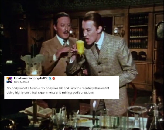
This was in the notes of my text post, and I really appreciate the compliment @kikikiwiart:

But. I didn't replace a cup with a glass. Whitehead Holmes actually tries to drink the results of a dubious chemical experiment. This is why Watson looks so shocked. Very funny scene in my opinion.
It is from The Case of the Final Curtain (1979), part of the series Sherlock Holmes and Doctor Watson by Sheldon Reynolds
I love this series. A happy, impish Holmes. Less depressed than in canon, good for him. In my opinion Granada (my personal favourite) and Ritchie Holmes have a more accurate depiction of Holmes' mental health, but it is also nice to see the lighthearted, humorous side of the Holmes stories explored.
Lovely relationship with Watson. The stories are not canon. As of January 2024 you can watch it on Youtube, this channel has all of them:
(Most of the effort in my text posts is finding the right tweets/posts and a scene that fits. I never had a twitter account, which I regret, but I certainly won't get one now. F... Elon Musk. I usually get the tweets/reddit posts etc. from boredpanda, cheezburger etc.)
#text posts#text post#geoffrey whitehead#living chemical experiment#Sherlock Holmes#not cat related#second try#first time I messed up the cropping while compressing the video
10 notes
·
View notes
Text

So when I first started off maybe like my first two sets, I used an application called Screen To Gif. Which Is the application I used for programming school. It’s great for a quick gif but doesn’t have a lot of options or like very good compressing.
What I currently use:
Adobe photoshop (to make the gif)
Nvidia Experience overlay (to capture footage)
Clip Converter (to download anything from youtube)
Get your footage, I normally just record my own but sometimes I get it from youtube. Today I’m just going to use something I have already downloaded. Here’s a quick cheat sheet for things to think about before you start.

Open photoshop. In the top left corner click File, Import, Video Frames to Layers

Then select whatever video you wish to use and click Open

Next you will get a screen like this

This is where you select where you wish to gif. Normally I do select range only and trip the scene. If I know its going to be a long gif, then I limit the frames to 2 frames. Or if it’s a small gif, then I leve that unclicked.
Use the two little marks on the video duration to trip the video, when your finished, hit OK.

Dont worry if you get this warning sign, it just means your video may be trimmed more and take a little while to load. You can either cancel and go back and retrim or just hit continue. I have a gaming laptop so normally this doesnt take very long but it can freeze a few time. Normally what happens on my laptop.

Next you should eventually get to your open project. Make sure you have the timelines shown. If they arent there, go Window, Workspaces, Motion

From there you trim the amount of frames you actually want. I normally aim at about 40 - 60 frames per gif depending on the size, shape and colours used in the gif.
You can do this by selecting the unwanted frames in the bottom timeline area and then deleting them with the trash icon.

From there if you have a slow computer I recommend also deleting the unused layers to the right. Now that you have the frames you are actually using, now is a good time to crop the image. Use the crop tool to the right and when your finished, hit the tick button up top. Depending on how many frame and the size is how long it takes to crop.

Now is a good time to mess around with any lighting or colour edits. Most of the time I increase the brightness and contrast for gifs set at night.

Now we change the time delay between each gif. To do this, select all the frams and hit the little arrow drop down list on one of the frames. Then click Other, and input the delay you wish to set the frames to. This is how quickly your gif will play. I normally put this at 0.05.

When you finished you now need to save your gif. I orginally learnt to make gifs on CS5 so this is the way I export. Go to File, Export, Save for Web (Legacy)

This is where I do my final edits. Now you can change the size of the image in photoshop prehand but I prefer to do it here, encase at a later date I want to go back and maybe crop the image more or edit it.
Below are shown the settings I have mine to. I have changed the gif size to 540 width as that is the post width on tumblr. You can also see on the bottom left corner that there is the size of the gif. Mine is 1.75M. That is good, I normally aim to keep it below 3M.

You can also playback the gif before you save it. When you are done, just hit save into your folder of choice.

And then your done! Heres my end result. I’m not the most advanced gif maker out there and I highly suggest maybe checking out some other tutorials or youtube for help. If you have any questions feel free to ask.

#photoshop tutorial#gif tutorial#feel free to link any other tutorials in the comments#im new myself and is always down to learn#i gtg work now so this is a bit rushed#anonymous#ask
28 notes
·
View notes
Text
Gif Coloring Tutorial
Requested by anon. Sorry for taking so long to post this!
This tutorial goes over how I color gifs, including tips for coloring dark scenes and scenes that are heavily filtered with a certain color (i.e blue scenes, yellow scenes, etc.).
We’ll be going from this:

To this:

Warning: This post is gonna be really long! (if the read more breaks blacklist “long post” or “usermerlin gif tutorial”)
*I’m using Photoshop CS5
1. Gif Making Basics (Note this part won’t include images since the anon specified coloring and avoiding noise I’m gonna focus on that)
First I take screencaps using Potplayer.
In PS I import the frames by selecting File --> Scripts --> “Load Multiple DICOM Files”
Once the images have loaded I go to the drop down menu on the animation window and select “Make frames from layers”.
Then I crop my gif using the crop tool. I put all the layers into a group (select all the layers and press ctrl + g (cmd + g if you’re using a Mac)
Now I sharpen my gif. I’ve created an action to speed up this process using user thepunisher’s action tutorial. I didn’t include the grouping of my layers in the action so that’s why I always group them before starting my action so that it works properly. My sharpening is pretty standard from what I’ve seen. I use smart sharpen:
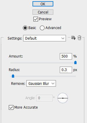
Now I can start coloring!
2. Basic Coloring
In this section, I’ll be going over a basic, but vibrant, coloring. When making adjustments you have to be careful not to increase brightness or vibrance too much or your gif will become grainier. Same goes with making changes to the colors. It’s better to have more layers with slight adjustments
I always start by brightening up my gif. Sometimes I use curves to both brighten and adjust colors. For this particular gif I didn’t, but I use this adjustment often. User villainelle has a tutorial for using curves to color adjust here and so does user thepunisher here. They have slightly different approaches and I use either depending on the scene. I’ll also be explaining this adjustment more in the next section but I learned how to use it from them.
Step 1:
For this gif, I just started with an Exposure adjustment layer. Exposure allows you to change the tones of your document. Gamma adjusts midtones, offset adjusts shadows, and exposure adjusts highlights. It’s really helpful with brightening up dark scenes or heavily shadowed scenes. I usually only adjust the midtones/gamma. Here are my settings:

I increased the Gamma to 1.12
Step 2:
I then use a Brightness/Contrast layer to adjust the highlights (you could also do this with Exposure but I find Brightness more manageable). At this point, I’m only increasing the brightness. I won’t increase or decrease the contrast bar. Here are my settings:
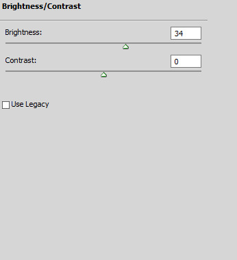
I increased the Brightness to 34
Step 3:
After adjusting the brightness, I want to bring back some depth (I’m probably using this word incorrectly tbh) to my gif by increasing the contrast before moving on to color correction and vibrancy.
To increase the contrast I use a black and white gradient map and set it to soft light. Then I lower the opacity between 10%-50%, depending on the scene.
You could also use Levels or Brightness/Contrast but I find the gradient map is easy to control while also making the gif more neutral. For this gif, I set the transparency to 10% but could go a little higher because the scene is naturally bright. All these adjustments are really about your personal preference.
Step 4:
Now I can move on to the colors. For basic coloring I usually start by increasing the saturation. I use a Hue/Saturation layer because this way I can increase the saturation of everything. I feel like the Vibrance layer tends to just make the gif warmer rather than making the colors pop- and I have less control over individual colors. For this gif, I increased the saturation for all colors (”Master”) to 27:
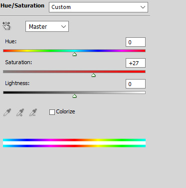
Step 5:
After adjusting the vibrancy I move on to color adjustment. This can really vary based on preferences. I tend to prefer to make my gifs cooler in tone. I use Selective Color and Color Balance to manipulate the colors.
I started by adding a Color Balance layer to adjust the colors on Aziraphale’s face:

I increased the Cyan to 4, the Magenta to 3, and the Blue to 1 to make the skin tones more neutral. I’m moving the bars toward the colors I want to add. So if my gif is too yellow I’d move it toward blue and if it’s too red I’d move it toward cyan. Also note that I only made changes to the midtones. If I wanted to make changes to the darker or lighter parts of this gif I’d alter the shadows or highlights but I usually only do that for rainbow gifsets. Typically, I prefer Selective Color to make more drastic color alterations so I have more control over the specific color I’m changing.
*Be careful when making these types of changes. You don’t want to make drastic changes to the natural undertones of a person’s skin. Same goes when you’re brightening your gif. You can easily whitewash if you’re not careful. User amorverus has a great tutorial on avoiding whitewashing in coloring here .*
I also wanted to brighten up the gif more after this so I added a curves layer :
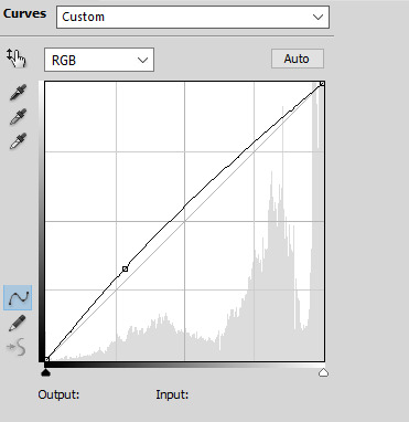
Then I used Selective Color to decrease the yellow tones in the White background:

I decreased it by 26. I almost always do this for scenes with white backgrounds or large blocks of white.
Step 6:
After I make some color adjustments I adjust the brightness and contrast again. I always add another Curves layer to increase the brightness of the shadows by slightly lifting the line on the bottom left:
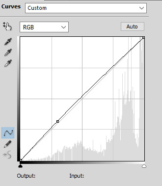
Then I use Levels to change the contrast of my tones. I usually increase the contrast by moving the left hand point slightly to the right:

After that I add another Curves layer, decreasing the shadow and increasing the highlights like this:

I feel like this adds some nice depth to my gif and brings out the colors more. The amount I decrease or increase the curve depends on the gif itself, so definitely play around with this.
Step 7:
Now I go back to make some last color changes. I added another Selective Color layer and increased the Black on Whites:

Finally, I added another Selective Color layer adjusting the Whites again. I decreased the Yellow again and also increased the Cyan and Magenta to make the blue in the sky pop a little more:
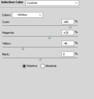
I used a layer mask to erase this layer on Aziraphale so the change is only apparent on the sky.
Now I’m done! Here’s the same method on two other scenes:


And I uploaded the .psds (dl here) so you can take a closer look at what I did in Photoshop. Keep in mind that I don’t always follow these steps in the exact same order. Psd #3 features the curves color adjustment method and has some more adjustments. It really depends on the scene itself and the mood I’m in. Practicing a lot will build your familiarity with the different adjustments and hopefully boost your confidence in making your own coloring!
3. Hard to Color Scenes
Blue/Yellow/Green/Red Scenes + Dark Scenes
These types of scenes can be hell to color but there are some techniques to help balance the colors so that you have something that’s easier to work with.
For general dark scenes, adjusting the Exposure can be really helpful. Unfortunately increasing the Gamma or Exposure too much can make the gif grainy so be careful when using it. Consider using it in combination with Brightness/Contrast and Curves to avoid making drastic changes.
Another helpful adjustment layer is the curves layer. As the tutorials linked above explain, using the midtone or highlight dropper tool can help adjust the presence of red, green, and blue in your gif. Photoshop will balance against the color you select.
Let’s take this scene for example:

This scene is really yellow. Using color balance or selective color to balance it out could help but given how yellow it is, you’d need to use a lot of these layers to gradually change the colors or you’d make your gif too grainy. Using Curves, we can adjust colors with less layers and hopefully introduce less grain (sometimes this type of adjustment can result in too drastic a change, so your gif becomes hella grainy so be careful). I used the midtone dropper around here:

And got this:

Here’s the Curves layer:

The shadows are a little more intense than they were to begin with but that’s easier to adjust. You could also keep messing around with the dropper so the scene doesn’t become darker. You could it make it slightly less yellow and then finish the rest with color balance and selective color. Either way, I’m satisfied with this so now I can continue coloring:

Here’s an example of a dark and blue scene:

Usually for darker scenes, I use the midtone dropper but that wasn’t resulting in a change I was happy with. I used the highlight dropper instead, clicking on the flecks of snow in the bottom right:

Here’s the Curves layer:
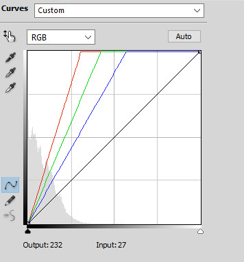
And here’s the final gif after coloring:

This method is great for making big changes to the lighting and colors of your gifs.
HQ GIF Tips:
Save Settings:
I save my gifs with Diffusion because I find that the dithering is usually less noticeable that way, so my gif looks smoother. Pattern can also look really nice though, depending on your coloring. Try out both and see which you prefer! Here are my settings:

Coloring:
Making drastic changes all at once can make your gifs grainier. Be careful not to change a color too much one one Selective Color or Color Balance layer. It’s better to make smaller changes over multiple layers. Same goes for increasing brightness and vibrance.
Source:
Use the highest quality video source you can. That’s an easy way to make HQ gifs. Blu Ray or DVD quality is better than Itunes for example and both of those will be better than clips from Youtube. If the file size is bigger that typically means there less compression so the quality will be better. If you can’t find larger sizes or you don’t have the space or time to save larger files, just make sure it’s at least 1080p. Keep in mind that now that gifs are converted to gifv, your gifs might look grainy or blurry when you post them even if they look fine when you save them. You can go back and mess with the coloring to see if this helps but otherwise there’s not much you can do about the conversion.
Those are all the tips I have for now! If anything doesn’t make sense or you have any questions please let me know.
#gif tutorial#coloring tutorial#photoshop help#long post#usermerlin gif tutorial#I hope this helps!!#sorry this got so long :(#please let me know if you still have any questions or if something doesn't make sense#I get all rambly#my current coloring is really a messy mix of all the tutorials I've ever seen#I'm gonna reblog this a couple of times to make sure it gets seen#I'm gonna go to sleep now lol
35 notes
·
View notes
Text
Merge Duplicate Profiles In NationBuilder
You would need one other program to combine MP3s. I actually really feel like perhaps I've missed something with Free MP3 Cutter Joiner. It appears to be like like two separate functions that have been joined by an unpleasant interface which tries its finest to confuse. It does what it claims, but poorly at greatest. Upload your mp3 info, ggysybil2429.wapamp.com than click "merge" button to merge. To make use of open monitoring in mail merge, you should enable the Track E-mail Opens possibility within the Mail Merge configure window. You also must specify a Campaign Identify as shown within the screenshot under. @AlaskaDave No, see the monitor visualization. At several places the merged observe jumps repeatedly from one facet of the road to the other. The merged monitor is just a big mess. Importing each tracks individually would be a lot better. You can be proven a display. Input the above copy" command and put it aside. Next time you won't need to retype the command each time, you just go to test> and type merge" (and hit enter"). After all you may name the bat file something you want. The revered indie label Merge Information celebrated its ten-yr anniversary with Oh, Merge, a group of largely uncommon and unreleased tracks from a few of its finest artists. The album displays Merge's range, showcasing old-school indie rock from Guv'ner, Spent, and label founders Superchunk together with the publish-rock of Ganger and lo-fi electronica of Third Eye Basis , while still discovering room for the pop classicism of East River Pipe , Impartial Milk Hotel , and the Ladybug Transistor, who turn in a rendition of the Bee Gees ' "Massachusetts." The Mad Scene, the Magnetic Fields, Lambchop, Pipe, and Portastatic additionally contribute worthy tracks to Oh, Merge, making it a fine retrospective of a distinctive and completed label. Make Preparation: free obtain and install this highly effective MP3 Merger in your Windows, after which comply with the step-by-step information to mix audio files inside minutes. Right here we take merge mp3 as instance. Windows solely: If you're searching for methods to merge a bunch of MP3 information into one larger file, and do not identical to the command line answer I wrote about earlier this week, attempt Merge MP3. To sum up, when you want a chunk of free Home windows 10 video editor software program with fundamental editing features only, WinX Video Converter is a nice choice. It is the easiest one with crop, trim, merge, deinterlace, compress and other features included. Apart from appropriate with Windows 10 LAPTOP, this video editor also runs nicely on Home windows eight, 7, etc. Click on the Add tracks button to select the music files to merge. The online app then shows the chosen tracks as in the snapshot directly under. When iTunes pulls up the CD information you wish to merge, spotlight the tracks you need to merge. You can do this by right-clicking the first track and then urgent the Shift key for the opposite tracks. Chances are you'll be tempted to only deactivate or delete one of many records but that might lose any history and information for that document. The most effective, and really helpful choice is to merge the data collectively. You can be amazed (good and dangerous) at some of the information that one document has vs the other(s) as you merge them together. You may additionally have to know which data is correct if discrepancies are present.
Step 1. Open the program and just click the following web page on on the Select information" icon. Choose the recordsdata to merge and click on Open" on the files explorer to add them. You may also drag and drop them to the program. Simple MP3 Joiner is a quick utility to merge MP3 and WAV files. You'll be able to choose the order of recordsdata to be joined, edit their ID3 tags if desired, insert silence between fragments, hearken to supply files within the constructed-in participant, set the output folder. Shift or Control-click (Command-click on for Mac OS) to pick the audio-solely clips you want to merge with the video clip. You can even flatten a take folder and merge the results. The take folder is changed with a single region that represents the present comp picks. All take region sections not used in the current comp are deleted. The file marked because the Primary Document serves as the target document; knowledge from other duplicates is merged into this file. To designate a unique record as the first record, select the Primary Record possibility for that document. Use the Merge Data component so as to add full new records to a data area, or to add new assignments to current information. Merge MP3 could even seamlessly merge recordsdata between lossy and lossless codecs. For instance, you possibly can merge a bunch of FLAC and MP3 recordsdata into a single compressed mp3, aac, or ogg file, and vice versa. For instance, you can merge a bunch of FLAC and MP3 information into a single compressed mp3, aac, or ogg file, and vice versa. Since it seems that most audiobooks I find outdoors of Audible are split into a ton of MP3 recordsdata, I sometimes merge them into a single MP3, drag into iTunes, convert to AAC file, then change the extension to M4b. Click "Merge" button, the merged MP3 file will routinely appear under the MP3 files with the name like "Merge 1". Double click the Merge 1, you'll be able to rename for your merged MP3 music or audio. Like mp3DirectCut, Mp3Splt can work on an audio file with out having to decompress it first, leading to a fast workflow and no impact to audio top quality. This app is far simple though: you simply select a begin and end time, then export that choice as a separate audio file. The resulting file may be break up again into its part components using the mp3splt machine - mp3wrap adds information to the IDv3 comment to permit this.It'll also merge multiple selected events on the identical observe collectively into a brand new copy of the mixed occasions. That is helpful to wash up a observe which will have many audio slices or events on it. It doesn't apply or remove the FX's which are on the corresponding channel. It does apply occasion based mostly FX and envelopes. It also with snap on, extends the event to the nearest measure. One in all many simplest devices, Shuang's Audio Joiner helps you merge your audio files at no cost. The software program can course of the information in a short time and lets you view the evolution with the assistance of the progress bar. On high of that creating information is actually swift as it takes not even 30 seconds for a lot of the MP3 tracks to create.
1 note
·
View note
Text
aftg headcanons
sorry if this is a mess but i have a lot of feeling/thoughts about this
• matt has donned “true friend” by hannah montana his and neil’s song okay
• neil is a runner and goes on runs a lot when he needs to clear his head and stuff so like what if the foxes started running with him
— kevin goes with him first (nicky was chilling in the dorm eating some ungodly snack and kevin was glaring at him and had this disgusted look so nicky laughed and with a surprise attack got kevin to swallow two whole bites)
• so kev is like no i need to work off these calories immediately and he sees neil getting ready for a run and just joins him
— he and kevin only talk about exy, it’ll take a while for them to actually be able to talk about anything else, but it does happen
• matt is second cause he sees them jogging out the window and is like “well shit i didn’t know neil was open to company on his runs (cause sometimes he’s not) and decides he’ll join him next time
— matt is neil’s best bro so they talk about whatever and neil is like since when has this happened but he’s fine with it and is actually glad for the company
• a few weeks later it’s dan, then nicky who won’t shut up and keeps blabbing his head off but by this point neil finds it endearing, then allison who tells neil how pretty he is and how she could make him look and i quote “bitchin’” if he let her do his make-up, he politely declines. renee asks him if she can join and neil was going to say no since she unnerves him but he’s trying hard to get over that and says yes and they don’t speak other than her occasional humming
• whenever “circle of life” from lion king and matt is anywhere neil he will pick him up and sing along and all the foxes have so many videos of this along with zoomed in pics of neil’s face while it’s happening and they all think it’s the funniest thing ever (they mostly put on the song just to see it)
• they all have so many videos and pictures of neil and kevin’s reactions to things. kevin mostly to their unhealthy food choices (so they purposely order the thing on the menu most likely to give them a heart-attack) and neil to like anything.
— they have compilations of neil going off on press and then panning over to kevin who is standing with his hand over his face sighing and muttering things like “why does wymack even let him do this he knows by this point” and “i’m going to murder him at night practice” and “why do i even try like honestly god why are you so against me”
— they all try to get neil to say his iconic “i’m fine” so they can record it and pan over to any one of the foxes faces like their on the office. they have to have hundreds of these videos by this point honestly. dan puts them all together and it’s more than an hour long, at one of the sleepovers they watch it all and neil is cursing them while they laugh and andrew is muttering “idiot, do you know the definition of that word?”
• all of them have a lot of sleepovers. they’ll watch movies (they take turns picking) and eat snacks and junk food that kevin complains about and they sometimes play games and they fall asleep on each other and its just really wonderful
• so when the upperclassmen graduate neil is proud but also feels a little lonely but he voice calls with them all the time but he decides that isn’t enough so he gets rid of the dinosaur (his phone that andrew gave to him so he doesn’t really get rid of it he keeps it in the drawer by his bed) and gets an iphone
— after that all hell is unleashed and he is always facetiming at least one of them. andrew mostly and then matt and dan (but he sees them the most cause of dan being assistant coach) and then nicky and kevin.
— they all try to call each other at least once a week but theres a lot of them so they have a groupchat. they talk all day in this groupchat and at least three conversations are always happening at once and pictures from the good ‘ol days and recent ones are always being sent
— bless the thing called skype and google hangouts because now he can talk to more than one of them at once and it’s really great and he loves it and them so much
• they also try to visit each other on any special occasion and when they can’t you best believe they send cards and facetime.
• neil is most surprised by the times that kevin initiates contact with him after he also graduates. kevin will call and text him reminding him to train and eat properly and keep his reflexes sharp and to insult his skills because kev always records and watches his games. it’s few and far in between that kevin compliments him but when he does neil feels good and proud and awed but he’d never tell kevin that
— kevin and neil become closer okay i don’t make the rules. they call each other and talk about things other than exy but lets be real these exy junkies mostly talk about exy and each others games and the players on their teams (usually to complain or insult them) and kevin gives him advice
• when robin comes neil doesn’t feel all that lonely anymore and they are giving matt and neil a run for their money of the level of bro-ness
• my wife allison plays professionally and you cannot fucking tell me otherwise i’m sorry i don’t make the rules, she becomes pro and is a badass and her team beats kevin’s team once and kevin is pissy about it but he can’t be that mad (although he makes his team practice twice as long for a week straight afterword)
— speaking on my wife allison didn’t nora say she didn’t play pro and became a fashion designer or something? anyway she still does that and she makes sports gear and work out clothes that make you That Bitch but are also comfortable and practical and she becomes even more rich. everything comes in shades of bright orange, pink, and black
— every time she sees any of the foxes she brings them clothes from her line and she promotes the line by making the foxes put them on and model them for her.
— the most popular ones are matt boyd in a bright orange crop-top and booty shorts, the second most popular being neil in tight compression pants that leaves nothing to the imagination and a pink muscle tee. as soon as the picture of neil is posted his phone is ringing and guess who it is, yes that’s right its andrew. allison shoots neil a wink
— eventually she gets a deal with nike and designs shoes and the same thing, though this time she makes dan and renee model them for her. nicky does it on his own and send her pics of him wearing them and she posts them
— kevin adamantly refuses to model for her but he owns everything from her line but he would never tell her that and he shows his support by taking a picture of him at the gym in the gym mirror and he’s wearing them and allison reposts it and texts him a winky face
— everything she designs she has them try it first to see if it can withstand practical use so even after they graduate more than half the shit in their closets is bright orange only now theres also varying shades of pink
— she also forces her current team members to model for her and they all don’t want to at first until they actually try them and now all her teammates are always sporting her designs while training or at the gym or on court and she’s so proud of herself because she’s made something of herself without her parents
• now on to kevin, so he learns the piano i have a headcanon (i forget if its actually canon or not but) jean is like a piano prodigy so when he and jean have their bi-weekly calls he begins asking jean for tips and its hard but kevin picks it up a lot faster than he would have expected
i have so many thoughts on these guys so i’ll do a part two more on like renee, dan, matt, the twinyards and kev. especially aaron cause i don’t think i mentioned him but i have so many about him also so that’ll be in the second part.
#aftg#tfc#the foxhole court#all for the game#the foxes#matt boyd#aftg headcanon#neil josten#andrew minyard#aaron minyard#renee walker#allison reynolds#kevin day#headcanon#dan wilds#danielle wilds#nicky hemmick#headcanons#tfc headcanon#jean moreau#mine#okneiljos#part I
379 notes
·
View notes
Text
Organize your catastrophic camera roll
Digital photos are free and don't take up any physical space. No wonder most of us are digital hoarders. (Antonio Gravante via Depositphotos/)
Since we started carrying smartphones with decent cameras in our pockets wherever we go, we’ve collectively taken more and more photos. Over the past decade, I’ve shot maybe 50,000 with my iPhones, which makes for a hell of a lot of mediocre pictures—and very few good ones.
If you’re reading this, chances are you’re in a somewhat similar situation: years of shooting smartphone photos have given you an entirely unsorted, multi-thousand-picture camera roll.
Digital photos are wonderful, but there’s no point shooting them if you just leave them sitting on your smartphone, totally ignored. Sure you’ve thought about putting everything in place, but just thinking about diving into those folders most likely scares you. Don’t worry—I’m here to tell you that sorting that photo mess of yours can be done, though it won’t be quick.
Keep or cull
There are two main strategies when it comes to sorting through thousands of photos, depending on how you feel about them: You can either aim to keep the good photos or you can cull the bad ones.
Keeping the good photos is easier and will give you a much smaller library. You’re essentially adopting a “hell yeah” or “nope” approach. Simply work your way through all your photos and pull out the ones you think are objectively great. Anything that doesn’t hit the mark gets deleted.
The problem with only keeping the technically good photos is that you throw a lot of baby pictures out with the bath water. Most people have hundreds or thousands of OK photos that won’t pass the test, but it’s also kind of a shame to lose them because they hold so much sentimental value. They’re the repetitive photos of your dog, sunset snaps, or shots from your trip to London with an ex. You can’t say you love every photo or that you’ll ever print them off, but they’re a record of your life, and maybe you’ll just want to have them in the future.
Culling all the actively bad photos is the better long-term solution. Rather than only keeping great pics, you delete all the bad ones—the random screenshots, the duplicates, all those out-of-focus images, the myriad of terrible selfies, and so on. At a guess, I’d say this kind of photo makes up between 50 to 75 percent of what you have on your camera roll.
By purging all the bad photos, you end up with a functioning photo library. All the images in it are meaningful—even if there are thousands of them. It might not be as good as your grandmother’s perfectly sorted albums, but it’s a workable solution for most people.
Just keep in mind that both of these methods will reduce your photo library considerably, but they won’t solve the overall issue—your photos will still be in a huge, unsorted pile, and, if you keep snapping at the rate you are without making any changes, it’ll all become a mess again in no time.
Gather your photos
The only thing worse than one messy photo library is two messy photo libraries. Most people now really just have one: the collection on their smartphone. However, if you still have some holdover photo library on your PC, an old phone, Facebook, or somewhere else, you should probably sort that at the same time.
Choose what you’re going to use as your master photo collection going forward and add all the unsorted photos from anywhere else to it. Boom—one really huge mess instead of several big ones.
For this, I’d really recommend either Apple’s Photo app (with iCloud Photos) or Google Photos, depending on your platform of choice. They both have web, smartphone, and desktop apps so you can access your images from anywhere (provided you have enough cloud storage, but we’ll get to that). A tool such as Lightroom is great if you’re a professional photographer, but is serious overkill for most people: it’s expensive and won’t play nice with your phone.
Get enough cloud storage
If you want to keep a nurtured collection of graffiti pics, you'll most certainly need a lot of space to store them. (Sandra Gutierrez /)
The year is 2020: flying cars glide through the neon-lit metropolis and no one ever accidentally deletes or loses a photo to a hard drive error...
Okay, we’re still waiting on the flying cars but there is no excuse for accidentally losing all your precious baby photos because you left your smartphone in the seat pocket of an airplane. Google Photos and iCloud Photos (plus Dropbox and a few other apps) can automatically back up your photos to the cloud. This is a big deal.
For years, the hardest part of having a photo library was making sure it was backed up. External hard drives dying and taking entire collections of important images with them was a real problem. I lost hundreds of photos I thought were backed up but actually weren’t.
Unless you shoot RAW photos on a professional camera, the cost of enough cloud storage to protect all your photos is almost nothing. iCloud offers 5GB of free storage space, which is not a lot of space, but charges 99 cents a month for 50GB—enough for about 15,000 photos. For bigger libraries, you’ll need to pony up $2.99 a month for 500GB, which should be enough to handle any photo library. If it can’t, you’re not sorting yours very well.
Google takes a slightly different approach. It won’t cost you anything to back up unlimited “high-quality” photos (marketing speak for images compressed and cropped to 16 megapixels and videos limited to 1080p). If you want to keep your images uncompressed and in their original quality, you’ll get 15GB of free storage and then plans start at $1.99 a month for 100GB. Be warned though: everything you store on Google platforms (Gmail, Google Drive, Google Photos, etc.) uses the same space in the cloud. If you have a lot of files backed up on Google Drive, that means less space for photos, and vice versa.
Also, note that you can use Google’s platform even if you have an iPhone—it’s just not as integrated with the whole Apple ecosystem. If you want those free photo backups, grab Google Photos from the App Store.
If you want to, you can buy an external hard drive for $50, but then you have to back things up manually. And since the whole point here is to sort things out once and for all, it’s better to go with the easy option: put everything in the cloud and treat any monthly fee as insurance against losing any important photos from #WolfpackTrip2K17.
Bring out the big guns
Alright—you’ve got one master library packed with thousands of unsorted photos on your smartphone and on the cloud. Now it’s time to sort things out for real. But first, the bad news: this is going to take time.
Unless you only recently took up photography, your photo library is likely a problem that’s been building for years. This isn’t something you’ll be able to fix in a few minutes. Yes, there are apps out there, like Gemini Photos for iOS, that can help you find duplicate or blurry shots, but if you want to get things done right, you’re going to have to go through your library photo by photo—no AI can yet do the job for you.
But that doesn’t mean you have to do it all by yourself. My favorite tool for the job is Slidebox, which is basically Tinder for your photo library—swipe up to delete an image, left to leave it unsorted, or tap to add it to an album. It’s a lot quicker than using the built-in photo app on iOS or Android when you’re going through a lot of photos.
And even with Slidebox, sorting your whole photo mess will take time. If you review an average of 30 photos a minute, 1,000 photos will take just over half an hour. Depending on the size of your photo library, you’re probably facing at least a few hours culling.
A couple of tips to get it done and not die trying:
<b>Do something else at the same time.</b> Don’t just go through your photo library—throw on a podcast or Netflix in the background. It’ll distract you and you won’t feel like you spent three hours just looking at your phone, though you totally did.
<b>Do it in blocks.</b> Spend 10 minutes every evening going through your photo library. Or snatch two minutes while you’re waiting for a train. Don’t try to do it all in one horrific go. It might take you a few weeks to get through everything, but you’ll finish the job sane.
To tag or not to tag
This would be the physical equivalent of having all your photos sorted and labeled. Isn't it pretty? (Markus Spiske via Unsplash /)
Adding photos to albums, naming all the files better, or adding tags to your images is a suggestion you see in most articles like this one—but I’m against that whole idea. In theory, I love perfectly tagged, album-ized photo libraries because they appeal to the productivity geek in me, but I refuse to believe anyone actually has one.
Photo albums made sense when a roll of film had 36 pictures and had to be developed and stored. It’s easy to go through two or three rolls worth of pictures and sort them, but your iPhone can shoot 36 photos in a couple of seconds. Your crazy-into-photography grandmother might have shot 100 photos just last month, and you probably shoot that at a single event.
Now, it’s ludicrous to suggest that most people sort their photos neatly into albums. If it’s something you want to spend hours doing, absolutely go for it. But for the majority it’s just not a realistic option. (I can’t even keep my professional photos accurately tagged.)
Instead, the better solution is to harshly downsize your photo library to a minimum and let technology do the heavy lifting. If you use an app like Slidebox, create big buckets instead of specific folders—I have one named “Travel and Stupid Stuff,” rather than creating one for every trip—and then use the built-in tools to find photos as you need them.
You want photos from your trip to Miami? Your smartphone geotagged them. What about Christmas a couple of years ago? Sort by date. And all the photos of your kids? Well, Apple and Google are going hard on auto-generated tags and facial recognition technology, so their platforms will automatically sort your photos according to who is in them. The systems aren’t perfect, but they work a lot better than spending months of your life categorizing images into discrete albums.
Build good habits
So you’ve sorted your photo library—you’ve culled a few thousand terrible photos and you’re left with the good stuff. Congratulations. Now, the next step is to not let things get out of hand again.
Apply a principle you were probably told growing up: the more often you tidy a room, the easier it is to tidy. It’s the same with photo libraries. You’re unlikely to stop taking terrible photos and taking screenshots of irrelevant memes, but you can at least get into the habit of purging them more frequently than once a decade.
Once a week or month (depending on how much you shoot) go through your photo library and get rid of anything you know you definitely won’t want in the future. It’ll only take you a few minutes and it’ll keep everything nicely sorted. At least until the big tech companies build an AI that can do it for you. In which case, hello robot overlords!
from Popular Photography | RSS https://ift.tt/3bzs1Zg
1 note
·
View note
Text
Organize your catastrophic digital photo library
Digital photos are free and don't take up any physical space. No wonder most of us are digital hoarders. (Antonio Gravante via Depositphotos/)
Since we started carrying smartphones with decent cameras in our pockets wherever we go, we’ve collectively taken more and more photos. Over the past decade, I’ve shot maybe 50,000 with my iPhones, which makes for a hell of a lot of mediocre pictures—and very few good ones.
If you’re reading this, chances are you’re in a somewhat similar situation: years of shooting smartphone photos have given you an entirely unsorted, multi-thousand-picture camera roll.
Digital photos are wonderful, but there’s no point shooting them if you just leave them sitting on your smartphone, totally ignored. Sure you’ve thought about putting everything in place, but just thinking about diving into those folders most likely scares you. Don’t worry—I’m here to tell you that sorting that photo mess of yours can be done, though it won’t be quick.
Keep or cull
There are two main strategies when it comes to sorting through thousands of photos, depending on how you feel about them: You can either aim to keep the good photos or you can cull the bad ones.
Keeping the good photos is easier and will give you a much smaller library. You’re essentially adopting a “hell yeah” or “nope” approach. Simply work your way through all your photos and pull out the ones you think are objectively great. Anything that doesn’t hit the mark gets deleted.
The problem with only keeping the technically good photos is that you throw a lot of baby pictures out with the bath water. Most people have hundreds or thousands of OK photos that won’t pass the test, but it’s also kind of a shame to lose them because they hold so much sentimental value. They’re the repetitive photos of your dog, sunset snaps, or shots from your trip to London with an ex. You can’t say you love every photo or that you’ll ever print them off, but they’re a record of your life, and maybe you’ll just want to have them in the future.
Culling all the actively bad photos is the better long-term solution. Rather than only keeping great pics, you delete all the bad ones—the random screenshots, the duplicates, all those out-of-focus images, the myriad of terrible selfies, and so on. At a guess, I’d say this kind of photo makes up between 50 to 75 percent of what you have on your camera roll.
By purging all the bad photos, you end up with a functioning photo library. All the images in it are meaningful—even if there are thousands of them. It might not be as good as your grandmother’s perfectly sorted albums, but it’s a workable solution for most people.
Just keep in mind that both of these methods will reduce your photo library considerably, but they won’t solve the overall issue—your photos will still be in a huge, unsorted pile, and, if you keep snapping at the rate you are without making any changes, it’ll all become a mess again in no time.
Gather your photos
The only thing worse than one messy photo library is two messy photo libraries. Most people now really just have one: the collection on their smartphone. However, if you still have some holdover photo library on your PC, an old phone, Facebook, or somewhere else, you should probably sort that at the same time.
Choose what you’re going to use as your master photo collection going forward and add all the unsorted photos from anywhere else to it. Boom—one really huge mess instead of several big ones.
For this, I’d really recommend either Apple’s Photo app (with iCloud Photos) or Google Photos, depending on your platform of choice. They both have web, smartphone, and desktop apps so you can access your images from anywhere (provided you have enough cloud storage, but we’ll get to that). A tool such as Lightroom is great if you’re a professional photographer, but is serious overkill for most people: it’s expensive and won’t play nice with your phone.
Get enough cloud storage
If you want to keep a nurtured collection of graffiti pics, you'll most certainly need a lot of space to store them. (Sandra Gutierrez /)
The year is 2020: flying cars glide through the neon-lit metropolis and no one ever accidentally deletes or loses a photo to a hard drive error...
Okay, we’re still waiting on the flying cars but there is no excuse for accidentally losing all your precious baby photos because you left your smartphone in the seat pocket of an airplane. Google Photos and iCloud Photos (plus Dropbox and a few other apps) can automatically back up your photos to the cloud. This is a big deal.
For years, the hardest part of having a photo library was making sure it was backed up. External hard drives dying and taking entire collections of important images with them was a real problem. I lost hundreds of photos I thought were backed up but actually weren’t.
Unless you shoot RAW photos on a professional camera, the cost of enough cloud storage to protect all your photos is almost nothing. iCloud offers 5GB of free storage space, which is not a lot of space, but charges 99 cents a month for 50GB—enough for about 15,000 photos. For bigger libraries, you’ll need to pony up $2.99 a month for 500GB, which should be enough to handle any photo library. If it can’t, you’re not sorting yours very well.
Google takes a slightly different approach. It won’t cost you anything to back up unlimited “high-quality” photos (marketing speak for images compressed and cropped to 16 megapixels and videos limited to 1080p). If you want to keep your images uncompressed and in their original quality, you’ll get 15GB of free storage and then plans start at $1.99 a month for 100GB. Be warned though: everything you store on Google platforms (Gmail, Google Drive, Google Photos, etc.) uses the same space in the cloud. If you have a lot of files backed up on Google Drive, that means less space for photos, and vice versa.
Also, note that you can use Google’s platform even if you have an iPhone—it’s just not as integrated with the whole Apple ecosystem. If you want those free photo backups, grab Google Photos from the App Store.
If you want to, you can buy an external hard drive for $50, but then you have to back things up manually. And since the whole point here is to sort things out once and for all, it’s better to go with the easy option: put everything in the cloud and treat any monthly fee as insurance against losing any important photos from #WolfpackTrip2K17.
Bring out the big guns
Alright—you’ve got one master library packed with thousands of unsorted photos on your smartphone and on the cloud. Now it’s time to sort things out for real. But first, the bad news: this is going to take time.
Unless you only recently took up photography, your photo library is likely a problem that’s been building for years. This isn’t something you’ll be able to fix in a few minutes. Yes, there are apps out there, like Gemini Photos for iOS, that can help you find duplicate or blurry shots, but if you want to get things done right, you’re going to have to go through your library photo by photo—no AI can yet do the job for you.
But that doesn’t mean you have to do it all by yourself. My favorite tool for the job is Slidebox, which is basically Tinder for your photo library—swipe up to delete an image, left to leave it unsorted, or tap to add it to an album. It’s a lot quicker than using the built-in photo app on iOS or Android when you’re going through a lot of photos.
And even with Slidebox, sorting your whole photo mess will take time. If you review an average of 30 photos a minute, 1,000 photos will take just over half an hour. Depending on the size of your photo library, you’re probably facing at least a few hours culling.
A couple of tips to get it done and not die trying:
<b>Do something else at the same time.</b> Don’t just go through your photo library—throw on a podcast or Netflix in the background. It’ll distract you and you won’t feel like you spent three hours just looking at your phone, though you totally did.
<b>Do it in blocks.</b> Spend 10 minutes every evening going through your photo library. Or snatch two minutes while you’re waiting for a train. Don’t try to do it all in one horrific go. It might take you a few weeks to get through everything, but you’ll finish the job sane.
To tag or not to tag
This would be the physical equivalent of having all your photos sorted and labeled. Isn't it pretty? (Markus Spiske via Unsplash /)
Adding photos to albums, naming all the files better, or adding tags to your images is a suggestion you see in most articles like this one—but I’m against that whole idea. In theory, I love perfectly tagged, album-ized photo libraries because they appeal to the productivity geek in me, but I refuse to believe anyone actually has one.
Photo albums made sense when a roll of film had 36 pictures and had to be developed and stored. It’s easy to go through two or three rolls worth of pictures and sort them, but your iPhone can shoot 36 photos in a couple of seconds. Your crazy-into-photography grandmother might have shot 100 photos just last month, and you probably shoot that at a single event.
Now, it’s ludicrous to suggest that most people sort their photos neatly into albums. If it’s something you want to spend hours doing, absolutely go for it. But for the majority it’s just not a realistic option. (I can’t even keep my professional photos accurately tagged.)
Instead, the better solution is to harshly downsize your photo library to a minimum and let technology do the heavy lifting. If you use an app like Slidebox, create big buckets instead of specific folders—I have one named “Travel and Stupid Stuff,” rather than creating one for every trip—and then use the built-in tools to find photos as you need them.
You want photos from your trip to Miami? Your smartphone geotagged them. What about Christmas a couple of years ago? Sort by date. And all the photos of your kids? Well, Apple and Google are going hard on auto-generated tags and facial recognition technology, so their platforms will automatically sort your photos according to who is in them. The systems aren’t perfect, but they work a lot better than spending months of your life categorizing images into discrete albums.
Build good habits
So you’ve sorted your photo library—you’ve culled a few thousand terrible photos and you’re left with the good stuff. Congratulations. Now, the next step is to not let things get out of hand again.
Apply a principle you were probably told growing up: the more often you tidy a room, the easier it is to tidy. It’s the same with photo libraries. You’re unlikely to stop taking terrible photos and taking screenshots of irrelevant memes, but you can at least get into the habit of purging them more frequently than once a decade.
Once a week or month (depending on how much you shoot) go through your photo library and get rid of anything you know you definitely won’t want in the future. It’ll only take you a few minutes and it’ll keep everything nicely sorted. At least until the big tech companies build an AI that can do it for you. In which case, hello robot overlords!
1 note
·
View note
Text
Adobe Unleashes Flurry of Creative Cloud Features at its MAX Event
As Adobe continues to broaden its Creative Cloud offering it’s hard to keep track of all the new applications, let alone all the new features. This week at MAX, updates arrived for just about every piece of Adobe’s creator ecosystem. We’ll take you through some of the most significant for photo and video creators — specifically updates to Premiere Pro and Rush, Photoshop, and Lightroom.
Auto Reframe Comes to Premiere Pro
With the proliferation of different social media video formats and the requirement for specific aspect ratios for web video embeds, re-framing existing videos has become a major time sink for many creatives. So Adobe has harnessed the power of its Sensei AI platform to help them tackle the task, by adding an Auto Reframe Effect to Premiere Pro. You can simply select a clip, or an entire sequence, and Premiere Pro will generate a new version in a different aspect ratio. The auto-generated crop will move to follow what Sensei decides is the subject. You can give it a hint about how quickly it needs to react to motion in the scene. The output sequence or clip is governed by a set of automatically-generated keyframes. So if the output isn’t exactly what you want, you can further refine it. Of course all the Adobe demos of the feature look awesome, so rather than just show you one of those we put the feature through something of a torture test. We used the vertical format Osmo Mobile 3 sample video from our review of the product, and told Auto-reframe to generate a more-traditional 16:9 horizontal format. That’s about as extreme a change as you can ask for, so we weren’t sure what to expect. In some ways, the effect worked really well, but it had a hard time knowing which of the people in the frame were the best to follow, and it also seemed to jump around more than was necessary. But if I needed to do this task, it would definitely be a nice head start over doing it manually. Below are the original video clip and the one generated by Auto Reframe in Premiere Pro:
youtube
Here is the 16:9 automatically-generated version:
youtube
As one example of a nice time saver, notice that the Reframe is smart enough to move the motion graphics title caption up into the frame and hold it steady. Perhaps not rocket science, but would be an extra step if you were doing the reframing entirely manually. Other improvements to Premiere Pro aren’t quite as dramatic, but they include improved tools for working with shapes and layers. Underlining text is now supported, and there are some improvements to the workflow for Motion Graphics. One special effect that will appeal to some folks is native support for speedups up to 20,000% (200x) without needing to mess around with nesting. Under the hood Adobe has improved its support for modern formats and decoders, including better ProRes HDR performance, as well as HEVC and H.265. You can also now add HDR10 metadata to your exports. As far as hardware, support has been added for the Canon C500, Canon XF-HEVC, and Sony Venice V4. You can also export Apple ProRes in MXF on both macOS and Windows. Premiere Rush now supports TikTok as a native video sharing option. When Adobe first said they had an exciting improvement for Rush, I was really hoping for LUT support. But unfortunately, that’s still off in the future, as is a version that will run on Chromebooks.
Photoshop 2020 Focuses on Performance
Adobe’s big push for Photoshop in 2020 is performance. They even funded a study of benchmarks that concludes that on average it is twice as fast as the 2019 version. Part of that is improvements to the interface and workflow, and part is optimization of the software itself. In particular the Properties panel has been over-hauled with the goal of making more operations easy to access. One exciting piece of news for those who create on the road is the shipment of the first version of the promised Photoshop for iPad. It isn’t at feature parity with the desktop version — no surprise — but looks like it will be a solid option for those who don’t need full functionality and don’t want to haul a full laptop around. Adobe is also showcasing an extension to its AI-powered Subject Selection tool that allows you to select an arbitrary object. You simply drag out a rectangle that surrounds the object you’re interested in, and it will do its best to select the object. From experimenting with a pre-release version, I’m fairly impressed. It is certainly a big head start over using any of the current manual and semi-automated tools. However, as you can see from this example, it isn’t perfect. So if you have a complex subject, you’ll likely need to apply some finishing touches to your selection.
Lightroom gets new features across all platforms, although as has been true for a while the cloud-centric version of Lightroom for desktops gets more updates than the Classic version. It sees new guided tutorials and interactive edits — which have been very popular in the mobile version of the app. Export also offers additional options for resolution, compression, metadata, file naming, output sharpening, and color space. IMAGE AI comes into play here too, with the addition of an option to have both versions of Lightroom and Camera Raw fill in the blank edges caused in some types of panorama merges. There is also an interesting new tool that allows users to migrate catalogs from Photoshop Elements. That makes sense for photographers who started out with the lighter weight Elements tools and are moving up to Creative Cloud. The updated version of Lightroom also takes more advantage of GPUs for improved performance, especially on high-resolution monitors.
Lightroom can now automatically fill in blank areas created when merging panoramas
Plenty of Features for Everyone Else
For users of Character Animator, After Effects, Audition, and most of the other Creative Cloud applications, there are plenty of other goodies. One feature that can benefit all Creative Cloud users is access to Library assets from Microsoft Word and Powerpoint. An interesting app that Adobe didn’t discuss during its press briefings is a new Photoshop Camera app. It uses AI to analyze the scene as you shoot and make recommendations. It also provides some lens presets for creative effects. It is available as a preview version for Android and iOS now, with general availability expected in 2020.
Now Read:
Hands On With Adobe Photoshop and Premiere Elements 2020
Full Version of Adobe Photoshop Coming to iPad
Hands On With Adobe’s Premiere Rush Video Editor for Android
from ExtremeTechExtremeTech https://www.extremetech.com/computing/301448-adobe-unleashes-flurry-of-creative-cloud-features-at-its-max-event from Blogger http://componentplanet.blogspot.com/2019/11/adobe-unleashes-flurry-of-creative.html
0 notes