#finally colored the sketch from last year LOL
Explore tagged Tumblr posts
Text

pov you interrupt aryu mid-game
#blue lock#blue lock fanart#aryu jyubei#gin gagamaru#aryugaga#gagaryu#linny draws#WELL WELL WELL LOOK WHO WAS HERE BEFOIRE EVERYONE ELSE#finally colored the sketch from last year LOL
169 notes
·
View notes
Text
CONTOUR LINES (18+)
Mingyu x artstudent!Femreader
Summary: You’ve finally broken up with your boyfriend Mingyu. Ignoring him has been hard, but you were finally at peace. But he had other plans, as he shows up to the figure drawing class you T.A…. And as the model.
Warnings: Unexplained breakup (im lazy lol), angst, cute fluff sometimes, art school stress, public nudity, public unprotected penetrative sex (no one is around though!), quickie
a/n: this was a idea i got while messing around with my friend who has a thing for mingyu, lol.
Word count: uhhh, around 7k ? I can’t remember 😅
————————
Another miss call.
Great, you thought, the tenth missed call from your ex boyfriend Mingyu this week.
It’s been about a month since you broke up with your ex, Kim Mingyu. It was an odd pairing in the first place. You met him coincidentally in the quad the beginning of the year, as you sat at the edge of the school fountain. Your sketchbook open, as you drew the scenery and people around you. A normal activity you did as an arts student.
You were clearly in the zone, drawing the fold in a random college student’s arm, before a voice interrupted your thoughts.
“Whoa, you can draw.”
Your eyes snap up, seeing a towering figure, completely blocking your view. No shit, you thought.
“Yeah, I guess.” You say plainly, hoping your short answer would deter this guy. But then the sunlight is back on the page you’re drawing, and you feel his warm presence sit right next to you. Maybe he’s just sitting down to sit down, so you try and finish your life drawing of the current student, but they were gone. Probably going to their next class.
Huffing, you still for a moment to put your pencil down.
“I wish I could draw like that,” You hear, as you glance to your side. Furrowing your eyebrows in irritation as the man leans over to stare directly into your sketchbook. “You’re a really good drawer.” He says in awe.
“Yeah, uh, thanks.” You say curtly, as he continues to stare at your sketches like he’s at a museum. These sketches were nothing compared to a Degas or something, yet he stared at them like it was, his brown eyes flickering around in interest.
He clears his throat, as he looks up to meet your eyes. He smiles, a toothy one where you notice how sharp his canines were. Cute.
He pulls his sleeve up from his wrist to his elbow, holding his large hand out, “Mingyu. Kim Mingyu.” He says, introducing himself. You nod, reluctantly shaking his hand, his grip tight and strong.
“Y/n.” You say back shortly, eyeing him, wondering how long this tall man was going to bother you.
He lets go of your hand, as he adjusts his position to turn more towards you. One leg over the other, leaning forward. His bangs falling so perfectly across his eyebrow, that it made you narrow your eyes. It’s crazy, people like this seriously exist huh?
“Do you do art or something?” No shit.
You nod, “Yeah, I’m a fine arts major.” You respond, giving him a strained polite smile. It felt like you had to, the way this guy has been beaming at you like a puppy as you give the driest replies.
He grins, “Whoa, no way. Thats cool,” He praises, “I’m—“
The rest of the meet cute didn’t matter.
After this, you kept bumping into him, coincidence you thought at first, but thinking back… he had no reason to be near the art school area of the campus.
He always asked to see your sketchbook, or whatever was in your portfolio folder as you tried to get to your studio. Even helping you carry your supplies and folders inside, and once he learned where you worked he came with iced coffee when he could.
At 3 am, he’d lay on the floor of your messy studio, watching you as you mix another color on your palette. Your sweatshirt pushed to your elbows, paint on your hands and face as you work on the gigantic canvas for your final.
“You don’t have to be here, you know,” You say a bit softly, your eyes tired despite your multiple energy drinks. “It must be boring to watch me throw paint for the last few hours.”
He shakes his head, sitting up as he looks at you with his puppy like eyes. “No, I like it. You’re so focused…” He trails, “I didn’t think art would be this hard.”
You glare at him for that remark, making him immediately tread back. His mouth gaping open and closing like a fish, “Ah! Not like that it’s easy — just that you’re so passionate you know?” He explains, throwing his hands around.
Rolling your eyes, you put your brush back into the muddy cup of water. “Why? Engineering not doing it for you?” You ask lazily, as you pull your claw clip out of your hair. Massaging your scalp from the tension.
Mingyu’s eyes focused on you, his cheeks slightly flushing. Eyes roving over how strands of your hair effortlessly frame your face. He clears his throat, “Uh, no. I like it. I’ve always been good at studying, and I get the material so,” He says, as he scratches his head.
“But I guess, it’s different watching you. Your eyes are different when you’re drawing, painting, sculpting. Whatever.” He says quietly.
“Different?” You muse, standing up to stretch your legs. Mingyu following instinctively, his tall frame dwarfing you.
He nods, “Mhm, yeah. I thought art was just a major for people who didn’t want to do anything, but getting to know you…” he says, as he follows you to your studio table. As you open the most recent energy drink you got from the vending machine. “You just don’t stop. Like you’re meant to do it.” He breathes.
His genuine words make you raise an eyebrow, turning to him. You give him a small smile, making his heart rate jump. “Yeah? It’s like you, I think.” You say, taking a sip of that battery acid of a drink. “I’ve just been doing this since forever. Natural to keep going.” You say nonchalantly, but Mingyu looks at you like you’re a living genius.
“Thats whats so cool,” He gushes, “You’re just made to do this.” He says, as he glances at your current work in progress. A large canvas with pleasing colors, his eye being drawn to the right areas. The beautifully rendered figure, framed with all the right strokes.
He looks back at you, with such an adoration you think it’s hallucinations from doing so many allnighters.
“Ah,” he starts, as he moves his long legs to shuffle through his bag, pulling out some tupperware. “I forgot, I was making uh, some dinner earlier and I had leftovers.” He lies, knowing full well he made it for you. He turns around, opening the tupperware to reveal a lunch box of different side dishes and protein. It could rival any meal inspo on pinterest, as he even carefully cut out seaweed to make cute faces.
You snicker, making Mingyu’s cheeks pink. “Leftovers huh?” You say, as you grab the lunchbox from him. Your fingers brushing over his, a welcome warmth from the cold air conditioning of the studio. “Thanks, I appreciate it. I was just gonna make some ramen.”
“Yeah no problem,” He strains, smiling. “You need energy to keep on going right? At least eat well if you’re gonna sacrifice your sleep.”
You take a bite, and even though it was cold, you nod in approval at the taste. The annoyingly large man could cook. Your reaction makes Mingyu grin, as you can see shamelessly how much that did to his ego.
“Still, you should go you know?” You say, as you remember Mingyu talking about his week a few days ago as you painted. “Don’t you have an exam tomorrow?”
Oh? He doesn’t focus on the fact that you’re asking him to go. Only that you remembered his schedule. He grins, “You remembered huh?”
You roll your eyes, “Of course I did. You told me.” You say, your own cheeks reddening from how embarrassed you felt from Mingyu’s reaction. Why was he so excited?
He shakes his head, “It’s fine, I was reviewing earlier. It’s in the afternoon anyways.”
You finish the lunchbox, washing it down with your energy drink before going to pick up a new large paint brush. “Fine by me then,” you sigh, not bothering to argue with him. It was weird the first time he accompanied you on an allnighter, but Mingyu’s presence became a normal occurrence since then.
And there he was, sitting obediently like a dog next to you as you continued painting. Your playlist ending hours ago, as the only sounds are the strokes of your brush, and the breathing of both of you.
It was like this for a while, until near the end of the year. This time, you were running out of steam.
Maybe it was all the all nighters the whole year, or the fact you got sick right before finals, but you were stuck in your studio once more. Slaving away as you work on your third painting of the night, trying to get your exhibition finished before sunlight.
You hear the sound of the door opening. He had his own key now — you copied one at one point since he always was knocking. Mingyu coming in with late night take out in one hand, clad in grey sweatpants and a hoodie, ready to tackle the night with you.
You don’t even bother looking behind you, his familiar presence and cologne already telling you who it is. “Hey,” He says softly, putting the food down as he notices your tired state. It was like you were running on fumes, the amount of empty redbulls and monsters around your studio telling him all he needed to know.
You grunt, “Yeah, hey.” You say tiredly, as you wipe your face with the back of your hand. Paint smearing on your cheek. Mingyu comes over with a napkin from the takeout container, huffing as he wipes your cheek with it.
“Whens the last time you took a break?” He asks, a bit worried. Despite hanging out with you for so long, he wouldn’t say he knew anything about art. But he knew you. And the way your wrist movements against the canvas were sluggish, and the way your eyebrows furrowed as the strokes didn’t land and look the way you wanted… he knew you were at your limit.
“Doesn’t matter, I have another painting after this.” You say roughly, “Fuck, I’m such an idiot. I should have painted when I was sick. At least worked on the concepts and colors so I didn’t have to figure it out right now.” You rant, sucking your bottom lip into your teeth.
Mingyu frowns, “No, y/n. What about a fifteen minute break? I got burgers, it’ll help.” He says, but your face isn’t budging, like the strict deadlines for the paintings.
You curse, “God, Mingyu, I can’t stop. All the fucking pieces look like shit, if I stall any longer I’ll never finish this ass of an exhibition.” You say shakily, as you haphazardly throw your brush into the water cup, the muddy water splashing out. You grab another brush to pick up a new color.
He looks around the 10 other pieces littered around the room drying, he doesn’t get it, and he never would. They all looked great, cohesive despite your protests. “Y/n, they look great. You gotta take a break you know? Maybe it’ll help. Maybe your eyes will like, reset or something. You’ve been looking at this painting for hours.” He says, trying to reason.
You don’t listen, as you flick your wrist harshly to create a quick line of color.
clack!
You wince, dropping your brush to clatter on the floor. Your wrist acting up at the worst time, as you curse under your breath. Mingyu’s hands go up instinctively to hold your wrist, holding it still.
“God, now my wrist is flaring up too. Great, just what I need!” You curse bitterly, your head down.
Mingyu holds your wrist gently, despite your angry state you don’t push him away as he gingerly inspects your wrist. “Hey, come on. Lets take a break, and then we can wrap your hand alright?” He says softly, trying to coax you.
He leans down to see your hidden face, and it breaks his heart. Hot tears welling in your eyes from stress, frustration, and the impending deadline.
He doesn’t think twice, leaning down to hold you into an embrace, pulling you off your stool into his arms. Tight, the tips of your shoes barely grazing the floor. You can’t help but cry into his shoulder, “God, why am I so bad? I can’t show anyone any of this,” You sob, as Mingyu rubs your back. His grip tightening around you, holding you close as you basically collapse into his arms.
“Hey, y/n, you’ve just been working too long. Lets take a break alright? It’ll look better once you rest your eyes a bit, I promise.” He coos, “I’ve got some burgers and sweet potato fries, even convinced them to give me extra —“
“Mingyu, why are you always here?” You ask bluntly, choking back your tears. Through the whole year you’ve been tolerating him getting closer. First, random conversations when you bumped into each other on campus, then visiting the art school, coming to your studio, staying to keep you company. You never once tried to push him away, but you didn’t understand how he hasn’t been turned off yet. Your all nighters, your insecurities, the way you reject his invitations to campus parties and events to work. It was all a mystery, especially as you crash out in his arms, over some acrylic and oil on canvas. This must look pathetic to him.
His eyes are a bit panicked at the question, “I uh, do you not want me to be?” He asks reluctantly, still holding you close.
You sniff, your hand against his chest, gripping the fabric of his hoodie into your fist.
“No, I just... Thank you.” You say quietly into his chest, and Mingyu felt his head spin. You could definitely hear it, he thought, the way his heart was pounding out his chest. How you relied on him, telling him to stay. If it wasn’t for the fact you were leaning on him to stay up, he’d probably melt into a puddle on the floor.
Mingyu takes you to the table, helping you sit down on one of the comfier chairs. A foldable one with a pillow he brought at one point, so he could watch you comfortably. He boasted once — y/n look! Found this by the dumpster!
You let out a deep sigh as you sit down, Mingyu bending down to his knees to look at you eye level. A hand to your cheek as you close your eyes tiredly. “Hey, you okay?” He asks, searching your face.
You nod, “Yeah, um, sorry,” You sigh, “I’m just — I’m just stressed. I didn’t mean to have a breakdown in front of you.” You say apologetically, embarrassed by it. But he shakes his head, not affected by it. In fact, it probably caused him to fall harder, seeing how hard you work.
“Don’t apologize,” He says, pushing strands of your hair back. You look up at him, straight into his brown eyes. The way he looks at you so fondly, worried, that his bottom lip juts out slightly as he observes you. The way his fingers felt along your cheek, how he’s warmed you up in the cold room, brought takeout for you.
Fuck, how his hair is tousled under the hood, and the fact his face was a sight for sore eyes after looking at your paintings all day. Something with actual 3d planes staring at you, instead of flat canvas. Maybe it was the all nighters, the fact you’re on multiple energy drinks on an empty stomach, or that Mingyu is there for you.
You lean forward, shutting your eyes shut as you push your lips against his.
It’s warm, soft… might even get lost in it if—
You pull back after a second, as you see Mingyu’s wide eyes.
Oh fuck, did you read this wrong? Shit, at least you can blame it on lack of sleep—
A pair of lips crash into yours again, this time, you part yours as Mingyu’s warm lips mold into yours. Its warm, and comforting and everything nice, as you grab his collar to pull him closer. Making him stumble forward as he holds onto the edge of the chair to steady himself close to you.
You let out a soft breath as Mingyu snakes his free hand around to the small or your back, pushing you close as possible to him. Mingyu compensating for your lack of energy with his, as he kisses you deeply, something he’s always wanted to do. Every since he watched you draw random people at that campus fountain.
He pulls back as you pathetically try to chase his lips, as he kisses you chastely before speaking. “Y/n,” He breathes, “Fuck, you don’t know how long I wanted to do that.” He confesses, as he holds your face in his large hands.
You smile softly, “Mingyu, I—“
The box of charcoals clatter, as you accidentally drop it right next to the table of supplies. Sheepishly you bow at the students in class, not meaning to disrupt their focus.
You bend down to pick up the charcoal. What are you doing? It may be the third figure drawing class today, but dropping a box of pencils as you recount your days with Mingyu was horrible. Terrible.
Especially when you boasted to one of your friends as you shared a meal, Ah, Kim Mingyu? Thats over. Lets just focus on grad review.
You sigh, standing back up as you slide the box of art supplies on the table. Checking the time, you slide the notifications of Mingyu’s missed calls away. It was five minutes before class started, where the hell was the model?
And as if on cue, the other T.A. comes skitting towards you, pushing her glasses up as she avoids the boxes of supplies around the room. “Ah, Y/n—“ She starts, talking quietly to not cause alarm.
She stops in front of you, as you furrow your brows. Today the professor wasn’t in. As the consistent T.A., she trusted you to handle today with no substitutes. It wasn’t anything hard. You just helped set up the drawing horses and supplies, adjusted the lights and made sure the models were comfortable. It was easier especially when another T.A. was assigned to assist you today.
“Hm? What?” You ask, as you dust your hands.
She takes a deep breath, “Um, well, the model got food poisoning.” She starts. Leaning in so other students didn’t hear. “I just learned this right now, she’s like in the bathroom in the main hall throwing up like crazy.”
You frown, “What? Is she okay?” You say, straightening up, walking towards the front door grabbing your jacket off one of the stray art horse chairs.
She follows clumsily, “She’s fine! But she can’t model for this class. I know you’re in charge, but I panicked and just called whoever was on the emergency model list.”
You stop, causing the other T.A. to bump into your back, with a little squeak. A small what should have been insignificant memory flooding back.
“You’re TAing now? Seriously?” Mingyu asks lightly, as he fiddles with a loose strand of your sweater, the rough pads of his fingers pulling on it.
You slap his hand away disapprovingly, causing him to pout. “Yeah, just for figure drawing. I want to make a little money anyways, but working at the campus cafe is too time consuming.” You respond, as you continue to draw in your sketchbook. Outlining the foliage in front of you with your pen.
“Hm, what would that mean?” He asks, leaning forward to wrap an arm around your shoulder. Careful not to disturb your drawing, as he rests his chin on your closer shoulder. Watching you draw was his favorite past time nowadays.
“Just like, setting up, taking care of the figure drawing models. Things like that.” You respond absentmindedly.
“Models? Like, thats a job?” He asks, making you crack a smile. You forget how normal people knew nothing about art. You’re just glad he was openminded about basically everything.
You turn to look at him, “Yeah, the school hires people to pose for drawing. Its for studying.” You respond, as you tap your pen against the tip of his nose, where his beloved mole resided. Making him scrunch his nose, the corners of his lips turning up.
“Actually, I should write the emergency contact list. The professor updates every semester of models to contact if theres no shows, and the et cetera. I should just do it now so I don’t forget —“
“Add me on there then.”
You blink.
“Huh, what?” You say confused, looking at him with raised brows.
He straightens up, “You heard me. Add my number to that list. It sounds interesting,” He defends, his tone light.
You shake your head, smiling. “Mingyu, you don’t get it. You have to stand there naked, and do different poses every five to thirty minutes. Its not an easy thing to do.” You say, dismissing his words as nonsense. Sometimes he was too eager to try things just because they existed in your world.
Mingyu doesn’t falter. “Yeah I know. I just, it sounds cool. Also having a bunch of people drawing me, I don’t know… sounds nice. Also its like emergency contact right?” He says shrugging, “It’s not like it’ll actually happen. I know you’d never call me if it was an emergency, but just add me on it. If all models decide they’re not feeling it that day.” He suggests lightly.
You stare at him still in disbelief, narrowing your eyes. He scoffs, leaning forward to lean his forehead against yours as a challenge. A little goofy smile on his face, “What? Come on. Just add me to the list.”
The rational side of you knew this would never actually happen. Mingyu had no qualifications, and besides, there was a dozen other numbers to call before him. So you suck it up, sighing, writing his name down. Just for the sake that he’d shut up about it.
“Okay, fine.”
Your heart beats, eyes wide as you try to calm yourself. You didn’t want to release your anger against this girl for trying to fix the situation. It was your fault, really, in the first place to put his number on there. But this never was something that has happened before.
“Which number picked up?” You ask calmly, clasping your hands together as you focus on not exploding on your fellow T.A.
“Uh, just called the first one. He said he was on campus so he was down, and we only have five minutes till class—“
“Jesus, his name please?”
“Kim Mingyu.”
Oh fuck. Fuuuucckkkkk.
Mouth wide, and panicked eyes, you start to speak, before you hear the opening of the classroom door. You turn, and your face practically goes pale.
There he was — Kim Mingyu, just in a simple coat and pants. His eyes immediately landing on you. Its only been a month, but he cut his hair. Slightly shorter than you remember, as you tilt your head.
Stop it. You have to act normal.
You take a deep breath, trying to act professional. There was no time to question why the hell he’d even pick up and walk all the way here. Or why your heart was beating so fast, just looking at him.
“Um, escort him to the dressing room area.” You start, prying your eyes from Mingyu to the other T.A. “There should be a clean robe there too.” You inform, patting her arm as you beeline straight away from them.
You find a haphazardly stacked amount of newsprint, focusing on making all the edges match as you calm your heart. It’s fine, it really is.
For some reason Mingyu was interested in figure drawing modeling before. Maybe he just wanted to cross that off his bucket list, and had nothing to do with you.
The other T.A. comes back to stand beside you, “Is he comfortable?” You ask.
“Yeah, he’s fine. Just seems a little inexperienced,” She responds, scratching her cheek. “He asked if he had to take all his clothes off, and I was like, huh? Yeah? But other that that—“
“Yeah, alright.” You interrupt dryly. “Thank you. I’ll just take over after this.” You say, as you grab the timer from the table.
You walk towards the center, clearing your throat as the art students look up. “Right, hi. Professor Kang isn’t here today, but don’t mind. Today will be quite an easy day.” You start, crossing your arms.
Your eyes immediately follow to the ruffle of the dressing curtain, as Mingyu walks out in a fluffy robe. Brown eyes meet yours, and for a second you think this will be fine. Until the corners of his lips turn up, into a toothy grin only you knew so well.
That motherfucker. Bucket list my ass, he said yes just to mess with you!
You turn away sharply, focusing back on the class. “The model today is Kim Mingyu.” You say shortly, before stepping off the small platform.
You gesture for Mingyu to walk to the center, your face stone cold as you watch him step onto the platform.
He clears his throat, “Do I take the robe off now?” He asks cluelessly.
Great, just show everyone you have no clue what you’re doing. If this was a few months ago, it’d be cute. But Mingyu standing hopelessly waiting for instructions was annoying you, to say the least.
You nod, and immediately, he undoes his robe and lets it fall to the floor.
You can’t help but stare. Your lips pressed into a thin line, your body tense. Stop stop stop! You couldn’t give him a reaction. As an artist, it was normal to see naked bodies. It wasn’t a sexual thing, especially in figure drawing. But Mingyu wasn’t just an old man or something. He was a conventionally attractive, tall, well built man. In more places than one.
“Oh shit, he’s hot.” The other T.A. whispers to you, covering her mouth. You bite back your embarrassment, as you just send her a glare for her unprofessional reaction.
It doesn’t help that other people around the room are pleasantly surprised by Mingyu, as I see pink dusting around people’s cheeks. It was infuriating, to say the least.
“Holy shit, a hot model. Is this real?”
“I thought we had a middle aged woman today. Bro… score!”
“I’ve never stared so closely.”
“Alright, warm ups. Ten one minute poses.” You say plainly, holding up the timer and pressing down on it. Immediately, Mingyu nods, springing into action.
His poses were something else. They were a bit awkward, as he stood there. First putting his hands on his hips, staring at the ground.
But he started getting more comfortable. After the ten one minute poses were up, the other T.A. Adds a stool to the platform for Mingyu to sit on.
“One pose, 15 minutes.” You say, setting the timer again.
This time instead of looking at the ground, wall, or ceiling, he stared straight at you. His eyes unwavering. The sight makes your mouth go dry, as the studio lights enhance Mingyu’s features perfectly.
His face framed by the little curl of his bang, light bouncing off his tanned skin as the definition of his muscles are on display. The way his large shoulders balance his proportions, and his skin smooth and tightly wrapped around his toned torso. He always was working out, and it seemed like he kept that up, as your eyes trail from his abs to his bottom half. Your cheeks flushing as he’s so unabashedly bare in front of the whole room.
But it only propelled your anger. How could he? Just step into your domain — the art school wing — and just come here? Posing like a gangly weirdo, riding on his looks so none of the students complained. Staring straight into your eyes as a confrontation. So much it felt like he was telepathically speaking to you.
Why aren’t you returning my calls? Or, how does this make you feel? It was infuriating.
And as if satisfied in your attention on him, he smirks, like he won some imaginary battle. This idiot.
The timer rings, making you flinch against the supply table. Your cheeks flush slightly, as you clear your throat. “Another 6 poses, each 2 minutes.” You manage to choke out, pressing the timer.
As the figure session goes on for the next hour, Mingyu’s confidence was starting to irritate you to no end. At first what was awkward, was now overtly dramatic. His poses of showing off his muscles, flexing his back, it was too much. People were here to draw, not ogle.
You decided to play, not wanting Mingyu to have the upper hand. As Mingyu goes to pick up the robe off the ground, you yell, “Stop right there!”
Mingyu freezes immediately, mainly out of confusion. His eyes drifting to you, a slight furrow of his brows.
“Now, the model will stay still. Do you see how the arm connects to the shoulder blades? Please turn to a new paper and start focusing on that area.” You say, stopping Mingyu in an uncomfortable position in the name of education.
You eye how his leg starts to shake from holding it, but it only fuels you. “Now focus on the thigh muscle, we’ll hold this pose for another 3 minutes.” You say, a little glee seeping into your voice.
Mingyu’s eyes shooting up to glare at you, as you cock your head and smile.
You push Mingyu to do crazy things, like pretending to do a lay up for 10 minutes to talk about line of action. Or when you asked the students to move in closer to draw his face, having twenty people at once hyper fixate on his expression. Now, the class was fun. You completely turned it around.
The timer rings. “Alright, lunch break.” You say, as it’s half way through the 6 hour class.
Theres a collective sigh of relief, as students massage their wrists, and Mingyu putting his robe back on, but loosely. Letting his chest peek out through the fabric, as he walks around the room.
You watch as he circles, smiling and complimenting others.
“Wow, thats really good.”
“Whoa, really love how you drew that one.”
“Is that how I look? I’m flattered! Thanks.”
You huff, looking away as you catch a glimpse of him leaning over a pretty girl’s shoulder as she shows her sketches. Purposefully letting the loose robe drape his exposed chest as he examines the drawings.
Students get up to stretch their bones outside, getting lunch during the break. The other T.A. goes to check on something, leaving only you and Mingyu in the figure drawing room.
You stand, ignoring him as you walk towards the platform, readjusting the power of the studio lights. “Next part of the class is long poses,” You say, twisting the knob. “So it’ll be harsh lights. you just have to sit there, it’ll easy.”
You turn back around, Mingyu looking at you with a small smile, barely a yard away. His hands on his hips, as he looks down at you. “You know,” He drawls, his voice low. “This was a lot more fun than I thought.”
“Is it?” You respond bitterly, “Well I’m glad. Because you’re not gonna be paid for this.” You inform him, as Mingyu isn’t a real model signed with the school.
“Thats okay, I’m getting what I wanted anyways.”
You sigh, as you cross your arms. Deciding not to beat around the bush.
“What are you doing here, Mingyu?” You ask tiredly, finally looking at him straight, your brows furrowed. You boldly looking into his playful eyes.
His smug expression softens, almost reminiscent to how he would look at you before everything. He takes his bottom lip under his teeth, chewing as he looks at you.
“You seriously need me to answer that? Like always?” He says quietly, but with only you two in the studio, he could whisper from across the room and you’d still catch it.
“What, like you actually answer me with anything that makes sense?” You respond back tightly. Sighing, you relax your shoulders, biting your cheek as you glance away from him. A student’s messy pencil case catching your attention, albeit forced.
A deafening silence falls. Mingyu never really liked to fight anyways.
“You’re, you’re difficult, you know that?” He starts, as he ruffles his hair with his hand, as if that would release his pent up frustration. “When I got the random phone call that you guys needed a last minute model, I thought for a second it was intentional.”
He takes a step closer, “But of course not. You looked like you saw a ghost when I walked in.”
You gulp, “Well, to be fair, thats what you are now.” You say quietly. Avoiding his eyes.
“Oh? So I’m just dead to you?”
“No, that would be easier.” You snap, finally looking back to face his eyes. Mingyu’s jaw clenched, his eyebrows knitted, trying to figure you out like an abstract art piece.
He swallows, his adam’s apple bobbing as he lets out a disappointed huff. “y/n.” He starts firmly, in a tone he barely used.
But of course, directed to you, making your skin crawl in the overly air conditioned room.
Hands on his hips, as he takes a long breath, his head facing down as he hides his expression. “For an artist, you’re really shit at expressing your feelings.” He sighs, his bangs hiding whatever you could gather from him.
“Fine.” He concludes, looking up, his shoulders more relaxed. “I’ll stop bothering you about it, since you’re so sure.” He says throwing his arms out. “On one condition.”
You furrow your brows in confusion, wary of whatever condition he was gonna propose. Mingyu could be unpredictable when you pushed him, making the hair at the back of your neck stand.
“Draw me.” He says finally. He glances at the clock on the wall, “They still have that lunch break. So just draw me at least once, before everyone comes back.” He proposes, turning around to walk casually to the platform, as if he’s assuming you would just do it.
Is he serious? You weren’t even together anymore, and yet he wants a free commission from you? Thats crazy, like you’d ever —
“Fine.” You say curtly, “Since you’re so desperate for my attention anyways.” You quip, walking over to the supply table, making sure your shoes stomp against the hard floor. You swipe some spare paper, clipboard, and some charcoal.
The second you were at an art horse in front of Mingyu though, your fire waned slightly. The dead silence of the room was deafening, as you adjust your clipboard. The sound of the metal clips thumping against the paper, the feet of the art horse squeaking as you adjust sitting on the worn wood.
When you gaze up at Mingyu, it was obvious. He really was getting what he wanted, and it was your undivided attention.
Once ready, the charcoal in your hand, Mingyu sits down on the stool, eyes steady on you as he grips the already loose tie around his robe with his large hand. Letting it fall, as he exposes himself once more in the bright lights you set up yourself. He kicks the robe away off the platform, set on you drawing him like this.
You blink back any feelings that threaten to show on your face, readjusting the charcoal in your hand as you avoid Mingyu’s eyes, pressing down to finally start a line.
Its been a while since you last drew figures, and it usually took an hour of continuous drawing before you really found your pace in figure drawing sessions. But it was different this time.
Your heart beats in your ears, a silence of the room highlighting the sound of your charcoal smearing against the newsprint — the sounds of your breathing and of Mingyu’s, as time passes. Agonizingly slowly, yet a focus every artist aches for.
Your hand moves accordingly. Outlining the contour of his silhouette, the way his neck slopes, the soft lines that shape his abs he always was working on. Pressing for pressure with your charcoal as you indicate the weight of him sitting on the stool, hands in his laps loose as you capture his likeness with ease.
But the focus doesn’t last for long, especially when you flicker your eyes back to his. Already flicking a stroke to mimic his right eyelid, before you still. Pressing the tip of your charcoal into the paper, crumbling against the grain as you stare into his large brown eyes.
Fuck. What are you even doing?
Why are you drawing him so intently, when you vowed just a while ago that you never wanted to see Mingyu again?
Your breath hitches, as you raise your arm, flickering back to your drawing. Charcoal in the air, swinging to run a huge line through your figure of him, to smear it, to destroy it, to —
Your wrist stops mid air, as you feel a warm grip tightening around you. Eyes wide, you unfocus on the paper, to look up. Somehow in your tiny melt down Mingyu got down from the platform.
He looks down at you, eyebrows furrowed. Jaw tense, “You were just gonna ruin it, weren’t you?” He asks you quietly.
You can’t help but knit your brows, a pained expression forming that matches the one in his eyes.
The charcoal clatters out of your hand, landing on the floor in broken pieces.
Tears start welling in your eyes, your bottom lip trembling. “You’re right,” You start shakily, “I don’t know… how to address anything unless I’m drawing.” You say weakly.
Mingyu’s eyes soften slightly, swallowing hard as the bright lights highlight the contour of throat bobbing. “Yeah, seems like it.” He replies carefully. You expected him to use this as a told you so, maybe give you a smug smile, like, I knew you weren’t over me.
But Mingyu was never like that anyways. No matter how much he craved your attention, he also wanted your peace of mind. A hard thing to ask from an artist like you.
His grip on your wrist softens, as he kneels down, getting eye level with you as you still sit on the art horse. Holding your hand in his, rubbing a thumb over the veins on the back of your hand gently.
“I miss you.” You finally muster, your eyes focused on his.
“I miss you too.” He responds back, before cracking a small smile.
You strain your brows into a furrow, blinking back the warm tears you naturally formed from the vulnerable moment. A shaky huff also coming out of you, as you decide to lean forward.
Inching your face closer, until the tip of your noses brush, Mingyu stiffening slightly as you shyly graze your lips against his lips. A small breath escaping his lips, fanning over yours before you finally part them.
Your lips against his — it was like home. Finding your way back after such a tumultuous and useless road. The warmth of his lips seeping into you, Mingyu as relieved as you are. His hands finding its way to the sides of your face, pulling you impossibly closer.
It only escalates, as you open your mouth wider to push your tongue against his, making Mingyu groan out as he meets you with similar enthusiasm.
He pulls you forward, off the art horse. Taking you down to the ground, maneuvering you until your back is against the hard floor. Covering you with his large frame, his weight pressing down on you in ways you were having such a hard time admitting you missed.
It was fast, and albeit messy and rushed. Like trying to make up for wasted time as you pull him close, hands wrapped around the back of his neck as your lips go numb, your teeth clashing.
You let out a whine, when Mingyu pulls away with a heavy breath, fighting against your attempts to pull him back for a kiss.
“Y/n — fuck, can we?” He asks hurriedly, his voice breathless. A look of want in his big eyes, but there was also a little responsibility.
First of all — anyone could walk into the studio any second. There was only a lunch break, sure, an hour. But at least half of it has passed.
As you take your bottom lip under your teeth, chewing at your swollen lip as you think. And Mingyu knows exactly what look you were giving him, and he wasn’t going to reject you. Not now.
He leans back in, crashing his lips against yours in a sloppy kiss, breath hot against yours, before moving to your jaw. Leaving open mouthed rushed kisses down your neck, as you move your hands down his back. Feeling the muscles you were forcing yourself to look away from during the whole first half of class.
Touching Mingyu was way better than just drawing him from afar. You’re sure on that.
He moves his hand down, to push your midi skirt up, bunching the fabric to your hips. Your legs exposed to the cold air of the studio, as he wastes no time to slide your panties to the side. Already wet and damp from the heavy making out, and partially to the adrenaline of being in such a risky place.
“Damn, already?” He says, with a slight tease to his voice, making you pinch his arm. He lets out a pained chuckle, before placing his thick fingers against yours core, a gasp escaping your lips.
It helped that he knew you so well already, your legs squirming around the sides of him as he runs his fingers through yours wet folds, his thumb circling your clit as he inserts two fingers in, stretching you out as you gasp, Mingyu attacking your neck with messy kisses as he gets you ready for him.
“Fuck, Gyu,” You whine, your eyes rolling back in pleasure as he curls his fingers, hitting the spongy flesh that makes you arch your back off of the floor.
You weren’t the only one worked up, Mingyu being bare this entire time. His dick pressing up against the inner of your thigh, hardening at the sounds of your pleasure.
Your hand shoots down to grab hold of him, helping him get hard as he lets out a moan, as you tighten your grip. Pumping him a few times, lining him up to you as he removes his hand from your entrance.
You both let out soft gasps as you hold his dick to swipe against you, coating him in your arousal, his tip leaking with precum.
He doesn’t even ask, he just knows, as he pushes in, filling you inch by inch. The friction from your pulled to the side panties, to the tight warm walls of your pussy, making him feel lightheaded with pleasure.
“Fuck, you’re so tight baby,” He breathes, without even adjusting, he ruts into you roughly. Bottoming out as he knocks the wind out of you.
A whine escapes your throat, as you hold tightly around his shoulders, as Mingyu doesn’t slow his pace.
Its rough, its fast, and overall — desperate. The lewd sounds of flesh colliding echoing in the empty studio. Your mind going dumb at his fast pace, only focused on how he goes in, out. In, out.
The smell of his sweat, the way your hands run down his exposed body, all for you. He did this all for you. To get your attention, to get you back. God, does he even know how that makes you feel?
“Fuck, fuck,” He whines, burying his face into the crook of your neck. Already feeling a little fatigued from abusing your pussy so fast. But it was just too good, he missed it so much. So, so much. And he made it evident, as he pushes the back of your thighs higher to your chest, getting deep as he can. And fucking you like his life counted on it.
You feel the familiar build up of your orgasm, your walls tightening as you grip Mingyu’s shoulders. “Gyu, Gyu, I’m —“ You manage to choke out, as he moves his face from your neck to yours. Catching your cry with his mouth, drowning it as he kisses you messily.
You shudder, squirming under him as you feel the familiar high. Your body tingling with sensitivity and pleasure, as he overwhelms you with what can only be love.
He follows soon after, not being able to maintain his mouth to yours as he lets out a shaky grunt. Spilling inside you, his cum warm and filling, making your cheeks flush in contentment and relief.
He slows, stilling as you both catch your breaths. Pulling out of you with a reluctance. Pushing himself up, to lean back to sit. You follow as well, adjusting your skirt back as you push yourself up to your elbows.
Mingyu was a sight, as he always is. His tan skin glowing with a layer of sweat. The way his toned chest rises from catching his breath. The way his bangs are sticking to his forehead, his cheeks flushed with a rush of blood. A satisfied look on his face, as he sighs, licking his bottom lip as he looks at you.
You can’t help but smile, a warm one. As you gather yourself.
“Lets get you cleaned up before the second half. Where did you throw your robe?”
“Oh fuck. I don’t know. You got any other ones?”
#seventeen#svt#kpop#seventeen smut#kpop smut#kim mingyu#mingyu smut#kim mingyu smut#mingyu x reader#svt x reader
899 notes
·
View notes
Text
severance comic process write up (unasked for)

i finished season 1 of severance jan 24 and maybe by then NL had already begun his apple tv tirades. so maybe that's why i thought of the get it twisted speech? dont remember exactly but i was like wait......... this kinda fits...... and basically the images were forming in my head and i had to get them out. this is the best kind of inspiration to have. when it feels like you are afflicted with a life-threatening disease and the only cure is to draw pictures
i decided i wanted square panels and a black and white color scheme pretty early on. i wanted the pacing to feel kind of fast, so one line per page (basically i was trying to match the monologue). black and white also made sense because 1) i didn't want this to take 2 years like my last comic 2) fits theme of the show and the monologue rapidly whipping back and forth 3) i thought maybe i'd riso print this in the beginning and 1 color would be cheapest/easiest
the sketching phase was really smooth. it was like the images were in my mind already and just needed to be brought to life. my motivation was strong as well (i thought it was really funny and if no one liked it at least i really really liked it).

^ my sketches. most compositions made it to final without major edits. i did cut almost all of the last 8 because i didn't feel like I needed the moment to be dragged out so much AND i was getting pretty tired by that point lol.
one page i'm glad i changed was the ms casey one. the reason i changed it at first was because i thought it was too similar to the irving/burt one. and then i ended up really liking the new composition.
as i moved to final, i had a couple of inspirations in mind. i'm a huge fan of sophia foster-dimino's work, and in particular her sex fantasy comics


^ books/zines i looked at for inspiration. second image is a spread from sex fantasy #4.
i also was inspired by jennifer xiao's comics and how chootalks and nogoodwithcat handle linework and value


i was inspired by jennifer's pop up ads comic for this page. i like the humor in her work and wanted to bring an element of that into my comic.


i love these drawings by choo that showcase these eerie tableaus of desserts/cakes/hammers/etc! i was trying to evoke the same vibe with the two "get it twisted" pages with the stack of waffles.
also, just tons and tons of references taken from the show and stock images.

i pretty much just worked for two weeks straight until i finished. what unemployment does to a motherfucker. even though it's fanart and the words aren't mine, it's a pretty personal comic. i got suddenly laid off last fall which has made me feel all sorts of feelings, and then starting up my job search this year has been grueling. it kinda blows my mind that anyone expects you to love your job. i love my cat. i love the people important to me. i love moving my body and eating good food and listening to music and being out in nature. i love the color green. i dont love my fucking JOB lmfao!!!!!!!!!!!!!!!!!!!!!!!!!!!!!!! are you freaking CRAZY???????? literally do NOT get it twisted. but also please hire me. <- this dichotomy has been making me nuts
anyway. the reception to my comic has been mind blowing. people have said some insanely nice things. i also really appreciate anyone who's read and enjoyed the comic without knowledge of severance or northernlion LMAO honestly amazed and in disbelief.... ty so much..... it really means a lot!!!!!!!!!!
okay i ran out of things to say for now byeeeeeeeeeeee
323 notes
·
View notes
Text
i got a few asks about my process :0 so yea i took some screenshots mid-process of my recent cliff-skk thing just for that
m gonna preface everything by saying that i did have a ref for the environment!! i avoid color dropping from the image and tracing cuz i do want to hone some digital skills. also saying i'm doing an "environment study" when i'm really just drawing skk makes me feel better abt myself
when i don't have a reference, i tend to do some thumbnail sketches in my sketchbook. here's some random stuff of past work, where i rawdogged everything:
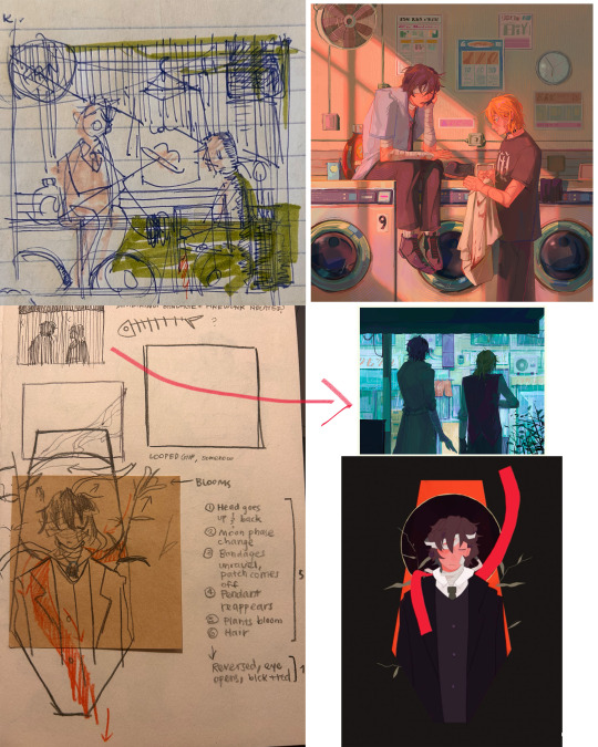
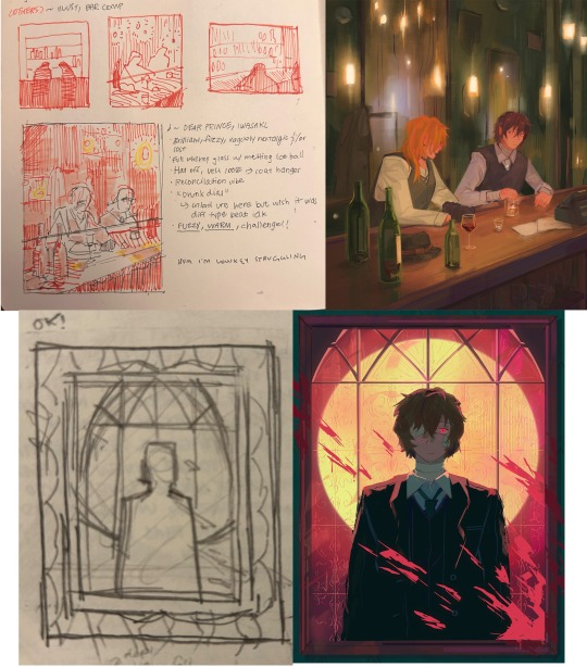
but whatever, back to the cliff-skk. i'll also post a timelapse of it for easy ref, but detailed stuff is under the cut :)
first i did some rough sketches on an orangeish background (underpainting etiquette, i find it helps things feel brighter and keep a stable tone when choosing colors to lay on top), and I quickly lined skk :)


then I laid down some flats for the background, again really eyeballing the reference for hues. afterwards i thought it was a bit bright, and i wanted a more sepia/nostalgia feel to it, so i hue adjusted everything to something more uniform


then i lay down flats for skk + the ocean, which i both had to color adjust a lot (you might see that in the timelapse), and then i jump straight into rendering the background. when i render, i always prefer to do it over something lineless, so i turn the sketch layer off. i rarely do lineart for backgrounds.
i also used to render the characters first, but i've found that it's just not a great approach—especially for art where characters and background are interacting, knowing the hues and shades of the environment is crucial to effective rendering on the character that doesn't make them look out of place.
when i'm rendering, i really try to keep in mind tenants of contrast, perspective, form, and light/shadow. ex, stuff "closer" to us has more detail; the hill in the back is minimalist (in comparison); the shadows lean cool-green while the light leans gray-yellow. rake brushes really carried me here idk... my fav brushstyle forever


eventually i reach a point where i'm satisfied (or bored) with the background. for the last stages i usually have the subjects hidden so i can really perfect the details—but then for super duper final details, like the little leaf specks and grass strands, i unhid skk so the poppy details could work around skk. then i get to rendering the characters :)
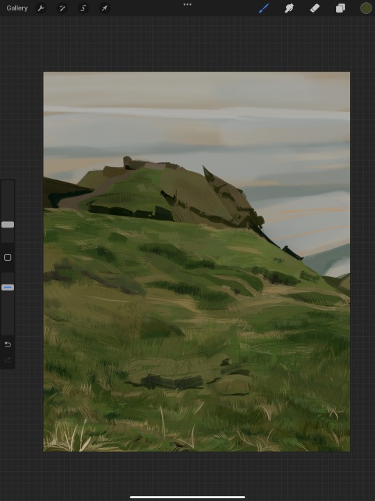
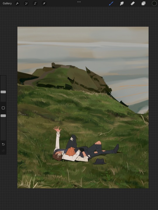
i forgot to take ss of all the stages when i rendered skk, but here's something from... about the middle of the process? i tend to render characters with the lineart hidden as well, sometimes bringing it back just to clarify things, but ultimately i prefer to define things by form than by line. that's just me tho idk, idt it makes or breaks anything, just a preference
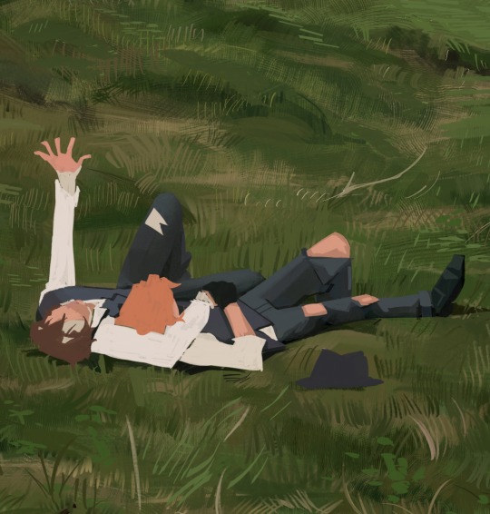
again rlly just thinking about cool/warm, reflective tones (the greenish shadow on chuuya's left inner leg, sky-gray blue on dazai's vest), really just slotting the subject into the environment. after i finish rendering the characters, i usually return to the background and add some stuff—in this one i defined the waves a bit and put some grass around skk
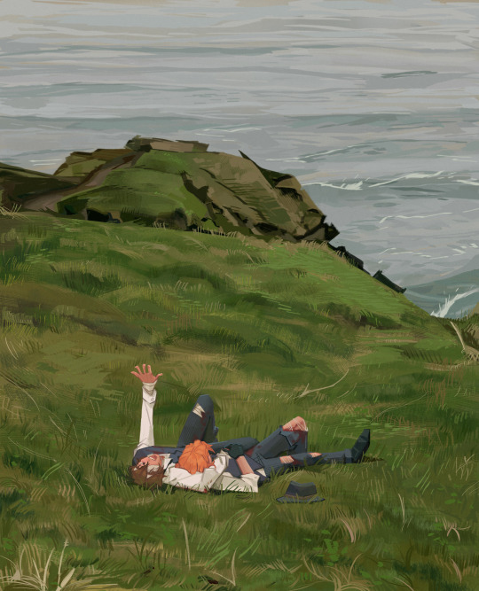
and yeah then we're done idk LOL. sometimes i run the file through camera raw (photoshop) to do some color adjustments—i find that my iPad displays colors super differently, usually making things a lot lighter than they are (u can see how dark the timelapse is...), so i find myself lightening my work a lot. i also sharpen and add noise as needed :)
i think my process has changed a lotttt even in this past year. it's kinda crazy!! it's always fun to do these and just reflect a bit on how i work. mostly just mindless insanity until it kinda works.
thanks for sending in an ask. and if u read all that, thanks to u too lolol
174 notes
·
View notes
Text
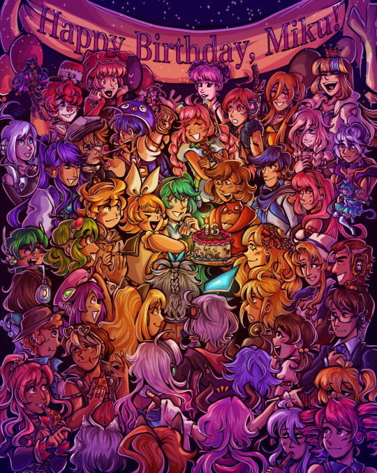
Happy birthday to the number one princess in the world!! 💖
~from her biggest fans :)
ramble of my scattered thoughts on the piece under cut as usual cuz i love talking 😋
This has been an idea I've been cookin for a while, and it was so cluttered and unlike any other ensemble piece I've made... and I decided I oughta do it anyway. I love Miku, I love Vocaloid, and I wanted to do something really ambitious and crazy for her anniversary. Crazy that she's turning her "canon" age this year TwT
I had the idea floating around since like, May...? And then finally started acting on it around June 18. I'm terrible with deadlines, obvious with how I can never make a silly birthday post in time, so I started wayyyy ahead to make sure I have some room to be lazy lol, especially with an idea as ambitious as this.
This was finished on July 12! So I had to sit on this for an annoying amount of time. Very difficult for someone like me who just wants to talk about everything I'm working on to the masses. But at the very least, that gave me the time to work on the draft for this post.
~~~
Here's some ~behind the scenes~ scribbles leading up to the finished piece!
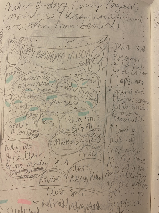
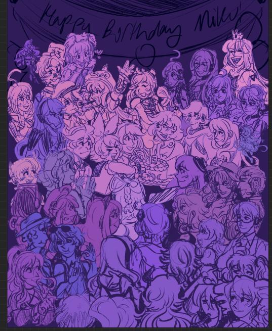
Left is the chicken scratch plan i made in my handy dandy notebook (whenever things are getting real and ambitious, i always made a rough ROUGH plan in there. Usually I'd do a rough pass of the full thing, but this was too complicated for me to do traditionally. I majorly benefited from digital tools to make this possible). CyberDiva and CyberSongman were considered, but I ended up cutting them cuz I just didn't feel like drawing them sorry-- (just pretend they're off to the side. They gave Ruby and Clara the pizza lol). Right is the "final" completed sketch (before I decided to include Chika mid-way through coloring and VY1 and VY2 near the finish line). I started by drawing the main "groups" separated on a different canvas so I can plop them into the main canvas for easy rearranging and transforming. However I got lazy and ended up drawing everyone in the bottom right corner directly on the canvas since I liked seeing the big picture of everyone's positions. Y'know.
Almost excluded Chika! But I like her design so much that I just felt like including her last-minute. You win this time, Chika fans. VY1 and VY2 were very close to being cut! I added them when I began doing the banner and thought "eh why not". I figured their non-human designs would be pretty easy to include pushed back in the bg. Ik VY1 is more commonly associated with the fan design, but I referenced the hairpin cuz it was simpler and the fan looked very annoying to draw 😭
Sorry to the fans of many Vocaloids I had to cut because this composition was insane enough as is. I promise I wanted to include fellas like CUL, LUMi and Sachiko 😭 I will admit I was a little biased on who I wanted to include over others. Like, I don't normally care for Bruno and Clara, but I wanted to get some more international 'loids in the mix. Also wanted to stick in the realm of official designs and not fan-designs since, as much as I can appreciate those, are just a whole "wait who is that guy supposed to be" situation I didn't wanna deal with. I also did wanna include even more character references through the balloons, but they ended up being kind of ugly and overcomplicated the BG :,) (Oh, and while this was originally planned to be a Vocaloid-only piece, I did end up including Teto, Neru, and Haku 'cuz those are Miku's besties dude!!! They may not be Officially in the club but they're her girls and it would be criminal to not invite them to her birthday).
Anyway, this project marks the first time I've drawn a lot of Vocaloids. Lily, Piko, Rana, Yuki, Yukari, Miki, Maika, and many more lol. All of 'em I've heard or seen in passing, but now I actually drew them, and some have really cool and fun designs!! I got into a habit of drawing Merli after this since I just love her design for example. And I'll probably be drawing more lol!!
Oh and the last thing I'll add for now!! The cake is indeed made up of various song references!! I wanted to reference the "big four" producers, just absolute icons in Vocaloid history. The pink/black checkerboard is "World is Mine" (Ryo), the crescents on the side is "Rolling Girl" (Wowaka), the smiley faces is "Matryoshka" (Hachi), and the three hearts on the side is "The Vampire" (DECO*27, which is sort of a symbol of his whole Mannequin album tbh). I know "The Vampire" is a bit modern but I couldn't think of anything else off the top of my head. I'm a fake DECO fan I know 😔 "Matryoshka" was originally going to be referenced in the colors of the candles but believe me it looked like shit so I just went for something else last minute 😭
That's all I have to say!!! Hope you didn't mind the text wall if you made it here. I hope you like it as much as I do!!!! Happy freakin' birthday Miku!!!!
I have to deal with tagging all these characters now for my page,,, in the drafts my tags got cut off after a certain point so I think I'm massively breaching the tag limit 😭 um... I'll figure that out later...
not losing sleep that i can't tag everyone, even for page organization purposes because some characters have pretty generic names and some are a little hard to see in full yknow. If you're one of those people who tag every character in the art piece you reblog... I am very sorry.
#mayor doidles#fanart#vocaloid#hatsune miku#miku#kagamine rin#kagamine len#rin and len#meiko#kaito#megurine luka#gumi#kamui gakupo#ia#vflower#mayu#kaai yuki#oliver#otomachi una#fukase#sf-a2 miki#utatane piko#yohioloid#big al#sweet an#kasane teto#i literally dont think i can tag everyone. um. so you get the idea right#digital art#cell shaded
3K notes
·
View notes
Text
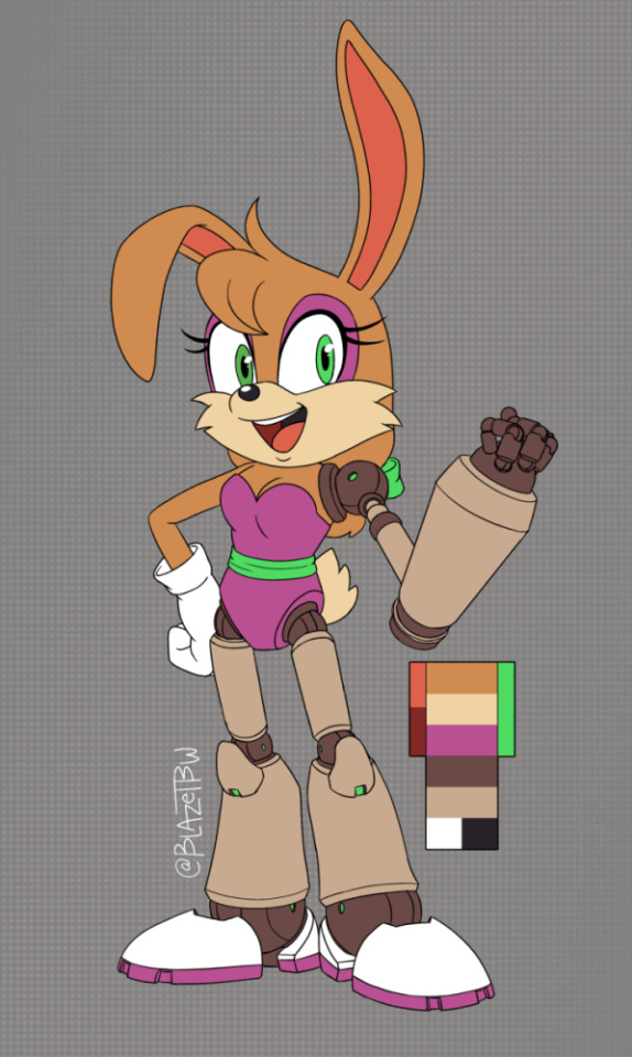
Hello, attempted a modern Sonic Bunnie Rabbot redesign!
@thepinkgalaxy55 did a post on twitter and it reminded me to finish this design from last year lol.
Check under the cut for the journey down the rabbit hole.
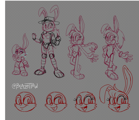
Started out with a sketch of her previous designs to get a better idea of what makes 'em tick.
From Left to Right: SatAM, Archie, Archie Reboot-all bunny, and Reboot Robo-bunny After that, figuring out the head. Stayed round, but wanted to avoid the same copy-past-face. Took out the bun-toof in the final since it really wasn't needed and she never had it anyway.
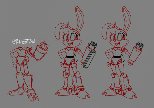
Next, let body & mech parts.
Initially started Forces Avatar like, but switch it over to a different direction. I wanted chonky lower legs and the Big O hydraulic fist. Started toying around with the joints found in the more modern renders of Metal Sonic and other bots.
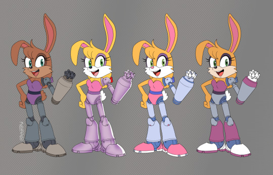
Final lines and Color tests! Or at least with the original colors to see how I could make them fit, and where to take her design from there.
Went a more EggPawn style because they're very practical in their form and function in terms of design. I also like to think that if the modern Eggman were to turn to robotizicing, he'd probably keep the bots more simplified for what he could mass produce over something more complex that would require more fixing and tweaking.
She also got a pony-tail like MLP's Applejack because I felt it would help her shape a bit more.
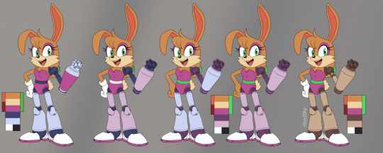
And finally, figuring out colors for myself.
I ended up going towards the dusty-rusty-rose on the end to help her stand out from the bots as well as the other pink and purple gals already in the cast.
Yennyway, thank and be well~
#my art#Sonic art#Bunnie Rabbot#redesign#character design#archie sonic#sonic satam#eggpawn#eggrobo#eggman#Freedom Fighter#if any character from the freedom fighters made it to canon#I'd want it to be bunnie lol
177 notes
·
View notes
Note
i hope this hasn't been asked before. what size do you make your canvas? and do you crop it to fit other socials (like Instagram for example)? i hear that 300 dpi is standard. i never know if it's good to make my canvas big or not.
hi i think this ask is like at least 4 months old but i was scanning my sketchbooks from last year and i abruptly remembered i had gotten this ask because i had made a little chart in my sketchbook trying to figure out how to answer it
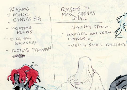
anyways theres pros and cons. and the size of your canvas is really going to depend on personal needs + preference. how good ur computer is, how complicated ur art style, how comfortable drawing feels, how much disk space you have to spare, what youre gonna end up using the art for in the end...300dpi is standard for PRINTING specifically, if you only plan to ever post things online then 72dpi works great and will save you space (fun fact a lot of professional animation files i deal with are 72dpi. and those eventually go on your tv screen). but personally i make everything i draw 300dpi because i am always printing stuff for cons, zines, etc and its nice to have the option even if i dont end up printing.
when I was a teen I used to draw on a rly shitty laptop and i made everything 800x800px 300dpi because big canvases would cause a lot of lag and also the resolution on this laptop was pretty small so 800px was a lot of the screen already. now i have a slightly better laptop with a bigger resolution and i sketch on giant 10000px-40000px canvases with the hard round brush and no shape dynamics or transfer whatsoever to minimize lag. when it comes to making a final illustration when i know ill be using a bunch of layer effects/blending modes/colors/mixing brushes etc etc ill generally crop the canvas down to the 6000px range. most illustrations i try to make sure are comfortably printable on tabloid size paper so thats pretty much anything hovering around or above 3000x5000px w 300dpi (so 11x17in). HOPE THIS HELPS?
EDIT: OH ALSO re: socials. i always ALWAYS size down my art to post on the internet. i think its crazy when other artists dont. because why would i ever let the internet have my hi-res file for free. also in general i think it looks better if you do the resizing yourself because if you don't then many social media sites will compress your file for you! a lot of people will post a hi-res file to twitter and then go "Wow twitter killed the quality of this img!!!" UH YEAH because they have an automatic image compressor. because they need to save space too lol and they dont want your image to take 248263895 years to load. same with instagram and to a lesser extent tumblr. when i post anything on social media i resize it down to 1200px-1600px on the longest side... its a little arbitrary but im kind of basing it on the smallest resolution of widely available screens. mostly because i think it looks stupid when u open up an image file fullsize and u have to scroll to see the whole thing... also iirc instagram only takes images up to 1080px before it resizes them? granted if you upload something smaller than that itll also resize it up which will look worse so I think bumping the numbers just over 1080px is pretty safe.
I should really be bringing the dpi down to 72 too when i post online but often im too lazy to do that. but it will technically help ur image load faster and stuff. and make it less likely for people to yoink it off the web and print it themselves.
149 notes
·
View notes
Text
AAAAAA! tony-award winning costume design for wicked 10000% deserved that tony: some thoughts
despite my usual area of disinterest in costumes, i've been going crazy about the wicked costume design all morning and i need to share my thoughts. because holy shit this design is crazy and more people need to know about the details of it. long post under the cut, you've been warned.
DESIGNER
susan hilferty!!!
she's fr a genius
her other broadway credits include spring awakening, funny girl, into the woods, and many more
also the taylors swift speak now world tour lol
side note about the wicked costumes, but the coat hilferty wore to the tonys that year was embroidered with the signatures of everyone who she wanted to thank for the award she would turn out to win. this included both the star cast and all the actual makers who contributed to the costume build :') (source)
preface to the rest of the list also: some of the sources here refer to international, touring, or other replica performances; the information is still all roughly if not exactly the same as the information to broadway.
THE DESIGNS
THE IDEAS
she describes the costumes as "twisted edwardian":
it's a contemporary eye on edwardian looks with an asymmetrical and twisted silhouette. for the non-animals, the idea was using high fashion to "distort" the human figure. (source)
asymmetry was the whole point! and it's very very intentional when costumes are balanced (more on that in the glinda section)!
on a similar note, she talks about how the show is "the struggle between individuality and uniformity" and how that's something represented in fashion trends, and in this design. (source)
INSIDE EMERALD CITY
they used sooooooo many shades of green, which is maybe obvious, but it's also an incredibly daunting challenge. the central colors are always green, but it shimmers and shifts with movements (and with the lighting design, but that's a different post). some examples of ensemble costumes below! (source)
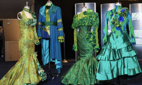
ensemble costumes from the australian production--each production riffs off the last one; hilferty is always adjusting and adding things for each new opening. (source, source)

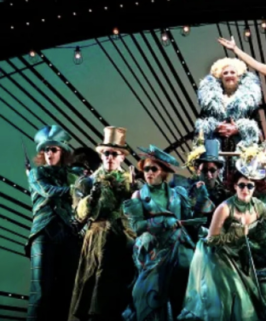
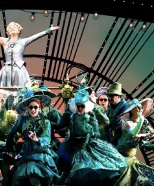
over 6,500 feet of ribbon is used in the emerald city scene. (source)
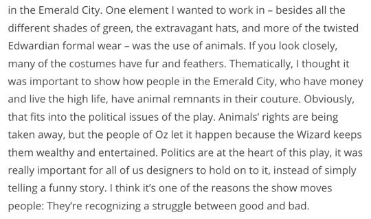
many of the costumes also use animal furs and feathers. this is also something really obvious and important in madame morrible's costumes. (source, quote below)
also it's important to me that everyone knows that elphaba and glinda's quick change between shiz and emerald city is ~14 seconds. crazy. (source)
#GELPHIE MOMENT
there was always an emphasis on their relationships to each other and to the world around them--it was important to show the way elphaba and glinda are so deeply connected even as they are diametrically opposed to each other. their "ultimate" looks are framed as elphaba grounded, connected to the earth, and glinda connected to the sky. (source)
there was also very much intention to have them stand out amongst the ensemble in different, but equally impactful ways. (source, quote below)

ELPHABA'S COSTUMES
she's visually grounded, sensible (ex. the boots in shiz). her costumes are intended to be earthy--the colors of her dresses aren't flat blacks, they're beautiful tones of earth, coal, mica, gems. (source)
there are so so so many layers and beading to the dress, but the inside of the dress is all smooth fabric to prevent getting caught on anything. (source - video)
her wicked witch of the west dress is 40 yards of layered fabric all stitched together. the intention was to create a continuous sense of rising earth; think like a stalactite. it's a heavy dress probably. (source)
included in those 40 yards are 50 layers of gathered ruffles made of 45 different fabrics for the skirt alone. it takes 3 weeks to make. (source)
hilferty's sketch below (source) vs final broadway costume (source) below! second photo really shows all the details of the layers and colors talked abt in the prev points.


the hat!! putting it on on stage covered the actresses' mic, so they put a mic in the hat. i love problem solving. (source)
elphaba's shade and contour makeup is purple, to pair with the green skin. it takes about 25-45 minutes to apply all the makeup. (source - video)
GLINDA'S COSTUMES
9 costume changes, 7 unique costumes! (source - video)
while everyone else is asymmetrical and has a literal twist to their silhouettes and necklines and such, glinda (and the wizard) is the only costume that is truly balanced at center, with the left and right being the same. this isn't quite true of thank goodness (perhaps a nod to how this scene provides a secret look at her unhappiness), but is really visible in her popular, one short day, and bubble dress looks. (source)
speaking of the blue bubble dress! it's intended to look lightweight and airy, but it's about 16 pounds of layers and layers of petticoats and sequins as well as a harness for her flight. one of the monkeys hooks her into the harness onstage. (source - video, source)
there are 45 petals in that dress that take 3 days to bead and 1.5 days to sequin, all by hand.
there are over 68,000 hand sewn beads are on that goddamn dress and 100,000 hand sewn sequins. i'm trying very hard to stay neutral on this post so it can be a future reference but that fact alone makes me insane, do you understand how much insane work that is, oh my god. (source - video, source)
below is hilferty's original sketch for the dress (source) compared with the final piece!! (source)

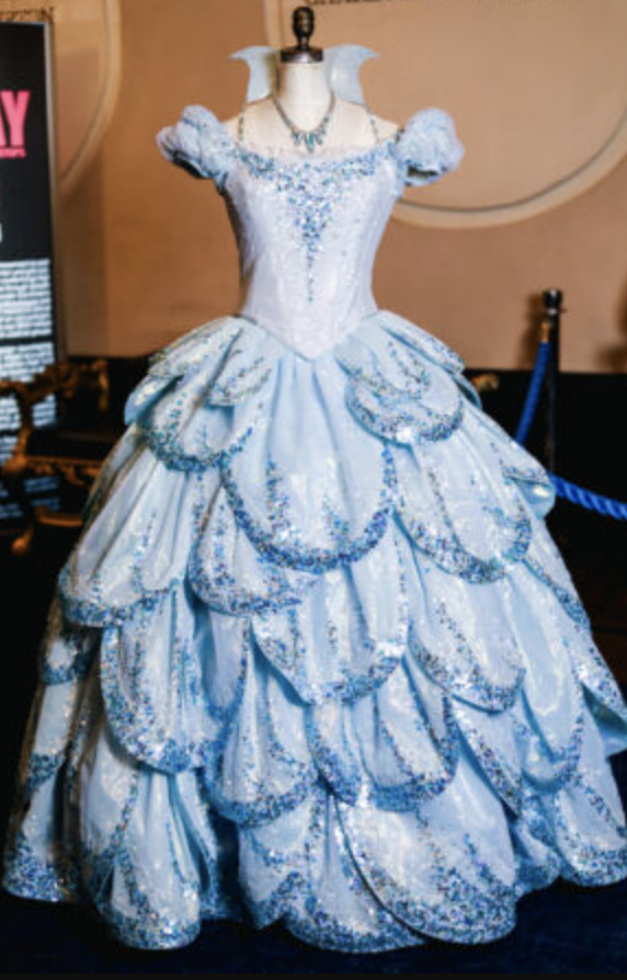
the blue bubble dress is inspired by a 1950s dior dress. comparison below, as well as close of up the sequin details!!! (source, source)


the quick change between this blue bubble dress and the shiz outfit is completed by 2 costumers in ~15 seconds. (source)
OTHER LOOKS
fiyero's dancing through life pants are inspired by riding clothes and polo uniforms. (source - video)
the shiz students!! they all have individualistic costumes but there's a pretty obvious through line to them--reminiscent of a school uniform while also providing room for self-expression of everyone in the ensemble. (source, quote below)

madame morrible!!! she has four distinct looks throughout the show that are specifically tailored to each and created for morrible that goes on stage. it takes roughly 6 weeks to create them for new actresses; usually the same stitcher will work on one piece because they know it so well. (source - video)
CREATION & MAINTENANCE
THE PROCESS
for research, hilferty asked young girls about their image of "goodness": what does goodness look like to young girls? the answer was princesses and brides, so she studied historical dresses of queen elizabeth II and lady diana to influence glinda's design. (source)
embroidering, stitching, beading: all starts with hilferty's sketch, is interpreted and drawn into a pattern that is drawn in pencil onto the fabric. this alone will take 7+ hours. (source - video)
the specific type of beads and stitches are chosen. fabric is stretched out taut and then beads are hand sewn on, one by one. (source - video)
MAINTENANCE
the team: wardrobe supervisor + assistant, 12 dressers on the show, 4-8 day workers for maintenance between shows. (source - video)
these are built to last, but still with so much use and thus room for wear and tear, every piece gets looked at every day and repaired if necessary. (source - video)
MORE FUN TRIVIA
there are over 300 custom pieces, over 200 shoes, over 230 hats and pairs of gloves, and 30 masks in the show. (source)
every principle, ensemble member, standby, understudy, and swing has a costume unique to them, and they altogether do an average of eight complete changes per show. (source)
with every new production, hilferty is still adding and adjusting, and she still wants to do more. icon. (source)
everyone who plays elphaba is required to have green painted nails all the time (and the production doesn't pay for nail care, which is fucked up but that's a different post), though they can vary the shade with costume permission. (source)
about 70 wigs in the show that each take 18-40 hours to initially make. (source - video)
ok i need to go make lunch lol so stopping there BUT thank you for reading and isnt it sooooooo cool isnt it so neat ooohhhh you wanna appreciate theatre technicians and design SOOOO bad !!!!!!
#wicked#wicked musical#wicked 2003#costume design#musical theater#musical theatre#theatre costumes#wicked 2024#<- i think all movie onlys should be forced to watch the stage show. required reading before giving an opinion.
31 notes
·
View notes
Text

What up y'all! I return bearing what was originally gonna be survival!shipping fluff (I sketch the face first and drew young Garmadon instead of his full Oni version) but morphed into this because my ass was listening to Ethel Cain and Flower Face while drawing. Honestly I took it and wound up playing rendering/color and quite frankly I'm actually pretty happy with how it turned out!
Translations: Vertical word- Destruction, bottom text- "You are no man, men don't have claws they can't cut."
Garmadon is my favorite character to use for these more painterly metaphorical art studies because:
A) He's my babygirl and favorite character, this is very well established lol
B) He's a fundamentally tragic character. He's doomed by the narrative in every sense of the word, he was a child when he was bit and after that he was left to deal with the fact that there was this evil snake in his head and his father as well as his brother (seemingly the only people he interacted with as a child) were now somewhat afraid of him. By his young adulthood his relationship with his family begins to strain due to their belief he's "turning evil" especially when going on the quest for tea leaves in Spinjitzu Brothers which shows he actually feels rather upset/angry that his brother and father believe he's turning evil simply because he experiences negative emotions (you know like a normal person) but then after he see's himself in the mirror in book three he goes on a downward spiral believing he's doomed to turn evil and be alone. We don't really know what happens after book four since the fifth and final book never came out but it's easy to assume that the tea didn't work and Garmadon is left all the worse for it coming out of the trip with his mental health in the gutter. We don't know to much about what happens in-between then and when he goes to Chen's Island but we do know that he doesn't seem to have gotten better since in Shatterspin he's still pretty self sacrificing and other people have begun to notice his less than stellar mental state.
Then we know what happens after the war, his mind is consumed and he is left to be less than himself. Even then when he comes back from the underworld we see that he still cares about his son, he kills the Great Devourer, he still wants to be a person. At the end of season two he gets what he wants, he cured, and for the time that he is fully himself for the first time in years he begins to apologize and try to make up for all that he did (even if it lowkey wasn't 100% his fault seeing he was being controlled by an evil snake), but even that didn't last. He dies, or moreover sacrifices himself to save Ninjago from Chen's Anacondrai army, but he dies a good person, he gets a memorial and family that mourns the truest version of himself. And then he was brought back again, ripped from the afterlife but only as half of himself, only the evil side, the side he spent thousands of years repressing until he couldn't anymore and regretted the second he was himself again. Despite that despite the fact it is supposedly only his evil side left he is still trying to be good, with the Garmadon comics showing his desire for redemption and his care for his son even in what he had thought to be his dying moments.
I think this is what makes one of the beginning lines from the Garmadon comics all the more tragic "Who knows what life he may have lived had he not been corrupted by the Great Devourer and cast into the underworld." He might have gotten to live a different life, he may have gotten to be happy and not fear what he might become, he might not have had to die multiple times over, but we'll never know because that's not what happened instead his fate was twisted by something completely and utterly out of his control.
So yeah he's a little fucked up and that's why he's my favorite! Hope y'all enjoyed my long winded rant, I have so many opinions on this man and don't even get me started on how much I hate crystalized for how it fucked up his development from the comics, but uhhh I think that's it!
If you want to you can check out my fic What Doesn't Kill You it's mostly me putting him in a jar and putting him under a microscope lol, other than that I hope yall have a great day/night and I'll see you when I appear from the mist again! PEACE OUT!
#garmadon ninjago#ninjago#spinjitzu#ninjago secrets of the forbidden spinjitzu#lord garmadon#ninjago fanart#ninjago fanfiction#ninjago fandom#vinny x garmadon#garmadon fanart#Garmadon is bisexual and you can pry that from my cold dead hands#biblical imagery#is it biblical imagery if god doesn't exist in that world and technically the character is the son of that worlds god?
28 notes
·
View notes
Text
Top 10 of 2024
I was tagged by @aalinaaaaaa here!! Thank you for making this game, it's so much fun! But I'm going to go from the last place to the first one, for you know, some ✨tension✨
10. Triangle x Stick DVAWTK
It amazes me that people still find this one somewhere.
9. David's Toyhouse
I think it got notes mainly because of the forehead kisses lmao.
8. My Intro
My intro 👍
7. Xueshu's Design
I honestly thought that no one will be interested in my oc's reference sheets, and it made me so happy that you people liked them T^T more will be coming in 2025!
6. Kim Kitsuragi
Tbh this one surprised me the most. It's a random sketch, I wasn't even sure whether or not to post it lol. Probably partially due to DE's fandom size.
5. AroAce Wenren E
That's my favorite artwork of the year! I finally figured out how to combine multiple things I wanted in my digital artstyle!
4. Colorful Xueshu
Most of the notes came after it was reblogged by a large blog during an event promoting Polish artists lol. I'm still happy about it, but the stupid 这儿 I wrote there instead of 哪儿 is killing me.
3. The post for signing up for asks and tag games lmao
2. Big Boob Mobei-Jun
I'm glad that some people have a good taste and agreed with me on this one 😌
1. Fanart for SVSSS System Possession AU
Surprising to nobody. It got reblogged by the author ¯\_(ツ)_/¯ It has over 7 times more notes than the number 2.
Tagging, no pressure<3 @seastarblue @andromedaexists @ace-malarky @walkman-cat @vsnotresponding @incandescent-creativity @inscrutable-shadow @notwritinganyflufftoday @albatris @trixierosewrites @transthadymacdermot @cepheusgalaxy @angsty-prompt-hole @primroseprime2019 @the-inkwell-variable @thegoddesswater @mecharose @ftmeriwether @aromanticsky @leahnardo-da-veggie @pluttskutt @littlepatchofhell @aether-wasteland-s @junypr-camus @annothersummerofsleep @starbuds-and-rosedust @negative-speedforce-ocs @dragomango @anumberofcatschilling @axl-ul
Yes, that's literally everyone from the tag list lol. Probably many of you got tagged by Alina but this game is so cool I want to make sure that everyone sees it lol
20 notes
·
View notes
Text
Merlin Starhawk's character design (an analysis)
Back when I started playing AFKJ some three months ago, my Merlin looked very different. Some things have stayed consistent with him; his pointy but short ears, black lipstick, glasses, his bitchface, his transgender identity, and his fashion sense being on the sophisticated side.

His initial design is rather different (no horns, no hat, shorter hair), the art style skews more realistic and less anime.

The second version is where you can see the recognizable aspects of his design take shape. The style is also more anime now. His hat is present, although it's missing a tassel, and his hat is far smaller. He used to have a cape and dressed in a more boring way. His glasses are also missing in these sketches, but I just forgot them lol. Another sketch has him with horns and a tail- I did keep the horns.

And finally, the third and last version of Merlin. His design and theme have solidified. Stars, a motif of lightbearer designs as well as a nod to the pentacle, and plants, a motif of wilders and his connection to the earth. (Fun fact- his horns are muntjac antler-inspired.)
My main inspirations for his design were classic depictions of the Merlin from from various legends ( and Starhawk's story also parallels Merlin; being half-demon/non-human, prophecies, shapeshifting) and stereotypical depictions of wizards in the modern day.
What comes to my mind when I hear "wizard" is an old man with a long grey beard and hair wearing a hat and cloak covered in stars. (Also, to let you in on a secret, one piece of inspo were wizards from Adventure Time from that season 1 episode. The tassels are probably subliminal influence from Orville Peck. The coins are based on Ukrainian jewelry from hundreds of years ago, replaced with Esperian coins. And the bell? My cats wear bells. I think it's cute.)
I took that in a different direction to subvert expectations you'd have of a great wizard- the great Merlin isn't some old human, he's a 20-30 year old stuck in time, bumbling his way through life, queer and plagued with joint pain and fainting episodes. He is wise but never takes his own advice. He is dedicated, kind, and all too forgiving, but is often lazy and petulant. He's antisocial and blunt but dresses finer than people do in the royal capital.
Besides inspo from some elves and small bits of inspo I took from all over the place, I also used Mirael and Celestials as reference, to draw a connection between them. I kept his colors bright and cool to make him stand out from all designs in game, which are muted, to show that he's built different.
He's a creep, he's a weirdo, and that's about it.
#i could go on#i would love to actually#afk journey#magister merlin#merlinverse#magister merlin starhawk
20 notes
·
View notes
Text
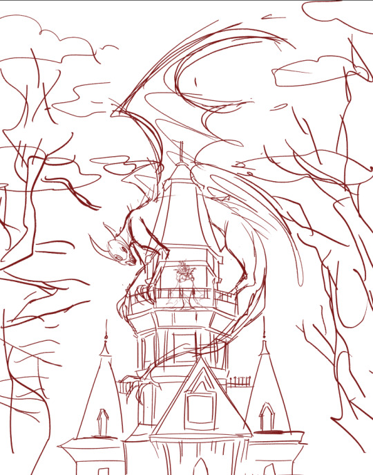
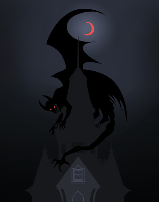

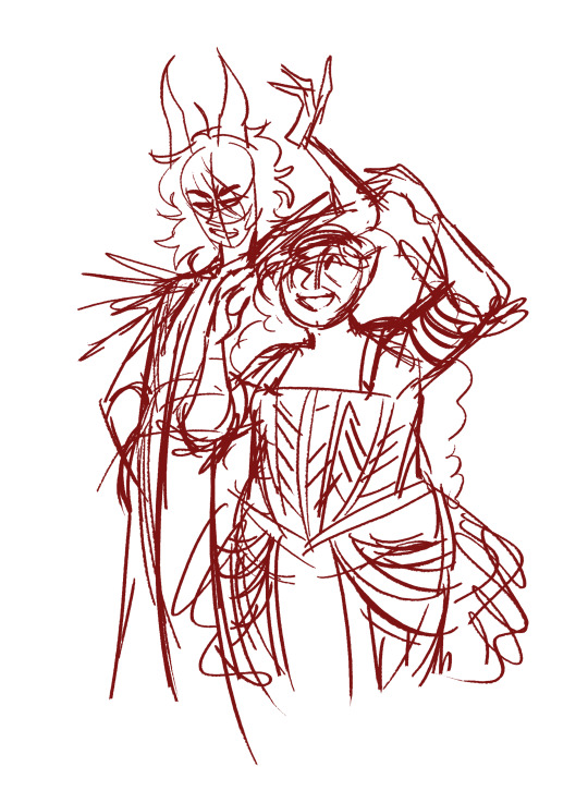
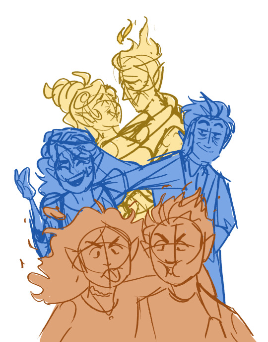

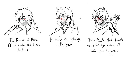
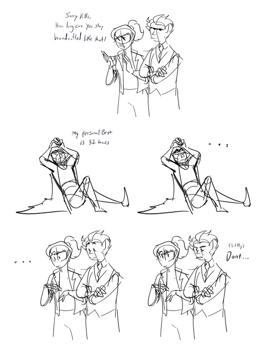


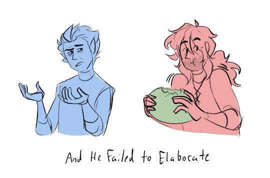
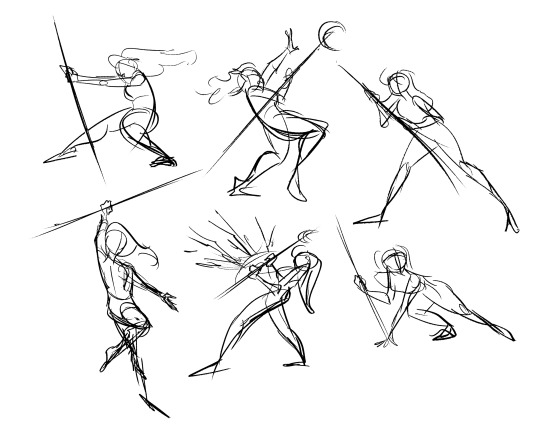
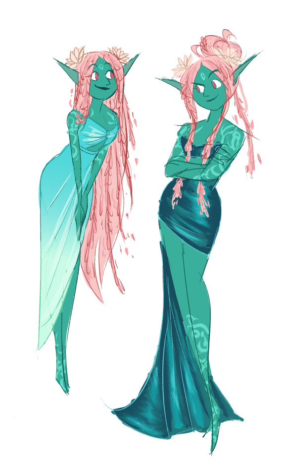
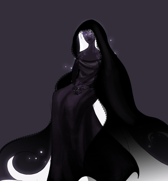
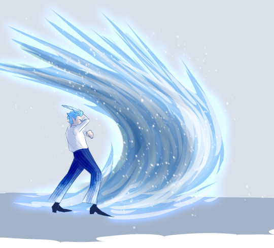
Doodle dump for the SOUL!!
This is a real eclectic collection, some of them are SUPER old, but I wanted to get most of my odds and ends accounted for before really chipping away at the two mega oc pieces I have planned. And there's a few really sick concepts here I've had in the chamber for a WHILE so let's go down the list!
The firs four are a few wips left over from last Halloween, including the second illustration I had going at the time but never finished. Maybe it'll come together this year!
Plus a close up of Autumn who was supposed to be on the balcony of the haunted house, in bat themed dress.
Five is my quick little take on the Frost Family photo that Jacquie has (I love them <3)
And then six and seven is a mushy blackice thing that I just barely managed to line in any decent way. And what Kills is saying is true! His eye color doesn't change when shapeshifting! And most people don't really notice but this winter sprite certainly did.
And eight to ten is a really really dumb, really really OLD mini comic made from a golden girls quote lol. This one is YEARS old at this point and i just didn't have the brain power to finish it beyond sketching. What Kills is saying here is ALSO true, in exactly what capacity he will not say
Eleven is taken from this post about a fanfic because it fit them TOO well not to
And then we just have some Lucy centric gestures! Gotta figure out how in what ways she swings that damn staff around. Answer: Easily.
And a NEW CHARACTER that's supposed to drop with the next Chance and Choice chapter! I don't have a concrete name for her yet, but she's a cutie! She's probably just gonna be a background character for CC but ill hopefully get to explore her more when she gets to be Lucys friend in the Epilogue Series.
OH BOY its DEATH CONCEPT (!!!) The Complient/opposite to our awful Moon Man that Lucy WILL meet in the finale. Her whole design theme is that she's quite literally the inverse of Moon Man. He has the white skin and starry hair, so she has the white hair and starry skin. They are cosmic siblings that have really had enough of each other at this point
And while I was doing the Lucy gestures, Jack snuck in there for potential fight scene between them, but I liked this particular pose of his enough to sloppily render it lol. He is SUPPOSED to be pathetic 90% of the time, that's just who he is. But I LOVE giving him just a few moments to be badass and cool, as a little treat.
#artists on tumblr#digital art#doodle dump#oc#blackice#crystal springs#cs au#lucy miller#jack frost#A LOT#A LOT ON YALLS PLATES TODAY#Gotta get all these lose ends out here to focus on the BIG adventures i wanna do#This probably isnt even all the little bits and bobs I have in my docs#i guarantee there's more somewhere#but I dont have time for all that!#gotta get going on this damn stage coach 😒
9 notes
·
View notes
Text
When posting my last post with Yugi being an idol, I had to go dig up old drawings and sketches I made for my Idol Yugi, with Seto and Atem. I don't know how I never posted them here before.
Sadly, I couldn't find my Atem ones. Most likely, those are in my actual physical sketchbooks. I've sketched them a lot in the years. I think it's funny that most of these started as sketches in my sketchesbooks or just loose paper. I transferred them over to digital for the final lining and colors.
Here's Yugi and Seto. I imagine they're in their mid 20s in this AU.
From between 2020 to about 2023. You can really see my style changing, lol.


#yu-gi-oh!#yugioh#yugioh fanart#yugi mutou#yugi x seto#seto x yugi#seto kaiba#rivalshipping#kaiba seto#mutou yugi#modern au#idol au
18 notes
·
View notes
Text
July/2024 - Commissions and Shop- Status update-

July is here and we are now halfway the year!
About Commissions:
🍩 sketch pages:
from April are almost all finished, I just have one more to finish as of today, I'll probably be announcing when I'll open some slots next week.
In any case I'll be also opening a few other slots on August!
🍩 Illustration commissions:
5 out of 12 finished
one is almost finished so it would be 6 finished soon
there's around 6 more to finish after that one and I already started working on 2, hopefully next week I'm able to start the other 4
🍩 Comic page commissions:
the one with 5 pages is now with 3 out of 5 pages inked and with base colors, needs inking of 1, needs pencils on another
I'm thinking on working on this one for one entire week so I can finally finish it lol
☕Ko-fi Shop:
I haven't had any purchases after I sent last batch of orders yet, but I've been working on some concepts for new items in the meantime! hopefully I have these ready on August!
Here's a peek at what I've been working on at the moment
Here's some sketches for stickers with some Sonic girls, I may also make an illustration with all of them together.

This one I want to make it a magnet

I've also thought on some Sonic Skyline stickers and illustration


and some other sticker ideas plus some bookmark concepts

Besides that, I want to remake a few old drawings so I can make them prints, besides of new illustrations
So yeah, I'll be working on these! I'm really looking forward to have these live on the shop! 😄
That's all for now! have a wonderful month!

20 notes
·
View notes
Note
Have u ever posted your comic or animation workflow anywhere? Im super curious on how you tackle the process, especially not using a drawing tablet. I know you have a very simple (and adorable) style so that probably helps in terms of workflow -- Im just curious about the steps you take.
Thank you! With both comics and animation my key thing is to not spend too much time on any particular thing, just draw loose and fast. Honestly the only downside to drawing with a mouse is that I can tell my arm has extremely specific muscle memory regarding it- if my mouse breaks and I get a new one I have to spend a good month or so just letting my hand get used to it again lol. Same with if my setup gets readjusted too much- right now my setup is my mouse on one of those padded mousepads, on top of 2 books, with my elbow resting on my 3DS case (I'll get an actual pillow or something for it eventually lol). But luckily thanks to this I suffer very minimal wrist pain 👍
(...Okay I started to go really in depth in my process here, so sorry if this is way more than what you were asking. Putting it under a readmore just to save space lol)
With MFM in particular, I start by writing out the entire script for the next story arc, which really is just all of the dialogue and vague notes about any important actions. Then I do the paneling with very loose stick-figure like sketches of where the characters are and what they're doing. I prefer having very little planning when it comes to character poses and panel shapes, coming up with those on the fly makes things much more exciting and faster to make. But it's the opposite with dialogue... it needs to be 100% FINAL before I draw a single line lol.


That's part of my script for my most recent chapter, as well as what my extremely loose goofy thumbnail sketching is like. I write the script as one big thing and don't separate it into pages until I actually start drawing- then I go and color change it just to keep track of what dialogue goes on each page
After that, I go back and do the ACTUAL sketch, as well as the lettering (I don't believe this is how it's done professionally. I used to do lettering as the very last step in the process... but then found it hard to cram speech bubbles in the right places lmao.) After that is lineart, coloring, background flat colors, then shading/rendering for all of it. I do each step in batches, as in I sketch out ALL pages of a chapter before moving to lineart, I line ALL pages before starting coloring, etc. I find it way easier to be productive when it's broken up like that, though when I first started the comic I used to draw each page to completion before starting the next (but also, the comic's style was DRASTICALLY simpler back then haha)
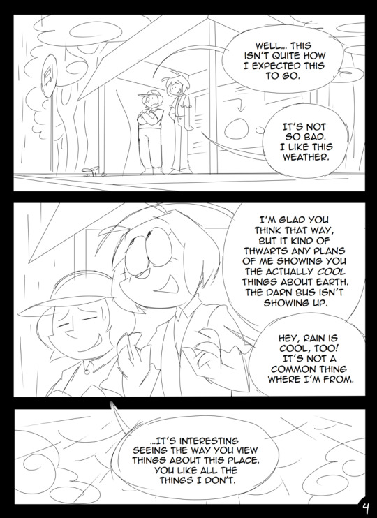
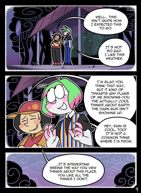
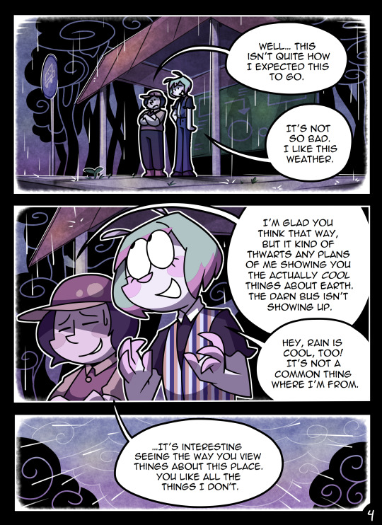
(Unfortunately I merged some of the shading to the background flat colors so it's not entirely accurate... oops) FireAlpaca has a sand texture feature that I only found out about last year- adding that to the backgrounds makes them look 10x better with WAY less effort.
With animation, it depends on the project. For simple 5-10 second animation I make for fun, there's very little planning lol. I skip some steps in the process- I'll sketch out the keyframes (and maybe any difficult inbetweens if necessary), line those, then go straight into making linework inbetweens. I'm not a cleanup artist and have no experience in that, so I always find trying to line my rough animation makes everything jittery and wobbly. If I do it with a clean line from the start then I can avoid that and save a lot of time 👍
For my bigger projects (such as the Parvey cartoon and the MFM Kickstarter trailer), I do the whole animatic with final audio first and foremost, with the animatic being almost like the keyframes. I split them up into individual shots, .mp4 files anywhere between 1-30 seconds usually, and animate those one at a time. I'm a huge fan of free to use programs and try to use them as much as I possibly can, here's a list of the ones I use:
FireAlpaca- for the actual drawing part itself (storyboarding/animating/etc). FireAlpaca has a feature that lets you export every frame as it's own drawing, as well as an onion skin mode
Windows Movie Maker- for compiling all of those frames into video format, creating individual shots. If you upload all of your frames and set them to around 0.08 seconds, it equals about 12fps (I usually animate at 0.10 seconds/10fps, its a bit slower but looks nice)
Onlinesequencer.net- for making music. It's the place I've made all of my songs on, like the timeloop song, hyperworkaholic, and the background music for the MFM Kickstarter trailer.
Audacity- for editing audio/music. Also great for recording things directly from your desktop
DaVinci Resolve- for editing and putting together all of the shots into one big video. Can get kind of intensive on the computer during rendering, so watch out.
YouCut (app)- also for editing and compiling shots, I used this one a lot a couple years back but I'm not sure how well it holds up. Doesn't need much phone storage to download but needs a lot to render videos.
MS Paint (yes really)- for typing up text. FireAlpaca has a text option but I don't like it as much as Paint's.
...The only thing I genuinely can't do alone is voice acting. Luckily there's a big voice acting community on Twitter and they're all amazing to work with!
This got... way more in depth than I planned for it to be, so sorry if this is way more than what you were asking lol. But that's my general process when it comes to my art 👍
32 notes
·
View notes
Text
Finally making the post about birthday stuff. ☺️ We had to leave earlier than intended because the science center we were going to closed at 3 😂 oops. We didn't know this before hand. Lol
The science center was really cool. It had a climbing tower with interactive stuff, an area about body systems, an area about the science of music (that was so cool) a giant light bright, an area where you can make things (it had a 3D printer but we didn't use it. But Kiku did get a 3D printed rainbow Charizard. 🥺)
Kiku got kind of scared at the top of the climbing thing because Kiku doesn't like heights but it was still really cool. Hubby got Kiku a bat plush. His name is Chicken Nugget.
ID: a large brown bat plush. End ID
After the science center Kiku got money and got to buy stuff for Kiku 😮
We went to starbucks and Kiku got a colorful drink and a new tumbler ☺️
ID: Four pictures in a square. First picture is an orange mam bottle with a turtle, a cat, a bird and hearts on it.
Second image is a blue, yellow, and green first years cocomelon straw cup with JJ and YoYo visible.
The third is image is folded up colorful cocomelon blanket with letters and the melon from cocomelon on it.
The last image is a metal tumbler from starbucks with art of a person with blue hair on it. Behind the person is a background of green leaves.
End ID
Things that Kiku hasn't taken pictures of but got for Kiku are a new sketch book, a pack of paper, a bunch of the pencils Kiku prefers, erasers, a set of four tangles, a muzzle (for petre and therian/otherkin reasons) and some calm strips ☺️ Kiku is still waiting on the calm strips and the muzzle to get here because Kiku ordered those online.
Oh! Kiku almost forgot!
This was Kiku's birthday cake!

ID: A construction themed cake with candles and construction trucks on it that says Happy Birthday, Kiku. End ID
20 notes
·
View notes