#example designs
Explore tagged Tumblr posts
Text
Judge Example Rooms ~
Heyo! Myself, @mistershinyobject, @gollumni and @spooky-bard came up with a few examples of Rooms for y'all's brainstorming this week. Can you guess who did which room? (There aren't bonus points for the right answer.)

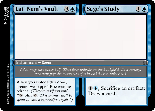
Lat-Nam's Vault / Sage's Study
This time-locked room from Dominaria allows you to delve into an artifact-oriented room, where the Powerstones can help you unlock your locked rooms, and if need be you can turn the Powerstones into card draw with various U/X themed decks! I like the way that this card shows the use of older cards/mechanics with new Room technology on one of Magic's most established planes.
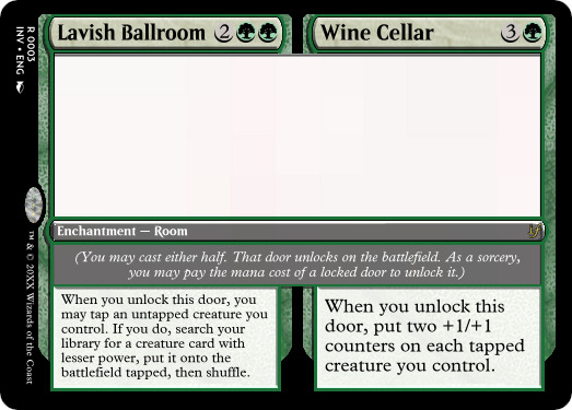
Lavish Ballroom / Wine Cellar
A powerful Duskmourn-themed rare, you can dance the night away or depart to the dank cellar for a quick nip. These are one-use effects, but the ability to tutor (and then make big swings) can create some serious presence. I like this card's limited-to-constructed feel with the power-push that resonates with contemporary design.
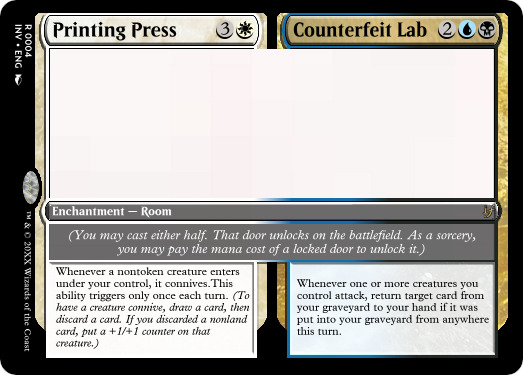
Printing Press / Counterfeit Lab
Move outta the way, there's ink and blood to be spilled! This super powerful card comes to us from the streets of New Capenna, with allied powers and monocolor benefits all around. This is a really fun design that plays into shard technology, multicolor overlap, potential limited shenanigans, and the feeling of how information and disinformation are collected together.
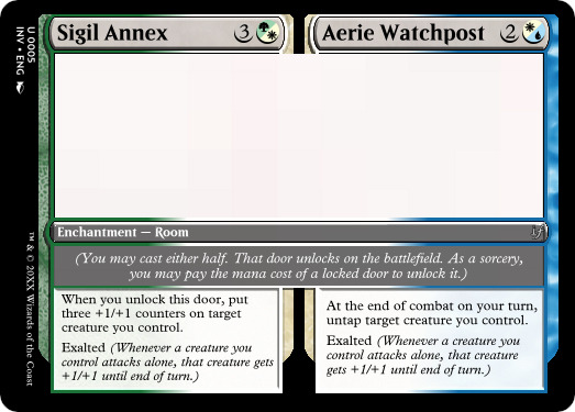
Sigil Annex / Aerie Watchpost
This hybrid Alara-themed card from the towers of Bant has some complex but grokable combat tech. Hybrid design allows for cards to be centered without overreach, and here you may want to get a little bit aggressive in Naya or a little more wary in Esper. Both sides allow for your deck to power up their given shards no matter what orientation you're going for—although in the greater scheme of things, I'm not sure what a Room would look like on Jund... Maybe a cave?

8 notes
·
View notes
Text
DELTARUNE CHAPTER 4 SPOILERS, WATCH OUT!!!!!
V
V
V
V
V
V
V
oml dude that titan fight was so cool ‼️ absolutely loved the design, music and fight mechanic!!

love me a design with lots of wings and eye imagery 🔥🔥 man i really wanna go back and do this fight again, it was so fun
the whole vibe of the titans really reminds me of the angles from Evangelion too I realised, which might be why I love em so much lol 🛐
since we never actually see the rest of it’s body, pulled some inspiration from the earlier depictions we’ve gotten of the titans (i think from chapter 1?)

i hope we’ll get to see more/different kinds of titans in the coming chapters!! that’d be so cool
#dude the way they build up the titan fight mechanic and get the player used to it?? so smart#(for example: they introduce it in the jackenstein fight then build onto it in the titan spawn fight right before the final battle)#god i love the undertale/deltarune game design it’s SO DAMN GOODDDDD#had a lot of fun drawing this thing too#funky perspective my goat#deltarune#deltarune spoilers#deltarune chapter 4#deltarune titans#biblically accurate angel#my art🦐🦐#mal yapping#toby fox
2K notes
·
View notes
Photo

Hinge presents an anthology of love stories almost never told. Read more on https://no-ordinary-love.co
3K notes
·
View notes
Text
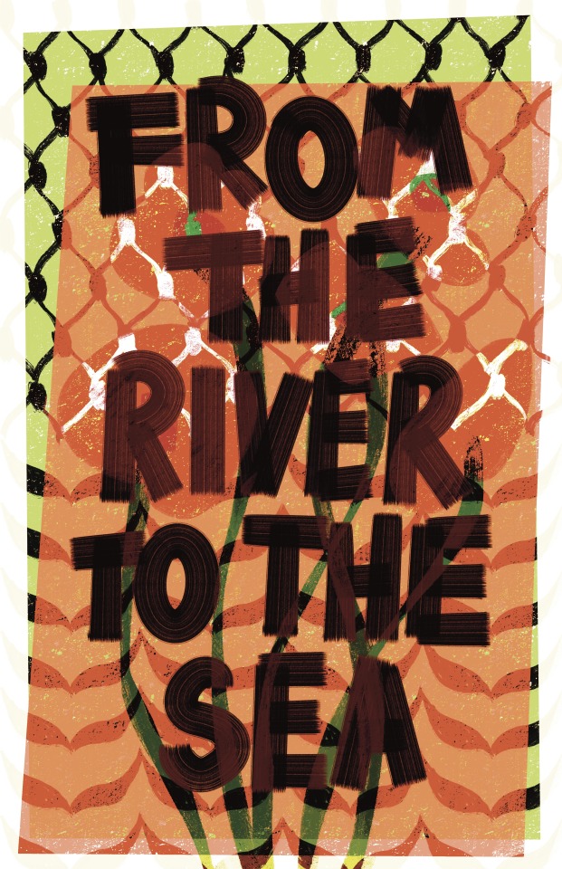
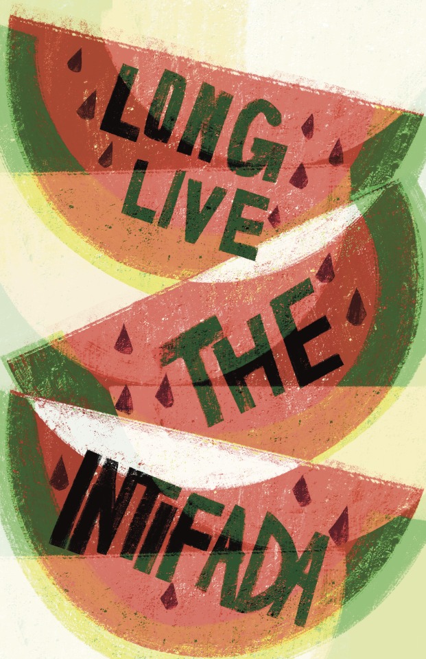

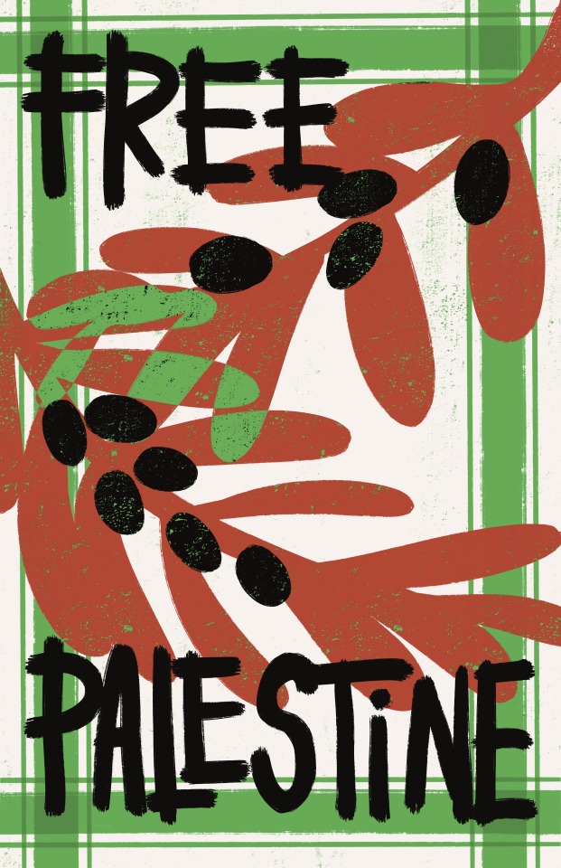
for artists against apartheid
#design for palestine#designforpalestine#palestine#mine#id in alt#These are all free to use! The linked post has many more examples of beautiful f2u posters!
7K notes
·
View notes
Text
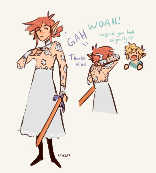
thinking about @kesoo's Legend in lace!!!
#linked universe#lu legend#lu wind#I tried designing a dress for Legend and it wasn't going well sooooo I went to a good example and drew this instead!!!#Keso's art slaps#(this one you can reblog lol)
475 notes
·
View notes
Text

So, this image has been viral on the Internets in armor nerd circles a few times, but I never saw anyone talk about the artist and how she also does amazing stuff like this.

And this.

And this.

Gambargin is mostly active on Facebook, but has a huge, HUGE backlog of amazing drawings of warrior women on Instagram and deviantArt.
In summary:

-wincenworks
#positive examples#plate armor#gambargin#image#science fiction#armor design#Bikini Armor Battle Damage#BikiniArmorBattleDamage#BABD#gothicc
423 notes
·
View notes
Text
A lot of you underestimate how prevalent British bias is not only in F1 but across sports generally, and even in other industries.
Max saying he has the wrong passport in the paddock is an accurate statement. Do you think he, Seb, or Michael would've been half as vilified by the British media if they had a British passport instead? Would Fernando? Do you think Yuki would get half as much shit about his radio "conduct" if he was British? Because it's the British commentators who consistently have issues with it, and say shit like it's "unbecoming" for a driver to speak that way, ignoring that 1 it's not his first language and 2 IT WAS ENGLISH PEOPLE HE LEARNT THAT LANGUAGE FROM. Sometimes people misspeak, but Yuki has always taken accountability and apologised if he has and if he caused harm. Martin Brundle did not get nearly as much backlash from the media when he misspoke and called an Asian driver a slur while commentating. He also never apologised for it.
Alex, one of the four Brits on the grid but who drives under the Thai flag, has said that the commentators only call him British born when he does well. He was completely excluded from the Silverstone publicity about the home crowd heroes, whereas George, Lewis & Lando were heralded, not only on race weekend, but for weeks leading up to it.
Alex's statement also reminded me of this Richard Harris quote, "When I'm in trouble, I'm an Irishman. When I turn in a good performance, I'm an Englishman." Genuinely, if I took a shot every time a British organisation/person claimed a talented Irish person was actually a Brit, I'd have died from alcohol poisoning years ago.
Hell, I see George wearing the poppy pin this weekend in the lead up to remembrance Sunday. Do you know the amount of shit James McClean gets every year because he refuses to wear one? And he has very valid reasons for choosing not to wear it, yet he's torn to shreds every year by not only random people on the Internet or on the streets but by commentators and the media too.
Because of how this sport became mainstream and because no one challenged Bernie Eccleston's monopoly on broadcasting rights back in the day (people were given the opportunity to buy a share of the broadcasting rights; the idiots said no), this sport has prioritised the British voice/perspective for decades. I know the other broadcasts are just as biased for their home team/drivers, but the British one is the biggest one, as it's the main broadcast for better and more often for the worst. It's the broadcast with the most reach and influence. Their bias has to be challenged eventually if this sport ever hopes to properly expand and grow. The British bias is so difficult to miss once you start noticing it.
#f1#formula 1#formula one#max verstappen#brazilian grand prix#brazilian gp 2024#like europe is still classist as fuck#f1 reminds the world of that consistently#also idiots is a direct quote from someone who refused the deal re: broadcasting rights and regretted it big time#before anyone comes at me lmao#edit because i forgot: the British commentators used to say seb was only winning because of Newey's (a brit) designs#which Adrian has called out because they started using the same rhetoric with Max#and Adrian (+ his wife) have vocally criticised the british bias#also: adrian newey design 🤝 rb golden boy = lethal combination#because if it was just the designs as the British media claimed... why didn't their teammates have equal success with the same design?#but i digress#sebastian vettel#fernando alonso#alex albon#yuki tsunoda#michael schumacher#only tagging drivers i explicitly mentioned but theres many more examples
1K notes
·
View notes
Text


I added some colours to her :)
#digital art#character art#character design#marcia#discworld#discworld fanart#angua von uberwald#bro i need to get weirder i need my art to be weirder i need the shapes i need the colurs i need to not play safe i need to be a freak#2025 goal become an even bigger freak i can never stop#i really like how she turned out#i never used such muted colours before i kinda like how murky she looks#a true ankhmorporkian#still making my way through men at arms they just found the clown#i am fascinated with the river that is running through that city#it makes me think of Bristol uk <3#going back to angua i like to think the armour they gave her was already all beaten up#hello and welcome to the nightwatch. have the nastiest underfunded gear we could find this side of the city#also i like to think that the official colours of ankh morpork are greenred#two colours on the opposing sides of the colour wheel but they are forced together to coexist#ankh would be green morpork would be red#and now everyone and their patrician just gotta cope#worldbuilding through colour would be fun : )#ohhh the inside of the palace could look quite cool because it would have to utilize both to celebrate the union#but then you go into the city and across the river you can sorta see the divide#not that all the houses would be one colour or whatever thats a bit predictable#but through fashion statements or exported goods or family insignia#and then you could incorporate it further for example vimes the guy of the city would want to take on the whooole thang. thats his city#some criss cross apple sauce checkers quilted mismatched mumbo jumbo#and then in contrast to that you would have his wife-elected suit and tie getup that distances him from his duty and kills him#so many options i tell you
703 notes
·
View notes
Text

starting a petition to end this dichotomy in warrior cats designs forever
#to be clear individual designs are not the issue obviously it's just how prevalent it is as a trend#it's less common nowadays but i still see people consistently do this especially for map designs and stuff#i think the only female characters people primarily draw like the latter are yellowfang and mapleshade#meanwhile with toms you got tigerstar(s) bramblestar lionblaze lionheart brokenstar pinestar goosefeather......#then if you make the example a wee bit softer-expressioned cloudtail tree shadowsight oakheart crookedstar graystripe purdy....#the girl cat here could be hollyleaf goldenflower feathertail silverstream cinderpelt squirrelflight nightcloud tawnypelt ferncloud daisy#bristlefrost sunbeam ivypool turtle tail honeyfern cinderheart poppyfrost brightheart mothwing willowshine sparkpelt frecklewish..........#you get it.
2K notes
·
View notes
Text


batter has a bat
#art#off game#off batter#off fanart#batter#I haven't even played off but i know sth about it. Batter is a nice example of a good character design for me
657 notes
·
View notes
Text
Typal Examples and More
Many thanks to Storm for pointing these cards out, but there are a few more cards from MTG history that have properties we're looking for in this contest:
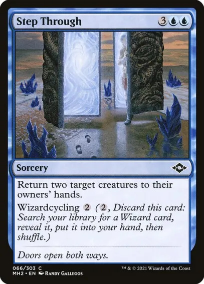
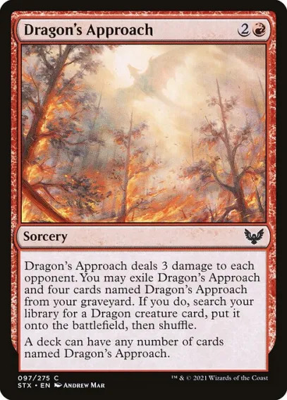
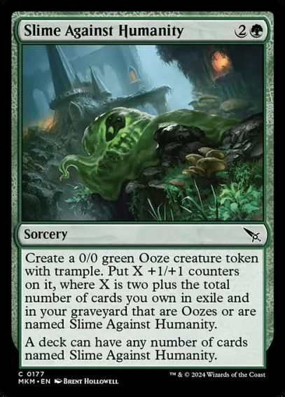
The thing about Dragon's Approach and Slime Against Humanity is that they also have the unlimited-number clause; considering that those are half the examples we have, it might be a good idea to stray away from this constraint specifically. But Step Through is a phenomenal example because the Wizards in MH2 were...varied, to say the least. They were all situated in Grixis colors (UBR) and looked for a variety of archetypes. Maybe you had a token-making Wizard, maybe it helped with Delirium, or maybe discarding Step Through allows you to cast your Asmoranomardicadaistinaculdacar that you picked up P1P1!
I'll also note that tokens are an interesting combination to look at. When you're browsing sets, are there any creature types that don't appear on tokens that you could make tokens for? Would that combination of token-plus-type impact someone's deck choices or card selection?
Regardless, we've been digging up a couple of examples, and want to show you what we've cooked up—
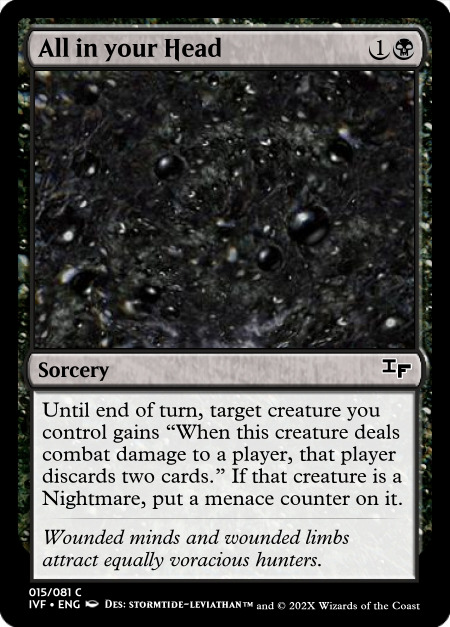
@loreholdlesbian designed a nightmarish combat trick from Ikoria that combines counters, menace-matters, and the Nightmare creature type into one horrific attack. The power of the effect makes the flavor of the Nightmare typing all the more effective—i.e. it's the creatures that are born from the psyche that are best at navigating the psychic terrain. This could just put a menace counter on any creature, but at common that would be far too easy to jam any one-mana creature with this spell; Nightmares matter here.
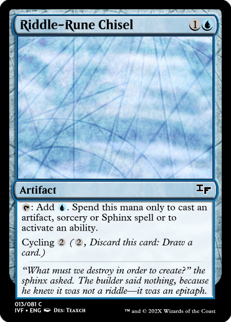
@teaxch brought the idea for an artifact to the table, one from the modern Amonkhet that looks to accompany the rebuilders of the world. I shaped the flavor for this one with some minor tweaks including the cycling, but most of the time this card would be used for either an artifact shell (to represent the rebuilding) or a sorcery-based tempo deck (to represent questions as opposed to the instant-speed answers). Having a Sphinx in your hand to cast would just be an added benefit that might be an extra boon for any Sphinx Commander players.
Actually, that's another note: sometimes these limited cards will significantly affect Commander! Keep that in mind for how you're designing. Maybe your card would possibly help in limited but definitely help in Commander.
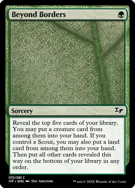
And as a last note, I came up with an Ixalanian card that I should add an art description to, but I wanted to get this post up first and foremost. Scouts on Ixalan can be found across multiple groups, but if the future of Ixalan perhaps doesn't involve the heavy typal and features a variety of outcasts and explorers together, this card can represent why you might need a specialist in your party.
Hope this is a useful resource! Have fun, everyone. @abelzumi
4 notes
·
View notes
Text
magical girls, generally, have something they fight against. this holds true in hms mg:ljga!.
heart, mind and soul fight 'Shadows', abstracted manifestations of consciousness and circumstance that have a tendency to mirror (or 'shadow') their individual and group situations. they often carry repetitive motifs or themes, functioning as tangible metaphors that must be 'resolved', much like any conflict.

the way in which a shadow is resolved varies. itd be wrong to say that there is ever one true or 'correct' resolution. rather, its a matter of what the group (or the individual,) sees as a proper ending to the matter. often, they default to violence.

it works well (or well enough...) for most shadows, as far as they can tell. its certainly easier than trying to talk it out...
#my art#chonny jash#cccc#hms mg:ljga!#mind#heart#soul#ive used one of minds shadows as an example for this but there tends to be a fairly equal distribution between the three#just a particular fan of this shadows design heehheh#sorry if the explanation is messy... i plan to elaborate further in future posts#im trying to balance info and drawings enough for it to be interesting without being overwhelming#<ppl said they were cool with an infodump but i feel kinda hectic abt this au and dont want to... dump it all and then sit quietly...#the dragging it out is more for my own benefit if anything lol. i like to ramble i like to draw... i also dont typically make or share aus#so i dont want to overwhelm myself either in a sense#if anything is confusing pls feel free to ask questions i love answering questions
201 notes
·
View notes
Photo

Hinge presents an anthology of love stories almost never told. Read more on https://no-ordinary-love.co
3K notes
·
View notes
Text
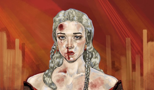
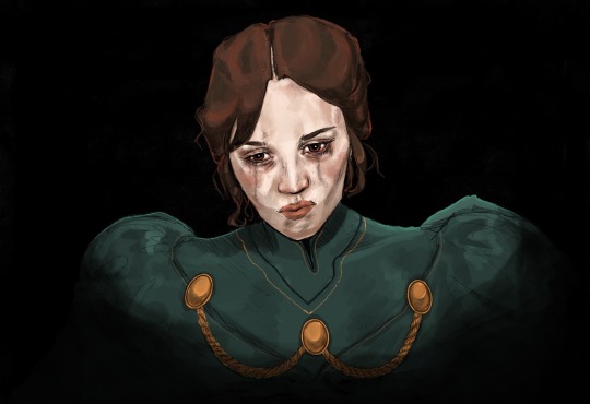
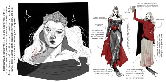
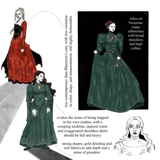

This technically applies to my Stepmother AU in which Alicent is around six years older than Rhaenyra, and occupies a wicked stepmother role as opposed to ex ‘friends-to-first loves-to-enemies’. Despite lacking the foundation of shared girlhood, both find simultaneous comfort and rivalry in one another, and undergo a gravitational pull. A young Rhaenyra’s eagerness to participate in swordplay and political affairs at a young is accommodated for, and she grows up with a sword in one hand and the weight of experience in another, which further helps pave her way to the throne.
Alicent’s Costuming
Alicent’s clothing is almost entirely bottle, emerald, or forest green. While there is layering present in her skirts and jackets, the accent should always be a darker green than the base color. The fabric is deep, rich, and retains an undeniably high-quality luster. Look to velvets and silks. Gold embroidery lingers around her sleeves, neck, and hemline to elevate the coloring.
Metallic embellishments should be almost military-like, and appear heavy. Contribute to the imagery of chains or shackles in addition to her status
Draws inspiration from historically accurate stiffness and Victorian shapes, with a tapered waist, imposing, puffy sleeves, and a high neckline. Despite inaccuracies, this shape is evocative of someone elegantly and conservatively feminine, repressed, and capable of exerting power over others. Reference a classic, trussed hourglass shape. Skirts should be notably heavy and full; may make noise in movement
The coloring and shapes remain relatively consistent but lack variation; this is to demonstrate a lack of freedom and exploration, as well as an adherence to conventional feminine roles
Despite these limitations, her costuming should always be put-together, coordinated, and unquestionably fashionable. Tight sleeve cuffs may be accompanied by a more traditionally medieval fan sleeve
Shoes should stick mostly to slippers, or flat designs
In this AU, her hair leans more towards a dark brown instead of auburn, as her show counterpart. This is mostly due to faux-book accuracy and to simplify the sketch process, since keeping her hair darker in comparison to Rhaenyra’s lighter hair translates more easily in uncolored renderings.
Keep her hair either in a tidy bun or pulled back and loose; avoid too many intricate shapes, braids, or styles. Occasionally, the hair will hang loose. Lean into medieval or royal headpieces, clips, coverings, etc.
Rhaenyra’s Costuming
Rhaenyra’s clothes are primarily black and red, occasionally accented or substituted with neutrals such as beige, white, or gray. Exceptions may include blue or yellow, but she generally stays in this color palette.
Strong focus is drawn to her shoulders and neckline, sometimes with embroidered or embellished detailing. She often has strong, angular shoulders in her dresses or jackets, occasionally theatrically pointed. Off-the shoulder necklines emphasize her collarbones and a certain broadness.
There should be decent variety in her clothing; there is a hypothetical outfit for every occasion and more (for battle, for riding, everyday, formal, feasts, everyday, etc.), and most should be composed of multiple pieces and utilize generous layering. This includes under-fabric, belts and corsets, jackets and doublets, draped fabric for aesthetic purpose, and even functional capes.
Most of her clothes should provide visual aid for movement; additional fabric to her skirts, for example. Her clothes should be highly stylized but still easy to move in. In riding and battle gear, it is presumed that she wears pants and boots under her skirts, even if they are not visible.
Shoes lean more into boot cuts, still practical but should have a sleek and uniform quality to them. When she walks, she should make some kind of noise. Shoes should usually be black or potentially red, the latter for decorative purposes.
Overall her style should be more contemporary and lean into the fantasy element. She’s not opposed to oriental details or showing skin, and her costumes should reflect both couture-height drama and period-reliant aspects. Longer lines and diagonal hems mean she is not as devoted to an hourglass shape, and her high collars should always be decorative in some respect.
Keep her hair long and mostly loose, sometimes pulled back. Small braids should be implied as incorporated. Occasional hairstyles feature complicated braids. With the exception of highly decorative braided styles, simple buns should be avoided unless accompanied with very high necklines.
Avoid headpieces that are not either a) her crown or b) ceremonial.
#rhaenicent#rhaenyra targaryen#alicent hightower#house of the dragon#hotd#rhaenyra x alicent#asoiaf#my art#thinking about how their character and costume designs are so communicative and are designed with each other in mind. for example havijg bc#the strong shoulders and embroidered necklines keeps them connected although imo they could’ve played around with it a lot more#I just have a lot of thoughts about them ok
1K notes
·
View notes
Text
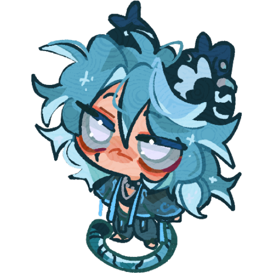
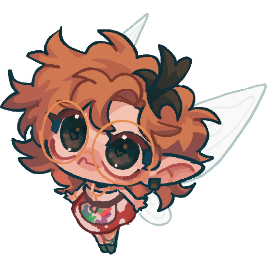
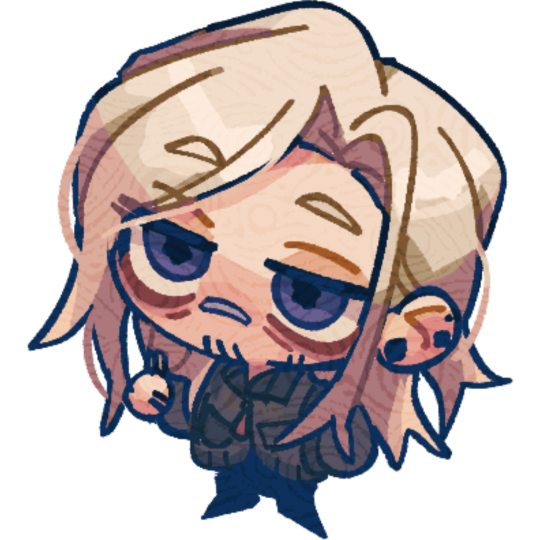
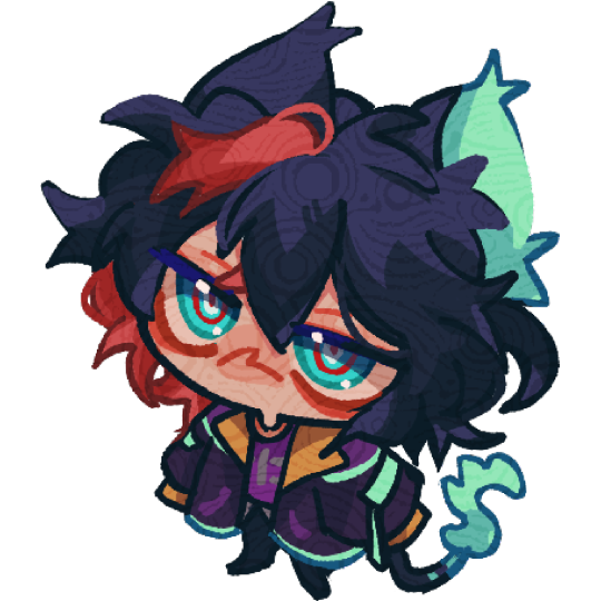
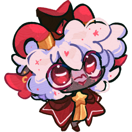
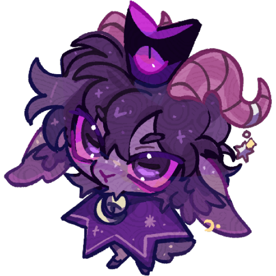
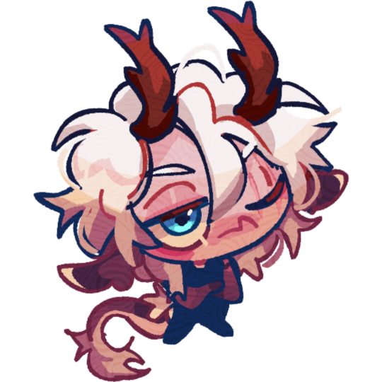
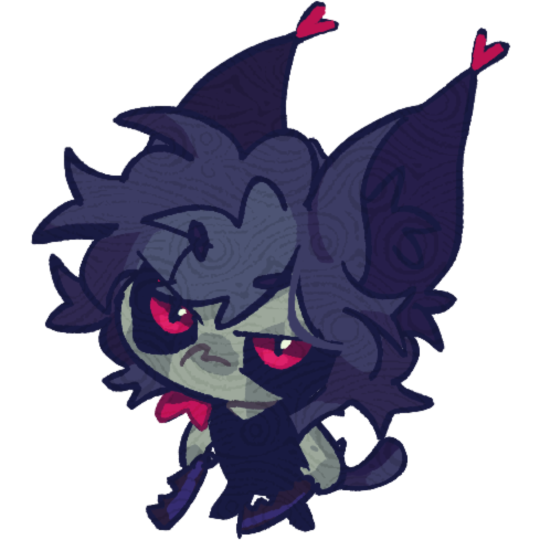
Hello :3!!! Doing some 20 (usd) chibi Comms like these ^ I need to save for a new laptop, so dm me if you’re interested!
#my art#I wanted to post my examples and show the different kinds I’ve done using friends ocs#the Cotl designs belong to to a friend!! I couldn’t help but doodle them they’re so precious#anyways#do dm me if ur interested#oc#friends oc
463 notes
·
View notes
Text

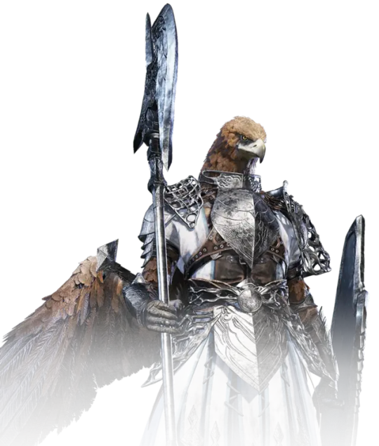
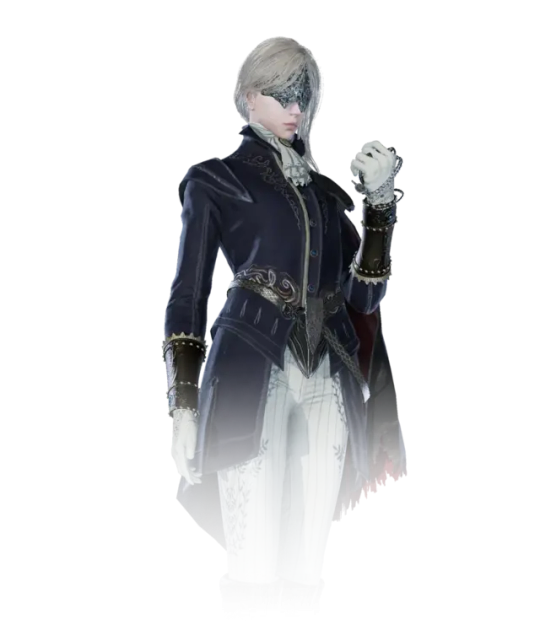

Looks like we've got some official pngs for 4 of the Nightreign guys now
#Elden Ring#Nightreign#y'know ngl I'm not sure I super vibe with any of their designs tbh#Like they look pretty cool but idk they don't blast my shit the way a lotta other FS character designs do ya feel?#Like Dutchess is clearly bloodborney in vibes but idk#like you can NOT tell me she's on the same level of drip as like#the Cainhurst Knight set for example#also like what is up with Wylder' neck? Is this dude like a cyborg or something?#is that the secret neightreign plot twist that they're also throwing armored core into the fromsoft blender game also?#pun's text posts
256 notes
·
View notes
Text
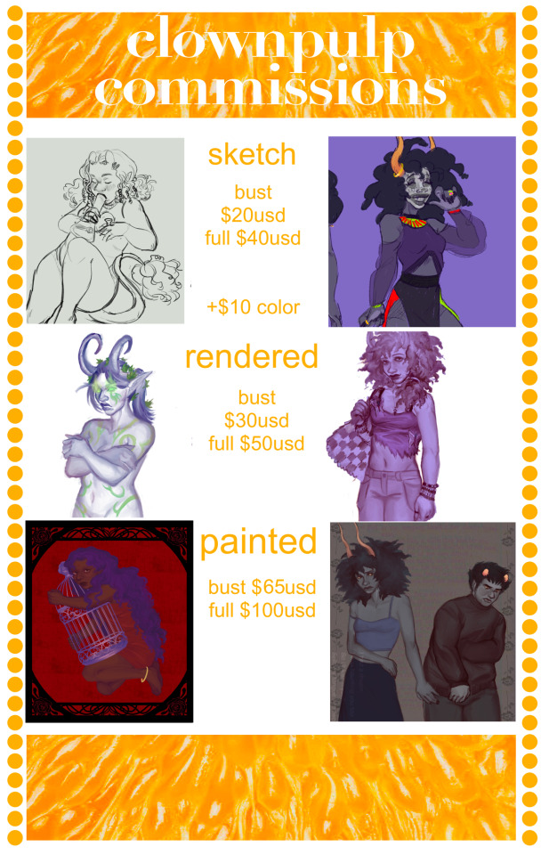
thought it was about time for a new commission post!
you can commission me by dming me here or going to my ko-fi
terms and examples under the cut
all prices are per figure
price can vary by detail/additional items/background
no especially complex mecha, most other things ok but i reserve the right to deny anything! 💚
examples:
(fullsize for detail)


#commission#commissions#original character#character design#clowns#furry#disabled artist#freelance artist#homestuck#revolutionary girl utena#excuse usong the fandom tags those are just what examples are on here. exposure and all lol
199 notes
·
View notes
Text
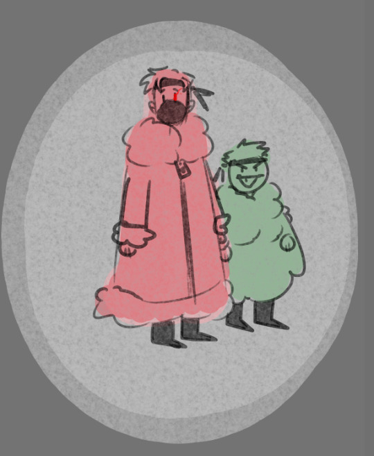
Totally Accurate heights of these two my source? Me. Im the source
#artists on tumblr#fanart#mcyt#ethoslab#etho fanart#ethoslab fanart#hermitcraft etho#hermitcraft bdubs#bdubs#bdubs fanart#every good character design has a tall and short duo#sans and papyrus are my example#my art
143 notes
·
View notes