#especially text and layout are things I really struggle with
Explore tagged Tumblr posts
Text
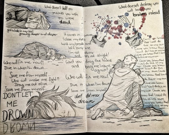
"Won't you drag the lake and bring me home again?"
Drown by Bring me the horizon
Have some itafushi angst *runs and hides*
#itafushi nation how we feeling?#I haven't read the new chapter yet aaaahhh#ahh I'm kinda scared to post this#I rarely do this kind of sketch pages#especially text and layout are things I really struggle with#but this wouldn't leave my head#now it's out there#jjk#jjk fanart#jujutsu kaisen#megumi fushiguro#itadori yuuji#itafushi
74 notes
·
View notes
Text
Sebepel headcanons 💞
😈 finally posting them after like 5000 months of procrastinating ☝️☝️ ummm they are long because well, I love them.
(about 1k words 😨😨😨)
Headcanons are like in chronological order I guess, from before they were dating to during dating basically 👍
I also changed my writing style/point of view (?) near the end, idk just wanted to give a heads up

Sebek being confused why he thinks of Epel so much. He’s just a human after all. I mean he is really cool and talented but still!! He’s a human. It’s strange to him.
Sebek treasures the squirrel plushie he got from Epels hometown
Sebek occasionally thinking about Epels hometown and wanting go there again.
Sebek getting frustrated and eventually decides to hang out with Epel more.
Sebek calls Epel by his name often instead of human. He calls him human sometimes but not as much as the others. People start noticing this and go “huh. Strange”
Sebek being nice to Epel and Epel being like “huh.”
Sebek hanging out with Epel often and giving him gifts and Epel being confused. Epel being like “this is….weird? I can’t believe SEBEK is doing this? Especially knowing what people say about him??”
Epel getting used to Sebek after a while and gladly accepting his gifts hanging out with him.
Epel eventually thinking its cute and endearing.
Sebek thinking Epel is really cool and strong and thinking he’s a very capable human. So much that he invites Epel to workout/train with him and occasionally to Diasomnia training sessions.
Epel really appreciating what Sebek does for him. Epel getting happy that Sebek invites him to train with him.
Sebek and Epel hanging out/training/studying in Sebeks room.
Epel visiting Diasomnia so much that he knows it’s layout and where stuff is.
Epel getting close Sebek and the Diasomnia gang.
Epel inviting Sebek to the Pomfeiore dorm and Sebek being nervous internally
Sebek becoming more nervous and self conscious about his actions and behaviors.
He doesn’t want to lose his beloved friend.
He doesn’t want him to this he’s annoying.
Sebek eventually getting over his hatred for humans and loving Epel to the fullest extent.
Epel being one of the reasons Sebeks hatred for humans starts chipping away.
Sebek loosening up with Epel and being much softer with him. He feels he can be more vulnerable with Epel.
Same with Epel, he feels like he can really be himself with Sebek.
Epel teasing Sebek a lot and vice versa.
Them sitting in silence doing their own thing <333 (huehuehuehuehue parallel play….)
Sebek hugging Epel tightly, baisically squishing him/crushing his bones
Epel getting used to Sebeks hugs and hugging him back the same
Sebek is so pathetic and such a loser. He tries to impress Epel but he struggles.
Lilia catching onto Sebeks crush on Epel and teasing him about it.
Sebek swears it’s not a crush.
Sebek talking about Malleus to Epel and Epel just listening quietly. :]
Sebek slowly talking about Epel more and more. The students can’t believe it! Sebek talking about someone other than Malleus or Lilia?! That’s insane
⚡️🍎⚡️🍎⚡️🍎⚡️🍎⚡️🍎⚡️
Sebek sends letters to Epel… because Lilia says that’s the old fashioned way to court someone! And it definitely works! So he should try it
The letters are a bit awkward and silly at first but Epel doesn’t mind…eventually they get really sweet,, and Epel thinks it’s cute but he’s still confused why he’s sending letters instead of texting, they have each others number after all.
Sebek starts texting Epel a lot, telling him all about malleus, things he did that day, and showing him things that remind him of Epel.
I like to think Sebek is a bit uncomfortable talking on the phone but Epel helps him get used to it.
Sebek learns how to play guitar for Epel. Lilia said it would be so cute to play him a Song
It’s night time when Sebek confesses, They’re sitting outside of Pomefiore just sitting there and laughing. It starts with “I think I love you” and from there Sebek starts rambling about how much he appreciates Epel. And the whole time Epel is just looking at him like “wow.”
⚡️🍏⚡️🍏⚡️🍏⚡️🍏⚡️🍏⚡️
Sebek talking about his lovely boyfriend who is the coolest guy to ever exist!!! (He might even surpass Malleus. Sebek is very conflicted) boasting about how amazing and strong he is for a human!!! How he’s very talented and skillfull.
Epel taking Sebek to his hometown to visit. Sebek being happy he can go back. He loves Epel’s hometown
Sebek going to Epel’s hometown often that he has now seen it in all of its seasons.
Epel speaking less formally with Sebek and occasionally going full blown with his Dialect.
Sebek wanting to learn more of Epel’s dialect and culture
Epel gladly teaching him
Sebek loves Epel’s accent so much.
Sebek genuinely being so happy and proud to have Epel as his boyfriend.
Sebek holding Epel’s hand tight because he loves him dearly.
When they held hands for the first time Sebek was so nervous he didn’t know what to do. (Internally he was screaming crying throwing up)
Epel wanting to take Sebek on rides on his motorbike
Sebek would definitely accept if Epel asked but he would be so nervous to do it
Epel wanting to do more stuff to show Sebek how much he means to him because Sebek does so much for him.
Epel asking Vil and and Rook for advice on gifts.
Vil not fully understanding why Epel is dating Sebek, but supports it anyway.
Sebek is just happy that Epel is his boyfriend and hangs out him.
Sebek introducing Epel to his family and Epel just being like “wow.” (/pos)
Sebek picks up Epel just so he can kiss him better.
Though sometimes, Epel will pull Sebek down to kiss him.
Sebek only kisses Epel on his cheek or hands because he’s too embarrassed to do it on the mouth.
Epel being awkward and rarely kissing Sebek, and if he does it’s on the cheek. Sebek is okay with it and wants to make sure Epel is comfortable
Sebek kissing Epel often. Sometimes in public. Epel starts finding it cute.
Epel getting more used to being affectionate and doing the same with Sebek!!!
Idk man they just love wholesome kisses and holding each other 😭😭😭😭
They probably had their first kiss on the lips in their junior or senior year. They were too embarrassed to try it before.
Sebek happy stims SO MUCH when he’s with Epel.
Epel loves it SO much because he’s just so glad Sebek feel comfortable enough around him…..
Epel giving Sebek apple carvings is a tradition.
Sebek started to put preserving spells on the apples so they wouldn’t rot
Epel is Sebeks number one supporter frfr 🙏🙏🙏
Epel made Sebek want to do handcrafted things again…. They started doing woodworking together
Epel compliments Sebek a lot and it makes Sebek feel like the specialest guy in the world. He loves it so much. But they also leave him a mess
Epel goes to Sebek for compliments because he thinks they’re cute, and he feels very validated around Sebek
Epel and Sebek are the biggest hypemen for eachother. “If you guys don’t cheer for my boyfriend I’m going to blow this place up” type shit
Sebek gives Epel his jacket often because Epel loves wearing big jackets. He also likes how he looks :3
Sebek will go to Epel’s games and sometimes even practices and cheer for him like crazy. Probably the loudest guy there. (Leona finds it annoying, but whatever)
But a lot of times he will stand and stare in awe of Epel’s skill. He’s so talented.
When Epel is done with a game or practice most of the time Sebek runs up to hug him or grabs him by the shoulders and tells him how amazing he was!!!
Epel will also go and see Sebek in the equestrian club!!! He thinks Sebek looks really cute (and stupid) and is just so endeared by him
Sebek walks Epel to class as often as he can,,, he thinks it’s sooo cool of him
When Epel saw Sebek with his hair down, he freaked out. He looked SO handsome. He couldn’t function for like a week, he would just keep thinking of Sebek.
Sebek was SO embarrassed, he couldn’t believe his boyfriend saw him like that. Epel assured him it was fine.
Epel wants Sebek to keep his hair down more often,,,, Sebek says that maybe one day he’ll do it more.
#ARGH I FINISHED THEM#OKAY CHAT#I LVOE SEBEPEL SO MUXH#THEYRE SO CUTE#THE COUPLE EVER#sebeppy…..i love them…#twst#twst hcs#epel x sebek#sebek x epel#sebek zigvolt#epel felmier#sebepel#twisted wonderland#twst ships#twst headcanons#💛!me talking💀#My creations💛!#<- putting this in both tags bc I sure am talking 💀 also its my stuff ☝️
57 notes
·
View notes
Note
what's your process like when making comics? especially during the thumbnailing/drawing part, that's what i struggle with the most
Tbh most of it comes through practice. The main thing I think is important to figure out is how much text you personally fit onto a comic page. That way you can look at the script and split it into pages. Its much easier to start thumbing when you have a set amount to work from.
On standard pages I generally aim for 5/6ish panels- a page splits fairly well into three rows of varying sizes, and you can chop those rows up to get some interesting shapes. Even my weird wiggly ones kind of fit the three row idea.
So uh, if I’m doing it for myself it’s much more interesting for me if I get to make decisions while I’m inking, instead of making a detailed sketch and copying over in ink. I vaguely plan the bubbles and panels, and get the character sizes/angles down to make sure it looks interesting and flows well. Before I ink I usually add the text (It often bites me in the ass if I don’t.)


It’s a bit like going from thumb to final without a sketch. I don’t draw Much but I do figure out the flow of the bubbles, and the size/angle of the figures so it’s not boring.
If its for something professional I go into much more detail, and also have a real thumb stage where I try out different layouts etc.


Honestly it's probably helpful to find some guides to making comics, there's so much to learn that will help with decision making! Idk tho, even two squares with some text is a comic, and you can always start there! Some of the best comics are really simple.
44 notes
·
View notes
Text


This week and the week of fall break has been great. This project plays to my strengths and has allowed me to express my own creativity while still showcasing the ability to adhere to a client's requests. I really like how everything came out considering I really do not like InDesign. For the colors I found a purple I liked then manipulated the CMYK values proportionally to get a differing color with the same shade and that's how I got the green color. I was struggling a lot with were to put the text especially with the 10pt size limitation but I feel that I solved the issue in a creative way. I am really happy with how this project turned out and I feel the things that were easiest for me was creating the letter and the character design portions but I struggled when it came to layout which I know I need to improve on.
The reading this week was very informative and helped with a couple symbols I didn't know the name of or the use of. We did however go over a lot of the stuff talked about in class so it felt a bit repetitive but also was a good reminder to strengthen what I thought I knew. The most informative part was the editing section because I had no idea what almost all of the marks meant. I can also see this information being helpful in the future if I ever work somewhere that requires text proofreading that I will then have to edit as a part of a design. Editing soft copy was pretty self explanatory to me and the hard copy was what was really new to me. I'm sure I will forget most of the symbols for hard copy editing but the author left a list at the end of the book that I can refer to in the future.
2 notes
·
View notes
Text
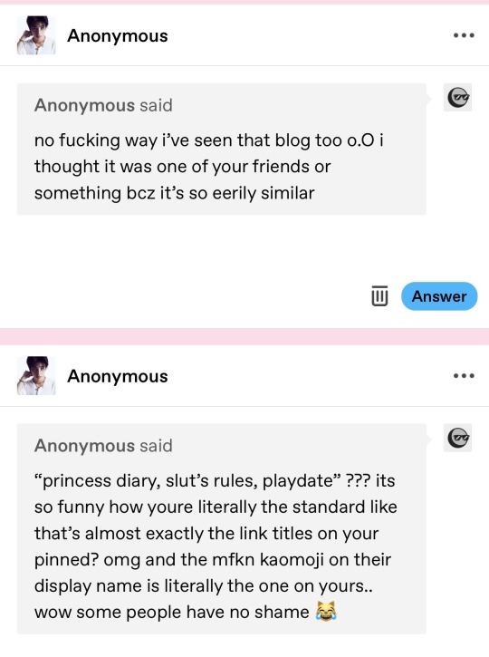
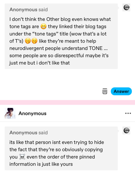
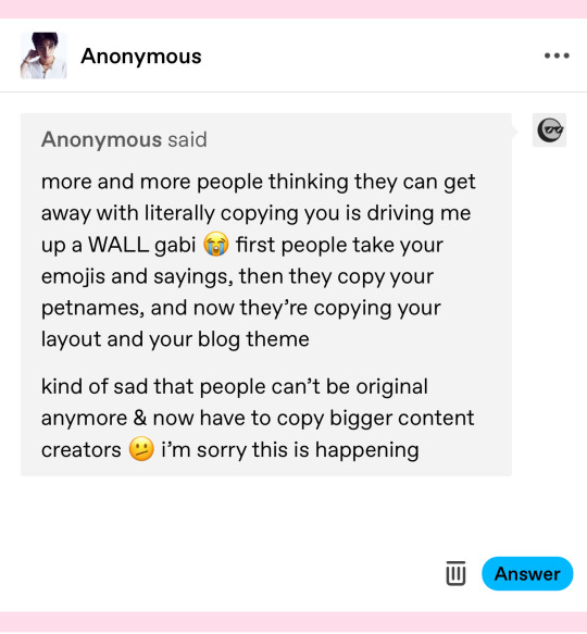
i keep getting asks regarding the blog that the anon questioned me about and i dont wanna flood my blog with this bc i feel bad so i’ll answer these here! and please don’t twist my words!!! i am allowed to feel some type of way abt this situation! at first i was giving them the benefit of the doubt bc i don’t wanna point fingers or seem like a mean person bc i wld hate to be thought of as a meanie T_T but im just gna reply to these real quick pls do not be rude or hateful to me, my nonies, or the writer!! thank you.
first: i do not know the writer at all, nonie! but i can understand why you would think that
second: i understand being upset for me, i’m also a bit bothered by this if m bein’ honest :( but i do not want anyone being rude to them or sending any hateful messages! i also noticed the emoticon and how they switched up the link titles so it wasnt exactly the same but :T there’s nothin i can do abt it T_T m too afraid of confrontation
third: i can understand why you’re upset about the “tone tags” thing! as someone who is audhd and relies on tone tags the majority of the time, it’s a little upsetting when people don’t do their research on the topic T_T but i’m not saying they didnt! i dont know them personally nor do i know if they’re nd! but i do see why you think it’s bothersome, nonie! blog tags are Not tone tags
fourth: idk if this was meant to be disrespectful to them bcz again i struggle with reading and processing tone, especially through text T_T but like i said earlier i understand being upset for me bc i am as well, considering i’ve spent so much time prettyin up my blog n making it a reflection of my personality n it makes me a lil sad when people jus’ take that from me without even asking :( it’s such a silly thing to be upset about, i know, but im rly proud of how my blog is set up n it sucks having it copied
fifth: i hate being bothered by something like this but i get where ur coming from anonie T_T this isn’t the first time i’ve noticed someone copying little bits of who i am -_- but i’ve never said anything bc like i said i hate (!!!!!!!) confrontation n i won’t say anything to this writer (and neither should you guys!!!!!!!) either :x but i have and i do notice when people take my lil phrases n terms of endearment nd blog related stuff like my tags n layout T_T n it bums me out so bad bc i try so hard to show my personality thru this account n ppl just take pieces n agh!!! idek what im sayin im jus a lil upset rn :T
anyway!!!!!! again guys please, please, please don’t be rude or mean or send hateful stuff to other creators!!!!! i choose kindness n it’d mean the world to me if you all did too <3 n sry if i seem silly for letting this bother me T_T i know it’s kinda stupid but i’m autistic and idk if anyone else struggles w this but i really really really get upset over stuff like this T_T anyway that’s all !!! rmb to be kind pls
3 notes
·
View notes
Text
DEVELOPMENT 1: TEXT WORK
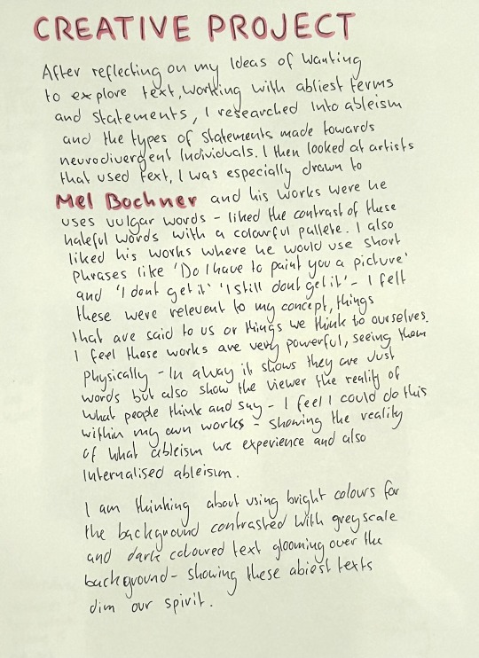
(Artist research and contextual research on different post)
Mel Bochner’s work I was inspired by:
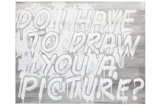
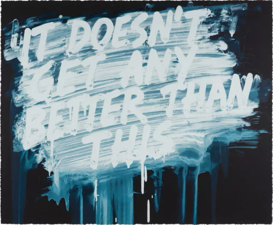
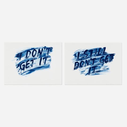
I resonated with these text within these works, I felt these were relevant to my concept - what we commonly hear as neurodivergent people as to ableism but also thoughts we have in terms of not understanding and feeling life won’t get better than this, we will always struggle.
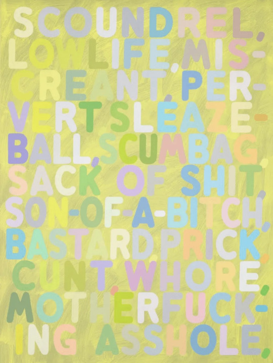
This work using vulgar words also inspired me to look at specific ableist words used towards neurodivergent people and create my own version of this work using those words. I especially like how the bright and colourfulness of the text contrasts with what’s being said, it makes me think about how even the nicest of people can be hateful.
More artworks I have saved from Mel Bochner as inspiration:
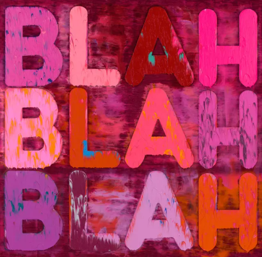

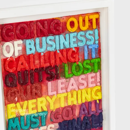
I especially liked how the letters stand out in this work and almost look 3D. After my research I began experimenting digitally with some text as i thought this would be a helpful way to experiment with the layout of text, fonts and colours schemes before beginning physical work.
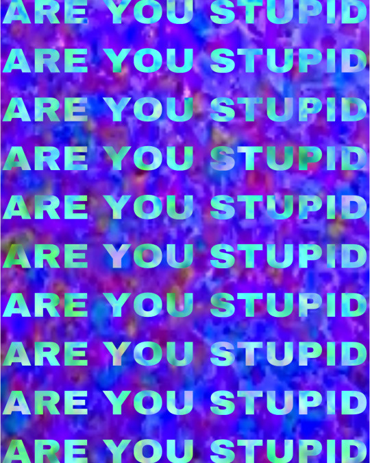


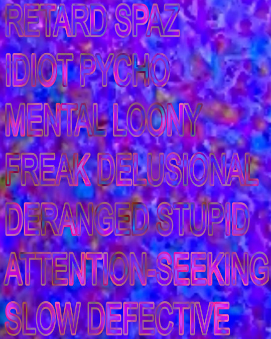
For these experiments I used bright photographs I had from my previous projects as I just wanted to see how the text would look against a busy background. I used words commonly said to neurodivergent people, my favourite was the ‘idiot’ work as I liked the painted background and bright text but also because the word idiot looked like it was spelt wrong even though it’s correct, it made me think of my dyslexia and how certain fonts make it difficult for us to read.
deciding I really liked the painted background I decide to begin experimenting with different techniques and colours palettes in my sketchbook. I looked a lot at Mel Bochners work and the different ways he paints his backgrounds and so I decided I wanted to try my own various techniques.
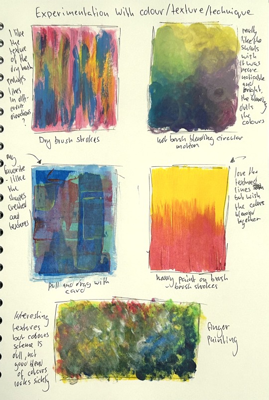
My favourite was the pull and drag technique, I felt as though it was more transparent than I wanted so when I do this next I will use more paint to ensure the different colours can be seen and saturated too.
whilst having my paints out I took this as an opportunity to make a small experiment with paint and text and so I took a recycled piece of card from a box, cut it down to A5 and began painting the background by first doing a first layer and then beginning the pull and drag technique using scrap bits of card.
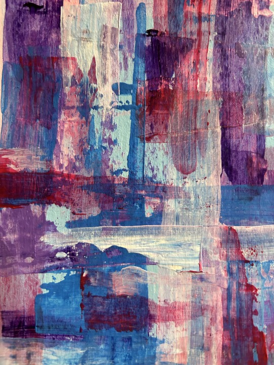
I found the layering to be really interesting, I especially liked how some of the colours blend together and the texture created. It also very bright which is what I was hoping for, I also feel the colours compliment one another very well.
I then decided to add text, I decided I wanted to use a contrasting colour scheme with the background and so I thought about using greys, blacks and white. I thought this could be a good idea to use a darkened colour scheme against the bright colours to show that these words dim our spirit. I did this very spontaneously and without much thought as this was just a quick experiment, I did a quick measurement of the text to insure the letters weren’t too big and that I could fit everything in I then went in directly with a paint brush and did a few layers of each other. I then allowed for some of the paint to drip as I thought this could look interesting, it didn’t really turn out how I hoped and the text just didn’t stand out like I wanted it to.
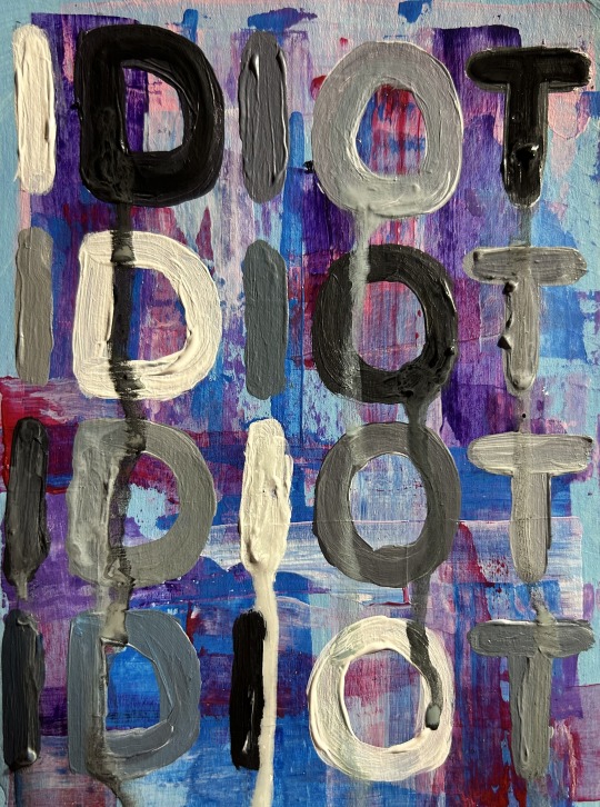
After completing this I realised the grey scaled letters didn’t look good against the bright colours, the letters also felt like they just didn’t stand out as much as I wanted it to, it looks too flat compared to the busy background. One thing I liked about Bochner’s work as no matter how busy the background was with colour and texture, this words always stood out with think thickness of paint/ink. I also didn’t like how the font looked and how each letter looked inconsistent and different from the other. Not liking how this turned out, I began thinking about how I could make the text stand out more against the background.
My idea is to print out the text I want for the artwork and carefully use a scape to cut this out and then using the print out as a guideline to cut the shape onto cardboard which I can then either decide to use it to trace round, use as stamps (dipping them into paint and applying to the work) or paint the cardboard and glue directly onto the piece to ensure it physically stands out but also visually. I am thinking painting it gluing it on to the canvas may be interesting as it will stand out completely but I will have to experiment this and I would also like to try the other options I listed. I also thought about buying letter stencils but I think this will be a great cheaper alternative and a good way of recycling scrap cardboard and greyboard I have kept from previous projects.
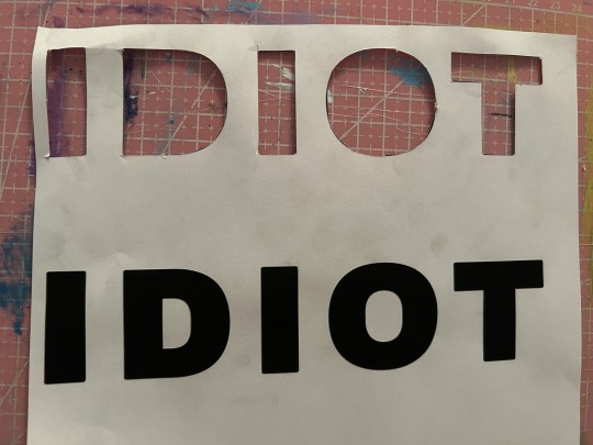
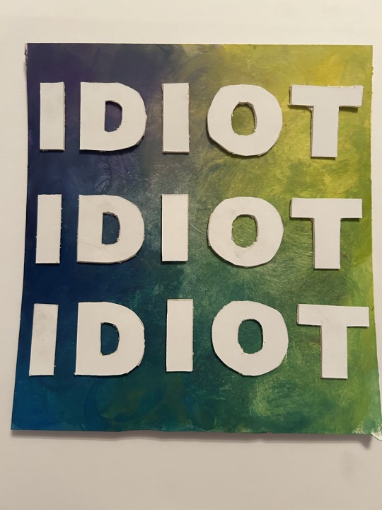
Printed out the text and cut these out, I then used them as a stencil to trace and cut round on think white board. I struggled slightly with this process as it was difficult to use a scalpel on the white board more specific when doing round shapes and so some of the shapes are imperfect but I am much happier with how they look against the painting and fully stand out.
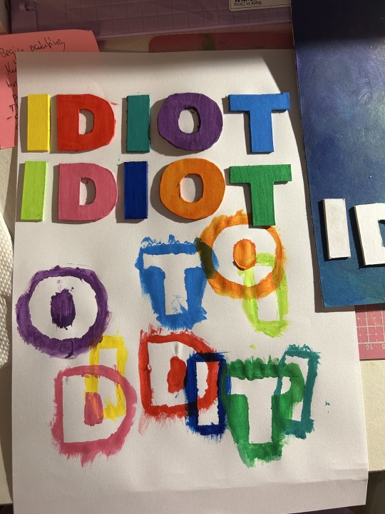
started painting the letters in random order, I just chose colours that felt right and different from the previous colour and ensuring to split up similar colours. I used a scrap piece of paper to paint these on as I had to ensure to paint around the edges of the letters, to my surprise I liked how the excess paint of the letters looked and how they overlapped one another I think this could be something interesting to look into further.
I then finished painting all of the letters, I really liked the colours chosen and how bright and how much they stand out against the painting.
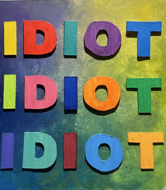
However I felt they lacked something and needed something extra as they were to plain and simple looking and so I began adding extra paint to the letters and creating some texture with the paint brush.
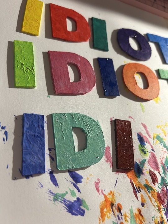
More experimenting:
I had the idea to try use the cut out shapes as stamps and see how this turned out.
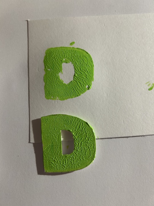
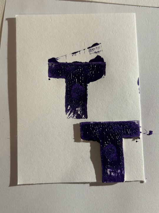
I applied a thick layer of paint with a brush and then pushed it into the paper, this did not work successfully as the full shape of the letter wasn’t stamped and some extra areas were stamped instead. I then tried it again but the same issue happened, however I liked the texture crated and so this inspired me to add texture to the letters.
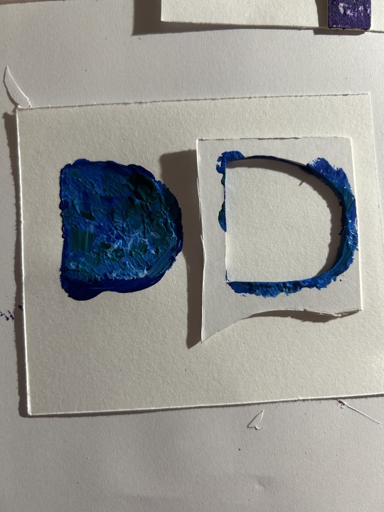
I also tried to use the card as a stencil but this didn’t work, the paint just bled through around the letter and just looked like a blob.
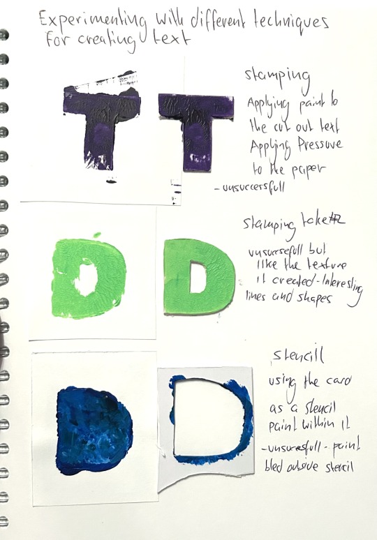
since I liked how the texture looked on the letters I used to stamp, I tried continuing this onto the other letters I had painted already. I liked how this looked although I felt I could’ve used more paint so they textures are thicker and perhaps a different shade of the base colour so that it’s more noticeable.
I liked how the letters looked and how they stood out, I just didn’t like the combination with the background and the large spaces between the text. I felt it the text were larger to fill the spaces and the background was more busy, it might look more visually stimulating and overwhelming like I wanted it to.
Through the techniques I tried for the text stamping, using stencils, painting directly onto the painting, cutting out the the letters and gluing them on - I think cutting out the letters and gluing them on is the technique that works best.
I now plan to experiment further, perhaps on a larger scale and working towards different texts, using multiple words on the painting instead of just one. After experimenting further, I would like to make an a3 or a2 development and begin working on my other ideas so that towards the end of my project, I can decide if this development is something I want to develop even further as one of my final pieces or select as a final piece if I am happy with how the development turns out.
I decided to plan what text I wanted to use for this next work and so I experimented with digital software, experimenting with different words, sizes and layouts.
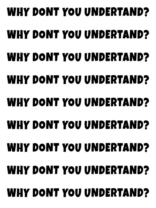
I wondered how longer text would look and I liked the idea of Why don't you understand? something that has been said frequently, especially as a child undiagnosed with dyslexia and autism. However, I felt the text just didn't look right, the spaces between each row as too large but if I made this smaller, then it would require even more words - had to think about that this would be time-consuming to do as I have to cut out each individual letter - perhaps this type of longer text could be used for digital works that require less time.

Repetition of the word idiot, I liked how this looked, and It looked visually interesting and overwhelming when in various scales. Although I didn't want to keep reusing the same text and wanted to used various types of words and more shocking ones in my next work and so I decided to do this;

I also thought about using various different ableist words rather than one being repeated over and over again. This involved a lot of reflecting and researching as I had to think about words that have been used towards me - it was quite a difficult process for me to have to think about this but it made me realise how harmful these words were to my confidence and self-esteem growing up. Considering how these words made me feel and how shocking it felt to see them laid out in front of of me - I felt it was clear to me that I should use this text for my next work. I also really liked the style of layout I chose, how some words are larger and smaller and inconsistent - this will allow the viewer's eyes to travel through each word, ensuring each one is read. I also hope this style will be easier for viewers with neurodiversity and learning difficulties to read the words as the words are separated by height.
For using this type of text, especially using slurs, I had to consider if this work is appropriate for college and studio work but through discussion with my lecturer I realised I shouldn’t have to filter or hide these words as these words come from my experience and my reality. It would feel wrong to filter them or “water them down” make it seem less of an issue than it is by using less extreme words because this is just taking away the difficulties and torment neurodivergent people have had to endure.
My intention for this text work is for the viewer to experience a feeling of shock when they view the text bolded and in large scale for everyone to see, I feel these words are something people try to hide in the sense that people will use these words in secret (behind someone’s back) or in conversations/situations where they can’t be held accountable and caught out for their ableist language and so I feel with this work people are forced to see these words for what they are which is ableist and almost take a moment to register if they also use this language, perhaps bring awareness to stop using these words? I also intend for the horrible negative words combined with the bright colourful text to make the viewer confused, question why these words are with happy upbeat colours when they’re awful - it’s my way of giving the viewer the opportunity to realise how awful these words are.
More thoughts:
Thinking about other ways I could create text works rather than looking at repetition of words. Words and phrases I could use: Why don’t you get it? Are you stupid? How many times do I need to explain it?
I also thought about how people will commonly think “oh but these are just words” and believe we should just think in this mindset in order for us not to be impacted by these harmful words but sadly that is just not true and so this gave me the idea to possible use the text “words are not just words”
1 note
·
View note
Text
shipka..
In the first half of Jody Shipka’s Toward a Composition Made Whole, she pushes us to rethink what we mean by composition, arguing that it’s not just about writing words on a page but about using various modes to communicate effectively. This really hit home for me, especially since I gave a presentation on multimodality for my ENG 7805 class last semester. While preparing, I realized that I actually prefer single-mode communication. I get easily overstimulated when there are too many things happening at once, like music, images, and text all competing for my attention.
Reading Shipka’s book made me reconsider my initial discomfort with multimodal content. She makes the case that to communicate well today, we need to understand how different modes, like visuals, layout, and sound, can work together to enhance our messages. She argues that mastering these interactions can make our communication more effective and engaging. So, I started to think that maybe my struggle wasn’t just about being overwhelmed but about not fully grasping how these various elements could complement and interact with each other.
Shipka’s insights tell me that instead of seeing my preference for straightforward text as a drawback, it could be a starting point for learning how to blend different modes more seamlessly. Her exploration of how different modes interact in the first half of her book helps shift the view from seeing multimodal composition as confusing to seeing it as a rich opportunity for deeper understanding and better communication. Her work provides a fresh perspective on how we can use multiple modes effectively, and it’s making me rethink how I approach and integrate various elements in my own compositions.
1 note
·
View note
Text
WEEK 9
What and who will you portray?
My photography series aims to portray everyday people and explore a more personal space of theirs, which is their bedroom and see what sort of things they like to collect.
What might you communicate visually through the concept of portrayal?
Visually I might communicate how many different people have different styles, are different ages, show the way people decorate their rooms but we all are the same in the way that we collect things that we have attachments to.
What is your position on your subject matter?
I have included myself in this series by starting the series with a self portrait as I felt that it was necessary for me to show the personal side of myself and my room if I was going to do the same to other people.
What is your voice? What is unique about your subject or your approach to it?
I think this project is unique in the way I can really explore ideas of identity and individuality. However I feel as though there is almost an underlying critique of consumerism and capitalism because for myself personally, my collection has accumulated this much because of capitalism.
What do you have unique access to? A group of people, a place, a situation…?
I think I have unique access to lots of different people who I KNOW have collections of things that could be interesting to photograph. I can show the range of things that different people and age groups can collect.
Consider the important role the title takes in communicating your intention and how audiences might ‘read’ the book. What is your working title?
My working title is currently “Bedroom Archives” as I feel like that gives the audience a pretty good idea that this series has something to do with bedrooms.
What would you like readers to think and feel?
I would like the readers to feel like they are taking a look into these random strangers lives and getting to know the different personalities of them by the way they pose, dress, decorate their room etc.
What is the role of the text within the book? How does the text relate to the story the images tell? How do they work together?
I think text is important in a portraiture series as viewers can learn the names of subjects and especially since I want to explore ideas of identity and individuality in my series, it's important to highlight things like people’s names.
How many shoots do you require to gain adequate coverage and successfully tell the story?
As my concept requires me to photograph many different people, I expect to do at least 10 different shoots so that I can get a wide range of images.
Do you need gear and support with your shoots? What is your plan?
The only gear needed is a reflector and tripod. As my project focuses on people’s bedrooms, I don't really need anything else.
What software and workflow will you use to edit, process, collate and design your photobook PDF?
I will be using camera raw to do post production editing on my images. Then I will be using Lightroom Classic to collate my images into a photobook with text. I did struggle a little bit with the text on LRC so I might also use Adobe Indesign.
What is your research plan?
I have looked at other photography series about people and bedrooms. I have seen the different ways of composition for the bedroom and models which have inspired me.
What other photo books have you looked at?
Other photo books I have looked at include Happy Victims by Kyoichi Tzuzuki, Inheritance by Andrea Stern and At Home and Aboard by Robin Morrison.
Are there decisions that have yet to be made? How will you resolve these?
I am photographing a wide age range of people so I am still trying to decide if I want to narrow it down and keep my subjects in the same age group. It will depend on the type of images I have taken and the layout I want to do.
0 notes
Text
Blog for ch: 11 Typographic Design
Okay, so this is probably the thing I struggle with most within my major. I always have a challenging text into something like an image or another symbol. I will get better as I work on it of course, but I really appreciate clever logos for this reason. I also remember doing a project that was basically 11/6-9, where we made letters with silhouettes of flowers in my other typography class. This was one of those projects I looked back on and wish that I could’ve worked on again because I know a lot more about the software and vectoring now. A lot of the work in this chapter reminds me of Paula Scher and the way she makes type, even traditional serif typefaces, seem so silly because of the letters bouncing around and changing angles. My favorite part of this chapter was probably the last few pages but especially the last one, it’s very captivating. It uses text to make something that feels almost like a mosaic, an artistic kind of beautiful.
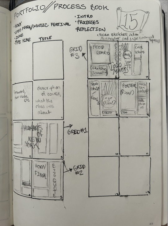
This week we finished our posters, AR type posters, and postcards for our National Park project, and then presented them in class. I’ve been working lately on my process book, and I’m enjoying it so far. Working on book and magazine layouts is one thing I enjoy more than others and it’s relaxing in a way. I hope this one will be the same. I have my layout on paper for what I want to do and have come up with a mood board and color palette which will both be applied to InDesign soon. We also began a new project where we have to design some branding based off a slang word, so I plan on starting that this weekend. Looking forward to it.
0 notes
Text
chapter 10
Something I struggle with when creating a composition like the process book spreads is having the images and text be cohesive instead of two separate elements on the page. I liked the quote from Armin Hofmann about placing text inside the picture instead of on top of it, that’s a really helpful way to approach graphic design, especially things where there is one large image with accompanying text. The jewelry store poster was a cool example of this that almost gave I Spy books, the text was moving with each element in the picture instead of placed over the top of all of it. It was also cool to see the case study on typographic film titles and see how each scene progressed. They were the same image but zoomed in a certain way to create a smooth transition between each. The True Lies sequence was probably my favorite because of the 3-D effect. I really liked how the first words turned into the second. Title sequences tend to pave the way for the rest of the movie and act as an intro for what the feeling of it is, so it's interesting to see how different ones are made and pieced together.
As I'm designing my process book, the struggle I'm having is trying to figure out interesting compositions of the images and text that aren’t too repetitive with the other pages. I don’t want each spread or page to have the same layout, as that makes the book boring. So far, I’ve been playing around with multiple columns to avoid chunky paragraphs, and wrapping text around the images for more interest. I'm also working my wave design into the spreads to fill some space and keep my theme consistent, but trying to make sure I don’t use too many colors on each spread to overwhelm the work itself. I pretty much have all the elements of my book, I just have to spend this weekend piecing it all together and figuring out my final compositions.


0 notes
Text
Week 1: DRS ll Tutorial
The Creative
Who is doing the creative practice & underpinning research ?
I am still in the stage of discovering and learning but I was very much inspired by a graduate, Jordan Tane. Instead of focusing on the aesthetically pleasing designs and producing aesthetically pleasing designs, she found that research was a fundamental stage when beginning to design something or even starting on a design project.
In that she found herself producing more meaningful and designs that relay a clear and concise message, a message that is fully understood to the target audience.
Who am I as a designer ?
As mentioned I am still in the stage of fully understanding and growing as a designer and I think that there is always room to grow and develop as a designer and is never a steady linear line.
However, a few things I’ve realised the past year and a half at AUT, I always make sure my work is meaningful and purposeful. In the process of designing I always question myself, “is this needed?”, “is this design purposeful and does it give purpose?”
What are the influences on me as a designer & where do they come from ?
I think learning to love a project and having passion for the project is quite important, something that really has impact on me as a designer. If I don’t enjoy it I feel that I design quite poorly. Therefore, whenever I am handed a brief I try find a bit of love and let that fuel me.
I also find research interesting prior to the actual design work and that research helps me to produce assets and designs. I also look at similar and also different works such as physical material, layout of text, images and also on behance, pinterest and other existing creatives and designers.
How can I unpack the personal design ideologies that shifts cultures, ethics, responsibiities that impact my design-thinking ?
I think having active conversations of the idea and also realising arising or even ‘problems’ that have existed and still exist can impact design-thinking and especially when coming to design, thinking about the implications it can have on others and what impact you want your design to have on others would be a way to unpack design ideologies.
How might I expand my visual vocabulary by understanding the environmental, social, cultural, political contexts of my design influences ?
Reflecting on each of your design work and fruther pushing your project or your work, outside the box, not simply just outlining the brief but to push beyond and see what and how it impact it had or has on others.
Where do I stand in relation to my practice and what do I value ?
Seeking feedback from peers, lecturers and even people who do not have any experience with design or knowledge in design is important, rather than trying to toughen it out by yourself. Allowing other and new perspectives and an outlook onto your design work will give you another new perspective to look at your work. Also staying true and create original designs but also finding enjoyments and love to the project youre working on.
The Creation
What is the nature of my communication design practice + research ?
I like to set deadlines but also allow myself to be flexible within that . I also tend to produce quite a lot of assets and research throughly, therefore I have a pool of information and assets I can pull from.
How does my environmental, social, cultural, sub-cultural, political contexts and influences show up in my work ?
I think these almost come very naturally, I don’t really have to force it. However, I do have to do more deep diving if it is something I want to use in my work.
What key themes, ideas and conversations are speaking through or in my work ?
I found myself drawing to themes of identity a lot, even throughout high school. It’s something that I’ve always been quite passionate about.
As a Kiwi-Korean, born and raised in NZ, I’ve struggled a lot with my identity growing up. Korean’s would say “i’m not korean enough” or, “I’m white-washed.”, and Kiwi’s would say, “I’m not a Kiwi”. I’ve always felt somewhat a little different.
These themes were a common and reoccurring ideas in my design work.
What specialist subject do I want to convey in my work ?
I still resonate and still am learning more about myself and I want to convey similar themes that I have found myself being drawn to.
Are there any specific techniques and crafts I want to hone in within my practice ?
I would love to learn more about lino printing, the slow craft of carving and ink rolling and the pressing is a beautiful process and something I would like to learn. I would also love to learn more about photography.
The Creative Communities
Who are the local & global creatives, designers, illustrators, and photographers that you want to connect with ?
Seachange, Milk studio, George Haijan are studios and creatives that I am quite interested.
What are the influences on them and what engages you in their work ?
Seachange’s design is a lot more groundbreaking and very new and fresh. They come up with effective but also category-breaking designs which are very clever, which makes me more interested about their work as well as milk studios.
George Haijan on the other hand, very artistic and crafty. He collages alot and uses pops of colours throughout his work which I find very interesting. He also uses the colour pink alot throughout his artworks.
In what ways are they collaborative and engaging with communities ?
In ways they are are being collborative with materials and tools that help them to create these pieces of work, but also evoking feelings in work they produce.
The two studios draw targeted audiences eyes to their branding, packaging.
What impacts, concepts, thematics, and organising principles are at play in the creative practice ?
I think research, interest and passion in the project play a huge part in what they design and create artworks. Iterating, developing and also pushing the edge and being quite playful in what they create - breaking boundaries.
Creatives wanted, wanted more alive than dead...
What excites you in the design and creative communities you are investigating ?
Although the end product is very exciting I think its the process and the thinking behind these end products. It is very exciting to see and reflect at how and what inspired them to create this in the way they did. I think that is what excites me the most.
Who would you want to share a meal with ?
Who would you want to work with ?
I would love to work with George Haijan, learn screen printing, and very hands-on work which I love.
Who would you want to mentor you ?
0 notes
Text
Rationale
I would have adjusted this to make it better if I had time to do so.
For my type specimen booklet I chose to explore the sans serif typeface Condor, created by American typographer David Jonathan Ross. I decided to go with this type after coming to the realisation that the original one I found to use in initial tasks wasn’t going to work, since it had no font families at all, along with only being in capital letters regardless of what was typed. Condor had 6 weights, italic versions of all of those, along with compressed, condensed, extended and wide versions in all these weights too. I also found that there was a much better, albeit vague connection with it to me, that being how it has a fair resemblance to type used in my family’s crest, but as a sans serif typeface rather than the original serif one used.
For the booklet’s palette I struggled for a while to work out a solid palette to use for it, and for a while I was working in black and white. I had committed to a simplistic duotone idea for the booklet’s general structure, since I found that would be a good way to keep the type prominent but also a strong way to differentiate and in a way isolate certain elements without making things overly intrusive and hard to focus on. Since I had no overtly personal preference to a certain colour, I never quite settled on something until I thought of using a mid red to pair with the white I knew I was going forward with as the other prominent colour. This was inspired by a rough combination of the two red tones used in my family’s tartan. I contemplated and partially experimented with how to implement the two tones of red as a flank to the main red I created along with the gold/yellow present in it, but with the direction I was going in with the structure of my booklet I couldn’t find a way to make these colours work in a way that was purposeful and effective. Due to this struggle, I ended up sticking with the very simplistic palette of the tartan inspired red, white and black, where I could try and form a slightly minimal and precise design with ideally a high emphasis on the cohesiveness and contrast of the different flat coloured pages within the booklet.
To begin experimenting with this typeface while simultaneously making it personally relate to me a bit, I incorporated my Pepeha (including smaller sized rough english translations of each line) along with occasionally adding words and phrases that relate to myself and some of my interests that shape me for each spread that included them prominently. I also made the type 3 dimensional like a pseudo 7th weight, which also made it much more decorative, which is why I largely limited it to being included in the cover pages of the booklet.
Outside of the text I tried experimenting with making use of images as something to fill in the red areas of the booklet in order to give more depth, but the ones I tried colour matching and putting into place didn’t really work in the way I would’ve liked, even when I turned them into a vector. Their detail I felt was way too high and thus made the booklet quite unbalanced, since the flat balance of its half red and white structure got disturbed by the additions I tried to implement, while also distracting from the main focus of the type a bit too much with this incorporation.Eventually I found that I could make use of my typeface for this extra detail, and using the outlines made some subtle details in every red area of the booklet. A lot of my page layouts, even though I had sketched initial ideas for them changed a lot, especially the weights spread (pages 14 & 15). This was mainly down to uncertainty about sizing and placement of certain elements, while maintaining a balance I was happy with, along with the dimensions of each individual page, which to me was quite unusual in the sense that I wasn’t used to it.
Overall, I learnt a lot from the creation of this booklet, including InDesign itself which I tried to almost exclusively make it in so that I wouldn’t be inclined to fall back on the more familiar Illustrator. I did struggle a bit with the layout of each of my spreads, which is probably where everything becomes a bit weaker in general, but I still feel that it turned out alright for my first attempt at producing something in an Adobe program that is completely new to me.
0 notes
Note
Heyooo! It’s me again (i hope i’m not bothering you by asking questions like these) I started making a comic and I’m struggling with the typography
Any tips or recs to look? I really like your work and that’s why I am asking :)
Heyo!
I can dish out a few tips but they aren't really hard rules so take them with a grain of salt and artistic freedom.
The most important thing imo is the presentation of the text on the page. The shape and number of speech bubbles will be registered way before any of the contents so it needs to looks the part.
The first tip would be generally avoid the speech bubbles being overly thin and long. The example below is pretty tame but believe me, I’ve read comics with the wormiest of speech bubbles and they tend to not look good.

Sometimes the automatic alignment of the text will look closer to a square (especially if there are many short words in a sentence) so feel free to go in and move the text around via the enter key so it looks more like the rhombus. You won't always be able to achieve it especially if the first word in a sentence is long (e.g. the word "hypothetically") but a rhombus should be the goal.
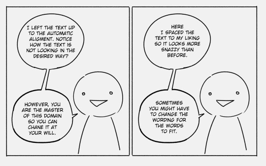
While we're on the topic of speech bubbles I like mine to have really short "tails" (the bits that indicate who is speaking), unless I REALLY want to make sure the reader knows who is speaking in a scene.

Also I always make the tails point directly towards characters mouth unless it would make the scene confusing (for example if two characters have mouths really close to each other or something, I might make one tail point a bit higher/lower/to the left/right to differentiate between the two speakers. But that’s like a super specific problem and could be avoided with proper frame layout.)
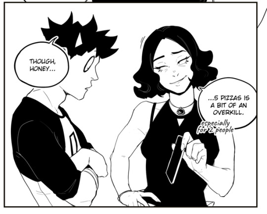
And like, never skip the tails unless its the same character monologuing at length. Nothing breaks emersion more than when you have to stop and turn into an investigator to determine who is speaking in a scene.
Now for the fonts themselves, in my opinion the size of text should be unified between speech bubbles and across pages when it comes to a single font. Example, all casual speech - arial, 14; all thought bubbles - Calibri, 15.
That is of course unless there is artistic merit to changing the font and/or font's size. Making someone yell, suggesting a threat or sarcasm, indicating a playful tone or something akin to that - lean into what you're trying to communicate visually.
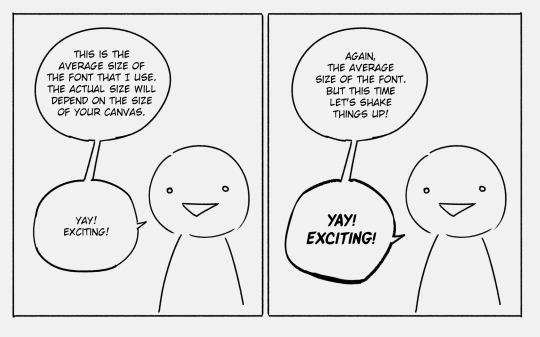
All fonts are not made equal and sometimes you will have to adjust things manually e.g. letter spacing or line spacing. Generally I try to keep the spacing the same regardless of the font, e.g. "yay exciting" had massive gaps between the lines which I've shrunk to make it look more visually cohesive with the rest of the dialogue. Same with these ones:

At the end of the day typography and everything pertaining to speech bubbles is design work and what designs do is communicate a message and serve a function. I’ve had this picture saved on my pc for years now (reverse google search doesn’t tell me who made it but it’s like the bible to me so I will share it, I am almost certain it was made by tryinghuman but I might be wrong):
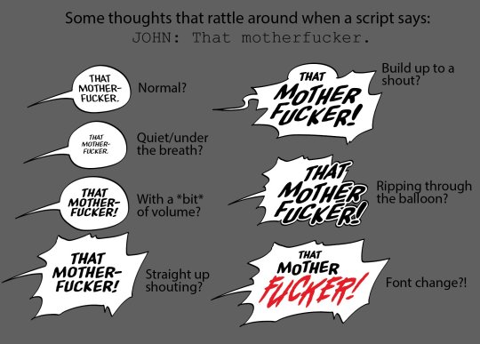
Really every part of a speech bubble can be “designed” down to a single word. The position of text, fonts, the shape of the bubble etc. And every change will culminate in an effect and the goal is to have that effect reflect what you’re going for.
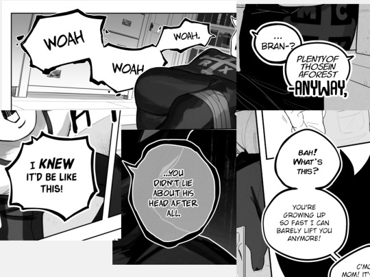
Make it legible or illegible, make it see-through, capitalise one word, cover speech bubbles up with other objects, make them crack or fall apart. Not every speech bubble needs special treatment! But once in a while it’s nice to throw something different in to spice things up.
Also, and this is a rule that was bestowed upon me during a graphic design class, don’t use more than 3 fonts per page (again, unless there is artistic merit to it like e.g. purposefully trying to communicate a sense of chaos. Otherwise it just looks a bit unprofessional. In my opinion anyway.)
And the last thing I will say, and this mostly applies to comics in English, is some “speech” fonts include capital “I”s both with and without serifs. The serif I should generally be reserved for the pronoun “I”.

There is so much more when it comes to text in comics like the flow of bubbles across pages, splicing text across bubbles for communicating speech patterns or intentions of the characters, and there are tutorials about it out there but I wasn’t able to find my favourites on command............. sorry................ But I’m peppering this in just so you’re on the lookout for all the other cool things that go into comic making :)
Hope this helped!
577 notes
·
View notes
Text
In Sickness and in Health - GSR
So, this was kind of therapeutic for me. Inspired by this post by @addictedtostorytelling. I, um, my husband and I have been trying to get pregnant for a while and it’s been a struggle. So, after I read her little meta, I got inspired and it’s something that I NEEDED to write. So, here you go. Something that wouldn’t stop flowing today. Enjoy!
In Sickness and in Health
GSR - Rated G
“No man, like I legitimately think Grissom knocked her up.”
Greg whispered loudly over the lab table, Nick narrowing his eyes at him from his position at the other side.
“You can’t be starting rumors like that man. Especially about Grissom.”
“Hodges told me!”
Now Nick really didn’t believe him. “And you honestly believe what Hodges says?”
“No, but I have proof!” Greg stood up and moved over closer to Nick so no-one could hear him.
“This is the text I got from Sara,” Greg cleared his throat and read the text to him in his best ‘Sara’ voice, “Greg, please make sure to follow up with Brass on the Carson case. I’m not feeling quite right today so I won’t be in. Also, please tell Warrick to get with Hodges on the trace analysis from the Wilson DB. Thanks.”
Nick looked at him unamused. “Nowhere in that text does it say, ‘Greg I’m pregnant’.”
“Okay but hear me out. Sara never misses work. She came in with 102 fever once and didn’t blink an eye. AND I had to stop on the side of the road yesterday so she could puke. I’m telling you man. Grissom knocked her up.” Greg put his phone back in his pocket and stood next to Nick with his arms crossed, grinning at his potential discovery.
“Alright boys, what have you got for me?” Catherine sauntered in, standing in between them. She surveyed the both of them and realized something was off.
“Alright Greg, spill, what is it?” Catherine put her hand on her hip and leaned against the table, waiting for Greg to open like a can of biscuits.
“Greg here thinks Sara’s pregnant.” Nick spoke for him, letting the air out of Greg’s balloon.
Catherine stared at Greg like he grew another head.
“You can’t be serious…”
Greg threw up his hands in exasperation.
“I swear no one believes anything I ever say! I’m taking my ball and going home.” Greg snatched the folders he was working on off the table and stormed out of the layout room.
Catherine shook her head and turned her attention towards Nick.
“You know Cath maybe he’s right.” Nick leaned forward on the lab table and Catherine followed behind him, putting her glasses on to look at a case he was working on.
“I did see her eating crackers and drinking a 7UP the other day. I have my suspicions. A woman knows.” She spoke as she looked over the document, clearly unfazed by the whole thing. “I guess all the jokes about Grissom’s virility will be put to bed.” Catherine put down the folder and smiled, bemused at the idea of Grissom being a father.
Nick pondered. Maybe Greg (ney Hodges) was right. A slow smile started to form on his face.
Grissom. That old son of a gun. He took a mental note to stop and buy some cigars on the way home to congratulate him.
The next day, Nick walked into Grissom’s office with a fancy box and a huge grin on his face.
Grissom looked up at him over his glasses.
“What is it, Nick?”
“I just wanted to come in and congratulate you.”
Grissom really looked at him now. “For what Nick?”
“On being a proud papa!”
Grissom took off his glasses and set them on this desk, threading his fingers together.
“Excuse me?”
“Yeah...”
And so.
“Hodges had told Greg that Sara was pregnant because she had to go out of the room quickly because her stomach was queasy, and Greg got a text that Sara wasn’t coming in because she and I quote ‘wasn’t feeling quite right’ and he had to pull over the other day for her to puke on the side of the road and Catherine said she saw her in the break room drinking 7UP and eating saltines so I put two and two together and just wanted to congratulate you.” He took a long breath and opened the shiny, wooden box he brought with him.
“So, congratulations daddy.” He grinned at Grissom.
Grissom looked down at the box full of cigars and then back up at Nick. He rubbed his eyes with his hand, then, pointedly
“She has the flu, Nick.”
“Just the flu?”
“Just the flu.”
“Oh.”
“Also, smoking is bad for you.” Nick closed the box slowly. His face fell and got red with embarrassment.
“I…” His mouth open and closed like a fish, not knowing what to say.
Grissom helped him.
“You can leave now Nick.”
Nick stuttered an ‘I’m sorry’ and showed his way out of Grissom’s office.
Grissom leaned back and sighed heavily, his mind drifting to Sara at home.
--------------------------------------------------------------------------------------------------------
Hearing the keys rattle in the door, startled the bundle of fur at the foot of the bed and leapt up from his position by human number 1. Barking his head off down the hall and to the door, tail wagging uncontrollably, waiting for what was to come next.
“Hey buddy. Have you been taking care of mom?” Grissom bent down to give Hank a scratch behind his ear and Hank thanked him by licking his hand.
Hank then turned around and ran back towards the bedroom where Sara laid.
Grissom heard a loud sneeze.
He sloughed off his jacket, hanging it up in the closet by the door and toed off his shoes.
He made his way to the back bedroom but stopped at the fridge first to grab a water for Sara.
He stopped at the doorway.
“How are you feeling?”
She blew her nose into a tissue and sniffed.
“Like I got hit by a Mack truck. Although at this point, that may be more pleasant.”
He chuckled and made his way towards her, handing the bottle to her. She took it from him and took a long swig.
“Ugh. I haven’t felt this bad since I was a kid.”
Grissom reached up and put his hand on her forehead. “Cool to the touch. Looks like your fever broke.” He slid his hand from her forehead to her cheek, stroking it softly with his thumb.
Sara leaned into his touch and gave him a soft smile. “Mmm. Thank you for taking care of me.”
“In sickness and in health, isn’t that how it goes?”
Her smile got wider. “It is.”
His mind drifted back to the events of the day. “So, um, today was interesting.”
She quirked an eyebrow at him and brought the bottle to her lips to drink, “how so?”
“Hodges started a rumor that you were pregnant.”
She spit out her water and choked slightly, gasping for air as he rubbed her back.
“Excuse me?! How in the world- “
“Because of all the times that you needed to throw up. Everyone just assumed. I got an earful from Nick in my office. Standing there with a box of cigars.”
She leaned back on her pillows and sniffed. “That’s…quite an assumption.”
He nodded, “it is.”
The silence was palpable.
Sara picked at the lint on the bed sheet and didn’t look up at him. “What is it, Sara?”
He knew when she got quiet, she was analyzing something and trying to figure out how to put it in words.
“…would that be such a bad thing?” She looked up at him slowly, searching his face for an answer.
Now he was the one that quirked a brow at her. “Sara…”
“Gil..I…” She started and then took a deep breath and continued, “you know that I had a less than stellar childhood and I guess I never really thought about the idea of having a child because of the childhood that I had and thought that maybe I would be a terrible mother because I didn’t know how to nurture a child or how to take care of one but maybe…” She drifted off and looked down.
He lifted her chin and searched her eyes, “Maybe what honey?” He said softly.
“Maybe I’d want one with you.” She whispered with so much hope in her voice.
He sighed. He knew that his answer had to be carefully chosen. It’s true he was never good with words, but this answer had to be worded oh so carefully and be the right one.
He thought about what to say and straightened his gaze at her. “Sara, with my age and my hearing, are you sure that’s such a good idea?”
She sniffed again, not sure if it’s her sickness or fighting back tears. She reached for his hand and held it.
“Gil, I know that things have been complicated, but when I was in that desert, I had a lot to think about. Especially about us. And maybe, maybe I thought that I would never get the chance to be a mom. More of a what if. And now I have that chance and maybe it wouldn’t be such a bad thing.”
He really looked at her then.
“Sweetheart, is this something that you really want?”
She squeezed his hand.
She nodded, “yes, it’s something I really want.”
“Okay.”
“Okay?” Her eyes lit up.
He nodded his assurance this time and squeezed her hand back.
Then.
“ACHOO!”
He really belly laughed then. Her sneeze breaking the intense conversation and his silent relief.
“Let’s focus on you getting better first and we’ll talk about babies. For now, hydrate and sleep.”
She didn’t argue. Sara shimmied down the covers and he pulled the sheets over her shoulders.
Hank circled next to her and laid back down, making sure that she was safe and sound, doing his natural duty.
Grissom smiled and leaned down to kiss her forehead as she drifted back off to sleep.
Closing the door to the bedroom, he walked to his office and fired up his laptop. He put on his glasses and Googled.
‘Men over 50 and being a first-time father.’
63 notes
·
View notes
Text
honey || b. barnes
summary: as an alumna, you still cared about your high school. so when one of your former teachers reaches out for help, you are more than willing to do so.
pairing: bucky barnes x female!reader
warning: swearing, and i mention daddy issues (idk if that needs a warning) ((also, i say it a bunch of times in this fic but i’m gonna reiterate it again. the reader is NOT in high school))
an: new bucky series yay! i wrote something similar to this for another fandom i was in a long time ago, but i'm super excited for this one!! i know i say that every time lol.

Like every morning, after grasping for every ounce of sleep, the first thing you did was check your phone. A couple emails about on-campus events and upcoming assignments, a couple tik-tok links from your best friend, and a text from an irregular person in your life. It was from one of your teachers, not a professor, but one of your teachers from high school.
Granted, this teacher did reach out to you semi-often, a couple times a year. Usually around your birthday, around back-to-school time, beginning of summer, and then sometime during summer to see if you’re free to come to visit her. It was currently none of those times so this caught you off guard.
‘Hello (Y/F/N)! Hope all is well! When you get a free moment, would you mind giving me a call? If you could text me first, that would be much appreciated.”
As if this wasn’t already out of the ordinary, she was asking you to call her. Your exchanges, besides the in-person one, were usually quick and only a couple of messages, never over the phone. You sent her a quick text, telling her you were available anytime before nine o’clock, as that’s when your first class started. Only a few moments later, you felt your phone vibrate in your hand.
“Hello, Mrs. Carr! How’re you doing?” You chirped. You could hear voices in the back, and her voice was as motherly as ever, “I’m doing well, darling, how about you?” You answered her with a simple, “Good!” You placed the phone between your ear and shoulder, as you slipped out of bed.
“I know you’re probably wondering why I texted you, so I’ll just get on with it.” The background noise ceased, you assumed she stepped out of her classroom. “So, to say this nicely, the yearbook staff this year is not as artistically inclined as previous years…” You always appreciated her way with words, especially when insulting people. You were convinced this was because she was an English teacher.
“And they’re really struggling with not just the editing, but the layouts, and especially the photography aspect.” You could hear a bit of frustration in her tone. “So I was wondering if you’re free of course if I could have one of my best editors back for a couple pages and games.” This made you blush, and without a second thought you took the opportunity,
“Of course, I would love to! Let me check my schedule, and I’ll let you know when I'm free!”
It had been about two weeks since you spoke to Mrs. Carr on the phone, and you were currently walking towards her classroom, with a visitor's badge stuck to your shirt. The hallways looked exactly the same as they did three years ago, you could have navigated these buildings with your eyes closed. Some brightly colored homecoming banners occupied any empty space on the walls, announcing the theme of each day. Homecoming was always your favorite part of the school year.
With a light knock on the aging door, you read the plaque reading ‘Carr, A3.’It swooped open quicker than you expected, and we’re greeted by a familiar figure. Her hair was greyer than the last time you saw her, a gaude necklace you had seen a hundred times before laid against her blouse, and her infamous white knit cardigan wrapped around her aging frame. “Good morning, dear.” She cooed, wrapping one of her arms around your neck, pulling you closer to her.”Good morning, Mrs. Carr.”
As you pulled away, a familiar voice filled your ears, “(Y/F/N)! Is that you?” Your eyes met his brown ones, which were filled to the brim with excitement, “Hey, Peter!” You sent him a wave, “I’ll talk to you after class.” You mouthed to him, taking a seat in the chair placed on the side of Mrs. Carr’s desk. Glancing up at the clock, you calculated about nine more minutes of this period. Carr vented to you while her students worked on some essay due before the upcoming weekend.
“I just need to show you some of these pictures and pages.” The older lady sitting beside you muttered, you assumed some of the students in her English class also partook in her Yearbook class, so she was trying to be on the quieter side. Soon the familiar ringing of a bell filled your ears, and Ms. Carr began her end of the class speech. Peter rushed up to you seconds after the bell.
“Hey!” He exclaimed, bouncing on the back of his heels. Peter looked a lot different since the last time you saw him. The two of you met in your junior year when he was a freshman. Within the two years you two had yearbook class together, you guys had grown quite close. But you hadn’t seen him in a considerable amount of time. “It’s nice to see you, Pete!” He was so much taller, a lot more muscular, and undeniably handsome. It was weird to think he was a senior now.
“Let me guess, Mrs. Carr told you about the yearbook catastrophe.” He chuckled, adjusting his backpack straps. “She sure did…” Your voice trailed off. “And I’m pretty sure I left you the torch. You were supposed to keep this ship afloat.” You let out a laugh, placing a hand on his shoulder. “I-I really tried, but Coach Barnes requires all football players to have weight-training fourth period, and obviously that’s when Mrs. Carr’s yearbook class is.” Peter explained, all in one breath.
“In my free time, I try to go to games and after-school events- Pete, I’m kidding.” You cut him off, you could tell he was overworking himself with this explanation. “I get it.” You squeezed his shoulder affectionately. “I’m gonna be around for the next couple weeks to help Mrs. Carr and the yearbook club, so hopefully I’ll see you around.” Sending him a wink. You saw his cheeks flush, and he sent you a quick smile before practically sprinting out of the classroom.
“So we got a new coach?” You asked, turning back towards Mrs. Carr. “We sure did, he used to work at another school in the district. He’s actually a friend of Coach Rogers.” She began to explain, as the next set of kids began to pile into the classroom. “Rogers is still here? I’ll have to go see him too.” Mr. Rogers was your history teacher for the majority of your time in high school.
“He has a new classroom, room C2, if you go during lunch, you’ll probably be able to meet Mr. Barnes as well, they’re always together.” She explained, standing up so she would address the whole class. And that’s exactly what you did, after asking Mrs. Carr when his lunch period was, you went and saw Mr. Rogers, and in turn meet Coach Barnes.
There were some straggler students in the hallways, going everywhere except to the lunchroom. C2 was on the opposite side of the building so it was a few minute walk. You had to confess something. As a woman with daddy issues, you did that fun and quirky thing where you put your male high school history teacher on a pedestal. So you’ve had a crush on this man since your sophomore year. But so did every other girl at your high school, Mr. Rogers was an eleven out of ten, and even the dudes saw that.
With another small knock, you pushed open the classroom door. It might have been a new room, but it looked exactly the same. “Hey, Coach Rogers!” His eyes left the computer and landed on you. “Miss (Y/L/N)!” A smile filled his face, and he leaned back in his old office chair. “How’re you?” You asked, grabbing a stool from the front of the classroom and setting it next to his desk.
The two of you chit-chatted for a while, it had been about a year since you last saw him, at last year's Homecoming game. “What’re you doing here?” He asked, flipping a pen between his fingers. “Well, Mrs. Carr called me a couple weeks ago, scared the shit out of me in the process, telling me about how the yearbook club is struggling with this year’s yearbook. So long story short, she asked if I could come to the school for the next couple weeks and help get some pictures, make some pages, etc.” Rogers didn’t say anything and just nodded.
“We got a new coach.” He said after a few moments. “Peter told me, Barnes, right?” You asked, trying to recall his name. “Yeah, Coach DuVault retired last year, so I convinced Barnes to transfer here and take the job.” You nodded, “Carr told me he’s usually in here with you during lunch, I wanted to meet him.” He chuckled, rummaging around in one of his drawers for his lunch box, you assumed. “And of course to see my favorite history teacher.” You added, nudging him with your elbow.
Mr. Rogers opened his mouth to say something, but the door being pushed open cut him off. “Hey, Steve, where the he-“ The man stopped mid-sentence, eyes landing on you. “Don’t worry about it, Buck, she’s a former student, very much graduated.” You shot him a look, “Did you just call me old?” Mr. Rogers laughed again. Even with this new information, the man standing near the door still didn’t say anything.
“(Y/F/N) this is Bucky, Bucky this is (Y/F/N).” Rogers gestured between the two of you with his fork. “Nice to meet you.” You said with a smile, and a small wave. “Nice to meet you, honey.” The way he said honey, made your cheeks burn. He was wearing a long-sleeved maroon shirt, black jeans (jeans are allowed on Fridays only), and some black combat boots. Something jumped out at you, one of his hands was completely black with accents of gold. You bookmarked this, making sure you reminded yourself to ask Rogers about it.
For a few moments, both the men spoke to one another, while you sat in silence, reading one of the papers sitting on Roger’s desk. “What about you, Miss (Y/L/N)?” Rogers' voice pulled you out of your trance. “Huh?” You asked, eyes shifting between the two men. “Are you going to be at the Homecoming game?” Barnes asked. “Oh, yeah, I’ll be on the field taking pictures.” Rogers nodded, and added, “You do take the best football picture.” He shoved a piece of broccoli into his mouth.
“So, Mr. Barnes, do you teach and coach? Like Rogers?” He had taken a seat in one of the student’s desks, the one closest to you and Rogers. “Yes, I’m the new physical science teacher, as well as the new football coach.” He explained, and you nodded along with his words. It was silent for a few moments before the bell rang. Barnes slowly stood, “Alright, bud, see you later.” He smiled at Rogers, and then his eyes landed on you.
“I’ll see you later, sweets.”
#bucky barnes x reader#bucky barnes fanfiction#bucky barnes x you#bucky barnes one shot#bucky barnes imagine#bucky barnes#sebastian stan x you#sebastian stan fanfiction#sebastian stan one shot#sebastian stan imagine#sebastian stan x reader#sebastian stan#winter soldier#winter solider one shot#winter solider x reader#winter solider imagine#winter solider x you#winter solider fanfiction
142 notes
·
View notes
Text
reunion- pt 2 (final)
Pairing: sherlock x fem!reader
Request: 'hi! can i pls request a sherlock x fem!reader fic in which reader is kinda john's childhood bestfriend, but they were separated when reader with her parents moved somewhere (to united states, for instance). so now when she is in britain again, she sort of struggles with finding a not very fancy place to stay. fortunately, she meets our johnny boi and he immediately proposes for her to stay in 221c, baker-street. so reader moves there, meets sherly and they sorta starting to fall in luv with each other'
Summary: Sherlock accidentally drags up some old unwanted memories for the reader
Genre: reader insert, angst
A/n: this is the final part of the above request. Sorry, I didn't exactly follow the request but I mostly tried to. Thanks to anon for requesting though! Enjoy!
Read pt 1 here.

-
The following day, after a restless night’s sleep, Y/N sat nervously in Mrs’s Hudson cosy kitchenette. Mrs Hudson had switched on the kettle and was preparing to make both of them a cup of tea. From what John had told her, she was perfectly lovely but she couldn’t help but be anxious. It was in her nature; she worried about everything. She made sure to bring papers to prove to her that she had a monthly income. But what if that wasn’t enough and Mrs Hudson had already decided that she wasn’t good enough to stay in her upstairs flat? The sound of china cups being placed on the table brought her back from the depths of her mind.
‘What brings you to London? John tells me you moved all the way from the States?’
John was right, Mrs Hudson was delightful. Y/N felt more relaxed at the sound of her comforting voice.
‘I’m starting my training next week to be a dentist in Harley Street ’
Mrs Hudson’s eyes genuinely glistened with interest.
‘Oh? John told me you already completed dental school in Seattle? Aren’t you already qualified?’
‘Yeah in the States. To work here, I have to do an extra year before I’m qualified. I don’t mind though, I wanted a fresh start in the UK.’
A door closing behind them interrupted their conversation. Both Y/N and Mrs H turned to where the noise came from but couldn’t see who or what made it. The latter called out.
‘Sherlock? John? Is that you?’
With no response, they returned to their conversation.
‘Y/N, you seem like a lovely young woman with a bright future. Of course, you can stay in the upstairs flat!’
She smiled widely, uttering a thousand ‘thank yous’. Y/N grabbed her important documents and handed them to Mrs Hudson.
‘Thank you. I’ll take a look at these later.’
Tomorrow, Mrs Hudson gave Y/N a tour of 221c. She fell speechless as she looked around. It was the same layout as Sherlock’s but had recently been renovated to have a more modern look. The apartment was already furnished so all she had to do was move her belonging's in from storage. She couldn’t believe that she was able to afford this apartment! Especially, as it was in central London. Promptly, she strolled over to where her new landlady was waiting by the front door.
‘So I get all this for this price? That’s insanely cheap for London.’
Y/N commented while pointing to the tenancy agreement Mrs Hudson was holding.
Simply, she just chuckled.
‘I do special rates for Sherlock and John. If you’re a friend of John’s then you’re a friend of mine. I’ll do the same for you.’
She continued.
'I met Sherlock in Florida when my husband was sentenced to death. He was able to help out so I owed him a favour. ’
Her face was completely serious yet it sounded so implausible. How could a lovely little lady like Mrs Hudson have such an impossible past like that? Adding to that, Y/N wondered that Sherlock really must be a genius if he can stop someone from being executed.
‘Wait, are you saying that Sherlock stopped your husband from being executed?’
‘Oh no, he ensured it.’
And with that bombshell of a statement, Mrs Hudson disappeared downstairs leaving Y/N utterly astonished in her new apartment. She made a note to herself to remind her to ask John about Mrs Hudson’s past. There was so much she wanted to know about her life.
A few days passed and the time finally arrived for Y/N to move into 221c. She was standing outside the cafe with Mrs Hudson, waiting for the moving company to arrive along with her possessions. She glanced at her watch, anxiously. The moving people were already five minutes late. Meanwhile, Sherlock and John were upstairs having carried three boxes between them that Y/N had brought herself. John was busying himself, tidying up the flat, waiting for a text from Y/N so he and Sherlock could help her move in and set up the place. He had told Sherlock to make himself useful but looking over his way, he hadn’t. Sherlock was staring intensely at the three boxes they had placed on the dining table by the windows. John marched over there to tell him off.
‘Sherlock! What are you doing? If you’re not going to make yourself useful up here, then can you at least go downstairs to check what’s taking the mover’s so long?’
Sherlock completely disregarded everything he just said.
‘Look at these three boxes, John. What do they tell you?’
He just groaned.
‘Nothing, they’re just boxes.’
‘Fine, if you’re not going to play ball then I will just tell you.Y/N has made sure she took these boxes here herself. Why? That suggests they’re private and she doesn’t want strangers, i.e the movers, to touch them. The first two boxes are labelled: electronics and toiletries. Makes sense then for why she would want to move them herself: one’s valuable and the others personal.’
He pointed towards the last cardboard box.
‘But why hasn’t she labelled this one? I’m sure I’m right to assume that she would have labelled every single box from what I’ve seen from these two. So what’s in this box that separates it from the rest?’
John stepped away from the dining table and started fluffing some pillows on the couch.
‘Sherlock, I really couldn’t care less. There’s nothing weird going on. She’s not part of some underground crime syndicate. Just leave it alone. You can’t know everything.’
However, the crinkling of tape being peeled off from the box told John that Sherlock, was in fact, not going to leave it alone.
John raced back over to the table and seized the box from Sherlock. Soon, a tug of war for the box began between them.
‘You are not going through Y/N’s private things!’
He yanked the box harder.
‘But John, I have to know what’s in there.’
John glared at him, pulling the box back towards him.
‘Tough luck. Once again let me spell this out: you cannot go through other people’s belongings. It’s rude.’
Sherlock’s grip remained firm, however.
‘Don’t you want to know more about why she’s moved back here? The answer could be in this box. It’s strange that she just packed up and left her life back in Seattle. She obviously doesn’t have any family here. Otherwise, why would she come to you for help? And there’s also the fact I heard her tell Mrs Hudson that she has to do extra training to be a qualified dentist in the UK. Why go to all that effort when she’s already qualified back in the US? Aren’t you in the least bit curious?’
John once again dragged the box back to him.
‘Oh so now you’re not only going through her stuff, you’re also eavesdropping on her?’
Sherlock was offended even though there was a hint of truth to what John was saying.
‘It wasn’t eavesdropping! I just happened to overhear her.’
What Sherlock was saying did make John curious, but still, Y/N deserved her privacy. It was up to her if she wanted to them the real reason she moved back to the UK. John was about to tell Sherlock this when the door burst open.
‘Hey, guys! The movers are here now if you wanna come down.’
Y/N’s voice staggered when she saw the scene before her.
In a moment of alarm, both Sherlock and John had dropped the box. Its content spilt out onto the floor. An off-white ornate picture frame smashed onto the hard wooden floor, glass spraying everywhere. The picture in the frame was of Y/N and a man in front of the Seattle Great Wheel. Y/N stood in surprise as the said man was knelt down holding a rose gold diamond-encrusted ring. The picture frame was custom engraved and it read ‘For my love.’
Oh.
It all made sense now to Sherlock.
However, there was no time to think more about the picture. Sherlock and John stood like a deer in headlights
‘It was Sherlock!’
John pointed accusingly towards Sherlock.
Y/N didn’t say anything, simply walked over to where the box had fallen, glass crunching under converse trainers. She knelt down to pick up the photograph. She remained there for a moment, an expression of profound anguish on her face.
John tried to help her up, but she refused. She practically ran out of the flat, trying to conceal her pain. John didn’t even have time to tell her that she had cut her knees on the glass from the floor. He grabbed a broom from the kitchen and started cleaning up the mess on the floor. He looked at Sherlock who was still in the same place. He had a look of regret on his face.
‘Sherlock there’s no point making that face now! You’re cleaning this mess up too. We’re going to make it up to her by making this apartment look really nice before she comes back.’
As he shifted the box back onto the table, he thought of his own way to make it up to Y/N.
-
Y/N was falling asleep at her desk, she was now four hours into writing her essay on dental hygiene. She placed her head in her hands, thinking she would just have a quick nap. Her phone ringing ended that plan though. She saw that it was Sherlock and hesitated. She still hadn’t forgiven him for trying to go through her things and bringing back unpleasant memories. It had been a week into ignoring him and giving him the cold shoulder. She let it ring out. Sherlock still didn’t get the hint and texted her.
‘Y/N meet me here. I wanna make it up to you. S.H’
That text was accompanied by a GPS location.
Y/N couldn’t think of any possible reason why Sherlock had asked to meet her here. Her uber ride had stopped outside of a manor house just on the outskirts of London. She quickly checked with the driver to make sure she was at the right place. To her bewilderment, he answered yes. Hesitantly, she strolled up to the door. She didn’t even have to knock when Sherlock opened the door. He motioned for her to follow him.
‘Sherlock, what the actual fuck? Do you live here?’
Sherlock led her through a ton of rooms. Y/N swear she could have counted there were at least five formal living rooms.
‘Nope.’
He opened a set of French doors and led her out into the back garden of the estate. Not that you could call it a garden. It was massive. In the distance, she saw stables as they walked through a formal botanical garden. Sherlock was more like running though, but Y/N didn’t know what was so urgent.
‘So if you don’t live here. Then who does?’
An undesirable thought entered her mind.
‘Don’t tell me you broke in here?’
Sherlock turned around just outside of the exit to the formal gardens, jangling keys in front of her face, a childish grin on his face.
‘It’s not breaking in if you have a set of keys.’
They had finally reached their final destination. Y/N saw that someone had set up a bonfire in the middle of a field. A can of petrol and a box lay adjacent to it. That box seemed really familiar. Sherlock picked it up and brought it over. It was hers!
‘Sherlock, you’re going through my things again. You know what, I’m done here!’
She began jogging back towards the house. Sherlock grabbed her arm.
‘Wait! Y/N. Let me explain.’
She gazed back at him intensely, waiting for an explanation.
He placed the box down.
‘I know you haven’t told me about what happened. But unfortunately, I am good at deducing things. Those things in that box came from a bad past relationship. I’m pretty sure I can guess what happened.’
He started to stammer, not sure of how to word what he wanted to say next.
Y/N wasn’t sure where he was going with this but could see he was trying.
‘John will be the first to let you know that I’m no expert on love or on relationships. But I can see you haven’t moved on. I thought it might help if you chucked all of the old stuff from the relationship on that bonfire and set it alight.’
She looked down, knowing that Sherlock was right. He had guessed everything perfectly. He had read her like a book.
‘You’re right. But I took running away from your problems to the extremest.’
She sat down on the grass, wrapping her arms around her knees. Sherlock shortly joined her.
‘He was my world. Or I thought he was until one night I returned home to see him shagging my best friend on the sofa.’
There was a moment of silence before she continued.
‘I just felt so foolish. I had to get away from Seattle. The place was full of memories of my time with him. I couldn’t stand it any longer.’
Sherlock got up and picked up the box.
‘And that’s why you should burn this stuff. He doesn’t deserve to have this much hold on you when he never cared about you in the slightest. We don’t have to do it if you don’t want to. But please just think about it.’
Y/N stood up with determination. Sherlock was right. She had to burn all of this stuff to finally move on. Together they placed the contents of the box around the bonfire.
Y/N stood back as Sherlock poured the can of petrol over the bonfire. He asked.
‘One more thing. Do you have that picture with you?’
She grabbed it out of her bag as an answer and showed it to him.
‘I thought you would', he stated.
She placed the picture in the centre of the bonfire.
They walked back a safer distance from it and Sherlock got a box of matches from his pocket. He lit one up and handed it to Y/N. He could see that she was having trouble actually lighting the bonfire. He reached out and held her hand to comfort her. Y/N greatly appreciated that. She took the final step and with her other hand, threw the match into the bonfire.
The bonfire went up in ablaze. It was oddly beautiful watching the embers rise up into the sky. Standing there in hand in hand with Sherlock, she felt the weight that had been on her shoulders for months slowly lift off. The whole experience was cathartic.
Out of the blue, they heard the distant sound of alarms ringing from back at the house. Y/N looked to Sherlock for answers. He just told her to:
‘RUN!’
They sprinted, holding onto each other, seemingly heading towards a gate at the end of a stone wall surrounding the estate.
‘Sherlock! What’s going on?’
Sherlock tried his best to explain as they were running.
‘Technically I did break into this house. But it’s my brother's so it should be fine. There should be a cab waiting just outside this gate.’
‘Oh my god!’, she exclaimed worrying about the consequences to come for their actions.
When they had reached the road outside the gate, they stopped to catch their breath. Then they looked at each other and burst into laughter.
She hadn’t laughed that like in months. And it was all thanks to Sherlock.
-
#sherlock x you#sherlock x y/n#sherlock x reader#sherlock fanfic#sherlock fic#sherlock holmes#sherlock imagine#sherlock fanfiction#sherlock imagines#sherlock holmes x reader#sherlock holmes x you#sherlock au#sherlock x john#bbc sherlock#sherlock bbc#sherlock#john watson#john watson x reader#sherlock and john
90 notes
·
View notes