#especially ones with decent image quality
Explore tagged Tumblr posts
Visit Tumblr Blog
Explore Tumblr blogs with no restrictions, modern design and the best experience.
Last Seen Tumblr Blogs


Fun Fact
The KCSC sent more than 20K requests to delete posts related to prostitution and porn to Tumblr from January to June 2017.
Text
Sorry for being so late with these but life a bitch. So here's part 4
The fourth one to meet our resident ghost is our fan favorite butler.
Alfred loved his weekly grocery runs. It started about a month or so after master Bruce brought young master Jason into their abode and about a month or so of Alfred feeling the indignanty of one of his charges disliking his food that Alfred realised the problem.
Young master Jason was used to certain types of food and with that came the peculiar taste that you just cannot get with the prime ingredients delivered to the mansion. He needed to buy the cheap cuts and products to make something the young master enjoyed.
With the indignanty of the first time Alfred simply had to wash the shame of using these subpar ingredients away with some quality tea that he did not have to make himself.
Nowadays it's became a soothing habit of his to visit the tea shop afterwards and since the young master Jason has decided to attend the weekly dinners for the last year or so at the behest of his paramour.
'Yes' Alfred thought with some degree of smug satisfaction as he entered the quaint little no name grocery shop. 'I know about the young lady your courting master Jason. Hiding things in this family of ours is akin to launching a flare for all to see, especially when you are that serious about her.'
Armed with a small list and an empty shopping cart Alfred started his search for item number one: a packet of no name instant soup to use as sauce for pasta.
After finding most of his list Alfred felt a blow on his shoulder. Swerving around and already halfway into a fighting stance against whomever had snuck up on him Alfred had to stop for what he thought was a fist was instead the pointer finger of a behemoth of a man.
"Sorry to bother you sir but could you help me with these?" the behemoth's voice rumbled, not even noticing his readiness to fight just holding three sacks out now that he had his attention.
"You see I want to bake a cake for my girlfriend's birthday while I'm a decent cook my knowledge on baking is pretty subpar. Which of flour do I use? Self-raising, whole wheat or cornstarch?" The giant didn't seem hostile so Alfred allowed himself a quick glance at what he was holding.
Indeed he was holding Self-raising, whole wheat and, much to Alfred own consternation, a sack of cornstarch.
After a deep sigh and a moment to get the image of using conrstach as flour out of his head bade the Man to return the sacks and walked him to the boxes of cake mixes. As soon as he started explaining the steps the man had a small notebook out, scribbling out the instructions along side his own advice such as adding an extra egg and substituting water with milk.
All too soon both of them found themselves exiting the store discussing pasta recipies and advice for baking. Only to look up and see his rolls royce flying through the air and crashing through a few other cars as a black figure practically dances out of the way. Her assailant, whom Alfred swiftly identifies as Bane, yells out in fury over orphan's continued survival.
Immediately the young man was in front of Alfred, intercepting the blow coming for them and returning a powerful blow to Bane's jaw then one to his kidney.
For second the two 8 foot tall titans stared at each other before bane fell over unconscious. Alfred barely even registered that just muttering. "No, not the Silver wraith..."
Call him old fashioned but he loved that car. Sure they had the newest models but it was not a 1948 silver wraith.
So distrought was Alfred that he completely missed orphan giving the young man a kiss and tie up the unconscious wrestler. The young man drew him out of his daze by putting a meaty paw on his shoulder.
"Hey umm sir... Ah was that your car?" the young man asked concerned. With a mournful glance at his now ruined favorite car, "Indeed, I shall have to ask one of the young masters to come and fetch me."
"And where would those 'young masters' be at this time of the night because I really don't want to leave you here alone. There's always a few idiots here in Gotham who would try a drive by shooting." The young man's greenish blue eyes radiated genuine concern for him.
"The young masters should be at the Wayne manor." Alfred found himself answering.
"Allright tell you what, I'll drop you off there since it's not that far past my place and you can tell me about that chocolate chip cookie recipe we were discussing earlier." The young man said as he picked up his groceries and herded Alfred over to the mammoth tank with wheels he really should have noticed before.
***
The next day master Bruce had the totalled car brought in for Alfred to try and restore. Young master Jason was the only one as distrought as he was about it but atleast young miss Cain gave him one of the cookies she usually hoards for his mental anguish.
For some reason the cookie tasted extremely familiar.
#dcu#dcxdp#dead silent#cass x danny#alfred pennyworth#cookies#cake#Don't hide shit from Alfred Pennyworth#He will find out#Mentioned Jazz x Jason#danny fenton#danny phantom#cassandra cain#dpxdc prompt
61 notes
·
View notes
Text
Springtrap DBD model analysis and opinion
All images are from the official Dead By Daylight twitter account, while the model dissection images are from @LukaszBorges on twitter, the image in front of you is from @Croco_Art_ also on twitter
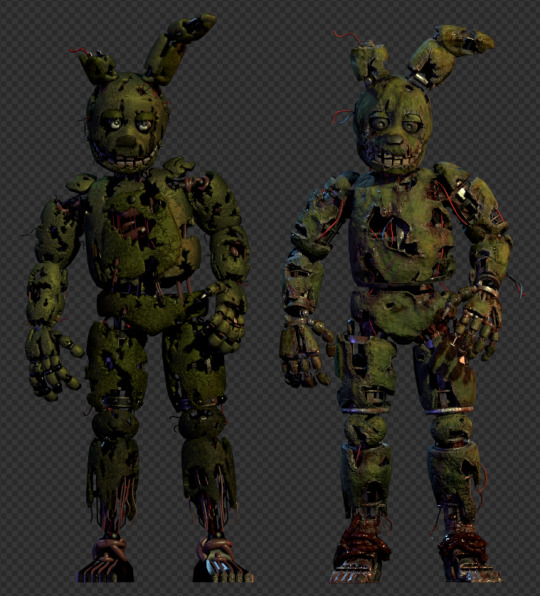
Springtrap is finally in DBD and we got to see his model and i want to do an analysis on it and give it my full on thoughts!
Now the model right from the outset is really faithful to the original Scott Cawthon Render. The pose, the vibe and it all practically screams "Yup this is William Afton aka Springtrap in HD gory glory ready to murder people in the Fog!"
But there are differences especially when you put the two renders/models side-by-side. The first thing were covering first is the suit.
The first thing to be noticed besides quality of the models (because DBD's model is the objectively better one here for the most part) is the texture of the DBD model is more of an actual fabric (something reminiscence of stretchy Fleece fabric) and is a slightly different color of green. The color of as described by my friend @amcomix, "As a barf green" (even thought the color is more of a Olive Green but eh semantics) meanwhile the original Scott model had a more "Rotten green color".
Now this isn't to say that the DBD model is bad or that these are complaints, ultimately I think the coloration and the new texture were required for this model and ultimately make it better than the current official Scott model.
Another thing to note is that there's a lot more wires on the DBD model, while the Scott's model only has like gray wires and fleshy tendrils. Another thing to notice is that the withering is different between the two models, while the withering placements and shapes are mostly similar. There are small yet obvious changes to see. Some spots of withering have either gotten bigger, smaller, wider, longer, etc, And the general shape of the tears in the DBD model is a lot more natural and what you expect from wear and tear. Where as Scott's withering is more jaggy and square-ish. (Also there's like an extra button on the DBD model compared the Scott one).
Now all of these difference in my opinion are for the better and are harmless. For one the new natural withering is great, the added wires makes sense, and the coloration and new textures really make this model better than the original springtrap in my opinion. But this nxt observation is one where I'm a tiny bit miffed.. SPRINGTRAP IS MISSING HIS DARK GREEN UNDER BELLY! a-and his dark green ear highlights i-i guess... BUT THE BELLY IS THE THING THAT ACTUALLY MATTERS!
Now this might be the most noticeable thing between the two models, you see in DBD model... the belly is just gone like it's fully removed and considering how FNaF animatronics usually have a belly that's a secondary color most of the time, seeing Springtrap without it is weird and imo just makes him feels a bit incomplete. Like yeah i'm fine with ears not having the undertones because they don't get noticed by people much, while the belly is big and noticeable so literally removing is gonna be noticed and focused on (god i'm sounding very weird with my words... bleh). Now this doesn't detract my stance that DBD's Springtrap model is the best, its just a blemish on a great model for me.
I guess the last thing to mention when it comes to the suits are the eyes. When it comes to the eyes of Scott's model they are pretty decent all around, gray iris, kinda dull bloodshot sclera's, the eyes are clearly just a texture on the model but it works and the expression in the render shows Springtrap as kinda tired almost barely clinging onto life... unless were looking at the UCN profile.... he just looks like he's about to answer a question for the teacher.
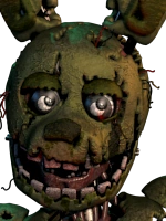
Where as with DBD model The sclera's are purely gray and the iris's and pupils are clearly indented. Almost as if he's fixated on something or someone. Now it's also good to keep in mind that DBD Springtrap is more animated and emotive than regular Springtrap. And you can tell the eyes were changed to give Springtrap more emotion when he kills you or when he chasing you or when he's in the lobby or when he's in promotional material. as you can see here.


Now do I think this change is bad... UH NO, you see Springtrap having more emotive eyes is a good thing because it helps portray Springtrap character and plus most fans would want that and so far its working.
Now that the suit has been covered let's move onto the endo and the corpse, Now lets start off with his feet because holy shit DBD fix them. Now the problem with Scott's Springtrap feet is that they look out of place... by that i mean the just like have lines of flash and fleshy tendrils on the endoskeleton feet. Now with the DBD model it still keeps the feet the way they are but actually makes them look more... like it can actually make sense... The metal endo feet are now covered in dried blood and the flesh tendrils are now more like intestines that have fallen out of Afton's body and are used to keep his feet from falling off the suit he's trapped in.

Now the rest of the endo is pretty much what you expect from a Springlock endo. But the corpse is completely different between the two, Springtrap's original corpse looked like a giant maroon head with big bulging eyes placed where an endo skeleton's head is suppose to be with a bunch of "Flash" tendrils big and small wrapping around the main torso area and all around body. It wasn't bad and there were ways to make it scary (the rare screens are a perfect example and many animations have used it to peoples advantage too).
Where as the DBD model looks like an actual tortured human corpse that is decaying yet in some way clinging onto life. You can see his rib cages, his neck and his pelvis, the only things that are not there is the eyes (because those eyes are a separate rig), feet and hands and those are because those are apart of the endoskeleton side of the model. Seriously DBD took the original model and gave it a whole glorious overhaul, not to say that the original model is bad because I still do love it and i think the model should still be used by new fans and more. But DBD's model is just now my new favorite.


------------------------------------------------------------------------------ Final thoughts i love this model and everything Springtrap offers to DBD and i might talk about the lore and the characterization and the costumes and Animations and voice lines/voice work related to Springtrap's chapter soon but for now this is my unprofessional and very opinionated model analysis.
MechaWriterPerson out.
#fnaf#five nights at freddy's#springtrap#dead by daylight#dbd#william afton#toxic springtrap#glitchtrap#clown springtrap#yellow rabbit#scraptrap#burntrap#flaming springtrap#curse springtrap#matthew lillard#freddy fazbear#dave miller#fnaf movie
75 notes
·
View notes
Text
Because I think everyone should know this today:
✨ How To Spot Generative AI Slop: Save Your Media Literacy! ✨
For AI images:
- Zoom in as close as you possibly can to background details. AI can make decently cohesive foregrounds but struggles with complex backgrounds.
- Keep an eye on patterns. Are they wobbly, inconsistent, fading out in weird places, or fusing into other parts of the image? That’s probably AI.
- AI tends to “stylize” images in weird ways that are meant to mimic staging or strong lighting, but it usually ends up giving it a weird reflective, airbrushed, or “plasticky” shine. Even if there are multiple textures in one image, they’ll usually end up looking nearly identical.
- Watch for “objects” in the image that look like nothing at all (blobs, deformed items, and general objects that you can’t even tell what they’re supposed to be) or “artifacting” in otherwise polished images.
- Symmetry is usually nonexistent, especially in architectural images.
- Text and numbers will usually be misspelled, inconsistent, or out of order.
- Mechanical images are usually a dead giveaway if you look close; none of the components or mechanisms will even appear to be functional or make sense in terms of construction.
For AI videos:
- As with AI images, check the backgrounds and you’ll see some absurdly nonsensical stuff.
- AI can’t generate convincing longform video, so keep an eye out for videos that “compile” or abruptly cut and splice different clips every 10 seconds or so.
- The movement in AI videos is not convincing at all, especially with human movement. Figures will all move at roughly the same pace, in partial slow-mo, or with a “floaty” or gliding quality to them.
- Keep an eye out for general logical errors; crowds of people tend to blend into each other or move strangely, cars will drive the wrong way on roads, etc.
- Faces won’t emote accurately (or at all), especially in eye and mouth movement. Emoting will make the entire face warp strangely. If a video relies a lot on facial movement, the figure and background will often be completely static.
For AI text/ChatGPT:
- Watch for unnecessarily long blocks of text where a short sentence or two would be preferred.
- ChatGPT relies heavily on descriptors and adjectives that fill out the writing but add nothing at all to the content. Be mindful of long descriptions and “explanations” that actually say nothing at all.
- AI can’t distinguish its “voice” or tone, so a lot of ChatGPT writing is unnecessarily verbose or formal. Even if the AI is initially trying to generate a casual voice, it can abruptly change into formal language.
- Keep an eye out for repetition of words, phrases, or concepts in general. AI can’t tell when it’s repeating itself, especially in longer passages, and you’ll typically notice one specific phrase or descriptor constantly being used.
- If attempting to write in an informational or “how-to” tone, ChatGPT won’t actually include any details or elaboration; any information it does give out will be overly general or vague.
- When AI generated information is fake, it’s usually egregiously fake. If you find a factual error that no person would have made, especially in a format that would have required an editor to put out, it’s likely ChatGPT generated.
For AI voices:
- The typical tone of voice will usually be flat and lack any emotion, even when trying to imitate it. AI voices tend to speak as if they’re reading off an essay, which is especially noticeable if they try to read a colloquial script.
- Listen for distortions or inconsistencies in the voice. Some AI voices constantly have an unnatural or synthesized tone or will slur when trying to read an unfamiliar word, repeating characters, or different languages.
- AI voices will sometimes pronounce the same word completely differently if read in the same sentence or audio clip.
- AI doesn’t know how to properly read sentence structures, so AI voices will sometimes read off scripts in stilted or grammatically incorrect ways. Pay attention to random pauses, bad pacing, or weird inflections on words.
110 notes
·
View notes
Text
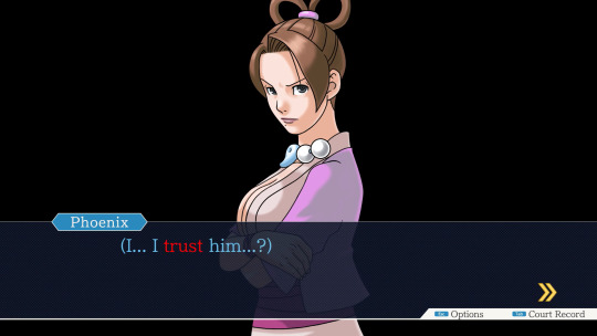
One of the major themes of ‘Ace Attorney’ has always been trust, obviously. Like, this is the most important creed that Mia Fey passed down to Phoenix and from there to anyone he has touched.
As well as just generally being one of Phoenix’s most important positive qualities.

The entire arc of the first game hinges on the idea of the Power of Trust, with it being a core pillar of Phoenix's relationships with both Miles and Maya.
And even the main gameplay themes of ‘turnabout’ and ‘turning your thinking around’ are linked to this theme of Trust. The whole idea around the narrative of a ‘turnabout’ is that the Defendant seems obviously totally guilty, but the defense attorney proves them innocent by Trusting in their innocence.
And ‘turning your thinking around’ is generally framed as - rather than the general mystery-solver mindset of trying to deduce what has happened from the evidence given - trusting in your client’s innocence and looking for evidence that should be there if they are innocent/that other person is the culprit. Using the Trust in the client as the foundation to build your logic from.
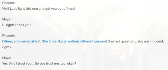
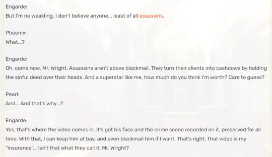
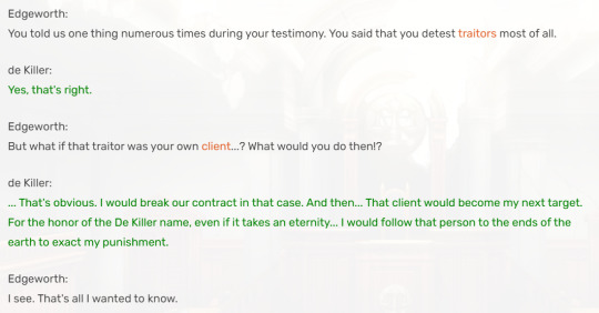
And being such a core theme of the franchise, the games started reiterating on and deconstructing it almost immediately. “Farewell, My Turnabout'' having a Guilty Client feels like the most obvious example, maybe. But actually the game starts casting suspicions on Engarde pretty early on, and most of the emotional turmoil related to him is more of the, like “will Phoenix sacrifice the truth for Maya’s sake” hostage situation stuff.
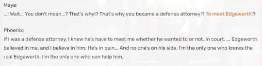
I think the more important stuff in that case is more about the Phoenix-Edgeworth drama. How Phoenix’ sense of trust, which seems like such an unwavering and unbreakable virtue in the first game, does actually have limits. Phoenix feels that Miles has betrayed his trust by, y’know, running off to Europe and making him think he was dead - and it takes him time to learn how to regain this sense of trust in him.
Meanwhile, Matt Engarde, he considers himself strong because he trusts in no one. In contrast to Adrian, who both he and she herself see as ‘weak’ because of her tendency to blindly trust the person she is dependent on. But at the end, it’s Matt’s distrust in everyone around him that brings on his own downfall.
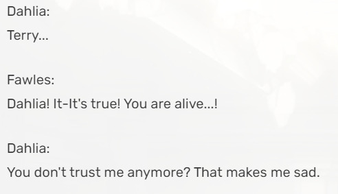
And the game after that adds in Dahlia Hawthorne who is, as Mia Fey’s nemesis, a sort of representation of the dangers of trust. A character who uses and manipulates those who put their trust in her.

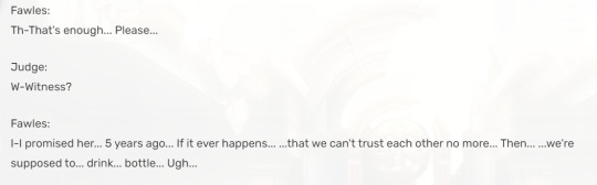
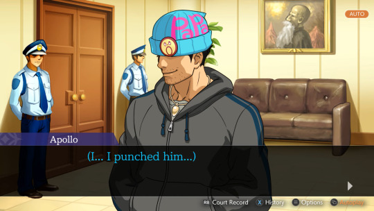
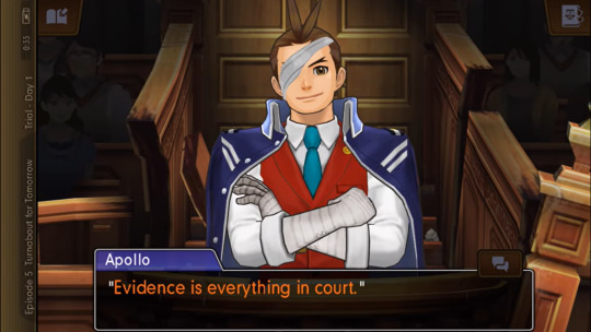
“Apollo Justice: Ace Attorney” establishes its more cynical and deconstructivist tone compared to the original trilogy in part by always putting some sort of element of distrust between the Lawyer and the Defendant. With Apollo basically unable to really have a decent conversation with any of his clients, many of them being antagonistic towards him or hiding things from him. Phoenix Wright was basically the only defendant Apollo went into court actually 100% putting his trust in him… and we all know how that worked out.
And this moment is especially effective because… if you’re playing this game unspoiled after finishing the Phoenix Wright Trilogy, you probably trust Phoenix as well! The emotions Apollo feels as he sees who Phoenix had become are meant to mirror the emotions the Player probably feels at this very moment. And the hints and questions about what Phoenix did in the trial seven years ago are a challenge to the trust of both Apollo and the Player. Both of them are stuck between what they knew of Phoenix before and the revelation of what Phoenix confessed to in “Turnabout Trump”. Apollo’s uncertainty is the player’s uncertainty as well.
And even if Apollo’s image of Phoenix is somewhat improved by “Turnabout Successions” and it’s clearly established that, no, Phoenix never knowingly used forged evidence as an attorney… There’s no big reconciliation that fixes everything like with Phoenix and Miles. It’s clear that Apollo’s sense of trust, in Phoenix Wright and in general, never quite recovered from the events of AJAA. Later games do still reiterate that he’s a lot more distrustful than other playable attorneys.
(And that’s also a point where the Player-Player Character Synergy from ‘Turnabout Trump’ kinda diverges, since I think most Players do regain their trust in Phoenix by the end of AA4 at least. Especially as unlike Apollo, we actually got to be inside his head again - that’s not exactly an experience Apollo will ever get to have. )
But, well, maybe it’s because it’s just really fresh in my mind, but I just think what ‘The Great Ace Attorney’ Duology does with this theme is just… really cool!
These games really play on the idea of challenging the trust… not just of the Player Character Ryunosuke, but also of the Player themselves. Because Ryunosuke also gets to have a Guilty Client… as his very-first actual client who is not himself. And since the game doesn’t lay on the suspicion quite as thick as with Matt Engarde, and since there’s no hostage situation of course… This plotline can have emotional synergy between the Player and the Player Character and focus a lot more about the emotional repercussion of putting your trust in someone totally absolutely unworthy of trust.
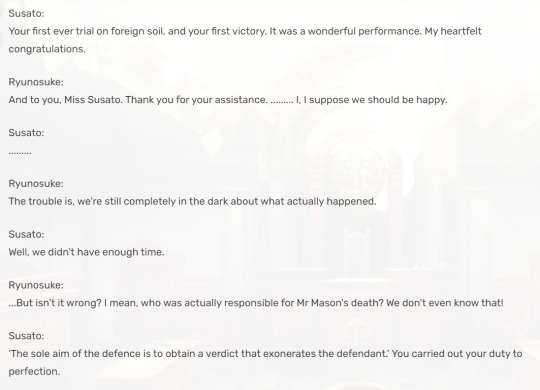
And how this betrayal of trust haunts the characters moving forwards. How Ryunosuke now finds himself being held back by his doubts due to the memories of this terrible trial, and... not necessarily a lack of trust in others as much as a lack of trust in himself. How Susato is driven to do something she considers unforgivable - tempering with the Crime Scene behind the police’s back - because that trial had made her lose trust in the entire British Justice System.
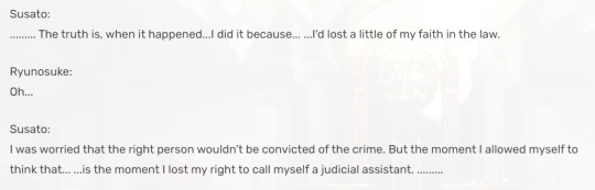
The entire climax of the first game is thus a reaffirmation of the power of trust. By unwaveringly defending Gina - a girl they have bonded with, but has also been extremely uncooperative, shady, dishonest and literally involved in what went down in the McGilded Trial, in a very grueling and seemingly unbeatable trial - Ryunosuke and Susato rediscover their ability to trust their defendant. Because, yeah, trust is a leap of faith - you never know when you’re gonna meet a McGilded or a Dahlia Hawthorne - but it’s also absolutely worth it.

And then with the themes of conspiracy strawn throughout the games and especially ramping up in the second game, that’s really kinda a thing that’s bound to sow seeds of paranoia and distrust in the Players about… all sorts of characters. Like, okay, I am fairly sure that pretty much every player who first walked into the Lord Chief Justice’s office and saw Mael Stronghart was like “Oh look! That’s the Final Boss!”. But with the hints for there being some sort of web of intrigue being hidden in the shadows, there’s plenty of other characters that skirt the line between feeling suspicious and trustworthy. The reveal that Seishiro Jigoku is actually a culprit was one of the best-done reveals in the whole franchise. And on the other hand, there are many reasons to be suspicious of Yujin due to the amount of secrets he clearly keeps, and yet he turns out to be a very straightforwardly heroic character.
And then there’s Kazuma. And Mael Stronghart might be the Obvious Final Boss to the Conspiracy and Murder Mystery parts of the game, but within this thematic throughline of the challenges of trust, Kazuma is pretty much that part’s Final Boss.
Initially designed to be someone both the characters and the players intently trust, both in terms of the meta-perspective of how he’s set up to be a kinda Mia-Miles hybrid and any Player with knowledge of the previous games will know that’s a kind of person you can rely on. And in general, even to newcomers, everything he says and does in the first two chapters of the game make him feel like just a very upstanding guy you can trust.
Then, when he comes back in the second games, he comes back with a new attitude that feels colder towards Ryunosuke (and thus the Player) and that’s also coupled with a whole bunch of mysteries about him that were hinted in the previous game, but are now coming to the forefront.
And as the Trial of Barok Van Zieks progresses, it becomes increasingly clear that Karuma has, theoretically, all the possible motivation to kill Greyson and frame Barok for it, that he was one of the last people to see Gregson before his death and that he literally brandished a sword at him. And despite how cagey and shady he acts, he still insists he never killed anyone.
And the reveal that he has knowingly participated in an assassination plot behind the backs of both Ryunosuke and Susato is bound to cause a feeling of shock, confusion and betrayal not just in these characters - but also in the Player. The Player and Player Characters are in a lot of emotional synergy through this entire Kazuma storyline. These feelings of conflict between wanting to trust Kazuma after seeing him in his best and all the mounting suspicions due to all the revelations about him are really felt by all three of us.
And in the end the challenge for Ryunosuke and Susato is not to abandon Kazuma completely, and it’s not to continue blindly trusting their old idealized view of Kazuma - it’s to face the fact that he has kinda lost his way for single-minded revenge, while also still trusting that he is deep-down the same good not-murdery man they have known him as before.
#ace attorney#the great ace attorney#great ace attorney#gyakuten saiban#dai gyakuten saiban#dai gyatuken saiban#tgaa#tgaac#tgaa2#ryuunosuke naruhodou#kazuma asogi#ryunosuke naruhodo#gaac#dgs#dgs2#dgs sherlock holmes#tgaa chronicles#tgaa 2#aa#pwaa#phoenix wright#phoenix wright ace attorney#aa meta#ace attorney meta#phoenix wright trilogy#aa trilogy#ace attorney trilogy#apollo justice ace attorney#food#phoenix wright: ace attorney
203 notes
·
View notes
Text
Miki angelic essence and Gas demonic essence don't seem to match their personalities at all.
Miki, despite her angelic status, is far from the classic image of a celestial being. She is rude, sarcastic, and doesn't mince words. It's not uncommon to see her threatening with her fists, most often, of course, at Gas.
Other demons also fall under her sharp tongue, but Gas is the main target of her stinging remarks. Once, pursuing the good goal of protecting their ward, Miki, without hesitation, froze Gas, depriving him of the opportunity to interfere – an act that is difficult to call angelic and fair. In addition, Miki remained in the second year, which speaks to her not the most outstanding academic achievements. In general, Miki's behavior often does not correspond to the generally accepted ideas about angels, which makes her an outcast in the angelic environment.
Gas contrasts with Miki. At first glance, he seems to be a typical demon, corresponding to all stereotypes. However, behind the outer shell and manners lies a "good-natured demon," as he is officially characterized. Gus shows a genuine interest in learning, especially in the lectures of Professor Temptel, in whom he seems to be in love (or skillfully creates such an appearance). He listens to her carefully, remembering every word, thanks to which he studies relatively well. There was even a moment when Gas showed a keen interest in history, wanting to delve into the study of the subject. It is also worth noting his extensive knowledge of cooking, which he is ready to talk about for hours.
Gas is courteous and polite, always says "Thank you" and "Please," and rarely shows rudeness. All these qualities, alien to the demonic nature, make him an outcast in hell.
Their inconsistency with their races is clearly manifested throughout the series, especially in the second season. This inconsistency becomes one of the key themes of the narrative. In the episode with the theatrical production for people, Gas chooses modest and decent outfits for the actors, and Miki, on the contrary, insists on defiant and modern clothes.
Gas Miki


In another series, to distract the teachers, Miki cunningly speeds up the treadmill on which Gas is running, which leads to his inevitable fall. In this episode, Miki acts as a cunning initiator, and Gas as a victim. It is noteworthy that in the series, it is most often demons who do mischief, and angels suffer, which goes against the usual ideas.

It seems that Miki and Gas simply should not have been born who they are.
Perhaps that is why they are so strongly attracted to each other, because they are both so different from the generally accepted ideas about demons and angels.
#angel's friends#angel friends#angels friends#gas#miki#angel's friends gas#angel's friends miki#gas angel's friends#miki angel's friends#angels friends gas#angels friends miki#miki angels friends#gas angels friends#gas x miki#miki x gas#giki#raf x sulfus#I added these two tags so that people would see the post more often#I'm sorry 🥺(I'm not sorry😈)
22 notes
·
View notes
Text
I redrew some of my old Undertale sancest Ship Children from sometime between 2018-2021
(Click Image for better quality)

!! IGNORE THE FACT THAT IT SAYS SUGAR I MEANT TO PUT CANDY !!
If you don't ship these, that's cool neither do I. If you do ship these, that's also cool, here's some kids to add to your day. When I made these a while back I basically just put a bunch of Sanses' names into a cup and pulled out two names, just to make ship kids for. However I really love them so much I wanted to give them another try at being my OC's. So here they are with much better designs and decent personalities. Hope you enjoy them as much as I do.
--
Old designs and Extra fun facts/info about them located below!
Old Designs (in order from right to left in the above picture):


--
They don't have much backstory or reason as to why they are alive, so if you'd like just make up how they were born. Sexualities can also be up to your interpretation, cuz I feel too lazy to give them any.
Anyways onto some fun facts (not at all sorted by the way).
Tricks has two separate ways to write his name because his name was never ever officially written down by his parents, so he fluctuates between both
Despite Fresh's dislike for curse words Ivy has the vocabulary of a sailor. He takes pride in his salty mouth
Vero is sometimes nicknamed Vamp/Vampire, not only because of his snaggle tooth but also because he dresses in dark, fancy clothing
Fable looks up to Dream and wishes to be like him someday
Contrary to Fable, Trix absolutely despises Dream for never being around when she was younger. However Trix loves his little sister and would never put her admiration against her.
Despite not at all being blood related the entire group considers each other cousins (minus the ones who are ACTUALLY "blood" related)
Ivy has a horrid fashion sense. While he doesn't understand how to make things match he does know he loves layering his clothing
Vero refers to the markings on his face as " Face Bananas"
Vero is selective mute
Tricks, despite being a skeleton, enjoys makeup and would practice either on Vero, or Fable (Ivy's always too shy to ask)
Fable likes to play pretend and play with dolls (like any kid should)
Vero enjoys crocheting
Error has a slight hatred for Ivy (Ivy and Vero don't care so much)
The majority of Ivy's closet is all clothes that he stole from his parents. It's often way too big for him to wear but that never stops him.
Trix's favorite colors are Pink and Yellow (if that wasn't obvious enough)
Ivy is a huge trouble maker and loves dragging Vero along with the trouble
Trix wears acrylic fake nails
If they were asked to choose a favorite parent the list would be: Vero-Error since he is kindest to him, and spoils him a little | Ivy-Killer since he lets him get away with most trouble making | Tricks- Lust because at least he acknowledged his existence | Fable-Dream since he was the coolest hero ever
Trix dislikes curse words, so she tries to keep Ivy's mouth clean as much as possible (especially around Fable)
Vero and Ivy adore Fable, so much so that they'd bend at her will if need be. They'd do so much for her.
And I guess that's it for now. If you have any questions about them, shoot me an ask or DM, I may or may not have an answer.
#art#digital art#artists on tumblr#undertale oc#undertale sans#alternate universe#undertale#sans au#sans art#sans#sans the skeleton#sancest#killer sans#error sans#dream sans#lust sans#candy sans#ship child#ship children#fan oc#fanart#fandom#illustration#killer x error#killer x fresh#dream x lust#dream x candy
80 notes
·
View notes
Text

"and i watched the water unfold, it's a feeling i want you to know, 'cause i'm not the same as i was…" - unfolding by porter robinson - i do not know how to convey how truly crazy this episode (and its following mini arc) make me. the implications. the potential. the complete and utter lack of any answers or actual meaningful results. im going to start eating drywall so here's this drawing that i made to try and process my many feelings about it! (did not help, got more deranged actually)
face close ups under the cut! (also a rant about this shirt)


i loved rendering her eyes for this one (and also spent wayyy too long on her locket for how little it is in the piece) ALSO
FUCK THIS SHIRT! I HATE IT! IT'S EVIL ACTUALLY! do you, dear reader, know how utterly distraught i was when, upon looking up a photo reference for what i was 1000% convinced was a shirt with flowers, i discovered it was in fact RANDOM PIRATE IMAGERY1?!?!?!?1/! because flowers? are easy to fudge! they're not that hard to make look decent! but THIS?! no this was gonna take EFFORT! and that is to say nothing of the fact that this show is old as hell at this point and there are NO GOOD QUALITY PHOTOS OF IT! BECAUSE NO ONE HAS BOTHERED! BECAUSE MOST PEOPLE CANT STAND THIS SEASON! (also my main source of footage to look at when google images failed me was amazon and good god is amazon's episode quality absolute dog-shit, especially when there is anything related to the water tentacle on screen in season 3)
SO IM LEFT SQUINTING AT THIS GRAINY ASS IMAGE TRYING TO TELL WHAT thE FUCK IS EVEN ON THIS SHIRT AND FOR WHAT! i bet that i am the only person who has paid this much attention to this thing. i bet i could've actually made it flowers and everyone would be none the wiser, and instead i voluntarily suffered and for why
I expected the hardest part of drawing this piece to be the stupid magic water tentacle snake and instead it was a piece of clothing. also this is ignoring that it's a weird 2000s cut where it's not a tshirt and it's not a tank top and it's kind of off the shoulder but not really. also the colors are jsut, so much, and anyway drawing this thing could count as psychological torture but, i did it👍
#cariba's acting in this scene is fantastic btw#her performance is part of what makes this episode so compelling to me#this episode is also i think maybe one of only 2 times rikki cries in the whole show??? (have not fully fact checked this)#but the way that this encounter clearly has such a profound effect on her is constantly being rotated in my brain#SEASON 3 YOU COULD'VE BEEN SO INTERESTING!!#WHY WERE YOU BAD INSTEAD#anyway on with the tags!#rikki chadwick#rikki h2o#h2o just add water#h2o#h2o fanart#sea scribbles#the water tentacle#a dark power arc
32 notes
·
View notes
Text
Artshield
I was going to flop in bed and try to draw from there, but the sudden swarm of AI shit on another of my accounts fueled me with spite, so I'm writing this post NOW rather than tomorrow when I'll be more awake.
If you can't run Glaze/Nightshade because of the insane specs required for it, give a try to Artshield.
It's a web-based app that will let you load all the pics you want and protect them with a big, invisible watermark all over it. It also has a checker option to use after you've shielded your art, to be sure it worked.
Now, I'm terrible with math so I can't explain how it exactly work, but here's the explanation on their blog. If someone who's more math-savvy than me wants to add a simpler explanation to this post, please do!
While it can't poison AIs like Nightshade does, it's still a good solution if you can't run Glaze/Nightshade on your pc... like many of us, really. As I wrote on another post about Glaze, I have a pretty decent gaming pc that, while not being like high-end or anything (my GPU is a RTX 3060), suits my needs perfectly and runs all the games I'm interested in (Tekken 8's demo being the most recent thing).
Yet, in order to try Nightshade, I had to close all the apps I had running in the background, which were, in that moment, Opera and Discord. Only when I shut them down, it finally started. 10 minutes for the mid setting and the result was awful.
I tried WebGlaze (not Cara yet), and the results were also awful, given you can't control the strenght of the glazing much.
I understand it might be hard to develop this kind of technology, but I wish they would meet us halfway since the majority of people use old machines, laptops (a friend of mine tried running Glaze on hers and the fans started spinning like it was ready to fly) or even just tablets and phones, so those specs are hard to meet.
That's why I want to share Artshield, as a solution for those of you who can't run Glaze and Nightshade.
Artshield's only big limitation is that it won't work with white backgrounds, so try to add a color layer to your white background before shielding it. Same for B/W images.
Other tips I can suggest for trying to protect your works:
Post at the lowest resolution you can: I go for 72 DPI, keeping bigger sizes and high quality files only for Ko-Fi rewards and clients' files
Add a noise filter: I always do this because I like the paper-like, grainy feel it gives to my art, but I read once it might messes with AI's scrapers. While I don't know if this is still true, it's worth trying it
Don't forget a big visible watermark (aside from the Artshield one)!
Hope this will help other strugglin artists, I never see Artshield suggested around, especially in posts about Glaze and Nightshade, so I decided to write this one.
Go and shield your art!
#artshield#nightshade#glaze#protecting artworks#artists on tumblr#text post#text posts#useful#I hope
135 notes
·
View notes
Text


JOIN ME, IN HELL
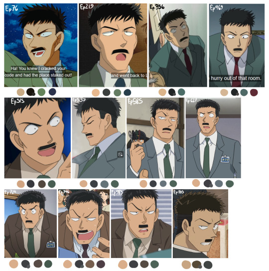
I always had this impression that Nakamori's color palette has changed the most dramatically in all of his appearances and I've always wanted to see if that's actually true, because I'm sick in the head and apparently didn't have anything better to do. So here are the results! While this isn't EVERY appearance, it's most of them, and ones I consider important as far as color palettes go.
Quality is a factor on a bunch of these, and so is the lighting of the shots, especially the OVAs which maybe I shouldn't've included since they throw things off a bit. I tried to find decent quality images of Naka in bright indoor lighting, but it wasn't always possible.
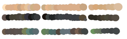
So to my eye, you can separate Naka's 'main' color palettes (and artstyle shifts) based on his suit colors, kinda like Lupin ironically:
Green suit (Ep. 76-515)
Gray/Brown Suit (515-983)
Black suit (1105-onward + all movies from 14 onward)
My other takeaways are:
No one can decide if his hair is black or brown, huh
His skin color's been pretty consistent actually, until recently when they made it darker.
Dunno what was going on with the first Magic Kaito TV special. The art style for the rest of them is nothing like it.
I probably should've ordered these chronologically to get a better idea of how the colors shifted over time. It is interesting to me how Nakamori's color palette for the movies has been consistent since Movie 14, but they didn't change his palette in DetCo to match it until super recently. And then Magic Kaito 1412 is just off doing entirely its own thing.
I most associate Nakamori with wearing green since I think that's what he wears straight through Magic Kaito 1412. If you count every episode he's in as a separate appearance, I think green might technically be the most common, but if you don't then I think brown wins.
Honestly these color palette shifts are probably true for Every character. I don't know why it feels so drastic for Nakamori. Probably because it's not like Rachel's hair randomly turns black for a few hundred episodes.
#ginzo nakamori#nakamori ginzo#dcmk#detective conan#magic kaito#magic kaito 1412#Me writing out this entire post before realizing this is Extremely Embarrassing#But I've already come this far so. have it
74 notes
·
View notes
Note
What if the kings of hell had Darling as a monster that closely resembled an angel? Not real, but in appearance so stereotypical for human culture and probably for others, what would be the attitude of their subjects and the rulers themselves? This could be a hilarious disaster, especially in a circle of lust or wrath, haha
With Kalymir, your biggest problem is his desire to hurt you. Kalymir has always dreamed of exerting dominion over the heavens, he wants to hunt angels, to make them bleed, to hang their wings around his throne and make himself a halo out of their bones. You, as angel-like in appearance as you are, trigger these urges in him. While he's always sadistic and always kind of sees you as a trophy, your appearance accentuates this cruelty and bloodlust. So much so that you are in twofold the risk of being murdered than any other Wrath Queen would be.
Cero might want to remove the angelic features, actually. No self-respecting demon will accept angelic features. Why don't you let him make you better? Let him take you apart and put you back together in the true image of perfection, not the filth reminiscent of Eden... Only Cero can fix you, so don't even try to struggle. Honestly, it's embarrassing to have something so angelic in his Ring.
Livius struggles. Like 99% of demons, he has an aversion to something that looks too much like an angel, enough so that he's genuinely not too keen on imitating a large portion of what you do. He's another one that may seek to remove your angelic features. It's the only way he can stand you.
Rinx sees you more as a mark of his great reach than anything. He's the most resourceful demon in the Rings, of course he'd be the one to end up with the closest thing reminiscent of an angel. An angel, stuck under his massive paw. His to keep. Like a pet. A display of dominance from the demonic to the angelic.
Vorticia keeps looking at your wings like she's planning to gnaw on them. She doesn't care for your angel-like features, mostly. What matters is what's in your soul. Do you have the rot necessary to accompany her in ruling Gluttony, or will she have to manually fix that?
Vesper, like Kalymir and Rinx, sees corrupting you as a display of dominance over Eden. He's also dreamed of fucking angels, for a variety of reasons, so making a public spectacle of your debauchery is about as close to such as he can get. And the King will make sure they know how the closest being to an angel there exists has joined him in the throes of depravity, in the bowels of Hell.
Zizz sincerely hopes your feathers are as soft as an angel's. Because he's heard a lot about the qualities of angel feathers, and he'd kill for a pillow made from those. If that doesn't quite work out then he'll be a bit huffy. He likes to keep you in a decently sized cage sometimes, just to watch you laze around like a pretty bird. Make things up, tell him what you picture Eden to be like. Maybe, in your next dreams, you'll get to be a part of it.
113 notes
·
View notes
Text
Help me update Gerard's Wikipedia page photo!
I'm on a mission, and I need help. The primary photo on Gerard's Wikipedia page is currently this, from 2017:

It's a fine photo, but it's 7 years old. I'd very much like to update it to something more current, optimally something from the tour. Unfortunately, that hasn't gone well in the past. Several people have attempted to do just that, but the issue is that Wikipedia doesn't allow copyrighted images to be used except in extremely specific circumstances, and primary images on pages of significant people don't count. All the images people have previously tried to use (the most recent was a photo from Dallas) have been copyrighted and pulled from the Wikimedia commons, and replaced back to this one. I'd like to get it updated properly this time, but I need everyone's help.
In order to get under the Wikipedia copyright rules, the image needs to either be creative commons, public domain, explicitly permissioned, or own work. In other words, essentially, if it's not already released as creative commons, it basically needs to be an image you took yourself. I obviously don't have any, so I'm calling on the fandom.
I need photos that are:
taken either by you yourself or someone you personally know that you can seek permission from
relatively high quality and clean - photos taken on a phone are potentially okay, but they need to be decently straight on, crisp & well lit, not grainy or too dark. He needs to be framed fairly close (full body is fine, just not a tiny little mousegirl as seen from the back of the room) and facing the camera. They don't need to be looking directly at or making eye contact with the camera, but nothing from extreme angles or in profile.
semi-neutral - not of him screaming, rolling around on the floor, eating the microphone, etc. Singing & posing is good just no chaos or major upskirts.
decently representative - meaning, it looks fairly accurate to what Gerard actually looks like, so no makeup, blood, or masks. This means Sydney, Tokyo, Osaka, any shows with the clear plastic mask, the skeleton, black swan, the forehead bullet hole and WWWY (the old man night) are out. The rest of the shows are good though. I would especially love photos of the cheerleader. I would really love to make the main wiki photo cheerard.
SOMETHING YOU ARE WILLING TO RELEASE COPYRIGHT OF. Any image that goes onto Wikipedia effectively becomes creative commons when uploaded, and there is a rule specifically prohibiting the use of images that have been given "wiki permission" from their photographers - ie, the photographer says "this is okay to upload on Wikipedia but not anywhere else." That's against the rules, so you/your friend needs to be okay with the image being allowed for use by anyone forever, effectively
IF YOU HAVE A PHOTO THAT COULD WORK: DM me here or on discord. My handle is the same over there. I know there's not going to be a lot out there. Most of the best photos are copyrighted and most of what everyone has taken is chaotic, dark, grainy, etc. I know this is a longshot, which is why I'm crowdsourcing.
NOT YET ASKED QUESTIONS (FAQ):
"Isn't wikipedia editable by anyone? Why are you putting yourself in charge of this and asking for people to reach out to you instead of just asking someone with the photo to upload it to wikipedia themselves?"
Yes, Wikipedia is editable by anyone who chooses. If you have an image you have taken yourself that you think will work and want to go make this change, go for it. However, unfortunately, this is a less trivial thing than it seems. As detailed above, Wikipedia's copyright rules are extremely strict, which is why previous efforts have failed. Additionally, Gerard's article is semi-protected, which means it can only be edited by a registered Wikipedia user with a certain number of days on the website. Additionally, Wikipedia is actually pretty tightly controlled. Most of Wikipedia is closely watched by experienced editors and changes to popular articles (pages about current celebrities very much count) will be reverted if they don't meet guidelines. In fact, if you go look at the talk page on Gerard's wiki right now, a lovely soul has offered a beautiful photo of the secretary to be used for the article, but it's never been updated, likely because the photo is very low quality and not very clear, and doesn't show their face well. I have some experience editing Wikipedia, and I want to use that to guide this towards being done the right way. Previous attempts to update the image that fall outside of Wikipedia's guidelines have been reverted half a dozen times and that's why we still have the image we have. If you have a photo to use and Wikipedia experience, please go swap it in yourself, I'll love you forever. However, I know that's not something a ton of people have. So I promise I'm not trying to make myself god of a Wikipedia article here - I just want to shepherd this towards getting fixed for good by making sure it's done 100% above board this time, so it sticks.
If you don't have a photo, I would appreciate a reblog. I need as many eyes as I can. I know someone out there has something that will work - help me find them!
45 notes
·
View notes
Note
Hi...I'm not the anon who asked Reach about getting into AI art, but I'm someone else who's interested in learning. The problem is that everything I've yet found that even remotely resembles a tutorial is like, "How to get rich quick by integrating AI synergy into your developing buzzword and produce art faster than ever at a fraction of the cost!" Which. Is not what I'm trying to do.
I have a somewhat outdated but still capable PC with a decent GPU. I have a basic understanding of python. I have played around mostly with DALL-E a couple years ago. I have a loose understanding of how prompts and negative prompts work. What I do not have is the compsci background knowledge to understand the in-depth writeups about genAI, or a lot of the technical discussions.
I want to run the model(s) locally on my own machine. I do not want to use any kind of subscription or membership service. I don't mind not having a GUI, as long as I've got good docs. I want to learn especially how to consistently make art of the same character (rather than just similar-looking characters). I want to properly learn how to engineer prompts instead of just muddling around by vibes.
Can you recommend me any resources?
Rad! Welcome aboard!
So, there are two "big" programs people like to use for running on their own machines: ComfyUI and A111. However, I personally prefer the way Invoke works.
Ultimately, the UI you use should be whatever is most comfortable for you. However, I will say, Comfy and Invoke are super easy installations. You just download the installer, double click, and follow the on screen instructions. A111 is a little more involved than that, as you can probably tell by the fact that it's on GitHub.
However, most tutorials of decent quality online assume you are using A111, so you may want to start there anyway!
Once you've picked a UI you like, check for that UI's YouTube channel. You'll find actual tutorials on those, rather than the corporate optimization drivel you tend to get from general search engines.
Those tutorials will teach you a lot of the jargon that people throw around, too, which will make it easier for you to use search engines to get to the information you actually want.
Once your UI is installed, it's time to pick a model!
Again, the big place to get your models is HuggingFace, but that's not the one I use. I prefer CivitAI, because I like the feature where you can see galleries of images generated with that model. It gives you a clear sense of what the outputs would look like, and if you click on an image, it will usually show you the exact prompt/settings used to generate it!
I cannot overstate how valuable that is for learning to create your own prompts. Being able to see how other people got their results is THE way to learn, in my opinion.
Now, in terms of creating a consistent, specific character! This is one of the things that people have spent a LOT of time getting genAI to do, because it was very much not the "natural" state of the technology.
There's a couple of ways you can do it, but I find that the most consistent results come from using a LORA trained on the character. Training a LORA can be done on basically any computer that can run genAI in the first place, but it's usually a lot faster to use Big Powerful Hardware from Google CoLab, CivitAI, etc.
Making a character LORA is very easy to do if you're trying to make fanart of an existing character, as you can just train on existing images from the source material. It's a tedious process, because you have to make matched pairs of images and descriptions, but that's sort of the difficult part once you get used to it.
However, what if it's an OC you want? That's trickier, because first you'll need to generate about 75 images (30-150 depending on complexity) that can serve as your training data.
Which means you also need to be able to get those consistent character traits without using the LORA in the first place. So! How????
Textual inversion. That's where you sort of... bundle a bunch of closely related tags into a single file, and then feed the AI that file instead of all the individual tags. The linked guide is focused around realistic looking human characters, but you can use the same techniques for other things (furry, mecha, etc) and for other styles (anime, western ani, cg, etc).
Use your textual inversion to generate your LORA training set, and then get that LORA going!
I hope this was helpful, but if it just raised more questions, please come on back. I love talking about my little computer art toy!!!
7 notes
·
View notes
Text
Old Computer Animation

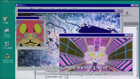
As I am planning the Digimon Rewatch, I found myself confronted with a problem: I have the BlueRays for the first four seasons of Digimon, however, nothing that right now can play them given they are Japanese BlueRays. One of my old laptops had a BR player and a laptop can easily read any code, obviously. But my PS4 is broken, and my BlueRay player is not cooperative when it comes to playing Japanese BlueRay. And my current laptop does not have any drive for CD, DVD or BlueRay. So, I did the thing, that I will not namely mention, but you know what I did. And when I did it, I looked at some of the movies, now in the quality of BR-Rips.
What noticed: Oh boy, it is quite a lot more noticable in HQ that this is really early computer animation. However, given how fucking old this is (the screenshots above are from 2000 and 2001) it actually looks fairly decent.
I am honestly not quite sure with Digimon season 1 and 2 for the TV show. I know they used some computer elements, but I am almost certain that at least the main animation was still done on cells, though I know Tamers was fully animated in computer with the drawings no longer being cells that were scanned in, but having been completely created in a computer. In Tamers it is actually quite noticable because the show uses a lot more complex layering with the backgrounds and such.
But the movies... Honestly, I do not think I realized how much of the background stuff was completely 3D but rendered flatly. Like some stuff as the backgrounds for the Hosoda movies for the Internet stuff was obvious, duh. But I do not think until yesterday I ever realized the Kuramon in movei 4 are completely 3D but rendered flat. And in thw HQ version it is also very noticable how many background in the third movie are fully 3D but created in a way that appears fairly flat. I know I noticed the flower field as being 3D before, but it is constant in that movie.
I mean, thinking about some of the stuff it makes so much sense. Like the Kuramon. At times there are like tens if not hundreds of those things on screen. Having someone animate them fully by hand, rather than animating a couple of patterns and then copy pasting the 3D Kuramon all over the screen, rotating them a bit, definitely was less of a nightmare. Imagining some poor soul animating those frame by frame makes me anxious xD
But it is kinda interesting to look at this and compare it to modern animation, that pretty much always is done in computer fully, allowing for a lot more complex layering to happen.
I am kinda looking forward to the rewatch in this regard. To see how far animation has come in the last 25 years. Especially given that Digimon is still an "advertisement TV show" that always had to cut a lot of corners and never had a lot of budget. I do remember that especially 02, with all the crunch going on behind the scenes, was at times very poorly animated, watching more like an animatic in some episodes, than actual animation. (I do remember the Christmas episode especially. So many frames that did not move and were just camera pans over a still image... I know the kind of crunch that happened with that show, but wow.)
But, well... As someone who loves animation, this is actually kinda interesting to see.
(Yadda-yadda-yadda. If you wanna join the rewatch. Bla-blubb-tumblr community. I am gonna annoy y'all with this for the next two weeks, sorry.)
#digimon#digimon adventure#digimon adventure 02#digimon tamers#animation#computer animation#tv animation#anime#2000s anime
13 notes
·
View notes
Text
I would like to PARTIALLY retract an earlier statement on AI
In relaIation to generative AI, it CAN effect professional artists, but it's not all or nothing like many people keep treating it.
I feel like the people who want AI art are people who sweat at the prices and wait time of human-made art. AI art is likely going to be the go-to tool for companies who just need promotional material made for their products or people who want art of their own ideas. Things for ads, PFPs, backgrounds, coloring, rendering etc.
For professional artists, the effect on their job opportunities may be as mere as shifting from getting paid to make something for someone else to getting paid to continue making personally driven work. Basically, artists aren't going to be getting paid to portray other people's ideas anymore, people are going to pay to see an artist's original works, their own comics, paintings, stories, songs, etc. Many artists already do this, creating their own projects and then setting up a means of financial support for their work, whether it's Ko-Fi, Patreon, ad revenue/sponsors etc.
I'm saying this bc I'm an artist myself and I did dabble in using AI after several commissions from other artists went pretty unsuccessfully- as in, I waited weeks to months for a product that I didn't even like, one guy straight up scammed me. And then artists that I genuinely would have wanted to commission were usually unavailable, bc most of the time the artists with mastered skill get the most demand and either close commissions entirely after being hired for a project, or their availability burns up, or their prices go through the roof as their audience grows just bc statistically there's going to be more people willing to pay a higher price-- some artist charge insane prices that only 1% of their audience actually buy, but bc their audience is so massive, that 1% still makes them a decent amount of money.
I only used the AI to gage what it was actually capable of and if it could actually make what I wanted it to-- it still spat out slop, and the one I used was relatively juvenile so it was limited in its training-- but the fact that it was so quick and cheap to use, yet effectively served the same purpose, was almost relieving as a consumer. I still think it's a pretty shitty invention with its demands on the environment and the unethical plagiarism of non-consenting sources, but to a corporation or company that wants to save money or time and simply doesn't care how an image is made (which is most companies) it's a godsend. Bc, lets face it, do you actually look at corperate art work and apreciate it the same way? No one's watching an animated ad thinking 'This art is so meaningful' bc the next moment you're deciding whether you're going to buy their product, not thinking about the art in the ad.
I can understand as an artist why a freelance artist sets their work up this way-- after all they have to pay their bills and eat and actually live their lives instead of spending every waking moment on commissions; but as a consumer, especially one who also needs money, I'm often sweating at the prices thinking if it's financially responsible to spend so much on an image, and if it's worth paying so much more just for slightly more detail or a slightly broader scope of work, like paying 50 more bucks to add a small cat to an illustration.
On top of that some artists will literally create lower quality work than their personal art just because they don't have the personal investment in the subject that motivates higher quality works. I've experienced this myself when drawing other people's characters, even though I try to make it look good, after a handful of works I start looking for shortcuts, I stop caring about details, the poses become pretty random and generic, etc. The art stops having meaning to the artist. Meanwhile in my own works I'm intrinsically invested in the work and push it to be refined just because I want to spend that time and effort to bring it to life and have meaning.
That's the flaw in the argument of human artwork being inherently more special, sometimes, even from a human, it's just a product to meet an end and leads to lower quality, relatively uninspired and meaningless work that feels less like art and more like an image spat out. Wildly enough the one commission I did order that made me really happy and inspired my own work, was by an artist who intrinsically found my characters interesting and just ran away with it, and was finishing the work before I could even properly ask for details or anything. They finished it in mere hours (I don't even remember if I paid first or not :<D it was a blurr). The work from that artists literally revitalized my own, I was simply amazed.
This isn't an argument that AI is good or that artist's work isn't valuable, but that there are some reasonable motivations for the preference of AI art by certain kinds of would-be consumers. It's only really a specific kind of consumer and a specific kind of professional art that's going to be affected, being prompt-based commissions where the consumer is the one with the idea and the artist is just the laborer. It won't wipe out creative professions as a whole, and I think those who think it will are severely lacking in their awareness of what motivates artists to begin with as well as the MANY different forms of professional art out there beyond just digital images of someone else's idea.
The art "industry" is already nutorious for being a terrible and volitile environment for professional artists. To get amazing works like Spirder-man Into the Spiderverse, and visually stunning games or designs, artists suffered to make it, laid off, forced to overwork, and potentially not even getting paid proportionally to the hours they spend working on it but by how much of their work makes it into the final product. Movies like Prince of Egypt and Sinbad aren't being made anymore BECAUSE they were too labor intensive and didn't make enough money to properly support it.
Klaus, the movie that amazingly pulled up a 3-d/ painted look on 2-d animation used AI assistance to perform the shading after their short Proof of Concept/Pilot proved too labor intensive to do by hand.
They would either need to magic up more money to hire more artists, take forever to produce the film and hope they break even, or push the artists to destroy themselves to make this movie.
Or, they could use an AI program to help with the shading.
I think that's one of the only examples I've seen where AI was good for both the artists and the producers, that was ethically trained, and didn't subtract from the intrinsic value of the movie itself.
We unfortunately don't have the collective sense to do this throughout the industry, so while it may not be necessary to pack your bags if you rely on art for income, getting paid to produce other people's ideas may start to be a thing of the past especially considering how rocky the foundations are even without AI. I used to want to work professionally as an animator or character designer, but I just kept reading stories about artists being abused and overworked, all to produce someone else's vision. Many more artists are independent these days for that exact reason.
7 notes
·
View notes
Text
Analyzing and reviewing some more stuff in the SOUP update for SJSM
So, in my last post talking about the SOUP update, I missed out on some things that I want to comment on. Obviously this won't be as long as my previous post, but I hope you enjoy regardless.
Miscellaneous Stuff
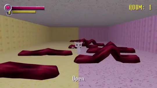
The funny red gummy worm mfs have 3d models now and judging from this still screenshot they'll actually move like worms. I really dig this change because not only will it make the pink and yellow room more surreal when you step into it, but it also makes it more clear that the worms are... well, worms, since that wasn't really made obvious in the original version where they were just 2d red lines moving across the floor. Very nice.
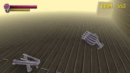
The bones that we see throughout the mansion will also be getting 3d models. A small but very great improvement. Always thought it was a bit lame and odd that the bones were 2d images. Especially since the skeleton of the Romantic Victim was a 3d model. Now all of them are 3d and will add to the atmosphere instead of looking out of place.
And there's this pic of Ringu showing her sharp teeth. Not much to say other than it looks cool.

Before we move on, I just want to talk about Beef Demon's redesign again. In the last post I kinda dunked on the dude, but after seeing him move around a bit and realizing he doesn't look as skinny as I originally thought thanks to that little showcase video Hoolopee posted on Twitter, I think he actually looks pretty cool and unnerving. I especially like the texture on him. It kinda makes him look like he's made out of meat, something I think the original model should have implied more. I think I'll start to prefer this model to the older once I get used to it. I think Jenbobby explained it best. The trailer just did my boy dirty.
Specimen 9

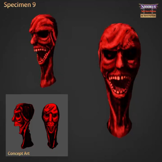
So, another design that I'm a bit mixed on. My guy do be looking like a cranky ass old man who just got woken up from his nap, but on the other hand, I do like how they lean more into the "disembodied head made out of clay" aspect. He actually looks like he's made out of clay here, which is pretty cool.
But, he just looks a bit odd to me and isn't as creepy as the original model in my opinion. I feel like the neck plays a factor into this as well as it looks a bit too long. Decent model I suppose, just think this one will take some getting used to.


As for his boss form, the redesign here is... decent. I think he is too brightly colored and his head and jaw looks odd which makes him look less creepy to me, but it's a solid model.
Specimen 13
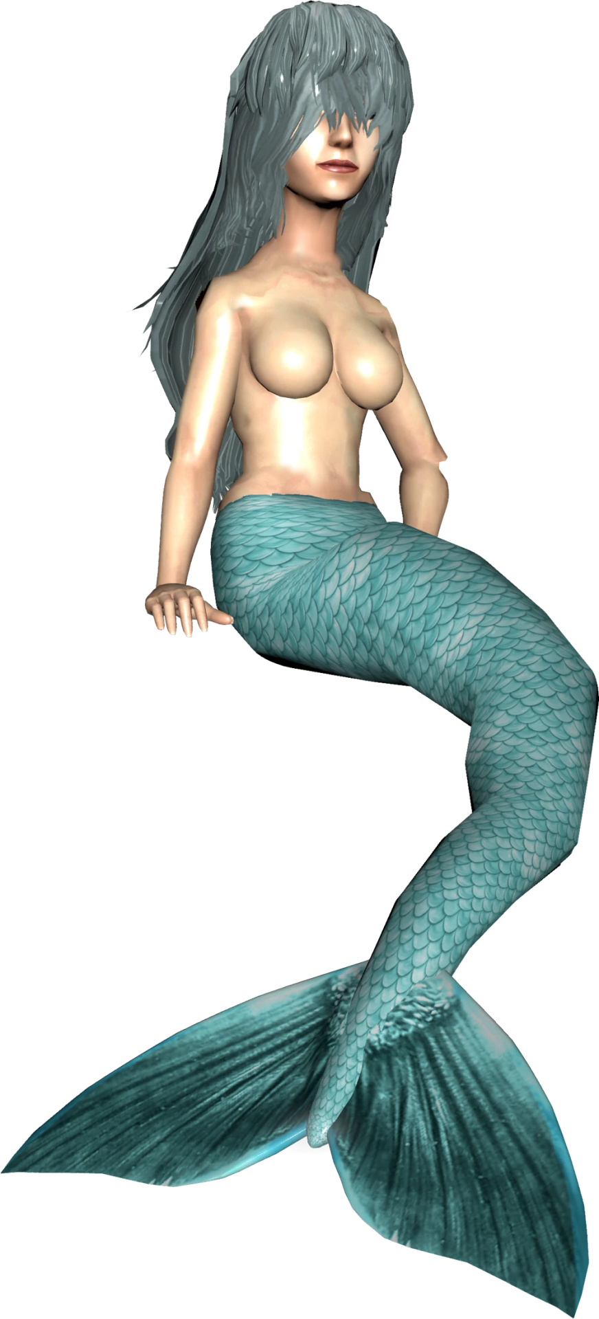

Originally I thought Specimen 13's model wasn't changed at all, but they actually did alter it a bit. Her hair is now slightly shorter and has changed a bit in appearance. Her fish body has went from blue to a more teal looking color and the end of her tail is a more triangular shape rather than looking like a typical fish tail. It also seems like compared to her original model, her breasts got a bit of a buff... nice so have fun with that.
Anyways, I do like this model, but I think the textures could've been done better. Comparing the models, her hair and the scales on her fish half look lower quality on the new model, which is odd. I also don't like how the end of her tail went from resembling the tail of a fish to... I don't even know what it's supposed to be anymore. Again, the model is pretty great, but it unfortunately gets brought down by the textures and tail.
Specimen 7
Wow... now this... this is a glow up. I already enjoyed Specimen 7's design before, but holy shit, this is amazing. The faces look like they're in more agony than ever, overall detail has been improved, and it looks more scarier overall. I don't know what else to add other than that this redesign is similar to how Spooper's redesign was handled. Do exactly what you did before... but just better. Move over Old Specimen 10 Eel Thing, because THIS is EASILY the best redesign from this update hands down. Specimen 7 fans are eating 100%.
Anyways, that's about it really. Not much else to say other than although it seems to be pretty controversial so far, I'll be gladly waiting for the SOUP update despite its faults I'll never forgive them for what they did to Bab though.
One more thing though...

You're telling me the mf behind the redesigns in this update is the same mf behind this? A-am I the only one shocked?
#sjsm#shojs#spookys house of jumpscares#spooky's house of jumpscares#spookys jumpscare mansion#spooky's jumpscare mansion#soup update
31 notes
·
View notes
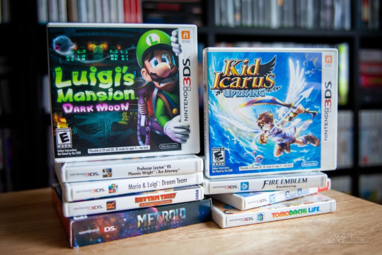
Text
Video game console and case design
Today's hyperfixation is on the PLAYSTATION 5. Because I want one, but I really shouldn't buy one, so I am just looking up everything to do with games consoles and burning my brain out.
I used to be a proper xbox player, until I got my PC, then I never really touched by xbox again. I got a PS4 to play Persona 5 and since then it's been a blu ray player for my Adventure Time boxset, not much else. But the current gen - PS5, Series X - is arguably more powerful than my gaming PC, and I still have a lot of friends stuck on PS5, so I am considering investing in a unit.
Anyway is it me or did they really shit the bed with design in this generation?

Look at these chunky fuckers! They do not fit smoothly under your television at all. There is no detail or decoration breaking up their unnecessarily large faces, which makes them look bland and ugly. They look like they're made of cheap plastic, with the two controllers being the highest quality thing about them. I can attest the xbox controller is unbeatable, but playstation really made their shot this generation. A shame I can never get used to the dualshock joystick positioning.
The Series S and the PS5 Slim are almost NO improvement on the base designs.
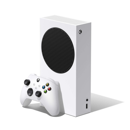
For some reason they made the Series S look like a speaker???
The new PS5 slim FINALLY has a line across that massive faceplate, but the half matte half glossed finish is not doing it any favours. I think it would've looked much better if, for example, the matte and gloss plates were different colours. Like black and white! It also has an even MORE out of place disc drive, which I think is part of Sony's agenda to go digital only, and the two tiny "feet" for its horizontal positioning are pathetic! Personally I like this more than the original but not significantly, disappointing since I was really looking forward to it.
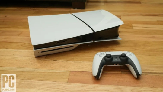
I want you to compare these nasties to the previous generation - the PS4 and the XBOX One.

....Now, what's hilarious about this image is the consoles look ALMOST IDENTICAL from this angle. And, I guess, that would be why Sony and Microsoft decided to make such a departure with the space heater PS5 and the fridge Series X.
But they both look very premium and advanced, and they fit very nicely in your living room.
The companies tried to look a bit more distinguished in their followup versions in the previous gen too. The white PS4 Pro looks a lot closer to PS5 with its quirkiness, but without the atrocious shiny plastic. Sony tended to add or remove a layer whenever they altered the PS4, I wonder what they would look like all stacked on top of each other.

It's not just the games console designs that suffer - Look at the game cases! I know that the companies want to incentivise you to go digital, but Xbox Series X cases are just awful.
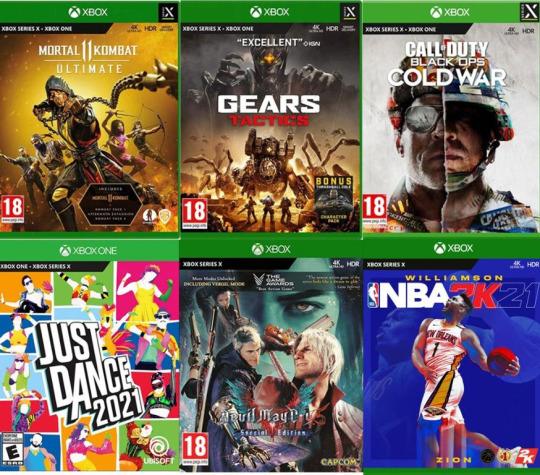

So if you're confused - You should be!!! Microsoft have two kinds of case for the Series X. One of them is the EXACT SAME CASE as Xbox One, but with Series X printed on the front. The second newer version foregoes the sexy Xbox logo entirely and just has Xbox Series X printed in some default font. Awful awful awful.
Playstation is doing better, but barely.

They are reusing PS4 cases with a different print on them. It doesn't look as horrible as Xbox's, and it at least has a different colour on the logo, but damn, the jump between PS3/360 and PS4/One was really impressive, and now they've stopped bothering because they want everyone to go digital. If your game cases look like shit, why bother with physical?
I want to contrast with physical media kings Nintendo, who did an outstanding job in 2017 with designing the case for the Nintendo Switch.

These bad boys are mine. They're super thin, easy to stack, decent quality, and F U N. The red colour pallette makes them pop out. You can see one from across the store and go, "damn, that's a Nintendo Switch game".
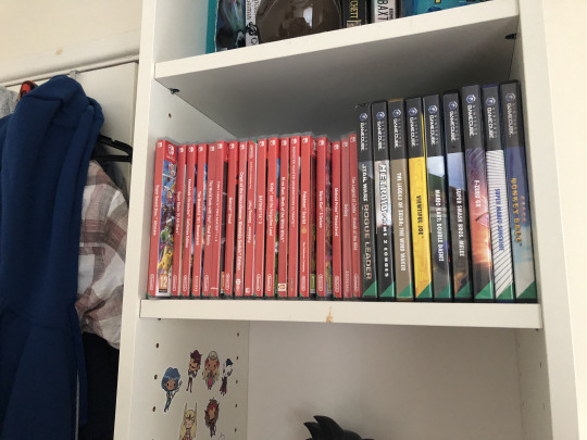
I just want a thousand of them.
I would say a disadvantage, especially compared to the Gamecube games next to them, and even compared to 3ds, is that you can't tell what game you're looking at without going right up to them. These cases are TOO uniform, and really tiny, so i have to triple check I am picking up Xenoblade Chronicles 3 and not Tony Hawk Pro Skater. Meanwhile you can tell exactly what Gamecube games I have by colour pallette alone. Like, you can instantly tell that's Windwaker.
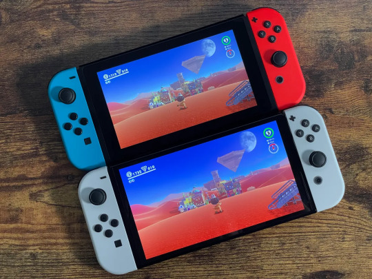
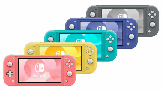
The switch in general is a very fun looking games console, much nicer looking than its predecessor the Wii U, though I'm not sure how I feel about the white of the OLED. But every time I see a Switch Lite in stores, even though I know it's worse than my Switch, I want to buy one. It just looks so FUUUUUN.
And finally a special mention to the 3DS and its games case. The console itself was pretty stylish, if... rudimentary for its release period, but the games cases are high quality and almost make me want to have 3ds games just so I can have the cases.
79 notes
·
View notes