#esp because i used it for sketching and lineart AND colouring
Explore tagged Tumblr posts
Text
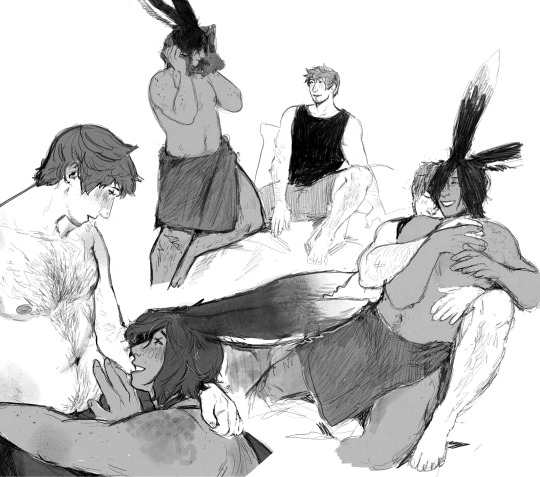
have some misc doodles i couldn't make anything out of
#the one on the left lived on its own canvas i just smushed it there so i don't need to have 7 million different files lol#i bought these two brush sets last week and at first i was feeling the regrets because i didn't see an immediate Good Way to use them#and they had cost me a pretty penny but they are both sooooo nice and easy on my hands...#a lot of procreate sets i've tried require so much pressure but i have very deliberately trained myself to have a feather light touch#and my fave brush was really starting to affect me#esp because i used it for sketching and lineart AND colouring#sketch#i draw sometimes#fanart#anyway i need to. remember how to draw other things now :')#Ardbert#warrior of light
61 notes
·
View notes
Text

It's been a while since I tried painting or doing studies/life drawing, so last night I felt like chilling out and just quickly painting something from a reference!
Reference from Trueref
#sometimes i remember that I do legit know how to paint realistically#i forget a lot LMAO i do it so infrequently#esp because most of my art is cel shaded lol it's easy for me to forget that i used to do a lot more painterly rendering#nabs doodles#art#digital art#drawing#digital drawing#artists on tumblr#artist#study#painting study#painting#digital painting#artwork#life drawing#also I fucking LOVE this pencil brush#I've been using it for sketching and sometimes also lineart and colouring when i want a textured look#and it turns out it works for painting too UGH love it#it's the YO2I pen for clip studio btw if anyone wants to yoink it
4 notes
·
View notes
Note
Can we see your drawing process? The way you colour and render (esp your insane lighting skills) is so impressive 🥹
Sorry for late answer, I've finally managed to compose myself and make this post Let me walk you through my process Usually I have a complete idea of what I want to draw in my head, and if the final art is close enough to what I see in there, I consider it a success Starting with a sketch, the idea in my head might be blurry, so to better understand what I want a pose or composition to be, I use references (everybody should) You can see it clearly below

Also I use browser app called Magic Poser, it's a bit clunky, but it helps to figure out a pose/angle/composition
Usually I try to keep my lineart clean so it will be easier to render later, but sometimes it's just prettier to clean up a sketch When it comes to colors, I don't use palettes, I kinda see colors in my head, so I just eye-pick them, and then use overlays to correct stuff I use blue/purple for shadows, and orange/white for light Also my art mostly in the same hues (blue or orange), so I'm used to work with these colors Here's an example of how bland my art looks without overlays

Render is actually my favorite part! I can fix any mistakes and add some details I don't have much to say about the process, I just mish-mash everything until it looks right, add some shadows on edges, smooth some lines

I do lighting with shine overlay, and to add deepness I use multiply (and a bunch of other overlays) As to how I think light should land on things, I think it's a mix of poser app, references and trained eye (so my lighting usually don't make sense haha) (same goes for folds)

I can't say anything about background work, because my brain just shuts down in the beginning and powers back up when it's done (but actually it's, again, references what helps)
So ughhhh I don't think this post was helpful in any way, but thank you for giving me an opportunity to blab about my process!
Here's a full process of one of my art that I was able to compile

15 notes
·
View notes
Note
talk shop tuesday!! (´꒳`)♡ awhile ago you mentioned that you were messing around with some new color palettes to help with artblock. your color choices are really interesting to me, esp the colors you choose for lineart, and i was wondering what you tend to gravitate towards color-wise and why?
thanks for the ask!!
so fun story, one time i brought my laptop and graphic tablet over to my friend's house and we had a fun session of my friends drawing and me watching them. the result is as follows:
colours used by them vs my colours before that
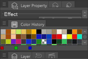
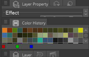
[id in alt text]
so i guess it's pretty telling.
i tend to lean more towards muted darker colours and my default background grey because a) my eyes get tired of staring at white screen b) it's actually better for later colour picking and rendering because something in colour theory about contrast.
my lineart is either solid black or dark grey when inking, but when i use softer brush i get to colour code characters or scenes or mood with which i associate that piece.
in drafting i use different colours to differentiate sketch layers in the drawing to not get confused when inking later. i tend to use red, blue, green and magenta since they are high in contrast (at least the ones that i use)
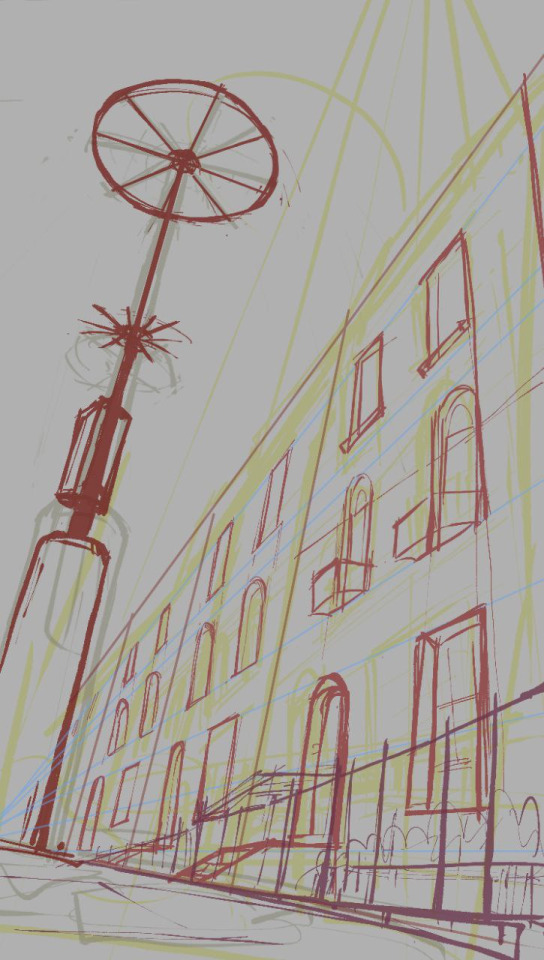
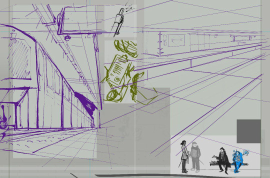
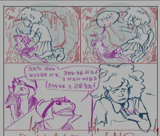
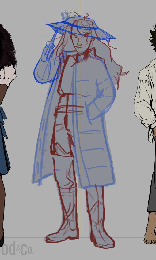
[id in alt text]
(i save my works in various stages all the time including just taking a screenshot bc my laptop had blue screened on me and corrupted my files multiple times before)
as for colour palettes, it was more of a change of pace, a trick to get myself out of artblock by changing how i approach the process. with limited colour palette it was interesting to figure out what colour goes where which basically ment building a piece backwards because colour is always an afterthought of mine
#great question! i tried to dig up some interesting insight sketches so hopefully these are good examples#l&co#amphibia#sketch#talk shop tuesday#inbox#id in alt text#artpost#blogposting
12 notes
·
View notes
Note
I HAVE SOME QUESTIONS MOOT!!!
2. What’s your favorite thing about your style?
7. Please show us a WIP!!
8. What are the most and least fun parts about your process?
10. How many different sketches do you usually have until your piece is finished?
14. Digital or Traditional?
15. If digital, what program do you use?
Sorry if this is a lot, I'd send the whole list if you let me but alas, I had to cut it down to just six questions and give everyone else a chance to ask things 😭
aaaaaaa my moot!!! it's lovely to get so many questions😭✨💖 thank you thank you🌷🩷🌷🩷🩷🌷🩷🌷🩷🌷🩷🌞
2. What’s your favorite thing about your style?
the way i draw eyes, esp bc it's inspired by an artist i rly like😖✨ lemon-shaped.
7. Please show us a WIP!!
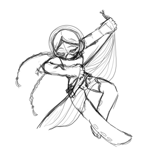
this is my Y/N for my mermaid au! i'm currently slapping out a fic and working on a post about the au, and this is a sketch for that!
8. What are the most and least fun parts about your process?
most fun is the sketch layer where i've figured out the pose and positioning, and have drawn in rly thick pen so the mistakes look more forgivable lmaoooo
least fun is picking colours and applying them. i have to force myself to just do it or i'll be hesitating with my pen over the screen forever
10. How many different sketches do you usually have until your piece is finished?
about three or four typically, then i move onto lineart
14. Digital or Traditional?
digital! i used to do only traditional for years until i got bored. i chose digital because it makes you relearn a lot of things, and i wanted to improve with something that allows you to do a lot of stuff quickly. plus it isn't so expensive. i used to draw and paint with ink and fineliners on crisp cartridge paper, do you know how much that costs?😭
15. If digital, what program do you use?
i use krita! it's free lmao
🩷 cheers for the questions, i love the chance to ramble. hugging you!
9 notes
·
View notes
Text
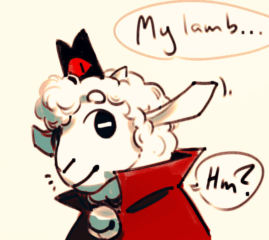
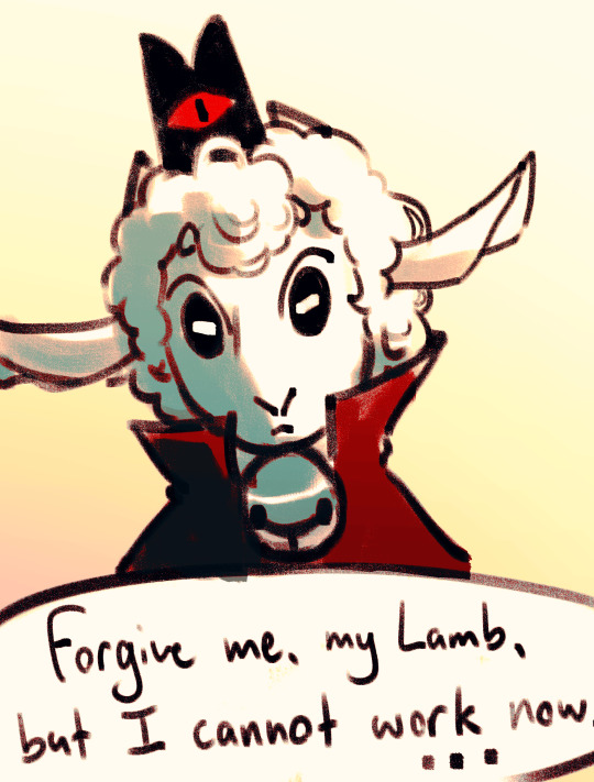
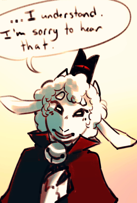
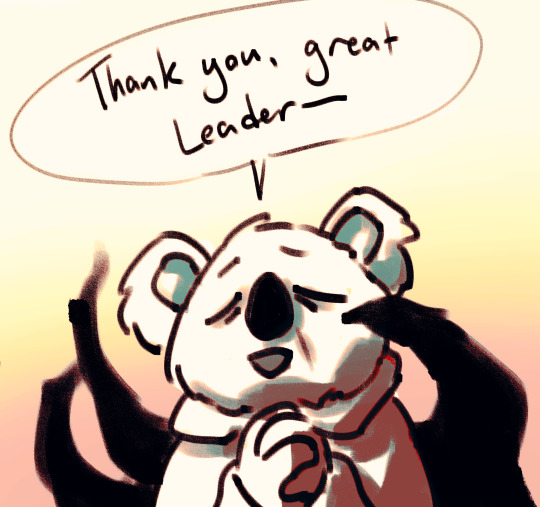
@faeriefrog-blog asked how i did the funny colours on these bad boys so i've broken it down into a few steps!!! starting with the bottom most layers:
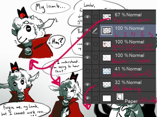
very bottom layer, just above the paper itself, we've got the background shading seen in the bottoms images here, panels 3-5 in the comic. note that without any effects applied to it, it is the same colour as the shadows, a deep teal hue. i like to keep all the shadows around the same hue for the sake of cohesion, even though these end up being altered quite a lot in the final product
a note about the base paper layer!! its not actually pure white, but very very light grey. sometimes i make it a slightly darker grey if im feeling dramatic. this keeps the focus on the figures on the foreground probably, and allows the paper layer to interact just a little bit more with colour altering layers above it (overlay layers, for example, dont do SHIT to pure white)
above the paper, the bg shading, and the sketch layer i was too lazy to remove, we've got the blocking ive put down so that the lamb, the speech bubbles, and the sweet elderly koala theyre about to yeet into the great beyond are both not grey and not fading into dark teal. this layer probably wouldnt be here if it was fully coloured!!! however, i love not doing things :]
then theres the one-colour colour layer, and the lineart, of course, normal stuff, and then the topmost layer in this chunk is the figure shading. this can be put above or below the lines if you prefer, since it wont be at full opacity anyways. teal is a pretty strong feature in the cotl palette, esp in toww's domain, so i tend to shade with teal a lot here. not much details of variation in shading strength is applied here, the only notable exception being the bell which i straight up just could not resist making all shiny. since the shading is blocked in with a sketchy pencil brush i use for like all of my art steps, it creates the idea of texture without much real effort.
directly above the shading we have this shit:
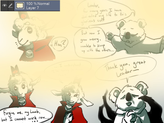
shown at normal and full opacity because i need to emphasize these are literally just gradient ovals of pale yellow and it looks silly but:
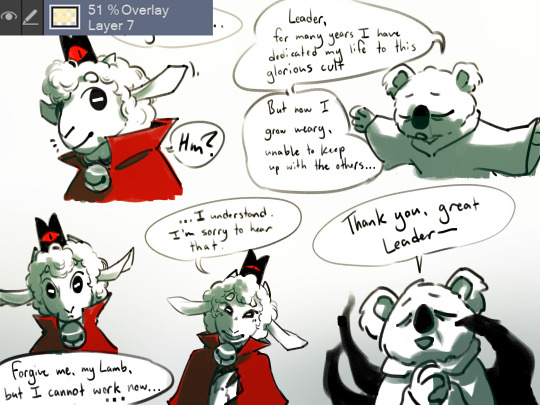
set that bitch to around 50% opacity and make it an overlay layer and it adds some light and depth to the shaded areas!! note that as i stated before, it is now completely invisible on the sections that are blocked in white, and has little effect on on the black lineart. it doesnt have to be super detailed or precise, but just have the gradient positioned in a way that suggests a source of light
finally, the topmost two layers:
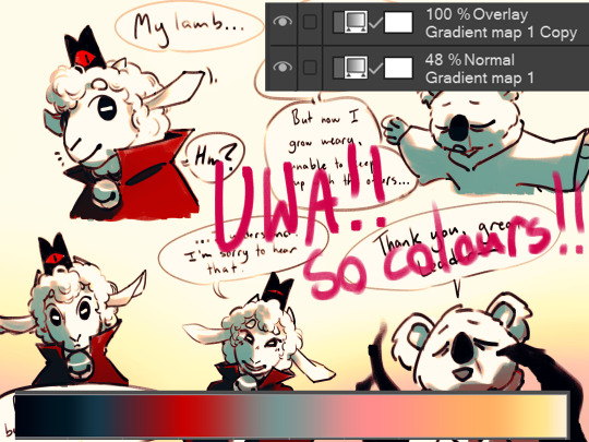
the gradient map here i what i use for most of my cotl stuff, though i poke and prod at it with every image to ensure the shadows are deep and the red is vivid. then duplicate that layer, make the bottom layer somewhere around 50% opacity, and make the topmost layer an overlay. i dont know with any fancyboy words WHY this specifically works; as best as i can figure, the bottom layer applies the colours, while the upper layer improves contrast and colour depth while keeping it within the colour scheme
thats it!!! once you get used to using overlays and gradients, this becomes quite simple, which is nice because i can use these tricks on top of a little low-energy doodle i did about old people murder and have it come out really nice still!!! i love things that save me time and energy!! if you do too, i hope this is helpful!! :]

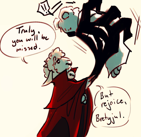
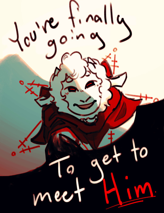
cult trait: good die young
4K notes
·
View notes
Text
A step-by-step look at my drawing process (commission edition) ✨
1) My client ( in this case @/brxkenvalley; ig) gives me their pitch and references. In this case, I was asked to draw their oc in whatever pose I thought would suit them and so I came up with these:
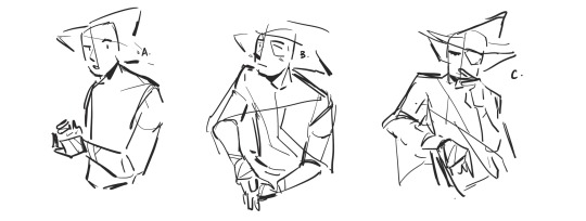
They’re very rough and I focused more on gesture and expression than getting the details right. I also asked them questions clarifying some of their designs and their personality traits (which is a really helpful thing for commissioners to provide so that the artist has a better grasp on the character)
2) my client then asked for C. with an altered expression resembling B. so I made minor alternations to the draft and they decided on the one on the right
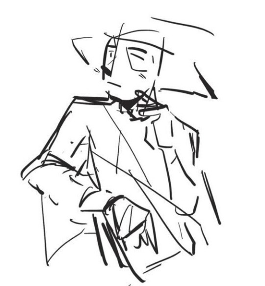

3) After approval, i sketch out the character and I’ve taken to just cleaning up my sketch instead of doing lineart because that saves a lot of time
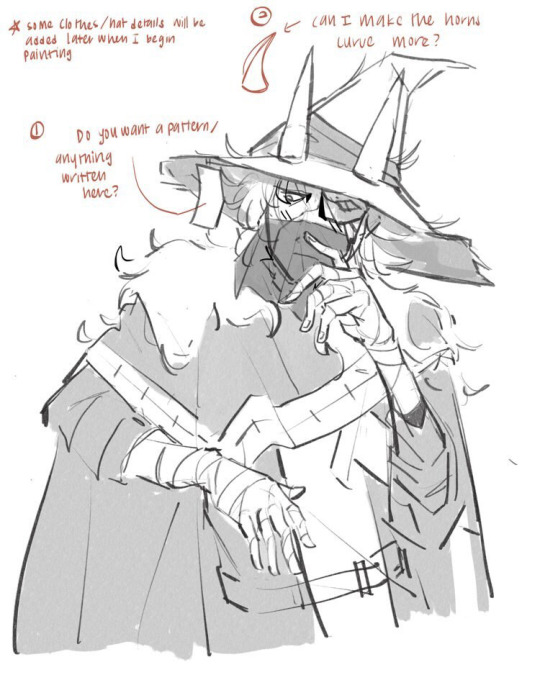
The annotations are me asking for some design clarifications because I wanted to make some alternations so that the piece looked better/more complete (esp cuz I thought straight horns did not look very good on the hat). The quick greyscale shading was just a temporary placeholder to separate the elements clearly. As for references, I use a combination of many from google and from pictures I’ve taken myself. For example, the hands here are based partly on an online reference, partly from my own hand, and partly from muscle memory of me practicing and knowing how to make a hand look like it makes sense
4) flats. This was tough because the reference I was given had the character’s whole colour scheme as similar shades of very dark grey and so I took some creative liberty to adjust the colours a little to make the separate parts pop out more
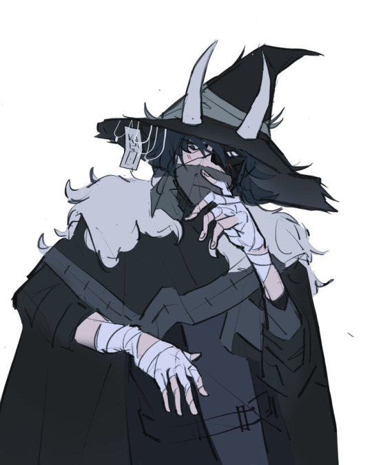
You can also see the horn fix and added details on the hat. Not much else to say except I stuck very much to cool colours for the whole thing to fit the character’s mysterious vibes
5) Rendering/painting. Everything prior to this was done on procreate but my brushes on Clip Studio Paint are just far superior so rendering was done there
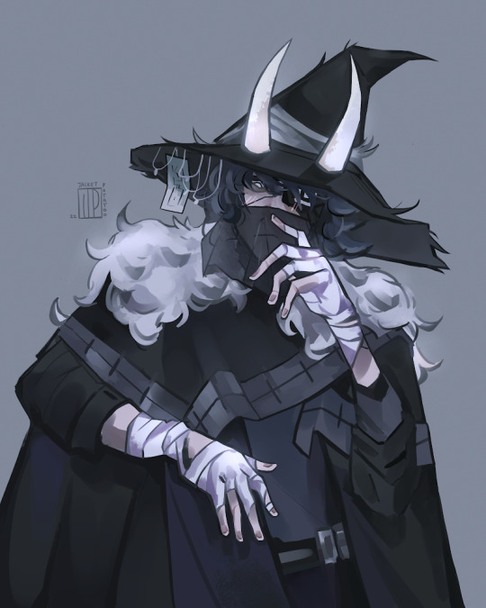
This is what takes the longest and is where I merge my sketch and flats layer and paint over everything (with the help of the magic tool and lasso tool to select segments according to colour). I think it might’ve taken around 4 hours? I used a lot of different brushes to try and get a varied texture and when I was satisfied, I exported it back over to procreate for colour correcting using different layer types and their in-built adjustment tool. I also used an add-glow correction layer with an airbrush on the white parts it pop out more, as well as give the character a more ethereal look
6) I ask my client if they want any minor changes and if not, I’ll email the file to them :)
And that’s my commission process! I don’t do all of these steps when I’m working on personal art (esp the planning) but occasionally, when I have a clear idea for a more complicated piece, I find planning really helpful. I could also do a process thing for a background piece if anyones interested, just lmk. Also feel free to ask questions if you have any and I hope this was clear!
#haven’t done a proper comm in a while so it’s pretty cool to see the improvement#please don’t use the art btw!#jp musings#art stuff#commission#commission art
33 notes
·
View notes
Note
Got any tips for lining watercolors?
i'd say just to use a waterproof liner and not to use cheap watercolours. the liners i use are sakura microns and uni pin fineliners, and the watercolours i use are jacksons, roman szmals, white nights and prima.
i recommend not using cheap watercolour because they contain a lot of binder which makes them chalky, which in turn makes them semi-opaque. this means they cover your lines and make them look faded, rather than transparent colours which don't affect your lineart.
the same is true for any semi-opaque colours (a lot of prima palettes have these), or any colours that contain a white pigment. i'd recommend not using white to mix colours in general but esp if you want your lineart to stay clear. you can use the semi-opaque pigments to intentionally fade lineart though, e.g., on elements you want to push into the background.
you can also ink after painting, but i prefer to ink first unless im sketching directly with the watercolours. if you go over pencil with watercolour, it seals the pencil meaning you can't rub it out. if you use graphite pencils, they can smudge which leads to muddy colours.
anyway, yeah! hope this helps in some way
35 notes
·
View notes
Text
Summary of November:
Not focussed at all. Started doing some random studies of other artists. Leaning hard on composition-over-plotted-out-backgrounds, which, while good for my composition skills, is not what I wanted to be doing
Plan from October :
All monthly/weekly goals for the year ✗
Proko: ribcage ✗
Review all Proko notes ✗
DAB Lesson 7 ✗ working through
One FE fanart every 4 days ✓ averaged out to every two days!
Draw N7 Day piece before N7 Day ✗ only did a boring fullbody sketch (at least I did something)
December plan:
All monthly/weekly goals for the year
Proko: ribcage
Review all Proko notes
DAB Lesson 7
One FE fanart every 4 days AND NOT MORE OFTEN
Plan out and draw all the Kylux Advent ideas I have
Put Kylux Advent into my spreadsheet
notes and improvements from finished stuff:
try to find photo reference for expressions✗, do Proko ribcage lesson✗, draw and detail with linework everyday objects✗
lute: proportions screwy, uncanny valley eyes, lineart+painting don't blend well together
valter: though I like the composition overall, it goes dark too quickly. hair is too abstract to really look like hair. awkward pose and his right hand looks kinda flat. cup looks too smooth/undetailed to fit in the picture
linhardt: eyes too far apart? attempt at softening lineart edge where it meets the tree is very messy and detracts. overall very plain and flat, could have used some patterns in the background or thinner lines
n!heath: expression is REALLY BAD (mouth), armour doesn't align with arm orientation and pose is stiff. however, detail level is nice!
shep: leg muscles are completely made up and it shows, hand is v bad
limstella: composition isn't very interesting, rendering on sleeve is just a bunch of random triangles because I don't know how to draw folds, facial features look uncanny and not in a good way, I do like how their hair fades out into the background though
revan: face is flat (nose looks 2d), colours are too busy with too-sudden contrast changes, hand perspective is a little screwy but looks ok overall, background is a mess
revolutionary girl eirika: gormless expression, cheaped out on drawing hands, she isn't actually putting any force into the hand on her hip, sleeves don't have clearly defined planes
lyon: i hate that bright white nose highlight so much, lighting direction overall is p unclear, hand is too dark and looks dead, eyes too far apart
heath 2: forearm should be facing more to the left because it looks like the upper arm is too short otherwise, face isn't tilted up enough (I remember struggling with this one because being able to see too much of the underside of the chin in a stylised drawing is… it looks weird), I do like how vibrant the colours ended up though. i think I was playing around with curves at the end?
kylux: hand looks very fat unintentionally, tried to convey the reflectiveness of leather but couldn't, they don't really look like they're interacting (works for the dynamic but I didn't mean to draw it this way)
karel: back of head too large, hands too simplified?, dull values, hair looks really bad/stringy
grado bang: I need to stop using a lineart brush that's too big because it makes any kind of details look really bad
ice machine: composition KINDA works but actions aren't clear, lines feel v lifeless (esp. chair). not sure why
karel: think his shoulder is in a bit of an awkward angle and hair feels a little contrived but overall this is p ok
heath 3: pose looks like he's overextending his shoulder, arrow hand could use a little more definition, bow lineart is wobbly, colours feel dull and unbalanced, I really should have put more detail into the background
ACTIONABLES: practice expression sketches from photos, do Proko ribcage lesson, draw and detail with linework everyday objects
0 notes