#emotionaldesign
Explore tagged Tumblr posts
Visit Tumblr Blog
Explore Tumblr blogs with no restrictions, modern design and the best experience.
Last Seen Tumblr Blogs


Fun Fact
In 2020, Tumblr had 29.4 million users in the US.
Text

THE PSYCHOLOGY OF SHAPES
Simple geometric shapes contain innate psychological properties that we instinctively recognize.
CIRCLE
Community, love, unity, inclusiveness. Positive emotions.
SQUARE
Stability, balance, strength, efficiency, professionalism.
TRIANGLE
Mystery, power. Used for sci-fi, religious, or law themes.
VERTICAL LINE
Commitment, strength, progress, goals.
HORIZONTAL LINE
Movement through time, futuristic, tech-savviness.
Follow @everythingaboutbiotech for useful posts.
#scicomm#science communication#ShapePsychology#DesignElements#VisualCommunication#GeometryInDesign#PsychologyOfDesign#ShapeSymbolism#VisualStorytelling#GraphicDesign101#EmotionalDesign#SymbolicShapes#ArtAndPsychology#DesignThinking#CreativeSymbols#ShapeLanguage#VisualImpact#DesignPsychology#FormAndFunction#GraphicElements#ShapeMeaning#DesignInspiration
8 notes
·
View notes
Text

Poster series — Palmės Diskoteka ‘18-19-20 — Master Phil — 2020
#vilnius#music#studiocryo#partyposter#palmdiscoteque#emotionaldesign#jedimaster#scifi poster#masterphil#club poster design#wow#wow ok
5 notes
·
View notes
Text
#industrialdesign#design#futureofdesign#productdesign#uxdesign#uidesign#3dprinting#augmentedreality#sustainabledesign#emotionaldesign#inclusivedesign
2 notes
·
View notes
Text
🌿 i made a thing — and maybe it's also for you 🌿
i’ve been quietly building a little t-shirt shop: https://www.teepublic.com/user/pixelpek
every design comes from a strange mix of overthinking, late nights, and trying to turn feelings into something wearable.
this is super personal — a soft launch from a soft human. if anything there speaks to you, or if you just feel like supporting a small artist trying to make rent and meaning, i’d be endlessly grateful.
no pressure. no hard sell. just putting it out into the world. 💌 https://www.teepublic.com/user/pixelpek
reblogs help too, more than you think.
thank you for even reading this. 🌱
#tshirtdesign#smallartist#indiebrand#emotionaldesign#aestheticclothing#softlaunch#supportsmallcreators#teepublicshop#pixelpek#weirdgirlcore#overthinkersclub#independentartist#mentalhealthart#latenightthoughts#feelyshirts
0 notes
Text
There is a silence that speaks. Hushed Rooms is a visual meditation on stillness. These interiors aren’t just designed—they’re felt. Each space whispers emotion, drawing you into a world of soft light, subtle textures, and quiet beauty.
#interiorphotography#quietspaces#minimalism#hushedrooms#designinspo#calminteriors#visualpoetry#moderninteriors#emotionaldesign#interiorstorytelling
0 notes
Text
Blog 37: Character Creation with Metahuman and Custom Scanning
In Shambhala, the characters had to feel real, not artificial. I didn’t want them to be generic avatars. I wanted faces that carried memories, eyes that held forgotten dreams. That’s why I chose MetaHuman Creator as the foundation for building the characters combined with real-world scanning methods like Polycam 3D.
youtube
Using MetaHuman allowed me to give each child and character in Shambhala deeply nuanced facial details, slight imperfections, and real emotional depth. No two characters feel the same. They live differently.
Polycam scanning brought an organic rawness, capturing textures, asymmetries, and small fractures of humanity that made the characters more believable. In Shambhala, characters are not glossy heroes. They are fractured memories trying to heal. Every scar, every wrinkle, every shadow on their faces tells a piece of the forgotten story.
Characters are not there to be controlled. They are there to be remembered.
#MetaHumanCreation#RealisticCharacters#EmotionalDesign#FantasyStorytelling#ShambhalaProtocol#Youtube
0 notes
Text
WOII: Week 1 - Phenomenology
Today's session explored phenomenology through shadows and time, focusing on how perception is shaped by lived experience. Using photography and drawing, I examined how light and shadow are not just visual elements, but also emotional and embodied experiences.
Phenomenology emphasizes how we experience the world through perception, highlighting subjective experience over objective truths. In design, this is critical, as it deepens engagement with how users interpret visual elements. Shadows, for example, carry emotional weight beyond their visual form, shaped by time and memory. In my photographic work, I noticed how shadows shift throughout the day, reflecting time's fluidity. This aligns with Merleau-Ponty’s idea of embodied perception, suggesting that our experience is always mediated by consciousness (Merleau-Ponty 213). Kandinsky’s theories on abstraction also show how visual elements transcend their physical form to evoke emotions (Kandinsky 89), a key understanding for designers.
The drawing exercise connected these ideas to design practice. By representing literal shadows, I revealed deeper meanings absence, identity, and the passage of time concepts designers can use to communicate beyond the surface. Paula Scher’s typography demonstrates how form and layout influence perception, much like shadows shape space (Scher 45). Giorgio de Chirico’s surrealist works use exaggerated shadows to create a dreamlike atmosphere, emphasizing the storytelling power of light and form (de Chirico 102). Phenomenology teaches that design is not just about aesthetics but also about the emotional and experiential responses it evokes.
Total word count: 253 Words


------------------------------------------------------------------------------
Works Cited
de Chirico, Giorgio. The Enigma of Arrival and the Afternoon. Thames & Hudson, 1995.
Husserl, Edmund. The Phenomenology of Internal Time-Consciousness. Translated by James S. Churchill, Indiana University Press, 1964.
Kandinsky, Wassily. Point and Line to Plane. Translated by Howard Dearstyne and Hilla Rebay, Dover Publications, 1979.
Merleau-Ponty, Maurice. Phenomenology of Perception. Translated by Donald A. Landes, Routledge, 2013.
Scher, Paula. Make It Bigger. Princeton Architectural Press, 2005.
------------------------------------------------------------------------------
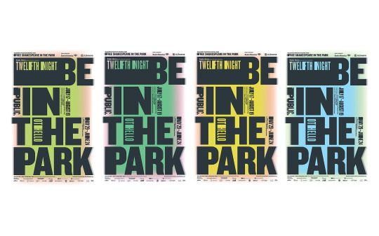
Paula Scher – "Shakespeare in the Park" Poster Series
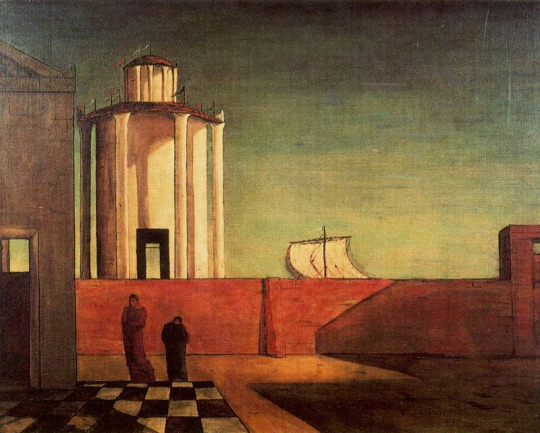
Giorgio de Chirico – "The Enigma of the Arrival and the Afternoon"
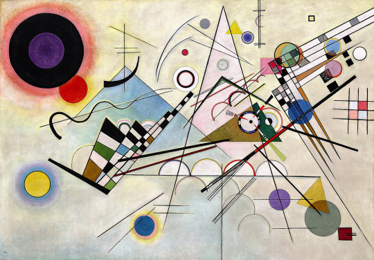
Kandinsky – "Composition VIII"
#Phenomenology#ShadowsAndTime#EmotionalDesign#TypographyDesign#AbstractArt#Kandinsky#CompositionVIII#Surrealism#DeChirico#TheEnigmaOfArrival#PaulaScher#ShakespeareInThePark#DesignAndPerception#EmbodiedExperience#DesignPrinciples#LightAndShadow#VisualCommunication#CulturalMeaning#ArtAndDesign#InterpretationInDesign#EmotionalResponse#SubjectiveExperience#PerceptionInArt#TypographicExpression#ArtisticPerception#FormAndMeaning#DesignForEmotion#SpaceAndPerception#MemoryInDesign#TimeAndDesign
0 notes
Text

2 notes
·
View notes
Text
Shadowed Love in the Darkness
Chapter 2: The Wounds That Bind

In the hushed corridors of the underground gallery, where shadows danced like specters on the damp walls, Raven and Lyra found solace in each other's broken whispers. The air was thick with the scent of old paint and forgotten memories, a canvas of decay that mirrored their wounded souls.
Night after night, they convened beneath the fractured moonlight that seeped through the cracked ceiling, their stories weaving a tapestry of sorrow and resilience. Raven’s voice, a low melody tinged with the haunting cadence of loss, filled the cavernous space.
“My family,” he began, his eyes lost in the swirling abyss of a half-finished painting, “was consumed by flames. A fire so fierce it devoured every trace of them, leaving me to wander in the ashes of a life that once was.”
His words dripped like the melancholic notes of a forlorn symphony, each one carrying the weight of a past that refused to fade. The fire, a ravenous beast, had not only claimed his family but had etched its fiery claws into his heart, branding him with a solitude that could not be extinguished.
Lyra listened, her gaze fixed on a sculpture that seemed to bleed stone tears, a silent testament to her own familial curse. “My family,” she whispered, her voice a fragile thread weaving through the darkness, “is shackled by a curse as ancient as the stones of this gallery. Anyone who dares to love a Lyra is destined to meet a tragic end.”
Her words hung in the air, delicate and deadly, like the fragile petals of a rose with thorns as sharp as daggers. She had seen it unfold, a relentless cycle of love and loss, each suitor falling into the abyss of fate’s cruel design. The curse was a specter, ever-present, its shadow a constant companion.
“And yet,” Raven’s voice broke through the silence, “you remain here, alone, waiting.”
Lyra’s eyes glistened with unshed tears, each one a prism reflecting the pain of a hundred broken hearts. “It is better to be alone,” she said, her voice a brittle whisper, “than to watch the people I love be swallowed by the darkness.”
Their pain, once isolated, now intertwined, like two rivers of sorrow merging into a single stream that flowed through the gallery, carving its way through the bedrock of their hearts. The gallery, with its walls steeped in the echoes of their anguish, became a sanctuary where they could bleed their truths, unburdened by the weight of the outside world.
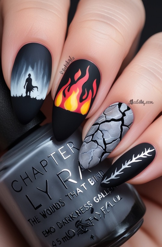
Nail Art Inspired by Chapter 2: "The Wounds That Bind"
The nail art inspired by Chapter 2, "The Wounds That Bind," captures the melancholic beauty and haunting emotions of Raven and Lyra’s shared pain. This design blends somber hues with symbolic elements, reflecting the tragic stories they unveil within the shadowy gallery.
Color Palette: A mix of deep charcoals, muted blues, and smudges of ash gray dominate the nails, mirroring the dark, oppressive atmosphere of the underground gallery where the characters meet. These colors create a canvas of sorrow and solitude, underscoring the weight of their respective pasts.
Design Elements:
Flaming Silhouette: One nail features the delicate silhouette of a flame, flickering in muted tones of red and orange, representing the fire that consumed Raven’s family. The flame is enclosed in blackened edges, symbolizing the eternal scars of his loss.
Cursed Vines: Another nail showcases a twisted vine in metallic silver, curling and encircling like the curse that binds Lyra’s family. The vines bear small, thorn-like details that subtly suggest the danger and inevitability of tragedy for those who come too close.
Cracked Porcelain Effect: Several nails have a cracked porcelain texture, symbolizing the fragile yet beautiful nature of both Raven and Lyra’s hearts. These cracks are highlighted with shimmering silver to indicate the glimmers of strength that still reside within their brokenness.
Tear Drops: Clear, glassy droplets adorn some nails, representing the unshed tears and emotional weight both characters carry. These droplets are strategically placed to evoke the sensation of rain or weeping stone, reflecting the gallery’s somber ambiance.
Moonlit Glow: A few nails are finished with a subtle, pearlescent sheen, reminiscent of moonlight filtering through the gallery’s cracks. This glow symbolizes the faint hope and connection between Raven and Lyra, even amidst their overwhelming darkness.
Finishes: The combination of matte and gloss finishes creates a dynamic interplay of textures, representing the duality of beauty and sorrow. Matte nails convey the depth of their pain, while glossy accents add a touch of ethereal light, balancing the darkness with a hint of dreamlike melancholy.
This nail art design not only embodies the essence of Chapter 2 but also transforms the narrative into a wearable work of art, allowing the story of Raven and Lyra to be carried and cherished in a uniquely personal way.


#NailArt#EmoDarkness#RavenAndLyra#DarkAesthetic#GothicNailArt#TragicLoveStory#ArtisticNailDesign#AbstractNailArt#GothicElegance#EmotionalDesign#SymbolismInArt#CreativeNailArt#GothNails#DarkRomance#NailArtInspiration#NailArtStorytelling#EmoStyle#MelancholicArt#EmoAesthetic#NailArtCommunity#TumblrNails
0 notes
Text


One of the most interesting design aspects that I discovered through my MA was the theory of Kiki and Bouba. Which links up everything from shapes, sounds to typography.
🔺 Kiki — Spiky, sharp, edgy.
🔵 Bouba — Round, soft, flowing.
Research has found this is a universal phenomenon, transcending language and cultures. This is SO important to understand in ethical design, as it could be the key aspect that could help something be a success. In design, we don’t just create for functionality—we create for human experience. The Kiki-Bouba effect reminds us of the subconscious cues we send.
.
Here's how this influences ethical design:
Accessibility:
Designing for inclusivity means understanding how shapes, sounds, and even visual elements trigger emotional or sensory responses.
🟢 Rounded buttons may feel more inviting and safe than sharp, angular ones.
Emotional Design:
Want users to feel calm? Opt for "Bouba-like" visuals—soft, rounded, and smooth. Need urgency? “Kiki” elements can create a sense of action or alertness.
😌 Calm = Rounded shapes.
⚠️ Alert = Angular shapes.
Avoid Manipulation:
Ethical design is about trust. Misusing these associations to manipulate user behavior (e.g., making aggressive designs to cause anxiety or urgency) can harm users’ well-being.
.
.
By understanding Kiki & Bouba, we can craft experiences that feel intuitive, fostering empathy and trust in our designs. Let’s build with intention, not manipulation. ✨ (looking at you marketing teams)
.
I also wanted to share some interesting research that presents animals understanding this theory! Which in itself is so fascinating and could be used to design for ecology, conservation and a resilient future.
#EthicalDesign#KikiBouba#DesignPsychology#UserExperience#UXDesign#InclusiveDesign#AccessibilityInDesign#EmotionalDesign#visualcommunication
0 notes
Text


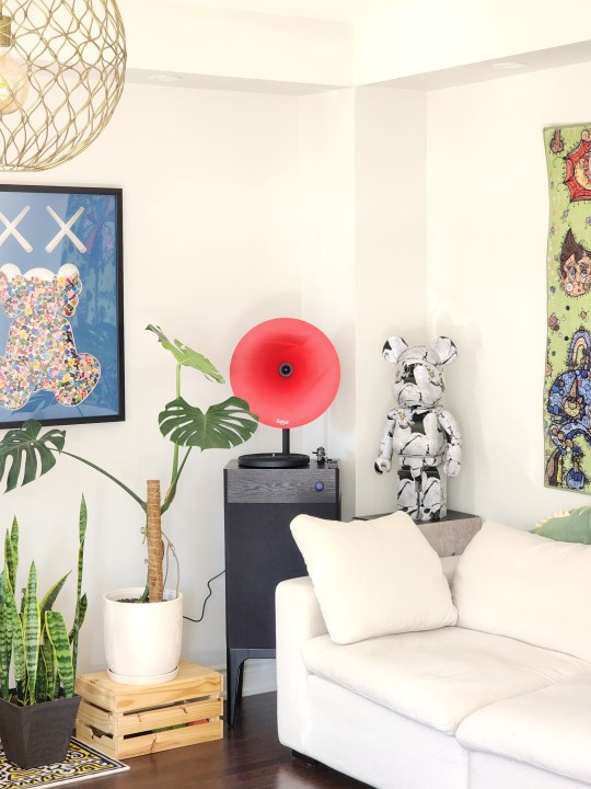

Space is more than just a container—it's an emotional journey. Furniture and decor speak volumes, narrating the life story within. 🏡✨
0 notes
Text
Psychology of Color in Digital Marketing: How It Affects Consumer Behavior
Colors have a profound impact on human emotions and behavior, making them a crucial element in digital marketing strategies. Whether you're designing a website, creating social media graphics, or crafting email campaigns, understanding the psychology of color can significantly influence how consumers perceive your brand and ultimately drive conversions. Here's a deep dive into the psychology of color and its role in digital marketing:

1. The Emotional Impact of Colors:
Different colors evoke various emotions and associations. For instance:
Red: Often associated with energy, passion, and urgency. It can be used to grab attention and encourage action.
Blue: Conveys trust, stability, and professionalism. It's commonly used by tech companies and financial institutions.
Green: Represents growth, health, and nature. It's often used for eco-friendly or wellness-related brands.
Yellow: Radiates positivity and optimism. It can be attention-grabbing and suitable for highlighting deals.
Black: Signifies luxury, sophistication, and power. It's commonly used by high-end brands.
2. Cultural and Contextual Considerations:
Colors can have different meanings in various cultures. For instance, while white symbolizes purity in Western cultures, it's associated with mourning in some Eastern cultures. Additionally, color context matters. A color that works well in one industry might not have the same impact in another. Understanding your target audience and their cultural background is crucial.
3. Creating Brand Identity:
Consistent use of colors in your branding helps in building brand recognition and identity. Think of Coca-Cola's red or McDonald's yellow. These colors have become synonymous with their respective brands. Choose colors that align with your brand's personality and values.
4. Calls to Action (CTAs):
The color of your CTAs can influence click-through rates. Choose a color that contrasts with your website's primary colors to make the CTA button stand out. However, ensure that the chosen color still aligns with your brand's overall color palette.
5. Color Combinations:
Creating visually appealing color combinations is essential. Complementary colors (opposite on the color wheel) can create a striking contrast, while analogous colors (adjacent on the color wheel) provide a harmonious and soothing feel. Using too many colors can be overwhelming, so sticking to a few key colors is often more effective.
6. Testing and Iteration:
Don't be afraid to experiment with different color variations. A/B testing different color schemes for landing pages, email templates, and ads can provide insights into which colors resonate better with your audience and drive higher engagement.
In conclusion, the psychology of color is a potent tool in your digital marketing arsenal. By understanding the emotions and associations different colors evoke, you can strategically use them to connect with your audience, build a strong brand presence, and drive desired actions. Remember that there's no one-size-fits-all approach, and it's essential to tailor your color choices to your specific audience and industry.
What are your thoughts on using color psychology in digital marketing? Have you noticed any particular colors that seem to work well for your brand? Let's discuss!
#ColorPsychology#DigitalMarketingColors#EmotionalDesign#BrandColorStrategy#ColorImpact#ConsumerBehavior#VisualMarketing#ColorInfluence#BrandIdentityColors#CulturalMeanings#ColorAssociation#CTAColorEffect#ColorPaletteTips#ColorCombinations#ColorTesting#ColorTheory#VisualAppeal#ColorStrategyInsights#ColorEngagement#BrandRecognition
0 notes
Text
🎨 The Magic of Colors in Interior Design: Exploring Emotional Impacts ✨
Colors hold the key to unlocking the perfect interior design. 🏡 Their power lies in their ability to shape emotions, alter moods, and redefine spaces. 🎨 In this captivating journey, let's dive into the world of color psychology, unveiling how different shades influence our minds and feelings, guiding us through a design wonderland. 🌟
The Enchanting World of Color Psychology 🧠🌈
Color psychology is like a palette of emotions, revealing the hidden effects of colors on our minds and perceptions. 🧙♂️ In interior design, it's like wielding a magical paintbrush. 🖌️ Each color brings a unique energy that can energize or soothe, transform our sense of space, and even make us feel warmer or cooler.
Warm Colors: Vibes of Energy and Warmth 🌞🔥
Imagine red, orange, and yellow – the warm color trio that ignites excitement. 🔥❤️ Red brings the heat of passion and social fun, making it perfect for lively living rooms and entertainment areas. 🛋️🥳 Orange offers a warm and enthusiastic embrace, creating inviting kitchens or cozy reading nooks. 💃📚 Yellow, the embodiment of sunshine, adds optimism to kitchens, breakfast nooks, and creative spaces. Balance is key to keeping the coziness intact. 🧘♀️🔥
Cool Colors: Tranquility and Chill Vibes 🌊❄️
Think blue, green, and purple – the cool colors that wash over us like a calming wave. 🌊💆♂️ Blue whispers serenity, making it your go-to for peaceful bedrooms and bathroom sanctuaries. 💤🚿 Green brings nature's balance and harmony indoors, making it a refreshing choice for bedrooms, home offices, and relaxation corners. Purple hints at luxury and sparks creativity, making it an alluring pick for artistic spaces or cozy sitting areas. These colors even have the superpower to make tight spaces feel breezy. 🚪🪟
Neutral Colors: Timeless Canvas for Creativity 🎨⏳
Neutrals like white, beige, and gray are the blank canvas of design, ready for your creative masterpiece. 🎨🖌️ White symbolizes purity and cleanliness, often gracing kitchens and bathrooms. Beige and gray set the stage for timeless elegance, seamlessly pairing with any style and awaiting your personal touch. 🏰✨ These neutrals create a versatile backdrop for accent colors to shine.
Accent Colors: Pop of Wow and Focus 🎉🎯
Accent colors are the spotlight of design, injecting personality and pizzazz. 🎉💃 Bold and vibrant, they shout "look here!" Whether through art, furniture, or accessories, these colors throw a spotlight on specific areas or elements, creating visual fireworks that tie the entire design together. 🎨🌟 Use accent colors in statement furniture, artwork, throw pillows, or even an accent wall for maximum impact.
In the captivating realm of interior design, colors blend creativity and emotion, sculpting spaces that speak to our hearts and minds. 🎨💓 Colors aren't just eye candy – they're emotional enchanters. By understanding the dance of color psychology, designers can summon spaces that elevate spirits, spark creativity, and offer relaxation galore. The symphony of colors transforms mere rooms into enchanting havens that sing to our souls. 🎶✨ Choose your colors wisely, and let the magic unfold in every corner of your home. 🏡✨
#I-Dzine#Interior Design#f&b renovation#f&b renovation contractor singapore#f&b renovation contractor#f&b interior design#f&b interior design singapore#restaurant renovation singapore#restaurant contractors#InteriorDesignMagic#ColorPsychology#DesignInspiration#HomeDecor#ColorfulSpaces#EmotionalDesign#InteriorAesthetics#DesignPalette#DesignEnchantment#HomeMakeover#ColorfulVibes#PersonalSpaceMagic#DesignSorcery#DesignWithEmotion#DesignJourney#ColorAlchemy#CreativeHues#DesignWizardry#ColorMoods#DesignMagic2023#DesignWonderland
1 note
·
View note
Text
Empathy-Lead Design
That’s not a title you see every day is it? I should probably clarify some things. “Empathy is experiencing the frame of reference of another, as if it were your own, but without ever losing that “as if” quality.” – Carl Rogers That definition is very important and needs to be considered as a whole. If you see something from someone else’s “point of view”, their “frame of reference” than you…
View On WordPress
#EmotionalDesign#EmpathyLeadDesign#LevelUpA5e#LevelUpAdvancedFifthEdition#Webring TTRPG TTRPGDesign RPGDesign
1 note
·
View note
Photo

Hola a todos, ¡acabamos de lanzar un nuevo episodio del podcast de @reinherit_ “Museum’s Up” titulado "Emotional Museums"! En este episodio, Elisa Bruttini, profesora de la Universidad de Siena (Italia) y directora científica de la Fundación Musei Senesi, explica el papel de las emociones en el diseño de museos: cómo las emociones son una condición previa para el aprendizaje y cómo facilitan las experiencias emocionales e incluso tienen como objetivo fomentar la empatía en los visitantes. Escúchalo ahora en Museums Up!: https://rss.com/podcasts/museumsup-reinherit/ y también en las plataformas de podcast Spotify, Apple, Google, Amazon y Samsung #reinherit #horizonproject #culturalheritage #museisenesifoundation #podcast #sienauniversity #emotionaldesign #visitorengagement #emotionalmuseum #museographicdesign #digitalhumanities #museumstudies #museumexhibitiondesign #artesostenible #museologia
2 notes
·
View notes
Text
🎨 Design That Speaks – Inspired by VMARK x VDAS, Ho Chi Minh City
Design isn’t just what you see. It’s what you feel. It’s the story whispered through textures, colors, and space.
At Lollypop Design Studio, we recently had the honor of attending the VMARK x VDAS showcase in Vietnam — a celebration of culture-driven design in the F&B and hospitality space. What moved us most? How heritage and humanity breathe life into design, creating spaces and brands that don’t just function — they connect.
From immersive digital experiences for global restaurants to thoughtful branding for boutique hotels, we specialize in design that blends emotion, usability, and authenticity.
🌿 Inspired by tradition. 💡 Designed for today. 🌎 Created for the world.
📩 Let’s create something unforgettable together. → www.lollypop.design
#LollypopDesignStudio #HospitalityDesign #FNBDesign #UXUIDesign #CulturalDesign #DesignInspiration #HeritageDesign #GlobalDesign #BrandExperience #EmotionalDesign #DigitalStorytelling #VMARK2025 #VDAS
For more, visit our site: https://lollypop.design/
Check out our Projects: https://lollypop.design/projects/
Get a free consultation: https://lollypop.design/project-enquiry/
#ui ux company#ui ux design#ui ux development services#ui ux trends#web development#web design#ui ux agency#uidesign#lollypopdesignstudio#motion design
0 notes