#egregious UI changes
Explore tagged Tumblr posts
Text
Reminder, you can undo the horrific dashboard changes with with Tampermonkey and https://github.com/enchanted-sword/dashboard-unfucker by @dragongirlsnout (this script actually has two methods to fix the issue, in case you have issues with one)
Or Stylus and https://userstyles.world/style/11286/old-tumblr-dashboard-july-2023 (not sure of tumblr username of this author)
Tampermonkey and Stylus both are available for Firefox and Chrome (probably most Chromium based browsers).
Note: usually I recommend Violentmonkey or possibly Firemonkey, as they are open source and have no Google Analytics, unlike Tampermonkey, but Dashboard Unfucker currently only supports Tampermonkey.
Friday, August 18th, 2023
🌟 New
We've streamlined our navigation in a way that will make it much easier for new and infrequent users to level up their experience here. Thanks to everyone who offered feedback, it was a huge help in refining it!
The Activity redesign is now live in the Android and iOS apps! It should be much easier to identify unread notifications, as well as notifications from your treasured mutuals and blogs you follow.
🛠 Fixed
Blogs that you have recently refollowed after unfollowing will no longer be hidden from your Dashboard. If this has happened to you, please unfollow and refollow the blog(s) in question one more time.
If you have allowed mature content, you'll no longer be warned when visiting a blog that contains mature content.
Clicking elements of a reblog's header will now take you to the same places in the iOS app as they do in the Android app and on web.
The year timestamp has returned to Messages for items that are over a year old.
On web, we had some brief issues on Wednesday with blog information (such as avatars and the follow button), but they've been fixed.
Spotify embeds are working again! Thank you to Spotify for helping us resolve this issue!
🚧 Ongoing
Staff are hard at work updating our docs. If you see anything confusing or out-of-date, please send some feedback!
🌱 Upcoming
Nothing to report here today.
Experiencing an issue? File a Support Request and we'll get back to you as soon as we can!
Want to share your feedback about something? Check out our Work in Progress blog and start a discussion with the community.
#tumblr changes#dashboard unfucker#old tumblr dashboard#egregious UI changes#tumblr enshittification#tumblr wearing twitter's skin
750 notes
·
View notes
Text
i do generally agree with the frustration at the ui and advertising changes on this site and on web 2.0 in general these days but i think its very funny how ppl treated the one piece thing like it was a uniquely egregious sign of web 2.0 decay as if the 2000's neopets experience wasn't logging on to look at the site news and see that the headline was "TAKE YOUR NEOPETS TO THE NEW MOUNTAIN DEW STORE IN NEOPIA CENTRAL AND SATE THEIR HUNGER WITH BAJA BLAST"
#ppl who get nostalgic for the age of flash often forget just how aggressively they were advertised to back then also#girl we were playing fucking millsberry
5K notes
·
View notes
Text
my magia exedra thoughts so far!
stuff I liked:
- original artwork and animations are really nice! always fun to see some new original stuff.
- the girls are 3D! love love love the models, I feel like they did a good job translating all the characters' visual styles.
- combat is really fun. feels smooth and enjoyable, I've been enjoying it a lot. I have it on reasonable authority however that it's kind of pulling pages out of honkai star rails' book- which is fine, I have no interest in hsr, but I'm curious what hsr players think of magia exedra, if you've played both please share!!!
- Namae-chan and AQ are really fun!!! I can feel the roots of a very interesting story, but I fear that her unknown origins will drag on.... More on that in the next section. The idea that AQ is something "special" and "non-kyubey" is really compelling.
- the setting is lovely- I really like the lighthouse and its layout.
- I actually really like the little scenes where Namae-chan walks through the memories and the silhouettes of the involved girls appear and vanish around her. it's a nice compromise to get the points of the memories across while keeping the rehashed story as optional.
okay. now my gripes, below the cut.
stuff I didn't like (note: a lot of this will probably change! hopefully!!! I hope that as I progress through things and they take time to update the game these points will become moot!!!! In a beautiful, perfect world I will look back on this post and laugh at my own naivete):
- this game seems to be struggling with whether it's for established fans of the series or trying to pull in new people, which is... A hell of a piece of indecision for a game relying so heavily on its legacy characters. it acts as though it's trying to appeal to newer fans in rehashing the story of madoka and others as its main quest, but the character stories and vignettes that are supposed to give us more character insight are a confusing mix of backstory rehashing and kind of unsatisfying little side stories so far. I've been enjoying some of them, but everything feels more disconnected than it did in magireco, where many of these characters were introduced (therefore kind of allowing the writers to build their stories from scratch).
- speaking of, the UI is such a downgrade! (I guess technically Ui was pretty central to the magireco plot....... lol) I miss the opulent buttons and skeuomorphic, gemstone-y designs of the buttons and menus in magireco. everything in magiex is so flat and generic :(
- the... main gameplay. I hesitate to even call it that. How sad that a concept like labyrinths, which seems absolutely tailormade for a more persona-esque dungeon exploration mechanic, are reduced to a mechanic so linear you can literally automate it. I don't even dislike the atmosphere of the labyrinths! the fixed camera angle is interesting as an artistic choice! but WOW it is not used that way. really genuinely such a bummer, kind of my biggest beef with the game so far to be honest. there are definitely some elements that I like though- the liminality of some of the levels, the map overlays are fun, and even the ambient familiars are nice (the distant line of Anthonys dancing on top of the buildings :3 )
- I miss doppels and connects :(
-i am both excited for and nervous about Namae-chan's story... On the one hand it could turn out to be really interesting! It could be a deeply compelling story! On the other, more-likely-due-to-the-nature-of-mobile-games hand, it could drag on forever, with Namae-chan basically just eternally going "wow. emotions are crazy huh." I am hoping and praying we get the compelling plot we deserve and it doesn't just string along with the same, status-quo ass premise ad nauseum. I choose to believe in Namae-chan 👍
- a surprising amount of asset reuse. holy shit the anime screenshots being used for the main story is so egregious. tons of stuff that clearly just copy pasted from magireco. and not even the good stuff!!!! please for the love of God give Yuma better art at this point!!!!
- honestly it just needs a lot of optimization. drains my phone battery like crazy. menus and cutscenes get laggy and I know I'm not alone in thinking that.
I'm sure I'll think of more things that I both like and dislike- I'll probably make more posts as I see things but these are the big immediate standouts. would love to hear others' opinions, tell me what you liked, what you disliked, if you agree or disagree with my opinions! I'm definitely going to be playing regularly, so I'm excited to see this game change and evolve over time. :)
#magia exedra#puella magi magia exedra#pmme#magiex#magireco#magia record#puella magi madoka magica#puella magi magia record#pmmm#madoka magica#mobile games#gacha games
19 notes
·
View notes
Text
Oblivion Remastered vs. Persona 3 Reloaded


Why am I comparing these titles? They are completely different genres.
Both of them are remasters of 2006 titles that came out for the price of full fledged new games.

Persona 3 reloaded is a complete overhaul of Persona 3. The story and dialogue is the same but it's all been re-recorded, and the game has been built from the ground up brand new. A lot of things are different from the original ps2 games. It's stylish and pretty and feels much like Persona 5.

Oblivion Remastered seems like a remake of the game in Unreal Engine 5. It's extremely faithful to the game you can get for a few bucks on Steam.
Therefore Persona 3 Reloaded probably has a much lower profit margin compared to Oblivion Remastered. It's probably not taken them a great deal of time and energy to build, but releasing it as a full priced game.
However there are some elements where the Oblivion game does prove to be better value for money than P3 Reloaded.

Primarily, it maintains all of the jank of the original Oblivion. I don't know about mod compatibility, and yes it'll be harder to develop mods for Unreal 5, but there'll definitely be some, and all the core GAMEPLAY seems to be untouched. The UI is different though. I think they changed it because it would take ages to load into the menu if it worked like the original, so it's for the best.


It also has two expansions included in the BASE price.
I mean. There's a deluxe edition. But other than just the shitty horse armor, the deluxe also contains a soundtrack, which I think already makes up the value of £10 they are charging for it.

Persona 3 Reloaded took half a year to release The Answer, which was included in the base game of P3 Fes. It doesn't have the weapons systems present in most versions of Persona 3. It doesn't have the female character option P3 Portable.
I haven't got enough data to compare directly with Oblivion yet but a lot of the 2d animations that made Persona 3 special have been heavily altered, turned into cgi, or in at least one case removed outright and replaced with low quality ingame cutscenes. The music is also different, much cleaner, which is antithetical to P3's dirty soundtrack.
Most egregiously, The Answer, which again was included in P3 Fes, has been renamed "Episode: Aigis" and is now ONLY available if you buy the £29 Expansion pass!!!

The DLC contains a bunch of skins that if bought individually would have a pretty high value, so that makes the expansion actually good value for money..... Right????
So you can buy all the skins that are in the expansion pass separately, but you can't buy the DLC separately. Strange!
Hmm I wonder what incentive Atlus would have to do that? Would it be that they want to add fake value to the expansion so that they can justify forcing anyone who wants to play Episode Aigis to throw out over half of the game's base cost? Because now it costs a total of £90! £90!!! to play the full remake of a game that came out in 2007.
Also you still can't listen to the ost that is supposed to be in the expansion pass without using some in game app... I've still been unable to get a good copy of the Reloaded OST. Half the original p3 soundtrack is better though so it's not a big loss.


13 notes
·
View notes
Text
Posting the damn essay I wrote on the last Infinity Nikki survey since I decided to quit the game.
"I am incredibly disappointed - especially the flagship event. What are my issues?
Events don't properly register;
Reaching goals either doesn't register or they are falsely marked as reached but can't be claimed
Cutscenes are skipped
Events don't trigger
You get softlocked all the time
The UI was changed AGAIN
Ping (on EU) is massively high
Game crashes suddenly
Notifications either don't go away or don't show up
And the Piecey models are completely broken when they are in idle
Beating the Eventboss "Through the Mist" immediately crashed the game and made it unplayable afterwards. By unplayable I mean the game froze after and kept crashing
[Crimson Feathers] outfit literally just DISAPPEARS sometimes
The entire version is a broken, buggy mess at this point and while previous times I was willing to wait it out and turn a blind eye I can no longer do that with how egregiously broken and miss managed this game is.
All the joy I ever felt for this game has been spoiled not only by the poor quality of the version but also the predatory and unjustified ways this game is steering. Not only is the game barely playable it is becoming increasingly that Infold, be that the creative team or higher ups, are not only not interested in creating a balanced, enjoyable experience but also will not bother telling a coherent, high quality story as evidenced by the rolling back of the beloved old intro and haphazard "implementation" of the Sea of Stars.
Speaking of the Sea of Stars; the entire region is a boring, soulless and childish theme park. There is no incentive to play in the place at all. The same goes for the new Co-Op feature. It's empty facade of okay-looking scenery and empty features that get old after the first time.
All in all I am extremely disappointed and hesitant to continue playing the game at all after this. Everything I like about the game has been overshadowed by the bitterness I feel as a result of this lackluster, horrifically unoptimised mess of an update patch and I no longer feel comfortable financially supporting the game or Infold.
You folks need to lock in because every patch has had issues that aren't fixed for the entirety of the patch and this one, along with Spooky Season breaking the Hoop-Hopper in a way that completely disables jumping in THE JUMPING FOCUSED MINI GAME is egregious. Still this awful patch took it out the park. The more I play and the more I converse about the state of the game and your team's statements the angrier I get. I no longer trust you to be a transparent company and I no longer trust you to make something good. Listen, I want this game to succeed. I really enjoyed it before but there has to be a certain quality that needs to be upheld for a product as well as a good customer relationship and your players shouldn't have to tell you this. You do not foster good will from your customers by pulling out the rug from under their feet and squeezing every last penny out of them. You do not nurture a good relationship with the consumer by showing them that they cannot trust you to make a good product and to uphold quality. As much as making games is an artform, at the end of the day it's still a product a consumer will use and it needs to at least work as intended. I wish you would stop releasing a faulty product and bank on the hope that there will be no backlash when it needs several hotfix-patches.
Also stop censoring critisism. It makes you look really bad."
Seeing their newest "apology" my feelings have just been validated. This company doesn't care about any of its players. They will continue becoming more and more predatory. This is not some F2P baby rage either. I am a paying customer. I spent money on this game quite often. I was already somewhat pissed when I bought the fucking bike voucher only for them to release an outfit that does the same damn thing as the voucher but is better. This is what they do and will continue to do. They will pull the rug out from under their players' feet over and over again, fucking everyone over and erasing every inch of goodwill.
I really enjoyed my time with the game for as long as I could. I was never deep into the story but I understood its appeal to others. That is now ruined, too.
I have never felt this insulted by another game company that wasn't EA.
Fuck you, Infold.
Sincerely.
8 notes
·
View notes
Note
i am actually so insane abt this if holy shit like holy SHIT????? it's rare that an if pulls me in so immediately as my personal preference is to go for completed ones (free so i am missing out on some itch and several cog ones lmao) if not long wips but every single aspect of this if is lovely and the sum is even greater than that somehow
the whole premise and wordbuilding is sublime and the fact that we are a 'useless' god is amazing love proving the inherent worth of just existing and that any kindnesses are all the more valuable because it's for you as you not for what u can do but i digress
such charming lovely well rounded characters and augh i can smell the angst and pain (i love it) and the gods v mortals conflict.................... also ur writing style is so flowy and like. elegant?? idk it's pleasing to read and rlly fits the tone of it!!!
not to mention the variability and just much more complex relationships/choices? i don't mind stat checking mainly cuz i haven't happened upon particularly egregious uses of it but i love this approach - reminds me of atoc!! and ur ui is amazing............. just GORGEOUS and works smoothly!!!!!! the tutorial esque bits are incorporated well too so it's def great for anyone who's first foray into ifs is uroboros!!!!
oke bye take care <3
!!! I cannot tell you how absolutely honored I am to hear that you gave this IF a chance, even if you usually go for completed works. 🥹 I am in the same boat where I only submit myself to waiting on WIPs if they particularly captivate me!
I'm ecstatic you loved the setting, themes, characters and style of the IF! It's a little different from other IFs, not necessarily better or worse, but it can be a little unfamiliar navigating such a writing style, so I'm grateful it isn't so annoying to read and it came across properly to at least some, haha. 🥹❤️
Similarly, I'm also so happy you enjoyed the non-story aspects of it, such as the UI and variability! The variability is overwhelmingly the most difficult part of writing Uroboros, but I wouldn't change it for anything in the world. I wasn't sure if anyone would care much about it, and it's so exciting that some do! I have to start skipping them and revisiting them later, however, as I end up drowning myself writing all the different choices. 😭 I'm also super proud of incorporating the tutorial bits!! I don't like throwing it all in one go.
Thank you so much for taking the time to write your thoughts. It still blows my mind for people to write at length about it, let alone share their thoughts at all. This truly means the world to me. Thank you again, dumplingcatho!!! ❤️❤️❤️❤️
38 notes
·
View notes
Text
alright i just finished veilguard for the first time so a list of unorganized thoughts. i played a mourn watch sword-and-shield warrior.
my tl;dr is great combat, a lot of great design work, bad writing and narrative design.
deeply utterly bizarre to play a dragon age game where the combat is extremely fun and the writing & narrative design is easily the weakest part
i know the bump down to two party members bothers a lot of people but for me the combat's excellence makes it a worthy tradeoff; it's frenetic and chaotic and exciting and adding another character would have made the realtime combat untenable, to think nothing of the party orders UI
i like the way the blight looks. it's wet and disgusting and that rules
generally i LOVE the art direction. there's some specific things i dislike but the factions have such clear signifiers and it feels so purposeful and careful
i love my rook very very much, i love the way she looks and how deep the character creator is, and corrigan's performance was INCREDIBLE and really helped to sell her as a real character
i like the chromatic aberration
the characters all feel flat to varying degrees. a big part of this is the fact that you can't stand around and ask them questions and dig and push them
it feels like everyone just arrives saying what their deal is and not keeping any secrets or having deeper thoughts about things. they feel like cardboard cutouts to me
all of the dialogue feels like a first draft to me. it feels like what you hammer out as a rough sketch before you go in and tighten it up and polish it. except it's just in the game.
i heard that lucanis had the least amount of content after deciding to romance him and boy they weren’t kidding. i fully thought i’d flubbed the romance somehow and i looked it up only to discover that no, he really only gets one real scene and it's well into act 3. great.
traversing and exploring the world was actually fun for maybe the first time. it was fun climbing up rocks and figuring out how to get up to that ledge up there
i sometimes had to fight the camera in combat but generally it was really unobtrusive which was a great surprise after bg3
the voice acting was really weird. right off the bat it struck me as sort of flat and awkward, and then it never really improved. it's obviously a very skilled voice cast and the returning characters did a better job so this has to be down to directing, right? similar to the dialogue writing, it struck me as rough and unpolished.
i loved the dragon battles so much that i was genuinely disappointed when my "you did all the dragon battles" achievement popped
there's nothing built into the game proper to incentivize replay. there are those couple of story beats that branch, but the game was so committed to handholding the whole way through that i'm confident i didn't miss much of anything
which is so backwards, because this game is the PERFECT length imo. it's the perfect length for having a bunch of playthroughs and exploring different routes and builds except that there aren't any routes, really, it's a set of traintracks with open-world exploration built in. compared to inquisition, which is wayyyy too big and empty and long and, while it still doesn't branch the way it should, leans in that direction more
every conflict resolves too easily. i make a decision and the character accepts it, the shot changes, and then we fade out. WHAT? no! this is dragon age! force me to wallow in the misery! make me cry, question my choices, ask if it has to be this way! oh, it's fine. doesn't matter. okay.
nothing has the weight that i want it to. the character storylines are structured strangely and sometimes feel discordant (taash's being the most egregious) and no characters have arcs as strong as they should in a dragon age game
that being said, the last scene with solas did Get Me. before it ended too early. do you WANT me to react emotionally to your art? stop fucking cutting away!! the catharsis comes from the resolution, stop undercutting it holy shit!!
the siege of weisshaupt was easily the best setpiece in the game, maybe in any dragon age game? i was in AWE. i was so happy my downstairs neighbor was out of town because i was YELLING.
flashbacks to the arishok fight in that boss battle, because i was running around chugging healing potions trying not to get hit, and it just KEPT GOING. every time a new phase started i would just maniacally cackle, it was amazing
on that note it was such a joy to see the other companions there during the setpieces, but just be separated from them -- they're running around on the battlements, still fighting and trying to help. a massive improvement over inquisition where it just feels like you left the rest of the team behind for no reason
i thought that the sound design was good. it's mostly unobtrusive and sound design is something i struggle to pay worthy attention to, but in combat it was visceral and it was so dimensional and well-implemented as part of the puzzles, eg the sparkling sounds of the evanuris altar targets helping you find them in 3d space
that's what i've got for now, i'm planning on another playthrough but i might take a break first. we'll see!
6 notes
·
View notes
Text
Amazing how big companies pave the way for ever-worsening products. Fortnite's whole addiction strategy revolves around hoarding skins and yet every time their locker interface changes it gets more unwieldy to manage the heaps of garbage clogging up your inventory.
(For the duration of the following paragraphs, please keep in mind that fortnite is currently selling a $40 cosmetic car body)
As of writing, the knockoff-spotify ui only actually changes what you have selected when clicked about 80% of the time. Even when it does, there is noticeable half-minute lag between the selection changing and the detail-editing button actually applying to the selected object. The only reliable element of this interaction is the overjuiced button tweening. There are few useful hotkeys either, so every change is mouse-only as you click through god awful menus and scroll bars.
Even EA distributes more tools for navigating their overflow of microtransaction waste. The Sims 4 at least allows you to search items by color and style, as well as what "pack" it's from. Hell, if you'd at least allow the user to tag the items themselves you'd make an unfathomable leap in navigability. You can't even sort objects by whether or not they're cell shaded - something getting increasingly egregious as Fortnite churns out anime OCs by the minute.
And yet Epic is dead set on forcing Fortnite into the shape of a mEtAvErSe PlAtFoRm. Placing the successor to the Rock Band games behind the 5 minute Fortnite loading screen and ui all for the sake of selling SONGS on the Fortnite store. Rocket Race and Lego Fortnite are both surprisingly competent little games, so much so that you can tell the only reason they're stuck inside Fortnite is so that you have to participate in the same microtransaction ecosystem, with cross-compatibility further obscuring the actual worth of each purchase.
If Epic really wants people to fully buy in to their games-as-service sandbox (that makes VALVE look open source by comparison) I'd like to think they'd at least consider making the experience of booting up the game on modern hardware like... manageable? fine? At least not worse than it has been?
They have a lot of nerve is all I'm saying. Is that clear? Am I communicating that?
#lab grown media#research.txt#fortnite#long post#This is the kind of shit I write after horrible sleep apnea nights
10 notes
·
View notes
Text
Progress Update #46
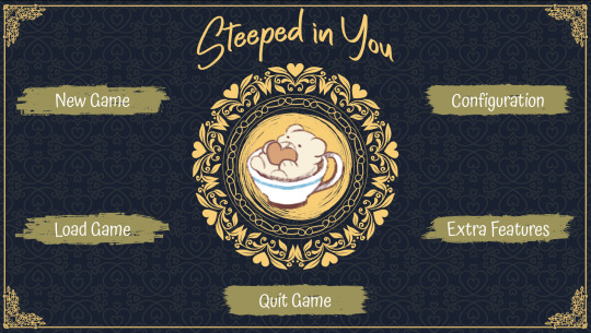
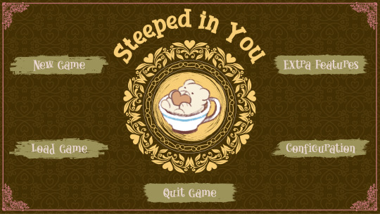
The poll overwhelmingly favors the dark blue over the gray blue for Soul Shattering Star's textbox. As I was finishing SSS's UI, I quickly realized there's a problem. It's the exact same color that I'm using for Steeped in You. Same color AND opacity.
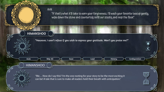
I can't be out here dressing my children the same!! That leaves only one thing to do: back to the drawing board.
I've been going through some sort of attitude problem, aka being very insistent on having a memorable and unique UI. Most textboxes for VN tend to use some off-black, off-white, or off-blue backing. Of course, I understand why. These colors are easy to work with to make both aesthetic and legible textboxes.
And as many shades and tints of the same color there are to work with, I can't help but see it all as the same. In my case as a budding UI designer, I think it's especially egregious how much blues and greens I favor. There are three games I'm juggling between, and I find it incredibly upsetting if their UIs can be mistaken for each other.
I think a large part of my issue stems from the fact that my UI designing skills are rapidly outgrowing my satisfaction with my existing work. Truly...with improvement comes growing pains. It also might be that I don't yet have the exact understanding of what's wrong with the old UIs, so my brain latches onto these things that I can see, such as color palettes and font choices.
Some time last week, I came across this message, and it helped put things into perspective.
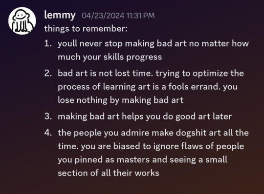
As a perfectionist, being satisfied with "bad art" is still a point of struggle. It's not realistic to constantly be revising my UI every time I see flaws in it, but I think undergoing two major revisions per game is about the current expectation for me.
In Steeped in You's case though, I decided to swap out the blue for a brown. However, there's about one too many brown-yellow combinations for food/cafe-related UIs, so that meant I couldn't just be content with that simple fix. Still, I needed to revamp the UI anyways to make it fit the current VN coding template, so it was a good opportunity as any to get all the fixes in now.
I went back to the old color palette and played with different color combinations. There were plenty to choose from when I swap primary and accent colors, but very few that actually worked. In the end, I decided to use pink to replace the yellow.
Surprisingly, I didn't go overboard on fixing everything. All I did was replace the fonts (which took a while to find) and colors!
Title Screen before and after:
Choices before and after:
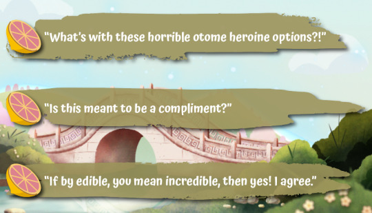
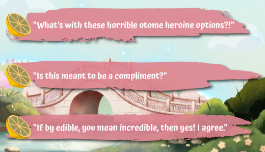
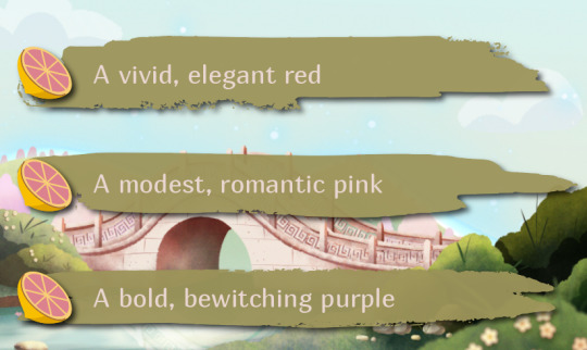
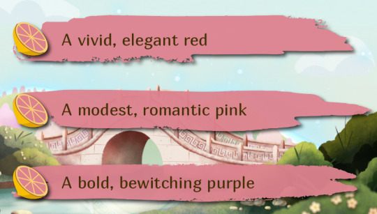
The choices screen is largely unchanged. Why change what ain't broke? Ahem...I'm deeply aware of the irony of me saying that as I do this whole redesign.
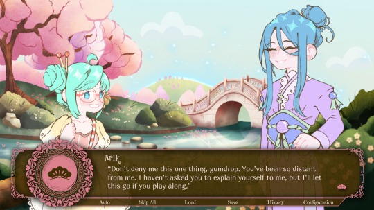
Even better, the fresh coat of paint on the textbox makes it look completely different even though it's the same color palette.
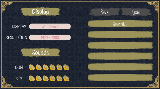
The configuration screens are where most of the changes are, and that's because of the VN template. It still needs some polishing, but I'm more or less satisfied with this look.
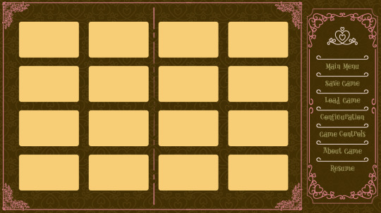
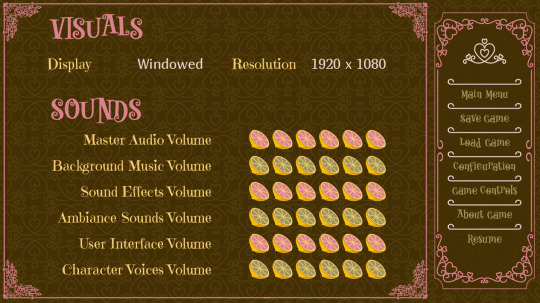
It's nearly May, and that means the date of my trip draws ever closer. My goal is to finish all the UIs I'm juggling, and then tick off at least one item on my list of coding tasks by May 3rd.
1) Figure out how to stop reading text from advancing when clicking buttons
2) Order the save files sequentially rather than alphabetically
3) Display star bars properly when loading save files
4) Animate certain menus
5) Find a way to call background effects
After that, I have to focus my attention completely on finishing the last bit of preparation for my trip. That means no devlog updates for a little while.
Catch y'all at the beginning of June!
#upcoming game#english visual novel#otome#interactive fiction#cyoa#oelvn#game development#ursine vision atelier#soul shattering star#steeped in you#devlog
2 notes
·
View notes
Text
Sonic Frontiers is an errand running power fantasy
*Played in November 2022, Written in December 2022
If you know anything about the development details of Sonic Riders, you know that its prototype was supposed to be more of a Tony Hawk like game instead of a standard racing game. That may be disappointing to hear considering this sounds like a pretty rad idea. Well I have good news. Sonic Frontiers is pretty much a Tony Hawk game. I’ve heard a lot of comparisons to The Legend of Zelda: Breath of the Wild and other open world/zone games and while those parallels are somewhat valid, they don't really get to the heart of what this game is. Sonic Frontiers is simply a game where you go around and perform sick tricks to get collectibles, and it's always fun because you just happen to be doing it as Sonic the Hedgehog.
Once you got really good at them, the beauty of the old Tony Hawk Pro Skater games was seeing how many task you could complete in a run. It was usually feasible to get 1 or 2 task out of the way within the 2 minute limit, but when you could knock out half of the objectives, you felt like a well oiled board sliding machine. Sonic Frontiers replicates the soul of this. It doesn't have a time limit, but it does have a ton of task to complete. Task which flow into each other seamlessly within it's giant skate parks masquerading as overworlds. It might seem weird for these environments to have grind rails and ramps plastered over the landscape, but it's only weird if you view this as a real place and not the skate park editor level that it is. I mean that more literally than you might think, as you actively build rails and springs as you progress through the island and these act as a sort of fast travel. It taps into the integral joy of seeing how fast you can get from point A to point B and how cool you can look while doing it.
None of the activities you do in Sonic Frontiers are all that interesting individually. Killing enemies is fun, but it's not the peak of stylish action by any means. Grabbing memory tokens are usually enjoyable obstacles, but they lack meaningful challenge usually. The puzzles are baby tier and don't take much thought. Cyber Space Stages are a good change of pace, but lack personality. None of these are anything special and I do wish there was more variety in each category, but doing so many of them, so fast makes it feel like you are getting a lot of shit done. The game can easily flow from puzzle to token to token to mini boss to stage within a few moments if you know what you're doing. And if you don't, then it takes longer, but it's still pretty quick. Sonic Frontiers is bursting with activities that feel like chores, but gives you the speed and tools to knock out those task in moments. It's what it feels like to truly speed run the mundanity of life. I don't know if I'm making this sound appealing by comparing it to doing chores, but I assure you I enjoyed pretty much the entire game. Even the rough parts.
And there are a lot of rough parts. Rough Parts such as: The animations being bare bones; The cutscene budget likely not existing; The physics not quite making sense; The UI feeling like a place holder that accidentally got fully produced; The Hellish pop-in diminishing the routes you can plan for on the fly; The dearth of new enemies pretty early in the game; The combat not knowing the meaning of the word ‘balanced’; Experience capping mid way through the game; The offensive amount of unskippable prompts and repeating cutscenes; The entire 3rd Island thinking it’s Sonic Colors; The 5th Island pretending it isn’t the other half of the 1st Island; Big the Cat trivializing the entire gameloop; The exiguous amount of Cyber Space level motifs; The final boss being hidden and optional; The resurrection of Pin-ball, the most egregious sin of them all. This game is not finished cooking and makes some pretty weird decisions.
I could probably keep going. But the point is, none of this shit matters too much because I get to be Sonic going fast on a big map. And that's all anyone really wants. Since Sonic Adventure, people have tricked themselves into thinking hub worlds were good because they gave you a little playground to run in. Heck, that's basically why Sonic Jam is still cooler than every other Sonic Game Compilation. Sonic is about freedom, and giving a nonlinear open level is about as free as it gets. Sure, physics are wonky, but they are fun to tame and use to your advantage. Upgrading speed takes forever, upgrading ring capacity is stupid, and collectibles could have more meat to them, but simply having a goal that requires Sonic to use his unique mechanics is enough. Cyber Space levels are soulless and I don't remember any of them. But getting an S rank on a few was exhilarating and they actually allow you to skip sections and platform yourself. Combat lacks depth and challenge. But it's still fun to make quick work out of enemies once you learn their behavior. There are flaws that stunt its potential, but never invalidate its value. Frontiers is fundamentally good. What I got out of playing it is about equal to what I got out of Mario Odyssey, but in a 1/3rd of the time. The game is at worst, fine. But it does plenty to elevate itself above that.
Sure going fast and homing attacking stuff is fun, but there are little flourishes that give it that extra oomfp. They did not need to include the Drop Dash in this game, but they did and I love it. Instead of being a way to maintain momentum, it sort of acts as a Spin Dash replacement. It’s not really much better than the boost overall when on a flat surface, but if you are on a hill you can really rack up speed. Using the Drop Dash in optimal locales feels like you are playing the opening cutscene of Sonic CD at times. And I did not expect the game to achieve this in any capacity. There's also the trick system which acts as sort of a small reward for taking big jumps and using certain springs and ramps. Because it's not something you can do whenever you want, it feels nice to just hit as many tricks as possible while it last and gain as much XP as you can. The game is perfectly fine without it, but the occasional bell and whistle to movement is appreciated and makes every bit of over world exploration more enjoyable.
I want to separate the Cyloop from the other new mechanics because I think it's more than just a bell or whistle. It's surprisingly integral to how this game works. It has its uses in combat as sort of a guard break, launcher, and heal. But its main importance comes in the islands themselves. The Cyloop is an alternate interact button. There are so many boring things you could theoretically do with the actual interact button. Blow out torches? just press X. Activate this switch? Just press X. Reset this puzzle piece? Just press X. Frontiers could have done all of these things, but uses its actual interact button as little as possible. Most miscellaneous actions that aren't talking, are performed by cylooping. And it sounds kinda brain dead, but quickly running in a circle is far more interesting then just pressing a context sensitive button. It creates its own intuitive design dialect that applies to many situations. And while all this dialect amounts to is: ‘If all else fails, Cyloop’, That's a much more interesting action than ‘press X when prompted’. It's a very sonicy way to go about making a generic action. Because you aren't required to stop moving in order to do it. Running around in a circle is simple fun that doesn't really get boring. Nights into Dream knew exactly what was up 25 years ago and I'm glad Sonic Team returned to the concept.
I liked combat far more than I thought I would. Enemies in the beginning could take a bit to defeat and really slowed down the flow of the game. The special attacks make quick work out of some, but those have some pretty lengthy animations. Luckily they provided the one thing flashy, substance light combat needs to be good: Animation cancels. Because you can cancel all but 2 animations, you are: A) not forced to wait at all during combat and not have to deal with ending lag, and B) a walking combo video. Outside of the horrid mini bosses you are forced to deal with or the actually good mini bosses you are forced to deal with, enemies are practically soft combo labs. Whenever you see a standard enemy and have the thought "oh lemme see if I can get 3 hits off, do a saw blade, cancel out and finish with a loop kick" you have full reign to execute on that or just run past them. Like I said, the mini bosses are hit and miss and mostly act as platforming challenges rather than combat exercises. The true test of your combat abilities come in the boss fights. Not that they are harder or anything. They are the same as a regular enemy once you get up close. They are all trivialized by the parry, and specials melt the health bar. But you look and feel cooler than ever before doing what you normally do to basic enemies to these walking angelic nightmares. These fights have all the spectacle and hype you’d expect from a Sonic Final Boss, but it's for every boss. They are the least polarizing thing in the game. Most people love them as far as I can tell and have the least amount of caveats attached to them
These bosses act as the perfect punctuation to the individual stories of each island. The story by the way, is adequate this time around. I say adequate as a positive, as the last decade of Sonic stories have been gutter trash. I don't think Sonic Frontiers has a better story than say Sonic Adventure 2 or Sonic and the Black Knight just due to how passive and routine it ends up being. It also does help that the plot is a reskin of Shadow of the Collossus. So it's still good, but kind of played at this point. What really drives it though, are the character interactions courtesy of the king himself, Ian Flynn.
This is where I have to release my Sonic fan limiters and go off a bit. When I picked up that issue of Archie Sonic in the middle of 3rd Eye Comics when I was 11 years old and saw how fucking rad those stories were, I never would have dreamed that the same guy working on them would be a writer on a Sonic game. Sure, he's only really in charge of dialogue, but this is only the first step. Ian Flynn cannot be stopped and will soon hold all the stones. He has proven himself many times over in the past 16 years and even more so in this game. The characters finally act like themselves. Sonic only cracks jokes when appropriate and they are actually funny when he does. He's cool for the first time in 13 years. A character built to be cool is finally cool. That's so cathartic, and honestly that's the easiest thing this game achieves writing wise. Amy is not annoying and veers into positive female role model territory; Knuckles is not a joke and his life situation is treated with respect; Tails' decade long character assassination is addressed and is rolled back in a fitting way; Eggman is no longer a cartoon, but a true villain with actual depth and is effortlessly humorous. They all have their own character arcs that, and while are bit undercooked due to the game being undercooked, are delivered in a believable way. It makes me excited to see what's in store for them. I'm excited for the future of Sonic stories in general.
I'm used to only getting my fix through the comics, but now I'm pretty certain that Flynn is going to have a bigger role in story structure next time. All the ingredients are here. The comics are canonized in this game pretty much. Comic characters already appear in Sonic Runners. We're so close to having NEW cast members in a Sonic game. I know Sage is a new character, and she's great and all, but that's not what I'm talking about. I'm talking about anthropomorphic [insert name here] the [insert animal species here] who is a major facet of the roster and a main stay of the franchise. Ever since Sonic 06, Sonic Team has been scared shit-less of these types of characters. The last one that stuck was Silver. Since then, the total cast has been underrepresented and the returning cast is just in the background while Sonic does all the work. It seems like they aren't confident introducing new characters. That's where the comics come in. We already know people love Tangle; We already know people love Whisper; We already know people love Surge. The data is there and has been since 2018. Testing is complete. They just need to be put in a game. This is such easy money that I don’t even think Sega will mess it up.
I know I have no right having optimism after the past 2 decades of Sonic Team shitting the bed, but fuck it. Keeping your expectations in check is not what this franchise is about. Since Sonic Colors we've been playing it safe. And that was when I truly started getting bored with these games. Now I want them to try new and old things. And I want to be excited about it. So I will be. It really feels like they're going for it this time around. They're putting more trust in the community than critics, making sure they're catering to people who actually like the games rather than trying to win over those who don't. It’s what Sonic Forces felt like it might have done if it wasn't based on surface perceptions of what people want. Frontiers is the genuine article. It's rough, and had more issues than I can list, but I'd be lying if I said it's not basically what I've been asking for.
Also the music is good. Undefeatable is a top 5 Sonic vocal track easily and Vandalize isn’t far behind. The Cyber Space music saves them from vanishing in my mind. Fishing Vibes makes me want to go back and get my masters so I can listen to it while I study. It lies on the side of Sonic soundtracks labeled “Not Sonic Chronicles” so it’s extremely good, go figure. This last paragraph is a formality.
0 notes
Text
WHY IS THE BLOG SECTION ON THE SIDE NOW???

#lunar lullabies#oh well not the most egregious ui change they could make#bit annoying though since it means I have to reach further to tap it with my right thumb
2 notes
·
View notes
Text
Asks about tumblr/twitter situation not special interest adjacent
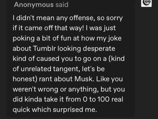
Alright apologies for the defensiveness, im a veteran witness of tumblr dramas of all sorts having been in this site since 2013 so its like that old guy farmer who always has a shotgun at hand to ward off any danger kek. The tangential rant was just concept association, I still think it’s purely coincidental though (elaborating a bit below)
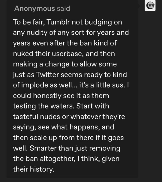
The community labels were implemented without any terms of service changes before shit went down on twitter though, it was a matter of discussion why there was a discrepancy even
A friend speculated the rollout of terms of service changes would be gradual and so far he was right on that one (speculated it to be much like you’re saying here, progressing more or less based on reception) first the labels to pitch the idea to the general populace then the first shift on changing the TOS. you’re right tumblr is still a dwindling strange site so I can completely see them using this opportunistically to attract user base from here on so who knows maybe it was not coincidental But I think this first rollout was planned to happen now, and the twitter thing happened to coincide and tumblr was like well shit, we can use this Situation!
Even attracting new users though issues remain because
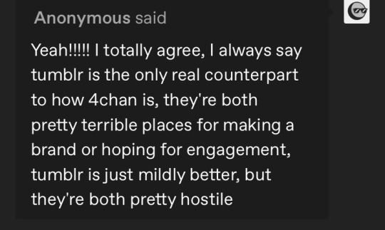
Of this ^^^^ above. Even with what you say anon, “just mildly” feels like being generous lol. Tumblr will unleash full fury on whoever they deem an acceptable target, and when they do theres no slur or intimidation tactic or even IRL event thats going too far (a couple superwholock dramas that leaked into actual irl con incidents come to mind) I think the tone of the violence is the different thing but tumblr and 4chan are nests for terminal online-ness. Artists who focus on fan merch and fanfic writers may be able to carve a niche but normies… never hahaha

In this respect tumblr is very old web-reminiscent which by itself is something I actually like about it and I hope it doesn’t get sanitised (if it does, to a minimal degree) Sure it’s ridiculous and inaccessible to the new user and an eyesore and a point of many a discourse I remember, but it helps indie people really personalise their brand and from the isolated teenager lens it permits a vast array of self expression.
I agree with you that it can get egregious and it definitely does not help the mainstream access though HAHA. To me its an endearing cringe at this point though I think tumblr really benefits from branding itself as an alt site, not as a mainstream social media joint
Reddit is egregious for non UI related reasons though. im not a fan

I agree!! I think the facetiousness is to not be too evident to the massive corpos like apple so they can get away with more, but it has the effect of also being unclear to the user base : ( tumblr should have addressed the problem in a more targeted way, banning it all outright was both ineffective and ended up financially fucking the site over and its still recovering
2 notes
·
View notes
Text
Wow Tinder is fucking unusable now. I haven’t had installed in like well over a year but what the fuck happened?
Three different subscription tiers for increasingly comedic amounts of money; you can barely even use the app without subbing
limited amount of likes per day unless you’re a premium member (hence previous point)
fuckin premade profile tags that are entirely useless unless you base your personality around like “wine” or “disney”
some kind of snapchat discover-esque thing where you can watch maybe the worst content-by-algorithm of all time
The one cool feature it uses to have where it could connect to spotify and show your top artists is super fuckin broken (mine will not update from when I last used it and it won’t even let me change it from what I had set)
frankly I really don’t want to see “who liked me” because that doesn’t really feel like the point of the app. I’m not paying for that feature and I don’t want the freebies I just want the beautiful RNG and the stars align to get matches like the old days
there’s this really weird push to give as much information as possible (not just for your profile but to the app itself for “verification purposes” too). Like you can’t forego listing your job title, job location, school location, city, instagram, etc without it reminding you constantly that “you only completed XX% of your profile!”
Similarly if you don’t want your profile listing your age or location for whatever reason (like I dunno privacy?) that requires a Tinder Plus ™ Subscription, baybee!!!
No seriously that last point is fucked up. I’m a guy, I don’t have to worry that much about my information on tinder because I’m not in much danger outside of the slim chance of getting hate-crimed if I match with the wrong guy (and I’m barely talking to tinder men as it is). If that shit rubs ME the wrong way I can’t imagine anyone who may be part of a more vulnerable group would even want to engage with the app in the first place.
the ads are just so fucking aggressive like they just appear in-between people and if you accidentally tap on them they open the obvious, obnoxious website you’d expect. Not only that but ads have been integrated right into the app functions (like a bunch of those “passions” tags are promotional). Shit like spotify integration has always been a form of advertising I guess but this isn’t even functional it’s just egregious (not like the spotify part is functional anymore either).
just in general the ui is a confusing nightmare hell zone where like just finding people you’ve matched with underneath layers and layers of requested monetization is ridiculous. Also parts of the app still look and feel the way it did like 6 years ago or whatever so you can clearly tell none of the money went into functionality
this one isn’t a problem with the app but I feel even shittier about myself after only a day on it again. I was kind of hoping to have like some fun, maybe not actually meet anyone but get at least a bit of a confidence from matching with people but the entire experience is just like soul sucking and I’m going to choose to blame the app instead of my own mental health
2 notes
·
View notes
Text
god damn
Mass Effect 2 has always been my least favorite of the trilogy
i still love it, but not as much as i love 1 or 3
and honestly
this is even more true in the Legendary Edition. the Legendary Edition widened that gap even further.
like, with each game, the Legendary Edition’s upgrades get more and more subtle. in ME1, they’re the most visible; in ME3, they’re the least. but that’s not the entire story.
the original ME1 had absolutely garbage graphics. that’s just the baggage almost every game from 2007 has, 2007 fucking sucked for game graphics. it could look good on occasion, but just from the sheer strength of having a good enough art style to make up for the garbage graphics. most of these occasions were when you were looking at something that was clearly supposed to wow you, like the view of the nebula surrounding the Citadel; otherwise, things tended to be fairly unimpressive. and it wasn’t just the graphics that were a problem. certain aspects of the gameplay were extremely clunky and awkward, and the UI was okay at the time but our understanding of good video game UIs progressed significantly over the course of the late 2000s.
in the Legendary Edition of ME1, this is no longer true. the entire game looks spectacular. ME1′s graphics have been fully updated to modern standards. i think the polycounts are still ultimately the same, but by the time ME1 came out we’d already basically gotten as far as we ever need to with polycounts. there are only so many polygons you actually need before increasing the polycount just becomes overkill. on top of that, the UI has been fully revamped to be more like ME2 and ME3′s UI, and the vast majority of the clunky gameplay issues have been resolved. the Mako in particular controls so much better. LE1 is the game ME1 was always meant to be, with all the junk wiped off. the junk had its charm, and i still absolutely intend to play the original on occasion, but overall, removing the junk made this amazing game shine even brighter.
the original ME3 was already a fucking spectacular game graphically. not only did it look amazing when it came out in 2012, but i honestly think it holds up today. it still looks very modern. and ME3 never had ME1′s problem of “junk obscuring the quality of the core game”- ME3′s flaws have always been more in the core game itself. i absolutely adore ME3, but i’ll admit, it’s an extremely flawed game and fixing those flaws wouldn’t be possible just with a remaster. so, when its flaws can’t be fixed with a remaster and its graphics still hold up amazingly well today.... i was extremely afraid that LE3 would be underwhelming.
thank god i was wrong. in the Legendary Edition of ME3, the game overall looks the same. again, the game already looks good by modern standards, why fix what ain’t broke? so they didn’t. but yet, while the game overall looks the same, it looks noticeably better, SOMEHOW. the longer i play LE3, the more and more subtle improvements i find myself picking up on. for instance, the way Husks and Cannibals get more and more visibly damaged as you hurt them (burning and emaciating when you set them on fire, chunks of flesh flying off as you shoot them, etc.). or Anderson’s clothes looking slightly more detailed. on the final Mars scene, Dr. Core seemed more visibly damaged. etc. and i’m sure there’s also a ton of stuff that i haven’t noticed yet, but has still contributed to this general feeling of “this looks better somehow”.
the graphical improvements of LE1 feel like making ME1′s garbage graphics finally good. meanwhile, the graphical improvements of LE3 feel like taking ME3′s already really good graphics and adding subtle and refined improvements that result in a game that looks the same but better, somehow. i really love these two improvements. too bad now we have to talk about LE2.
the original ME2 was an okay looking game. it was good by 2009 standards (and graphics from 2009 do not suffer the same curse as graphics from 2007; 2007 wasn’t a general sign of the era, it was just a particularly bad year because the industry was having trouble coping with the jump to HD), but it hasn’t aged nearly as gracefully as ME3′s graphics. but the graphics weren’t as garbage as ME1′s either. it was okay.
and the Legendary Edition of ME2 feels just about the same. the graphical improvements in LE2 are more drastic than they are in LE3, yet somehow they’re less noticeable. most of the time, it doesn’t really feel like i’m playing an improved version of ME2, it just feels like i’m playing ME2. LE3 and ME3 look almost fucking identical and yet LE3 still feels like a massive improvement somehow because the few changes they did make are so good; ME2 and LE2 have tons of extremely noticeable differences and yet it just feels........ the same. and actually, in some ways, LE2 is a little bit of a downgrade. for instance, the lighting on the Normandy. in ME1 and ME3, the Normandy was pretty darkly-lit; by contrast, the Normandy was brightly-lit in ME2. i prefer the dark lighting, but i always found it cool that ME2 did contrast the others in this way. and in LE2, the Normandy is still more brightly-lit than the other two games, but noticeably not as much. but that’s just one minor thing- the bigger and more consistent issue is that LE2 can feel really sloppy a lot of the time. there are so many assets that i can tell they haven’t changed. a few models that are egregiously low-poly (i said earlier that polycounts have mostly been solved since around ME1′s era, and yet...), a ton of video and picture files that clearly haven’t been updated (any video or picture of Anderson looks really weird, because in LE1 and LE2 Anderson uses the ME3 model, but in the original ME1 and ME2 he looked a bit different, and because all the pictures and videos are unaltered, any pictures or videos you see of Anderson.... look like the old Anderson), textures that are really low-res (especially weird because from what i understood the entire LE project started off as just a texture upscale?), a number of other things that i can think of but won’t list because this list is already so long....... LE2 just feels like a pretty sloppy improvement overall.
in the end, this isn’t that big a problem for me. the improvements to LE1 and LE3 are strong enough that i can put up with the comparative weakness of LE2. but it has widened the gap that already existed between ME2 and ME1/ME3 even further.
4 notes
·
View notes
Text
I am incredibly disappointed with the quality of the recent Infinity Nikki update - especially the flagship event. What's my issues?
Events don't properly register; Reaching goals either doesn't register or they are falsely marked as reached but can't be claimed
Cutscenes are skipped
Events don't trigger
You get softlocked all the time
The UI was changed AGAIN
Ping (on EU) is massively high
Game crashes suddenly
Notifications don't go away
And the Piecey models are completely broken when they are in idle
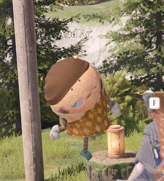
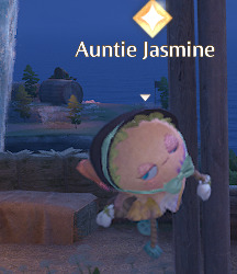
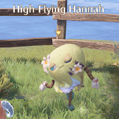
Edit: More bugs. Ahem...
Beating the Eventboss "Through the Mist" does indeed immediately crash the game and make it unplayable afterwards. By unplayable I mean the game freezes after and keeps crashing
[Crimson Feathers] outfit literallyjus DISAPPEARS sometimes
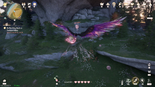
All in all? Infold needs to lock the tf in because every patch has had fuckass issues that aren't fixed for the entirety of the patch and this one, along with Spooky Season breaking the Hoop-Hopper in a way that completely disables jumping in THE JUMPING FOCUSED MINI GAME is egregious. Yesterday I sat here for 2 hours trying to figure out how to progress the event story line unsure if I was being stupid or if I was softlocked. Then I left and came back the next day to be immediately thrown into a dialogue event the script apparently just skipped when I first entered Steamville. I was indeed softlocked.
Listen, I want this game to succeed. I really enjoy it but there has to be a certain quality that needs to be upheld for a product. As much as making games is an artform, at the end of the day it's still a product a consumer will use and it needs to at least work as intended. I wish modern developers AND their higher ups would stop fucking releasing faulty products and bank on the hope that there will be no backlash when it needs several hotfix-patches.
4 notes
·
View notes
Text
[Review] Conker: Live & Reloaded (XB)

Let’s see just how well this misguided remake/expansion holds up. This will be a long one!
Conker’s Bad Fur Day is my favourite N64 game. It’s cinematic and ambitious, technically impressive, has scads of gameplay variety with fun settings and setpieces, and when I first played it I was just the right age for the humour to land very well for me. A scant four years later Rare remade it for the Xbox after their acquisition by Microsoft, replacing the original multiplayer modes with a new online mode that would be the focus of the project, with classes and objectives and such.
First, an assessment of the single-player campaign. On a revisit I can see the common criticisms hold some water: the 3D platformer gameplay is a bit shaky at times, certain gameplay segments are just plain wonky and unfair, and some of the humour doesn’t hold up. It’s got all the best poorly-aged jokes: reference humour, gross-out/shock humour, and poking fun at conventions of the now dormant 3D collectathon platformer genre. I also am more sensitive these days to things like the sexual assault and homophobia undertones to the cogs, or Conker doing awful things for lols. Having said that, there’s plenty that I still find amusing, and outside of a few aggravatingly difficult sequences (surf punks, the mansion key hunt, the submarine attack, the beach escape) I do still appreciate the range of things you do in the game.
As for the remake, I’m not sure it can be called an improvement by any metric. Sure, there’s some minor additions. There’s a new surgeon Tediz miniboss, the new haunted baby doll enemy, and the opening to Spooky has been given a Gothic village retheme along with an added—though unremarked on—costume for Conker during this chapter based on the Hugh Jackman Van Helsing flop. Other changes are if anything detrimental. The electrocution and Berri’s shooting cutscenes have been extended, thus undermining the joke/emotional impact. The original game used the trope of censoring certain swear words to makes lines more funny; the remake adds more censorship for some reason, in one case (the Rock Solid bouncer scene) ruining the joke, and Chucky Poo’s Lament is just worse with fart noises covering the cursing.
The most egregious change, and one lampshaded in the tutorial, is the replacement of the frying pan (an instant and satisfying interaction) with a baseball bat which must be equipped, changing the control and camera to the behind-the-back combat style, and then swung with timed inputs to defeat the many added armoured goblings and dolls carelessly dumped all throughout the game world. This flat out makes the game less fun to play through.
On top of this, all the music has been rerecorded (with apologies to Robin Beanland, I didn’t really notice apart from instances where it had to be changed, such as in Franky’s boss fight where the intensely frenetic banjo lead was drastically reduced as a concession to the requirement to actually play it in real life), and the graphics totally redone. Bad Fur Day made excellent use of textures, but with detail cranked up, the sixth generation muddiness, and a frankly overdone fur effect, something is lost. I’m not a fan of the character redesigns either; sure Birdy has a new hat, but I didn’t particularly want to see Conker’s hands, and the Tediz are no longer sinister stuffed bears but weird biological monster bears with uniforms. On top of all this you notice regular dropped details; a swapped texture makes for nonsensical dialogue in the Batula cutscene, and characters have lost some emotive animations. Plus, the new translucent scrolling speech bubbles are undeniably worse.
I could mention the understandable loading screens (at least they’re quick), the mistimed lip sync (possibly exacerbated by my tech setup), or the removal of cheats (not a big deal), but enough remake bashing. To be fair, the swimming controls have been improved and the air meter mercifully extended, making Bats Tower more palatable. And some sequences have been shortened to—I suppose—lessen gameplay tedium (although removing the electric eel entirely is an odd choice). But let’s cover the multiplayer. Losing the varied modes from the original is a heavy blow, as I remember many a fun evening spent in Beach, War, or Raptor, along with the cutscenes setting up each mode.
The new headline feature of this release is the Live mode. The new Xbox Live service allowing online multiplayer was integrated, although it’s all gone now. Chasing the hot trends of the time, it’s a set of class-based team missions, with the Squirrel High Command vs. the Tediz in a variety of scenarios, mostly boiling down to progressing through capture points or capture the flag. Each class is quite specialised and I’m not sure how balanced it is, plus there’s proto-achievements and unlocks behind substantial milestones none of which I got close to reaching (I don’t think I could get most of them anyway, not being “Live”).
The maps are structured around a “Chapter X” campaign in which the Tediz and the weasel antagonist from BFD Ze Professor (here given a new and highly offensive double-barrelled slur name) are initially fighting the SHC in the Second World War-inspired past of the Old War, before using a time machine, opening up a sci-fi theme for the Future War. These are mainly just aesthetic changes, but it’s a fun idea and lets them explore Seavor’s beloved wartime theming a bit more while also bringing in plenty of references to Star Wars, Alien, Dune, and Halo; mostly visual.
Unfortunately the plot is a bit incoherent, rushed through narration (unusually provided by professional American voice actor Fred Tatasciore rather than a Rare staffer doing a raspy or regional voice like the rest of the game) over admittedly nice-looking cutscenes. They also muddle the timeline significantly, seemingly ignoring the BFD events... and then the Tediz’ ultimate goal is to revive the hibernating Panther King, when the purpose of their creation was to usurp him in the first place! It expands on the Conker universe but in a way that makes the world feel smaller and more confusing. It’s weird, and also Conker doesn’t appear at all.
On top of this, I found the multiplayer experience itself frustrating. To unlock the full Chapter X, you need to play the first three maps on easy, then you can go through the whole six. But I couldn’t pass the first one on normal difficulty! The “Dumbots” seemed to have so much health and impeccable aim, while the action was so chaotic, obscured by intrusive UI, floating usernames, and smoke and other effects with loads of characters milling around, not to mention the confusing map layouts, the friendly fire, the instant respawns, and the spawncamping. Luckily I could play the maps themselves in solo mode with cutscenes and adjustable AI and options.
I found some classes much more satisfying than others. I tried to like the Long Ranger and the slow Demolisher, but found it difficult to be accurate. The awkward range of the Thermophile and the Sky Jockey’s rarely effective vehicles made them uncommon choices. I had most success with the simple Grunt, or the melee-range Sneeker (the SHC variant of which is sadly the sole playable female in the whole thing). You can pick up upgrade tokens during gameplay to expand the toolset of each class, which range from necessary to situational. But ultimately it’s a crapshoot, as I rarely felt that my intentions led to clear results.
Live & Reloaded is such a mess. The Reloaded BFD is full of odd decisions and baffling drawbacks, while the Live portion feels undercooked. I’d have preferred a greater focus on either one; a remake is unnecessary, especially only four years on, but a new single-player adventure would have been ace. And a multiplayer mode in this universe with its own story mode could be cool if it was better balanced and had more to it than just eight maps. As a source of some slight scrapings of new Conker content I appreciated it to some extent, but I can’t help being let down. I guess it’s true what they say... the grass is always greener. And you don’t really know what it is you have, until it’s gone... gone. Gone.
Yes, that ending is still genuinely emotionally affecting.
4 notes
·
View notes