#edit: changed the shadow colors
Explore tagged Tumblr posts
Visit Tumblr Blog
Explore Tumblr blogs with no restrictions, modern design and the best experience.
Last Seen Tumblr Blogs


Fun Fact
In 2020, Tumblr had 29.4 million users in the US.
Text

Day 2: Past What's that? The week is over? No, no, it's only day two, so don't worry about it. I haven't said much about their past because I try to keep them canon-compliant and also… because I love to change my mind. Still, I've drawn them a few times around this age, so here's something a bit more specific.
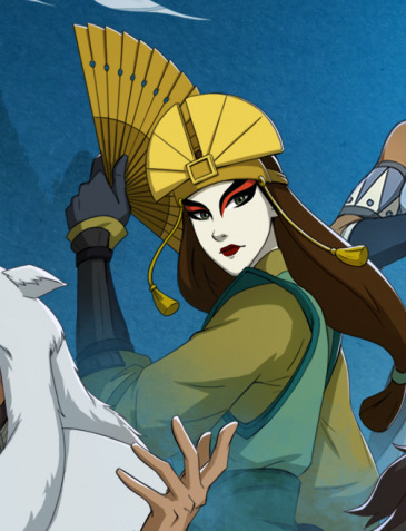
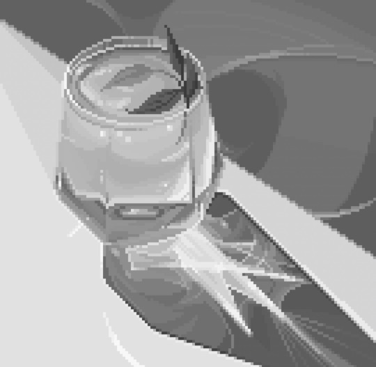
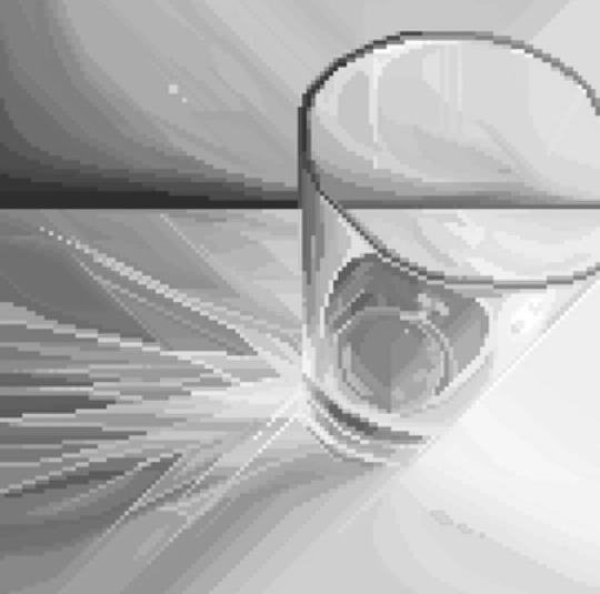
#Orion's Art#Kingdom Hearts#KHX#KHUX#Player Character#khoc#khocweek#khocweek2024#''I need to keep these simple'' I say#immediately creating a composition#that requires a background#taking a break from drawing sprawling backgrounds#by drawing sprawling backgrounds#when drawing their hair at this length#it's just been kind of messy and indistinct#so I've thought about styling it more deliberately#in Final Fantasy 2#the homeland of Dragoons is called Deist#so I just call it that in my mind#edit: changed the shadow colors#and the resolution lmao
39 notes
·
View notes
Text


DOCTOR WHO Empire of Death
#dwedit#doctor who#usertennant#userteri#userdiana#mrs flood#cherry sunday#*#now what on earth is your true name.....#edit: had to change the coloring on a couple gifs#bc for some reason gif 5 was shadow banning the post lol
548 notes
·
View notes
Text


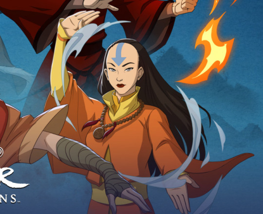

(sloppy) Kyoshi and Yangchen edits I did to drive the point home that Kyoshi and Yangchen look similar in a headcanon/theory post about Kyoshi resembling Yangchen physically as well as maybe being related.
(Note: Kyo's skin color is lighter and lacks freckles because Yangchen does....I wanted to do an edit where I compare teen Kyo's appearance with Yangchen and thus giving Yangchen darker skin/freckles/bangs but I forgot ;"D ;w; Maybe I'll do that later tonight if I remember ;w;)
#kyoshi#yangchen#jetsun#jesa#hark#rise of kyoshi#dawn of yangchen#shadow of kyoshi#legacy of yangchen#chronicles of the avatar#tried so hard to not spoil yangchen TT0TT#Headcanon Court#silly theories#silly theory#avatar theory#figured I'd make a separate post to just showcase the edits#silly edits#even if they are sloppy#Generations art gives Kyoshi slightly larger eyes but imo both her and yangchen have more narrow eyes#kyoshi's eye color changes like the wind but the last pic I did NOT change that eye color#ironically enough it's accurate to her original statue's eye color jfklasjfkld
31 notes
·
View notes
Text
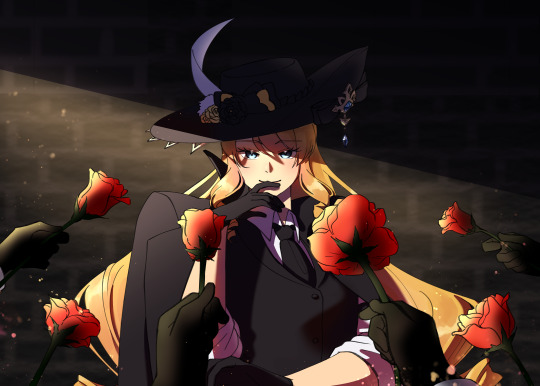

she cooked, she served, she ate 💛 may all navia wanters be navia havers 🌹
open for better quality | no reposts
#navia#genshin impact#fanart#myart#doodle#after i finished coloring navia my first thought was 'am i skilled enough to Not ruin this piece?'#thankfully i managed somehow ;;;#i was just playing around w/ the shadows and tonal edits and it worked#i wanted to do the art of a character surrounded by people offering them lighters but-#i changed it to roses bc that's navia's motif ^^#good luck to those wishing for her!!#2nd version of this art is here bc i wanted to show off how i did her hair#i'm super proud of it hehe i think it looks very pretty
88 notes
·
View notes
Text

I drew Dark Choco with the slit eye thing
Let this be canon Devsis, let him do it
#cookie run#cookie run kingdom#dark choco cookie#dark cacao cookie#I know he’s not in this but it’s the thing Dark Cacao does#I had to like study Dark Cacao’s rage sprites to figure out how to do it#because it’s not just a darker line in his eye#his eyes are actually a lighter color with a gradient that goes to dark#and then doing the shadow#the hair was also a combination of his new traveler outfit and his New Years outfit#since the hair is slightly different in both#anyways#my art#this was on another canvas I had and I just took a screenshot#maybe I’ll post it if I ever bother to finish it#it’s just a collection of sketches#or it’s supposed to be#edit: I keep slightly changing the picture and having to upload a new one gets really annoying
228 notes
·
View notes
Text
AAAANYways. look at the map ive been working on :]
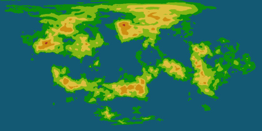
#its actually rlyyy unfortunate bc ive been spending all day sprucing it up it ws originally just generated by the globe making site i like#and then i realized that i dont quitee know how to make the height map.. the original generation it ws rly easy i just made the map#grayscale and then futzed with it a little bit and i got it looking rly good..but im the process of lining everything to make it easier to#comprehend they got too seperate from eachother sighs. so i might have to go in and manually add more transitional colors#but the trouble is id have to do that for the height map AND the normal map which is also a geographical map..#also its rly weird. on da site i rly prefer the look of the 3d heightmap#rather than 2d just adding like shadows your know#but when i do the 3d it gets this huge black blotch that i cant for the life of me get rid of#and it rly sucks. bc i think its sooo cute when i have the height map intensity set pretty high#bc it makes da planet look small..#but yas. and i cant just use the uhmm original height map#bc i made some pretttyy extensive edits#not rly. mainly i#well its hard t talk abt bc its all technically one continent but that ties into what i changed#bc i didnt realize it was all one continent bc on the original map it generated it was cut up rly weird#and i couldnt get it to fit as one thing. so i went in and smushed some aprts closer together#the biggest is umm the bottom right corner#the top part of that mass USED to hang down below and to the rifht#and bled over to the other side of the image#i moved that and the top left land mass to be closer to the top right#so i could fit it all together...#and the hright map thing wouldnt be an issue if the 3d height map thing was working. it just looks sliiiightly wonky with the 2d height map#i also need to smooth out the whole thing bc i used a digital brush like an IDIOT and i dont like how that looks when its on the sphere#oh also do u guys wanna see the globe of it.. grins#ik i was already doing this awhile ago but ohwell.#once i get it wayyy more finalized like. once ive added in major settlements and the like. id love to try to make an actual globe of it..#i wanna get it to a point im rly happy with FIRST bc otherwise ill change things on the globe#and then ill get annoyed bc i wont be able to transfer the irl globe into a digital one#bc thats what happened last time when i sketched a world on a ball. grins.#hopefully i dont drop this one like i did with that one.. idt i will since i have an accurate flat map thats literally made to be a globe
5 notes
·
View notes
Text
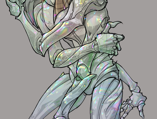
gonna show u guys a little opalescent highlight hack i threw together today
rainbow gradient above your main figure (i usually have all my main figure folders/layers in one big folder, so i can clip gradient maps + adjustments to it!). liquify tool to push the colors around a bit. STAY WITH ME I KNOW IT LOOKS STUPID RN I'M GOING SOMEWHERE WITH THIS
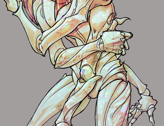
THEN: set it to add/glow (or the equivalent in ur drawing program), lower the opacity a bit, and apply a layer mask. then u can edit the mask with whatever tools you like to create rainbow highlights!!
in this case i'm mostly using the lasso fill tool to chip out little facets, but i've also done some soft airbrushing to bring in larger rainbow swirls in some areas. it's pretty subtle here, but you can see it better when i remove the gradient map that's above everything, since below i'm working in greyscale:
more granular rambling beneath the cut!
u could also just do this with a brush that has color jitter, but what i like about using layer masks for highlight/shading layers is how simple and reversible it makes everything. i can use whatever brushes i want, and erasing/redoing things is super low stakes, which is great when i often approach this stuff with a super trial-and-error approach.
example: have u ever thrown a gradient w multiple colors over an entire piece, set it to multiply etc, and then tried to erase it away to carve out shadows/highlights? it's super frustrating, bc it looks really good, but if u erase something and then change ur mind later, u basically would have to like. recreate the gradient in the area u want to cover up again. that's how i used to do things before figuring out layer masks!! but masking basically creates a version of this with INFINITE undo bc u can erase/re-place the base layer whenever u want.
anyway, back to rambling about this specific method:
i actually have TWO of these layers on this piece (one with the liquified swirls shown above, and another that's just a normal concentric circle gradient with much broader stripes) so i can vary the highlights easily as needed.
since i've basically hidden the rainbow pattern from myself, the colors in each brushstroke i make will kind of be a surprise, which isn't always great -- but easily fixable! for example, if i carve out a highlight and it turns out the rainbow pattern in that area is way too stripey, i can just switch from editing the mask to editing the main layer and blur that spot a bit.
also, this isn't a full explanation of the overall transparency effect in these screencaps! there's other layer stuff happening below the rainbow highlights, but the short version is i have all this character's body parts in different folders, each with their own lineart and background fill, and then the fill opacity is lowered and there's multiply layers clipped to that -- blah blah it's a whole thing. maybe i'll have a whole rundown on this on patreon later. uhhh i think that's it tho! i hope u get something useful out of this extremely specific thing i did lmao
12K notes
·
View notes
Text
I havent seen this anywhere yet so
heres the (leaked) origin of the pokemon universe story with the correct pokemon names in place of the beta ones
(original text here)
EDIT: just woke up but theres an updated translated version here. I've gone ahead and changed the text below to the updated version Please note that there is no mention of giratina in the updated version (which makes more sense based on some other info we have)
In the beginning, there was a vortex of chaos. All mixed slowly together, and everything was a blur. One day, a large egg appeared in the center of the chaos. For a long time, the egg continued to shake.
Eventually, the vortex stopped, and the egg broke. The absolute god Arceus was born.
The scattered fragments of the egg transformed into giants, and attacked the newly born Arceus. However, Arceus quickly grew, and continuously defeated the giants. At last, after a fierce battle, Arceus defeated all the giants.
The wounded Arceus created an alternate self. As the left and right side of Arceus’s body were different, it created two selves. Arceus gathered the body of the defeated giants, and poured its blood into them.
From the one who resembled his left poured out light, so Arceus named it Palkia, the god of light. From the one who resembled his right poured out darkness, so Arceus named it Dialga, the god of darkness.
To the two, Arceus commanded that the world be filled with people, and fell into a deep slumber.
Although Palkia and Dialga were different in appearance, they loved one another, were joined, and had many children. However, there still existed no world, and their frail children, who had nowhere to go, died one after the other. Though overcome with great sadness, Palkia and Dialga thought of creating a world where all could live healthy and prosperous lives.
Palkia and Dialga called their children Uxie, the god of eyes; Mesprit, the god of heart; and Azelf, the god of voice.
When Uxie open its eyes, everything that was there appeared. There was now contour and color in the world. When Mesprit wished for it, everything that was there could be felt. A sense of calm spread. When Azelf shouted, everything that was there trembled. A blessed timbre began to resonate.
To the three, Palkia and Dialga gave the seed of life and told them to nurture it.
The three gathered in a circle and prayed, and the seed sprouted.
The sprout quickly grew, and became the giant tree of life. However, the tree continued to grow, soon filling the entire world, and no one was able to move.
The three asked Father Palkia and Mother Dialga for help.
Dialga and Palkia joined once again, and had three children. The god of the sky, RAYQUAZA; the god of the earth, GROUDON; and the god of the ocean, KYOGRE were born.
RAYQUAZA wrapped its body around the tree of life. GROUDON and KYOGRE slammed their bodies into the tree of life. Eventually, the tree fell and broke into three pieces.
Uxie, Mesprit, and Azelf prayed, saddened that the tree would rot away like this. Then, the pieces of the broken tree would transform into the sky, earth, and ocean.
RAYQUAZA became the pillar that holds the sky. The shadow that reached into the heavens became the three gods who sustain the sky: Dragonite, Gyarados, and Tyranitar. The air filled the sky, and the stars sparkled.
GROUDON became the land that covers the earth. The roar of the diving land became the three gods who sustain the earth: DAABU, SAAN, and GOODON. The earth shook, and the mountains stirred.
KYOGRE became the veins of water that embraced the oceans. The ripples that disappeared into the seas became the three gods who sustain the ocean: LATIAS, METAGROSS, and LATIOS. The ocean was filled with water, and the waves whispered.
Thus the world was born.
Palkia and Dialga, and the various gods, were very pleased with this, and filled this world with their children.
That peaceful world was a paradise for the children of god.
The children of god would continue to multiply.
Through that, words would change little by little.
Over time, the gods began would call those who lived in the world by two names.
The children of god who resembled the great father, Palkia, would be called “Pokémon”. The children of god who resembled the great mother, Dialga, were called “humans”.
The absolute god Arceus will soon awaken, and seeing the world filled with its descendants, will promise great abundance and prosperity.
1K notes
·
View notes
Text
(Retro & Vintage) Gaming Consoles #1 - PlayStation 1 (PS1) - Updated & Fixed
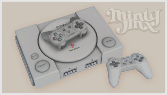


So, Mr. Procrastination has been squatting with me for a good while now. I have so much CC to upload but for some reason I never get around to it.
I’ll be making a collection of retro/vintage gaming consoles and thought I’d start with a tribute to the Sony Playstation 1, dedicated to my Hubby who grew up playing on the O.G. gaming consoles!
This is a set with a total of 5 items! 1. PlayStation (PS1) Game Console - Decorative 2. PlayStation (PS1) Game Console - Functional (Requires City Living EP) 3. PlayStation (PS1) Controller / Gamepad - Decorative 4. PlayStation (PS1) Controller / Gamepad - Functional/Override for “Game Console Controller” from City Living EP. (As Shown in the picture below) ⤵️ 5. PlayStation (PS1) Controller / Gamepad - Functional/Override (in Simlish)! (install EITHER the simlish override or the regular override, not both.)
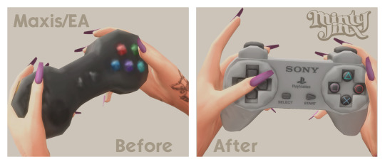
This set also has a few colorful swatches for those of us who are more whimsical 🌼
More Preview Pictures:


All files have been updated as of 2023-11-17. Delete all your old PS1 files and re-download the new ones linked below. Keep in mind that you can only have 1 override file for the controller though. (For more details on what's been changed, read "Updates & Fixes" further down)
Download (SFS) (free)
Updates & Fixes: ✦ Fixed texture & Shadow issues with PS1 Console (Functional), PS1 Controller (Decorative) & PS1 Controller (Override). ✦ Added Simlish swatches to the decorative controller and consoles (both decorative & functional). ✦ Added a new controller override in Simlish.
------------ I also want to give credit to the amazing CC creators who’s items are shown in the preview pictures ⤵️
CREDIT(s): ★ @mechtasims: Y2K Set: Heels, Cyber Girl: TV, Bathroom Set: Lotion, Pluto Set: Table, ★ @grayvixen: Neon Flamingo Sign ★ @savagesimbaby: Sweet & Sexy tattoo ★ @cecesimsxo: Cherry Ombre Nails ★ @joliebean: Ballerina Nails Matte -----------
Note(s): For any questions, requests, or if you're having any issues with my CC; leave a comment or ask me anything HERE.
Notes For CC creators wishing to edit my CC: You may absolutely recolor my CC. If you share the recolor then please do not include the mesh but rather provide a link back to this page. (Unless it’s for personal use, obviously.)
You may edit any and all of my meshes. All I ask is to credit me with a link that leads to this page stating that you’ve used my mesh as a base/source etc. For more detailed notes regarding this, click HERE or contact me directly.
#ts4 custom content#s4cc#simblr#ts4#ts4 maxis match#ts4cc#ts4 cc#Ts4 mm cc#ccfinds#sims4cc#maxis match#ts4 retro#ts4 decor#ts4 bb
4K notes
·
View notes
Text


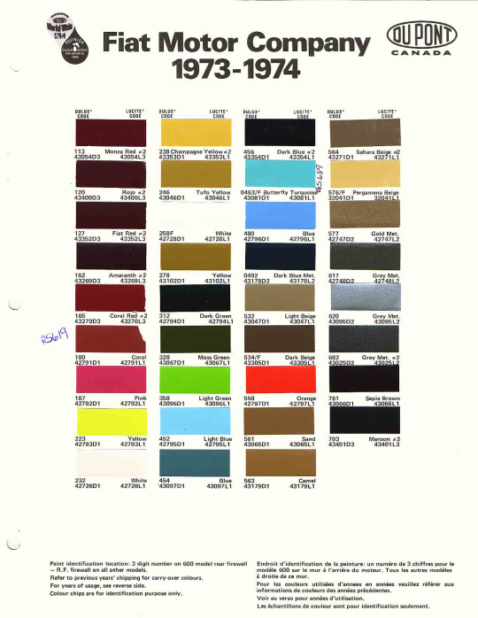
>>Download<<
Edited mesh included. This will work with the original colors, however, I have replaced the default white from Ginger's original car with the Fiat Red one you see in the first pic. These recolors will semi-work with the original mesh, there will be a slightly misplaced shadow under the front Fiat logo if you're using Ginger's mesh. Mesh changes: Moved & resized the license plates to closer resemble the position that license plates are usually located on these type of cars. Moved the Fiat logo to where it would actually go. Slightly reshaped the front. Yanked the front bumper back into the car so it's not floating. Fixed direction on interior faces under the backseat. Texture changes: Added slight shading & better seats. Changed the interior of the door to wood paneling. Added the trunk latch & the 3 extra vent slots that the 74 has. The license plate is in Simlish. Why is this a 1974?: It's actually pretty hard to tell what year the 126p is in this low-poly of a model, since there are very few changes from year-to-year cosmetically (it looked about the same for its entire run), but what really sold me on 1974 was the whitewall tires. Color Theory: Look, Fiat has some good colors. Just behold them. I needed all of them.
You Get: 35 car colors. The interior is its own recolor channel but shares textures with the body of the car, mix&match however you want.
681 notes
·
View notes
Text
STICKY POST: ULTIMATE(ISH) GUIDE(S) TO SIMS 4 CC-MAKING; OR, A COMPREHENSIVE COMPENDIUM OF TUTORIALS, INSTRUCTIONAL MATERIALS, & FELLOW COMPILATIONS OF A LIKEWISE NATURE
In which I list a fuckton of tutorials, guides, and lists of such, each written, curated, and crafted by people far more talented than I.
More will be added as I find them.
---
@teanmoon's CC Guides - Includes tutorials on cloning, uv_1, weights, bump and specular maps, bi-color hair, and a Blender Cheat Sheet. High poly 'creators' have little excuse to churn out high poly, non-optimized garbage when they can lean on bump maps. (I know those can only do so much for more complex meshes, but for objects, texture maps can do SO much heavy-lifting).
@vintagesimstress's CC Guides - Includes tutorials on using Blender to create objects and clothing, especially for people who are just getting started.
@eliavah's uv-1 adjustment tutorial. Haven't tried this myself yet, but after glancing through it, it's something I will surely want to keep bookmarked.
@simlaughlove's CC Tutorials List - Includes many tutorials handily laid out by category on everything from object texturing to CAS morphs.
@thefoxburyinstitute's Nav Page - This blog is nonstop Sims 4 resources for e v e r y t h i n g. READ THIS POST FIRST as a guide on how to actually... nav.
@simsresourcehub's Tags List - What it says on the tin.
Transferring Weights in Blender 3.3.1 - Over at Sims4Studio forums.
@trillyke's List of Tutorials - Good ones!
@sims4tutorials - *GRAND GESTURES*
@katverse's Huge List of Tutorials - Tutorials on eeeverything.
@thatsimslady's Massive List of Tutorials - 31 pages????? Damn.
@kouukie's Sims 4 CAS with Marvelous Designer Tutorial - YouTube video!
@rusticottage's Gifmaking Tutorial - I love Sims gifs tbh.
@cowplant-pizza' Boes' Editing Masterlist - Includes stuff for Reshade, PSDs, PS Actions, and how to use them.
@melonsloth's Deco Sim Tutorial - Using SimRipper
@depthofpixels's Deco Sim Tutorial - Using SimRipper
@azuhrasims' Guide to Posing Sims - Includes how to pose sims, and handy workarounds! Super great for beginners and longtime users.
@radioactivedotcom's Guide to Posing - Includes additional posing resources. NOT for beginners.
@madameriasims4's Add a Flame to Your Basegame Candle - Great for mood lighting and historical gameplay!
@syboubou's Making a Lamp Start to Finish - a video tutorial
MORE BELOW:
Adding Lit DST to Fireplace
New image ref for default overrides
Make an RGB Spec for Objects
Bake a shadow onto your object in Blender
Linking all bedding to a single frame
Cutouts for Doors/Windows/Archways
Making objects see-through/glass
Making lamps light correctly
Give an object transparency (add an alpha)
Make a candle w/ multiple flames
Change LOD viewing distance
698 notes
·
View notes
Text

𝖶𝖧𝖠𝖳 𝖣𝖮𝖤𝖲 𝖸𝖮𝖴𝖱 𝖥𝖴𝖳𝖴𝖱𝖤 𝖲𝖯𝖮𝖴𝖲𝖤 𝖫𝖮𝖮𝖪 𝖫𝖨𝖪𝖤? | 𝗉𝗂𝖼𝗄 𝖺 𝖼𝖺𝗋𝖽.

— Hi! Apologies for being a bit inactive lately. Been tied up with stuff, but I'm back with a reading for you all! Today, we'll delve into what your future partner could look like. Remember, just take whatever resonates with you. This reading is more so about what sticks out to you when reading.
ORIGINAL DATE POSTED : APRIL 26TH, 2024.
HOW TO CHOOSE A PILE : The outcome may vary based on whether you receive clear messages visually or intuitively. If you resonate more with selecting a pile visually, trust that inclination. Personally, I believe the notion that 'looks can deceive,' so I prefer to take a deep breath and close my eyes, allowing the pile I'm meant to connect with to come to me. You might see the color of the pile, sense or hear a number, or simply feel its overall vibe.
Please don’t redistribute or edit my content.
MUST READ + MASTERLIST | KO-FI
PILE ONE
Zodiac Dice Roll. — Virgo.
Your future partner likely has an oval face shape with a more narrow jawline and chin, contrasted by prominent cheekbones. They're likely to have a slender physique, though proportionate in any case.
Tarot. — Six of Swords.
They give off a moody or unassuming vibe, seeming as though they don't express much. Yet, they're quite proactive in changing their appearance, whether it's their style, hair, or even their athleticism. However, they'll always maintain that aloof, 'leave me out of it' demeanor.
Additional. Hermit — Light : Seeks solitude to focus intently on inner life. Serves personal creativity. Shadow : Withdraws from society out of fear or negative judgements of others. Refusing to help those in need. Pioneer — Light : Passion for doing and creating what has not been done before. Shadow : Compulsive need to keep moving on.
As I mentioned earlier, they are constantly undergoing physical changes in some way. They have an introverted and withdrawn aura. They could let their hair grow out and become a bit scruffy before impulsively cutting it off. They maintain a rather deadpan expression when simply existing in their own world. The image of Edward Cullen specifically came to mind when pulling the cards.
Specifics. — Take What Feels Right. High Cheekbones, Heart Shaped Face, Pale Skin, Brown Eyes, Curly Hair, Cat Beauty, Honey Eyes, Thin Eyebrows.
Yes, very vampire allure-esque indeed. Their eyes could appear normally brown but take on a honey-like glow under certain lighting. Their eyes are quite striking, considering they have feline type features. Although hair color didn't come up during the reading, I pictured them with dark hair that complements their skin tone.
Apocalypse : Cigarettes After Sex.
PILE TWO
Zodiac Dice Roll. — Leo.
Of course, they possesses striking hair like a lion's mane—thick, unruly, perhaps even a bit frizzy, something that immediately catches one's eye, possibly long in length. Their eyes are equally intense, matching their strong jawline. They exude a fierce appearance that naturally draws attention, whether they seek it or not.
Tarot. — Four of Wands [Reversed].
Your future spouse might have a more mature-looking face compared to yours or for their age. They appear quite stressed, with heavy eyes and noticeable wrinkles, particularly around their eyes, such as crow's feet and frown lines.
This aspect also reflects in their demeanor. They might carry an air of disappointment, even if they don't necessarily feel that way—it's just a testament to what they've been through. They tend to go for neutrals in their clothing choices, not leaning towards vibrant styles. Despite appearing restless, they naturally possess an attractive charm.
Additional. Mystic — Light : Revels in intimate union with the Divine. Shadow : Delusional rapport with the Divine.
They have a divine look to their appearance, regardless of their modest and simple attire or styling. There's a hint of mystique about them, but I feel it leans more towards a deity-like appearance rather than a witchy vibe. I imagine your future partner resembling a god/goddess, genuinely embodying timeless beauty.
Specifics. — Take What Feels Right. Below Average Height, Legs, Medium-Length Hair, Prominent Mouth, Broad Nose, Copper hair, Medium Skin.
Your future spouse has a complexion you'd deem as medium-toned. When it comes to their hair, I envision it falling somewhere between medium to long length. Though a single color came out, you could interpret it as having hints of orange or red tones instead. Their mouth is defined by sharp, pointed features, while their nose possesses a broad, perhaps even slightly downturned shape.
Bernadette : IAMX. | Lucky Drive : Sarah Kinsley. | Who Is She? : I Monster. [ I think these songs perfectly describe their vibe. ]
PILE THREE
Zodiac Dice Roll. — Aries.
Your future spouse has distinct/sharp, broad features with thick eyebrows framing their face. Freckles, beauty marks, or subtle scars might adorn their face, too. Their shoulders are broad and sturdy. They could be tinged with red in some way. It could be in their complexion with rosy cheeks, hair, eyes, or they just wear a lot of red. Despite a muscular build, they still have curves, whether it's slim hips and wider thighs or a smaller waist and broader hips.
Tarot. — Three of Wands [Reversed].
It seems they may have a serious RBF, often appearing quite frustrated or impatient. There's a strong and confident demeanor about them. When envisioning their build or expression, I see Rhea Ripley 100%.
Additional. Hero/Heroine — Light : Passion for a journey of personal empowerment. Shadow : Escapism and a false sense of heroism.
When we typically imagine heroes, we picture them as polished and composed. However, behind the curtain, they bear the marks of their struggles, with visible signs of stress etched into their body. Your future partner will be this way. Peel back their layers, and you'll uncover scars, calluses, and an overall roughness.
Specifics. — Take What Feels Right. Gray Eyes, Hawk Nose, Thick Nose, Scars, Thighs, Neutral Tone, Square Shaped Face, Hands.
What did I say about scars? It popped up three times at this point. Their skin tone has a neutral undertone, not warm or cool. Their nose is large and hooked. And those gray eyes? Unwavering. You could simply like their thighs and hands specifically, or there's something significant about them.
Hey Sexy Lady : Shaggy. | Blood Sweat & Tears : BTS.
PILE FOUR
Zodiac Dice Roll. — Pisces.
Your future spouse has round, soft lips, with dewy skin and eyes shining with tenderness. They have a dreamy aura, perhaps lost in thought at times. Their hair may tend towards the finer side. I envision them as 'dainty' and clumsy.
Tarot. — Four of Wands [Reversed]. | The Star.
The Star card suits them perfectly. They radiate both warmth and serenity, their presence quite calming. This reflects in their appearance, with a lively step and a clear sense of purpose in all they do. They have a whimsical charm, very cute!
Additional. Child : Orphan — Light : Independence based on learning to go at it alone. Conquering fear of surviving. Shadow : Feelings of abandonment that stifle maturation. Seeking inappropriate surrogate families.
In terms of aesthetic, your future spouse has a more colorful style. They appear youthful without seeming childish, dressing without fear and staying true to themselves, free from judgment.
Specifics. — Take What Feels Right. Alternative, Sparse Eyebrows, Long Eyelashes, Waist, Slim, Small Eyes, Green Eyes, Bald, Masculine.
This aligns with what I was getting at. They definitely have an alternative style. Although the energy initially felt 'feminine,' masculine came out. So, I believe this person is deeply connected to both aspects. They might also identify as queer. And while they could actually be bald, I heard in it a joking tone, given their naturally thin hair.
The Shining : The Neighbourhood. | Confidence : Ocean Alley.
PILE FIVE
Zodiac Dice Roll. — Capricorn.
Your future spouse is somewhat lanky but has hidden strength, almost described as lithe. They carry an almost stern and steady gaze, radiating seriousness and maturity. Their bone structure is striking, too. Unlike typical Capricorns, they move with a deliberate slowness, calculated in their actions. They are an alluring person. — I forgot to add that they have nice teeth!
Tarot. — Knight of Pentacles [Reversed].
I picture your future spouse as having a disheveled and unkempt appearance, but in a somehow intentional and controllable manner—it's a bit hard to put into words. Think of someone like Hozier in terms of what I mean. They might give off a slightly lazy energy, dressing in loose-fitting clothes. I don't think they enjoy changing their appearance much and prefer to stick to the same style. I imagine they lean towards neutral or dark colors, something easy on the eyes.
Additional. Messiah — Light : Serving humanity with humility. Shadow : Exaggerated belief that you are the only means through which a cause can succeed.
This person is confident, fully aware of their own charm. I envision them with darker skin and dark hair. If you're attracted to men, I imagine them having some form of facial hair, perhaps a beard.
Specifics. — Take What Feels Right. Eye Bags, Light Freckles, Prominent Nose, Full Lips, Short Hair, Dark Skin, Olive Skin, Monotone Voice, Puppy-Dog Eyes, Brown Hair.
I think your future spouse aims for that bad boy vibe but doesn't quite nail it. They naturally give off that vibe, but they try a bit too hard to make it obvious. Perhaps they have freckles that become more visible in the summer or are barely noticeable. They aren't very expressive with their voice, but their eyes more than compensate for it, being a bit pouty, too. As for their hair, while I initially pictured it as long, it likely varies based on personal preference since short hair came out. Generally, they have a darker appearance overall.
Beautiful Is Boring : BONES UK. | Judas : Lady Gaga. | Too Sweet : Hozier.
PILE SIX
Zodiac Dice Roll. — Sagittarius.
Your future spouse has a wider face and a welcoming, cheerful demeanor. I see them with a cute button nose, sparkling eyes, and a pretty smile. They are bubbly and curious, with chubby cheeks and a curvier frame. Their expression reminds me of Armin Arlert. AHHH, I LOVE ARMIN! I HAD TO BRING HIM UP. T-T
Tarot. — Ace of swords [Reversed].
This person tends to get easily distracted, often appearing spaced out. Their appearance mirrors their emotions, reflecting whatever they're feeling that day. They're not one to settle on a particular style, constantly changing their look.
Additional. Shape-Shifter — Light : Skill at navigating through different levels of consciousness. Ability to see the potential in everything. Shadow : Projecting any image that serves your personal agenda in the moment.
Yeah, they seem like a real shape-shifter. Always evolving, whether it's their physical appearance or their mindset. One day they might be all about frills and pastels, and the next they're wearing dark, sleek attire.
Specifics. — Take What Feels Right. Hazel Eyes, Button Nose, Tattoos, Neutral Tone, Fingers, Freckles, Hips, Round Shaped Face, Slim Nose.
It's kind of spooky how tarot readings can be so consistently on point with their messages. Hazel eyes were mentioned, but even if not, they have lighter eyes. They might have tattoos, but I'm not sure of what. You might find yourself drawn to their fingers or hips. I envision them as more heavy-set.
Primadonna : MARINA. | Paris, Texas : Lana Del Rey. | Black Friday : Tom Odell.
#metaphysical#occult#tarot#tarot reading#tarot readings#tarot reader#tarot cards#divination#divination reading#oracle#oracle cards#oracle deck#oracle reading#spiritual#spirit#spirituality#pick a card#witch#pac#tarot deck#advice#manifestation#tarot community#rainerioun#romance#friendship#general reading#future spouse#future spouse reading#future spouse pac
541 notes
·
View notes
Text
talking about james somerton's dogshit color grading
okay, i see people talking about how poorly james somerton's videos are lit and at first i was like "how does this dumbass not understand three point lighting, its like something you learn about within the first month of film school" but then someone on twitter pointed out he probably just didn't know how to properly grade footage and i was like ooooh my god how did i not realize?
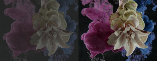
so when you first shoot something, it will probably look fine on your camera, but when you import it to your computer it might look like dogshit on your monitor, like in the image on the left. this has to do with whether you shoot it in LOG or RAW. basically RAW= huge file size but no change in saturation/exposure/white balance, ect. LOG= smaller file size but really ugly, little saturation and contrast, etc.
when you take this footage into your color grading software, you have to put a LUT (look-up-table) matching the camera you shot on onto the LOG footage to restore it so it looks like the image on the right. After that, you can start grading (fixing the exposure, adding colors to the highlights or shadows, there's a million different things you can do when you color grade.)
but whoever edited these (I'm assuming it's James, who we can always count on to be extremely lazy in his "creative" endeavors) just skipped that crucial step and went straight into color grading the LOG footage. Which is a huge no-no.
that is the reason why shots like these look so weirdly lit. conversion to LOG literally drains the contrast and saturation from the footage. which is why it is STEP ONE to correct it in post. but this dude probably just went straight into applying filters and colors and just thought upping the exposure or brightness would fix the footage.
obviously i don't have access to these files personally, so i can't say this with 100% certainty, but it would explain why the footage looks so damn weird. in my personal opinion it's not a lighting mistake necessarily (though the choices of colored gels he uses for his lights are very questionable.)
1K notes
·
View notes
Text

hello and welcome to my tutorial on how to create gifs like this one! full explanation under the cut, but if you wanted to take a little peek at the gifset attached to this tutorial, here ya go!
for the purposes of this tutorial i am assuming you know
how to make a gif
what vhs footage looks like
STEP ONE: MAKING YOUR GIF
choose your footage and plug it into your desired software of choice! i use photoshop for this so i can only attest to the efficacy of these methods in that context
as for shot selection, you could feasibly choose anything. however, i prefer shots without too much movement in them - makes it look more like a home video.
because of the heavy amount of colors and filters, i'd recommend a gif somewhere around the 40-50 frames! but of course you can play around.
oh i also set the frame delay to 0.08 seconds. this is slower than most gifmakers tend to set theirs, but it makes it run buttery smooth imo.
STEP TWO: MAKING THE COLORING
here's where we get vhs specific. if you're unfamiliar with vhs footage, i recommend clicking through this youtube playlist! if you're not interested in the coloring, skip to step three (smart object fuckery + filters)
now while making a set i tend to choose some primary colors for my gifs. in the gifset i linked above, i chose to work with blue and orange-y yellow. in some of the other gifs i'll be using as examples (from an unfinished set) i chose green and yellow.


to create the above coloring i generally use these steps:
1) curves
i'm a maniac so i use the same curves layer to initially edit the luminosity AND colors of my gifs. the purpose of this layer is to edit brightness/contrast like i normally would and already start the process of changing the colors a little bit. this is my curves layer for the blue house gif:

to make the gif go from the left image to the right image:


as you can see i used the brightening curves to make the footage a whole lot lighter. i also increased the reds to get rid of the cyan tint a lot of blue footage has, slightly increased the blues, and once again decreased the greens to get rid of any cyan. this does make the blue hue a bit more purple, which is a nice bonus!
as for the gif of the boy, that one's a little harder to show a before and after for, but i'lls how the curves for good measure:

the original shot was already quite bright so i only edited the brightness a litttle bit. because i knew i wanted the gif to be green and yellow, i increased the greens, decreased the reds (except in the shadows), and decreased the blues (to get yellow)
2) channel mixer
now the channel mixer layer takes a little getting used to so i recommend experimenting. ALWAYS USE THIS LAYER ON THE COLOR BLENDING MODE for a more even result.
i use channel mixers to sort of... unify the colors a bit more. for the house gif, for example, i increased the blue channel to +110% blue, but decreased the blue in the red (-12%) to retain the yellow in the window.
if you want me to explain this more in depth, send an ask! it'll be kinda longwinded though


before / after of the boy gif with curves/channel mixer.
3) levels
this is where it starts looking more vhs-y! vhs footage has light shadows and dark highlights.
first, set your levels layer to luminosity blending mode to retain your beautiful colors.
then, crunch the hell out of your gif to make it very... mid.


this may feel a little wrong at first but i prommy it'll look okay at the end. a before/after for the boy:


now that's starting to look familiar right?
4) color fill/gradient map
because i want to unify my colors/make sure my gif is saturated, i usually add either a color fill or gradient map layer. in the case of the house, i chose to go with a dark blue color fill:


because the coloring of the boy gif was a little more complex, i decided to go with a brown to green gradient map.

this will make the shadows yellow, and the highlights green.


BOTH THESE LAYERS ARE SET TO OVERLAY. i usually fiddle with the opacity of them until i like it, but it's anywhere from 7% - 17% depending on what i feel like that day
5) curves (again)
this layer is probably useless but i do it anyway to make myself feel better. this is just a regular curse layer to up the brightness a tiiiiny bit and amke sure everything's clear. also it helps counteract the darkness your overlay color will add in.
6) color balance
this is my most subtle layer so i won't be able to show before and after but i fiddle with the color distribution a little until i'm satisfied. set this layer to color blending 'cause that's what you wanna affect!
i decided i wanted the house gif shadows to be a little more purple, for example, so i added in red (+3), magenta (-1) and blue (+1). etc etc. do what feels good!
STEP THREE: SMART OBJECT FUCKERY AND FILTERS
OKAY that was a lot. sorry or you're welcome. but good news: now's the fun part. convert your animation to a timeline, then select both your coloring and gif layers, right click, and select convert to smart object.
now that your gif's a smart object, i usually crop it. i tend make vhs aes gifs a 4:3 ratio (so 540 x 405 px) because that's what vhs footage was usually recorded as! crop your gif, resize, and then we can continue.
1) color bleeding
vhs footage usually bleeds its colors - this manifests as a short of... weird subtle halo around any object. the way to recreate this in photoshop is to duplicate your smart object.
set your copied smart object to color blending. now move it to the side a couple of pixels (i usually do around 5px, but you do you!)


as you can see, the tree and chimney (and everything else but less prominently) have a yellow shadow to them. this is exactly what we want!
2) filters
now's the time to add your filters and make it look like shit (but on purpose!) first, select both smart objects and convert to smart object again. this will ensure the filters apply to all layers evenly.
i use the following filters:
unsharp mask (amt 35%, radius 4px) - this will subtly add some sharpening but only on the edges of objects
add noise (amt 7.5%, distr. uniform, not monochromatic) - this will add the signature vhs grain.
box blur (2px) - i edit this to be 75% opacity with the little arrows to the right, just to make sure you can still make SOMETHING out when you're looking at the gif. MAKE SURE THIS FILTER IS ON TOP OF YOUR NOISE FILTER. tumblr will kill your gif otherwise
4) ONE LAST THING
usually at this point i'm not happy with either the saturation or levels. (usually the levels). so on top of your smart object, add another saturation or levels layer and fuck around!
in the case of the house gif, i thought it was too bright still so i set my output levels to 13 and 216. for the boy, i thought the shadows were too dark, so i set my shadow output to 11.
BEFORE & AFTER:


aaaand that's it! thanks for reading! if you have any questions, feel free to come to my askbox, i'm always happy to explain my process. happy giffing 🥰
#gif tutorial#ps tutorial#photoshop#completeresources#allresources#giffing tutorial#vhs gif tutorial#idfk. what do you even tag for tutorials lmao
255 notes
·
View notes
Note
Hey! Just wanted to ask, got any tips for highlights in pixelart? Ive got shadows down decently enough that i can at least stand looking at them a week later, but i have struggled with highlights and brighter lights in general. Also, awesome stuff, your space elevator piece got me into trying pixelart and it has been a fascinating journey so far
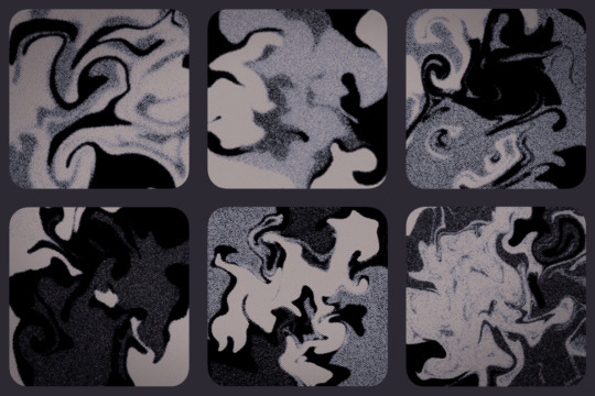
honestly when i first started i worked a LOT in black/white/values. i also tend to work dark to light, so ill build a piece up from its darkest areas, then finish with the highlights.
here is some of my art edited so you can see the values:
contrasting highlights against shadows will always make them stand out more and be more striking. i usually add a lot of rim lighting to pieces bc it’s like easy mode for focal points so i def recommend looking that up and learning about that!! truly though working in EXTREME values will help you get to more nuanced values so def try to work with a small color palette for a few times and seeing how that changes your understanding. when i first started out a LOT of my art was monochromatic just because i was focusing on values instead of color and i think that helped a lot!! examples of that:

#artist on tumblr#art help#artist help#artist tutorial#pixel art tutorial#values#i hope this helps it’s hard for me to explain my thoughts a lot lol
725 notes
·
View notes
Text
Complete Warriors PDF on Library Genesis
First Series Original Covers: 1 | 2 | 3 | 4 | 5 | 6
The Prophecies Begin
The New Prophecy
Power of Three
Omen of the Stars
Dawn of the Clans
A Vision of Shadows + Bonus Scenes
The Broken Code + Bonus Scene
A Starless Clan
Changing Skies
Super Editions
Novellas
Field Guides
Colored Graphic Novels
The Prophecies Begin Graphic Novel: 1
Non-Colored Manga
Graystripe's Adventure
Ravenpaw's Path
SkyClan and the Stranger
Tigerstar and Sasha
The Rise of Scourge
617 notes
·
View notes