#duplicate line removal
Explore tagged Tumblr posts
Text


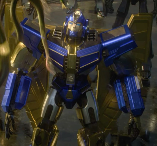

⚙︎ Just same quick Yandere Transformers One thoughts

Imagine Sentinal Prime taking you as his darling. It's so easy for him to make you disappear, to erase you from a semi-functional world. He snaps his fingers and you're kneeling before him, optics wide in fear, servos bound behind you. All Cybertron runs through his digits, and you little girl should be utterly honored to have caught his optic.
He colors you in the richest of paints, upgrades you with the newest enhancements in all of Cybertron.
Reconstructed as the perfect doll, sitting pretty in his lap as his golden wings gently caress your back. Maybe if you're particularly feisty, rebellious, and tenacious he'll even remove your T-cog. Making you watch as he crushes your metallic organ in his fist.
"Don't forget your place, my dear. Don't make me remind you again"
Sentinal always has you propped up pretty on his lap. Trailing his fingers over your arms and thighs. Half-heartedly tracing stars and swirls as he's forced to listen to Cybertron's newest developments and his latest orders. The senate's conversations are unfiltered, they peel away the senator's golden facades leaving only the monstrous truth. Sentinel especially is the wickedest of all. Diabolic traitor playing king-prophet. You fight the urge to sink your teeth into him, biting and ridding until only scrap remains...
But the truth is too brittle. You have no power, no strength compared to him. And you're too terrified of Sentinal's punishments to step out of line.
Sometimes when the conversations get too grotesque to drown out, your desperate optics weave to an open window, peering helplessly at a world that's forgotten you. It's usually Senital's cold lips that melt away the melancholy trance. Reawaking you into your nightmare...
── .✦⋆˚☆˖°⋆。° ✮˖ ࣪ ⊹⋆.˚ ✦ . ──
Imagine D-16 finding you as he's defeating Sentinal. You look so bruised and battered, so broken. Maybe he knew you once, a transformer who was always sweet and kind to the miners. Maybe it's the look of utter despair and hopelessness in your optics that catches his attention. Almost like a mirror of his pain. His servos itch to wrap around your neck, to crush wires and circuits, to eliminate anything that Sentinal has ever held dear.
But he can't...
His broken spark screams in pity. You're just another helpless bot trapped in Sentinel's web of deceit. He saves you for himself, a shivered war prize he's convinced he can fix. He makes plans to seek out Solus Prime's T-cog to lay within your chest. He wonders if Megatronus would approve.
But it doesn't end that way now, does it?
Destiny is too cruel for such fragile hopes.
⛧°。 ⋆༺★༻⋆。 °⛧
Alternatively, Maybe Orian is the one to find you, sacred confused, and utterly alone. He's so eager to lend a helping hand. Wanting so badly to wrap you in his arms, to give you warmth and hope. He plucks you away from Sentinal's tarnished castle. Pulling you away into a life that tastest of saccharine daydreams and sugar-laced optimism.
And Orian -or rather Optimus- is perfect, sweet and loving, and hopeful...
But he's also tasted loss and duplicity. Bitter truths leading to his jaded obsession. He's so careful with you always having a servo on your hip, always listening to every conversation. He can't have this fragile world hurt you again. He needs to protect you from everything at every cost.
Sometimes when your body is curled next to him recharging peacefully. He'll reminisce about the other Primes, wonder if they've ever felt such a love that bites so sharply at the spark. He wonders if he can really make Cybertron the perfect world for you...
#transformers one#transformers#megatron#megatron x reader#yandere megatron#d-16#d-16 x reader#optimus prime#optimus prime x reader#optimus prime x you#yandere optimus prime#megatron x you#sentinel prime#sentinel prime x reader#sentinel prime x you#yandere sentinel prime#yandere#yandere x reader#yancore#yandere x you#yandere aesthetic#yandere male x reader#yandere male x you#cybercore#yandere imagines#transformers imagine#transformers headcanons#transformers one spoilers#orian pax#orian pax x reader
2K notes
·
View notes
Text

^ iterator projection tutorial!! ^
this post follows on from this one made by @prismsoup, intended to cover my slightly more extended process (including post-processing)
step -1 : pre-requisites
this tutorial is designed around clip studio paint for PC because its what i work with. its probable that whatever other program / platform you're using has these features but under different names
i use a rainworld typography font for text. find it here (or do it yourself)
i use scanline textures as a part of this. find them here
step 0 : select a base image

maps, blueprints and diagrams are favourable due to lots of detail without it derailing into noise. get experimental though, my favourite one came out from a picture of a nebula, and another from a friends factorio screenshot
step 1 : binarise & flip
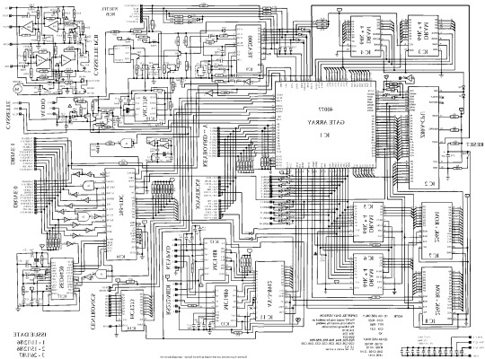
this command can be found under edit > tonal correction (D) > binarization. this forces every pixel in the image to be either black or white. adjust its sensitivity to your liking
step 2 : remove background

add in a black layer below (not just paper layer, as will become important later). wand select the background colour and delete it. if the remaining colour is black, CTRL+I to invert it to white
step 3 : add details

replace any text with rainworld font or simply remove it. add in blueprints or other complex decals (drawingdatabase is a decent source). during importing remember to binarise (after resizing). for "lower layer" elements such as contour lines create outlines for higher layers to retain clarity
step 4 : add multiply layer(s)
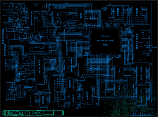
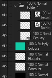
if you want to have multiple colours, put everything in the "higher" layer into a folder and set the top multiply to clipping above it
step 6 : post processing setup

copy all existing layers, create a new folder on top, and paste into that folder. right click the folder and "merge selected layers" set the resultant layer to add(glow). copy+paste and hide duplicate for now. from filters > blur apply a guassian blur with a strength of 130-170 (this creates the base bloom layer). set opacity to ~50%
step 7 : chromatic abberation
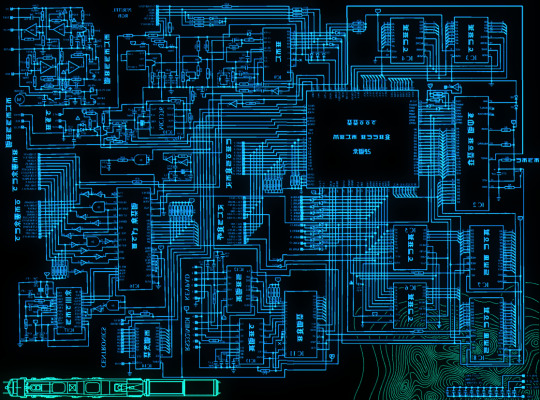
unhide not-blurred layer. guassian blur with a strength of 2. duplicate again. select top layer and move 1px up and 1px left (with arrow keys). CTRL+U then change the hue by 30. select bottom layer and move 1px down and 1px right, CTRL+U then change hue by -30.
stronger chromatic abberation can come from stronger gaussian blur and more change in hue
step 8 : scanlines

add the scan lines on top, invert so that they're white and set to add(glow). copy a multiply layer over it and make sure clipping is on. decrease layer opacity to ~10%. if it does not cover the whole image initially, paste more in and merge them together into one layer
tada! you now have one iterator projection. if you want to give it an extra affect, re-import the final PNG and filter > distort > convert to panorama. set distortion to 10 and scale to 101 (note that this drastically blurs the image)
259 notes
·
View notes
Text
FF14 Battle Portrait Tutorial
For the past few weeks I was trying to find a way to recreate the battle portrait from FF14 as there was a few characters that I want to see in that style but don't officially have one yet. I think I got it down more or less (see image below) so I thought it's a good time to share what I did.

First of all, I made a few files that would help make life a little easier. They can be grabbed here .
Note: I did use Reshade to do a bit of work at the screenshot stage to help speed up the process but the same effect can be recreated in Photoshop with a vanilla screenshot. There are a lot of tutorials on how to do comic/cartoon effect in photoshop and those would make good bases to work off of.
Step 1: Take the screenshot with the PortraitBase Shader on. I usually take two screenshots. One with "Comic" on and one with it turned off. This is so that I have more to work with if needed.
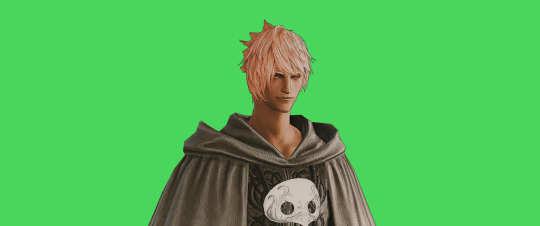

Step 2: Drag all the screenshots into photoshop and remove the background. In photoshop, arrange the layer so that the screenshot with the Comic lines visible is on top of the one with the effect off.
Step 3: Duplicate the the layer with the "comic" effect and apply Blur->Gaussian blur (radius 0.5)
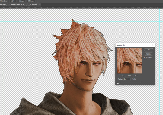
Step 4: Take a look at the hair. In Eric's case, It still doesn't look blur enough to me so I used the blur tool and blurred it a bit more
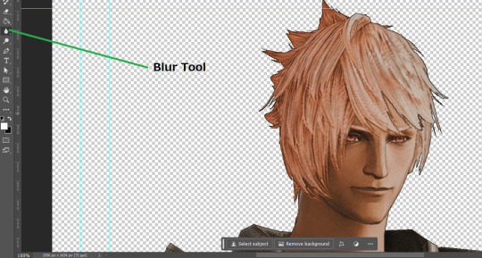
Step 5: Create a new layer above the layer in the previous step and use the brush tool to start outlining the edges. Where to outline is up to you but the idea is to make edges defined so that it looks more like a drawing.

Step 6: Duplicate the outline layer and then hide that layer. Step 7: Merge everything under the outline layer. Step 8: Drag and drop the "Texture.png" into the project and Clip it to your character layer. Set the blending of the texture to "soft light". Step 9: Drag and drop the "stroke Texture.png" into the project and Clip it to your character layer. Adjust the size till you are happy then set the blending to "overlay". Step 10: Adjust the opacity settings of both texture layers until it looks good to you.
Step 11: Click on your character layer and go to image->Adjustments->Hue/Saturation (note: you will see I dragged in the official Hades portrait as a point of reference to work off of). Adjust the saturation till you are happy.
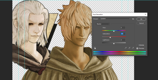
Step 12: Go to image->Adjustments->Color Balance and adjust the color till you are happy. In this example, since Eric is also wearing the Sophist robe, I tried to match that color to Hades' Sophist robe color.
Step 13: Once you are happy, drag the "Template.png" into the project and scale that to the size you want. Make sure it is completely covering the character. If it's not, you can just use paint more of it with the brush tool to extend it till it covers everything.

Step 14: Hide the "template.png" layer and select your character layer. Use the magic wand tool to select the outside of the character.
Step 15: With the selection still selected, click on the "Template.png" layer and press delete on your keyboard. You should now be left with a blank in the shape of your character.

Step 16: Drag the"Template.png" layer to be below your character layer. Then click on your character layer and clip it.
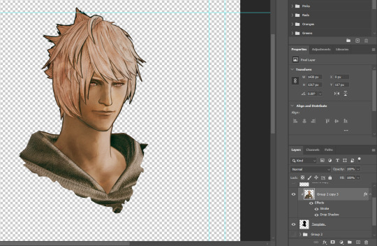
Step 17: Click on the "Template.png" layer and add a 2px stroke and shadow to it.
Step 18: Drag "Back_Deco.png" into the project and place it behind your character. Scale it till you are happy with it.
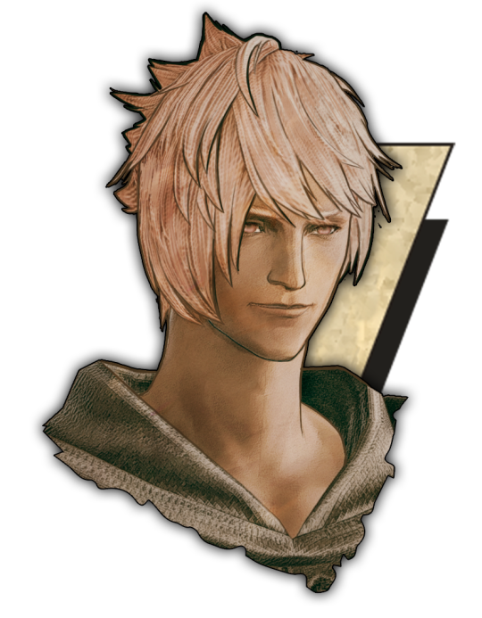
And that's it! Now you can recreate portraits for any NPCs that you want (in theory). A lot of it is also fine tuning to what you want but this should at least give you a decent base to work off of :)
971 notes
·
View notes
Text
MEGATHREAD OF KIM MENTIONS BY ALL SKILLS
While doing my max stats run, I noticed Rhetoric called Kim 'Kim'. I thought this was a little unusual, as I assumed blue skills would address him in a more formal fashion. This led me down a rabbit hole of how they all refer to Kim, so here you go.
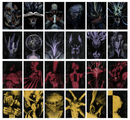
DISCLAIMER: These are all mined from fayde.co.uk (big shoutout, this post would not have been possible without it). I have removed all duplicates and interactions with variants ("Replaced with:"). It is also possible despite my best efforts my dyscalculia may have fked up with the larger figures but I did go over it multiple times, so it's unlikely. OK LET'S GO
BLUE SKILLS
LOGIC
All 3 mentions of 'Kim' are late-game. Otherwise, Logic defaults to 'the lieutenant'. Only 1 mention of 'Kim Kitsuragi' and that's only when talking about the case file number sequence for The Hanged Man.

ENCYCLOPEDIA
The full name usage is related to when you discover his past with pinball - even the one mention of 'Kim' is in reference to how Seolite people love pinball. Otherwise, the most common address is also 'the lieutenant'.

RHETORIC
Seems like the use of 'Kim' is an outlier and like I suspected, the default tends to be 'the lieutenant'. It wasn't a late vs. early game thing either because I got the 'Kim' mention on Day 1 of the game.

DRAMA
Interestingly, no 'Kim' at all. Drama prefers more bombastic and less personal terms, I guess.

CONCEPTUALIZATION
No use of 'Kim' or 'Kitsuragi'. The only direct address was the line "Dammit lieutenant, have you no intellectual curiosity?"
Otherwise, like most of the other blue skills, Conceptualization doesn't mention Kim that much.

VISUAL CALCULUS
Mentions Kim (in all forms) the least, which is not surprising.
Like all other blue skills, 'the lieutenant' is the most common used. They tend to be more on the less personal side.

PURPLE SKILLS
VOLITION
Only 1 direct address of 'lieutenant'. The line mentioning Pinball/Kimball is 'Any plan to call him Pinball or Kimball is immediately wiped from your neocortex, as if with some sort of mind altering device. It is simply not going to happen.'
Still more of a formal address preference.

INLAND EMPIRE
The only time IE uses 'Kim' is "If you can't trust your own eyes, who can you trust? Certainly not Kim. He's so… suspicious." in regards to finding a key card in Evrart's office.
Also prefers 'the lieutenant', like the blue skills.

EMPATHY
Also seems to refer to Kim in a more respectful way. The only mention of 'Kimball' is about footprints in the dust in the back of the Whirling: "This is so good it makes him forget the whole Kimball memory."
Also note the increased frequency in Kim mentions.

AUTHORITY
Of course 'Lieutenant Eyebrow' occurs during the famous showdown. One mention of 'Kim' is earlier game and one is late game. Makes sense Authority would be professional most of the time and use 'the lieutenant'.

ESPRIT DE CORPS
Will not shut up about Kim (101!!). Most mentions advise you not to complete important tasks without him. 1 repeat of 'Lieutenant Kitsuragi' mentions the black bomber jacket you get from hardcore mode. The last one is when Harry climbs the horse statue during the moralist run.
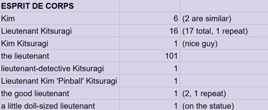
SUGGESTION
Much less quiet in comparison, but still polite.
Purple skills mention Kim a lot more, in general, than blue ones, which makes sense as they concern external affairs and people moreso. Out of all the skills, they refer to Kim the most, actually, as we will see.

RED SKILLS
ENDURANCE
The two instances of 'Lieutenant Kitsuragi' are during the confrontation with Ruby: "The torment Lieutenant Kitsuragi is experiencing is worse than your own."

PAIN THRESHOLD
Doesn't care about anyone but Harry, probably. Only mention is talking to Klaasje about the body hanging behind the Whirling: "A bitter cringe. It hurts. You look to the lieutenant…"

PHYSICAL INSTRUMENT
The most disrespectful. Refers to Kim as a binoclard the most out of all the skills.

ELECTROCHEMISTRY
The only mention of 'binoclard' is when you try to teach Lilienne's twins to say 'fuck'. EC cheers you on. Volition is disappointed, as is Kim ("deeply unimpressed").
"Why does he have to be such a binoclard? It's just a funny word!"

SHIVERS
Doesn't have much to say about the lieutenant. 2 of the 4 are variations of each other during the Moralist quest. Duplicates are due to the Noid vs. Soona version of the quest.

HALF LIGHT
One mention is during the game of Suzerainty, when Kim has the upper hand, which is a funny time for a fight-or-flight response to kick in.
In general, the red skills don't concern themselves much with Kim, since they largely are focused on Harry.

YELLOW SKILLS
HAND/EYE COORDINATION
Second least mentions of Kim in the yellow skills.

PERCEPTION
Both 'Kim' mentions are Sight. Mentions of 'the lieutenant' by category: 2 Smell, 6 Hearing, 2 Sight. (No Taste… sadly).

REACTION SPEED
Gets a little more fancy with it 'the good lieutenant' and also addresses Kim directly the most out of all the skills (2 mentions of 'lieutenant'): "Too late, lieutenant." and "Impressive note-keeping, lieutenant."

SAVOIR FAIRE
The duplicates have to do with a line during the Ultraliberal quest: "The lieutenant speaks as if you're rich -- a common misconception -- especially if you count the tax. No, we've got a long way to go before we can feel financially comfortable. The hustle never stops!"

INTERFACING
Least reference to Kim of all yellow skills, which is surprising considering the Kineema interaction.

COMPOSURE
The chattiest of the yellow skills about Kim, though yellow skills still have the second lowest mentions of the lieutenant.

STATS RUNDOWN
Total Kim mentions by colour
Blue: 82
Purple: 245 (thanks, EDC)
Red: 31
Yellow: 62
Top 3 mentions
EDC: 128
Empathy: 43
Rhetoric: 30
Bottom 3 mentions
Pain Threshold: 1
Interfacing, Shivers, VisCal: 4
H/E Coordination, Endurance, Half Light: 5
Most common address
the lieutenant: 335
Kim: 32
Lieutenant Kitsuragi: 26
So, overwhelmingly, most of the skills seem to default to 'the lieutenant'. Not just the blue ones. Hopefully, that helps someone, although how I have no idea.
BONUS: YOU!
What about Harry, you ask (or not)? I GOT YOU.
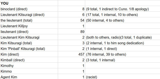
Harry calls Kim a binoclard more than Physical Instrument, though one time he says it as an apology.
Both times he uses Kim's full name and title is during radio comms.
Harry calls him 'Kim' to his face (457) more than 'lieutenant' (89) (spread over early to late game).
To others, Harry refers to Kim as 'Kim' 39 times, compared to 4 uses of 'the lieutenant'.
The only time Agent Kim is used is discussing the Seolite conspiracy.
That's it! One last parting gift: Kim refers to Harry as 'Harry' 15 times. :)
#disco elysium#harrier du bois#harry du bois#kim kitsuragi#meta#disco elysium meta#skills#disco elysium skills
132 notes
·
View notes
Text
Photoshop Tutorial #1 - Change Background & Add Reflections
Before & After


You will need
Photoshop
Internet Access
I was inspired to make this tutorial after facing a dilemma in my game. I wanted my sims to swim in Brindleton Bay, but, shock horror, the water there is not swimmable. Luckily, I know how to change the background of my screenshots to make it appear as though it is - and I'm going to bring you through the process of how!
Starting off, in game, I brought my sims to Tartosa and got my desired shot. Then, heading over to Brindleton Bay, I got some shots of the horizon that I wanted as a backdrop.
Here's a picture I took:

Okay! Let's open up Photoshop!
For reference, I have Photoshop 2024, but most if not all of the features I've used should be included in older versions too.

Here's our image! Now I'm selecting the Background layer in the layers panel and press CTRL J twice to create two duplicates.
I'll turn off the bottom two layers for now, (by clicking the eye button, for newbies) and go to the properties panel. this should be on the right hand side, above the layers panel, but if it isn't, simply go into window > properties to switch it on.
With the layer selected, I click remove background and voila! Photoshop has... er... done her best to remove the background (she sometimes gets it wrong, but at least it's a help)
You'll see that a layer mask has been created. (circled in image).

If you haven't used layer masks before, the only important thing to know is that black will erase and white will add.
So with my brush tool (shortcut B) selected and set to black, I can go around the image and erase all of the parts I don't want.
If you have a steady hand and a tablet/cintiq you can do the same job a little quicker with the lasso tool (shortcut L) by selecting any unwanted area and simply pressing delete
Once I've removed all that needs to be removed, I see that there's a little slice of her hair that needs to be added. I can change the brush colour to white and paint it in.
Done! Easy!

Okay, let's switch off this layer for now, and switch on the one beneath it.
This is the layer I want to make look like the Brindleton Bay sea. So I'll make sure to pull an image of the water up as reference for colour.
This time I'm going to create a layer mask using the polygonal lasso tool
It's easy.
Find the lasso tool in the tool panel on the left of screen (the third icon from the top - or by pressing L on your keyboard)
Left click & hold, and a menu will pop up. Select the polygonal lasso tool.
Click around the area you'd like to mask, in my case, the sea. Tip: if you hold down the shift key while clicking, you will be able to create perfectly straight lines.
Click on the layer mask button at the bottom of the layers panel (pictured)
Everything except the selected area should disappear!

A small thing here, but I don't want the reflection of the rock in the water in my picture. I'll select the layer (not mask), take the eyedropper tool (shortcut i) with the sample set to all layers, and use a soft brush (B) to paint it away.

Next I'm using adjustment layers to edit the colour of the water, to try and make the blue turquoise paradise look more like the horrible green bog water of the bay.
You'll find these next to the mask button in the layers panel.
For my picture, I'm using hue/saturation for the colour and levels for the light. you can fiddle around with any of the adjustment layers to find what works for you.
I've shown the adjustments I've made for my specific scene below, just for reference.
When I'm happy with the colours/lighting, I select all adjustment layers (shift + L click to select multiple), then right click and choose create clipping mask. This is to ensure that the adj layers don't affect any other parts of the image, just the area I want it to.
And there! My water is looking sludgy, just like I wanted.

Okay! I've decided that I'd like some texture in the water. It always annoys me that sims water looks so flat. So here's where Pinterest enters the story.
I like Pinterest because unlike Google, the majority of the images are not watermarked. You're also slightly less likely to find AI slop.
I wanted some water ripples, so I searched for something like Water Texture, found one I liked, and dragged and dropped it into my photoshop file.
From here, I transformed it (CTRL + T) by resizing & rotating the bounding box, then grabbing the corners while holding CTRL to create some kind of perspective that works for the image.
I didn't bother bringing it all the way to the horizon, because I intend to fade that out with a gradient anyway. I had to sacrifice the bottom of the image for the sake of correct perspective, but that's fine. I will crop that out later.
With the texture layer selected, set the blending mode to soft light. It blends nicely!

Now! Another layer mask! These are our friends
With the texture layer still selected, I create a layer mask.
This time, because I had nothing in the image selected first, the layer mask will appear white. That just means nothing has been masked yet.
With it selected, I find the gradient tool (shortcut G) if you press G and the paint bucket tool is activated, simply navigate to the tool panel on the left of the file, hold the paint bucket tool down and select gradient.
I'll change the colour to black, and make sure I have the foreground to transparent gradient selected.
Other settings are pictured.

I'll drag the gradient over the area I want to mask. In this case, the top of the water texture to make it appear as though it's fading away towards the horizon.
(Doubly make sure you've selected the mask, not the layer while performing this action.)
Looking good!
Time to drag the layer above your adjustment layers and create a clipping mask again.

Alright! Let's do the background.
I'll drag that image of Brindleton Bay that I took earlier into the file.
I want to place it below my sea layer, and above that original background layer (I am going to leave that untouched for insurance reasons)
Then, using the move tool (shortcut V) I'm simply going to move it to the correct place. Basically I just want the horizon lines to match up.
Tip: hold the shift key to drag an image in a straight line.
Enter to confirm.
You can see that the sky is now unfinished, but it's such an easy fix. I'll just select the sky colour with the eyedropper tool, then use the paint bucket tool & brush tool to fill in the sky.
Done!

Now - note that the sea doesn't quite blend in with the background. To fix this, I'm going to take my eyedropper tool (shortcut i) and select some of that dark green colour beneath the mountains.
I will create a layer (+ button on the base of the layer panel) and drag it above that sea texture layer I created earlier.
Then I'll create a layer mask to clip it to the sea.
I'm grabbing that gradient tool again (G) and creating a nice gradient on the horizon.
The horizon line is a little sharp, in my opinion, I want it more faded. So, using a soft brush (B) and that same green colour, I'm going to create a new layer & place it above that green gradient, this time I'm not clipping it.
Holding down the shift key, I'm going to draw a straight line right across the horizon. This helps to blend it all together a bit better.

Now! for Reflections!
Firstly, I'm going back to that sky layer with the Brindleton Bay mountains, and I'm going to duplicated by pressing CTRL + J
I'm dragging it above the sea layer, but below all of the other clipping masks. This will automatically create a clipping mask for the new layer.
Next, I'm going to edit > transform > flip vertical
With the move tool (V) I'm moving the image upwards so that the horizon lines meet and it looks like the lighthouse and mountains are reflecting in the sea.
Note: make sure auto select is off while using the move tool on a layer that lies beneath several others.

This leaves a little bit of a mess on the bottom on the canvas, which can be fixed by creating a layer mask & the gradient tool set to black, and dragging a gradient over the bottom of the image until it blends nicely into the sea.

With the mountains reflection done, I'm going to move onto the people.
I'll turn that top layer that I worked on earlier back on.
Then I'll duplicate it (CTRL + J)
Right click on the layer mask of the duplicate and select Apply Layer Mask from the dropdown. This simply bakes the layer mask into the image. Usually I try to edit non-destructively as much as possible, but in this case it's fine to destroy.
I'm going to rename this layer Reflection
With that new, reflection layer selected, I'll go to Edit > Transform > Flip Vertical, just like before.

I want to add a little water/shimmer effect to their faces, so I'm going to Filter > Distort > ZigZag
I'll just mess around with the settings here until I find something I like.
This is optional, obviously, I've done reflections in edits without doing any of this, but it just adds something a little extra to water scenes, I think.
Here's a time I didn't do that.

anyway, my sims are looking a bit crazy now, but it's fine, because I'm going to, you guessed it, add a layer mask and gradient.
But first, using the lasso tool (L) I'm going to draw around one of the characters and drag her into place. I can move the bounding box around a bit to make her shoulders meet in the right place.
Then I'll do the same for the other character.
Tip: Hold CTRL while moving, warping or resizing something for a smoother, more precise experience.

Now, I'm doing what I said I would, and I'm creating that layer mask. We know how to do it by now, right?
Make sure everything is deselected first by pressing CTRL + D
Create layer mask
Select Gradient (G) set to black
Drag gradient over bottom of reflection (If you ever need more precise gradients, you can select the round gradient at the top of the file. I needed it to blend the reflection on the right more, because the characters are not at an even height.)
In the Layer panel, change opacity to 20% (or whatever you like) and hit Enter to confirm

Using Crop (shortcut C) I'm going to crop my image, cut off that pesky strip at the bottom and just basically make the framing of the picture a little bit nicer.
And viola!

I could edit this image more, throw in bounced light, splashes etc etc but I'll leave it like this.
The only thing I will add in is a little lens flare to indicate sun, so again, I'm taking to Pinterest and searching for one that works.
Tip: make sure the background of a lens flare image is completely black. Otherwise it will be harder to use.
Below is the one I have chosen.
I'm simply changing the blending mode to screen, moving it and resizing it with the transform tool (T), and fiddling with the opacity until I'm happy.


That's it!
I made a video running through this whole process, with all of my shortcuts in the bottom right hand corner so that you can see exactly what is happening.
youtube
If there are other tutorials you'd like to see in future, please let me know!
And I'm more than happy to answer any questions!
Good luck <3
#sims 4 tutorial#editing tutorial#sims editing tutorial#sims 4 edit#photoshop editing#photoshop tutorial#sims 4 community#simblr#Youtube#sims 4 photoshop tutorial
183 notes
·
View notes
Text
V3 Survey suggestions
With Version 3 coming out, there will also be a survey. I'm sure many of you have had many ideas for how to improve the game, so before we forget any of them, let's compile them here
Please add your own additions to this post! Don't be shy!! It will let people consider them and put them on their own survey answers too!
I'll start:
New things in LADS:
Orbit playback feature - to allow us to replay directional orbit stages that we've already cleared
A "Sleeping next to him" quality time feature that lets us listen to the LI breathing. Maybe with a bedtime story that we can collect through gameplay or the chocolate shop too
An "Eating with him" quality time where you... eat with him
An alarm clock feature where we can set an alarm and our chosen LI will say good morning to us. Also maybe reminder alerts to work out and go to bed
The Kiss interaction in the cafe that the Chinese server got
More Zayne animations
More animations with visible MC interacting with the boys
Let us exchange large ascension crystals for smaller ones
Let us exchange duplicate plushie/kitty badges for something useful
Add EXP to memories used in battle after a win
Let us replay text messages so that we can choose different options
Let us replay special login greetings that autoplay during special events
Let us save our voice/language preferences for each individual LI
Make in-game friends more meaningful with interactions, power ups, etc. Such as borrowing a friend's cards for battles or having their main LI rescue us when we almost fail in battle
Have the LI acknowledge when you've made several attempts at the same Deepspace trial and encourage you further. Also congratulate us more often 🥺
More things to do in LADS:
More combat modes, especially stages we can clear daily that don't need the highest level cards and will give us diamonds
Make Abyssal Chaos harder so that the boosts actually mean something
More mini games, especially the ones that have already appeared in the game
More ways to earn diamonds through gameplay
More interactions in the cafe
Add different locations to the homescreen (for example, the LI's homes)
More Sylus cards
Improve existing things in LADS:
improve voice direction so that the voiced lines don't need to be artificially sped up
Improve English translations to line up more closely with the original scripts and the other translations
Increase/remove the weekly cap for chocolate, especially now with 5 LI
Increase/remove the directional orbit key limit
Increase the drop rate of bounty hunts
Let us permanently set our MC's appearance in the cards/battles
Let the servers get new content at the same time so the NA server doesn’t always get spoiled by other servers and the official twitter
Outfits:
More casual/comfy outfits for Zayne because he deserves it
Give us Zayne's Exclusive Tutorial outfit!
PLEASE code Zayne to choose his black shirt + sunglasses outfit less often!!
Give us the dress Sylus talks about - the one with the night sky over a river
#some of these things were what I wrote on the V2 survey but they're still important#love and deepspace#zayne love and deepspace#sylus love and deepspace#rafayel love and deepspace#xavier love and deepspace#caleb love and deepspace#to add to survey
82 notes
·
View notes
Note
I LOVE this set and i was wondering if you could pls explain how you did the text, including how you added texture to the ripped text and the highlighting/circling/etc of words? thank you for posting your beautiful gifs 😊
thank you!! 🥺 & of course! (photopea tutorial)
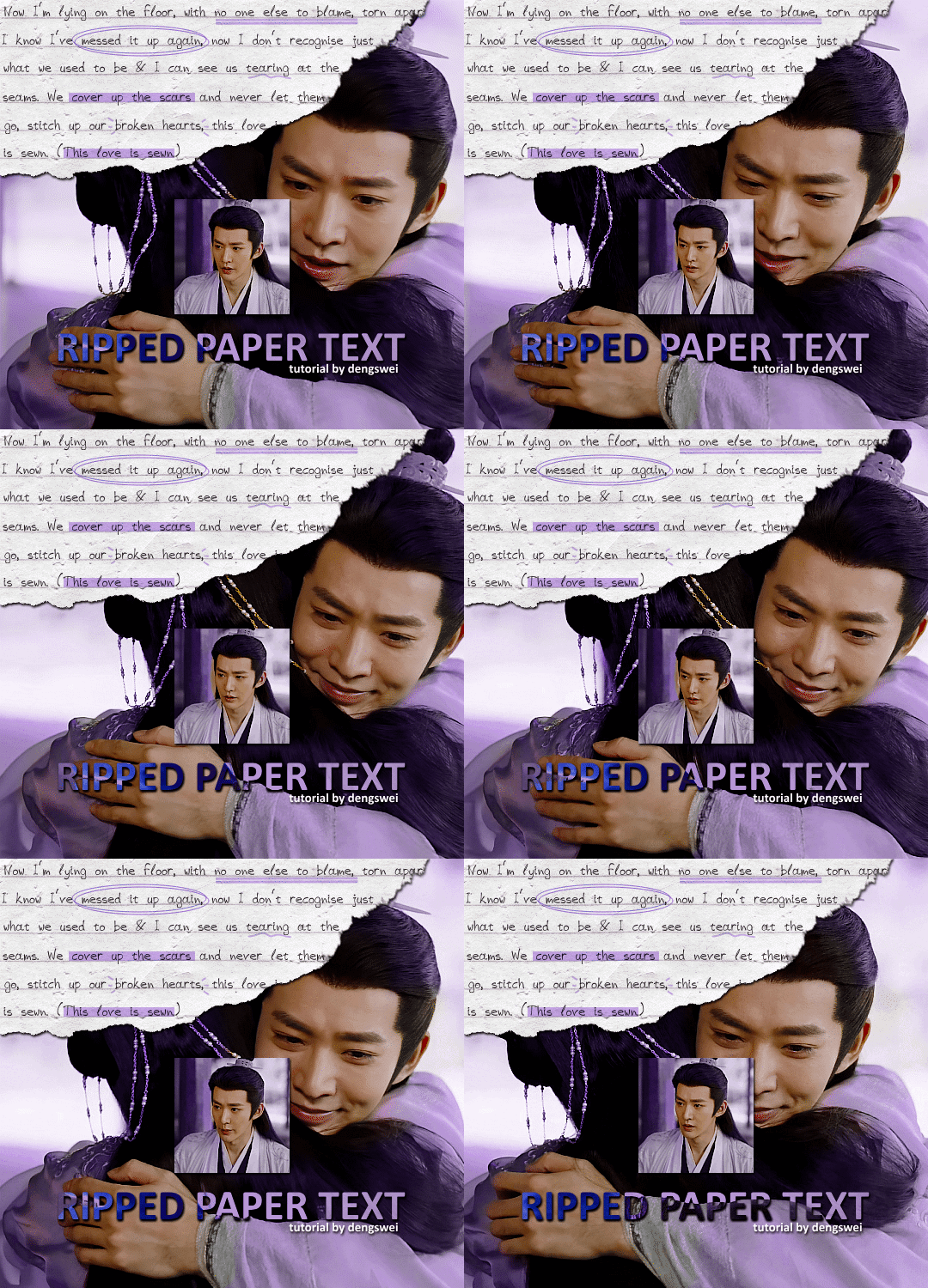
the majority of the texture for the ripped paper effect i can't really take credit for it's on the paper it's self all i did was make the paper white (because the texture was yellow) and used curves to darken the texture), i got the texture from one of photopea's templates but it seems their whole template section has changed drastically and no longer has like anything i used to see before ???? so i'll just share both versions here:
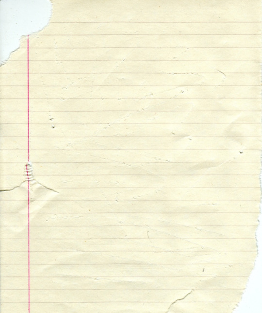
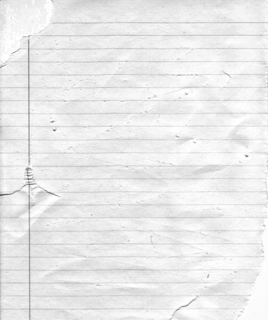
(original & my edited version)
for the ripped parts i just played around with this brush set in the plugins
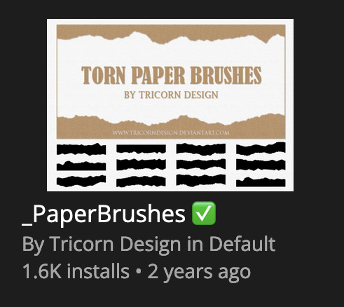
once i decided which of the paper brushes to use i had a new layer and used it where i wanted, so top left in the gif above, i clip masked the paper texture (and the adjustment layers as well) onto it so you get that ripped effect (if you don't like or want to add to that you can always use the brush tool again (or the erasure tool) set as the paper brush to add or remove sections i did this a lot when i realised certain words i wanted to show weren't on there (also changing the size of the paper brush when wanting to add a little bit or take a little bit away was a massive help)
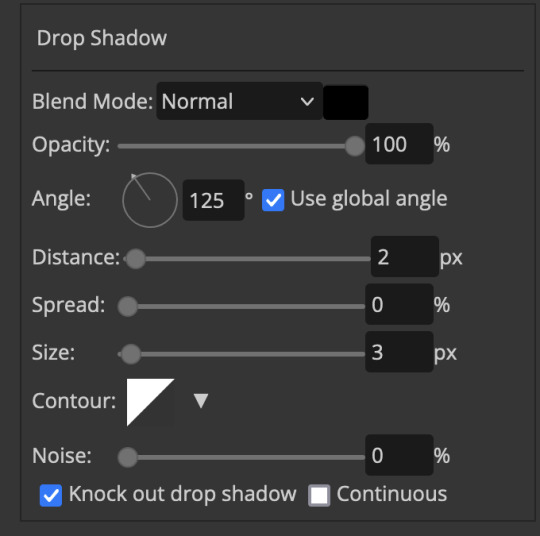
i also always add a drop shadow to my paper textures, the settings i used is mostly the same EXCEPT for the angle for all of the ripped paper (it's also my text drop shadow settings) because depending on how the ripped paper looks you might have to change the angle
also i know in the screenshot below it's on but make sure the use global angle is off if you're going to have multiple different angles of drop shadow in your one gif (so if you want your paper texture on 125° but anything else on 60° the global angle needs to be off but if you want them the same then you can keep that on, which is why it's on for me because the angle is the same for both the text & the ripped paper) (and by text this isn't the text on the ripped paper, there isn't any drop shadow on the text itself there, just to clarify this was for my "ripped paper text tutorial by dengswei" text)
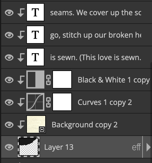
as you can see i also clipped my "handwriting" text to the paper layer this is so it stayed on the paper rather then going onto the gif itself (and it saved the fiddly part of masking it away & it felt more authentic this way too)
i found for me it was easier to seperate the text line by line so i knew exactly which part of the text was on which and if i wanted to change anything either it being a typo, changing the paper texture, or wanting a different word on a different line it was easier that way because it didn't end up messing up all of the text (though you don't have to do it that way, it's just what worked for me here)
font i used was: vag-handwritten (a default photopea font)
all of the next part needs to be above the text on your ripped paper:
for the highlighting, circles, and the lines it's pretty much all the same, i chose the colour which matched the gif (so say purple), for the highlight used the rectangle select & colour fill tools and set that to multiply & then played around with opacity (for most of my highlighting it's set to 50%), for the circles it was the same except the circle shape tool (no fill just stroke) set to purple, set to multiply, with 100% opacity (i found the circles looked better with 100% on some gifs depending on what colour i used), & then duplicated it once or twice and then just moved each circle to where i thought it looked best & the double lines is also the same using the line tool, set to multiply, & playing around with the opacity, & positioning them where i like
for the squiggly lines, the hearts, the 3 small doodle lines at either side of a word, & any other doodles i had on there i doodled them myself with my drawing tablet (you probably don't have to use a drawing tablet i just found it easier that way) using the free pen tool and then did the same thing set it to multiply and played with the opacity
if the colour you choose looks too dark or too light with it set to multiply either try a lighter/darker colour, try out something else like lighten, or screen, or increase/decrease the opacity more (i found i had this issue with the yellow being hard to see on the white paper so i used a darker yellow and kept everything at 100% opacity rather than 50%)
hope that helps! and please if anything is confusing or you want to ask any more don't hesitate to ask i know i ramble on a bit and it can sometimes get a bit confusing 🤣 or if there was anything i missed feel free to ask again 🥰
#replies#edwinas#mine | tutorials#gifmakerresource#photopeablr#photopea tutorial#photopea tutorials#gif tutorial#gif tutorials#usergif#tutorial#tutorials#photopea has so many great default fonts i just spend hours searching through them i barely download fonts now 🤣#i hope i didn't miss anything#also i don't know why the paper textures & my screenshots posted this way i had them side by side#okay they're side by side on mobile but not desktop ??? but mobile doesn't have the read more okay
97 notes
·
View notes
Text
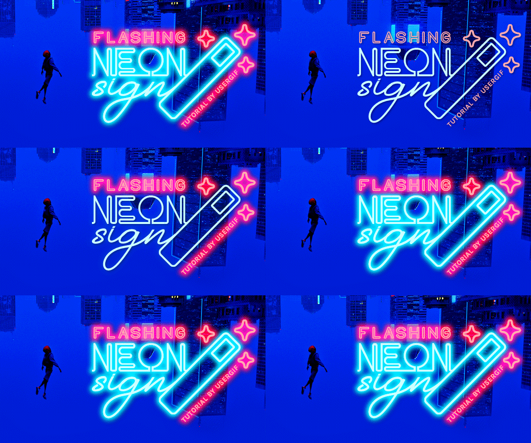
HOW TO: Make Animated Neon Text
Hi! No one asked for this tutorial, but this is one of my favorite typography effects as of late — so I thought I'd share how I do it. You can see this effect in the first gif of this *NSYNC Celebrity set and the last gif of this Anthony Bridgerton set. Disclaimer: This tutorial assumes you have a basic understanding of gif-making in Photoshop. It's also exclusively in Timeline and uses keyframes for the fading effect seen on the blue text.

PHASE 1: PREP YOUR BASE GIF
1.1 – Choose a dark scene. This effect looks best contrasted against a dark background. You can definitely do it with a bright background, but just like a neon sign irl, you only turn it on in the dark/at night — so keep that in mind!
1.2 – Determine the length of your clip. Depending on how much you want your text to flash or fade in, you'll want to make sure you have a scene long enough to also allow the text not to flash — reducing the strain it takes to actually read the text. For reference, my gif is 48 frames.
1.3 – Crop, color, etc. as you would. New to gif-making? Check out my basic tutorial here!
PHASE 2: FORMAT YOUR TEXT
Before we animate anything, get your text and any vectors laid out and formatted exactly as you want them!
2.1 – Finding neon sign fonts. It's easy as going to dafont.com and typing "neon" into the search bar!
2.2 – Fonts I used. Neon Glow by weknow | Neon by Fenotype | Neon Bines by Eknoji Studio
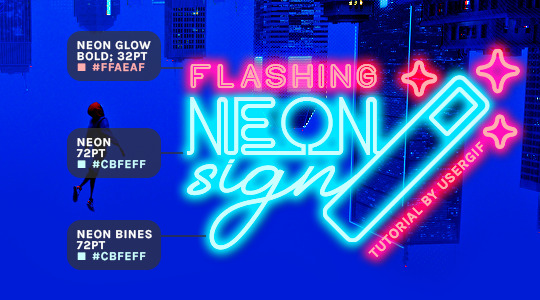
And to not leave my fellow font hoarders hanging, the font for "tutorial by usergif" is Karla (it's a Google font) 🥰
2.3 – Group your text layers. (Conditional) If you plan on having multiple text layers like I did and you want them to appear connected (like how the last letters of "NEON" and "sign" intersect with the wand icon), I suggest putting the layers into groups according to color (the shortcut to group layers is Command+G). If you don't group your text and just apply the outer glow settings to each individual layer, you'll end up with something like this:
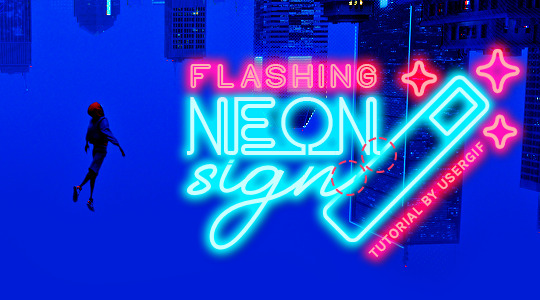
—where you can see the glow overlap with the line, instead of the smooth connection you see in my final example gif. I'm using 2 colors for my text, so I made a group for red and a group for blue.
2.4 – Apply Outer Glow. Right-click your text layer (or your group if you have several layers) and select "Blending Options" to open the Layer Style menu. Check "Outer Glow" and feel free to play around with the settings until you like the way your text looks!
Your outer glow color should be darker and more vibrant than the color of the text itself. The text should be within the same color family but much brighter and, sometimes, almost white (see Step 2.2 again for my text colors).
Here are the settings for the Red Glow (the glow color is #FF3966) and Blue Glow (#00F0FF):
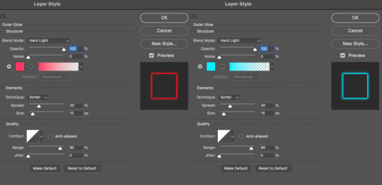
These aren't always my exact settings but they're pretty close to my standard. I always set the blend mode to Hard Light and usually have the opacity at 100%.
For every gif I use this effect on, I like to play around with Spread and Size. Spread will make the glow look denser and "expand the boundaries" (source: Adobe) and Size will diffuse the glow and blow it out so it covers a larger area (Adobe says it "Specifies the radius and size of blur").
2.5 – Duplicate your text layer/groups and remove glow. We're only going to be animating the glow on our text, and since doing this affects its opacity/visibility, we want to preserve the base text by creating a duplicate.
I just hit the Command+J shortcut to duplicate my groups and delete the Outer Glow effects, making sure that the "No Glow" version is above the "Glow" version:
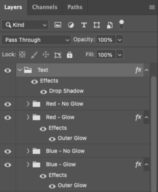
I also put all these groups into one group called "Text" for organization and so I could apply a drop shadow to all the elements for better visibility.
PHASE 3: CREATE THE FLASHING EFFECT
This is for the effect you see on the RED text in my gif!
3.1 – The 0.03-Second Rule If you've read any of my animation tutorials before, you're probably already familiar with this rule. In my experience (and for reasons I can't explain), Video Timeline pauses every 0.03 seconds (try clicking the forward button a few times, you'll probably find a "duplicate" or paused frame). So, keep all your layers a duration of 0.03-second increments (e.g. 0.06 or 0.09 seconds can also work) and align them on the Timeline at 0.03-second intervals. If you don't follow this rule, you'll get duplicate frames when you export, resulting in a choppy final gif.
3.2 – Trim and arrange your text layers. Only on the layers/groups WITH the Outer Glow effect, trim them into several segments of varying lengths where the glow will be "on" (visible) and leaving spaces where the glow should be "off."
Typically, I'll have a mixture of 0.06 and 0.03-second text. That's when the glow will be visible. Between each "flash" of visibility, I've got a 0.03-second blank space, baby *pen clicks* and I'll write your name:

The layers shown above are arranged with a few flashes and two long segments of no flashing. This is the order and duration of each segment shown above (purple = visible segments):
0.06 blank, 0.06 visible, 0.03 blank, 0.03 visible, 0.03 blank, 0.03 visible, 0.03 blank, 0.24 visible (the long bit where "FLASHING" doesn't flash at all), 0.03 blank, 0.03 visible, 0.03 blank, 0.12 visible
(I only did this for the text that says "FLASHING" to give it a glitching effect. The other red text keeps the glow visible starting at the first long segment.)
PHASE 4: CREATE THE FADE-IN EFFECT
This is for the effect you see on the BLUE text in my gif!
4.1 – Animate using the Opacity Keyframe. Again, we're only touching the layers/groups WITH the glow effect. If you only have one layer of text, you'll find the Opacity Keyframe by clicking the film reel icon:

If you're working with groups like me, you'll find it in the Timeline panel under the group when it's expanded:
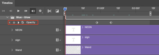
As you can see, I already added my keyframes (lil diamond babies). And luckily, it's super easy to do!
4.2 – Add the ending Keyframe first. We're starting at the end because our layers/groups are already at 100% opacity. Drag the playhead (the blue arrow attached to the red vertical line) to a spot where you want the glow to be 100% opaque — this is where the glow will be fully "on" or visible. [Again, follow the 0.03-Second Rule. You will get duplicate frames regardless when using keyframes (this will be explained in the note in Phase 5), but abiding to the rule will mitigate the amount of dupes you get.]
Then, click the clock icon by "Opacity" to place a keyframe:
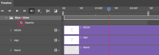
4.3 – Add the starting Keyframe. Go backward from the ending Keyframe you just placed (I went back 0.12 seconds — but you can play around with the duration of the fade, just keep it a multiple of 0.03):
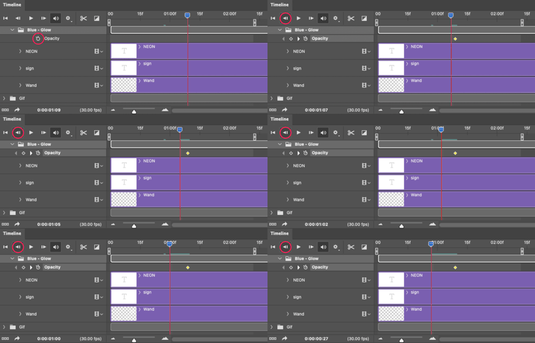
And drop another keyframe, this time by clicking the diamond icon by "Opacity":
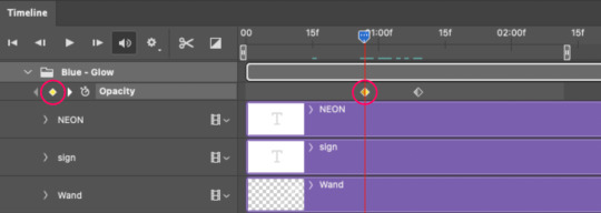
4.4 – Reduce the opacity on the starting Keyframe. Keeping that keyframe you just placed selected, go to the layers panel and reduce your layer's/group's opacity to 0%:
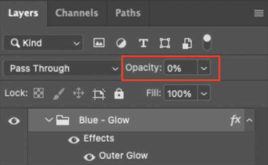
Now, this Outer Glow will slowly fade from 0% to 100% opacity.
And just for a visual aid, here's where my fade-in keyframes are in relation to my flashing segments:
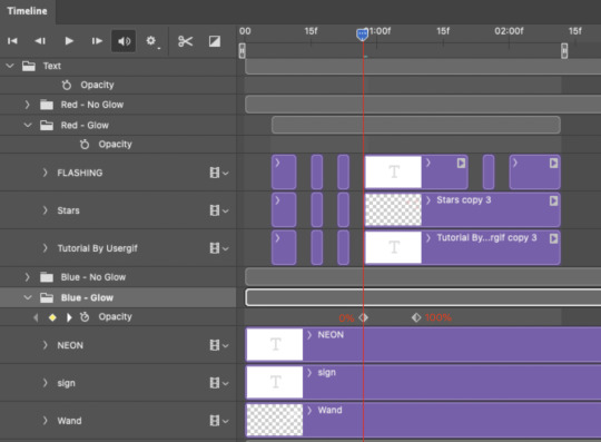
To refresh your mind, the 0% Opacity Keyframe starts when "FLASHING" is visible for 0.24 seconds (the first long segment of visibility).
With these keyframes, you'll get a smooth fade-in à la ✨light switch with a dimmer✨
PHASE 5: EXPORT
Yay, we're finished! Convert from Timeline back to Frames and export your gif!

NOTE: If you only did the flashing effect and followed my 0.03-Second Rule, you shouldn't have any duplicate gifs. BUT if you included the fade-in effect using keyframes, you WILL have duplicate frames. 'Tis the nature of keyframes. 🤷♀️ I had 4 extra frames where the fade-in starts, which I deleted. So, as always, I recommend checking your frames when you convert from Video Timeline back to Frame Animation — and manually delete any duplicate frames.
Sorry this tutorial is so long 🙈 I over-explain so you're not just mechanically copying steps, but understanding the WHY behind each step! Thanks for bearing with me
If you have specific questions about this tutorial, feel free to send a message to usergif and I'll try my best to help! :)
More USERGIF tutorials • More resources by Nik • USERGIF Resource Directory
#typography#gif tutorial#completeresources#usershreyu#useryoshi#userelio#userzaynab#userives#usertreena#usercim#userrobin#userkosmos#usersalty#userhella#alielook#uservalentina#uservivaldi#*usergif#*tutorial#by nik#flashing gif
807 notes
·
View notes
Note
hi! would it be possible to post a tutorial of how you created the shapes in this set /post/753222419295158272 thank you :)
sure I made the gifset a while ago so don't have the psds saved but i decided to make a new gifset with a similar shape effect and show you how i made that :)
tutorial below the banner/cut

first start by making and colouring your base gif as you'd like. for the example i'm making today i'd like a pink gif.
for simplicity i'll put all the colouring layers in a group so it is easier to see what's going on with the shapes, but this is not a step i usually take.

once you've got your base gif ready search for the image/shape you would like to appear on your gif. in this case i searched for glinda's crown :)
make sure the image has no background and save it. if needed go to https://www.remove.bg/ and remove the background from the image then save it.
open your saved image in photoshop and drag it onto your gif. typically i drag it on the gray area outside the image canvas so it will land in the centre of the canvas.


if the image is too big resize it by using the transform function (ctrl +t)

right click the image layer and go to "Blending Options" (you can also do this by double clicking the layer (but not on the layer name as this will prompt renaming the layer)


go to color overlay and change the colour to white with blend mode normal and click ok

convert the new image layer to a smart object by right clicking and selecting the relevant option

change the blending mode of the new smart object to 'difference'

go back into blending options now and change the color overlay to the desired colour with the blending mode set to 'color'

at this point you can also add a stroke and drop shadow


this results in the below result

i noticed a bit of background missed from remove.bg

so i now add a layer mask and mask over the errant mark


and that's the basics of how to make a shape like the one in the gifset you linked. you can now add any text or other embellishments you may like.
a few other tips:
play around with your stroke settings, i did this a lot when making the so highschool gifset (e.g. i think the basketball one used the centre option)
the stroke option will outline what doesn't have a solid fill. to get each part of the basketball outlined like it is in the gifset i used an image like the first one below where the lines on the ball were also transparent to get the strokes i wanted (if that makes sense). if the whole image was solid, like the second image the outline would just be a circle basically.


in most cases the method i showed here is the best method, but for the so highschool book image i did something slightly different where instead of doing a straight smart object i also duplicated the shape on top with all the details left in. i applied the same effects to the bottom layer as above and on the duplicated layer also set that to difference and added a color overlay like the above


gives a result like this:

you can tweak how this looks a bit by using a selective colour layer clipped to the top layer. i wanted a bit more definition on the hat so i ended up with this after tweaking the neutral and blacks channels

overall my advice is to experiment and see what you like as that is what i basically do :)
#asks#resources#ps help#usergif#allresources#yeahps#completeresources#resourcemarket#dailyresources#tutorials#photoshop tutorial#*mine#i hope this helps/makes sense
52 notes
·
View notes
Text
I am genuinely very confused as to why so many people think All 2 U is a song that's attacking Blitz, or is somehow mean. Yes, Stolas calls Blitz a motherfucker, but it should be noted that that's not what he was originally going to say, it's what Verosika (and Vortex) interjected with. And also, him calling Blitz a motherfucker with a defeated tone of voice, in a show where Blitz and several others come up with some very creative, graphic insults, and characters like Verosika, Fizz, and Barbie have talked to Blitz with seething anger and resentment, is pretty damn tame.
But aside from that, Stolas doesn't actually have anything negative to say about Blitz. He puts all of the blame for things going wrong on himself, and doesn't find fault in Blitz for not returning his feelings or even for hurting him. He does not paint Blitz as malicious or manipulative or cruel, nor does he even imply that Blitz's supposed apathy towards him is something negative about Blitz.
Like, okay, here are the lyrics, with duplicate lines removed to keep it from being any longer than it needs to be, and with interjected commentary:
"I let you get too close, I let it go too far" both of these statements show he knows that he is the one responsible for his feelings, not Blitz. Like he admits in Stolas Sings, he let himself get caught up in a fantasy of romance that didn't actually exist, and that's on him, not Blitz.
"Now I know, now I know, now I know exactly what you are" it's unclear what he was about to say here, but regardless of what it was going to be, he's cut off by his backup singers saying ->
"Na, na, na, na, na, na! A motherfucker!" Pretty unsurprising given that Verosika is still extremely bitter, and Stolas agreeing later in the song makes sense too, because Blitz did self-destruct in truly spectacular fashion earlier in the episode and make an ass out of himself for a large portion of it. And again, Stolas doesn't even say it in an angry or bitter tone.
"I don't think you meant to hurt me, 'cause I don't think it meant a thing at all," is said in a pretty neutral tone, edging towards mournful, and not like he's blaming Blitz for seemingly not caring the way he wants Blitz to care. It perhaps seems unfair to say, since from an outside perspective we know that Blitz does care, but Stolas unfortunately does not have the insight and context that we as the audience do.
"I let it go too long, I let you go too deep" once again he places himself at fault.
"Now I know, now I know, now I know there's one thing I can't keep." As he has said in The Full Moon, he knows that he cannot force Blitz to care about him and should not force Blitz to stay with him if he doesn't wish it. He does not imply any blame on Blitz's part here; if Blitz doesn't want to stay and can't give Stolas the reciprocated feelings he yearns for, that's just how things are, no matter how much he wishes otherwise.
"But I, I keep on waiting! Waiting to want you less than I do! And I do, oh I do, yes I still do want you" self explanatory. No matter how badly things went, he has not stopped loving him and wanting him in his life.
"But maybe it's all on me! For missing every sign and every glance and every turn!" Blame is explicitly and solely put on himself here. He does not find Blitz at fault for things going wrong, he has majorly fucked up in a number of ways throughout the course of their relationship, and he knows it.
"No, no, no he's a motherfucker!" Thanks guys, for trying to shut down his introspection. Very helpful. Luckily, Stolas seems to just ignore them lol.
"Maybe there's something here for us to glean, for you to teach and me to try and learn" Again the blame is placed on himself. He recognizes that he's been ignorant of many things, and that Blitz, rather than being the cause of things going badly, is the one who opened up Stolas' eyes on several occasions that his behavior was demeaning. Blitz is placed in a very positive light here, put into the role of a teacher and someone whose opinions are highly valued by Stolas.
"'Cause I am not a thief, but you were mine to earn" Stolas again shows his awareness of the fact Blitz's feelings are not things he can take by force, and his autonomy is something he should not take by force. He recognizes that he had the chance to show Blitz he cared and might have even had a chance to make things real between them, but fumbled the ball.
"What if I came on too strong? What if I read this all wrong?! What if we just don't belong?" Again, the blame is explicitly and solely placed on himself. He fucked up, not Blitz.
"All this what if, what if, what if, what if, what if, what if, why, why, why, why, why, why makes me burn!" He's confused about a lot of things, and hurting, but he's still not blaming Blitz nor is he expressing any anger or bitterness.
So yeah. This is definitely not the Blitz bashing song people seem to think it is, for whatever reason. Even Blitz doesn't think it is. Look at his expressions during the song. Yes, Blitz is hurting during it, but he's hurt for the same reason he was hurt seeing Stolas cry: because he feels sick with guilt. He made Stolas feel like he didn't care about him at all, when in fact he loves that stupid owl so much it physically pains him. And worse, he doesn't even blame Blitz for it the way that all those other exes did. Sometime between the garden scene and the party, Stolas clearly reflected on what Blitz had been telling him and came to the conclusion that it's solely his own fault for the relationship combusting, while Blitz is convinced that he's the one who ruined things. And that hurts Blitz so much to see someone he loves blame themselves for something he thinks he alone did.
It also hurts Blitz because he spent so long pushing Stolas away and convincing himself that Stolas didn't actually care about him as a person, writing any evidence to the contrary off as fake, but this song is proof he can't deny that Stolas was being genuine about his feelings during the crystal exchange. Stolas was being goaded into bashing Blitz and did not, despite not knowing Blitz was there listening in. He could have, if he was pettier, if he cared less, if he was feeling more angry than hurt. But he didn't. Instead he sang about how he was the one who ultimately caused his own heartbreak.
Because yeah, Blitz seemingly didn't care about Stolas, but that was never what Blitz signed up for. On paper, their relationship was just a monthly transaction. Yes, they both eventually caught feelings, but the simple fact of the matter is that Blitz did not go into it with romance in mind, nor was he obligated to. It was a job, not them dating. If Blitz had never developed feelings for Stolas, that still would have been fine, because that's not what their relationship was about. Stolas knows that. He no longer thinks Blitz cares about him, and that hurts, but it's also something he's been prepared for since Ozzie's.
As Stolas said twice in Apology Tour, Blitz doesn't owe it to him to reciprocate his feelings, and though Stolas hoped he did, it's very clear from everything in season 2 that Stolas didn't actually expect him to. He expected rejection, it was just the way in which Blitz seemingly rejected him that he wasn't expecting (as it was accidentally very traumatizing for him, both the mock roleplay bit and the yelling, because Stella), and he also didn't expect Blitz to keep inadvertently rubbing salt into that wound, which is why he was so snappish and petulant in the garden scene. But somewhere between then and the party, Stolas had enough time and space to come to the correct conclusion that everything Blitz said that morning and the night before wasn't done out of maliciousness. He just didn't realize that it wasn't done out of apathy either, it was done out of fear due to unresolved abandonment trauma.
#helluva boss#stolas goetia#blitzo#text post#meta#my post#stolitz#long post#unsurprisingly this got a little away from me...
75 notes
·
View notes
Text
So when I talk about how the Winter King is, on some level, far more removed from original-flavor Simon than Ice King ever was - Betty is the most obvious example. Ice King’s whole obsession with princesses and the kidnapping therefore and general romantic neediness has always been a Mad, Sad and Magical reflection of just how much Simon misses Betty.

Even when he was too far too gone to recognize Betty when she was standing right in front of his face
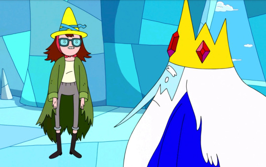
Ice King always carried the hole she left in his heart. Meanwhile, the Winter King has full access to his old memories, he just forgotten her because he doesn’t care anymore.

Even while he was forcing Princess Bubblegum to dance along in a recreation of that same romantic grief.
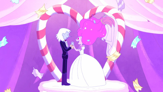
But still, I feel like what happened Winterworld version of Marceline is an ever more poetic example, even if figuring out what exactly happened includes a lot of inferences and headcanons.
In “I Remember You”, during yet another emotional breakdown, Ice King accidentally shoved Marceline - and he was immediately absolutely overcome with regret and shame
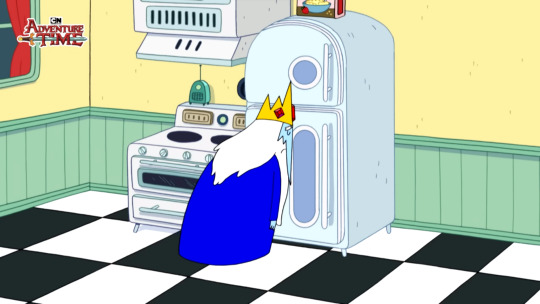
Because although he didn’t consciously remember what Marceline meant to him, he still retained these feelings of fatherly care and affection. Some sort of core element of Simon’s being that persisted despite the effects of the Magic Crown. Because of that, he couldn't even stand the thought of hurting her, even slightly.
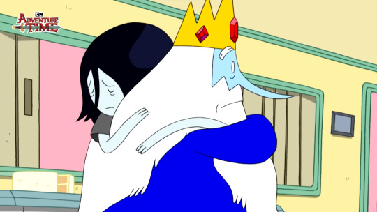
Ice King was capable of doing some fucked-up things in his desperation and madness - but hurting Marceline was the one line he never ever wanted to cross.
But the Winter King?
We only have hints of what went down between Winterworld Simon and Winterworld Marceline. All we know is:
The Winter King and Winterworld Marceline had the same Simon and Marcy backstory as in the Mainworld, and the Winter King fully remembers it - since he conjures a vision of them during his song.

Since Marceline’s Ax Bass still exists in its familiar form, it’s safe to say this version of Marceline did reach adulthood and probably had a pretty similar life to Mainworld Marceline.
The Winter King did something absolutely morally repugnant to the Candy Kingdom in general and Princess Bubblegum specifically. Although at the time the Winter King came to being, Marcy and Peebs were still reeling from that centuries-old breakup (assuming there are no other major divergences in the timeline) - I have no doubt that Marceline still had enough lingering feelings (and also maybe general human decency) that she would not stand for Simon’s actions.
And yet the real Marceline is 100% unaccounted for, only her Ax-Bass remains, in the Winter King’s possession.
Or rather, in the possession of Ice Marcy, an icy duplicate of Marceline as a child living in a gilded cage in the Winter King’s palace - presumably just as lacking in Free Will as the Ice Scouts and any other creation of the Winter King.
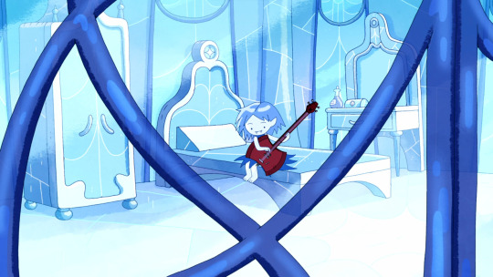
The Winter King’s little conversation with Simon about Betty is the best hint we have to Winter King’s motivation for making Ice Marcy. Namely, he suggested making an ‘Ice Betty’ as a way for Simon to get over losing the love of his life. And he’s fully aware that this is unethical - he just doesn’t care.
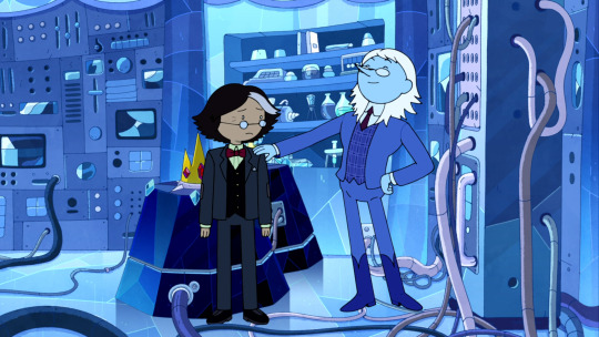
I think it’s pretty reasonable to assume that Marceline and the Winter King would have some sort of confrontation about what he did to Bubblegum and since the Winter King implicitly compares it to the situation with ‘the dead one’ (Betty)… I honestly think it is not a stretch at all to assume the Winter King killed Marceline.
And even if he didn’t straight-up kill her, I think most scenarios that fall under Occam’s Razor still involve the Winter King knowingly inflicting a great amount of emotional and potentially physical damage to Marceline. And it definitely involves the Winter King claiming Marceline’s most beloved posession as his own and giving it to a false icy duplicate of her child self he made to replace her.
I mean, the fact that he even bothered implies that he at least misses her more than Betty. But his discussion with Simon still means he considers replacing her with a nonsapient magic ice construct that copies not the person she was when she was speaking out against him but the child who adored him to be more than a suitable solution. Which is a demonstration that whatever sort of love remained in the Winter King’s heart for Marceline was a very twisted and selfish kind of love.
Even if you want to argue that the Winter King has nothing to do with Marceline’s disappearance - the fact that this is how he dealt with her being gone shows how much of the love Simon genuinely had for Marcy is now become a hollow and self-centered sort of thing. This is also a form of hurting her. And again, with the way the Winter King is in general - I think it’s very likely he has a lot to do with what happened to Marceline.
Meanwhile in the Mainverse, the Ice King couldn’t even lightly shove her away in a fit of emotions without being overcome with pain and regret.
So which Ice Wizard really retains more of what made Simon Petrikov who has is? The one who kept his identity and memories but has lost all of the love and care that has once motivated him more than anything? Or the one who can’t remember his name or his old face most days but still retains this ever-persistent echo of his romantic love for Betty and his fatherly love for Marceline even if he doesn’t fully understand where it comes from?
#adventure time#atimers#fionna and cake#fionna & cake#at#at spoilers#fac#fac spoilers#f&c#f&c spoilers#adventure time fionna and cake#adventure time spoilers#adventure time simon#fionna and cake spoilers#fionna and cake series#fionna and cake simon#fionna and cake show#simon petrikov#simon adventure time#the winter king#winter king#ice king#the ice king#simon and marcy#ice marceline#ice marcy#marceline#marceline the vampire queen#marceline abadeer#marceline and bonnibel
770 notes
·
View notes
Text

Ilkka's version I hope you're ready for pain & suffering because I WASN'T when I heard this version for the first time. I'm curious about how many they recorded because I couldn't find the one from the Behind the Scenes video, and those extras from IN07 weren't even mixed in the final audio, apparently. Still, I'm glad they left us plenty of unused files, it gives us an idea of how much the game changed over time and we can also appreciate more the work done by the cast and the Sound Design team. ♥
Matt's files for the Drowning video and fadeout lines are available here. The MIX folder contains the video version with the sound effects applied (just in case anyone needs it) and the recombined fadeout lines since Remedy had to cut it in ~3s parts for in-game usage. I removed duplicates and the angry-031 line bc it feels a bit out of place and edited the pacing, but you can always change that or just listen to the separate files.
Now if you excuse me I'm gonna pack a bag with a weighted blanket, hot cocoa and antipsychotics, and jump on Cauldron Lake because our favorite tortured writer clearly needs some help and a hug.
#and Porretta my beloved you seriously need to narrate audiobooks or join your brother's podcast if he eventually releases it I'm serious#such a beautiful voice even Rose points that out in the game - yeah she's biased but she's right#Matthew Porretta#Ilkka Villi#Alan Wake 2#Remedy Entertainment#cw suicide ideation#audio#tinyclowntent
348 notes
·
View notes
Note
Your art is wonderful!!!
A constant inspiration to my own creativity and art work. Could you explain some of your art style to me? I’m interested in looking at a bunch of different ones to try and finally find one for me.
Goodnight!!🌙
Thank you so much! That means the world to me! I’d be happy to share some of my process with you 😄
Keep in mind I’m completely self-taught, so this is just the process of how I make my drawings and not any sort of professional advice 😅 apologies for the long post ahead 😪
Starting with the basics, my biggest influences are Jin Kim and Ami Thompson. Both are amazing character designers and I really admire their stylization and expressions. Whenever I feel stuck on something, I always go back to their drawings for inspiration.
I typically start in Procreate with a canvas size of 3300px x 4200px or 11” x 14” with a DPI of 300.
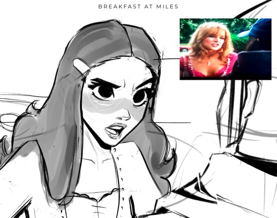
I put my reference in the corner of the canvas (in this case it’s a screenshot from the movie She’s the Man) and I start my rough sketch (emphasis on rough). Sketching is probably the longest part in my drawing process because I’m focusing on expression, composition, proportions, etc. This usually has about two to three passes before I move on.
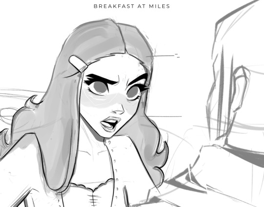
Then I lower the opacity of the sketch and clean it up with some lineart on a new layer. Lineart doesn’t play a huge part in my style, but I still like to play around with line weight. Since I knew this was going to be a fully rendered piece, I didn’t spend much time on lines that I knew were going to be removed later in the process.
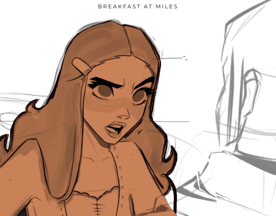
Underneath all of that, I use the skin tone and color the base of the character. I make sure that I color ever so slightly past the lineart, for reasons that will be important later. This part can be tedious, especially because I use a textured brush, so there are a lot of gaps that I fill in later.
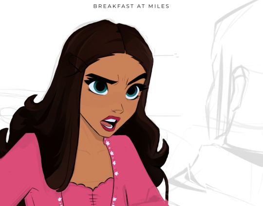
Then using new layers with clipping masks, I start the flat colors. Nothing too crazy here.
I’ve made color palettes for characters and backgrounds that I typically draw, so this way it speeds up the process and maintains style consistency. If I need a color that I don’t normally use, I’ll just play around with the colors until I find something that fits well with everything else.

Next, on a multiply layer, I add some basic shading (with the skin tone color) and blush (with an orange-pink color). I also move onto the background. Some are more complex than others. If I’m going for a more cinematic look, I’ll fill the background in with some basic shapes and blur it slightly. Thankfully the background was pretty simple in this reference.
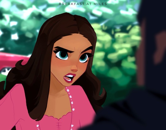
I start checking proportions now that everything has basic colors. Then I duplicate my lineart layer and change it to a pinkish-red and put it on multiply mode and turn down the opacity. This is why the base color layer needs to line up with the lineart, otherwise there’d just be gaps underneath. Instead of erasing my black lineart layer, I put a mask on it and just keep the eyes and eyebrows.

Then I start working on the shading and hair, which is an entire process in itself. Maybe I’ll make a tutorial on that one day 😅
I also use some vivid light and soft light layers and put in some subtle colors for extra pizzazz.

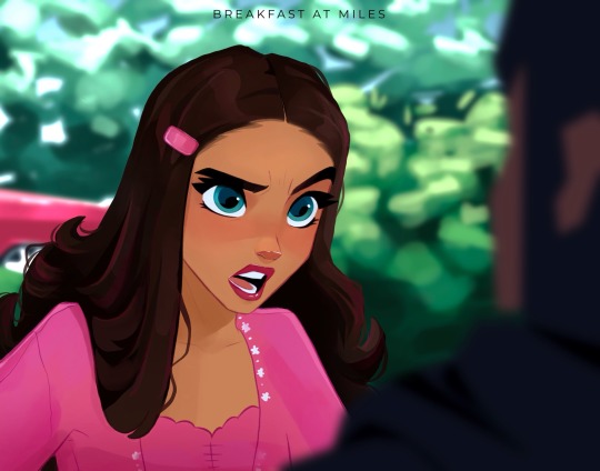
Then I add a hard light layer to the eyes for that glossy look and on a normal layer add some white details just to make some things pop more (like the nose, lips, eyes, sometimes hair, etc.)
I did make an eye tutorial a while back, but my process is still the same!
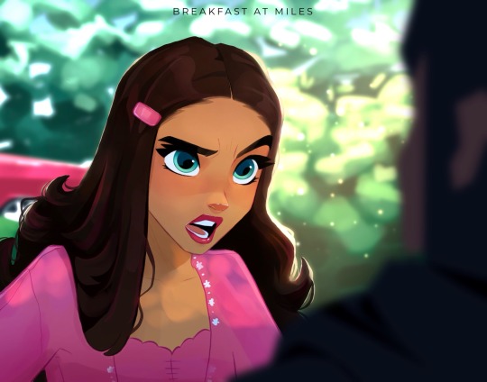
Lastly, I spend a lot of time playing with different blending modes (multiply, add, soft light, vivid light layers) and really focus on the lighting. I used to focus on adding a lot more details and make the coloring more realistic, but I found that the more simplistic coloring was easier for me to do and fit my style better. Sometimes I still tend to go too far with the details and realize that it looks better when I tone it down a bit.
That’s pretty much it! Let me know if you have any questions! Hope this helps. Have fun making art!
#art#digital art#procreate#art process#danny phantom#fanart#danny fenton#my art#paulina sanchez#tutorial
42 notes
·
View notes
Text
Duplicate Frame Deletion: A Likely Unnecessary Tutorial
So… you updated to MacOS Sonoma, and–while it is amazing in many regards for photoshop things–it is a dang bummer and mood killer if you use MPV. However, after slamming my head into a wall trying to change the code on my own, I realized there is a much, much simpler solution to this.
In this tutorial, I will be showing you all how to delete duplicate frames from your gifs, with two options:
duplicate finder
within photoshop
Under the cut because pictures are a visual learner’s best friend!
A quick note:
MPV is odd with this. I’ve not had to do this on 4k capping, but have had to on anything under that. I don’t know the full reasoning, but it mostly looks to be something with the way it is reading frame rate. I know it’s in the code, but could not pinpoint it myself, and these were the only tricks that worked. If you find a better solution, please let me know! It has been rough, otherwise.
Step 1: Cap in MPV as normal
Now, this may be obvious, but make your caps in MPV. For a full tutorial on this, I highly recommend this one by kylos. The only difference between our software and their suggestion is going to be using the newest version of MPV (.0.36 at the time of this), and not the older. This is because there is an issue with MacOS Sonoma and older versions of MPV that prevent it from opening for… Some reason.
Step 2: Make sure you have your caps
I recommend moving your caps to whatever folder you like for your own ease of use. My biggest rec is to have it in its own folder, with no older folders within the folder. Not really a requirement, but in my mind, it makes the process faster (only true depending on number of files in other folders). You should have something like this (I am doing a scene from TWOT, as it’s one I’ve tested this method on a few times in several instances):
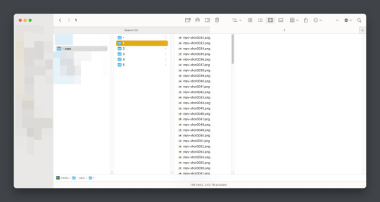
Once there, it’s time for the line split. I recommend option 1 the most (it’s faster, IMO), but again, this is a two option thing.
Option 1: Duplicate File Finder
So, duplicate finders are what they sound like. They are pieces of software that can be used to scan your device (or specific sections of said device), for duplicate files. It does not matter the title of the file, if the system reads it as a copy, it will find it.
There are a number of varieties for this, paid and free. I will not lie, the one I use is a paid version, because I had a huge issue with duplicate files taking up space when I moved to a new device. This also helps a lot with cloud file keeping, in my opinion. But that is beside the point.
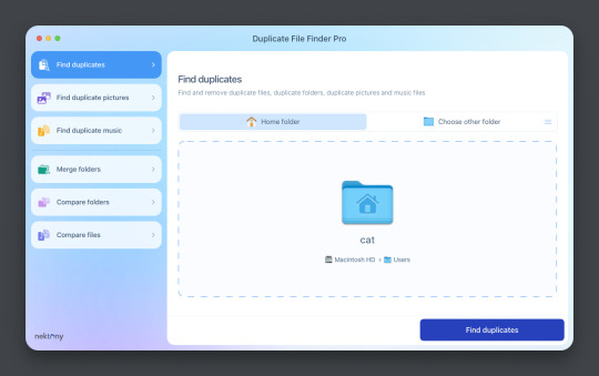
This is Duplicate File Finder Pro, which I got for other reasons, but has been very useful since this became an issue. The free version is sufficient for removing duplicate files found in folders, and that is why I still suggest it. You only need to get the pro if you have other intentions.
Now, onto the next step…
Step 3: Drag and drop the folder
With our folder full of caps, we simply drag and drop it into the application to begin.

Step 4: Click “Find duplicates” and watch the pretty graph roll.
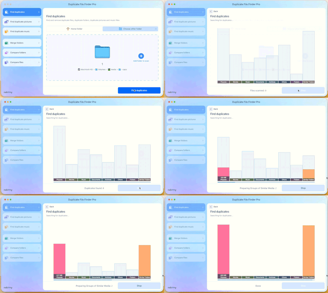
Step 5: Select the duplicate images
You can see here it found the duplicates.

Now, I could go through by hand and click them, but… that’s a lot of time I don’t want to waste. I let it auto select them instead (you can tweak the settings for auto-select, but this is not that tutorial).
Step 6: Select review & remove, complete!
Wham bam! You’re completely set and good to go. Gif as normal~ (all final results at bottom)
Now, of course, maybe you don’t want a duplicate remover. Understandable, so what then? Well…
Option 2: Photoshop & the Changing Frame rate
So, this one is a little more technical. I suggest basic giffing and Photoshop knowledge before attempting.
Step 3: Import folder as you normally would
I believe this works as it would for import video, but I don’t want to say that and be wrong. But load your files in and you’ll be here:
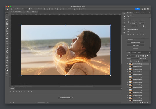
Now create video timeline, make frames from layers, yada yada (kylos’ guide is very good with this if you need help, it’s the same that was linked at the beginning of this). You’ll now be here:
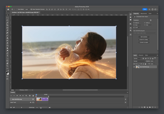
And the actual part of the tutorial you all came here for...
Step 4: Change the frame rate
So, in the bottom, next to the mountains for zooming in on the timeline, you’ll see it reads “30.00 fps.” We need to change this to 60. How? Easy! Click the three lines circled here:
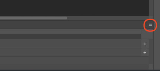
Then click “Set Timeline Frame Rate…”

A little box will pop up, change the 30 to 15 (dropdown or typing, it works the same) and click “OK.”

Your timeline will now be cut in half for length. That’s OKAY. DO NOT PANIC.
(Optional) Step 5: Double Checking
Click play on your gif, and you’ll notice it is no longer duplicate framed! To verify, let’s convert back to frames, just to see…
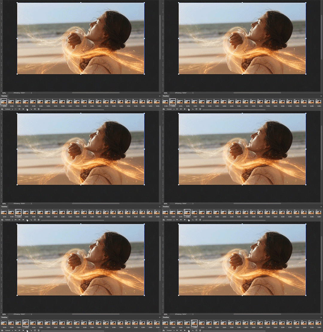
And it did, success! So make the rest of your gif as normal.
Your final results for the gif will be the following, with the gifs all labeled on what option was taken (or not). These were cropped for uploading and sharpened because of how I am. No coloring applied.
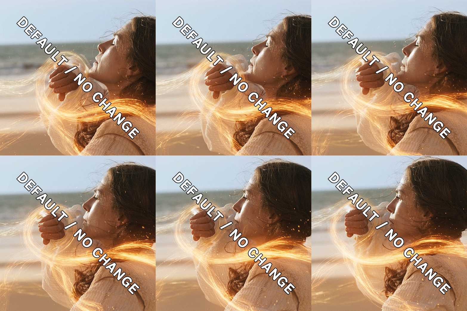
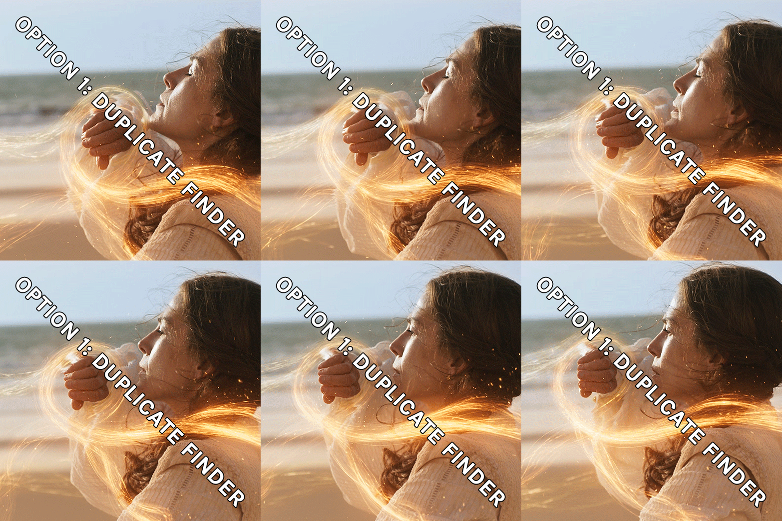
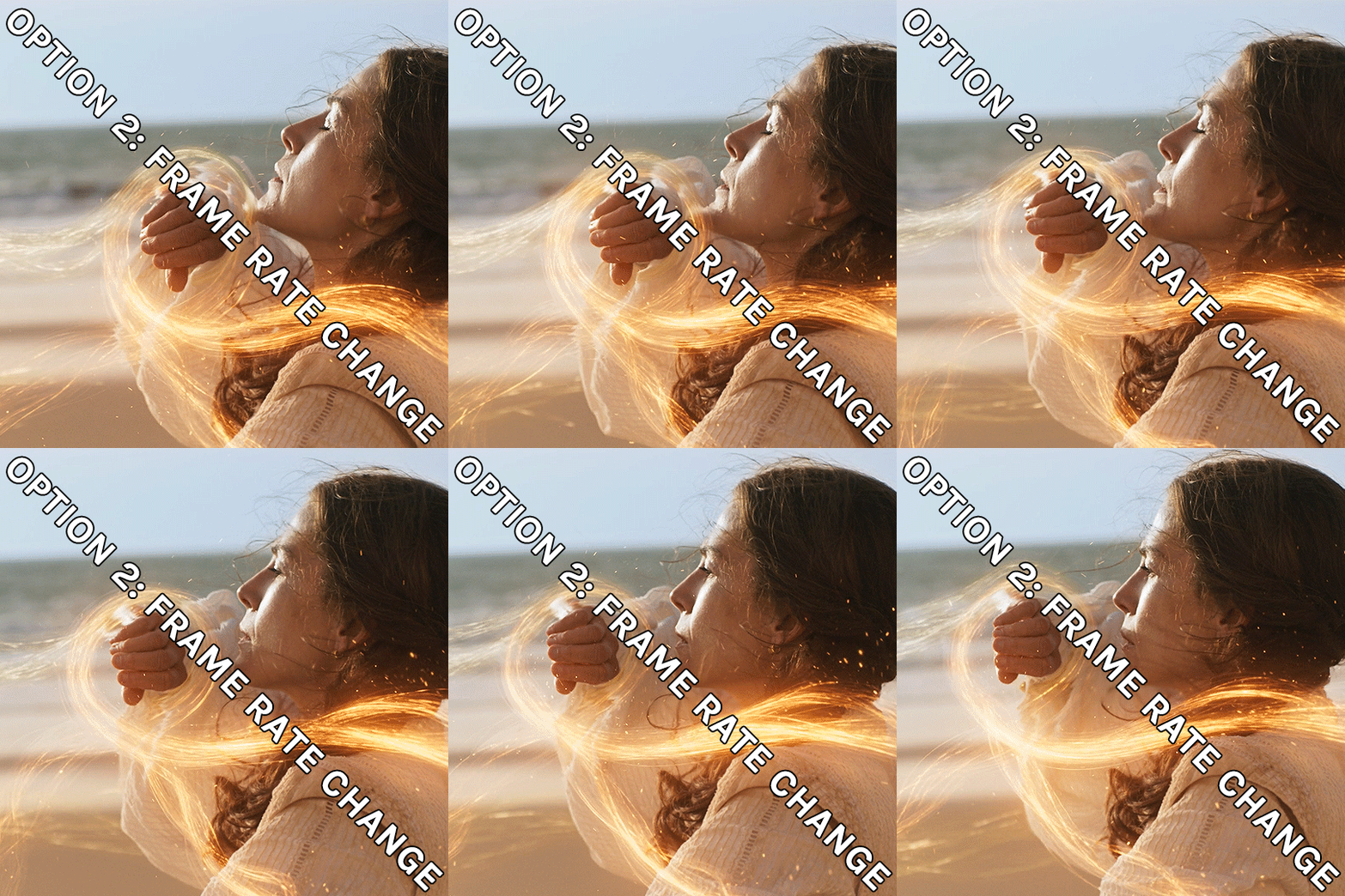
If anything was confusing, please don't hesitate to reach out! I'm happy to help in any way I can on this. My ask is always open. Happy Giffing!
#*tutorial#*ps#photoshop#resources#tutorial#alielook#singinprincess#sophiedevreaux#tuserabbie#tuserheidi#userace#userairi#useraish#userbarrow#userdorksinlove#userhella#userkayjay#userkraina#usermadita#usernik#userrobin#usershale#usersmia#usersray#usertj
173 notes
·
View notes
Text
If you’re new to Olitz fanfiction, read these stories!
- NOTES -
• Mentioned fics were recommended by readers who follow our blog and social media account.
• This list ranges from current/WIPs to completed. Some have been removed and we don’t have access to old files.
• Please read summaries before starting; plots, tropes, and ratings will vary.
• This is the tip of the iceberg when it comes to Olitz fanfiction, we encourage you check FFN and AO3, and look through the categories and archives from 2012! We believe there is a fic for you.
• And of course, make sure to leave a review/comment/love to these authors. They put in so much time to create and world build. Even if the story isn't finished, they deserve respect and encouragement. So leave that note.
-
A Semester Away (removed by author)
A Winning Season
Arranged Love
Be My Downfall
Blurred Lines
Desire (2015)
Desire (2022)
Duplicity
Duty Calls
Epiphany
Executive Orders
Feel Again
Fighting Hearts
First Do No Harm
Forbidden (removed by author)
Governor Grant
If Only You Knew
Knights Ferry
Lifestyles of the Rich and the Famous
Love Beyond The Scars
My Father’s Best Friend (removed by author)
No Escaping Him (removed by author)
On Stage
One Night Only
SECRETS
Some Other Me
Something good can work
Taken
Thank you Dr. Pope
The Agreement
The Chemistry Test (removed by author)
The Distillery
The Game Chose Me
The Game Plan
The Right Kind of Madness
Unexpected Circunstance
Vision
Weekend Fiancée
Welcome to Las Vegas
Whatever We Want
Enjoy!
28 notes
·
View notes
Text
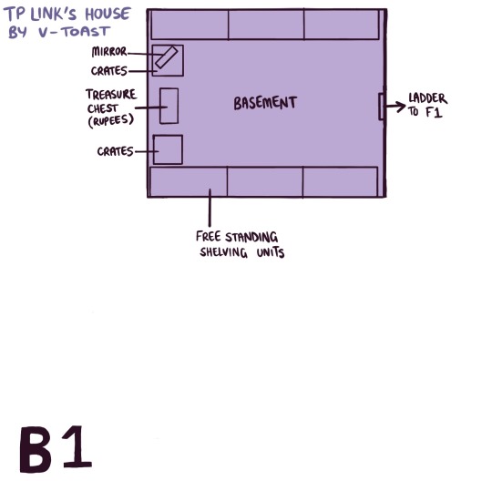
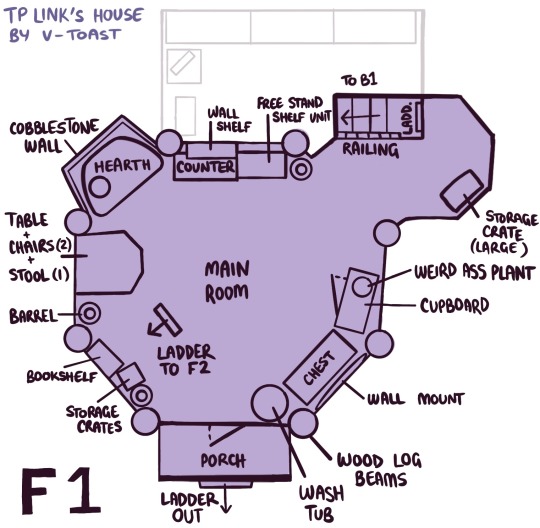
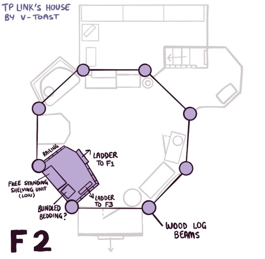
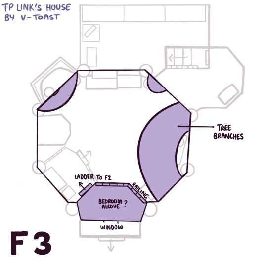
twilight princess link's house ! wii / wii u hero mode version (gamecube / wii u normal mode version is mirrored)
feel free to use as reference and save if you want, but don't remove the credit/watermark :]
fun facts i learnt while mapping this out:
1. this house has a skylight ! and its not even half covered by branches and leaves. this man's house is RUINED every time it rains
2. he has a wrap and sash/obi hanging on a decorative line that are in the same pattern and fabric as colin's ! so either colin keeps his spare (duplicate..) clothes in link's house, or link has a matching outfit
3. link has one mirror in his house, and it's in a corner in the basement (B1), and your reflection can only be seen when you're carrying a lamp and walking directly up to it (that's very out of the way for a mirror...)
4. the wall mount on F1 holds a big pitchfork, and what seems to be a whip wrapped around it ?
this was super fun and took way too many braincells out of me lol
#twilight princess#tloz#art#ref#also there are loadsss of details in this house#like the different patterns on the many rugs and cloths around#theres some sort of tapestry or maybe cloth painting he has hung up and it has a painting of a goat on it#also theres roofing on the top of the house thats in the same style of the ones in ordon village. so the skylight was an active choice#and he has a lot of books !! many books !
384 notes
·
View notes