#drawingwithlena
Explore tagged Tumblr posts
Visit Tumblr Blog
Explore Tumblr blogs with no restrictions, modern design and the best experience.
Last Seen Tumblr Blogs


Fun Fact
Tumblr’s reach among the 26-to-35-year-olds in the US is 11%.
Text

PRACTICE, PRACTICE, PRACTICE
They say Practice Makes Perfect.
This is of course bullshit, because there’s no such thing as perfection -- especially in art, where a lot of quality is subjective. No drawing will ever be perfect, and it’s a useless, meaningless thing to strive for. You can’t be a perfect artist.
But you can be damn good. And practice? Makes you better.
The problem though, is that we happily tell folks that the secret to getting better is to practice, without explaining what that means and entails -- and without an understanding of how to practice, and how to make it work, it’s not going to be as effective a means of improving. So this post is going to get into some Practicing Best Practices, so to speak!

- Make time regularly. If you’re serious about improving, set aside a certain amount of time on the regular to draw. Work it into your schedule. It doesn’t need to be daily -- everyone needs a day off from time to time -- but make it routine. If you have downtime on the subway during your commute, or during your lunchbreak, or while you’re waiting around at work or between classes, start carrying a sketchbook with you and using those times to sketch. The more you make it a habit, the easier it’ll get to motivate yourself to put pencil to paper. Figure out what time of day you’re most consistently energized -- whether that’s first thing in the morning, or at 10pm (like me) -- and make an appointment with yourself to work on your art. Sometimes it helps to put it on your daily calendar, if you keep one.

- Carry a sketchbook. I mean it about that sketchbook. Don’t even bother springing for a nice one -- just get something you can carry around and aren’t afraid to fill with scribbles. Even if you prefer to draw digitally, keeping sketching materials on hand lets you practice even when you don’t have a tablet or computer set up. Instead of playing a game on your phone when you’re waiting somewhere and bored our of your skull, pull our your sketchbook and pick something in your environment to try to draw.

- Let bad drawings happen. It’s easy to think they don’t for some people, when your favorite artists only post great work after great work. But the truth is, for every awesome piece they post? There’s probably a dozen scrapped sketches and failed attempts. The bad drawings might not be shared, but trust me, they exist. So don’t get discouraged when something you’re drawing turns out looking nothing like how you wanted; you can still learn from it and use it to improve. Every bad drawing is a lesson.

- Review your drawings. In every drawing you do, come back to it at least an hour after you’ve finished, and try to find 3 things about the drawing you like and feel you did well, and 3 things about it that aren’t working so hot. Try to be specific as possible in identifying what the issue is. Maybe your figure’s arm looks wrong. Why? Is the shading inconsistent with your light source? Is it out of proportion? Ask yourself questions to find what specifically is a pain point (you can even ask a friend or instructor, as sometimes a fresh set of eyes helps).

- Identify & isolate. Figure out your weaknesses. Do you struggle with shading? Is linework difficult for you? Can you just plain not draw feet? Identify your problem areas, and then practice working on them in isolation. Practicing the stuff you’re already good at is fun, but practicing the stuff that’s giving you a hard time is going to be a more efficient and effective use of your practice time. So when you’re practicing, don’t worry too much about whole and polished drawings; instead concentrate on the subject or technique that you want to improve, and do a series of studies.

- Do drawing exercises. Doing a blind contour drawing of a sneaker or redrawing the same piece of fruit half a dozen times from different angles might seem really boring compared to, say, drawing your favorite characters or a really badass wizard fighting a dragon. But a lot of academic drawing exercises are specifically designed to build certain skills in isolation. They can be tedious, but they do help you get better. Try to do a mix of creatively-inspired drawing, and structured exercise drawing. The creative stuff will be fun enough to keep you wanting to draw, and the technique exercises -- much like eating your vegetables -- will be good for you. And sometimes you’ll stumble across a technique you actually really like!

- Don’t give up. Practice can be dull sometimes, and frustrating, and sometimes you feel like you’re not making progress at all. But I guarantee you, it’s worth it. Take a break when you need to, do some wrist stretches, make yourself a cup of tea, and then come back to it. It takes time and effort, but you’ve got this.
313 notes
·
View notes
Text

LESSON THREE: GETTING IN SHAPE(S)
Today’s lesson will focus on geometric shapes and forms, and how to render them with light and shadow.
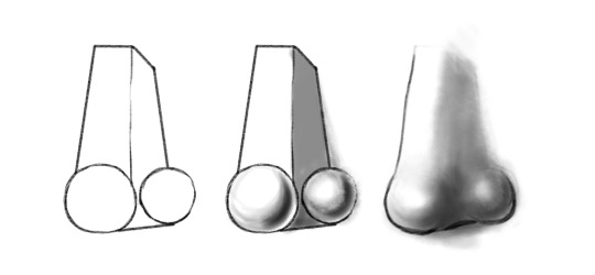
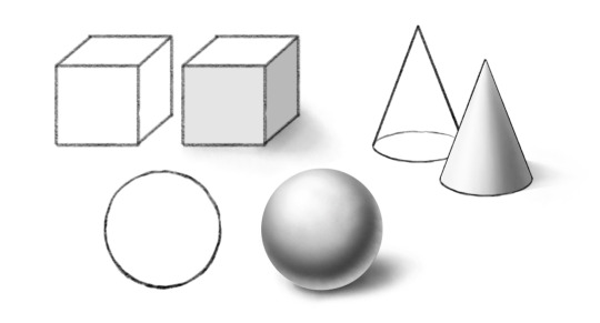
Now granted, very little of what you may want to draw will consist of perfect spheres, cubes, or cones. But almost every complex, organic shape? Can be reduced to basic geometric components. A nose might not be a standard geometric form, but you can build one by combining spheres for the tip of the nose and nostrils with a rectangular prism for the bridge -- and if you know how to render and shade those forms, then shading a nose gets a lot easier.
Now, a sphere with no shading at all, just looks like a circle. It’s a little easier with boxier shapes to convey 3-dimensionality just with contours, but it’s still tricky sometimes to convey depth. You can convey a lot with just contours and linework, but we’ll be talking about the technique involved in that in a later lesson. For today, dealing with light and shadow to communicate shape and depth will be our focus. We’ll be concentrating mainly on simple geometric forms, because these are our building blocks for constructing more detailed, complex images as we feel more comfortable with our skills.
To start, let’s make sure we have some terms defined:
SHAPE: A two-dimensional figure. ie, a circle, square, rectangle, triangle, etc.
FORM: A three-dimensional figure. ie., a sphere, cube, prism, cone, etc.
Technically nothing we draw is three-dimensional, since the page itself is two dimensional, but with shading and depth indicators, we are able to create the illusion of three-dimensional space in a two-dimensional drawing.
So, there’s our terms as far as shape. Now, for light and shadow, let’s look at some more terms:
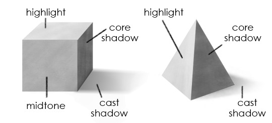
HIGHLIGHT: The area of a form that faces the light source and reflects the most light.
MIDTONE: What it says on the tin.
CORE SHADOW: The area of a form furthest from the light source which has the deepest area of visible shadow.
REFLECTIVE HIGHLIGHT: An area of dimmer light where the form catches light reflected by other surfaces.
CAST SHADOW: The shadow the form casts on the surface it rests on, or on objects around it.
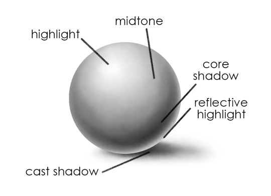
On a curved surface, such as we see in the sphere above, and also in cones and cylinders, we see shading in a gradient. There is a gradual shift along the same continuous surface from an area of highlight to an area of shadow.
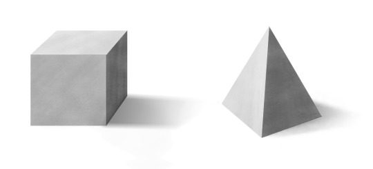
On flat surfaces, such as on cubes, prisms, or the flat top of a closed cylinder, the light hits all points of a surface at a more similar angle, making each visible side a comparatively flat area of highlight or shadow. (You may see some gradation, depending on proximity of the light source, reflections, or small variations and imperfections in the form -- but not to the degree you would on a sphere).
Now, the most important step in drawing shaded objects? Is IDENTIFYING YOUR LIGHT SOURCE.
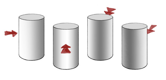
On each of these cylinders, the light is coming from a different direction. On the second cylinder to the left, the light is coming from the front; the area of brightest highlight is visible; the area of deepest shadow is on the far side of the cylinder. On the cylinder immediately to the right of it, the opposite is true -- we can see the deepest shadow, and the highlight is on the far side.
Now, in reality, there are often multiple light sources -- two lamps in a room, natural light through a window plus indoor light, lights reflected off multiple surfaces, etc. But for the sake of our drawing exercises, we’re really just going to focus on a single primary light source in a given drawing, plus some slight amount of reflected light.
When you have multiple objects in a drawing, or a complex object made of multiple geometric forms, keeping track of your light source is important! It’s logically consistent, and makes everything in your drawing appear to occupy the same space. I often make a little arrow to remind myself of the angle of the light, which I can erase later.

Recommended Media: If you have gray-toned paper and drawing chalks/gray pastels, this is a great time to break them out. Otherwise, charcoal is great, or pencil and paper is fine.
EXERCISE ONE: VALUE SCALE
When we talk about values in drawing, we are’t talking about our moral principles (though there is a fantastic quote by G. K. Chesterton that “art, like morality, consists of drawing the line somewhere.”) Instead we are talking about light and dark in very literal terms.
Before drawing any shapes, let’s take a minute to explore the full range of your value scale. Draw at least 9 to say, 12 boxes of equal size, all in a row with touching sides.
Now, starting on one side, fill in the first box as dark and black as you possibly can.
Using your materials, in whatever medium you’re in, try to fill in the boxes from one side to the other in a gradual scale, with the opposite box being white (if you are drawing on gray-toned paper, you will want to fill in that box with white chalk, conte or pastel). Make the transition as even and gradual as possible. In the end, it should look something like this:

The value of this exercise (ayyyyy see what I did there?) lies in making you explore the FULL range of value available to you, so you’re aware of just how deep you can make your shadows in comparison to your highlights. A lot of folks go light on their shading instead of really getting in there with a full value scale. Pin this up as a reminder of what you have at your disposal!
EXERCISE TWO: DRAWING FORMS
On different pieces of paper, draw, and then shade:
a cube
a sphere
a cylinder
a cone
and a pyramid
(links provided for example -- you can use them as reference, or you can find your own, online or in real life!)
For each form, identify a direction for your light source. Figure out your area of highlight, your area of core shadow, and your cast shadow. Refer to your value scale! If you’re feeling ambitious, try drawing the forms more than once, with your light source at different angles.
EXERCISE THREE: GET IN FORMATION
Now, on a new sheet, try combining and overlapping the forms, maintaining a consistent light source.
If you want to do this with references, you can look online, OR -- look in your pantry. Canned goods and boxes make great simple geometric references. Eggs, while ovoid, shade similarly to spheres. Shine a desk lamp on your composition for a clear light source, and then draw away!
As always, my askbox is open, you’re welcome to @ me, and I’m happy to provide feedback via message if asked.
51 notes
·
View notes
Text

LESSON FIVE: CONTOURS
“Art, like morality, consists of drawing the line somewhere.” - G. K. Chesterton
In this week’s lesson, we are going to talk about, as G. K. Chesterton puts it, “drawing the line somewhere.” More specifically -- drawing in contour.
In drawing, a contour refers to “an outline, especially one representing or bounding the shape or form of something.” We got a little bit of practice with this when we did the blind contour exercise in lesson two. But in this lesson, I promise, we’ll actually be able to look at what we’re doing (though if you want to go back and give the blind contour exercise another go, it’s never bad practice).
The following are all contour, or linework drawings:

The outline doesn’t refer solely to the exterior outline, such as we’d see framing a silhouette, but also to outlines of interior details, such as folds of cloth or curls of hair. All the information in the drawings is conveyed with line.
[Personal note: the sample drawings above are all mine -- as a huge comic book fan since the age of 11, contour-heavy artwork has always been near and dear to my heart, and has become a central component of my personal style.]
There are a few different styles of contour drawing. One is continuous contour, where a drawing is made with a single continuous line, never lifting from the page. Continuous contour can be done while looking at one’s work, or without, in the case of blind contour.

Cross-contour uses lines in an almost mesh-like fashion to show depth and form -- like a topographical map. This is a way to render 3d form without the use of shading.

You can also convey depth and form, however, as well as light and shadow, with line weight:
A thin, delicate, even disappearing line might indicate a very shallow edge, like a small wrinkle in a figure’s clothing. It can also indicate that the area it is contouring is an area of highlight.
Thicker, heavier lines have weight to them, and can suggest a more pronounced area of depth, or an area of shadow.
You can communicate a lot of information just by changing up the weight of your lines. For example:

The image to the left has uniform line weight throughout the entire drawing. The image to the right, however, has varied line weight. Consider what information you can tell from the image on the right that isn’t presented in the image on the left, though both are of the same subject, and have lines in the same places.
Now, let’s get into some exercises:
Recommended media: Well-sharpened but soft-leaded pencil (something on the B side of the HB scale), pen & ink, digital stylus with pressure sensitivity enabled.
EXERCISE ONE: WARM UP
To start, don’t draw anything in particular. Just loosen up, and start drawing lines - go abstract with it. Give yourself a big page to work on; let your lines be long and loose, not short, cramped things. Draw from your elbow, not your wrist. And as you draw, try varying your line weight. Push down harder and darker, or thin and barely there; draw lines that go from dark to light and light to dark; try to draw as many kinds of lines as possible. Play with it. Explore. Feel out your range, and let it be fluid, without overthinking it. Avoid “hairy lines.”
EXERCISE TWO: TRACE
An important part of contour drawing is deciding what contours to draw. Is that slight indentation enough to warrant a line? How many of those folds need to be recorded?
For this exercise, you’re going to need either a digital drawing program with layers, or, if you’re working traditionally, a printed out image that you want to draw from, and either a light table (if you have a glass table and a desk lamp, this is easy enough to rig up) or a window with outside light. Lay your paper over the printed image and place it on your makeshift light table or window so you can see the underlying image. If you’re working digitally, put the image you’re drawing from in one layer, turn down the opacity to 60%, lock that layer, and make a new one.
Now, trace the contours. But think, as you draw, what contours are best to include -- for instance, does every crease in a person’s face need to be included? Note all the potential contours, and decide which ones are important to your drawing. And while you draw, pay attention to your line weight!
From time to time, you can turn off your image layer or pull your drawing away from your window/light-table, and look at your lines. Ask yourself questions: what’s working? What isn’t? Should some lines be thicker/darker? Are there important lines that are missing, or present lines that are superfluous? You might not see a clear answer, but it’s good to be in the habit of thinking about it.

EXERCISE THREE: OBSERVATIONAL DRAWING & CONTOUR
Our tracing exercise allowed you to focus on contour by itself, without worrying too much to proportion, etc. Now, we’re going to put things together.
Pick a subject. It can be a reference image, or an object from real life; ideally, practice drawing both. Now, with a pencil (preferably a harder lead - H or higher on the HB scale), lightly, roughly sketch it out. Remember what we covered in our lesson on proportion! Draw from the inside out, and focus more to start with getting the shapes down in the right places than detail. Those come next. Be sure to really look at your subject, and adjust your drawing based on your observations.
Work up your underdrawing, until you feel like you have a good framework to lay your linework down on. (I like to do underdrawings in blue so I can differentiate them easily from my final linework).

Using the contour skills we practiced in exercise two, and observing your object, lay down your contours, picking out the details of the object -- if you use pen, it will be easier to erase your underdrawing, though you can also use a softer pencil lead.

Once you’re done, you can either turn off your underdrawing layer if you’re working digitally, or lightly pad away your pencil marks with an eraser.
ADDITIONAL EXERCISES: (If you’re having fun and want to do more!)
Blind Contour Drawing - See Lesson 2.
Continuous Contour Drawing - Like with Blind Contour, you keep your pen/pencil on the page at all times and draw all the details you see in a continuous line -- only you’re allowed to look down at your page when you want.
Cross-Contour Drawing - Pick a relatively simple object, like a piece of fruit, or a simple tool/utensil. Something with depth. Use cross-contours to illustrate that depth topographically.
As always, my askbox is open if you have questions or would like feedback!
47 notes
·
View notes
Text

LESSON FOUR: SHADING TECHNIQUES
In Lesson Three, we talked about paying attention to light and shadow in shading forms. In this week’s post, we’re going to focus on shading techniques! Specifically, in how we create marks that build up to areas of shadow.
There are a number of different ways to apply drawn media to a page to create value. A few of them are:
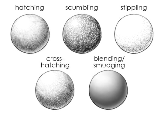
Now, let’s break ‘em down:
HATCHING is the technique of creating shadow with small, thin lines, oriented in a consistent direction. These lines are often straight, but can also be curved. Curved hatching can be particularly useful for conveying a rounded object, with the hatch-marks following the curved contour of the object to emphasize form through interior contour -- while simultaneously creating shading. In the sphere above, for instance, the hatching lines radiate from the highlight, and run longitudinally down the sphere, rather than parallel on the page.
Hatching works well with pen and ink, or with pencil. You see it used a lot also in etchings and printmaking.
Hatching examples:

SCUMBLING, also sometimes called “brillo pad technique” is a bit less controlled and more random, and involves using your pen or pencil to make lots of random, squiggly marks to build up areas of shadow. It creates interesting texture, and requires a certain amount of looseness and impulsivity. When scumbling, try drawing lots of little round loops, squiggles, and figure-eight like shapes, layering them or applying them in tighter marks to create darker areas, with looser, less overlapped marks for lighter areas.
Scumbling works well with pen and ink, or with pencil.
Scumbling examples:

STIPPLING is a somewhat painstaking technique of applying tiny dots to the page, clustering them together to create areas of deep shadow, and leaving them spaced further apart to make for lighter areas. It takes a long time, but can create a very clean, impressive look when executed well.
Stippling is particularly well-suited to work with pen and ink.
Stippling examples:

CROSS-HATCHING is hatching, but with lines going in two directions. This is a very common and widely-used technique, and you can find examples in drawings throughout history. A drawing may include areas of hatching and cross-hatching, with the cross-hatch-marks applied to darken areas of deeper shadow and simple single-direction hatching in midtone areas.
Like hatching, cross-hatching works well for pen and pencil.
Cross-hatching examples:

BLENDING/SMUDGING is a technique of shading that focuses less on specific mark-making, and more on concealing the application of marks by either applying them seamlessly (such as by creating such smooth and closely-applied shading with pencils that the hatching becomes invisible), or by rubbing in the media using a finger or smudging tool. (I am a filthy heathen who always smudges with my fingers instead of using a blending stump like I ought to, but if you do this, wash your hands BEFOREHAND as the oils on your skin can work into the paper and make it a LOT harder to erase!)
Blending can be done easily enough with pencils, or with gradated chalks. Charcoal is EXCELLENT for smudging!
Blending/smudging examples:

Which technique you choose is ultimately up to you; some techniques might be better suited to the medium you’re working in or the style of your drawing. And some might just be more fun to you! I would rather get punched in the face than stipple a whole drawing, personally, but you might find the process profoundly relaxing and hypnotic. Or maybe you’re like me and think hatching is the bees’ knees. Maybe you discover that you love the energy of scumbling! The best way to find out is to try them all. So:
EXERCISES ONE - FIVE: Keeping in mind the shading concepts we discussed in Lesson Three, try a drawing in every shading style listed. It can be a simple object, or something more complex if you want. It’s up to your comfort level. Take your time.
If you do five drawings and you want to try more --
EXERCISE SIX+: Try a drawing (or multiple drawings!) that uses more than one type of shading. Maybe you use hatching and cross-hatching, or hatching and stippling, or scumbling with blending. Explore with it! Find what works well together, and what works well for you.
As always, my ask-box is open (now at the new blog!) if you have questions, or would like feedback!
Cheers, -Lena
#drawing 101#art lessons#drawingwithlena#shading#shading techniques#hatching#cross-hatching#scumbling#stippling#blending#how to draw#sorry this one is so late this week!
140 notes
·
View notes
Text
New sideblog!
Hello folks! Lena’s Drawing 101, previously on @portraitoftheoddity, now has a new home. I will probably still cross-post and reblog to my main, personal blog, but will answer questions, share resources, and reblog additional content on the new sideblog. So if you’re interested in more drawing content, give it a follow!
Cheers, -Lena
11 notes
·
View notes
Text
Hey folks! Quick reminder that you can access all my art lesson posts at #drawingwithlena (also linked on my sidebar). ALSO! If you do any drawings that are exercises from or inspired by the posts, please feel free to send them my way via message so I can squeal and cheer you on! (I would be over the moon to see them, for real.) I am also more than happy to provide constructive feedback if requested. ♥♥♥
14 notes
·
View notes
Text

LESSON TWO: DRAW WHAT YOU SEE, NOT WHAT YOU THINK YOU SEE
Some of my followers are probably already rolling their eyes at this lesson title but by god I will beat this dead horse into the ground if I have to
The single most valuable art advice I have ever been given is “draw what you see, not what you think you see.”
What does that mean?
Human beings love pictograms. We communicate effectively, across language barriers, by using icons and other visual shorthand to get ideas across. We’re very good at this, because we have a knack for reducing a complex visual to a few minimal, key pieces of information, and then extrapolating from that minimal information by recognizing what it stands for.
For instance, we take the very complex image of a human face, with all its individually unique characteristics, specifically expressing happiness through muscle movements we know to associate with that emotion -- flexing of the muscles around the mouth, showing of the teeth, but without upper lip curling, contraction of the muscles around the eyes -- and we strip it down to two dots and a curving line:

We cannot tell looking at it who is happy; who is being depicted, whether they are old or young, male or female, anything about them -- but we understand that that pictogram translates to someone smiling. The person who draws the smiley face does not draw what they have seen; they draw the idea of what they have seen. In this case, “happiness.”
This is a pretty useful way to be wired. We recognize things quickly, and are able to reduce complex visual input to a few simple characteristics that we can remember.
But it’s less useful to someone trying to learn to draw accurately and representationally.
When we draw, our instinct is to look at the object, recognize the object and apply those simplifications, and then record the simplifications. In doing so, we draw what our brain has already refined and coded, dropping ‘unnecessary’ details and hitting the checklist of items we think we need in order to recognize the subject matter (ie., the sun has yellow lines radiating out from it) -- all without realizing that we’re doing it. We draw what we think we see.
A big part of learning to draw is unlearning the pictographic instinct. It’s about bypassing that simplification process, and drawing what you actually see, in whole, without paring it down. It’s about seeing that maybe the smile doesn’t actually curve down in the middle -- but if you render it as you see it, you can still have it recognizably be a smile.
This lesson’s exercises will focus on techniques to help you practice seeing what it is you’re drawing.
LESSON TWO EXERCISES
Required Materials: It’s recommended to draw from life by pulling on random objects in your environment for some of these exercises, such as a chair, but nothing too unusual.
Recommended Medium: Pencil and paper. We’re keeping it simple!
EXERCISE ONE: NOT-VERY-MUSICAL CHAIRS
Do you have a chair nearby? Preferably not the one you’re sitting in, but any other chair around that’s pretty lightweight and easy to move. Dining room chair, folding chair, lawn chair, etc. If you don’t have a real life chair available, you can use this picture of one of my chairs:

Now, draw the chair.
Done? Okay. Great. Good job!
Now, flip the chair over.
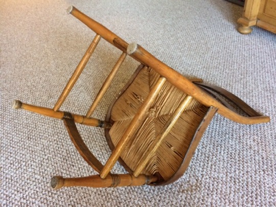
Draw the chair again. Feel free to give yourself as much time as you need.
When you’re done, look at the two drawings. The first one might say “chair” to you more clearly when you look at it. BUT! Which one is more accurate? Which one more closely resembles the specific chair you were drawing?
The trick of flipping an object upside down is an old favorite when it comes to bypassing your brain’s impulse to replace the object it sees with the object it wants to condense information into. When your brain sees a chair at an angle where it looks like a normal chair, it really just wants to draw something like this:

But flipping it upside down? Makes it look nothing like that. And so you’re forced to look that much more closely instead of relying on your pre-existing mental image of what a chair looks like.
I recommend trying this exercise a few more times with various household objects, sketching them at weird and unusual angles, flipped upside down, etc.
EXERCISE TWO: BLIND CONTOUR
Full disclosure: I hated blind contour drawing for a long time growing up and swore I would never teach it to anyone, which makes me a big honking liar. But while blind contours can be really frustrating because they don’t tend to produce accurate, attractive pictures, they are very helpful in forcing you to look at your subject and rely entirely on your visual input to draw.
Pick a subject. It can be a friend who is really patient and willing to sit for you. It can be your sneaker. It can be one of the toys from the proportion lesson. Or a houseplant. Or your own non-dominant hand. Choose something reasonably complex. If you can’t find anything, try using this photo.
Now, get comfortable. There are two rules here:
Your pencil, once it touches the paper, does not leave the paper. You are going to draw one long, continuous line. You can bear down as heavily or as lightly as you want, but don’t lift your pencil.
From this moment on, you do not look at your paper. It’s tempting, I know! But what is on the paper is not what’s important. Your subject is what’s important.
You aren’t going to worry about shading here, or accurate proportional masses, but you are going to be looking at every single bump and detail (basically the exact opposite of what we did in the proportion lesson). DRAW SLOWLY. Take all the time you need or want, but move very slowly.
Look at your subject. Maybe you start at the toe of the shoe; the tip of the thumb; your friend’s ear. Let your eye trace very slowly along the edges, or contours, of that area. Your pencil should move with your eye. Keep a slow, steady, constant pace. As your eyes trace over the ridges in a knuckle, let your pencil slowly draw each of those ridges. As you look at the eyelets around the laces of a shoe, let your pencil record that information, at the same pace as your eye. There’s no rush here.
Do not look at the page.
Take all the time you need, and when you feel you’re done, lower your pencil and let yourself look.
Odds are, it doesn’t look a lot like the subject. You may be able to pick out bits of detail where you see where you were drawing the pinkie finger/mouth/criss-crossing laces. A lot of it may look like scribbles. And very little of it will be in proportion.
If you got something that looks like any of these? You did great:

Now you may not have drawn something that looks a lot like what you were drawing. Heck, you may have drawn something that looks like a picasso fell down the stairs. But while you were drawing, by not letting yourself look at your paper, you really looked at your subject -- and probably recorded details you wouldn’t have normally paid attention to.
Blind contour drawings can actually produce some really cool looking images, even if they aren’t accurately proportional, because of the density of detail they often result in.
And as an exercise, they train you to spend more time looking at the subject than just what’s on your paper.
I recommend trying several more of these. See how slow you can go; see how much detail you can note. Pick more and less complex objects. Let yourself have some fun with it.
That’s it for this lesson, and as always, my askbox is open. You can check out other posts in this series here. In the next lesson, we’ll be talking about shapes and shadows!
80 notes
·
View notes
Note
Hello! Any advice for drawing hands? Or maybe I should say looking at them properly-because they just end up as chunky lumps for me! How do you segment them? Into circles or more square shapes? And are there any really common mistakes people make when drawing them that I can avoid? Thank you sensei ^_^
First of all, please know that the overwhelming majority of artists I know gripe about hands, because they are hard. So if you’re struggling with hands, take comfort in the knowledge that you are in good company! Hell, I pretty much always use a reference, even if it’s just snapping a picture of my own hand in a specific pose so I have it to look at and compare.
TIPS:
So, most people have different ways of going about drawing hands. There’s a popular technique of drawing small circles at every joint, and a technique of making multiple little boxes for each finger. I frankly like a combination of the two – but first!
Map out the general mass of the hand. Pretend the hand is wearing a mitten. Put in rough blocks for the palm, and the area that encompasses the fingers. I usually do a big circle for the fleshy part of the hand where the thumb connects, and the thumb as a separate mass. This lets you get in the general proportions and position of the hand before you have a chance to make yourself insane with individual fingers:

Next, I like to map out the middle line of each finger, and the knuckles. This is probably a circle technique you’ve seen in some art tutorials. From left to right, we have the reference, the “mitten-hand” mapping out the general mass of the hand, and the “joint hand” mapping out all the knuckles and general lines of bone:

Each finger connects to the mass of the hand with a knuckle (though the bones of that finger continue on within the hand and connect down to the wrist), has a middle knuckle, and another smaller knuckle just below the fingernail. I usually mark the tip of the finger with a circle too.
Now, I like to block out the segments of the fingers. Some people do this as cylinders, but I generally have better luck treating them as rectangular blocks -- especially if the hand is at all flex! (look at your hand when it’s relaxed, then flex it into a “claw” pose. See how much more angular everything suddenly looks?)
Blocked out, it looks a bit like this:

From there, you can do more detailed contouring of the skin, and use the blocks as your guide to shading:

In addition to this, I strongly recommend that you get to know the bones of the hand – there’s no need to know what they’re all named (we’re not passing a medical exam), but at least get familiar where they all are – and where a lot of them protrude visibly through the skin. Knowing the underlying structure of the hand (or any part of the body) makes it easier to understand and draw realistically.

Lastly, remember that you have a reference attached to your wrist! Spend time practicing drawing your non-dominant hand. This gets easier with practice. Try holding your hand in different positions, like holding a pen or balled into a fist. The more time you spend drawing from life, the more you’ll recognize quirks of how the skin folds and how the knuckles bulge, and the more familiar and comfortable you’ll get with hand anatomy.
COMMON MISTAKES:
1) The first big mistake I think a lot of people make is going for round, sausagey hands – like an inflated latex glove or Mickey Mouse hands:

Remember that hands are kinda blocky, and don’t let your lines get too rounded and your shapes too puffy.
2) Another common mistake I see is making all the fingers equal length, and putting the knuckles and/or fingertips in a straight line. But there’s actually a curve to both!

3) And speaking of fingertips – the tapered, claw-like fingertip, with the whole finger narrowing to a point is another common issue:

While nails might be longer and sharpened (at least, if you aren’t a chronic nailbiter like yours truly), the fingertips themselves are actually pretty blunt, and only curve at the very tip!
Hopefully some of that was helpful! Good luck with your hand drawing, and remember that nothing beats lots and lots of good ol’ fashioned hand studies. :)
99 notes
·
View notes
Text

INTER-LESSON TANGENT #1: LEARN THE RULES BEFORE YOU BREAK THEM
Not a lesson, but a bit of rambling.
Looking back on my art education, I’m reminded about all the exercises I bitched and moaned about and thought were stupid at the time, which I retroactively see the value in. But when I was 11 and taking an after-school art class, I didn’t wanna sit and draw fruit for 3 hours. I wanted to draw DRAGONS and X-WING FIGHTERS and COOL SHIT. (I drew a lot of X-wing fighters in my math book anyway.)
And yeah, now that I’m an adult I draw dragons and superheroes and I have a grand old time. BUT!
Drawing fruit was good for me. And I have to grudgingly admit it, as tedious as it was. Because it made me learn the rules and the basics which I was then able to apply to the things I wanted to draw (X-wings included). And while artists flaunt and break the rules and do stuff unrealistically all the time, it’s usually because they learn the rules first, and get comfortable enough with them to learn what they can and can’t afford to screw with.
See this painting here?

It’s nice, right? Realistic, evocative, well-crafted.
It was painted by Pablo Picasso.
Yes, THAT Picasso. Who later painted this:

Picasso trained classically before breaking convention with his work in cubism. e e cummings learned all the rules of language before throwing them out the window with his experimental poetic forms. Hell, even mathematicians and physicists had to learn the high-school level building blocks of arithmetic and basic physics before they got to play with all the crazy shit where the math doesn’t even have numbers anymore and quantum physics ignores all the rules ever (seriously, quantum physicists: what the fuck??).
The same rules I learned for shading a bowl of goddamn fruit became the rules I applied for shading in a dragon’s scales. Knowing why certain guidelines and ways of drawing things existed let me know what impact I could have if I deviated from them purposefully (like getting a really surreal, weird scene by deliberately messing with perspective).
“But what if I just wanna draw cartoons?” someone invariably asks. “What if I only want to do stylistic stuff, and not realism?”
Well, you certainly can. Some webcomics pull this off just fine, but usually because the visuals are not a central focus. Most professional cartoonists do have some more formal art training.
And do you know what happens when you launch into the stylized stuff without ever really studying anatomy or learning how to draw realistically first?
Do you know what happens?
DO YOU?
YOU GET ROB. MUTHERFUCKING. LIEFELD. THAT IS WHAT GODDAMN HAPPENS. DO YOU WANT ROB LIEFELD? DO YOU??????

....
Yeah. I thought not.
So I really encourage everyone to draw fruit, do the tedious Art 101 exercises, and learn the boring rules for drawing realistically. You WILL be able to apply them later, to as many dragons and x-wings and pirates and gay superheroes kissing as you want. Or you might toss some of the rules out, but you’ll be doing so knowingly, while making a strategic choice. And that choice gives you all the more control.
99 notes
·
View notes
Text

LESSON ONE: PROPORTION
Have you ever started a drawing, and drawn, like, the best eye you’ve ever drawn in your life? It’s detailed and perfect and you love it, and you sit back--
-- And you realize that the eyes are completely crooked and in the wrong place?
Getting things proportioned properly and in the right place can be tricky, but it’s an important early step in any drawing. By getting the proportions sketched out early, you save yourself grief later on and don’t waste time drawing detail on something if it’s in a place where it doesn’t belong.
For this lesson, we’re going to focus on an exercise in very simple observational proportion.
LESSON ONE EXERCISE
Materials: you will need a small, complex object, capable of being comfortably lifted in one hand -- I recommend child’s toy, such as a toy soldier, action figure, plastic animal, etc. Something reasonably detailed in shape. If you have more than one, even better! You can get a bag of cheap little plastic toys at the dollar store sometimes that work great for this.
Recommended Media: (Optional) Vine charcoal on newsprint works well for this exercise. You’ll also want an eraser (kneaded eraser works really nicely).
Set up your work space with your paper, and your toy within easy reach.
Hold up your toy. Look at it. Set it down next to you.
Me? I’m using my cute little Natasha
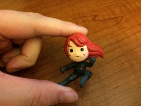
Now, draw your toy’s silhouette.
The silhouette should be solid and black. Do not draw any interior detail -- JUST the silhouette, completely filled in. If you’re working with vine charcoal, let it take up most of the page.
Set a timer if you can (your phone should work fine) and work for up to 10 minutes.
Once you’re done, you should have a silhouette drawing a little like this:

Now, hold your toy up in front of your face between you and your drawing. You might want to tape the paper to the wall to get a good angle. Look at the proportions.
How accurate did you get?

Was it pretty close?
If this is your first time trying this, it’s probably not. That’s normal. Now, when you started, did you start with an outline, like this?

If you did -- you’re in good company, because most people do. We tend to translate silhouette as ‘outline’ and then just fill it in. But drawing the outline of an object freehand is pretty difficult to do accurately.
I want you to try this same exercise again, but this time, start from the inside out. Whatever external detail there is -- little ridges & bumps, etc. -- get to those last. Put in rough shapes -- circles, lines, squiggles -- for the general shapes of your figure first. Get them the right size and in the right places first before you fill things out.
Start with something a bit more like this:

Give yourself another ten minute drawing. You can switch to a different toy if you have more than one.
When you’re done, hold your toy up again. Compare between your first and second drawings -- did the proportions improve?
TIP: If you’re still having trouble, try flipping your toy upside-down when you draw it. The less it looks like something recognizable, the less your brain will try to (inaccurately) fill things in.
Question: did you lift your figure while you were working on your drawings? Did you hold it up and squint and compare it to what was on your page? Some of you maybe did. Some of you might be blinking and asking ‘well isn’t that cheating?’
And it isn’t cheating -- it’s using your reference! Now, granted, a lot of times you’ll be drawing things that you can’t pick up and hold in front of your page. So it’s good to practice drawing things that don’t afford you that luxury. But in this case -- I’m not gonna yell at you for it! But if you’ve been doing it, try doing a drawing without touching the toy. And if you haven’t been doing it -- do one where you do lift it. Change it up!
I recommend trying this exercise a few more times. If you have an object with more detail, try giving yourself 20 minutes on one of your drawings. It should start getting easier, and a bit more accurate with every try.
Again, only draw the silhouette - no inside detail. Try drawing it at different sizes. Try drawing different solid objects. And remember -- draw from the inside-out! Focus on getting the proportions as accurate as possible. Even if your outside contours aren’t perfectly detailed, if the overall proportions of your drawing are accurate, then you’re doing great.
If anyone has questions, or wants feedback, hit up my askbox! Otherwise, I’ll see you soon with Lesson Two.
Cheers, Lena
76 notes
·
View notes
Text

PRE-LESSON: SUPPLIES
Hello folks,
Before any of the actual lesson stuff, let’s talk about supplies.
A friend asked me recently how much the quality of art supplies mattered in learning to draw, and if she needed to invest in really good, high-end materials to learn.
I told her hell no.
Do materials matter? Sure. But they mostly matter for the end product. If your focus is on producing a very high-quality, enduring piece of art that you can frame on your wall, materials matter. And at a certain level, yes, the quality of your materials matters for technique. But for starting off, and focusing purely on the act of learning to draw and developing skill? You don’t need to invest in super expensive supplies. If all you have is printer paper and a No. 2 pencil, you can still learn.
Now, I do have SOME recommendations for supplies that are helpful for certain exercises. Graded chalks, for example, are really great for light/shadow studies. So in some lessons, I will include recommended supplies, for the folks who want to try them out. You can raid your local art & craft supply store, and employees there might have additional recommendations. But if you don’t have the budget -- don’t sweat it! And if you’re working purely digital, that’s okay too! Most of the concepts I’m going to try to focus on should work in most media or can be simulated digitally easily enough.
A list of art supplies I would recommend, if you want to try out a range of traditional media in these lessons (based on supplies I used a lot in my college 101 class -- and don’t feel like you have to get these specific brands, I’m mostly highlighting easily-acquired examples):
Newsprint sketch paper. Don’t draw anything on this you want to last, because newsprint tends to become brittle and break down over time, but it’s great for practice. (x)
A sketchbook (x)
Gray sketchbook (really good to pair with the chalks) (x)
vine charcoal (x)
Gray chalks (x)
Compressed charcoal (x) (be warned -- this stuff gets MESSY)
Graphite pencils (x)
kneaded eraser (x) ***seriously, get one of these if you get anything on this list they are MAGIC***
white eraser (x) (this brand is my personal fav)
India ink & dip pen (x)
But again, these are purely optional. As long as, at minimum, you have a pencil with an eraser and a fair amount of paper, we should be good.
22 notes
·
View notes
Text

Introduction
I asked in a recent post if people would be interested if I did a series of art-lesson posts and I got a few positive responses, so I’m gonna go ahead and do it. Posts in the series will feature the above header, and will be tagged #drawingwithlena
I have a rough lesson plan for the first few “lessons” but I am wide open to feedback, so if there’s particular areas anyone wants to focus on, or if you have questions, feel free to hit me up in my ask box.
The goal is to focus on some simple beginner drawing principles and skills, and present exercises that help to build those skills and illustrate those principles. It’ll be a bit of a mishmash, and I’ll try to do one a week or so, schedule permitting (though everyone is free to follow along in their own time).
Cheers!
-Lena
17 notes
·
View notes