Don't wanna be here? Send us removal request.
Text
PERPLEXED MAGAZINE
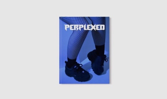
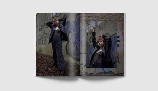
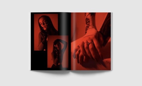
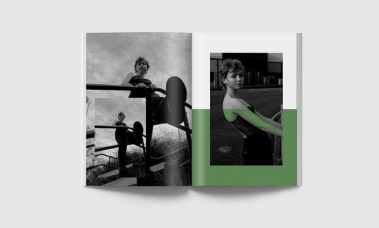
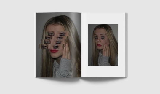
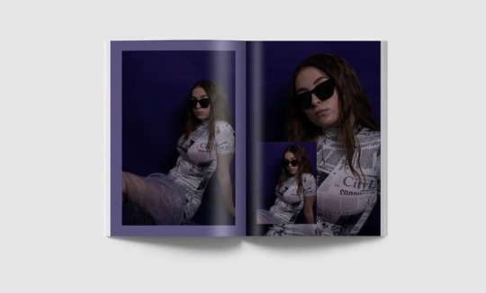
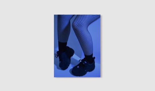
This is my finalised magazine, I am really happy with my outcome. I’ve really enjoyed this project and I will be definitely using the skills I have learnt in the future.
0 notes
Text
INDESIGN DOCUMENT

On indesign we had to lay out our magazine. We had to make a 12 page spread and dropped our finalised into indesign. We had to make our bleed and slug 2 cm thick so we knew where to place our images. I found indesign tricky to use at some points but I got the hang of it eventually.
0 notes
Text
MAGAZINE EDITS


These are some of my edits I have created to go in my magazine. I am really impressed with my photographs and I really think I have captured dystopia well in my images. I have tried to use dark colours and turned the brightness down on my images.
0 notes
Text
MARTIN C. HERBST
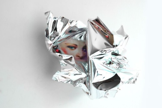
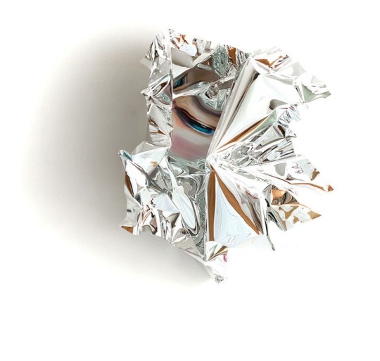
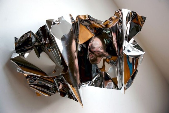
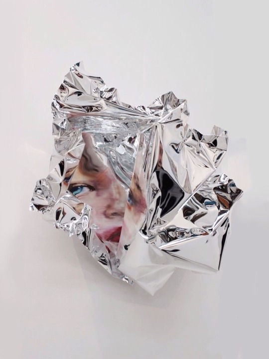
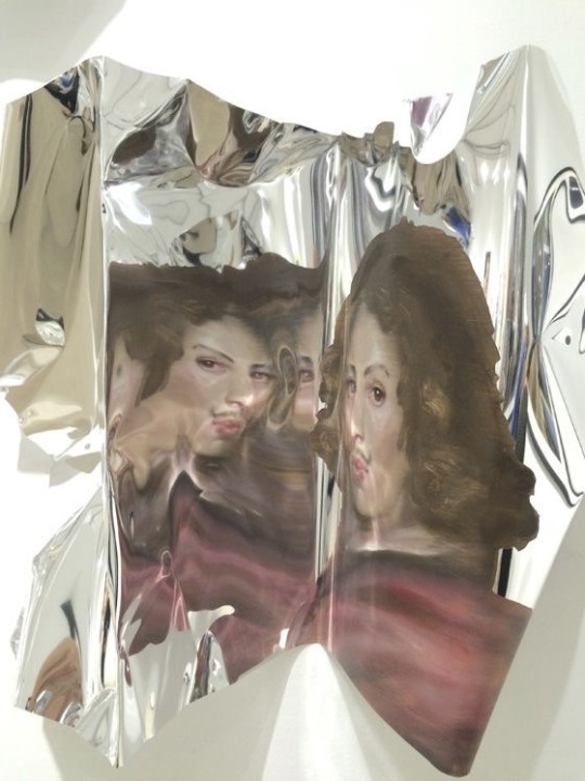
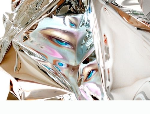
Martin C. Herbst is an austrian painter whose work focuses on the re-evaluation of historical themes, classic portrait theories, and the human figure.
He uses oli paints to paint on to foil then scrunches up the foil to distort the paintings. This is really effective as his painting is very life like and looks like it’s somebody’s actual face being distorted.
0 notes
Text
MM6 MASION MARGELA AUTUMN/WINTER 2018
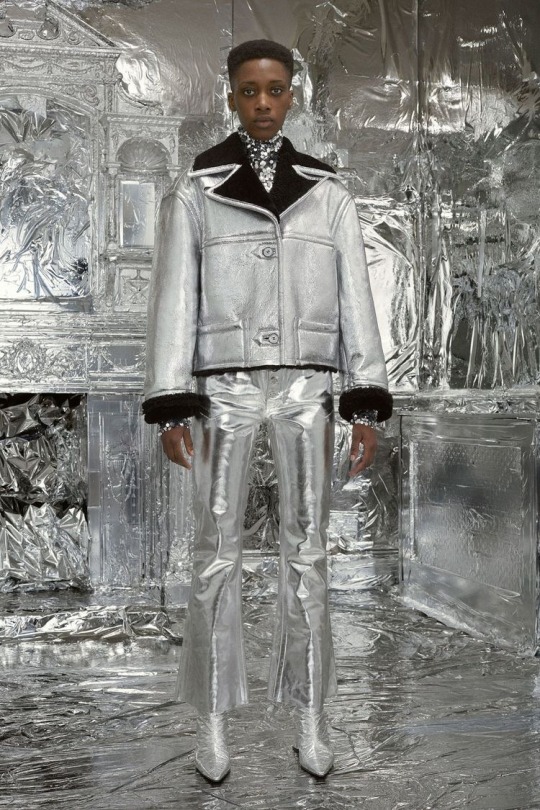
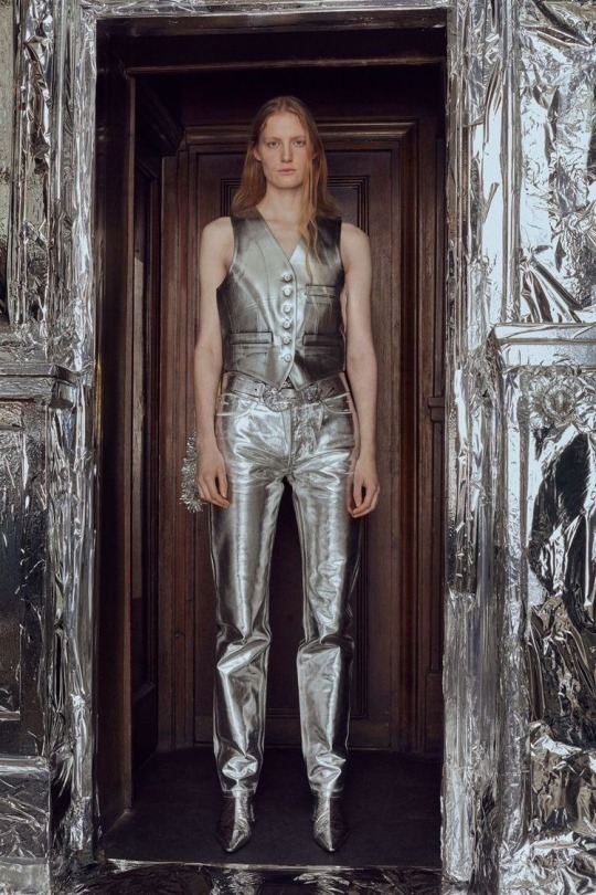
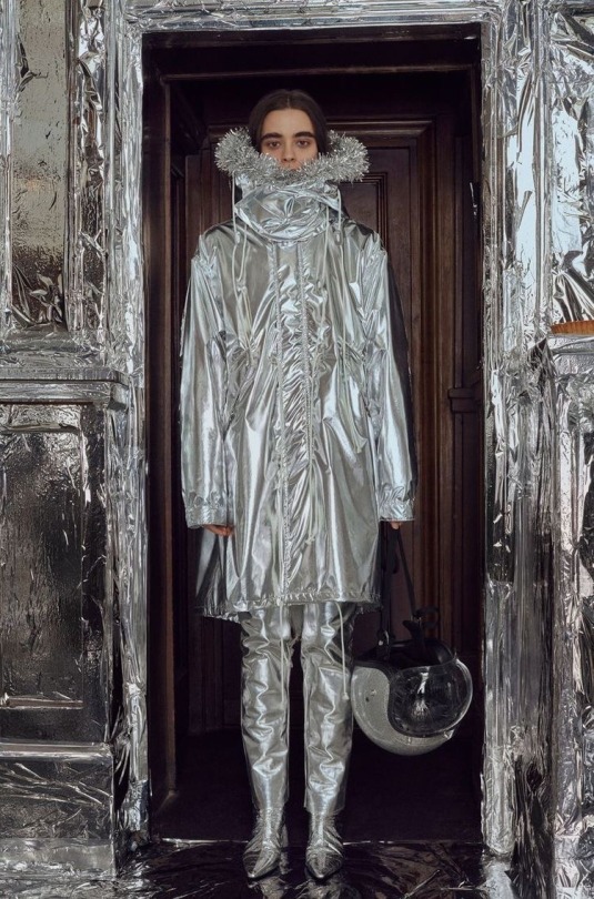
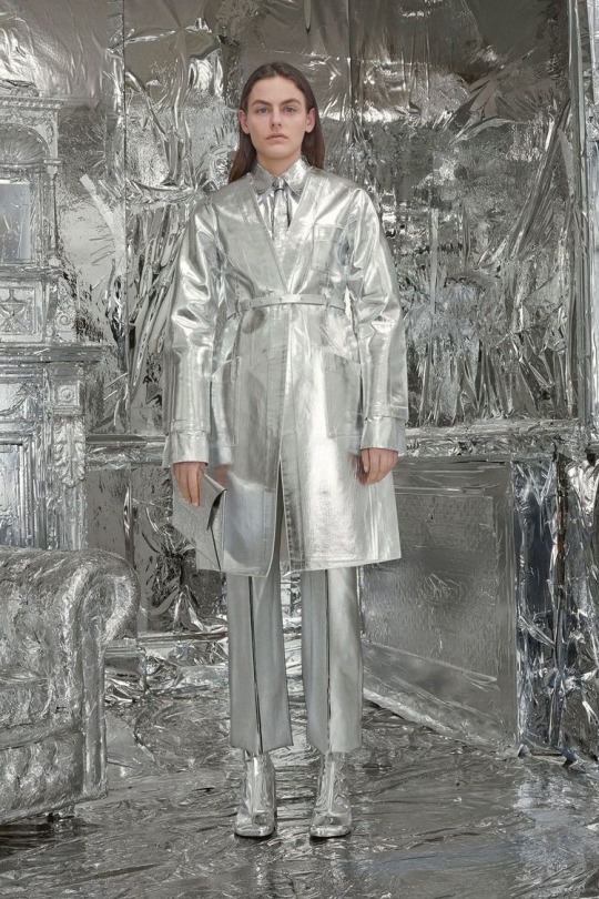
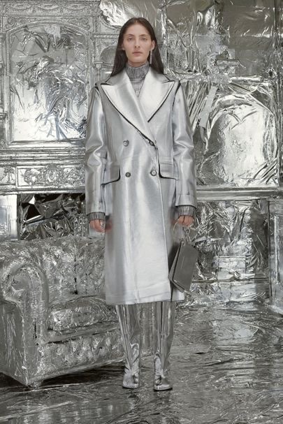
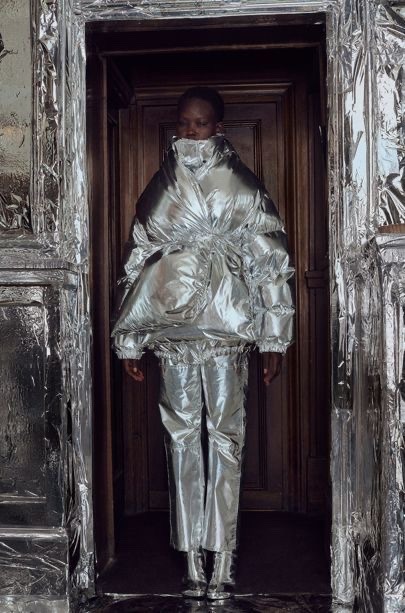
Using a pub in the middle of Mayfair London, MM6 foiled out the entire place for a photoshoot. The shoot was inspired by Andy Warhol.
The background matches the metallic collection really well. The models look futuristic and bold, the complete opposite to Alberta Ferretti’s collection I looked at.
0 notes
Text
STEPH WILSON
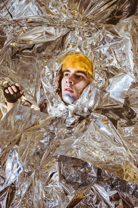
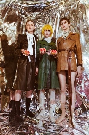
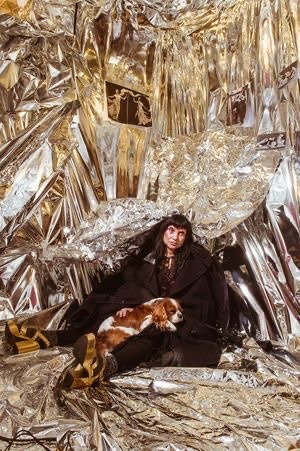
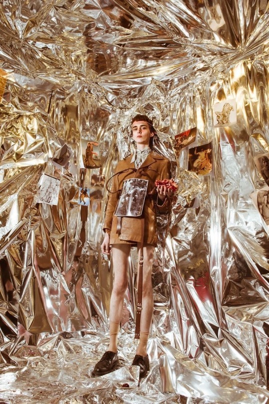
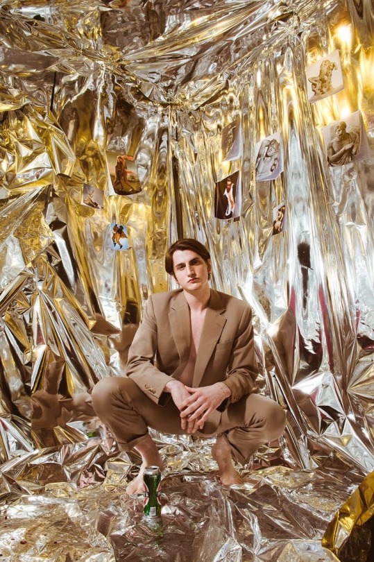
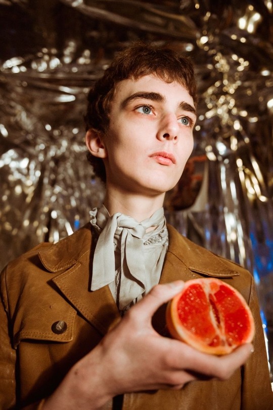
Steph Wilson is a photographer and videographer based in Brixton, London. She has worked with clients and publications such as Dazed, Tiffany & co and Vogue italia.
Her work is bold and interesting. She uses foil and old victorian looking outfits holding fruit which makes her work unique to herself. The whole photograph itself contrasts everything in it which I love.
1 note
·
View note
Text
GARETH PUGH S/S 2011
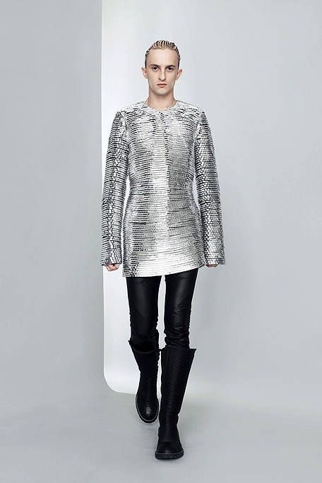
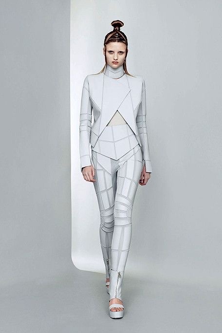
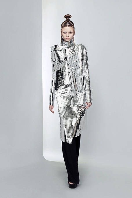
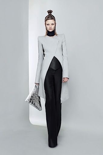
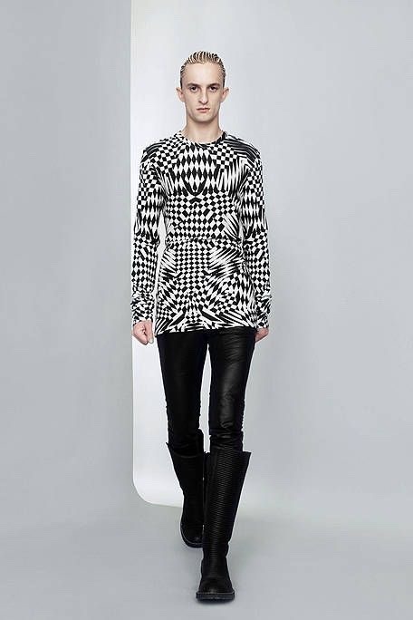
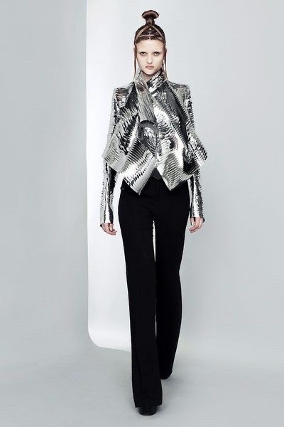
Gareth Pugh’s 2011 collection is clean and futuristic looking. The only colours he used in this collection are white, black and sliver. He uses aluminium in the outfits which ties well together with the work I did with foiling.
Pugh’s collection pushes boundaries and shows that you can make outfits out of any sort of materials and still make it look good.
0 notes
Text
ALBERTA FERRETTI A/W 2014
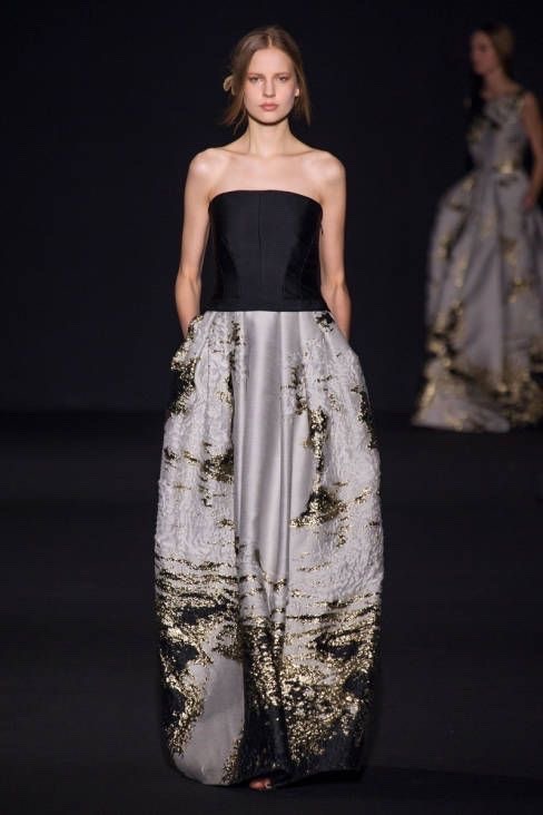
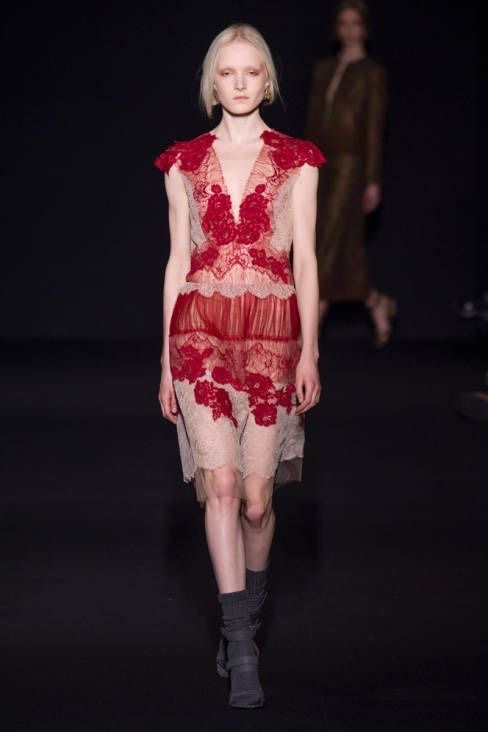
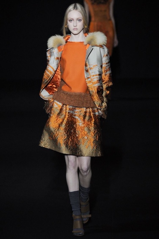
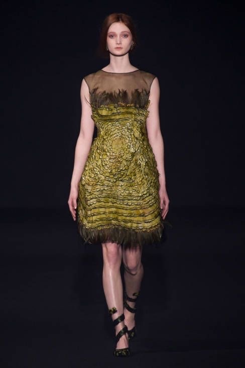
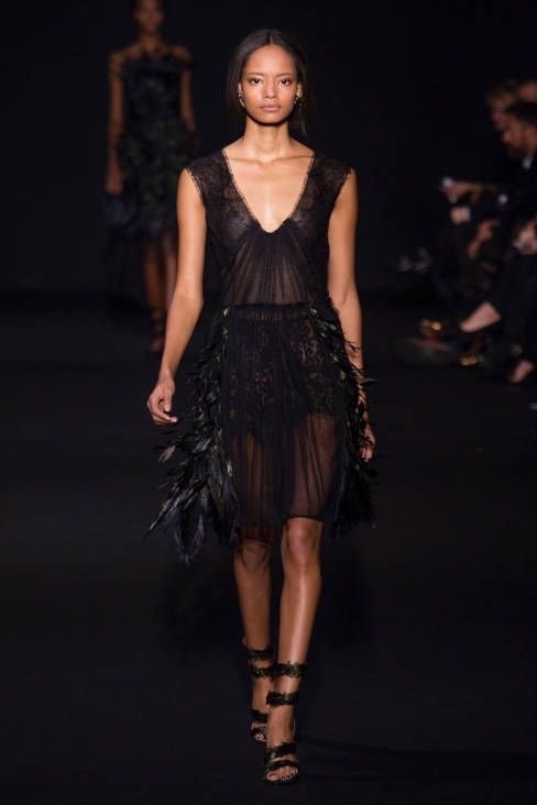
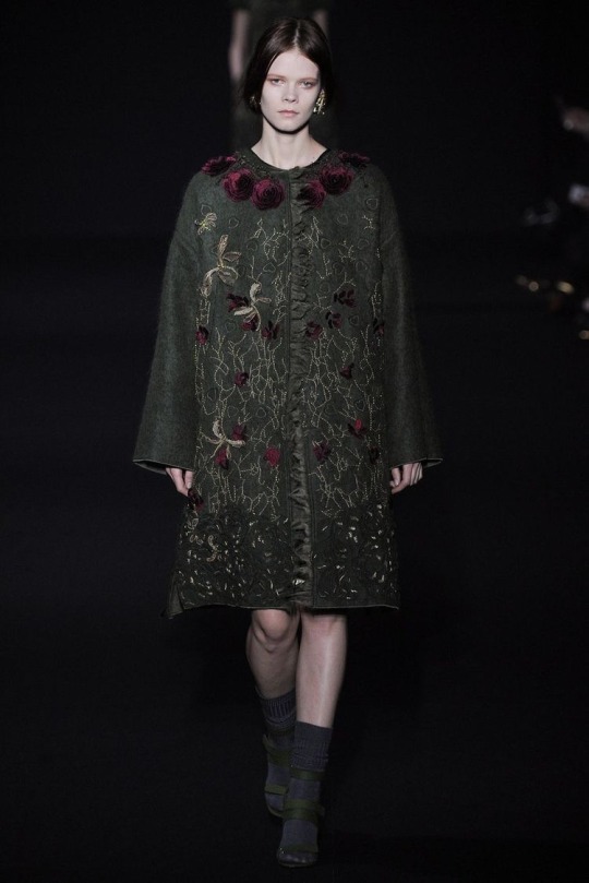
Alberta Ferretti took the fashion world into a magical woodland fairytale with her fall/winter 2014 show. The models outfits are very elegant and are very earthy colours, which ties in well with the woodland theme.
I really like this collection and I think it ties in well with the utopia theme as the outfits are almost fairy like. I will definitely look back at Ferretti’s work for reference.
0 notes
Text
GUSTAV KLIMT
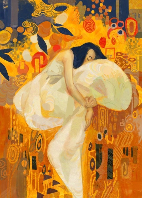
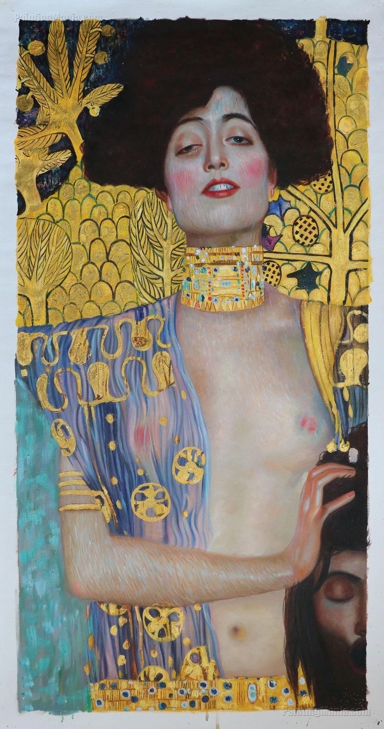
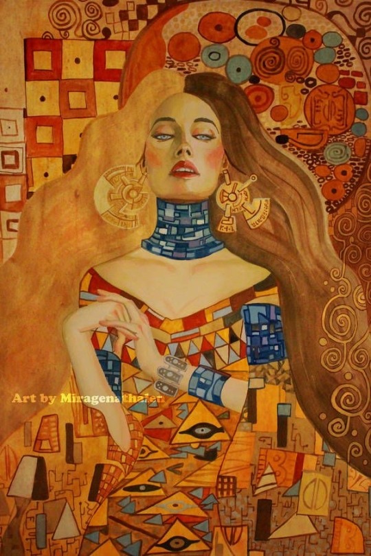
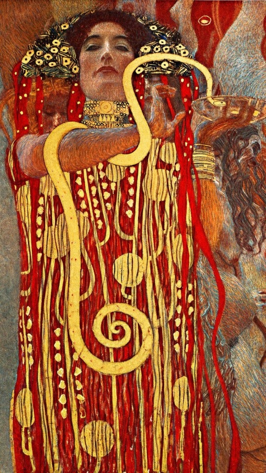
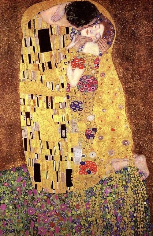
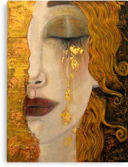
Gustav Klimt was an austrian symbolist painter. His work was very ahead of its time and many people thought it to be scandalous. His work pushed boundaries.
The images I have included in this post were from Klimt’s ‘golden phase’. He used golden foil in his work, which makes it really bright, bold and eye-catching.
I really like Klimt’s work and I will look back at his work for reference in the future.
0 notes
Text
FOILING INTO PHOTOGRAPHS
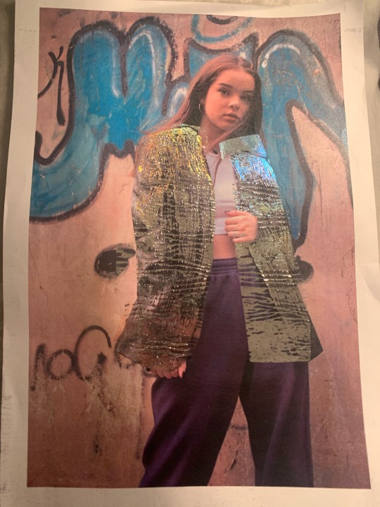
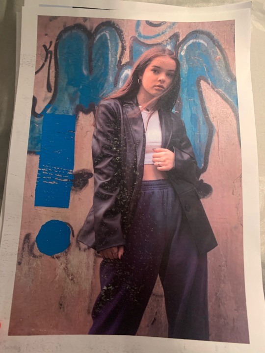
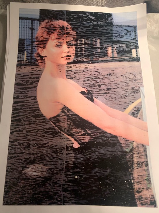
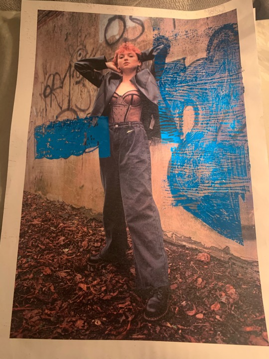
On wednesday’s lesson we learnt how to foil into our images. We chose different coloured foil then using a hot press we placed the foil on top of our images and left them for 15 seconds.
We used lots of different techniques, one of them was called bonda web. We brushed on glue to our images then let it dry then stuck our foil on top and repeated the hot press then peeled the foil off.
I really enjoyed foiling and I think I came out with some interesting outcomes, I will be using foiling again.
0 notes
Text
EXAMPLES OF LOCATION PHOTOGRAPHY
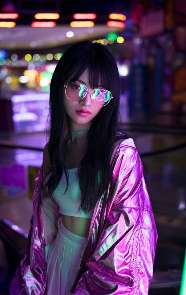

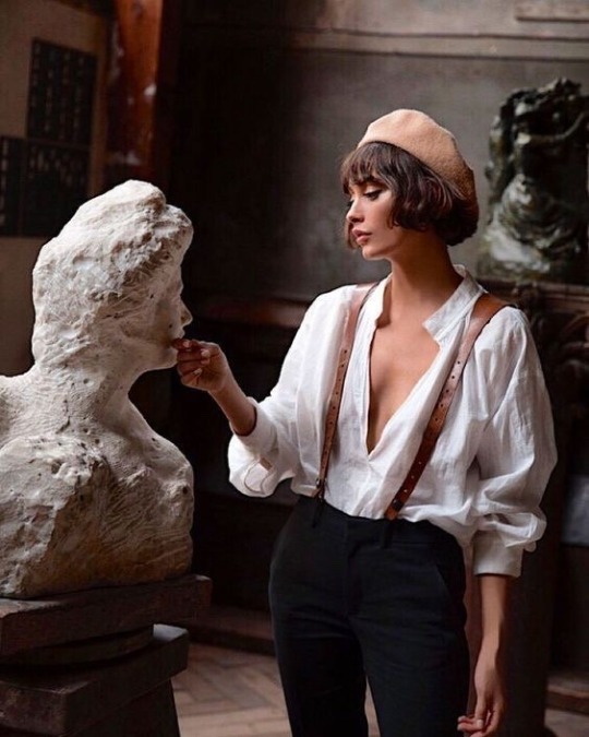
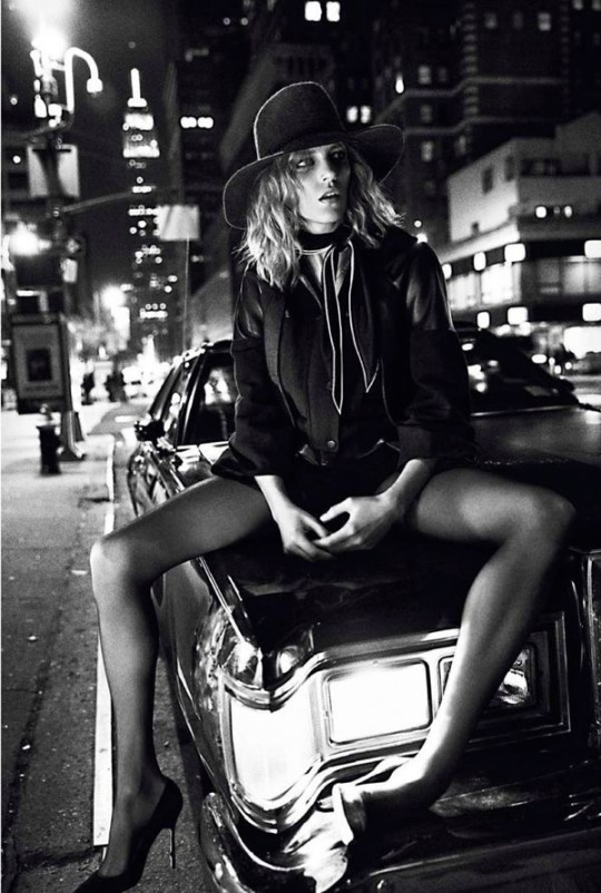
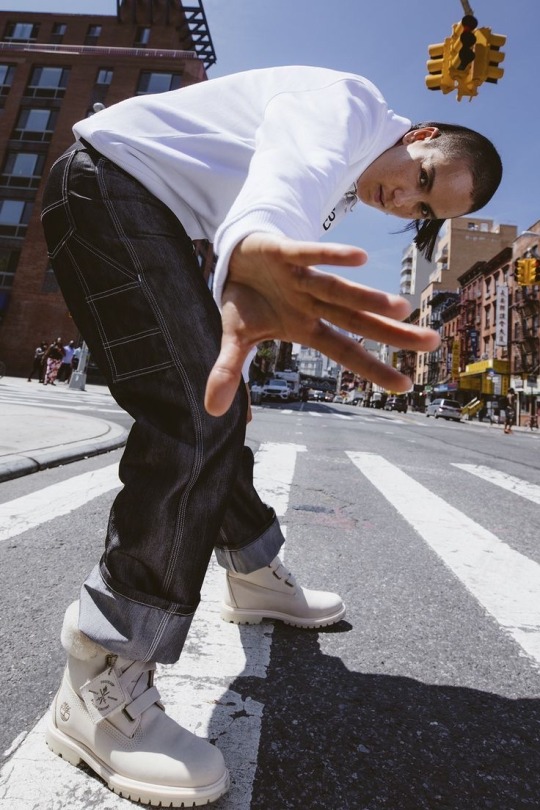
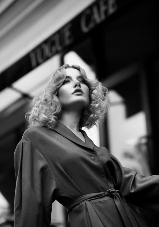
These are some examples of location photography I have found on pinterest. These photographs really stand out to me, the photographer has really tried to show off the background as well as the model, which I will do in my work.
0 notes
Text
EXAMPLES OF PROJECTION PHOTOGRAPHY
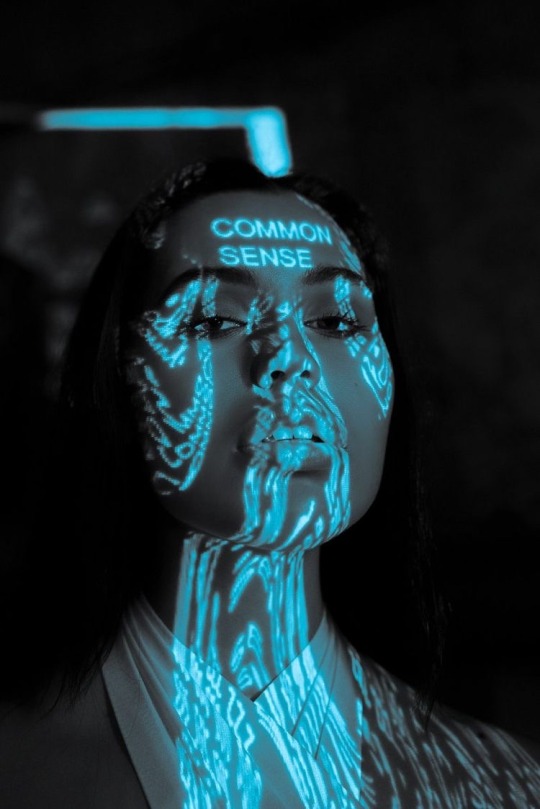

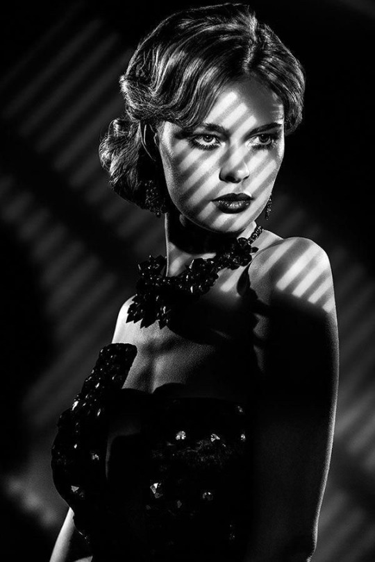
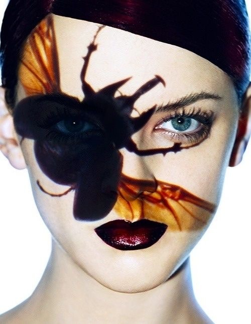
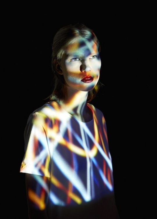
These are some examples of projection photography I found on pinterest. I really like these photographs and these have inspired me to be more bold and outgoing when I next use the projector.
0 notes
Text
PROJECTION PHOTGRAPHY
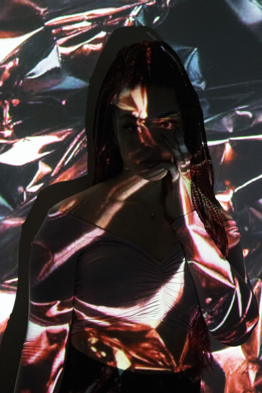
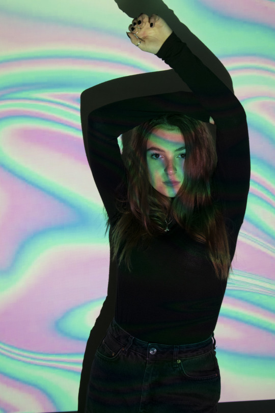
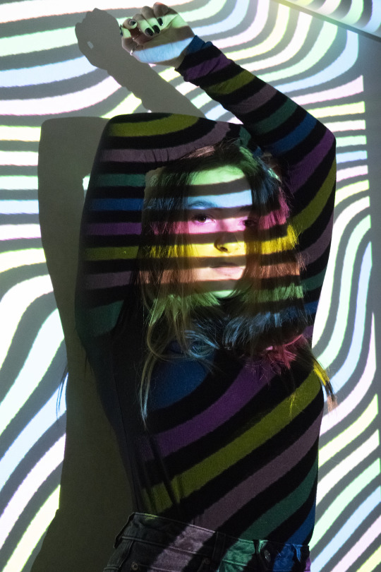
These are some of my favourite outcomes from my projection photoshoot on tuesday. Using the projector was very straight forward and easy to work with. I am really proud of my outcomes and the distorted effect it had on the models, I will be using the projector again in the future.
0 notes
Text
OUTSIDE PHOTOGRAPHY
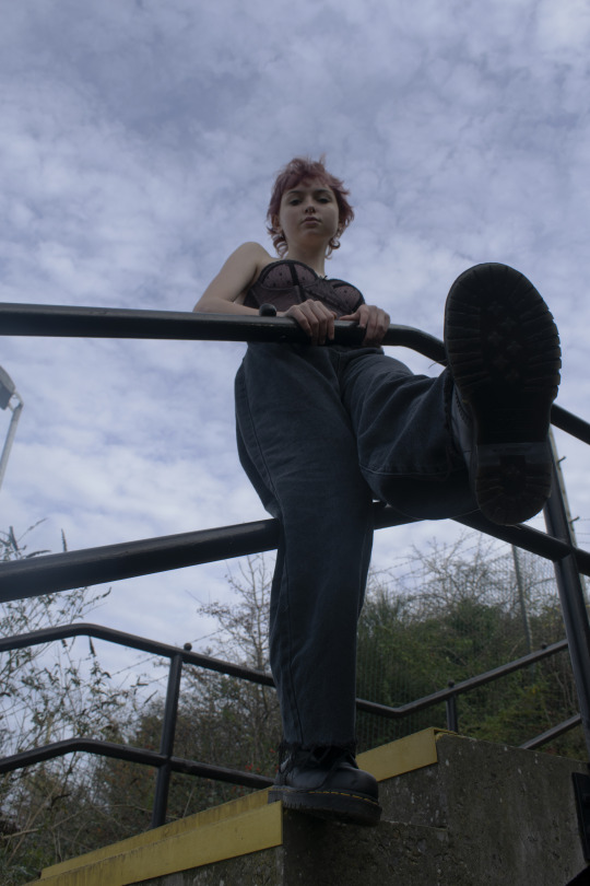
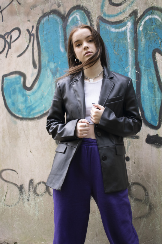
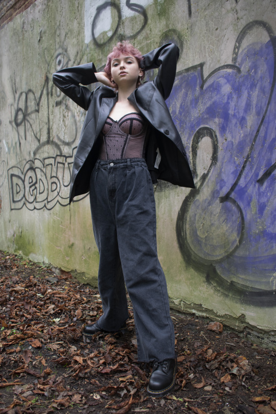
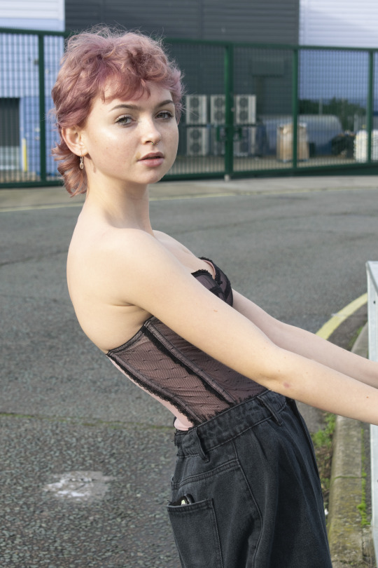
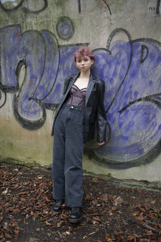
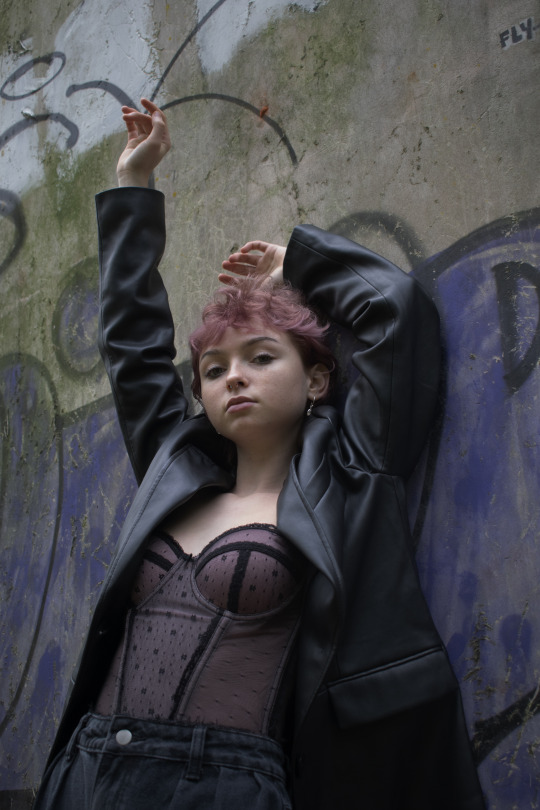
These are the photographs I produced from tuesday’s outside photoshoot. I am really pleased with the outcomes and I will be using these images in my magazine. I think I captured the dystopia theme really well in these images.
0 notes
Text
PROJECTION LESSON PREP
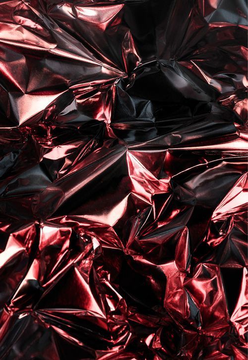
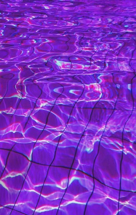

On our photography lesson on tuesday, we were using the projector which projects images onto a surface. Our task was to find images from pinterest to use to project on our models. Above I have included the images I found and used.
0 notes
Text
RETOUCHING
BEFORE

AFTER

On photoshop using the spot healing tool we covered up any blemishes on the model’s face. We then used the dodge and burn tool, dodge was for highlights and the burn tool darkened areas. Overall I am happy with my outcomes and I will be using this method again in the future.
0 notes
Text
NOCTIS
LOGO

FRONT COVERS
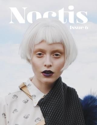
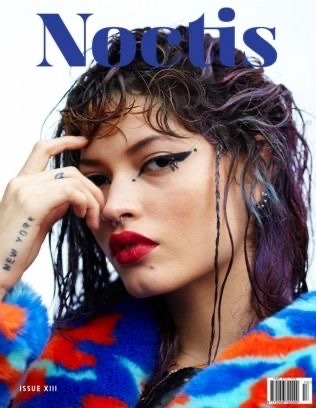
FAVOURITE PHOTOSHOOTS
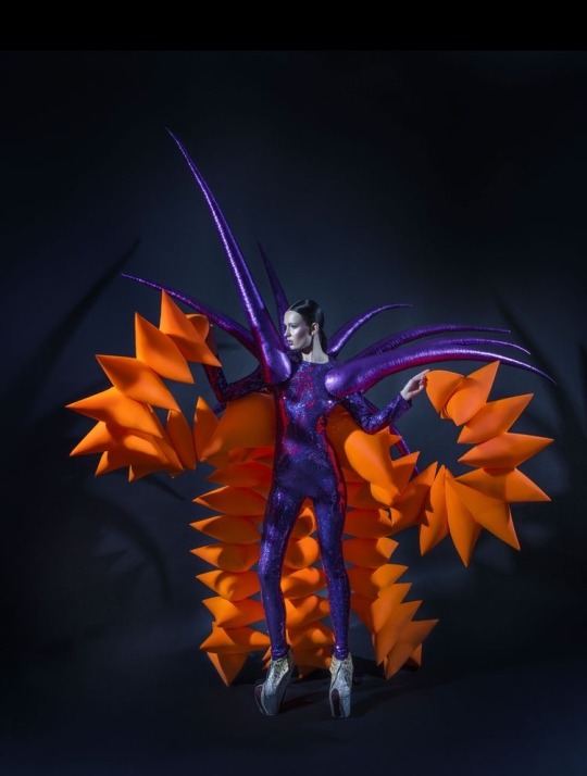
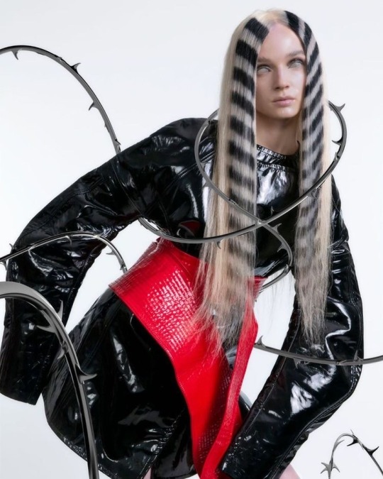
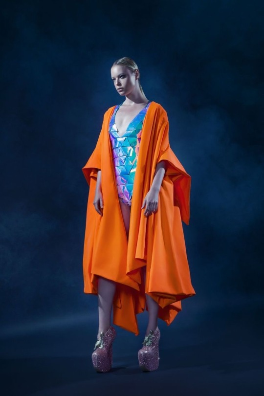
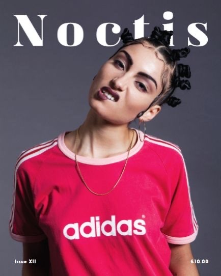
Noctis magazine was founded in September 2011. Based in South London Noctis magazine is a fast-growing online outlet for creative minds. They collaborate with artists from all walks of life as they wanted to create something special and unique.
0 notes