#doing actual studying with grayscale
Explore tagged Tumblr posts
Visit Tumblr Blog
Explore Tumblr blogs with no restrictions, modern design and the best experience.
Last Seen Tumblr Blogs


Fun Fact
In 2020, 44% of users from Denmark used Tumblr daily.
Text

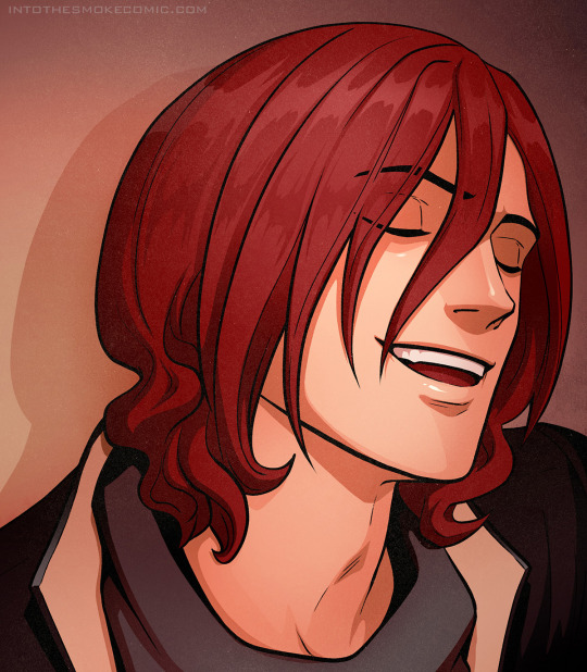
ok i like how i painted the top
#wip#doing actual studying with grayscale#instead of just relying on the eyedropper for once#also branching out with the brushes instead of using the same 3
372 notes
·
View notes
Text
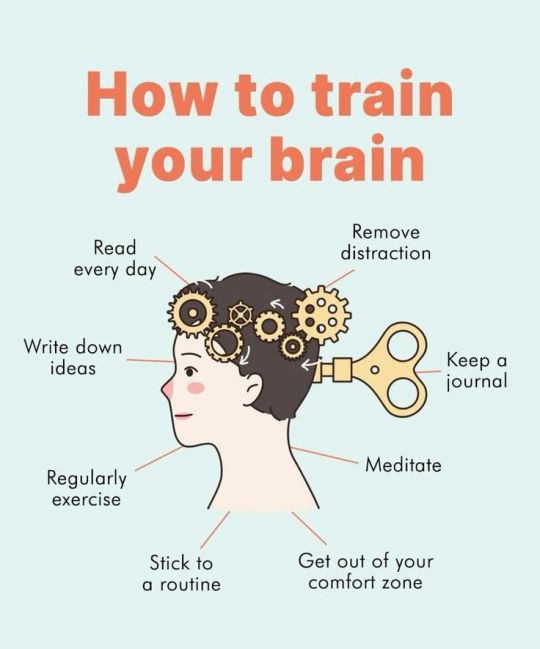
A practical, step-by-step approach to break free from phone and content addiction:
The goal is to create a lifestyle that is much more attractive than going back to the void for momentary pleasure
Environment Modification
Place your phone in a different room while working/studying
Use a basic alarm clock instead of phone alarm
Create phone-free zones (bedroom, dining area)
Put your phone in grayscale mode to reduce visual appeal
Delete most engaging/addictive apps
Move remaining social apps to the last screen of your phone
Replace Addictive Behaviors Instead of reaching for your phone when:
Waking up → Do light stretching, drink water
Feeling bored → Keep a book handy, practice a hobby
Taking breaks → Go for a short walk, do quick exercises
Before bed → Read, journal, or meditate
Waiting in line → Practice mindfulness, observe surroundings
Eating → Focus on your food, practice mindful eating
#Build Healthy Digital Habits
Use app timers (set 30-minute daily limits for social apps)
Schedule specific times to check social media/content
Turn off all notifications except calls from important contacts
Install website blockers during work hours
Use "Do Not Disturb" mode more frequently
Keep your phone out of sight during tasks
#Create Meaningful Alternatives
Develop offline hobbies (drawing, writing, crafts)
Join in-person social groups/classes
Exercise regularly
Practice meditation
Spend time in nature
Learn a new skill that requires focus
#Mindset Shifts
Recognize triggers that lead to excessive phone use
Practice sitting with boredom
Focus on creating rather than consuming
Be present in social situations
Understand that you're not missing out by being offline
##Progressive Reduction Week 1: Baseline awareness - track your usage Week 2: Remove most addictive apps Week 3: Implement phone-free morning routine Week 4: Establish phone-free periods throughout day Week 5: Create new habits to replace phone use
# specific actionable steps:
Waking Up:
Stretch arms overhead while still in bed
Roll shoulders back and forward
Gentle spinal twists while lying down
Cat-cow stretches after getting up
Drink a full glass of room temperature water
Open curtains to get natural light exposure
Feeling Bored:
Keep a paperback book in your bag/desk
Have a small sketchbook and pen handy
Practice a portable hobby (origami, knitting)
Carry a puzzle book (sudoku, crosswords)
Learn finger exercises for dexterity
Practice a language using flashcards
Taking Breaks:
Walk up and down stairs
Do 5 minutes of jumping jacks or squats
Step outside for fresh air
Shoulder rolls and neck stretches
Quick cleaning task in your space
Simple breathing exercises
Before Bed:
Write three gratitude points
Plan tomorrow's tasks
Read a physical book (not e-book)
Do gentle yoga or stretching
Practice progressive muscle relaxation
Write about your day's experiences
Waiting in Line:
Notice five things you can see
Focus on four things you can feel
Listen for three distinct sounds
Observe people's expressions and body language
Practice good posture
Do subtle ankle and calf exercises
Eating:
Notice the temperature of your food
Chew each bite thoroughly (aim for 20-30 chews)
Identify different flavors and textures
Put your utensil down between bites
Sit at a proper table when possible
Express gratitude for your meal
Remember: The goal isn't to be perfect, but to gradually build these healthier habits. Start with one context (like mealtime) and build from there.
Here's how to handle those intense urges to check your phone;
#Immediate Physical Response
Take 3 deep breaths
Stand up or change your position
Clench and unclench your fists
Stretch your arms overhead
Drink a full glass of water
Walk to a different room
#The 10-Minute Rule
Tell yourself "I'll wait just 10 minutes"
Set an actual timer
Often the urge passes within this window
If it doesn't, the pause still gives you control
#Urge Surfing Technique
Acknowledge the urge without judgment
Notice where you feel it in your body
Observe how it rises and falls
Remember urges are temporary waves
They typically peak at 20-30 seconds
#Quick Alternatives
Do 10 jumping jacks
Write down what you're feeling
Look out the window and find 5 specific things
Organize something small nearby
Hum your favorite song
Stretch your fingers and hands
# Ask Yourself:
"What am I trying to avoid right now?"
"What am I actually needing in this moment?"
"Will this matter in 24 hours?"
"What could I create instead of consume?"
#Emergency Reset Options
Splash cold water on your face
Step outside briefly
Call or text a friend
Do a quick physical task
Listen to one song
Write down your current goal
Remember: Each time you resist an urge; you're building stronger neural pathways. The urge will get easier to manage with practice.
##A targeted journaling approach to redirect that "random lookup" energy into something more meaningful:
#Curiosity Journal Structure
Keep two sections:
"Questions I Want to Answer" (capture random thoughts)
"Planned Research Time" (dedicated lookup sessions)
Date each entry
Include how urgent each question feels (1-5 scale)
Note why you want to know this information
#Daily Practice Morning Brain Dump (5-10 minutes):
Write all questions floating in your mind
Add topics you might want to explore
Rate their true importance
Schedule specific research time
Evening Reflection:
Which questions still matter?
What did you learn today?
What patterns do you notice in your curiosity?
Was the information you looked up actually valuable?
#Implementation Rules
Write down every urge to look something up
Wait at least 30 minutes before researching
Batch similar questions together
Set specific research time blocks (e.g., 4-4:30 PM)
Review old questions - many become irrelevant
#Question Categories Create sections for:
Essential Knowledge (work/study related)
Personal Growth
Pure Entertainment
Practical Needs
Random Curiosity
This helps you:
See patterns in your distractions
Identify what truly matters
Transform impulse into intentional learning
Build focus and patience
#content addiction#women in stem#studyblr#100 days of productivity#study motivation#studyspo#stem academia#for me#study blog#distraction#phone addiction#addiction#study space
88 notes
·
View notes
Text
Well i talk about it talk about it talk about it
The beginning of FUNKY TOWN is still stuck in my head.
❗️For commonly asked qs please see my BTD FAQ


Thanks, I'm glad my art improvement is noticeable :D I have actually KIND OF redrawn scenes before such as
and a bunch of frames from
so who knows i might do some more at some point lol!
YOU GUYS STILL SEND THEM TO ME :d

I don't actually get that many, i just tend to answer months worth all at once so it looks like a lot haha. I also don't answer a bunch of them if I've already answered something similar before or the answer is in my FAQ. Though I'm going to be honest some of the asks that get sent to me I don't think anyone expects me to actually answer, because they're just weird enough that if i turned off anon i'm pretty sure no one would be asking them.
My free time (...when I'm not procrastinating |D ) is trying to be spent on BP so I currently dont have any plans beyond the fun little doodles and animatics and stuff that I usually do. Gato is working on YKMET so if you guys like Strade then you have that to look forward to :)
(Why thank you!)
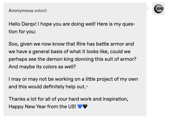
The armour follows his usual colour scheme which is gold on black.
You can tell this ask is from January lol.
Thanks haha my colouring style layers colour over colour so colour over grayscale always just looks oddly muddy in my POV |D ESPECIALLY LIGHT COLOURS LIKE YELLOW.
Demons can traditionally reproduce within the same species or with a compatible species.

Psychology, Law or Politics. I think these are the top normal majors you could take where the info you learn from them could be really useful in not getting fucked over and/or fucking someone else over.
I haven't been asked to make chibis for Gato this time around so you'll probably be getting something different for your finished runs!
Demon Commons.

All demons have some sort of specific mark that they are born with (anywhere on their body). The exact reason why has been lost to time, but it often gets used for identification. Here are some of the rest of my demon characs:

Hm, if I have to consider real life anatomy (nooooooo XD) the yellow is probably his iris.
Man i've answered so many asks i sometimes only remember saying something when another asks sounds familiar lmao 🤔 Ok; Rire, as a demon of station, has been captured in the background of some historical paintings and photographs, sometimes without his knowledge but always to his amusement later when he finds out. Like just imagine you are intensely studying art history and in those paintings of events with lots of people in it, suddenly your eye happens to catch upon a tall dark haired figure wearing sunglasses from that time period somehow blending in amongst everyone else there.

He has no particular preference in this regard.

Rire doesn't have like 🤔...a set criteria as it depends entirely on certain whims; like whether he is looking for business or pleasure, what he's feeling like at the time etc. If it's purely business then there are types of people he would approach that he wouldn't otherwise if it was for mainly entertainment.
They probably average out at about room temperature - they tend to reflect environment temp a bit and the main part that's closest to his back will always be a bit warmer than the rest of the ichor.


Probably not
They are evenly matched
Thanks very much! :D
Rire has been around for a while so yes he would have witnessed a bunch of things in human history. Who he met and who he made deals with is up for debate.
He is "polite" so he would thank you, at the very least. And yes they are his signature flower lol. It wouldnt be any special..er than receiving any other flowers though to him - we are the ones ascribing the meaning to it.

Two for the price of one 🤌🏻 Also this is an insanely old ask but yes you have permission to do fancomics or whatever with him |D

Anon, considering most people know him from a weird "dating sim", I dont think this is as startling an ask as you might think haha.

if it makes you happy.

Pick a nice smell that you particularly jive with and it would be that. This is individual specific so if a whole bunch of people are around Rire they may each perceive something different.

I get asked this question a lot |D I'm gonna be real with you guys - i haven't actively thought about a canon design for his parents because i'm kind of lazy to (since right now i dont need to know what they look like). Until that happens you guys will just have to go off the vague text descriptions i've given before :p
110 notes
·
View notes
Note
Hii first of all, I FUCKIN LOVE YOUR ART! ITS GORGEOUS AND IM SURE EVERYONE CAN UNDERSTAND YOU REALLY GIVE YOUR SOUL INTO THAT🤧 Your color palette looks so good, What do you pay attention to when painting? (Like when do you think its better to use multiply or something like that and etc.)
first off, I'M HAPPY YOU CAN TELL THAT I PUT MY SOUL INTO MY ART!!! im genuinely in love with drawing and am always finding ways to make creating art enjoyable and impress myself with what i can achieve and learn :D
second, thanks for asking your question!! i dont mind answering it, but my response is quite long. here's my thinking process:
(you specified layer modes like multiply, so im gonna gear my answer towards that a bit) 1. REFERENCE SEARCHING IS KING. color is actually extremely hard for me, so i search around for artworks with palettes i'd like to use and study how an artist uses it. some situations i have a clear idea of what i want, but usually the images in my head are extremely vague, so i borrow palettes from various other artworks that fit the vibe of what i want. an example is this one. my main palette reference were from these artworks. im looking at this artist's use of high saturates and how drawings are overlayed on top of each other. while looking at references, im asking myself how is this artist using warm/cools, where are these warm/cools placed, if their illustration used any form of texturing (like halftones, hatching), how do they use their palette to render form/shape/gradient, when/where do they saturate/desaturate their colors. those questions inform my decisions when using colors too.
2. USING LAYER MODES WHEN NECESSARY. i used to be reliant on multiply for everything, which atp i dont do since i can definitely push colors more first before using layer modes. only when i feel like my current colors are lacking do i start tinkering with tone curves and/or brightness/contrast/hue/saturation/luminosity settings. and if that doesn't work, then i start using layer modes. using layer modes do help with achieving certain effects, color corrections, or when i want to fuck around and find out. i think having a better understanding of what these modes can do makes you more decisive on how you can properly utilize them and to achieve a particular look (like using multiply for a cel shaded style). here's an example:
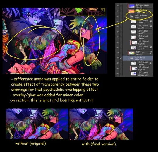
this leads into my next point:
3. BALANCING OUT VALUES. big thing that makes an illustration hard to read is if values blend together which affects the hues and contrast. i check for what elements need to be distinguished from one another and if it can be read clearly. using layer modes can either help with this or not help at all. it's very dependent on the type of layer mode. here's this example where i applied pin light:

back to #2, there are various instances where i'm using layer modes for quick color corrections and/or to help with readability:


other times, i start off having my entire subject in gray and to figure out main shadow/lights (similar to the multiply cel shaded process i linked ealier). im thinking about what this should look like if i only used 2 value tones:


when in doubt though, i check my artwork in grayscale to ensure values aren't overly blended into each other, especially if i didnt start with grayscale like this one:

painting for me takes into consideration a lot of different aspects. im thinking about how colors should interact, where/when to give contrast, checking/balancing out values, etc, but im also making it a time to study off of how other artists use their colors through the references i collected.
hope this answered your question! lmk if there's more :]
#answered art process questions#answered asks#this one took me a couple of hours to form out my thoughts while editing in examples ngl
149 notes
·
View notes
Text
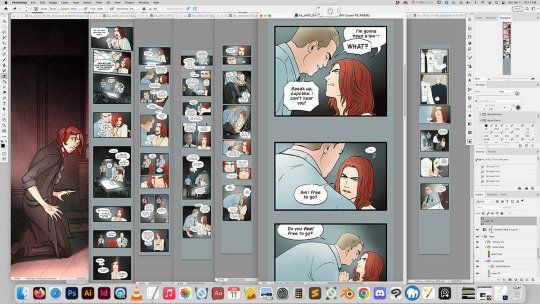
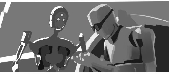
I'm gonna nerd out about comic process for a second!
That screenshot was from about a month ago, when I was coloring the first two episodes of Into the Smoke chapter 2. My coloring process is a little unhinged. First, I set up palettes, do base shading, and color basic backgrounds kind of simultaneously across an entire scene. So I'm actively working on 4-6 600dpi files with 60-200 final layers at a time. I also usually have a few references open from previous episodes.
(My iMac has beefy specs, and I never have any lag or performance issues, but I'm probably still driving it into the ground, lol.)
I do this stage on a non-screen tablet because I like being able to see everything at a straight angle on a very nice screen. (Mac screens are nicer than Wacom screens.)
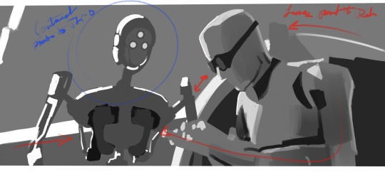
After that, I fire up the Cintiq and do the actual serious work of shading.
I do most character shading in ITS with Kyle's lasso fill in PS. Almost all my shading on all my pages is done with two grayscale swatches (incidentally, #c2c2c2 an #e0e0e0) with different layer effects, and I just hit x to toggle between the swatches. I'll sometimes use white or a pale color for highlights, but my shading work is much more extensive than my highlights, and the shading colors are handled with gradient maps.
Backgrounds, highlights/lighting, and most of my other projects outside ITS are painted with brushes instead of lasso-filled. In addition to organizing my brushes by category, I have brush folders for specific projects, and I organize them so I can use keyboard shortcuts to sequence through the ones I use the most.

The first two episodes of ITS chapter 2 were really difficult to color because I hadn't colored an episode in like 8 months, so I had to re-learn how to do it. My natural style is more painted, so I kept accidentally over-rendering. It really took me until episode 3 to get the hang of it again.
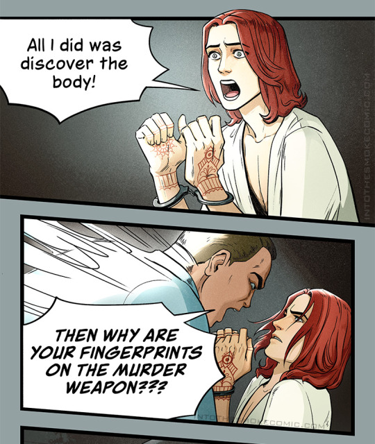
I'm also much more comfortable with warm color palettes and warm lighting, so the sorta grungy cool palette for the interrogation room was a challenge. I need to do more cool palette and cool lighting studies. Episode 3 is back to warm, though! :D
Anyway, here you can see the in-progress color vs the final color!
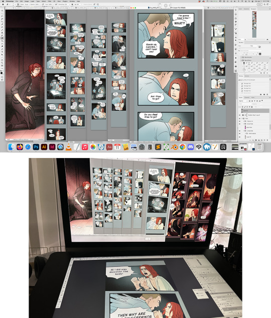

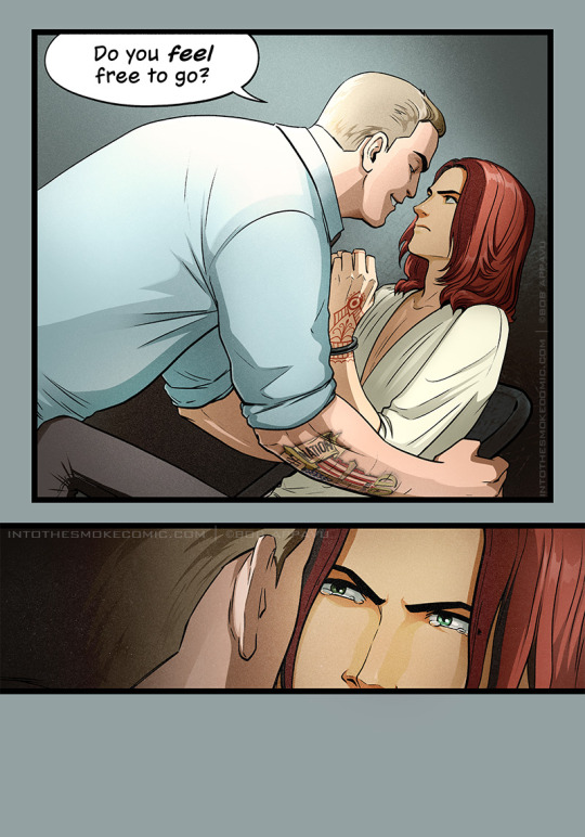
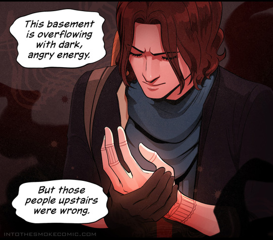
And a few warmer palette panels with more typical shading for good measure. :)
#artists on tumblr#art process#wip#comic#comics#comic process#art#webcomic#webcomics#into the smoke#into the smoke comic
38 notes
·
View notes
Text


I didn't get a chance to show off what I drew in last Thursday's botanical illustration class! We started with bracken fern (Pteridium aquilinum) (which I misspelled--oops). I was a little intimidated by the large, branching fronds all dried into odd shapes, so I decided to just do a study of this tiny little fragment. I spent the better part of two hours on it, which gave me time to practice my shading. I'm used to shading in color, so grayscale is a real challenge for me, especially since I was just using a number 2 pencil. As always, I was highly critical of it in the process, but now that I look at it after the fact I'm rather happy with it.
We also had a chance to draw my favorite tree, western red cedar (Thuja plicata)! I've always found this one to be challenging because there are so many little details, so I mainly focused on a gestural drawing that focused mostly on general shapes and overall flow. I was pretty worn out after a couple of hours of shading bracken, so there's maybe twenty minutes of actual effort put into this drawing, but I feel like I was beginning to get a good sense for this tree's "feel".
#bracken fern#ferns#western red cedar#cedar#plants#native plants#botanical illustration#botanical art#drawing#nature#sketches#PNW#bracken#naturalist#trees#conifers#not ai generated#traditional art#traditional media
36 notes
·
View notes
Note
humbly requesting some Reverend and Will first meeting content 🪽🤞🏻
This was both fun and a challenge to write!! No warnings here, other than what you probably already know about the characters and the Reverse Falls au.

Standing alone in the room, staring at the candles on the wooden floor, he braced himself. Again, the warning rang in Stanford’s mind.
Do not summon at all costs.
It was not a phrase to be taken lightly. Not an action to take without long, careful thought. Long sleepless hours of research and study, restless nights alone, turning it over and over in his mind. Preparing himself for what he wanted to do. A reckless man would have summoned the strange spirit, this dream demon, as soon as he could. He didn't like to think of himself that way. He liked to consider himself better than that.
Nothing else he'd come across had a warning like this. Nothing else had the potential like this. Nothing else begged for his attention like this. Begged for his control like this.
Too good to resist. Too good to hold back.
Yes. Whatever this truly was, demon or lesser spirit, or something else unimaginable, he was ready for it.
The candles flickered. Stanford Gleeful held his breath. A wind wrapped around him, tossing his hair as the world distorted into grayscale. Behind his arms he watched with wide eyes as a hole ripped itself open in reality. A triangle through which he could see the whole cosmos watching back.
He blinked.
The eye within the hole blinked back.
Reality turned solid again. The triangle seemed to smile, looking around the room.
“I'm back,” he said.
Stanford lowered his arms, and stared. He was a strange thing, dark arms and legs with a top hat and tie. All blue, an almost photo negative shade, with a single eye that looked at him with cheerful curiosity. Intelligence burned within it. So did power.
He couldn't look away.
“So!” The little thing floated closer. “You're Stanford Gleeful!” He circled around, as if examining Stanford. “Yknow, I didn't think you'd actually do it. Summon me. I'm glad you did though! It's nice to talk to a human again.”
“How-” Stanford swallowed. “How do you know my name?”
The triangle laughed. “What don't I know!” He said. “I'm practically a god of knowledge!” He rubbed his face with his little hand. “But uh. I've actually been hoping someone would summon me for a long time. The last guys didn't like me. They thought I was annoying. I saw you find that old stuff-” He gestured to the desk across the room. “- and I thought, maybe this time it'll happen! And go better, too! I shouldn't hope, it's gotten me in trouble before. But for once, it worked out!”
He reached out and brushed a few strands of hair out of Stanford's face, before flicking him on the nose.
“Name's Will Cipher! Great to finally meet you. Hope I don't let you down!”
Stanford felt something odd wrapping around inside him. Like… intrigue. Interest. Attraction? He couldn't say. This whole situation caught him off guard. He'd expected a demon like his grandfather spoke of so often in his sermons, in personality, if nothing else.
But Will, he seemed… Nice. Innocent, even.
“So!” Will crossed his legs and looked at Stanford with clear eagerness. “What would you like to do first?”
Right. He'd wanted to test the demon with questions. See how powerful, how dangerous, he truly was. But he couldn't remember them anymore. Damn it.
“Hold on,” Stanford said, raising his hand. “What was it you just said about being a god?”
“Compared to humans, yeah!” Will said. “I'll show you! You want to see something fun?”
“... Yes?” Stanford said.
Will took off his hat and tossed it in the air. He spun around in a blur of blue and black, moving so quickly Stanford could not see him anymore. The hat shot up, almost hitting the ceiling, and drifted back down.
The hand that caught the hat was human, in black fingerless gloves. The head that the hand put the hat back onto, covered in blonde hair, was also human. Dark blue eyes winked at him, human eyes, a human face. A human body dressed in a blue vest over a black sleeveless turtleneck and dark pants, lean and youthful and grinning wide. Will adjusted his tie.
“What do you think?” Will said.
Something about Stanford's face must've caught Will’s attention. He wilted.
“... I didn't make you uncomfortable did I?” He said. “I can change back if you-”
“No!”
Stanford lowered his hand. He exhaled. Forced himself to smile through his disbelief.
“I… I like it.”
But Will must have known that. How, he would need to figure out. Stanford never told a soul about his true desire in a partner. He would never let anyone know he was gay. But this form that this bright-eyed demon took…
He must have known. How else could he have chosen a body that captured everything he'd ever fantasized about?
“Thanks!” Will said.
Or maybe he didn't. Maybe it was an accident. Maybe it was fate.
Maybe they were meant for each other.
Stanford grinned. This was the best decision he ever made in his life.
#reverse runaways au#gravity falls#gravity falls au#reverse falls#reverse falls au#stanford gleeful#willford#will cipher
49 notes
·
View notes
Text
Because I have a tendency to get stuck in art blocks and s t r u g g l e badly with composition, and because I think The Bad Batch is a beautifully shot show, I’ve started doing rough grayscale studies of bad batch to unpack how line and value can be used to direct a viewer’s eye to where people want the audience to look. (I’m doing it with other movies and shows, but I do really like TBB, so….) That way, if I’m sitting in a period where I can’t draw, then maybe I can at least learn something. It’s not fan art, it’s just trying to break the composition down and make it make sense to me, but I think it’s interesting so I figured I’d throw them all here.
So! Potentially very boring things under the cut:
The thing that started this off was getting sent a gifset of the scene in “The Return” where Wrecker gives Crosshair his armor back. It’s a great scene, and one of the things that allows for the show to pull that moment off is the way that most everything in many of the shots is designed to draw the viewer’s attention to Crosshair’s face so that we’re paying attention to his reaction. For example:
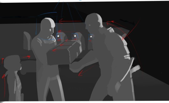
It’s not a very high contrast shot, but if we block out the basics, most of the lines in the scene are directing us towards Crosshair. Both Wrecker and Omega make movements towards him in this shot, and then this movement is sort of carried over to Crosshair via the various lines in the background/Wrecker’s arm/even the crate. Additionally, our eyes tend to be drawn towards points of highest contract, which, in this shot, include the lamps in the far background against the pillars (forming a line from Wrecker to Crosshair) and the light hitting Crosshair’s face against the much darker background. Between all of this most people in the audience are going to end up automatically looking right at Crosshair who is, of course, the main person we’re supposed to paying attention to here.
This isn’t actually a full frame. I sort of grabbed a screenshot over the interwebs for this one, but The Bad Batch actually has a very wide aspect ratio. From what I understand it’s shot and aired in a CinemaScope ratio (2:39:1 or 2:35:1, though TBB is 2:39:1). It’s basically super ultra widescreen, an aspect ratio used when a filmmaker wants to make something feel more epic or cinematic, and as far as I know it’s the same aspect ratio used for the original trilogy before any cropping happened. (For reference, The Clone Wars was also shot in a CinemaScope ratio, 2:35:1, but was cropped to 16:9 for airing on Cartoon Network, and Rebels was shot and aired in 1:78/more or less 16:9.) So an uncropped screenshot of TBB would look more like this:

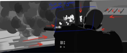
This is from “The Outpost.” It’s actually a fairly dark shot with Crosshair faced away from the camera and the value of his figure blending right into the rest of the foreground, which actually comes communicate a sense of someone who isn’t trying to draw attention to themselves (to me, anyway), but our eyes are drawn to Crosshair anyway by every major line in the shot as well as the highest point of contrast converging right over Crosshair’s shoulder. That, and the line of his rifle/shoulder and the support pole forming a big, well, cross-hair right in that same spot. Otherwise, he would blend right into the foreground and be easier to miss.
Unlike Hunter in this shot from “Plan 99”
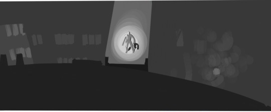
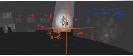
Where basically you’ve got the exact same thing happening, every line in the shot converges on Hunter’s location, but instead of using just high contrast to draw our attention, we’ve got a fairly middle-gray scene with our eyes being drawn to the focal point by having one bright spotlight.
The orange cross mark I’ve drawn here is just to mark the center of the frame, which I wanted to point out since, at least as far as I’ve noticed, TBB has a tendency to save center and slightly off-center shots for really specific moments. I’d have to check on that and what the pattern is, though, since a few of the remaining shots in this post are center shot. (Filmmakers area generally taught shoot in thirds or, alternatively, on a phi grid or other away from center set of focal points, though you do get some center shot movies and shows. I think Raiders of the Lost Arc has a lot of center shots.)
In fact, a pretty good example of shooting in thirds (or on a phi grid—I laid it out and I think it fits the phi grid slightly better) is this shot from “Faster”
Where you’ve got Tech and Tay-0 placed on slightly close thirds on either side of the frame. If we’re just looking at line and value, with this shot we actually get this sort of interesting back and forth between where our eye is being drawn. A lot of the lines in the shot are directing us to look at Tech, but then you’ve got one of the lines going through, and the sweep of Tech’s arm and datapad pointing towards, Tay-0, whose face and body are outlined with a much higher contrast in value. And then we have that one very bold arc connecting the two. The result of this is that our eyes sort of bounce back and forth between these two characters as they get into their conversation.
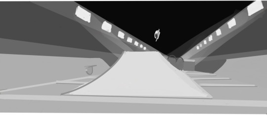
Most of these shots have had just one or two (at most three) characters, and there are many scenes of TBB with everyone where our gaze is sort of directed to the group collectively, but sometimes you’ll have group scene where our attention is directed more towards one individual than others, like with this shot from “Battle Scars”
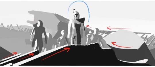
Once again, you’ve got most of the lines in the shot converging towards Rex as well as Rex’s person serving as the point of highest contrast while everyone else sort of melds into the background in terms of value. He’s also the first (and maybe only) figure who breaks fully above objects in the background to be shot directly against the sky. Line and value aren’t the only things directing the audience’s gaze towards Rex in this shot—there’s actually a lot of desaturation happening as we move from Rex, to the other characters, to the far background that helps as well, buuuuut this is a grayscale breakdown so that unfortunately doesn’t show up...here. (This is a center shot scene if we’re going horizontally, but Rex’s head, which is really the focal point, is right around the top third of the frame; it’s not exactly a low angle shot, but we are still looking up at him.)
Anyway, the reason any of this is important is because when you’re shooting with an incredibly wide aspect ratio like this, there’s a LOT of information being conveyed with every frame. You can fit a lot of stuff on screen at once. And while people generally going to rewatch and pay attention to background details (if nothing else, TBB is a goldmine for those background details), you do want to draw your audience’s attention to the most important parts of the frame—especially when an individual shot typically lasts only a few seconds. Or less. Like with this:
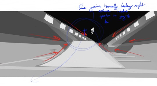
So this shot from "Faster" is up for less than a second before the camera turns to follow the speeders and then changes to another shot, and I had a devil of a time even getting screengrab of it. (Mostly because I was trying to grab it on my phone, but that's not really the point.) In less than a second the people making this have to communicate where Tech's speeder is, what's happening, what we're even looking at, while the objects in the scene are all moving incredibly fast. .
So, to communicate that, you've got multiple speeders moving in the shot, but only one (Tech's) standing out in terms of value against a fairly dark ceiling, as well as a combination of some real direct one-point linear perspective and the more or less arrow shape of the ramp pointing directly at the point Tech's speeder is going to be when it reaches the peak of its crest over the ramp. That way we're already looking at where Tech is going to be before he gets there and end up following his speeder as he zooms by.
#the bad batch#so anyway it's a very pretty show#and a very visually deliberate one too#(I think it's deliberate in other ways too but that's the kind of stuff I save for my endless old lady yells we're not done at clouds box)#there's no real conclusion to this#I just have a hard time getting my head around composition so I thought the way TBB does it is neat#also I know in animation it’s scene and sequence instead of shot and scene#but it’s easier to communicate it with shot and scene
23 notes
·
View notes
Note
Sorry to bother you again but do you have any tips on improving my art?
I always imagine stories that I can't animate or draw because I'm not skilled enough and I always feel discouraged.
Thanks!
There's a couple of different things you can do, depending on what angle you think suits you best! Although the truth behind all of them is that the way to improve your art is to do it, and just to keep doing it. Time and practice will always get you closer to where you want to be!
If there's something specific that you feel needs improving, spend a few weeks focusing just on that. Whether it's something like faces, hands, expressions, backgrounds, values/grayscale, or what have you, actually buckling down and studying just that thing for awhile can help you take a big step forward with it. The downside is that it can become tedious, and requires a lot of actual study and focus, which can be hard to maintain on your own.
If there's not anything in particular you want to improve, honestly just doing a completed comic or animation project (especially a short one) from beginning to end will help a lot. Doing any kind of sequential art forces you to tackle a lot of different things at once, but also teaches you how to handle them all, and to do so coherently. Even finishing a five-page comic or a 10-second animation can do wonders for the next thing you do!
If what you're worried about is how people will perceive your art, especially online or with social media, remove that aspect from it and just make something you don't plan on sharing. It can be very freeing to make something for just yourself, and can help lessen any discouragement you may feel.
When in doubt, you can always go back to the well...see comics or animation that inspire you, since for me that's often a good kick in the pants to want to try and create myself. Instead of comparing yourself, see it as a sort of thing where you go, "That looks really fun! I want to have fun, too!"
Hope that helps, and good luck!
60 notes
·
View notes
Note
How and where did you learn to do art like the actual game cause it looks awesome!?
First of all, sorry for the late response!! I was waiting to finish the piece I was working on to use as an example, as my method is a bit messy
Explanation below the cut!
I mostly just kinda studied the way the splash art is rendered via staring at it a lot lol and figured out the general Danganronpa character proportions for the sketch (like that giant forehead, small torso, large legs, you get it)
The method I follow is coloring on grayscale over the sketch, adding colors with a color layer, and then just keep stacking overlay, multiplying and soft light layers until it gets to where I like it
I use only a watercolor brush at different opacities (mostly under 20% opacity) for the grayscale part and an airbrush for shadows and lights
As a tip, remember that dr cg art has hard strokes all over and mostly black shadows, so I kept going back on dark spots to make them darker and highlighted others to create more of a contrast
Here are exports from the different stages of the last one I did to hopefully make myself clearer (I recommend having a design already established to not keep changing it mid render like I did lol)


Thank's for the ask!
#ask#danganronpa#hopefully it's helpful!!#i just kinda wing it with the opacity of brushes and the layers I use for colors and other overlays#sorry if it's too over the place
52 notes
·
View notes
Note
Do you believe it’s helpful to compare non-human animal intelligence to human intelligence?
I think that it can be helpful as a way of trying to understand the cognitive capacities of non-human animals, so long as we recognise the limits of any such comparison. Intelligence is an inherently human concept; we base intelligence on what we can do. That isn’t necessarily bad, we need a reference point after all, but we’ve made the mistake of judging our own kind of intelligence as the only kind there is.
We are really just scratching the surface when it comes to animal intelligence and perception. We can measure how they perform tasks that we invented to measure intelligence as we define it, but we can never really know what it is ‘like’ to be a dog, or a bat, or a fish. Many behaviours we think of as ‘intelligent’ have no benefit for many animals, so how ‘intelligent’ would it be for them to develop it?
Likewise, there are realms of perception that we just can’t touch. We consistently underestimate how radically different every creature’s inner and outer world is to our own. It is what the biologist Jakob von Uexküll calls an animal’s ‘Umwelt,’ their own unique sensory world. We can’t even do this with animals we know well, never mind with animals radically different to us.
Just look at dogs. Most of the intelligence experiments involve getting dogs to perform a specific task, and most of it is based on sighted intelligence, because that is at the centre of our Umwelt. But the primary sensory modality of a dog is not sight, it is smell. How often do we think a dog isn’t performing a set task because they can’t remember that the first button produces food and the second button doesn’t, when they’re actually responding to perceptual clues we can’t even perceive?
There is just so much about animal behaviour that we don’t understand. Why do cephalopods like octopus, squid, and cuttlefish put on elaborate colour shows when alone, when their eyes appear to only see in grayscale? What are they perceiving and what are they responding to? How do we measure animal intelligence for an animal that has sonar? Or an animal that can see ultraviolet light? Or can sense minor vibrations from miles away?
Intelligence is just such a distinctly human concept that it is hard to apply to minds that are so different to our own. We sort of assume intelligence is a scale with us at the top, and we measure how close other animals are to us on that same scale. But non-humans need a different scale entirely. That is the biggest problem with the study of animal intelligence in general, we too often assume we’re studying lesser minds, rather than just other minds.
22 notes
·
View notes
Text
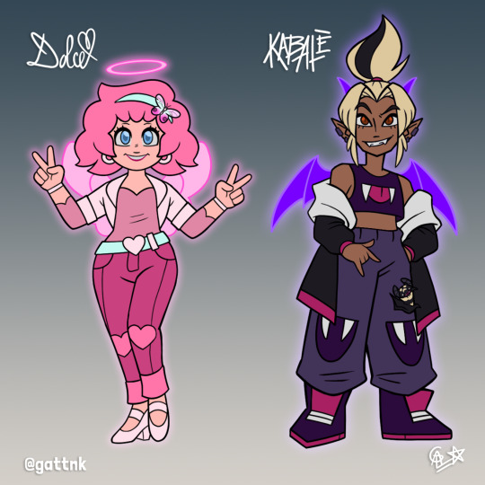
Only Dolce's saccharine nature could counter Kabalè's acrid attitude.
Probably one of my best pairs in terms of contrast, hands down! I'm really proud of how they came out :D Let's go over them design notes:
While Kabalè gave me a lot of room for exploration between her two canon designs, Dolce was pretty straightforward in terms of source material, since she's a series-exclusive character.
I wanted to keep Dolce as part of the main cast because I noticed some animosity from the fandom towards her back in the day, particularly over how "dumb" and stereotypically girly she was. There should be room for ultra-feminine characters in girl-focused media, because I know a lot of girls and women love them and look up to them, and who am I to deny them their fun?
My position regarding Dolce pretty much defined what I would do with Kabalè. If Dolce got to be unapologetically feminine in the traditional sense, why, Kabale HAD to be feminine in a transgressive sense! Those familiar with Ever After High know what I'm talking about: the "opposite" figure to the pink goodie-goodie princess is the purple rebellious evil witch.
My decision to make Kabalè more tanned than her canon counterparts stemmed from the same place as Mefisto and Gabi's changes: it matched her new design much better in terms of color contrast, and adding a bit more variety to the devils wouldn't hurt. I also wanted to pay homage to her hair in both iterations by making her blonde with a high ponytail and a streak.
I studied Dolce's key traits and focused on them for her new design: hearts, pink contrasted with blue and white, and puffy hair. I actually increased the amount of pink but used less saturated hues so they wouldn't clash or feel like too much, and used cyan and off-white accessories to visually segment her body by her joints, similar to an articulated doll.
For Kabalè I chose to mix her "spooky-chic" colors from the series with her comic design, and then I focused on modernizing said design! Not gonna lie, I had a lot of fun looking at current urban fashion and playing around with Kabalè's purple palette, it's not too common apparently (outside of Gengar apparel, lol).
Dolce's mascot, a blushing phantom butterfly, is right atop her hairband to represent how Dolce is the most emotionally mature of the group, since she's also naturally open-minded and focused on positive self-growth. Meanwhile, Kabalè's badger bat perches inside her jacket's inner pocket, symbolizing how Kabalè's polarizing nature often isolates her from the world around her.
Honestly I'm glad these two came out as well as they did, for the longest time I was stuck with them until some good friends of mine gave me a crucial helping hand (my most special thanks go to @fairy-of-the-black-willow). To put it bluntly, I wanted them to look grand but my sense of fashion is a bit too practical... all my pants are denim and I only wear grayscale t-shirts :V
I'll Fly With You (rewrite fic) Art masterpost
101 notes
·
View notes
Note
I love forensic anthropology so much, it's been one of my dream topics to study for a very long time! I've been hoping to go to school for it but I'm worried I don't have the smarts or discipline for it, especially because I want to specialize in the osteology aspect of it (if that's even possible i have no idea tbh) and I've always done poorly in school. But it makes me so happy to see other tumblr users in the field! I hope you're having a great day ✨️
Hello there! Thanks for reaching out! I've actually been busy with a forensic science symposium, or I'd have replied earlier! There are free forensic webinars and symposiums online and in person, by the way - worth looking around for. Also, FutureLearn usually runs free Forensic Anth online courses. I found them both fun and useful for university review. https://www.futurelearn.com/courses/forensic-archaeology-and-anthropology
If I may give you a pep talk, don't get in your own way with thoughts of not being up to the studies. Yes, there is a lot of foundational stuff to get through, but in forensics there is always something that grabs you and makes you WANT to keep coming back for more, and figure out new ways to make it lodge your brain. And the people you will meet are some of the most wonderfully nerdy, interested, service-minded and friendly you will meet.
I made a first run at university at age 19, and it did not go well. Nobody was talking about ADHD, and it was a cold and isolating place at the time. I wouldn't have had the guts to go ask for help even if I'd known where to go. That was in 1993. Fast forward to 2010, and I very suddenly got bitten by the Forensics bug. I started re-doing all my Gr 12 sciences, to get ready to re-apply. I found out that my brain had shifted. I knew how to play to its strengths. I wasn't anxious and trying to graduate, but working towards something I wanted. I had role models I wanted to follow. And I was able to e-mail researchers and even my future grad supervisor directly, and they were incredibly supportive.
I finished that first degree with strong marks, but a dismal CGPA, because no amount of work could entirely pull up that year of 0.25 GPA (I just disappeared from classes.) I might have still applied for Grad School and made the case that I had shown what I was capable of. As it happened, I went back for another two and a half years, and did a second BA with an Honours research component. (You generally only have to do the upper level stuff and a few key pre-requisites, for a second degree.) That was enough to get me into Grad School. And THEN I figured out I probably certainly definitely was a textbook case of hidden ADHD.
Osteology: Yes, osteo is hard. I thought it would be easier for a visual learner like me, but oof, it is a lot of 3D puzzles of bony fragments, with landmarks and grooves and subtle wear marks! But it CAN be done. Look up the William Bass Human Osteology Field Guide and textbook. They're the gold standard, and they're in grayscale, which makes them much easier to make out than natural coloured bones. Start slow and just have fun with it before starting any courses. Figure out what your brain likes. I've found my top two osteo hacks are to make plasticene models, or simple flashcards.
And yes, there are lots of forensics careers that are based around Osteology - it might be fun to do some digging and reach out to a few osteologists or forensic anthropologists to ask them about their work.
Come chat bones any time!
5 notes
·
View notes
Note
Your art is super satisfying to look at. The way you simplify form into shape and chisel details into life (especially the face and folds) is very 'crunchy on the outside and soft on the inside.' I especially admire the different values—The almost black graphite lines and shadows are my favorite haha.
How long have you been studying art? What do you think of and prioritize when drawing a picture? Is there anything you find especially challenging to draw?
(Sorry for the rant your art is just like super cool to me.)
Wow, thank you so much!! I love the way you described it haha, and I love these questions! They're some real thinkers... Sorry in advance for my response-rant because you really got me reflecting on some things lol
I've been drawing since I could pick up a pencil, but taking art seriously through classes and commissions and all that started at about 11/12 years old. (I'm 23) I honestly don't know what anybody saw in my art at that age but I can certainly say the few that encouraged me that early are the reason I'm still at it today!
I mean this in the least pretentious way possible, but I've noticed that when I draw I kind of enter like a "trance" state and barely even realize what I'm doing until it's over. I can't say that I'm thinking, focusing, or prioritizing anything, really! When I do start a piece with the explicit goal of *practicing* however, the focus/priorities change depending on what I'm trying to improve. It's probably obvious looking at my art, but I love the look of sharp angles and heavy contrast. My fav part of drawing is the delicate balancing of values. If that's helpful at all
For what I find to be challenging in art- two things. Inorganic shapes, and color. Starting with color, it's not enjoyable for me to use color in art and I therefore find it difficult to use effectively. It goes beyond just my art actually! I don't hate ALL color by any means, but I just truly do not identify with it. Clothes, accessories, home decor, the personalization of my phone case and the home screens of all my devices are all in grayscale, but I'm totally into it my partner wears the rainbow, for example. I could dig into why I think this is, but it'd all be theory. I am well aware of the power color holds in the perception and final product when it comes to art and sometimes wish I could harness that, but it's like it causes me psychic damage to use it lmao. And with inorganic shapes idk it's like a whole different ballpark to me. Buildings and cars are hell lol but flowers trees animals and people rock! You probably won't ever see me draw the former it's genuinely embarrassing haha.
Oh, and backgrounds. Fuck backgrounds all my homies hate backgrounds.
That was a LOT of yapping... Thanks for the questions and I hope I didn't bore you!!
13 notes
·
View notes
Note
Heya, Ford! Just dropping by to share a fun fact I learned recently since I've been doing a lot of research involving dreams (mostly because a lot of mine have been a little off-putting lately)
Did you know that people who grew up with black-and-white television are more likely to dream without color? However, only about 12% of the population actually apply to this criteria. Most people have *some* sort of color in their dreams. I've heard that this varies too, though: while some will see only a few notable hues or even plain sepia tones, others will see very vibrant and saturated colors in their sleep.
Feel free to fact-check all of this if you feel I got something wrong (it's honestly a little challenging to find a trustworthy source these days). I just find the brain a very interesting thing to study. There's so much about our own minds that's lost on us (and no, I don't count anything that bill says about it to be factual)
-✨ (ps I hope I haven't completely destroyed your hair. sorry about that)
Now this is a subject of personal interest. There’s very little we can assert for certain of our own minds, and dreams are as evidence of that as any. It’s true that black-and-white dreaming was far more commonly reported in the early 20th century, even seen as the norm. Studies among hospital patients even suggested to then-researchers that colorful dreams were likely even a symptom of psychiatric problems. Of course, dreams in color quickly became the new norm alongside the gradual rise of colored televisions. There are a few theories of course, but like I said, the mind is a mystery.
Some scientists suggest the fluidity and emotionality of moving pictures are what made them especially influential in dream saturation—Unlike paintings and photography which had achieved color far before television but seemingly had no influence. The “realistic” nature of watching characters as you would see them in person, with our observations quickly becoming our daily happenstance. With that idea, the media we consumed just as easily became our own experiences, no doubt influencing the appearance of our dreams.
Another aspect is the popular cultural norm. Some early studies on the subject mistakenly delayed when they would ask people to recollect their dreams—Instead of immediately upon waking, they would wait long periods of time, obviously causing some inaccuracies upon later remembering them. That is to say, the expected cultural norm at the time was black-and-white dreams, meanwhile technicolor dreams maintained something of a stigma associated with them. As it’s theorized, this bias may have subconsciously affected how people interpreted their own dreams. For instance, if grayscale dreams were more typical, you might be more inclined to assume your dream also fell within that norm. Perhaps even brushing off any color you might have seen as a flawed memory. Though, that’s not to say there were no studies not misleading information. When asked immediately upon waking, cultural bias seems to have less influence, suggesting that colored dreams clearly are a newly popularized phenomena.
Lastly, individuals “who grew up with black-and-white televisions” tend to be older. Age plays a significant role in dream remembrance. Often older people are less likely to recall and place importance on their dreams. One notable omitted detail in recollection tends to be color. So while they may not be dreaming in black-and-white, they may recall it vaguely enough to assume so. And that’s not to mention the years of exposure to colored televisions since then that makes comparison extremely unbalanced.
While the figures have clearly changed throughout the years, it’s difficult to put into test without a few difficulties of unrelated variables. It’s fascinating really. Dreams can be so familiar yet so unexplainable to us. Another one of the world’s great mysteries.
Ah, right. My hair is fine. I’ll let it slide just this once.
#ooc: yooooo this is cool thank you for forcing me to do research lol#also hes not saying youre wrong btw. all super true its just interesting to look at some related factors. dream research is still ongoing :#looked up from typing and this was suddenly an essay oops lol#sparkle anon#stanford pines rp#asks
5 notes
·
View notes
Text
50 Follower Special Surprise
Hihi besties, so I've officially hit 50 followers which may not seem like much but the fact that there's 50 of you that listen to my insanity is wild so first off, thank you all!!
Second, I promised a surprise, and I am following through. So for those of you who don't know, hi I am currently studying fashion. I have been for the past four years, and in my studies, one thing we've learned is how to do flat sketches. I found that I loved doing these, so sometimes I do them on my own for various ideas I have. One of these ideas that had come to me was to make gown concepts based on all of the BVB albums and eventually the EPs, so, that's what this is. You can view the full collection below, and under the cut are close ups of each gown and some insight into my thought process for each, enjoy!
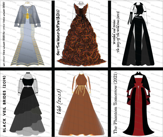


First up is We Stitch/Re-Stitch These Wounds. Since these albums are companions to each other, I wanted to make one gown that combined aspects of both. Fun fact this was actually one of the last gowns I conceived because oh boy did I struggle with the silhouette on it. Anyway, to the gown itself, the most obvious motif is the lacing calling back to the idea of stitches, featured on the side panels, the neck, and on the corset belt. Then, on the detachable cape and matching choker are embellishments made to look like eyes, which relates to the eye motif found on the original We Stitch cover. The colors are then picked from the Re-Stitch cover, since by the point I did this gown I had already done quite a bit of black and wanted to go in a different direction.


Next is Set The World On Fire, or as I have lovingly dubbed this gown, Set My Computer On Fire because Adobe Illustrator crashed a grand total of three times while figuring out this gradient. Now my ORIGINAL plan for this one was to have the entire gown be one gradient from black at the top to fire colors at the bottom (think Katniss' Mockingjay dress but like mid-transformation). Illustrator uh... did not like that because each of those wing shapes is separate and complicated, hence the crashing. Instead, each wing shape has the fire-colored gradient which I ended up liking better. Obviously the wings are a reference to both Fallen Angels (obviously) and The Legacy ("on leather wings"). Then, the sort of tattered belt and choker are there to be callbacks to the acrylic paint the band wore on their bodies during this era.

Next is my beloved Wretched And Divine. For this one, I didn't take inspiration from the album cover so much as I did the Wild Ones' outfits, particularly the Prophet (to the surprise of no one). In those outfits you obviously see use of mainly black with a lot of asymmetrical elements. The collar of the gown, for example, references the collar of the Prophet vest in the In The End MV. The armpiece, on the other hand, is a twofold reference. It references both the strips hanging off of his belt in the In The End MV but it also references the feather armband Andy wore during I believe it was Download 2012 if I'm not mistaken. This one was very fun to play with the various elements and just kinda go nuts.


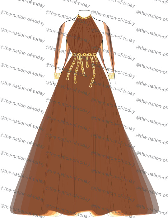
Next is Black Veil Brides from 2014. I will be the first to admit I struggled heavily with this one. I feel like this album is one of their most stripped back, so I was struggling on how to represent the different aspects. I eventually turned to the album cover again for inspiration. The tired skirt is a reference to the rubble pile that the gargoyle stands on, while the mesh sleeves and chest are reminiscent of the skyscraper ruins in the background, using a large, square mesh to evoke that building skeleton look. Finally, the silver belt with the circle clasp is a reference to the eclipse happening on the cover, and the color scheme is evoking the album's grayscale.

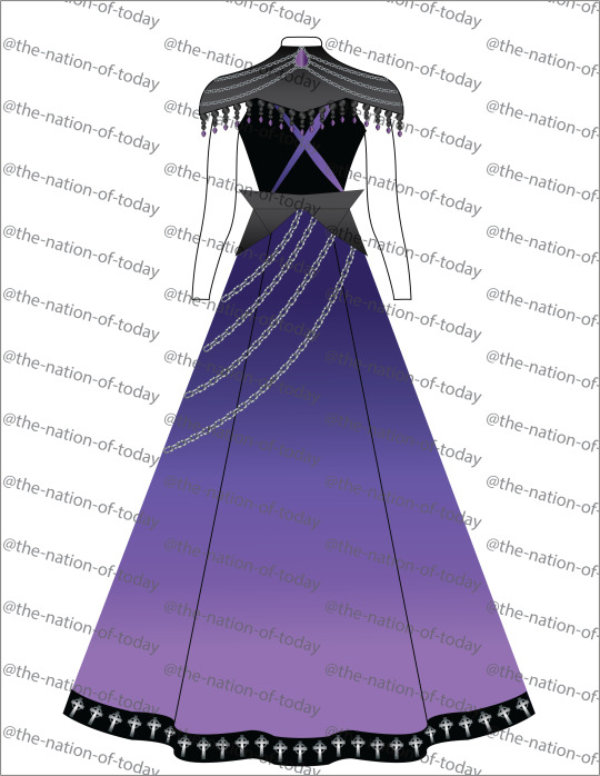
Next we have bestie beloved Vale. Now stick with me, this is the most conceptual of all the gowns. So with Vale, whenever I listen to it, I always get two kinda ideas from it: the idea of feeling like a ghost and the imagery of being chained down to something. It’s hard to translate into 2D but if it were real, it would be made of some really light and flowy fabric (something like a semi-sheer chiffon for anyone else who knows fabric) and each layer of fabric is a different color from the album cover (you can see it at the bottom there as well as on the open sleeves). This is where that "ghost" idea comes in, that weightlessness. Then, being weighed down is represented by the chain belt, with the sleeves are connected in the back to that top chain detail on the collar and I imagine there would be chains back there too. Essentially, I wanted to play with those dualities of feeling like you're floating away while still being chained down by something.

Finally for the full albums is The Phantom Tomorrow. This was actually the first gown that I made in this mini collection because I had such a clear idea of what I wanted since TPT has some of the most obvious visual motifs in the form of the scarlet cross. This gown is actually two parts, the gown itself and the cape/collar. The silhouette is based off of both the girl's dress in the TPT music videos and of Andy's jacket in the Scarlet Cross MV. You then obviously have the motif of the cross cutting through the center of the gown. The cape is then a result of me wanting to allude to the idea of wings (because of the Blackbird) without wanting to do something obvious like feathers. Then, of course, I needed to incorporate Andy's slutty priest collar as a crucial element. Finally, the rosary belt was added to both break up the red and to add a little extra blasphemy because we can always do with more (sweet) blasphemy (Get it??? Wrong album I know but I had to)
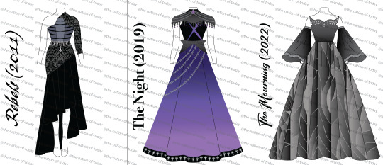
Now, onto the EPs. So I actually did not do these at the same time as the albums. I did the albums in October 2022, before The Mourning came out. Once I finished those, I didn't really have any ideas for the EPs so I just let them be. Then in March of this year, I had basically an epiphany about them, like I got out of bed specifically to do a janky sketch so I wouldn't forget my ideas. So, here they are.


First off is, of course, Rebels. Since this is Rebels, I wanted it to look different from every other gown so far, hence the silhouette. The asymmetrical skirt and sleeve allude to going against the grain and not being perfect (y’know, rebelling). The damask pattern on the top of the skirt and sleeve comes from the Coffin video, the women with the candles wear veils that look like they have a sort of damask (tbh, couldn’t tell exactly but they’re Ornate). The center panel of the bodice also has a distinct coffin shape, while the slashed stripes across the bodice reference the chest paint they all wear in that video, it’s sorta striped and almost looks like a ribcage. Hard to tell on here, but it would be almost sliced open with like a peekaboo black fabric beneath it. The colors of the rest of the bodice are then color picked from the jacket on the EP cover. Finally, the chain details come from the chains on the EP cover, and the upside down cross allude to both the crosses in the Coffin video and the fact that Unholy is a song on there, y’know the upside down cross being the opposite of a right side up one.

Next up is The Night, aka the first one I had an epiphany on in regards to this set. The purple comes from the EP cover and the videos, obviously. The chains are a part of Andy’s outfits in both MVs, which is also where the crosses on the hem come from, both are on his jacket in both videos. The neck piece is a callback to the streaky paint/makeup Andy has on, and then the X on the bodice is a reference to Lonny’s makeup since it was his first record with the band, I wanted to ensure there was a reference to him. I wanted the X to be a little sharp and almost look painted on. This whole EP has always sounded very sharp to me, so I wanted to channel that in this gown. Kinda just went with the vibes on this one, ended up with this gothic armor sort of look for the neck piece, but it slaps so we're sticking with it.


And last but certainly not least, The Mourning. I wanted this to be a very big and ornate gown, almost looking heavy. The color scheme, obviously, adheres to the grayscale of both the cover and music videos. The skirt is made to look like panels or pieces of a stained glass window, referencing the rose window in the Saviour II video. The neckline is a modified sweetheart, with the two extrusions made to look like devil horns (cause, Devil, get it). Then the sleeves are twofold- they are reminiscent of angel wings (both Better Angels and the angel on the EP cover) and they represent Saviour II because they’re meant to be big and sweeping, like the song is. Finally, the studs are taken directly from Andy’s jacket in the Saviour II video
And that's it! I hope you guys enjoyed these. I am very proud of how these all came out, definitely one of my biggest projects to date but one that I'll always love!
#black veil brides#bvb#black veil army#bvb army#we stitch these wounds#re stitch these wounds#set the world on fire#wretched and divine#black veil brides 2014#vale#the phantom tomorrow#rebels#the night#the mourning#maeve.png#this is my first time sharing my designs to a wider audience so be kind to them#i put a lot of effort into these so
57 notes
·
View notes