#do opacity on mobile ibis paint.
Explore tagged Tumblr posts
Text

I woke up in a cold sweat and couldn’t rest until this was done.
#dragon ball#cain instinct#crane hermit#master shen#hè shén#turtle hermit#master Roshi#muten roshi#tao pai pai#mercenary tao#‘why did you make the images transparent with the eraser’ funny but also idk how to#do opacity on mobile ibis paint.
13 notes
·
View notes
Note
Heyy, I’ve been reading your wonderful one piece works for a while — and I couldn’t stop wondering how are you actually doing those magnificent headers?
Like… hello? The great quality, with additional 3D-alike details I could catch by my eyes? I got only Ibis Paint X on mobile, since I’m only a young man that literally two months ago went on a life-time ‘adventure’ of living alone in a small apartment.
In short — I got no money to pay for additional graphics/drawing programs, not yet at least
Hello!
Thank you! I'm glad you enjoy my writing - I'm curious to know what's your favorite piece / part? Also I'm so happy you like my headers? Makes it feel worth it to spend time on them! :D
I have excellent news for you, I used a mix of Canva and Photopea. They're both FREE!
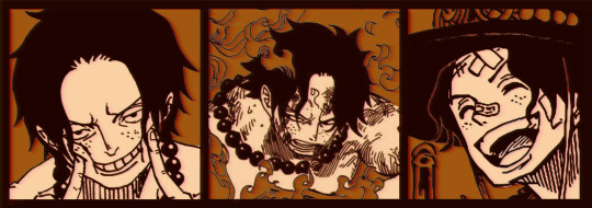
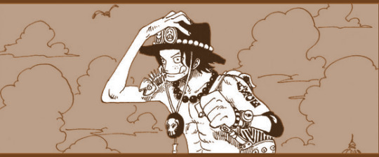
I'll be explaining the process for making these two kinda? The full tutorial is below the cut, to be courteous to the other folks, hope you don't mind?
Though I am hearing that Canva has given people some grief. But Photopea is just *chefs kiss*
If you've ever used photoshop, Photopea is essentially a free photoshop, and it even has the automation tools! An absolute lifesaver when you have multiple layers you want to export (but that's for larger projects not this)
I'm going to assume you have basic knowledge of layers in digital drawing programs for this. If anything isn't clear: ask me, I'll clarify!
//-------------------------------------------------
My General Process is:
Search for official art / images
bring it into canva / photopea
crop / arrange images to match the dimensions
select a thematic color that is associated with the character
separate the foreground from the background
mess around and test things until they work
//--------------------------------------------------
Given "Louder than Words" is the latest one I've made, I'll start with the process for it.

Dimensions: 3000 x 1055 px dpi: 96
//-------------------------------------------
Let's Get Crackin'
Alright let's grab some official art so we're not using any fanart without the artist's permission
I try to pick images that feel relevant enough to what I'm trying to make. For example: the image for the Matching banner shows the ASCE tattoo which is super important in that fic
2. Let's arrange them onto a banner where each individual image has the same/similar dimensions to the rest
That's probably part of why you like these. To a certain extent they have similar dimensions, so they have a uniformity that's pleasing to the eye! (It's not perfect because I threw perfectionism to the wind because this is tumblr not my portfolio) Tip: if you have 3 images and only 2 that have similar dimensions, and the 3rd one can't be cropped logically: but the one that's a different aspect ratio in the middle!
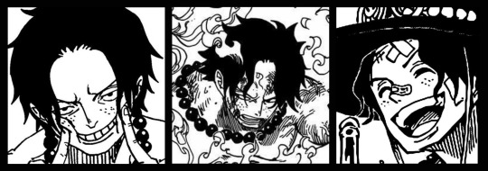
3. lets arrange them in such a way that the borders all feel like they're the same/equal width/thickness
you might find that you have to shrink some images for this, that's fine.
ALTERNATIVELY: if you're going with one image crop it so it's just the relevant info and it matches the dimensions (3000 x 1055 px)
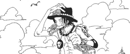
We have our base! Now let's add some color, and direct the viewer's eye together!
4. pick out a color that you think matches your character / vibe - that color is going to be your background Given I'm making an Ace banner: orange is the color I'm going with
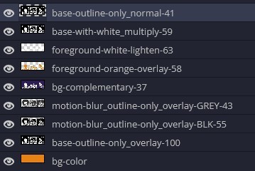
I went and named my layers for this lol. The numbers represent the opacity, and they aren't important. I just kept changing the opacity until I liked the way things looks. But here's the secret to the 3D feel:
Motionblur (+ moving it about)
Separating the foreground and background and dulling out the background.
I'm going to show you my process so you can see the effects, but first let's give you some quick skills:
//------------------------------------
SKILLS / THINGS I THINK ARE HELPFUL
//------- Select Similar
magic wand -> select something -> right-click -> select similar This works best when you have high contrast images (like manga panels that are black and white). You can select the black or the white areas. Depending on what works better for you. TIP! Invert selections with ctrl + i Say you know that you want to select everything but Ace's face in the second panel. Select his face with the magic wand then ctrl + i, and that's the only thing NOT selected

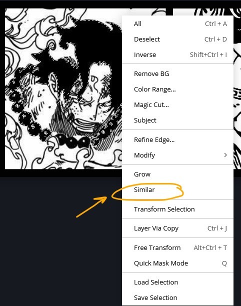


TIP!!!!!!!!!!!!!!! Please, please, please, duplicate your original image and work on the duplicate layer. This helps you SO much. !!!!!!!!!!!!!!!!! TIP! Check your selection tolerance! This could be why too little, or too much is being selected.

//------- The Move Tool
Shortcut key: v While the move tool is active, you can nudge the stuff on whatever layer with your arrow keys Shift + arrow key = 10 px move (generally)
//------- Layer Locking
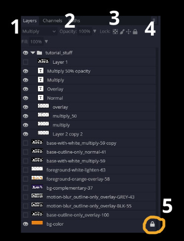
1- Layer Blending Mode (see Overlay vs Multiply vs Normal) for how this can affect results) 2- Opacity: how see through it is / isn't 3- Lock Transparency (it's the little checker board) 4- Lock Layer (looks like a lock) 5- Lock icon that appears when anything on the layer has been locked More on 3 Lock Transparency: You can only paint on / modify what's on that layer. You CANNOT add anything to any area that is already transparent Here's a demo of what you can do with this power:
Here's the original Image - notice how it's just the lineart with a transparent background.
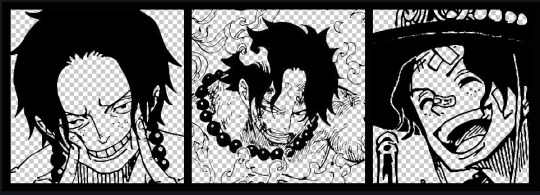
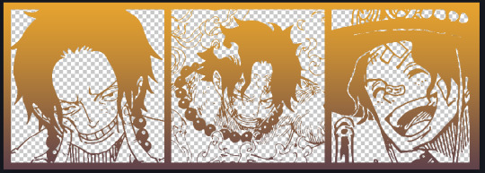
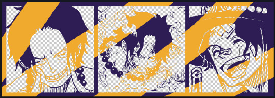
It's powerful: abuse it
//------- Overlay vs Multiply vs Normal
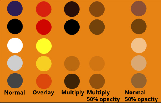
I think seeing this is the best way to visualize how different modes can affect the color.
//--------------------------------
Back to the Tutorial
!!I IMPORTANT NOTE !!
Please play around with the opacity slider to figure out what opacity works best for you on the multiple different layers we're about to make / work with. It's up to your own style to figure this out. Next: please feel free to not follow all of it. Add more layers, add less layers, take the base principles and go wild! :D
5. Separate the lineart from the background and save it as a new layer 6. Duplicate it and set it to overlay, or set it to overlay immediately
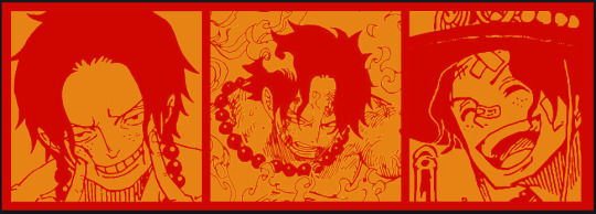
7. Duplicate that lineart layer twice and set the blending mode to overlay 8. lock transparency on the top one and change it to be a dark grey 9. Apply motion blur to both:
Main menu bar -> Filter -> Motion Blur I made it so that the grey layer was blurrier than the black layer
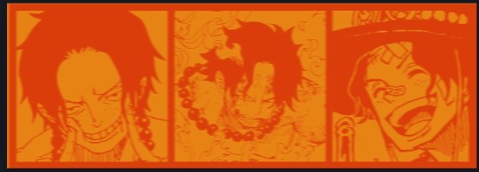
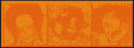
10. More them around a little to give it a "3D effect" as you called it.
It creates shadows under the lines - I was aiming for an effect similar to chromatic aberration (chromatic aberration is a valid way to add punch to your stuff too!)
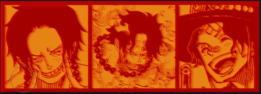
So this is what things look like now - painful, but let's keep going
11. Duplicate the ORIGINAL / BASE lineart layer, that you DID not apply motion blur to -> set the blend mode to multiply (reduce opacity for it to actually take effect)
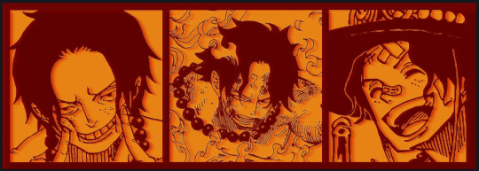
okay that's less painful here's what the layers look like right now:
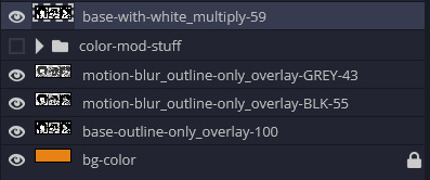
let's bring more focus to Ace's face, and push the background farther away:
12. Use the magic wand tool to quickly select large areas of the faces / focal area / foreground and the lasso tool to refine things
TIP! Hold shift + click -> add to selection Hold Alt + click -> subtract from selection
13. On a new layer with blending mode -> lighten, fill that selection to be white

If you look at it, you'll notice that it is ALREADY starting to draw our attention to his face, but the background is kinda aggressive, so let's dim that down
TIP! Right-click on the gradient tool to find the paint-bucket tool

TIP! Sample All Layers: Turning this option off makes it so that you only work with the content on THAT specific layer. Turning it on makes it so that it is working while taking all other layers into consideration.
14. ctrl + click on the "white foreground" layer to select the contents of that specific layer (pink thing is your mouse)
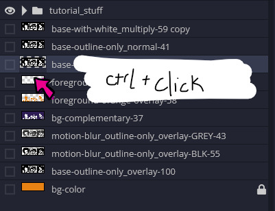
15. ctrl + i to invert selection and ON A NEW LAYER (layer mode -> multiply) fill that with a complementary color

16. I did one last thing where I took the original base (before we separated the lineart) and added it to the very top and played with the opacity to get something less in your face (layer blend mode was set to NORMAL)

And that's it!
More considerations that I take:
I want the banner to be "thin" or not square, so it doesn't take up too much screen real estate on people's devices
I don't want readers having to scroll too much to get to my writing (which is the whole point of the post, let's not waste their time making them look for things)
I want the banner content to be relevant enough?
ie: with Matching: I wanted the ASCE tattoo to be visible. With matching I wanted Ace to not look too happy in some of them.
I'm also trying to avoid spoilers, I hated getting things spoiled, so I'm trying to be careful that the images I pick don't spoil anything really.
Congrats on starting life on your own! I did that whole living by myself thing too! Tip: keep the pantry stocked with lentils, beans, pastas, baking essentials, rice. They really come in a clutch when you're hungry.
#photopea resources#photopea psd#tutorial#tutorials#tumblr banner#photoshop#photoshop tutorial#digital art#fuck adobe#adobe photoshop
26 notes
·
View notes
Note
your mobile theme is so cool how do you do it!! your blog immediately has good vibes upon arrival
AHGFHDHD thank you :) !!!! i just looked for transparent lace borders and fitted them around my header ... ibis paint x has some in the materials folder !!!
the dividers in my pinned are stolen from a png blog, i just cropped them and flipped them around .
and my header is a picture of my actual bed in my bedroom :) i just kinda adjusted the colors to be warmer by adding a soft orange gradient and playing w/ the opacity . then i played w/ hex codes for a lil bit in order to get a not eyestrain-y palette !!!
1 note
·
View note
Note
Which drawing app thingy do you use? Ive been wanting to try out digital art but idk what app to use.
I use clip studio paint! However I started off on Adobe Illustrator, which was a free and very basic, and had an extremely beginner friendly interface.
I have also used FireAlpaca and paint tool Sai, but I have to admit I prefer Sai, as FireAlpaca can be buggy when it comes to pressure, opacity, etc. In certain brushes.
Though I've used Paint Tool Sai the longest, Clip Studio is likely my favorite as I had access to WAY more brushes, textures, and overall options. The asset community has a TON of resources that I really should be taking advantage of, such as reference models, pre-made environmental assets, pre made and customizable speech bubbles, etc!
I have never used a mobile program before though, but the programs I am aware of that my mutuals give high praise are Procreate and Ibis, though Ibis can be glitchy at times and Procreate has limited capabilities in regards to layer group settings.
3 notes
·
View notes
Text
Ok so I tried to do a massive drawing program review where I redrew the same drawing on each program but only got a couple done
If I end up finishing any others I’ll just edit this post

Medibang Mobile App
The Medibang mobile app was what got me started in digital art and it was pretty nostalgic returning to it. As Ive since become more versed in digital art I noticed there were some things that were lacking, primarily the brush selection and how it can be a little difficult to get a precise color. Ive heard many people say it’s confusing and yeah, I don’t think there was much of a tutorial or anything but I just spent time with it and learned as I went.
One thing that I really learned to like is the cloud storage. I usually don’t use cloud storage a lot but I like how this is set up because you can start a sketch on your phone and when you get home just open it right up on your desktop and continue it there
All in all, it’s pretty much perfect and it’s a great little app to get started in digital art or just for on the go sketching or even finished pieces like this one

Sketchbook Mobile
I fucking HATED this app. The desktop version is alright (haven’t done a lot of drawing in it though-) but this app was just very confusing. All of the brushes had crazy pressure settings, it was so hard to find an eraser that just acted like a normal eraser, I had to spend a lot of time editing each brush to just- be /decent enough/ to draw with. The stabilizer tool just stopped working halfway through it and I was too lazy to go back and redraw things. It was fucking impossible to change the brush size without messing up the opacity/ color hue/ I don’t even know what else because everything was in the same confusing menu without any labels AND it didn’t respect my privacy when I said I didn’t want it to collect my data (I would flip the switch, exit out of the settings, go back and it would be back on again)
Now I get they were going for a very compact design, maybe it’s just me, but I would rather prefer a bunch of menus and icons and all that stuff rather than CLICKING LIKE FIVE BUTTONS JUST TO REACH THE UNDO OPTION because everything is hidden away in ONE menu
God I hated this app
(If you use this app and like it good for you- I’m sure it’s a good app when you get used to it and all but it just doesn’t work with my preferences for a drawing software)


Here are my WIPS for Ibis Paint X and Medibang Desktop respectively
Obviously haven’t finished them. Might go back- however I did enjoy using both of these apps so thats epic
#anime#animu#art#drawing#aaaaaa#sketch#oc#doodle#pencil#cowboy art#original character#rant#sketchbook#autodesk sketchbook#app#mobile app#phone drawing#medibang#ibis paint#colors#aaaaa#pain#one of them I hated#the rest were good#sorry if you like the app I hated#ndisjan#cowboy characters
4 notes
·
View notes
Text
i was always like “wtf” at photoshop artists bc i used it and it’s not a good art based program like,, i use procreate now n its obv much better but like, if u cant afford a program n wanna make some neat art? i have some neat n free recommendations (both for mobile n desktop)
take this w/ a grain of salt of course, cos i’m not the best artist and i def. have my biases
fire alpaca (desktop) / medibang paint (desktop + mobile):
basically my highest recommended, both come from the same company i think- there’s an english vers. and other language vers. for both so far. they each have websites with a bunch of tutorials on stuff like clipping layers and coloring mixing brushes- and medibang has a mobile version (tho, imo it doesn’t work as well as the desktop + theres a lowkey subscription thing).
the main difference between the two is in layout- medibang is a lot more detailed but firealpaca has more beginner friendly features.
pros
+ actually has a lot of things most paid products have, like transform tools and lassos n all that. shares all of it’s shortcuts w/ photoshop
+ custom brushes are fine, tho they use a diff format from photoshop brushes n all, also similar-ish to sai n csp
+ brush stabilizer and the ability to lock layer opacities / masks!! so many programs dont have this but it’s real helpful, esp when you dont want to go through the process of having a billion clipping layers
+ medibang has a resource library, n fire alpaca has comic features / a 3d perspective tool
cons
- a fair bit overwhelming on medibangs end, generally confusing on firealpaca’s if you dont have a guide to help you figure out what icon is connected to what tool
- theres a canvas limit for editing, not much more than general editing either, which, while it is the base of art programs- doesn’t leave much for creativity, plus brushes only have a few settings, u cant make them softer / sharper unless you make a new one
- subscription service for medibang, which is kinda… iff.
basically, medibang / firealpaca are easy to use, solid choice for artists. the former is for peeps who really wanna go for illustrations and detailed drawings, whilst the latter is better for beginners + comic artists. download links below:
https://medibangpaint.com
https://firealpaca.com
krita (desktop)
honestly havent used this much, i didnt really like the program. but, it does have it’s strong suits. unsure if it’s compatible with other program’s brushes or files, unfortunately
pros
+ very customizable due to being open source, preset brushes and custom ones and also in the app’s layout itself.
+ constantly updated, so there’s always new features.
+ allows the upload of custom assets like brushes and palettes and stuff
cons
- definitely overwhelming at first, a lot of features and admittedly brushes are useless to one’s dynamic dependent on what they wanna do. it can be hard to figure out what will work on your first time on it
- laggy, probably due to bugs and stuff from the updates. new features are hit or miss on the working on as well. they get fixed soon enough, but still.
so it’s a fine program, if you can take the time to learn it and swerve around the more glitchy or slow parts. and if your computer can handle it, of course. download link is:
https://krita.org/en/
ibis paint x (mobile)
ah ibis paint, the mobile users dream. i have it too from my finger drawing stage, so i like to think i have had a decent enough experience.
pros
+ surprisingly professional for an art app, filter features, lasso tool, etc. a whole lot of brushes and a resource library as well. comic support is also added.
+ community support! they show off art of the weeks, allow you to upload your works on their servers to be liked by other people, and recently ive heard they’re starting to allow custom brushes transferable by qr code, so, neat.
cons
- ads, ads everywhere. i understand it’s a free program and they need money to maintain the servers (for the community based content, as mentioned), but admittedly- it’s a little cheap. you only have a select set of base brushes and then you need to watch an ad to get 48 hours of like, every single brush in the pack. it’s a good- no, great deal! but still, reeks of cheapness.
- it does look equally cluttered and is a bit klunky when navigating, due to it being a mobile app and thus screens can be… small, yes. it looks better on a tablet, though the squished layout makes it seem kinda overwhelming.
all in all? it vibes! one of the best mobile art apps if you can get over the cheapness. i can see why a lot of people use this. download it on google play and the app store!
autodesk sketchbook (desktop + mobile)
okay now this might be outta the park a bit, but hear me out. this’ll be- a lot more simple compared to the others, admittedly cos i haven’t used this in a while.
pros
+ like a whole lot of realistic— and i really do mean realistic —brushes. pencils and charcoal and even smudge sticks. it feels a lot like drawing on actual paper
+ clear cut interface, it’s minimal for the sake of giving you more space to draw, and all that. however, the canvas is still very easy to manipulate when you wanna zoom in or rotate or anything.
cons
- it doesnt have a lot of the cooler filter or gradient tools, at least from what i’ve seen. no custom brushes either, this is definitely… traditional, in the sense that it doesnt offer much.
- touch controls are a bit wobbly too, it’s meant mainly for a stylus with all it’s pen pressure stuff. you’ll miss out a lot on touch / mouse alone.
it’s… well there’s not much to say about this one, mostly because it’s— ultimately it’s for those who’re really into the more traditional feel! it’s pretty niche, but to those who can use it- and i do recommend you give it a try if traditional brushes are your thing -more power to you! download link below for desktop, but you may also find it on your phone’s app stores:
https://www.sketchbook.com
of course, you can always just pirate photoshop or whatever
but for those who would probably find art programs interesting, these are good and once more, free alternatives to the popular program
remember not to take adobe’s corporate shit, either way!!
denormalize using photoshop for serious art. when people tell you they use photoshop just be like “uhhhh… for art???” and brush them off every time they try to justify it. make fun of people for using photoshop. bully people for paying for photoshop subscriptions. no more adobe products we have moved past the need for adobe products
#important#art#art tips#art programs#art progress#for anyone interested#for artists#hope this helps#whew i spent too much time on this#there are more probs but i cant think of any rn
12K notes
·
View notes
Text
Ibis Paint X Download For Mac
Ibis Paint X is an application for Android, iOS devices. The app is created for digital painting. It is based on a natural painting process where you can use a variety of tools, brushes to create a digital painting. Download acer v772 driver. Application is not yet available on Google Play which is a downside, but it does offer compatibility with other drawing, illustration software that is available on the market.
How Do I Download Ibis Paint X On Pc
Download PhotoRoom for PC, Windows and macOS; Download FREECABLE TV App for PC and Laptop; ibis Paint X is a versatile drawing app as a series that provides over 2500 materials, over 800 fonts, which provides 381 brushes, 71 filters, 46 screen tones, 27 blending modes, recording drawing processes, stroke stabilization feature, various ruler features such as Radial Line rulers or Symmetry. Free social drawing app 'ibisPaint X'. Upload the drawing process to YouTube. Download Ibis Paint X for Windows 10, 8, 7, XP PC and Mac Computers. Developer: ibis mobile inc. License: Free Ratings: 4.5/5 – 1.008.848 Votes. Last Update: September 2020.
It allows you to Ibis Paint X download for Windows on the screen in real time with your fingers or stylus. You can create your own paintings or work on your own paintings by adding more paint stroke with the paint brush tool. Users can also import pictures to paint on them.
Interface
Interface Ibis Paint X computer is very simple and easy to navigate. It is divided into four sections: Home, My Drawings, Store, Heart. Home tab is tab that is always available and allows the user to navigate to the other three tabs. The My Drawings tab displays all of the drawings the user has created in software product. The Store tab is where the user can purchase bundles in order to unlock certain features in software product. The Heart tab is where the user can view the user's heart, which is a representation of the user's achievements.
The interface of Ibis Paint X download free is simple and intuitive. It has a set of three tools for choosing color, brush size, brush type. Includes several useful layers, such as a layer for drawing, erasing, one for adding text. The toolbar at the bottom has the options for saving, sharing, undoing, redoing your painting.
Usability
The app is very easy to use. There are three drawing tools that are available to the user: the paintbrush, the pencil, eraser. Each drawing tool can be customized to have different sizes, opacity, hardness. There are also other features in software product that the user can take advantage of, such as the option to undo or redo a drawing.
Functionality

Has a simple and intuitive interface Ibis Paint X Windows with a variety of tools and brushes you can use to create a painting. The interface is easy to navigate and it offers a wide range of brushes and tools.
Support
Has a website where you can find tutorials Ibis Paint X download PC, download software product, look for support. There is no option for contacting the developer of the app.
FAQ
How Do I Download Ibis Paint X On Pc
Is Ibis Paint X laptop available for Android and iOS? Yes, software product is available for Windows and Mac OS.
Is Ibis Paint X available on iPad? Yes, is available for iPad 2 and later.
I’ve heard that Ibis Paint X App is a terrible software product? It depends on what you’re looking for. If you’re looking for a full-fledged, professional-level app that offers a ton of features and the ability to paint, then software product may not be for you. However, if you’re looking for a simple, easy-to-use app to edit and make your images pop, then would be a great app to use.
0 notes