#digital photo printing review
Explore tagged Tumblr posts
Text
How to Take Car Photos
As someone who gets the thrilling opportunity to review a new and exciting car every week, I’ve learned that taking great car photos is more than just snapping a quick picture—it’s about capturing the essence of each vehicle I come across. Whether it’s the raw power of a sports car or the refined elegance of a luxury sedan, knowing how to take car photos that truly reflect the personality of…
#Auto Design#Auto Enthusiast#Auto Photography#automotive art#automotive design#Background Tips#Car Art#Car Details#Car enthusiast#Car Features#Car Personality#Car Photography#Car Portraits#car reviews#Car Shots#Close-Up Shots#composition#Detail Shots#Digital Clutter#digital photography#Editing Photos#Gen Z#Golden Hour#high-quality prints#HP Smart Tank#Image Refinement#Lighting Tips#Luxury Cars#Memory Preservation#Millennials
0 notes
Note
How did you make your filofax reading log it looks so cool!
djffs through Trial And Error (still ongoing) haha - i arrange everything digitally in procreate on a4 sized pages, print out the text on tomoe river paper, fold it over + holepunch, print out the covers on photo paper & stick em in
its all little textboxes & the dividers i draw by hand (the base hobonichi grid as ive mentioned before i found just by googling - someone uploaded a digital version of it on reddit)

(italicized = i own a physical copy)
im pretty behind on the actual review pages tho (some i have finished digitally but havent printed out yet, most r just unfinished bc its hard to produce coherent thoughts when brain machine broke lol)
377 notes
·
View notes
Text
📝ENG Translation: Elle Men Special: A Fashion Odyssey with Kris Guštin

Article written by Ajda Gregorc, published in the November/December 2024 ELLE Slovenia Magazine. Print and digital versions of the magazine are available for purchase.
Scans and English translation by @kurooscoffee, review by @weolucbasu and a member of JokerOutSubs, proofread by IG GBoleyn123.
Full article translation, scans, and Spotify link are under the cut 👇
🎧 Article available in audio form on Spotify.
Elle Men Special: A Fashion Odyssey with Kris Guštin
With Kris Guštin, the music author and guitarist of Joker Out, we escaped to another side of music, and with that, to his other passion. We talked about style and everything connected to it. There will also be no shortage of this in the band's third album, titled 'Souvenir Pop', which is released on the 15th of November—one week after the issue of Elle you’re holding now. How perfectly synchronised we are!
PHOTOS URŠA PREMIK, STYLING ALENKA BIRK
At Ljubljana’s Moderna Café, on a fresh but lovely autumn Tuesday, when everyone’s still at work or in school, he arrives in a dark green jacket with a checkered pattern, awesome trousers, and her necklace. This time, the menu is not serving music and life, but matcha and "all things fashion." I’m in a regular trench coat and a white T-shirt, but luckily he doesn’t judge people by their style—instead, the style might be what piques his interest to converse, if it's good, of course. Besides, he's the one being interviewed. So, let’s begin! AJDA GREGORC
Interviewer: When did you first discover your personal style or the field of fashion? Was it in childhood or a bit later?
Kris: I roughly divide my life into two periods: before I first held a guitar, and after. When I really got into playing and ventured into music, my world opened up in all areas. Discovering fashion definitely falls into this second period, so the post-high school era. To be completely honest, my style in high school wasn’t something I’m particularly proud of today. (laughs) My girlfriend and I still have a photo of me wearing cargo pants and a black sweater, which is a proof she truly loves me, since that look was far from the best choice. (laughs)
When did it evolve from just a aesthetic impression to self-expression?
My first contact with fashion as a form of art or expression was during our band's first music video or fashion shoot, when I realised that this is also something you need to consider as a musician. At first, it seemed to me like a fairly peripheral element, but as our career developed and we met new people who gave us more insight into this, I began to understand its significance, what I could personally gain from it, and what we as a band could gain. This quickly developed into standard practice. I was increasingly exposed to fashion; we had more and more costume rehearsals and stylings, and two years ago, we even got our first proper stylist. And then I really committed to it—at around nineteen or twenty. Before that, my philosophy was always to "just wear whatever I first find in the closet," but then I shifted to "I'll wear things that would make me stand out from others". But this process was a long one.
So, your style development with the band inspired your personal growth too? I’ve always wondered if a young person is compelled to mature in every area when so many 'big things' happen all at once, as they did for you.
Maybe you do "grow old" in terms of personality sooner. Yes, at first I wanted, and still want, to primarily express the difference or uniqueness that I feel inside myself through music, but then I discovered that this goes very much hand in hand with fashion, so I started looking for my expression there as well. Today, it's almost an equally important part of my day.
Which fashion ideas or directions attract you? You’ve probably encountered a lot of inspiration during your travels on tour, right?
Definitely, but speaking purely origin-wise, I think I’m just like any other rock musician—we draw from the rock aesthetic of the ���60s and ’70s, which was also very "in" when my fashion awareness was born. Back then, around 2016 to 2018, here were a lot of flamboyant shirts on the music scene, with a slight hippie influence, which was the starting point. Only later did I start getting interested in slightly more modern clothes. When I was younger, I found myself in street fashion, that sort of Eminem-esque, hip-hop vibe, so very baggy clothes, which I then began to reject when I made the shift toward the ’60s and a slightly psychedelic aesthetic. It makes perfect sense, as humans tend to jump between extremes. When I had worked through that style, I started discovering the aesthetics of the ’80s and late ’90s, which was also reflected in music at the time. The best example that comes to mind is Dua Lipa’s previous album, which was in the style of the “new ’80s,” and the fashion matched that as well. Today, the early 2000s style has come back, but I haven’t fully decided whether I like it or not. As a musician, I was, of course, initially inspired by other music groups. Arctic Monkeys were a big inspiration for us both musically and visually, as was the whole British rock scene, including bands like The Kooks and Oasis. That entire aesthetic has always been strongly present with us. I doubt there’s a single inspiration board at our shoots that doesn’t include a photo of one of those bands or, for instance, the Beatles. And that aesthetic has always been close to my heart, too.
Rockers have always been associated with more masculine fashion elements, while in recent years, many male musicians have been experimenting with more feminine style elements (for example, Harry Styles and Lenny Kravitz). David Bowie was already the one who back then started to blur these fashion boundaries. You, too, wear such pieces and dare to stand out with them.
It happened quite naturally, as the stylists we worked with always chose slightly more “unmanly” clothing for me. This doesn’t necessarily mean women’s clothing, but rather somewhat more androgynous pieces, which I quickly embraced. I found them interesting and appealing because there’s a lot of fresh expression in that style that I don’t find in traditional men’s clothing, though I don’t want to overdo it. I also started experimenting with them personally, choosing many more varied colours. For a while, I was very fond of pink, and lately, I’ve been playing around with orange. On the cover of the album 'Demoni', I wore an orange-pink sweater.
Are we, as an audience here, already mature enough for a musician to present his feminine side through fashion? Does that require courage?
It does, there will always be people who won’t understand you. But for me, when it comes to the stage or a shoot, I’ll wear anything, and if I feel good in it, I don’t worry about what someone thinks. When I walk around "in civilian clothes," however, especially in Ljubljana, I am still aware if I’m dressed somewhat "untraditionally." There’s a certain boundary that I still need to break within myself. On stage, it’s easier because it’s not necessarily a hundred percent my expression; I’m playing a certain character, but personally, sometimes I do need some courage to show up in a particular style. However, the awareness of being different is stronger in Ljubljana than in other parts of the Western world. For example, I never felt that way in London, but still, our capital isn’t the worst when it comes to this.
Speaking of influences, what about other artistic or cultural movements?
I love art deco, the aesthetics of the '20s and '30s, though it doesn’t influence my daily life. In terms of photography, Damon Baker’s black-and-white style is beautiful. The vintage camera aesthetic has recently won me over, which will also be reflected in our band. Musically, over the past year, I’ve been listening to old Italian chansons and older French music, chansons as well, so I’m clearly feeling very retro this year. (smile)
Will the third album visually stand out from the previous ones then?
Yes, it will be very different. In the last two, we used a lot of colours, but there won’t be as many in this one.
Style can be an excellent tool for expressing an artist's authenticity, but with increasing success, the artist can also become its slave; the line is thin. Do you ever feel the pressure of having to express your fashion style in your private life as well?
No, I’ve never felt like my style owns me; it’s always been the opposite. I’ve always felt like I want more, like I want to dress even better than the day before, especially when it comes to my music career. Perhaps style only hangs over my head a bit when I have no inspiration and would rather wear sweatpants on an ordinary, relaxed day. There’s nothing wrong with that, of course, but then I do think about what would happen if I ended up somewhere in the middle of the city dressed like that.
It seems that Joker Out has developed a distinct style despite outside influences.
Yes, today we are already very complete in our style. Others have definitely had an influence on us, and I think it’s great that each of them tried to express themselves through us – it was interesting to experience how Joker Out was seen by Ponorelli, and how Andraž Drobnič or Karlo Kirri did. Of course, there is a difference in this, but it also aligns with the development of our music and aesthetics, so all these influences are very welcome.
How much of your personal fashion identity is therefore reflected in Joker Out?
Maybe, as someone who is not an external observer, I can't answer that, but I can say that I was always one of the first to give feedback to the stylist when we were creating our outfits, approving moodboards, and so on. So, I have definitely shaped our style in a direction that suits me. On certain "blind stylings," when we just dressed up, I quickly threw something on myself and then helped look for pieces for the other band members.
What about this photoshoot, where Alenka Birk took over the styling? Did you let her take the lead with her tactics, or did you collaborate on fashion choices? How did the communication go?
I didn’t know Alenka, who, by the way, is an excellent stylist, before. She was recommended by Urša (the photographer, ed.). Later, she confided in me that she had also worked with my father. Alenka focuses on elegant men's fashion, which is a departure from this more fluid fashion; and this suited me because I had never really been photographed in a men's suit, jacket, and tie. I wanted to try something new. I hadn’t seen the outfits before the day of the photoshoot when we met in her small studio in the morning. There were nine of them in total, and we only swapped out a piece or two in at most three of the looks.
This is more of an exception than a rule in fashion photoshoots. Does that mean you felt good in them?
Yes. In some more so, obviously, but in others, you have to trust the people you're working with. When I first look in the mirror, I always keep in mind that if something isn't optimal, it doesn't mean it won’t work well on camera. Even if the pants are too short or creased, it's still worth photographing them, because the photo can be edited later, whereas on stage, it's a different story, and everything has to already be perfect in the mirror. Working with Alenka was very simple; we clicked really well, and I will definitely work with her again.
How linked are your confidence and the way you feel on stage with your styling?
Very connected. As a musician, you want to enjoy yourself as much as possible on stage, and the people who come to listen to you and pay for the ticket deserve to see you at your best, which means you have to feel good in every aspect.
You recently attended Ljubljana Fashion Week. Which of the local fashion designers do you like to follow?
As far as the Slovenian fashion scene is concerned, I’m still quite the beginner, so I only knew the designers we had worked with. This was my first time visiting the Fashion Week.
Which shows did you watch?
On the first day, all of them. I didn’t like everything, but what stuck in my mind was Sarivalenci¹ with their somewhat "country club", Lana Del Rey vibe, and golf moment. I also really enjoyed the Belgrade Fashion Week, as there was an obvious Balkan touch, which I would love to see more of in Slovenia.
¹Sarivalenci is a Slovene high fashion brand created by fashion designer Sari Valenci.
You are a fan of vintage clothes and second-hand shops. What do these pieces have for you that new ones don't?
Honestly, I don’t know if there’s an objective explanation why. I started getting into it because it was popular, and at the same time, it gives you the feeling of getting a more unique piece. At the same time, you're shopping sustainably and not contributing to the production of unnecessary new textiles on Earth, which is great, but I would be lying if I said that’s my main motivation. What I like the most is the experience of "flipping" through clothes, where each piece is different, like a treasure hunt, compared to regular stores where you "flip" through the same clothes in different sizes.
Did your mum, who comes from the Netherlands where people have been aware of this for many years, introduce you to this concept?
I wouldn’t say we talked much about it at home, but I literally lived it. This is probably true for Slovenians in general – almost all the clothes I had as a child were from older peers, or I would take something from my dad, too. When I was done with wearing the clothes, my brother would wear them too. Every piece of clothing that came into our house was passed around, which is a great practice, and it’s still like that today. My sister "stole" half of my sweaters, my mum sometimes takes something too, Maks borrows jackets from my dad, which I’ve also done myself. It's like we all share one big closet! (laughs)
So you have influenced each other’s style in your family, or rather, you still do so? Who has otherwise had the most influence on your style in the past, and who does today?
I don’t remember ever looking at my parents as role models in this regard, as I didn’t really think about it back then, but they definitely influenced me, at least subconsciously. When I see how my mom dresses today, I see parallels with my own style, so she probably did influence me, perhaps more than my dad. As for street style, which I mentioned at the beginning, it might have been inherited from my uncle, my aunt’s husband from the Netherlands, who wore loose sweaters and listened to hip hop. My mum also had an uncle from the Indonesian side of the family, whom I never met, but he was very eccentric. Some of his clothes made their way to us over the years, and when I looked at these pieces in the closet, I was fascinated by how they reflected his personality. Asian fashion became a bit closer to me because of this, and I might even explore it someday.
The heart necklace you wear all the time, even today, is from your girlfriend. Do you ever dress your girlfriend or does she dress you?
My girlfriend is very fashion-oriented and has played a big role in my fashion development. She has always encouraged me when I tried new clothes that, at the time, seemed more radical to me. In this way, she partially shaped me. We also really enjoy shopping together. She dresses me more often than I dress her, which means I ask her for opinion. There have also been times when we’ve dressed the same when it comes to basic pieces; we’ve never really styled each other, but there will probably be time for that in the future.
Where do you like to go for vintage pieces in Ljubljana? Did you find any gems while on tour across Europe?
Textile House Vintage Shop is, in my opinion, by far the best in Ljubljana. The next one is Humana on Stritarjeva street, where I find something every now and then. Abroad, we’ve visited many vintage shops in Dublin, Paris, and London. In the latter, I always go to Brick Lane, which is a street with vintage shops in the east side of central London, where the more hipster area starts. The downside is that it quickly becomes quite an expensive experience.
What kind of information can you deduce about a person based on what they’re wearing? Who, in your opinion, is truly well-dressed?
A person’s style is never a reason not to engage in conversation with them, but it is a very strong stimulator of my interest in that person. If I think someone is really well-dressed, I automatically assume they might think similarly to me and be interested in the same artistic, musical, or visual directions, so I’m more eager to talk to them. However, I’ve often met people who didn’t seem interestingly dressed, and later realised they were amazing people, even if they dressed completely casually.
Your audience expresses itself very differently in terms of fashion, as your parents also mentioned in a recent interview for Elle. How do you as a band perceive this?
Yes, what they meant was that it is no longer the case that you have to be "appropriately" dressed for a rock concert. When we observe the audience from the stage, I would say that the most typical thing for our time is that we are no longer genre-bound. Not just musically, but also in terms of fashion. 30 or 40 years ago, you would see people at a rock concert in leather jackets, black shoes, and jeans, and that was it. Today, you have flamboyant outfits with blue and green hair in one corner, gothic style in another, and of course, people in simple t-shirts and pants somewhere in the middle. And no one feels like they don’t belong; everyone sings our songs, and that’s really nice.
- ~ - ~ - ~ - ~ - ~ - ~ - ~ - ~ - ~ - ~
❗Please do not repost without credit, and if you quote, please link back to this post!


#joker out#jokeroutsubs#kris guštin#source: elle slovenia#Spotify#type: article#year: 2024#jo: kris solo#og language: slovenian#jos: podcast
82 notes
·
View notes
Text

~🧑🍳 PRODUCTION UPDATE #1🧑🍳~
We’ve already got a hefty update for you all so please read carefully!
🍴As we have shared previously, our spoons are already in production! We have approved the samples and expect them to arrive to our shipping mod in late January for shipping in Feb.
🍴Formatting for all three zines is COMPLETE and Melting Pot is ready to be printed!
🍴We hope to receive our zine book and other samples soon. We'll share photos when we get them!
🍴Unfortunately, we have run into a delay. Chinese New Year is infamous in zine and merch circles for causing delays in production as manufacturers shut down for the duration of the holiday. We had hoped to get our order completed before CNY, but due to its especially large size and complexity (thanks to your incredible support!), this is simply not possible. However, because we have made sure to hammer out details with our manufacturers in advance, we'll be able to hit the ground running after CNY. We will also not be idle!
🍴While we wait, we will be carefully reviewing our samples for any necessary revisions or changes and preparing the spoon sets for shipping.
🍴Happy lunar new year to all who celebrate and stay tuned for our next update!
Don’t forget our delicious digital bundles are still available throughout production!
#production update#dungeon meshi#delicious in dungeon#dungeon meshi zine#dunmeshi#fanzine#zine#dungeon meshi anime
22 notes
·
View notes
Text
Selling your merch and shipping from home with Fourthwall
I've been selling @shiftythrifting Junk Boxes - our curated secondhand mystery boxes - since 2017 using different platforms with different levels of success. I moved to Fourthwall in 2022 and my teeny tiny business has only grown since then! FW is free to use and you get ALL the money from your home sales save for the credit card processing fees. I don't miss the fee structure from our previous hosts, so I thought I'd write up a little guide on how easy it is to get started.
Things you need to start shipping from home:
A scale, and it doesn't need to be an expensive or large one! Even a kitchen scale works for small stuff.
Packaging and packing materials for the product(s) you're selling.
Access to a post office and/or a printer.
Funds set aside for postage. You'll get this money back with your Fourthwall payout when the month rolls over.
(Optional but handy) A ShipStation account.

Make yourself a store if you haven't already. You can sell print on demand, digital stuff, and your own inventory in one place but today we're talking about selling from home, so add a product and pick the middle option.
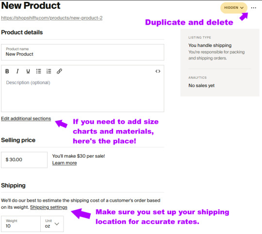
You can customize everything about your product on this page, from adding size and color variations, the materials used to make it, size charts, inventory, and more. Get an accurate weight of what you're selling in its packaging and add that here. Hit save and you have your first listing. Gonna be selling a variety of products? You can duplicate the listing with the meatball menu! Change the name, photos, and anything else that needs changing and have your second listing up in a couple minutes.
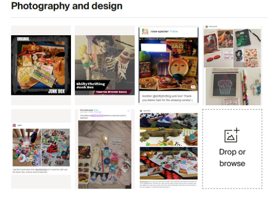
Didi protip: I like to put people's reviews right in the listing. Lots of photos help sell your product, but there's nothing like a positive review from fans!
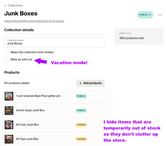
Fourthwall's Collections feature lets me put my Junk Boxes in their own little section where I can set them to hidden or mark them sold out if I get sick or am on vacation. This lets me easily turn the self-fulfilled part of my store off while folks can still purchase print on demand and digital stuff and sign up for memberships.
Didi protip: If you are in the US, the US postal service will pick up your outgoing packages free of charge on any regular mail day. Just set up a pickup on USPS.com!
When you've made your first sale, you can either make the label yourself or connect directly to ShipStation through Fourthwall's app integration. That's brand new and I love it so far. My labels pop up in ShipStation about 24 hours after a purchase, giving people a little window of time to adjust their order or make changes before I ship it.
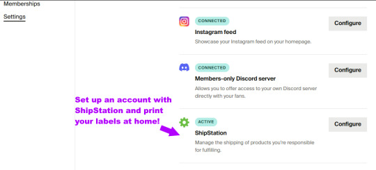
At that point, all that's left is handing it off to the postal carrier of your choice! Boom, you're done!
A final note from me, I moved ShopShifty to Fourthwall so I could have one address for ALL my merch instead of splitting it between Patreon, a print-on-demand store, and the Junk Box store. It's proven to be the best choice I've made in years and has saved me a ton of money in marketplace fees, Paypal's cut, and web hosting charges. This has genuinely been the easiest way to sell my merch!
#fourthwall#I wouldn't praise anything like this that I didn't absolutely love#and I love fw#I'm proud our lil shifty made partner#now I help other people set their stores up
181 notes
·
View notes
Note
Hi Sam! Recently diagnosed midlife ADHDer here. First, thanks for talking about your ADHD & sharing what you’re figuring out. It’s super helpful to someone on a similar trajectory.
I just saw a reference to your photo books for the first time & it seems like a great way to help with memory issues that come with ADHD (like I know I did [x thing] but when?). Could you talk a little about the process of collecting photos & such all year & then how you create one?
Thank you!
Ey, happy to have helped! Congrats and sympathies on your diagnosis. And honestly it's good for me too, talking all this out, it helps me get my thoughts in order. I often namedrop you guys to Therapist, you are "my readers" :D
The process of putting the photobooks together is...well, it's a lot, so this is going to be a super high-level overview, but basically yeah I wanted to have records of where I'd been and what I'd been doing that were more concrete than just digital photos on a hard drive or a cloud. But I didn't really want to just print the digital photos and put them in a box, either, so I started making photobooks. Usually I go through Walgreens or Shutterfly for printing, whichever has the good coupons when I'm working on it.
So, here's the weird, kind of obsessive part: a huge help in making a yearly photobook, for me, is the fact that I take my photos off my phone at the end of every month. I have some that live on the phone -- my growing collection of photos of my niece, a selection of photos from my Europe trip, some memes -- but those live in their own folders. The main camera roll gets downloaded every month, and I put them all in a file labeled with the month and year (2023-01, 2023-02, etc). It's a recurring task in my to-do list, that I offload the photos on the last Saturday of each month. You don't necessarily have to do it this way, though -- it's just what works best for me, and I encourage people to find a way to do things that will actually be functional for them.
Across the course of the year, although really moreso in October and November, I go through the photos and remove any I absolutely know I don't want to keep. Once I've done that, I save a copy of the whole year's worth of photos to my digital archive, and I take another copy and label it "FOR PHOTOBOOK" which allows me to do more culling of them than I otherwise would, because I know anything I delete is still in my archive. And this all has the advantage of me knowing that the photos in my archive are at least SOMEWHAT organized.
So I go through all the year's photos in the For Photobook file, month by month, sort them into folders by event (so there's, like, 01-Polar Vortex, or 04-Europe, or 09-Birthday) and clear out all but the photos I know I want most. My photobooks are generally longer than the default length they give you at most sites, so I usually do have to add a few pages (they're like $1/page or something) but not too many. Often these days I have some stuff that's events, like the Europe trip, and then some stuff that's just like....a folder of funny shit I saw in Chicago, or a folder of all the food I photographed that I want to save. The cats generally get their own four-page spread at the back. :D
In 2020, I will say, there were only two themes: CATS and COVID. I alternated pages.
Anyway, once I've got the photos sorted, and deleted any I don't want to include, I get on Shutterfly or Walgreens Photo and start up a new photobook project. I upload the first folder of photos, place them on the page with suitable captions, then upload the second folder of photos, etc etc, until all the photos are uploaded and placed in the book. I don't caption extensively -- often it'll just be a page that'll say like "TEXAS IN JULY!" and all the photos from that trip. But it definitely does help me keep track of what I was up to. And it's kind of soothing to review the year and see all the stuff I accomplished.
So that's the bare bones -- by all means feel free to ask questions, although if you guys wouldn't mind asking in comments or reblogs if possible, that should keep the discussion contained as necessary. :)
109 notes
·
View notes
Note
Are you familiar with Jared Polin, aka 'Fro Knows Photo'? I'm not a pro like him, nor do I aspire to be, but I can put his tips into practice, such as putting my money into 'glass glass glass glass glass' with the D600. Thanks to a miserable season, baseball tickets today are dirt cheap. Thanks to KEH, heavy artillery glass was a bargain. Plan on getting action shots with the 80-200mm at f/2.8, 1/2000 sec and letting the camera deal with the ISO. Beauty shots around the park 'f/8 and be there.' Hope you're well today. Let's Go Bucs!
I have mixed feelings about Jared. He can be crass and some of his photography opinions are old school and outdated. Though he has gotten better over the years and I actually enjoy his videos more now than in the past.
My main gripe is that he doesn't believe in cropping photos, which bothers me to no end. The beauty of having high megapixel cameras is the ability to crop in and almost get a "second lens" without having to actually buy one. As a disabled photographer who cannot always "zoom with my feet" sometimes I have to take photos knowing I will be cropping them later on.
The main reason for "not cropping" goes back to film and prints. Your photos would always end up the same size and aspect ratio. Also, 35mm film did not enlarge very well, especially with the low sharpness lenses from the past. That is not a constraint with presenting photos in a digital medium.
I also think he cranks the contrast up on his photos to a ridiculous degree. I want to re-edit all of his photos because anything in shadow gets lost. But that is more of a subjective complaint.
He is a great natural light, documentary style photographer. And I do think his real world testing of gear is a good perspective over some of the other camera reviewers that do nothing but lab tests. (Both have their place.)
In the end, he has a lot of experience and has some pretty stunning photos in his portfolio. And I do like that he isn't afraid of high ISO photography like some others can be. So as long as you ignore his advice about cropping, I do think he has a lot to teach.
If I could recommend one photographer to folks who are in the beginning of their photography journey, I think it would be French-Canadian wildlife photographer, Simon d'Entremont. (pronounced see-mon) Even if you aren't into wildlife shooting, his photography education/communication skills are fantastic. He breaks everything down into very easy-to-understand chunks and makes very few (if any) factual errors. He is a good balance of artistic and technical and gives very practical advice for getting better shots. And his work is absolutely stunning.
I also think you might enjoy Sean Tucker. He tends to be less about gear and more about the art and philosophy of photography.
And you are correct, lenses are far more important than any other piece of gear. They are the main thing that sets big cameras apart from smartphones. You can't break the laws of physics and certain things require more than a tiny plastic lens can do.
Also, I miss baseball. I really enjoyed watching games with my dad when he was sick and had trouble concentrating on shows with a narrative. But it has been hard for me to watch a game since he passed. So I just follow some baseball YouTube channels to dip my toe back into that world every once in a while. I think I just need more time and I will get back into baseball again. Also, the Cardinals seem to be struggling so this was probably a good time to step away.
Though I do feel like I am missing out on seeing Shohei Ohtani's career develop.
17 notes
·
View notes
Text
Kodansha USA (2024) Omnibus Release Volume 02
Has it really been three months already?
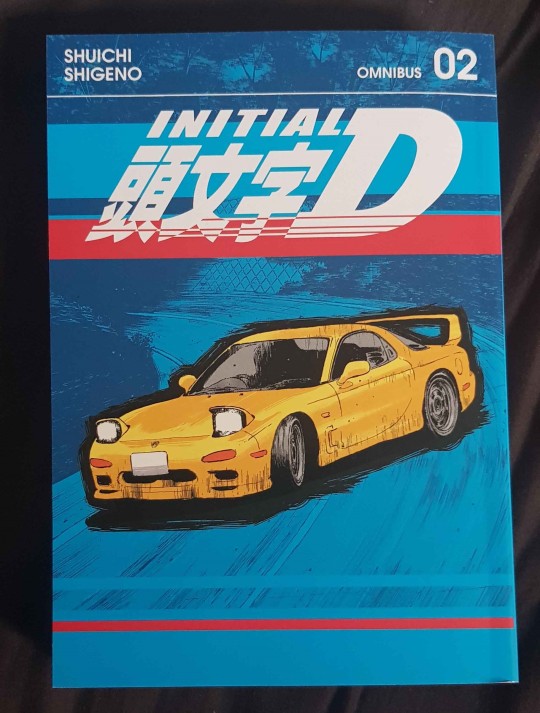
The second volume of Kodansha USA's Omnibus release of Initial D just released (June 25th 2024, though it was also released digitally three weeks earlier on June 4th) and I have just gotten my hands on a copy.
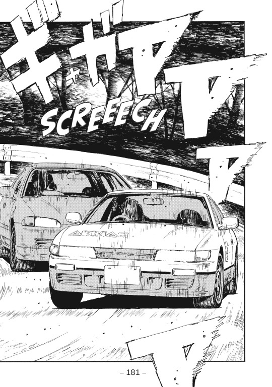
Pretty much every compliment I paid to the translation last time is true. As with before, the many oddities and changes present in the Tokyopop and earlier 2019 Kodansha USA release are gone.
I feel its pertinent for me to offer a minor addendum to my review of the first volume, specifically in regard to print quality. Many people have noted that the paper that the first volume is printed on appears incredibly grainy. While it isn't something I paid much mind to, it does appear to be grainier than your average, which is somewhat embarrassing for a "premium" release that costs twice the amount of a normal manga volume. Many people have also complained that their volumes have pages where the ink is visibly lighter than it should be. This doesn't effect every reader, but it is unfortunate that some people are having a worse experience than I am with this release.
The paper grain of this volume does seem better to my eyes, though it may be about the same (I would like to provide a photo of this but my phone's camera doesn't really show the grain very well.
Unfortunately, once again, there is a minor blight on this great release in the form of a translation error. When Shingo is first introduced in chapter 29, he, for whatever reason, calls himself "Shingo Atsushi", instead of Shingo Shoji.
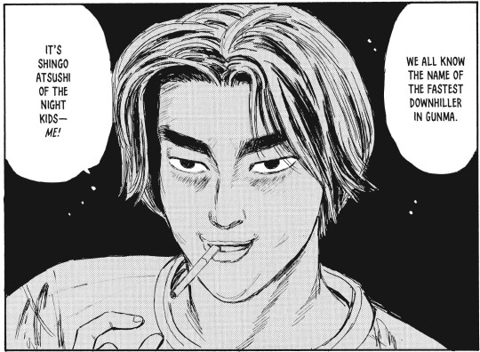
This error does confuse me slightly, as a quick cursory search online would show that this is incorrect. It's possible that the translator misread 庄司 (Shoji) as 厚司 (Atsushi), as they do have a character in common, but I cannot say for sure. I believe this is the only location in this volume where Shingo is referred to using his surname, so we may have to wait for the next release to see if this gets corrected. This does remind me of a similar mistranslation in the Tokyopop release with Toru Suetsugu's name, which I may cover at some point.
I dont mean for any of this to come off as a condemnation of this release; this is still the best version of Initial D that we have ever received, it's just unfortunate to see the translation be tripped up by minor things such as this. I do still recommend picking this up if you are interested in reading the manga (and I think you should be, its the best version of the story.)
12 notes
·
View notes
Note
do you have any tips for scanning old magazines/catalogs? i'd like to help archive some of the publications i have, but i don't really know where to start ʕ´•ᴥ•`ʔ
i'm mostly concerned about binding (especially on glbs) and what scanner specifications to look at, but any other advice or resources would be appreciated too!
So, I'm not actually an archivist, I'm a web developer by trade. I own a relatively inexpensive flatbed printer/scanner, mostly because it was what I could go out to a physical store and buy for relatively cheap when I started out scanning old magazines and catalogs.
For anything that is staple bound, like a magazine, and can be put flat on a table while open, scanning is relatively easy. You just need a flatbed scanner that is bigger than the pages, and a book to put on top of the lid to keep it flat (don't use too heavy of a book or you will damage the scanner 1-2 magazines is usually good. Also, don't forget they are there, open the lid and fling them across the room). Line up a corner of the page on the corner of the scanner and you should be golden. Scan in photo mode if your scanner software has options. Ideally, for things like the GLB, you would either want a copy you can destroy (which I kind of think is what some of the 'latest magazines' scanning farms were doing in the 2010s) and to carefully unbind the whole thing and scan the pages flat (which I have no personal interest in doing because destroying books pains me and I'm not trying to digitize "clean" digital copies for any professional reason). OR, my understanding is you want something with a V-shaped cradle of some type that is specialized for scanning books, either as an actual scanner or a camera setup with software. The problem is last time I looked those were like 10K and up if you get a piece of specialized equipment.
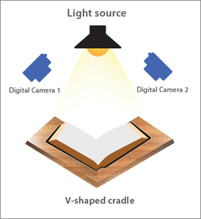
I've vaguely dabbled with the idea of doing a very hacky version of a DIY build with boxes cut down to the right angle and some panes of glass and my DSLR for my pink house catalogs because they are too big but I never really got it fully figured out. I will admit, I haven't tried super hard. I kept getting reflections, and I had to worry about the glass scratching the pages, and I didn't feel like getting a proper light.... I know I should really try again, and try a little harder, but it's a lot and I have a lot of other stuff I need to do so it just keeps getting kicked down the road.
That said, if you want to get into trying a DIY build, there is a whole community of people who were doing that in the 2010s that have posted good info on types of glass and way more detailed suggestions than I can make here: https://diybookscanner.org/forum/index.php This box scanner is essentially what I was trying to set up and it theoretically should work, I'm pretty sure my whole issue is that I was trying to do it all quickly at like midnight one day and did not have the right lighting and didn't try too hard to fix that. Like... I could have tried a lot harder than I did https://www.instructables.com/Bargain-Price-Book-Scanner-From-A-Cardboard-Box/ (good pictures of one here: https://diybookscanner.org/forum/viewtopic.php?f=14&t=1202)
And then I needed to take it apart because I needed the table back...
But yeah, if you don't want to invest thousands or destroy them, I would say try a cardboard box scanner for things like the GLB, see if you can get it to work for you?
And then for things that can go flat, a combo scanner/printer that is good enough for photographs will be more than good enough for the print resolution of most magazines and the scanner/printer combos are way cheaper than dedicated scanners because they think you are going to become an ink customer and buy printer ink, so they make it cheaper. But the joke is on them. My combo scanner printer has never had ink in it before. (Note: do read reviews and make sure it's not stupid enough to require it's ink to be full to scan. I wouldn't put it past some companies to add that to their software). If you are really passionate about this, there are a lot of people who are way more dedicated to archival book scanning who have developed all sorts of DIY solutions for speeding up the process, automating parts of it, etc, and searching for terms like DIY book scanner should get you in the right place on the internet.
7 notes
·
View notes
Text
FRIDAY!
Yesterday was definitely NOT the most productive of workdays. I don't expect today will be much better but again if I can get over 70% that would be a huge improvement. I didn't make it over 50% yesterday. Oops. Ah well. 🤷♀️
Work on script for lab tour video
11am meeting - lab tour video
Pet shop - get flea + worm treatments for cats
Morning routine / Evening routine
Write 1k / 2k
Tidy and dust end office and vacuum (15 minute tidy)
Add 3 daily diaries to the queue
Breakfast / Lunch / Dinner
Work emails under 35 / 30 / 25 / 20 / 15 / 10 / 5
Work on scavenger hunt
Work on Moodle page content
Pull weekly report
508 grades chased up with supervisors etc.
Report for PG students
Make new work list of tasks to do + print
Social media email
New Staff photos
PhD student photos
Drink 2L of water
Review emails in joint inbox
EAB minutes sent out
Coffee - morning hot drink
Moisturise
Do traditional drawing / Do digital drawing
Exercise
Make weekend list
Post what to write weekend
Reply to AO3 comments
Post AO3 chapter
(24/40)
60% so far.
I'll take it.
2 notes
·
View notes
Text
New Crane Wives Merch!
+ My thoughts on it. + "Wolves" Shirt Review.
Also, this is a little long.

Obviously I'll start with the CD- Looks cool! I bought it when the album dropped. This was out before this merch drop, but I figured I'd throw it in too.
There is also a digital download, but I didn't take a screenshot of it because the product photos are the same. I'm surprised they didn't change the CD photos when they updated almost everything else on the website, including the website. At least they didn't change the product urls, those are funny. (Go look at them)

Beyond Beyond Beyond Release Show Poster- Looks nice, might buy it. A screenprinted poster sounds cool, and I like to stare at artwork, but I don't know if I want one for a show I didn't go to. There's also no dimensions listed.

I've never seen these in person, but I've seen the plum ones in person and... they don't look that good. The plum ones looked super thin (in the bad way), and the vinyl decoration looked weird on the fabric. I also vehemently dislike vinyl decals on anything, they're super smooth and just look bad. These hoodies are also my least-favorite fabric ever, being made of fleece.
But they sold out like, less than halfway through the show so that's cool.
I really appreciate the new product photos instead of just the product mockup.

I have this! The print on the front is nice and soft, but I just got this a few months ago so it hasn't had that much wear and tear. I'm still sad that there are no dates on the back.
I figure I should mention that I have never put this in a dryer, and it also gets washed inside out with other whites.
The shirt is 100% cotton, which is nice. However, it is as thin as it looks in the product listing.


So the 2023 tour shirt was taken down from the site a month or two ago, but I found these two photos while looking for pictures of the Beyond Beyond Beyond Release Show Poster. They must be in the bowels of the website but still able to be scraped by Google's image search. Cool.
But the fact that they are still in there is really funny.
I know the reason that my 2024 tour shirt doesn't have dates on the back is because of how long the 2023 tour shirts took to sell out. Even the $15 misprints took forever. (Well, kinda. The mediums sold out long before the smalls did.)

Ok, I know this isn't new. This shirt has been on the website for a while, and will likely be there for a while, too. It's popular for a good reason. It sold out at my show.
Actually, a lot of things sold out at my show. Out of the Plum Hoodie, the 2024 Tour T-Shirt, the Wolves T-Shirt, the Phoenix Hoodie, and the Tote Bag (I could see the merch stand from my perch), the only things that didn't sell out were the 2024 Tour T-Shirt (The only concert exclusive there) and the Phoenix T-Shirt.
The real reason it's on this list is because I bought this shirt in December 2023, was going to make a post about it, and then decided to wait, and then I never did.
When I first purchased this shirt, I was nervous about it as the only thing I could find about the material content was that it was a "Bella + Canvas triblend. (In writing this post I realized it says "triblend" and not "blend". Yes you can find the material content on a Bella + Canvas triblend, although you have to go onto the Bella + Canvas website and click on the triblend listing, so it's not that easy. I thought it said "blend" and that Bella + Canvas was the name of the blend, looked it up, and got confused.)
A Bella + Canvas triblend is 50% polyester, 25% cotton, and 25% rayon. I did not know this, and I would not have bought this shirt if I had known this.
The print is pretty nice, I haven't noticed any cracking. The thin lines of the design would hide it well if there was any cracking, but there isn't. Cool.
Once again, I have never put this shirt in the dryer, and I wash it inside out on cold.
The shirt doesn't feel the best, it's tolerable but not my favorite texturally. I'm also not a "soft" person, this just feels like exercise clothes to me. The shirt is also pilling super badly due to the material content. My 3-4 year old 50% polyester 50% cotton NASA T-Shirt that I wash right side out and threw it in the dryer on high with a dryer sheet (Back when I used the dryer, everything's hang-dry only now) is less pilled than this very new T-Shirt.
Anyways I hope you liked reading this, if there's anything I recommend it's the CDs and the pins, and probably the poster too. Everything they've had printed looks nice. The vinyl's probably alright too, but I don't like vinyl so I don't know. I also recommend their Patreon! It's got song demos!
4 notes
·
View notes
Note
Any recommendations on good Polaroid cameras? i have an instax mini 9 and its pretty shit IMO, the colours bearly show, im not sure if thats because im doing something wrong though? but i saw you said you dislike instax cameras so im curious if you could suggest any better ones! (luckily i got it for free and it works, just feel like im doing something wrong with it)
I HATE INSTAX CAMERAS!!!!!! you’re totally right with the weird faded colors, it’s an issue i’ve noticed frequently with instax film! i don’t think you’re doing anything wrong, but rather that it’s just an issue with the brand.
In terms of other instant film camera recommendations, I have a couple!
1.) Polaroid Onestep SX-70

An instant classic!! I have one of these cameras, and it’s 100% my favorite of my collection. Polaroid still produces film for these, and so they’re not too much of a hassle to find film- which is an issue with most other old instant film cameras. (cough cough, kodak colorburst. don’t buy those)
if you find one with a flash bar, you’re golden! but even if you don’t have a flashbar (like me!) you can still take gorgeous photos outside ^^!! i wish i knew where my photo album was right now. my rooms a mess post graduating, so i can’t find it :’D!! but basically, 10/10. could only be better if the polaroid film quality was as good as it was in the 80s haha
2. Kodak instant-printer camera
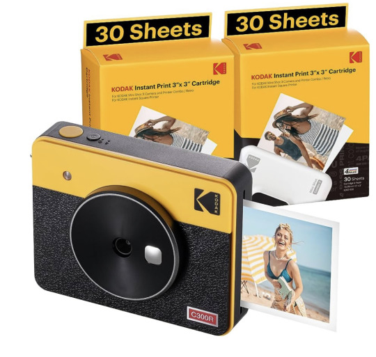
this camera works similarly to a digital camera, allowing you to review your photo before you print , so you never have to waste any of your film! i’ve had this one for a few years, and it’s a lot of fun. my model actually prints like a printer, and moves in and out of the camera to print the ink colors one at a time before it pops out. it’s kind of entertaining i can’t lie…
one of their models even utilized the classic square film we all know and love! 9/10, simply because i have a hard time finding film even if it’s still being produced.
3. Polaroid Now i-type

god i want one of these so bad it’s not even funny. although on the pricier side, these cameras take old polaroid technology, using the same film cartridges as the Polaroid-600, and have a built in flash as well as a modern build that will (hopefully) work for years n years to come. I haven’t gotten to try one yet, but it looks promising from what i’ve seen!
15 notes
·
View notes
Text
FANE MASTER POST
youtube
[Status December 1st 2023. Issue 1 now available in digital and print-on-demand formats! www.FANEmag.com | Currently accepting submissions of all kinds for Issue 2.]
{Contributors/contributions per category for next issue: Art (0), Photography (0), Interviews (0), Music Reviews (0), Print (0), Articles (0), Random (0), Letters (0)}
FANE is a digital & print zine with the intent to lift up artists of all kinds and expose them to new audiences. In every issue I hope to feature Musicians, Photographers, Illustrators, Poets, Painters, etc., along with life testimonials from marginalized peoples (are you a gender non conforming POC in the Crust Punk scene? I wanna know what that’s like. Are you transitioning in a rural area and want to share your experience? I want to help you do that. Do you love transgressive writing and like picking it apart? I wanna read those book reviews.). I am actively seeking out creatives in the LGBTQIA+ community who make the kinds of works that don’t get the attention or respect of mainstream queer culture. That said, FANE is all encompassing and we welcome submissions from peoples of all different walks of life (from CisHet to TransQueer, and everything before, in between, and after).
FANE is 100% volunteer. Everyone involved is donating their time and content. The digital version of the zine is available completely free. The print version will full color A4 Print-on-Demand by Lulu.com Any kind of profits made or donations received will go towards building an online presence, securing future hosting/domain related fees, etc.
Examples of what we’re looking for:
Music Reviews, Live Show Reports, Photography, Painting, interviews (both interviewers and those willing to be interviewed), indie film makers, queer activists/artists, anything that defies convention, short stories, poetry, anyone willing to share honestly their struggles with mental health or other health issues, anyone into body modification, anyone with an unconventional body structure comfortable showing their body and discussing it, anyone willing to share terrifying personal experiences they’ve overcome, comedic works as prose or illustration, sex workers willing to share what their lives are like. Anything & anyone who deserves their “15 minutes” currently denied by surface culture. Contributions don’t have to be small, and you don’t have to do any page layout/framing (we can set up the pages from your content/files). Aesthetic: glitchy, dark, dusty, ash, noise, industrial, goth, experimental electronics, metal, punk, esoterica…
Examples of what we’re NOT looking for:
Pornography, edgelord shit for the sake of edgelord shit, right wing/conservative bullshit, Racists, animal cruelty, white nationalist propaganda, Nazi sympathizers, homophobes, transphobes, sexists, and other generally shitty human garbage. This doesn’t mean journalistic articles about such things can’t find inclusion, just that I don’t want to print the actual things themselves. For legal reasons, we’re also not accepting fandom art, fan fiction, etc. We respect those of you who create such things, it’s just they’re not a good fit for us.
All submissions to FANE must be your original work or works you have the legal right to use. When submitting, you give FANE the right to reproduce your material in perpetuity within the context of magazine print runs, website/blog postings, publishing collected editions of the zine, etc. (we’re not going to sell your works as prints or shirts or mugs or any kind of similar shenanigans). You are NOT giving us exclusive rights to anything, and your works will always be yours to do with as you wish outside of the zine.
No matter what you’re submitting, we ask everyone for a photo of themselves in the portrait orientation. If you are uncomfortable sharing a photo of yourself, we can go with an artistic interpretation or simply a “No Photo Available” generic pic. There’s also a short questionnaire. Any question you don’t want to answer, you can put “No Comment” or something sassy, etc. The Bio bit should only be about a paragraph (2-5 sentences).
Name:
Age:
Pronouns:
Gender:
Location:
Primary Medium:
Other Mediums:
Bio:
Links:
For each visual artist that has contributed so far, I’ve created a Bio page for the issue. I don’t know how that will translate to written works (would make sense for poetry submissions, or long journalistic works, but probably not for short reviews, know what I mean?), but better to have the info/pic and not need it than the other way around.
Please make sure to include a direct link, or links, to your work. You can also send files via email, but keep in mind we’re not touching anything that looks shady (Archives, Executables, etc). Also be sure to tell us what it is we should be looking at, and what your contribution idea is (Example: Photographer who provides links to their photos and states they want to share new works for the zine.)
Questions? Suggestions? Contributions? You can contact me here on tumblr or use FANEmag at gmail. I’m working on other communication methods as well, but I’m an Elder Millennial so please be patient with me :)
Feel free to reblog/spread far & wide.
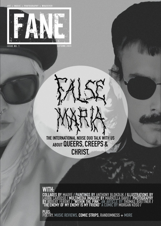
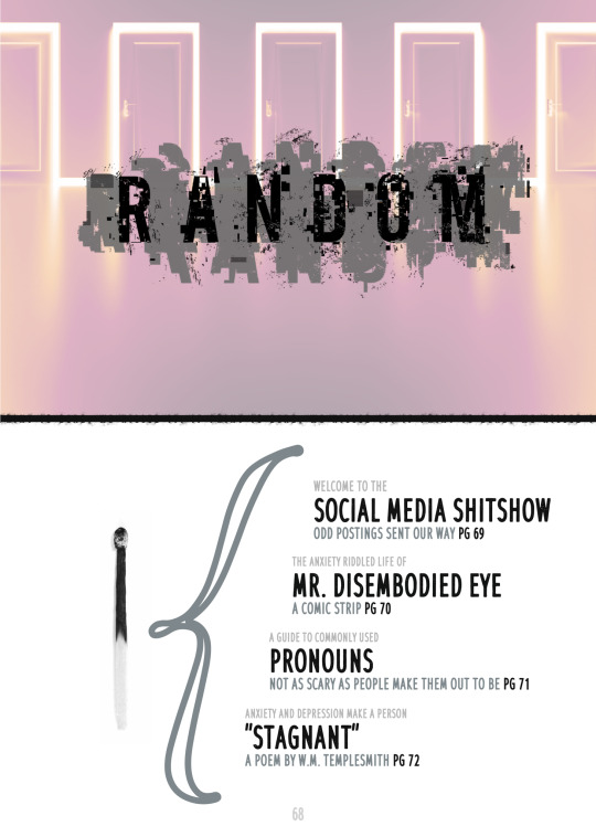
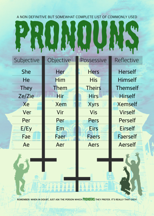
Here are some visuals from Issue 1 to give you an idea of what the overall “vibe” of the zine is. The full issue can be downloaded for free from FANEmag.com


Asked & Answered:
* Hey! What does the name FANE mean/stand for?
It’s a noun. It means a church or temple. I’m not a religious person, but the most spiritual I feel is when I’m submersed in the arts, hence the name choice. Major world religions aren’t exactly friendly to the LGBTQIA+ community, so the zine, in my head at least, is an alternate experience where people can find community, inspiration, and acceptance.
I’m a self deprecating sarcastic asshat too, so the fact it rhymes with “feign” as in “to feign interest in this boring zine” is absolutely intentional. As is the fact that it’s a four letter “F” word :)
* Who are you?
Hi, my name’s Rob, and I’m an alcoholic (recovering). I’m a married cisgendered gay white male who uses he/him pronouns living on the East Coast USA. I’m medicated for anxiety and depression, and I believe I may have undiagnosed ADHD and/or ASD. I’m an amateur creative that’s been doing the best I can for the last 30 or so years with zero professional training. I’ve put out a good chunk of experimental music, some of which is still available online (“Vermilion Sky” is my best if you go looking). I’ve also collaborated with other musicians, labels, etc. I’m currently working on histological and minimal photography, as well as graphic design and illustration (digital).
#Open Call#Submissions Wanted#FANE#LGBTQIA+#Transgender#Queer#Non-binary#Zine#Noise#Industrial#Experimental#Artists on Tumblr#Photographers on Tumblr#Writers on Tumblr#Musicians on Tumblr#POC#Mental Health#Reviews#Articles#Testimonials#Comic Strips#Gay#Illustators on Tumblr#Subculture#Outsider#Marginalized People#Youtube
12 notes
·
View notes
Text
Made a thing - anyone want a sampler/test print preview copy of the zine?

Sent some stuff off to mixam (UK) to see how they looked like in print versus just being on my screen, mostly came out really good. One of only three copies to exist - ordered one test zine & they sent me two extra copies. Got one copy plus some promo merch on ebay right now ... * eta: somebody incredibly cool actually bought it omg squee
[and an almost identical copy is on ko-fi or available to trade. *** message me if you're interested in trading **** ]
*(sorry this took a ridiculously long time for me to finish writing and uploading all the images thanks to exhaustion & shitty internet - the ebay copy'll probably have sold by the time you see this post / it escapes being stuck in drafts, and I still haven't added image descriptions.)
...with not quite world wide postage via ebay's Global Shipping Programme, I'm keeping the best quality one & was thinking of doing a giveaway of the other* when I finally write the review of mixam's print quality I promised months ago, unless anyone wants to trade? - fake edit: *scratch that, copy #2 of #3 is now up in my ko-fi shop & I'll probably stick it on etsy, now I've seen people are actually interested in the ebay copy.(eta: somebody incredibly cool actually bought it omg squee)
https://ko-fi.com/s/483109b440 *** message me if you want to trade **** copy #2 has the same content as #3 shown below, just slightly different margin/bleed printing & Copy #2 of #3 written on the front cover. - it's 44 pages of a couple of articles and extracts of bits of issues 1 & two plus spreads from possible future issues (mostly graphics) inc. rough drafts etc.

Thoughts Of You a Dennis Wilson fanzine Mixam Zine test print no #1 Sept Nov 2023 Stapled, bleed recycled silk 130 GSM 44 pages #1 of 1 #3 of 3 by Jenna Appleseed (me)
https://www.ebay.co.uk/itm/226162925472 includes coverage of virtual zine fests, inc KC Zine Con; earlier issue's cover art; collages by Valarie Simadis; zine promo; being featured on De_ziners instagram; Dennis performing Angel Come Home on The Midnight Special; a Dennis t-shirt, a Dennis song recommendation from The Horrors & tributes and art by Gino Dal Cin. Some of this is reprinted from pdf issues 1 & 2 and/or going to reappear in a proper print issue/future digital zine, revised/updated or with a better layout.
Colours are richer in print than they look in the photos. (it's impossible to get decent photos without glare or off colours) Promo stuff:

sticker is a 10cm x 3.3cm vinyl sticker showing the fanzine logo/header with a white border. (done with a stickermule discount before I realised they were as dodgy as fuck, sorry.)
Business cards are printed by Moo on card made from recycled cotton t-shirts & have three different designs on the front & fanzine info on the back.
Designs are: the zine logo, issue one's front cover, and a photo of a silver heart trinket engraved with Forever.
Three million photos showing all pages incoming, click keep reading to see them: One or two pics are NSFW for swearing


10 page feature from issue 2 about virtual zine fests inc. KC Zine Con & zine merch. (lots of trash pandas reading zines).

Two variations of a layout with a song recommendation from The Horrors, one'll end up in a zine when I work out which looks best. (background taken from the cover art for their album Skying)

A couple of Dennis image edits/layer blends & layout I designed. (these'll probably eventually appear in a proper finished zine)

Collages by Valarie Simadis from pdf issue 2. (background added by me from a stock illustration).

Zine links page & call for submissions /promo art - also from digital issue 2.

Two page feature on being featured on De_ziners instagram (from pdf issue 2)

Preview of a double page spread layout/graphic design/digital art/image editing for a future zine feature / themed issue on Dennis singing Angel Come Home on The Midnight Special.

Another couple of pages with added swearing - just need to make the text make sense and write the bloody rest of it.

Another double page spread layout design with a pull quote and a digital collage/image manipulation of Dennis singing Angel Come Home.

Page layout design experiments for Pacific Ocean Blue & Bambu that may eventually appear in a zine.

Double page spread of my photo of Dennis & Venice Surf (Dennis tee's from Bathroom Wall & Venice Surf tee was from Pep & Co at Poundland) - extract from an unofficial t-shirts feature in pdf issue 1.

Two different heart themed page designs from two different features in pdf issue 1.

A couple of digital collages/image manipulations based around Dennis' performance of Angel Come Home on The Midnight Special + lyrics from the Manic Street Preachers song You're Tender & Your Tired, that just seemed to fit so fucking well.) Probably need to rework/improve one of them if/before including in an actual issue.

Double page spread with a quote on the song + a screenshot of Dennis from youtube. (needs a little bit of tweaking before it's ready for a finished zine)

Sample credits page from issue one about Forever inspired art by Gino Dal Cin, & a sarcastic fanzine promo graphic I made.

Two versions of the same page so I could see how much of a difference the image resolution actually makes (remade the second one from the original photo - the higher res really does make it look better quality when printed) - the dpi notes won't be on the finished version (fucked up and had to replace a page in the files I'm sending to mixam to print a real physical issue one of the zine cos I got so used to having the dpi note over a lower res graphic I accidentally forgot it wasn't permanently meant to be there).

So i'm goin' away but not forever"
Back cover art by Gino Dal Cin, blue & silver (& pink) star background from a scrapbooking site.
#zine updates#mixam#zine printing#fanzines#zines#Dennis Wilson#for sale#ebay#shameless plug#trash pandas reading zines#kc zine con#ok who keeps turning off the internet?#apologies for the lack of image descriptions i'll try and add them later
2 notes
·
View notes
Text
60 Years of Doctor Who Anniversary Marathon - Davison 9th Review
Skaro: 20 Years of Time Travel Reviews - Fanzine
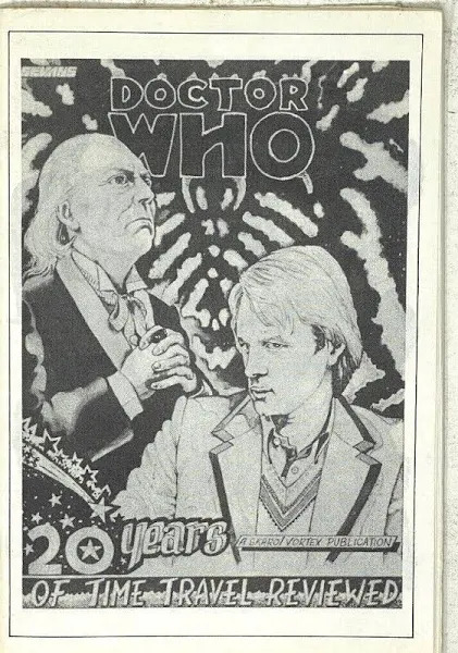
So what is a fanzine?
A fanzine is a fan published magazine.
Before the days of the internet, chat rooms, e-mails, forums, blogs, and social media, there was fan clubs, news letters, charity publications, and magazines. The fanzine was the primary way to share opinions, analyzes, fandom news, fan fiction, and fan art.
There have been several Doctor Who themed fanzines through out the decades; hundreds even. Skaro was one of the more professional looking ones that came out during the early 80s, and had connections with a fairly large fan club called the Doctor Who Appreciation Society.
While Skaro is no longer in print, the DWAS is still going and even publishes a different fanzine today... albeit digitally now. http://www.dwasonline.co.uk/

As for today’s issue, I manged to grab a copy off of ebay for eight bucks, and it came with a bonus issue as well.
Each are about 8 by 5 inches, printed on thick matte paper, and are all in black in white. Despite being held together by obvious staples, each zine looks and feels more like a thin cover-less paperback than what you would think of as a magazine on a store shelf today.
As for the contents of the zine, this special 20th anniversary issue features reviews of each season up to that point by 20 different fans.
It seems rather pointless to review a bunch of other reviews however, so I will just point out two things.
First, the print and layout of the various articles and production photos was very well handled, easy to read, and pleasing to the the eye. Outside of the occasional typo and one or two tiny printing mistakes, I can see why this particular fanzine is well remembered in fandom.
The second matter, and perhaps my only real criticism of the issue, is that while by and large most of the reviews are full of love of the show, one or two reviewers couldn’t seem to stop nagging on the then current era.
I mean it’s an anniversary special for goodness' sake! You’re telling me you couldn’t find a single fan in all of the UK who enjoyed season 18 enough to write a positive review of it?
I’m fine with people voicing dissenting opinions, but there’s other times and places for that. Not at the anniversary celebration though.
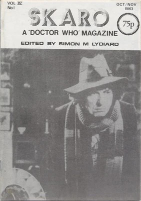
The next issue gives a look at what the magazine normally featured and I gave it a quick glace through.
We start off with an introduction by the editor and some legal copy-write disclaimers and footnotes. Then comes an assortment of fan letters talking about fandom things, the DWAS, and expressing general appreciation for the magazine.
Following from that we get an article from a fan gushing over the Brigadier and how awesome his BrOTP with the Doctor is. Then we’re treated to more reviews, this time of three individual episodes from season 13. While the next submission is a more heady piece of intellectual analysis discussing gray morality in the series as a whole.
We also get treated with some fan art and the third part of a three part story featuring Nyssa and the Doctor. Sadly, I shall not bother reading this particular fan fic as I have no way of obtaining the rest of it.
After that we get a particularly whiny bitch complaining about Doctor Who ‘catering to Americans too much’ because JNT dared to make the next companion from the US and had the gall to advertise the show to overseas markets! Yes, how dare a TV producer do his job! Worst Show-runner Ever!
Moving past that outdated unpleasantness, we come to the ‘advertising’ portion of the issue, which is just listing previous issues and talking about what to expect in the next.
We end the zine on yet another fan pointlessly complaining about JNT and how ‘the show is not as good at it used to be’, and finally the most interesting piece in the entire publication, an actual interview with the then editor of the official Doctor Who Magazine and one of the professional Doctor Who comic artists. Out of everything here, I’m most likely to go back and properly re-read that instead of just speed reading it.
So is the Skaro fanzine something worth getting?
Not really.
There’s a certain amount of novelty in reading a fanwork that is physically older than you are. It’s like uncovering a time capsule. But, nothing therein isn’t anything you haven’t heard before elsewhere on the web.
The most unique things here, the ones really worth preserving are the fanfictions and you can’t even read the entire thing in a single issue. And issues can run ridiculously high, most averaging around $25 and some going up to even $50.
Unless you’re a collector of fanzines specifically, it’s not really worth it. I lucked out on finding two issues for ten bucks (once you count shipping), and honestly I wouldn’t pay much more than five dollars for an issues anyways.
6 notes
·
View notes
Text

Welcome to SRI SAI ENTERPRISES
We do Bulk Document & Photo’s Digital Scanning / Bulk Legal Document & Study Materials Digital Color / Black & White Printing with Bulk Hard Binding / Perfect Glue Binding / Spiral Binding.
ABOUT US:
SRI SAI ENTERPRISES is a Bangalore based firm dealing with Digital Bulk Hard Copy to Soft Copy, Digital Bulk Xerox, Digital Bulk Color & B/w Printing, Bulk Perfect Glue Binding / Hard Binding & Spiral Binding, Bulk PVC ID Card’s Printing Services & also we do Bulk Digital Study Materials Printing & Bulk Digital Legal documents printing.
We have emerged into the domain to prove how passionate we are about what we do to provide 100% satisfaction to our customers. We are committed to providing a High Quality Bulk Digital Printing / Xerox / Scanning experience at affordable price to our customers, which is why, lot of our customers are happy and satisfied with our services and are our permanent customers. We ensure to provide the best services with 100% clarity & quality.
Mission:
To serve our clients efficiently, cost effectively and fulfilling the end user requirements through our prompt Digital Xerox / Printing / Scanning / Spiral Binding / Hard Binding & Perfect Glue Binding services.
Our philosophy and our success are based upon treating and maintaining long-term business relationship with our customers.
Our customers are also experiencing our services through Online & Offline booking for printing.
We have built an active and extensive online & offline store that sparks much of our innovation – we are always finding new ways to engage with our customers. We look forward for positive customer satisfaction in every order we go through because our motto is “CUSTOMER SATISFACTION”, so stop wandering and begin exploring with us for printing services at SRI SAI ENTERPRISES.
If you would like to know more about our customer satisfaction Reviews & Ratings, then go through at
Like Share and subscribe to my YouTube Channel @srisaienterprises1
SRI SAI ENTERPRISES
Purushotham G
No. 346, 11th “A” Cross, 14th main, J P Nagar, 2nd Phase,Bangalore–560078, Karnataka, India.
Mobile: + 91 - 9739289295 / 080 - 26582233.
Land Mark : VET College.
Email - [email protected] / [email protected]
Website: www.srisaipurushotham.wix.com/raghu
Youtube account - https://youtube.com/@SRISAIENTERPRISES1
Channel id - UCl2o4E5fGXwdqBFAm6F74Zg
Google Feedback & Review - https://g.page/sri-sai-enterprises-karnataka/review?gm
Subscribe to Youtube Channel - https://youtube.com/@SRISAIENTERPRISES1
2 notes
·
View notes