#didier faustino
Explore tagged Tumblr posts
Text

‘love me tender’ chair
design by didier faustino
1 note
·
View note
Photo

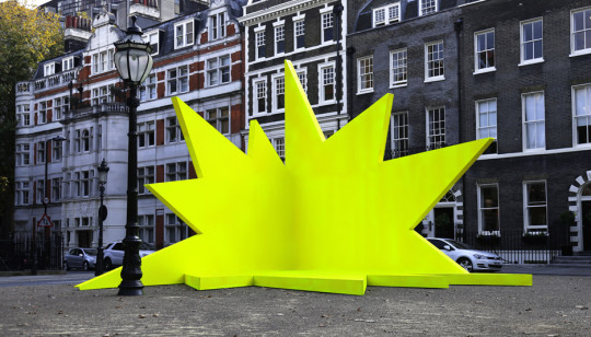
Didier Fiuza Faustino / Double Happiness / 2009 / Image © Didier Fiuza Faustino and Michel Rein / via MoMA / Tocho T8
0 notes
Text

Didier Fiúza Faustino
Les Jetées, 2012
Photo: Bérénice Serra
287 notes
·
View notes
Photo

Didier Faustino (pictured here: "This is Not a Love Song," 2014, Meudon, France) is a 2015 Graham Foundation individual grant recipient. The latest iteration is now accepting grant applications. Image: Graham Foundation.
189 notes
·
View notes
Photo

Les Jetées by Didier Fiúza Faustino https://thisispaper.com/mag/les-jetees-didier-fiuza-faustino
75 notes
·
View notes
Text
Aluminium shutters create "defensive" facade for Portuguese housing block

Architecture studio Bureau des Mésarchitecture has completed an apartment block in Leiria, Portugal, wrapped in concrete and gold aluminium shutters. Situated on a corner site where the old and new neighbourhoods of Leiria meet, the block of five apartments is connected to an existing, yellow-painted 20th century house, which was renovated and converted into two additional apartments as part of the project. Lisbon and Paris-based Bureau des Mésarchitecture looked to balance these two distinct conditions, drawing on the yellow-painted exterior of the existing building to inform a curved facade of pale concrete with golden aluminium.

Bureau des Mésarchitecture has completed an apartment block in Leiria"The site is at the articulation of two neighbourhoods with different urban fabric – the old part of the city with one to two storeys buildings and a new area, under development, with 4 storeys or more buildings," the studio's founder Didier Fiúza Faustino told Dezeen. "There were two main ideas for the project: designing a housing building with a defensive facade and a soft interior, designing a facade that can be totally closed or totally open," he added. "The concept can be resumed in two words: protect and care."

The facade features shutters made from exposed concrete and gold aluminiumThe housing block sits atop a gold-panelled base leading to a garage dug into the gently sloping site, with a staircase on the southern street leading up to the entrance. Positioned where the old and new buildings meet, this entrance leads into a central stair and lift core alongside a communal room. The fan-shaped plan of the new building has been used to organise the kitchens and bathrooms at its centre, with the semicircular front of the block used to provide each floor's apartments with large, well-lit living areas.

Red accents enliven social housing block on triangular plot in Barcelona
Each of these spaces opens onto small balconies, while the uppermost apartments have access to a private rooftop terrace via a gold spiral staircase. The large windows of the living areas and their balconies can be completely opened or closed to the street via the exterior's bifold aluminium shutters, which are contrasted by solid areas of exposed concrete.

Large windows draw light into the apartments' living spaces"We chose the materials to express the duality of roughness and softness, of mass and lightness," explained Faustino. "Concrete could give this sense of tectonic mass," he continued. "Aluminium, on the contrary, feels thin and light. Both materials also play a game of contrast between the matt appearance of the concrete panels and the shiny reflection of the sunlight on the aluminium shutters."

A private rooftop terrace is accessed via a gold spiral staircaseThis duality has been carried through to the apartment interiors, where a structure of exposed concrete columns and beams is contrasted by areas of full-height wooden panelling and storage. Elsewhere in Leiria, Portuguese studio Contaminar recently completed a home at the city's highest point, using stacked concrete layers to create 360-degree views over the landscape. The photography is by Francisco Nogueir. Read the full article
0 notes
Text
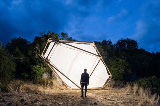
2016 | A Home is not a Hole :: Didier Faustino
1 note
·
View note
Photo


Night fever 6: Hospitality design by Angel Trinidad, Ana Martins, Lauren Teague, Jeanne Tan, 2019
This book represents beautiful modern hospitality designs and it gave me a clear understanding of how pattern can be applied indoors. My favourite project from this book was a fully developed design from scratch for Mean Noodles. This project is inspired my Malaysian Batik, which a popular art style with floral and leaf depictions. This project is an example of how nature can be brought indoors. This bulky concrete space feels airy and fresh due to the consistent use of leaf shapes and forest green. I like the use of the pattern on the steps. It invites the visitors into a natural world and demonstrates the atmosphere of the space.
I also enjoyed reading an interview about colour with Didier Faustino. He says that colour is very powerful and it can set a tone and pace of a space. It can make people feel good or disgusted. When designing a project, you need to clearly state what feel you want to bring and pick your colour palette from there. Colour isn't a decorative element, “colour is the text” says Didier. He sees the use of colour, when it goes beyond trends and feels timeless.
0 notes
Photo
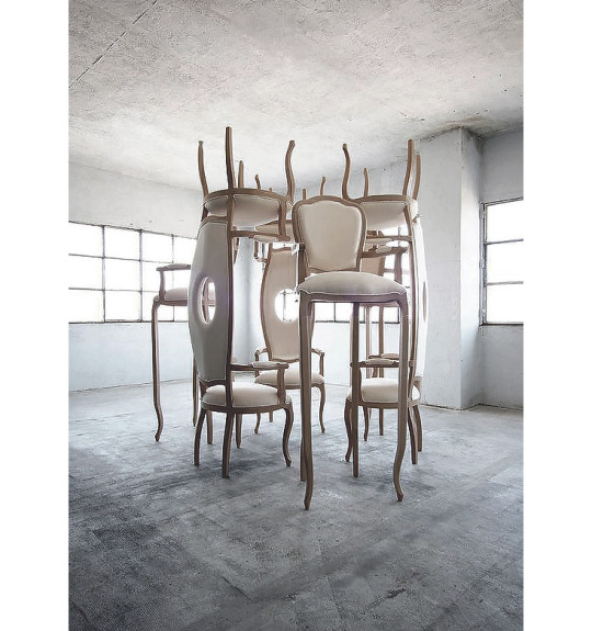

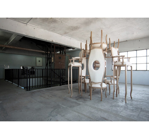
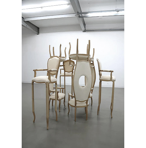
DIDIER FAUSTINO
#didier faustino#furniture#furniture design#furniture art#furniture designer#design#surreal#surrealism#illusion#sophie gunnol#gunnol#art collection#art curator#art community#contemporary art#contemporary design#museum#chair#chairs#installation#installation art#sculpture#woodworking
208 notes
·
View notes
Photo
5 notes
·
View notes
Photo

The Unbearable Lightness of Being - Didier Faustino | Mésarchitectures
230 notes
·
View notes
Text
instagram
Didier Faustino
11 notes
·
View notes


