We explore Design, Travel Architecture, DIY, Life Hacks and Self-Care. Day-to-day we design custom furniture and organise homes | E: [email protected]
Don't wanna be here? Send us removal request.
Text
A Cleverly Curated Apartment Full of Calm


Hej kompisar! Welcome to your mid-week breath of fresh air—and a masterclass in creating a sitting room and bedroom in one! This light and airy 51-square-metre (549-square-foot) apartment in Gothenburg has been beautifully curated in a soothing palette of white, cream, amber and brown to create a calming oasis in the heart of the city.The main living area seamlessly combines a cosy social zone, a home office, and a sleep space—all while maintaining a wonderful sense of serenity. And guess what? There's even plenty of storage! The spacious kitchen is another highlight, with just the right amount of warm wood.While it’s undeniably styled and curated, there’s still plenty of inspiration to take from this delightful Swedish apartment. Välkommen in!


The bedroom area is tucked into a small alcove off the sitting room. For added privacy—or simply to avoid making your bed every day!—you could hang a curtain. Don’t have an alcove like this? No problem! A wrap-around curtain or canopy can also help define a bedroom space and create a cosy feel. There’s a great example of this in this Swedish apartment.


The wooden floor is likely the original from 1900, when the building was constructed. Many people choose to sand off the varnish and treat it with a special soap or wax for protection and a natural look. Of course, it helps that shoes are never worn inside a Swedish apartment—one of the secrets to keeping floors in such great condition!

I love the soft bedside table! Correct me if I am wrong, but I believe the lamp is actually from H&M Home (they do great lamps!).


What a great starting point! Now all that’s left is to add books, art, and all those personal treasures you’ve collected over the years to make it truly yours.What do you think of the bed solution? Would you have done it the same way? Personally, I find these smaller sleeping areas so cosy—there’s something wonderfully cocooning about them.You can see more sleep zones / smart bedroom zone areas in the small spaces archive - there are some really beautiful homes in there! Thank you for your warm wishes for my daughter (who is now back at school - yay!) and Per - who is hobbling around one of those boots (for the next 6 to 8 weeks) but also getting on with things. The sun is shining in Malmö today - so everything feels brighter! I hope the sun is shining where you are too. See you Friday, friends! Read the full article
0 notes
Link
0 notes
Link
0 notes
Text
Creating a beautiful table with aluminium trestlers

THER is a collection based design practice & brand, based in Lisbon, Portugal. Creating functional objects, furniture and household items, embracing material properties and craftsmanship values. Unique, Bespoke & Functional Objects! It were the Aluminium Trestles that caught my eye and I could easily imagine them on my dark oak kitchen floor with a mat black wooden table top. Looking further into the brand I found some images of exactly what I had in mind and I love to show them to you. At the end of this post you see more of the black chair ‘Askew’ which also comes in red eucalyptus and the beautiful ceramic jug, Visit THER to see more about the brand and their design.

U03 Trude / Between the sharp and plain, the language of material, comes through


U01 Askew Chair / Driven by branch and tree twist, the live-edge elements combined, form an object of rural resemblance


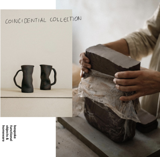
All images via Ther Read the full article
0 notes
Text
A Cosy Swedish Cottage with Stunning Sea Views


Happy Friday, friends! Got any fun plans for the weekend? I can’t help but think the owners of this charming Swedish cottage by the sea won’t be venturing far. Why would you, when you can snuggle up indoors, hide from the chill, and enjoy the most wonderful views over the Gothenburg archipelago from so many of the windows? It’s the perfect spot to sit, relax, and reflect!Anna, John, and their daughter Gunnevi found this little gem by the water and have lovingly transformed it into their dream family retreat. They’ve worked hard to expand the space while staying true to the authentic look and feel of the original cottage.On one end, they added a sunroom to soak in the light and those breathtaking views. On the other, they extended the house with an entrance, a new kitchen, and a dining area. To bring it all together, they decorated with delightful nods to the cottage’s West Coast roots, as well as incorporating warm earthy tones in ochre and green that radiate cosiness.The furnishings are a delightful mix of vintage treasures, each chosen with comfort and practicality in mind, enhancing the timeless charm of the traditional cottage. Ready to take a closer look at Villa Valborg? Let’s start with a picture of the original cottage, so you can follow the family’s inspiring journey of transformation. I hope it sparks your imagination!


How wonderful! It's a dream of mine to live in a lovely cottage by the sea like this one day. Could you imagine relaxing here too? I love the green and ochre combination too - it's a tone that we are seeing everywhere right now. But most of all, for me this cottage is all about the cosy feel and the incredible vistas. Is there anything that stands out to you about Villa Valborg - or perhaps a detail I have missed? You can see more pictures as well as some behind-the-scene footage from the renovation over at @villa.valborg. Shall we take this opportunity to look at a few more cottages by the sea? I love: And with that, I'll leave you to have a wonderful weekend! See you Monday friends! Read the full article
0 notes
Link
0 notes
Text
17 Black and White Bathroom Ideas for a Contrasting Effect
Designing a black and white bathroom is a popular choice for renovations, helping to modernize the house and create a more modern bathroom appearance. However, there are endless options and styles to choose from, which can quickly become overwhelming and make an already large undertaking seem that much bigger. To make the task of finding inspiration just a bit easier, you can find the most inspiring black-and-white bathroom ideas in the list below to get that custom look you’ve been dreaming of.
Make White Tiles Pop With Black Grout and a Black Ceiling
This bathroom uses a combination of different titles for a unique visual texture. Vertical white subway tile and much smaller square tile both use dark grout, resulting in a cohesive appearance. The large, rimless mirror strengthens the sleek look of the room, while the two-faucet sink mimics the style of a double vanity without the extra bulk. Silver plumbing and natural wood and brown accents complete the look.

Styled by Lotta Agaton Interiors for Esny
Bring Visual Texture into the Space by Blending Tile Patterns
Similarly to the previous photo, this bathroom pairs two different tiles for a chic visual appeal. The black hexagonal tile floor and herringbone tile walls with their contrasting grout create a unique black-and-white bathroom design. Black shower hardware, interesting decor pieces, and fluffy white towels decorate the space while pairing well with the warm wood finish of the vanity.

styled by Linnéa H. Manaberi, photographed by Frederik J Karlsson for Bjurfors
Create a Dramatic Bathroom With Black Walls and White Cabinets
This dark and moody black and white bathroom incorporates multiple different materials in its design. Dark wood and exposed beams along the roof mirror the rich wood flooring. The uncommon elongated black tile and dark grout provide a dramatic contrast to the bright white vanity that’s wall-mounted to create a floating effect. Long pull handles on the cabinets also serve to pique interest, especially when combined with the uniquely designed mirror and elegant lighting.

via Vipp
Embrace a Classic Look With Checkerboard Flooring and Dark Wood Accents
A black-and-white color scheme can help a small bathroom make a big impact. White tiles line the walls, creating a classic style that’s only enhanced by the checkerboard floor. The white sink and shower curtain are balanced well by the black storage cabinet, and the white toilet with a black lid is the perfect bridge between the two. Silver hardware throughout is the right choice for this space, as is the glass divider separating the shower area from the rest of the room.

via Entrance Makleri
Make a Bold Statement With Unique Black and White Tile Throughout the Room
This bold master bathroom is bursting with personality and is a perfect example of how patterns can be used for a unique and dramatic effect. By continuing the design from the floor and along the walls surrounding the bathtub, the eye is immediately drawn to this area as the focal point. Solid black paint on the adjacent wall creates contrast with the pattern without distracting from it or disturbing the theme. The unique decorative chair is an excellent finishing touch for this bathroom.

via File under Pop
Pair White Walls and Ceiling With Black Floor Tile, Trim, and Cabinetry
For a more modern space, try blending different shapes, patterns, and materials within the same bathroom. This example photo uses square white tiles, hexagonal floor tile, a round mirror, and an abstract rug to make a visually appealing bathroom. Black trim and cabinetry tie in well with the flooring, allowing the room to feel more balanced overall. A few accessories in a new color can bring in an interesting pop or two like the subtle copper tones do here.

via Entrance Makleri
Place a Checkerboard Floor, Black Curtain, and Subtle Black Accents in a Solid White Bathroom
Classic white subway tile is an effective tool to brighten a small bathroom with limited lighting. This photo shows how this black and white bathroom packs a lot into minimal square footage, using black accents to provide contrast and depth into the room and prevent the white from becoming overpowering. The custom shower unit also creates an air of originality, as does the creative placement of the faucet on the vanity.

Styled by Lindholm Design, photographed by Therese Jahnson for Historiska Hem
Use Brass Accents to Bring an Air of Luxury to Your Black and White Bathroom
Similar in style to some of our previous modern black-and-white bathroom ideas, this photo example uses a combination of black hexagonal floor tile and white walls as the base for the space. However, it then builds upon this look for a more custom appearance by using brass hardware throughout. The almost vintage feel of these items transforms this space from a standard black and white bathroom to a stunning room that will stand the test of time.

via Alvhem
Combine Modern and Retro Design Style to Create a Space Unique to Your Home
This bathroom with black marble floor tiles and white walls showcases incredible natural lighting and a freestanding tub perfect for a long, relaxing bath. Light natural wood accents and plant life help to make a refreshing bathroom that anyone will enjoy spending time in. The section of plain white paint along the top of the walls is a great touch, serving as a transition area from the tiles to the ceiling.

Styled by Bon Interior, photographed by Maria Sahlander, for sale via Bjurfors
Show Off Your Personality With Boldly Patterned Tiles and a Stunning Black Sink
Your black-and-white bathroom doesn’t have to be formulaic in its design. A fun and funky tile floor or walls can make all the difference. This photo example shows a one-of-a-kind dotted tile covering the walls and a stunning black sink used as both an accent piece and an anchor for the space. Though this look works extremely well in a half bath or powder room setup, it can be even more remarkable in a larger bathroom with a black tub or shower to match.

via File under Pop
Lean Into Simplicity With a Black and White Bathroom and Laundry Room Combo
This sleek black and white bathroom combines many of the design elements we’ve seen so far. That being said, unlike the other ideas, this example photo tackles the added complication of designing a bathroom that also has a laundry area included. Fortunately, a black-and-white bathroom palette can easily handle this challenge. Gray and light tan accents work well in this bathroom, and a mirror with a built-in medicine cabinet can help with storage.

via Entrance Makleri
Make Your All-White Bathroom Pop With Minimal Touches of Black
This master bathroom also follows the trend of hexagonal black tile on the floor and white square tile on the walls but with a decently sized bathtub with a built-in shower. Multiple recessed shelves keep everything that’s frequently used within easy reach, creating a relaxing place to unwind in the bath after a long and stressful day. Read the full article
0 notes
Link
0 notes
Text
my scandinavian home: From Dated to Dreamy: Jennie-Ann's Swedish Farmhouse Renovation

One of the things I’ve always marvelled at is just how great my Swedish friends are at DIY. There’s no task too daunting for them (although, thankfully, they’ll call in an expert for electrics!). It certainly helps that absolutely everyone learns how to sew, work with wood, and generally run a home (even budgeting!) at school. But anything that hasn’t been covered "can be conquered with the help of YouTube" (or so they tell me!).Jennie-Ann is a prime example of this. She and her partner have lovingly transformed an old Swedish farmhouse in Larv, taking it from a dated and rundown building to a beautiful home that stays true to its original character. Jennie-Ann is also the founder of Lin & Lera, which includes an onsite boutique offering everything you might need to renovate your home sustainably, a salvage yard, and workshops to help with every aspect of updating and caring for your home and garden.If the beautiful natural materials, colours, and details in Jennie-Ann’s home are anything to go by, I think the farm could be well worth a visit if we're ever passing by! In the meantime, let’s appreciate her beautiful and unique house. First, let me just give you a glimpse of how the kitchen looked before they started. It’s a great marker to see just how much they’ve accomplished since moving in.

Are you ready to see the results? Varsågod:


Note that the lower kitchen cabinets were salvaged from the original kitchen. Jennie-Ann sells an array of earthy-toned linseed oil paint colours in her boutique - many of which feature throughout her home. She is also a pro at making her only paint colours from clay!

Look extra carefully at the details and you'll spot traditional Swedish pendant lamps, tables and rugs.


Mid-blue and ochre make for a beautiful combination and create a calm feel in the bedroom.


The bathroom is potentially my favourite room of all - it's filled with nostalgia while also providing all the modern amenities you need to feel comfortable.

Needless to say, locals flock to Lin & Lera to discover what's in store - and for exciting events. I hope I can be a part of the crowd one day!


Keep an eye on Lin & Lera for one of Jennie-Ann's upcoming workshops (sometimes held in the barn seen below) which include themes such as 'how to make your own colour from clay', 'how to cultivate your own forest garden' and 'basic courses in window renovation' as well as many more!

Truly inspiring! Does this give you the boost you need to get a paint brush out or dabble in a little DIY this weekend? Feel inspired by Jenni-Ann's latest renovation projects over at @lin.o.lera and find out more about her boutique and workshops here. Wishing you all a great Wednesday! Read the full article
0 notes
Text
Steal This Look: Designer Rose Uniacke’s Serene and Airy Office Kitchen
This week we’re revisiting our favorite stories from 2024, like this one: In her latest book, English designer Rose Uniacke reveals the updated interiors of her 1860 property in central London’s Pimlico area. The kitchen, unsurprisingly, is at once homely and monastic chic, decorated with carefully selected antiques and an artful layout. Her kitchen/dining room stands out, with original plaster walls, rare Swedish furniture, and a custom curtained kitchen. Here we profile a few of the details that make up the look.

Above: The kitchen is smartly divided using custom drapery. Photograph by Francois Halard from Rose Uniacke at Work (see also our post: Required Reading: Rose Uniacke at Work).

Above: A closer look at the kitchen, where an oak surround frames the sink and splashback. Photograph by Francois Halard from Rose Uniacke at Work, as featured in our post: Required Reading: Rose Uniacke at Work.
Materials

Above: Mimic the natural plaster pink walls with Bauwerk Colour’s Limewash Paint in Charlottenburg. For more on limewash paint, see Remodeling 101: Everything You Need to Know About Limewash Paint and DIY Project: Limewashed Walls for Modern Times.
Fixtures & Appliances

Above: For a similar faucet, the Barber Wilsons & Co. Regent 1040 1890s Style Faucet (R1040-1890) is $3,420 at Quality Bath.

Above: The Gaggenau Induction Hob with Integrated Hook (CV282101) is available through Gaggenau dealers.
Lighting & Furniture

Above: Vintage Charlotte Perriand CP1 Wall Sconces from the 1970s can be found for $1,300 per piece at Gallery L7.

Above: The table lamp on the cupboard is by Jos Devriendt. The Night and Day 246 Lamp at left is available through Demisch Danant.

Above: Uniacke chose dining furniture designed by Swedish maker Axel Einar Hjorth. The Utö Dining Table in pine was manufactured by Nordiska Kompaniet in 1932. The table can be found through online auction houses such as Phillips and for sale at The Expert.

Above: Axel Einar Hjorth Utö Dining Chairs to complement the table, also from the 1930s, are available at 1stDibs and elsewhere online.

Above: Similar rattan chairs can be sourced widely online. Atelier Vime in Provence offers a slew of vintage options: Shown here is the Georges Coslin Vintage Rattan Set. On the low end, there’s the Monet High Back Antique Lounge Chair from Scout & Nimble, currently on sale for $620.
Accessories

Above: To source quality fabric for curtains of all sizes, East London Cloth’s Elderfield Vellum is an example of some of their fabric available by the meter; $72 per meter. For more, see our post: East London Cloth: Purveyors of Household Linens, Made to Last.

Above: For a simple, easy-to-source cast iron teapot, The Republic of Tea’s Simplicity Iron Teapot is $65.99.

Above: For something akin to the fluted white vase on the table, the Large Fountain Vase is $179 from Ferm Living. For more from designer Rose Uniacke, see our posts: - A New, Natural Paint Line from Rose Uniacke in Shades of Pale - Object of Desire: A Minimal-Luxe Water Carafe and Glasses from Rose Uniacke in London - To the Manor Born: Luxury and Elegance in a Restored 18th-Century Home - Among the Orchids: Designer Rose Uniacke at Home in London N.B.: This story originally ran on January 2, 2024 and has been updated with new products, links, and pricing. Read the full article
0 notes
Text
Interior Trends 2025 and how to achieve them at home

Back from a short break I start with wishing you all the best for the new year. I was a bit in my own bubble, reflecting on the last year and looking into 2025, the new fair season, travels and restyling my home. In my previous article I wrote about how Mocha Mousse, Pantone’s colour of the year 2025 adds a warm touch to our homes and how it can achieved with paint and rugs. Looking at the beautiful images of Tapis studio I realized I love that vibe, they also reminded me of the beautiful modernist masterpiece – Villa Borsani at Alcova 2024 Following up this recent post about creating a cozy atmosphere at home with Mocha Mousse, I’d like to share more about the trends shaping living rooms in 2025. One thing is very clear! This year, interiors continue to celebrate comfort, character, and individuality.

Nostalgia Meets Modernity
One standout trend is the fusion of vintage and retro styles with modern design. Imagine bold ‘70s colors, the clean lines of mid-century modern, or even subtle nods to the ‘90s—each reimagined with a refined, contemporary twist. This mix of old and new creates a timeless space filled with personality, where nostalgia and modernity coexist in harmony. Comfort remains a top priority in 2025. Living rooms are designed as intimate retreats, offering a place to relax and recharge. Think deep, inviting sofas, plush fabrics, and warm textures that balance style with coziness. These spaces go beyond aesthetics to create a true sense of belonging. Adding to this is the rising appreciation for artisanal craftsmanship. Handwoven rugs, sculpted ceramics, and bespoke decor pieces bring authenticity and individuality to the home. Every handcrafted object tells a story, adding depth and a personal touch to your living space.

How to achieve the Look according to Hommes Studio
Designing a chic and timeless living room in 2025 starts with a statement vintage piece. Whether it’s a velvet sofa, a classic wooden sideboard, or an iconic mid-century chair, these standout items bring history and character to your space. Build around this foundation by adding contemporary accents to create balance and ensure the room feels fresh and modern. Comfort is key in 2025, and deep-seated sofas in tactile fabrics like bouclé, velvet, or linen add a luxurious and calming touch. These materials not only feel soft to the touch but also contribute to the inviting ambiance of a space designed for relaxation and unwinding. This year, handcrafted decor takes center stage. Artisanal pieces such as handwoven rugs, sculpted ceramics, or intricately carved objects add depth and individuality to your home. These unique items aren’t just decor—they’re conversation starters that bring authenticity and meaning to your living room. With a mix of vintage furniture, modern elements, and artisanal craftsmanship, you can design a living room that feels both thoughtful and warm. It’s about creating a space that reflects your personality while offering comfort and beauty. Hommes curated a selection of must-have pieces to help you embrace these trends for 2025, making it easier to create a living room that perfectly balances nostalgia and contemporary design. Find them here at their website


Images courtesy Hommes – Tapis Studio Read the full article
0 notes
Link
0 notes
Text
49 Clever DIY Organization Ideas for Your Home
Talking DIY organization ideas (for your home) today!
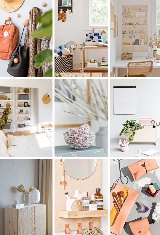
Over the break, I did a lot of organizing and reorganizing, and honestly it really cleared my mind. Sometimes you just need a clean slate to make the same old day-to-day feel new again. Or at least fresh…and clutter-free! So, I put together a whole lot of DIY organization ideas to get you started, if you need a little inspo for the season. Whether you’re on some deeper quest to gain control OR you really just want to organize your craft room, bedroom, bathroom, etc – this list has TONS of DIY organizing ideas! 49 of them to be exact. Bonus: Many of the projects (like most of them actually) utilize items you might already have in your home (or garage) that can be repurposed as something new. Creating more sustainable organizational systems, rather having to go out and buy a ton of bins, baskets, and storage things. Anyway, here are 49 home organization ideas that you can totally DIY – from clothing racks to hanging wall organizers, trays, decorative boxes, and jewelry stands!
49 DIY Organization Ideas for your Home
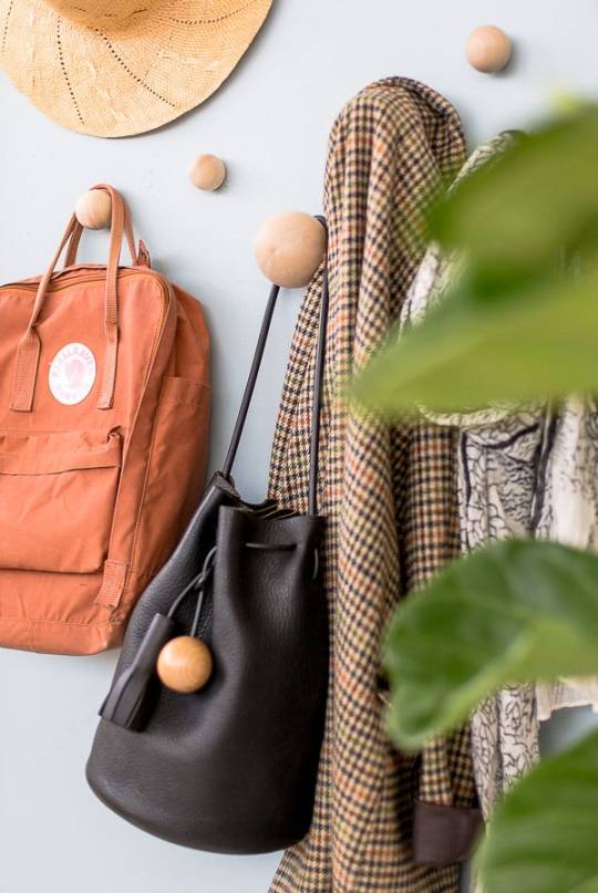
1. DIY wall hooks to organize your entryway (that don’t look like wall hooks). I love that these wall hooks just look like wood baubles on the wall when nothing is hanging on them. Kind of like jewelry for your walls. Plus, they’re great for tight spaces, since they don’t stick out very far.
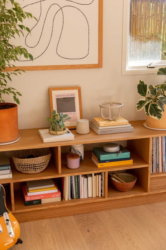
2. When it comes to organizing, there’s nothing better than a built in bookcase, for storing all of your extra housewares. This bookcase completely transformed this room. And helped us find a home for so many things that were previously in storage (or on the floor).
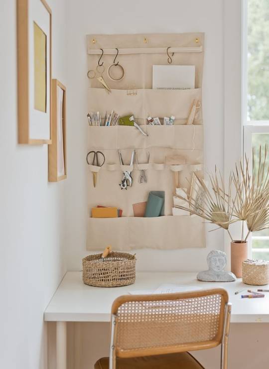
3. Need office organization? This DIY hanging wall organizer looks good AND keeps things organized – which can be a challenge in a craft room or office space. The thing I love most about this canvas organizer though is that you use it for so many other things too – from sorting mail to hanging hammers. I feel like this could work as a DIY closet organizer with a few modifications as well. Most recently, I started using mine in my son’s room as toy and book storage and it looks so cute! Bonus: You can customize the size of this wall organizer to suit your needs in any room of the house.
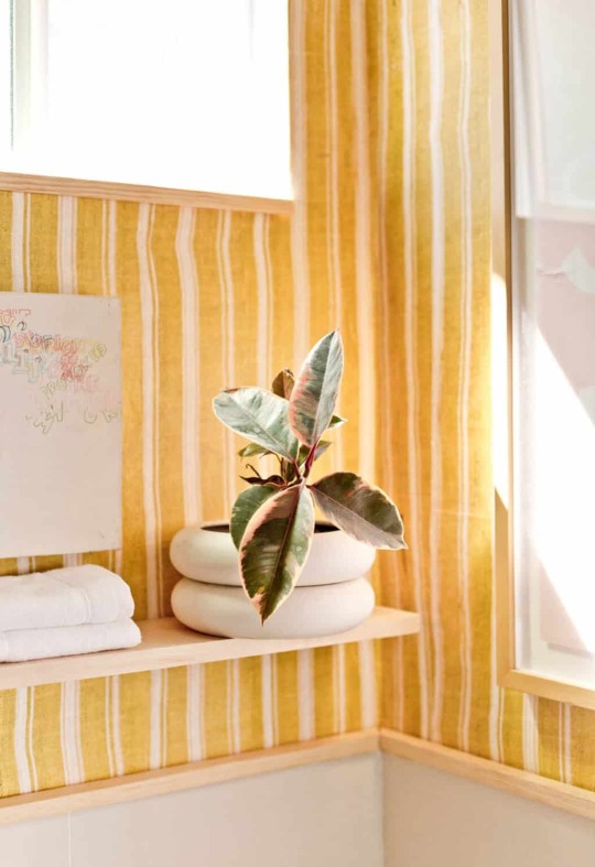
4. My yellow bathroom makeover has some clever little hacks for small spaces, including a way to make your own floating shelf in minutes!
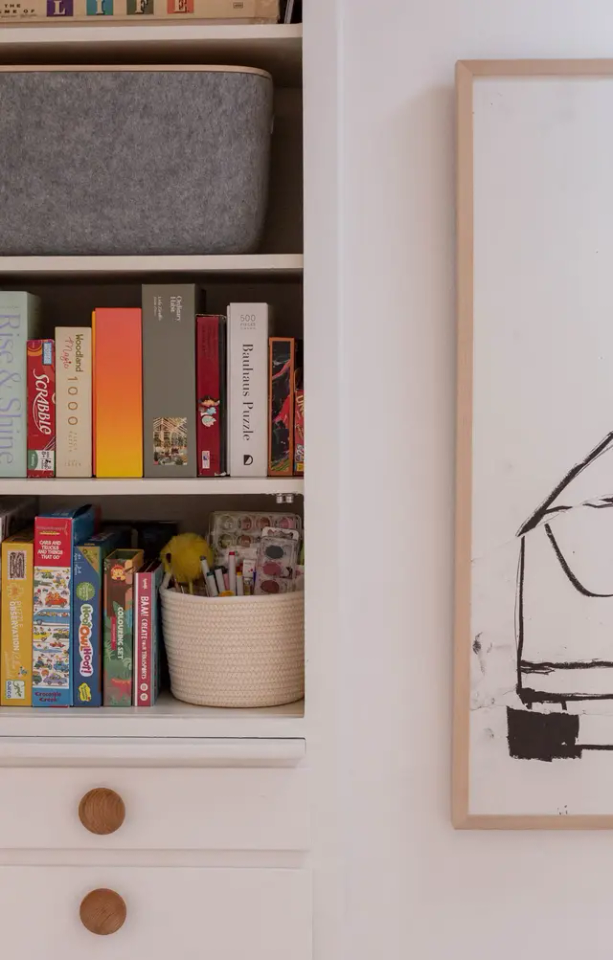
5. If you’re looking for hall closet organization, I broke down exactly how I organized my entire hall closet in one hour. You gotta see the before. It was not pretty.

6. And speaking of a closet organizer… This clothing rack DIY from Weekday Carnival is great for extra clothes that don’t fit in the closet. And it would be a good option for a guest bedroom without a closet as well.

7. A drawstring pouch is perfect for storing / organizing small items, like jewelry and craft supplies. I have a tutorial for it, if you wanna make your own.
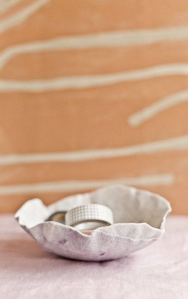
8. Will always include my DIY fabric paper mache bowls when talking about organizational ideas because they’re very easy to make, surprisingly very sturdy, and pretty unique.
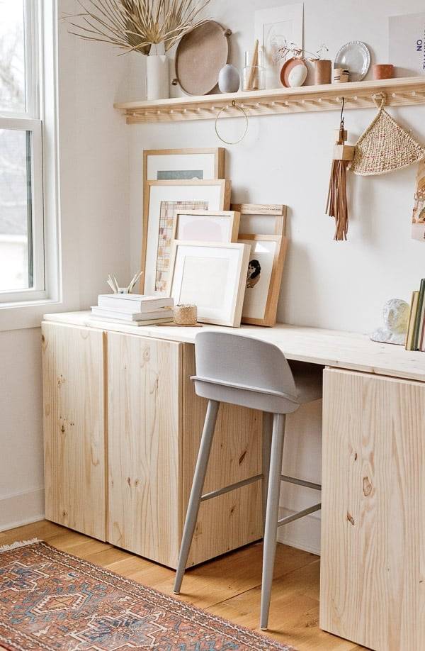
9. Maybe a DIY standing desk, with lots of storage, is more your thing? What I love most about this Ikea hack is the fact that the storage is closed, so you can be as messy as you want inside and no one will know. BUT of course, you’re not going to be messy….your going to be organized because that’s what this whole post in about. Right? Wink, wink!
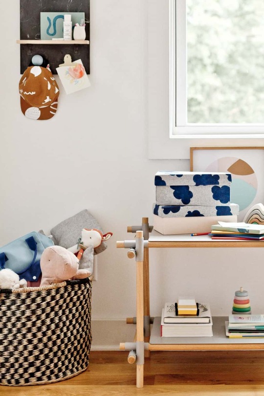
10. And speaking of keeping those cabinets organized, you can turn old shoe boxes into really cute fabric organizer boxes. I use these exact ones in my desk cabinets and they work so well for receipts, scissors, markers, and other small(ish) items.
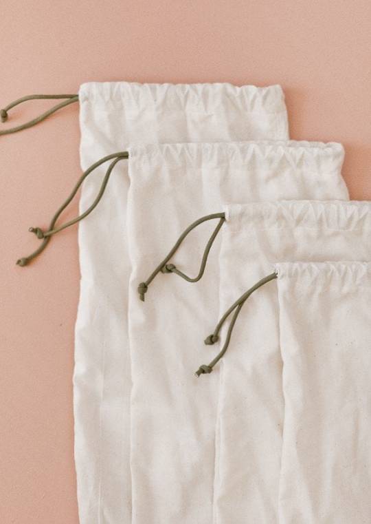
11. Reusable produce bags (these are another DIY idea) are handy for the grocery store, but you can also use that at home for pantry staples, closet organization, and more. Read the full article
11 notes
·
View notes
Text
A Home with Heart and History Awaits Its Next Chapter

When one of my darlings—a home I've featured—comes on the market, I feel an irresistible duty to let you know. Especially when it’s not just the house that’s up for grabs, but all the furniture too.Yes, you heard that right: Lynda Gardener is selling her beloved The White House in Daylesford. The dreamy property is a masterclass in understated elegance, with natural tones brought to life by the patina and stories of the individual vintage pieces Lynda has so lovingly sourced over time. Every room tells a tale, making it a one-of-a-kind home.And let’s not forget that beautiful garden room, the one I’ve been dreaming over since first laying eyes on it back in 2017. Now, imagine not just owning the home, but also having the chance to take it on with all its thoughtfully curated treasures. How wonderful?Whether you’re contemplating a move to Australia or simply looking for a dose of gorgeous interior inspiration to brighten your Friday, this home is sure to have something for each everyone of us. Some of these images might be familiar, others perhaps new, I hope you enjoy the tour all the same!


Lovely! I'll never tire of this home, and Lynda's unique style. I do love a garden room - what a perfect guesthouse. Is there anything that stood out to you? Shall we take a few more tours to round off the week? How about taking a peek inside: It's been great to be back blogging this week, I hope you've enjoyed all the tours.Before I sign off, I want to send all my love to everyone in LA. It’s truly devastating to witness the destruction from afar, and my thoughts are with all those affected—to those who have lost their homes and businesses and also the precious wildlife losing their habitats. Our thoughts are with you. Trevlig helg, Read the full article
0 notes
Text
Industrial minimalism | Frama Rivet Collection

No need to tell you I have always been attracted to metal. Years ago I mainly wrote about industrial and raw spaces, early readers will remember how we all swooned over the industrial home in concrete and steal by Johan Israelson. I experimented a lot with adding unusual metal objects to my styling, which I mainly found at antique and curiosa markets. It was my own style in which I often used zinc, sometimes I still come across a beautiful French roof decoration as I used. There are moments I regret selling it must confess. In the meantime, most of the objects, except for a few real treasures, have disappeared from my styling and home. You still see a lot of metal in my home though. Such as the beautiful shelves from Menuspace, which I get a question about almost every week. You can’t miss my metal cabinets, table and chairs by wdstck. I brought more brass into my home and in my styling, metal is also still present, in addition to ceramics and beautiful fabrics, but now a bit more polished using objects from my ever expanding Mad et Len collection.

Industrial minimalism | Frama Rivet Collection
Industrial minimalism is a term I used in the time I started decluttering my home from all the zink and slowly adopted a more minimalist approach while decorating my home. When thinking of minimalism, Scandinavia and Japan comes to mind. And when I first discovered Danish Frama over 10 years ago, I immediately fell in love with the brand. Later I visited the home of founder Niels Strøyer Christophersen. See here: A raw and minimalistic apartment | Frama Studio apartment which at that moment really was an eye opener. Telling me that the direction I was going, was pure and personal and perfectly reflected my ideas on decorating and that that was okay! Years later my style is still changing and ‘developing’…. and can you believe I am also still decluttering. I accepted my kitchen will never have a bare empty countertop as I love good food and a Burgundian kitchen style while keeping it minimal. I can just get really happy from a stack of black plates, kitchen herbs and beautiful silver cutlery in a ceramic pot. I also adopted colour into my home, creating the perfect kitchen for my Mediterranean heart.

Rivet Shelves
With the ongoing use of Aluminium, adding a soft industrial touch to our homes, I’d love you to have a look at the Rivet Shelves by Frama. Rivet Shelf makes for a practical and aesthetic storage solution and a symbiosis between craftsmanship and industrial production. The first piece in the series was developed in 2011 at the Statens Værksteder for Kunst, National Workshops for Arts in Copenhagen, aiming to find an alternative to welding aluminum. Recently also glass variants were added to the Series. Have a look at the shelves and other products from this series at the frama website here: Rivet Series


Read the full article
0 notes
Text
17 Yellow Bedroom Ideas to add a Subtle Cheerful Touch

Whether you’re looking to simply change up the appearance of your bedroom or undertake a full-blown remodel, yellow bedroom ideas should be at the top of your list. This color can evoke feelings of happiness, joy, humor, and spontaneity as well as optimism, mental clarity, and intellect. From yellow bedding to a yellow headboard or even a single accent wall, this versatile color can make all the difference in your interior design. Below you can find the most gorgeous yellow bedrooms to inspire your next project.
Pair Subtle Yellow Walls With Soft Linens for a Welcoming Environment
Depending on the look you’re going for in the room, there are various shades of yellow that can work well around a bed, especially more pale and subdued tones. This example bedroom has a relaxed and inviting air, drawing you in and helping you unwind after a stressful day. Soft linens add a touch of visual texture to the room, as does the natural wood flooring.

Styled by Asa Copparstad for Historiska Hem
Match Your Curtains and Walls to Create a Yellow Bedroom That’s Bursting With Personality
This rich, sunny room is the perfect shade of yellow-orange, with big windows and warm wood flooring. In this setting, plain white walls would likely feel far too stark as opposed to inviting and comforting. The light color palette used for the bedding paired with the dark brown furniture and modern decor is another excellent choice for this room, resulting in a cohesive yellow bedroom that serves as a statement piece for the whole home.

via Alvhem
Use Neutral Tones and Shades of White to Showcase the Unique Paint Color on the Walls
This example uses a darker yellow-brown paint as a solid basis for a neutral bedroom. The white half-wall makes for the perfect headboard as well as a storage area for eye-catching decor. White curtains and light-colored bedding work with the white ceiling to exaggerate the natural light coming from the window, which brightens the space and allows the wall paint to really shine.

via Historiska Hem
Fill Your Sleeping Space With Bright Colors that Both Contrast and Complement the Yellow Walls
This yellow bedroom features a bold mix of vibrant colors, including a lilac bed and a gallery of abstract wall art. A perfect representation of the resident’s personality, this style is bursting with fun, bright shades that are sure to be the talking point of guests. A mix of materials for flooring, floating shelves for a nightstand, and uniquely shaped ceiling lighting cement the theme, resulting in a bold yellow bedroom that’s truly one-of-a-kind.

Styling by Åsa Copparstad , photographed by Emily Laye for Historiska Hem
Use a Color Palette That Highlights Golden Yellows for a Cheerful, Yet Conservative, Design
This yellow bedroom uses a very similar shade of paint as the previous example, though the overall color scheme is quite different. The flooring is darker and the bed is more subdued, with a gray headboard and reddish-pink-toned pillows and comforter. Overall, this bedroom is still fun and a showcase of personality, but the space has a more relaxed and casual feeling that some homeowners may prefer.

via Nya Kvadrat
Pair Off-White and Gray Bedding With Soft Yellow Walls to Create a Neutral Bedroom
This classic yellow bedroom is a prime example of a peaceful sleeping space. The soft yellow paint and medium gray tones create a relaxing space to unwind, something that’s accentuated by the gentle pops of green from plant life. Task lighting on both sides of the bed is positioned perfectly to facilitate late-night reading without taking up unnecessary space on the nightstands. The plush rug at the foot of the bed completes the cozy look.

Styled by Grey Deco, photographed by Janne Olander for Stadshem
Combine Light Yellow Walls and White Bedding for a Neutral Backdrop that Showcases Your Decorating Style
This bedroom uses a variety of similar shades to create a neutral base for decor to shine. Off-white linens and the pale yellow wall color are the perfect blank slate for a wide range of bedroom designs, and this example beautifully displays that. The throw blanket with primary colors creates an unexpected pop in the otherwise uniform color scheme, and abstract wall art with beige tones ties everything together for a cohesive style.

Styled by Lindholm Design, photographed by Sawsonov for Historiska Hem
Use Patterned Wallpaper and Decorative Pillows for Visual Interest
Nothing creates visual interest with minimal effort quite like bedroom wallpaper. This bedroom with yellow floral wallpaper has a certain vintage charm. Minimal decor and a decorative throw pillow enhance this feel while ensuring that the room isn’t overwhelming to the senses. The result is a naturally bright yellow bedroom that’s a pleasing shade to look at. The single piece of framed artwork is the perfect touch to round out this bedroom design.

via Alvhem
Pair Yellow Paint, Brown-Toned Accents, and Cozy Bedding for a Mildly Earthy Bedroom Design
A palette consisting of varying shades of yellow and brown can serve to create an earthy and natural bedroom design that will stand the test of time. These rich, peaceful tones can boost your mood, while the geometric pattern on the rug brings additional visual appeal. As an added bonus, the curtains starting at the ceiling create an illusion in which the windows seem larger than they are, which in turn makes the room feel more spacious.

Styled by Livin Deco, photographed by Krister Engström for Kvarteret Makleri
Buttery Yellow Walls as the Perfect Complement to a Lively Child’s Room
There’s perhaps no better room for a bold yellow than a children’s bedroom. This cheery and playful bedroom is full of youthful wonder. Striped pillows on the bed are a great touch, however, other patterns would do well here too. A whimsical mural wouldn’t be out of place here, either, only serving to further the merriment. A few more pops of green, orange, or pink could enhance the brightness of the yellow and accentuate the existing decor.

via Stadshem
Yellow-Beige Walls Paired With a Neutral Color Scheme for a Peaceful Bedroom Space
Similar to some of the previous examples we’ve looked at so far, this bedroom uses tan tones throughout to create a neutral bedroom. The yellow-beige paint complements this style beautifully. Overall, the design of this room blends modern, contemporary, and more traditional elements well, particularly with the peg rail along the wall opposite the bed.

via Alvhem
A Pale Yellow Color on the Walls With Crisp White Linens to Enhance the Bright, Natural Light
A showcase of minimalism with a splash of personality, this bedroom is full of natural sunlight, which only serves to strengthen the joyful appearance. The white ceiling, gauzy white sheets, and dark floor provide excellent contrast to the yellow, while the warm orange-brown tone of the nightstands complement it nicely. The resulting bedroom is one that anyone would love waking up in.

via Jotun Lady
Use Mustard Yellow Paint to Create a Warm and Inviting Bedroom With Subtle Accent Pieces
A golden mustard tone, this yellow bedroom is warm and rich, creating an inviting air. Pale bedding and a similarly colored lantern bring a cozy, casual feel to the room. The shelving above the bed draws the eye further into the bedroom, while the books themselves give off an academic, lived-in vibe. By turning all the spines to the wall, the natural color of the pages echoes the rest of the room’s palette, completing the look. Read the full article
0 notes
Text
13 Stunning Red kitchen cabinet ideas for a Bold Effect

A kitchen with red cabinets is a great way to bring personality into your home and create a natural talking point for guests. There’s a wide variety of shades to choose from and endless options for where to use them. From a two-toned look to all-over red and even a red island as a statement piece, there’s sure to be the perfect combination of just the right shade for your kitchen. Below, you’ll find the most inspiring red kitchen ideas to help you transform the appearance of your existing kitchen or inspire a total remodel.
Pair Bold, Orange-Red Cabinets With Light Colored Walls and Floors and a Touch of Visual Texture
This stunning red island serves as the visual anchor for this kitchen, standing dramatically apart from the white walls and floor. Boldly veined marble countertops bring additional personality, especially when paired with the framed artwork on the wall. The painted ceiling is the ideal counterbalance to the deep red cabinets, allowing the shade to feel even more at home. Brass or stainless steel appliances would pair wonderfully with this color palette, though white appliances aren’t out of the question either.

via Reform CPH
Muted Brick Kitchen Cabinets and White Countertops in a Historic Space
The beautiful historic space with rounded windows that let in an abundance of daylight is enhanced with a gorgeous shaker kitchen with muted brick red cabinets placed on the lower section only. The upper part of the wall is painted in an off-white paint color, complementing the white countertops, gold hardware, and white hood. The warm wood kitchen island and the stainless steel appliances bring a lovely variety to the color and material palette used in the design.
Use Brick-Red Cabinets in a Cozy, Traditional Kitchen to Embrace a Farmhouse Style
If you prefer a more natural tone as opposed to a bright red, brick-red cabinets are the answer. This traditional L-shaped kitchen is full of warm wood tones, creating a cozy and inviting environment. Light wood shelves and grey walls add a lovely contrast to the rich tones found in the lower cabinets, floor, and dining table. The vintage glass and bronze chandelier provides a certain level of charm to the kitchen that is unmatched by modern lighting fixtures.

Styled by Asa Copparstad, photographed by Therese Jahnson for Historiska Hem
Set Dramatic Red-Brown Cabinets Against a Historic Floor and Antique Accents
Similar to the previous example, this red kitchen is bursting with rustic appeal. However, instead of a simple farmhouse design, this kitchen embraces a more historic, almost colonial, aesthetic. Deep brown-red cabinets and white countertops create an eye-catching contrast, and antique decor cements the 1800s inspiration. This kitchen is sure to be a fun talking point for guests and will delight everyone who enters it by subverting their expectations. The traditional square tile floor completes this look, tying everything together in a way that another material wouldn’t be able to.

via DeVol Kitchens
Combine Vibrant Pink-Red Cabinets, Retro Appliances, and Granite Countertops for a Funky Kitchen Design
These dark salmon cabinets paired with granite countertops create a modern look that’s balanced beautifully with the retro-style refrigerator and light fixture. This combination results in an exciting room that’s cheery and free-spirited. The pop of blue in the artwork on the counter draws the eye in, providing a starting point for it to travel through the space. Recessed shelves serve as the perfect location for decorative touches, and the natural wood floor creates a more relaxed air.

via Plum Living
A Natural Light Wood Floor and Pale Red Cabinets for an Earthy, Relaxing Kitchen Space
A new kitchen with red cabinets doesn’t have to be busy and dramatic. This kitchen uses worn, pale red-brown paint on the cabinets, paired with gray countertops, for a subdued appearance. Stainless steel appliances and an L-shaped design support the easy-going feel of the room, while durable wood flooring stands ready to endure the tests of time. An abundance of natural light pouring in through the window and door of the kitchen brightens the space and allows for minimal, unintrusive light fixtures to be added where needed.

via &Schufl
Pair Rich Red Cabinets With a Blend of Materials and Textures for a Kitchen That’s Unique
For a kitchen that’s completely unique to your home, try a creative mix of materials not often seen in interiors. Burgundy wood cabinets, concrete, and scalloped tiles make up the majority of this kitchen’s stunning visuals. This wealth of textures delight the senses and showcases the bold personality of the homeowner. Old-school appliances and bare lightbulbs reinforce the hand-built and designed aesthetic of the kitchen, making for an appealing space.

Styled by Åsa Copparstad, photographed by Fredric Boukari for Historiska Hem
Use Red Kitchen Cabinets as a Transition Piece Between Light Colored Walls and Dark Flooring
Smooth beige walls and a black herringbone floor are practically opposites and can make for a jarring experience when initially entering a room if not handled correctly. However, dark red kitchen cabinets can act as the perfect stepping point between these two extremes. This example kitchen uses a dramatic color palette and traditional design ideals to make an exciting space packed with various dark shades. The farmhouse sink further expands on the old-world feel of this kitchen and provides a touch of brightness to the cabinets.

via DeVol Kitchens
Enhance a Mid-Century Modern Style With Soft Red-Orange Paint and Pops of Color
A mixture of solid surface countertops and two different cabinet colors can transform your contemporary kitchen into a mid-century modern wonder. By having the island be a different color and its countertop a different material, there’s a sense of depth created that highlights the square footage of this kitchen. A couple of pops of blue and yellow draw the eye, keeping it moving through the space.


via Himlekok
Allow a Traditional, Rustic Kitchen to Thrive With Dark Cherry Cabinets and Lots of Natural Wood
Maintain the heritage of your traditional kitchen by adding minimal updates, such as stainless steel appliances, and allowing all the natural wood to shine. These dark cherry cabinets are timeless, perfectly suiting the historic features of the room. Glass front cabinets could be used in place of the wall-mounted dish rack for an additional modern touch, though that relies on personal preference.

via DeVol Kitchens
Highlight a Bold Color Choice by Using Contrasting Red Cabinets and a Dramatic Marble Floor
Flat panel cabinets, sometimes called shaker cabinets, look incredible in every shade, though they stand out particularly well when built in a deep red-toned finish and paired with a mustard wall and dark marble floor. Brass or copper cabinet hardware and pans will pair well with this palette, as will worn clays and solid blacks. White grout surrounding the large marble slabs provides much-needed contrast to the floor.

via DeVol Kitchens
Bring Depth to Bright and Airy Kitchen Designs With Complementary Red Cabinets
A high-ceiling kitchen with loads of natural light is the ideal backdrop to dark-colored cabinets. Light tan tones fill the space, creating an airy, natural feel that’s like a breath of fresh air. In a similarly refreshing take on the common white subway tile backsplash, this kitchen takes the tiles and turns them vertically before running them up the wall. All of this comes together to result in a kitchen that won’t soon go out of style.

Styled by Clindholm Design, photographed by Therese Jahnson for Historiska Hem
Deep, Rich Red Kitchen Cabinets for an Effective Focal Point
The red kitchen cabinets in the example below act as a visual anchor to this light-toned kitchen space. This styling results in a kitchen that feels grounded and planned by an experienced designer. This design can be easily mimicked with little to no changes, though the small back lip of the countertop could be replaced with a taller white backsplash for a similar look that offers more protection for your walls.

via Entrance Makleri Read the full article
0 notes