#designbindings
Explore tagged Tumblr posts
Text

The Ancient Art of Bookbinding: Creative Expression Through a Timeless Medium
In the picturesque town of Hornsea, nestled along the East Riding of Yorkshire coastline, lies the workshop of a master craftsman, Glenn Malkin. With a keen eye for aesthetics and a deep understanding of materials, Glenn creates bindings that are not only visually stunning but also tactile and evocative. His artistic process begins with a careful study of the book's content, allowing the story to inspire his design choices.
Leather, a primary material in Glenn's bindings, becomes a canvas for his creativity. He selects high-quality hides, often opting for luxurious leathers that offer a rich texture and depth of color. Through intricate embossing, tooling, and gilding techniques, Glenn transforms the leather into a three-dimensional work of art. His designs range from intricate floral patterns to abstract motifs, each carefully crafted to complement the book's theme and appeal to the senses.
Gold leaf is another signature element in Glenn Malkin's design bindings, adding a touch of opulence and elegance to his creations. This ancient technique involves applying thin sheets of gold to the leather, creating a lustrous and shimmering effect. Glenn's mastery lies in the delicate handling of this precious material, ensuring it adheres seamlessly to the intricate designs he has created.
The use of gold leaf serves multiple purposes. Firstly, it enhances the visual appeal of the binding, drawing the viewer's attention to the intricate details. Secondly, it symbolizes the value and importance of the book, elevating it to a level of luxury and prestige. Glenn's skilled application of gold leaf showcases his ability to combine traditional techniques with a modern aesthetic sensibility.
Glenn Malkin's design process is a meticulous journey from concept to artistic expression. He begins by sketching and experimenting with various materials and techniques, allowing the book's essence to guide his creative decisions. Each design binding becomes a unique interpretation of the text, reflecting Glenn's personal style and the client's preferences.
As the binding takes shape, Glenn's artistic vision comes to life. The leather, once a blank canvas, is now adorned with intricate patterns, textures, and the radiant glow of gold leaf. The final product is a harmonious marriage of form and function, where the book's content is protected and presented in a way that captivates and inspires.
The documentary follows Glenn’s process of creating a design binding for a bookbinding competition, showcasing his skill, experience, and passion for his craft.
Men in Sheds: The Bookbinder (Graham Robertshaw, PHaTGRoBFiLMS, June 2015)
youtube
Friday, October 11, 2024
#bookbinding#designbindings#traditionalcraft#leathercraft#craftsmanship#modernart#documentary#ai assisted writing#machine art#Youtube
9 notes
·
View notes
Photo
Why ?!

Just back from its tour as a Distinguished Prize winner at Gathering of Leaves, @boundbycooksey ‘s Blight. 3 layers of onlayed brass. Pleased to say it is off today to Smith. #artistbook #designbinding #bookarts #gabbycooksey #ralphwaldoemerson https://www.instagram.com/p/Cp-Xv-turnR/?igshid=NGJjMDIxMWI=
3 notes
·
View notes
Photo

The Wound 🩸 This is the first binding I’ve named in a while…just felt right. Ready to sh1p n0w! . . . #McCallCo #bookbinding #grimoire #magic #magick #occultart #spellbook #bookofshadows #leatherbook #craftsmanship #leatherbound #booklover #journal #bibliophile #finebinding #designbinding #goldtooling https://www.instagram.com/p/ClO3DZuPk0G/?igshid=NGJjMDIxMWI=
#mccallco#bookbinding#grimoire#magic#magick#occultart#spellbook#bookofshadows#leatherbook#craftsmanship#leatherbound#booklover#journal#bibliophile#finebinding#designbinding#goldtooling
23 notes
·
View notes
Text
HOLI SALONI
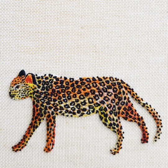
Holi is a popular ancient Hindu festival, also known as the “Festival of Spring”, the “Festival of Colours” or “The Festival of Love” and is celebrated in March on differing dates each year to mark the arrival of spring, the end of winter and the blossoming of love. The annual event commemorates the triumph of good over evil, while also celebrating fertility, colour and love.
In 2019 I was commissioned by the fashion label Saloni, to make two identical bindings for photographs taken during this festival in India in 2018. Named "Holi Saloni" the festival was a celebration of Holi teamed with Saloni's exacting sense of colour, cut and imaginative collections. The brief set was to create two bindings with the below hand-embroidered design on the cover; the “Holi Saloni” title with a leopard above it.
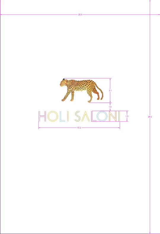
The bindings were to be covered in a neutral linen bookcloth that I ordered from Winter & CO, “WICOTEX® - Natuurlinnen 2041 - Tamar Cream Natuurlinnen”.

I decided the best method was going to be to work on the leopard cut-out off the book. As the bindings were going to be quite large, the linen book cloth was going to be difficult to embroider onto so this was to aid this part of the process to make it more manageable.
I cut out the leopard outlines from thinly pared pale yellow leather. The onlays were then painted with acrylic paint to build up a background colour.
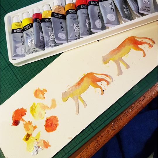
I then selected a range of orange, yellow, cream and white threads and began to embroider the leopard cut outs.
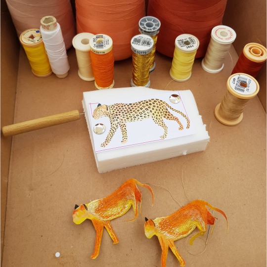
I used tiny stitches, overlapping the colours to blend them together.
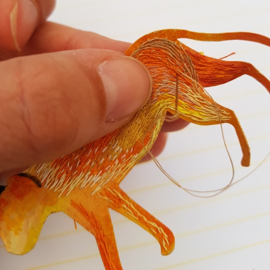
I worked little by little across the two leopards, working one colour at a time so that they were as similar as possible in appearance. I left the very edge of the leopard outline free of stitches, knowing that I would add these in once the leather cut-out was stuck to the linen covering cloth.

In order to make sure that I was going to sew the leopards black spots in the same pattern on both of the cut-outs I punched a series of holes through the paper leopard template where I wanted each to be. This was then placed on the reverse of the sewn leather onlay, and I marked through each hole with a marker pen.

I was then able to create the leopard’s black spots using the black spots I had marked on the reverse as a guide.
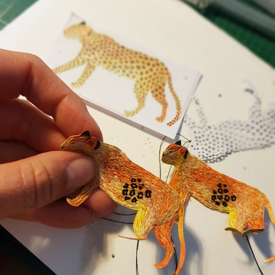
These spots were built up using a series of knots, creating clusters of dots to form a pattern all over the body of the leopard.

As with the base threads, the spots were also embroidered within the outer edge of the leopard shape, with the outer stitches to be completed once the onlay was stuck onto the covering linen cloth.

To correctly place the title onto the linen cloth for embroidering, the paper template was stuck down with masking tape in the correct position and the lines of the title letters were pricked through with a needle pricker. This marked where the stitches needed to go.

I matched the colours on the initial design to thread colours. The lines were then embroidered with a running stitch, and then I used a whipping stitch to consolidate the running stitch.
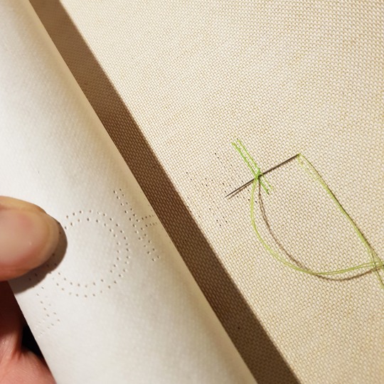
On the back of the linen cloth, the end of the threads were woven behind the stitches, and once I had done all of the stitching these were trimmed so no loose threads were present.
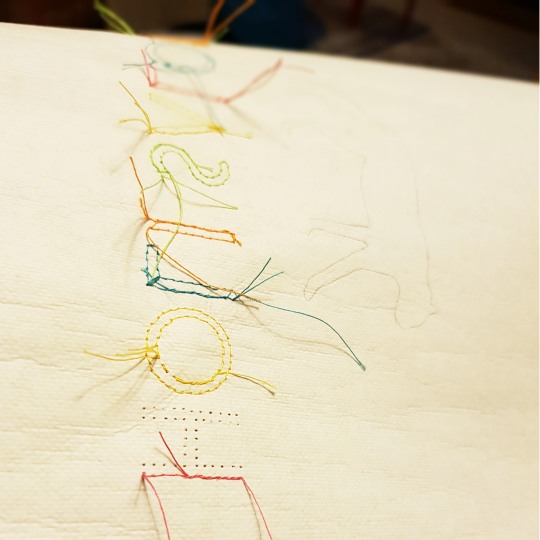
At this point I was able to stick the embroidered leopard cut-outs onto the linen cloth using PVA glue. I then finished off the tiny base stitches in the orange, yellow, white and cream threads and also finished the black dots around the circumference.

The back of the linen below shows what it looked like once all of the embroidery was complete.

I next moved onto the construction of the outer cover. A case was made, sticking laminated boards and a spine piece to the linen cloth. The cloth was turned in and the inside of the boards were infilled and sanded flush. The back and front boards were then finished with a mandarin orange coloured paper stuck down as a doublure.
The plan was to sew each of the seventeen sections into the book using linen threads. I therefore needed to drill a series of holes through the spine section of the case to allow me to attach each section directly through it.
I made a template from card, with lines marked in the corresponding thread colour order.
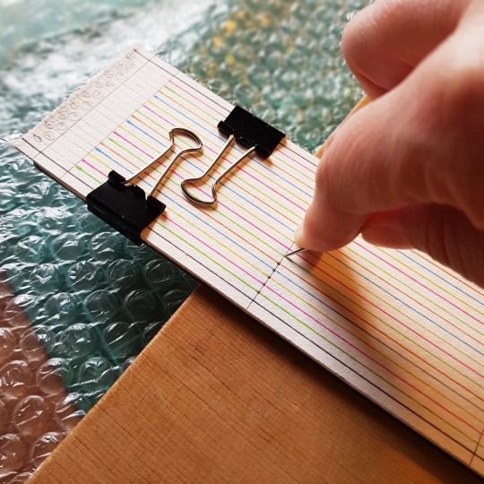
This was then clipped to the spine section using bulldog clips and I marked a point at each of the holes using a bodkin. I then removed the template, and using a 0.8mm drill bit, drilled a hole at each of the points using my Dremel.
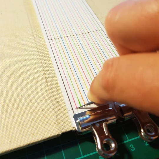
Section by section I then attached them onto the spine, making sure I pulled the threads as tightly as possible to keep the sections taught against the spine of the case.

The threads were ordered from Hilke Kurzke at Büchertiger. To get a good match for the five colours I largely ordered Crawford Threads (Orange Crush, Fuchsia , Autumn Yellow and Turquoise) with the final length being Lin Cable (Vert Clair).
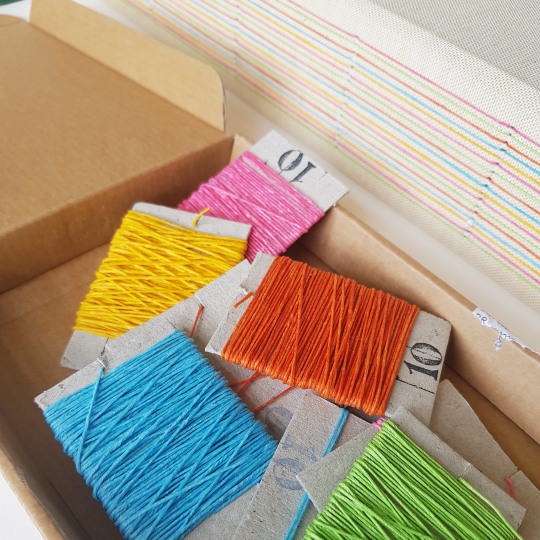
The following images show the completed book...
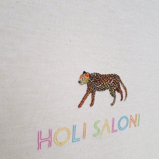
COVER AND SPINE DETAIL

THE BINDINGS OPENED NICE A FLAT USIGN THIS METHOD OF BINDING, ALLOWING THE PAGES OF THIS LARGE BOOK TO BE VIEWED WITH EASE
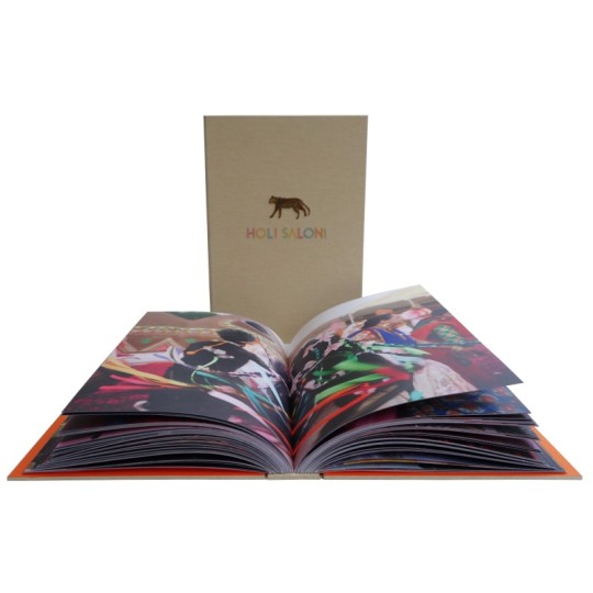
THE TWO IDENTICAL BINDINGS SIDE BY SIDE
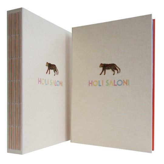
DETAIL OF THE PAGES, WITH THE COLOURED THREAD TIED ON THE INNER FOLD OF EACH OF THE SECTIONS
#holisaloni#saloni#holifestival#festivaloflcolours#festivalofspring#festivaloflove#bookbinding#embroideredbinding#designbinding#embroidered animals#embroideredleopard#leopard
18 notes
·
View notes
Photo

We’re in love with this fine binding by Sangorski & Sutcliffe on a copy of Chaucer’s Canterbury Tales. The blind tooling is perfect and those endpapers are to die for! #finebinding #designbinding #bookbinding #bookstagram #specialcollections (at MSU Libraries)
21 notes
·
View notes
Photo

Cuore nero e Cuore rosso. Dopo aver provato vari prototipi ecco la versione "leggera" del libro cuore di qualche mese fa 😊. Per ora sono due versioni (rossa e nera) ma pensiamo di farne una verde e blu. Le pagine sono illustrate e ve le mostreremo a breve su stories ❤ . . . Black heart and red heart. After trying various prototypes here is the "light" version of the heart book 😊. For now they are two versions (red and black) but we think to make a green and blue. The pages are illustrated and we'll show them to you on stories ❤ . . . . #lamandragola #heartbook #blackheart #redheart #artbook #valentinescard #paperartist #booklove #booklover #valentinegift #artbook #imadethis #forest_of_twinkling_fireflies #papercut #handbound #handmadebook #illustratedbook #designbinding
#lamandragola#paperartist#blackheart#forest_of_twinkling_fireflies#redheart#booklover#imadethis#artbook#valentinegift#booklove#handbound#handmadebook#heartbook#valentinescard#illustratedbook#designbinding#papercut
0 notes
Photo

Lux Mentis’ booth (216) at Boston ABAA 2022…first in 3 years. Set up and ready for 4pm opening. Early. <stunned>. #bostonabaa22 #artistbooks #bookarts #designbindings #occult #esoterica #fetishism #generallycoolstuff (at Hynes Convention Center) https://www.instagram.com/p/Ck1QD-PpMxJ/?igshid=NGJjMDIxMWI=
0 notes
Photo
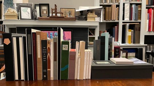
Something to look forward to at the NYC ABAA fair in April. Over twenty different book by and/or bound by Dan Kelm. #dankelm #wideawakegarage #bookart #artistbooks #designbinding https://www.instagram.com/p/CqVmD-juFJI/?igshid=NGJjMDIxMWI=
3 notes
·
View notes
Photo

Booth shots. @bostonbookfair Booth 318. Lux Mentis chaos! #bookfair #bostonbookfair #finepress #designbindings #occult #witchcraft #esoterica https://www.instagram.com/p/B45kaZWJ0ow/?igshid=1kdyuzi3fiyjt
0 notes
Photo

Keri, the brilliant madwoman behind @coyotebonespress is not merely a wonderful binder and book artist…but also the creator and source for some brutally cool bibliophilic merch. Can a coat or bag really be complete without this? I think not. #bookart #artistbook #designbinding #printingpatch #coolstuff https://www.instagram.com/p/Cixcr8cOcIS/?igshid=NGJjMDIxMWI=
2 notes
·
View notes
Text
“La Charrue D'Érable” (The Maplewood Plough) Part Four: Embroidery and Covering

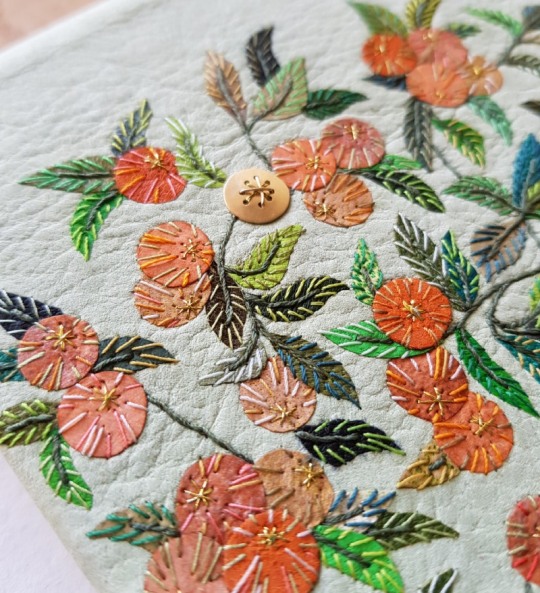
Finally the time had come for me to do the bit that I like the most - decorating the covering leather! The first step in the process was to cut out all of the leather onlays I needed to complete the design, including lots of lots of little leaves. On a couple of occasions I brushed past these loose leaves sitting on one of my benches and dislodged a few and it was a rather frustrating game trying to find their correct positions again!
When it came to the apples, I cut out a multitude of discs in different tones of leather and tried to spread the colours out as evenly as possible over the front cover.
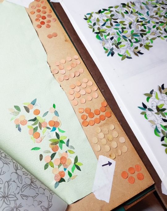
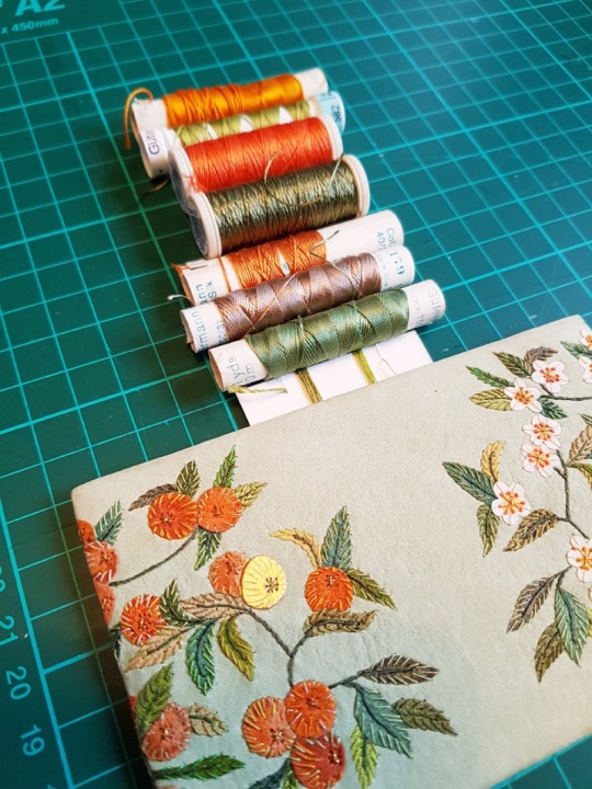
Once all of the onlays were down, I went through my box of threads and pulled out a selection of greens, reds and oranges with which to start sewing the detail onto the cover.

Firstly I concentrated on sewing all of the ‘branches’ using a dark green thread. This also helped to secure each of the leaves onto the leather. Each leaf in turn was then further embroidered with little stitches all the way up in a contrasting green to the colour of the onlay. As the leaves on the front and back covers were mirror images of each other, I made sure to sew the corresponding leaves in the same coloured thread.

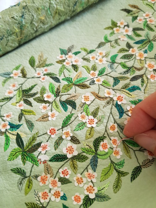
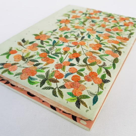
The apple blossom was attached to the leather using a double criss-cross stitch to look like the stamens of the flowers. I pricked the holes first with a needle pricker as the vellum inlays were tough to push a needle through.

Onto the end of each of the criss-cross stitched (eight in total for each flower) I tied a small French knot. These were done in a variety of different coloured threads to add variety.
The apples on the front cover were also embellished with a variety of coloured threads, enhancing the colour whilst also securing the onlays down.
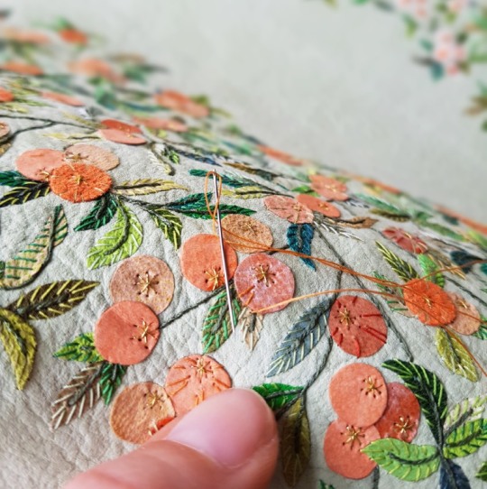
The back of the leather looked like this once the embroidery was complete - a random scattering of coloured threads!

So, the time had come to cover the book, always a daunting task after spending so much time embroidering the leather beforehand. I laid a few layers of newsprint down onto my bench and got together all the tools I needed for the process: sharp scissors, teflon folder, scalpel, fine metal tools for forming the head caps and some cord, also for forming the head caps.

The front of the leather was spritzed with some water to prevent marks from forming on the front of the leather once it dried. The back was pasted out three times using flour paste, with time left in between each application to allow for it to absorb into the leather.

The covering of the binding requires all the hands and nerves I have so I often don’t get many photos of this part of the process! The leather went down well and the book was left to dry under weights between blotting paper for 24 hours, with the blotters changed regularly. The following day, I dampened the joints with a water pen and carefully opened up the boards. The leather joints were stuck down into position with PVA whilst both of the book boards were open.
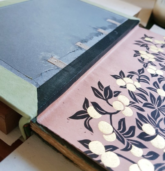
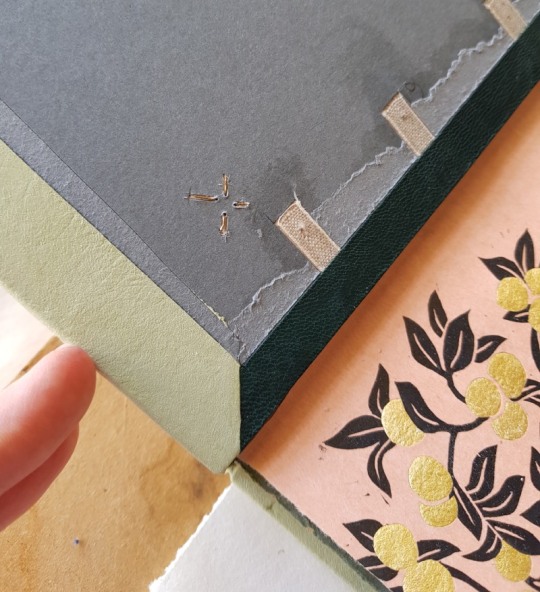
I bought some 18 carat yellow gold sheet in order to add one gold apple to the front cover. This was pierced into shape using a jeweller’s piercing saw and holes drilled through it. One of the criss-crosses was sewn with metallic gold thread, the other had gold wire passed across it to physically attach the gold apple to the book board through small holes that had been drilled using my Dremel..
Small channels were cut out of the reverse of the board and the ends of the gold wire were bent into these to permanently fix the gold apple in its place. The insides of both the front and back boards were then infilled and sanded. The first layer was some watercolour paper, which was the same thickness as the turn-ins and the leather joint. The second layer was a piece or Zerkall, cut a few millimetres smaller than the size of the boards. This was then sanded completely flush to get rid of any lumps and bumps.
It was then time to stick the paper doublure down to the front and back boards. All of the pierced shapes had been filled with gold leaf backed onto Japanese tissue.

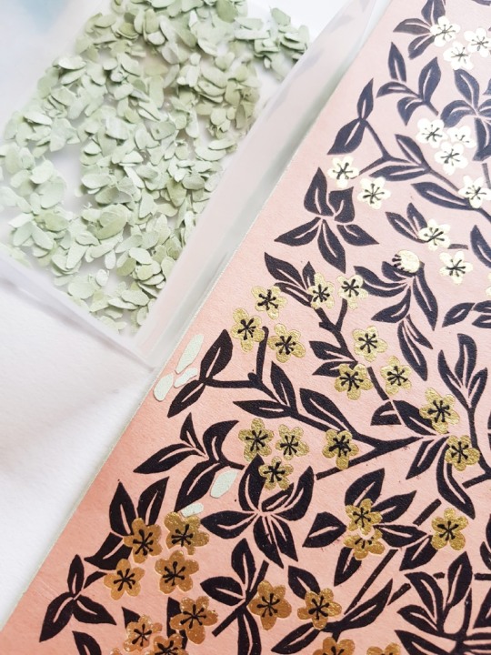
Once stuck down, I wanted to add extra detail to the endpapers and doublures. For the apples inside the front board, I cut out tiny criss-crosses from black paper.

These were then stuck down onto the gold using PVA glue.

For the blossom inside the back board, I used black acrylic paint on the end of a needle pricker and applied paint to each of the flower centres.

Finally, I wanted to add a little of the cover leather to the endpapers and doublures. I cut out small shapes from thinly pared cover leather and stuck them randomly amongst the branches.
The next, and final, blog post in this series shows images of the completed binding and wooden box that was made for the binding.
#bookstagram#bookshelf#reading#booklover#bibliophile#bookbinding#craft#leather#inspiredbynature#tooling#designbinding#artbookbinding#reliuredart#reliure#finebinding#leatherbinding#firstedition#hannahbrown#contemporaryembroidery#thread#bookcollecting#erangy#erangypress#pissarro#lucienpissarro#camillepissaro
46 notes
·
View notes
Text
“La Charrue D'Érable” (The Maplewood Plough) Part Five: Completed Binding

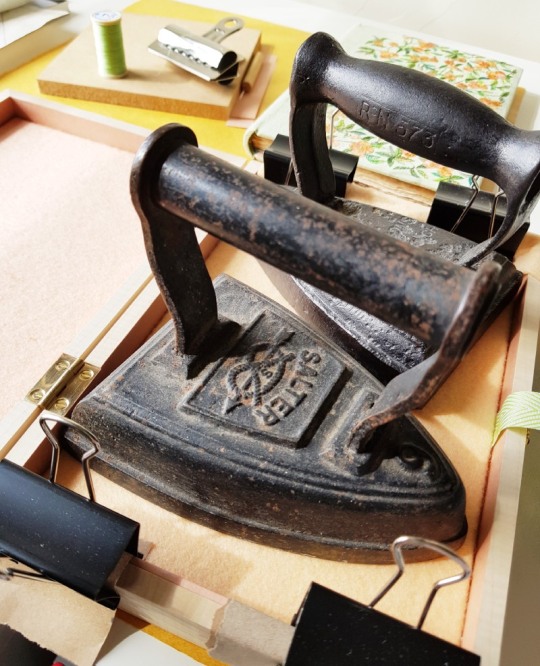
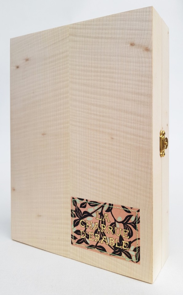
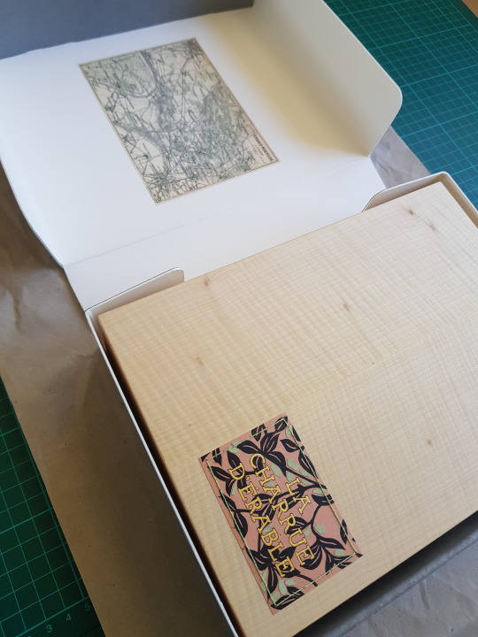
And so the binding was complete! I used a spare piece of the endpapers to create a title for the box. The words were pierced out using a scalpel and backed with gold leaf. The title was then sewn to the lid of the box through small holes drilled around the outside of the label.

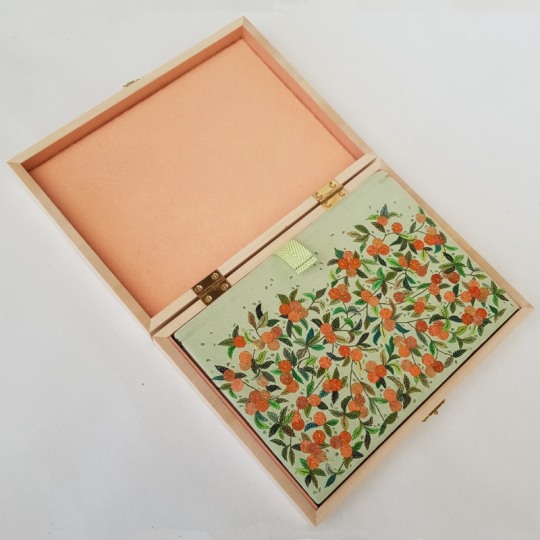
I knew early on that wanted the container to be made from Maple wood to tie in with the book title and I was pleased to be able to source some. The inside of the box was lined with felt, with a ribbon lifter attached to help to get the book out of the box.
THE COMPLETED BOX
THE BOOK IN THE OPEN BOX
THE BOOK ON THE OPEN BOX

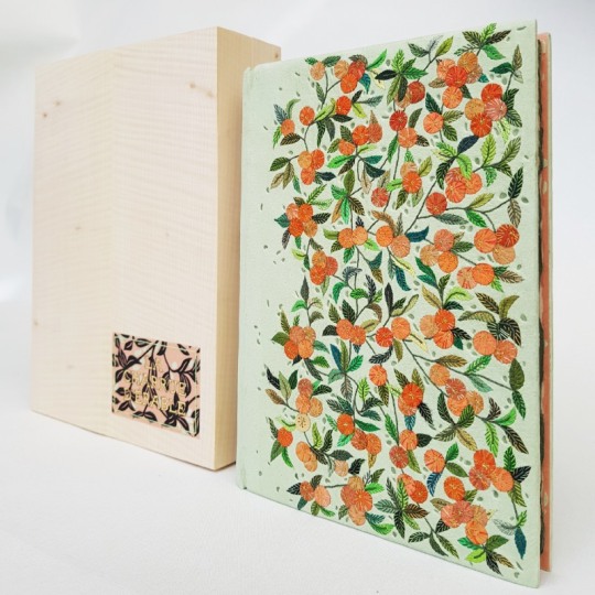
THE BOOK NEXT TO THE BOX
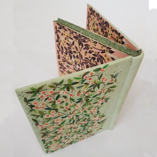
THE EDGE DECORATION
THE FULL COVER

THE PASTE-DOWNS

BACK COVER DETAIL

FRONT COVER DETAIL
THE ENDPAPERS

I was finally able to order the outer conservation box from The Bodleian Library a few weeks ago.
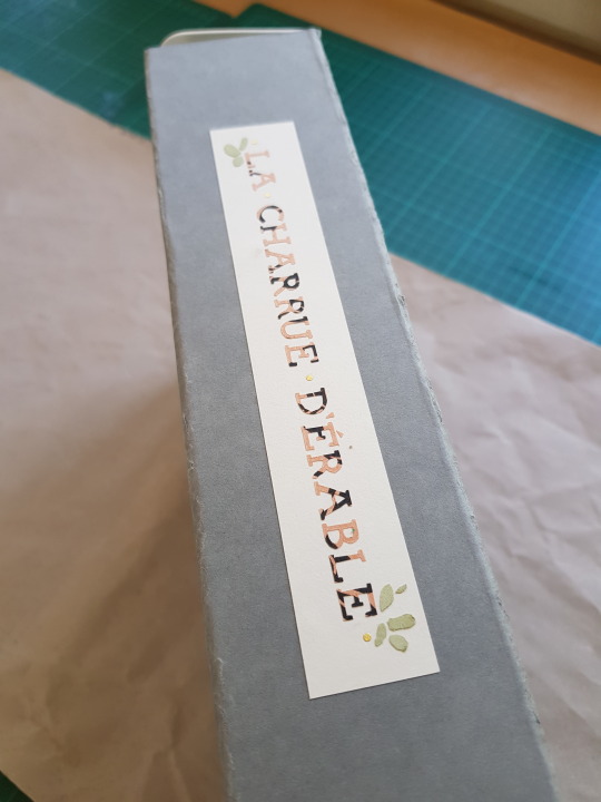
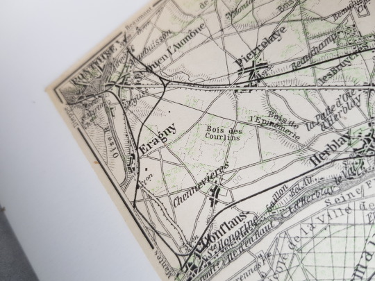
As well as adding a title to the spine, I glued into the inner lid of the box a map dating from 1910, showing the area of "St. Denis-Pontoise" in France, including the town of "Eragny".
The press was named after the Pissarro family's home village in Normandy, I will have to try and visit it someday!
#bookstagram#bookshelf#reading#booklover#bibliophile#bookbinding#craft#leather#inspiredbynature#tooling#designbinding#artbookbinding#reliuredart#reliure#finebinding#leatherbinding#firstedition#hannahbrown#contemporaryembroidery#thread#bookcollecting#erangy#erangypress#pissarro#lucienpissarro#camillepissaro
32 notes
·
View notes
Text
“La Charrue D'Érable” (The Maplewood Plough) Part Three: Forwarding
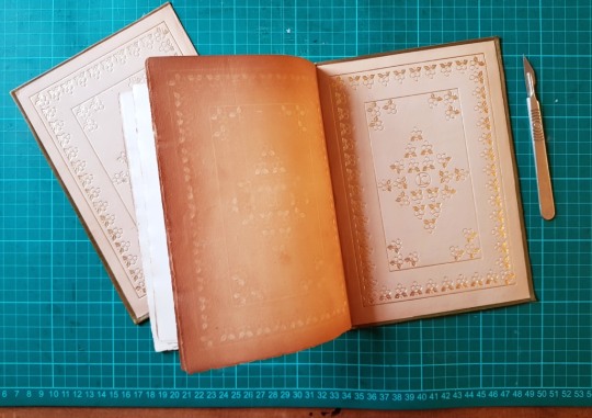
The client wished to retain the gilt calf paste-downs if possible to include them within the new binding. To do so it meant removing them from the existing limp cover so I could mount them to new sheets of paper.

The leather of the limp calf cover had started to degrade, so I removed it by peeling it back carefully from the reverse of the paste-down. I was then able to sand the surface using a fine sandpaper.
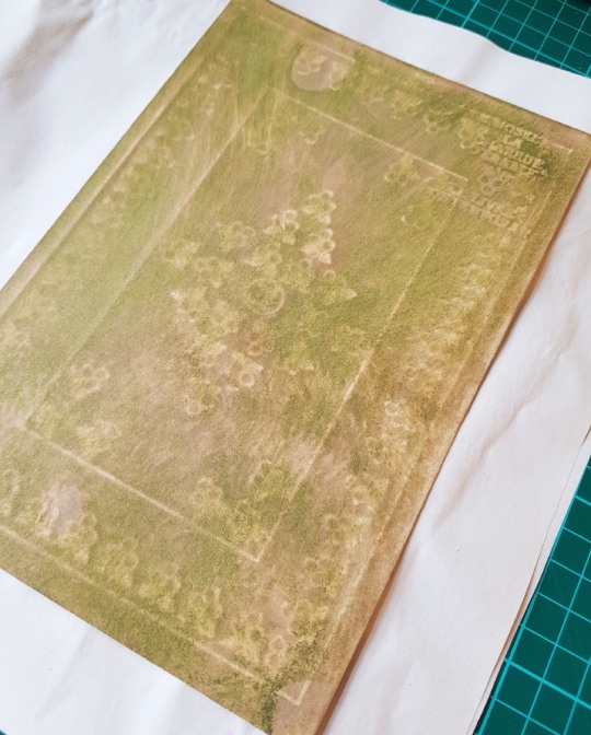
Once sanded the paste-downs were mounted to a bi-folded sheet of paper and sewn to the textblock as an additional section on the front and the back. I wrapped a bi-folded strip of paper to this new section as a guard, the other side of which (as visible in the below photograph) was then tipped onto the endpaper section once that had been sewn to the textblock.

The sections were all then sewn together onto four tapes.
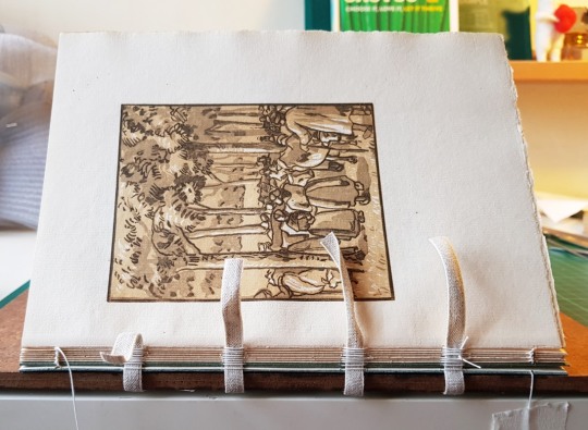
Once all the sections were sewn together, with the endpapers added on at either end, the spine of the book was glued up in-between the tapes with PVA glue and left to dry.

I then rounded and backed the book, and lined the spine attaching a one-on, two-off hollow and then sanded the top edge flush. I wanted to add some edge decoration and did so using watered down acrylic paints. I first applied a thin layer of dark green to match the paper I had used to mount the new paste-downs onto. I further built up the colour by dabbing on small amounts of white, peach and green paints on top to create an abstract pattern in colours to match the binding.
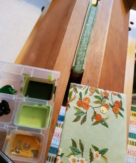
The foredge and bottom edge were left deckled so I did not need to apply edge decoration to them. The next stage was then to sew the endbands. I selected colours that I thought would work well on the binding.
I then created double core endbands using a mixture of these coloured endband threads. The larger core was made from a lamination of leather and a thin strip of vellum. The vellum side was paced pointing towards the top edge of the binding to try and keep a crisp edge where the endband silks wrapped over it. The smaller core was made by stiffening some linen sewing thread with PVA glue and letting it dry out.

The boards were then laced on and bevelled. The covering leather was pared in preparation for the next stage of the binding process.

The next post details how the leather onlays and embroiderd elements were added to the covering leather to build up the design.
#bookstagram#bookshelf#reading#booklover#bibliophile#bookbinding#craft#leather#inspiredbynature#tooling#designbinding#artbookbinding#reliuredart#reliure#finebinding#leatherbinding#firstedition#hannahbrown#contemporaryembroidery#thread#bookcollecting#erangy#erangypress#pissarro#lucienpissarro#camillepissaro
13 notes
·
View notes
Text
“La Charrue D'Érable” (The Maplewood Plough) Part Two: The Endpapers and Doublures

Throughout the book there were numerous wood cut prints so I decided to try out some lino printing to tie in with this. In order to transfer the design onto the lino for cutting I placed a sheet of carbon paper on top of the lino. On top of that I laid a line drawing of the design and then I traced the lines with a biro in order to leave a mark through the carbon paper on the surface of the lino.
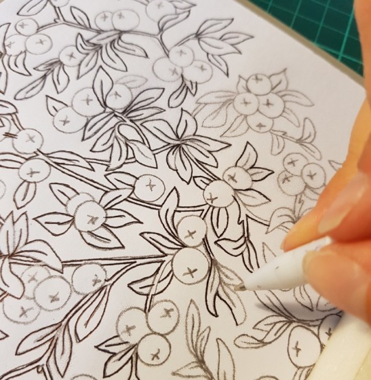
I only wanted to print the leaves using the lino plate, so only marked these areas through the carbon paper. It was very clear to see what I needed to cut once I was done marking the lines.
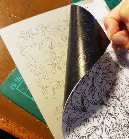
I invested in some rather lovely new “Pfeil” lino cutting tools in a variety of cutting shapes. Each tool is made from chrome vanadium steel with ergonomically shaped hardwood handles – they made slicing the lino a breeze!
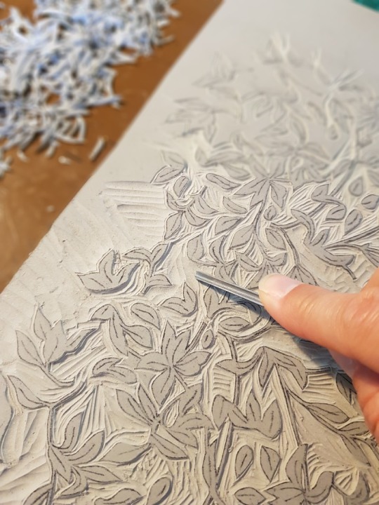
The sample board was done in the same manner, just cut on a smaller scale.

The cut lino was inked up with black intaglio ink using a roller.

The apricot Satogami paper was then laid on top of the lino plate and put into a press. Once printed they were pegged up and left to dry for a few days, I did extra copies so I could select the best ones for the final binding.

I chose to split the cover design so there were apples on the front and apple blossom on the back of the book. I wanted this difference to carry through onto the endpapers and doublures. To add another level of complexity to the design I decided to make it so that each of the flowers and apples on the endpapers and doublures would have gold leaf behind them to catch the light when the book boards were opened which meant cutting out each shape using a scalpel.
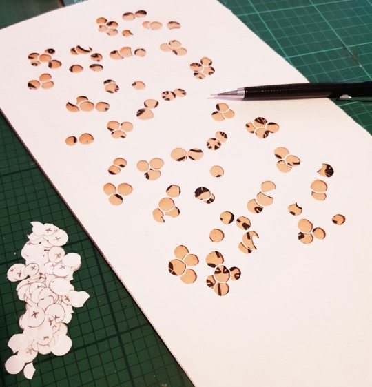
I glued some squares of gold leaf to Japanese paper in preparation using PVA glue and left them to dry.

I flipped both the paper-backed gold leaf and the pierced endpapers over and drew around the shape of the flower and apple clusters that I needed to back onto the reverse side of the gold leaf.
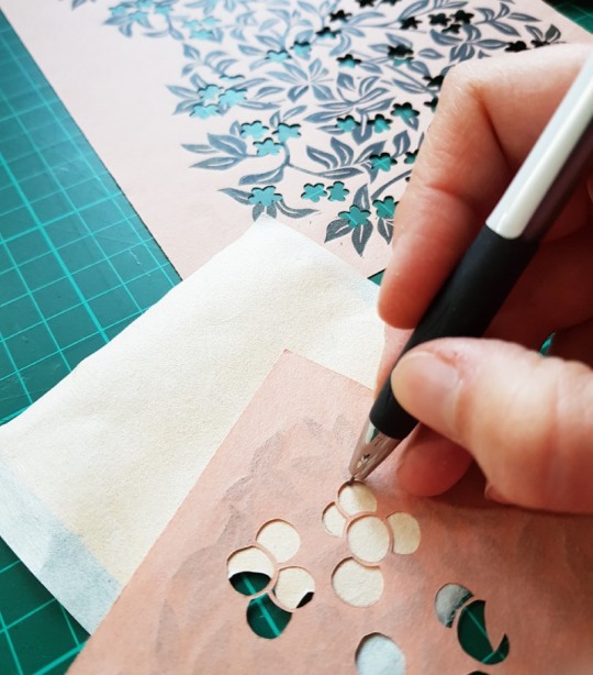
I then made a slightly oversized cut around the pencil outline so that there was enough extra to glue it onto the reverse of the printed paper to span the pierced void.
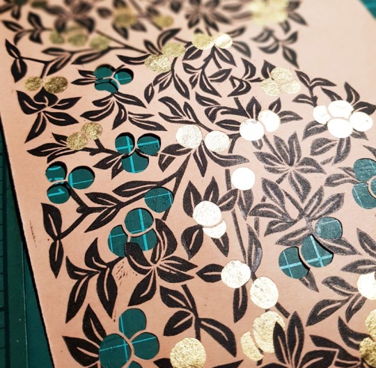
The next post covers the forwarding of the book!
#bookstagram#bookshelf#reading#booklover#bibliophile#bookbinding#craft#leather#inspiredbynature#tooling#designbinding#artbookbinding#reliuredart#reliure#finebinding#leatherbinding#firstedition#hannahbrown#contemporaryembroidery#thread#bookcollecting#erangy#erangypress#pissarro#lucienpissarro#camillepissaro
17 notes
·
View notes
Photo

Stunning Binding of the Day: Design binding by @grahampattenbinder on Curved Folding Origami Design by #JunMitani #designbinding #artbinding #bookarts #grahampatten #origami https://www.instagram.com/p/Cps1NC-ucHh/?igshid=NGJjMDIxMWI=
0 notes
Photo

Making of the Modern Book at the Library of Congress. Next on deck, Legendre, Hastings and Cooksey NB: Paul Bonet and Gabby were just referenced in the same sentence with the more effusive praise granted to the brutally wonderful Ms. Cooksey. 🤘🏻🖤🤘🏻 @boundbycooksey #bookarts #designbinding #artistbook #artistbooks (at Library Of Congress, Jefferson Building) https://www.instagram.com/p/CnnFsVcITiw/?igshid=NGJjMDIxMWI=
1 note
·
View note