#decided to color my sketch instead of doing lineart
Explore tagged Tumblr posts
Text
Nehehshhehepomni
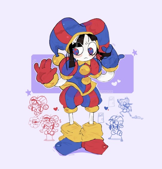
I love her design sm
#she reminds me of a wet cat for some reason#my art#ibispaintx#fanart#digital art#procreate#doodles#practice #tadc pomni#pomni#the amazing digital circus pomni#pomni fanart#the amazing digital circus#tadc#decided to color my sketch instead of doing lineart#Ik lazy#and I just know she sits like a damn shrimp
264 notes
·
View notes
Note
hey what made you want to keep on drawing
i’ve been drawing since i was real little and started focusing on it in like 3rd grade (warrior cats… and pokemon lol) and just never really wanted to stop i guess. i really just love creating? i love putting things to paper and i love watching the production of it all. i find new ways to make art fun for me rather than sticking to the same brushes i know and the same characters, i always try to switch it up somehow. maybe i’ll design a new character, or try a new pose, or find a new brush!!! idk drawing has always been a fun way to express myself and characters rather than like. a chore that takes up all of my time
i had to kind of teach myself that if something isn’t turning out the way i want it to, i don’t have to keep drawing it and i can just. restart the sketch and try something else. i don’t force myself if i don’t like it because then it’s fun for no one
#asks#i don’t always post everything i draw too i draw just for myself or my friends sometimes#sometimes i’ll just draw stupid memes for a month instead of full pieces if i feel like it#plus you can just like. skip stages in art. you don’t have to do lineart#or you can skip the sketch stage entirely!!#not every piece has to be a full render you can decide you’re done with the piece at any point even if it’s only partly colored
4 notes
·
View notes
Text
So I’ve been making this
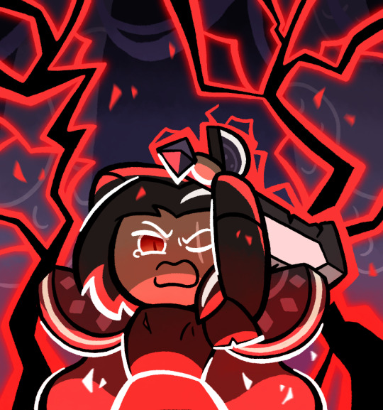
So basically last night, I was listening to some music, specifically Not Gonna Die by Skillet, more specifically a version on YouTube with the intro (because I’m not the biggest fan of Good to be Alive where the intro actually is). Anyways, when it’s night, my imagination tends to be more active and I tend to have more energy. While listening to the song, I eventually got this mental image in my mind of this scene with Dark Choco, and the more it crystallized the more I wanted to draw it. I was going to go to sleep and maybe do it in the morning, but I realized that I probably would forget the vibe and not have as much energy, so instead I decided to power through and draw the idea
It was a bit difficult since I had limited references for the pose I wanted, and I suppose I can admit the sword looks a bit off anatomically, but it looks good enough I think, and lets me keep the eyes revealed
I did eventually have to stop drawing, because my iPad had been worked all the way down to 4% (and it was at 30% when I started, the poor thing), not to mention it was around 11:30 already which is pretty late for me, and my earbuds had been running nonstop for over 2 hours (yes I was listening to the same song, it’s how I keep the vibe). I was at least able to get the pose, base colors and lineart done, and I’m still pretty proud of where I left things last night
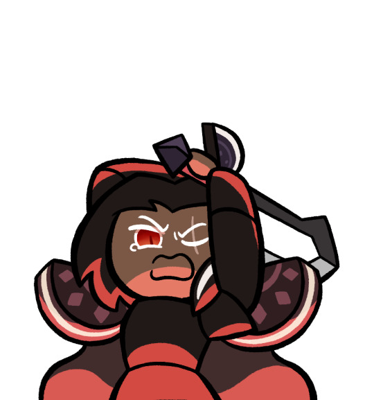
Today was mostly just doing the background and lighting, which admittedly I may have fumbled. I’m not very good at backgrounds and I didn’t know how to draw lightning. I tried my best, but honestly I don’t think I got the image in my head. Didn’t help that my brain was playing the wrong Skillet song this morning
Oh yeah and by the way, the background is supposed to be from this. That’s what I used as reference

The lightning both feels like too much and too little. Like, it’s crowding the picture, and I can’t have more because it’d be way too crowded with it, but also at the same time, it doesn’t feel like enough, like there isn’t as much power as I wanted
Actually wait, maybe I can add some small particle effects to like, enhance the lightning feel. That was in the original sketch but I omitted it in the final. If you see one with that, you know I did that
Edit: I did indeed do that
To be fair though, I don’t think I have the art skill to properly convey the image in my head. Basically the scene is that Dark Choco is using absolutely every amount of his power for this final swing down, so much that it’s too powerful and the Strawberry Jam Sword completely shatters. But also it’s too powerful that Dark Choco’s body simply can’t handle it, and he basically ends up exploding. The scene depicted would be the wind up to that final swing that destroys the both of them
This isn’t necessarily the first time I’ve come up with this scenario, and the setup would basically be that he turned on the Cookies of Darkness slightly earlier, because he didn’t want to destroy his homeland again, and he tried to get rid of them while in the kingdom but not yet at the Citadel, but he ended up failing, so with nothing to lose, he chases after them and decides to put everything into destroying them, even if it likely ends in his death. After this he probably killed Pomegranate and crippled Licorice in some way (I don’t think he’d attack Poison Mushroom), so his final act did have some effect, but he’s still dead by the end of it. And he and his father never got the chance to properly reconcile because Dark Choco thought that could never be a possibility anymore and he had resigned himself to his fate
But yeah, I just don’t know how to convey that sheer overwhelming power and emotion that this scenario suggests. I tried my best though
I also want to submit this to the Dark Cacao Forever contest, but I’m not sure if it’s good enough for it. What do you think?
#cookie run#cookie run kingdom#dark choco cookie#my art#I really did try hard and this and it does look better than most of my others#but I don’t know if it’s really that good or anything
231 notes
·
View notes
Text
I'm working on crackships I swear... 😭 Have some art in the mean time!


These are some mew twos! Basically testing how a more mewtish 'two would look but I couldn't decide exactly how to go about it.
I ended up really liking the brown one in the second image as well as the one to the left of it... But also very much enjoying the one in the first image in the top left XD decisions... 😭 They were meant to be ADOPTS!!!!!!! Why do I do this to myself
@phlurrii actually now owns the spotty one in the second image! They clicked with it and I didn't so X3 I think it's a much better home hehe
If anyone's interested in my process for these specific kinds of designs, I saved two wips XD


Anyway! Most recent art is a mirage mew because we watched the special in a call! (I feel violent towards it when it makes noise grrr)

A design I have yet to finalize 😢... Sometimes when I'm about to sleep, I'll get sudden inspiration or a sudden design idea so I'll get up and very hastily draw a sketch and give a rough coloring (usually I wait until after lineart to do coloring at all even for new designs... maybe I should do concept sketches first more often instead of just one shotting XD)

noodel,,, why him so nakey,,, put on pants,,, pls,,,

Another spur of the moment middle of the night drawings. This one is meant to be a Rayquaza! I'll finish that eventually
Anyways,,, bye bye
57 notes
·
View notes
Text
FORGOTTEN LAND'S SECOND ANNIVERSARY :3
I AM SOOOO BACK
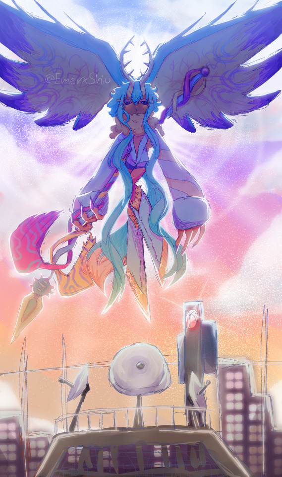
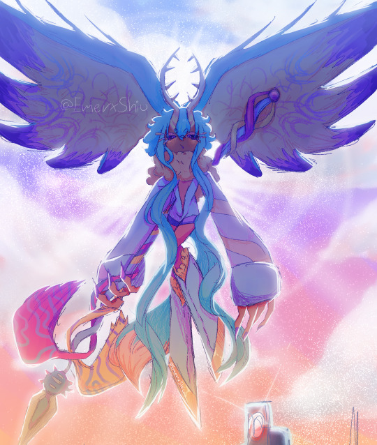
I started this drawing yesterday around afternoon and finished it just a few minutes earlier.
I went with a messier type of drawing instead of more clean like the elfilin one from yesterday, i find it fun doing it like this, mostly cause i dont have to worry about making it perfectly so i dont get as frustrated as normal. Id place this one as my second best digital drawing. im pretty sure i havent posted what i consider my best digital drawing here, tho i do have it in instagram, i might post it here one day, tho these two are way too tied up, i love how this came out, its not exactly like how i imagined it but its really close to it, and also itd say that since i dont tend to play around lighting that much, this was such a joy to draw and i cant help but stare at it a lot, at least until i start hating it because i made quite a lot of errors. i also changed my elfilis gijinka just a tad bit from last time, but its not that big of a difference, mostly.
ofc i had to draw elfilis for forgotten land's anniversary, i tend to deny it in my head but yeah they're my fave of the kirby characters even tho i hate them a bit. I wanted to draw some more doodles, like, elfilis eating cake, kirby car, a bunch of other stuff (not elfilin cuz i already drew him yesterday) but when i tried i couldnt draw anything more, guess this drawing burned me out a lot, huh?
you can definitly tell i spent all the efforts on him cuz if you look a bit closer to the bottom part you'll see its almost barely detailed, but i mean, they're the focus so make sense i guess for me not add that much detail there. um also, maybe because i dunno i had OVER 130 LAYERS jeez no wonder firealpaca was slowing down so much, i need to manage my layers better next time, tho i did do something i keep forgetting, wich is naming them (most of them at least) that was a real life saver
Also, antares (fecto elfilis' spear/cadaceus), as always, was a pain to draw, but this time its probably been draw the most accurate out of every other drawing ive made with it in it, i didnt notice it was like, a little curved when it reached the blade
some close ups since his face is a bit hard to see
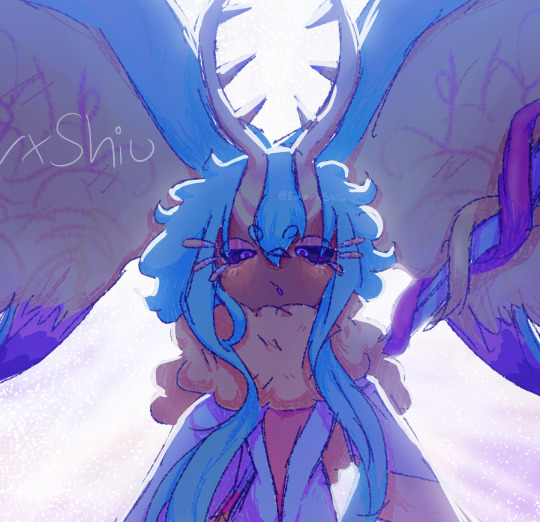
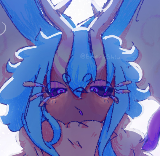
silly :3
fun fact! actually, this is technically a redraw, somewhere around between february and march i started a fecto elfilis drawing for the first anniversary, but i couldnt finish it in time, and i never finished it
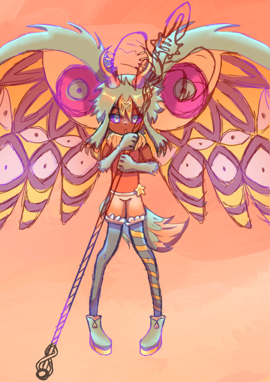
thats...quite the improvement! (i remember being so proud of it)
also his wings are like that cuz i did not want to draw the pattern, its way too hard, i literally copy pasted it, wait, i was talking about the 2024 version but i looked at the 2023 one and i just noticed it also has the pattern copy pasted, i guess some stuff never changes since i still abuse the ctrl+c ctrl+v to this day
Also i ended up making a huge error there, i was planing to add the phantom spears from orbital pulsar (the attack he does first when you battle them at lab discovera) but theres an innacuracy, when they do the attack, they always close their eyes, i had actually sketched him (well i mean both these drawings are basically the first sketch (2023) or second sketch(2024) with some color, shadows and lighting. i didnt do lineart in the 2024 one cuz i wanted to be a bit like the og i made (too bad i sketched that one with black since the og was sketched with white due to me drawing the bg first)) with his eyes closed but them decided to make them open for a reason i cant remember, maybe i thought itd look nicer? idk
ive had the idea of redrawing this for quite some month now so it was kinda already planned
background cuz i think it came out really pretty
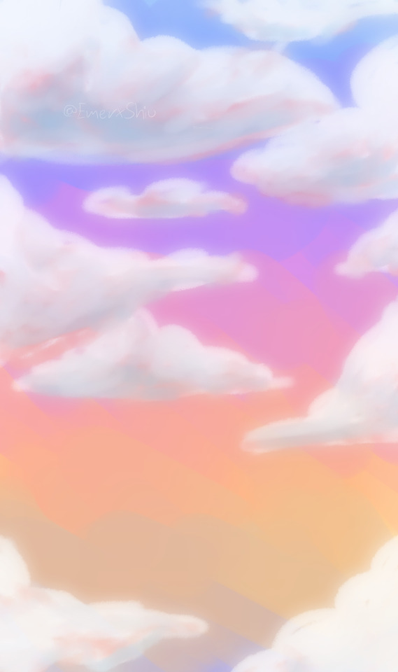
doesnt have the little stars since without elfilis and the structures it looks fucked up. the actual sky in game is more blue, but the clouds have some orange, in the 2023 ver. i made the sky orange, and in the 2024 ver i wanted it more accurate, but i didnt wanna loose the orange sky, so i did a gradient. pretty...
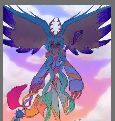
also here's a screenshot i took when i was like halfway trough it, its barely noticeable but i changed his mouth in the final drawing
I really love katfl, like a buncha whole lot, its basically almost my first mainline kirby game. 100% the demo, finished the game in almost one day, i literally play it monthly, like, every month i put the card in my switch, start it up, get morpho sword, and go shred elfilis in lab discovera. i would probably not even be here on tumblr and the kirby fandom if it werent for it. and i love it so much i genuinly cannot express how much i like it and treasure it with words or anything
Thank you for reading my unnecesarily long rambles lol
I hope i'll post tomorrow and dont forget like usual
Jambuhbye!
#art#fanart#kirby#kirby fanart#kirby gijinka#silly#digital art#firealpaca#fecto elfilis#fecto elfilis gijinka#my wife fecto elfilis and his new drip#yep changed them again#fecto elfilis lives in my head rent free 24/7#fecto elfilis fanart#kirby and the forgotten land#katfl#katfl spoilers#katfl second anniversary#kirby and the forgotten land second anniversary#katfl fanart#kirby and the forgotten land fanart#please reach a lot of people i spent way too much effort on this drawing#kirby series#kirby elfilis#kirby of the stars#:3333#:3#digital artist#artists on tumblr#small artist
47 notes
·
View notes
Text
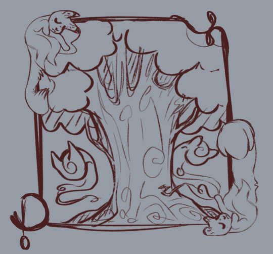
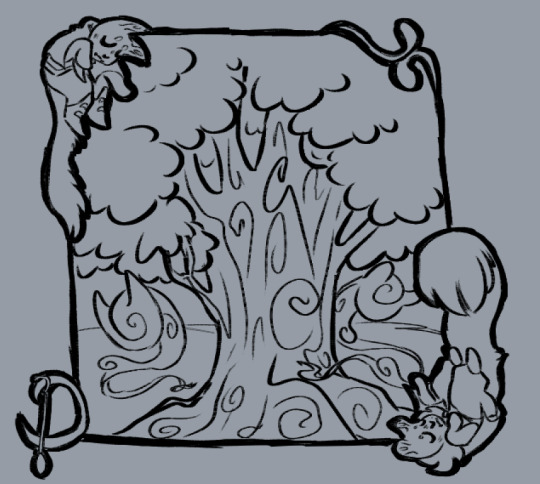
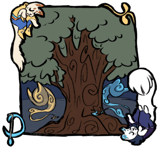
Sketch, lineart, and solid colors of my two little furred felines! Love em. (Dream and Nightmare ofc belong to Jokublog!)
Decided to draw them since I want to do something pretty funny with em later! Thinking about a Cram (as in Cat!Dream) fic. I was originally going to do Catmare, but Nightmare gets so much love already so I will go with Dream instead. The little guy needs some love too!
I'm wondering if I should start it when Cram wakes up from being a statue oooor if I should do it from the very beginning. I have an idea for both ways but I want to focus on only one to flesh it out. Let me know what you guys think!
40 notes
·
View notes
Text
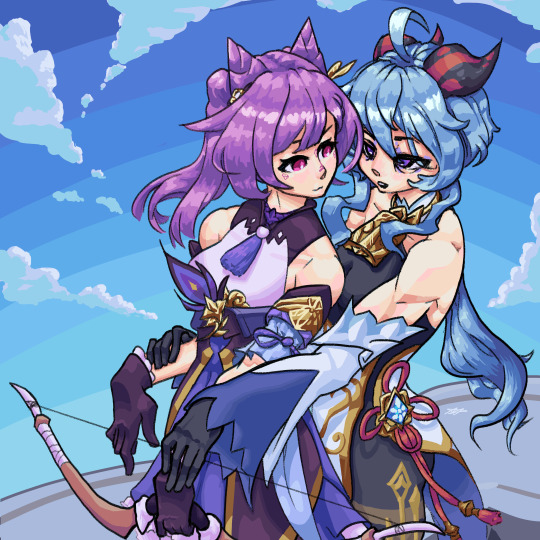
⚠️ CRINGE FANFIC PAST THE BREAK ⚠️
"Keqing..." Ganyu murmured, "your form?" She lazily placed her fingers atop Keqing's wrists, guiding them. "Would you like me to remind you?" she continued.
Keqing's posture stiffened slightly and her eyes widened for a moment. Ganyu's breath tickled the back of Keqing's neck, causing jolts of Electro to dance down her spine. She slowly turned her head while cracking a shaking smile.
"Yes- I mean- No, I remember. Straight wrists. To line up with the force of the weapon, right?" Following the pressure of Ganyu's fingers, Keqing started relaxing her wrists.
"Mmhmm, better," said Ganyu, yawning.
Ganyu's morning voice took out whatever parts of Keqing's brain were still functioning. Her mind was sent swimming. She couldn't help but notice how the groggy morning Ganyu was a bit more informal, a bit less reserved...
These archery lessons would be more affecting than Keqing anticipated.
---- End of Fanfic. Beginning of random thoughts ----
I want to believe that Ganyu uses war bows with serious draw weight: she fought in a war, didn't she? So, God as my witness, she should have the muscles to do that.
I bet Ganyu's lat spread is crazy. Wings and horns? Is she an alicorn? buffalo wild wings?
I also don't personally ship these two very hard, but just Aesthetically though?
I had a lot of fun with this one. For the sake of learning, I tried using no blending (full cell shading), no blending layers, and choosing every color using the color wheel. I definitely wouldn't do it this way again, but it felt instructive!
I think i'm gonna draw some class of '09 next because if i don't get some of this out of my system i'm gonna be watching jeckole animatics forever
Here are the progress shots of this because i just love how the sketch/lineart of them look
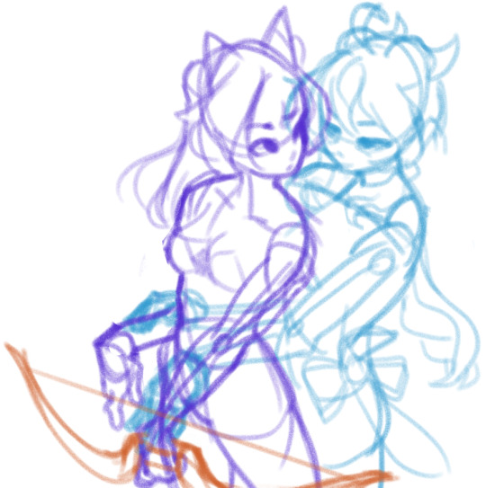
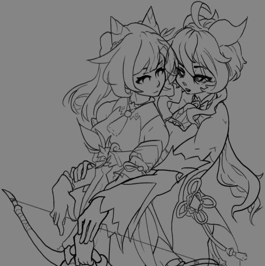
I wanted to draw a complex background but I just hated how it looked, so i scrapped it and put them on the jade chamber.
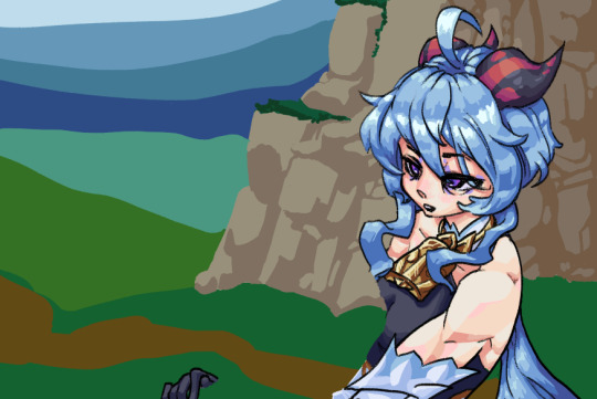
i want groggy ganyu! i would love to see an irritated/fed up Ganyu. Do you ever think Ganyu gets finished with a 30 hour shift and just go "fuck work, fuck this, i can't believe this shit. the whole country is resting on whether or not i decide to slave away working inhumane hours"
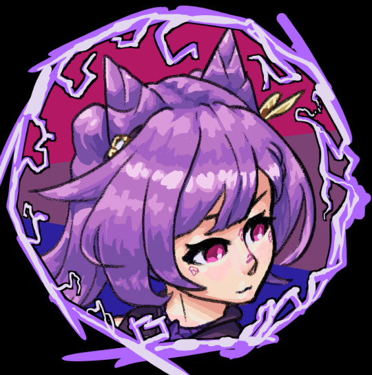
I also made pfps of these for myself and the loml. This makes it kinda look like I headcanon Ganyu as trans; lmao. i don't but nothing against anyone who does. if you wanna use these, idk credit me ig. if you dm me and ask nicely, i might send you one with a transparent background instead lol. if i have time

the keqing border looks worse imo but it was mine so idrc
#genshin#genshin fanart#ganyu#keqing#ganqing#gay#i wish genshin had time to make time for its characters#there could be a different mini-series for each nation and its characters getting up to hijinks#instead we get like 1-3 events per patch which spoonfeed a tiny bit of character here and there#gayshit impact#HOYO give me a real keqing hangout and my life is yours#HOYO please ganyu's immigrant story was a bit weirdge but the most seen i've felt in any character story#genshin impact
12 notes
·
View notes
Text
Current digital art process!
Acting on @shkika 's request because making my redraw for this post actually ended up giving me more confidence in my digital art process! As such, I'm gonna use it as a reference. And if this walkthrough of sorts turns out nice, I might do it again as my process evolves!
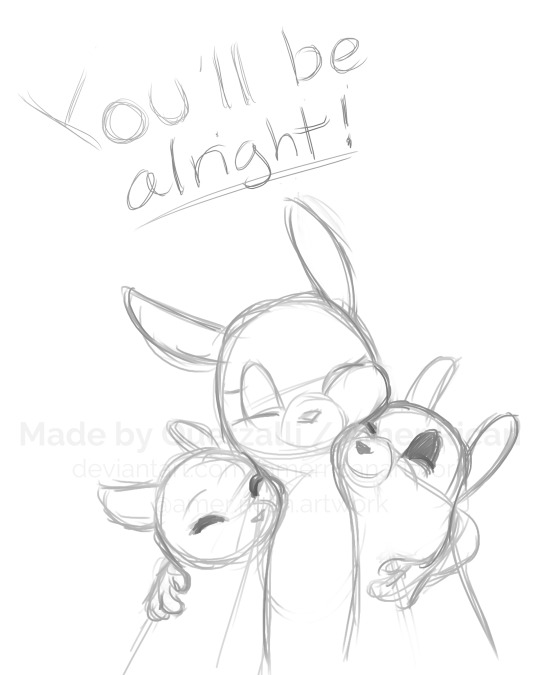
I started off with a quick sketch of sorts, trying to focus both on movement and volume, and get the general idea of where each element is located. I edit the image dimensions and placement of things a lot in this phase, as my ideas often tend to change once I actually begin drawing them. In this case, as I got it down, I decided I wanted it to look like some cheesy animal motivational poster, so that influenced where the text was.
From there, I began to clean and sometimes edit the sketch, mainly by thickening the lines to make the shapes more definite, and erasing what wasn't necessary and interfered with other parts. Volume is one of my biggest focuses in my drawings, so I try my best to get the volume of each character at least hinted at with the lines. This is something that will probably remain in my process for a while, as I quite dislike doing separate lineart and like the messy, sketchy feel anyway.

I also wanna mention, in addition to having references and such in other windows, I've recently begun having a second mini window of my current drawing off to the side so I can see what it looks like overall more easily, regardless of how much I zoom in on and flip the main window. It's quite helpful!
For reference, this is what the final sketch looked like:
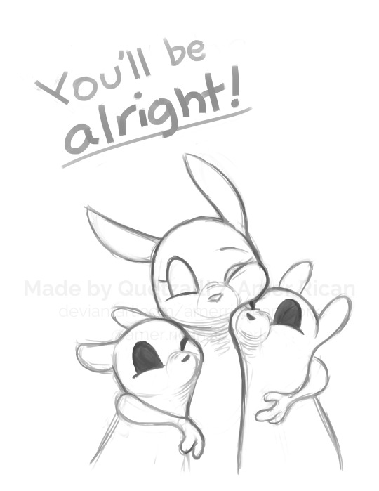
Then, I went on to add the flat colors. Another tip: I almost always set my sketch layer to "Lumi & Shade" because I think it makes the line colors a lot richer, but since it's based on what colors are underneath, it colors the lines a lot more individually than changing the sketch color as a whole. Here's some comparison to a version without the effect (left):

Then, I add some shading using a (really nice) marker brush. This is honestly one of my favorite parts of the process, just trying to carve out all the volumes, especially since I usually use a pretty blue color for shadows!
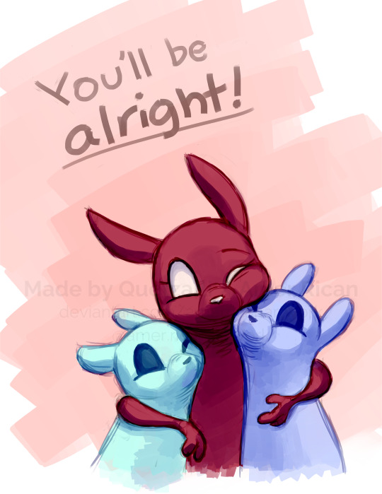
Sometimes, I honestly just leave drawings finished at this step, because I adore the sketchy look so much, and because I really don't like the tediousness of more realistic rendering in the painting process; from what I've seen/experienced, it often involves having to basically paint the entire image over again, which I've realized I find REALLY boring (and is also why I clean the sketch instead of making a new lineart layer). As such, one of my hopes is to reach a point where I could almost completely avoid having to clean up the image in a traditional painting method, instead being able to lay down lines and colors so well that they convey nearly all the volume necessary on their own, still have that sketchy appeal, yet also look finished and professional.
Alas, I did do a bit of clean up on this image, but I think it still turned out alright!

Here's the finished drawing! I'll have to practice with this process a bit more to truly solidify it as my digital go-to, but nonetheless, I think this came out adorable! Thanks again shkika for the ask, and thanks to @mintscampi for the sweet prompt! I hope you guys like it!
#art#artwork#artists on tumbr#digital#digital art#digital artwork#painting#digital painting#process#painting process#art process#tutorial#fanart#rain world#slugcat#rw slugcat#slugpup#artificer#rw artificer#quetzalli draws#quetzalli's notes
100 notes
·
View notes
Text
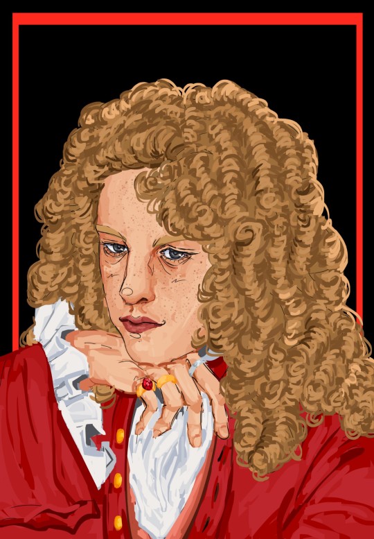
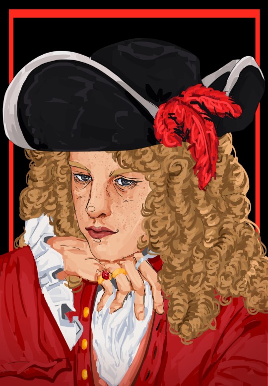
Prince Jenson of Somerset
+ process & lore
Yayyyyy omg finally have drawn portraits of the four main characters!!!! I'll show the process of Jenson's first and then them all four together. Though it's a shame the Seb/Fernando ones are older, I think it's hopefully obvious how much I've improved since November?
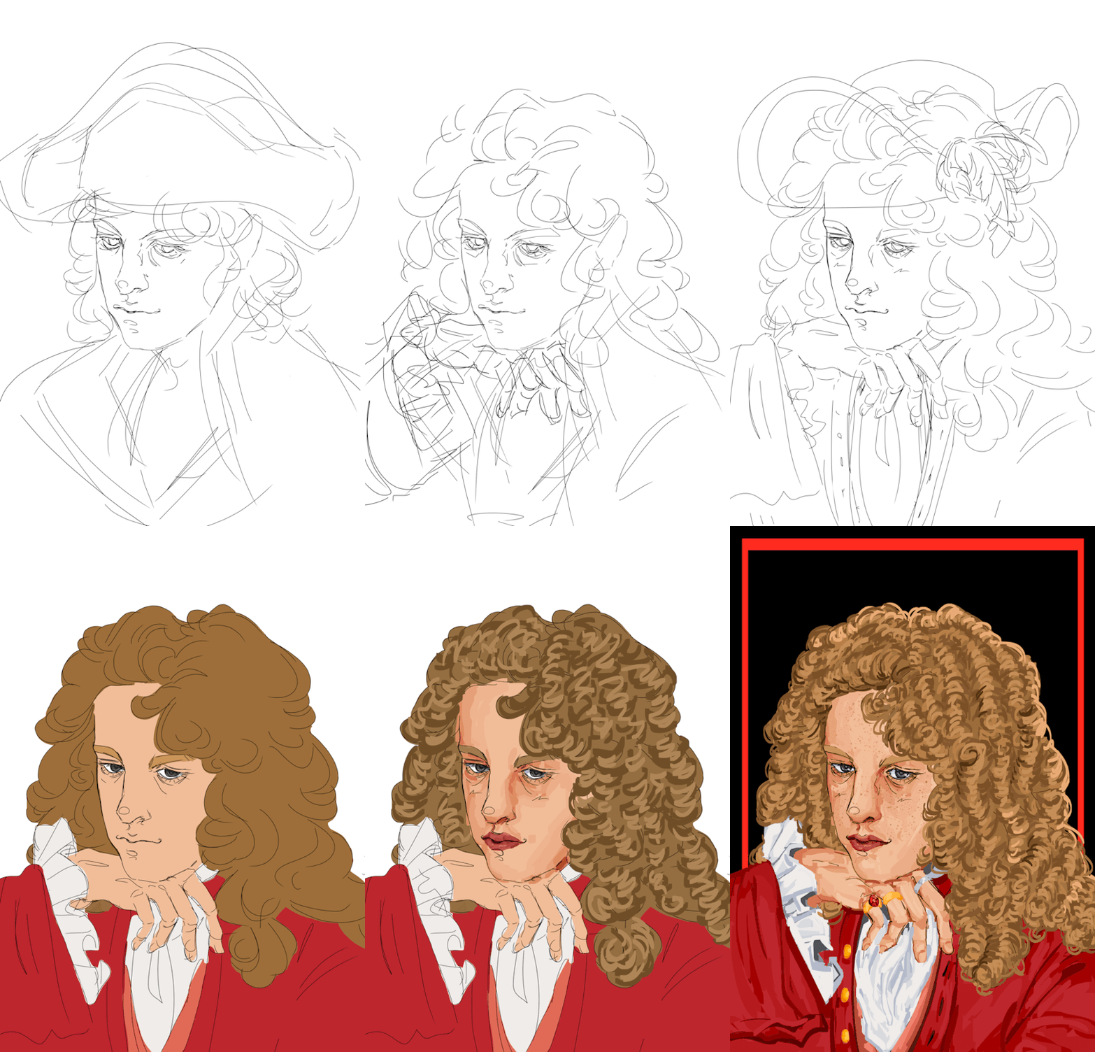
Look at him in all his handsome, princely glory 🥹 It's funny, I'm always happy with the second sketch and initial lineart, and then I start coloring it and I absolutely hate it, and it takes a significant amount of time into the painting for me to like it again. And then I reach a certain point and I'm in love with it again. Ugh though I gotta say, I love drawing the curls, it's just so 18th century, but at the same point, man I always will love my original lineart for the hair the best ah. Also yes I absolutely had to give him a big ass hat with feathers, he really is that kinda guy to me. I originally drew a bicorne and then realized that those don't really exist until basically almost a century later oops, so tricorne it is!!
Okay now omg look at them all together 🥹
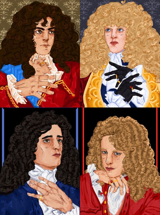
Haha wow I have improved a lot! Just like the Seb/Fernando ones, Mark and Jense's were meant to be put together. I think there's a lot of inherent characterization in their poses that highlight the difference between them. Mark is looking up, very wistful, looking up to greater people, greater things. Jenson's head is tilted down, almost looking at the viewer, he is very satisfied with his role and revels in it, he's here to slay!
Okay, yes, lore, characterization, sorry that it is so far down on the post!!
Jense would probably be the fan favorite if this AU was an actual book or show or something. He's the guy you randomly find while browsing Wikipedia and you're like, woah this guy is so cool??? Unlike Sebmarknando, he doesn't really have the same level of angst, he's kinda just chilling. He's a bit harder to write a lore post about, because he's basically that character who is always magically around the corner, ready to witness some crazy thing and just breeze past it.
He is less linked to Seb than people like Mark and Fernando, because he's basically just his personal minister of transportation(read: horse fucker), so he avoids a lot of the relationship complications and drama, but that isn't to say he's completely uninvolved. He really likes Seb, and loves to hang around with him and serve him, but he's not as beholden to him. He's who everyone goes to air their grievances or to get away from the others, and he's very happy with this role. He's generally willing to play any side in an argument, but does tend to have a pretty big soft spot for Seb overall(Seb also gives him cuteness aggression, and he wants to bite him. Especially when Seb puffs himself up and acts super bratty when he gets offended at not being seen as a proper ruler.)
He's royalty from other kingdom, but pledged his loyalty to Seb's kingdom when he was quite young and has served him(his father first) ever since. He started off somewhat low in the military, rose to a pretty high rank, was a renowed war hero, and then ended up retiring pretty early to tend to Seb's horses. That's an oversimplification, but yeah. He liked the military life, was very good at it, but decided he had done enough, and wanted to be involved in more direct service, albeit more laid back. As I mentioned in Mark's post, Mark *really* doesn't understand his choice to do this, because if Mark had been in Jense's position, he can't ever imagine being able to let all that go and living the quiet life.
He is the palace whore, everyone has been with him honestly. It'll be like, some man walks into his bedroom, only to see Jenson in bed with his wife, but instead of being angry, he's like "wow you couldn't even wait for me??" He's just very carefree, and happy to just slut around and tend to Seb's horses.
I think he definitely still advises Seb, and would go to battle if truly need be, but generally seems to be living in a different world than the weird psychosexual homoerotic political drama that the others seem to be living in. But as I said, it's not like he doesn't contribute to it! He loves to goad Fernando, and constantly plays devil's advocate in "debates" between Fernando and Seb. He's also obviously the one that keep "accidentally" locking them in rooms and forgetting where the key is.
Sorry if this isn't very explanatory, I hope it gives a general idea to the type of character he is???? As always, let me know if you have any questions! I kinda struggled on what to write here because I'm finishing this at almost 8 am 😭 so I'm not sure if it's great or not. But basically you need to know: horse fucker who is generally breezy and carefree but also can be a bit of a menace to society every once in a while.
#YAYAAAAAAA PRETTY HAPPY WITH THIS ONE!!!!#lmfao tho not 100% sure about the lore notes because i wrote this at like 8 am#hope its understandable 😭 and that you love jense as much I do#hes probably the funniest character in the AU#and like if it wasn't centered on seb/nando he would be the favorite#hes just often there as my kinda reaction character#tho both he and Mark are reaction characters but on opposite sides of the scale and they play off each other#jenson walks into a room where sebnando are psychosexually glaring at each other from across the room#and hes like hmmm how can i make this worse#and mark is the type to walk into the room. see whats going on. and briskly walk away#so jense absolutely loves to tease him w this kinda thing and just make any situation 100x worse(aka funnier)#well funnier for him probably not the other people involved#but its okay bcs they love him. hes jense!!! who wouldn't love him!! hes our favorite guy!! our jense!!!#I just love to imagine he gets all the sides of the gossip and is like hmm yes yes interesting#but doesnt use it for scheming or evil but rather just to tease and be annoying and make everyone blush :)#okay well anyways wow im not really discussing the art itslef sorry!!!@#I think he looks so handsome pretty in this 🥺#hes pretty difficult to draw but i think it came together when i gave him freckles tbh#i hope he gives off carefree but seductive but laidback prince 🙏🙏#f1#formula 1#jenson button#catie.art.#boy king au#*not sure about his title officially yet. i mean hes from somerset but yeah idk its okay
50 notes
·
View notes
Text

Sooo I actually decided to make better commission sheets, anddd... open commissions!! Sharing would be absolutely appreciated, whether that be reblogging, sharing on discord, or other social media platforms! Also, before I get into this, wanted to say that two examples have stars on it, which are art trades. The characters belong to Sebhris so go check them out!
Also (forgot to mention this before) but I am a student! I may be able to message throughout the day but don’t always count on it. My schedule for school is 8:30am to 3:40pm so keep that in mind!
This will probably be my pinned post for awhile, my about moving to my bio instead.
Now onto the info:


These are the main options I'm offering, but definitely feel free to ask if want a specific coloring style or lineart style I do, and we can discuss! Adding an extra character will be doubling the price as it takes just as much effort as the first character will take.
Also, if you rather just have a sketch, any sketch is just 4 dollars as long as it isn't colored/has very VERY simple coloring
I also am placing a policy where you have to pay half the price before I get started. I'm doing this so I know that you're legit about this transaction and so I don't get scammed. If you don't like it, don't request a commission.
I take paypal, cashapp, and venmo! (don't ask to use something else bc I only take those as pay options! sorry!)
Heres some examples of my work!

As I said both before and in this image, if you want a specific lineart, coloring, and or rendering style that isn't shown on the price option images, please don't hesitate to ask about it and we can discuss it!
#my art can definitely show you more of my work if you need some inspo!
feel free to ask any questions whatsoever!
to commission me, you can dm me either on tumblr, discord (preferred ngl) (antsypantsy is my user), or email me at [email protected]!
cya around!
#splatoon#fanart#commissions#digital commisions#digital commissions#digital art#art commissions#open commissions#commission info#oc art#my art#yippee
59 notes
·
View notes
Text
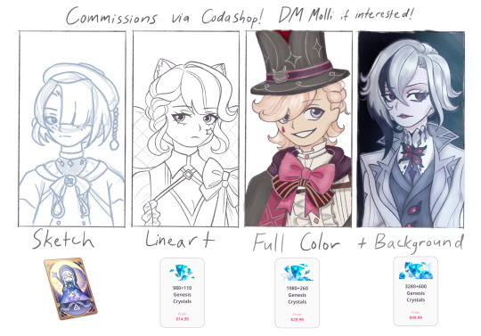
Molli’s Genshin Commissions!!!
Hey y’all! I decided to open up commissions because I so want to raise more funds for future characters/skins in Genshin. (Also if you’re here from one of my non-Genshin fanarts and have no idea what Genshin Impact is, welcome!!!) More info is down below :)
What is Codashop? It’s a website where you can buy in-game currency for your friends without having to log into their account. Codashop is an official partner of Hoyoverse (the company behind Genshin), so all purchases from that site are safe and legit! Also it’s not only restricted to Genshin, but also includes other games like Honkai Star Rail and ZZZ! Basically you pay on the site (with the UID I’ll give you) and the crystals go right into my Genshin account! I will start drawing your commission as soon as I see your receipt as confirmation.
Pricing!
Sketch - Welkin of the Blessing Moon ($5)
Lineart (aka a coloring page!) - $15
Full color without background - $30
Full color with background - $50
What can you draw? I mainly draw fandom characters (not just Genshin), as well as OCs, real people, and ships.
Is there anything you won’t draw? I won’t draw NSFW (I might allow spicy art if you’re at least 18, but nothing too explicit), mech, and just anything that promotes racism, homophobia, etc.
Will you charge extra for more than 1 character? Yes, additional characters will cost an extra Welkin (+$5).
Do all backgrounds cost the $50 top-up? It depends on the background, honestly. I suppose if you want a commission that has a really complicated background, there’s a possibility I might charge the $100 top-up instead.
I can’t afford a commission. What can I do? It really helps to reblog and just spread the word! I appreciate any and all support!!
And I think that’s about it! If y’all have more questions, don’t be afraid to reach out. Thank you for checking out my page! <33
#artists on tumblr#genshin impact#genshin fanart#digital illustration#queer artist#art commisions#commission#digital art#my art#commisions open#sketch#hoyoverse#genshin oc
12 notes
·
View notes
Text

WHOAH!! THE PARTY IS COLORED NOW!!!
for those unfamiliar, hi!! these are my initial designs for a currently unnamed cyberpunk rpg i'm making. their names are sylvie, v, xenon, and kori. you can read about them here!
anyway, these are only my initial designs and so they're still very much subject to change. i decided to just color the sketch instead of doing lineart because i don't want to spend excessive time on a simple lineup, but i might line it one day. who knows.
the weapons are currently just silhouettes because they're eventually getting their own post about designs!!
a bunch of stupid gifs under the cut for whoever wants em :3
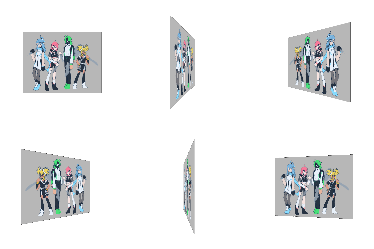
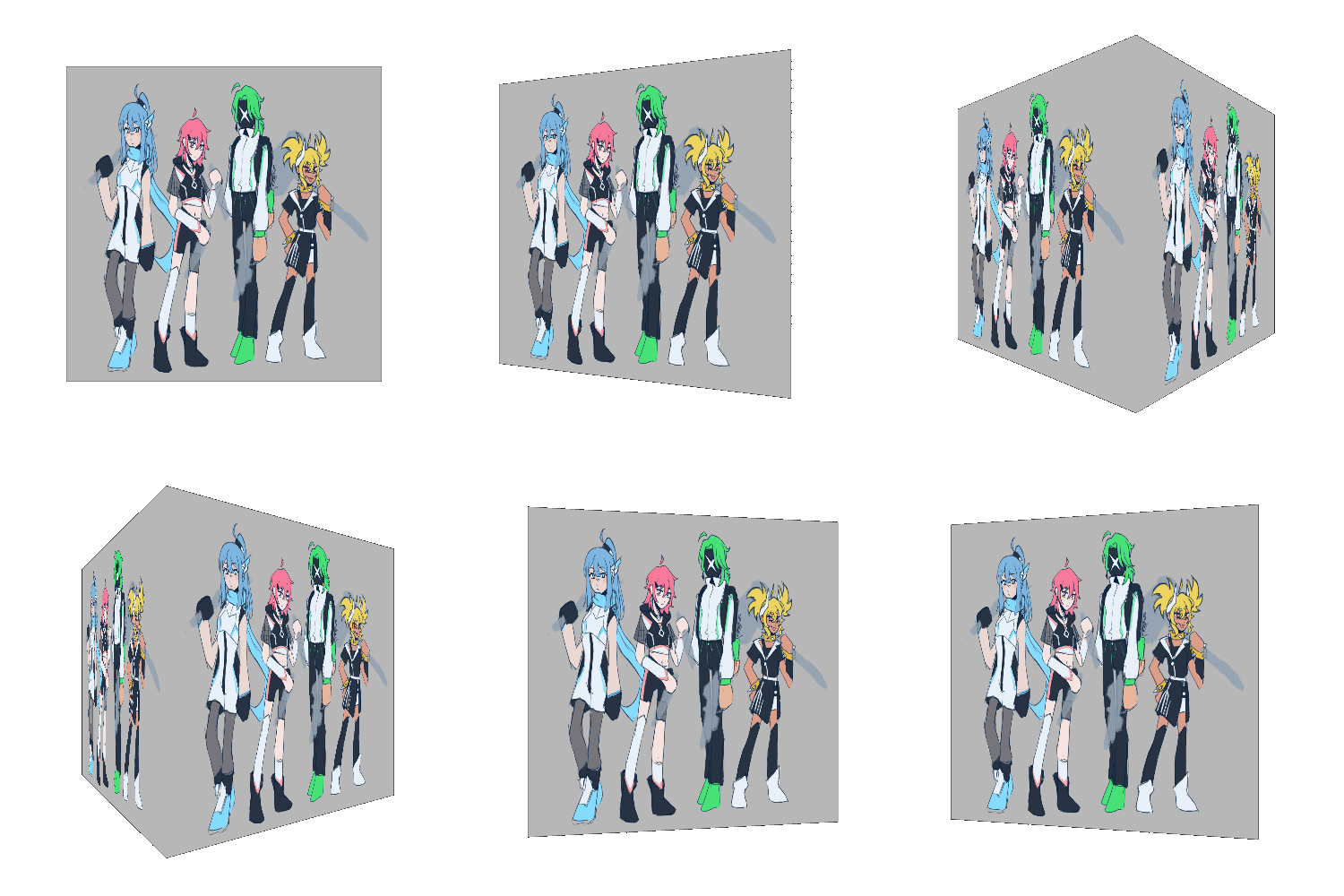
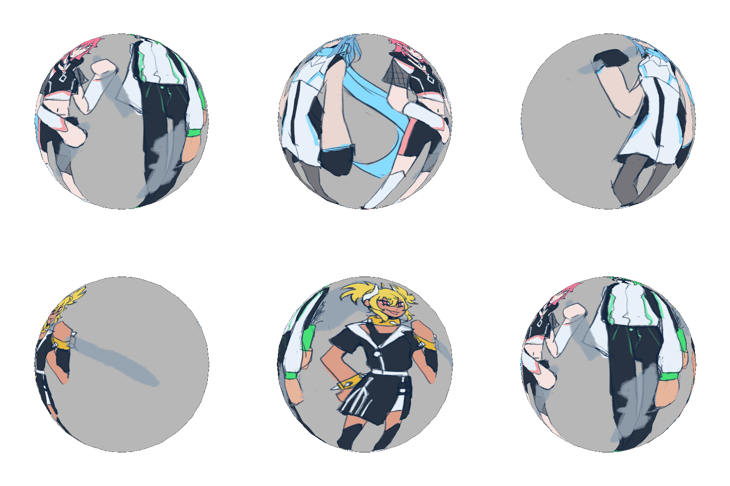

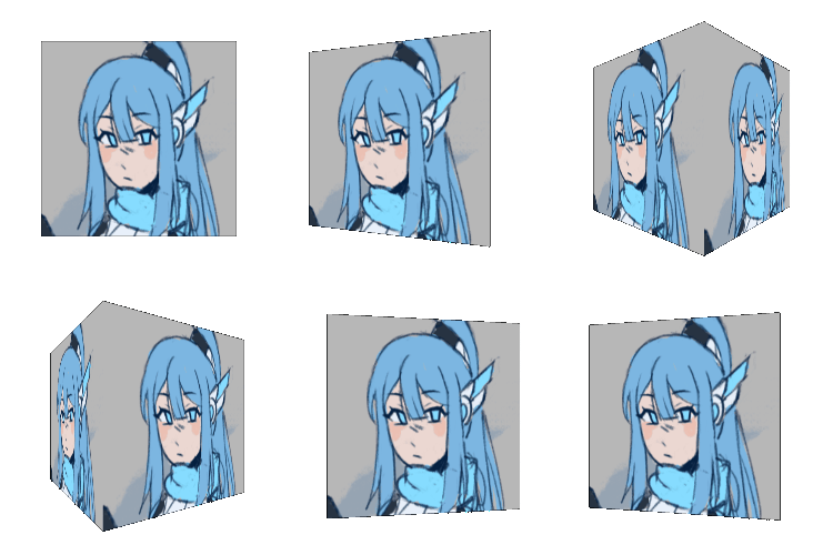
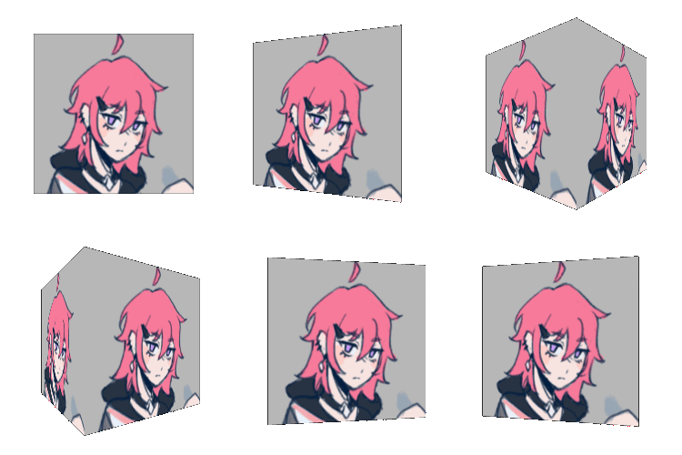
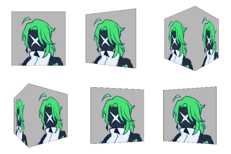

rotating them in my brain at all times
#pixell.rpg#pixell.art#rpg#game design#character design#oc#original character#game development#gamedev#feels weird using that tag but i guess im a gamedev now technically!! aaa!!!!#please ask questions about them if you have any i would be positively delighted to answer <33
30 notes
·
View notes
Note
if you havent yet, could you do an almond x latte fankid? i love that ship a lot :)
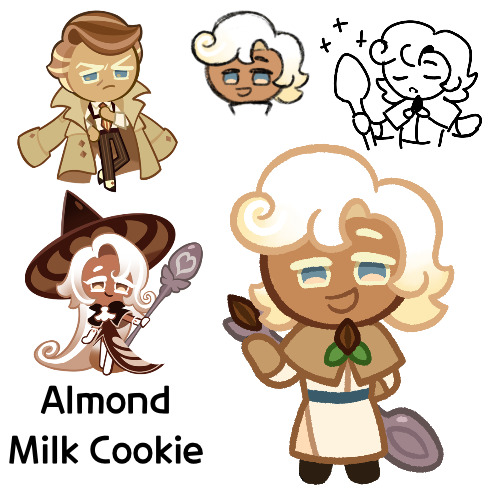
Here we are, this is Almond Milk Cookie
Funny enough, I was actually trying to go back and find this post after editing something, only to realize I never actually posted it and left it in drafts. Only for one day, but still
Anyways, so on to him
So Almond Milk here is a healer, using almost exclusively milk magic. He started out in Parfaedia, and spent a good portion of time there, until he switched over to the Vanilla Kingdom to learn healing magic, where he now works as a doctor
He’s a very friendly and kind sort, and he’s very dependable. Also, despite what some may think from his profession, he’s quite physically strong as well
However he is self conscious about not being made of “real milk”, instead being made from almonds, and he wonders if his false ingredient hinders his healing abilities. His mother has told him that whether or not his ingredient really counts as “real milk” doesn’t matter, but it’s never been something he’s able to let go. He doesn’t really make it that known anymore though, preferring to keep it to himself
Now on to design things
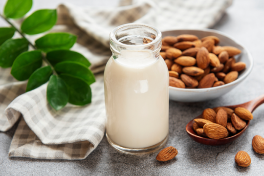
So I’ve had the name Almond Milk as an almondlatte kid idea for a good while now. Lattes are made of coffee and milk, and there exists a form of milk made of almonds, so it’s the obvious choice
Almond milk:
I made the initial rough sketch some months ago, so I don’t entirely remember the thought process behind it. But it looks nice, and like Latte’s but with one of Almond’s hair colors
I’m not sure why I gave him a thicker body type, but whatever, he has one. It’s not like I’m that good at drawing super skinny Cookies anyways
His outfit was originally going to be more hospital like, and probably somewhat closer to Butter Roll’s, until I decided that maybe I should make it more fantasy looking. Especially with all of my Almond kids generally having more modern looks to them, or at least in the way that Almond is “modern”, I don’t know the right word
The small cloak thing was a bit of a struggle, especially with his smile, but I eventually got something
In the sketch I gave his almond brooch something around it that looked nice, but I wasn’t really sure what it was going into the lineart, so I made it leaves. They probably shouldn’t have lines and should instead be solid green, but whatever
I gave him that spoon last minute in the sketch, since I remembered that as I said prior, I tend to not give my fankids accessories or tools anymore, and I wanted to rectify that. Unfortunately his pose didn’t really lend me well to putting it in his hands, so it’s just slapped on to the back. I’m also noticing now that the spoon itself it too small, at least on the bowl thing. But it’d be a big hassle to try and fix it, so I guess I’m stuck with it annoying the crap out of it
Oh yeah, so as mentioned earlier, I came to edit something in his design, that being his colors. Originally he looked like this
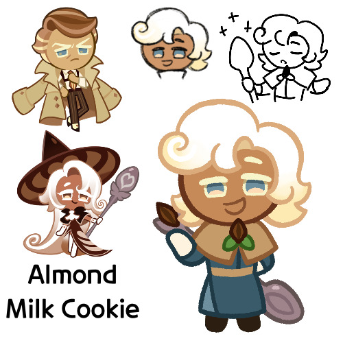
I liked the blue, and it does give him a color scheme unique from his parents, but my big problem was that the colors reminded me of Marcille from Dungeon Meshi. I don’t know if the outfit is exactly like hers, but it was bugging me, so I changed it. I think overall I like the new color scheme better, but I just wanted to mention the old one
I’m actually quite satisfied with how he turned out. Though granted I did have ideas going in about what to do with him, so that probably helped
Anyways, so that’s Almond Milk. I hope you like him
#cookie run#cookie run kingdom#almond cookie#latte cookie#almondlatte#cookie run oc#fankid#fanchild#almond milk cookie#my OCs#my art#requests#answers
39 notes
·
View notes
Text
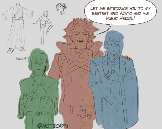
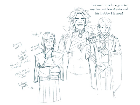
Itto looks like the type to say “hubby” unironically, love this guy
uh, my first concept of Heizou from arranged marriage au by @throwingstuffhere, thank you for inspiration there!
design explanation under the cut
uh.. look, character design is hard, and this is one of the first ideas i came up with after staring at Kamisatos for a while. this will change, if i ever do this again
there was this reddit post about Ayato’s design and how it was majorly inspired by Japanese Meiji era clothes, worn by both nobility and samurais, it is here, if you are curious
here, my main problem was, well, Heizou is decidedly not a samurai, so a lot of design choices for Kamisato siblings or even Thoma wouldn’t fit, he needs more space to move
so the liberties i’ve taken here (in this iteration, again, if i decide to work on this more i most likely will change things i didn’t do enough research for it to be any form of final design), i took Ayato’s design and adjusted it:
instead of Ayato’s coat, which will constrict his movements, flail around and overall be very impractical, here he wears a cloak, which is easy to remove and put it back on (and i imagine he’d flick the cloak dramatically); the Yashiro commission crest on his back
instead of the tight western trousers he’d wear hakama pants (or something along those lines), which also allows him more freedom
now, like Ayato, he’s also wearing kimono, but after sitting on it i’ve started to lean towards a western shirt under, but those tend to be tight as well, so cropped? Heizou doesn’t tend to worry about propriety and it wouldn’t be visible anyway, so that might be one of the changes i’d make
unlike Ayato who wears at least four layers of fabric, Heizou would have at most three and that’s counting the cloak
to emphasise the fact that Heizou is a part of the family, but is distancing himself from them, I’m giving him clothing of similar style, but slightly different colour scheme (i know this image is not coloured, bear with me):
Kamisatos’ accents colours are deep blues, purples, golds. well, in Ayaka’s case, it’s more pink then purple, but I’m wilfully ignoring that, now it’s light purple
Heizou in this au might wear gold and purple, and burgundy (or maybe orange-ish brown like his shorts from his og design) as “his own” color, so he fits in, but also not really
every Kamisato (Thoma, obviously, included) has their visions motif in their clothing (or, well, their main outfits ig, i didn’t look at Ayaka’s new dress): so Heizou’s most likely will be on his cloak, like Thoma or Ayato, or his pants, like Ayaka’s dress. which also could tie into his character arc, if it comes to that: Heizou accepts his role and instead of the burgundy he’d wear his vision’s blue-ish green, so his colour scheme is closer to the siblings
did you know that inazuman designs tend to have a lot of rope and ties? well, i didn’t until before i started this thing, so naturally this design is too simple for Inazuma and genshin in general, so it needs more work
also i made his hair a bit less unruly then i would normally do (not that anyone could tell) and he doesn’t have the tie
actually nvm here’s the “canon” Heizou in my style
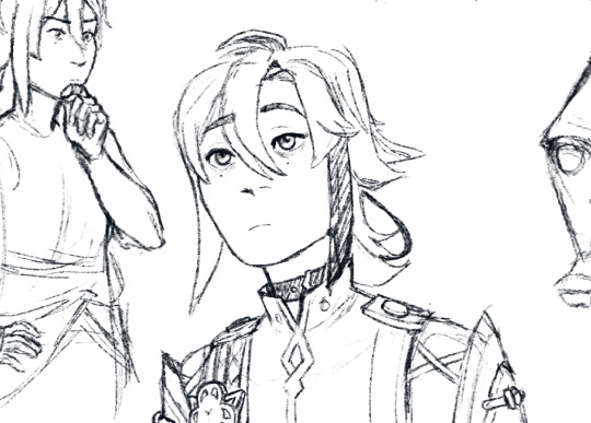
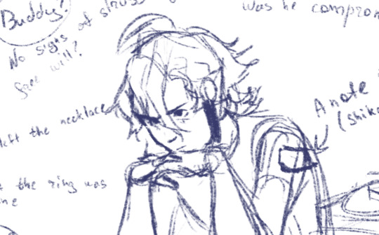
and if the lineart looks like shit, here's the sketch
#genshin impact#arranged marriage au#shikanoin heizou#technically kamisato heizou#kamisato ayato#arataki itto#ayahei#i swear im not insane#this is literally me learning how to lineart in csp haha#genshin fanart#as much as i love itto i was not ready to draw his whole design#i suddenly remembered why i stopped drawing huh#turns out art is time consuming and im a senior in uni figure that#notecapn art
31 notes
·
View notes
Note
I love your art sm!!!!!! Do you have any drawing tips / process examples?
thank you!
i don't take many progress pics, so here's a timelapse just for you.
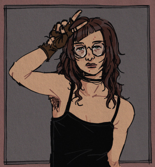
i'm almost entirely self-taught (and in a very uneven manner lol) so i can't offer much in the way of technical skills. so i'll just say a few of the things i'm glad to have learned over the years. (largely wrt digital art)
-if you really dislike a step in the process, there's a good chance you can decide to just... not do it. hate doing lineart? you can just neaten up your sketch a bit, or go completely lineless. hate coloring? switch to black and white. hate shading? just don't do it.
you'll draw a lot more if you enjoy it, and in the future you'll probably get in the mood to try again at something you used to hate, and re-evaluate, so you're not missing out.
like for a while i drew almost entirely in black+white because i hated coloring, and then i played theresia: dear emile and was hit with the inspiration to work with color again, and i've continued to do so ever since.
on the other hand, i've been doing digital art almost exclusively for like 10 years now. occasionally i'll be in the mood to draw with an actual pencil again, so i do it. and my decision is reaffirmed haha
-the scope of your character drawing will truly unlock the moment you realize there is no fundamental difference between drawing men and women, only specific features that differ on a person by person basis
-most programs will let you use any brush as an eraser (or "draw with clear"), it's a lifesaver for using heavily textured brushes
-use pureref for your reference images. idk how i worked without it for so long.
-fall in love with drawing noses. they're one of the most distinctive parts of the face, and so many people just default to one or two types!!
-sketch on a grey canvas, instead of a white one. spare your eyes the strain
-the artists who actually went to school are right, you really should use references. they making everything so much easier AND you improve your skills. win win scenario
#ask#anonymous#sorry that these are probably really generic common. that's just how it goes sometimes
21 notes
·
View notes
Text

Hey. Guess what. Update post time!
I am happy to announce I am still alive haha. This project has not been cancelled, I have not disappeared under mysterious circumstances, and development marches on.
This is a little bit of an informal post because there’s an error in the cover image, and if you see it, no you don’t. But I wanted to get it out quickly, so here we are.
I have decided to scrap the second Pre Comic, because its been driving me insane and my style has since changed from when I made the original sketch. Lol. So keep an eye open for the first issue sometime in late August/early September! Also, there’s been a little bit of consideration in finding someone to do colors, which would take a HUGE burden off me. I am not a good colorist 😔. Originally, I wanted to do it all, but I now know that’s not possible. So, instead, I’ll be doing the writing and sketches and lineart! In theory!! I’ll keep you all posted!!
More good news: the fabled computer that will be mine has been dropped off, literally minutes before I started typing this post. So, art production will ACTUALLY speed up, especially with the start of school. I know that sounds contrary, but trust me ;)
I’m really excited to get this project rolling, and will see you all when that drops! Thank you so much for your patience. Niko out!
If you have any questions, feel free to send an ask <3
#the jackal project#sonic forces#infinite the jackal#sonic the hedgehog#the jackal squad#finn the jackal#bonus content#update post
7 notes
·
View notes