#customizable boxes
Explore tagged Tumblr posts
Text
edited my blog theme again so posting it here so all you mobile only users can see <33
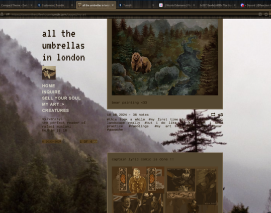
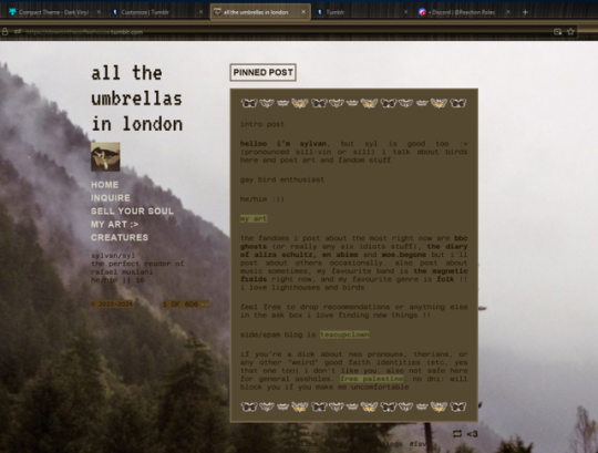
#i couldn't find any matching user boxes or stamps#and searching was giving me a headache so i stopped#but i will look again later#i wish mobile themes were more customizable#ramblings
11 notes
·
View notes
Text
Opinions. On if I made a custom card deck. With my OCs
#i already found a website for it#and its fully customizable#so im gonna do all the face cards as OCs#and custom backs for all of them#idk about fhe box yet#not decided#uhhhgh#yeah#ive had this idea for like 3 years but i never did anything about it#im so close too#like i just need to figure out oneee more character to put on the jack of spades#so normal about this guys#oc#oc art#<< can i tag this? its like. future oc art#im gonna post all of the cards here too bc iiiii want to
2 notes
·
View notes
Text
Elevate Your Tasting Experience with Vivanda's Custom Selections!
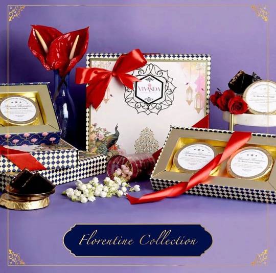
Customized Chocolate Gift Box Vivanda offers customizable chocolate gift boxes, adding a personal touch to your gifts. You can add your personal message or choose from our themed designs. Whether for a birthday, wedding, or corporate event, a custom gift box from Vivanda makes it memorable.
Buy Chocolate Gift Boxes Online Want to surprise a chocoholic friend or make your loved ones feel extra special? All you need to do is buy chocolate gift boxes online from Vivanda. What’s great about it? It’s simple, hassle-free, and conveniently done in the comfort of your home.
Customized Chocolate Gifts Online At Vivanda, we believe that every occasion is unique, which is why we offer customized chocolate gifts online. Please make your own assortment of your favorite flavors or choose from our curated boxes.
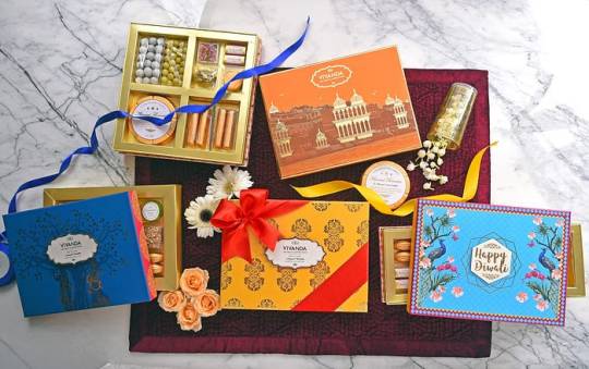
Personalised Corporate Chocolate Gift Box Why not show appreciation to your employees or clients in a sweet way? Make corporate gifting a delightful experience with our personalised corporate chocolate gift box.
Diwali Chocolate Gifts for Employees Celebrate the festival of lights in a different way. Show your gratitude to your outstanding employees with specially curated Diwali chocolate gifts.

Premium Baby Announcement Chocolate Gifts Celebrate the arrival of your little bundle of joy with our premium baby announcement chocolate gifts. Each box is a treat that heralds the sweetest beginnings.
Thank You Chocolate Gift Box Gratitude comes with a sweet note at Vivanda! Express your heartfelt thanks with our specialty ‘Thank You’ chocolate gift box. With our irresistible chocolate selections, we elevate and revolutionize your tasting experience. Choose Vivanda and create priceless chocolate experiences!
#customizable chocolate gift boxes#buy chocolate gift boxes online#customized chocolate gifts online#personalised corporate chocolate gift box#Diwali Chocolate Gifts for Employees#personalized wedding chocolate gift box#Thank You' chocolate gift box
2 notes
·
View notes
Photo

(via Responsive Standing Striking Bag 2025)
0 notes
Text
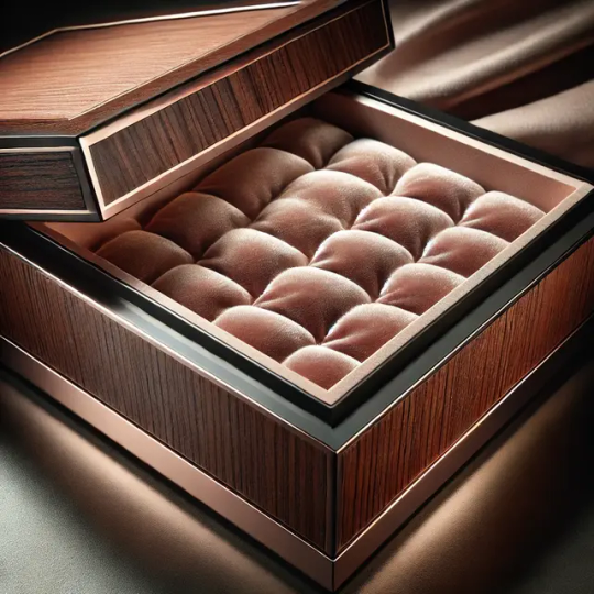
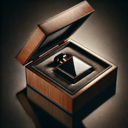
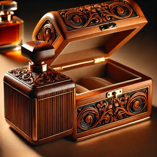
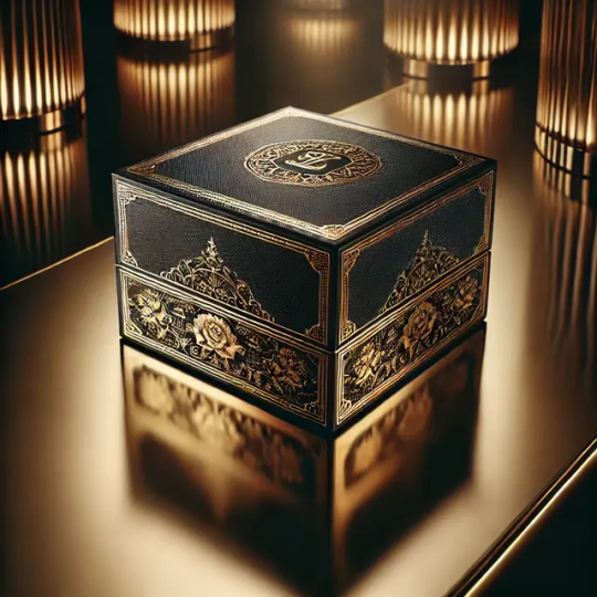
Wooden Gift Company “Wooden Gift Company” is a Brand of Pravat Timbers. Started in 1965, WGC has been one of the pioneers in Imaging, Customizing, Manufacturing, Distribution, and Exporting of Wooden Products.
Product Description:
Elevate the art of perfume storage with our exquisite Luxury Wooden Perfume Box, expertly crafted to pamper your senses. This stunning, fully customizable box is the perfect gift for perfume connoisseurs, luxury enthusiasts, and anyone deserving of elegance.
Features:
- Premium Materials: Handcrafted from high-quality wood, ensuring durability and sophistication.
- Customizable: Personalize with names, initials, or messages to make it unique.
- Spacious Interior: Stores multiple perfume bottles, keeping them organized and protected.
- Soft-Close Lid: Smooth, effortless opening and closing.
- Velvet Interior: Luxurious fabric cradles your precious perfumes.
Design Options:
- Wood Finishes: Choose from rich walnut, elegant cherry, or sleek ebony.
- Engraving Styles: Select from modern, classic, or script fonts.
- Custom Colors: Match your brand or personal style.
Perfect For:
- Luxury gifts
- Perfume collectors
- Home decor enthusiasts
- Special occasions (weddings, anniversaries, birthdays)
Care Instructions:
- Dust with a soft cloth
- Avoid direct sunlight
- Handle with care
Order Now and indulge in the art of luxury perfume storage!
Make this New Year truly special, Order now to get the best price
Contact Email ID: [email protected]
Contact Number: +91–90510 51051 (INDIA)
Select Your Design or Decide a Design: Decide the shape, size, and finish that fits your decor style. Customize Colors & Finish: Pick from various colors and wood finishes. Add Personalization: Include names, dates, or any unique message to make it yours & an Example Product.
#home & lifestyle#wooden perfume box#luxury wooden products#interior decorating#living room#interior decor#decor#home decorating#business#luxury wooden perfume box#customizable gift#perfume storage#wooden gift box#high-end home decor#personalized gift#LuxuryPerfumeBox#WoodenPerfumeBox#WeddingGifts#AnniversaryGifts#BirthdayGifts#WoodenFurniture#CustomDesign#PersonalizedGifts#ElegantHome#SophisticatedStyle#ClassicDesign#HomeDecorEnthusiasts#LuxuryLiving#GiftGivingIdeas#ShopNow
1 note
·
View note
Text

Discover how Clariannt's Modular Gang Boxes enhance the functionality and aesthetic appeal of your electrical setups. Designed for seamless integration with Roma switches, these high-quality solutions offer customization, durability, and ease of installation for residential, commercial, and industrial applications.
#Modular Gang Boxes#Clariannt#Roma switches#electrical installations#ABS material#customizable#durable#easy installation
0 notes
Text

Customizable Gift boxes!
#Customizable Gift boxes!#customgifts#CorporateGiftingTrends#InnovationInGifting#PersonalizedGifting#CustomizableGifts#MarketShifts#BusinessGrowth#FestiveGifting#IndustryTrends#GiftSolutions#gifts#Special#Sweets#Festival#Bangalore#followers#Memories#hampers#hra#marketing#Admin#Follow Us On:#Instagram - @kappaboxes#Linkedin - www.linkedin.com/company/kappa-boxes
0 notes
Text
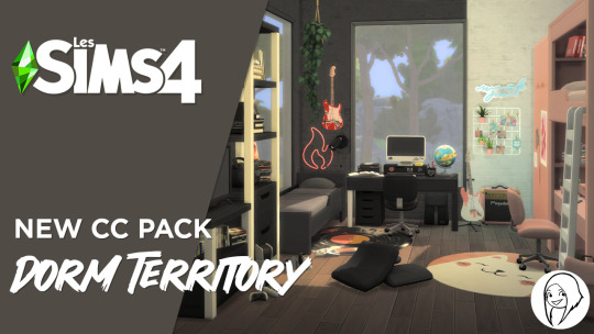
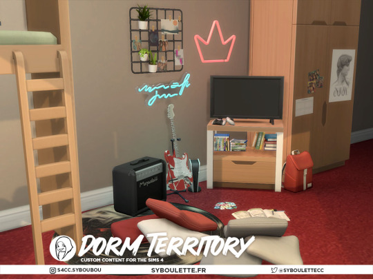
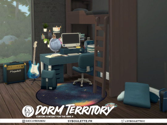
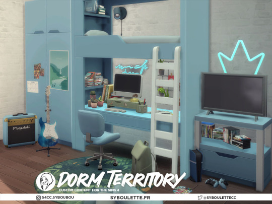
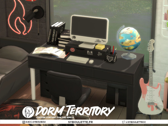
Dorm Territory CC set
This is the ultimate customizable haven for young Sims with a new custom content set designed for crafting the perfect dormitory or teenage bedroom. This collection is packed with modular elements that offer endless combinations, featuring an extensive range of color swatches to match any style or theme.
Dive into diverse thematic options—from celestial space motifs and geeky gadgets to musical influences, gothic darkness, adorable kawaii touches, athletic vibes, or serene nature elements. Each theme is meticulously curated to ensure that every room can be tailored to reflect the unique personality and interests of your young Sims.
Whether you opt to differentiate each room with its own distinctive clutter or unify them under a common theme with personalized variations, this set provides the flexibility to create spaces that are as individual as your Sims. Explore the possibilities and let your Sims express their identity in their personal sanctuaries 🤓
Description
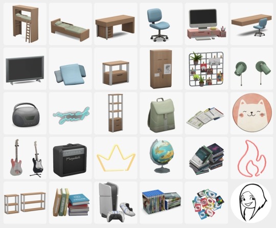
This set includes 35 new items:
Comfort: Bunk bed, single bed, desk chair, messy pillows floor seat
Surfaces: Desk, wall desk, standing shelfes, wall shelves, TV console table
Storage: Dresser (with our without posters)
Electronics: Computer, Small TV, Hifi stereo, Video games console (requires City living)
Lighting: Left and right wall lamp, crown neon, fire flame neon, quote neon
Hobby: Functional electric guitar (+ wall decor version)
Clutter: Wall organizer, bagpack, homework, rug, decor amp, globe, cds stack pile, Schoolbooks pile, controllers, videogames box, uno cards
📥Free download on my website
✨NEW ✨ If you can't subscribe to my patreon you can still support me via the Support A Creator program ! 💚

#s4cc#syboubou#Syboulette#thesims4#s4mm#ts4#ts4 custom content#ts4cc#sims4#ts4 download#ts4 custom objects#sims 4 objects#s4decor#s4object#s4 custom content#ts4 furniture#simblr#ts4 build#ts4 buy#ts4mmcc#ts4 maxis match#ts4 maxis cc#sims 4 maxis cc#maxis match cc
7K notes
·
View notes
Text
refreshed, healed, content, thriving, ready to take on the world <- just reorganized his desktop icons
#was tired of my steam game shortcuts taking up the whole damn screen#and having to like. maneuver them around so i could still see my background#so i found this software that lets you like. basically put your icons in little compartments#and you can scroll through them and all. and it's So customizable#you can put the boxes wherever you like resize them resize the icons change the color#there's even like a labeling system for the icons ? you can tag them things like ''work'' ''leisure'' ''important'' & all#and then organize with that it's p neat#Mostly though you have an option to make the compartments invisible unless you click on the desktop#meaning you get to see your whole desktop image Yeehaw#loving this shit rn#it's called nimi places if you wanna check it out. it free#the only downside i've found is that like. you can't just drag and drop icons to a compartment#basically each compartment is just tied to a folder on your computer and shows everything that's in it#so like i had to make a folder to put my shortcuts in And make separate ones for each 'category'#so say if i install a new game on steam and it adds a desktop icon for it#i'm gonna have to manually put that in the corresponding folder for it to show up in the compartment#instead of just dragging it in and boom done#but eh. minor drawback tbh it'll take like 10 seconds
1 note
·
View note
Text

[Image Description: A white text box: "Accounts created after May 8th, 2023 have the 'For You' tab as the default dashboard tab. Other existing users' dashboard tabs are not changed. We are also working on making dashboard tabs even more customizable, including adding the ability to choose which tab appears first." End ID.]
From the latest update (June 2nd, 2023)
Oh, fuck this. If you're a new user, don't forget to set your dashboard to Following and turn "Based on your likes" and "Best stuff first" off
EDIT: A few corrections
For new users, you can't change the default back to Following. This means that whenever you open up your app/go to your dash, the first tab you'll see is the For You tab
Note for the previous point, I can't confirm this since my account is rather old, if anybody has an examples, I'd appreciate it
Yes, some people mentioned that you don't have to turn off Based on your likes and Best stuff first, but that's mostly my preference since (to me at least) it does not work, it just shows me random shit that is absolutely not based on my likes
My main problem with this update is that it strips the user from being able to choose what they wanted to see. It's totally cool if you use the For You tab, but it shouldn't be the default option
Additional points from the tags and reblogs:
You can turn off public likes and followings, again, not mandatory, but it's an option
Make sure to turn off Tumblr Live (pretty sure it's only available to US users, which I am not one) since it apparently drains mobile data
There are (browser) addons and extensions that allows you to block elements or make your tumblr experience better, like uBlock Origin (an adblocker which can be used to block certain elements from showing up) and the XKit Control Panel/New XKit
#pink posts#what the fuck is this update hello???#one week later edit: yeah a few corrections#also why the fuck did this explode
24K notes
·
View notes
Text
https://www.luxuryhomes.om/brand/agresti
0 notes
Text
4t2 Showers!


Felt some type of way and decided we needed more showers! Everything has a dirty state and most everything has 2 subsets. I hope you like it, please let me know if you experience issues!
These items do require LordCrumps' 4t2 shadow file
Download all - SFS | MF
Pick & Choose - SFS | MF
details below the cut:
Crystal Box | 1315 simoleons | 560 poly Double Delight Combo | 2100 simoleons | 1447 poly Post Modern | 375 simoleons | 682 poly RAW Walk-In | 635 simoleons | 804 poly Under the Sea Clawfoot Combo | 845 simoleons | 1689 poly Unicorn Dream | 500 simoleons | 352 poly EP03 Plink | 705 simoleons | 312 poly EP05 Vintage Subway Tile | 800 simoleons | 780 poly EP06 Designer's Deluge | 2100 simoleons | 1447 poly EP06 The Swan's Ablution | 1500 simoleons | 679 poly EP07 In or Out Outdoor Shower | +communal | 880 simoleons | 349 poly EP08 Almost Invisi 2.0 | 300 simoleons | 714 poly EP08 EZPZ Stall | 400 simoleons | 636 poly EP10 Steamy Times | 325 simoleons | 914 poly EP13 Generational, but Different | 2300 simoleons | 1460 poly GP01 It's a Shower Tarp | 335 simoleons | 1024 poly GP01 Waterfall Shower | 585 simoleons | 900 poly GP02 Tranquil Waters | 880 simoleons | 465 poly GP04 Sheer Will Clawfoot Combo | 1225 simoleons | 2000 poly GP05 Xtreme Shower Tub w/ Customizable Curtain | 1500 simoleons | 1255 poly GP06 Stereogram Tile | 860 simoleons | 968 poly GP07 Epic DIY Shower | 1500 simoleons | 1810 poly GP08 Loudini's Chamber of Sprinkles | 600 simoleons | 851 poly SP11 At One With Shower | 950 simoleons | 322 poly
#4t2#s2cc#ts2cc#sims 2 cc#sims 2 download#ts2 download#4t2cc#4t2 conversion#the sims 2 cc#sims 4t2#4t2 download#4t2 objects#sims 2 custom content#download#dl:buy#dl:obj
2K notes
·
View notes
Text

[Download] Lyralei's Pose Addon (Early Release)
It's finally here! 🎉 An successor to Virtual Artisan’s incredible Pose Addon!
VA’s Pose Addon has always been an essential part of my game, but it’s no secret that it had a few quirks and issues. While fixing those, I couldn’t resist adding some exciting new features to take it to the next level!
DOWNLOAD:
Simblr.CC
Requirements:
Cmomoney's Pose Box
Why Not Use Virtual Artisan's Pose Box with this mod?
This mod is an update to their original mod! Since it’s no longer available on their website, I decided to fully integrate it into this mod.
What does that mean?
This mod includes VA’s Pose Addon, so you don’t need to download it separately. Just make sure to delete the old version to avoid any glitches or conflicts! 😊
⭐ New Features:
Most things that are mine can be found under "Photo Shooting" > "Lyralei's Pose Addon".


👀Better Look at
Ever posed a sim to look at something next to them, but they do this weird "eye roll-y" and "nudging slightly to the left" type of look at?
Or maybe you simply wanted to make the eyes look somewhere and not the head?
Let's check it out:

Here we have Morgana, looking normally...


Left = Va's Pose addon - Right = Lyralei's Pose Addon.

To get started, first pose your Sim as usual! Once they’re in position, simply click "Look At..." to make it work.
Massive thanks to @thesweetsimmer111 for helping me on this!
Look at with just the eyes:
As mentioned, you can also just move certain parts of the body! In this case, the eyes!



(Left: No Look At, Middle = Looking left, Right = Looking up)
This is done with something called a "Track Mask". When selected, the only parts of the sim will move that fit the chosen trackmask.
For example: Track Mask "EyesOnly" will ONLY animate the eyes!
Blending Poses
Can't find a pose online that fits your needs, but you do have 2 poses that would totally fix that?
Not a problem anymore! With "Pose Blending" you can use a pose "base" and then overlay another pose to create your own dynamic poses!
Here are some examples!
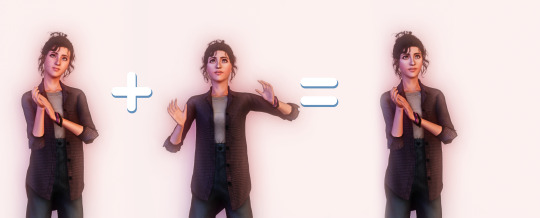
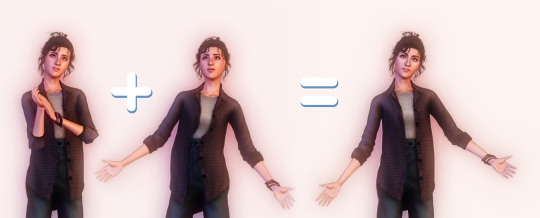
On both cases, we have the "base" pose on the left. Then I have chosen to blend it with the pose in the middle, to get this as an end result! :)
How to:
First, pose your sim as you normally would
Go to "Photo shooting..." > "Lyralei's Pose Addon..." > "Utils..." > "Blend" > Choose whichever option you'd like to use! :)
Pick the Track Mask you'd like to apply. If you only want the upperbody to be affected, click that option.
Click/type in the pose you want to blend it with....
And tada!
Sitting/Laying poses:

Even that's possible! :) Keep in mind, though: The base pose HAS to sit/lay/etc. Otherwise, your sim will elevate!
Categorised Pose List
Frustrated because every time you want to grab a pose from your list, it takes 3455325352 years for the list to load? Well, wait no more!

Completely customizable through XML, you can now sort poses in their own respective categories!

Need a sitting pose? no problem! Just go to Lyralei's Pose Addon > Take pose From... > Common List > Sitting, and there you have all your sitting poses! :)
Can I customise this list myself?
Of course! I wrote a How-To here: Click me!
🕰️ Show History
The Add-on remembers your pose history!
Whether you’re a dedicated “Pose by Name” user or prefer the simplicity of “Show by List”, both options now display your pose history for quick reference.
Note: Each Sim has their own individual history list. This means you’ll only see the pose history for Sim X when clicking on them, and not for Sim Y.
What did I fix for Virtual Artisan's Pose Addon?
I've made sure to keep everything as it used to (and if I made a replacement for it, it's now labeled with "[LEGACY]" at the beginning of the interaction).
But, of course there were some bugs that came with it.
Changelist:
There is now an interaction that uses both look at & reaction simultaneously. (In case you don't want to use my look at interaction).
Fixed an issue where reactions would sometimes or never show on the sim.
Fixed an issue where sims didn't always want to look at the item.
Fixed an issue where certain poses get called twice, making it harder to keep reactions or even look at history data.
Optimised the code here and there.
Most interactions will now continue on posing your sim if you exited out of the interaction, rather than resetting it. (this counts for "Change Expression" and "Look At").
DOWNLOAD:
Simblr.CC
#ts3#the sims 3#the sims#sims 3#sims#sims 3 cc#ts3 cc#ts3cc#sims3cc#sims 3 shopping#sims 3 poses#sims 3 story#ts3 script mod#sims 3 script#sims 3 script mod#sims 3 mod#ts3 mod#ts3 mods#sims 3 mods
639 notes
·
View notes
Text
a beginner’s guide to…
✨ altars ✨
here are some materials you can use for an altar, whether it is for your spellwork, a deity, or any other use! altars should reflect your personality, and be a space where you feel happy and safe :D
none of these materials are required, and everything is completely customizable to your beliefs! (just practice respect and safety obviously)
🕯️ basics 🕯️
an altar cloth is a piece of fabric that covers your altar. this could be a bandana, a small blanket, or even a piece of paper!
a glass plate is a mundane but VERY versatile altar piece. it can work as an offering dish, a tray to collect wax drippings, or just a little trinket holder
candles are an easy addition to any altar. you can use any type of candle, but my favorites are taper and prayer candles. scented candles are completely fine to use as well! choose candles based on color and scent
natural materials like crystals, flowers, plants, animal bones (responsibly sourced), etc. are an incredible addition to any altar! if you have a deity altar, learn about their associations and use this to guide your choice
paper and pen/pencil will be your best friend if you write petitions, draw sigils, etc. keep them near your altar for convenience
🌱 cleansing 🌱
many people believe an area should be “cleansed” before it is used as an altar or sacred space
methods of cleansing include incense, water cleansing, sage smudging, and more
incense cleansing is often done by wafting an incense stick or cone through a space and visualizing the smoke clearing out negative energy
sandalwood, lavender, and rosemary are common incense choices for cleansing
water cleansing is something i do a lot, it can be done by sprinkling water in an area or even washing/pouring water. regular tap water is perfectly fine, but you can also incorporate moon water, sun water, rainwater, etc.
smudging with sage involves burning a bundle of sage and, similar to incense cleansing, wafting the smoke through the area. sage smudging is traditional to indigenous tribes like the Lakota and Navajo. as a result, sage smudging (especially the use of white sage) is often considered cultural appropriation when done by non-indigenous people. i am not indigenous nor do i use sage, so i am not incredibly well versed on the subject but i thought i should include it. always do research and practice respect and sensitivity 💌
🌙 takeaways 🌙
finally, your altar is YOUR space. you can include or exclude anything you want; your space doesn’t need to be “aesthetic” or make sense to others
my first altar was a cardboard box with one candle and a handful of crystals. it wasn’t expensive or fancy, but it got me into my practice
through the years, my altar has grown and changed as i have
if you want to make an altar, start with what you have! you would be surprised how powerful your resources are 🩷
#witchcraft#witches of tumblr#altar#witchblr#baby witch#witch tips#paganism#hellenic pagan#deity worship#aphrodite#aphrodite worship
1K notes
·
View notes
Photo

(via Responsive Standing Striking Bag 2025)
1 note
·
View note