#curves + gradient maps on soft light low opacity + selective color white are your friends
Explore tagged Tumblr posts
Note
hi! i noticed you said you were fairly new to making gifs, and i'm also kind of new and still struggling on how to make the quality crisp/how to get good coloring. is it possible for you to provide some advice / tips for me?
ah hello !! yes, i started last year spring but i'm feeling a lot more confident these days so hopefully i'll have some insights that are of use to you 💜
i yapped a lot, so i'm putting most of this under a readmore
first: tutorials are your friend. gifmakers sharing things are your friend! we gotta look out for each other lmao. how else will we keep our timeconsuming hobby on dying website alive. try to find resource blogs like usergif tutorials section or these sorts of things. im sure lots of us muddled our way through like that. if you have a favorite gifmaker see if they have like a photoshop help or a ref tag, too, that's nice (i dont on this blog, but lots of folks do)
second: quality generally is going to be a lot bit down to your source video. u can sharpen and do everything you like to 480p and it will still be 480p you know? so for kpop, most mvs and that kinda stuff will be in 4k which you can download from youtube and that's nice enough. if you want to have better you can look for masters (which i do, i have a huge list of hoarded mvs). for performances ideally you want either like nice 1080p .ts files or uhd - there are places you can look for that like on twitter or on different sites. basically you want to use the nicest you can get (that wont brick your computer - 4k can be troublesome for this reason sometimes)
third: once you have nice quality video source, a lot of crispiness and prettiness is down to individual sharpen settings and coloring, especially contrast and white balance. curves tool is your friend for fixing tints/white balance/contrast. here's a good sharpen actions set from my mutual @/sugurugetos (and thats her resource blog so it may be worthwhile to poke around in there). i use a combination of my own sharpen settings + photoshop camera raw filter most of the time.
(aside: there are some other more complicated things you can do to nice-ify your footage, like vaporsynth/avisynth or handbrake or topaz upscale or whatever, and im here to tell you i dont use any of those things and i still make it out okay hehe. but there are many tutorials for them too if you like)
fourth: it is a learning curve like any other creative hobby so give it time & keep trying hehe. most gifmakers have their own style of coloring/sharpening and yours will become more apparent once you figure out how you like to do it. i believe in u
#rowan asks#gifmaking#long post#side note: one of the most important coloring skills for kpop gifmaker compared to regular is that you Need to know how to make things#less white and overexposed esp when stage lighting is super duper bright and/or filters are involved#curves + gradient maps on soft light low opacity + selective color white are your friends#hopefully any of this is of some use to you hehe#if you have a more specific question let me know and i can try to answer that too !
5 notes
·
View notes
Note
would you ever consider doing a colouring tutorial?
hi! i really don't have the time to do a tutorial of my current process (and plus i keep changing it all the time anyway so i'm not sure how useful it would be) but i did this tutorial (pls view on web) almost a year back that covers the basics. i can give you some more pointers under the cut!
so as is probably obvious, i don't use the same coloring style as i did in that tutorial anymore, but i think its still a good guide to get you started, and plus the steps i've mentioned, here are some of the things i like to do:
i now use two curve layers instead of one; i duplicate the original curves layer and reduce the opacity as needed, just to keep the gif as bright as possible.
gradient maps. these aren't just useful for giving your gif a splash of color, i now use one or two gradient maps in most sets - one layer set to black and white at soft light and one layer set to grey and white at soft light. i keep the opacities of these layers low; preferably around 50% and keep lowering them depending on if the scene is already dark. this is a great way to add contrast, make your gif look sharper and less pixelated, and the grey to white layer really enhances the whites!
photo filters. these are also really a great way to give your gif a more unique look! i like to have a photo filter layer to some cool color - blue or purple - and then i lower the opacity to around 50% again and set it to hue blending mode. then, sometimes i duplicate the layer, lower the opacity even more - maybe to about 30% - and then set it to screen (note: if you followed my tip on having multiple curve layers, don't add the second photo filter layer - instead, try moving your second curve layer directly above the first photo filter). you can see examples of me using this technique here and here.
selective color layers. depending on what colors are present in the gif (while giffing 911, for example, blue is a very prevalent color), i like to have multiple selective color layers to enhance the colors that are already there and make them look as vibrant as possible; layers for cyan and blue; yellow and green; majenta, and so on. also be sure to use plenty of selective colors on red to balance out skin tones of the characters - especially poc!
i think that's about it! if you have any questions, feel free to ask and i'll do my best to help you out! 💕
2 notes
·
View notes
Note
hello! i love your gifs a lot and i just wanted to ask you about them from technical point of view, because i see that your coloring helps the quality and i love how your gifs "pop out", your skill right there is amazing. so i was wondering if you could share some tips on how you improve your quality? how do you sharpen your gifs and which adjustments you use to color correct? 💜 thank you so much in advance!
pardon my late response! this is very kind of you to say, thank you so much! i come from a background of giffing movies and tv (several of you have guessed this and you were correct lol) so my work on here pretty much follows the same standards. 1080p videos, working with screencaps, smart sharpening twice (500%, 0.3px radius, remove gaussian blur, more accurate checked + 10%, 10px radius, remove gaussian blur, more accurate checked). i do not use topaz clean on my gifs. i then start off my coloring with a curves later to do quick color correcting with the black and white eye dropper tools before moving onto levels, selective color (paying close attention to reds, yellows, neutrals, and blacks), color balance, hue/saturation (my favorite tool and where all my secrets live), photo filters (optional, i dont always use it), and a black and white gradient map set to soft light on a low opacity with the black set to whatever color for the tone i’m aiming for. that’s up to you to play with! i go back and make adjustments as i go, but that’s essentially the order i always use. i save them as adaptive+diffusion, 100% dither, 256 colors. i hope this is helpful :)
i shared some of these tips here and here!
13 notes
·
View notes
Note
hi, what were your sharpening settings for https://yienbot.tumblr.com/post/661900879046279168/160701-bora ? i really like how it looks, it’s so clear. do you use vapoursynth ? and also how do you color your gifs
hello!!
sorry for taking so long to reply to this, and sorry in advance if it's hard to understand, english is not my first language so it may be confusing
I don’t use vapoursynth, I use avisynth instead to resize my gifs
tbh I have no idea of what I’m doing so my settings might not be the best for you but I’ll try to explain everything I do:
in photoshop I use topaz denoise and clean mostly for music shows, that's what makes the biggest difference for me, I don’t really like the result on videos with bad quality, I bet you could get a good result if you change the settings but I’m too lazy so I prefer to not apply it lol
here are my topaz settings:
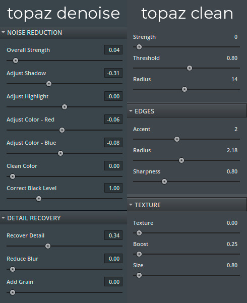
for the sharpening I don’t really know the best way to explain the steps to you, so I just will give you the action for it: you can download it here
now for the coloring, I always use the curves before I actually start coloring the gif
I use these two eyedropper tools in the curves properties, I select the color black with the first one and the color white with the third one
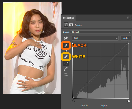
I think it’s easier to color the gif after this because it makes the colors look more natural
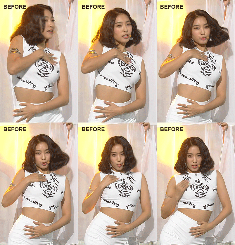
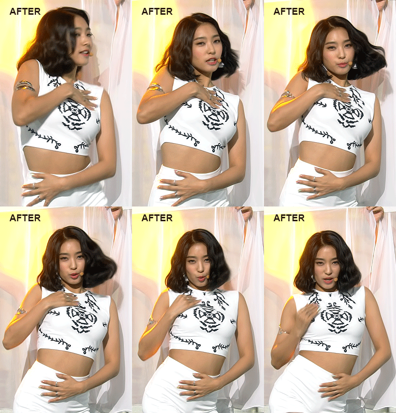
for the rest, I mostly focus on one color, using the selective color and hue/saturation I try to get the rest of the colors closer to the one I want to be more prominent
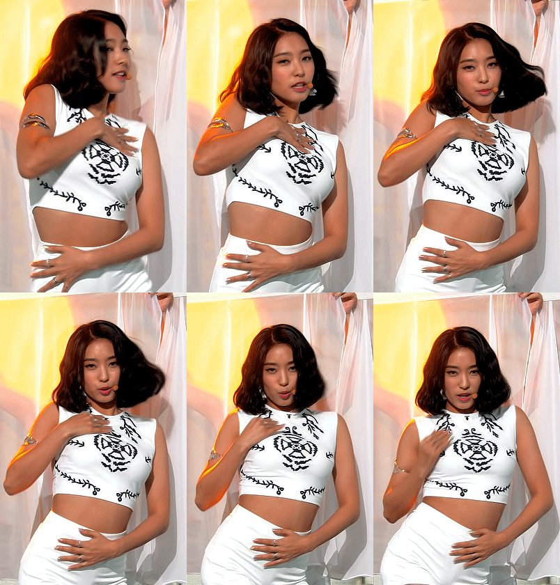
I also adjust brightness/contrast, levels and vibrance, sometimes I use two black and white gradient maps, I reverse one of them and select soft light, then I low the opacity till I like the result (I’ll give you a psd to understand this better, I don’t know how to explain it lol), I feel like this makes everything more smooth and it brings some details to the image
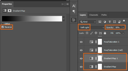
I didn’t save the original psd, so this is the closest I got, you can download it to take a look, I’m not really good at coloring gifs so I just try to make the colors more intense and balanced
2 notes
·
View notes
Note
hi!! your coloring is always SO BEAUTIFUL and i’m so sorry if i’m overstepping but i was wondering if you had any coloring tips? ofc no pressure to respond and anyway your sets are absolutely stunning!!! <3
hi!! first of all that’s so sweet of you to say, wow thank you so much 🤧 and yeah, for sure!! under a read more bc it got kinda long and rambly but i hope this helps!!
ok so this one might be kind of obvious, but i rely on the selective color adjustment layer so heavily!! like i kid you not i usually have at least 10 of them on any given gif, it’s just so versatile!! i usually focus on reds/yellows/neutrals/blacks and sometimes greens!! knowing how the colors affect each other, for example if you’re editing the reds, knowing that adding cyan will help cancel out the red and mute it or adding magenta if theres a green cast to the gif (i’m looking @ u lone star) is super helpful.
right now i’m into kinda desaturated coloring for gifs and gradient maps set to different blending modes really help achieve that effect!! i usually use a gray to white gradient map set to soft light and a black to white one set to exclusion for that effect. but different colored gradients maps set to different blending modes can give you really interesting results!! luminosity is another blending mode i like. also definitely remember to change the opacity if the effect is too strong, sometimes i have them set super low like 15-20% but it can still really add to the overall look. also!!! be mindful of skin tones!!! going back to selective coloring after you’re happy with the general coloring to make sure you aren’t whitewashing is important.
i like photo filters!! they’re excellent at warming up or cooling down a scene but are also fun with just color fills like pink or purple to add a light wash of color if you’re going for something more stylized!!
this kinda goes with photo filters, but i think just noticing what needs to be done to a scene to get it to a more neutral coloring is really important. for example: season 1 of 911 is super yellow toned, so before i do anything else i usually add a cooling filter or bring down the yellows in selective color to neutralize it. the color balance adjustment layer is also really good for this for the midtones and highlights of a gif. and for lone star, it’s usually really dark and gray, so adding vibrance and brightness and bumping up the reds in selective color usually helps things look better.
USE CURVE LAYERS. this is such an easy way to white balance gifs!! open the adjustment layer > click on the white dropper next to the graph > then on the part of the gif you want white. i almost always drop the opacity down to like 20-30% but it really helps the overall look imo
these are all kinda overall tips and ofc it’ll vary from scene to scene and show to show but if you ever have more specific questions or want me to elaborate on something please feel free to send an ask or dm and i’d be more than happy to help you out!! and thank you again for the kind words!! :)
#anonymous#answered#i had this all written out and then i accidentally clicked away from the page 🙃 why am i this way#tutorial
4 notes
·
View notes
Photo
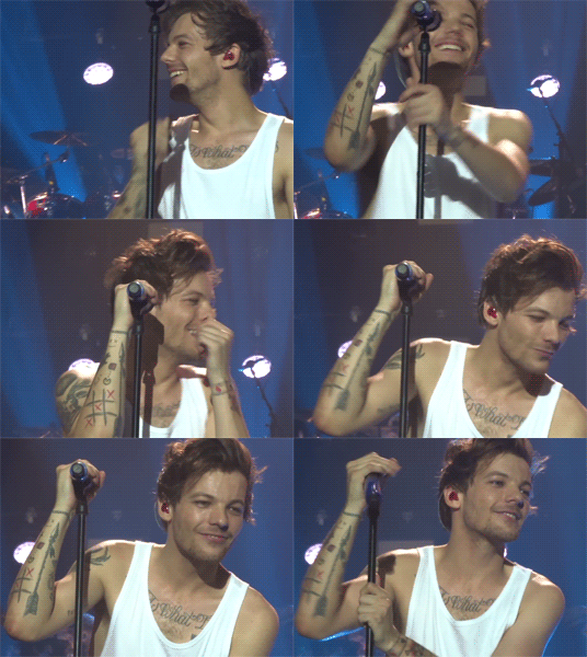
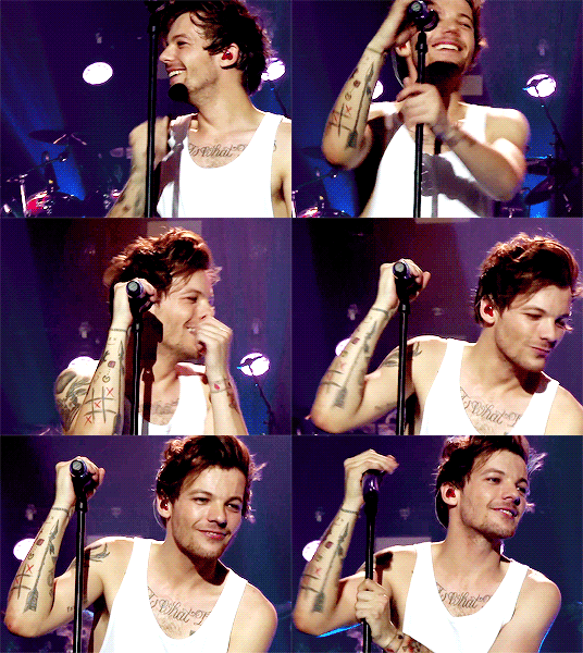
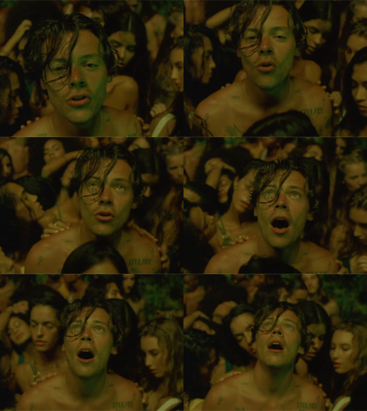
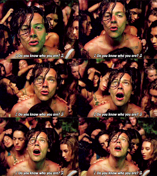
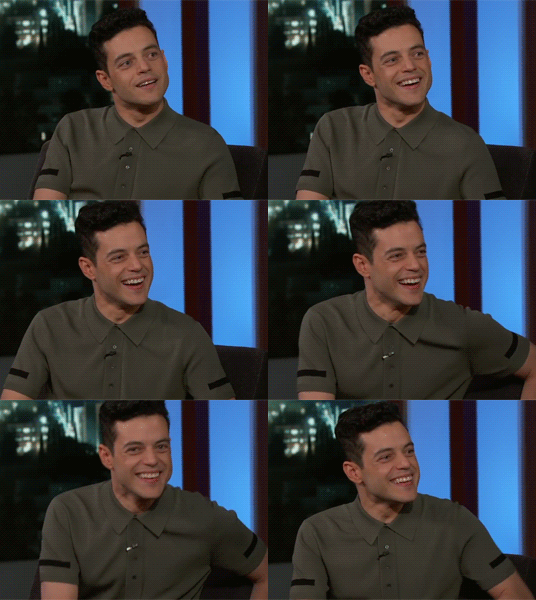
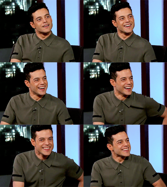

ORIGINAL → EDITED gif making process tag
I wasn’t sure if this was something anyone wanted to see from me specifically, but I’ve been tagged by @cuddlerlouis @ltwalls2020 and @finewalls to do it so!!! okay sure!!!
LEFT: animated, cropped, resized from a 1080p video RIGHT: sharpened, colored, text added (optional)
Listen...I’ve been making gifs since the dawn of time. I think I first taught myself how to gif when I was 11 with Windows Movie Maker and a program called Paint Shop Pro 9 and the only social media that existed were fandom message boards. I’d have to manually screenshot the video frame by frame. Nowadays, (and for the last decade on tumblr) I’ve used KMPlayer to screencap and Photoshop CS3 to make the gifs because the “load files into stack” extension doesn’t work in my version of CS5 and that’s how I like to do it lol. My entire experience of making gifs on this site is still documented on my blog, and you can absolutely see how I’ve improved over the years and discovered my own style and stuck with it. But I am STILL constantly learning and adapting!!! so it’s quite fun. anyways, onward.
I load the screencap files into a stack. Then, I use an action I made myself of my basic giffing steps to speed up the process once my files are imported—make frames from layers, reverse frames, flatten frames into layers, set time delay to 0.04. Time delay is a personal preference but I like smooth gifs, especially when I have a lot of frames. I run this action before I crop so I can see exactly where my subject moves around and compare where they are in the first frame vs. the last frame, so I don’t accidentally cut them off somewhere when I crop. Once it’s cropped how I want, I run a sharpening action.
Then I color it from scratch! I used to be big on finding PSDs and altering them to fit the look I was going for, but I find that doing it yourself layer by layer is how you really learn about coloring. I specifically chose clips for this that were gonna need more editing than your average gif that is already well lit with a decent white balance (rip to every person who has ever filmed Harry and Louis but I’m different) so you can see the difference and how I work around inconsistent lighting or unstable concert footage with ever-changing colors and shadows. I usually go in the same order:
curves - (I only JUST recently discovered what the eyedroppers in this tool can do for a gif’s white balance, so....*clown music*....glad I know that now) and do a minor adjustment to lighten the gif a tiny bit.
levels - to further crisp up the black and white points and brighten
brightness/contrast - ya know
selective color - I bump up the black in every gif to avoid any noise and this also helps lower the gif size by the time I save. it helps make a gif pop a little more and gives it some good contrast. Then I’ll fuss a bit with the red and yellows and take out any unwanted tones I don’t want like the blues/cyans in the background or the yellows in the original color grading (why the FUCK is the Lights Up video this way). BUT! This is not always necessary and there are times where it should be avoided. I included a gif of Rami here because I notice a lot of gif makers go ham on the selective coloring and brightening, that he’ll look pretty whitewashed in their final gifs because they take out a lot of reds/yellows and his skin loses color. so it’s important to pay attention to your subject’s skin tone especially if you’re giffing a POC, pay attention that your editing doesn’t wash their gorgeous skin out ok!!!! you can brighten a gif without brightening their whole being!!! moving on!!!!
color balance - this is a fun layer to play with and a very crucial step to how my final gif looks in terms of color. I gave the Lights Up video a reddish tone with this, but you could also go with more blue-ish look here too.
text/captioning - I have my font settings saved as a PSD file so I just pull that up and drag and drop the text, and edit the layer to whatever my caption is. I’ve been using the same font settings for YEARS and I think that is one of the main things that differentiate your gifs from others is having your own style of captioning. It’s fun to experiment with this!
I might add a couple more brightness layers or a black and white gradient map set to soft light at a very low opacity!!! or play with the exposure tool!!! it depends on what I’m working on, but those are my basic steps!!!!! then I save them set to Pattern or Adaptive (whichever looks better) and that’s pretty much it :) i’m happy to answer any questions or help if you’re starting out!!!
Idk who else has done this yet but I’m gonna tag some of my favorite gif makers in other fandoms to spread the love @summercohen @joewright @barrysberkman annnd @s-k-y-w-a-l-k-e-r but no worries if you don’t wanna share all your tips and secrets, fam. We totally get it xx
#...very sorry about how long this is#this is why!!!! gif makers get frustrated about stolen gifs or lack of notes...it's a lot of work
105 notes
·
View notes
Text
another icon tutorial
so the poll was pretty 50/50, so most likely i’ll make a gif tutorial at some point soon.
please leave any questions or requests you have in my inbox!!
i’m not the best at explaining so bear with me lol
general method
so i’m going to show you how i make these kinds of icons:
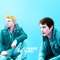

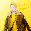
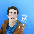

tutorials under the cut.
i try to be trendy and give cute tip sections:
a huge tip would be to make sure your screencap is hd quality. i get my screencaps from (x), (x), or just googling ‘___ screencaps’. remember kids, always pick good quality screencaps.
here is our screencap! two fresh ass beautiful boys, we love a couple
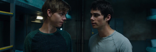
i use a psd for headers, but for icons i tend to just color them myself. i use curves, color balance, vibrance & sometimes a white color fill set to soft light. maybe even some selective color to brighten the neutrals and darken the blacks.
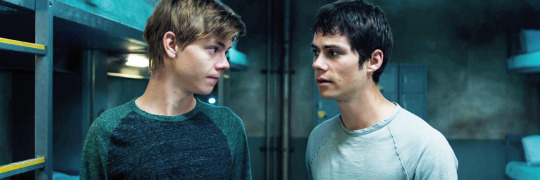
now it’s time for my personal favorite part, coloring the subjects. i take a small brush with 0% hardness in a new layer set to multiply and paint over thomas’ lips. i draw over his eyebrows with a black brush set to soft light. then a brown brush set to multiply or hard light over his hair. :)
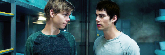
i do the same for newt now, albeit different color choices.
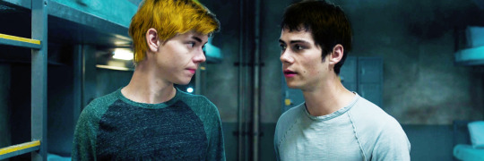
next i crop the image, my icon dimensions are 120x120! you could use 150, 100, 200, but my go to is 120.

now i create a solid fill layer with the color of my choice, i add a layer mask and brush black over the subjects so they’re visible. i then take a white brush with 50% hardness and brush around the subjects until it looks like this.

i add a black and white gradient fill, set it to soft light, and angle it at 68.2.

i create a new layer and set it to color, then i paint over thomas and newt’s shirts with the same color i used for the background. then i duplicate the layer and set it to soft light.

and you could easily leave it there with a nice, perfectly good icon, but i like to add my own details and textures and stuff to make them more personal :)
(here is where we go full on crazy, windows vista is quaking in a corner, this is too bright for me to handle bitch what are you doing)
i add more curves, up the vibrance, brighten the image with selective color. (remember to keep darkening the blacks so the icon doesn’t look washed out), keep in mind that all your coloring should be underneath the solid color fill layer. i also duplicate some of the coloring layers i made, such as the hair layers and lips.

this is a lil trick that i use often for darker icons and picspams, it gives a nice glowy look that i like a lot. i zoom in and take a small white brush set to soft light, and paint over the highlights on their faces/hair.

sometimes i create a new layer, set it to screen, and take a big light blue brush and just click lightly where i want there to be more light. but i don’t need to do that for this icon.
i try to be trendy and give cute tip sections:
PSA; always color your icons to fit the lighting!1!! normally in tv shows we get shitty, dark, blue/yellow lighting that looks grainier than a 1950′s tv set. you need to be stealthy and work around the lighting. color balance is your best friend when it comes to yellow/blue lighting. here are some good coloring tutorials to use as techniques. (x) (x) (x)
i take this texture, add a b&w filter to it, set it to soft light and create a layer mask to remove the texture from their faces.

now, u could add lil doodles to it like this;
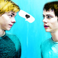
or you could just leave it as it is. i now convert (only the screencap) for smart filters, and i use a sharpening action (i wish i could remember who made it!! i don’t remember).
and boom, that is how i make most of my icons.
here is my result:

fancy/longer method!
this method is for when i take twenty years to make one icon, usually for when i make my mobile themes or a request.
examples:


and this will be our result:
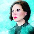
so we have our screencap, i’m using one of regina mills, one of the great loves of my life.
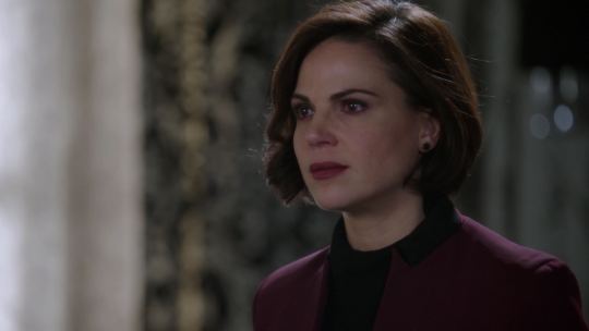
now we do the coloring process i used for my last icon. curves, color balance, white color fills, gradient maps, vibrance, etc.
i follow all the previous steps that i mentioned, the hair and face coloring, changing the outfit colors, cropping, solid color background.
i try to be cute and give trendy tip sections:
tip, follow the curves of the subject’s hair when coloring the outline/erasing the bg!! it just makes the icon look nicer and it flows better. sometimes you can even create your own waves.
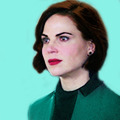
next, add the gradients. i use an angled b&w one and then i use one matching the bg layer and angle it where the light would hit regina. i set it to screen, and use a layer mask to remove it in areas i don’t want it.
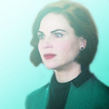

(just play around with gradients. they can rlly make or break your icon)
here is when i start messing about with lil details. i start highlighting her face with a small white brush on a layer set to soft light to make the icon stand out more, and i even take a tan colored brush (set to multiply, low opacity) and brush around where the shadows hit more; her jawline and where her hair looks darker. look at the difference

here is when i go full whack and add more curves, brightness, saturation, color balance, bring out more of the blacks with selective color and duplicate some of the coloring layers.

now i add various textures, specifically watercolor textures from this pack. (i set them to soft light and using a layer mask, remove the texture from her face.)

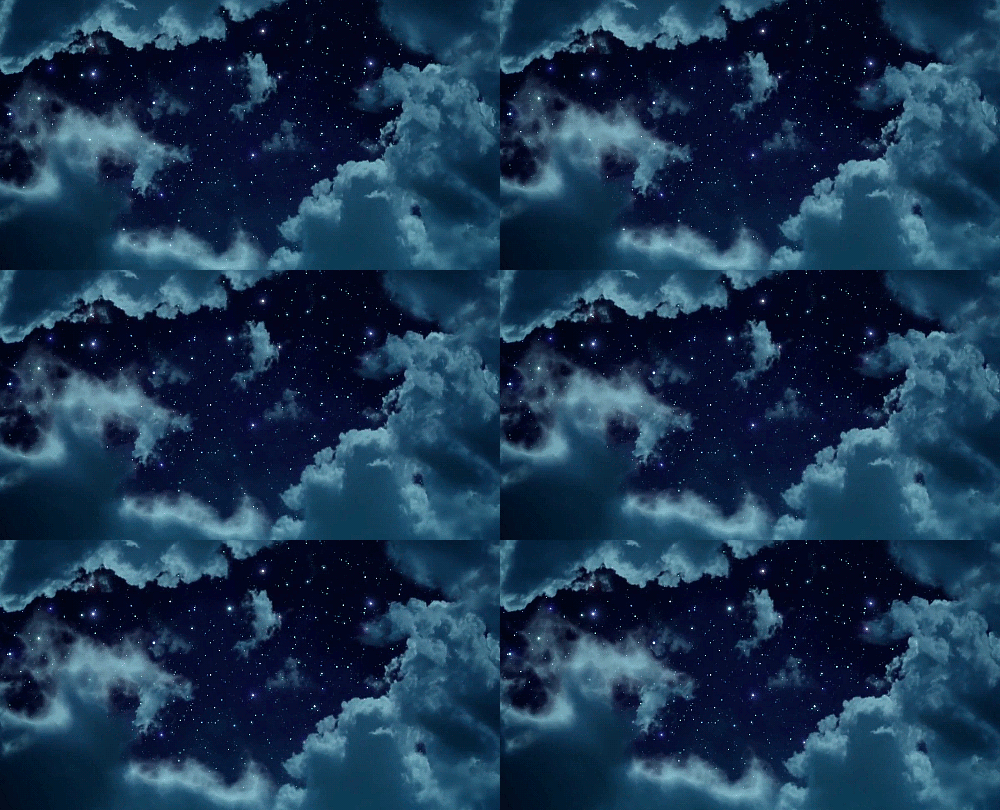
now, i usually google ‘tumblr cloud overlay’ or something and add them to my icon. i’m using these three specifically:
(i use them as gifs for headers, but that’s a different process. for icons i just place them over my image like another texture.)


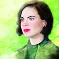
now just duplicate any layers as finishing touches, sharpen, save, and you’re done!
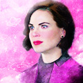
(you could also change the green-blue to different colors.)
main tips;
always keep your screencap coloring as natural as possible until after you’ve added the color background, that’s when you can go crazy and go as far as you can with vibrance and brightness.
different scenes work with different techniques. you can’t follow one coloring tutorial and use it for everything, you have to keep the steps in mind and just merge all the knowledge together.
highlighting with soft light is such a nice detail!! it rlly adds to the soft glowing look
textures are the love of my life! i have a huge folder saved with hundreds of different ones, but i can link you to some that i use a lot. (x) (x) (x)
practice!! icons are fun to make and should be an enjoyable hobby, the way your icons look will progress over time. tutorials are just helpful along the way :)
#icon tutorial#ps tutorial#icons tutorial#ps help#mine#my tutorial#idk if i did a good job at explaining??#hopefully i did
57 notes
·
View notes
Text
tutorial - psd for icons

to learn how to make your own psd for icon like mine, keep reading :)
program: photoshop
dificulty: medium (but you can do it ;)
(sorry about my english, is not my native language!)
‘’but... what does the psd for icon has different from the others?’’
well, the psd for icon is really colorful, bright and a little bit pale (but let’s remember that psd ‘’for icon‘’ it’s just the name!! you don’t need to only use it in icons!!!!)
it has two types of psd for icons:
simple - as the name says, it’s simple and fast to do it
hard - full of layers and it takes a long time to do it
to create one in the style that I usually make (hard but not too hard)! you’ll need to use selective colors (to colorize it); gradient map (reeeally important); curves; color balance, and some others layers!
i’m going to use this picture for example, because she is bright, colorful and in a good quality (it’s important to be like that)
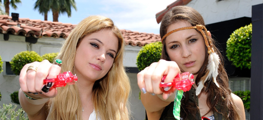
-to start the psd, let’s discolor it (yes, it’s ironic hahhah)
create a new group;
put the curves like this in 50% and this;
add a black and white gradient map on something next to 40% in soft light;
low the vibration;
change the levels like this
- now, it’s time to bright it and color it :D
add curves to bright it;
put the contrast in something next to +15;
high the vibration next to +15;
add solid color #dcdcdc , #ecbee7 and #a3c7eb in 3% opacity (each) on soft light;
add a white and black gradient map in 10% and this in 25% opacity
put this whole group in 40%
our pic is going to be like this:
- time to colorize it, yaaay
create a new group;
add selective colors to put the magenta in pink/purple but don’t a lot (x);
hue/saturation in hue -7 in lighten mode (x);
change the green, cyano, blue and yellow at the selective colors whatever you want (but don’t forget to make it bright and colorful);
change the pink/magenta for more reddish, doing something like this 2 times or until it’s how you want;
it’s gonna be like this:
- let’s adjust it!!
you can adjust adding some layers that you want! I’m going to:
put the curves down;put
change the exposure (x);
add selective color > black > black +6
put this curves on 50% opacity;
add this gradient map in 15% opacity (important, to make it pale!!);
add a white gradient in radial>reverse>scale 150% in 6% opacity (x);
after that, change some other layers like selective colors, gradient map (you can add this one), curves... until the psd gets how you want!!
then, put all of the three groups in another group, duplicate it, put the new two groups (with the 3 layers in each) in another group and that’s it!! (it’s difficult to understand, i know hahha) ps: you can rename the groups!
doooone!! my psd is like this! I put it in 70% and look how it is!!

I hope you liked it!! I tried my best to explain it well, but ask me anything you want if you didn’t understand something or has any dought!
please, like, reblog and follow me if I helped you!!! :D thankss (oh, and send me your psds if you want tipsss!! also bcs I’m curious to know how is it hahahhah)
if you want to download this psd (for personal use), click here
#tutorials#icon psd#tutorial psd for icon#psd for icons#psd for icon#como fazer psd for icons#tutorial psd#tutorial psd colorful#tutorial psd pale colorful#psd colorful#psd pale colorful#psd coloring#tutorial psd coloring#como fazer psd coloring#itsphotoshop#yeahps#xreblogs#selenapastel#tutoriais#photoshop tutorial#psd tutorial#aula psd para icon#preview com psd#reblogfi#reblog-fi
61 notes
·
View notes
Photo


TUT 03: Selective Coloring
Photoshop Timeline or Frame Animation
For the most part, selective coloring is a huge part of editing colored gifs. It’s pretty easy to use once you get the hang of it, but it can be hard if you haven’t used it before. This tutorial will show you how I use selective coloring to color correct and to make vibrant gifs as well.
This is the first gif I will be using (sharpened but no editing). It doesn’t really need color correcting, so for now, I will show you how I get ultra vibrant colors.
An easy way to get used to selective color is to think of each option as a “point” system. There’s a cyan, magenta, yellow and black option. The opposite of those are red, green, blue, white. So cyan/red, magenta/green, yellow/blue and black/white. If you want your red to be more red you’ll want to “take away” cyan “points” so a brighter red would need a negative cyan number. If you want your blue to be more purple, you’ll need to “add” points to your magenta and remove yellow “points”. For a super bright cyan (light blue) color, you can add 100 “points” to your cyan, cyan slider. So for each slider, there is up to 100 “points” and as low as -100 “points”.
Here’s the gif I’ll be using:

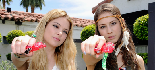
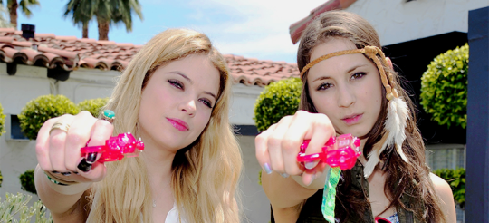
So, the first thing I do is brighten the gif up using a mix of brighten/contrast and a curves layer. I have another tutorial of exactly how I color my gifs, but for now, I’ll use these settings:
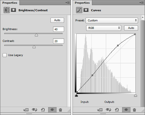
And my gif after that:
Now for the selective color. Go to layer > new adjustment layer > selective color. Depending on your gif, you’ll need to change the colors accordingly. In my gif, I want to make the blue on his shirt and eyes to pop, so I want to bump up those colors. Sometime’s you’ll need to tweak the other colors, but for gifs with lesser colors you really don’t have too. Here are my settings so far:
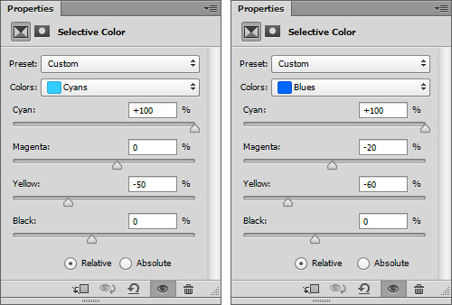
and I duplicate that selective color layer again, so I get this:

I really wanted the blues to be a deep royal blue, so I add add cyan (cyan +100) on the cyan slider and to make that more blue than green, I also slide the yellow slider to -50. On the blue color, I add to the cyan (cyan +100) so that the blue is a bright blue instead of a purple blue. I also remove some magenta (magenta -20) for that same reason. I also move the yellow to -60 for the blue to be more saturated.
After that, I want to brighten up my gif again, so I use another brighten layer (same settings as above but opacity at 40%) and a levels layer with these settings:
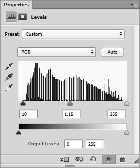
here’s my gif now:

Now you can edit the rest of your colors using another selective color layer, all except the white, neutral and black, we’ll do that in the next step. Here are my settings:
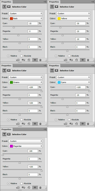
And here’s my gif:

Now, for the whites, neutrals and black. My gif has a overly blue tone on the darker colors. I also want the black to be darker, so here are my settings for the black color:
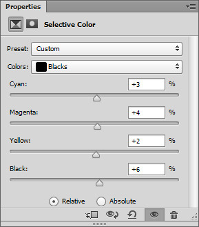
I don’t really mess with neutrals unless my gif is toned too much in a certain color, which it isn’t right now. But I always use the white color. Here’s my settings:
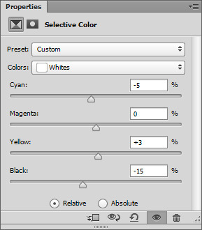
The reason I have the color sliders moved is to even out the white colors. I added some red highlight tint to the highlight by removing some cyan (cyan -5) and added some yellow (yellow +3). I also added some brightness to that by moving the black to -15, meaning minus 15 black.
And my current gif:
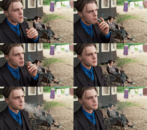
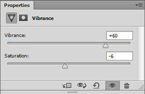
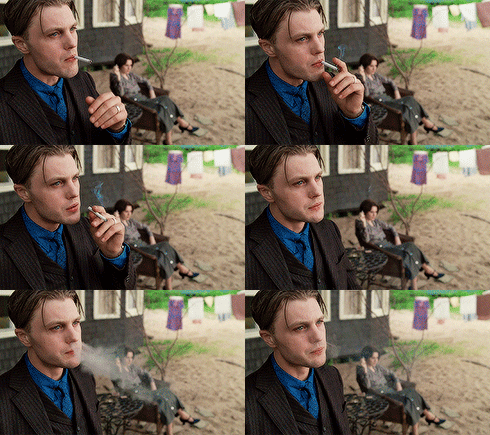
Now to really get the most out of your colors, you can add a vibrance layer. This also helps if the skin color (if any) is washed out and dull. You can go from nice to carried away very easily with a vibrance layer, so a simple rule I live by is for every increment of 10 on the vibrance scale, the saturation is a -1. So here are my settings for this gif:
To finish this gif, I will add another selective coloring layer and play around with the colors again. Make the reds more red, the greens more green, etc. Here’s my gif:
Now, to even out the gif and remove some of the noise that selective coloring may add, I add a black and white gradient map set to soft light 35%. That’s really it. You can add as many selective color layers as you need to really pop your colors.
Here’s my before gif:

And after:

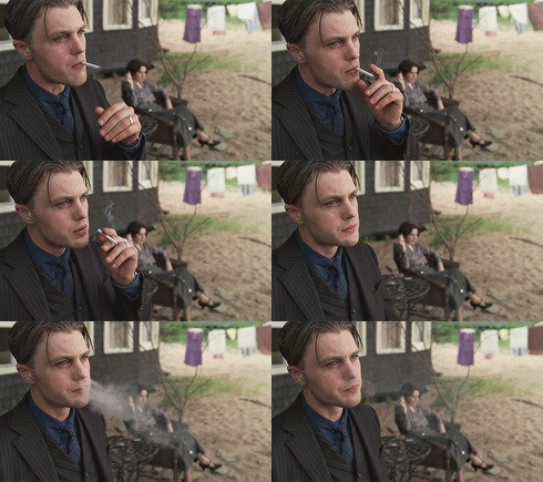
To color correct gifs, selective coloring is pretty easy too. But you’ll need to do it as one of the first steps before actually editing colors. Here’s the gif I’m using:

So, same as above, I start with a mix of brighten/contrast and curves. Here are my settings for this gif:

And my gif now:
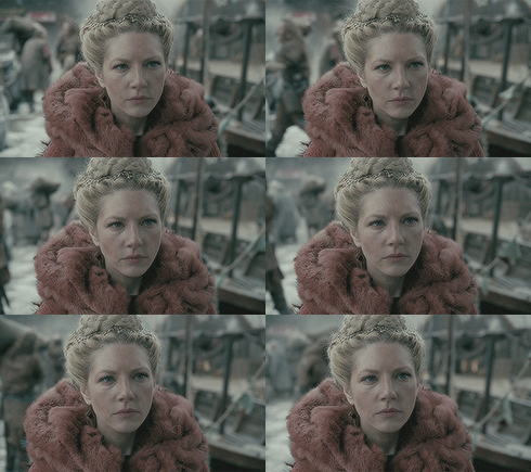
As you can see, my gif has a lot of greens and a lighter blue tint to the entire gif. To start, I want to add a selective color layer and on the neutral color, I want to remove some of that. Here are my settings:
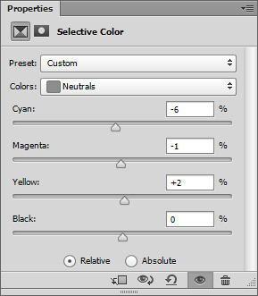
I wanted to remove some of the blue tint by “taking away” some of the cyan color. I also want to remove some green by adding some yellow. Here is my gif now:

Now I want to edit the individual colors. Right now I’m just trying to balance the colors, rather then having certain ones pop. For this gif, I really want to balance out the reds, yellows and green. After adding another selective color layer, here are my settings on the red:

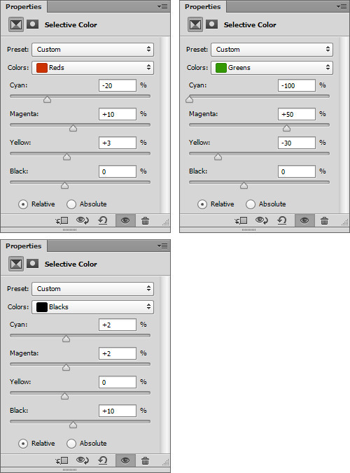
I wanted to add more red, so I removed some cyan (cyan -50). I also wanted to add some magenta to correct the green (magenta +10). I also wanted to add some warmth to the reds by adding yellow (yellow +13). Finally, I wanted to darken the reds a bit by adding some black (black +13).
Here are my settings for the yellow color:
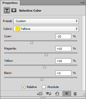
I wanted the yellows to be more towards red. On the color wheel, yellow is between red and green, so I want it to lean more towards the red, rather than the green so I took away cyan (cyan -25). Same reasoning as above, I added some magenta (magenta +15) and again, to add warmth to the yellows, I added more yellow (yellow +10) and also darken the yellow (+black).
Here is my gif so far:

Now I can add some more brightness by adding a brighten/contrast, curves and vibrance layer to the gif. Here are my settings:
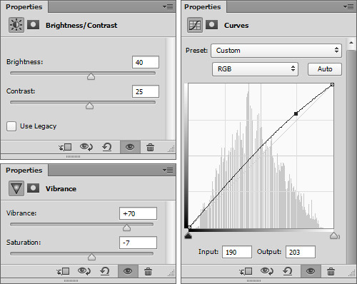
Now, my gif is a little washed out, so I want to edit the blacks and white. I want the blacks more black, so I want to add black to the slider. I also want to take away some of the redness, so I add some can to the black as well. I also want the whites brighter, and a bit less yellow, so here are my settings:
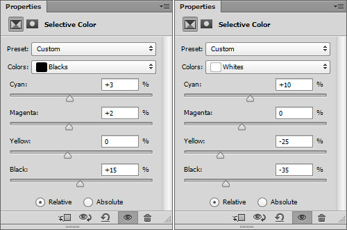
And my gif so far:
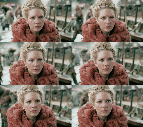
Now that my gif is more balanced, I can really make the colors pop. I want the reds to really stand out, since her fur is red. Here is my settings:
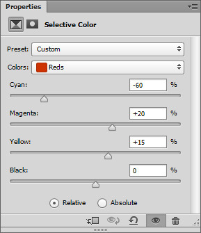
And my gif now:
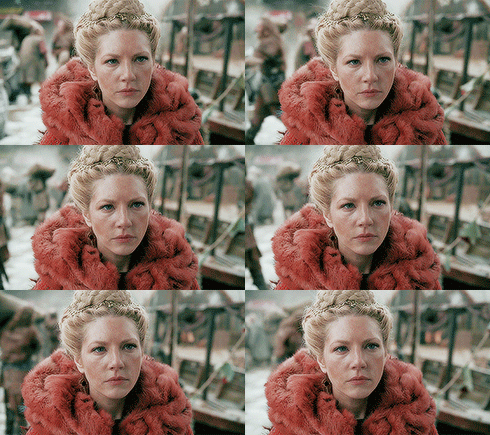
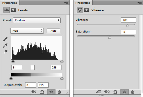
Now, to finish my gif up, I want to add a vibrance layer, and levels layer. Here are the settings to brighten and warm the colors:
Now, another selective color layer. I just want to touch up the reds, greens (the majority of the background tint) and blacks. Here are my settings:
Now I just add a black and white gradient map set to soft light 28%. Here is my before gif:

and finished:
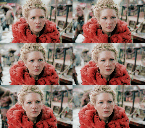
I hope you learned some new things. Selective color is one of the funnest parts of making gifs!
245 notes
·
View notes
Text
Create a Prisma-style image
1. Retouch the portrait
Start by cutting out your subject using Healing brush (J) to fix blemishes and the bags under the subject’s eyes. Create a Curves adjustment, invert (Cmd/Ctrl+I) and mask in the eyes with a soft, white brush. Increase the contrast of the eyes.
2. Outline with the Pen
Select the Pen tool again. On a new layer, select around the face and fill with #e4b5a3. Select the eyes on a new layer and fill in with black, then create an outline for each body part. Hide these layers for now; they will provide detail later.
3. Work on the shadows
Create a 50% opaque layer, and again with the Pen, select and fill some of the shadows with black. Create another 50% opaque layer and do the rest of the shadows. Merge these layers, then go to Filter>Filter Gallery>Dry Brush, set to Brush Size: 2, Brush Detail: 8, Texture: 1.
4. Run the Poster Edges filter
Hide your shadows layer along with the body parts you outlined with the Pen. Duplicate your portrait layer (Cmd/ Ctrl+J) and go to the Filter Gallery again. Go to Poster Edges and choose Edge Thickness: 10, Edge Intensity: 10, Posterization: 6.
5. Apply the Oil Paint filter
With your Poster Edges effect applied, you’ll have a subtle outline to the entire portrait. Go to Filter>Stylize>Oil Paint and choose Stylization: 10, Cleanliness: 6, Scale: 10, Bristle Detail: 10, Lighting Angle: 90 degrees, Shine: 0. This will soften and blend your portrait to give a more painted feel to the image.
6. Make the Cutout effect
Go to the Filter Gallery once again. Choose Cutout, but instead of following a set rule of what you should type for each value, experiment with what would work best for your subject. Keep Simplicity low and Fidelity high for clearest results.
7. Re-apply the Oil Paint filter
Once again, go to the Oil Paint filter. Run exactly the same values as you did before – Photoshop will automatically load the last ones that you used – only this time, slide the Cleanliness up to 10 for even more of a smudged effect.
8. Filter the hair
Hit Cmd/Ctrl+Alt/Opt+Shift+E to merge everything to a new layer. Select the hair with the Pen, and hit Cmd/Ctrl+J to duplicate to a new layer. Go to the Filter Gallery; choose Paint Daubs (Brush Size: 20, Sharpness: 40), Palette Knife (Stroke Size: 7, Stroke Detail: 3, Softness: 10).
9. Draw over the hair
On a new layer above the hair, select strands of hair with the Pen tool. Fill these in with #642215 and set this layer to Multiply. Because we filtered the hair in the previous step, it should be easier to select blocks of colour.
10. Brush over the hair
Cmd/Ctrl+click on the preview window of the hair layer you just created. Create a new layer, select a big, 0% hard brush, and using the colours from the supplied swatches on the FileSilo, add touches of different colours for a multicoloured, gradient-like effect.
11. Repeat the hair effect
Repeat this effect until the majority of the hair is covered with these bright colours. You may wish to experiment with different blend modes, such as Screen, Soft Light and Color Dodge. Unhide the Pen outline layers you created, and drag them to the top of the layer stack.
12. Touch up the hair
Again, hit Cmd/Ctrl+Alt/Opt+Shift+E to merge everything to a new layer; Cmd/Ctrl+click on the preview window of the layer on which you filtered the hair in step 8, and hit Mask. Use Smudge to blur colour into the roots, then go to Filter>Filter Gallery>Paint Daubs, with Brush Size set to 20 and Sharpness: 40.
13. Adjust the piece
At this stage, start to adjust your image with a Curves adjustment (as seen), Vibrance (Vibrance: +50, Saturation: +10) and add a Gradient Map. We’ve supplied a gradient that you can apply to the piece; just turn the Gradient Map to Soft Light for optimum effect.
14. Add noise
Create a new layer. Go to Filter>Noise>Add Noise and choose Amount: 400%, Distribution: Gaussian and check the Monochromatic box. Click OK, set to Soft Light, 30% Opacity. Insert a paper texture, desaturate (Cmd/Ctrl+Shift+U) and set this to Overlay, 40% Opacity. Insert your background at the bottom of the layer stack.
15. Sharpen and cartoonise
Finally, merge everything to a new layer twice more. On the first of these two layers, go to Filter>Noise>Reduce Noise; choose Strength: 10, Preserve Details: 100%, Reduce Color Noise: 100%, Sharpen Details: 0%. On the second, go to Filter>Other>High Pass; choose 6px, click OK and set to Overlay to sharpen.
3 notes
·
View notes