#creature deaign
Explore tagged Tumblr posts
Text
How to make tea in the Porcelain Forest... would you like a cup? ॱ⋅.˳˳.⋅˙ॱᐧ.˳˳.⋅ઇଓ
This is one of two new paintings in Los Angeles for the 'Cute and Creepy' show at Hive Gallery, opening October 5th!
♡ Anka
#grubs#tea grub#flowers#weird art#bugs#insects#worm#tea ceremony#unreality#microfiction#video#painting process#porcelain forest#artists on tumblr#art#painting#pop surrealism#agblend13#traditional art#acrylic painting#lowbrow art#traditional painting#cottagecore#dreamy#fantasy art#scifi art#fantasy creature#weird cat#creature deaign#fantasy animal
8 notes
·
View notes
Note
Good day to you Luna!
Ive always enjoyed how you deaign your characters from the use of shape language to the use of color.
I noticed that many of your designs have around 6-8 (and more on your latest) colors in use at a time. I was always told that you should work with a limited pallete when designing characters, but you somehow designs lovely characters "breaking" that rule.
How do you do it? I always get overwhelmed if i have more than 5 colors in a designs but usually it lacks the contrast and "pop" that your designs have.
Also when you design characters, do you start with a theme, their personality or their role in a story?
COLOR THEORY
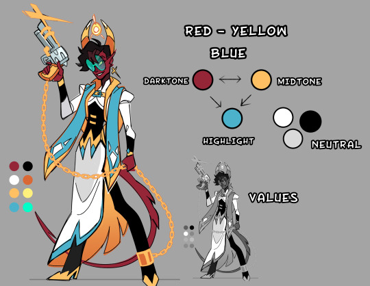
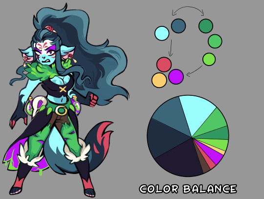
This is a great question! So when it comes to color in designs; character/backgrounds/props, generally less is more. You pick 3 colors : 2 right next to each other ( analogous colors ) : 1 on the the otherside of the color wheel ( complementary colors ). From there you want to vary the value/saturation. So there's a dark color - mid tone - highlight (usually the complementary color).

So It might seem like I have a lot of colors, but in actuality it's only 2-3 colors with varied saturation/values to create contrast.

You want a 2/3 ratio split of the analogous colors with the remaining 1/3 being the brighter complementary color to make little details POP. Now sometimes I will use 4 colors in a design, it still works because it's all about balance. I made a little crud pie chart for a general idea. Faye's main color scheme is blue -> green highlighted with red/purple/yellow. Her vibe is poisonous, and poisonous creatures tend to be colorful.

With the right balance you can make any color scheme work, you have to give each color their place, some are more dominate then others. If you make a design with every color 25/25/25/25 equal split, the design will come off as bland and nothing will stand out. But if you make it 40/40/20 suddenly that 20% stands out.

Thinking of palettes in terms of pie-charts will help out seeing the color balance in your design. Give it a shot if you're struggling with making your design pop!
#art reference#advice#coloring tutorial#character design#tips#ref#art#tutorial#coloring reference#color palette
626 notes
·
View notes
Text
Hi! This is my art account just rbing here
In case anyone is curious...Caleb is a Tiger Shark, hence the patterning on his tail.
I wanted to be a marine biologist when I was a kid...turns out you need to be good at math and uhhh physics for that. Guess who suck at math lol
But I still enjoy learning about sea life and I love drawing and painting it! My favorite thing is to match characters to different sea creatures ♡ you can do anything with merfolk they are so fun to deaign!!

"You're lookin' a bit like a fish out of water there, friend. Let me get a good look at you...oh this won't do. You've hardly enough meat on your bones for the chilled months."
In which Mollymauk, first mate to Captain Kingsley of the Nine Eyes, finds an injured merman. Caleb, having just escaped the abusive scientists of the Cerberus Research Assembly, has no clue if pirates are better...or worse.
Aka: the fic I haven't written but lives in my mind rent free
#gonna write this actually#ruby of the sea is a lion fish ugh all those fins gorgeous#jester is also a lion fish#molly would be a beta phhhh unless i can find another obnoxiously colorful aggressive fish#i made Veth! shes a selkie!#anyways#critical role#widomauk#caleb widogast#mollymauk tealeaf#mermaid au#pirate au
163 notes
·
View notes
Text
What if I just start making The crossover AUs ever
What if I just start drawing crossover content of everything everyone followed me for since I post so much?
I'm talking Venus Kanamori from Heaven's Design Team having a chat with the Squid Sisters from Splatoon
Zane from Ninjago and The Spine from Steam Powered Giraffe somehow swapping places and ending up in each other's world and it takes everyone around them a little too long to realize somethings wrong
Yulivia from Amphibia meets Rosemary from Homestuck
Agents from Splatoon finding offline SPG robots and having Marina come get them back online
Drawing Kai & Nya having the same energy as Rose & Dave
That kind of junk
But also
I do mean
More of my Ninjago AU where they're all inklings and octolings, or the Amphibia AU I was thinking about where they're all inkling and Octolings
The Cephalopod House, where all the Splatoon characters exist in The Owl House world instead of theirs
Steam Powered Giraffe, but they're Ninja instead of musical robots (Rabbit with the element of fire?? Absolutely.)
Heaven's Design Team? More like Hussie's Deaign Team now. Give me John bumbling around with no knowledge of anything and Equius trying to sneak horses into every creature he possibly can.
And yknow what? Fuck it, let's just totally swap HDT and HS, I'll draw the Design Team & Angels in Godtier
What if I were to start making all this content? Huh? What then?
What would y'all do about it?
No one could stop me. I'd be so powerful.
18 notes
·
View notes
Text
I forgot I had this old sketch for dog cr8

and completely remembered I have no idea on how to draw dogs. I still have the sketch so I think I can knock out a design sometime.
#i have a habit of drawing creighton as random creatures/animals wHOOPS#its fun because deaigns but than like. after the design what is next?#i mean breeds dont even fit his character#i just wanted to draw him as a shibe inu#i love those dogs#anyway hey what are legs? or paws? what the fuck is a dog
0 notes
Photo

Personal work character deaign line work. His name is Comrade Communism. #art #painting #digitalart #illustration #conceptart #concept #character #creature #artoninstagram #scifi #sketch #future #tech #soviet #communism
#art#scifi#soviet#painting#artoninstagram#character#concept#tech#digitalart#communism#illustration#sketch#future#conceptart#creature
0 notes