#commercial use clip art
Explore tagged Tumblr posts
Text


Creative Fabrica is currently giving away this bundle of Free Christmas graphics. They're calling them door signs and they seem intended to be used in laser cutters to make wooden signs but they can certainly be used for any graphic design project you have including holiday t-shirts and greeting cards.
This set of 50 Free Vector and JPG Christmas Clipart Designs is available in Creative Fabrica for free for the next 3 weeks.
#free clip art#commercial use clip art#free graphics#free illustrations#free commercial clip art#free vector files#christmas clipart#free christmas clipart#xmas art#free christmas vector files#free vector art#graphic designers#graphic design#free art for christmas#free christmas card art
2 notes
·
View notes
Text

https://creativemarket.com/MISSCHATZ/291247728-Collection-of-Basketball-Elements
Score big with our dynamic basketball vector illustration collection, featuring everything from hoops and balls to jerseys and scoreboards! These elements are perfect for sports designs, ready to elevate your project with slam-dunk style.
Source Files: Adobe Illustrator AI + EPS (CS6 Compatible)
#icon#shopping#icons#set#vector#business#basket#vector illustration#basketball elements#sports design#basketball hoop#basketball ball#scoreboard#jersey#whistle#sports graphics#digital art#graphic design#clip art#instant download#commercial use
1 note
·
View note
Text

Just a tad late was marathoning atla all day but could not ‘not’ draw something for the 20th anniversary of Avatar: The Last Airbender. Gosh like this show has been so important to me for so long, it’s such a great inspiration for storytelling and worldbuilding not to mention the art style alone greatly influenced my own. Thank you for being a source of happiness,and comfort, and creativity for me and so many others.
Also p.s. Does anyone else remember the lil like look inside nicktoons studio videos they used play in-between the shows n commercials I used to love the how to draw certain cartoon character segments n my favorite was the one for Katara. Me and my friend both remember one of the tips in that tutorial was that Katara had 8 bumps in her braid. It’s super random, but I was only able to find clips of the ones for Aang and Appa on YouTube, that shits prolly lost media but I’ll stop yappin.
4K notes
·
View notes
Text
I'm a coffee girl whose brain won't function properly without her morning coffee :"> like right now
I got withdrawals the other day and it kinda ruined my mood too lol

I messed up, or did I?
#ice or iced?#iced coffee#clip art#digital art#decoration#cute#coffee#typography#art print#commercial use#personal use
1 note
·
View note
Text
I have tried to sort my thoughts about Skeletá and mostly failed, but still wanted to talk about it because it’s such an interesting little big album already after only a handful of listens
tl;dr: I like it alot, it has some certified bangers on it, some songs didn’t fully land for me personally, I love the variety and his voice is amazing.
I think what stood out to me the most – apart from the very obvious and super cool 80s vibe going on (80s lovers WIN) – is the sheer variety of songs on it and how most of them did not sound the way I expected them to sound at all: Cenotaph was so much groovier and uplifting than I thought (looking back and knowing it’s about his brother, I feel like I should’ve seen that coming), De Profundis Borealis is less heavy than I thought (and hoped; insert the "I know it's not a black metal song" clip), Marks of the Evil one is just so much etc! And I do mean this as an absolute positive in a time where most successful music does not surprise us often anymore.
I totally applaud and respect him for not doing the easy thing: Making an album that follows directly down Impera’s path sound wise – that would have been safe, considering the commercial and critical success it had. Instead he took some of Impera’s (and Phantomime’s) sound, threw in some things from the old albums and a ton of stuff out of his Very Normal brilliant brain to mix something… well. Different.
It is not an album aimed to please people, it’s not targeted at his „old“ fans, not at his new fans from the last album, not at critics or whatever; it’s not a people pleaser album, in my opinion (I’ve seen people say it’s too „commercial“, gotta disagree; I think they just heard it's more „pop", not understanding how 80s Rock worked), but rather Tobias doing what *he* thinks fits, what he thinks needs to be done, what he thinks would be cool, interesting, fun.
While doing that he’s once again not afraid of things that are bordering on too cringe, too corny, too whatever. We’ve all seen that one Reddit review of Missilia Amori – but one thing about his music I really respect is how he can take stuff that wouldn’t work with other artists, would be painfully cringe, and make it work. Because with him it is (and comes across as such) intentional and well handled, often with a wink; he’s been doing that literally from the beginning, because he, unlike some people on Reddit, is capable of not taking himself and things *so* fucking seriously all the time.
He knows that things, art, music, yes, even Big Serious Metal, can just be fucking FUN. (Plus, have these people never listened to any bit of 80s Rock? Like, really?)
And there is so much going on in this album. Lyrics wise, yes, some absolute gold (the 3rd rider "looking cool" absolutely took me out, though), I won’t even touch on that here, because I haven’t studied them enough. But every song is very different: Different vibe, different themes, different *things* that make them stand out (something I LOVE about his music is how every song has at least 1-2 thingies, special, interesting melodies, intrument bits, vocal moments, whatever, that just scratch the brain right and make you come back again and again).
While there are many callbacks to his previous works (and obviously even way more to other artists; it's once again a loveletter of his to his favourite artists growing up), in my opinion it’s also the least „typical Ghost“ album to date; in a way it’s more a Tobias album, which is fine to me, and fitting, considering how incredibly personal it is – and a fun coincidence with the other Tobias album, Passiflora, having finally blessed our ears earlier this year. I think there are surprisingly many similarities? Obviously he has developed all of his skills enormously since, but… It was fun listening to both of these very personal albums back to back, highly recommended.
Lots of high praise, is it my new fave? It doesn’t beat Prequelle, my #1, at this moment in time, and I don’t think it will, even after multiple listens. It’s an album that definitely requires being listened to at least a dozen times. Many songs on it – on Tobias’ work in general – are absolutely required to be listened to multiple times before you can fully appreciate and connect with it (which is, i may add, a GOOD thing. He puts in so much stuff to discover!).
First of all, for me the ballads didn’t land. And this is mostly a personal preference, I am not a ballads person, they rarely hit for me (Life Eternal taking me out almost immediately was an outlier and to this day the Helvetesfönster – Life Eternal combo is the only music that ever made me bawl my eyes out). Both Guiding Lights (his vocals are so, so good) and Excelsis are objectively fantastic songs and I understand why people love them so much, but especially Excelsis is musically just a bit too much...I don’t have the right word...; the end however is wonderful (and circles nicely back to Life Eternal (and also Respite!))
I would have very, very, VERY much preferred a heavy song instead of one of these two. A Faith, a Mummy Dust, a Twenties, you know, some growls? The heavy riff in Lachryma gave me hope there’d be more in another song, but it’s fine, it’s his baby! I expected De Profundis to be the heavier song, but it turned out softer than i thought, but it’s still super fun and I think it will do a bit of a Watcher in the Sky, where it’s cool on the album and then FUCK live!
Speaking of live, many of these songs will shine live, as the 4 already played prove. The vocals on the album – SO good, so much variety! Sometimes he sounds like Ozzy, sometimes like Phil Collins, sometimes very Phantomime, the high notes but also more lower register, bless him (that was one of my big wishes), just great! – show that he’s experimented with his voice (despite talking shit about it all the time) a lot and that he has much more trust into his abilities to perform them live (with the reduced mask; and he’s already proven that; I cannot stress enough how incredible he sounds live now).
The instrumentals are fantastic, such nice guitar solos, the synths, the keyboard-guitar sex in Umbra is just 👌🏽, but really, they shine in all songs. And you cannot forget the Cowbell, bless him.
My favourite is Lachryma with the heavy guitars and the catchy pop-y chorus, followed by Peacefield (esp live) and Umbra; honorable mention Marks of the Evil one and Missilia Amori, and De Profundis
There is so much to love about this album; how personal it is for him, how much it feels like a big hug (and punch in the gut, followed by another hug tbh and of course some horny) from him to the world. How much growth both as a singer, instrumentalist, producer etc but also in his...presentation of himself and his art he has shown.
He doesn’t hide behind a full latex mask on stage anymore, but he also doesn’t hide his messages behind a mask of 3 layers of satanic lyrics anymore.
It’s in every way such a vulnerable, wonderful work and I’m very grateful he shared this with us
#the band ghost#ghost#tobias forge#skeletá#tobias#it talks#its such an interesting album ill have to eat the vinyl
151 notes
·
View notes
Text
So, people explaining that AI isn't "real art" bother me, not so much because of the answer they reach but because most of the people saying it isn't seem to romanticize not just commercial art production, but also bizarrely to romanticize AI as well, in ways that bother me for subtle reasons I want to try to articulate.
So, first of all, I personally don't think fine art will be changed much by AI.
"What if the artist isn't directly producing the art but instead letting some process create it?"
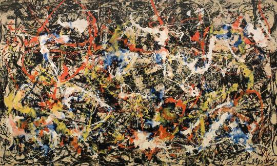
Convergence by Jackson Pollock, 1952
"What if the so called "artist" is merely rearranging and recontextualizing something that already exists?"
"What if the artist outsources a tremendous amount of work?"
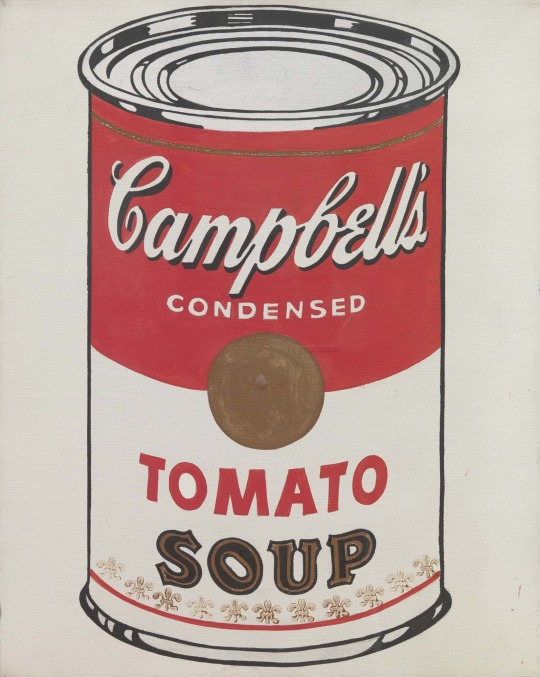
Cambell's Soup Can, Andy Warhol, 1968
The fine art world already confronted these questions and answered between 1912 and, what, 1980 at the latest maybe?
My point here is not to assert the artistic worth of these paintings but to assert their undeniable importance to 20th century art history.
Nobody paying thousands of dollars for a traditional painting on canvas is going to buy an AI version because it's cheaper; such people are already paying a premium for artistic technique and cultivated human talent.
Or, alternatively, I have absolutely no doubt that people would pay a lot for an AI project with, I don't know, Banksy's name on it, even if it was made with freely available, open source tools, because in other cases people are paying for, essentially, a name.
The fine art community already confronted the questions raised by AI art and we're already on the other side of that confrontation. Statistically, the large battles being waged over these issues already finished before you were born.
The actually (potentially) endangered part of the art world is the commercial art world.
Not fine art, but art produced as part of an essentially commercial process in large part under the direction of other people. Fan Art, scripts for films, stock footage, key art used for commercial campaigns, pulp fiction cover illustrations, etc.
And, first of all, the reason that you can be so romantically attached to low-brow, heavily commercial art in the way that you are without feeling utterly absurd about it is Marcel Duchamp's Fountain and the works of Andy Warhol, so maybe have a bit more respect for them and their place in history if you are going to romanticize commercial art production.
Second, because it is those things that are threatened, defenses of human art against AI tend to have this kind of implicit view that the things which characterize commercial pop art are the most important characteristics of art. There is something about this that kind of bothers me for reasons I have trouble bringing up.
Okay, like, one I just watched a YouTube video where the creator said, more or less, "Can you imagine a world where people are so alienated from the production of art that instead of learning to produce it themselves, they type 'woman painting a picture' into a box on a computer and something just pops out?"
The video background was stock footage of a woman painting.
You have this really obnoxious trend of people who make monetized YouTube videos out of other people's copyrighted clips (Claiming "Fair use") talking about how awful it is for AI to "steal" other people's works, and people who fill their videos with stock footage and library tracks talking about how crazy it is that anybody would want to outsource this stuff instead of learning to do it themselves.
But also, beneath that, there is a kind of picture of "What's important about art" that is being built purely out of commercial concerns but masquerading as belief in something higher, and that really bugs me. Stock footage is elevated to the highest of human endeavors purely because it is commercially threatened by AI production.
221 notes
·
View notes
Text
Okay I put this together for a buddy who couldn’t make it so I may as well put it here too now that I have it all in one place
All the dev commentary I picked up from the UTY anniversary stream
PLEASE REBLOG WITH ANYTHING I MAY HAVE MISSED
• It apparently took them FOREVER to solidify a design for Decibat. One of the early concepts was a literal baseball bat with wings and I enjoy this fact very much
• They originally had an idea that Dalv would accidentally try and move into Martlet’s house after leaving the Ruins LMAO
• They expanded on this piece of concept art that had been floating around: there were never really plans for the Feisty Five to be evil, they just made their own wanted posters to inflate their own egos LOL

• I didn’t really write any of the specifics down, but listening to them talk about the Flowey fight was so interesting because they were all chiming in about who worked on what parts and where the inspirations were from and where they sourced their materials. Some details I remember off the top of my head:
- Flowey’s voice lines were pulled from the same McDonald’s commercial as his canon ones
- The audio for the scene where Martlet melts before Meta Flowey was a combination of a stock laugh and a clip one of the devs just so happened to have, when they used to edit for a YouTube channel, and the file got corrupted and just randomly made that sound
- The heartbeat monitor sound that plays during the Organic speciman is taken from the frequency of an actual human heart. Don’t remember the story about how they acquired that one
- The graphics for the Polygonal speciman were inspired by PS1 horror, Ben Drowned and that meme that went around in the late 2010s of a gif of a bug that made it look like a bug was on your screen (in specific reference to the little Flowey gremlins that crawl down the screen)
- They originally had plans to include a spectrogram in the fight, but decided it would make them seem too tryhardy
• There were plans for an underwater segment that were scrapped extremely early in development, something about a bridge in Waterfall breaking
• The comment Starlo makes in the Wild East about there being a fourth mission that was scrapped from the regimen is a reference to a literal fourth mission that the devs cut because they felt like it killed the pacing, where Virgil would kidnap the Feisty Five and tie them up in places around town and you had to go rescue them and it was a stealth game type thing
• - The designs for the Feisty Five have a lot of funny inspirations
- Ed was originally designed to be a normal monster, but they liked his design so much they used it for something more important
- Initial concepts of Moray’s design had them in a fisherman’s cap or a paper boat hat, to show how unserious they were about this. Also, they weren’t originally designed to be Angie and Gillbert’s child, a playtester just made that assumption and they were like y’know what sure we’ll roll with it
- Mooch’s design originated from a Minecraft RP OC that one of the devs had that she never got to use. Which is iconic tbh
• Mo was inspired by this lil dude, who showed up and had babies in one of the devs’ attic. Additionally, while coding the game, there were little variables they put in for fun like a timer. One of them was a number that just incrementally increased, and was labelled “Crimes that Mo has committed”

• The fact that sparing Dalv doesn’t abort Geno, that everyone chalked up to being a genius narrative decision, was AN OVERSIGHT??????? It was a coding error caused by the fact that they were initially gonna make everything that happens in the Dark Ruins not count towards any route, like Flowey implies in his dialogue, but they went back on that decision and fixed it for everyone except Dalv. They made a comment on stream like “we should really fix that” and everyone in chat was like PLEASE don’t LOL
• There were never really concepts for a Geno Starlo fight. And a lot of it is the reasons the fandom talks about that he’s a coward before his character development and it makes more sense for him to back out in the face of real danger. But also because in terms of power level, it didn’t make sense for him to stand a chance. And also because they were making all the routes at once and designing the boss fights at equal times and this was the first chance they got to make a boss fight for Ceroba LOL. But the plan was already set by that point that it was gonna be her instead of him
• No one truly knows the origins of the super faded silhouette standing in the background of the UG Apartments shop in Geno. Apparently the dude who made the CG just. Put it there
• We got more insight into the Martlet transformation animation. It was made with SO much purpose. If you look closely, she starts to melt and the determination puddles underneath her, but then she gains control of it and the puddle ABSORBS BACK INTO HER, then shoots out in a burst when her first wing transforms. THAT’S SO COOL
• Additionally, they also canonized that Martlet took the determination before Alphys had any of the fallen-down bodies, and that she had no idea what it actually WAS, other than that it had something to do with the human SOULs. Which makes this even MORE impressive because she wasn’t intrinsically prepared to control determination, she just DID it
• Additionally, they also canonized that Martlet took the determination before Alphys had any of the fallen-down bodies, and that she had no idea what it actually WAS, other than that it had something to do with the human SOULs. Which makes this even MORE impressive because she wasn’t intrinsically prepared to control determination, she just DID it
• The dive-bomb attack Martlet does in her first-phase Zenith fight was inspired by Dyna Blade, as a Kirby fan that fact just made me happy lol
• Retribution was the last song made for the game, and was composed in just a couple days, which is WILD to me
• We got confirmation that Flowey is still in control of saves after defeating Axis in Geno, and Clover’s text in the overworld/after dying is just them being so focused on their mission that they’re drowning out everything else
• CANNOT forget The Jincident
#undertale yellow#uty#ut yellow#utyversary#uty anniversary#uty stream#infodump#decibat#uty decibat#dalv uty#uty dalv#dalv#martlet uty#martlet#feisty five#uty flowey#starlo uty#starlo#ed uty#ed undertale yellow#moray uty#mooch uty#mo uty#ceroba ketsukane#undertale yellow ceroba#clover uty#axis uty#uty kanako#uty chujin#the jincident
193 notes
·
View notes
Note
Hi there! 😄 Tysfm for compiling the LO brushes, being able to use them (non-commercially of course lol) makes me so friggin happy. 🙇♀️ I have a few questions to ask about them though:
Which brush did RS use for laying down color before shading/effects? In the Rekindled tutorial, you use the Lineart Brush for laying down flats, but I'm not sure if what I said in the previous sentence is the same thing as flats (I've been drawing my whole life, but I didn't start taking digital seriously until very recently lol 🤦♀️).
When the Splatter Versa brush was used in S1, there are varying oval shapes as well as several other non-ovular shapes that I don't see when I use the brush. Were there other similar brushes used with different shapes? Or am I just doing something wrong with the brush settings? The other shapes look more wilted than the other petal shapes.
Which brush was used for the usual thick, varying lineart? (It's most noticeable with the lines in hair in mid-S1 esp.) This brush isn't really textured, so I'm a bit confused which one in particular it is.
Sorry for being annoying, I'm just not tech-savvy and very intimidated by all the technical aspects of digital drawing lol ("Wtf are 'blending modes'?" /hj). 🙇♀️
Hey there, no problem!! I'm glad people are getting use out of them!
Though I'm not entirely sure as it clearly changed often throughout the course of the first season, the Gouache a Go Go brush and Hard Pastel both have those "crunchier" textures that you can see in some panels. There are also watercolor brushes that she used to blend the edges in some bigger panels.
Could you send me an example of a panel? Just so then I can actually see it and mess around with some things and give you a better answer haha That said, if I had to take a guess, either she messed with the brush control / tilt settings in Photoshop, or she may have used the Warp / Liquify tools to warp them intentionally to achieve that "petal" look. But again, send me a pic of the panels in question if you can and I can take a closer look :>
As mentioned previously, an example would help a lot here, but I do know what you're saying that some panels had very thick, varied lineart. Rachel has gone on record on two separate occasions that she used the Gouache Wet Pencil / Wet Round brush from the Kyle Webster Pack. Though the Hard Square Pastel brush can also achieve similar effects. Note that the Wet Round brush is a dual-sizing brush - if you adjust the brush size, you have to also adjust the particle size in tandem, otherwise you'll get a bigger brush size with more scattered/diluted particles. Though this effect IS very helpful for shading!
As mentioned, Rachel has mentioned some of the brushes she's used, and though it's not necessarily relevant to what you're looking for specifically, she's also mentioned these brushes in old FAQ's, specifically the Wet Round brush for lineart.
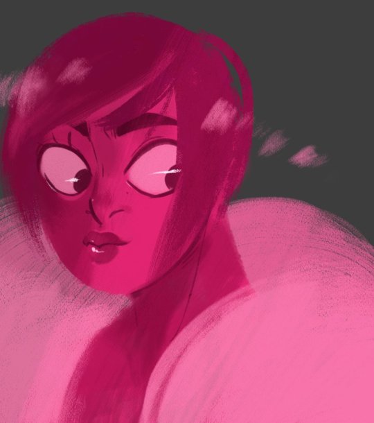
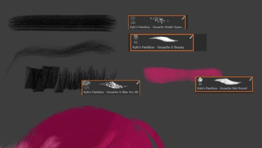


Here are some examples I whipped up real quick based on some of the panels that specifically depict thick lineart and textured coloring:

Mind you, these are all my best guesses, based on what Rachel has provided and what I've both dug up and been provided by other contributors who have pointed me in the right direction.
Unfortunately, while LO's art style is unique, it also makes it very difficult to reverse-engineer because throughout the comic (esp in S1 when she was still experimenting) while she did clearly have some "favorites" out of the bunch, she also just kind of went off "vibes" a lot of the time, treating every panel as an individual painting. And while that did lend to some of LO's most beautiful panels throughout S1, it also created a lot of whiplash between stylization because after doing one panel with thick lineart and bold texturing, she'd do another with watercolors and softer edges.
That's also not taking into account the software she was using - many of these brushes were designed exclusively with the Photoshop brush engine in mind, not Clip Studio, so they may not work entirely as intended if you use them in Clip Studio or some other non-Photoshop software. We also have to consider other factors like canvas resolution, texture effects added afterwards (such as that canvas overlay), and other adjustable settings within the brushes themselves that Rachel may have tweaked, including the pressure sensitivity, particle size/density, thickness, etc. All of which we can't really truly know, so we can only settle for our closest guess.
This is half the challenge - and fun - of trying to emulate her art style, because even she clearly didn't follow any strict rules 😅 Unfortunately it leaned more towards worse as time went on as it was clear the assistants themselves were given very little guidance or consistency (or at least, didn't have the time to settle on a happy medium) resulting in panels that are even more distinctly out of place as they were being swapped between different artists with different backgrounds and styles.
All that aside, I hope that helps! I do admittedly have to update that brush pack again, I feel like there are a handful of brushes I've found since then that could also be added, but I'd also like to update the included instructions to better reflect what I've learned since then regarding each brush and how they could be used. Ultimately though, they're yours to experiment with! Mess around, adjust the sizes and density and pressure settings, all of these things can contribute to the overall look.
Good luck! <3
82 notes
·
View notes
Text
As someone correctly pointed out, the Trump McDonald's photoshoot is camp.


The man is a celebrity reality TV game show host who has had appearances at pro-wrestling matches. This is like if there were a commercial that featured Shaquille O'Neal working the drive-thru at McDonald's, only here, we get the 'backstage version.'
The argument is that this is a fake campaign stop by the politician Donald Trump, rather than a real shift at a McDonald's restaurant.
It's a fake in-person campaign stop by the politician Donald Trump, with, presumably, a few real McDonald's workers.
It's a real reality TV photoshoot of the celebrity businessman character "Donald Trump," who eats McDonald's food and drinks Diet Coke, for the campaign of politician Donald Trump.
The character "Donald Trump" is played by celebrity actor Donald Trump, who eats McDonald's food and drinks Diet Coke. His enjoyment of french fries is authentic.
It's a behind-the-scenes look at the reality TV photoshoot of the campaign ad for politician Donald Trump, featuring celebrity actor Donald Trump, showing us the cameras and set.
The shirt, tie, apron, and lighting are a callback to the 1980s, the time most associated with the brash businessman persona of the character "Donald Trump," seen in movies such as 1992's Home Alone.
The shirt, tie, and apron while serving food at a burger joint feel like a callback to the 1950s, and there are lots of photos online of McDonald's managers looking a lot like this from the 1970s. It has a very "Americana" feel.
It's a real 21st-century campaign PR event spread across social media (with lots of photos and clips circulating) and news media, being used for memes, causing arguments or discourse that cause it to spread even farther.
Win or lose, this is beyond just a campaign ad. Is it authentically inauthentic? This is some kind of performance art.
111 notes
·
View notes
Text
Jack Jeanne March/April 2025 News
Apologies if someone has already done a big news roundup post but I figured I'd write one for covering the fourth anniversary stuff and new book and manga releases.
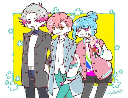
This year's anniversary art took a very different direction from the formal styles from last year's with a more streetwear look. Official website here.

We got a livestream too with Yuka Terasaki (Kisa), Masumu Ono (Kasai), and Taichi Kusano (Mare) where they read some fan mail about things people like about JJ and which class they'd be in. The stream didn't reveal a lot of new news, although it does sound like Ishida and Towada are working on the sequel pretty much every day. Towada also posted this cute art before the stream on Bluesky.
On another stream Kisa's VA did with Gakuto Kajiwara (Shirota) she mentioned that she's only met with Ishida twice so far (and that he reminds her of Kenshi Yonezu??) so it sounds like probably a lot is going on in the planning and writing stage, but they're not at the recording stage yet. Also please watch this adorable clip of them singing Faded Color together.
As far as anniversary news, a lot of it was the expected things (mostly stuff that's hard to access outside of Japan) like Joysound karaoke collab, Gratte cafe collab, popup shops in Shibuya and Umeda with a little digital stamp collection game. I'm expecting merch to be sold online on Broccoli's store after the shops close at the end of March (requires a JP address so you will likely need a proxy shipping service outside of Japan). In addition to the acrylic stands and pins, there was a cute Tummy coffee tumbler and a sorta itabag-style tote with a window in it for showing off merch. They also announced a new drama CD coming out based on Towada's birthday stories (currently untranslated to my knowledge).
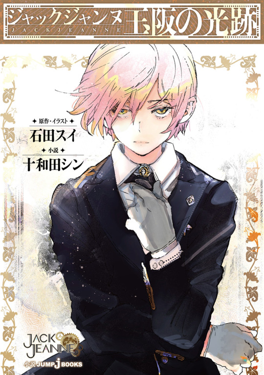
But the most exciting thing is that we're getting some new content! The first is a novel by Towada called 玉坂の光跡 or "Tamasaka's Trail of Light" which includes both the first anniversary novel "Happy Anniversary" (which used to be free but has sadly been cut to just a sample) and a new episode of 30k characters. It's a bit over 300 pages long which makes it slightly longer than the summer novel and Seven Winds. There's also some pre-order bonuses (art from Stella Worth and a visual board with a short story from Animate)
The second is a manga collection titled ジャックジャンヌ FOLIAGE ~アンバー・オニキス~ (Jack Jeanne FOLIAGE - Amber & Onyx) which has both Puppet and Parsley manga with some new art. If you want to check out the JP versions, I suggest trying to do so before April 17th as I'm unsure if they'll continue to be available for free after the commercial release.
But perhaps one of the most exciting things is that just today Ishida announced a new two-part manga one-shot published in Ultra Jump on April 18th. It's called "Duckweed" and will be focused on Minorikawa's first year after being picked to the be class lead's assistant and his challenges in managing all the Rhodonite girlies. Unlike the others, I do not expect this one to be posted officially online for free since it's being published.
For those who were maybe hoping for more sequel news, I do think the biggest thing we can take away from all this between the note at the end of Parsley, Kasai and Mare on the anniversary stream, and now a Minorikawa manga is that I get the strong sense the sequel will take place in the following year with Kisa as a second-year. I'm not sure how they will make this work with the graduated students, but that seems to be the direction all signs are indicating.
52 notes
·
View notes
Text

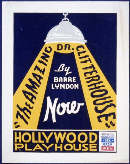
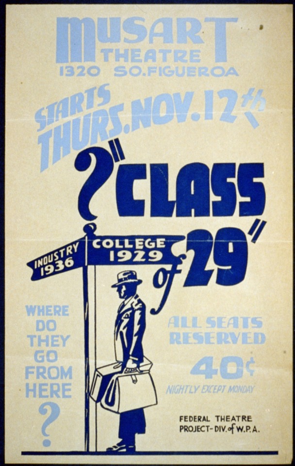


Did you know you can use these WPA posters absolutely free. These posters were created for the Federal Works Progress Administration. These are great examples of mid-century graphic design and would be great for any design projects you have that need a retro feel. They're also great for inspiration.
You can find these WPA posters and many many more on the Library of Congress website.
#free clip art#free clipart#free commercial clip art#free commercial use art#graphic design#graphic designers#typography#illustrators#typographers#retro graphic design#vintage graphic design#vintage posters#retro posters#wpa posters#free wpa posters
27 notes
·
View notes
Text
COMMISSIONS
Status: OPEN


Starting today i will be taking commissions!
If you are interested you can DM me and we can discuss the details here on tumblr c:
Prices and details under the cut:
PRICE LIST:
10 € for a simple whiteboard sketch

15€ for a more detailed sketch on clip studio

30€ for a colored sketch, simil watercolor


The price for everyone of these will be a little higher to do 2 characters, depends on the complexity but it will be ranging from a 5 to 10€ fee!
I will draw almost any fandom and ocs (i will let you know ahead if i can't or don't want to draw that character) but obviously my main fandoms are Stardew Valley, Pressure and Identity V.
No proship, no NSFW for now.
PAYMENT DETAILS:
Paypal only, buisness transactions.
After we discuss the commission details i will need the price upfront, just to be wary of scammers.
When i send the sketch we can talk about revisions, same goes for a colored product.
In terms of selling anything with my art attached to it i will refuse, these comms are for personal use non-commercial.
We can discuss all details in tumblr DMs and i will send you the finished commision here as a png.
I will then ask if it would be ok to share on my account, obviously no need to say yes!
Thank you for supporting me as always 💕
#sdv#my art#stardew valley#fanart#digital art#harvey sdv#pressure roblox#identity v#idv#commission#fandomcrap
26 notes
·
View notes
Text
02/17-20/2025 Daily OFMD Recap
TLDR; David Jenkins: CW: Pet Death; Rhys Darby; Taika Waititi; Vico Ortiz; Samba Schutte; Madeleine Sami; Anapela Polata'ivao; Guz Khan; Damien Gerard; Dominic Burgess; Fan Spotlight: Never Left Podcast; Owl Trousers Bayeux Tapestries; Love Notes;
Hey dearies, I'm catching up again, got a lot lined up today and I'll be pushing a lot of my backlog out throughout the day. Hope you all are hanging in there.
= David Jenkins =
Hey loves, it's been a couple weeks now, but our pirate dad David Jenkins lost a dear family member, their dog Sammy. If you haven't already, please send him some love.

Source: David's IG
= Rhys Darby =
Rhys was out in Austin Texas at Cap City Comedy on Feb 15th/16th!

Source: Rhys' IG Stories
And hey, is that Jared Padalecki and Charlie Capen (from Momentus) at the Austin Show?!


Source: CapCity Comedy Club IG
And Rhys was announced as Plato, in the new Movie, The Lost Tiger!

Just in case you needed some encouragement, our Dear Captain sent us a lovely message.

Source: Rhys' Bsky
He was also a guest on Inside of You Podcast! You can listen on your favorite podcast platform here!
instagram
Source: Inside Of You Podcast IG
= Taika Waititi =
Just a bit of Taika out and about.

Source: PtChevalierFamily Destist IG

Source: Kermasdf IG
Oh and did you know he directed the new Lays Matrix Commercial?
youtube
= Vico Ortiz =
Vico has been very active with the Today In Gay Podcast and their Patreon! They post encouraging photos and love notes every day on their Patreon! But also-- They've added more BTS!
BTS 1

BTS 2

Source: Vico's Paid Patreon
In other news, Vico will be at Yall Comedy Fest NYC on April 4th, 5 pm! Wanna check them out in person? Visit here! Thank you to @adoptourcrew for the info!

Source: Vico / Adopt Our Crew's Bsky
New episodes of Today In Gay!
Today In Gay - 02/17/2025

Today In Gay - 02/18/2025

Today In Gay - 02/19/2025

Today In Gay - 02/20/2025

Source: Today In Gay Substack
= Samba Schutte =
Just a quick shot of Samba at the beach!

Source: Samba's Bsky
= Madeleine Sami =
Beautiful article about our dear Archie, reminding us that even the greats struggle with the same things we do.
Source: Madeleine Sami's IG Stories
= Anapela Polata'ivao =
Auntie's new film, Tinā has been selected for the Māoriland Film Festival 2025 on March 29, 2025!

Source: Tina The Film IG = Guz Khan =
Guz is getting some stress out with the bag!
instagram
Source: Guz IG
= Damian Gerard =
Dragon Age: Vows and Vengeance, a podcast Damien's been working on has been nominated for the Best Fiction Pordcast & Podcast of the year at the Ambies! Check the other nominees out here!

Source: Damien's Bsky
= Dominic Burgess =
Dominic put together a 2025 Reel of his work! Check it out below!
Source: Dominic's Bsky
== Fan Spotlight ==
= Never Left Podcast =
New episode of Never Left Podcast! This time Art Part 4 and Books Part 2! Check them out on your favorite podcast platform!

Source: Never Left Podcast
= Owl Trowser's Bayeux Tapestries =
= Episode 3: A Gentleman Pirate =
More beautiful Tapestry work by the wonderful @owltrousers!


Source: Owl Trouser's Bluesky
== Love Notes ==
Hey lovelies. Been a while. I know it's been a lot these last few weeks. Lots been going on, both bad and good. I hope you're taking some time to rest. I'm doing some short love notes today since I'm gonna be pushing out quite a few of these recaps. Be safe and be kind out there luvs <3

Source: The Latest Kate's IG
#daily ofmd recap#ofmd daily recap#rhys darby#taika waititi#vico ortiz#madeleine sami#samba schutte#david jenkins#cw: pet death#owl trousers bayeux tapestries#anapela polata'ivao#dominic burgess#damien gerard#guz khan
31 notes
·
View notes
Text
Alastor & Charlie's Dance Analysis
I find it interesting that Alastor would choose a hobby that has been so romantically coded for centuries. The art of dance is basically a mating ritual of sorts. It opens the door to romance, love, passion and trust.
In the dance film "Take the Lead", the lead character describes dance as an act of trust. As he says (paraphrasing a bit because I couldn't find the actual quote or clip) "The man leads the dance, but it is the woman's choice to let him lead so she is the one with the power."
I feel like this line sums up Alastor and Charlie's first dance in the pilot and their relationship in general. Tossing Charlie into the air and catching her. Sliding down the ramp/stairs while holding her hand. Alastor dipping her. All of these moments during their dance were how Alastor was building trust with Charlie.
Alastor believes he is the one leading their "dance". He's the one "producing" the show. He's the storyteller. He's the one directing the tide how he wants. Except for underestimating Adam, he has had a lot of control over many events; running the hotel, mutually agreeing with Charlie to let Sir Pentious stay at the hotel, protecting the hotel, the satisfied look he had during "More than Anything" almost as if the outcome of the song is exactly what he wanted, saving information on the angels for a rainy day, Alastor telling Charlie about his smile being a power play, Alastor taking her to a town full of cannibals, looping his arm through hers so Charlie doesn't stray, Alastor introducing Rosie as an ally for Charlie and lending Charlie his microphone staff.
"I knew she could do it all along."
"She's filled with potential that I could guide."
When Alastor returns during the Finale song, Charlie literally re-receives him with literal open arms. He smiles with satisfaction because her hug confirms that he hasn't lost Charlie's trust (which is currently the most important thing to him besides his freedom).
Earlier, I had said dancing can be a mating ritual. It makes people bond. In this case, Alastor and Charlie bonded as friends while also "bonding" through their ambiguous contract. While not binding Charlie's soul to him, their "dance" still bound her to him in a sense. They'll be "together" until Alastor decides what his favor will be/what he wants to do after he regains his freedom.
Now onto Charlie's POV of their "dance". She knows that Alastor's whole persona is an amalgamation of control and choice. As Alastor stated before, he can make people stay at the hotel so why doesn't he just force them? Charlie wants it to be the sinners' choice.
Why does he originally use modern technology for the first commercial? Charlie. Why does he stop beating up Sir Pentious? Because Charlie had said "He's had enough." He actually did stop and only blasted Pentious a moment later because he ripped his coat.
Why does he allow Pentious to stay at the hotel? Because Charlie was the one that encouraged Pentious to apologize to Alastor. Why was Pentious allowed to stay even after they found out he was a spy? Because Charlie forgave him and that was good enough for Alastor.
It's always about Charlie's choice. When they first met, Charlie said, "I know he probably doesn't want to change, but I can't turn him away. It goes everything I believe in." Then she takes the reigns of the situation by telling Alastor, "I hereby order you to help with this hotel for as long as you desire."
A royal decree but not one that forces Alastor to stay at the hotel forever. She's giving him a choice and choices are probably seldom for Alastor due to him being leashed.
"Sometimes the best way to conquer an enemy is to get right in their face."
Another fitting quote from the Take the Lead film. I feel like Charlie's decision to let Alastor into the hotel was meant to keep him as close as possible by keeping a watchful eye on him so that he wouldn't be all over the city again back to his old ways.
It was Charlie's choice to defend Alastors sadistic way of defending the hotel. It was her choice to make a deal in exchange for valuable information because they were all in a desperate situation.
Charlie trusted that Alastor would "ask for one favor at a time of my choosing where you harm no one." No matter what the deal is, for her the most important part is that she wouldn't be obligated to hurt anyone once Alastor collects. It was her choice to make a risky decision because it would be for the good of all.
Charlie has more power in this "dance" of theirs than people think. If Charlie is unhappy, Alastor is unhappy. She is the one with the power because for whatever reason, Alastor's goal is to keep Charlie happy and fulfill her "every bizarre request."
Her trust to let Alastor into the hotel did have a pay off. She didn't expect him to change or care and yet he ended up "growing accustomed" to Charlie and the Hazbin gang and went all out in trying to protect them and the hotel from the angels.
Even when Alastor cashes in on the deal/inevitably betrays her, she'll understand that it was her choice to let him in, to work with him and to care about him enough to say she "loves" him, the Hazbin gang and the cannibals.
That's why it will also be her choice in trusting him to do the right thing at the perfect time and her choice to forgive him and let him back into her life. That is why going back to the quote from earlier, "The man leads the dance but it is the woman's choice to let him lead so she is the one with the power." It will be her choice to allow him to be her partner in dance, business or anything else.
135 notes
·
View notes
Text
COMMISSIONS ARE OPEN :)
about me: krizzia, 25, she/her
links:
art tag: #draws
art twitter
personal twitter
bluesky
instagram
ko-fi (tips/shop)
you can use/repost my art as long as you credit me. if you want to print them out for yourself please ask permission first. absolutely no commercial use for my art.
i use clip studio paint (brushes i use: 1, 2) and photoshop to draw. my drawing tablet is a huion kamvas 13
78 notes
·
View notes
Note
Any tips on how to correctly credit clips used in YTP? I'm very lost when it comes to finding copyright info and stuff like that.
The stakes are pretty low for YouTube Poop and crediting clips in the video/description is not standard practice - but it's a good thing to do! That said I am not an authority on this and even my method has some blind spots. These are just some generally good ideas for being a slightly-more-courteous-than-average shitposter.
The acknowledgement is the most important part, stating outright what the names of the sources are. Pay attention to the official titles of what you use and try to trace them to their original form - for example in The Price is Rice COMPLETE I wanted to credit the gamer-themed Dust-Off commercial I used in The Price is Rice Jr. Usually ads are more difficult to track down than other kinds of televised media, so often "___ TV Spot" does the job, but a quick peek at the official YouTube channel reveals that the ad's actual name was How to properly clean your gaming computer.
Then there's an acknowledgement of the owner. I try to list composers for music, directors for film, and of course artists for art. You aren't required to give an exhaustive list of every single contributor to the art you've sampled, but make sure you credit the person/company it belongs to at the very least. Going back to the Dust-Off example, the YouTube video contained a link to dust-off . com which now redirects to falconsafety . com - I lucked out because the top of the page indicates clearly that Dust-Off is a product owned by Falcon Safety Products Inc. but this info is often in the About section of a website or at the bottom of the page.
I like to throw the year on each YTP credit as well. Academic citations usually require a more precise publication date if available. Among other benefits it helps distinguish between things with the same name/owner that were rebooted later - for example there are multiple games called Sonic the Hedgehog owned by SEGA from different years (In fact in this example there are two games from 1991 so it's also important to note what system the game is for!) Generally your source credits should communicate to a viewer where to start looking for a specific thing or who to ask.
You can use Wikipedia to orient yourself if you need a lead on where to start tracking down copyright information for popular media, but make sure you cross-reference what's there with other sources. For Movies/TV I usually just look at the very end of their credits which usually has the copyright info. For music I use Discogs. Sometimes for more obscure or less-documented things I have to do some search-engine sleuthing.
If you're stuck, ask a friend for help! It can be fun and rewarding to track down something that isn't answered by a quick google search, and like most things turning it into a collaborative effort makes it less of a slog.
Copyright acknowledgement is tricky to do correctly and not every Best Practice applies to each situation. There may come a day when MLA-style citations become normal or required even for shitposts and your due diligence will become greater. Do your best, give credit where it's due, and you'll be fine :)
79 notes
·
View notes