#colorpicking and instead trying to pick colors off the top of my head
Explore tagged Tumblr posts
Text

2023 art summary!!! had to make a lot of hard choices haha. im liking my art a lot THANK YOU FIG FOR GETTING ME CLIP STUDIO PAINT ITS BEEN LITERALLY LIFECHANGING ASDFGHJDSGFHADJKDHJS
template is here!!!
#scribbles#tried to pick my fav pieces of each month which was a breeze for some months and a chore for others XDD#i drew like nothing in june#granted cuz i was busy irl but#december piece is specific when i drew other things - but! that drawing was one of my first times not like#colorpicking and instead trying to pick colors off the top of my head#hence why it looks a biiit wonky in that department? but im proud hehe#HERES TO 2024!!!#way less mp100 and tttaac on this than id anticipate given how much tttaac i draw but a lot of those arts got beaten out by other ones from#that month xP
15 notes
·
View notes
Note
I wanna know about your art style. How you draw like that??
i tried putting down considerations as well as a (very) general step by step of what i do; if there's anything more specific you want me to explain lmk i guess?
first off, general (self imposed) constraints / purpose of project -- this informs what i draw & how i draw it
i.e. "kuradex" is pretty different from my normal art (my 5 latest rough illustrations):

or my monster hunter charms:
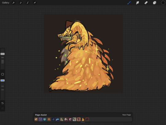
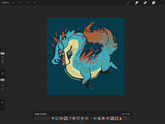
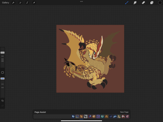
or my pokemon tcg contest illustrations that im not allowed to show until june (😉):
although i've said its for merch purposes, ive started drawing these because i wanted to practice conveying "liveliness" and noticing key features / nuances of a given design, but i didn't want to spend a large amount of time on each one.
so what i came up with is
i want to draw things on-model in terms of proportions ( + take note of weight / tapering of shapes / etc )
no backgrounds & minimal "props"
experiment with / practice line/texture/color/flow/rhythm/etc
spend <1 hr on each pokemon on average (this is a bit more difficult for me to track, but for example, the cyndaquil line took me less than 42min to color, combined, and means at some point in time instead of focusing on cleaning up the art as much as i can, i stop after cleaning up most of it)
that said, the pose & the rhythm/flow of lines are key in conveying liveliness, and if i have a concept in mind i usually end up going with it, but i may go thru a few if i dont.
i consider pokemon origin / lore or a key point in its design, and if i'm particularly stuck, i try looking up pokemon card illustrations for inspiration. (i noticed the research i do is essentially a truncated version of how Atsushi Furusawa does research before doing an illustration.
(& even despite all this i do get stuck sometimes and don't exactly understand a pokemon and just opt for "as cute or cool as i can make it i guess?", but i think it's part of the process...?) (theoretically things that are A Shape should be really easy to draw but with what i want to practice in perspective i find them difficult...)
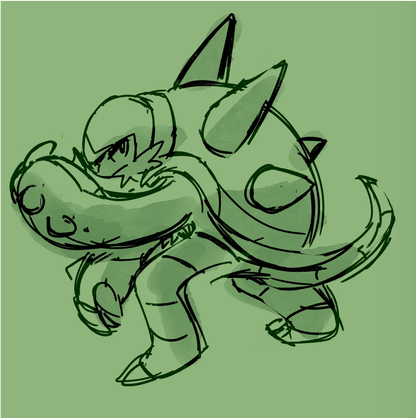
this is from my latest paid req but these are my first sketches of chesnaught -- i was thinking of how one of its inspirations is a warrior / tanker from RPGs, so i drew a pose where it's shielding its face.

i do another pass and take note of details.
in general i draw overlapping shapes and erase (it's a bit visible on one of the spikes)
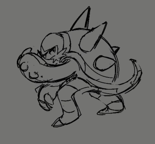
because i opt for quickness i start coloring at this point -- i just use a colored "color burn" sketch layer for the "lineart" & colorpick official art & lay down messy flats & set the color layer to 60%
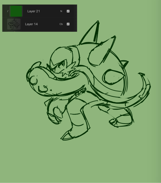
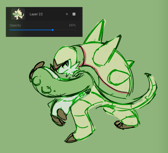
60% multiply layer for shadows. i tend to use both hard and soft brushes
for bigger projects i would use 2-3 shadow layers to create more "layered" shadows
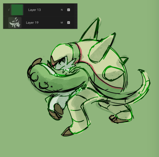
here i use overlay layer (60%). this is just throwing colors at it and seeing what works and doesn't work. i personally prefer to throw red under the eye and a yellow or blue near the top of the head. this is mostly done with a soft brush

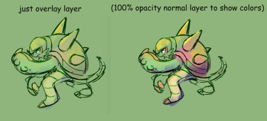
before this point, everything is under the rough lines, but now i start drawing/painting over it
i just color pick the colors that have been laid down from the previous steps and clean up / render textures (making the green on its arms look fuzzy) / fixing anything that i forgot or looks too off (i.e. the spike on its shoulder and the way the tail curves)

I could potentially keep cleaning this up, but this is where i usually stop 🫡
138 notes
·
View notes