#coloring stuff with gradient maps instead of fully coloring
Explore tagged Tumblr posts
Text
How I Set Up Recolor Actions!
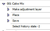
if you saw me hit post early on this, no you didn't
I'm having to re-re-redo my CS2 actions, so I figured I'd post a quick primer on what steps I use, both to be helpful and so that if I'm missing something that'll save me headache later, someone else can yell at me.
All of these steps occur on a newly-opened DDS or PSD. If you have adjustments to make on a file before recoloring it, I recommend saving, closing, and reopening it (or a duplicate of it) to keep the history on it simple.
Make Adjustment Layer Recorded by running your recolor steps Mine is a gradient map, but if your recolor action is a multi-step process, record all those steps here. It's functionally the same.
Place Recorded by using the File>Place... context menu This one's important! I have a spot in S4S where I keep a file that is always titled overlay.png. If you're ever recoloring something that has parts you don't want to be hit by the recolor, cut it out and save it as a .png that you can retitle to overlay and plop in that folder. The Place step will insert it as a layer on top of your recolor, perfectly aligned on the canvas IF you don't display mipmaps. Lifesaver for stuff like eyes, buttons, etc. If your recolor doesn't have any overlays, keep a same-sized PNG that's fully empty in as overlay.png.
Save Recorded by saving the file (ctrl+shift+S) You'll probably need to make two sets of macros if you use both DDSes and PNGs, and it'll also need to be redone if you change your save file location. But you can do that somewhat faster by copying the entire folder of palette actions, deleting the save step, and just going through one by one on the actions to re-record it to the proper format/file name/location/etc.
Select history state -2 Recorded by going to the History palette and selecting the state directly before the recolor actions began. And now undo it all! This preps for the next color to be applied, and keeps you from having a big buildup of overlay layers floating on your project. Note that the number of history states displayed will change depending on how many steps are in your recolor process. And that's it! At least, for my process. I would recommend having all recolor actions per each palette you work with in their own folder, and then make a new folder for All-In-Ones where you make a new action whose entire purpose is to play all of a palette's actions in one shot so you can set it and walk away for a bit. And then if you're like I was when I first started, you have an action to play all those actions, and you decide you're gonna recolor everything in 16 or 17 whole-ass palettes, and then you get burnt out from having to take so many preview screenshots and quit. ... Maybe don't do that, actually. Regardless, there you go! Do let me know if you have any questions! I'm always happy to help people out with stuff like this. (especially if you start cake mixing stuff with me. what who said that.) Maybe next I'll make a cheat sheet on how I set up my S4S self-importing macro and troubleshooting it... Semi Important Note: If your computer has an SSD, constantly writing and rewriting the same files over and over can ding away at its health. If you have an external hard drive, you can set the files up to save there instead, and hold shift when deleting the DDSes/PNGs to skip over the Recycle Bin and have them be immediately deleted.
#s4cc recolor#ts4 recolor#i hope this helps someone!#come recolor things in Cake Mix with me#it's got such good unnat colors#anyway countdown to someone telling me there's an easier way in three... two... one...#also remind me to tell you about my zombie external hard drive some time if that sounds even a little interesting
0 notes
Text

First meeting, first rebellion against fate
#hm i should make an original art tag#destiel#dean winchester#castiel#spn fanart#spn#destiversary#destiversary s4#hii i am. doing something a bit experimental for this event#coloring stuff with gradient maps instead of fully coloring#gives it a more vibeful vibe i think#anywaes. enjoy#very proud of cas's hands in the first panel that's some of my best hands
18 notes
·
View notes
Note
I dont wanna come off as pushy, but someday could you do a speed-paint video please? Ive asked like 20 tumblr artists key facts on learning stuff and like 11 of them went “speed-paints”, and your shit(affectionate) is cool so yea sorry for long ask bye gn I'm tired.
the few speedpaints ive recorded are heavy enough to crash my computer when i try to load them so have a set of stages in my drawings instead
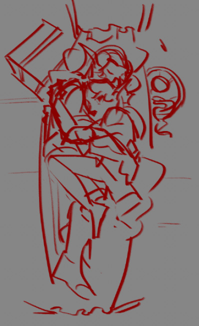
sketch: i lay down the composition and body language, if im feeling confident ill also plan values but i didn't in this case. i try to keep a very loose vibe as the more layers to lineart the more stiff the characters can feel
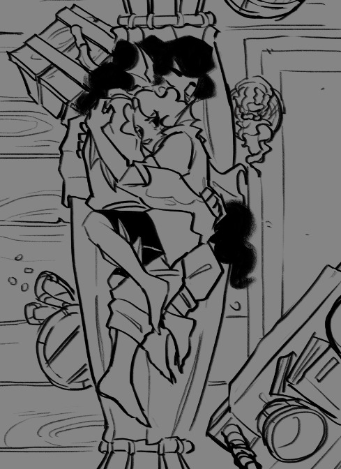
lineart: shit gets cleaned up, characters and background defined, keep background, characters and foreground linearts on different layer groups, you'll thank me later

flats: the ugliest stage in my opinion but necessary, start planning a light source for the next step

base shadows: simple as well, just shade based on light source and bouncing light, you can also do some rendering on some parts. i like to do my initial shading without multiply layers as it gives it a bit of a painterly look
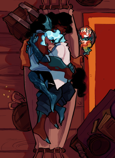
coloring the lineart: helps pull the piece together and add a sence of depth, this is also why we separated the lineart layers so they work more smoothly without cutting of colors
now i would consider this done but i wanted to change the mood so we now go onto extra stuff
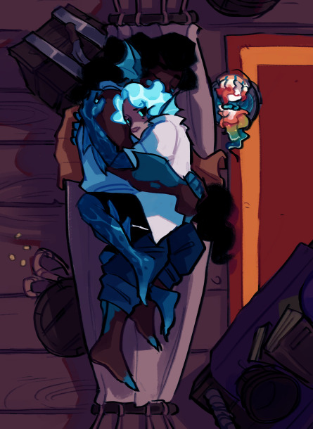
here i did some heavy hue altering to a colder atmosphere, mostly using hue shift and lighting settings on editing
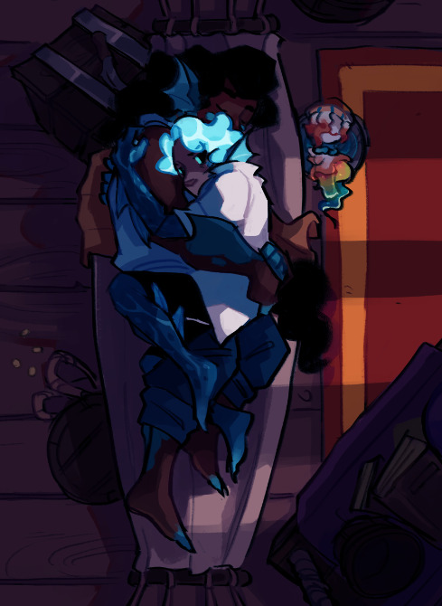
multiply layers are your friends for dramatic shadows, use them wisely, i actually erased them in mariza's hair to make it stand out
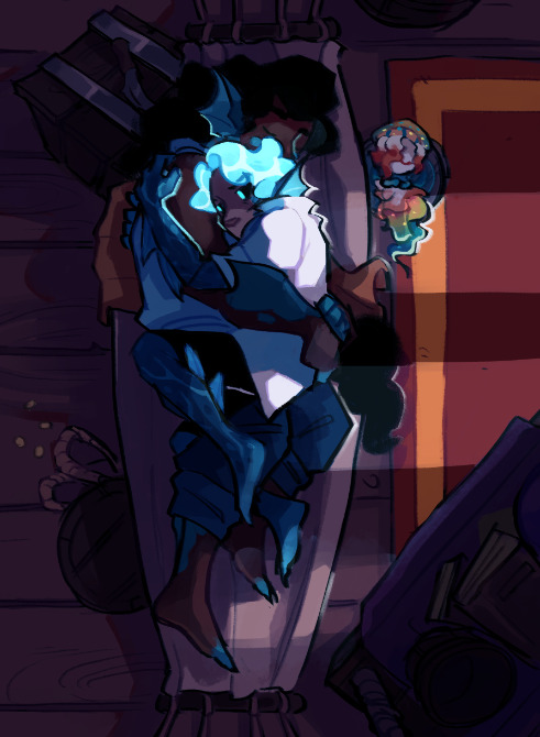
lighting time to make the shadows stand out more, remember that its also going to reflect on surfaces near them so keep a track or those. i used glow layers for this
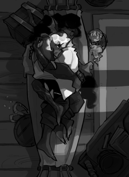
value check! something that should be done across the entire process, helps you track your shadows and lights without the colors getting in the way. use it to avoid muddy areas of greys on your art
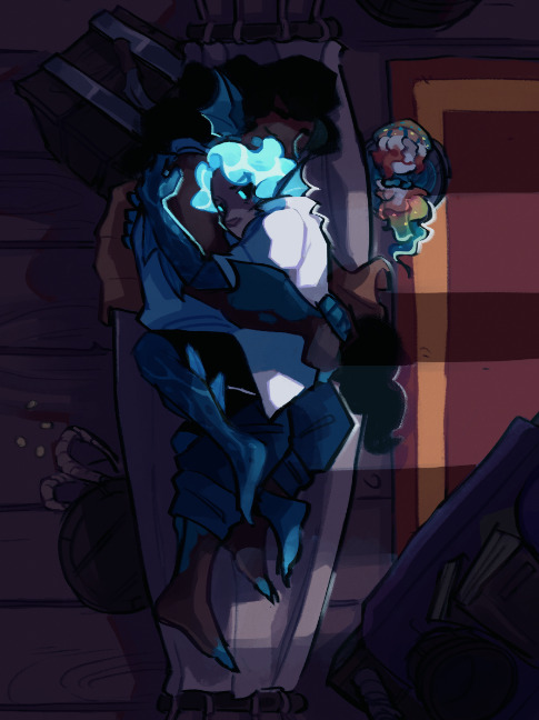
mess around with some settings and gradient maps and boom! you got your fully done ilustration, theres a lot i didnt touch on like painting rendering and some extra pizzaz i like to add but im running out of image capacity and time so i hope this helped
happy drawing!
#pada asks#my art#idk how to explain art stuff so this is a bit of a mess#but so is my art process to i guess it works out in the end#long reads#long post#art advice#art tutorial#tutorial#digital art#ilustration#artists on tumblr
217 notes
·
View notes
Photo

days before doom, 1992-1993
doom was a watershed moment in gaming culture. it changed everything; it rocketed id software from stardom into super-stardom, making them one of the most well-known names in the western games industry. it redefined the discussion on video game violence, climaxing in the shitstorm that surrounded the 1999 columbine shooting. and it put the first person shooter firmly on the map for good, looming large over developers, serving as the chief example of what happens when you push the envelope just that extra bit. it’s impossible to overstate just how important doom is. but the key thing about watershed moments is that there is a status before them as well as after them. in the years immediately preceding doom, the first person shooter genre was starting to grow in size, and a variety of approaches to design were prevalent. here, then, are three of doom’s immediate predecessors.
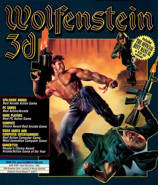
wolfenstein 3D

the early years of modern PC gaming were a strange time; the burgeoning field of home PCs (at the time called IBM-compatibles) were replacing the multitude of home computers that ran with proprietary hardware and software, with increasing parity between brands when it came to internals and a slow gravitation towards plain beige boxes (not counting some of the more experimental models.) PC game development was something of a wild west, a career for hobbyists and isolated-but-brilliant coders. id software were no different, a motley four-man crew consisting of programmers, designers and an artist, who liked heavy metal and super mario, who met working in the games department for the computer magazine softdisk but chafed under softdisk's office culture. after proving that side-scrolling games could be done on then-underpowered PCs using a technique john carmack devised, they formed id software and began "borrowing" softdisk's computers over the weekend to design their own games, to be sold independently. after getting busted by the management, they left softdisk with no criminal charges under the stipulation that they write one game every two months for softdisk for a period of time, but without any direction from softdisk.
id software were now free to pursue their own avenues of game design, with john carmack's programming genius at the helm. alongside the now-classic platformer series commander keen, carmack's experiments in writing a first person engine had resulted in early landmark titles hovertank 3D and catacomb 3D. while catacomb 3D had been the result of carmack's assertion that he could write a faster texture renderer than the fully-textured ultima underworld, which he'd seen at a CES demo in 1990, wolfenstein 3D was intended to be the next step up -- faster, more action-packed, and -- most importantly -- violent.
similar to how catacomb 3D was a first-person followup to john carmack's softdisk title catacomb, the wolfenstein franchise goes back before its “3D” entry. the series began life in 1981 under the auspices of industry legend silas warner, whose apple II classic castle wolfenstein was a vastly different sort of game. a top-down shooter, castle wolfenstein is by all accounts the first stealth game, in which the player must hide from patrolling nazis, using stealth and subterfuge to complete their objective and escape from the castle. ammunition was scarce and the player was sometimes better off holding up guards and stealing their equipment, rendering them harmless. the game was a smash hit, with a followup coming three years later.
the idea to utilize the wolfenstein name was john romero's, but they ran through a number of alternate titles beforehand, among them "hard cell," "luger me now," and "how do you duseldorf?" after meeting with silas warner himself and getting his blessing, id software went ahead with the wolfenstein name and the rest is history.

on a technical level, wolfenstein 3D was the next step up from catacomb 3D. while the basics of the engine were unchanged (textured walls, but no floors or ceilings) there were several notable updates under the hood. the most visible difference is the switch from the EGA display standard, which allowed for up to 16 colors (out of a palette of 64) to VGA, which could display up to 256 colors. that this switch was done mid-development is made plain in the somewhat limited palette in the art assets, with an abundance of shades of blue, turqouise or purple, all of which were common colors in EGA programs and games.
the second big difference was speed; players could move at an almost inhuman rate around the mazes of the game, and the focus was on action over the more sedate tactical espionage of castle wolfenstein. the emphasis on speed figured into the game design; plans for features like dragging bodies out of sight of patrolling guards were scrapped for the sake of keeping up the breakneck pace.
perhaps the standout element, of course, was the violence. sex and violence in video games and other media was an increasingly hot topic; the 80s had been marked by controversies surrounding games like custer's revenge and splatterhouse, and the legacy of 1976's death race 2000 cast a bit of a shadow as well. but nothing could have prepared the industry for what was to come in the 90s. wolfenstein 3D managed to slip in ahead of the shitstorm that id's next game, doom would get embroiled in alongside mortal kombat, but even still it drew concern from id's retail publisher at the time, formgen. artist adrian carmack (no relation to john) had long been a fan of gory themes in his work; doing the art for the relatively kid-friendly commander keen had chafed him, and he relished the opportunity to do something grotesque. hovertank 3D had been a good start, but wolfenstein 3D gave him the opportunity to really cut loose, and in response to formgen raising its concerns, he added much more violence to the art assets, the levels being dotted with skeletons and corpses, and tom hall and john romero recorded themselves screaming almost random phrases in broken german to give voice to the enemy forces. the original three episodes of the game culminated in a final battle with hitler, resulting in one of the goriest deaths ever seen on a screen at the time. (it's worth noting that this isn't the first time hitler's been exploded in a video game...)
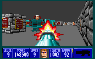
like doom, wolfenstein 3D saw a number of ports over the years; a mac version had updated graphics, but the one that most people remember is probably the SNES version, which is infamous for its censorship. gone were the nazis (hell, the bad guys didn’t even speak german anymore!) gone was the blood (it was sweat instead) and hitler himself was replaced by the generic “staatmeister.” the development of the SNES version is a particularly sore memory for id software, in part due to this censorship and in part due to the initial contractor (rebecca heineman) assigned to the porting project going AWOL.
wolfenstein 3D has a long legacy. the serious tone of castle wolfenstein had given way to a grindhouse vibe, stripping away complexity to leave one of the first pure action FPS games, where you go from point A to point B while killing everything in your way and occasionally using keys to progress. while its design was primitive compared to later games, with strictly orthogonal walls and an unchanging height, it proved the potential of the 3D engine for creating realistic environments. while the franchise has seen a couple of revivals, most recently in the utterly brilliant wolfenstein: the new order, it's wolfenstein 3D that laid the groundwork for the future, making the first person shooter popular and proving that shareware distribution was, for the time, a viable method of publishing games.
and besides, everybody loves dead nazis.
pathways into darkness

speaking of dead nazis...
if id software were once the rock gods of PC gaming, bungie were the jazz masters of mac gaming. formed by a pair of college students in the early 90s, they got their start assembling and shipping copies of minotaur: the labyrinths of crete by hand, which is a seriously humble origin given the legendary status bungie holds today as the creator of halo and destiny. their early focus on mac development was largely due to jason jones, who grew up on apple computers, but also because the field was a lot more open in mac development at the time.
after the moderate success of minotaur, they set about working on a first person shooter, inspired by wolfenstein 3D. minotaur and bungie's earlier game operation: desert storm were quirky in an intellectual kind of way; operation: desert storm came with a glossary of military terms and trivia, and authentic maps of the kuwaiti theater of operations during the gulf war. pathways into darkness was no different, which set it apart from the mindless fun of wolfenstein 3D. initially intended to be a first person version of minotaur, they chose to write an original story instead, a lengthy tale of a secret special forces mission to stop the awakening of a dreaming cosmic monster deep beneath a pyramid in the yucatan peninsula. along the way one can speak to the dead that litter the pyramid's corridors, ranging from the player character's special forces comrades to a lost nazi expedition that had entered the pyramid in the late 1930s looking for a potential superweapon.

in terms of technical stuff, the engine isn't a purely orthogonal game like wolfenstein 3D is. instead, walls are quite narrow, with beveled ends; while the underlying map design does seem to be grid-based, the grid squares appear to be much smaller than the massive blocks of wolfenstein 3D, which allows for narrow columns built out of in-game architecture rather than having to use sprites. lighting is not universal, either, and visibility fades into black off in the distance, though a flashlight pushes the darkness back a little. the initial version of the game used gradients for the walls and floors; the powerPC version finally texture maps these.
at times, the game comes off feeling more like a cross between a survival horror and an adventure game with dungeon crawler elements; a text parser requires some specific keywords for talking to the dead, and some of the puzzles are obtuse as hell, and it's entirely possible to play yourself into a corner without realizing it for hours. meanwhile, time actually passes as you play, and you only have five in-game days to complete your task. a weight limit determines how much you can carry, and healing options are limited to rare blue potions and sleeping, the latter of which uses up time. ammo is scarce until you find a certain magical item that lets you create duplicates of anything you put into it, and enemies respawn, furthering the constant threat. saving the game can only be done at save points, which are far and few between.

in spite of its difficulty (or perhaps because of it) pathways into darkness was a smash hit; it was the first native first person shooter for the mac (not counting the colony) and launched bungie into stardom, enabling them to expand their operations.
unfortunately, accessibility to this fantastic game is quite limited. mac owners will be pleased to know that it's available for free on the app store; for everyone else, there's basilisk II (or sheepshaver for the powerPC version) but setting up can be quite the chore.
in addition, art game genius brendon chung has devised his own spin on the early hours of the game in the form of doom 3 mod pathways redux.
ultima underworld: the stygian abyss

ultima and its major competitor wizardry are probably the two greatest influences on RPGs, east and west. a lot of the things we take for granted in RPGs now were invented and codified by these two series. for most of the early 80s they dominated sales, but by the early 90s they'd lost their grip on the market as their successors began to take over, especially final fantasy and other japanese series. ultima VI had shown the franchise still had the chops, but wizardry was fading fast, and by the 1990s only a cult following in japan really still cared about it. as the cRPG scene began to go dormant in the face of the rising wave of jRPGs, the bigger names began to experiment, tossing out a few spinoffs in an attempt to remain relevant. most of them weren’t successful -- the worlds of ultima series seem to have gone forgotten -- but there was at least one runaway hit.
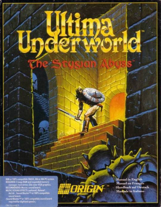
ultima underworld: the stygian abyss began as the brainchild of paul neurath, who worked at origin systems, the company richard garriot founded to aid in publishing his ultima series, and which had grown into a huge company by the 1990s. neurath was dissatisfied with the simplistic graphics of earlier dungeon crawler games like wizardry, and wanted to create something that built on suspension of disbelief. he founded blue sky productions (not to be confused with bluesky software, creators of vectorman) with the intent of developing this game. the famous demo shown at CES 1990 came out of the early work; origin was so impressed that they offered a publishing agreement and suggested the game be rewritten as an ultima spinoff.
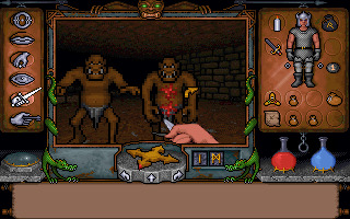
i've written a lot in this space about immersive sims; one of the more invisible aspects of immersive sims, particularly the "traditional" ones like thief and deus ex, is a development process that is perhaps more organic than that of other studios. ultima underworld was developed in such an environment, and is often described as the first immersive sim -- and indeed, it would seem to fit by most any standards, including mine. stepping away from the grid-based movement of classic dungeon crawlers like dungeon master or, yes, wizardry, realtime movement combined with more tactile world interaction pushed ultima underworld out of the hoary old dungeon crawler genre and into something a little more interesting. there's actually a surprising amount of things to see and do, and the entirety of the dungeon is open to you. in a very real sense, ultima underworld laid the groundwork for everything from deus ex to skyrim to dark souls, on top of being leagues ahead of the competition in terms of technology, with fully-textured everything, curved walls, sloped ceilings and floors, and some early 3D models. it's also singlehandedly responsible for launching the career of warren spector, whose previous production work had been wing commander II and one of the worlds of ultima spinoff games. spector would go on to produce system shock, which was in a very real sense the sci-fi counterpart to ultima underworld, and the rest is history.
of course, a game with ultima underworld’s cult popularity can’t go without a sequel. by september 1992 origin was forced by money issues to sell to electronic arts (a shocking move given garriot's long-running hatred of EA founder trip hawkins.) blue sky ended up merging with lerner research, a small outfit that mostly did flight sims, to form looking glass technologies, and it was under these auspices that ultima underworld II: labyrinth of worlds was created in 1993, with much stronger ties to the ultima franchise than its predecessor. years later, arkane studios (they of dishonored fame) would create a spiritual sequel called arx fatalis. and just as the ultima series lives on in garriot's upcoming shroud of the avatar, so too will ultima underworld, in underworld ascendant.
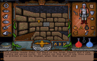
i'm on record as saying i strongly dislike ultima as a series, finding them to be mostly unplayable and difficult to take seriously, and i think garriot is a hack resistant to change, even positive change that would make his games more accessible to people other than crazy assholes who speak in faux-old english in their daily life. i find ultima underworld's controls to be clunky and its historical slowness on DOSbox has long precluded me from being able to get into it. but even i must admit that ultima underworld, and ultima as a whole, are among the most influential games ever made, which is why whenever some gaming site talks about gaming history and ignores the franchise and its influence on everything from final fantasy to bioshock, i have to wonder just how lazy they really are.
this article is a complete rewrite of an earlier entry.
history of FPS masterpost
#wolfenstein 3d#pathways into darkness#ultima underworld#id software#bungie software#looking glass software#ultima#wolfenstein#marathon#halo#history of fps#classic FPS#classic gaming
5 notes
·
View notes
Text
Themify Helps You Say Goodbye to Boring Website Templates
WordPress is used to power an estimated 27.4 percent of all websites, and templates in general are popular across all sites. In other words, the search for templates and themes that are compatible with WordPress is very prevalent among professional and hobbyist designers. In the past, this led to a long and boring list of template options that could only be tweaked in minor ways.
Although this was a huge success story at first as it allowed people to break away from doing their own HTML coding, the reality is that the look and feel of many of these templates is no longer up to par. Fortunately, Themify offers a new way of looking at the popular website building option. Instead of being stuck with the exact layout of the theme you choose, you now have an unprecedented level of control.
Themify Ultra Takes Things to a New Level
Themify Ultra is by far the most powerful WordPress creation that the Themify team has developed. Designers of all skill levels will enjoy the vast selection of choices that transform the basic theme into a professional looking and fully responsive website. This theme is alterable through the easy to use drag and drop builder.
Have you ever found a template you adored but wanted to tweak the header, background or footer? Perhaps you’ve also encountered issues getting the layout to cooperate for single posts and archives. With Themify Ultra, you’ll gain access to a robust list of customizable layout choices that will enable you to truly make the resulting website unique.
Header/Page Styles
First up is the impressive list of header/page styles. Your theme can be altered to feature any of 15 styles that range from the Header Magazine look to a Header that slides out from the left or right-hand side of the page. You can also choose no header at all, which is ideal for any landing pages that you are planning to build.
Header Background Options
Next, there are six header background options to improve upon the header you select. Again, you can choose between a nice array of looks such as an image, a slider or animating colors. You can even upload a video, which is a nice feature that is a lot of fun to work with.
Footer Layouts
It would be odd to have so many customizations available for the header without also giving some love to the footer. Themify provides six footer styles, and each style can be further altered with widgets, a menu, credit text and visibility toggling.
Single Post Layouts
Themify Ultra comes with a default single post layout, but it doesn’t end there. Users have four more layouts to choose from, including gallery style and split.
Archive Layouts
An archive is something that most website template designers have given little to no thought to. This is evidenced by the complete lack of a designated archive layout that is found within most website builders. Themify has again stepped up to provide users with yet another useful way to set their site apart from the competition. Choose from six archive layouts that can each be further customized through visibility toggling of several components.
Introducing: Section Scrolling
One of Themify’s newest features is also among the most exciting! Section scrolling has been designed to allow website visitors to scroll one row at a time through your entire page design. This mimics the concept of a presentation slideshow and can be extremely useful for a wide variety of online businesses. Unsurprisingly, Themify took this beyond the basics by offering six ways to configure section scrolling so that it fits in the best with the rest of your layout.
Pre-Designed Layouts Offer Simplicity
All of the cool stuff that Themify can do is only going to be as useful as your level of skill and patience. For example, if you don’t want to make a bunch of decisions about the layout of your site, you’re probably not going to spend a lot of time tweaking things such as your footer and header. However, website owners who still want to end up with the best possible appearance can select from more than 60 pre-designed layouts.
Much like every other pre-designed template that is offered by website builders, you’ll be able to look through your options, pick your favorite and plug your own words and images into the provided boxes. Unlike most pre-designed layouts, Themify has impressive parallax landing pages available for their layouts. This helps ensure an end result that doesn’t look like it was quickly put together with an existing layout. Instead, users get professional quality results without needing to hire a website designer.
Of course, even if you are working with a professional, Themify is a great way to get a look and feel you truly like. If this is what you’re planning to do, though, it makes the most sense to give the website designer access to Themify Ultra so that they can tweak your site more extensively.
Free Bonus Builder Addons
The Ultra theme becomes an even better bang for your buck when you take advantage of the builder add-ons. With a simple click, you can access and add elements to your website that include a pricing table, a contact form, a map, a progress bar and a timeline. Themify values this add-on pack at $100, but they toss it in free of charge with Ultra.
Image Filters
We’re living in an Instagram world, which means that images need to be hip in order to capture attention. Themify removes the need to purchase expensive editing software such as Photoshop by offering built-in filters. There’s also a portfolio feature and you can utilize website alterations such as overlays, animated colors and gradient colors to make your site truly pop!
What We Love
Now that we’ve provided a breakdown of some of Themify’s best features, it’s time to look at what really works for us. We absolutely love all of the layout customizations that come with Themify Ultra. The pre-designed layouts, add-ons and image features are also a nice touch, as is the easy to work with WooCommerce Shop.
What We Don’t Love
There’s nothing about Themify that we actively dislike, but it would be nice if the image customizations offered more filter choices. Additionally, the long list of custom options that can be used with Ultra is almost too long! People who are indecisive by nature may take a while to make their final selections as a result.
Final Thoughts
Themify is one of the most powerful WordPress compatible website builders we’ve ever encountered. The ability to change almost every single detail of a layout without needing to know HTML or CSS coding is a game changer, and we suspect most intermediate to advanced users will choose to make a lot of alterations. This couldn’t possibly be easier thanks to the drag and drop technology.
Those who want a very quick and simple way to build a website can’t go wrong with the pre-built templates, although upgrading to Themify Ultra’s wonderful level of creative control will offer a much more unique result. Ultimately, we love and highly recommend Themify for a wide variety of website needs!
Read More at Themify Helps You Say Goodbye to Boring Website Templates
from IT Feed https://webdesignledger.com/themify-helps-you-say-goodbye-to-boring-website-templates/
0 notes
Text
Themify Helps You Say Goodbye to Boring Website Templates
WordPress is used to power an estimated 27.4 percent of all websites, and templates in general are popular across all sites. In other words, the search for templates and themes that are compatible with WordPress is very prevalent among professional and hobbyist designers. In the past, this led to a long and boring list of template options that could only be tweaked in minor ways. Although this was a huge success story at first as it allowed people to break away from doing their own HTML coding, the reality is that the look and feel of many of these templates is no longer up to par. Fortunately, Themify offers a new way of looking at the popular website building option. Instead of being stuck with the exact layout of the theme you choose, you now have an unprecedented level of control. Themify Ultra Takes Things to a New Level Themify Ultra is by far the most powerful WordPress creation that the Themify team has developed. Designers of all skill levels will enjoy the vast selection of choices that transform the basic theme into a professional looking and fully responsive website. This theme is alterable through the easy to use drag and drop builder. Have you ever found a template you adored but wanted to tweak the header, background or footer? Perhaps you’ve also encountered issues getting the layout to cooperate for single posts and archives. With Themify Ultra, you’ll gain access to a robust list of customizable layout choices that will enable you to truly make the resulting website unique. Header/Page Styles First up is the impressive list of header/page styles. Your theme can be altered to feature any of 15 styles that range from the Header Magazine look to a Header that slides out from the left or right-hand side of the page. You can also choose no header at all, which is ideal for any landing pages that you are planning to build. Header Background Options Next, there are six header background options to improve upon the header you select. Again, you can choose between a nice array of looks such as an image, a slider or animating colors. You can even upload a video, which is a nice feature that is a lot of fun to work with. Footer Layouts It would be odd to have so many customizations available for the header without also giving some love to the footer. Themify provides six footer styles, and each style can be further altered with widgets, a menu, credit text and visibility toggling. Single Post Layouts Themify Ultra comes with a default single post layout, but it doesn’t end there. Users have four more layouts to choose from, including gallery style and split. Archive Layouts An archive is something that most website template designers have given little to no thought to. This is evidenced by the complete lack of a designated archive layout that is found within most website builders. Themify has again stepped up to provide users with yet another useful way to set their site apart from the competition. Choose from six archive layouts that can each be further customized through visibility toggling of several components. Introducing: Section Scrolling One of Themify’s newest features is also among the most exciting! Section scrolling has been designed to allow website visitors to scroll one row at a time through your entire page design. This mimics the concept of a presentation slideshow and can be extremely useful for a wide variety of online businesses. Unsurprisingly, Themify took this beyond the basics by offering six ways to configure section scrolling so that it fits in the best with the rest of your layout. Pre-Designed Layouts Offer Simplicity All of the cool stuff that Themify can do is only going to be as useful as your level of skill and patience. For example, if you don’t want to make a bunch of decisions about the layout of your site, you’re probably not going to spend a lot of time tweaking things such as your footer and header. However, website owners who still want to end up with the best possible appearance can select from more than 60 pre-designed layouts. Much like every other pre-designed template that is offered by website builders, you’ll be able to look through your options, pick your favorite and plug your own words and images into the provided boxes. Unlike most pre-designed layouts, Themify has impressive parallax landing pages available for their layouts. This helps ensure an end result that doesn’t look like it was quickly put together with an existing layout. Instead, users get professional quality results without needing to hire a website designer. Of course, even if you are working with a professional, Themify is a great way to get a look and feel you truly like. If this is what you’re planning to do, though, it makes the most sense to give the website designer access to Themify Ultra so that they can tweak your site more extensively. Free Bonus Builder Addons The Ultra theme becomes an even better bang for your buck when you take advantage of the builder add-ons. With a simple click, you can access and add elements to your website that include a pricing table, a contact form, a map, a progress bar and a timeline. Themify values this add-on pack at $100, but they toss it in free of charge with Ultra. Image Filters We’re living in an Instagram world, which means that images need to be hip in order to capture attention. Themify removes the need to purchase expensive editing software such as Photoshop by offering built-in filters. There’s also a portfolio feature and you can utilize website alterations such as overlays, animated colors and gradient colors to make your site truly pop! What We Love Now that we’ve provided a breakdown of some of Themify’s best features, it’s time to look at what really works for us. We absolutely love all of the layout customizations that come with Themify Ultra. The pre-designed layouts, add-ons and image features are also a nice touch, as is the easy to work with WooCommerce Shop. What We Don’t Love There’s nothing about Themify that we actively dislike, but it would be nice if the image customizations offered more filter choices. Additionally, the long list of custom options that can be used with Ultra is almost too long! People who are indecisive by nature may take a while to make their final selections as a result. Final Thoughts Themify is one of the most powerful WordPress compatible website builders we’ve ever encountered. The ability to change almost every single detail of a layout without needing to know HTML or CSS coding is a game changer, and we suspect most intermediate to advanced users will choose to make a lot of alterations. This couldn’t possibly be easier thanks to the drag and drop technology. Those who want a very quick and simple way to build a website can’t go wrong with the pre-built templates, although upgrading to Themify Ultra’s wonderful level of creative control will offer a much more unique result. Ultimately, we love and highly recommend Themify for a wide variety of website needs! Read More at Themify Helps You Say Goodbye to Boring Website Templates http://dlvr.it/NJLTLZ www.regulardomainname.com
0 notes