#color and text edits by me
Explore tagged Tumblr posts
Text

Billie Blair in Loris Azzaro for Virginia Slims
#billie blair#loris azzaro#70s fashion#m posts#1970s#black vintage#vintage ads#color and text edits by me
28 notes
·
View notes
Text
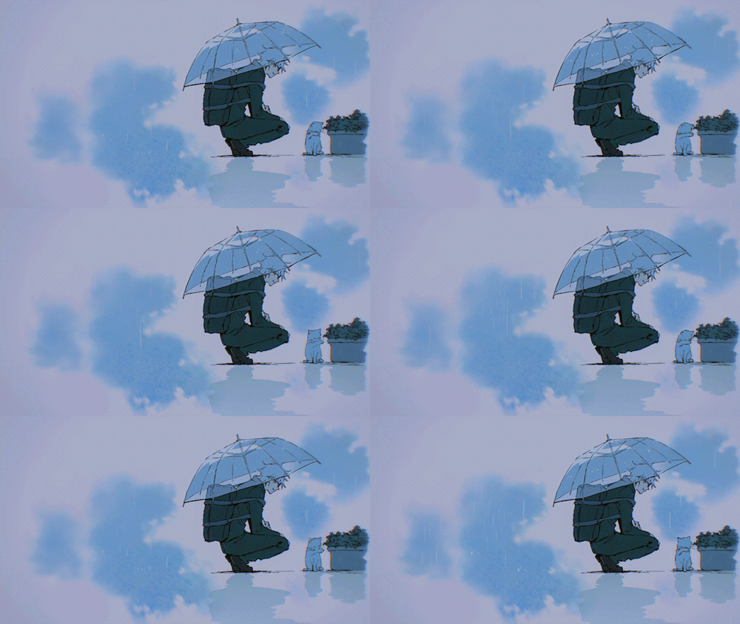


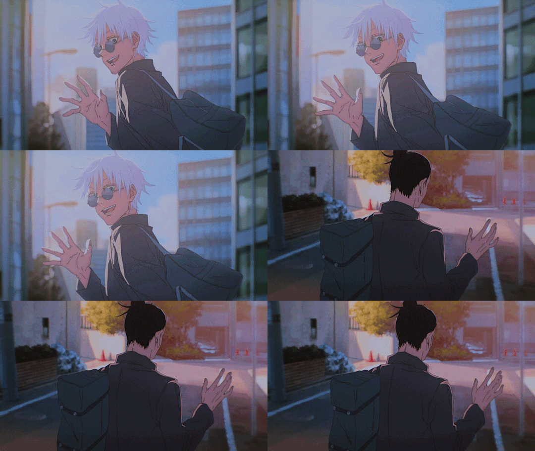


Jujutsu Kaisen 2 ED 1 | AKARI
#jujutsu kaisen#jjk#jjk 2#gojou satoru#getou suguru#satosugu#gif#gifset#my gif#my edit#asukachii#i still have lots of gifs...#these are a bit edited like i said in the tags of my previous post#i mixed some scenes together and also made some of them in loop#corrected the timing also#added some coloring on#i deleted the text in some and then i found out that there are creditless versions of op and ed on yt?#from what i've seen they're in 720p though so not the best quality mh... maybe me deleting wasn't for nothing idk#opening and ending are gorgeous btw
3K notes
·
View notes
Note
Hey Karl you think whenever BF or GF just hit Pico with a random hug no matter the circumstance his face just crumbles into the most vulnerable and yearning look and suddenly the hug lasts for 20 minutes because they don't have the heart to pull away when Pico lays his arms around their backs in the most gentle way possible

(id in alt - do not repost, please ask before using as icon/ banner etc.)
yeag..


Close-ups of my personal favorite shots LOL. I also really like how Boyf came out here but he's already Huge in the piece so he doesn't need a close-up.
Do you ever think BF and GF get super emotional when he's soft with them? This guy, known for his fuckin' Bite with an attitude developed partially for self-defense, melting at their touch and allowing them to see his more gentle side? Something that nobody else will ever get to see?
The demon and the rapper are nice by default. Boyf can be a bit of a menace and Girlf is not afraid to show her demonic side when necessary, but they're kind to others as a default, maybe even to a fault. Not that Pico doesn't ever show kindness to others, but he's usually prickly and standoffish; his kindness could come off in ways that read almost as passive aggression. And yet, around the two idiots (used affectionately lol) he's like putty in their hands.
Anyways idk what I'm on abt really I just think if you gave him the choice he would literally melt into their embraces. Safe, and protected in their arms; for once, he isn't the one who has to do the protecting. I think the worst part of a hug to him would be having to let go.
#artings#ochre is going to come back and immediately be obliterated by this SORRY.#fnf#friday night funkin#pico#pico newgrounds#girlfriend fnf#friday night funkin girlfriend#boyfriend fnf#friday night funkin boyfriend#rgb trio#pico x girlfriend#picogf#boyfriend x girlfriend x pico#polyship#eyestrain#digital art#comic#be niceys to me i think this is the first finished comic like this ive done. LOL#colors were my enemy here but i like how it turned out in the end i think#if this is received well i might try and do more!! euhhhh no promises tho bc this took me so many fucking hours to get done#so i am not doing another quite yet#decided to focus on picogf for this bc i dont give them nearly enough love i dont think#at least not as much love as i have given picobf so i am going to try and correct that :3c#i just. barely ran out of characters for the alt text on the main image im sorry i am so bad at being brief#<- in a weird mood rn (i need a break from this Badly) but i might come back and edit it later to be more brief
424 notes
·
View notes
Text


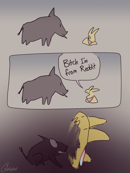
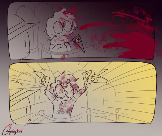
Get Spr(ule)onkd
#I was supposed to finish this at least 5 hours ago but instead I added color (;▽;) one day i will sleep at a Normal Time#anyway hi welcome 196!! please stay omg#oughhhh god i have not stood up in like 7-8 hours i need food#siphisketches#my art#csp#get spronkd#reddit migration#r/196#196#spronkus kronkus#comic#artists on tumblr#id in alt#cw//#blood#violence#implied animal death#(Edit: okay alt text added in now! tried something different this time and just wrote it as a sequence of events instead of trying to#describe the visual composition of each panel lol -- it's a lot less wordy this way so hopefully it works better! Let me know what you thin#Also I fixed the boar label that I accidentally erased the first time -- should go without saying but just in case:#depiction of violence is intended for purely metaphorical purposes & I am not endorsing the use of cartoon rabbits as bear-trap guillotines
1K notes
·
View notes
Text


100% accurate depiction of the Ferryman writing that journal
#EDIT: added a link to the journal text for image ID purposes#draws him being uncharacteristically cute#and i’ll do it again#this took way too long bc I color everything using my phone#ultrakill#ultrakill ferryman#gabriel ultrakill#robot(me) art#ferrygabe#id in alt
3K notes
·
View notes
Text
it's probably decently obvious that my main lemon demon design was created BEFORE seeing any fandom depictions (or even really that much official art past the logo) because of how violently he stands out in comparison to other designs. it's a little obvious that my inspiration was self-contained and it granted me a bit of creative freedom along with a completely different train of thought while designing him. his three eyes however is very much a relic of 2022 because I was designing a lot of demons with asymmetrical faces at the time and well, why not make another
anyway here's a comparison of him to my most recent lemon demon original design (where it's a bit more obvious I was influenced by somewhat of a fandom culture)


extra bonus rambling under the cut
my general design process has actually stayed relatively contained with a few exceptions like soft fuzzy man's color and weirdly neil himself. yeah sorry chat neil is the first guy that was highly influenced by someone else's design you can shoot me too if you'd like. but I legitimately believe he's the only real example because every other character that has a design remotely similar to someone else is likely due to us both following a similar source material (like my cabinet design being based off polybius) or there being only so many ways to interpret the design (gef the mongoose would've fallen into this category if it wasn't for the fact I made him Joker colors)
in general I tend to follow a mindset of how "weird" I can make a design or how much I can push a lyric/implement it into a design. I also like to twist around the convention and try new things. a good example of both of these apply to my doctor amnesia design.


really the main things going through my head were "well he didn't state HOW many eyes", chosing an eye color that often is overlooked in conventional beauty standards to elevate them and cause you to think, while leaning into the somewhat otherworldly nature she's depicted in by giving her blue skin, a color I associate with the song.
another fun thing I'll do is create a "design pipeline" where I'll take an attribute and run it through a list of connections before we end up in a place long past where we started or just combining a bunch of traits that could be interpreted that way, resulting in designs like this.


though wolfgang isn't my weirdest design, he definitely did not start where we ended off. I believe before the wizard of oz theming for clown circus was set in stone (a choice that has EVERYTHING to do with oz explodes and an element I'll explain later), he was some kinda mirror object head that had absolutely nothing to do with his current namesake. since I wasn't satisfied with that design, I kept a relative aspect of the personality and shapes and thus ended up creating a really interesting take on a character who is largely depicted as... well there's no really good way to say this, but Bad.
since I was working with a new fresh aspect I started by making him a wolf... and then connecting him to "there's a robot in my head". this kind of connected the dots to ultimately make him associated to the tin man, since no one was connected to that character for the wizard of oz element and it was up for grabs (this is also how he somehow got associated with toasters via connecting the previously mentioned song to "what's in the toaster", etc etc). these pipelines of connecting songs that aren't normally related, but making them Work in a believable way makes designs more interesting for me and gives them a bit more purpose and personality. I think this is what ultimately makes people get a bit lost on my interpretations considering they aren't super simple by just being about One Song, but by being about multiple that aren't originally related in the source material. just like how I connected dr amnesia to when he died, explaining a bit of her more mildly supernatural or off-putting elements by making the man in that song her father.
the final real design element that I focus on is the strange rule I follow in terms of how these characters are shaped. there's a massive sort of "alice in wonderland" theming going on in terms of how human/humanoid designs look in contrast to designs that look less and less human. their proportions become more cartoon and shaped, their sizes are affected etc etc all while the human/humanoid characters stay relatively normal next to each other with more believable design elements.
here's the horrid long strip of nearly 100 different character renders next to each other to get a general idea on what I'm talking about

the silhouettes of the human characters "pop" less because they're supposed to contrast to their nonhuman counterparts. which isn't something I normally do, but given the source idea of a sort of "wonderland", I think it works in this specific context.
in conclusion: I'm design autistic and like to use designing to try new things, which is why I fucked that lemon up. sorry about that chat
#guy on the right is completely unaffiliated with the ncu which is why I don't think about him that much sorry ld#also imagine him with half circle black eyes like the logo design because that's legitimately the only colored art of him#nobody has ever actually asked me about this before so I will no longer wait for permission#debating whether or not I should even main tag this I want this self contained to my followers#but it's late so I'm sure no one will see this anyway erm#edit: fuck it it took like ten morbillion years to write the bonus stuff I'm main tagging#lemon demon#mos text post
65 notes
·
View notes
Text


Buddie Countdown to Season 7:
68 days.
#911#buddie#911edit#buddieedit#911 on fox#911 fox#911 abc#evanbuckleyedit#eddiediazedit#my edit#buddies7#911hiatus2023#otp: you don't need to pretend with me#usercam#i had to make this 8 times#i colored this scene for random sets millions of times#but for some reason trying to render it with no text was fucking it up#911verse#evan buckley#eddie diaz
178 notes
·
View notes
Text


you know where to find me, and i know where to look
footers(the bows) by @/animatedglittergraphics-n-more
alt versions


#saw an edit of them to this song once and it make me go hrhghfrhthh /pos#hatchetfield#miss holloway#duke keane#holloweane#holloduke#nmt#nightmare time#nmt 2#nightmare time 2#killer track#gif#gifs#kitty.gif#ik the text colors r kinda. flipped compared 2 the gif colors but shhh it looks better to me like that
83 notes
·
View notes
Text
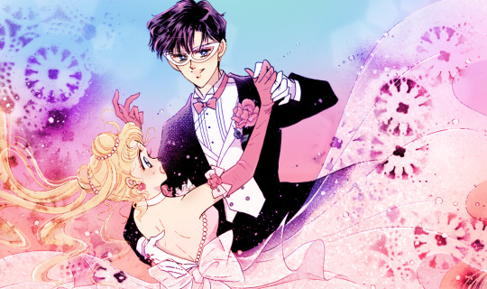
i coloured the usamamo dance panel because i love these two so much
Scan Credit: Miss Dream
#this took me forever to stitch the two pages together and even longer to get the right mood#also i've been taking a break from art but this is fun. less high stakes. i get to do the fun part instead of sketching and lineart#alt text provided#sailor moon#manga coloring#my coloring#usagi tsukino#chiba mamoru#mamoru chiba#usamamo#my colors / edits#kats popular posts#my colouring
1K notes
·
View notes
Text


does it count as a criminal record if his only crime is having way more fun than the navy allows? (insp).
#topgunmaverickedit#top gun maverick#pete maverick mitchell#top gun maverick gifs#top gun maverick edit#top gun#stars gifs#mine#stars tg edits#idek HOW to explain myself on this one babes i saw the insp post a couple days ago and it has been HAUNTING me#torturing me like those voices#its so. yeah. cant explain it but its him#being so normal about that old man is an olympic sport and baby im bringing home the gold#or whatever that famous text post says#i am paraphrasing#anyways these gifs are not perfect and coloring this movie was a real bitch but enjoy akdhfkffhgj#me trying to write my wips and my brain is just MAKE GIFS !!! MAKE GIFS !!! DO ITTTTT
168 notes
·
View notes
Text


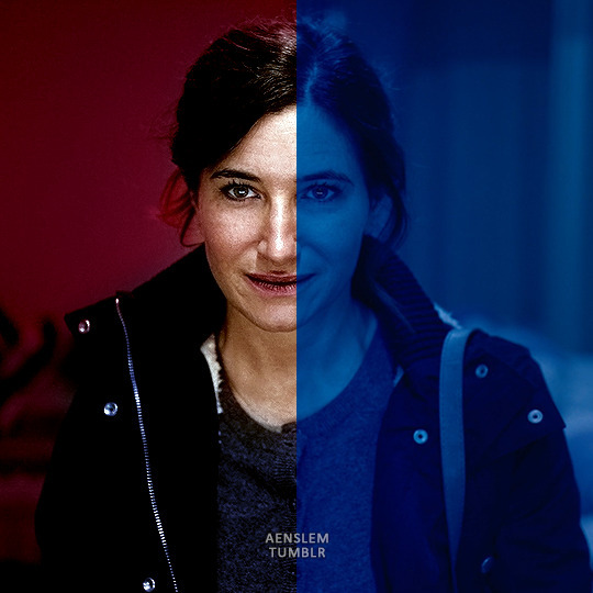
my mortal enemies (not the ladies, the ladies are the loves of my life, I mean the filters in media)
#text#adventures in gifmaking#why they always put horrible dark red\green\bue\yellow\whatever filters on my fav ladies that I have to struggle to gif#whyyyy#okay im complaining a lot but that's actually my fav part of making gifs#i love changing colors correcting them editing stuff making gifs look pretty#yeah so somebody can steal them after and post them and then tell me gifmaking takes only 2 minutes or smt#channel mixer my beloved#curves and color balance my beloveds too#not really happy with the green one but im working on it#but putting them all together im yelling guys i love these 3 so muuuuuuch aaaaaaaaaaaaaaaaaaaaaaaaaaaaaaa
51 notes
·
View notes
Text
In which being a knight is a double-edged sword, and Helsknight isn't wearing his gauntlets.
#the barking writer#redstone and skulk#helsknight#tanguish#ya'll really gotta respect the hustle on this one#it took me two hours to edit in all the links and change the text colors#Also the very very large rewrite which involved scrapping this chapter 3 times#and editing it to death 2 more times after#needless to say it was a bear and i'm glad it exists#i probably should have waited until i had my backlog more fleshed out but ehhhhhh#i was excited about the colorful text#anyway its 2am and i'm tired goodnight
118 notes
·
View notes
Note
Can you show us your and your siblings' mortal forms, Conservator?

The Conservator: Hmm, well, there are many mortal forms to choose from, so I will make them based on how you said humans look.
The Conservator lifts its hand, and with a flourish, a set of 6 images appear in its hand. It turns the pictures around to show all of you.


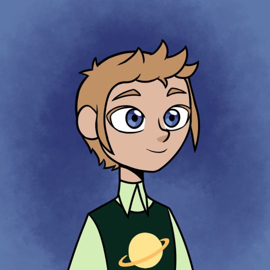
#toh#the owl house#ask blog#ask the archivists#asks are open#id in alt text#toh oc#meteor shower event#me: man I need to finish this event it's been going for forever#also me: what if I edited and designed and colored human versions of these mother fuckers
36 notes
·
View notes
Text
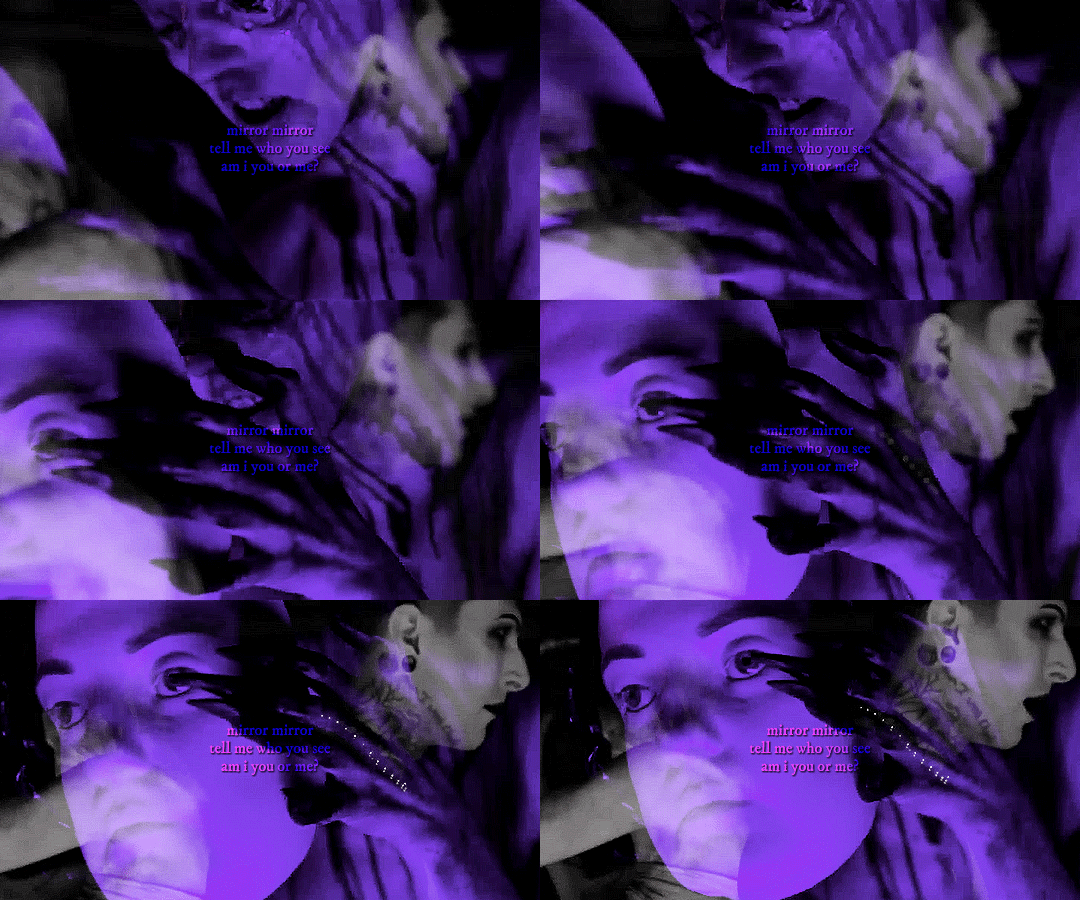
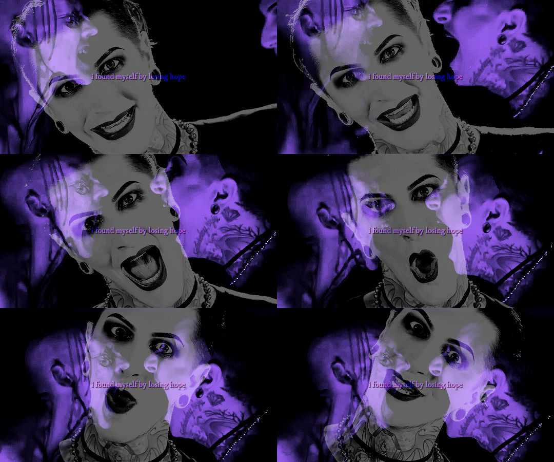
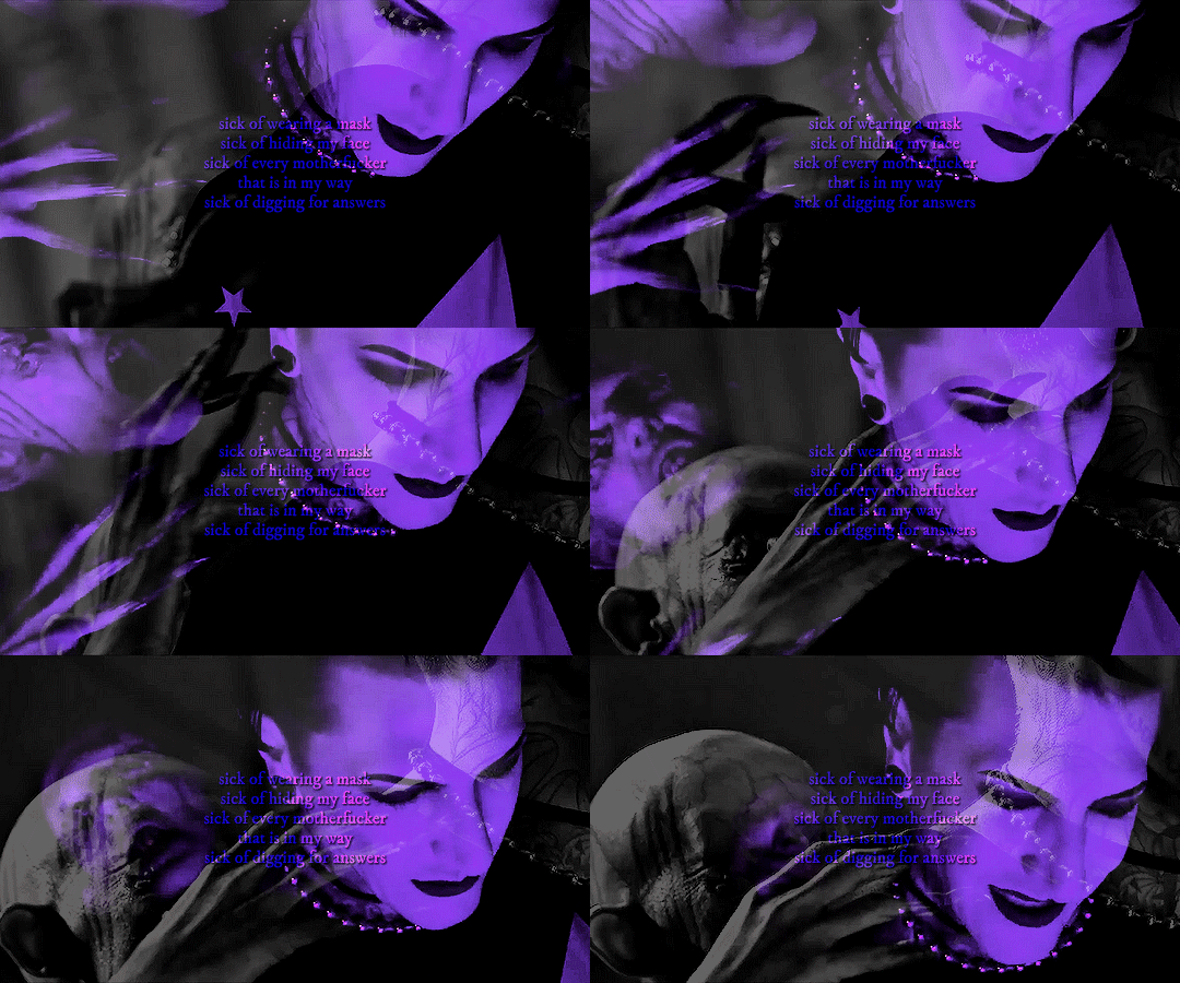


@miwnet motionless in white meme — 2/4 songs
disguise
#miwedit#motionlessinwhiteedit#miw#motionless in white#miwnet#usermaguire#userangelic#userridge#userbanana#userkam#usertiny#usersen#jennahui#**edits#miwmeme#flashing tw#pulsing lights#eyestrain#equates this song with me being in the closet then accidentally bi colored w/ the text#i forgot to post this yesterday for disguise mv's birthday
67 notes
·
View notes
Text


"There was a lady Inzilbêth, renowned for her beauty, and her mother was Lindórië, sister of Eärendur, the Lord of Andúnië in the days of Ar-Sakalthôr father of Ar-Gimilzôr. Gimilzôr took her to wife, though this was little to her liking, for she was in heart one of the Faithful, being taught by her mother [...] No love was there between Ar-Gimilzôr and his queen, or between their sons. Inziladûn [later called Tar-Palantir], the elder, was like his mother in mind as in body; but Gimilkhâd, the younger, went with his father, unless he were yet prouder and more wilful. To him Ar-Gimilzôr would have yielded the sceptre rather than to the elder son, if the laws had allowed." - J.R.R. Tolkien, The Silmarillion, "Akallabêth"
@tolkienofcolourweek day 4: cultural identity + growing up || INZILBÊTH & INZILADÛN
[ID: an edit comprised of four posters in shades of teal and cool beige.
1: A rectangle image taking up most of the poster shows Advina Ratnaningsih, an indonesian model, sitting holding her young child in her lap. They both have brown skin and black hair, and are draped in variously patterned batik fabrics. The room is richly decorated with rugs and brocade hangings. Large teal text up the left side of the image reads "inzilbêth" in all caps, and small text in the bottom right corner reads "she was secretly of the Faithful, for her mother was Lindórië of the House of the Lords of Andúnië." Teal lines flush with the text frame the photo / 2: A small image of traditional indonesian stone carvings on a beige background. A thin teal frame surrounds the picture, with text at the top reading "mother & son," and text below reading "faithful to the valar," with "faithful" in a large gothic font / 3: Same format as Image 2, but the small image shows green mountains in mist, and the text reads "queen & king" and "flowers of númenórë" / 4: Same format as Image 1, but the picture is of a young indonesian man dressed in a patterned sarong with other pieces thrown over his shoulder and wrapped around his head. He is surrounded by green leaves and looks seriously at the viewer. Text on the right side reads "inziladûn" in all caps, and the smaller text reads "he took again a title in the Elven-tongue as of old, calling himself Tar-Palantir" //End ID]
#tocweek2024#inzilbêth#inziladûn#tar-palantir#the silmarillion#akallabêth#númenor#mepoc#silmedit#tolkienedit#sourcetolkien#tolkiensource#oneringnet#litedit#fantasyedit#brought to you by me#edits with the wild hunt#posters#described#fc: advina ratnaningsih#really excited to share this one :} i have been fermenting it for a while. in my puter#also isn't the gradient text delectable?? bbcode & html text colorizer serving up something today
45 notes
·
View notes
Text


A heart of clear water, and a face of ice.
#id in alt text#genshinet#genshinedit#dailygaming#genshincreations#genshinimpactedit#chongyun#teyvat posts#userjidai#kilruas#this is my son my main and my blorbo. have you seen him? now you have :)#spent so long being conflicted on the colors. did 1st 2 images in about <1 day and the 3rd (and a deleted 4th pic) took me over a week#genshin edits#genshin impact#genshin chongyun#genshin gfx#genshin graphics#chongyun graphics#chongyun gfx#genshingfx#genshin impact graphics#genshin impact graphic
103 notes
·
View notes