#clive grinyer
Explore tagged Tumblr posts
Text
The Story of Clyve Grinyer - design, passion and making the world a better place
In this episode, we speak with Clive Grineer, an highly experienced and influential voice in the world of design and service design. Clive shares his ambition to make the world a better place through design and his passion for inspiring creativity.
Check out this episode!
0 notes
Text
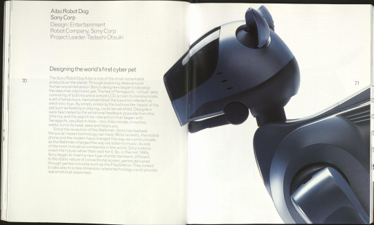
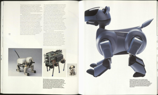
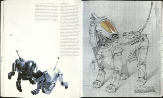
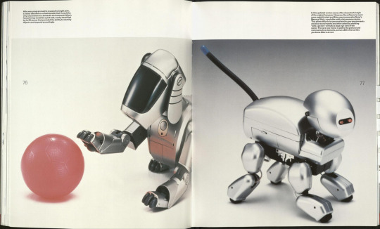
Sony: AIBO Robot Dog in Smart Design Magazine By: Clive Grinyer (2001)
Hajime Sorayama designed one of the first models of AIBO robot dog 'ERS-110' back in 1999 for Sony.
#sony#aibo#robot#dog#companion#hajime sorayama#smart#design#magazine#clive grinyer#tech#futurism#2001#japan
2K notes
·
View notes
Text

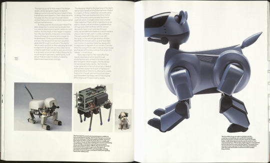


Sony aibo in Smart Design by Clive Grinyer
4K notes
·
View notes
Photo


https://at.tumblr.com/zegalba/sony-aibo-in-smart-design-by-clive-grinyer/dd9hddplzpev
Sony aibo in Smart Design by Clive Grinyer
0 notes
Text
Olafur Eliasson projects artwork on COP26 venue as built environment day kicks off
Daily COP26 briefing: today's COP26 briefing includes an Olafur Eliasson artwork, electric vehicle charging points designed by the RCA and a guide to the events taking place on Cities, Regions & Built Environment Day.
Throughout COP26, we are publishing regular updates of what's happening at the climate conference and surrounding events. See all our COP26 coverage here.
Voices for Earth projection illuminates COP venue
The Foster + Partners-designed SEC Armadillo building, which is one of the venues for COP26, was illuminated by a one-hour-long light show including artworks by Danish designer Danish-Icelandic artist Eliasson, French artist JR and American filmmaker Darren Aronofsky, and photographers Cristina Mittermeier and Steve McCurry.
Named Voices for Earth, the light show was directed by American Oscar-winning documentary maker Louie Psihoyos.
"I conceived the artwork Earth Speakr with kids around the world," said Eliasson "It's their voices, their concerns about the climate and their hopes for the future which must be heard by global leaders at COP26."
Royal College of Art designs electric vehicle charging point for UK network
The design of an electric vehicle charging point that is set to be rolled out across the country has been revealed at COP26. Designed by London university Royal College of Art (RCA) and technology consultant PA Consulting, the charging point is intended to be "as recognisable as the red post box or black cab".
The charging points will be installed across the UK from 2022.
"This design is a landmark in our journey to electric vehicles and zero carbon," said RCA lead designer Clive Grinyer.
"We have listened to people around the country who asked to have a minimum impact on their streets, to ensure that it works well for disabled and all people and that we bring the UK's design and engineering talent to create an iconic design that we can all be proud of."
Design Museum launches national net-zero research programme
London's design museum is collaborating with the UK government's Department for Business, Energy and Industrial Strategy, the Arts and Humanities Research Council, UK Research and Innovation to launch a nationwide research programme focused on moving towards a net-zero future.
Named Future Observatory, the programme will aim "to show how design research can drive Britain's future prosperity".
"Future Observatory is a catalyst for bringing design research to life and connecting it to industry and policy-making so that it can have greater impact on the challenges the UK faces," said Design Museum chief curator and Future Observatory director Justin McGuirk.
"We're using the power of the Design Museum as a place that brings people together to imagine, debate and hopefully shape a better future."
Built environment day kicks off
Today's COP26 conference features a range of talks dedicated to the built environment. Officially called Cities, Regions & Built Environment Day, it will see talks from hosted by the Ellen MacArthur Foundation, Carbon Trust and Royal Institute British Architects (RIBA). See below for an events listing of the highlights.
COP26 events on built environment day:
Enhancing ambition on climate change in cities and regions
Hosted by the Carbon Trust, this event will aim to show how cities "can play a more ambitious role in addressing climate change and reaching the goal of net zero".
Register and watch ›
Fix the economy to fix climate change
Hosted by the Ellen MacArthur Foundation, this talk will focus on how businesses can integrate the circular economy into their overall strategy. It will showcase examples of companies integrating the circular economy into their business.
Register and watch ›
Disability, Resilience and Inclusion in our Cities – inclusive design and community-led urban solutions for disability-inclusive climate resilience
Hosted by the Global Disability Innovation Hub, this side event will aim to "set an agenda for the inclusive design of climate-resilient cities".
Register and watch ›
Inside the RIBA International Awards for Built Environment Day
At this virtual event, the chair of the RIBA awards group Jo Bacon will explain and explore five sustainable case studies from this year's RIBA International Awards for Excellence winners.
Register and watch ›
UK Green Building Council Launch of Whole Life Carbon Roadmap for the Built Environment
The UK Green Building Council (UKGBC) is launching its Net Zero Whole Life Carbon Roadmap today with an event that will invite responses from panellists on how the plan can be realised.
Register and watch ›
Accelerating Climate Action in Cities
Taking place at the UK Presidency Pavilion, this event will launch the Urban Climate Action Programme and aim to explain how it "will support participating cities in developing countries to shape and deliver net-zero ambition to build low carbon and climate-resilient cities".
Register and watch ›
Climate Activism in the Built Environment: An Introduction to Architects Climate Action Network
This event hosted by the Architects Climate Action Network will showcase the current work that the climate action group is undertaking.
Register and watch ›
Sustainability in structural engineering: Panel discussion
Hosted by the Scottish Regional Group of the Institution of Structural Engineers, this talk will focus on the role structural engineers have in creating a more sustainable built environment.
Register and watch ›
Delivering net-zero carbon buildings in cities – recent examples and what needs to happen next?
Hosted by ICLEI – Local Governments for Sustainability, this discussion will include a talk by UK studio Foster + Partners. The studio will present a "science-based journey refurbishing the historic Acciona Ombu building in Madrid".
Register and watch ›
COP26 takes place at SEC Centre in Glasgow from 1 to 12 November 2021. See Dezeen Events Guide for all the latest information you need to know to attend the event, as well as a list of other architecture and design events taking place around the world.
The post Olafur Eliasson projects artwork on COP26 venue as built environment day kicks off appeared first on Dezeen.
0 notes
Photo

The double Diamond ( Design Council)
What is the Double Diamond?
The Double Diamond is a visual representation of the design and innovation process. It is a simple way to describe the steps taken in any design and innovation project , irrespective of methods and tools used.
Part of Design Councils reason for creating the double diamond was because models of design process were not widely shared so they created it to address the lack of visibility.
The double diamond is today used and referenced world wide.
Richard Eisermann inherited a multi-disciplinary design and innovation team from his predecessor Clive Grinyer. The team included Anna White, Chris Vanstone, Gill Wildman, Jennie Winhall and Jonathan Ball.
Jonathon Ball who is an independent strategist on the Design and innovation team recalls how everything got started. He stated “ As Richard got his feet under the table, he was excited to see the new work at Design Council and the breadth of challenges that were being addressed. He realised that Design Council talked about process – the design process – but wasn't explicit about how this process was defined.”
Richard Believed that design council needed a way that was consistent in telling a process story. At a team meeting Richard expressed his curiosity as to how the design council might define design process and the methods that it could use at different stages of the process. Richard then challenged the rest of the team to answer that question.
The ambitious of the team was to create something that could be applied in any field , to create a model that design council could use with any one of their clients.
Richard recalled “Dave Duncanson, an engineer at IDEO, talked to me about the product development process as being like the classic diamond-shaped kite, with a tail composed of progressively smaller diamonds. So the double diamond shape was definitely already present at IDEO in the late 90s, although it may not have been called such.”
Richard’s next encounter with this diamond shape was at Whirlpool. “We did an extensive innovation programme with business guru Gary Hamel. Gary used the diamond as a way of framing innovation. He even called it the Double Diamond. But the names of the four steps were different.”
“The team put in the work trying to define design, process, methods, etc. What we did with the Double Diamond was codify it, rename the steps and popularise it. It was important work, but we were certainly standing on the shoulders of giants”
The team came up with a simplified way to describe any design and innovation process. It is based on four distinct phases that the team names discover , define , develop and deliver.
Discover - The process starts by questioning the challenge and quickly leads to research to identify user needs.
Define - The second phase is to make sense of the findings, understanding how user needs and the problem align. The result is to create a design brief which clearly defines the challenge based on these insights.
Develop - The third phase concentrates on developing, testing and refining multiple potential solutions.
Deliver - The final phase involves selecting a single solution that works and preparing it for launch.
“As a model for the design process, I thought it was a neat representation, but I have to say that at the time, apart from presenting it in an almost academic way, I couldn't get my head around using it in practice. I found I had to rehearse the way I told the Double Diamond story. Once I was comfortable with it, it became the starting point for any design-orientated conversation, for positioning design in a broader context, discussing a specific design project, or as the process itself.”
Jonathan Bell
The Double Diamond Today.
The double diamond still remains at he heart of design councils work.
0 notes
Text
The Double Diamond
What is the Double Diamond for designers?
“I think you can use the Double Diamond to tell all sorts of design stories in really helpful ways. Part of its beauty is its simplicity.”
Jonathan Ball
The double diamond is a visual representation to show designers approach the design and innovation process in a project. Using this method displays the steps that are taken into any project irrespective of methods and tools used.
Clive Grinyer and his team was a pioneer for this double diamond. The aim for his team to categories and document the design methods that are used within his team to determine the flexible framework in which these methods could be applied.
The double diamond would be split into 4 different points of the design process
These are :
Discover
The discover process involves beginning the project and challenge ahead which will lead to the start of the research stage.
Define
The define process involves understanding what is needed for the user and problems they may encounter. After reviewing this there will be results that will define the design based around the findings.
Develop
The development process will be the phase that will focus on the development of each potential solution. This will involve testing and refining the multiple potential solutions
Deliver
The Deliver process will involve selecting the single solution that works and they prepare for the launch of the project

0 notes
Text
Giving your product a soul
After a few years of designing products for clients, I began to feel fatigued. I wondered why. Turns out, I’d been chasing metric after metric. “Increase those page views!” “Help people spend more time in the app!” And it kept coming. Still, something was missing. I knew that meeting goals was part of what a designer does, but I could see how my work could easily become commoditized and less fulfilling unless something changed.
I thought of how bored I’d be if I kept on that path. I needed to build some guiding principles that would help me find my place in design. These principles would help grow and would shape my career in a way that fits me best.
What I’d like to share here is how I found my principles and regained a sense of fulfilment. I’ll also discuss one of them and hopefully convince you that it’s worth considering when we design products. Speaking of convincing, I’d also like to help you convince your boss that these things are important.
One small string that began to tie it together was watching Bret Victor’s talk “Inventing on Principle.” The first half is mostly a code demo; then, he gets philosophical and talks about how goals and principles help you. I believe that living by principles can lead you to some really interesting places — for me, they’ve helped me to find the right ways (and places) to work and the right projects to take on (like designing a typeface), and they’ve helped me to identify which areas of my life need to be nurtured so I don’t burn out.
Advocate For Design Having A Soul Link
I’ve worked on projects whose goals varied from increasing email signups by 10% to boosting ad impressions by 30%. It was honest work, to be sure. It’s important that our designs meet the needs of the product owners and our clients — this isn’t art school, and there are real constraints and requirements we need to address.
However, it’s not enough to do metrics-based design. That in itself is a bit too clinical and detached, and where’s the fun in that? We need more.
Validating and then meeting a project’s requirements should be the minimum of what we set out to do. Once we set those metrics as our baseline, we’re allowed to be more impactful and thoughtful as we get to the root of a design problem.
What we need to shoot for is to help people fall in love with our products. That means pushing to give our designs a soul.
Here’s what “emotionally connecting” means: It means you’ve created a product that stands out in someone’s heart. The product becomes what people reach for because it’s the most helpful. People might not be able to understand what you’ve done, but they’ll perceive that it’s better. This is one way to make a product that’s indescribably good.
I usually ask these two questions, which get at part of what helps people fall in love with a product:
What’s going to help someone really find this useful?
What’s going to make them care about it?
For years, we’ve focused on making our websites and products be functional, reliable and usable. These qualities are the bedrock of any good product, but it’s when we add a soul to a product that it really comes alive.
My first hint of a design having soul came back in 2005 when I logged into Flickr for the first time. Sure, Flickr has undergone many, many changes since then, but I’d like to explain how it helped me, as someone who hadn’t shared much online before. I wasn’t sure how to share something, but I noticed right away that the website greeted me with a friendly “Hello.” The website helped me breeze through the process, and the friendly tone was really assuring.
My Flickr experience was like a pal gently leading me through the process, making it easy to succeed. It was a warm experience that made me want to return. Incidentally, I can say “hello” in a lot more languages now, thanks to what Flickr taught me.
Moving forward to newer examples, we can also consider Slack, its competitors and email. All of these options help people communicate, but Slack has a personality that helps you feel more connected with it. Slackbot helps you get started by asking you questions in a conversation, much like a real human would when you meet them for the first time. The makers of Slack eschewed the standard idea of filling in a registration form in favour of something more conversational — this makes other services feel stale and unfriendly by comparison. Slack has soulful flourishes everywhere: from smooth animations to a cute little emoji that is shown when you’ve scrolled all the way to the newest message in your group.
To be fair, Slack and Flickr (which, by the way, share co-founders) weren’t the first to try for something more human — that desire has spanned centuries. Lovers of typographic history may recall that Gutenberg wanted the movable type he created to mimic the look of handwriting. He used blackletter-style letters, which were similar to the bible manuscripts that monks illuminated.
These examples makes a strong case for design having a soul. The personality that develops from having one is what wins someone’s heart and makes competitors feel like poor (or, at best, passable) copies. Consider this statement by John Medina in “Brain Rules“:
Emotionally arousing events tend to do better remembered than neutral events… Emotionally charged events persist much longer in our memories and are recalled with greater accuracy than neutral memories.
In other words, we’re wired to remember products with a soul. Let’s use that to our advantage.
Next, let’s get a little more specific and see how that can play out.
FIDDLE FACTORS
One example of a way to give a product a soul is by adding a “fiddle factor.” A fiddle factor is a playful part of a product that imparts a sense of joy or playfulness when used. I first heard this term in Jony Ive’s unofficial biography, Jony Ive: The Genius Behind Apple’s Greatest Products. Ive had a new take on, of all things, a pen. Noticing that people tend to fiddle with their pens when not writing, he added something to his pen design to give people something to play with when they were idle. Of course, Ive started by making the best possible pen, then added the fiddle factor.
According to Clive Grinyer, Ive’s once-boss:
This was a new idea back then, to put something on a pen that was purely there to fiddle with. He was really thinking differently. The pen’s design was not just about shape, but also there was an emotional side to it.
Fiddle factors invite people to idly toy with them and form a deeper connection with what you’ve made. They become that warm little blanket that wraps a product around your heart and makes you want it more.
I’ve described one already with Slack and its emoji use, but here are a few more digital fiddle factors:
That pull-to-refresh spinner with the really cool spinning animation? A fiddle factor.
That fun animation you click to like something on Twitter? Fiddle factor.
In MailChimp, when you find out that Freddy’s arm can extend almost forever when you’re testing an email’s responsive breakpoints? That’s a fiddle factor (albeit a cruel one).
ONE WAY TO ADD A LITTLE SOUL TO YOUR PROJECT
To give a project a soul is to cultivate a relationship with it. You need to know what it needs and understand its nature. In this sense, this relationship is the same as a potter with clay or an architect with wood and steel. Once you understand the nature of your materials, you will know what it can become and what its limits are. This will help you to mould a soul in the right ways. Not doing this will ultimately cause your project to feel inauthentic and fail.
Let’s say you’ve built a playful iOS app. It’s meant to send short, fun replies to friends. In the app, you’ve got an overview page showing the latest emails, and the user can go into a detail view to read a particular message. You could go the standard route of sliding in the email from the right — it’s a simple thing to do, and it’s built right into iOS.
The drawback with built-in transitions is well covered: Anyone can use them. Sure, there are definite benefits to them (namely, that they’re cheaper and faster to implement), but it’s difficult to build something that’s soulful if you only use stock components and animation.
Instead, consider an alternative kind of transition. Think about it like this: Consider the personality you think the app should have. Think about the people who will use this app. I use this chart to help me determine the tone of a project:
Back to our email app. Let’s say it’s a fun email client. In this chart, it shows most strongly in the casual, energetic and easy-going categories. If we think about the animations we’ll use here, it makes sense to be more playful.
So, let’s animate the email message to come up from the bottom of the screen with a little spring in its step. When you’re finished with it, you can swipe it away or pull it back down.
Let’s take that even further, based on the chart and animation:
Maybe the animation could be the basis for how you approach other animations in the app. Your other animations could be similarly fun (but don’t overdo it).
Maybe it will affect which typefaces you choose.
What’s important here is to avoid forcing something in where it doesn’t belong. Don’t be different just for the sake of being different, and don’t overdo it. If we saw the President of the United States deliver the State of the Union address in a Hawaiian shirt, we’d probably feel like something’s amiss and might not take him as seriously as we should. Same here — what we do has to feel natural.
OTHER IDEAS
Any interaction, be it with a button or a scroll, is a perfect place to explore adding a fiddle factor. Explore what might happen when the user scrolls to the bottom of the content. Or perhaps you could come up with something unexpected when the user hovers over a photo for a long time. Maybe you could make a neat hover or focus animation.
Adding soul isn’t limited to animation, either. It goes much deeper!
How does it sound? Each person’s voice is totally unique, and your product’s should be, too.
How does it look? We need to stand out and be ourselves; so do the things we make.
How does it act? Could your product know the user on a deeper level and anticipate their needs? That would be deeply soulful.
Convincing Your Boss And Team
It’s all well and good for designers to talk about giving their products a soul, but here’s where it gets real: You have a deadline, and a budget. Your boss might not want to go for it, and your engineers might be resistant because it would take them extra time. Let’s talk about a framework for those conversations.
The framework I use to have these discussions centres on the effort required to implement an idea and the idea’s impact on the customer and the business.
While there will inevitably be high-impact, high-effort items in a project, the sweet spot is low-effort, high-impact ideas. These types of ideas help the user in meaningful ways, without significantly affecting your timeline and budget.
This way of looking at ideas also helps me to let go of ideas that might be a little too egocentric. Those usually have low levels of impact and high levels of effort. Mapping them out in this way helps me to focus on what matters most.
I’ve found this approach effective because it enables us to differentiate our products, while making the most of our time.
Let’s go back to custom animations for a moment. If we’re talking about adding fiddle factors and animation to our email app, we can’t build something great by assembling it entirely from off-the-shelf components. If we use only basic components and built-in animations, the product wouldn’t be memorable enough to matter to people. Plus, it will make it difficult for us to fall in love with what we’re building and to give the product a soul.
One additional framework to keep in mind is the Kano model, which was developed in the 1980s by Noriaki Kano.
There is a great explanation video, but, in short, this model covers three areas:
basic needs (Does the product work?),
performance needs (How efficient is it?),
attractive needs (What makes me love it?).
The soul of a product lives in the attractive needs. The Kano model invites us to think of one or two features that set the product apart from its competition. Framing your high-impact, low-effort ideas with this model will help you make a strong case for soul.
At our core, we’re people who care about our craft. We want to build great products, and the products need to have those nice touches. Being able to fully ply our trade also helps with employee retention. We’re happier when we’re able to do our best work. If we’re able to fully stretch ourselves to make something great, we’re going to keep giving our best in future. Conversely, if we’re prevented from doing our best work, we’ll become disconnected and disinterested, motivating us to go elsewhere when the opportunity presents itself.
If your boss or company doesn’t give you this freedom and you think it’s important, it might be time to plan your next transition.
Wrapping Up
It’s not enough to simply design something and meet a goal. This is a surefire way to burnout and boring products. We’ve got to do more for ourselves, our products and our industry. Finding our principles will help us find the right place to work and to do our best work.
Giving our products a soul will make them better, more engaging products. The next time you’re designing, ask yourself what would make someone find your product useful, and what would make them care about it more than another product? Once you do that, you’ll be well on your way to cultivating a healthy relationship with your products and building things that people really love.
Also, it’s not enough for us to have these ideas; convincing our team members and bosses to come along with us is important. Once we test and articulate the value of what we do, we’ll have a much easier and more rewarding time.
By Joshua Mauldin.
This article first appeared in Smashing Magazine. | Image credit: Pixabay
The post Giving your product a soul appeared first on Akimi Technologies.
from Akimi Technologies http://ift.tt/2imgiSW
0 notes


