#click photos or link to see large version of photos
Explore tagged Tumblr posts
Text
Oops! All Updates (and Fixes)!
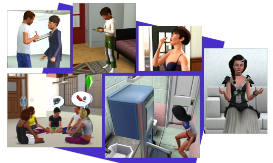
I've got a bunch of fixes and updates to some of my older mods and I decided to release them all in a batch. Please read below for the details to see what has been changed and then links to the files to redownload and replace in your game.
If this is your first time downloading, obviously you'll need to download everything and you should read the original post for more information.
As always, let me know if any issues and enjoy!
Voidcritters Mod
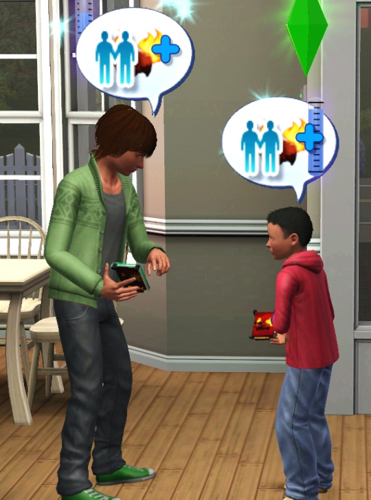
Fixed Read Card Stats animation
Added a new interaction to allow your sims to talk about and compare their cards. Sims will build relationship, gain skill and train their critters a little as well (the cards will vibrate as the critters train up)
Giving a rare or limited edition card to another Sim will yield a higher relationship boost.
Previously there was no way to get all 22 cards in the game as you only get one of the two Limited Edition cards. I've fixed that by adding the chance to also get Limited Edition cards by reading a Voidcritters comic book. There's a 25% chance if you have less than level 8 skill and 45% if 8 or higher.
Now that Sims can collect all cards, I've added a new skill opportunity. Sims that collect all the cards will get the Critter Collector reward and going forward their cards will be worth more.
Download MAIN file here and updated card file here
Student Council Mod

The Collect Signatures interaction now has a more appropriate animation of a sim collecting signatures
Increased the chances that more inactive council members will autonomously raise funds and collect signatures
The campaign tracker will no longer show blank information after you've closed out and restarted the game
All campaign icons will now show up in the notifications
Fixed an issue where the Sim would reset when submitting signatures for the Teacher Pay school campaign
Reduced the skilling level for council roles while at the afterschool activity
Download updated MAIN here
Hang Out Mod
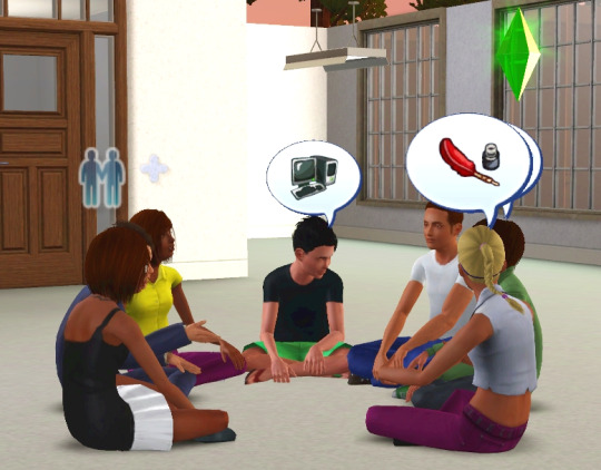
Children and teens can now hang out in groups. Simply click on one of the two Sims hanging out and select “Hang Out with X and his/her friends” (you need to have LTR 30 or higher)
A child or a teen hanging out can also invite another friend to join them
I think you can have up to 8 Sims given that I have 7 in the photo and there's still room.
Added liking VFX and speech bubbles when hanging out
Download here (all ages version here)
Washer+Dryer Combo
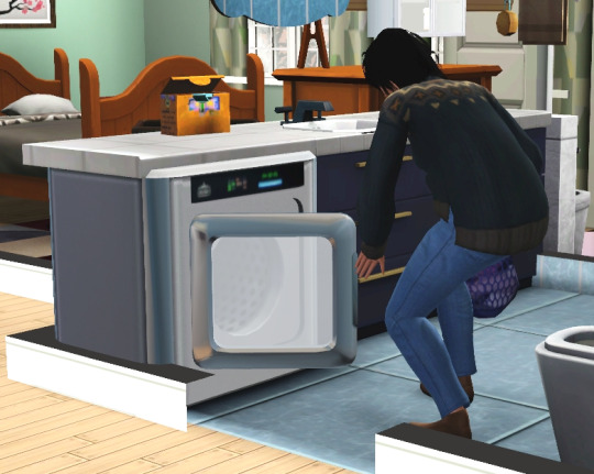
I created a new mesh for the washer/dryer so it slots under the counter like dishwashers and trash compactors.
Added a stacked washer/dryer tower. This still uses the same script as the single appliance so you can’t run the washer and the dryer at the same time.
Changed out the pod and detergent box meshes
Important: If you have the old version, you need to replace with this or remove it. You can't have both the old version and this one in your game or it will CTD. Also, the script is in the Combo file so you still need to download both if you only want the stacked tower version.
Download here (stacked version here)
Private Clinic (BASE)
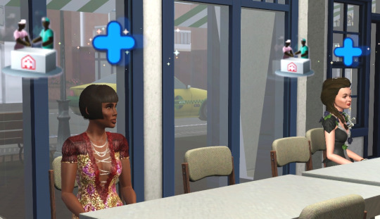
The clinic controller will now push Sims that have certain traits as well, such as Neurotic, Commitment Issues, Insane, Hotheaded, etc.
Once pushed to the clinic, Sims will find a chair to sit in and then wait for an hour to be seen by a doctor. After an hour, they will stop waiting with an annoyed message (you can still see them though).
Waiting patients now identified with a custom headline effect
Prenatal vitamins no longer have a weight loss effect (as I'm putting a similar feature in the breastfeeding aspect of the obgym module, it's not needed here)
Updated the Buy and Sell Pills animations
Updated the comically large horsepill mesh to make it smaller and more realistic. The animation has been updated as well
Updated the write prescription animation
Updated the apply ointment animation
Download updated MAIN here
Private Clinic - Psychiatry

Updated the therapist session animations – therapist will now take more notes to jot down how crazy you are
Updated the patient records layout to avoid text overflow
Sims can now do their coping mechanisms (breathing exercises and mindfulness) while sitting
Important: You need to download the updated Private Clinic MAIN file above as well if you download this
Download updated MAIN here
Disclaimer: My CAS cc for this world was not loaded. I am not responsible for any of these Sims' outfit choices.
#download#s3cc#s3cc download#mod updates#privateclinicmod#voidcritters#afterschoolactivities#student council#washerdryer#hangout
513 notes
·
View notes
Text
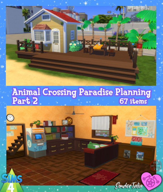


🌺🌴 ACNH Paradise Planning Set: Part 2 🌴🌺
All the items you'll need to recreate the downstairs & outside of the Paradise Planning office in your TS4 game. Most items came with only 1 swatch each. There are again items that I added extra swatches for, for part 2. *See bottom of item list for links to other items that were used in my images 🌺
Sims 4, Base game compatible | 67 items
All the items you'll need to recreate the downstairs & outside of the Paradise Planning office in your TS4 game. Most items came with only 1 swatch each. There are again items that I added extra swatches for, for part 2. *See bottom of item list for links to other items that were used in my images 🌺
🌺 To place clutter on windowsill (and any window that has slots) first place backward so the shelf is on the outside of the building (with right click) place your clutter, then pick up the window & turn it around again & place.
Always suggested: bb.objects ON, it makes placing items much easier. For further placement tweaking, check out the TOOL mod.
You can raise & lower items with 0 and 9 on your keyboard.
Use the scale up & down feature on your keyboard to make the items larger or smaller to your liking. If you have a non-US keyboard, it may be different keys depending on which alphabet it uses.
I hope you enjoy! ☺️ Download below, all in a zip file or pick & choose!
Set contains: Buy: -Amiibo Scanner | 5 swatches | 418 poly -Amiibo Scanner Liberated | 2 swatches | 166 poly -ATM | 1 swatch | 840 poly -Birds 1 & 2 | 3 swatches each | 1052 poly -Bird Statuette 1 | 7 swatches | 754 poly -Books 1-6 (6 items) | 1 swatch each, Book 6has 11 swatches | 112, 98, 152, 138, 582, & 82 poly -Bookshelf Large | 1 swatch | 186 poly -Candy Display | 7 swatches | 1290 poly -Ceiling Fan (Small, Medium, & Large - 3 items) | 2 swatches each | 1304 poly -Clipboard Map | 1 swatch | 393 poly -Computer | 1 swatch | 660 poly -Corkboard | 1 swatch | 1896 poly -Counter (corner) | 1 swatch | 1946 poly -Curtain | 1 swatch | 848 poly -Display Flowers | 1 swatch | 306 poly (see Vacation Set for another Plumeria Blossom)-Display Platform 1 & 2 (2 items) | 3 swatches each | 92 & 218 poly -Display Skinny (Has magazines on it) | 9 swatches | 337 poly -Display Table | 3 swatches | 447 poly -Doormat | 3 swatches | 18 poly -Flyers | 1 swatch | 219 poly -Framed Photo | 1 swatch | 52 poly -Framed Photos (Wall) | 2 frame colors, 6 photo sets, 12 total swatches | 88 poly -Front Desk | 4 swatches for table runner cloth | 436 poly -Info Mat | 1 swatch | 48 poly -Monstera Plant | 7 swatches | 1360 poly (See ACNH Set 3 for a smaller version) -Napkin | 1 swatch | 110 poly -Outdoor Bench | 5 swatches | 278 poly -Outdoor Candle 1 & 2 (2 items) | 1 swatch each | 590 & 584 poly -Outdoor Flag 1 & 2 (2 items) | 9 & 1 swatches | 718 & 908 poly -Outdoor Seat | 5 swatch | 292 poly -Palm Tree 1 & 2 (2 items) | 1 swatch each | 1206 poly -Palm Tree Short 1 & 2 (2 items) | 1 swatch each | 1268 & 1202 poly -Pillow Stack | 6 swatches | 1697 poly -Pen Cup | 1 swatch | 432 poly -Plant Hanging | 1 swatch | 1452 poly -Plaque Decor | 1 swatch | 974 poly -Plumeria Bush | 2 flower colors, 2 leaf colors, 4 total swatches | 4680 poly -Posters 1 (candy display) | 1 swatch | 90 poly -Poster 2 & 3 ( 2 items) | 1 swatch each | 80 poly -Posters 4 (hallway) | 1 swatch | 208 poly -Potted Palm | 8 swatches for pot | 888 poly -Potted Yucca | 8 swatches for pot | 1265 poly -Sold Sign | 7 swatches for language (includes Simlish) | 74 poly -Square Table | 3 swatches | 314 poly -Starfish | 4 swatches | 872 poly -Tablecloth Outdoor (for square table) | 1 swatch | 290 poly -Wall Flag 1 & 2 (indoor) | 6 swatches each | 86 & 1190 poly -Wall Plug | 2 swatches | 104 poly -Window | 1 swatch | 176 poly -Window with Sill (slotted) | 1 swatch | 176 poly -Wooden Tray | 5 swatches | 254 poly
Build: -Floor Stone | 6 swatches | Masonry & Tile-Floor Wood | 6 swatches | Wood
Type “ACNH paradise planning 2” into the search query in build mode to find quickly. You can always find items like this, just begin typing the title and it will appear.
As always, please let me know if you have any issues!
📁 Download all or pick & choose (SFS, No Ads): HERE
📁 Alt Mega Download (still no ads): HERE
Will be public on August 9th, 2024 💗 Midnight CET
Happy Simming! ✨ Some of my CC is early access. If you like my work, please consider supporting me (all support helps me with managing my chronic pain/illness):
★ Patreon 🎉 ❤️ |★ Ko-Fi ☕️ ❤️ ★ Instagram📷
Thank you for reblogging ❤️ ❤️ ❤️
@sssvitlanz @maxismatchccworld @mmoutfitters @coffee-cc-finds @itsjessicaccfinds @gamommypeach @stargazer-sims-finds @khelga68 @suricringe @vaporwavesims @mystictrance15 @moonglitchccfinds @xlost-in-wonderlandx @jbthedisabledvet
-Simple Siding by Sahiya81 -Country Carriage House Roof recolors (by LinaCherie) -Limber Lumber Traditional Hardwoods (EA Base Game) used on deck
🌴👉 PART 1 👈🌴
The rest of my CC
#s4cc#ts4cc#sims 4 office#sims 4 retail#sims 4 paradise planning#sims 4 acnh location#sims 4 table#sims 4 chair#sims 4 wall#sims 4 walls#sims 4 bench#sims 4 plant#sims 4 plants#sims 4 bush#sims 4 rug#sims 4 rugs#sims 4 tree#sims 4 sign#sims 4 electronics#sims 4 book#sims 4 books#sims 4 shelf#sims 4 display#sims 4 lighting#sims 4 candle#sims 4 vacation#sims 4 tropical#simdertalia
137 notes
·
View notes
Text

blender lighting tutorial + tips.
requested by @thecrimsonsimmer + recommended viewing: youtube video one, two, three, and four. this post will be dealing with newer versions of blender (2.8+) and cycles since that's what i'm more familiar with + commonly used for rendering. this is coming from me as an artist with some dabbling in photography and things i've learned in college!
references and setting the mood
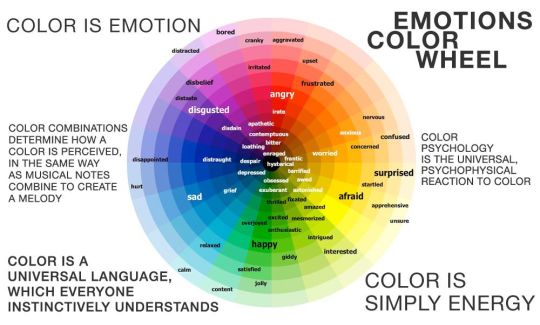
are you basing your render on an existing photo? study the light source and what direction it's coming from: that's what's going to tell you your set up for a similar effect. if you're not basing it on an existing piece, a good start is knowing How you want to set your subject (your sim) up - do you want them to be in the spotlight? are they in a specific environment that has neon lights? are you going for moody or something fresh, bright? definitely look up colors and their meaning (color theory, movie screencaps, etc.) to create a stronger image!
using resources to start the set up
it's always a good thing to mix your tools with different communities, such as the art community! many have lighting tools to figure out how to color their subject, such as this free-to-use head figure that depicts where the lighting source should be placed.

there's also the photography community and teaching people how to set up their lights for certain setups. video three and four linked in the beginning are from photography viewpoints.
spot? area? point? sun?
let's think of the lighting types as objects - a spot is like a plain lightbulb, area is a reflective sheet, spot is a flashlight, and the sun... well is the sun!
a spot is similar to an area light, but triangular/a cone. think of a helicopter search light, it's focused on a small area with the most light concentration. these can be used for lamps with lampshades, car headlights, or a lighthouse.
an area light is great for lighting up technology. a phone screen, tv screen, tablet, anything that's an LED screen emitting from a surface. the light is not as concentrated as a spot and is meant to cover more flatly (hence the rectangular source)
a point is best used for small pops of colors such as candlelight, lamppost, lightning bug tail, etc. a small source that has nothing covering it.
a sun covers the entire area and can be used as the overall mood setter. it can create filter over the entire render by just shifting the color like you would see in a movie. you'll be given a line with a sun light that gives the direction of where the sun is coming from. basically a spot light just on a much larger scale LOL.
power + coloring

this screenshot is mostly what you'll only use to start off with. watts is the unit of measurement and the higher you go, the brighter the light will be. examples with a white colored point light 10W-20W: general portrait lighting 30W-50W: bright source, close flashlight for example 60W+: blinding

coloring is just like the system for in game lights for ts4. shift it to whatever you want it to be (click the white bar, that's the color preview) and mess around with the vibrancy. the darker, more intense color, the less it's going to appear on the sim.

closeness and intensity
similar to what's shown in the head lighting tool shown earlier, the closer the light is, the more that specific area is lit up. go too close and your sim could be completely washed out. it helps to change the size of the light (change with the radius slider) to better imitate what you're wanting. the larger the radius, the more diffused and softer the light source will be. close + small = very clear of the light source shape, can obviously tell where it is in relation to the subject far away + large = soft lighting, more of a hazy lighting of the color you choose.


to quickly adjust the light, press "G" and hold down your middle mouse button to adjust which axis you'd like to edit along. green is the x-axis, blue is the y-axis, and red is the z-axis. you can also press "G" and type the letter of the axis you want to use. drag the mouse to change the placement on that specific axis to however you want. if you want to freely edit the placement, just press "G" to move it out of the axis bounds.
world lighting
take this step as setting your canvas color before you start painting. in order for the values to look their best, change the world color to the same hue of the color you are mostly using. for example, this is set in a red-toned environment:


this is essentially changing the cast shadow onto the sim. the default is gray and will muddy up your undertones if not changed properly. for this instance, if you were to still use the same red point light in a gray world color it'd look like this:

of course, this will be based on if you have an environment image or not that can affect your lighting overall. this post is based on the fact there is no environment image and what not! if you need a visual demonstration on how to mess with the world lighting, check out this short video.

i hope that helped anyone beginning to render or wanting to light up your own scenes! i'm no rendering expert, but here's some of the helpful tricks i've learned and collected over the years<3 if you have any other questions feel free to send an ask!
#ts4 blender tutorial#sims 4 blender tutorial#ts4 render tutorial#sims 4 render tutorial#lighting tutorial#lyko posts#tutorial#long post
231 notes
·
View notes
Note
Hey!
I majored in anth at a p awesome school for it (had a so fun class where we hands on used paleo to neo lithic techniques- from making stone tools to processing hides) but there wasn't much available for prehistoric art (+ I was a major switch from microbiology so bio anth, epidemiology and forensics stuff, made more sense with my course history). Been out of school for almost 10 years now and unfortunately doing nothing even remotely related, but I'm wanting to learn more about prehistoric art of all sorts. With search engines being overrun with AI misinfo I'm not really sure where to start other than Wikipedia. Do you have any favorite resources you'd be up for recommending?
Thanks a ton! Happy holidays, and may the new year be kind.
Hello! I should preface this with saying I am just someone with a general interest and not remotely an expert haha! Getting to do hands on stuff sounds really fun!
A lot of my reading has been restricted to Upper Palaeolithic Europe, and cave art at that, so I can't really recommend anything outside of that.
I've been concerned also with avoiding misinformation - there was a painting I saw a while ago where it was obvious the level of research involved was typing "Lascaux" into pinterest and just using whatever results came up (the art used was from Cueva de los Caballos and Mesolithic) and it's been driving me nuts. I've been sticking to books for information, almost everything I've read has been through Internet Archive, and majority are over 30 years old so could be outdated, can contradict each other, and should be noted are can be very racist.
Putting the list of everything under a read more as it's quite long, I hope there's something useful in amongst all of this! Happy holidays, I hope you have a good new year!
Books and other resources I've found useful in no particular order:
The Cave of Lascaux: The Final Photographs by Mario Ruspoli (1987) [Is on Internet Archive but currently unavailable, the German version is still up.] When Lascaux was closed to the public Mario Ruspoli was hired by the French govenment to document the entire cave on film and wrote this book afterwards. Even though it's focus is Lascaux I found it a good introduction to the topic of cave art. I have tried to find the footage online with little success so if anyone knows... do tell. This book brings you through the cave and gives a good idea of the layout and where paintings/engravings are in relation to each other. I would love if there was something like this for other caves but I'm not aware of anything 🤔
Lascaux Virtual Tour [Link here] The video isn't toally clear but it gives a good sense of the layout, and you can click the little 'i' icon to see clearer photos and get more details.
Images of the Ice Age by Paul Bahn and Jean Vertut (1988) [Internet Archive Link] This book is also a good starting point! There's also Journey Through the Ice Age which is the same book.
Cambridge Illustrated History of Cave Art by Paul Bahn (1998) [Internet Archive Link] I haven't gotten around to reading this yet but it appears to be a broader scope and not restricted to Europe.
Palaeolithic Cave Art by Peter J. Ucko and Andrée Rosenfeld (1967) The main appeal of this bok is that it goes through the different possible reasons for cave art. I had to buy a physical copy as I couldn't find it online.
Kindred: Neanderthal Life, Love, Death and Art by Rebecca Wragg Sykes (2020) [Aeon article link "Sheanderthal: Not all Neanderthals were ‘cavemen’: half were women. What can archaeologists tell us about how they lived?] Not solely focused on art but she does talk about what the neanderthals made including a large circular structure in Bruniquel Cave - there is footage of the cave in the recent netflix documentary Secrets of the Neanderthals (not great, at one point the narrator says neanderthals lived in the neolithic lmfao but the interviews with experts are interesting).
Don's Maps [Link here] Really great website. Some books will mention a painting/engraving/sculpture but no image, so my first place to check is Don's Maps as everything he includes is either from a book which will be referenced or from his own visits to caves.
The Neanderthal Museum Digital Archive [Link here] Despite the name is not exclusively Neanderthal, lots of photos of cave art in the Wendel Collection (including a photo of the one known instance of a saiga antelope in cave art that I hadn't been able to find a photo of before!).
There's also the Archaeology Podcast Network and sites like Academia.edu but I don't have any specific recommendations at present.
18 notes
·
View notes
Text
famous dc!au (dick's version)
TRACK ONE - HEAD OVER HEELS
You weren’t expecting to get a call back. In all honesty you were expecting to hear nothing from the casting crew. This was your last ditch effort before you gave up and looked for another job, a more practical job as people would say.
Being in the industry was hard if your parents weren't already in it or if you didn't have enough money. You've barely been getting by with doing advertising. And while you still weren't sure what specific field you wanted to go into, you thought that music videos could be cool.
So that's why you sent in a thumb drive of photos of you. Which wasn't the weirdest thing you've had to do to pay rent but it was still a bit iffy.
It had been a week or so. And in that time usually the rejection is already setting in so really there was no need to hear the word ‘no’ or read it in an email. You got the gist. You weren’t chosen.
Just when you’re about to click on an application for a desk receptionist job in an office space downtown, you hear the ping from your phone. Thinking it’s just another senseless ad you open your phone. And to our surprise its not an ad. Or a phishing link.
You got it. You got the lead role in the music video. You let out a scream and then cover your mouth with your own hand. Then you scream again, it’s muffled this time. You put your phone down and jump to your feet. Jumping around is the most cardio you’ve gotten this week.
You reach for your phone again and read the email again.
“We’re please to offer you the role of the love interest in an upcoming music video. Of course because of the artist’s large stature we’ll need you to sign an NDA if you agree to come on. Please contact us at the number below if you have any concerns…”
You scream again.
This is it. You can feel it. In your bones, something is starting right now. And you’re at the center of it. This means you can't give up, you won't give up.
-
Dick didn’t want to come off as a creep. He’s already known as the heartthrob of Hollywood and that’s not doing him any favors. It’s not that he wants to be a heartbreaker. And nine times out of ten he isn’t. It’s just that he’s looking for something real. Not some fleeting PR relationship.
Of course the casting of a love interest in a music video isn’t really something he needs to concern himself with. And for the past two albums he hasn’t. But he decided to take a chance this time—and Damian straight up told him to do it.
The youngest Wayne had enough of his endless chatter of failing at love and ending up old and lonely. First it was Barbra and then it was Kory, at some point it might have been Donna but that turned out to be more platonic. And then there was Zatana. Damian had had enough.
So he told Dick to look for someone that wasn’t in the music world. Someone who might not even be in the entertainment industry. Which was hard because who would want to enter the hectic Hollywood life for a possible relationship? And what if it didn’t work out?
Dick knew it was out of the question. Jason had been lucky to fall in love with his co-star who was up and coming and shared his love for acting. Dick hasn’t had that luck and he doubted he ever would.
But when he asked to see the finalists that would be playing his love interest, he was shooting one last shot into the universe. A call out into the ether for anyone to hear. And someone did. You did.
He was sent a thumb-drive with five folders. All the four other applicants had professional shots. Like professional backdrops and themed pictures. The works. But you? You kept it simple, you kept it real.
There were only five snapshots of you in the folder but they managed to get Dick’s heart to race. A cafe photo, a fun beach shot. There were two of you out on the street amongst a flower shop. And lastly, the not that did it, a picture of you on a porch taken off guard. The way the sun hit you and the way you seemed so at ease, it made Dick take a moment.
And then he was texting his casting crew that you were the one. Those exact words. And they had agreed and said they would ask if you wanted the role. Dick was happy they did. He couldn’t wait to meet you in person though.
Maybe you would be the one. He hadn’t written a song in six months besides the one he’s filming a video for. And that’s why he’s doing the video in the first place, to placate fans and business execs. At least long enough for him to write an album.
And you had a face to write a million songs about. You seemed like a genuine and kind person. At the least he'll be able to write a song or two and satisfy his label. At the very most? Maybe he'll fall in love with you, who knows.
#dc x reader#dick Grayson x reader#dick Grayson imagine#dick Grayson fic#dick Grayson x you#dc x you#dc fic#dc imagine#famous dc! au (dick's version)
128 notes
·
View notes
Text
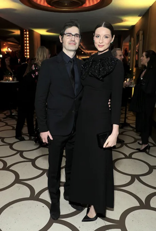
Photo : John Salangsang/Invision/AP (Producers Guild Awards, 18 January 2020, Los Angeles California USA)
All the Celebrities Who Managed to Keep Their Baby News a Secret
While the days of tracking celebrity pregnancies aren’t exactly behind us, some sneaky stars have managed to stay out of the spotlight long enough to welcome a new addition to their family in private. So, which stars have managed to keep their baby news a secret? Quite a few.
There are lots of reasons to want to keep baby news a secret. Many moms-to-be won’t disclose their pregnancies until they’re past the first trimester, and those facing high-risk pregnancies often prefer not to disclose it at all to the world at large. And for those welcoming new children via surrogate, the added layer of secrecy can help protect their surrogate’s privacy — a real point of concern where celeb-crazed paparazzi are involved. So when the world got word of these celebs’ baby news, our jaws dropped.
While celebrities have to accept that their own lives will be under some amount of public scrutiny, many (and many partners of celebs) don’t want that spotlight to extend to the whole family. To that end, stars will not only keep the news of the baby’s arrival under wraps, but they’ll keep key details, like their child’s name, out of the press for as long as humanly possible.
So let’s take a peek back at all the other times our jaws dropped over celeb baby news. Here are all the stars who surprised us with a baby announcement over the years.
A version of this story was originally published January 2020.
Caitríona Balfe & Tony McGill
Outlander star Caitríona Balfe revealed she had welcomed her first child with husband Tony McGill after a long social media silence on Aug. 18, 2021, writing: “I’ve been off socials for a while as I was taking some time to enjoy cooking up this little human …. We are so grateful for this little soul ….that he chose us as his parents. I’m in awe of him already and can’t help stare and wonder at all the possibilities of who he will become, where he will go and what he’ll do on the big adventure of his life.”
She Knows
Remember… Reshma’s up-to-date repost includes 49 other parents/sets of parents, including Priyanka Chopra & Nick Jonas. Tap/Click the link for the complete story.
Nice to see old Tait news published accurately… 👏🏻
56 notes
·
View notes
Text
Hi, before I explain my post, I want to say something important.
• What you see my blog has become a major overhaul. And despite the changes, I decided that my 2nd account will be now my artwork blog with a secret twist.
⚠️NEW RULE! (W/ BIGGER TEXT!)⚠️
⚠️ SO PLEASE DO NOT SHARE MY 2nd ACCOUNT TO EVERYONE! THIS SECRECY BLOG OF MINE IS FOR CLOSES FRIENDS ONLY!⚠️
• AND FOR MY CLOSES FRIENDS, DON’T REBLOG IT. INSTEAD, JUST COPY MY LINK AND PASTE IT ON YOUR TUMBLR POST! JUST BE SURE THE IMAGE WILL BE REMOVED AND THE ONLY LEFT WAS THE TEXT.
⚠️ SHARING LINKS, LIKE POSTS, REBLOG POSTS, STEALING MY SNAPSHOT PHOTOS/RECORDED VIDEOS/ARTWORKS (a.k.a. ART THIEVES) OR PLAGIARIZING FROM UNKNOWN TUMBLR STRANGERS WILL IMMEDIATELY BE BLOCKED, RIGHT AWAY!⚠️
😡 WHATEVER YOU DO, DO NOT EVER LIKED & REBLOG MY SECRET POST! THIS IS FOR MY SECRET FRIENDS ONLY, NOT YOU! 😡

Okay? Capiche? Make sense? Good, now back to the post…↓
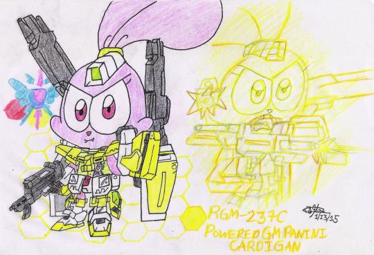
#OnThisDay: Jan 13th, 2015
Title: Powered GM Panini Cardigan
Before Panini 🐰👩🍳 was upgrade to her quirky yet effective power of the armored 'Winning', she armors the 'Powered GM Cardigan' 💛🤖🔫 based on the actually Gunpla counterpart appeared on the Anime ('Gundam Build Fighters TRY') of the same name. The Gunpla itself (which custom built by Hoshino Fumina [or Fumina Hoshino]) appeared in a few episodes before it switched to the aforementioned 'Winning' Gundam and then the upgraded version, that I will get there, very soon (at the right date). Anyways, Panini's armor 'Powered GM Cardigan' focuses on standard armaments like beam sabers, large rifles, and other standard weapons without any special features that related to 'Newtype' or 'Psycho-Frame' technology (almost) similar to 'Lightning Gumball'. 🤖🔫 🚫✨ From the looks of it, both the armor 'Powered GM Cardigan' and its Gunpla counterpart is like something came from of the 'Mobile Suit Gundam Thunderbolt' era style, and we wish that this awesome custom GM will be adapted to the said UC's (Universal Century's) 'Thunberbolt' era; either in Manga or an upcoming Anime. Which, by the way, I've watched two episodes ("December Sky" and "Bandit Flower") in a English Dub years ago, and we're WILLING to wait for their future 'Gundam Thunderbolt' installments. (What's taking SO LONG, SUNRISE!? 🤨) *Sigh* Anyway, let's bring out the infos. 🤷♀️
Powered GM Panini CardiganBased on: RGM-237C Powered GM Cardigan [CLICK ME!]
Armament(s):
• Beam Saber A sword-like beam weapon that serves as armor Powered GM Cardigan's primary close combat weapon, a pair of them are stored in the storage racks on top of the shoulder armor. The racks will rotate forward when the beam sabers are needed.
• Gatling Gun Mounted on each arm, the triple-barrel Gatling guns have low accuracy, but they can cause heavy damage when fired in close range and as such they are mainly used for close combat. When in use, the top section of the yellow add-ons on the arms will pop up to reveal the Gatling guns.
• Shield Mounted on long, foldable arms on the backpack, the pair of shields provide the suit with additional protection compared to other suits that have only one shield. They can also be more flexibly positioned compared to arm-mounted or handheld shields, allowing the suit to use its arm-mounted or handheld weaponry more freely.
• Beam Machine Gun Armor powered GM Cardigan's primary mid-range weapon, it is a beam rifle that can fire beam shots individually or in three-round bursts.
Special Equipment(s)/Feature(s):
• Dummy Launcher The fingers of the armor Powered GM Cardigan are fitted with dummy launchers that launch dummy balloons that roughly resemble the CMA ('Cuteness Mecha Armor') suit. The dummy balloons are used for tricking enemy units during combat.
Previous: • Build Burning Jason (Jan 8th, 2015) • Lightning Gumball (Jan 10th, 2015)
Panini - CHOWDER! © Cartoon Network Armor (Gundam Build Fighters Try) - Gundam Series © Bandai Namco Filmworks, Inc. (SUNRISE), Sotsu
2 notes
·
View notes
Text
RARE BEAUTY IS USING PALESTINE AS A PR MOVE
(This is a long post. You can read the colored text for a summarized version.)
This is just sick. I can't believe this is happening. If you don't know what's going on, let me give you a recap of what happened in a chronological order.
So, a while ago, Selena Gomez took to instagram to post a story about her stance regarding what's happening in Gaza. Everyone instantly came at her for not only staying neutral in the face of a literal GENOCIDE, but to somehow make the entire thing about her by claiming she needs to "take a break from social media" for her "mental health". She also claims that any post she makes about it will not matter, which is bullshit, considering she's one of the most followed persons on Instagram. Not only that, people are also calling her out about her hypocrisy by pointing out the differences in her response for the Ukrainian crisis and the Gaza crisis.
Below are the instagram posts she made for Gaza (left) and Ukraine (right). Notice the difference?
(I took these photos from this post)
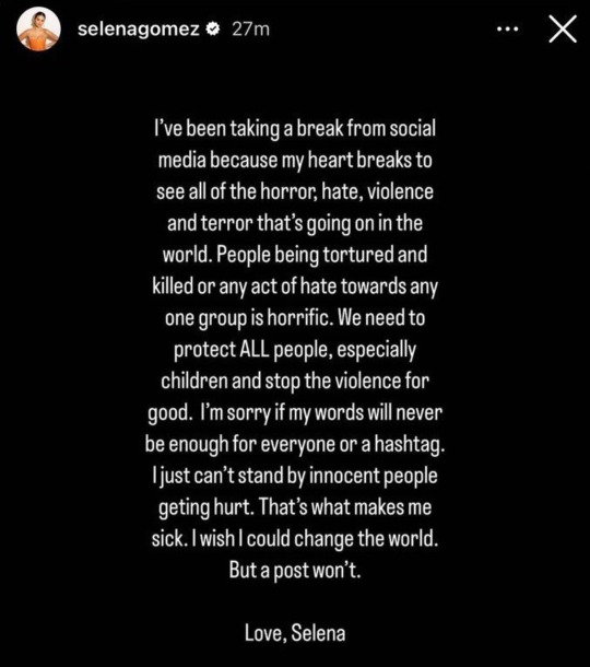

Not only that, people also noticed that Selena liked Amy Schumer's post—who is not only known to be a Zionist, but also problematic, racist, and Islamophobic—about a pro-Israel propaganda.
(I acquired the photo from the same Tumblr post linked above)

This led to people all around the world actively voicing their intentions of boycotting Rare Beauty, the makeup company of which she is the founder. One day ago, the official Rare Beauty page on Instagram posted a single picture with the words: "Humanitarian Crisis in Gaza".
Upon first look, this post seems great. It looks like Rare Beauty is finally stating its official stance about the on-going crisis! Until, of course, you read the caption.
(Click here to see the original post by Rare Beauty on Instagram)
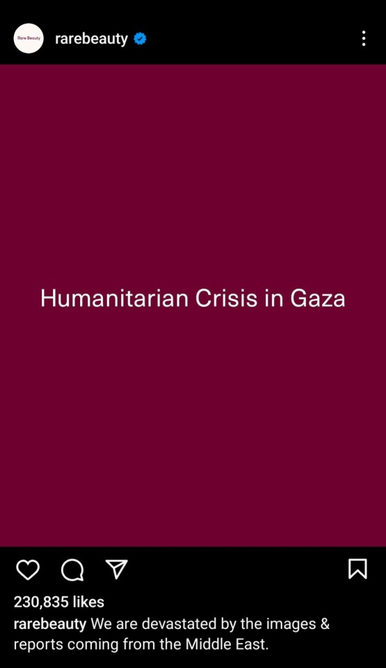

As you read further, you will notice that Rare Beauty is still taking a neutral stance over what's going on. Not only that, they literally admitted in that post about injecting their money into the Israel government. Magen David Adom, the name that Rare Beauty mentioned as one of the recipients of the money they're donating, is a known Zionist organization.
Below is the profile of Magen David Adom on instagram.
(You can check MDA's profile through this link)
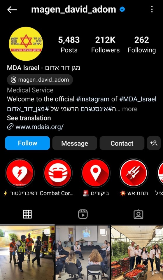
Now, we all know that many large brands out there have openly stated their support for Israel or opted to take a neutral stance instead. By this point, I'm not surprised anymore. But that's not what revolts me about what Rare Beauty has done.
It's the fact that they made a post titled "Humanitarian Crisis in Gaza", only to go ahead and use their money to fund the Zionist goverment instead.
It is one thing to publicly assert a neutral stance or voice your support for Israel. But it is another level of atrocious to literally use the name Gaza and/or Palestine as a PR move, as hundreds and perhaps thousands of people there die every single day, only to then go and fund the same regime responsible for this bloodshed.
And for what?
To manipulate people to stop the boycott and save their company from going bankrupt?
Where is the fucking humanity?
I don't know what else to say. I'm literally at loss for words. This just goes to show that we ought to be more careful about whomever we support, because you never know if there are any malicious intentions hiding underneath.
So, in hindsight, PLEASE KEEP BOYCOTTING RARE BEAUTY IF YOU SUPPORT FREE PALESTINE 🇵🇸🇵🇸🇵🇸🇵🇸🇵🇸
#palestine#free palestine#gaza#free gaza#from the river to the sea palestine will be free#gaza under attack#gaza genocide#gazaunderattack#gaza strip#save gaza#rare beauty#selena gomez
19 notes
·
View notes
Note
hiii i just saw your ryuseitai phone theme and it’s so cool!! can you make a tutorial of how you did it?
hi !!!! id love to! im so glad you liked my ryuseitai theme! :3
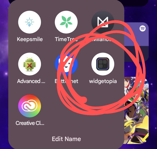
first step: this widget app (widgetopia), or any other of choice. i used this to make the little square widgets as well as the countdown timer labeled LIBERATION (which is actually my graduation date)
in addition, i would recommend having some kind of drawing app / image editing program on hand in case you want some custom graphics like my lock screen / wallpaper! ibisPaint X is my app of choice, as its free and has a pretty simple interface, but any programs will reasonably work!
keep in mind both of these programs have ads and paid versions but you dont need to pay for anything for this!
also i dont have progress pictures so. bear with me lol.
for the small square widgets, youre going to want to go to the LIBRARY panel and hit +SMALL.

this will open the NEW WIDGET menu! from here, youre going to want to hit NEW WIDGET (should show up as a tealy green button), which brings up this menu

from here, you can set various things, such as making the background of the widget transparent, making it a specific color, or setting it to send you to a website via an embedded link if you please!
for this tutorial we'll just make a basic regular widget with a picture on it :3
on this screen, hit the PLUS icon, and choose the option that says IMAGE. choose the image you want, and voila! its there!
although...
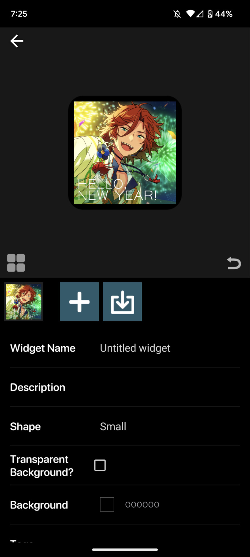
the borders are an issue. youre going to want to resize your image! this is a part of the process regardless of the image's original size.
click on the image to open the image property menu! here you'll find a ton of options for moving the image around, and edit it! here you can add some extra flair such as a slight rotation or tint, or you can set it to have an action when you tap on it! i wont get into that in this, but its neat to take a look at on your own!

make sure the chain icon between width and height is LINKED, and then increase the size! this is just a matter of eyeballing it based on your image, and will result in corners being cut off, so avoid having important bits of the image in the very corner! when youre done, you should be able to see rounded corners INSIDE the image's bounding box! this means that your image is as large or larger than than the widget, meaning that no weird borders will show!

from here, you can hit the back button, and then the purple ADD WIDGET button to put it on your homescreen!
note: if youre editing an already made widget of the same size, you do not need to press ADD WIDGET, as it will result in having two of the same widget on your screen!
from here, itll look something like this!

if you ever want to change the widget image, you can just click on it (if you have multiple, click on the specific one you want to replace), and go through this process again!
as for the lock and home screen backgrounds, thats more tedious. i recommend a 9:16 aspect ratio for phone screens, but other than that theres not many tips i can give you in the design sector of things, sorry 😔
one tip i can give is that if you dont want your home screen image to shift when youre swiping between screens, go into google photos, and zoom in on the image! make sure its cropped the way you want it to by the borders of your own device, get the UI out of the way (done easily by tapping once on the image), and take a screenshot, that way there wont be any buffer room on the sides for it to shift!
---
anyways, i hope this helps! i absolutely advocate for playing with some of the more advanced options on your own, as its super fun to learn new modes of phone customization! if anyone makes any themes with help from this tutorial, feel free to tag me in the comments! id love to see your work! :3
16 notes
·
View notes
Text
About Illustrating Emanata's 2022-23 Cover
Hello again! Click read more to read through my process, thoughts, and visual development for my illustrated cover of Emanata's 2022-23 comic anthology RUIN.

Before I get into it, I just want to say that I spent a few hours working on the first draft of this blog post and it got accidentally wiped. That version of this post had a lot more to do with my mental space during the production of this piece in regards to how I felt as an artist post-graduation from Art School. Because all those typed up thoughts are now not typed up, I will be making a separate post eventually that goes into that more. I'll update this post with a link to that when I can. :)
Anyway.
RUIN.
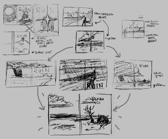
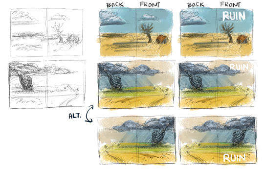
Here's a little thumbnail diagram thing that kind of shows my thought process during this stage.
The general direction I was given when asked to do this project was something like, "more about emotion instead of action," as well as "no reds and purples." So immediately I set my brain into thinking of blues and greens and scenes that I could paint with those colors.
My first idea can be seen top left corner: I imagined an ancient, magical ruin portal standing in a field at night. It was cool, but frankly, didn't make sense and I quickly ditched it. I went back to my blues and greens and was really squeezing my brain for any ideas and that's when I came to top center.
I thought of a lone house, on a precarious cliff, being slowly torn apart by the strength of a raging sea-side storm. I honestly still think this is a good idea as a stand-alone painting, but it didn't really strike me as the cover of this anthology.
However, I really enjoyed the storm concept and began thinking about tornadoes and how deathly afraid of them I am, and the fear humans experience when confronted with the reality of the destruction caused by tornadoes! I looked at lots of beautiful photos of large tornadoes ravaging the country side - the images were very blue, green, yellow... the concept was perfect. I began developing it with a few color thumbnails...
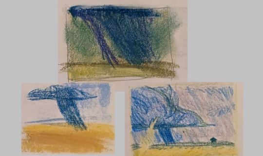
...and immediately fell out of love with it. Har-har.
I still loved this concept of a sprawling yellow grassy plain clashing against a deep, stormy blue sky though! I thought about grassy plains and that led me to thinking about the American Midwest and old, falling-apart houses abandoned in these fields. The culmination of those thoughts led to the final thumbnail you see up there.
It was approved so I got to work! I knew I wanted to do this traditionally and started working in oil pastel. But after a few days of working on it, I realized something: I did not have enough experience in the medium to do a full illustration like this. This is about where I stopped:
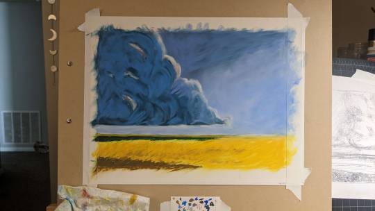
It's not bad, but I knew there wasn't any saving this piece as it was. I got too loose with my color choices and in many spots, just muddied my color. It was really disheartening honestly; I felt so stuck.
I had to start over.
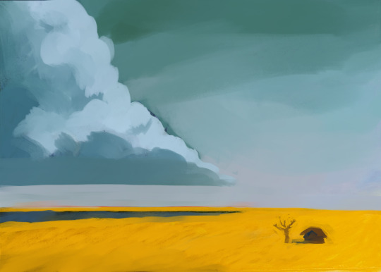
Using that oil pastel painting as a base, I moved to Clip Studio Paint. Working digitally is something I'm very comfortable doing and decided that the ability to fix things easily would be a great advantage for myself with this piece. At this point, if I remember correctly, I had just less than two weeks left to finish this project.
I still wasn't feeling it at this stage though and took a few days, despite my approaching deadline, to simply think about it. I felt stuck: even in the early stages, this piece didn't scream that it was made by me. Sure it would have my name on it, but as it stood, I had zero connection to it as an artist other than the fact it was an assignment I was working on. I asked myself, what did I want my work to look like? And I thought back to my time at school and to the pieces I felt most connected to and that's when that spark lit up in me again!
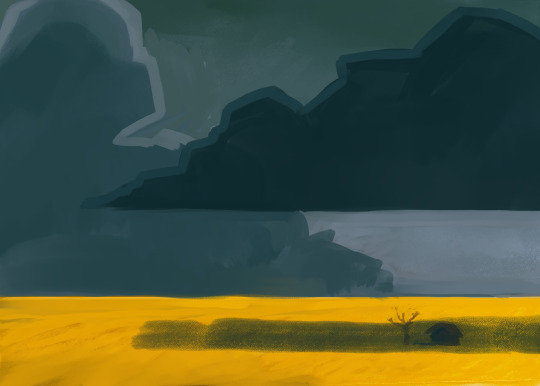
I darkened the sky, made it more foreboding, and it really started clicking then. I carved the shapes out, alternating between working on the clouds to working on the little abandoned house.

I continued building depth and form by layering my values until everything seemed just right.
The house was a doozy though, but I finally figured that one out. DETAIL SHOT!

I hope the detail comes out well on the cover!!
And here is some bonus imagery for you:
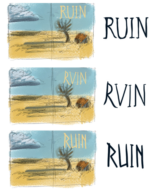
The first one is what we went with for the title's type - hand drawn in the final as well by the way!!
Anyway, here's the finished piece again to remind you of where I ended up!

Closing thoughts: I'm proud of how this turned out. I think this cover complements the previous years' well. This illustration (painting?) feels like me and it jump started new artistic growth within me too! All in all, very happy with it.
Thanks for reading!
10 notes
·
View notes
Text
wow, i really really hate the new post editor
when i make an image post, that bar thing that says drag you photo or url here just stay open up there after you’ve already added photos??? and i have the option to close it? so i get to manually close it every single time just so i can see how my post is going to look??
and when adding tags, you can’t just click anywhere in the tag field, you have to click the teeny tiny little plus sign? boo, major downgrade
also its HELLA ugly and clunky looking. like look at all these big dumbass grey bubbles taking up WAY too much screen real estate??? wtf
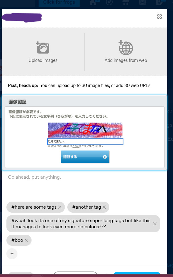
like i cant even see the post buttons with just a single not large image (its 303px tall) in it???
same tags for reference:

clean, easy to understand its not part of the post, not freaking ugly?
like yeah, the font size could be a smidge bigger, but the grey bubbles?? *barf emoji* its ugly and intrusive and i can’t even customize it to be like baby pink or something? smh
also, again, the stupid teeny tiny plus sign??? versus being able to click literally anywhere in the tag area??? i aint got time to be lining up my mouse to hit that stupidly small target every time i decide i want to add tags to a post???
like if its supposed to be more accessible on mobile...1) tapping anywhere in the tags section would be infinitely easier on mobile also i think? but maybe people were accidentally hitting the tags section like while scrolling so they made it harder to hit on purpose? but if thats the case, 2) theres a tumblr app?? i dont think the browser version needs to have all the, uhhh, “upgrades” the app should be getting? but then again, i guess the app must still be broken so instead of fixing/adjusting it to be mobile friendly they’ll juse make everything mobile friendly? and less pc friendly? like damn i would hate hate hate hate hate to be using tumblr on anything bigger than my small laptop screen.
and last also, why is the dumb new post editor only on every post type except text? not that i want it here too, but like???
OH WAIT no this is the last also!
the new editor doesn’t give the option for blockquotes? blockquotes are literally one of my favorite formatting tools (blockquote + italics, it gets me every time)
OH WAIT NO i thought of another, in the new editor, the formatting popup is no longer (roughly) centered over the mouse??? like that was so convenient??? much less distance to travel than the new one which pops up starting on the mouses’ right side??? you wanna add a link, go all the fucking way over there! D<
ugh i hate unnecessary design choices. like im sure theyre beneficial to some people and im happy for you. but this site has just gotten 15% worse for me to use and it was already a bit of a struggle. :/
#tumblr#new post editor#spoiler alert: i hate it#oh cute compact tags section im gonna miss you#faint rant
3 notes
·
View notes
Text
I’M SCREAMING
Ok for context, ages ago I found a photo on an old website for Robert Duncan McNeill that was from some show I’d never heard of. The photo wasn’t very big and being curious, I wanted to find a better/larger version of it.
This was the image (from “Going to Extremes”, some one-season show from the early 90′s apparently):

The thing is, even with a lot of googling and various reverse-image searches, I couldn’t find a better size or quality for this image and I eventually just gave up.
Fast forward months, and now I’m randomly googling Robbie this evening because I was looking for a completely different photo (there was something I wanted to show my sister and I couldn’t remember where to find it).
Lo and behold, I find THIS:

Despite the odd color toning and the obvious stock-photo watermarks, it’s a way bigger and way better quality photo. Which is excellent! Except, that’s not why I’m screaming.
Because you know how, when you search for images on google, and you click on an image, you can then open whatever website page the photo comes from? Can you guess where google image search linked me to when I innocently clicked on the “visit page” button? Do you think that I was sent to alamy dot com and their no doubt large collection of stock photos?
No. This photo was hiding deep within the internet for me to find, on fucking
MEN’S WIKIFEET
If that isn’t insane enough, you want to know what’s even wilder?
I can’t find this photo on alamy dot com. You know, the place where all the watermarks are telling me it is from. Did it used to be there? Was it taken down for some reason? Has it somehow been mislabeled so my search terms aren’t working? Who fucking knows.
The point is, I finally got to see a better version of this image. But boy, I wouldn’t have bet that goddamn Wikifeet would be where it was fucking hiding.
#robert duncan mcneill#going to extremes#when I tell you I took fucking PSYCHIC DAMAGE#I found what I wanted but at what cost#insanity truly insanity#I just needed someone to KNOW to UNDERSTAND
4 notes
·
View notes
Text

i learned on one picture, translating things (I wanna mean, translation from visuals, data to writings) about the (science) poster and, it’s now well organized in my head and, well as the tree data (six months after I find how to catch a picture like that) this is a screenshot from the original; the screens do not all give a similar result when i check the original photo (off camera)

i have to be able/know how to read the image and that is the goal of the poster so show how to learn steps on reading and understanding things (like therefore processing the analytical data in the right way) I had a source of information from the photography that will be used for the poster which is not this one;
youtube
Analytical skill is the ability to deconstruct information into smaller categories in order to draw conclusions.

(same sky of february 1) but more to the left, so, another serie of stars and things) image which looks like something boring but which reveals the magnetic difference well so it is not magic without the writings. (extract) The word galaxy was borrowed via French and Medieval Latin from the Greek term for the Milky Way, galaxías (kúklos) γαλαξίας (κύκλος)milky (circle)', named after its appearance as a milky band of light in the sky. In Greek mythology, Zeus places his son, born by a mortal woman, the infant Heracles, on Hera's breast while she is asleep so the baby will drink her divine milk and thus become immortal. Hera wakes up while breastfeeding and then realises she is nursing an unknown baby: she pushes the baby away, some of her milk spills, and it produces the band of light known as the Milky Way.
(details of stars later tonight)
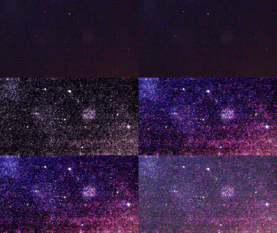
so here the first steps image by image, then, the gif / same image, using 4 filters, add images together, made a gif with them. it’s cute
(by click on, this is the normal size view because this tumblr theme enlarge all the things, it’s not always fine)
In the astronomical literature, the capitalised word "Galaxy" is often used to refer to the Milky Way galaxy, to distinguish it from the other galaxies in the observable universe.

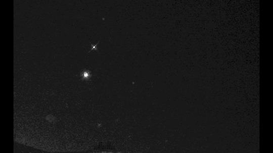
Original image in 3 versions + poster (another image closer) of the same conjunction and, the inverted version
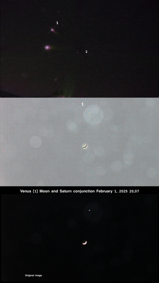
poster image 3 (image: pure science)

(pls enlarge by click on) all the madness of this precious photo (for my demonstration of the phenomenon of bubbles) is (I am jubilant to be honest, while writing it) Venus. What can we read on the image.. , oh my brain sparkles for the information received from this photography; with Venus and its thermal imprint (magnetic imprint) PM I can detail the polarization;
1.SCIENCE
Simplified reorganization (of a body or light) under the effect of an electromagnetic field or a filter.
2.FIGURATIONALLY
Action of concentrating at one point (forces, influences) the 1 + 2 definitions gives the entire series of data (large series of information) linked by pdf in my webspace (private tab) I can’t let it on the web because of people stealing my stuffs but it’s super interesting and, added in the magazine, when it resurrect.
The English term Milky Way can be traced back to a story by Geoffrey Chaucer c. 1380:
(See yonder, lo, the Galaxyë) Which men clepeth the Milky Wey For hit is whyt.
— Geoffrey Chaucer, The House of Fame
(extract) Gif 3D + how to see in 3D here or by using blue red glasses + 1 for more: there are not coloring filters but rather image processing using software (paid) the 3 Ds are also under license.
0 notes
Text
Sales Page Design Tips to Skyrocket Your Conversions
When it comes to digital marketing, few things are as crucial as a well-designed sales page. Your sales page is your 24/7 salesperson, pitching your product or service to every potential customer who visits. A poorly designed page can scare visitors away, but a well-crafted one can turn casual browsers into loyal customers. In this guide, we’ll cover actionable sales page design tips that will help you optimize your page for maximum conversions.
1. Start with a Compelling Headline
Your headline is the first thing visitors see, and it determines whether they will stay or leave. A compelling headline should:
Clearly communicate the value of your offering.
Capture attention immediately.
Be concise and easy to read.
For example, instead of saying, "Our Software Helps You Manage Tasks," try something more specific and benefit-driven like, "Save 10 Hours a Week with Our Task Management Software."
2. Prioritize a Clear Value Proposition
Your value proposition should answer the question, “What’s in it for me?” Highlight the benefits of your product or service, not just the features. Use bullet points, bold text, or subheadings to make this information stand out. Ensure that your value proposition is front and center, so visitors grasp your offer instantly.
3. Leverage High-Quality Visuals
Humans process visuals much faster than text. Incorporate high-quality images, videos, and graphics that complement your content and showcase your product. For example:
Use explainer videos to demonstrate your product’s features.
Include before-and-after photos for services like fitness or home improvement.
Opt for professional product photography to build credibility.
4. Design with Mobile Users in Mind
With more than half of web traffic coming from mobile devices, a mobile-optimized sales page is non-negotiable. Ensure your page:
Loads quickly on mobile devices.
Features large, tappable buttons.
Uses responsive design to adapt to various screen sizes.
Test your sales page on multiple devices to confirm it offers a seamless experience for all users.
5. Create an Eye-Catching Call-to-Action (CTA)
Your call-to-action is arguably the most critical element of your sales page. It should:
Be visually prominent with contrasting colors.
Use action-oriented text like “Buy Now,” “Start Your Free Trial,” or “Download Today.”
Appear multiple times throughout your page.
For instance, a brightly colored button with the text “Get Started in Seconds” can entice visitors to click and convert.
6. Build Trust with Social Proof
Social proof helps establish credibility and reassures potential customers. Include elements such as:
Customer testimonials with names and photos.
Case studies detailing real-world results.
Trust badges (e.g., “Money-Back Guarantee” or “Secure Checkout”).
Reviews and ratings from trusted platforms.
7. Eliminate Distractions
Keep your sales page focused. Remove unnecessary navigation bars, links, or elements that might divert attention from your primary goal. A clean, minimalistic design helps keep visitors engaged and on track to conversion.
8. Use Persuasive Copywriting
Your sales page copy should:
Address your audience’s pain points.
Use emotional triggers to connect with readers.
Be written in a conversational tone.
For example, instead of saying, “Our product has a user-friendly interface,” try “Effortlessly organize your projects with our easy-to-use platform.”
9. Optimize Page Load Speed
Slow-loading pages frustrate visitors and lead to higher bounce rates. Optimize your page’s load time by:
Compressing images and videos.
Minimizing the use of heavy scripts.
Using a reliable hosting provider.
Tools like Google PageSpeed Insights can help identify performance issues and provide actionable recommendations.
10. Implement A/B Testing
Even with the best design practices, there’s always room for improvement. A/B testing allows you to compare two versions of your sales page to see which performs better. Test elements such as:
Headline variations.
CTA colors and placement.
Page layouts.
Analyze the results and continually optimize your sales page for better conversions.
11. Incorporate Urgency and Scarcity
Urgency and scarcity can compel visitors to take action immediately. Examples include:
Limited-time offers (e.g., “50% Off Today Only!”).
Low-stock alerts (e.g., “Only 3 Left in Stock”).
Countdown timers for promotions.
Be genuine when using these tactics to avoid losing trust.
12. Make Navigation Intuitive
Even though you want to keep your sales page focused, intuitive navigation is still essential. Use anchor links to guide visitors to different sections of your page. For instance:
A "Learn More" button can take users to the FAQ section.
A "See Pricing" link can jump directly to the pricing table.
This enhances the user experience and keeps potential customers engaged.
13. Highlight Customer Support
Make it easy for visitors to get their questions answered. Include contact options like:
A live chat feature for instant support.
A prominent FAQ section.
A visible email address or phone number.
Accessible customer support can reassure potential buyers and reduce purchase hesitation.
14. Use Data-Driven Design
Analyze your site’s metrics to identify what works and what doesn’t. Pay attention to:
Bounce rates to spot areas for improvement.
Heatmaps to see where users spend the most time.
Conversion rates to track the effectiveness of your page.
Use these insights to refine your design and boost performance.
15. Ensure Consistency Across Branding
Your sales page should align with your brand’s identity. This includes:
Matching colors, fonts, and logos to your overall branding.
Using consistent messaging across all marketing channels.
Reinforcing your brand’s voice and tone in the copy.
A cohesive brand experience builds trust and strengthens customer loyalty.
16. Offer a Risk-Free Guarantee
Address potential objections by offering a risk-free guarantee. Examples include:
A 30-day money-back guarantee.
A free trial with no credit card required.
An easy return policy.
Clearly communicate this guarantee to reduce hesitation and encourage conversions.
17. Focus on Benefits, Not Just Features
While features describe your product’s capabilities, benefits explain how it improves the user’s life. For example:
Feature: “10 GB Cloud Storage”
Benefit: “Store All Your Files Securely and Access Them Anywhere.”
Emphasize benefits to create an emotional connection with your audience.
18. Include Strong Visual Hierarchy
Organize your sales page content to guide users’ attention naturally. Use:
Large, bold headlines for key messages.
Subheadings to break up sections.
Contrasting colors to emphasize CTAs.
A clear visual hierarchy ensures that important elements stand out and users can easily navigate your page.
19. Add Testimonials and Reviews
Showcase positive feedback from satisfied customers. Highlight specific outcomes or results they’ve achieved using your product or service. For example:
"I doubled my sales in just three months thanks to this software!" – Jane D.
Include video testimonials for a more personal touch.
20. Keep Forms Short and Simple
If your sales page includes a form, minimize the number of fields. Only ask for essential information. For instance:
Instead of asking for full name, phone number, email, and address, only ask for an email to start.
Use autofill features to make the process even smoother.
Conclusion
A well-designed sales page is the cornerstone of successful online marketing. By following these tips, you can create a page that engages visitors, builds trust, and drives conversions. Remember to continuously test and refine your page to stay ahead of the competition. Start implementing these sales page design strategies today and watch your conversions skyrocket!
0 notes
Text
Google Drive is popular online storage software introduced by none other than Google itself to help you sync and store your files online for safe keeping. It is essential at times when your laptop, computer or phone decides to leave your side and takes all your work down with it. But, there is so much more to Google Drive that people miss out on. So, take a look at the following most helpful tips and tricks to help you get the best of what Drive has to offer: Use It For Collaboration Google Drive is like a collaborative tool. If you are working with a large group of people, you can upload a document and up to 50 people can simultaneously edit it without any hassle. The maximum amount of people that a document can be shared with is equal to 200, although only the first 50 will be able to edit it. Save To Google Drive Save to Google Drive is actually an extension for your Chrome browser. Once you have installed this feature, you will see a new option when you use the right click. With this add-on, you can add images or links straight to your drive which can be downloaded or viewed later as per your need. Drive And My Documents In case you want to turn the My Documents folder of your computer into your Google Drive folder, you will find that all your files are saved to your Drive by default. You can do this by changing the settings available in the properties tab. In case you are dissatisfied, you can switch to the original settings whenever you want. Edit Documents With Drive Notepad Drive Notepad is useful for editing documents online, and you do not need any other software or app to download stuff on to your PC for editing when you have this handy app. Drive notepad also has support for multiple popular programming languages and not just commonly spoken English. Transfer Your Files To Mobile This is the best trick if you rely on Drive for media files. The first step is downloading the Google Drive app on your smart phone. Then, all you have to do is a find a music file and you can download it on to your cell phone using Drive to listen to it later on. This is one of the reasons why Google drive is must have app for college students. Access The Deleted Files You accidentally deleted a file and you feel like your world is falling apart; not a problem anymore. Google Drive has this feature that it stores previous versions of a file for the past 30 days. So in case you lose a file, you can easily check file history and catch up from where you left off. You can also turn the auto delete after 30 days feature off. Avail The Offline Accessibility There may be a point in life where you don't have internet connection and you need to access your files one way or the other. This again will require you to have Chrome installed and with just a few adjustments, you can change the settings of Drive so that it allows you to view your files even without the internet. Online Editing Of Images Attaching Pixlr Editor for your Chrome browser gives you the advantage to edit your photos online instead of from your computer. This software has similar tools as Photoshop software but it is not as complicated and difficult as you think, and it can be used for simple editing; nothing too fancy but useful for everyday users. Attaching Drive Files To Gmail Google Drive is basically an extension for your Gmail. Once you have uploaded something to your Drive, you can send it using a Gmail account without the need to upload it all over again from scratch. In case of Google Drive, the file size doesnot matter when compared to Gmail as a link is sent to the recipients. Sharing Photos Becomes Easy Since almost all Google apps are linked, Google+ is also connected to your Drive. All the photos and images pre-existing in your Drive can be effortlessly added to your Google+ account which is in some ways similar to Facebook so that you can share all those cherished memories with your loved ones. Listening To Music You already have permission to download music files
from your Google Drive as mentioned above, but installing Drive Music lets you listen to the song first so that you know what you’re in for before you download it to your phone. Drive Music has similar features as a commonly used media player. Installing Google Drive Apps Google Drive has a vast library of apps along with all the apps and add-ons mentioned above. There is a definite chance that you will find something that spikes your interest and you will be eager to try it out if you browse through it well. There are extensions for Firefox as well if you do not use Chrome. Option For Editing Videos No need to download videos, install software and then edit your videos. It is too time consuming, so another Drive Extension that goes by the name of Pixorial Videos can help you out here. Now you can edit, trim, combine, add titles etc. to the different types of videos right from your Drive. Huge Storage Space Google Drive provides every user 15 GB of storage space free of cost. While this is a lot for many, it is still not enough for a lot of people. Fortunately, Google thinks about everyone and offers additional packages at a reasonable price for the people who want to use more than 15 GB for their work and assignments. Docurated With the increasing number of files uploaded to drive, it takes more time for someone to search for what they actually require. Docurated provides a faster way to search for the information you are looking for without you having to open the file at all. It provides immediate access to anything and everything that you need. Conduct A Survey Its super easy to conduct a survey using Google drive. Create a google form with required information from your audience and send them the web form link. All responses will be conveniently recorded in a google spreadsheet. Auto Reply With Google Forms You can use google scripts to send automated reply on a google form submission. If you are using google forms this is a easiest way to acknowledge to the submitter that you have received the information. Do Awesome Stuff With Google Spreadsheet Google spreadsheet has almost all features supported by Microsoft excel. The best part is, it also supports the formulas. Use the spreadsheet formulas to do thing quickly. Use IFTTT Recipes To Automate Google Drive IFTTT is a powerful free tool to automate a lot of stuff. You have many recipes available at IFTTT to capture data in Google drive from various sources. Instagram To Google Drive Automatically send your Instagram pics to google drive. Dropbox To Google Drive Automatically add your dropbox file to google drive. Gmail To Google Drive Automatically save your receipts in Gmail to google drive. Explore More Google Drive Recipes on IFTTT Google Drive also provides mobile access to its users; the free app is available for both Android and Apple. Everything that you need can be viewed on multiple platforms; one of the reasons why Google deserves the respect it is given by its loyal users. Stevens Stone is an academician at AssignmentGeek.co.uk who provides assignment writing help to students around the globe. Moreover, he shares tech-savvy tips such as with students to help them store, secure and access their important documents easily.
0 notes
Text
The Importance of Fast Load Times Across All Devices
Why Fast Load Times in Cross-Device Speed Matter
In today’s fast-paced digital world, having a website that loads quickly at cross-device speed is crucial. Not only does it improve user experience, but it also boosts your site’s search engine ranking. But why exactly are fast load times so important? Let’s delve into the significance of fast load times and provide practical tips for achieving them on any device.
The Significance of Load Times in Cross-Device Speed Optimization
User Experience in Cross-Device Speed
Imagine you’ve just clicked on a website link, eager to find information or make a purchase, but the site takes forever to load. Frustrating, right? That’s how your visitors feel when your website isn’t optimized for speed. Tips for achieving load across devices are essential for keeping visitors engaged and reducing bounce rates.
Impact on Search Engine Rankings
Search engines like Google prioritize websites with load in cross-device speed. If your site loads quickly, it’s more likely to rank higher in search results. This is especially true for mobile searches, where users expect instant access to information.
Increased Conversion Rates
Did you know that even a one-second delay in load time can result in a 7% reduction in conversions? Faster websites lead to higher conversion rates, meaning more sales and better ROI for your business.
Tips for Achieving Cross-Devices Speed
Optimizing Images
Compress Images Without Losing Quality
Large image files can significantly slow down your website with load times. Use image compression tools to reduce file sizes without compromising quality. Tools like TinyPNG or ImageOptim can be lifesavers.
Use the Right Format
JPEG for photos, PNG for graphics with fewer colors, and SVG for logos and icons. Choosing the right format can make a big difference in fast load times in cross-device speed.
Minimize HTTP Requests
Combine Files
Every time a user visits your site, their browser makes HTTP requests to load various elements like scripts, stylesheets, and images. Combining these files can reduce the number of requests, speeding up load times.
Asynchronous Loading
Load JavaScript files asynchronously to ensure they don’t block the rest of the page from rendering. This technique allows the page to fast load times while scripts load in the background.
Optimizing for Mobile Devices
Responsive Design
Ensure your website is mobile-friendly by using a responsive design. This means your site adapts to different screen sizes and orientations, and the importance of load times in cross-device optimization provides a seamless experience across all devices.
Prioritize Above-the-Fold Content
Load above-the-fold content first so users can see something quickly, even if the rest of the page takes a bit longer. The importance of fast load times in cross-device optimization gives the illusion of a load time.
Reduce Server Response Time in Cross-Device Speed
Choose a Reliable Hosting Provider
High-Performance Hosting
Opt for a hosting provider known for cross-device speed and reliability. Look for ones that offer solid-state drives (SSD) and excellent uptime.
Content Delivery Network (CDN)
Use a CDN to distribute your website’s content across multiple servers worldwide. This reduces the distance between your server and the user, resulting in fast load times in cross-device speed.
Leverage Browser Caching in Cross-Device Speed
Enable Browser Caching
Cache Static Resources
By enabling browser caching, you allow your site’s static resources (like images, stylesheets, and scripts) to be stored in users’ browsers. This way, they don’t have to be reloaded every time a user visits your site.
Set Expiry Dates
Set expiry dates for cached resources to ensure users always have the latest version of your site’s content. This balance helps maintain cross-device speed while keeping content fresh.
Minify CSS, JavaScript, and HTML
Remove Unnecessary Code
Minification Tools
Use tools like UglifyJS, CSSNano, and HTMLMinifier to remove unnecessary characters from your code, such as spaces, commas, and comments. This reduces file sizes and speeds up load times.
Optimise Code Structure
Organize your code logically to make it easier for browsers to read and load efficiently. Cleaner code can lead to fast load times and easier maintenance.
Optimising Web Fonts
Limit Font Use
Font Subsets
Only load the characters you need by using font subsets. This can significantly reduce the size of font files and improve load times.
Web Font Loaders
Use web font loaders to manage how fonts are loaded and displayed on your site. This can help prevent issues like FOIT (Flash of Invisible Text) and ensure a smoother user experience.
Regular Performance Testing for Cross-Device Speed
Monitor Load Times
Performance Tools
Regularly test your website’s performance using tools like Google PageSpeed Insights, GTmetrix, and Pingdom. These tools provide detailed insights and recommendations for improving load times.
Continuous Optimisation in Cross-Device Speed
Make performance testing a regular part of your website maintenance routine. Importance of load times in cross-device optimization ensures your site remains fast and efficient as you make updates and add new content.
Fast Load Times in Cross-Device Speed and SEO
Technical SEO
Optimize for Crawling
Ensure your site is easy for search engines to crawl by improving your technical SEO. This includes creating a sitemap, using proper header tags, and ensuring a logical site structure. For detailed insights, consider a service like technical SEO.
Mobile SEO
With more users accessing websites via mobile devices, mobile SEO is crucial. Optimizing your site for mobile can improve load and boost your search engine rankings. Learn more about mobile SEO.
Fast Load Times in Cross-Device Speed for E-commerce
Importance for Online Stores
User Expectations
E-commerce customers expect to load in cross-device speed. Slow websites can lead to cart abandonment and lost sales. Ensuring your online store loads quickly can improve customer satisfaction and sales.
Optimising Product Pages
Product pages with high-quality images and detailed descriptions are essential. However, they can also be heavy and slow to load. Compress images, use lazy loading, and streamline code to keep these pages fast.
Leveraging AI for Cross-Device Speed
AI Tools and Services
Automated Optimisation
AI tools can help automate the process of optimizing your website for cross-device speed. They can analyze your site, identify areas for improvement, and implement changes quickly and efficiently.
AI SEO Services
Consider using an AI SEO Services agency to help manage and improve your website’s performance. They offer a range of services, including cross-device speed optimization, to ensure your site runs smoothly.
Content Delivery Networks in Cross-Device Speed (CDNs)
The Role of CDNs
Global Distribution
A CDN distributes your site’s content across multiple servers around the world. This reduces the distance data has to travel, resulting in cross-device for users everywhere.
Reliability and Security in Cross-Device Speed
CDNs also enhance the reliability and security of your website. They can help protect against DDoS attacks and ensure your site remains accessible even during high-traffic periods.
Cross-Device Speed and User Engagement
Keeping Visitors on Your Site for Cross-Device Speed
Reduced Bounce Rates
Load in cross-device speed is crucial for keeping visitors engaged. If your site loads quickly, users are more likely to stay, explore, and interact with your content.
Improved User Experience Cross-Device Speed
A fast-loading website provides a better overall user experience. It makes your site feel professional and reliable, encouraging users to return in the future.
Cross-Device Speed and Business Growth
Impact on Revenue in Cross-Device Speed
Higher Conversion Rates
As mentioned earlier, in cross-device speed can lead to higher conversion rates. This translates to more sales, subscriptions, or leads for your business.
Competitive Advantage in Cross-Device Speed
In a competitive online market, a fast-loading website can give you an edge. Tips for achieving load across devices help build trust with users and set you apart from slower competitors.
Final Thoughts
Regular Maintenance
Ongoing Optimisation
Achieving and maintaining load in cross-device speed requires regular effort. Continuously monitor, test, and optimize your website to ensure it remains fast and efficient.
Professional Help
If managing your website’s performance seems overwhelming, consider hiring professionals. Agencies like AI SEO Services offer comprehensive solutions to keep your site running smoothly.
Conclusion
In today’s digital landscape, the importance of load cannot be overstated. They impact user experience, search engine rankings, and conversion rates. By implementing the tips outlined in this article, you can ensure your website loads quickly across all devices. If you need assistance, consider reaching out to the AI SEO Services agency. They offer a range of services, including cross-device speed optimization, to help your website perform at its best. With AI SEO Services, you can achieve load in cross-device speed and boost your online presence.

0 notes