#cleaned up my sketch recoloured it and then coloured the drawing and called it a day lol
Explore tagged Tumblr posts
Text

Subtlety is not his strong suit
#skyy's art#south park#Kenny mccormick#butters stotch#bunny#sp au#sp bnha au#sp Kenny#sp butters#sp bunny#leopold butters stotch#idk man i was bored#cleaned up my sketch recoloured it and then coloured the drawing and called it a day lol#not the cleanest piece nor the best but eh I wanted to show off butters’s eyes and also have them interact#also this is Butters’s puppy crush coming into play lol
29 notes
·
View notes
Text
Creating the Book
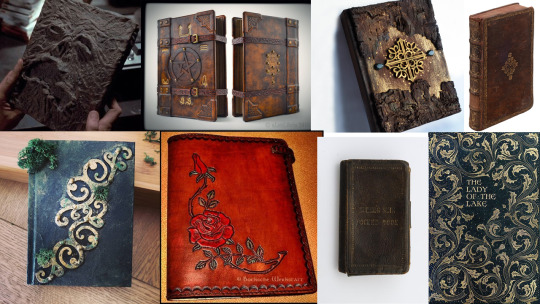
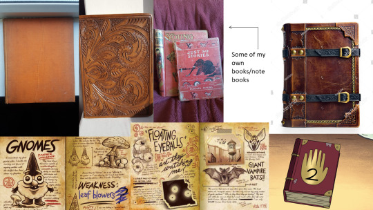
Before sketching ideas, I did some research on books that could inspire the look of my design. This included the Necronomicon from The Evil Dead (1981), the journals from Gravity Falls (2012) and a pocketbook made from the skin of William Burke, an 1820′s murderer who sold corpses to surgeons for study (bottom right image in the first moodboard, next to The Lady of the Lake).
I’m really drawn to the examples bound with aged, brown leather; there is something that feels so historical and significant about the material compared to paper or cloth covers.
I also really like the idea of including buckles on the book- suggesting there is something inside you are forbidden to see, or something trying to get out.
In my scriptwriting work, the book does something that alerts Mary’s attention, like flash with light or move slightly, so I need to include something on the cover that I could use to signal her with.
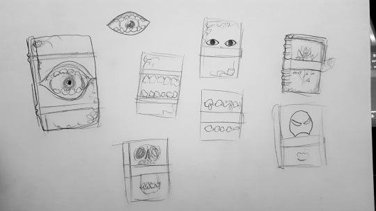
So, in these thumbnails I experimented with different covers- thinking maybe the moving jaw of a skull, gnashing mouth or a blinking eye would work well. I also played with the placement of the buckle, which was a little awkward because it needs to be either one in the middle (obscuring the cover art) or two at the top and bottom (forcing the cover art to take up a smaller amount of space. So, I decided 2 buckles would be my best option.
A blinking eye would have a real supernatural feel to it- like the book is living, almost like it is a character in of itself. Plus, it is such a subtle movement that I can believe not many other people would notice it. So, I decided to push this idea further:
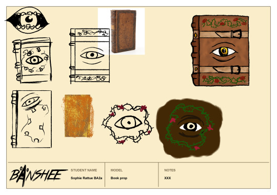
As cool as the eyeball in a mouth looks, I don’t know if closing the mouth would read to the viewer as a blink. Plus, I think this is just one too many elements to try and fit on the cover, so I switched to a simple eye that looks like it has been embedded in the leather. Then I experimented with the placement of the vines- and decided it would work better around the edges of the book than surrounding the eye.
I liked the overall look of the top right iteration, but still felt like there was more I could do to refine the design. It didn’t feel ‘evil’ enough; the lines are too rounded and the colouring too light & cheerful. So, I began by re-drawing it in my chosen art style, with textured back lines. For the colouring, I used a mix of browns blended together with the smudge tool in Photoshop (eye-dropped from my moodboards) and followed this tutorial:
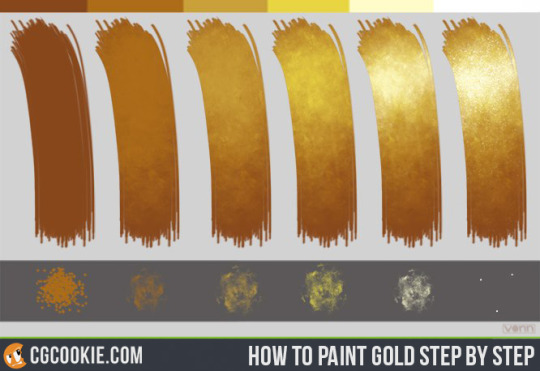
(by CGCookie (2012) Gold Step by Step tutorial, available at https://www.deviantart.com/cgcookie/art/Gold-Step-by-Step-tutorial-327175040 [acessed 10/01/21])
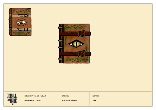
to give the eye a golden colour. Then, I darkened the spine to differentiate it from the cover and tried a deep red for the buckles. I think the darker buckles were a step in the right direction, but with the addition of red, I thought everything was starting too look too warm & saturated, and it was losing the ‘edge’ of my original idea.
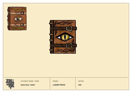
I tried to remedy this by giving the eye a sharper form and recolouring the vines in black and the straps in brown. This did help in making it feel darker & more evil, but it still looked quite bland.
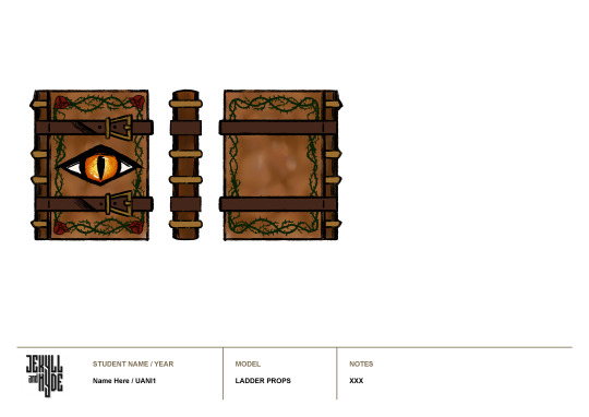
Then, I added a red hue to the eye and I feel like this immediately improved the design- giving it a more malicious feel. After that I added green vines again to try and alleviate the blandness, this time as a border. To me this looks much better, it frames the eye really nicely and I used a darker shade of green so that it doesn’t look too natural or comforting. Next, I added the roses, also in quite a dark shade and I think this was the finishing touch the book needed; they compliment the red of the eye and red undertones of the leather nicely and they mark out the corners of the cover, creating additional framing for the eye.
So, next I made the back & side views easily enough by copying and flipping what I’ve already drawn, and using guidelines to match up the bumps on the spine.
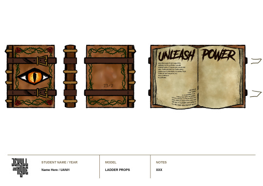
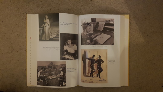
For the open position, I was heavily inspired by the journals from Gravity Falls- with their scrawling text and sketchy drawings. I began by referencing an open book, to see how the pages lie:
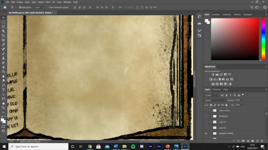
Then, I used a variety of textured brushes to fill in the page colour, blending them with the smudge tool and adding random speckles to the edge of the page to indicate fading or mould or water damage.
Once I had the blank pages, I then went back to the horror fonts I downloaded for making the logo and picked one called ‘Another Danger’ by The Branded Quotes on https://www.dafont.com/theme.php?cat=110. With this I added the ‘unleash power’ title and used lorem ipsum to fill out some small areas, leaving room for illustrations.
I think this font works really well, the title looks almost hand-drawn and it makes the smaller text look so much more complex- almost as if the letters are from a different alphabet.
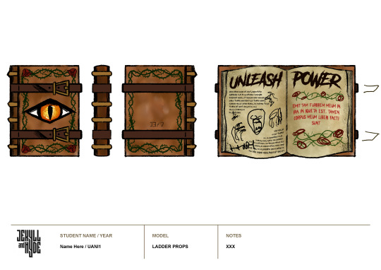
Once again taking inspiration from Gravity falls, I then planned out some illustrations and added the inscription to the other side- framed by the rose and thorn vines in order to to carry the motif through the book.
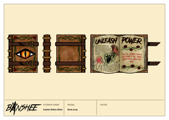
Then, I cleaned up the vines, doodled a few scratchy drawings to fill the space between text and added a faded pentagram behind the inscription. And coloured the now unfastened straps.
Overall I am so pleased with my final result. I think gathering all of that research and iterating until I was completely satisfied has made this design feel really polished. I especially love the colour palette I ended up using- it has a warmth that I can see Mary finding enticing but it also has deep, blood reds and blacks, indicating its sinister power. I’m not sure where I would improve this, maybe the leather of the book looks a little bit blurry but I don’t think this is too much of an issue. I’ll be really interested to see what critique I receive in the next tutorial.
Next, I want to try and achieve this same level of polish with the pub sign- so I’ll gather loads of images for reference to start with.
0 notes