#bydpx
Explore tagged Tumblr posts
Photo

Coconut Crazy Catgirl! [Rhapsody]
Patreon | Twitter | Tumblr | Pixiv | Pawoo | Picarto | Personal Gallery Hi-res version available on Patreon!
There's a cat stuck in a really tall tree! Self Critique: my efforts to foreshorten Rhapsody's left leg (the one to our right) didn't quite go the way I had planned. The bra top's design might look strange. I design her new top with an over the shoulder strap, but didn't think the design all the way through when it came to the under-arm area and got woefully confused. After three long years, Rhapsody has finally returned! And she's sporting a slightly new look. Her hair has been given a makeover and is no longer pointy. Her bangs have also been changed. I's now very wavy and silky. Her ears are now white to make the cat parts of her arms and legs. Her tail is now extra fluffy, and now has a bow with a bell tied at the end of it. The three dots that were on her face (which was a holdover from when she had whiskers) has now been turned into freckles (which is also on her shoulder too). Here's the old 2015 pic for comparison. And, for the first time ever, she now has... clothes! But fear not, she still has her classic nude version as well. If you're watching the clothed version of this, the clothing is based on her chibi version's outfit. She now has an shoulder straps on her bra, and the ragged skirt she has is now a transparent silk one. And as a standard under it, she has a thong. Keep in mind, this is not her summer swimsuit. This is her normal outfit.
This whole pic is actually one big homage to a pin-up pic I came across. The pic in question is by pin-up artist Gil Elvgren and depicts a lady climbing up a tree collecting a coconut. Whenever I think of Summer, my mind often goes back to back to old pin-up art from back then. While I'll never be able to match the mastery of those pics (especially from that of Elvgren), I still wanted to give something like it a shot and put my own spin on it. Plus it was a perfect scenario to put Rhapsody in since she's, well, a catgirl. Here's the pic in question. One thing I wanted to add was the beach in the back. This was due to this and a couple other pics I'm working on being connected in some way. The other two pics are of Chelsí and Belinda together not too far off, and Xiuying is at the bottom of this large tree waiting to Rhapsody to come down with the coconut. I also wanted to try my hand at a real beach scene again (not counting the Moira pic I did earlier this season). Last time was when I drew Falcon and Rouge together, as well as the Puerto Rican Day pic. This was back in 2015. I was also still using GIMP at the time. Overall, this came out pretty good. And I'm definitely sticking with this new design of Rhapsody. Done on Clip Studio Paint Pro. Intuos4 Tablet used. Painting by Gil Elvgren referenced. Body-chan model traced for schematic skeleton, then drawn freehand the rest of the way. Rhapsody is © DeadPhoenX. --------------------------------------------------- Want a hi-res version of this pic? Or maybe a break down on how this was done. Support me on Patreon and you'll gain access to all those, and then some! Hi-res version available on Patreon! https://www.patreon.com/artofdpx --------------------------------------------------- Social Media and Other Galleries Twitter: twitter.com/ArtOfDPX Pawoo: https://pawoo.net/@DeadPhoenX Pixiv: https://www.pixiv.net/member.php?id=9692031 Tumblr: https://deadphoenx.tumblr.com/ Personal Gallery: artofdpx.blog.fc2.com/
7 notes
·
View notes
Photo

Moira's Vacation [Request Raffle Winner]
Patreon | Twitter | Tumblr | Pixiv | Pawoo | Picarto | Personal Gallery Hi-res version available on Patreon!
"You got some active eyes hon. How about making yourself useful and helping me with my sunscreen." Self Critique: I should've maybe flipped her bangs into her face to compliment the rest of her hair going into her face. Right now it just looks like the shape of her head from the cheek to the chin is very narrow, when it's really her hair covering her face. Here she is, 9b8ll's OC Moira. This pic was the winner of the 600 Watcher Request raffle. There wasn't much info beyond showing me the character, so all decisions were up to my discretion. I settled on drawing her in the same bikini design from the reference photo, but also adding a few string ties for the bikini, as well as a transparent skirt. I also decided to add a flower to her head as well. You can pretty much tell this was gonna be summer themed huh? So I pretty much ran with it. I also took this chance to try doing more toned body, heavily referencing the human body figure over on Posemaniacs. Might've made the body a little too long, but it's a step in the right direction I feel.
The background took a bit to conceptualize. But I figured a cutout of Moira with a sunny beach background would do the trick. Kinda had the white and blue idea from the cover of Anri's Timely album, which contains the song “Windy Summer”. I was hoping to just draw an ocean, some sand, and the sky. But something in me didn't want to settle on that. I wanted to do some buildings instead, like a resort. But I really wasn't feeling drawing some buildings. That's when I checked Clip Studio Paint's materials to see if there was a building in there. Lucky for me, there was an entire infinite skyline! So I plopped that baby down, drew the sand and sky, and applied the necessary filters. This came out much better than I expected! Done on Clip Studio Paint. Intuos4 Tablet used. Model referenced. Moira is (c) 9b8ll. https://www.deviantart.com/9b8ll/ --------------------------------------------------- Want a hi-res version of this pic? Or maybe a break down on how this was done. Support me on Patreon and you'll gain access to all those, and then some! Hi-res version available on Patreon! https://www.patreon.com/artofdpx --------------------------------------------------- Social Media and Other Galleries Twitter: twitter.com/ArtOfDPX Pawoo: https://pawoo.net/@DeadPhoenX Pixiv: https://www.pixiv.net/member.php?id=9692031 Tumblr: https://deadphoenx.tumblr.com/ Personal Gallery: artofdpx.blog.fc2.com/
7 notes
·
View notes
Photo

Dumplings or Steamed Buns? [Shampoo - Ranma 1/2]
Patreon | Twitter | Tumblr | Pixiv | Pawoo | Picarto | Personal Gallery Hi-res version available on Patreon!
“I bring you big lunch Ranma!” Self Critique: The perspective of the table is a pretty jank compared to the floorboards. I should've bent her foot downwards instead of keeping them straightened out like that (She was previously gonna be right on the floor instead of on a cushion). You can go ahead and blame Artzie Music for this. Last year heard a song he posted and in the accompanying video he put up, there was Shampoo from Ranma ½. Now, I've never seen the show (that is until recently when I saw an OVA thanks to my bud Sutorippu). But I do know there's fans of her (and the show in general). I had intended to draw her and actually announced it. But I ended up forgetting about it. That is, until I recently saw another vid Artzie had featuring Shampoo some time later thanks to Youtube Recommendations, and again I was reminded to draw her. This time she got added to the list.
The pose was actually a salvaged one. The initial schematic sketch was absolutely awful, and I wasn't sure if I wanted to keep the pose. However I redrew the schematic again, this time on the computer and with a clearer head. I still had my reservations, but sure enough things started to take shape once I finished the 1st sketch phase. When it came to designing Shampoo's qipao, I was ready to make it based on the one from the anime. But then I spotted the one from the manga, and it looked A LOT nicer than the anime. The same applied to her hair accessories. So I decided to do a mix of the two. She would keep the hair accessories from the manga, the qipao design from the anime, but the qipao pattern from the manga. There were a few extra things I added too, like the two bracelets, an anklet, and a couple more accessories on the other variants to this. The background was also planned to be on the simpler side, with a plain background with some Chinese motifs and the panda from the show in the background. After watching that OVA, I settled on just putting her inside her house. However I had no idea just how detailed I would end up making this! I took this chance to really start putting to the test using the Watercolor Brush for shading, as well as the “Selection from Layer” command, which works much better than the magic wand ever could in Clip Studio Paint. I think what I'm most proud of here are the food and the floorboards. The food I shaded in with one of the more rougher brushes give the dumplings and steamed buns that textured look. The floorboards I used a standard Smooth Watercolor brush. But something I did for a commission a couple of weeks ago helped me to better render tiles. So I figured I could use this same technique on wood floors. Even better, I can fudge it a little bit to give it that man-made look (like that part under the table there). When everything I done, I wondered if I should add dust particles and steam from the food. But I think it's best I left it as is. Done on Clip Studio Paint Pro. Intuos4 Tablet used. Body-chan model traced for schematic skeleton, then drawn freehand the rest of the way. Shampoo and Ranma ½ is (c) Rumiko Takahashi. --------------------------------------------------- Want a hi-res version of this pic? Or maybe a break down on how this was done. Support me on Patreon and you'll gain access to all those, and then some! Hi-res version available on Patreon!
https://www.patreon.com/artofdpx
--------------------------------------------------- Social Media and Other Galleries Twitter: twitter.com/ArtOfDPX Pawoo: https://pawoo.net/@DeadPhoenX Pixiv: https://www.pixiv.net/member.php?id=9692031 Tumblr: https://deadphoenx.tumblr.com/ Personal Gallery: artofdpx.blog.fc2.com/ ------------------------------------------------------ New Patrons from the Month of May: DagobahResident and pixytce. Many, many thanks for your patronage!
3 notes
·
View notes
Photo

[Commission] Stephanie Morgan Anderson
Patreon | Twitter | Tumblr | Pixiv | Pawoo | Picarto | Personal Gallery Check Here For Commission Info
2nd furry pic, this time its a commission! Self Critique: both hands could've been drawn better. Once again I dabble into doing furry artwork. This was started around the same time as Peg Pete, so this actually took quite a while to get back to due to other artwork. I was given the option to choose an OC from Julius and Friends roster. I was looking to do something a little different from my usual workflow. So I picked this OC, named Stephanie Morgan Anderson.
Julius wanted a pose that was tough and sassy, and gave me an example. I was able to find a pose very close to it through my pose book and got to work on it. I was also commissioned to do a nude version of this as well. So I also had to take into account what exactly would be removed. I guess I'll take this opportunity to explain how I've been handling nude variants lately. Before, I used to have a boat-load of variants for different states of undress. This was most apparent for my Wendy pic from 2017. This proved to be a problem as this would increase the workload by a lot for just a single pic, not to mention feel very redundant. The last remnant of this was Kurokishi, which was done last year, but fully completed this year. So after her completion, I made the decision to reduce how many undressing variants I would do. So this basically meant that, for example, if a lady was wearing stockings, she would wear them for each variant. Same applies for shoes, gloves, or any other bit of clothing that would be redundant to remove. So going back to Anderson, the nude variant would have her still wearing her stockings. I decided to give her shoes since I wasn't quite sure if to draw the paws. From what other people have done, it was tough to gauge what she had. So I settled on shoes. I did have to make a garter from scratch since no one else did them (plus you can see the clip under the poofy pants from other artists' rendition, suggesting that he had some on). One part I knew would be interesting to do was any part that had many color transitions, like the stockings and tail. I started changing up my filter shading method. After I finished the shade layers for the base color, I would copy those layers up to the transitioning colors, and pass them through a filter. Before this would be where I would end it. But now I've begun diving into the Hue Saturation setting and shifting the color to one that fits all colors. I use to drop the saturation to a grayscale in dire circumstances. But now I try my best to keep a color in there that works for the filter chosen. This ended up working quite well for the stockings, tail, and hair ribbons as they don't look too de-saturated from grayscale filtering Side note: I was gonna do a grassy mound for her to stand on, similar to what one of the other artists did. After I completed it, it looked a little too busy. It made for nice experimentation, but overall just didn't work for this pic. So I dropped it in favor of what you see now. Overall this came out quite well. Done on Clip Studio Paint. Intuos4 Tablet used. Model pose referenced. Stephanie Morgan Anderson is (c) Julius and Friends. --------------------------------------------------- Want to have a pic like this drawn for you? Check out my Commissions page for more info!
http://artofdpx.blog.fc2.com/blog-entry-6.html
--------------------------------------------------- Social Media and Other Galleries Twitter: twitter.com/ArtOfDPX Pawoo: https://pawoo.net/@DeadPhoenX Pixiv: https://www.pixiv.net/member.php?id=9692031 Tumblr: https://deadphoenx.tumblr.com/ Personal Gallery: artofdpx.blog.fc2.com/ ------------------------------------------------------
1 note
·
View note
Photo

Ready To Protect! [Gotta Protectors - Amazon]
Patreon | Twitter | Tumblr | Pixiv | Pawoo | Picarto | Personal Gallery Hi-res version available on Patreon!
Gotta Protectors, go!! I guess all that running paid off!
Self Critique: Kinda wish I added more detail to the hand holding the spear. Also, her face miiiight look a little odd. She was drawn roughly around the facial overall period with all of my pics some time in early Summer. Either way, the face it a bit off. Another one done from the backlog! Meet the Amazon from Ancient's 3DS game Gotta Protectors (JP name みんなでまもって騎士, or "Protect Me Knight"). How I came about doing this was pretty funny. I saw gameplay of the game, and knew that I wanted to draw the Amazon. I just didn't know when. Then Ancient's Japanese Twitter wondered who in the game was the "Suggestive Themes" offender. Then I stepped in. You can see the exchange on Twitter, it's pretty hilarious: (https://twitter.com/AncientGames_JP/status/800870427727802368). And so for almost a year (off by a day actually), I've been teasing the pic to Ancient's Twitter, and each time they were anticipating it. Then Amazon's Running Diet came out. At that point, I knew I had to hurry up! And finally, it's done! This was actually going to be a tongue-in-cheek joke pic with the Amazon posing while an explosion went off in the background as her comrades tried their best to protect Princess Lola. However those ideas began to die down the more I realized how much more detail I'd have to add to make that happen. Plus the workload of other pics began to pile on. As time went on, I settled on a more calmer setting. Lucky for me, Amazon's Running Diet became a thing. I had already finished the Amazon's shading by the time the game was announced. So thematically, I repurposed the pic to have it be the Amazon showing off her new hot body after she finishes her Running Diet. The pose was one of the earliest ones I did using my old Body-chan model, and required a lot of tinkering to get right. When it came to drawing the Amazon, there weren't that many references to go by, and both the promo art and the in-game art had slight differences in her clothing, and especially her hair. So I based most of her design on the promo art. The background went through a few changes. Initially, the castle was much further back as there was supposed to be an explosion with her comrades flying out of it with them pleading to the Amazon to "stop posing and help us!". When the theme was changed, the castle was moved closer. It began looking off scale when I started shading everything in. So I moved it even closer to where it is now. Also for the background, I experimented more with the oil brush (as opposed to my Airbrush/Smudge combo), and was able to get in more details using a single layer (as opposed to using 5). It did take slightly longer with some elements, like the boulder and the barricade, but I'm certain with time I should get faster the more I use it. The biggest hurdles were the tree bark and the castle. I tried doing the individual bark lines, referencing both real life photos and paintings from George Kamitani with trees in them, but it wasn't working out. So I reverted back to what I did with Cala Maria, but with more refinement. The castle I tried to paint the individual bricks, but it was tedious and too numerous. So I created a rough brick pattern in a separate canvas and imported it over to the castle. Then from there I shaded in in the individual bricks where needed. For the shingles of the castle, I actually brought in the Fish Scale Material from Cala Maria and painted each scale to create the shingle pattern. Looks like that thing's gonna come in handy quite often! Done on Clip Studio Paint Pro. Intuos4 Tablet used. Body-chan model traced for schematic skeleton, then drawn the rest of the way. Amazon and Gotta Protectors are (c) Ancient Games (Hope ya like the pic guys!)
Want a hi-res version of this pic? Or maybe a break down on how this was done. Support me on Patreon and you'll gain access to all those, and then some! Hi-res version available on Patreon! Twitter: twitter.com/ArtOfDPX Pawoo: pawoo.net/web/accounts/9125 Pixiv: www.pixiv.net/member.php?id=96… Personal Gallery: artofdpx.blog.fc2.com/
7 notes
·
View notes
Photo


SPECIAL CHRISTMAS PREVIEW!
In the spirit of Christmas, here's a special preview of these two lovely ladies (aka my postergirls). It’s the Lady of Lights, Chelsí Pleinair, and The Fearless* Belinda Cauldron. They're not done yet as this is an all encompassing pic. Planning to get this done either before or very close to after New Years. Well then, Merry Christmas everyone!
2 notes
·
View notes
Photo


Round ‘n’ Round The 109 [Mew - Jet Set Radio]
Patreon | Twitter | Tumblr | Pixiv | Pawoo | Picarto | Personal Gallery
Hi-res version available on Patreon!
ROCK THAT, ROCK THAT.... ROCK THAT SHIT HOMIE!
Self Critique: The wheels on the skates might be a little crooked. The perspective of them is also kinda messed up. The eye to out right could be moved inward a bit. This was slightly before I started really fixing faces, so now these are more noticeable. And here's the end result of hangin' with the Jet Set Radio Live community! After hangin' out with them for a while and showing my artwork (especially my Twintelle pic), I was in something of a Jet Set Radio mood. So I tried to think of which character to draw. At first I was thinking of drawing Gum, but she kinda already has a lot of fanart. So I moved over to one of the best girls in the game. Out of everyone early in the game, she was the only character that could hold 20 cans, which made my romp through Tokyo-to a bit easier since I didn't have to stop and hunt for cans as often. Anyway, I hit a dilemma right away as I had no idea what kind of outfit Mew was wearing, if it was a dress or some kind of one-piece with fur on the end. The official art didn't help, and neither did the in-game model. Even the community was divided, with different artists interpreting what it was exactly. Even the katakana on her dress was confusing as it originally say ビス on it (which seems to be her original Japanese name), but fanartists, and eventually Sega, put ミウ on it instead. So I settled on just doing my thing. I would replicate the katakana decision on the bikini version, putting a character on each boob. I wanted the pose to be very dynamic, matching the movement of the game. So the pose was achieved using the old Body-chan model and using the perspective tool to bring the legs closer to the viewer. To make sure things would be placed accordingly, I had a sketch of the rail always present, and always made sure that the legs would be on the rail in some way if I move them anywhere. For the background, From the outset I wanted to make her grind a rail around a popular location in Tokyo. And what better place than the Shibuya 109 building. Here's the catch: there's no rail there! At all! So I thought about changing the location to a building that had some kind of grindable surface. But I couldn't stop thinking about the 109 building. So you can just pretend that it's under some kind of renovation and Mew's causing a ruckus in the name of the GGs! Another thing I noticed was that the other buildings around the 109 are the same height, so I took some liberties and made those shorter to give a sense of height to Mew's crazy actions. Plus, who didn't love going around that one building Benten-cho (y'know, the one that's lined with cans)? Later in the pic, I decided to add some taller buildings in the back since all the buildings were the same height and making the landscape look rather flat. So used the same technique I did on Twintelle's background when I did the buildings there too. The billboards are actually references to the JSRL community, and there's even a little cameo from JSRL itself... if you look hard enough ;p. With that said, many thanks to the JSRL community for welcoming me! Maybe next time I'll give Gum a shot (or maybe even Piranha!). If ya'll wanna hang out with us rudies and listen to good music, check us over at jetsetradio.live. Done on Clip Studio Paint. Intuos4 Tablet used. Body-Chan model traced for schematic skeleton, then draw the rest of the way. Mew and Jet Set Radio are (c) Sega. .............................................. Want a hi-res version of this pic? Or maybe a break down on how this was done. Support me on Patreon and you'll gain access to all those, and then some! Hi-res version available on Patreon! Twitter: twitter.com/ArtOfDPX Pawoo: pawoo.net/web/accounts/9125 Pixiv: www.pixiv.net/member.php?id=96… Personal Gallery: artofdpx.blog.fc2.com/
#Jet Set Radio#Mew#Sega#Dreamcast#fanart#bydpx#JSR#striped stockings#stockings#bikini#rollerskates#ジェットセットラジオ
4 notes
·
View notes
Photo

Your Friend in Japan! [J-List My Style Contest Entry]
Patreon | Twitter | Tumblr | Pixiv | Pawoo | Picarto | Personal Gallery
They have a lot of useful products from Japan!
Self-Critique: The tip of the shoe on the floor could've been executed better. Last year J-List held a contest to draw their mascot Megumi in your own style. As much as I wanted to participate, other pics, plus still learning a new program (Clip Studio Paint) put off those plans. But this year, J-List is running the contest again. And as I declared on Twitter, I was gonna enter. So the idea here was to pick a fun and energetic pose for Megumi. And what better place to get a pose than from my first purchase from J-List: The Sexual Nude Pose Book! Of course, I was gonna pick the more normal poses from the beginning of the book and not the risque ones. There were a lot of peace signs and the "muscle flex" arm poses for Megumi, but I wanted one that was more of a hyper-energetic greeting of the sort, like an "いらしゃいませ! Check out our products!" gesture. And so the pose stuck! The shading was pretty much par for the course. As first I wasn't thinking of adding much skin-peeking though the stockings, leaving it to the absolute territory (zettai-ryouikki in other words). But I decided to do it for the lower half of the legs too. I based the products I chose to display on what's most popular on J-List, plus products I've bought from them. First was the chocolates and candy. While I personally haven't bought chocolates from J-List, I have eaten some of them before -- chief among them being the Pocky, きのこの山 (Mushroom Mountain), and the Hi-Chew gummy candy. The Kit-Kats from Japan are very much sought after due to the variety of flavors available only in Japan (like green tea and strawberry). The cat paws are the little squeaky toys that I bought as Christmas gifts for family and friends last year. I knew J-List sold otaku clothing, so I picked several to display, which include the sailor outfit and skirt, the gym bloomers, and glasses. The Pose Book there is a replica of the exact one I bought from J-list (and that Megumi's pose comes from). The Body-chan box I decided to put Belinda on as I wasn't sure if to try replicating the art on the original box or not (particuarly of the Kentaro Yabuki edition). The calendars J-List sells come in a variety of themes, whether they be locales, animals, anime, and sexy ladies (mostly JAVs). So I picked cats, locals, and ladies. On that last one, I decided to make a nod to one of J-List recent hires, Bunny Ayumi (she's a cool lady that you should follow on Twitter!). J-List is also known for sellign adult products as well. But since DeviantArt has a rule against depicting adult products (like their onhaholes), I decided to leave them out since I want to put this up on my DA gallery as well. Well guys, wish me luck! This is my offical entry into J-List contest! Done on Clip Studio Paint Pro. Early sketches done on Autodesk Sketchbook. Intuos4 Tablet used. Early sketches done on Galaxy Tab A with S-pen. Model referenced for pose.Megumi (c) J-list. Products displayed (c) respective owners.
Patreon: https://www.patreon.com/artofdpx Twitter: twitter.com/ArtOfDPX Pawoo: pawoo.net/web/accounts/9125 Pixiv: www.pixiv.net/member.php?id=96… Personal Gallery: artofdpx.blog.fc2.com/
1 note
·
View note
Photo

Best Legs In Kattelox
(Below is copy pasted from DeviantArt, first uploaded on February 4th, 2015) (also uploaded to Pixiv as アメリア「ロックマンDASH」, uploaded on February 5, 2015) The Mega Man Legends spree continues, this time with a different mayor. Mayor Amelia of Kattleox Island.
Self Critique: The perspective between her and the office is slightly off as the bottom of her chair ends facing forward instead of slightly down like the rest of anything in that specific part of the room. On the hand holding the phone, her pinky and ring finger still doesn't sit well with me. Design-wise, the desk doesn't exactly match how it looks in the game. I couldn't find many pics of how the desk looks from the side and behind, and I really couldn't be assed to power MML on to look at the desk. I was only about to find the front view and, around the end of the game, an obscured behind view on Youtube. For this pic, It was all about perspectives. I wanted to make this more of a commanding picture with the viewer almost groveling at Amelia's feet. During the planning stages, I wanted to make the background look like it was being shot with a bubble lens. Coupled with the not-so=curved desk, those attempts failed. So I settled with just a normal, slightly from the bottom perspective. With Amelia herself, I tried a little bit of foreshortening by making her crossed leg become bigger as it came closer to the viewer. I think I'll need to practive this a little more as I wanted it to get closer but didn't have the skill to do it yet. Done on GIMP 2.8. Intuos4 Tablet used. Amelia, the map of Kattelox Island, and Mega Man Legends are © Capcom.
#mega man#megaman#mega man legends#megaman legends#capcom#fanart#rockman#rockman dash#pantyhose#legs#amelia#ロックマン DASH#ロックマン#パンスト#足#アメリア#bydpx
6 notes
·
View notes
Photo

Surprise! The Fearless* Belinda Cauldron from Monday was actually a redraw of a pic I did way back then. And judging by the way I drew her legs, this was more before I drew Xiuying and learned how to better drew legs Either way, just like Xiuying and Peach Heaven before this, it’s still satisfying to see the improvements side by side like this.
If you want to see the full pic... Clothed and Lingerie Variants NSFW Variants
Patreon | Twitter | Tumblr | Pixiv | Pawoo | Picarto | Personal Gallery
2 notes
·
View notes
Photo


Why's It So Small? Did You Freeze It? [Smug Wendy] (Clothed Variants)
(First uploaded to my personal gallery May 25th, 2017) (Due to limits on how many images I can upload at once, this post is being split into two)
She's talking about burgers guys. Honest! Self Critique: On the variants showing the feet, I should've elongated the planted foot just a tad bit more. Clavical bone is a bit too prominent. One of the eyes is not smug (i.e. half closed) enough. After receiving a critique about the eyes being too small, I increased them. To be honest though, I think I made them too big, and something closer to its original size might've sufficed. I should bring up other critiques I've received in the making of this pic. During the sketch phase, I received a critique from one of my Twitter followers, Teruaki Murakami, about needing to do something with the face. With that in mind, I fixed up a few things here and there an increased the sizes of a few facial features. Bucking the trend of doing the legs first, I instead did the face first. One thing I always noticed but never did anything about was how flat the faces I drew looked whenever they were facing forward, at the viewer. I started shading the eyes a little bit back on the Harriette Easter 2017 pic. But now I did more shading around the eyes, particularly around the brows of the eyes. When I showed a preview of the completed face, the follower I mentioned earlier was none too kind about the results. So I rushed back to the WIP and drafted up several new noses, as well when to the chats of Jet Set Radio Live (cool people) to get feedback on the rest of the face. The end result was a bigger mouth, bigger eyes, and "Version 5" of the nose being chosen. There's maybe a few things I probably shouldn't have listened to (the eyes being very big at one point), but I'd like to thank everyone for the help! I hope to take what I learned here to future pics coming up.
Now then, onto the pose. I got it the pose from the Sexual Nude Pose Book and from there when to work. I repeated what I did back on STB-Chan and her legs and used the Free Transform tool on the raised leg to bring it closer to the viewer, then I drew in the details accordingly. I was wondering to myself how exactly I should handle all the stripes on Wendy here. I'm already used to particular method on Chelsí and her striped stockings. But hers are black and white, and Wendy's are red and white. In the end, the Chelsí method worked. But for the outfit, that one was different. On the base of the outfit, I shaded it in like normal. But for the stripes, I shaded them in separately. I realized by the end of it though that I could've just copied the shade layer of the outfit's base, de-saturated the color to gray, move it above the Stripes layer, Clip it down to that layer, and used a filter. But at least I know for next time! The environment allow me to flex a bit more muscle on certain things and continue doing my usual thing. There were some new things I did though. For the rod of the table, I shaded it in like normal. But then I took the reference photo I had for the restaurant location, and made two copies for each table. I then scrunched them down and used mesh transform to warp them to the curvature of the rods. And finally, I filtered them through. You can see how I did it over on Twitter. The food I'm probably the most proud of pulling off, in particular the burgers. I was ready to do two of the same burger, but someone on Jet Set Radio Live wondered if I'd do the Baconator. I didn't think about that. So I did one normal Wendy's burger, and one Baconator. The shading of them was pretty cool as I used a the Droplet airbush for the texture, the Spray airbrush for the lettuce, the Tone Scrape airbrush for the sesame seed on the regular burger. I also blurred up anything that would sit behind the glass panels.
And with that said, thanks again to everyone for their help!
Done on Clip Studio Paint. Intuos4 Tablet used. Wendy's mascot and logo in the back is the (c) of Wendy's.
1 note
·
View note
Photo

射干玉・アイリスター [Iristar Nubatama]
(First uploaded to my personal gallery December 31st, 2016)
It’s been a long time since I’ve done a character with this much detail! Self-Critique: The placement of the rockets is quite off. By the time I finally caught on, it was too late to change it. The perspective angle on the gun to our left is also messed up. Same reasoning for not being able to fix it soon enough. So I was browsing Twitter one day, as usual. Then someone had retweeted a gif from someone named RCTR_tw of this rocket-girl he created. It was really well animated and the girl was cute. So I thought I should give it a shot drawing her. I did some concept art first to get a feel for it and put it up on twitter as part of an “Upcoming Previews” set. RCTR liked it a lot and grouped it among other fanart that was drawn of her in a Moments post on Twitter. Much later on he also drew my Big Al (Pilotwings) profile pic that I use on Twitter. So I wanted to make this one look awesome.
I grabbed several frames of the animations he made so that I can reference each angle. There was also a gun concept that he posted that I also used as a reference. And finally, he put up a fully proportioned pic of the girl, as well as her official name, Iristar Nubatama. And so once I got to the shading process, the references were all ready. For posing, I used the Mikoto program for the pose, but I also tried out this other technique I picked up from Proko about gesture drawing, namely about S curves and C curves. I do need more practice with it, but it did help a lot when arranging the parts of the body and outfits. For the background, I tried a different blending brush, Running Color on Fiber, for the nebulas colors. Worked much better than I initially thought. Save for the errors I mentioned in the self-critique, I’m beyond pleased with the results. Hope RCTR likes it! And Happy New Year everyone! Done on Clip Studio Paint. Intuos4 tablet used.
Iristar Nubatama is (c) RCTR_tw. Check out his website for more info on Iristar and the game (that’s in development) that she stars in. http://rcrt.blog.fc2.com/
0 notes
Photo

Joyeuse Saint Valentin
(first uploaded to my personal gallery February 23rd, 2017)
She finally has one this time! Self Critique: Both hands I could've done better, particularly the one with the brush. I wanted to talk about how I'm getting poses lately on another pic with Chelsí, but since this came out first, I’ll do it here instead. So I had gotten another artist model to use as a reference, the S.H. Figuarts Body Chan. However I was contemplating tracing it for the skeleton since I kept seeing Japanese art products suggest it (including Clip Studio Paint ... and that last episode of Golden Boy Kintaro). You can see what I mean on my twitter. I wanted to do this to speed up the process of drawing since I'm notoriously slow at getting new pictures out. One thing I wanted to do to cut out the fat was to at least get the skeleton, and from there I could make any changes I wanted and freehand from there. I presented the question over on my Twitter, with the end result being split down the middle as to whether I should do it (the polls say to NOT do it, but one of my buds EroBotan came in too late but said I should, so it's split). So I gave it a shot, and it worked! I got my skeleton, and I was able to get the exact pose I needed for both the other Chelsí pic and this one. So from now on, if the model's skeleton is traced, I'll make a note of it down below.
Now then, onto the pic in question. Last year the was no Valentine's Day pic. If kinda bummed me out as it was yet another holiday pic I missed out on. But this time I wanted to get something out, and I went into literal crunch time to make this. And thanks to Clip Studio Paint, I can do things a little bit faster than last year. So obviously I wanted to to use Chelsí so that she can redeem herself. And since I wanted to get this out fast, that meant no variants. Thanks to the model, I was able to get a good profile shot of her body, though it's obvious I need more practice. But, in due time. As for the heart in the background, I used Clip Studio's Figure Ruler (I think that's what it was) to create a heart, to which I filled it in. I then used two lace brushes along the ruler to line out the heart. I wanted to use more hearts, but since Chelsí's all about stripes, I stuck with the stripe motif. And since she's French, "Happy Valentine's Day" is also in French. As well as the label of the vanilla whipped cream she's eating with a paintbrush. So Joyeuse Saint Valentin from Chelsí Pleinar... and Finne too if he can hold on long enough.
Done on Clip Studio Paint Pro. Intuos4 Tablet used. Model's skeleton traced, freehanded the rest of the way. Chelsí Pleinair and Finne is (c) DeadPhoenX. Permission not required for non-profit purposes, but credit with link back is needed.
0 notes
Photo
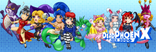
Who Are Those Chibi Characters? [10 Anniversary Special]
So you’re now accustomed to the gallery and all its intricacies. But you’re probably wondering what those Chibi characters are adorning the header (and several other areas, like on Twitter, DeviantArt, Pixiv, and the 10 Anniversary Poster). I’ve already explained a little bit on both DeviantArt and Pixiv where they come from. But now I’ll give a full explanation as to when they were created, what they were associated with, what years they represent, and if they’ll still have any use in any projects or stories I create.
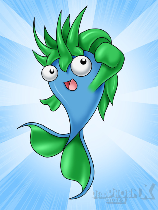
I should probably start with the fish, the odd-man out of the entire group. Finne is my mascot. He technically debuted in 2006 under a different name and part of a fan-game idea. However in 2009, I started drawing him more frequently among my friends and family, acting as something of a calling card whenever I was around and I wanted to leave behind a drawing. He was quick and easy to draw compared to other characters I’ve done. He soon became part of my “DeadPhoenX” logo in 2010. My gaming blog “The Wired Fish” was also named after him and incorporated into the site’s logo. Today, he’s still in almost everything I do. As a matter of fact, since 2015 he’s included as an Easter egg in all original art (not fanart) that I do. Think can you find him? He represents years 2010-2013. Artwork With Finne: He's everywhere!
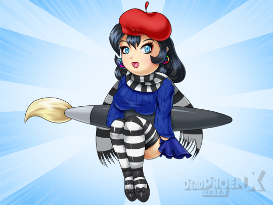
Chelsí is the next one, full name Chelsí Pleinair. Her creation is an interesting case and is something that almost every girl in this group has in common. She was created in 2004 as “Chelsea” and was a schoolgirl with a French Painter theme. Her design was inspired by a line of Lollipop Girls dolls that my sister was collecting. The story she was included in was actually a hentai story I had concepts of. However that went nowhere with the story being scrapped (but the characters being retained for repurposing in other stories). She was then (somewhat subconsciously) repurposed for a medieval fantasy story as a French-themed princess around late 2005. Like before, it too was hentai themed. However that story was scrapped too (with the characters being retained as well). So she was never drawn again until 2015. There was a ribbed sweater craze going on in the ecchi art community, and I was wondering how I could get in on it. Then I remembered having a French painter girl in my repertoire of characters that wore a sweater. So I brought her back with her old design and under a new name spelling, Chelsí, and made her sweater ribbed. Once uploaded, she became my postergirl for everything I do, representing the art side of things. Since she debuted in very late 2015 but had more art in 2016, she represents 2016. Artwork with Chelsí: What Am I Going to Draw Today (2015), No Valentine's Day Pic (2016), I'm Ready To Paint (2016), Chelsí's Summer Fashion (2016), Joyeuse Saint Valentin (2017), Zis Chandail, It'z So Low! [Virgin Killer Sweater] (2017)
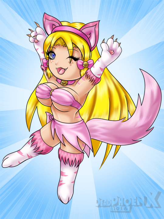
The catgirl, Rhapsody, was actually something of an error in both name and design. Starting with the name, she was actually a short-and-pink-haired catgirl. She debuted with a set of 5 catgirls and was part of a regular story idea I had. You can still find her tucked away in my DeviantArt gallery. All catgirls I’ve ever drawn had musically themed names. Here’s where the error part comes in. I had another catgirl under a different name that has the current white paws, pink stripes, and blonde hair look. She was part of a hentai story idea that saw all the catgirls from the normal story repurposed to here and completely naked. So she was a new addition to the group. When it came time to draw her and Lullaby together on DeviantArt, I realized too late that I accidentally named the new girl Rhapsody. So I pretty much gave her the Street Fighter II treatment. She would stay as Rhapsody while the old one would have whatever name the new girl originally had. She represents her online debut year, 2007. Artwork with Rhapsody: Wanna Play a Game (2007), Purrrfect Valentine's Day (2015)
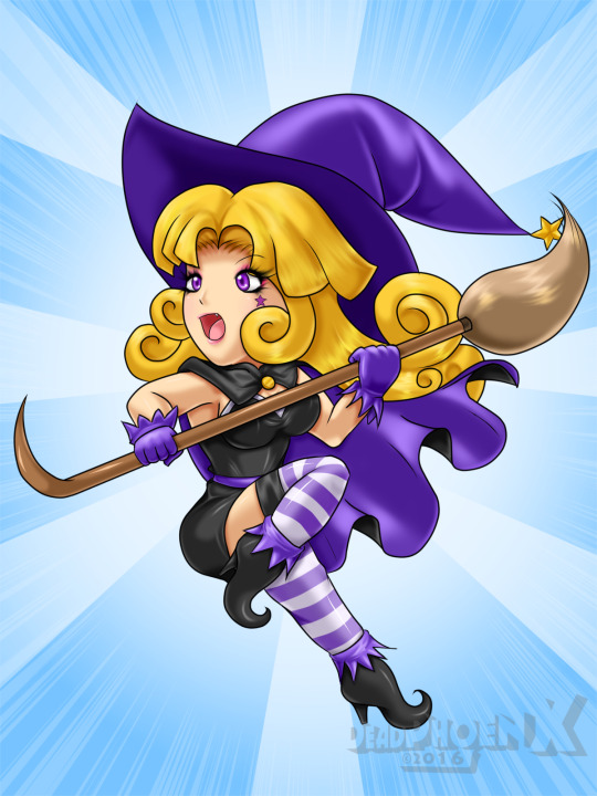
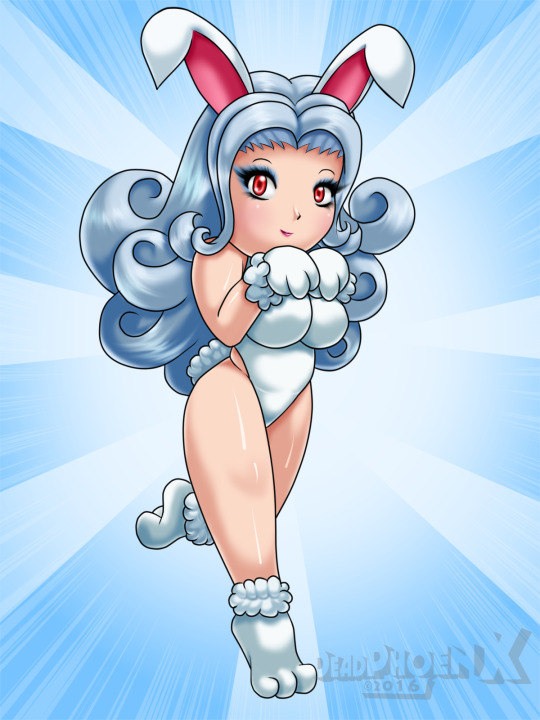
Belinda comes from the second hentai story idea that Chelsí once appeared in. All I could remember was that she was a witch, and that’s about it. Any details about her relevance to the story were all forgotten. In 2015, I wanted to get in on the Halloween art and had the perfect character I could use. So I brought back Belinda from the Scraps ghetto and gave her the full artwork treatment 10 years later (since the story she was in was conceived in 2005). She currently doesn’t have much of a story and is really only made for anything Halloween/spooky themed. Since she made her online debut in 2006, that’s the year she represents. Artwork with Belinda: Belinda's Halloween Rush (2015) Next is Harriette. She came from the same hentai story that Rhapsody came from. Talking more about that story, the theme of it was mythical fantasy-creature girls. Not necessarily monster girls, but things like Mermaids, wood nymphs, fairies, angels, catgirls, etc. Harriette (whose original name was simply Fluffy), was one of only two bunnygirls in that story. She never made her debut online and was never repurposed for any other story. When Easter 2015 was close by, I figured it was time I drew her again. However since Japanese artists and quite a bit of the ecchi/hentai community like it, I decided to make her a bit thicker this time, as well as give her a new name. Her name is actually a pun on “Hare”, which actually gave me a hard time sometimes when I would say her name out loud and trying to squeeze the “Hare” in there. I’ve since given up and just pronounce it like normal. Since someone already has 2015, Harriette’s online debut year, she instead represents 2005, the year before I joined DeviantArt (and having any online presence). Artwork with Harriette: Harriette Easter Surprise (2015), Please... Gimme That Chocolate Carrot (2017)
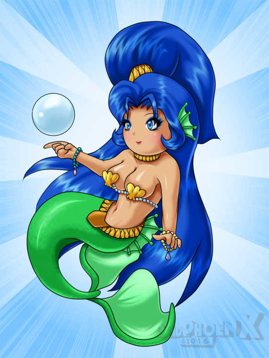
The No-Name Mermaid comes from the same hentai story as Harriette and Rhapsody. She actually had a name back then, however around that time naming things didn’t really work too well. I can’t remember her name right now, but it was probably something simple and dumb. So now she doesn’t have a name. She was paired with another mermaid in that story that I might draw in the future. I wanted to do something water themed in 2015 that would help me flex my background-making muscles at the time. In bringing her back, I changed up her tail fin design a bit, and also made the tied hair more straight instead of making it flow out like big strands. She represents her online debut year, 2015. Maybe she’ll finally have a name before the decade ends! Artwork with the No-Name Mermaid: Sailing Through The Sea (2015)
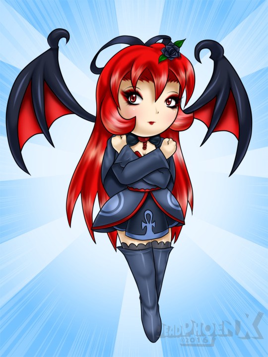
Lola’s origin is actually kinda forgotten. I can’t quite remember if she came from either a hentai story or a different story. Regardless, she ended up getting repurposed for the only story idea to make it to DeviantArt, Devangie’s Fairy Tale. She herself made her debut in 2007 with a light counterpart. However I made the mistake of building up her individual story, as well as others, before building up the world she would inhabit. This is something that I did a lot during my highschool/pre-online days. This would result in a lot of stories getting the axe and the characters shelved or repurposed. This would also include Devangie’s Fairy Tale. That story has been abandoned with all the human characters (except one of them) getting shelved. The fairies that were in that story might get repurposed back into the hentai that they were once in. I currently have plans to repurpose Lola into a normal story, this time without her light half. She represents year 2007. Artwork with Lola: Hell Hath No Fury (2007), Darket of Lolitas (2007)
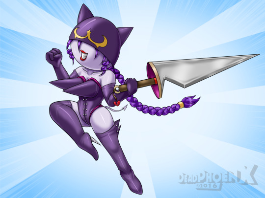
Lady Jess comes from a series of girls I drew in 2009 called the BladeLadies. At the time, I was really into rock and heavy metal, getting a metal poster calendar and got inspired by the music video Ghost Town by the group Shiny Toy Guns. I remember sketching out a more realistic semi-nude Heavy-Metal inspired woman in a small sketchbook I had. Right next to her I drew this tiny puppet like thing with a cartoonish blade, a helmet covering half her head, and very pointy torpedo-tits. I wondered what this would look like if it was drawn larger. So I did that on the next page. I then got the idea to draw more of them with different boob deformations and weapons. The end result was seven of them being made. Also around this time was when I would change programs right in the middle of the series, forcibly getting switched from Picture Publisher 7 to GIMP. This was when my artwork creating skills would improve with better hardware. Lady Jess represents 2009. Artwork with Lady Mimi: Bladeladies - Lady Jess (2009)
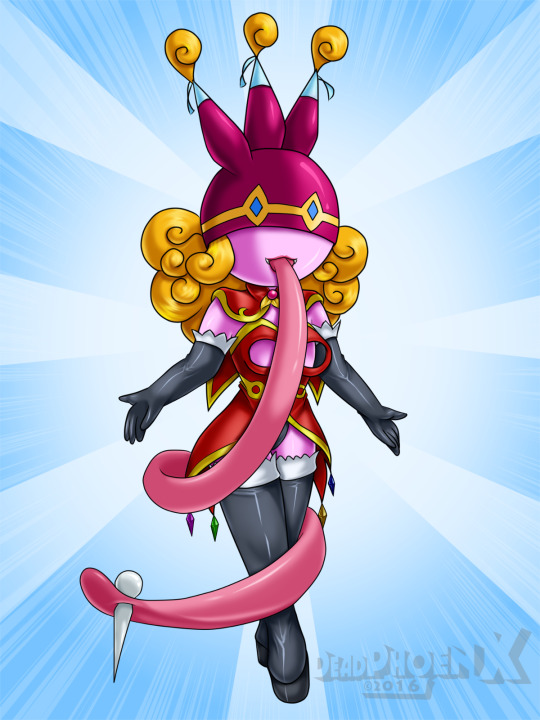
Lady Mimi is my newest creation, making her debut in 2014 with the series BladeLadies 2nd. She was actually conceived soon after the first wave of BladeLadies ended, most likely around 2009/2010. The old theme of BladeLadies 2nd was actually based on gore, building up from the first wave’s theme of rock and heavy metal. I had drawn some BladeLadies concepts, with a few catching on. One of them was Lady Mimi with the giant piecing in her tongue and the tongue length being much shorter than now. At this time however, I had really bad artist block as well as college work eating up a huge chunk of my time. On top of that, I ended up realizing how bad I actually was at drawing gore. Upon my return to making pics on DeviantArt, I decided to bring back the BladeLadies. The theme was switched from gore to a circus, and this some had something of a story unlike the first wave. But it’s very minimal right now so that I can build the world first. Lady Mimi represents 2014. Artwork with Lady Mimi: BladeLadies 2nd (2014).
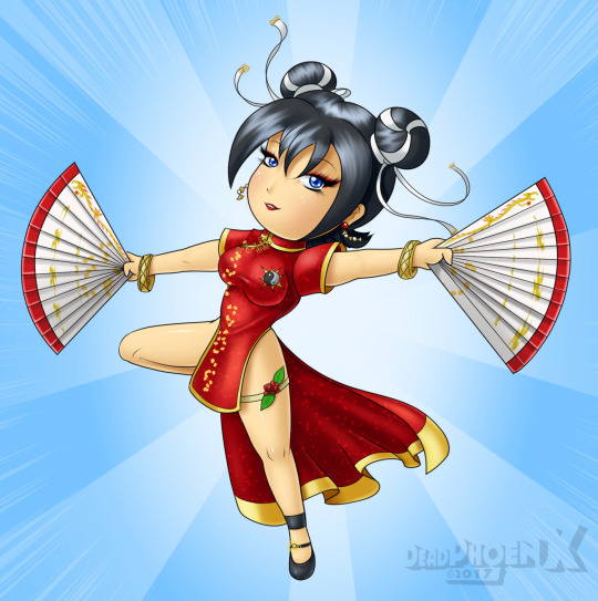
Meet the newest girl to the chibi parade, Xiuying Gushan! Like many of the other girls, Xiuying had her start in a hentai story. And like the others, when that story folded, they were all shelved. Due to my lack of knowledge on the specifics of Chinese and Japanese culture and language back then, Xiuying's original name wasn't even Chinese, but Japanese. I had desires to bring her back for a while, but I didn't find a good time to do it. I finally had a chance during this year's Lunar New Year celebration. The release did something of a snag, but I was able to upload the pic close enough to the Lunar New Year Date to be relevent enough. Currently, Xiuying is being utuilized in a story as high-ranking general. The story details won't be known anytime soon however. Xiuying represent 2017. Artwork with Xiuying: Natsuko Nakahara (2005, old name), Elegant Flower of the Lone Mountain (2017).
0 notes