#but to alternatively outline the highlights and shadows
Explore tagged Tumblr posts
Text
<3
Anyway A+++++++ pic, made my night made my day, I think I wanna adopt him, son...., he's such a son, candy flavoured, trans coloured, cute...., smol...., lives on the edge..., better played with Lunalights give Isis the Fluffals.

#omg I love this so much#the slight papery texture over the piece gives it such a clean and soft watercolour feel#and the coloured outlines which you use for the highlights and shadows is amazing#im impressed by the dedication to not just outline your shading#but to alternatively outline the highlights and shadows#normally people stick to shadows#here (I think because of the combo black lines setting everything apart)#it creates such a beautiful vibe#it makes it feel very hard and glassy and gemmy but also very sweet#its a piece that looks like a lollipop tastes is what im saying#and considering how Sora treats lollipops#that makes complete sense to me#the colour choices for the highlights and shading is so pleasing too#the pink/red/purple used to shade the golds and oranges#the saturated blues on his shirt#the cute lil pink and cyan highlights in his hair#fluffal mouse's cute scarf and giant eyes (thank you for revealing the hearts in his ears#only learned that today) (I also like how saturated the blue on his whites greys and blacks are#it keeps the pic from ever feeling monochrome)#even the shading on his skin is pastel cause of the pink/blue#how is this so sweet and candy#so precious#I dont care if hes a war criminal hes MY war criminal#look at his confident smirk and lackadaisical pose this child fears NOTHING#look at Fluffal mouses giant soulful eyes there are no thoughts#only such a fearless duo could gamble their lives on Toy Vendor every day#the scissors look great#too! (edge imp sabres is seething enviously)#whats the fluffal behind him? it has fluffal eyes but its grey like metal#even the bg and strong black outline to foreground sora are genius
77 notes
·
View notes
Text
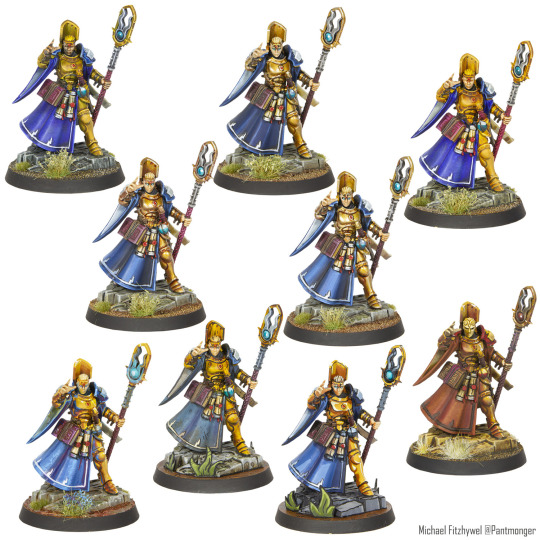
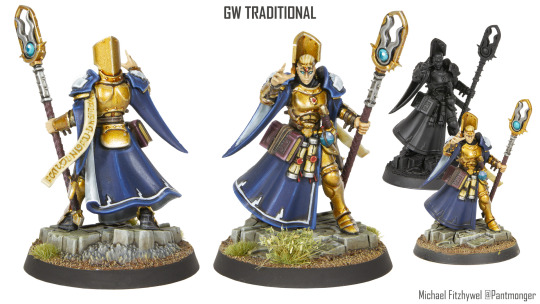
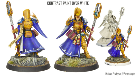
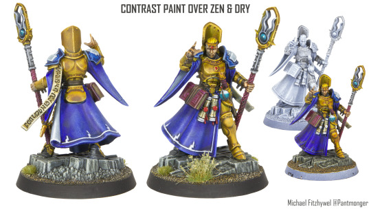
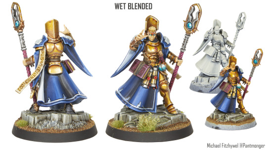
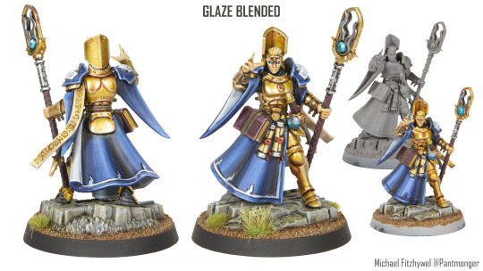
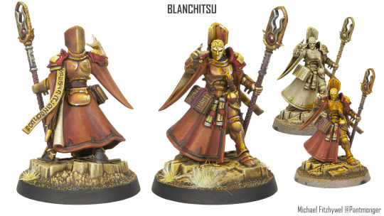
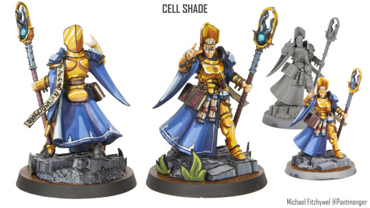
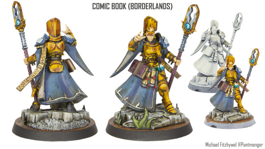
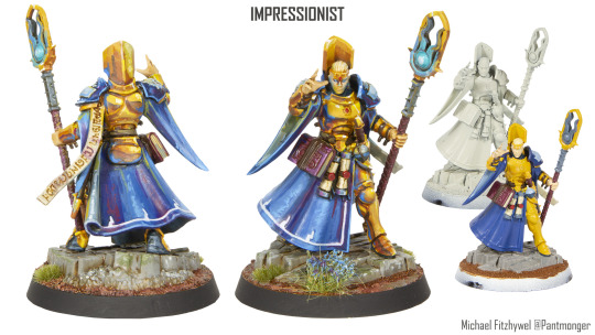
9 Identical models.2 Painted for speed.3 With different approaches to the same end goal.4 Explorations of alternate art styles.52 hours of my slow painting 1 GW Basic. Painted with simple flat colours that all receive a wash. 'Black-line' was added using black for all. Everything received a solid highlight pass. 6.3hrs 2 Contrast Over White: A speed focused method. Single pass contrast paints over off white. Some dry-brush highlights (where possible) and a touch of cherry picked detailing. 2.4hrs 3 Contrast Over Zenithal and Dry-brush: Same as number 2, but with a more complex under paint providing additional details. Has the benefit of giving it a lighting solutions, but that the cost of murk. 2.5hr 4 Wet Blended: A method focused on adding lighting via gradients. The gradients being achieved with wet blending. Faster then glazing, but at the cost of a little less control. Personal fav. 6.5hr 5 Glaze Blended: A method focused on adding lighting via gradients. The gradients being achieved by applying multiple passes of ultra thinned paints. Effective, but time consuming. 8.1hr 6 Blanchitsu: An attempt to mimic the 2d art style of John Blanche one of the defining artists of Warhammer. Lots of sepia and warm tones. Ambient colour and white highlights of untouched paper. 4.5hr 7 Cell Shade: An attempt to recreate an anime esk look. Clean colors with sharp transitions mimicking light and shadows finished off with black ink 'lines' Time consuming and needing a high level of precision. 8.6hr 8 Comic Book (Boarderlands): A dirty, textured style that includes lighting. Low saturation, and defined not only by outline 'inks' but with inks being used to add illustrative detail. Time consuming but not as much as cell shade 6.5hr 9 Impressionist: Trying to channel the traditional media art style. No blacks, bright colours applied in daubs without blending and an exploration of complex colour, ambient and reflections. 6.3hr
96 notes
·
View notes
Text
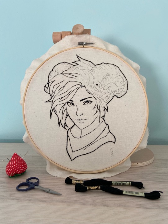
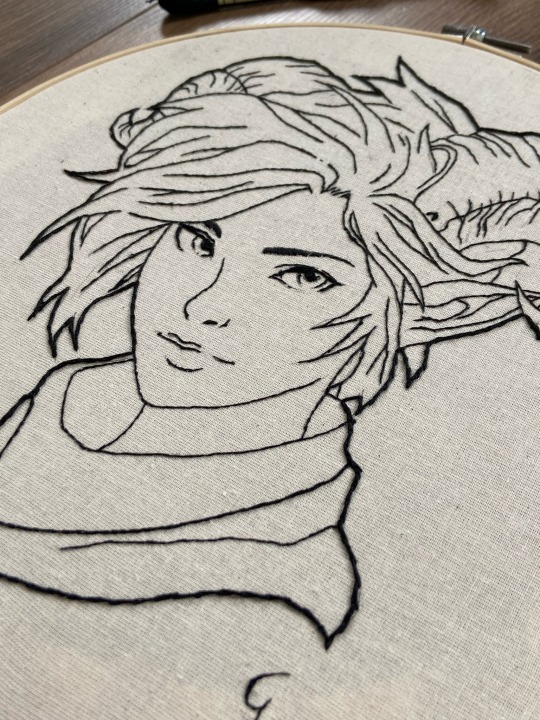
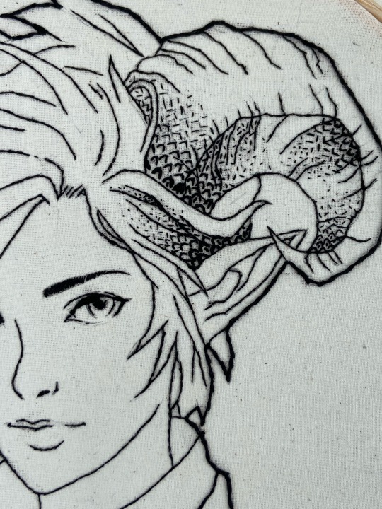
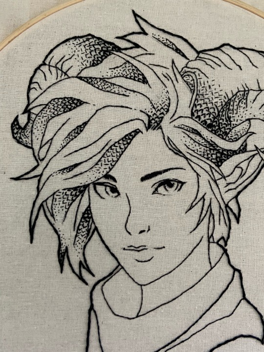
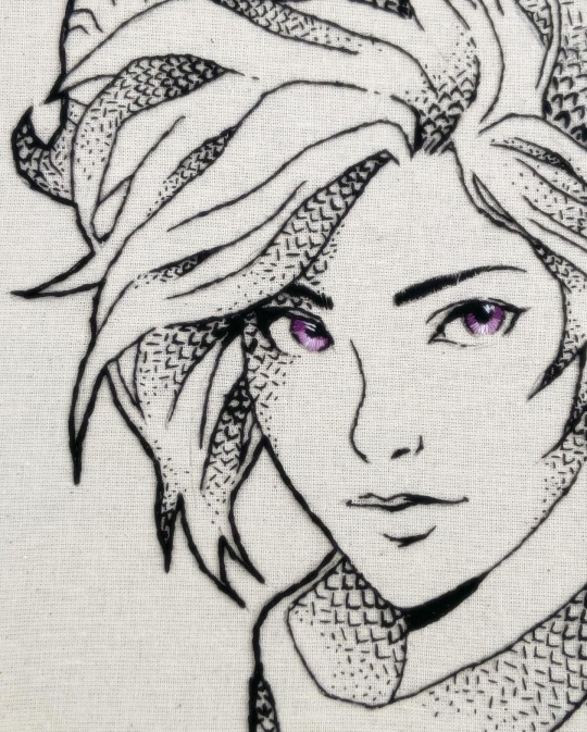
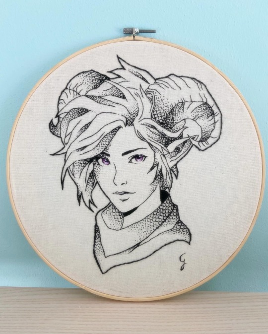
An interesting Challenge: freestyle Blackwork Lady Faun 🌿
Blackwork embroidery, with its elegant and bold outlines, has a rich history dating back to Tudor England. Today, I'm taking you on the journey of creating a freestyle blackwork embroidery featuring a lovely Lady Faun I designed myself!
From Sketch to Stitch
My design process began in Procreate, a well-known app for illustrators and designers. On Procreate I sketched my Fantasy character and drew lineart but I also simulated my stitches to better plan out the ideal blackwork pattern and study light and shadow areas (watch the video below!)
Since I wasn't yet comfortable with counted thread techniques, I opted for freestyle blackwork. This technique gave me the freedom I needed, especially because I planned to use thread painting for the eyes (which required a cotton/linen fabric).
Scales & Shadows: Building Texture
To bring a touch of Fantasy to the design, I chose a simple fly stitch to create a pattern resembling dragon scales. To create shadow effects, I got creative! I used two methods simultaneously:
Varying thread thickness: thickening the lines from 4 strands for the darkest areas to 1 strand for the highlights.
Seed Stitch accents: adding texture and depth with tiny seed stitches in bright areas.
Embroidering, finally 😅
The actual stitching process involved several stages: the initial outer lineart (4 strands), followed by progressively finer inner lines,and finally, the definition of shaded areas with my alternated fly/seed stitch pattern. Ah! Of course I used black thread, n° 310 DMC cotton mouliné ✌🏻
Challenges & Triumphs
This project wasn't without its hurdles! Maintaining precision with freestyle blackwork, especially on a larger format, was a test. Constantly changing thread thickness also added a layer of complexity. However, the end result was a successful experiment with great visual impact! The fly/seed stitch pattern proved to be easy to execute with freestyle and offered a beautiful textural element. Absolutely love the ink/pen sketching effect (with a touch of colour 😛).
In the end, my freestyle blackwork with alternated fly/seed stitches is a fun and versatile technique for beginners and experienced stitchers alike 😉
What do you think about this piece?🖤
#embroidery#blackwork#crafts#handmade#handcrafted#ricamo#thread painting#my art#textilart#portrait#fantasy art#fantasy#original character#character design#procreate art#hand stitching#stitching
9 notes
·
View notes
Text
Shadow(Lost Prince AU)
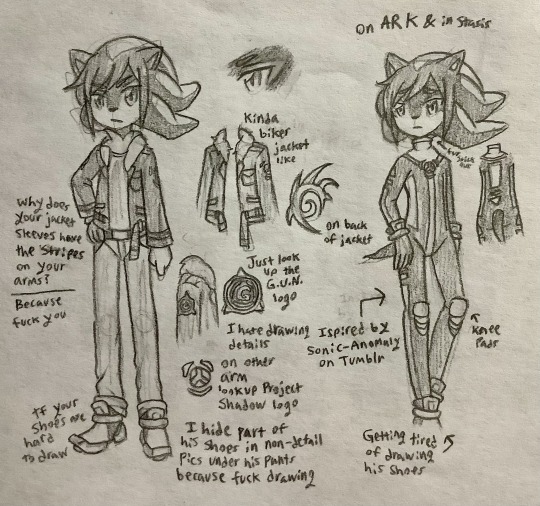
Decided to add Shadow, his outfit changed a lot over time. I made him look like a vampire for some reason in the past. Also as you can see I couldn't draw any of the 3 fucking logos. You can also see that I had issues drawing his shoes in detail… Something tells me I'm not looking forward to drawing him in detail later…
Sonic-Anomaly(her account is gone now) inspired me to give him a body suit or whatever it's called for when he's in the tank/on the Ark. It's kind of better than the alternative as I was remembered he would have likely been in a hospital gown instead if not for this.(Which is funny since there's implications Maria gave him the vampire outfit from an old comic I made on a paper towel in high school) The close up of his eye showing that red highlight took multiple attempts because the eyelid outline got messed up at one point & then kept having to fix it because the eyebrow was to close to the eye lid. I also learned recently that they don't go all the way over the eye lids. -
Shadow was made by Eggman's grandfather to be the ultimate life form & to help him try to save his ill granddaughter. Once a strong but gentle brother figure to Maria he became a bitter loner thanks to Gerald messing with him to get revenge along with seeing the death of his sister/friend Maria as she saved him. He's gotten better with the help of Rouge, Sonic & the others so he's doing his best to live his own life while also working for G.U.N. which has been reformed by Commander Towers(I've seen some fanfics call him that, better than just calling him Commander all the time) & as Rouge's work partner. He's still a little sadned by the past but is working to move forward, he's not alone in this anymore. Shadow is also one of the very few that remember the reboot of the world(Sonic 06) Blaze, Silver & Mephiles being the other known people to remember.
Shadow doesn't want to admit it but he's warmed up to everyone & is on more friendly terms even if he acts a little like a loner still, he's more open to coming to get-togethers than in the past. He's also more open to being around Sonic even if he acts like the other is annoying. Sonic has been doing his best(with help from Knuckles & the others) to help Shadow get to know about stuff on Mobius, still learning but is fitting in mostly.
6 notes
·
View notes
Text
Wasting Beats In This Heart Of Mine
The Last Hours fan fiction. James Herondale x Cordelia Carstairs x Original Character with a side of platonic Matthew Fairchild, served chilled as the winter of London, 1903.
“If you could do it all over again, what would you change?” “Everything.”
How do you say goodbye to the love of your life? What do you do when you can't say goodbye? If you had one more chance, would you risk the entire universe to spend the last hours of its existence with them?
Lila Raftis is lonely. James Herondale is tired. Cordelia Carstairs is missing. Matthew Fairchild is drinking too much. Somehow, they have to trust each other in order to save the world. Every world. Someone has created a tear in reality, and the clocks are counting down until the universe's collapse. Lila must impersonate Cordelia to help James repair this tear and prevent doomsday. Matthew's just trying to stay out of trouble. When Lila falls in love along the way, she must decide which is more important: love or the universe?
or, it's alternate title: A Gentleman's Guide to Conversing with Teasing Young Ladies (with Possible Violent Intentions) of Suspicious Circumstances from an Alternate Dimension Where One Does Not Exist, published in 1904 by James M.H. Herondale.
Read on AO3: https://archiveofourown.org/works/42234207/chapters/106041132
Below are some art pieces I feel fit the vibe of the fanfic (I have done my best to credit. If anyone has an issue, please feel free to let me know and I will act as soon as possible) as well as some quotes.
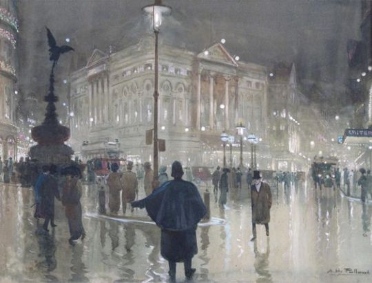
Piccadilly Circus at night, Albert Henry Fullwood (1863-1930)
Image description: a watercolour painting of the location Piccadilly Circus on a wet and grey London night. There are people milling the streets and lamps alight, causing reflections on the pavement. There is a dark shadow of a fountain statue. The buildings in the background are also filled with lights. This is not a modern scene, but of the painter’s view of the space sometime between 1863 and 1930.
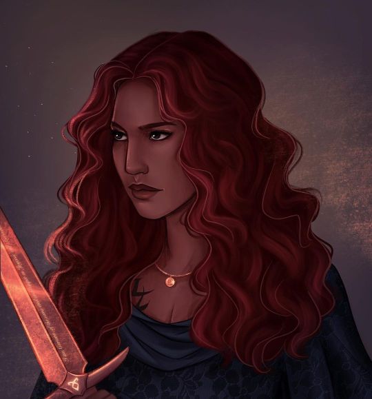
Cordelia Carstairs, cami @skyllowarts (April 2023)
Image description: a stunning art piece of the half-Persian character Cordelia Carstairs from Cassandra Clare’s The Last Hours Shadowhunter series. Cordelia has dark red hair, often associated with rose petals in the books or fire (as you do when describing red hair, apparently) and lovely brown skin. Her dark eyes are focused somewhere in the distance as she holds her legendary sword, Cortana, in front of her. The glow of the sword softly highlights her hair and face. A small globe necklace shines brightly at her collarbones above the neckline of her deep blue dress.
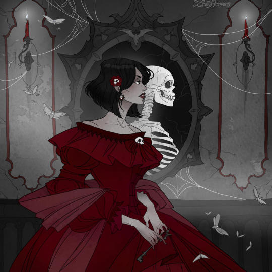
Memento Mori, Iren Horrors (September 2021)
Image description: a pale and dainty woman in a large, almost drowning red dress is walking by a mirror where her only reflection is a skeleton (her skeleton, quite possibly). Grey moths fly all about the room, and spiderwebs hang by the mirror. On either side of the mirror are red candles burning white. The woman is holding a key and looking ahead at something the viewer cannot see. Her dark hair is cut short and it is decorated with a skull-in-a-rose pin, while similar skull decorations adorn her ears and dress.
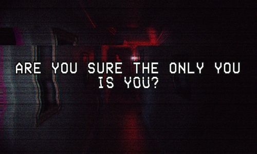
Are you sure the only you is you?, @creature-from-the-mud (unknown)
Image description: distorted film tape of something dark with the white text outlined in black stating: “Are you sure the only you is you?”
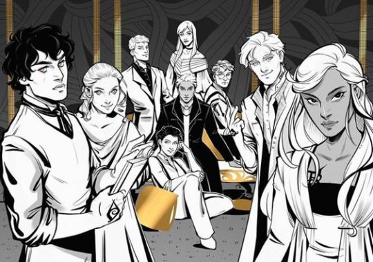
credit unknown.
Image description: a black, white, and gold illustration of the primary The Last Hours characters assembled. Gathered from left to right are James Herondale, Lucie Herondale, Thomas Lightwood, Anna Lightwood, Alastair Carstairs, Grace Blackthorn, Christopher Lightwood, Matthew Fairchild, and Cordelia Carstairs.
#James Herondale#Cordelia Carstairs#Matthew Fairchild#The Last Hours#Chain of Gold#Chain of Iron#Mild Chain of Thorns spoilers#fanfic#fanfiction#james herondale x cordelia carstairs#ao3#romance#dark fantasy#time travel#dimensions#alternate reality#angst#Alastair Carstairs honourable mention#continuing work
3 notes
·
View notes
Text
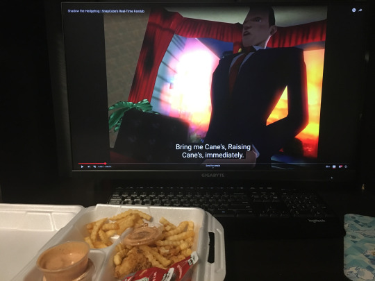
MY RETROSPECTIVE ON THE MOVIE SONIC THE HEDGEHOG 3
On February 7th, I watched the third Sonic Movie with my best friend Mags. We’ve watched the previous 2 together in past years, and make no mistake in that we both kind of thought they sucked, but I just couldn’t help but hide myself away from all spoilers/info and to hold hope in my heart for this newest installment in spite of all the past errors made by the filmmakers because like… There’s not a lot of room for you to bungle Shadow’s backstory. The old cartoon Sonic X knew this when they adapted the game Sonic Adventure 2 to screen, they often went in wild directions (mech anime 3rd season???) but for that story they kept closely to the script outlines.
The idea of seeing the tragic ups and downs of Shadow’s story on the big screen in contrast to the “silly” adventures of the past 2 films was just gonna be a breath of fresh air I know it…. AND IT WAS!!! I actually really loved this film….. 💖
First off, I’m going to get into how it improved on the previous installments of the series or how it (regretfully) charted the same course in some places.
-The opening scene was a BANGER. Already it peaked my interest in a way no previous scene in the trilogy had…. -IT FEELS MORE LIKE THEY’RE LEARNING TO LEAN MORE INTO THE SONIC LORE OF EARTH JUST HAVING THIS WEIRD ALTERNATE GOVERNMENT AND MILITARY… Although the amount of explanation for G.U.N. activity in the movie still leaves a lot to be desired just like it also did in the past two movies. -I loved the appearance of the different environments and set-pieces that were explored in this movie… The military bunker in the flashback with the 70s theme was so good. -Hearing Idris Elba Knuckles again after so long to where I’ve forgotten most of the second movie had me like…. Good voice actor, but why’d they make him play his character like this. It feels like to the movie-makers the way he talks is just one long joke that they're over-my-shoulder expecting me to laugh at but I don't have the same brain chemistry as them in seeing it as a joke. (I was also going to wonder how they made an entire TV series around this character, but looking up more about that series apparently he isn't even much of a character in it...) -More just blatantly visible gay pining between Stone & Robotnik… Mags was as much of a freak about this part as me LMAO. -Mags also brought up that the pacing for the story felt weird, and I didn’t notice at first because I was riding the high of this movie, but I agree it does kind of feel weird the way story transitions so quick away from Sonic in the start straight into the main plot. (More thoughts on the plot later) -Yessss feed me with actual Sonic game references instead of your scenes focusing on your human OCs making racist cop jokes…. THE CHAO GARDEN & SHADOWS GUN & MOTORCYCLE SCENES WENT CRAZY…. (I also saw that slick biolizard reference y’all did…) The sonic fan in me was geeking out so hard throughout this entire movie…. -NOOO THERES STILL SO MANY SCENES OF YOUR HUMAN OCS MAKING RACIST COP JOKES….
Suffice it to say that I’m one of those people that thinks the human casts (barring Robotnik+Co & GUN) only ever drag down these movies and don’t add anything positive to them… If you the reader thought they were alright, that’s fine by me. Sonic in the way they’re telling this story inevitably needed to meet humans and make the journey he does with them, but I’m just always left wondering on if they really needed to feature them as heavily as they did considering it takes away so much time that could be used for character development and backstory of the actual animal characters of the franchise. Like people are filling the movie theater seats FOR these animated animal characters, but it feels like the filmmakers are insecure about that fact and want to highlight humans (and the Office-ass comedy scripts they give them) to try and give the movie more of a “mass market appeal”.
WELL… That criticism of mine sunk the past two movies for me in terms of enjoyment, but somehow it didn’t manage to ruin this third movie for me even still….
And that’s because the sheer -presence- of Shadow the Hedgehog in this film blasted me away in my seat. I HAVE SO MANY THOUGHTS ON HOW HE WAS DONE IN THIS MOVIE….
His introduction gives a good amount of mystery to his character and I enjoy how the movie treats the viewer as if they’ve never seen this character in action before now, which is a no-brainer but I feel like would be an easy mistake for adaptation movies to make. (When I think about Tails and Knuckles, maybe I’ve just forgotten most of the previous movie, but I do sorta feel like I still don’t know these people… so Shadow just comes out on top in having the fullest characterization here)
On that one GUN commander dying... An established character death added some edge which is needed for a Shadow movie, but that edge kept being utilized by the human characters and I’m like, leave some for our hedgehog boy….
SHADOW'S FLASHBACKS WERE EVERYTHING I WANTED…. So they actually are very starkly different from the games and reinvents Shadow’s story completely, fitting it into the movie’s context, but the way in which they did that actually works out well I think in comparison to the ways they tried to do this in the previous 2 films…. Shadow is an actual alien like Sonic, but their whole thing is they mirror eachother in terms of who found them, with one family being loving and caring and the other being cold and scientific, until Maria… (Sonic Adventure 2 does not explain the history between the animal characters and humans on earth At All from what I remember… I usually enjoy reinterpreting sonic lore as them not just being weird animal freaks but I can give it a pass here in how it makes the story flow) I WAS KIND OF SCARED TO SEE HOW THEY’D PORTRAY MARIA TOO BUT THEY DID A DECENT JOB… I really felt for Shadow and his relationship with her… The stars scennnne;;; 😭
Trying to remember the death scene, I think the one thing they changed is instead of a soldier just straight up shooting her in the back, she dies indirectly from an explosion before that can happen… (Feels like an arbitrary difference like they could have just done it the original way. But hey, if they did everything the original way then Gerald Robotnik would have been dead this entire movie because in the original lore he was executed by firing squad after finishing the eclipse cannon—) (They do atleast avoid SA2's storytelling trap there of Gerald having previously programmed all of Shadow’s evil behavior into him instead of Gerald just being an active influence in his decisions and world view…) (It makes Shadow’s journey and progress in doing the right thing at the end all the more powerful if it’s this way)
The final battle between Shadow and Sonic is really peak too… Sonic having pushed to the brink of anger and his paralells with Shadow being highlighted even more was really great to see there… The moon scene at the end was very special too… 💖
As for the Robotniks! Well! They were funny in this movie, but the near-universal criticism I see online is that they should have stopped being funny by the tails-end of the movie and I have to agree. Gerald just drops the facade and goes full nihilism mode but actually no he’s still goofy with it in his DNA— Bluhh.
AND THE UNCEREMONIOUSNESS OF GERALD’S DEATH… Dude got ctrl-z’d. I don’t think it would have been that way if they had a different actor portraying him, but since they were the same they were like “audiences are gonna hate us doing this for the same actor twice”. IDC MAN… I CAN SUSPEND MY BELIEF….
Also very funny to think about how they totally made the decision to kill off Robotnik here because his actor did NOT want to be in any future movies, but the studio DID want to do another sequel.
(I got another little criticism here at the end too in that the plot with the new head of GUN went nowhere, like she just showed up in one scene to get smacked into the floor by gravity and get tricked) (Literally every time she got tricked it felt like she was going to turn around and reveal she actually knew the plan anyways, but then she didn’t. LOL?) (she only gets to play one role in the film and that's to be a plot device making GUN the enemies of sonic the same way they are in SA2)
Amy cameo in the end btw and she’s so cuuuute… I love the wizard hood look for her so much. I’m not excited about there being more than one Metal Sonic for her to just wreck house with because that could possibly mean they don’t focus on Metal Sonic’s individual character and story in the next one… Also Metal Sonic is for sure going to be a creation of Agent Stone who is stepping up as the replacement villain.
Alright! I feel like I’ve pretty thoroughly typed my thoughts out on this movie so far, so I’ll end it here! Thank you for reading to the end! 💖 I love Sonic & I love Shadow~ ❤️💞💕💕
#coffee#sonic#My first real post on this blog! ^_^#I had lots of fun watching this movie#and so I tried to balance all the little criticisms I had with the sense that I did still enjoy my time with it immensely#I would give it a 7/10 because it felt perfect except for the one fact that some of its humor didn't land with me#An improvement for sure over me giving the previous movies a rating of like... a 3 or a 4
1 note
·
View note
Text
RM - "COME BACK TO ME"
youtube
Permission to shower?
[5.17]
Anna Katrina Lockwood: BTS' thoughtful leader, RM, is actively rejecting the aggressively populist tropes his group has traded in for the past five years or so. "Come Back To Me" is a pretty nice song! Languidly downtempo, minimally arranged, acoustically instrumented — it's a trope in and of itself how much this song slots in the playbook of the post-boy group redefinition in progress. OHHYUK's production is the dominant attribute, which is not a bad thing but perhaps not quite what one would expect from a release from a BTS member. RM's vocals kind of drift on by indistinctly — so, perhaps less of an active rejection of the boy group tropes than a meditation. [7]
Joshua Minsoo Kim: RM takes the typical café-friendly Korean ballad and makes it "respectable," bringing on OHHYUK and Sunset Rollercoaster's frontman. The result is something closer to the former's music but with a faux-deep seriousness (a common problem with BTS solo projects). The switching between English and Korean is fun, highlighting the differences in mood between both languages, but this is a song whose relaxed mood is too manicured and labored over. RM is in the shadow of the 2017 class of KRNB artists who could do this stuff effortlessly, from Rad Museum to 2xxx to offonoff. [4]
Nortey Dowuona: Apparently Sunset Rollercoaster were in the off-hours playlist. I hope none of my fellow writers who suffered the shocking betrayal of 2022 by Lil Yachty are surprised by this. I was though, so I will close my mouth. Praise Kuo for his fantastic guitar riffs, praise OHHYUK for having the good sense to trust RM to stick to his range so the Melodyning wasn't v obvious, and condemn Tame Impala for teaching young men my age all over the world the best way to make guitar driven music is to lock it in Logic. [10]
Michael Hong: RM assembled some of Asian indie's biggest — here, he's got Hyukoh's OHHYUK and Sunset Rollercoaster's Tseng Kuo-hung — for an album engineered to sound tasteful. The result feels like a room dressed in the soft lighting and refined fixtures meant to look stylish but never lived-in. Beyond the pleasantness, "Come Back to Me" feels like nothing: a cursory outline of feelings sluggishly pulled together into roll credits that work better closing out the album than they do as a lead single. Even in the case of the former, it still sounds uninspired. [2]
Jacob Sujin Kuppermann: There's a cafe that I go to in my neighborhood fairly often — I'm not a regular or anything, but I know the different baristas and their tastes. There's a set that lean towards crowdpleasers: Motown, lite-'80s pop, some of the sunnier elements of the Jason Mraz-wave of the 2000s. Some lean more toward the Boygenius-National-Bon Iver constellation, and then a few more opt for even more anonymous choices: piano covers of pop hits, lo-fi beats to study and relax to. "Come Back to Me" is one of the few songs that could slot into any of their playlists, a pleasingly blank object with just enough heavy-handed marks of artistry that it sounds bespoke. [5]
Ian Mathers: This feels almost aggressively shapeless, and I mean that as a compliment. "I forgot the hour/I don't want to know about the hour" is pretty much the mood the song both engenders and reflects, and even when it hits a kind of stumbling crescendo, there something appealingly weary and wary about it. It kind of reminds me of Jack Johnson, but for once I don't mean that as a pejorative. [7]
Katherine St. Asaph: Drifts perilously close (and the verb here truly is "drifts") toward a set of sounds I normally don't love: Post Malone, How to Dress Well, Jack Johnson, "The Lazy Song." RM alternates between barely trying to sing and trying way, way too hard. Yet while I still don't love this, I like it well enough. He sounds genuinely introspective, maybe that's why. [6]
Alfred Soto: Maybe I'd prefer it in Korean, but I suspect it would sound like Post Malone or something. [3]
TA Inskeep: So sleepy it feels as if he took some Ambien before recording. I miss the old Rap Monster of “Do You.” [3]
Will Adams: If you're willing to put up with the first two minutes of post-coital guitar noodling from your worst college hookup, you'll be rewarded with four minutes of blazed-out relaxation on a blanket on the quad after finals week is over. Your mileage will vary based on how fondly you recall your college years. [5]
Mark Sinker: Every time I had this playing while I worked – concentrating, barely even half listening probably – I was loving it, for the mood and the simplicity and the whistling; for the husky lightness at the edge of my attention. And I like that even when you point your thinking listening mind at it, it’s still not much more than a feather dodging your grasp. It doesn’t firm up or settle or clarify, quite the opposite. [7]
Jonathan Bradley: At close to a third of the way through these six-and-a-half interminable minutes, RM allows some drums to kick into his dorm room serenade, suggesting he has Anderson .Paak's stoned beach-soul headiness in mind for "Come Back to Me," rather than a deliberate attempt to whistle his way into Jack Johnson's deck chair. "I forgot to shower," he muses, and I think he's trying to suggest there's something filthy about his attempt at funk; he does, after all, pronounce "staying good" as if he hopes listeners might hear "stank good." Get dressed, dude. Use some deodorant. [3]
[Read, comment and vote on The Singles Jukebox]
1 note
·
View note
Text
4 Benefits Of Having A Backlit Mirror In Your Bathroom - Illuminated Mirrors
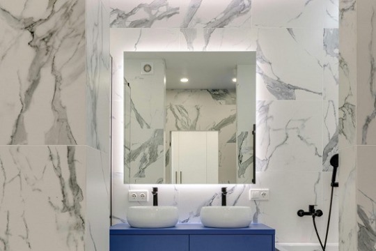
A mirror can obviously serve as a crucial part of your bathroom, allowing you to clearly see what you are doing as you fulfil morning responsibilities such as applying makeup or shaving.
Still, you might not have considered sourcing a backlit mirror… at least until now. This type of mirror comes with LED lighting tubes attached to its back.
By switching on this lighting, you can give your mirror a subtly illuminated outline — but there are also quite a few other excellent reasons to buy a backlit mirror.
No shadows
Would it not suffice if you simply settled for a standard mirror and relied on lighting from overhead electrical fixtures in your bathroom, along with sunshine through a nearby window?
Yes, perhaps. However, these alternative forms of lighting can cast shadows on parts of your face that you need to see clearly as you look in your mirror.
It may be reassuring to you, then, that backlights can highlight your entire face, sparing you from having to keep turning your head at awkward angles just to see everything.
More space
Another potential problem with lights that hang directly over a mirror is that they can take up valuable space in the bathroom — especially if they are affixed to a low ceiling.
The bathrooms in new-build homes tend to be smaller than those in properties constructed many decades ago. So, you might especially appreciate having lights tastefully tucked away behind your mirror, rather than in full view and potentially blighting your room’s overall “vibe” as a result.
Energy savings
We should all be treating sustainability as a major priority these days, so it’s heartening that a backlit mirror can make this job easier for you.
That’s because these mirrors include LED lights, which consume far less electricity than the incandescent lights still commonplace in conventional lighting fixtures for the bathroom.
How much less? Well, while incandescent lightbulbs last around 1,200 hours before needing to be replaced, the approximate lifespan of LED lighting is a mammoth 40,000 hours.
This vast improvement in energy efficiency enables you to save on your energy bills and reduce your carbon footprint.
Extra features
We build Dual White Lighting technology into all of the backlit mirrors we manufacture for our customers, who can consequently use a rocker switch on the mirror’s frame to toggle between “cool” and “warm” lighting.
Meanwhile, using a socket on the frame’s bottom-right edge, you will be able to charge your electric shaver or toothbrush with ease.
Of course, you will also want a mirror that looks “just right” — rather than like an ill-fitting add-on — in your bathroom. This is why we offer backlit mirrors in not only square and rectangular forms but also rather less orthodox circular, oval, and capsule shapes.
Exploring The Variety of Backlit Mirrors
To truly personalise your bathroom and match your unique style choices, there is a varied range of backlit mirrors to choose from.Each of these has its benefits, allowing you to select a backlit mirror that matches your needs from an aesthetic point-of-view, but also from a practical perspective as well.
Standard Backlit Mirrors: The classic choice, offering a sleek and straightforward design that provides ample light without overshadowing the room’s aesthetic.
Framed Backlit Mirrors: These mirrors come with an added frame, blending functionality with decorative appeal to complement your bathroom’s décor.
Arch Mirrors: Featuring a distinctive arch shape, these mirrors add an elegant touch to any bathroom, making a statement while providing the benefits of backlighting.
Pebble Mirrors: With their unique pebble shape, these mirrors are perfect for adding a modern twist and visual interest to your bathroom.
Custom Shapes and Styles: For those with specific design needs, our range extends to less orthodox shapes like circular, oval, and capsule, allowing for a truly personalised space.
If you are unsure what you are looking for though, have a look at our full range of backlit mirrorsand Backlit Buyers Guide before you start to narrow down your style preferences.
You can take your pick from these options when you place an online order for a backlit mirror with Illuminated Mirrors. We can deliver either a readymade or custom-made mirror to your UK home; please peruse our website and phone our team on 07893 952 606 to learn more about the specifics.
0 notes
Text
Illuminating the Night Enhancing Architecture with Outdoor Lighting
Architectural outdoor lighting isn't just about brightening up the night; it's about transforming spaces, creating ambiance, and highlighting the beauty of structures. From historic landmarks to contemporary buildings, outdoor lighting plays a crucial role in enhancing architectural features, providing safety, and extending the usability of outdoor areas. Let's delve into the art and science of architectural outdoor lighting.
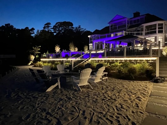
Enhancing Architectural Features:
Outdoor lighting serves as a tool for architects and designers to emphasize the unique features of a building. By strategically placing lights, they can draw attention to intricate facades, ornate details, and striking geometries. Whether it's a grand cathedral bathed in soft light or a sleek modern building outlined with LED strips, outdoor lighting can accentuate the character and style of any architecture.
Creating Ambiance and Atmosphere:
Beyond mere illumination, outdoor lighting sets the mood and creates atmosphere. Warm, inviting lighting can turn a cold, empty plaza into a cozy gathering spot. Subtle uplighting can evoke a sense of drama and mystery, while gentle downlighting can create a serene ambiance. By carefully choosing the color temperature, intensity, and placement of lights, designers can evoke a range of emotions and transform outdoor spaces into enchanting environments.
Safety and Security:
In addition to aesthetics, outdoor lighting serves practical purposes such as safety and security. Well-lit pathways, staircases, and entrances ensure that pedestrians can navigate outdoor spaces safely, especially during the dark hours. Proper lighting also deters crime by eliminating hiding spots and creating a sense of visibility. With advancements in technology, outdoor lighting systems can now include motion sensors, timers, and remote controls, adding an extra layer of security and convenience.
Extending Usability:
Architectural outdoor lighting extends the functionality of outdoor spaces, allowing them to be enjoyed well into the evening. By illuminating patios, gardens, and terraces, outdoor areas become usable for dining, socializing, or simply relaxing under the stars. Thoughtfully designed lighting schemes consider how people will use these spaces and ensure that they remain inviting and comfortable after sunset.
Sustainability and Energy Efficiency:
As environmental concerns become increasingly important, so does the need for sustainable outdoor lighting solutions. LED technology has revolutionized the industry, offering energy-efficient alternatives to traditional incandescent and halogen lights. LED lights consume less power, have a longer lifespan, and produce less heat, making them ideal for outdoor applications. Additionally, smart lighting controls enable precise adjustment of light levels, reducing unnecessary energy consumption.
Integration with Nature:
Architectural outdoor lighting should harmonize with the surrounding natural environment, not overpower it. Designers often incorporate principles of biophilic design, aiming to create connections with nature through lighting. Soft, diffused lighting mimics natural moonlight, while strategically placed fixtures minimize light pollution and preserve views of the night sky. By blending seamlessly with the landscape, outdoor lighting enhances the overall experience of both the built and natural environments.
Architectural outdoor lighting is a multifaceted discipline that goes beyond mere illumination. It's about enhancing the beauty of buildings, creating ambiance, ensuring safety, and extending the usability of outdoor spaces. By carefully considering factors such as aesthetics, functionality, sustainability, and integration with nature, designers can transform ordinary outdoor environments into enchanting nocturnal landscapes. In the interplay of light and shadow, architecture truly comes alive, illuminating the night with its timeless allure.
For more info:-
Architectural Outdoor Lighting
1 note
·
View note
Text
Clipping World: Elevating Excellence in Clipping Path Services
In the digital age, where visual appeal is paramount, the demand for top-notch images is on the rise. Clipping World emerges as a pivotal player in the realm of image editing, offering unparalleled expertise in the art of precision through its best-in-class clipping path services. This comprehensive guide explores the nuances of Clipping World's services, shedding light on their significance, techniques, applications, and the transformative impact they have across diverse industries.

Introduction to Clipping World's Best Clipping Path Services:
Clipping World's best clipping path services involve the meticulous creation of vector paths or outlines around objects in images, delivering a level of precision that sets them apart. Tailored for graphic design, advertising, e-commerce, and other industries that prioritize visually stunning images, the primary objective is to enhance the overall aesthetic appeal and professionalism of the visuals.
Techniques in Clipping World's Clipping Path Services:
Basic Clipping Path:
Involves crafting a simple outline around uncomplicated objects.
Ideal for e-commerce product presentations requiring a clean and straightforward visual narrative.
Complex or Advanced Clipping Path:
Tailored for intricate objects with complex shapes and multiple curves.
Applied to images with detailed backgrounds or intricate product designs, demanding advanced skills and precision.
Multi-Clipping Path:
Employs multiple paths within a single image, enabling selective adjustments or modifications to different image segments.
Perfect for color correction, shadow addition, or other targeted enhancements.
Hair Masking:
Preserves fine details of hair while seamlessly removing the background.
Particularly crucial in fashion and photography industries, ensuring hair intricacies are impeccably retained.
Applications of Clipping World's Clipping Path Services:
E-commerce:
Vital for crafting visually engaging product images on e-commerce platforms.
Facilitates the presentation of products against diverse backgrounds or settings.
Advertising and Marketing:
Empowers the creation of attention-grabbing visuals for advertisements.
Utilized in designing banners, brochures, and various promotional materials.
Photography:
Widely adopted in post-processing to refine and modify images.
Essential in fashion photography, highlighting details such as clothing and hair.
Graphic Design:
Integral in designing visuals for websites, social media, and digital platforms.
Offers flexibility in incorporating images into diverse design concepts.
Tools and Software Used by Clipping World:
Adobe Photoshop:
The industry gold standard, providing an array of tools for precise clipping paths.
Leverages features like the Pen Tool, Magic Wand, and Quick Selection Tool.
GIMP (GNU Image Manipulation Program):
A cost-effective alternative to Photoshop, suitable for basic to intermediate-level image editing.
Equipped with tools for creating clipping paths and working with layers.
Outsourcing Clipping Path Services to Clipping World:
Cost-Effective Solutions:
Outsourcing to Clipping World offers competitive pricing without compromising on quality.
Ideal for businesses seeking a budget-friendly yet top-tier solution.
Focus on Core Competencies:
Enables businesses to concentrate on core competencies while entrusting image editing tasks to Clipping World's professionals.
Enhances overall efficiency and productivity.
Future Trends in Clipping World's Clipping Path Services:
Artificial Intelligence (AI) Integration:
Clipping World anticipates integrating AI to streamline and automate aspects of the clipping path process.
AI tools hold the potential to enhance accuracy and efficiency in path creation.
Virtual and Augmented Reality (VR/AR):
As VR/AR technologies advance, Clipping World foresees new applications for creating immersive and interactive visual content.
Conclusion:
In the visual-centric landscape, Clipping World stands as a beacon, redefining the standards of excellence in clipping path services. From enhancing e-commerce product visuals to crafting captivating marketing materials, the precision, and commitment to artistry by Clipping World reshape how visual content is perceived and embraced. As technology evolves, the future promises even more innovations, ensuring that the world's best clipping path services continue to lead the way in visual communication.
#photo editing sevices#Clipping path service#Clipping path services#best Clipping path service#Clipping path service provider#Clipping path service providers#Clipping path service company
0 notes
Text
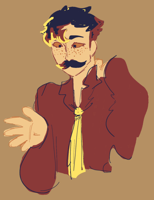

[ID 1/2: A digital drawing of Mumbo Jumbo. He is drawn with an alternative color palette so his design is not entirely faithful to his original design. Mumbo is a thin man with short and spiky hair, a mustache, wide eyes, a button up shirt, and a tie. He has one hand out and one hand rubbing his neck. His hair is dark blue with red shadows and yellow highlights. His shirt is a red button up with a yellow tie, both of which are very messily outlined in dark blue. He is staring down at the ground, and looks like he’s vaguely anxious about something. /end ID.]
[ID 2/2: A five color color palette which matches the colors of the above picture. There is a burnt orange, tan, red, dark blue, and yellow in the palette, showing in that order. The orange color block has a white dot in its center. /end ID.]
289 notes
·
View notes
Text
Fixing realistic hair in MMD: the cool guy way
Welcome to an effect tutorial! Here I will cover the basics of mipmapping and teach you how to “fix” realistic hair using MME.
Game ports have been around the MMDC since forever, but MMD struggles to read alpha channels right and the hair looks horrible. Thankfully, I have an alternative solution to that!
Before we start, we need to understand what are mipmaps and how they play a role on realistic hair for MMD.
For starters, the MIP maps, or mipmapping, is a 3D rendering technique that creates many copies of the same texture in different resolution scales, so the image is always clean when you either zoom in or out, distant or not. Check the examples below:


Ok, and how is it related to MMD and realistic hair?
Well, have you ever noticed that MMD’s view tab has an option called “mipmap (anisotropic)”? Nobody talks about it at all, so it is understandable if you haven’t.

As you know, MMD struggles a lot to read realistic hair alphas properly and you must fix it most of the time. However, some models have hair so realistic that you may only think “ok, so what am I supposed to do here? Even with bad alphas, it looks great in PMXe!”

How great king Noctis looks! His hair and beard look fine, oh boy what a great day! Then you open MMD and see this:

Do not worry about him, he is going though adult life crisis.
Wondering what the hell happened there? I tell you: mipmaps. The thing is that PMXe does not have mipmaps (do not quote me on that) while MMD has them, so the texture looks like a mess once you load the model.
If you go to the view tab and disable the mipmapping, you will see that the model is looking good again! However, our job is not done here.

Did you notice the default alpha issues? These white outlines must go away or they will mess with our render! If you turn the default background black, they look much better, go almost unnoticed.

Since MMD’s default background changes from white to black and vice versa depending on the effects you load, I recommend using a solid black skydome behind the model in the draw order with another skydome or stage in front of it, so you keep this “fix”.
Now you decide to continue the project and apply the effects! When it is shading time, the mipmaps simply are on again.

Back to stage 0, I guess...
What happened is that some shaders have mipmaping enabled by default and disabling it on the view tab is no use. Now here is the catch: I did my homework and compiled a list of shaders that do not make up of mipmaps, so you can apply them only to realistic hair.
They are mostly old shaders that people do not bother to use anymore (Ray tutorial coming soon), but if you prefer working with them, here is the list:
Adult Shader;
Dark Adult Shader;
Full Simple Soft SHadow;
Mask Shader;
OverRay Shader;
PmotSkin;
Toon Master.
My favorite one is OverRay because of the highlights, they look great on realistic hair!
For best results, I recommend using o_disalphablend to ease even more the problematic hair alphas and add Object Luminous for the highlights! Example of usage of Adult Shader + Cook Torrance below:


With Adult Shader, Yagami’s hair was “fixed” with the addition of o_disalphablend. The black lines are actually good for separating the hair strands from the background and make good aeshtetics too!
Now a test without Adult Shader on the hair:

Exactly, Yagami-san...
DISCLAIMER: I am not saying you do not need to manually fix the crazy alphas in PMXe because you have this gimmick to back you up. It is a “fix” and may not work in every situation!
10 notes
·
View notes
Text
How to Locate Blind Spots in Shadow Work
I got asked recently how to locate blind spots without having to have someone else point them out to you.
And the answer is – it’s tricky.
First, you have to absolutely want to. If you don’t really want to know how your perspective might be warped, you’re not going to bother trying what I outline here. Or you’ll try it enough to feel like you’ve checked and revalidate your world view. So if it you aren’t hungry to know yourself better in this way, take caution.
It’s also good to be cautious if you’re new to doing introspection. You’re probably not used to your general biases yet and it can make it harder. But it absolutely is fruitful work at any stage. After a lot of thought I’ve tried to roughly outline how I try to find my own blind spots. It’s helped me tease out more than a few ways my lens had been warped. I hope it’s helpful to you.
Expose yourself to different experiences
Starting out, you can’t know what you don’t know. This is why so many people rely on other people telling them. But you can take some of the burden off others by making a commitment to listen.
A lot of people who’ve been through neglect, abuse, or other forms of trauma don’t find out what they’ve been through isn’t normal or okay until they have meaningful contact with people who haven’t. It’s one of the reasons families that have intergenerational trauma and partners who abuse their partners try so hard to limit their victims’ contact with people they see as a threat that sense of normality. So much hinges on it.
So take the time to intentionally push against your sense of normality. Try to socialize with folks with a variety of experiences. If you’ve ever come across someone who you felt would “find you out”, see if you can talk to them and get to know what their normal is. Read accounts of folks’ lives online. Read memoirs. Check out vlogs of folks who lives and came from families very different from your own.
This is where tarot comes into my shadow work. Look for challenges, especially ones gears toward hard truths or self-awareness. Tarot is it’s own form of different perspective.
The important thing is just getting used to questioning what you assume is normal. Whatever gets you there is likely going to help.
Observe your behaviors
This is where journaling really helps. A bullet journal can serve this purpose but a note in your phone can serve a similar purpose. What you want is something allows you to begin to look at your actions in a matter of fact way. Get used to describing actions absent emotion or intent. You can always add a line in later but you’d be amazed how many people who cannot state factually what they’ve done in a given situation. They can’t separate the spin from the reality of a situation.
So find something that allows you to separate those out – especially with regards to really emotionally charged situations. Observe them as they’re happening in real time. I used to keep a note in my phone for this express purpose – just to write out what actually happened separate from why I did it and how I felt about it.
Evaluate discrepancies
Once you’ve gotten better at separating action from feelings and intent, you can begin to evaluate for discrepancies. Where do your actions not align with your goals? You say you’re doing something because you care but is that action you’re doing likely to be seen as caring by the other person? Why are you really doing it?
Or alternatively, do you notice actions you avoid taking? Are you not reaching out to people because you don’t want to bother them or are you scared of rejection? Or something else?
Another way to evaluate for discrepancies is to look at those experiences you’ve been exposing yourself to and see where your actions differ from what they do. Have you seen people going after what they want and you’ve realized you haven’t? Why is that?
These are the sorts of questions to be asking at this stage. Where are things different? Why are they different?
I also use tarot here to check my answers so to speak. It’s not foolproof but it can help highlight when I might be ascribing certain reasons to my actions that aren’t fully truthful. We’re not always the best at isolating precise reasons for why we do what we do. So I like to pull cards to see if the deck aligns with the reasons I’ve dug up or whether it has a different perspective.
If you’re finding discrepancies between your actions and your beliefs or your actions and how most people you’ve interacted with act, you’ve hit on a blind spot pretty much every time.
Once you find one, it’s time to dig in and try to better understand that gap. Why do you act the way you do? Why might someone act the way they act? And so on until you can determine what needs to shift to bring things into line.
Conclusion
This isn’t foolproof. I don’t actually think we’re capable of fully knowing our blind spots without others pointing things out. But I do think we’re capable of doing a lot more on our own than what most people are used to doing.
I’m interested in hearing what other folks do to cultivate self-awareness.
How do you find your blind spots?
349 notes
·
View notes
Text
Learn Log #6 - Cozy Cabin (Exterior)
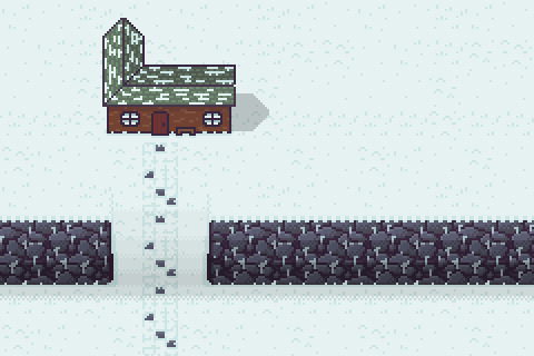
I’m finally returning to learning pixel art after taking a short break! This week’s Learn Log will focus exterior of my Cozy Cabin, covering my learning about houses, snow tiles, stone tiles and brick tiles.
House
I wanted to start with the house as I feel like that will determine how large I should make the canvas. I decided to return to 16x16 tile sizes after the beach piece and used this as the basis for my house.
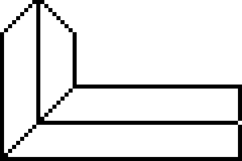
First, I drew the roof outline as the size and shape of the roof will determine the size and shape of the building. You can certainly start with the building, however, during my practice, I realised that I much prefer starting with the roof. The shape does look a little weird, but I’m hoping that with the addition of shading it’ll look a lot nicer.
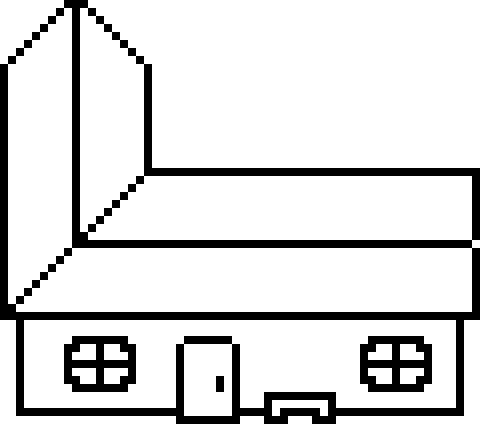
After the roof, I drew the outline for the building. I left a little of the roof hanging over the sides of the building to represent a gutter overhang. Once the rectangle shape of the building base was done, I added details including the door, a bench and two windows. I stuck the door out to make it clear that it can be interacted with to enter the house. Making interaction clear is crucial in the graphical design of videogames, so this is an excellent way to do so with doors, I think. The door should roughly be the size of the characters entering them. In this case, my character was the size of one tile (16x16), so the door was just underneath those dimensions. I then added other key features to the building, including the bench and windows to remove the empty space that would make the building seem odd.
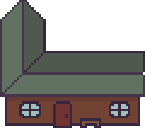
I then added some colours and shading to the building to better display depth. The back of the roof and top of the building is shaded to display the reduced light hitting these areas. Meanwhile, some areas of the roof outline are highlighted to emphasise the sunlight is hitting areas with direct light.

Finally, I added details to the building to provide the viewer with more information. The roof was detailed with a simple brick pattern to give viewers the idea it is made of slate tiles. A simple brick pattern is simply composed of an alternating grid pattern with ‘bricks’ usually being stacked on the gaps between the ‘bricks’ of the line below.
I then wanted to make the walls and door of the building out of wooden planks. With the door, I did this by alternating shading with vertical lines which worked well. This could also work for the wall; however, I wanted the building to seem a little older, so I drew sporadic lines across the building in a lighter colour. This made the door seem solid while the wall was worn down.
I decided to make the canvas 240x160 pixels and placed my house inside.
Snow
Snow is very similar to sand, and a snow texture can be made with wavy lines as described in the last Learn Log. However, I think a grassy snowfield can also be created by using grass techniques with two shades of white. The colours used for snow can’t be a bright, saturated white but they also can’t be too dark, or it will seem unnatural. A highly desaturated, slightly darkened, bright blue seems to work well. After a bit of tinkering around, I made the tiles shown below:

This image is a 64x64 made up of smaller individual 16x16 tiles that can be placed separately. I think it looks pretty good, but it is a little flat. I guess I’ll set it into the scene and continue with these tiles.
I also added some snow to the building to make it fit into the environment better.

Stone
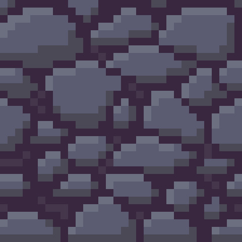
I wanted to transform these snow plains into a mountain range, so I created stone tiles for a cliff face. To create these tiles, I started by selecting two grey colours before drawing stone shapes (deformed ovals and circles).
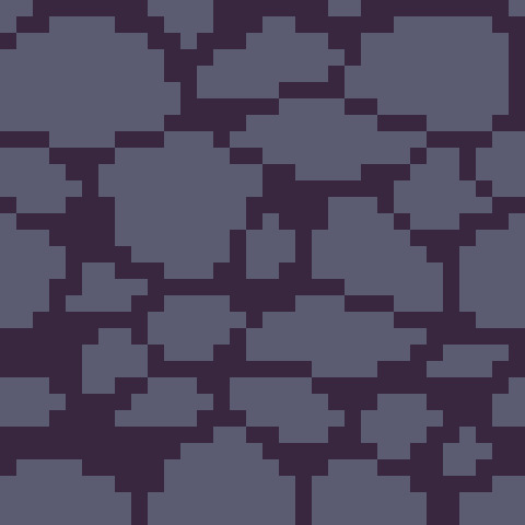
I then added lighter and darker shades to the rocks to add shading, along with some brighter highlights to show where sunlight reaches in-between the cracks.
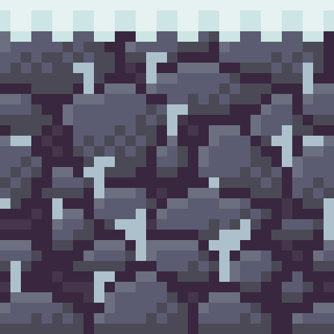
Finally, I needed to make this tile fit within the snowy environment. I decided to add a snowy overhang to the top of the cliff-face and icicles stemming from stones. I also added some dithering to each stone to make the shading appear more natural.
I was fairly happy with the tile, so I decided to add it into the scene for a quick test.
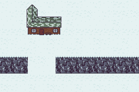
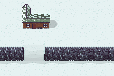
There was not a clear sense of depth here, making it seem more like a stone wall rather than a cliff. To add additional depth, I added a darker snow outline around the tiles and added shading onto the tiles. This shading should be a gradient with more light hitting the top of the cliff and less hitting the bottom. This also goes for the path to give a sense of elevation. Dithering is an excellent way to better transition these gradients. I also added a shadow to the building as I added the rest of this shading.
Path
To make the path I first made a grid texture with the same greys from the stone tile (to keep the palette minimal) and shaded each rectangle in the grid as I did with the stone tiles.
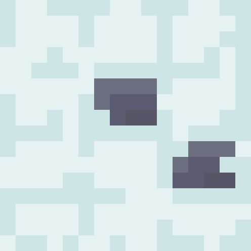
I then made two tiles with different snow cover to alternate between when laying out the path. I kept two bricks in the path tiles clear and utilised the darker snow colour to ensure the grid pattern is still present.
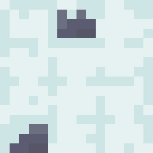
I finally added the path to the canvas and was pretty happy with how it turned out, so I called it there.

Conclusion
I definitely struggled with this week’s piece. The snow feels a little flat due to the limitations of working with white/off-whites which kind of sets the whole environment off a bit. The background was ok, but that depth really would have made the environment a lot better, I think. I particularly struggled with the cliffs. Trying to highlight the elevation to the next area of snow was quite tricky. Next time, I think I’ll use specific tiles representing a staircase or ramp rather than shaded standard tiles. Finally, while the house looks nice, it still feels off. I think I’ll have to do more tinkering with buildings to better understand what I can do to improve the shape of it because right now I’m quite unsure. Overall, it’s a good start. My work on the man-made tiles was quite decent, but I need to improve with my creation of depth and snow tiles.
That concludes this week’s learn log. Next week I’ll be covering the interior of the Cozy Cabin including floors, walls and furniture.
My learning and this blog post wouldn’t have been made possible without these fantastic resources. Go check them out if you wanna learn some stuff about pixel art!
How to Make a Pixel Art House by TutsByKai
How to Pixel Snow by TutsByKai
How to Create a Brick Texture by TutsByKai
How to Make a Pixel Art Stone Texture by TutsByKai
Tutorial: Pixel Art Tile Floor by Michel Mohr
16 notes
·
View notes
Text
Packaging
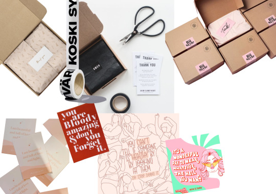
Packaging is an important part of customer experience and therefore takes a lot of time and consideration. I created a mood board about the general ideas that I wanted to put into the packaging. We decided that we wanted our products to be packaged in a box, so I added some different boxes onto the mood board. We did not want a standard brown box as we thought it would not be personal to our brand. Our idea is for the outside of the box to be a matte black, as it would look very sleek and minimal, which would link to the rest of our branding.
The products inside would be wrapped in tissue paper, with a sticker holding it together. I added an image of a box with black tissue paper and a black sticker to the mood board to illustrate this. Another element we wanted to add was a small card that came with the packaging. Usually, cards that come with products are based around promoting the brand, such as there Instagram or other products that they sell. We decided that, as our brand is promoting empowerment in our customers, we wanted a card with a quote on it that empowered the women who read it. It would be the size of a standard credit card so that it would be able to fit into the customers’ purse so that they would be able to carry it around with them to encourage them to be more confident.

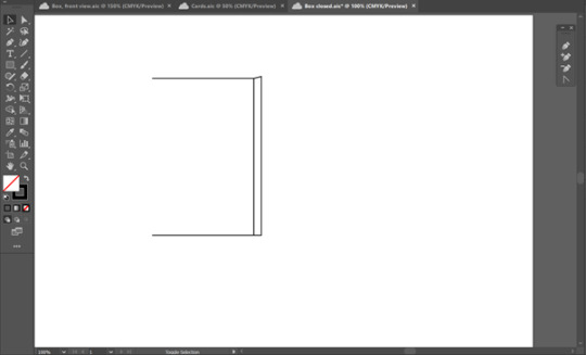
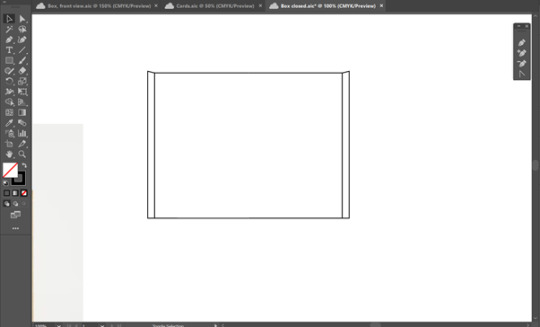
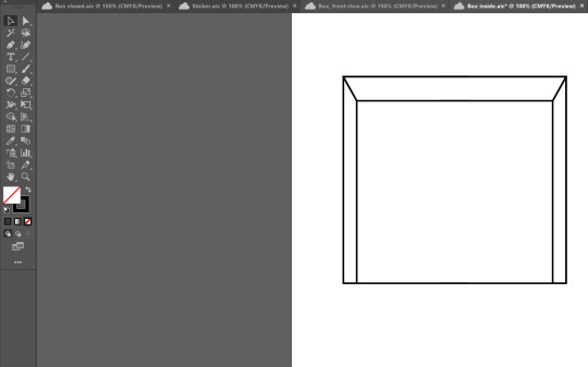
I started by creating the outside of the box on illustrator. Using an image of the outside of a box, I used the pen tool to trace around half of the box. Once I had done this, I duplicated and flipped the illustration to create the other half of the box. By doing this, it ensures that the box is symmetrical on both sides.
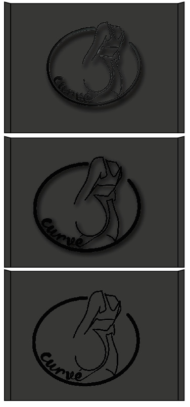
Once I had completed the illustration, I added a dark grey to the fill of the box. I chose to use dark grey so that it would display that the box is a matte black, as if I were to fill the box with just black, it would not have the same effect.
I trialled different way of putting the logo onto the box. The first was to use an effect called ‘plastic wrap’ on Illustrator, which gave a shiny look to the logo. I added a drop shadow as well so that it would highlight the logo. I decided that I did not like this as our packaging is supposed to be minimal, so the amount of detailing on the logo did not work and made it very unclear.
I took away the ‘plastic wrap’ effect on the logo and left the drop shadow on. This worked better than the previous attempt as it added attention to the logo without it being too dramatic. However, I still did not like the drop shadow as it seemed to make the edges of the logo quite blurry and not very clear.
I took away the drop shadow and left the logo as it was on the packaging. Although it is clear and minimal, it seemed too basic to use on our packaging and did not fit with the luxurious aura that our brand is trying to showcase.

For the final design of the outside of the box, I revisited the ‘plastic wrap’ effect without the drop shadow. This contrasts well against the matte of the box and draws attention to the sheen that is seen of the logo. The difference in the finishes of the box and the logo will make it stand out and will display the sleek and luxurious look that we were hoping for.
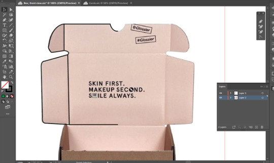

Like the previous illustration, I used the pen tool to outline an image of the inside of a box. I drew one half of the illustration and then duplicated and flipped it to create the full symmetrical illustration.
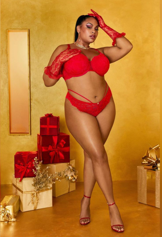

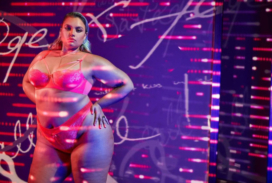
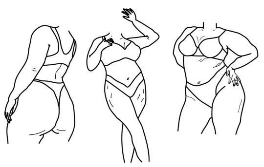
I decided to create outlines of curvy and ‘normal’ sized bodies to use on our packaging. The illustrations could be used on other parts of our branding, such as promotion on posters or Instagram posts. I used three images of different women that I found on Savage x Fenty’s Instagram. I used the pen tool on Illustrator to create the outlines of the women. I added lines on the body to show the texture of the skin, as most women will have these lines, whether it be stretch marks or layers of skin. I chose to add this as it would illustrate the size and shape of the body more easily, as well as show the customer that that these lines on bodies are normal, linking back to the empowerment of women that we want to demonstrate in our brand.

I trialled six different designs for the inside of the packaging. I used our slogan ‘Stand out, Show out’ on the design as it would personalise the box more for the customer. I used three colours for the inside, which was the continuation of the matte black from the outside, an off-white and a beige. The contrast between the outside of the packaging and the inside of the packaging would have worked well as it would make the box more interesting. However, we decided that by having a colour inside the box, it would take attention away from the illustration and the product that is inside the box.
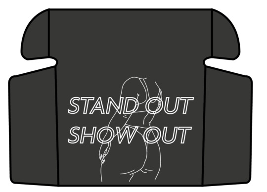
Our final design for this section of the inside of the box is matte black, with the ‘Stand out, Show out’ slogan in the centre, with an illustration behind it. The illustration is like the logo, but all the lines are linked together and have there are no gaps as there are in the logo. We decided to use white for the illustration and the lettering as it contrasted enough against the background to make it interesting for the viewer, without it taking too much attention away from the product in the box.
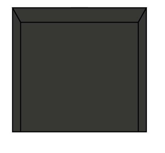
For the bottom of the box, I freehand drew it to match the sizing to the top of the box. Using the pen tool, I was able to create the bottom inside box. I filled it with the same dark grey colour as the rest of the packaging.
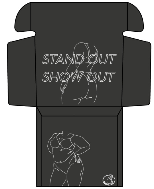
I chose to add one of the other figure outlines on the bottom of the box, as well as the Curvé logo in the bottom right corner. The illustration will be revealed once the customer lifts the product from the box, which will add to the customer experience when they open their order.

To create the cards that will be placed in with the packaging, I used the rectangular tool to create the front and back of the cards, one version being filled with a solid black and one filled white with a black outline.
I trialled different versions of the quote that I wanted to add to the cards. I used the Transform tool on Illustrator to create the different effects of the text, such as the Bulge and Vertical Transform lettering. I used the ‘Stylize’ effect to create the gradient on the lettering in the centre.

I chose to create a gold text that could be used on the cards. As we are aiming to be a luxurious brand, I thought that gold writing on the cards would illustrate this. By using the gradient tool on Illustrator, I added multiple colours onto the charts in varying shades, such as cream, orange and a dark red. I alternated these colours throughout the gradient to give that gold foil look that is seen on the text.
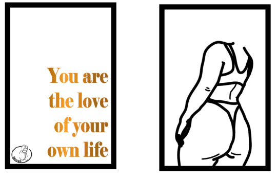
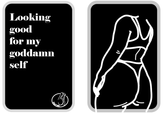
Using the illustration that inspired the logo, I created these two cards. Both cards have the illustration on the back of the card. The white card has the gold lettering that I previously made, as well as the logo in the bottom left corner. I added the logo to ensure that the customer is aware that this card is from our brand, and as a watermark so that it is not copied. The second is very similar, with the logo being in the bottom right corner on this card. I chose to keep the text white on this card as I thought it worked well the link with the opposite side of the card.
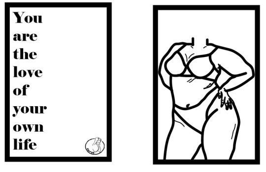

These two cards, again, have the same illustration on the back. With the white card, I placed the text down the left side of the card. This created negative space on the opposite side of the card which allowed me to place the logo in the bottom right corner. I did the same with the black card, but I stretched the text along the fill card. I chose to do this as it created varying sizes of negative space.

To create the stickers for the packaging, I used the Rectangular and Elliptical shape tool to create both rectangular and circular stickers. I filled the shapes in with black and beige, as these two colours are going to be used in our brand promotion, so this continue the colour story throughout our whole brand.

I chose to use the logo as the design on the sticker. By doing this, it ensures that the brand logo is highlighted throughout every aspect of the packaging, as well as sticking to the minimal theme that our brand is looking to achieve.

The final two stickers that we chose were the two circular stickers with a white logo in the centre. We decided that a circular sticker looked better with the logo as it follows the curve of the ‘C’, making them work cohesively together. We chose both colours as the black sticker with the black tissue paper would look very sleek and the beige would give just enough contrast to make it interesting, whilst also looking luxurious.
1 note
·
View note
Text
Atlanta Falcons Unveil New Uniforms

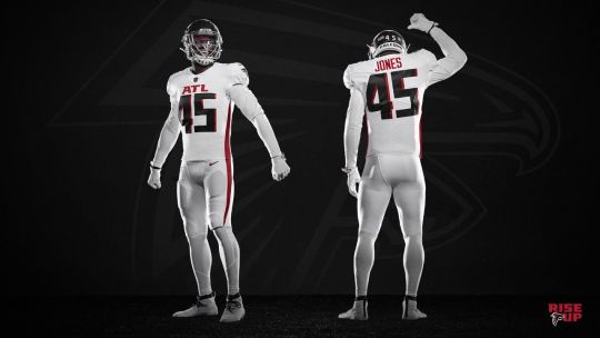
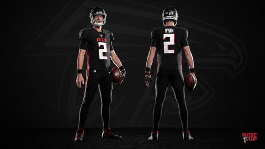
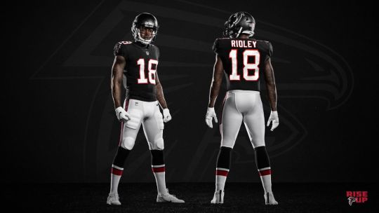
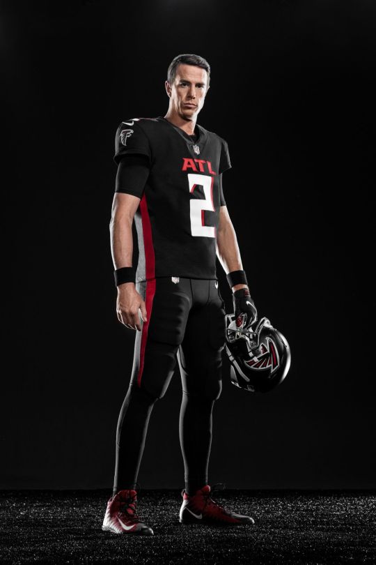
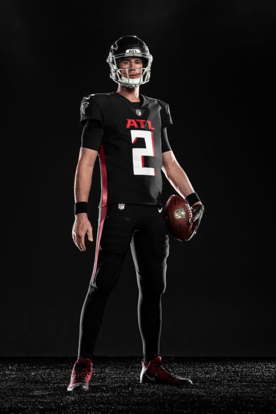
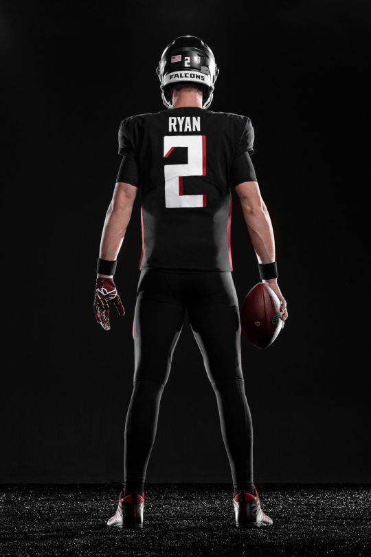
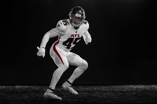
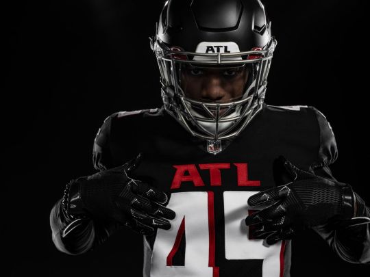
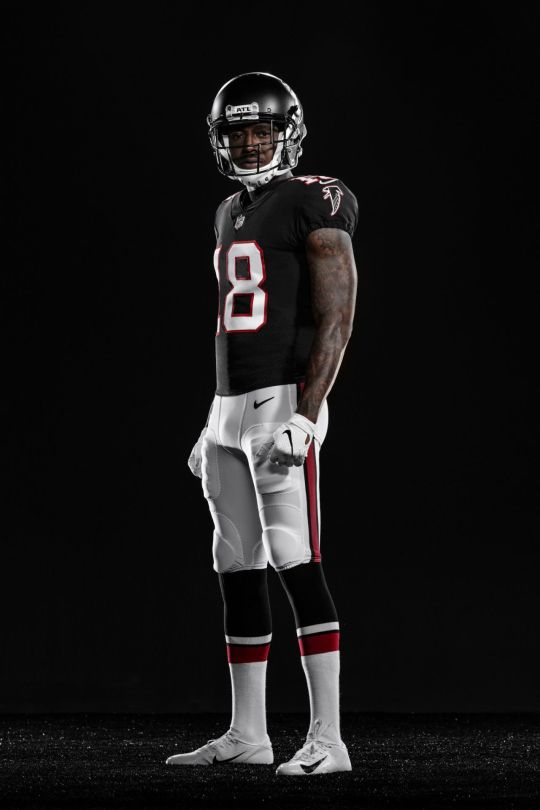
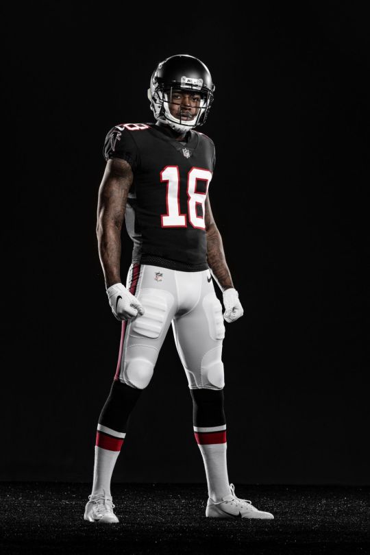
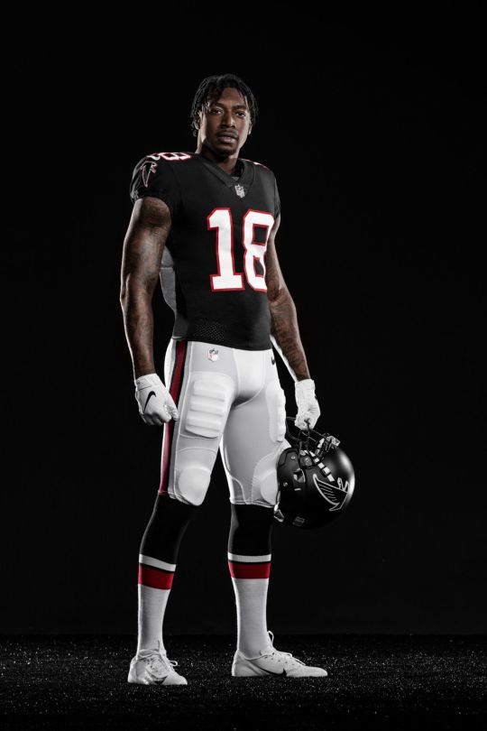
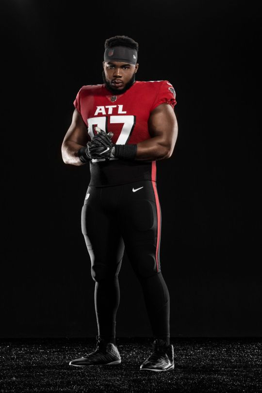
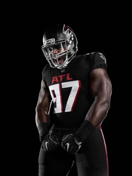
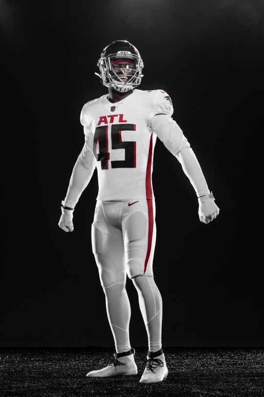
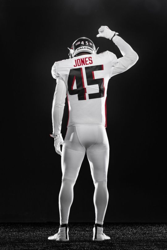
The Atlanta Falcons announced on Wednesday they will usher in the 2020 season with new uniforms as part of a comprehensive redesign for the first time in 17 years. The entire new array of uniform options includes elements of the Falcons’ past while updating the brand to match the modern progression of Atlanta.
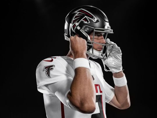
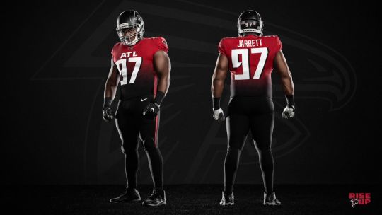
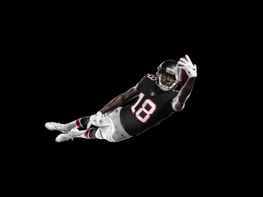
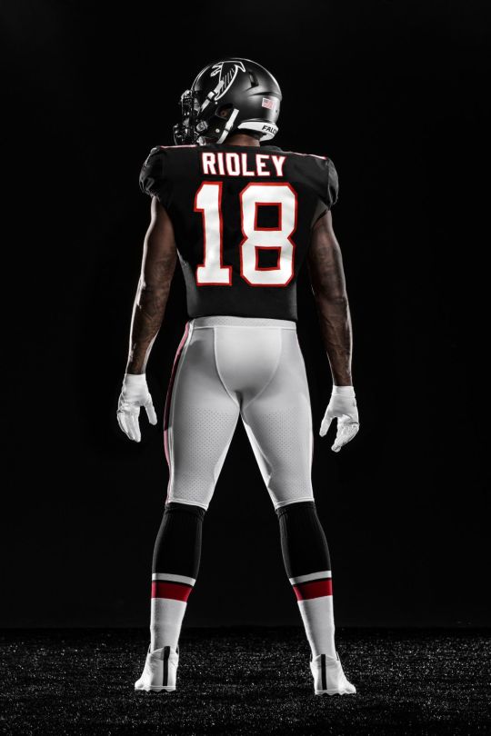
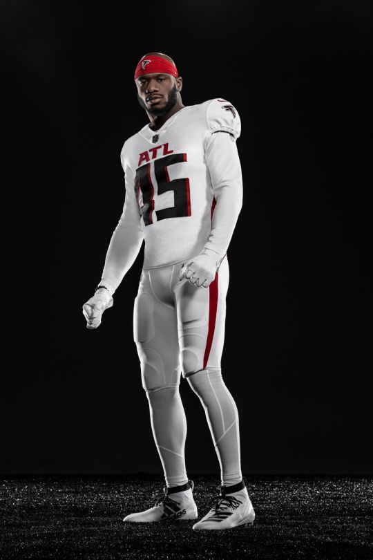
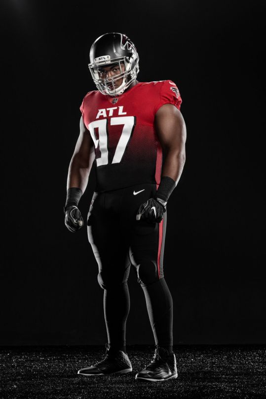
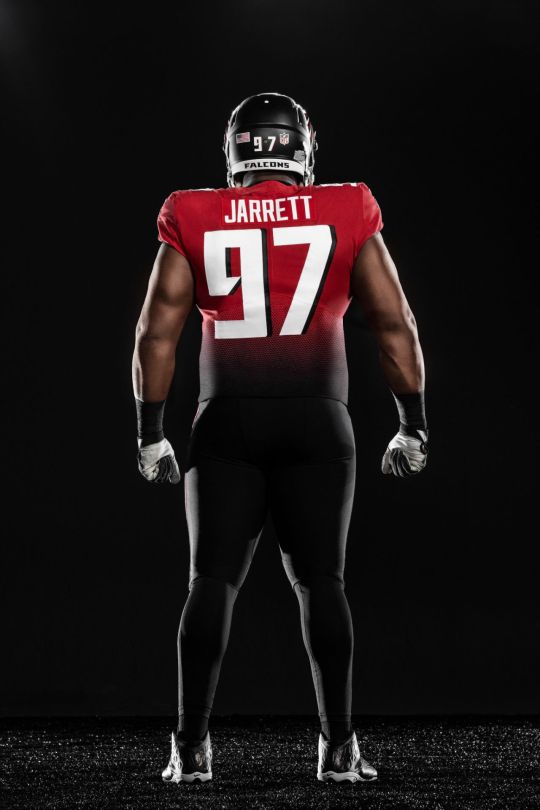
The new official Falcons home look will feature black jerseys and black pants with the away look going white on white. The uniform closet will now offer up to eight different color combinations, including the current throwback version paying homage to the 1966 team and a new “Rise Up” alternate uniform. The collection includes four jerseys (black home, white away, gradient alternate and the ’66 throwbacks), four pants (black, white, red and throwbacks) and one helmet (satin black).
BACKGROUND
Using nearly two decades of fan research collected from focus groups, online and through different social media platforms, as well as input by current and former Falcons players, the overwhelming plea was consistent: 1) Own red, but bring on the black, 2) reflect the modern progression of the city, and 3) keep it simple and stay true to our roots.
Throughout continued conversations with fans and players, it was clear that the designs needed to reflect elements of the past and the present, the pride of Atlanta as well as the state-of-the-art design of Mercedes-Benz Stadium.
THE PROCESS
Conversations started inside the organization back in 2016 with the official process kicking off in January 2018. The Falcons embedded their internal design team together with the NFL and Nike to determine how best to bring the uniform and identity to life, and the result is clean, simple and intentional.
“We took a fan-first approach in gathering feedback and design input and have modernized the look of our team and our brand” said Falcons President, Rich McKay. “Black has been a part of our organization since we took the field in 1966 so we’ve stayed true to our roots and have given our fans and players what they’ve been asking for over many years.”
“This process has been a true reflection of Arthur Blank’s core values -- listening and responding to our fans” said Morgan Shaw Parker, the Falcons chief marketing officer. “The city has evolved, our stadium has evolved and we knew it was time to do the same with our brand.”
OWN RED, BUT BRING ON THE BLACK
Like the city of Atlanta, black evokes strength, power, grit … and a little bit of swagger. Black jerseys have been a part of Falcons history since they first took the field in 1966, during the original Dirty Bird era in the late 1990’s, from 2003-08 and more recently as alternates or throwbacks, amplified by personalities like Deion Sanders, Jerry Glanville and Michael Vick to Matt Ryan and Julio Jones.
The color red reflects a shared sense of community in Atlanta as most of the major sports teams and many iconic homegrown brands share the color. Several signature elements across the new uniforms are highlighted in red including the familiar Falcons bird logo, the new ATL mark across the chest and the new stripe or “stoop”, down the side of the uniform. Red is also featured as a primary jersey color in the new gradient “Rise Up” alternate uniform.
Silver and gray have also been a part of the Falcons color palate for decades but will now play a more prominent role, incorporated into the helmet decal and the new silver facemask.
REFLECT THE MODERN PROGRESSION OF ATLANTA
Atlanta is known as much for diversity and culture as it is for innovation and creativity. From music and design to business and technology, the city of Atlanta influences everything. The Falcons have a proud tradition of bringing people together from all walks of life, so the new ATL mark is placed proudly and prominently across the chest of the new uniforms as a reflection of a city constantly on the rise. A three-letter combination recognized around the world; it is only fitting the Falcons represent the ATL on a global stage.
The Falcons helmet has evolved from a traditional glossy look to a more modern all-black satin finish. The Falcon bird logo is nearly 30 percent larger than before with a chrome outline to compliment the new face mask.
The “Rise Up” alternate uniform pays homage to our next generation of Falcons fans. The gradient pattern rising from black to red offers a fresh representation of a city constantly on the rise through a visual pattern made from the eye in the Falcon logo.
KEEP IT SIMPLE; STAY TRUE TO OUR ROOTS
The familiar, identifiable Atlanta Falcons wordmark has been tightened and sharpened for ease of use, while the new numbers boast a more modern typeface, a drop shadow and sharp terminals to match the angles of the current wordmark and primary Falcon bird logo.
The Atlanta Falcons primary logo was updated in 2003 and remains the same in 2020. It was derived from the original team logo dating back to the club’s debut in 1966. We’ve stayed true to our roots by keeping our colors and the Falcon bird intact – making it even more prominent than ever before but delivering a more modern design that reflects our team, our fans and this great city.
The stripe or “stoop” down the side of the uniform is a graphic extension taken directly from the wing on the Falcon logo, and the gradient pattern in the “Rise Up” Alternate uniform pattern is taken directly from the eye of the bird.
The 1966 throwback uniform has become an icon to both players and fans alike, and one that will remain a staple in the Falcons closet. The throwback decal adorns the helmet and the iconic red and black stripe pattern has been a consistent staple through several historical uniform designs. (And yes, we too would love to have that second red helmet!)
RETAIL INFORMATION
The new Nike Falcons fan jerseys will go on sale April 14th on shop.AtlantaFalcons.com as well as in both the Atlanta Falcons team shop at Atlantic Station and the team store at Mercedes-Benz Stadium upon re-opening (date to be determined). As the traditional supply chain is currently impacted by the pandemic, jersey shipments may be slightly delayed. Download the Atlanta Falcons app or log onto www.AtlantaFalcons.com for the most updated details and information.





1 note
·
View note