#but the lineart is actually old but the coloring is new
Explore tagged Tumblr posts
Text


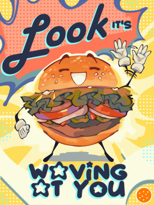
Happy Birthday to Damian Wayne!!! A fanart for a fanfic where the brothers got reborn as Reverse Robins and kept all their memories. So Damian, now the eldest, adopted a more cheerful Robin persona knowing that the Gotham before Grayson needed hope and until his other siblings show up, he would have to BE that beacon of light. Though the fic has been in hiatus for awhile.
Not gonna lie, a happy-go-lucky Damian was hard to imagine, but the image of him holding his arms out to comfort a civilian had long been stuck in my mind. In the end, I went with this design that's a lot less sharp, yet more welcoming than his original Robin uniform. With only hints of his true self scattered throughout. I also like how he's doing his best, but it's really not his style. Lol. That's why beneath the mask, he's awkward.

-Bubbly💙
#spacebubblearts#dc#dcu#damian wayne#robin#doodle#birthday boy#bat brothers#batman#batfam#gotham#damian al ghul#it's been awhile#my baby#look at my son!#character redesign#sort of#reverse robins#rebirth#heroes#vigilante#coloring#imagine running up to hug him. thats what his pose is for#happy birthday#completely different artstyle from when I draw hazbin#but the lineart is actually old but the coloring is new#comics#ao3#fanart#fanfic
216 notes
·
View notes
Note
Question. Since monster falls au Stan and Ford have tails, do they wag when they're happy??
I dunno i just think that would be cute </3
I can't actually imagine them wagging their tails due to excitement/happiness. Irritation/annoyance and anxiety on the other hand...


#the 2nd drawing was just in my sketchbook not meant to be released for the eyes of the people but I didn't want to redraw the same scenario#Mabel painted him with a bunch of different colors#and not providing any context for the 2nd drawing. figure it out yourselves#ask#anonymous#gravity falls#gravity falls au#stan pines#stanley pines#stanford pines#ford pines#monster falls#sphinx ford#gargoyle stan#art#fanart#traditional art#watercolor#Dipper would wag his tail in excitement tho. gotta draw it actually#can you see the difference in the lineart between these two drawings? (I got a new pen because the old one was running out of ink)
219 notes
·
View notes
Text
controversial onion i like the new faerie ixi better lmaooo
#editing a while later to add. i think the colored lineart Could Have Worked but it was too thin & too close to the actual colors...#the contrast was Not There & i just dont think it read as well as the new one .#i feel like the ideal would have been to use the bolder lineart & make it colored but still darker than the original#but if i had to choose between the old & the new. i do prefer the new. tbh
0 notes
Text

Old Dog, New Trick by R/L Monroe @petitemortality is out! This one's for the big hairy bear lovers, the leather likers, the transmasc tops, and the fags. It's really good and sweet and all about falling in love with your own body again. You can check out the first three pages and a list of what it features on its shop page, and it's only $3!
but this means it's time once again for a process poooost~ you can read about how we designed the cover below!
THUMBNAILS!

this one might have been the most straightforward yet. lee essentially told me 'dad bod in a chest harness' and that is what he got. the two on the bottom left were me thinking he hadn't Literally meant that, somehow, and trying other things. even rereading the chat log i'm not sure how i came to that conclusion because he very clearly asked for a dad bod in a harness. (i also had not read the story yet, so i didn't have an impression of charlie. do not be fooled by my slinky little twink in the bottom middle. he is a big boy too)
the bottom right is when i was like 'no wait he definitely just said dad bod with harness' and had the thought of putting the author and title on the harness itself. we went with that one!

color passes, had to involve the rainbow somehow for pride. dom painting himself seemed the obvious choice for me, very dad at a football game. but lee was like "wait. put it in the background." and it Is the obvious choice. and then

what did he mean by this
honestly there wasn't much more to it from there, just workshopping where the 18+ should be on his body and how much space it should take up. this is probably the most straightforwardly representative cover i've done for him so far! oh my god there's lineart.
also please appreciate the itchio thumbnail. making the itchio thumbnails is actually the most fun part. you should look at lee's shop page and see how nice and clean those look all together. i wish i'd kept a consistent style guide when i started out with my own books ; ;

tits
259 notes
·
View notes
Text
Allowing myself to go on a tangent about the nearly 26 year old virtual pet website that i am way too invested in.


So today they released the Candy Pteri. While I appreciate what they were trying to do here with it effectively having two designs that you get to choose between (The "Melted Candy Pteri" on the left is a Paint Brush wearable that can be removed to reveal the customizable base pet on the right), I think in this case, they have created two extremely boring designs when they could have easily created one strong design, or hell, even two strong designs if they wanted to do extra work.
Because with this release, we get a base Candy Pteri with no real lineart changes (like the rounded hair tufts and spines on the Candy Zafara), and an alternate design that's just... a drawing of a Marshmallow Peep™???
I would have WAY preferred a base Pteri where they did something like give it a little marshmallow dollop shape on its head and in place of the tail tuft, like my friend @darieyrie suggested. Or they could give it the Peep dot eyes and more rounded features! There's all kinds of ways you could do this concept.
I'd be less frustrated if the Peep wearable had any Pteri traits whatsoever, but its JUST a Peep that's been slightly microwaved. Which is a little funny, but even more than the Toy Poogle is just an iDog, the Candy Pteri does not have any deviation from its base inspiration at all. It's not actually an execution of the concept of "Candy Pteri thats based on a Peep" if there's no Pteri left at all!
(also are they just banking on the Just Born corporation (who make Peeps) never taking any action on this? it kind of goes beyond 'cheeky reference', its EXACTLY their product. I mean, it seems unlikely that they'll notice or bother doing anything if they do, but i don't really know why you'd risk that.) The saving graces of this design, imo, are that the pink and cream color scheme of the base pet IS pleasant (though the lineart and shading treatment aren't really my bag), and some people will enjoy the novelty of having a pet Marshmallow Peep™.
But really this is just the latest of a number of recent outfit and color releases that feel like they don't think people want Neopets. Like. This cardinal outfit that they also released today.

I love the idea of a cardinal Pteri! But this outfit literally takes away every distinguishing trait of the Pteri to make a high effort, nicely rendered, but stylistically incongruous generic cartoon cardinal????? Its not even a Neopet anymore!!! Even if I set aside my personal dislike of the overly rendered style they're using for more and more of the site assets, this wouldn't work with most of the rendering removed either, because it would still be a Pteri in pose and proportions only.
Not every new design and outfit that's come out in the past couple years has these issues and there have been a number I've really liked, and I DO think its great that the quality of the art has improved since the JumpStart era. But I would really appreciate it if the new pet colors in particular were designed a little more thoughtfully, so that they at bare minimum still resemble the species they're supposed to be outside of the rough pose and proportions. It sometimes feels like there isn't a rough draft or workshopping progress for new colors, and the members of the art team just kind of do their own thing and then the very first draft of an idea is what gets polished and released.
The current art direction for the customization aspects of the site just has me feeling like they've decided to throw out years of relatively cohesive art and world design for a strange jumble of ideas that don't really capture the appeal or feeling of Neopets to me.
#neopets#long post#i need a text post tag#sorry for my derangement#while this is frustrating to me at the end of the day like. there's years of stuff that they already made that i do like#so i'm not sitting around constantly seething. also i swear i have interests besides neopets as well lol#i'm just very invested in and opinionated about both neopets and design
84 notes
·
View notes
Text
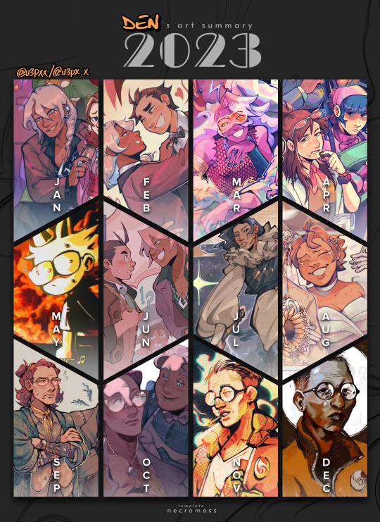
WHAT DO YOU MEAN IT'S 2024?!?!
next, you're gonna tell me it's gonna be some made-up year like "2025" next. tch, imagine that.
anyways, whoo! 2023! compared to both 2022 and 2021, i gotta say, my art style took a hard swerve in some direction this year. i mean, look at that klavier from january and that butch kim from just this december! (granted, i heavily referenced the portrait of butch kim but still, i didn't use to paint! mama mia!)
---
the way i drew faces has definitely changed, that's what i get for getting into something that's live-action and into smth that has realistically proportioned art lol
OH! OH! HOW COULD I FORGET!!! IT WAS (and still will be) THE YEAR OF THE OLD MAN!! i really learned how to draw aged faces this year! ach fraulein, i have not stopped drawing people in their 40's-50's! i would say "send help" but i'm actually having a lot of fun ASKSKS
---
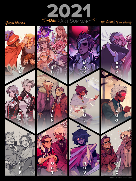
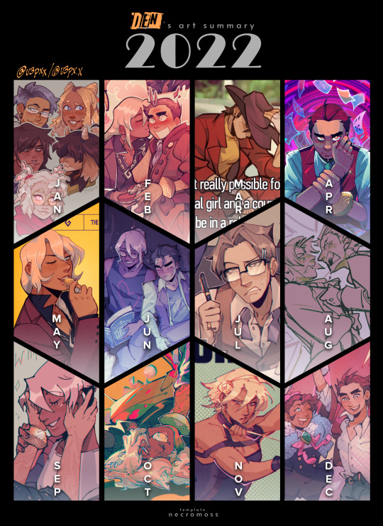
i think a funny thing about these art summaries i've done is that they're mostly ace attorney but then there's just a month where i become a different type of ill LMAO this year it was four months for the price of two new interests!
cheers! here's to 2024!!! hope y'all have a fun art year!!!!
---
i'm gonna ramble more below about like, other art things i did this year but i'm gonna put it under 'keep reading' bc this baby is getting way too wordy now WHEEZES
1. FAVORITE THINGS I'VE DRAWN THIS YEAR (IN NO PARTICULAR ORDER)
⚖️ mea culpa comic [x]
drawing this one was so time-consuming and ambitious but boy, do i love the end result! i had fun doing the inks for this one but was it a lot! i usually color in lineart and render everything but i had to stop myself from doing it for this one bc man, i'll die asksks
this also has some of my favorite apollos i've drawn, definitely
also! the part about the lineart not being colored and no rendering ended up being a deliberate stylistic choice for this one bc i had like more freedom to do just shadows with inks without it looking too out of place.
💐 my lawfully wedded zine spread [x]
now this one isn't out yet but take my word for when i say that this is one of the most craxy things i've ever drawn for this year, on account of drawing a comic AND group shot all in one!
also literally one of the prettiest things i've rendered this year, lookit that klav...
🎉 aa4 redraw - 2022 anniversary [x]
kind of like my wedding zine piece, group photos are insane, and rendering like uhhh [looks at drawing] 11 CHARACTERS IS ALSO INSANE if i try and draw a group photo again you have to stop me DFGHDJ
🎨 my art fight stuff [x] [x]
was possessed in the month of july or smth bc i pumped out like how many drawings so quickly (before i got burnt out that is pftt)
pace yourselves and don't be like me pls ajshgdghhjk
💥 people park day [x]
my friend told me that it was very obvious i watched across the spiderverse when they saw this FDFGHJD
but yea! this is when i started getting really into like, thought bubbles or just like, panels or drawings within a drawing when coming up with layouts
i still love the colors on this one...
🪩 fem disco portraits
ok so i haven't uploaded these yet but you have to trust me when i say that something was in the water DFGHDJ
who knew that all it took for me to learn how to paint was butches
2. ALSO DID YOU KNOW THAT I SOLD STICKERS THIS YEAR IN OUR UNI'S ART MART?
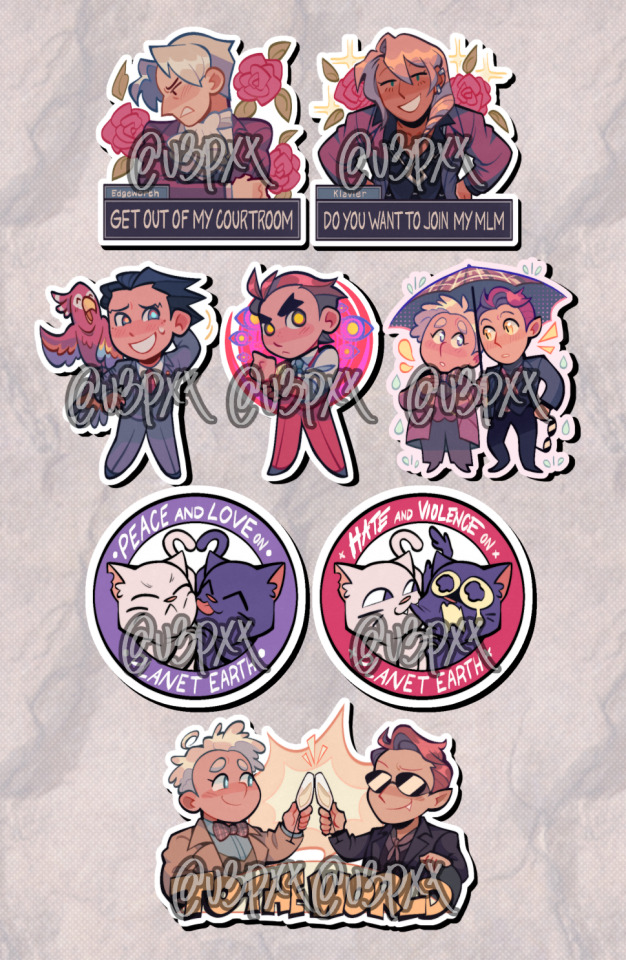
THE ONLY GOOD THING ABOUT THAT SCHOOL I SWEAR PFTTT this experience has also awaken the merch beast in me and i need to make more physical things for my brain to be happy, that's just how it be pfttt
hopefully next year i can actually start like a shopee shop or whatever lmao
3. ART FIGHT
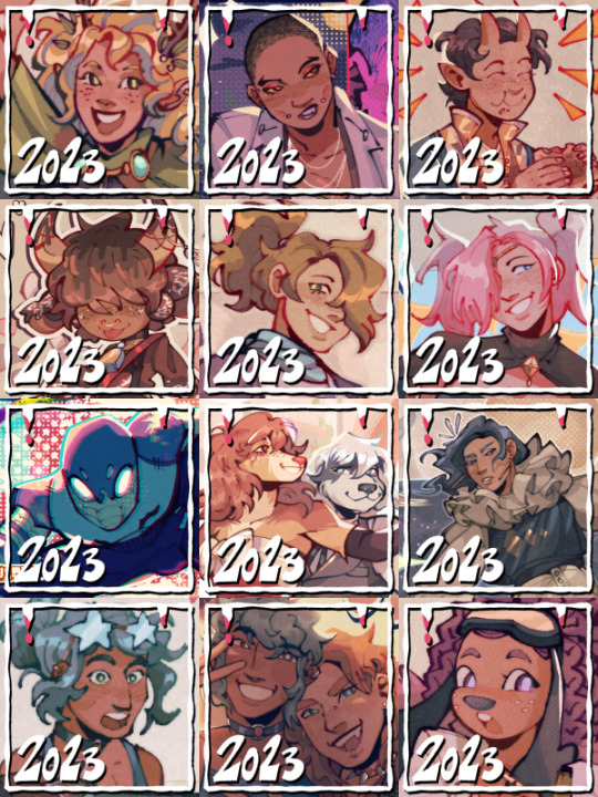
i'm actually quite happy i got to participate in art fight this year! very delighted for all the art i've gotten and very fun to have drawn for others too!!
4. ZINES
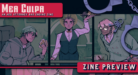
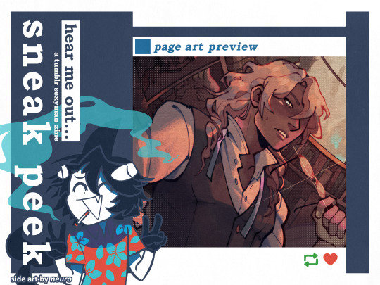
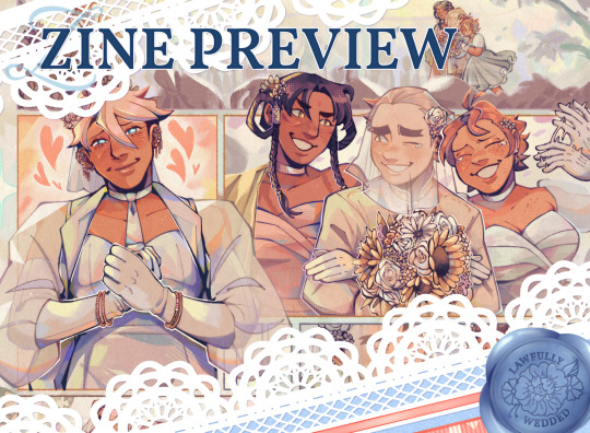
i got invited and joined so many zines from 2022 continuing to 2023 that i kind of got burnt out from participating for now ngl ASKSKSKS not gonna be joining much this year oopsiessss! (unless i lose self-control [very likely])
5. SCHOOL
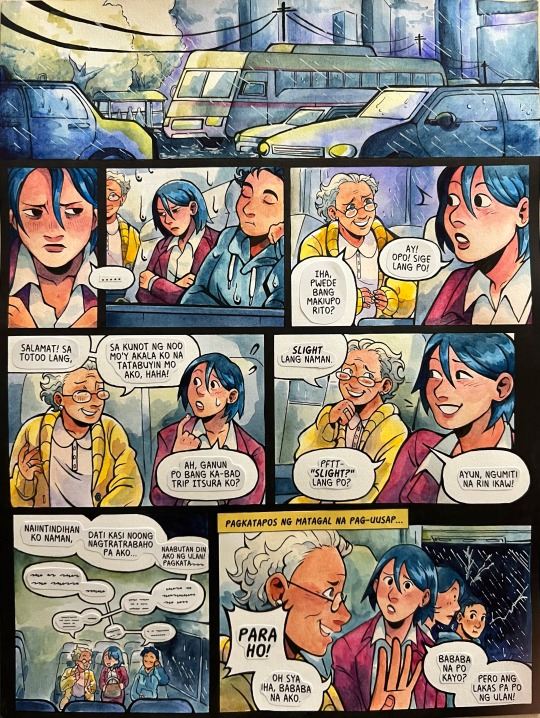
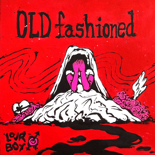
i don't actually like a lot of the stuff i draw for art school bc i tend to cram and not have fun pftt <- adhd moment, tragic! but here are some that i actually kind of like lol
6. THAT'S IT!
i think that's it! thanks for reading all the way down here!! o(* ̄▽ ̄*)ブ
189 notes
·
View notes
Note
I was wondering how achieve such a wonderful textured finish on your pieces? They are wonderful and I love their resemblance to aged photographs and the speckles of colors in the backgrounds. Your art is mesmerizing :)
you can see some of the texture brush sets i use in my #info_asks tag but i have some more (procreate) tips aside from just brushes
also hi i made this whole thing and then stupidly hit ctrl z to erase ONE word and i lost the entire bottom half of the post and all my image descriptions so fuck you tumblr i had to make this twice
to get a faded photo or old digital screen look, consider duplicating the canvas (once all the layers are merged) and using a gaussian blur tool on the new duplicated layer. then set that to low opacity to add a misty sort of look. looks nice in combination with some chromatic abberation and a small bloom effect. then a subtle noise filter on top:
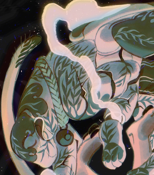
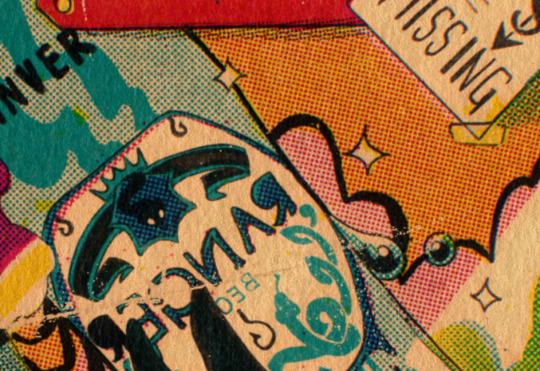
for faded print effects, it's really worthwhile to learn how to use layer masks. you can use a layer mask to non-destructively 'weather' blocks of colour or lineart, without erasing the layer itself. the weathered ink/block print effect here was made using layer masks which means that if i just hide the mask, the lineart becomes solid black again and easy to alter or colour in:

for old paper effects you can just set a paper texture on multiply over the art sure, but you can also combine it with the blur & bloom thing, a really subtle drop shadow and canvas tilt, and highlights to make it look like an aged photograph of a card. this originally had a transparent bg but i'll post it here with a white bg so that the drop shadow is more obvious. the scuffed edges of the card (left) were hand drawn, simple white stucco brush. the bigger patch of scuffed ink (top right) was a texture stamp.

for block print looks you can move the colour layer out of alignment by a few pixels - but only after you're absolutely sure you're done with it, otherwise you'll get something like this -

i forgot to erase out her eye before i moved the red layer so now her eye defeats the 'look' of a misaligned print. the black lineart and red layer were also given the same layer mask treatment as described above to make them look faded or like the ink didn't stick down right to the paper
you can do this with multiple colour layers too. if the colour layers are separated and set to multiply (as in this cmyk example), it'll leave halos and edges around each shape which mimic old comic book print
just to show what you can do WITHOUT any special brushes, here's a piece of one of my mez tarot cards from before i got any extra brushsets at all. for this one, i added a green tint over everything to mimic a sun-bleached or faded print (my actual goal wasn't 'medieval illustration' but actually 'trading card from the 60s that got left on someone's windowsill for decades'). the background texture is the procreate noise brush. the texture under the green lion drawing is the procreate concrete brush (to make it look painted onto a wall). the lettering and lineart is procreate's 6B pencil. but to properly aim for The Look of it being a printed physical object, i also used a perspective blur so that the edges are out of focus, and metallic gold highlights which don't match the lighting of the actual illustration and appear to be catching some other external light. that texture was made from the procreate noise brush
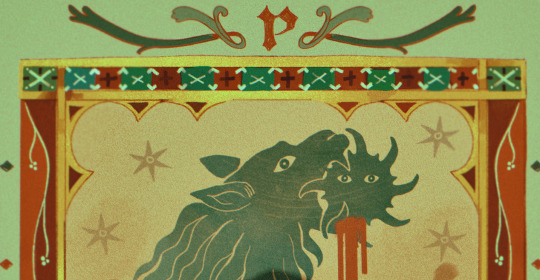
it's pretty simple compared to my later stuff but i still really like the effect
in terms of colours, you need to keep them unified so that they all appear to be acting under the same external light source, like if someone is holding up a torch to a painting then the painting colours will be glazed with firelight even if there's no painted fire. a really easy way to do this is to slap a multiply layer over everything in one shade - grey-yellow for a weathered paper look, or greenish blue for sunbleached photos. this unifies all the colours of the drawing. or you can apply a gradient map at a low opacity so that there's only a subtle change. or just do it by hand - if you want everything to be slightly tinted yellow, just pick the colours you normally would, but move the colour wheel towards yellow to get a yellowfied version of the base colour. easy
it's really important to consider how fading and weathering can affect printed colour. white paper yellows, black fades. you will rarely see pure black or pure white. which means you can use pure black or pure white to add external effects like the white scuff marks on the hierophant card. if the whole drawing is yellowed from age but there's some white somewhere, it's an easy shorthand to show that the scuff mark or whatever was not originally part of the drawing (great way to add some nasty stains lol)
#info asks#i don't have like a specific set of steps i follow i kind of freestyle it every time#obviously i have favourites i like to use but like that sphinx drawing? don't ask me how i did it because i don't remember#i just played with it until it looked nice. the blue dots are ... some sort of effect layer i don't remember which
651 notes
·
View notes
Note
whats your drawing process? I'm stupid and can't figure it out just by looking at it. I really want to figure out how you do lineart (if you do it at all) Do you do lineart and paint over it? do you paint over your sketch?
ah its pretty simple actually! i do regular lineart, then color, and then i create a new layer and paint on top of everything. i set my lineart layer to like 25% opacity so i can focus on shapes and colors instead, and then i kinda draw new lineart wherever i see fit. then i delete the old lineart layer :] thats where the sort of lineless looks comes from i guess ..... i hope i explained it well!
98 notes
·
View notes
Text
holy shit this year marks 10 years of this blog and moz!! i can't remember the exact date i started posting here - my archive says i have one post from november 2013 but let's disregard that - but i do remember it was around late 2014/early 2015 :)
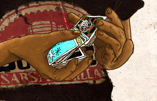
^ one of the very first moz art pieces i ever drew, for fallout week 2015!!
memories and art through the years under a read more bc it got long
2014 → baby's first rpg!! i started playing fnv on my cousin's jailbroken xbox late 2013 and finished mid 2014 and i loved every minute of it. i remember waking up at 8am and playing almost nonstop until 2am the next day haha!
i didn't play moz on my first playthrough - but i did start creating a character that would eventually become her: a shorthaired ex-boxer who punched her way through obstacles when diplomacy failed. i remember she spent a lot of time with boone. i liked him then, because he saved my ass more times than i can count. but i digress. this is draft 1 moz essentially
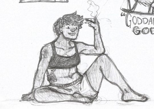
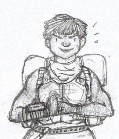
2015 → this is the year that i was doing my thesis so i could graduate but i was so depressed and stressed about it that i distracted myself by replaying fnv on pc, where i played through the dlcs for the first time. i fell in love with the dlcs' oversarching story; particularly ulysses, who i became obssessed with, especially since i couldn't find any content of him at the time. in the game, i played as moz; i had most of her personality and choices down, but her backstory was still up in the air.
fun fact: this was an existing sideblog that i remade to be a fallout blog so i could look for ulysses content, and when i couldn't find any, i made some myself, featuring moz as my main courier six. originally, i didn't ship them, but eventually i ended the year as a courier/ulysses otp shipper.
this was the year i started drawing digitally - my uncle let me borrow a drawing tablet and i used an old copy of photoshop i pirated hehe
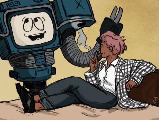
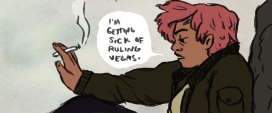
2016 → i graduated this year!! and promptly fell deeper into my depression. this was the year that it got so bad that i had to be medicated. through it all, this blog and moz and ulysses and my fandom friends were with me. and for that i am truly grateful :) this was the year i figured out how to lock transparent pixels so that i could color my lineart lol
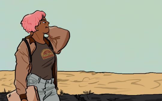
2017 → i started hammering out moz's backstory this year i think. there's a lot of sketches of her and her family in my files. i experimented with shading and backgrounds here but that experimentation was pretty short-lived
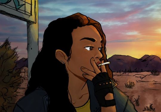
2018 → i started using references seriously!!!! i did a lot of oc on oc kissing this year, featuring mostly moz and many friend ocs haha

2019 → didn't draw much this year. actually this year was a blur and i can't remember much from it except from it being the year of my terrible no good bad copywriting jobs... anyway i did manage to continue my courier/ulysses brainrot and make this piece, which i'm still proud of
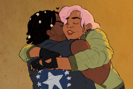
2020 → pandemic time. i spent a lot of time asleep at home and i think this was also the year i started doing commissions?? shoutout to anyone who has ever commissioned me - thank you so much, i truly appreciate it!!

2021 → i switched from my old-ass pirated photoshop to clip studio paint and never looked back. also i did a bunch of commissions for my grandmother's surgery, which failed, and i distracted myself from the sadness by drawing my ocs over and over and playing disco elysium

2022 → by this year, i've got moz down pat and have started vaguely developing other ocs instead. but she's still always at the back of my mind

2023 → i bought new brushes from true grit texture supply and immediately found new favorites that i started using for everything. i tentatively started incorporating background elements in some pieces!
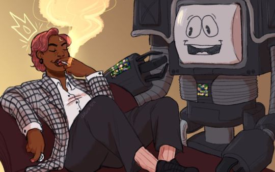
2024 → while it's still too early to say where this year will lead me art-wise, i will say that i started experimenting in realistic paint studio (which i bought in 2021, the same time as clip studio paint) a few days ago and i'm liking the results so far. we'll see!

all in all, these last 10 years have been quite a ride, but i'm glad i stuck around and i'm glad you guys stuck around too!! much much love 💖💖💖
#shh peri shhh#god. look at that old art... i took the ones that i still kinda liked but the rest...#well i don't hate them. but they're old and of their time and i wish i could redo them lmao#my art#moz
89 notes
·
View notes
Text
probably the biggest surprise for me in the New Game! manga are those colored pages you get once in a while. technically they're so above the level of what you can find in similar situations in other manga, and actually work to elevate the art style instead of just being a gimmick. I mean look at this:
as a counterexample to illustrate what I mean,let's consider Mahoako: the lineart is one of the best I've encountered recently in any manga, but the execution and color schemes on the covers feel very awkward and mismatched to me tbh.
the barely noticeable aura of light around the characters in those bath scenes???? the general approach to lighting??? the elegant low-contrast linework??? the post-processing?? and the color schemes are amazing. all of this adds up to make them work as independent pieces of art you could put on display as a poster/home screen/etc.


anyways go read New Game! it's a slice of life about a gamedev studio, and it has very light and tasteful yuri undertones^^ the only downside so far is that it has a few moments of that tired old anime cliche of women being inherently prone to talking about diets and losing weight which feels pretty distasteful for me due to some previous life experiences, but it's thankfully a rare occurrence. besides that, really good manga for sure!
(my fav character is probs Hazuki-san so far, both as a person and as a design hehe)

𓁺
23 notes
·
View notes
Note
if you havent yet, could you do an almond x latte fankid? i love that ship a lot :)
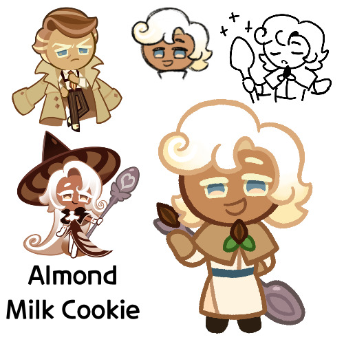
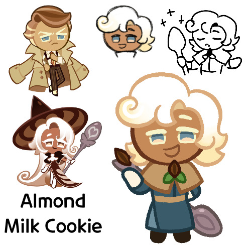
Here we are, this is Almond Milk Cookie
Funny enough, I was actually trying to go back and find this post after editing something, only to realize I never actually posted it and left it in drafts. Only for one day, but still
Anyways, so on to him
So Almond Milk here is a healer, using almost exclusively milk magic. He started out in Parfaedia, and spent a good portion of time there, until he switched over to the Vanilla Kingdom to learn healing magic, where he now works as a doctor
He’s a very friendly and kind sort, and he’s very dependable. Also, despite what some may think from his profession, he’s quite physically strong as well
However he is self conscious about not being made of “real milk”, instead being made from almonds, and he wonders if his false ingredient hinders his healing abilities. His mother has told him that whether or not his ingredient really counts as “real milk” doesn’t matter, but it’s never been something he’s able to let go. He doesn’t really make it that known anymore though, preferring to keep it to himself
Now on to design things
So I’ve had the name Almond Milk as an almondlatte kid idea for a good while now. Lattes are made of coffee and milk, and there exists a form of milk made of almonds, so it’s the obvious choice
Almond milk:
I made the initial rough sketch some months ago, so I don’t entirely remember the thought process behind it. But it looks nice, and like Latte’s but with one of Almond’s hair colors
I’m not sure why I gave him a thicker body type, but whatever, he has one. It’s not like I’m that good at drawing super skinny Cookies anyways
His outfit was originally going to be more hospital like, and probably somewhat closer to Butter Roll’s, until I decided that maybe I should make it more fantasy looking. Especially with all of my Almond kids generally having more modern looks to them, or at least in the way that Almond is “modern”, I don’t know the right word
The small cloak thing was a bit of a struggle, especially with his smile, but I eventually got something
In the sketch I gave his almond brooch something around it that looked nice, but I wasn’t really sure what it was going into the lineart, so I made it leaves. They probably shouldn’t have lines and should instead be solid green, but whatever
I gave him that spoon last minute in the sketch, since I remembered that as I said prior, I tend to not give my fankids accessories or tools anymore, and I wanted to rectify that. Unfortunately his pose didn’t really lend me well to putting it in his hands, so it’s just slapped on to the back. I’m also noticing now that the spoon itself it too small, at least on the bowl thing. But it’d be a big hassle to try and fix it, so I guess I’m stuck with it annoying the crap out of it
Oh yeah, so as mentioned earlier, I came to edit something in his design, that being his colors. Originally he looked like this
I liked the blue, and it does give him a color scheme unique from his parents, but my big problem was that the colors reminded me of Marcille from Dungeon Meshi. I don’t know if the outfit is exactly like hers, but it was bugging me, so I changed it. I think overall I like the new color scheme better, but I just wanted to mention the old one
I’m actually quite satisfied with how he turned out. Though granted I did have ideas going in about what to do with him, so that probably helped
Anyways, so that’s Almond Milk. I hope you like him
#cookie run#cookie run kingdom#almond cookie#latte cookie#almondlatte#cookie run oc#fankid#fanchild#almond milk cookie#my OCs#my art#requests#answers
51 notes
·
View notes
Text

Galinda Upland (old)
I drew this Galinda art last year back in July 2023
I was trying on this new technique where I use light colored watercolor pencils to sketch Galinda so that I don't have to do the lineart in a normal paper and trace transfer it to the watercolor paper (using eraser on watercolor paper kinda ruins the integrity of the paper and makes it more likely for the colors to bleed see the right shoulders)
It was actually going to be part of two pieces set. One with Galinda and one with Elphaba (which is why there is a dark silhouette in the background) but I didn't like how it turned out.
I actually really like how the hair turned out! Hair is definitely my favorite part to do. Especially curly hair. It just gives the piece more movement. I tried emulating ssavaart's lineart when doing this piece but adding my own take on it. I actually did this a lot in my older art. I start with thinner lineart and then using a brush tip pen after the paint has dried (the ink is not waterproof).
#wicked#wicked the musical#wicked musical#glinda#galinda upland#glinda x elphaba#gelphie#watercolor art#watercolor#traditional art#pose study#old art#degen art
13 notes
·
View notes
Note
the way you color stuff is AMAZING!!! I MEAN IT! mind explaining how you make colors look so good?? its ok if you dont want to :)
Hi, thank you so much!!! <3
Generally, I try to go for softer, more pastel like palettes, and that helps make the drawings seem more "consistent" and pleasing to the eye.
First tip: if you use Clip Studio Paint, definitely get this tool. It saves so much time on filling out lineart, and it's crazy accurate. If you're having trouble figuring out how it works, here's how I do it: I put the lineart layer in a group, add another layer below it (still in that group), and then use the tool on that new layer. Make sure the tool is set to refer to layers in a group though. Then I erase some areas that were "enclosed" by the lineart.

As for the actual coloring process. First of all, I use the mechanical pencil brush from Clip Studio Paint, the same one I use for the lineart, except this one has random color jitter per stroke. It adds slight variety to the base colors, which helps making them look less flat.
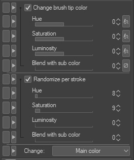
Here are the settings I use, but I recommend playing around with them if you want less subtle results.
For a comparison, here is one of my drawings with regular flat colors vs one colored with the brush I mentioned:

A pretty important part of the process isn't actually related to the coloring itself, but the layer effects I add to the finished drawing, as well as the paper texture (which you can see in the background; I add it twice, to the background and on top of all the layers).
Here are the layers I usually go with, I'll explain each of them below.
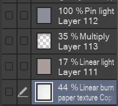
I'll start from the bottom. The paper texture is almost white with some very subtle warm tones, and it's set to linear burn, which works the best for this kind of texture. Like I mentioned, I use this overlay twice, but both use the same layer mode.
Next is the brown-ish linear light mode layer. This is to give the drawing more subtle contrast while also tinting it with a sepia-like tone. You can use any color for this, but I find this light brown color to work the best for my artstyle, since it makes the drawing look softer and gives it the old photograph kind of look which I tend to go for.
The multiply layer is mostly transparent aside from the edges. This is for the vignette effect, not much aside from that. It's definitely a personal preference thing.
Lastly, there is the pin light layer. This one is a bit weird, but I really like the effect. It's hard to explain it, but I use it to tint the dark tones of the drawing with a slight blue color. You'll see what I mean in the examples below. Occasionally, I'll add another layer with a darker base color, since pin light kind of works in reverse: if you use a light color, it will target the dark shades on your drawing, but if you use a dark color, it will instead only go for the light shades. Note that it's pretty strong in this drawing in particular, I usually make it a bit more subtle. If you look at my recent drawings you'll see it.
Here is the same drawing, with each of the layers applied in the order I listed (left to right order):
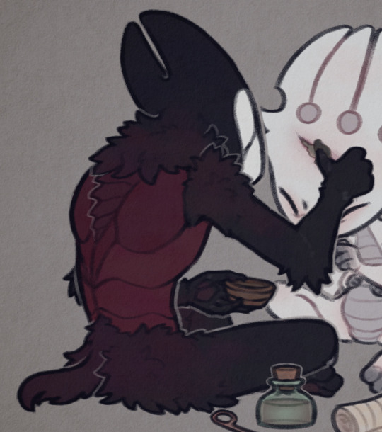


I'd also like to mention the lineart, which actually plays a big role in making my drawings look softer. I color the lines on the "inside" with a darker shade of the base color, though I often make it more saturated to really bring them out.
For example, here are the colors I use for FPK's lines. Not including his eye colors or the tips of his fingers/feet, since I don't color the lineart there. And a comparison of what he looks like with and without those lines colors, just to show how big of a difference it makes.

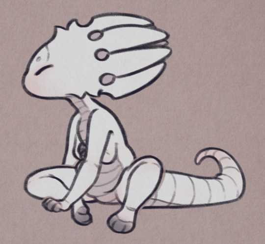
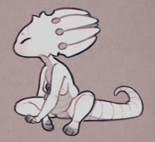
And to go back to the previous drawing, here is a similar comparison.

One thing to note is the additional white lines on the darker areas of Grimm's arms, the lines blend with the base color so I like to make them slightly lighter to help them pop out.
And lastly, I'll mention the light outlines you probably noticed by now. I add them as the final touch, they're the same color as the background though I sometimes lower the opacity if I feel like they're too much. They're meant to help with colors that blend together too much, and to highlight the silhouettes of the characters, as well as adding more dimension to the drawing. I think you'll see what I mean when I hide them in this final comparison:


Hope this is helpful! Sorry if you didn't expect that long of a post, I wanted to go through each step in my process so that I can explain it the best I can haha
40 notes
·
View notes
Text
i've always hated doing lineart. my hands aren't steady enough for it
but lineless also was never really my thing
i decided to play with a different way to do lines today and

(left how i usually do it, vs the test on the right)
it may have taken longer to do it but.. for once i actually enjoyed doing the lines,,


(same thing: left is old, right is new)
also a var using the same base sketch/colors for more accurate comparison
like Yes it's still a little messy and isn't perfect but like. this is the first time i've tried using it so that's to be expected. i really like it and may stick with it..
#void ramblings#art wip#voids ocs#oc: cadera'tten#oc: din#oc: varkhal haysh#yeah ik i'm rambling but i genuinely got excited about this 😅#silly thing but#i've been frustrated with my art for such a long time.#it's. nice. to be excited about it again.
6 notes
·
View notes
Text


Updated commission sheet! Thought I'd make a new one instead of still reblogging the old one. I still need some extra money mainly just for paying back my dad for car repairs, and I just need to actually save up money. So I'm able to do sketch commissions, simple lineart, characters with color, and fully drawn out art pieces! Please DM me if you'd like a commission or would like more information, and all payments will go through PayPal. (My PayPal is madisonuffelman1 still under my deadname. My name is Nix.)
Anyway, here are some other drawings to show off as examples of what I can do:


#my commissions#commission sheet#my commission sheet#my art#commissions#again thank you to my first commissioner!#it was at least a little something to prove to my dad i'm not doing totally nothing here
26 notes
·
View notes
Note
Question, how are you so good at art? I mean, it’s all subjective really but your specific art and colour combinations really tickle that itch in my autistic brain.
I've been drawing since I have memory. One of my earliest memory was at maybe 5, drawing Spyro. I started drawing gems at 15 maybe? A lot of the gemsonas from that era are lost to time, but I do remember they were requests (wow, me doing free art? Unheard of!).
Started taking art more seriously when I started this blog, at 2019. I have no job and by the time I was dealing with some serious depresssion shit so when I was sad I took drawing as a therapy. I drew a lot. So I still draw a lot since it's what I'm used to do or else it feels weird haha. I can guarantee your skills will improve on a speed demon level if you have no job and aren't the type of person that likes going outside.
Now more seriously, between 2019 and 2024 a lot of time happens. Art takes a while and one can get mentally burn, so while my hands rest, I can take my time to improve and get stronger. Mindlessly drawing can make lineart and coloring faster but designing can get weirder in the sense of not knowing what to do and just overcomplicating things. Here's my favourite example, good 'ol Blizzard! And I'm still not happy with the damn thing! Art can be personal, art can be a challenge, art can be fun, depends on how you take it. All you have to do is not to give up.


Art feels like a beast to dominate, you need to understand it to break it (I say this as a self-taught artist). No one, and I repeat, NO ONE, starts drawing good. If you don't draw good at the first time, don't give up. You don't like it? Too bad! Art is subjective and just because you don't like it, it doesn't mean someone else won't either. You don't like it because you saw the full progress, of course it doesn't surprise you. But it can surprise someone else!


This drawing right here is the FIRST digital drawing I made (I already drew a lot of paper, I'm sure you can tell haha). I used no layers because I had no idea they existed. Same gang ages later. And they still need to be updated!
Art is constant practice. A commission? Oops, it's actually practice regardless of how serious it is because in the future you will get better, you just have to not give up.
About the whole colouring part, I usually don't overthink it much. If it fits, it sits. BUT I do put it to a test. Does it have a lot of neon colours? Does it look cool? Then I have a problem because if I put that to greyscale and I can't see any difference because it all becomes a grey mass that's an issue. That and limiting the palette, depending on the character's complexity.
Per example when I draw on my art-style (hiii new followers who don't know my art style), I have to play with greyscales a lot to make sure all details can be seen.

I'm sure you get the point by now. I really want to do a video someday reacting to my pile of sketchbooks full of old drawings and do more lessons and all that stuff haha. It's not just about "drawing a lot since old age", that's boogus. It's more about "drawing a lot, having patience, learning from mistakes, research about art and keep drawing".
I'm sure I missed a bunch of things to say, hope that helps anyway! ^^
8 notes
·
View notes