#but lineless is just fun to play with /
Explore tagged Tumblr posts
Text

i dont like this and its so obscenely rushed but i wanted to atleast post Something before release
#NINE HOURS!!!!!!#NOBODY gets to talk to me when it releases#i am very not practiced with lineless i just did it cause its faster than my lineart and i have to go in like an hour#i got really lazy also so cyn is just glowy “true form” nonsense#if j files a complaint with corporate then i think cyn tormenting her with the same “You Didn't Have To See This” line would be fun#solver limbs are a lot easier to draw in lineless maybe i should play around with them like that and then just outline it after#art#but rushed#murder drones#murder drones j#serial designation j#murder drones cyn#episode 8 hype lets gooo. im going to kill liam for making it the finale
535 notes
·
View notes
Text


Yeehawgust 2024
Day 1 - On the Road Again
The battle between Humans and Monsters
#my art#my utmv art#utmv#undertale au#westerntale#yeehawgust#yeehawgust 2024#FINISHED JUST IN TIME#Hoping that the tumblr croping works with this#Yeah Ill do the entire intro to the game in a single day it will workout fine :)#I know some stuff is uneven proabably but im done with this for now just dont look too close lmao#I really like playing with lineless and color contrast so this was fun to do#rest of prompts are going to be single images
216 notes
·
View notes
Photo
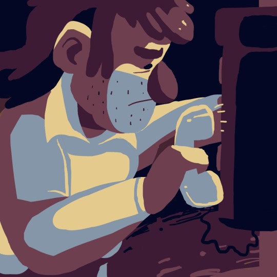
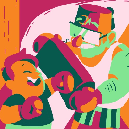
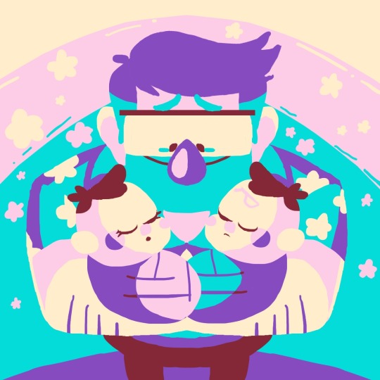
STANUARY WEEK 2: CONNECTION (+FATHER FIGURE and TWINS)
Gee this one was tricky to figure out! It took me ages to think up what I could do for the prompts, and then I had too many ideas I wanted to do and couldn’t decide which one to go with, so in the end I just did a bunch of ‘em ^^’
#gravity falls#stanuary#stanuary 2023#stan pines#soos ramirez#mabel pines#dipper pines#man I love doing limited palette stuff#it's so fun and pleasant :)#just playing around with colour and tone#nice and easy when the brain fog hits#especially when it's lineless#like I love doing lineart and all#but this just feels real nice ^^
1K notes
·
View notes
Text

A fresh coat of paint for my dear Anatome!
I’ve had very little time to draw lately, so I wanted to do something with an OC- kitties are my comfort zone. And what better time for my horror mascot than the spooky season?
#I’ll draw some AF or other such fanart soon you’ll just have to bear with me lol. my anxiety’s been bad lately and I love my OCs dearly (and#- not just the human ones. though mad scientist Diana would be fun ‘n spooky…)#oc: anatome#fursona#my art#anyway’s anatome’s a torbie now! like little blood splashes.#this super-cartoony/lineless style’s a lot of fun to play with I need to design more fluffy critters it’s so comforting#tw gore#??i guess?? for the background
4 notes
·
View notes
Text

got back into stardew valley recently! here's some art about it
#macs doodles#honestly im having a very fun time w this experimental drawing period#im really happy w this piece- i think both sides turned out great#i feel like when i draw w my mouse im not constantly erasing/redoing linework/sketches#i just do a very quick sketch pass through and then use the lasso tool to block everything in !!#its fun being able to take time to play around w color and composition w/o having to worry abt line art n stuff#if i dont like the shape of smth i can just take some away or add some more#this is the first time ive been consistently doing lineless work im happy with since like 2018/2019#stardew valley#stardew fanart#stardew farmer#sdv#sdv fanart#sdv farmer#stardew valley emily#stardew emily#sdv emily
20 notes
·
View notes
Text
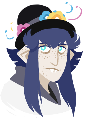

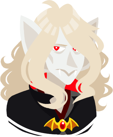

i finally did something lineless again for the first time in A While, so i felt like comparing!!
old ones are from october 2018, new ones are from very recently (august 2023)
#man. that's nearly five years huh. dang#low stakes 🦇#sometimes it's just really fun to compare recent stuff with old similar stuff#just to see how your art has progressed. and also how their designs may have subtly changed. very neat#also don't worry einarr still mainly has a sidepart haha#i like playing with his hair!!! i always did#i've drawn him with a middle part back then too#it's fine#also it was 2018 einarr was only BARELY starting to become a character at this point#also yeah i've been drawing mort's hair a lot wavier lately#it's more fun and it looks very nice actually#morten still has the top hat too. don't you worry#again i like playing with their designs and morten has a lot of hats <3#but yeah. pretty sure that old lineless mort actually never saw the light of day until now. he was literally still in the psd file#i wasn't completely happy with it at the time
24 notes
·
View notes
Text
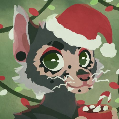
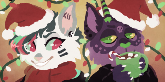
Christmas icon commissions for Syntago on toyhou.se! :D These were so much fun to do
#Christmas /#Decided to post this now because it felt weird queueing it up for early February when it's already late to be posting Christmas stuff /#contemplating offering lineless icon commissions more publicly though /#or maybe lined icon commissions because they're easier + faster? /#but lineless is just fun to play with /#dunno! if anyone would be interested in icons/headshots and has thoughts let me know! /#commissions#Rainy#Syntago#for others#holiday#Christmas
7 notes
·
View notes
Text
One of these days I’m gonna actually make beastly art in like his actual colors but um. I’m having fun returning to my comfy play scape lately <3
#doing shading studies on skulls for the funsies was such a tangible thing in how I do lineless art now#so like I somewhere got going drawing on index cards bc they’re less space to fill than a full page and thus less intimidating. that became#drawing silhouetted buildings and horizons against a gradient sky- I used roughly cut masking tape to have clean sun/moon and if I wanted#other clean lines. while I was staying w my grandma for a while I went oh shit I could do this digitally and that’s when I started getting#into digital art outside of just tracing photos exclusively. started playing with silly doodles digitally and somewhere along the line#wanted to draw teeth bc why not. struggled and didn’t like the result- tried again a few days in a row. liked how I’d improved but wasn’t#satisfied. so I saved an image of a skull lowered the opacity and originally was gonna trace the teeth but that got boring so like. I used#white to mark out the brightest points on the skull. a light grey for the next brightest. rinse and repeat until the whole thing is covered#and I’d do that for ages. like a year or two I think. I’d done other art too but the skulls and doing the same process with selfies was a#fun way to burn a lot of time and to just. have an ongoing project I could return to. a ways FURTHER down the line I was like ah damn. I’m#real happy with these but since I just grabbed images off whatever search engine idk if it’s ok for me to post these especially since I#wouldn’t even know who to credit anymore. so eventually I just sorta. stopped#but ummmm if u hit me up I can send u some of my skull study whatever’s and u can peek at how I mean they massively affected my process and#how I shade and stuff. that was like my whole learning process with shading outside of like. do line under the chin and the simplest things#that follow that train of thought. those skulls 🤝 buddy. rewired my brain and I’m vibin w it
1 note
·
View note
Text

[Click for better quality]
Ok yay I'm back from my vacation yipeeeeeee. I started this drawing of Keiki before I left and I was half considering just giving up on it.... until I did a short study of facial planes and then got motivated to work on this again! I'm glad I didn't give up on it though, as I'm actually really happy with this one!
Artist's Notes;
So as I mentioned in my last post about Touhou 17, I wanted to finish this by the game's five year anniversary but with how progress was going I didn't want to rush this so I decided to take a long break from it. Mainly because of the face. For a while now I was kind of feeling like I was stagnating with my drawings, not really in the clothing but in the bodies. There was something about the way I was rendering them that I just wasn't happy with, and after talking with someone else about this issue, I realized that the reason I felt this way was because the faces were too flat and didn't match the rest of the drawing and that I needed to find a way to make the rendering of the face feel consistent with everything else. So after doing a short study of the plains of the face (I used this 3D head model from art station as a reference for my short study, please go give this person some love as they are a lifesaver) I went back into this drawing and applied what I learned here. It was only after that that I finally became motivated to finish the piece, and while it started off as just a simple character sketch like Saki and Yachie's were, the moment I added in Keiki's little fire dragon I knew I had gotten in too deep and now here we are with a full on background. OK it's not super crazy or anything, but it gets the job done and it's better than there just being an empty void behind her. It's rare moments like this when I use brushes other than the Clip Studio Default Charcoal Brush and use the Clip Studio Default Paint Brushes as well (god bless the oil paint and dry gouache clip studio brushes, they were amazing). I don't know why but painting fire has always been really fun for me, there's something oddly satisfying about it y'know? I do think that another reason for this problem was because I was drawing faces like I would in my more sketchy style that didn't mesh well with my lineless style, so I'm glad I've started remedying that.
After adding in the fire dragon I had an idea to kinda make it feel like splash art in the way the composition works... probably because I have been playing Reverse 1999 again and it has taken over my brain. I do feel like Keiki's tools get a little lost in the composition, and I didn't fully render the metal parts of them mainly because I didn't feel like they needed it, but that's just something for me to improve on later down the line.
If you guys are wondering where I went for my vacation, I went to New York and got to go to the MET and the Museum of Natural History. In both places I found Kofun period stuff and I was so happy to see it you have no idea. I remember one of the Haniwa I saw had some neat face paint under the eyes that I tried to replicate with the makeup under Keiki's eyes in my drawing, though I think I'll gave to figure out how to draw makeup on characters because this reads more like blush to me than anything. While drawing this I also looked up some references of Kofun period jewelry and really liked the stuff I found, which also meant that now she has proper Kofun earrings instead of earrings shaped like Kofun tombs. I put some of the things I referenced with a closeup of Keiki's face as well down below. I made her outfit more reminiscent of the outfit I gave her at the beginning of the year with the buttons and all, though I do want to try and draw her in some more period accurate clothing like the Haniwa I took a picture of at the Museum of Natural History. I wish I could find a way to make her handercheif look better though as I wish I made it a little bit bigger, though I think I'm saying this because I've looked at this drawing for too long lmao. Once again something to work on for when I next draw her. Also want to get better at rendering hair, as some details (like the little strands in front of her ears) kinda got unreadable due to the similarities in colour lol.

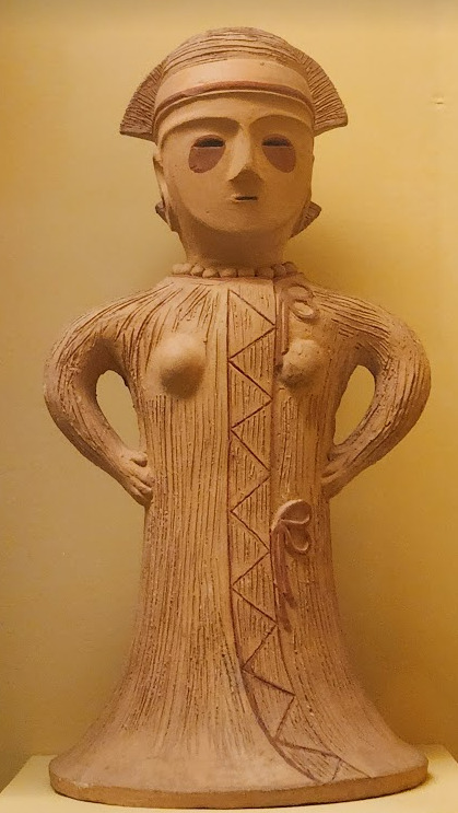


Now you may have also noticed the little cracks I added onto Keiki's face, and that's because I have fallen in love with the idea of Keiki's body being made from ceramic and that she crafted her body herself. While they aren't very visible I also tried to add some doll joints to her body, which is an idea I played around with in the past but never went to far with. I also want to get better at rendering cracks in ceramic, porcelain, etc, as I'm not sure how those read in the drawing. I also have a headcanon where the cracks in Keiki's face show up because of heightened emotions, and while Keiki is aware of this and does her best to make sure her face doesn't break off.... she will still end up with at least a few cracks during any given day, and she can often forget to repair her own body quite frequently so Mayumi has to remind her quite a lot. Mayumi even taught herself some basic sculpting techniques to help repair parts of her body that are so badly damaged to the point where Keiki can't repair them herself, i.e. if both her arms broke off, Mayumi would put them back together for her so Keiki can at least have something to repair herself with rather than nothing. I also like to imagine that if Keiki created her own body, if you took a look at Keiki from the beginning of her life she would look completely different compared to now.
BTW If you guys are wondering what a very very angry Keiki looks like....ok in order for this to make sense have any of you read volume 11 of Land of The Lustrous? Am I bringing back some memories for those of you that have? Ok good, glad we all got that mental image brewing in our minds, I'll probably draw a version of Keiki that is somewhat inspired by that one day as it's an idea I've had for a little while now. And to those who haven't gotten to that volume yet and are confused.... don't worry about it, just keep reading :)
#touhou project#art#fanart#touhou fanart#touhou 17#keiki haniyasushin#wily beast and weakest creature#touhou#東方project#own art
190 notes
·
View notes
Note
Not a traditional request, but I'm curious to see how your art is formed and what your process is. It's so cool that your art is similar to comyet's!! I always wondered what other people in their newer artstyle would look like but they only ever drew Ink. I guess now I have a chance :D
Drink water and i hope you have a good day!!!
this is a really interesting request!! thank you for asking, actually! i like questions like these :-D
i'll start by explaining my personal art process—how i, 12-year-old me started out, and then explain how i got where i am with my art today! buckle up, because this will probably be a lengthy post :-)
The Progression of my Art
my first ever art posted online was at the beginning of 2020, when quarantine first hit. i had always had a knack for art; doodling in class, making OCs, etcetc. however, when i heard about undertale through a friend, that's when i really started to take things serious.
i did all the things kids do when they first find out about undertale—i watched countless comic dubs, animation memes, looked up fanart, etc. i first started my real art journey when i began making fanart for undertale and the AUs. this is why undertale is so special to me, and why i have loved it for so long! it has fueled my creativity for almost five years now.
this is the first fanart i ever had done. i posted it on amino sometime in may.

i was SO so proud of this piece. i showed it to my friends & family, and then decided to show people online! this was my first big milestone as an artist.
as time went on, i improved more and more, creating countless UT AU artworks in my spare time. and it was all because of the people who were kind and supportive of my art! the UTAU amino will always hold a special place in my heart, because of the positive experience i had. the positive feedback i got is what drove me to really want to start improving my skills and become a better artist like the ones i looked up to 💛 this is why it's so important to be kind to beginners. even if their art isn't the best at first, you bet your asses it'll be in the next few years!!
SO! i drew and improved, really just trying to find my own style that i liked. i had always loved ink sans, and that prompted me to look into his creator's artwork around late 2022-early 2023. i followed her instagram, and at first, just admired her work from afar.

then, i tried out replicating her style! this is the first piece i ever drew inspired by mye! i made this last fall, in 2023.
after that, i tried to find my own style some more, leaving the lineless style behind. but, in may of this year—2024—myebi decided to hold a DTIYs, and that's when i decided to replicate her style!
i know, i know, kinda defeats the whole "draw this in your own style" thing... but i had been wanting to try and replicate their style for quite some time, and i saw this as a perfect opportunity to try it out!

this is myebi's OC, aheran, that i drew for the contest !! it isn't exactly like her style, obviously, since i didn't want it to be too similar and weird mye out. however, i did replicate the lineless style, the grain textures, and the shading style as best i could. i also played around with shape language.
this piece was SO fun to do, and i did end up earning an honorable mention!
this was also my first post on instagram. after this, i started to draw all my art in a style inspired off mye's!
How do I draw in Comyet/Myebi's style?
here is where i'll be answering your question: what does my process look like when I'm replicating myebi's style?
i'll try my best to break it down into seperate steps that i usually take!
1. References!
References, references, references! References are the most important thing you need when trying to replicate something specific. I am currently at a point in my style where I do not usually need references, but you bet I used them big time when I first began to replicate mye's style!
Personally, I believe her instagram (@mye_bi) is the best place to get recent refs of her style! It's the social they post most often on. For Undertale specific references, I gathered them from her Tumblr (@/comyet) because her insta doesn't have Undertale related art. You may have to scroll a bit, but you'll find it on her blog!
I also have some niche references from other online sources, but I had to dig quite a bit for them. You don't need to be that thorough lmao

all art by myebi/comyet!
2. Sketching
After I gather references, I start with a sketch! Really, it's just taking a bunch of references and finding things you like/need to replicate in your piece. If there isn't a reference for something you are trying to draw, then the best you can do is guess! I have to make guesses on how Myebi would draw something all the time, because I draw a wide range of different characters. It's all about experimenting and doing your best!

sketch by me, ink reference by @/comyet, error reference by @/loverofpiggies
3. Coloring over the sketch
After I finish the sketch, I go straight over it with all my base colors! I typically do everything on seperate layers, which procreate... hates. I use a lot of layers.

And, to finish off, I really just add details! Lines, textures, shading, etc. I can't quite explain how I do it—I just go off Myebi's style!

Finding the right brushes
I have spent a long time trying to find brushes that best replicate Myebi's style, and the one I linked below is the best I've been able to find! It's the pack I use right now.
I use Weak Pencil 3 for any lineart I do, I use Fine Pencil 2 for color blocking, and Weak Pencil 4 for the grainy textures/shading :-)
The pack does cost a bit of money, but unfortunately, I haven't been able to find a free brush pack that gets the job done quite the same!
and that's all there is to it! i hope this answers your question and gives you some insight on how i make my art :-D
DISCLAIMER: i am not attempting to be a "myebi 2.0" or anything like that. i simply really enjoy how their style looks, and i enjoy drawing in a similar style! i mean absolutely NO ill intent towards mye—she is my biggest inspiration, and i will always have the most amount of respect and admiration for them and her work. 💛
#utmv#undertale#undertale au#undertale fanart#error sans#ink sans#errorink#error x ink#frisk dreemurr#frisk undertale#inkblott#myebi#comyet#art journey#i really hope this helps people lol#or inspires people#idk tbh#i love you myebi!!!#sans undertale#sanscest#error sans x ink sans#utilizing sans tags for reach lmao
103 notes
·
View notes
Text
Why do people complain about doing lineart all the time just dont do it then or just like play with it more
Easy solutions:
-just clean the sketch up and color that
-experiment with lineless
-do looser and more vague sketches rather than super defined ones cause honestly you’re just setting yourself up for getting annoyed at that point and also it probably helps build confidence in your linework much like drawing with a pen does
-get more loose with the lineart let there be some gaps do it quick and fun
-try thinning/thickening the lines or experiment with line weight thickness to exaggerate shadows and emphasis
-use the lasso and fill tools for lineart. Its fun
Experiment and have fun if art is a hobby then it shouldnt be a chore
I hated lineart for so long until i started doing looser sketches and linework and also started working in ms paint LOL find something you like doing
57 notes
·
View notes
Text

art summary through the years! i saw this going around and i wanted to play too, i always love doing these summaries.. template 🌹
my art became "i discovered the joy of drawing drapery and fabric in 2021 and never looked back" HAHA
looking at the early stuff, sometimes i really miss stylizing and drawing cartoons!! 2015 was the first year i started drawing cartoony stuff, pre-2015 was purely anime style. an updated art summary from 2010+ for me would be fun.
going back to the 1st sentence, stylizing just doesn't give me what i want from art anymore, it doesn't satisfy my art hunger haha (dungeon meshi joke.. iykyk). although it's still fun to experiment once in a while (e.g. merch). even if my current personal art is not very animation industry friendly or "hireable", i think i have a stronger notion of my "artistic" voice now more than before. (again, at least for personal art)
2020-2022 were rough years during the pandemic... i wanted to stop drawing so many times. i always say this, but during that time i went back and touched base with things i used to love as a teen, such as old anime (fma, pandora hearts, etc) that inspired me to pick up a pencil in the first place, and it helped to revitalize my love for art. and then i discovered drawing and studying fabric and i could never go back! i think my art is now more inspired by fine art history than cartoons hence the more realistic drapery...
one reason why i always change up my art style or technique every 2 ish years is that i kinda get bored of the same brushes easily... ive worried that using the same brushes gets boring and stale to people, but i think my art values are more or less consistent with how it was 3 years ago. i cycle through a set of like, 3 different brush sets (watercolour, pastel/lineless, and regular shading) depending on the mood of the drawing. different drawings call for different techniques you know?? and i think it's okay to use different tools for each drawing, art isn't meant to all be the same.
#art summary#bit early for art summary but a half year/through the ages one is fun once in a while#my art
98 notes
·
View notes
Note
seeing your clowns made me go feral since my fixation is cringe and clown flavored
Who let you cook like that who let you cook AUTHHFFH UR ART IS SO COOL IM BEING DRAGGED AWAY
You’re hatching is so fucking inspiring since it’s soMETHING I try to do in my own work I LOVE UR ART
would it be fine to ask what brushes you use? I love ur values also, you’re so so good at shapes and form WAAAA I LOVE UR STUFF. I did dig up an old ask you made iirc, but I’m not sure if it’s changed
Hey! Thank you very much. I'll go through the brushes I use for each program: Drawpile
From what I understand most of these are MyPaint brushes... but I only know them as drawpile brushes because that's what I use. Main ones I've used lately is Irregular Ink and a default brush for coloring


I don't really change the size of irregular ink much and the pressure doesn't matter that much. It has high stabilization which I haven't changed, but I'm sure you could get away with lowering it. For the other brush I'm pretty sure it's a default one that I slightly tweaked (drawpile is a bit bad about communicating what brush exactly you are using to you.) I quite like it because it feels like playing with clay, makes it easy to map out the volume. I use it for those lineless pieces I do from time to time too. I change its size a lot while drawing. I've also used these two, one of the pencil brushes and a second one I stole from Jokioro that I have no idea what is called
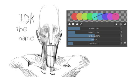

I used the first one for the D'arce I did a while ago and the recent VTMB piece. It's great at emulating sketchy graphite pencils, I like layering it to do multi-colored hatching rendering. The second one I don't know how to use super well yet but it's probably my fourth most used as of late. It works very weirdly so if you wanna figure out how to make it work I recommend looking at how Jokioro draws. Clip Studio I bounce around a lot with all the brushes, but I use a loooot of stuff from the Frenden pack. Mainly Meeko Leako for lining and even coloring, it has a great texture to it, very fun

This has been my most used brush for years. It's great for super straight lines and produces a great difference in value between quick lines and thick lines. I haven't used it as much since I picked up drawpile more recently, but it's amazing! Other than that I use the default G-pen when I just want simple lines without much texture
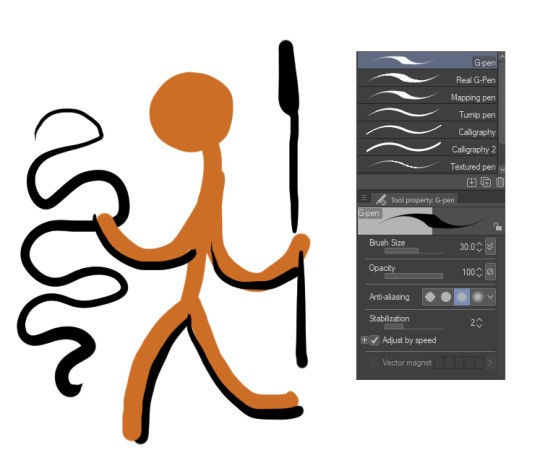
It's a bit ugly at a glance but I think if you lock in it's great for super clean lines, just trying to get the point across without much noise. I also like coloring with it at times, when I'm going lineless. SAI Binary pen. Use the binary pen. It's the best brush ever made
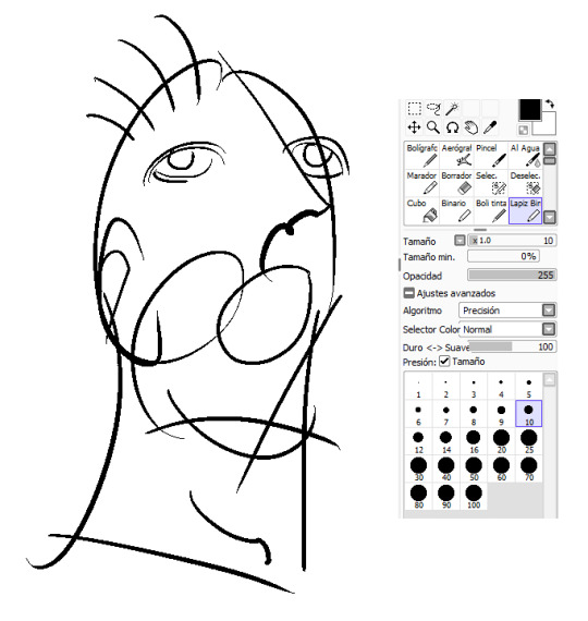
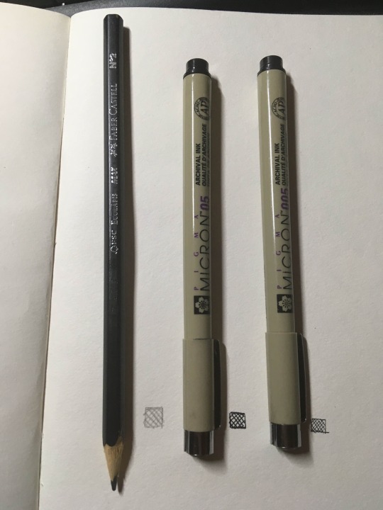
It just feels super right to draw with it, it's so simple but it makes your lines look super slick, and it's just a binary pen. I guess they just got the behavior down perfect for it. But yeah, love this brush. IRL I've always used these archival ink pens in different sizes for basically everything I've done traditionally, and of course just a simple number 2 pencil for sketching and such. I've used a bit of charcoal recently, and been wanting to deep into darker pencils for detail, but this is still the default. I also will probably try out dip pens sometime
That's all I can think of immediately, but I always like to mess around to try and find another great brush, and you should do the same even if you end up using these a lot.
43 notes
·
View notes
Note
do you have any tips on drawing backgrounds. I struggle with them so much and can’t always make them cohesive with the drawing yk
Oh man, yeah. I do indeed know, all too well U_U Backgrounds are a STRUGGLE
Here are some things I’ve picked up, that have helped make them a little less difficult (feel free to take what you think might be helpful and then scrap the rest!):
1. Map out your Composition, Tones and Colors in a Rough Thumbnail
-I think the main thing that helps me, is planning. If you’re gonna do a background, don’t think of it as an after thought. I find it’s helpful to plan out the background at the same time you’re planning the character pose, rather that just slapping in a background, once the character is already finished. It’s like a little dance, making the environment work to accommodate the character while simultaneously making the character work to accommodate the BG.
-I usually do a small thumbnail and color key before I actually go into the drawing itself
-I like to think of the thumbnail like a little roadmap that I can always refer back to when I’m stuck. It's something that is easy to experiment with and will help me keep the big picture in mind, while working, rather than fussing over all of the small details.
-you can plan how you might want to use light and other elements of the bg to frame important things, or point and lead your eye to the focal point, or divide up the frame.

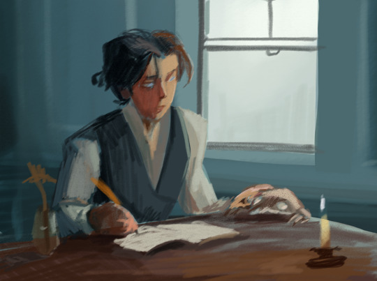
When I’m working on the actual drawing, I’ll always keep my thumbnail visible off in the corner of my workspace, just as a reminder of where I want to go with the piece, and to keep it available to color pick from, when I want to.
2. Try Sticking to 1 or 2 Dominant Colors and try not to stray too far, unless it’s an intentional accent
I usually choose 1-2 main colors and then paint bucket fill the canvas with those colors as a base, before I even start on the "cleaned up" linework. Then when I start painting, for real, I choose my colors based off how warm or cold they are, compared to the main color(s).
So say, for example, I want the dominating color of the illustration to be red, if I’m coloring an apple (that is naturally red) I would keep it the same hue, but might change the tone or saturation. However, if I’m painting a carrot (that would naturally be orange) I might just shift the hue to be a warmer red, rather than a full blown orange. Conversely, if I wanted to paint a naturally blue sky, I would shift the hue from red to be a bit colder, maybe more of a purple, but not necessarily a true blue.
*sometimes the saturation can mess around with a perceived color as well, (like how a desaturated yellow, will often look green), so I find there’s a lot of trial and error and messing around to be done with color, which I guess is half of the fun :P
(obviously this isn’t the only way to approach color, but I find it helpful for reigning myself in and keeping things a little more cohesive)
3. Add Depth
-Think of your environment as a 3D space with overlapping elements. Consider what your foreground, midground and background elements might be, to give depth to the drawing.
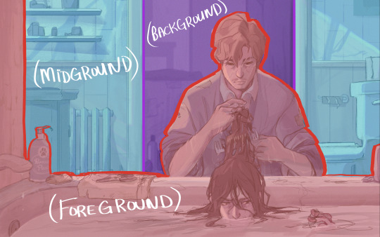
The further away something is, the less details the human eye can make out, and atmosphere will create a sort of hazy look to things that are set far away. So to mimic this effect for things that you want to recede into the distance, you can use less saturated colors, less contrast, do less detail, less line work (maybe even go lineless) and use slightly cooler colors. Maybe even add a little gaussian blur if it looks good. Conversely, for things you want push forward, just do the opposite (higher contrast, higher saturation, heavier line, more detail ect.)
4a. Study and Play with Lighting
I think lighting can be a big factor in helping make a character feel like they fit and belong in their environment. Study how light works and interacts with the world and think about how it might effect every element of your environment. How does it break apart when it’s going through something translucent? Is it going to cast harsh or soft shadows? Are there multiple light sources? Are they different colors? different intensities? Is the light source visible or not? Is it a controlled beam of light, like a laser, or more open, like the sun?
4b. Make use of Reflected Light and Color
So, when light hits an object, that is near another object, some of it’s color can be reflected onto the nearby object, if the angle is right. So for reflected light, I usually add a clipping mask layer to the affected object and add a gradient coming from the first object, using a color that has be color picked from the first object. Then I’ll turn down the opacity to my liking.
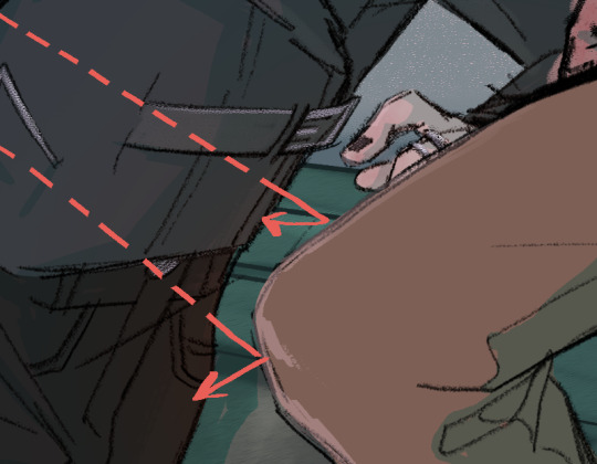

^(Ok, this first example of reflected light is super subtle on Sirius’s jacket, but it’s a little clearer to see the reflected light from the tub reflecting onto Sirius’s face and Remus’s arms, in the second example)
5. Add a Little Bit of *Spice*
If by the end of my coloring, I still want to do some tweaking, these are my general go to’s:
-Edit with filters and/or gradients. If you’re working digitally, play around with blending modes. You can make a new layer, fill it with a color or a gradient, then see what different blending modes and levels of opacities will do to it.
-Color your lines so that the black isn’t so harsh against the other colors in the scene. Sometimes I like to go completely lineless in some areas, if it's an area blown out by light, or is maybe pulling your attention away from the focal point
-You could add a little bit of grain and noise (to do this in photoshop, make a new layer, fill it with a grey colour (or experiment with other colours) then go to filter>noise>add noise>ok and turndown the fill and maybe change the blending mode)
-Adjust the levels, if you’re still not fully satisfied with the contrast, you can adjust the levels (ctrl +L in photoshop)
-Adjust the Color balance if you're not fully satisfied with the saturation and colors (ctrl+ B in photoshop)
Ok, gosh, there’s so much, but I think I’ve rambled on long enough… hope this helps and wasn't too obvious or convoluted!
Good luck!!
105 notes
·
View notes
Text

He literally just wants to play hide-n-seek, and you're running away. You're running away from him, and he just wants to play hide-n-seek. I cannot believe you. You know what? You're going in time out until you can remember what having good ol' fashioned fun is about.
lineless vers below

#[r0b0.img]#everyone ignore that i took his arm off cuz i didnt feel like drawing it :)#ne ways....#this took me like 3 and half hours#dca community#fnaf sb#fnaf moon#fnaf#moon dca#daycare attendant#dca fanart
47 notes
·
View notes
Note
Question about the Unknown Fazbear entities. Are they constructs made by Fazco, or did they just suddenly appear? Where did they come from?
Also, can I make a little friend for your Sun and Moon variant?
hi hi !!! im so so so sorry for taking so ridiculously long to respond to this but ah! this is something im hoping to get more into throughout the videos :) this is going to be long so i'll answer ur second question here: if ur still interested yes!!!! oh my god that would be so cool!!! what!!!
and for ur first question:
(actual answer + VD below the cut !)
they are a bit of both! Fazbear Entertainment being Fazbear Entertainment (and especially with the new AR mask stuff from the ruin dlc) was experimenting with a brand new virtual companion kind of thing ever since the pizzaplex burned down! its similar to the AR app (that.. isnt very canon as far as im aware but doesnt seem too far of a stretch from what they would do) & scp-1471 - with the fun twist being that its not an app. it's almost like a reality-warping virus, ig??
so to answer your question: yes, they were made by fazco! but (and i tried to hint at this in the third video but im honestly not sure how well they came across) despite limiting the first batch of these "virtual companions" to the beta testers that signed up for the program, a couple of strays ended up on the front porch of other people's brains (including "you"/the pov you play as throughout the videos)
the current idea im working with is that the entities are linked to the original (decommissioned) animatronics, but duplicated - think the way that freddy comments on there being other freddies in other pizzaplex locations. im really liking the idea of subtle variations between entities: same original source, same memories, but slightly different reactions, personalities and effects on their host!! i imagine especially so for entities based on aggressive animatronics like monty. some of them are a tad confused on why theyre there.
thank you for sending this ask!!! again im SO so sorry for taking so long to respond!!! at least part of it was waiting for myself to finish the third video and the other part of it was just me never getting around to it i fear :( i hope u have such a wonderful day !!!
[VD: a video of entity sun speaking to the viewer through captions. entity sun is drawn in a simplistic lineless style. their face is half shadowed and they are missing a ray; they are cropped below their neck ruffles, which are larger than their canon ruffles and have a second pair of sheer ruffles underneath. sun stares at the viewer before saying, “where i came from?”. they tilt their head to the right. “a lot of thoughts you’re having there, friend.” “i don’t know if you need to worry about all of them.” Silence. “do you?” Silence. “Do you think you need to worry?” Longer silence. “Are you worrying about anything, starlight?”. This last dialogue lasts longer than the others. In the last few seconds of the video, moon faintly appears behind sun, looking distraught. The video cuts to black. / end VD.]
85 notes
·
View notes