#but in terms of aesthetics and landscape? still basically the same
Explore tagged Tumblr posts
Text
People point out a lot of Venti not doing his job, not governing his people, he sure can drink, but do you think the other archons ever look at Mondstadt and go "Venti....your nation has barely changed in over 2000 years"
#2000 years ago he had a friend who had a vision for mondstadt who died who made him a god#and 2000 years later Venti still hangs on to that friend and that dream and that vision for mondstadt#well. i guess the knights and stuff did get established. arostocricies rose and fell and rose and fell and#but in terms of aesthetics and landscape? still basically the same#the fact that overthrowing danger is always done with a Gunnhildr and a Ragnvindr and a hero to lead#and a member of the nobility who turned#mondstadt stuck in a cycle of it's own making. things playing out over and over again. trapped in statis of sorts due to its god#who hasn't let go of his past yet#genshin talk
18 notes
·
View notes
Text
the problem with long-term temporary infrastructure in minecraft is that most common solutions to how do you get around a build in survival while it's under construction just don't signify infrastructure. moss, dirt, slime etc., especially when pillared, read as ultra-tempoarary or disconnected; they are so supremely unconstructed, betraying that the reality of the thing you're building is not aligned with the reality of the process of building it. gravity-defying, structurally unsound, fantastical etc., they produce an unpleasant dissonance next to a build destined for polish.
ladders signify what they are perfectly well, but don't provide the functionality of a platform. scaffolding is visually noisy and repetitive at scale, and ironically although it signifies something intentionally structured for support, it's even more temporary than the blocks that read that way - and it's easy to accidentally destroy, so not ideal for medium to long term.
bubble columns, because they're usually hidden, don't seem to signify anything at all to me - and even a lava-and-cobble setup process trades aesthetics for quick creation, and they're still a pain to clean up as the scale increases. and like ladders, they aren't a solution to the problem of not being able to float on their own.
the reason i built a mushroom parkour course in my ethogirls tower base is because i wanted to be able to fully scale it as i built it; it's still an imperfect solution because i basically can't texture from the inside now, and i've got the same problem on the exterior, but you can i suppose solve the "too fantastical" problem by... leaning into fantasy. wonder if you could start a house build, then set up the landscaping/trees/other stuff nearby to function as sneaky scaffolding as well? if you can't get what you're doing to signify as what it's supposed to be, what if you fully obscured its purpose instead?
8 notes
·
View notes
Text
Louvered Roof Systems vs. Traditional Pergolas: Which Is Right for You?

When it comes to enhancing your outdoor living space, the choice between a louvered pergola and a traditional pergola can be a tough one. Both offer unique advantages, but understanding the key differences can help you make a more informed decision. Let’s explore how these two options compare in terms of style, functionality, and value for money.
What is a Traditional Pergola?
Traditional pergolas are simple structures that offer a basic framework for climbing plants or a shaded area for relaxation. Typically made from timber or metal, they feature open beams or rafters, which allow sunlight to filter through while still providing some protection from the elements. Traditional pergolas are ideal for those who want to create a garden feature or a place to unwind in the fresh air, but they don't offer much in terms of weather protection or flexibility.
What Are Louvred Roof Systems?
In contrast, louvred roof systems are designed for ultimate versatility. These modern structures feature adjustable slats that can be rotated to control the amount of sunlight or shade. With the ability to open and close at the touch of a button, a louvre roof system offers a much higher level of control over your outdoor environment. Whether you’re looking to block out the sun on a hot day or let in the warmth on a cooler evening, these systems provide the flexibility to adapt to changing weather conditions.
Style and Aesthetics
Traditional pergolas are often chosen for their classic and rustic appeal. They can seamlessly blend into garden settings, providing a charming, natural atmosphere. Whether you’re going for a Mediterranean vibe or a more cottage-style garden, a pergola can easily complement your landscaping.
On the other hand, louvred roof systems are sleek, contemporary, and designed with modern aesthetics in mind. They often come in a variety of materials, including aluminium and steel, and can be powder-coated in different colours to match your home’s exterior. If you’re after a more polished and stylish outdoor living space, a louvred pergola can offer a more sophisticated look that works well with modern homes and contemporary landscapes.
Weather Protection and Flexibility
One of the main reasons people opt for louvred roof systems over traditional pergolas is their superior weather protection. While a traditional pergola offers limited shelter, a louvre roof allows you to adjust the slats to block out rain or excessive sunlight. This means you can enjoy your outdoor space all year round, regardless of the weather.
Traditional pergolas, while offering some shade, don’t provide the same level of protection from rain or intense heat. If you live in an area with unpredictable weather, a louvred system might be a better choice for ensuring comfort and usability.
Maintenance and Durability
Traditional pergolas, especially those made from wood, require regular maintenance. They need to be treated for weatherproofing, and over time, they may show signs of wear, such as rotting or warping. Metal pergolas are more durable but can still suffer from rust if not properly cared for.
In contrast, louvred roof systems are typically made from durable, weather-resistant materials like aluminium, which requires minimal maintenance. They’re designed to withstand the elements, making them a long-lasting option for your outdoor space. Plus, their adjustable slats are easy to clean and maintain, ensuring that your investment continues to look great for years.
Cost Considerations
While traditional pergolas are generally more affordable to install, louvred roof systems can be a more expensive investment upfront. However, the added functionality and durability of a louvred system often justify the higher price. When you factor in the long-term savings on maintenance and the added value to your property, the extra cost may be well worth it.
Which One Should You Choose?
The decision between a traditional pergola and a louvred pergola ultimately depends on your needs and preferences. If you’re looking for a low-maintenance, affordable option that adds charm to your garden, a traditional pergola might be the way to go. However, if you want a more versatile, weatherproof, and modern solution that enhances your outdoor living experience, a louvre roof is an investment that offers both style and functionality.
The author is an outdoor living expert with years of experience helping homeowners create beautiful and functional outdoor spaces. He specialises in pergolas, retractable canopies, and outdoor structures, providing valuable insights on how to maintain and care for these installations. Visit https://www.eurola.com.au/louvre-roof/ for more information.
1 note
·
View note
Text
Nightingale - Impressions
It's still very, very, very much in Early Access. Difficulty selections practically don't matter, and biome selection really just reskins the same basic resources to either one of three aesthetic variants. Enemies all charge you straight-on and circle-strafing is your guaranteed Win Button. You also have the sense that Puck, the Fae personage taking you through his people's stunningly beautiful Wildlands, is still being worked on by his dedicated animators. Some of his end-of-convo animations end rather abruptly. I could also comment on the character designs, but this is mostly a personal dislike of Inflection's focusing on lithe and lanky human PCs than any sort of informed criticism on the art direction.
The servers were obviously shit for Launch day, and it's yet another one of those cases where you wonder why the game had to be designed to be always online. In a landscape that contains discrete titles like V Rising or Age of Conan that both allow players to cover the upfront costs of a custom server and that manage to streamline the entirety of their ecosystems client-side, you're sort of left wondering why the online component is necessary. I can understand Indies wanting to combat piracy, but locking your title down to the existence of a server is an extremely dicey proposition for a group shipping its first title ever - even if some of the alumni of Inflexion Games include ex-BioWare employees. I would've preferred something like a Dark Souls-esque Mutiplayer integration, whereby everything is client-side and a lobby is joined only if and when the local user chooses for it to happen, either through the use of a menu system or through more diegetic means, as is the case in Soulsborne titles.
Past that, I think recipe costs should be rebalanced, especially in terms of building pieces and materials. I love that Inflexion cribbed Funcom's concept of laying down complete blueprints first and then letting players slowly funnel bulk resources to the build, but the total costs for something as simple as four one-square Foundations and a basic wooden shack are beyond ridiculous. I shouldn't need to strip an entire hill's worth of trees, shrubs and tall grass for a cabin that's about the same size as Thoreau's little sylvan pied-à-terre.
Thankfully, the game does pack solid navigational systems. Permanent markers can be placed in the game world that show up for all players, which is handy if you're looking to make that final push to a Realm's exit portal, or you can put several personal ones atop your compass - which is always handy to keep track of the berjillion logging camps and lean-tos you're going to be putting together.
Where it differs from titles like Valheim is in how the gameworld actually contains friendly NPCs that can serve as vendors. Puck eventually stops unlocking crafting recipes for you, and you'll have to seek out fellow humans in the Faewilds to learn how to build or craft more intricate designs. Everything in-game can be broken down to its Essence value, and Essence is effectively your in-game currency as well as your all-purpose Fix-It Wonder-Thingy that allows you to keep your crafted goods operational. You can expect to strip entire hills of basic mats for the express purpose of funding a few basic purchases with some of the game's many Steampunk vendors, which all tend to come from various literary and fictional corners. The game obviously incentivizes a forward technological creep, seeing as the more advanced you are, the easier it becomes to funnel advanced tech into your Essence production, or to barter using Essence-rich items as a source of capital. All of that is paid for by and enables you to take to dungeons of various levels of difficulty to claim rarer materials and resources for yourself.
It's a bit barebones for now, but Nightingale does show promise.
0 notes
Text
It's somewhat surprising to me that Wagner keeps returning to DEVIL BY THE DEED given how dramatically the GRENDEL series moves on from it. The Hunter Rose stories are set in the present, and are a sort of hybrid of crime drama and superhero action (again, evil Batman by way of Fantomas). Later embellishments set during Hunter's lifetime are bloodier and grimmer, but still substantially the same thing.
The subsequent Grendel stories become quite a bit different. The first major arc of the ongoing book (collected in GRENDEL OMNIBUS VOL. 2: THE LEGACY) is set in a poppy '80s near-future, with flying cars and a kind of Patrick Nagel aesthetic, dealing with Stacy Palumbo's daughter Christine, now an adult, adopting Hunter Rose's guise to find her son Anson, kidnapped by a malevolent kabuki star who's secretly a vampire. That's followed by a rather bleak coda involving Christine's boyfriend Brian also becoming Grendel a few months later.
Wagner apparently got bored with that approach, so the second half of the series takes a radical turn, leaping forward in time hundreds of years to a world where the Catholic Church has appropriated Grendel as a representation of the Devil. A businessman named Orion Assante eventually leads a civil war against the papacy, adopting the Grendel motif as his banner, creating a new culture of warrior clans fighting vampires in a postapocalyptic landscape. After Orion's death, the antihero of the new age is a Terminator-esque cyborg called Grendel Prime, who eventually outlives (by centuries) all of the other characters and has to find various new quests to fulfill. The most recent storylines have him traveling into space to find a new homeworld for humanity, and returning to Earth centuries later to find the world changed yet further. The basic "cyborg warrior wandering MAD MAX landscape" shtick is kind of dull, so the interest value of these later series is directly related to whether Wagner writes and draws them himself or not; if he does, they're entertaining if not necessarily challenging, but the GRENDEL TALES spinoffs by others (also collected in Omnibus form) are extremely dreary and of (minor) interest mostly for their art.
How a storyline that started off with a character who could (and did) cross over easily enough with Batman could end up a far-future postapocalyptic lone wanderer sci-fi series is sort of fascinating. On one hand, hats off to Wagner for being willing to shake up his own formula; on the other, his ruthlessness with his own characters and premises is both interesting and ultimately a bit off-putting. The durability of the Grendel Prime character is somewhat surprising in that he doesn't have that much going on in terms of personality, and yet he's stuck around long after the earlier human characters (some of whom were much more compelling) have been discarded.
It's hard to think of many comics works that have gone as much mid-publication and post-publication second-guessing as Matt Wagner's GRENDEL: DEVIL BY THE DEED, a tragic sort-of superhero saga about the battle between a suave fiend called Grendel (sort of an evil Batman by way of Fantomas) and his theoretically heroic but generally monstrous werewolf-like foe Grendel, centered on a young girl named Stacy Palumbo, who was the adoptive daughter of Grendel's alter ego, mystery novelist Hunter Rose. Wagner began the original version of the story in 1982, but after three installments, he pulled the plug, frustrated that his craft still fell short of his ambition.
In 1985, he completely retooled the story and ran it in serialized form in his fantasy series MAGE: THE HERO DISCOVERED, making the unusual choice to step back from the original version's conventional comic book narrative in favor of prose narration (ostensibly part of an in-universe book by Stacy Palumbo's daughter Christine, written years after the fact) with stylish Art Deco layouts, using inventive design to cover for some still dodgy figure work (compensated somewhat by Rich Rankin's inks). This was much more satisfactory to everyone except, apparently, Wagner, so he kept tinkering with it. The serialized version of DEVIL BY THE DEED (subsequently released as a graphic novel by Comico in 1986) was in color — I guess by Wagner himself, as no other colorist is credited in the MAGE issues — and looked pretty good, but when Dark Horse reprinted the story in the '90s, Wagner had it recolored by Bernie Mireault and Kathryn Delaney, giving it a significantly but not dramatically different look. Here are the two color versions; the left is the original MAGE version, the right the Mireault/Delaney version:


I'm not entirely sure if the recoloring (and relettering) was done for aesthetic reasons or if the original color separations were gone or no longer usable. While Wagner has always owned GRENDEL and MAGE, when Comico went bankrupt, many of the physical assets of the GRENDEL series ended up in limbo for many years before Wagner was able to reclaim them, so it may have been necessary to reshoot and recolor the story from the original art. In any case, while the Mireault/Delaney version is somewhat more dramatic, I find the loss of the original warm Deco vibe somewhat regrettable.
In the early '00s, Wagner returned to the Hunter Rose character with a miniseries called GRENDEL: BLACK, WHITE & RED, a series of stylish but not very pleasant short stories distinguished by using no color other than red. Wagner then had Chris Pitzer recolor DEVIL BY THE DEED along the same lines, in which version the above page looks like this:

I can't say I find this a great improvement — I think the B&W&Red thing (or B&W&Gold, etc.) is a gimmick best taken in small doses, and it makes the previously colorful DEVIL BY THE DEED seem rather drab. However, Wagner apparently considers it the definitive version, and it's what's now collected in the GRENDEL OMNIBUS books.
Wagner apparently still wasn't satisfied, so after the pandemic started, he decided to completely redo DEVIL BY THE DEED, not just remastering and recoloring it, but redrawing and rewriting the entire story, in the process expanding it to about three times its original length (and making an already dark story considerably meaner and bloodier). In the revised MASTER'S EDITION version (colored by Cameron Mazzia and Wagner's son Brennan), the equivalent of the above page looks like this:

Wagner's mature style is obviously more accomplished than when he was a teenager (40 years earlier!), but I can't help feeling that something has been lost in the process. The original color and most of the Art Deco motifs have gone (there are a few smatterings of the latter, but not many), but maybe the biggest loss is the sense of invention. I was always impressed at Wagner's boldness in completely reimagining his own story to work around what he felt were his own youthful limitations, and there's little left of that in the MASTER EDITION even if the results are more polished.
4 notes
·
View notes
Text
Book Review 7 - Empress of Forever by Max Gladstone
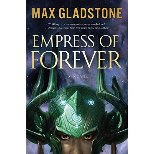
Okay, once again trying to get back on the horse of keeping up with these reviews. So, I’m generally a massive fan of Gladstone’s stuff, and having finished this I have now read every book he’s published that isn’t part of some massive series (which, sorry, but no). Also, it’s quite literally about a lesbian in space and there are lots of atrocities, so it’s so incredibly on-theme for this blog I was basically obligated to read it at some point.
Honestly, I was kind of disappointed? Not that the book was bad – it really was an enjoyable read, I promise – but it really didn’t live up to the rest of Gladstone’s stuff? Now, maybe I’d have appreciated it more if I was more familiar with Journey to the West, but still. A big part of it was the characters, I think – compared to Gladstone’s other work they’re just so obviously narrative devices and not people. The plot is fine, though the big second reveal was so obvious that I didn’t realize it was suppossed to be surprising, and the overall pacing was really poorly suited to the medium. The descriptions and general High Space Opera aesthetic/vibes was sublime though, I’m such a sucker for stuff that’s basically just chrome-accented magic thrown around with wild abandon.
Now, the book is clearly a very, very, very loose (like ‘in the same way Dragonball is’) take on Journey to the West. I, knowing almost nothing about Journey except the general synopsis and third-order cultural references and influences, am almost certainly not in a position to properly appreciate this, but as a general rule I think it’s fun and cute when people do shit like this, in the same way that my favourite modern day Shakespeare adaptation is She’s The Man. But also I kind of think it’s the reason the book’s pacing is so weird?
Which is to say, the book has a very episodic structure, with the heroine and her crazy powerful space-pirate demigod magically-bound-slave/travelling companion and all the other weird and wonderful friends they pick up along the way going from place to place and meeting people and having personal growth and getting into misadventures. These are without question the best part of the book, but quite a few of them are also unfortunately compressed by the tyranny of page count, without the character beats getting the space to breathe they deserve. (The actual plot has this problem even worse – the entire final confrontation and denouncement got like 20 pages?) This is not a story that should have been told in a single book – it should have been told in a luxuriously animated incredibly over-the-top two season adventure serial made of 2-3 episode mini-arcs. Tell me I’m wrong.
The characters themselves are – look, they’re fun. They’re so much fun. The actual heroine far less than the rest of the supporting cast, but even her. But they’re just very...archtypal? They’re clearly and obviously characters, bundles of tropes and narratives roles and aesthetics, with only the barest performance of being people? Which is honestly pretty surprising, because I’m coming to this from Last Exit which, say whatever you want about them, that was full of fucking specific people with incredible attention paid to their particular psychologies and damage. Whereas everyone in this just felt kind of broadly written.
(Also, much like how Last Exit screamed that it was written during the Trump Administration with every word, this is very clearly a book conceived and written while Obama was president)
All this sounds very negative, because I’m a naturally miserable person, but I really should say that I did enjoy reading this book. Gladstone is up there with Valente and Miller as my favourite authors writing in terms of sentence-to-sentence prose, and the gloriously self-indulgent semi-mythical space opera landscapes and creatures and battles were an absolute joy to read. The Mirrorfaith and Pride and Orn and all the rest are all just very vividly realized and I want to see concept art of them for a triple A video game or something.
For all that the cast was pretty broadly written, I did enjoy spending time in all of their heads – though it might not say great things about the book overall that the single most affecting and beautiful set-piece by far was the one that Vivian wasn’t a part of.
Anyways, overall it was a fun book, would have been a better anime. Also, unrelated to everything above – Vivian and Zanji’s dynamic and relationship would have been textbook 101 inarguable queerbaiting if Vivian didn’t also get a (different) girlfriend she fucked on screen. I just find this kind of funny to think about.
19 notes
·
View notes
Text
If there’s one thing Nanoha A’s makes clear, it’s that this show is to early 2000s anime as Symphogear is to 2010s anime. They’re not so much stories as they are melting pots for the ecosystem they were born into and helped shape, combining and remixing the foundations of their particular eras of anime into a big pulsating love letter for everything that makes this medium special. Hell, with all the similarities between them, you could argue that Symphogear is basically just a Nanoha remake modernized for anime’s current landscape. Same building blocks, different configuration. And it’s fun to think of these two shows in that way, as complimentary landmarks for their respective generations, both inspired by and further inspiring the ecosystem they pay tribute to.
There’s just one tiny little problem.
And that problem is that I really, really, really am not a fan of early 2000s anime.
Look, modern anime has plenty of issues, there’s no denying that. But the era of anime that Nanoha basically defines- that awkward five-year stretch from 2001 to 2005- has consistently been the most impenetrable era of this medium for me. I hate the aesthetics, I bounce off the common tropes, I struggle to connect with the vibes, and I just don’t like almost any of the stories. There are so few anime from Nanoha’s era that I like, and most of them are clear exceptions to what most shows were like. This show is a celebration of a creative millieu that I barely even tolerate at the best of times. That alone would be a nigh-insurmountable stumbling block, even if the show in question did turn out really good.
But that leads an even bigger problem, something that might as well have spelled Nanoha’s death knell before I watched a single episode. Because now, we also have to remember that Symphogear exists. Nanoha’s spiritual successor, a show that basically hits all the same beats and fulfills all the same points of interest on a conceptual level. A show I could watch and pretty much get exactly the same kind of experience as if I watched Nanoha. A show so thoroughly dedicated to copying its predecessor that it can easily work as a full-on replacement.
Or, in simpler terms: there is very little I can get out of watching Nanoha that I can’t also get out of watching Symphogear.
And if you’re competing against Symphogear for my attention?
Then sister, you are going to lose.
Yes, it probably doesn’t help that A’s is a substantially weaker installment than Nanoha’s first season. Nanoha and Fate are reduced to side characters in their own story. Without Shinbou in the director’s chair, the visual style is so much less interesting. The final battle is a bloated letdown that barely even focuses on the emotional bonds the season had been building up between Hayate and her knights. But even if A’s had been as good or better than the first season, it would still inevitably face being compared to one of my single favorite anime of all time. Symphogear, for all its faults, is a show that continues to dominate my mind and heart like few pieces of fiction even come close to. And Nanoha’s fighting to take up that exact same place in my subconscious, except it’s trying to do so with the style that speaks to me the least out of anything I’ve seen in anime. You might as well try to storm the gates of Mordor with a dozen untrained farmers and an incontinent mountain goat.
The fact of the matter is, some things are left behind by the passage of time. Ideas get iterated on, improved, and refined to such an extent that their old versions no longer have any real use outside of historical interest. And watching Nanoha A’s felt like pointlessly trying to use a rotary phone when I have a portable Samsung Galaxy tucked right into my pocket. Why do I need to put up with these outdated early 2000s aesthetics when I can pop on Symphogear and watch some of the most gloriously bonkers action ever put to the silver screen? What’s the point of a story that shoves its ostensible protagonists to the side when Symphogear can give me a similar story that always puts Hibiki front and center? As interesting as these sympathetic villains are, are they really more compelling than Kirika, or Shirabe, or Elfnein, or Noble Red?
And look, I like NanoFate a lot. I’m having a lot of fun with their developing relationship.
But look what I’m forced to fucking compare them to.

Yeah, suffice to say, this match was over before it even began.
Now, does that mean I’m going to stop watching Nanoha? Hell no. In fact, I may be more excited for Strikers than anything else up until this point. Because Strikers has the potential to actually deliver something that Symphogear didn’t: grown-up yuri relationships. We never got to see Hibiki and Miku grow old together, but I know that Strikers is going to focus on Nanoha and Fate living their adult lives together and even adopting a kid. That, for once, is something that I won’t be able to compare to Symphogear. That’s something that only Nanoha is capable of giving me. And if seeing that play out is worth it? Then this franchise may not be doomed to antique status just yet.
But that’s gonna be a bit. For now, I’m gonna get back to Kaiji and finish that up, and I’ll be back for Strikers when that’s done. In the meantime, I’m unfortunately gonna have to give A’s a score of 4/10. I didn’t dislike it, but so much of it felt like a first draft in need of tighter pacing and greater focus. Hopefully Strikers will be the moment this franchise truly earns its keep. See you then!
#anime#the anime binge-watcher#tabw#mahou shoujo lyrical nanoha#magical girl lyrical nanoha#nanoha#0105 aniwatch
11 notes
·
View notes
Text
Amoureux - The Children’s Character Profiles
A/N Six children are a lot to keep track of so I made one-page summaries for each of them so we can familiarize ourselves with each of their personalities and hobbies!


Henry is the eldest of his siblings and who is known to his parents (and to this blog) as our little prince. His five siblings are just as royal as he is but he is the one who really brought together his family and started his parents on the road to the rest of their lives. Born on the 6th of August 1821, Henry is the only American born child but his nationality is definitely 100% British regardless. He was given two strong regal names, Henry and Alexander both appearing through history as English and French rulers. He was born into poverty but was named to be destined for greatness to seventeen-year-old Daniel and Louisa who had more love than money after fleeing Europe for the sake of their romance. Henry introduced them into the responsibility that parenthood was and forced them to grow up far quicker than they had anticipated. Even still, he is their little prince and they always seemed to have him on a bit of a pedestal.
Moving back to England to the Royal Family and growing up in a palace meant that Henry could get away with quite a bit. He was a naughty little boy like his father had been as a child but he never met much reprimanding from his parents, especially once they started to have more children and their attention was focused elsewhere. Young Henry wasn’t much of a jealous child per se but his younger brother was born the same year his Uncle Christian became King so the little prince who was once the focus of everything, seemed to be pushed back a few steps. This only made him act up a bit more, hiding around the palace and running everywhere instead of walking and putting up fits when it really wasn’t necessary. He just liked being the centre of attention.
After the havoc that young Daniel and Louisa caused across the country, they were determined to make up for it through perfectly properly behaved children…starting with Henry. It took a few years for his uncle to have children which meant, if God forbid his uncle died, he would take the throne (Daniel couldn’t because of his criminal record from being banished before he was born…having a ‘criminal’ on the throne wouldn’t look good to the public). Henry was young and he didn’t understand this too well and his fiery personality was perfect proof of it but he smartened up as he grew up, especially as he learned his place as eldest child. He took his ‘job’ as oldest child very seriously and took charge of his five younger siblings in every way from teaching them French to sneaking them into the kitchen for extra pastries.
It’s safe to say Henry was an active little prince and from a young age he took up horseback riding and eventually started playing polo when he was old enough. Henry was the perfect handsome mix of his uncle and his father with their soft brown hair and shining blue eyes (and his uncle’s dimples) and caught the eyes of young ladies from the moment he was school age. He basked in it too because he loved being the centre of attention – especially if the attention was from girls. There was nothing that the aristocrats’ daughters loved more than watching Prince Henry playing polo or accompanying him on rides around the garden.
Henry never had to become King but he was certainly up to the challenge if the situation arose. He was the pride of his parents and the eye-candy of his country and the key to his family’s entire stability, honestly. Our little prince.

Philip was the first British born child of Daniel and Louisa. He was conceived nearly as soon as the young parents moved back to England and was born into regality from his very first breath. He was born on the 19th of March 1823 at Highgrove where his family resided. He was named after both his British and French regal heritage, his middle name in particular stemming from his mother’s name and the most common name of prior French Kings. He had deep brown hair like his older brother but was the only on of two of the Seavey children to have their mother’s green eyes.
In fact, he was a lot like Louisa in many ways and it was safe to say he was a bit of Mama’s boy from the start. French came easiest to Philip and he often chose to speak it as much as he could – even though he kept having to be reminded by father, siblings, and staff to speak English please. But he could always speak French with Louisa at teatime. Philip was the most perfect little gentleman both with his manners, his dress, and the way he always cared for his mother and his younger siblings the best he could. If Daniel wasn’t around, it would be Philip at Louisa’s side, holding her hand as a boy and offering his arm as a young man. He had a soft spot in his mother’s heart that was for sure.
He was much gentler compared to his hyperactive older brother; but the boys, being quite close in age, got along well regardless. Henry was always one to help coax Philip out of his comfort zone and usually was the one who ended up getting Philip in trouble. The younger brother was more of the reasonable child and was best known to question Henry’s antics. Philip much preferred quiet hobbies like painting or piano – although painting was his favourite. He could paint portraits and landscapes alike and often helped himself to Highgrove’s grounds to get lost in the trees for an entire afternoon with his easel and canvas.
Daniel tried to get his second son into music since his first could hardly sit still at the bench long enough to set his fingers on the keys. Philip humoured his father enough to learn the basics of piano but as he grew up, he kept rushing off to paint or to sit quietly with Louisa in the drawing room. He much preferred the gentle romantic aesthetic of the world and he found his comfort in the green of the grass and the colours of the flowers and even scribbled little poems in the pages of his lesson books – only in French though so none of the staff could ever read them and laugh. He was a shy tender little boy and his mother saw the world in his green eyes and kind soul.
He was gentle but fair in his status as second-eldest and made sure to be the sensible one when his older brother might not have thought something through. Philip was there to ground his family and his siblings and to be the mediator if things got rough. His tame nature was enticing to many and his natural calm aesthetic and the way he saw the world was of nothing but the sweetest of souls.

Margret was the first of three daughters and the third of six children. She was born closest in age to Philip, being born at Highgrove House on the 25th of May 1824. She was the perfect mix of her parents after an eldest boy who took after the English side of the family and a second-eldest boy who took after the French side of the family. With her mother’s light strawberry blonde hair and her father’s bright blue eyes, Margo was the most perfect little princess. At least in her parents’ eyes. She was named after her father’s maternal grandmother and her mother’s maternal grandmother, respectively, making for the perfect combination of British and French.
She was a perfect mix of her parents by looks and a perfect mix of her brothers by personality. She was active like Henry and was just as sneaky as he was – but was better at getting away with it – and yet she was gentle and compassionate like Philip and admired the grace in the world. She tended to turn to French when she was emotional, ever since she was a little girl even having a nightmare in the middle of the night she would crawl into her parents’ room and whimper to her father about her “cauchemar”. Daniel could only really offer her comfort in English but his attempt was nice enough and she always fell right back to sleep in his presence.
Margret’s active side came out from a young age, always getting up to dance around the room when Daniel would be playing piano and it wasn’t long before she got her own ballet instructor. As a dancer, she knew a little bit about music too so she had just enough piano lessons to get by but her focus was on ballet. It wasn’t odd to find her practicing her grande jete’s down the hallways at Highgrove, nearly knocking over candelabras and unaware servants in the process.
Margo was graceful as a ballerina and she could use that to her advantage in her adventures with her siblings, especially when it came to sneaking into the kitchen for extra pastries – a Seavey original antic. As a young tot she was used to pouting her way out of trouble – those blonde curls and big blue eyes always melting any adult’s heart – but once she was older, she was able to cross the entire palace without making a single sound (made for sneaking out a bit easier as a teenager). She seemed to be so stealthy she could walk up behind any member of her family and startle them with a sweet “qu'est-ce que tu fais?” (what are you doing) over their shoulder. Daniel swore he was going to die of a heart attack by the hands of his eldest daughter because of this.
In terms of studies, Margret preferred the languages to the arithmetic or sciences; spending her time practicing French and Latin and keeping her nose in a book as she spun a row of ballet chaînés down the hallways. There honestly wasn’t a time Margret wasn’t dancing. She danced more than she walked truly. Music came easily to her father and dancing came easily to her; both of them constantly hearing music in their heads in their own ways.
Princess Margret was the idealized concept of graceful princess in and out of the palace and made her own appearances at the Royal Ballet as she got older. But she knew her place in her family well and was a gentle and persistent eldest sister.

Fredrick was the youngest surviving son of Daniel and Louisa. He was born in Highgrove on the 27th of February 1826 in the middle of a winter storm. His middle name was a strong English name often passed down from British royalty and his first name was the English form of the Germanic name meaning ‘peaceful ruler’. He was similar to his elder sister with his appearance with their mother’s strawberry blonde hair and their father’s blue eyes and from the moment he was born, his sister took quite the liking to him. The not-even-two-year-old Margret was captivated by her new baby brother and constantly asked to play with him as soon as she possibly could.
Most likely because of this, Fredrick grew up close with his elder sister and tended to copy more of her activities than his elder brothers. Daniel was a little worried he was going to have a second son that preferred tea over solid hobbies but Fredrick’s interests didn’t stop at the garden table. Up to this point, much to Daniel’s glee, Fredrick was his only diligent music student but he took more to the cello than piano which was quite unique. As a young boy, Fredrick was very close to his father because of his interest in the cello and they had lessons together almost every day.
Their slight hostility only began when Fredrick started his studies. Arithmetic didn’t come easily to him and reading and languages were boring and it took him a long time to finally learn how to read in either English or French. He never learned to read Latin. Daniel, once a young boy who detested his own lessons, grew up to understand the importance of an education in his children and Fredrick’s constant dismission of his studies drove Daniel crazy. He saw too much of himself in his youngest son in that case. They argued quite a bit about Fredrick’s studies and Daniel couldn’t understand why he just couldn’t learn the bloody lessons. It was often that Daniel took away his son’s cello to force him to get his work done. Fredrick learned how to swear in French just to curse off his father when he didn’t know what he was saying. Fredrick was a graceful child like his elder sister – and the meaning behind his name – but he could really swear like a sailor when it got down to it.
He never really cared for horseback riding too much but he found his outlet in archery. He was oddly good at it too and Daniel used that to his advantage to help Fredrick with his studies. He would write words on pieces of paper and stick them to the target and every time Fredrick hit one, he would have to read the word to teach himself to read. Any incentive that worked was good enough – especially after his tutor was deemed unfit after he was caught punishing the young prince with a ruler on his palm. Ever seen Louisa yell? You probably haven’t until that day. Fredrick stayed as the least studious of his siblings through most of his youth, much preferring to spend his time in the music conservatory or with a bow and arrow in hand.
Being the youngest boy, Fredrick had to sort of keep on his toes to keep up with his older siblings but he also had more of a gentle nature to support his younger sisters as well. For a middle child, he was a good mix of everything before him and, at the same time, almost fiercely independent.

Adelaide – sweet little Delia – was born on the 3rd of September 1828 right around teatime. It was a warm and sunny afternoon and she was delivered at her family home of Highgrove like her three elder siblings. Her name is Germanic for ‘nobility’ which was quite fitting for her family’s societal standing but her middle name is both a perfect mix of her French and British backgrounds. She was the prettiest of the Royal babies – at least that’s what the staff whispered, and what Margret decreed at her first look at her baby sister – and donned her father’s brown hair and her mother’s green eyes.
From a young age, Adelaide was charming and clever yet sensitive and she saw the world in more of an analytical sense. She asked “why” to everything (both in English and French) and lessons came easily to her from languages to sciences and arithmetic. She knew her multiplication tables at an impressive age and her constant shining colours often made her elder brother Fredrick envious. The likes of his younger sister was something that Fredrick hated to be compared to. Delia was Daniel’s little shining star because of her intelligence and her talent for music and her caring personality. For a girl in the 19th century, Adelaide was taking the world by storm and often questioned her tutors and her family about the ways of the world in terms of politics, sciences, and mathematics. She was a girl ahead of her time.
Adelaide could have been seen as ‘one of the boys’ but there was nothing she loved more than the femininity of life. Teatime with her family or going dress shopping or, especially, where she found her calling in singing. Adelaide had a set of lungs on her and that was apparent ever since she was a baby and could cry loud enough to wake up the servants in the basement. When she was a child, she could scream at the top of her lungs if one of her older siblings tried to play a trick on her – and she always got the pity. This only led her to discovering her gift of singing as a pre-teen, especially when she accompanied her family to the opera and the show brought her to tears. From then on, you could hear her practicing her scales all through the palace – and breaking a few glasses if she really tried. She even sang a few songs for her family and guests when she was older as the entertainer of the house.
Sure, she was arguably the prettiest of the children, but Adelaide was more focused on her studies and her singing than getting married and she was often blind to the callers that would come by the palace for her. Even during balls, she would bore her dance partners with talk of mathematics or sciences until they would up and leave her. Daniel was approached plenty of times by fathers of aristocratic young men who were appalled by Adelaide’s intelligence and scolded him for “not raising a nice young lady”. It never phased him, Daniel (and Louisa) were incredibly proud of their young scholar, especially within the fact that she was a woman, and if no boys wanted to dance with her, Daniel would always gladly take their place.
Henry was her protector since she was so blind to her callers that someone had to ward off the boys. Adelaide was a well-rounded princess and the envy of her siblings but – although she might have used her intelligence to pick on them as a child – she always treated them fairly and with nothing but love.

Victoria was Daniel and Louisa’s rainbow baby (in modern day terms). The Duke and Duchess expected not to have any more children after their son, Alfred, was stillborn in 1829. His death caused much grief in the young parents so they weren’t willing to risk that ever again. But Louisa fell pregnant again and gave birth to a healthy baby girl in the early morning of the 30th of April 1831. The relief that followed a safe birth only had Daniel and Louisa falling more in love with each other and with their new baby. She was named Victoria meaning victory; from overcoming and shining through a great loss. Her middle name was, of course, taken from Daniel’s younger sister. In fact, Victoria even looked like her aunt with light brown hair and those blue Seavey eyes and button nose. She truly looked like a little princess.
Victoria was in love with the idea of royalty and her family’s standing in society. She asked often when it was to be her time to be queen, always hoping for another answer than her mother or father’s usual “you’re a princess, not a queen”. If she asked enough times, they would let her be queen, right? She enjoyed spending time with her Uncle Christian who was king and hearing all the responsibilities he had and she especially liked travelling with him in the Royal Carriage (even after there was an assassination attempt that nearly took young Victoria with it). But she could relate a lot more to her Aunt Anna as youngest child and royal princess and they often went horseback riding around the palace grounds whenever they could.
With five elder siblings, Victoria grew up a little spoiled but also a little tormented. She always tried to keep up with everyone as best as she could and was willing to get up to just as much mischief as her brothers and sisters. She caught up with Henry on horseback and Philip with lingering afternoons in the gardens and clashed most with Fredrick in regard to music. Fredrick was a diligent cello student but Victoria was the only one of her family members to pick up the violin and the two often got into silent arguments with their bows in hand and trying to out play the other. Their usual bickering – as youngest son and youngest daughter – was expected to the other siblings and Daniel and Louisa often had to nearly force them to make up over whatever silly argument they were having.
Victoria could give or take her studies. She did well – especially in the languages where she even took up a little bit of German on top of French, English, and Latin – but would have much rather been with her violin or out with her horse. She could often be seen joined by her more musically inclined brothers and sisters putting on a little band performance for the family and/or guests. Victoria took her royal duties quite seriously – expected from someone who grew up begging to be queen – and she loved traveling into London to visit the public shops and, as she got older, helped to give speeches at various events. She was responsible and respectable and was determined to keep a good public appearance no matter what, not only through hos she carried herself but also within who she chose to spend her time around.
Of course, in the comfort of her own home was where Victoria’s spunky personality could flourish. Afterall, how else was she supposed to keep up with five older siblings?
11 notes
·
View notes
Text
Tips on creating fun fanfic headers!

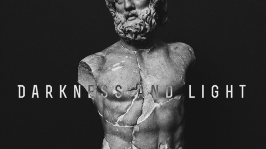


i had so much fun writing the fanfic writing tips yesterday and i got a few more questions about header-making, and so i decided to make one more of these! i hope these tips help somebody out there! hope you enjoy :)
p.s. these tips won’t require any hard editing skills or photoshop skills, nor any expensive tablets/apps!
typically i spend around ~5-10 min creating one header, and that’s either after i think of/finish a fic. i have so much fun doing it and sharing it with you that i figured i’d share how i do it!
why headers?
as I talked about in my fic tips, one of the most eye-catching things about fics are headers. when i’m scrolling through a rec page, my home page, a tag, or even someone’s masterlist, i’m immediately drawn to well-made headers. that’s what captures my attention, and then i’m more drawn in by the content. so, you can say that headers is your own version of an ad for your own fic, or an extension of it (like the cover of a novel!)
if you were writing your own book, imagine how much time you’d spend figuring out what you wanted your cover to look like. i try to have as much fun and invest as much time making my own headers because it’s just the cherry on top to my finished product :)
disclaimer: BUT HEADERS ARE NOT NECESSARY/DO OR DIE! if you don’t feel like you want to do this, then keep writing! its ok! this is just a suggestion. i’ve seen plenty of well-written fics without headers at all, so don’t beat yourself up over not having one/not wanting to do one. this is truly just a fun, extra kind of thing, and only keep reading if you want to learn how i do it! :)
tips for people who don’t want to make headers: if you still want something to make your fic stand out, use gifs! i use them in my drabbles a lot! this will at least give ur fic a lil boost!
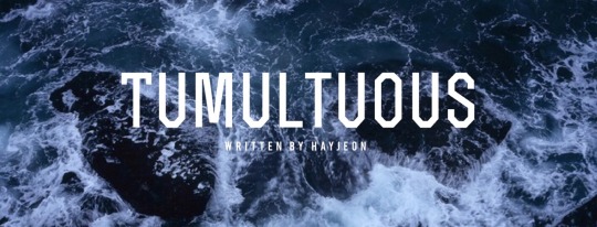
how to find pictures
I typically use unsplash, which is a free website in which photographers upload their HQ pics for free use. the pics are really high quality, typically stock photos, and don’t have any logos on them like other ones on google. unfortunately, you won’t find any pics of the members or anything, but you’ll find beautiful stock photos of typical scenes like “ocean scene” or “desert scene.” I found the stock photo for cut me open (shown below) on that site by just looking up “medical” or “doctor”.
i used to use google a lot and just use keywords like “desert scene HQ” and edit the search settings to deliver HQ pics, and a minimum # of pixels, but unplash is definitely better in terms of quality, more aesthetic photos, and no logos/watermarks.

on some occasions, i will screenshot some scenes of youtube videos, turning up the quality to 1080p or 4k and zooming in so that the pixelation is as crisp as possible, and then editing it later to look good (which i’ll explain in a second!)
the above photo was a scene from the specific characters from the drama, “100 Days My Prince” that I screenshotted from a youtube video that TvN uploaded, recapping the drama. I cropped it just right so that their faces were left out, which i’ll also mention soon!

things to look for when picking pictures:
you want the picture to reflect a specific motif/theme from your fic! if its a moody fic, then try to find a moody scene that you can edit with filters/lighting to look even moodier; or if the characters’ jobs are a big portion of the fic (like cut me open/doctor theme) try to look for stock photos with that shown very clearly!
make sure its high quality: tumblr really dumbs down the quality of the photo when uploading it, so try your best to find something with a lot of pixels in it so that when you start editing, you don’t sacrifice too much of the quality already
try to look for something simple/clean: a picture with too much subject (ie. people in the background, or too much detail) may end up taking away from the main point of your header, which is your title. so find pics without too much clutter!
try to make sure its landscape: which will help during editing to save some of the quality better.
editing your pictures
now that you have a specific photo you want to use, now its time to edit! I use VSCO CAM (free app) and my own apple photos cropping tool for faster crops.
crop/adjust: if your picture is too large/wide, crop it to at least a 16:9 ratio. i’d say aim for skinnier if you can, so that you don’t take up too much space (especially if you’re planning to add headers to your masterlist). also crop out any faces, any clutter, any unnecessary details, so you have a nice, clean slate to work on when adding text.
contrast/sharpen/clarity/white balance/etc.: i’m not gonna give you a lesson on photography, but i’ll tell you I learned like 80% of everything that i know just by fiddling with it on VSCO! So just try it out and play with the app, see what you can make of it. i’d say a rule of thumb to follow is that you want happier fics with a brighter tone, and moodier/angsty fics with a darker tone so that it can reflect the nature of the fic further, without saying anything!

if you wanna be extra af like me, then go a step further and photoshop your pics. this one is a good example; when i screenshotted this scene from another youtube video for my fic One Year My Love part 2, i was specifically looking for a scene that would showcase the ornate/regal details of their clothing/environment in contrast to part 1′s modest clothing/scene (the first header in this post).
i found this scene, but actually, this scene portrays the Crown Prince and the Princess, not y/n. So, the actors weren’t smiling at all! They were actually frowning at eachother in this scene, to portray the tension between the two characters and their marriage.
So, I took the extra step, adjusting the pic with VSCO so that their shoulders/chins were at the same level, cropped off their faces up until their lips, and then used the adobe photoshop free app to photoshop their lips to be SMILING at eachother!!!! subtle, but important!
call me crazy for taking that much time but i’m so proud of how it turned out and i loved every second of making this one. that way, this scene makes it portray the happy ending for Jungkook and y/n!
adding text to your header
you can use any app out there, but i really like Font Candy! I actually ended up buying the 2$ version of this and never regretted it, but you can actually find a lot of their basic fonts on the free version; I tend to use the fonts: OSTRICH SANS, BEBAS, TREND, and INTRO the most! these are pretty clean-looking, block letters that look good whenever i put them as my titles.
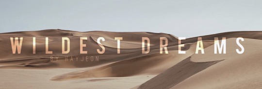
I love this app too cause you can easily control the spacing between letters to make them take up more space, add shadows, or even make them contrast their background using the overlay feature; like this one i made for wildest dreams (see how the text changes depending on what part of the photo its on? amazing! it’s literally with a click of a button!!)
And i’ll always add “written by HAYJEON” or “by HAYEJON”, space it out, and add it somewhere underneath as my own branding.
orrrrrr
if you want to be more creative, you can even go a step further and use whatever you have on hand to enhance whatever you’re trying to portray.
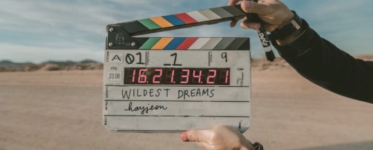
for this one, i ended up finding this amazing photo on unsplash and i thought it would do a create job of portraying the “movie-set” quality of what wildest dreams is going to be about. this stock photo had someone else’s names on it, so i used my ipad, and used instagram to just erase the existing writing with the color of the background, and then wrote in my own title and url with my own handwriting/apple pen!!!
i thought this was pretty cool because it’s like wildest dreams is its own movie/has its own movie set, which, once it’s out, you guys will see that it’s supposed to be!
saving/uploading
this is pretty easy/obvious, but i figured i’d mention it. all the apps i mentioned are available on the appstore, and they will save directly to your photos. after doing that, i’ll just upload them into a special folder i have on my google drive so that when i’m finished writing a fic on tumblr using my laptop, i can easily download the photos without sacrificing quality. easy!
and that way, i can save them forever; even if i have to delete them from my computer, i can always redownload them!
side note: making text separators
i just recently started doing this, but ever since tumblr took down their text separators, i’ve just been cropping the bottom like 5-10 pixels of the header to use as my text separators! (with my laptop)
i saw some other writer doing it and thought that it looked better than what i had used previously (a cropped photo of a random line i found on google); i found that doing this tied my fics together a little better and just looked better aesthetically;
so there it is! hope you enjoyed! :) i would love to see what other tips you guys have been using, feel free to send me an ask or reply to this post; and if you end up using any of my tips, please let me know! I love to hear from you guys all the time <3
lots of love, especially during these times,
hay <3
159 notes
·
View notes
Link
Three months after launch, Jeffrey Katzenberg and Meg Whitman’s short-form service Quibi is entering its first awards season.
As the nascent platform, which is still finding its feet with subscribers, kicks off its debut FYC campaign, Deadline has assembled a virtual roundtable of creators and stars to explore how it lured Hollywood A-listers to the second screen, what they really thought of it when they first heard about it, the creative process, the importance of owning their own rights and how they see things going forward.
Joining us were Darren Criss, co-creator, songwriter and star of musical comedy Royalties, Nicole Richie, creator and star of irreverent comedy Nikki Fre$h, Cody Heller, creator of Anna Kendrick sex doll comedy Dummy, Veena Sud, creator of dark thriller The Stranger and Nick Santora, creator of Liam Hemsworth action drama Most Dangerous Game.
DEADLINE: What did you think of Quibi when you first heard about it?
Nicole Richie: I went in there and I had a general with them, not really knowing what I was going to make. Separately, I was kind of preparing to do this comedy album without the show around it and I sat with [Jeffrey Katzenberg] and talked to him about the platform and the idea that it was for these in between moments, and that it’s quick bites, it’s ten minutes or less, and it was something that, I found it very smart and pretty exciting. I’ve done short-form before so I definitely felt like I could do it. There’s a lot of young creative people there and I was very excited to work with them.
Darren Criss: Just like everybody else in the industry I’d heard about Quibi. Obviously, anything that you know, Jeffrey Katzenberg attaches himself, my ears kind of perk up. So, I’d been aware of the concept. I think the specific idea of short form was never something that I thought ‘I have to make short form, nor was it, oh my God, that’s the worst thing ever’. For me, what excited me about Quibi, much like Nicole said, was the fact that it was this new thing. I always gravitate towards the renegade kind of out-of-box thinkers and I always think it’s an exciting opportunity to try something.
In many respects, it is the Wild West. So, when you’re shooting stuff you go, man is this going to fly, do we do it in this aspect ratio, how do we edit this, what is the precedent here, and in the lack of precedent I think for a lot of people that is actually kind of a scary thing where you say ‘We don’t know what works and what doesn’t work’, but for me I actually look at it as a really cool thing because you’re like, ‘Wow, fuck it, shoot it, ask questions later’. We get to decide what the thing is or not. I really was excited by that, it’s a really kind of fresh kind of community of people that are with the company that just got me excited about doing something in a new way.
Cody Heller: I had a weird evolution of Dummy (left) becoming a real thing, it was kind of a twisty journey. I had just written it as a script to get me staffed on other shows years ago and then I had a general meeting with Colin Davis who used to work at TBS and I actually had it set up to be a short form show at TBS, when they were attempting something like 15-minute late night programming thing with edgy stuff. So, I had written seven 15 minute episodes and then the whole block at TBS died. I was devastated but I was already working on this other show on Showtime, so that’s the way it is and I moved on.
Then like a year later you know, I kept in touch with Colin because he’s just a cool dude, and he gave me a call and he said ‘I left TBS, I’m at this new place, you never heard of it before because it doesn’t exist yet. It’s called Quibi. I hope you don’t mind, I gave all your scripts to Jeffrey Katzenberg and he loves them and he wants to meet with you next week’. It was just like the most surreal experience, like I went in and met with Jeffrey and he was quoting lines from these insane, very raunchy scripts, and he just got the show. It was so exciting and cool to have this older Jewish gentleman totally grasp and get what I was going for. That was just so exciting.
Veena Sud: I felt when I met with Jeffrey that what he was talking about was nothing short of potentially revolutionary in how we look at content, from the vertical screen obviously, but also how people would look at our storytelling, and what device they would watch it on. I thought about how radically different our relationship is with these things we walk around with in our hands than it is with the screens that we watched you know, in our homes or in the theaters. The device itself allowed for potentially a very different experience in content, which was really, really interesting to me.
Nick Santora: Well, my initial reaction was ’What the hell is this?’ I went to meet with Jeffrey, like it seems everyone else on the call did and he’s a very impressive guy, and he’s full of energy, and full of enthusiasm. It was coming off this Most Dangerous Game being a pilot for NBC that didn’t go, and he said, ‘Listen, can you basically add a hundred pages to this and blow it up?’ When he was talking about the ten minute segments I just had a feeling what I wanted to write would work really well for that because you just needed a cliffhanger or a twist or a turn about every nine or ten minutes. I worked on Prison Break and that show was bananas, and every commercial break was a massive cliffhanger and every episode out was an even bigger cliffhanger so I said, ‘I’m going to have to do this 15 times and I thought I could I don’t know if it would have worked better anywhere else. I think it really worked well in the Quibi format because, I call it Pringles entertainment, you just pop one in your mouth every nine minutes.
DEADLINE: How was the actual process of writing, producing and editing in this way?
Nick Santora: The writing for me was the same, I just needed to make sure that organically that every nine to ten pages there was an oh shit moment that would make people want to watch the next episode. The prep was very different because I had to work very closely with my director to make sure that in addition to filming it the way we would normally film something for network television or any television that didn’t have a turnstyle device, we had to have three cameras rolling at all time and we had to make sure and prep for the shot based on the location, based on the actors, based on what was going on in the scene, that the vertical and the horizontal would both have something very interesting to fill the frame. We always had a third camera running to catch the vertical, especially when you’re doing action and we have guys you know, jumping off of boats onto bridges and stupid shit or crazy shit like that, you want to make sure you’re getting it in the frame if people are turning their phones in either direction.
That was challenging and really fun though, and then editing was effectively the same if I’m being honest, it’s just that you had to do a vertical pass and edit the entire thing for you know, for a vertical turnstyle watch. But that wasn’t that big of a deal because it all comes down to making sure you’re editing it in a way that’s visually interesting and tells a good story. The prep was where it was most different for me, where we had to basically say, this is going to basically be two different movies, one vertical and one horizontal.
Veena Sud: What was so fascinating for me with The Stranger, directing it as well, was having to think really radically in terms of not thinking about vertical and horizontal as separate entities. I really wanted to have one monitor. Looking at two monitors or three monitors is really just kind of out of my wheelhouse. I like to look at one thing when I’m directing and focus on performance mostly. So, I had to have something baked in that would allow me to have that freedom to be looking at the actors versus, ‘Are we getting the shot?’. One thing we talked about extensively in prep, which was radically different because of this is, how do you service this story and allow the audience to feel what they would feel on a bigger screen and not feel less? What I mean by this is, if you hold a phone vertically you’re automatically losing east and west, right?
We looked at other shows that had tried to do vertical framing and very quickly started to think this is going to be a disaster unless we come up with a whole other aesthetic approach to this. So, really quickly, instead of thinking east and west in terms of the screen, think of north and south, and think of A to Z. Think of infinities, think of the depth of what you’re looking at. Think of going as deep into the screen as you possibly can in a way that maybe traditionally you wouldn’t think of when you have a landscape you know, when you have that aspect ratio. So, that’s why we had people moving, that’s why we’re always leading and following for the most part, that’s why all the environments were constantly changing, and we were looking for infinity lines constantly when we’re shooting and prepping. So, pushing the aisles of a grocery store closer together so that as the actor moves through them you would see left and right in a way that you know, traditionally you would not see if you were shooting that type of aspect ratio.
Darren Criss: Obviously for the three comedy weirdos here, the medium services our genres in very, very different ways than to Nick and Veena. I was really impressed with the way that they utilized what might seem a limitation in storytelling. I noticed it consciously. I wondered how they were going to fill all of the big action stuff in here. Yes, there is this aspect ratio thing, there’s the short form, you’re still applying the same rules that you would apply to if Katzenberg told all of us ‘I want a three-hour movie’ but if it was just that, if your idea is good enough, if you’re dexterous enough as a storyteller, you can kind of kneed the dough to fill in the space that you’re given. People have thought of really cool ways to maximize their narrative within this very specific box and that variety of nuance is such an exciting thing and the fact that that’s possible in such a fresh way is like something not to be ignored.
Cody Heller: We’re all just so fucking talented [laughs]. With [The Stranger and Most Dangerous Game], I did find myself wanting to experience both versions, so I want to rewatch in the vertical just to see the difference and experience it both ways. That is different than my experience because for me I really did just kind of center frame everything, like I shot everything in one big square and then just had demarcations on the video village screen. Because I had this show where literally it’s mostly one character and then a sex doll, most of the time they’re close enough together that it’s not really an issue, but the only times I would really notice it would be establishing shots. It was such a fun challenge to rise to and I loved the experience.
DEADLINE: Do you think these shows could be made anywhere else and if not, were you aware of that while you were making them?
Cody Heller: I don’t think I could have made this show anywhere else. I think my show, in particular, blends itself so well to ten minutes because I think if you made it a half hour you’d have to really go into [B] stories, which I think for my show it just works better as a smaller piece about Cody and Barbara. Quibi was so supportive and gave me so much artistic freedom that I just cannot speak highly enough of their whole team. They give really good notes that makes it so much better.
I really loved the challenge of taking on something new and the turnstyle thing was exciting. One thing that was super cool that I didn’t think of while I was shooting but noticed during the editing process, was because Quibi has to be ten minutes, it can’t be more than ten minutes but it can be less than ten minutes, and the episodes don’t have to be uniform in length, that was very liberating in the edit stage because then I was able to say this scene that I thought was so funny on the page, it didn’t really play as I thought and it’s not necessary to the story, let’s just cut the whole scene.
Nicole Richie: Cody mentioned having the A story and the B story on a television show and just having it be the A story, it does feel very intimate. I do feel like a B story on your phone doesn’t really work because when you are watching on a phone, you really do want to be locked in to that story, and from a comedy perspective, I love the jokes, but I’m very conscious of the breath after the joke, letting people digest that. With a show like Nikki Fre$h you know, only focusing on two people and then the music video, I was able to shoot that and give the jokes a moment. I can’t see this show living anywhere else.
Darren Criss: I think ideally anything that you make is so good in that particular mode of communication that you simply cannot imagine it anywhere else because the meal has been cooked so well. But I don’t want to shoot myself in the foot if somebody would like to make a five-movie franchise deal with Royalties [laughs].
I don’t think this could have existed anywhere else in any other format simply because I don’t think anybody else would have taken a chance on what we were doing. That is one of the valuable parts that I kind of glazed over about Quibi is that they’re really creator forward and really empowering a lot of the creators. It sounds like we all had a date with the Great Oz [Jeffrey Katzenberg]. I’d like to think it could exist in other places because I’d like to think our idea is malleable enough to fit in other places, but it comes down to the belief system and the support from someone in Jeffrey Katzenberg’s shoes.
DEADLINE: Have you had any feedback in terms of whether people watched in one go or in short bursts?
Veena Sud: It’s been anecdotal and it’s been both. Some waited for the whole thing to drop so they could watch it all in one go, because that’s the muscle that we’re used to as Americans now, with all the streaming devices. The most fascinating feedback were people who watched it day by day and feeling their growing anxiety and their growing desperation for the next hit. That was fascinating because while I was cutting and shooting simultaneously, you could feel that growing kind of addictive nature of something that’s less than ten minutes long and that does have cliffhangers built into it. It’s pretty fascinating to see how the need for the next, and the next, and then next grows over time.
Cody Heller: I binged The Stranger and I think if I had to wait each day I’d probably would have had many panic attacks every day. It would have been such a different experience, and now I am curious and kind of wish that I had experienced it that way because that’s so fascinating.
Can I just circle back to one thing that we were talking about before… Nicole, you made a really smart interesting point about the phone and it being this personal thing. For me I was one of the early ones to shoot and I didn’t know at the time that it was only for your phone. I thought that you were going to be able to also watch it on your TV, so I wasn’t really aware of that and then when I found out later during post-production I was kind of bummed since I thought that especially for comedy and especially during corona, like people love to laugh together. I was happy when they decided to add the possibility to your TV feature because I love nothing more than going to the theater and laughing with people. You can’t do that during Corona but at least you can be with family members or whoever we’re quarantined with and watch something together.
Also, I just want to say one other thing, Nicole Richie, you seriously, like could be in a Christopher Guest movie.
DEADLINE: Quibi’s rights position is that you can retain the IP and after two years repackage these shows into long form versions if you want to. How important was that for you and have you thought about that since you made these shows?
Nick Santora: I’m in the process of dealing with that right now. We have a potential buyer very interested in doing Most Dangerous Game as a feature film, and it was a big selling point to me because I just intuitively thought I could take those ten-minute segments and work with the composer to smooth out some of the musical cues, get the establishing shots that we would need to act as bridges and in just a matter of weeks with some minimal effort, turn it into a nice hour and fifty-minute movie that would play really well. There’s a fair amount of interest and I think we’re going to be successful in selling it. It was a selling point to me because you know, you want as many people to see your work as possible, and I think it’s great that Quibi gives you the opportunity to just turn it into another platform and see if it can be successful there. I’m interested to see how it plays out.
Darren Criss: I think for everybody it’s sort of a no-brainer deal. If anything, it’s sort of a brilliant way to incentivize the creator to deliver the best shit humanly possible because it’s a money back guarantee. Having this deal, I kept asking what’s the catch here, like this simply cannot be the case. I was so grateful frankly for the set up that was given behind our deal that, aside from just personally wanting to make something great, I was incentivized to make this really as kickass as humanly possible for the hand the fed me.
Veena Sud: What I found so fascinating about the idea of retaining the rights to what I create, even in its modified form, is this discussion has not been around since the 70s and United Artists. It’s the radical idea that we, as creators, get to own the thing that we create, which is revolutionary and beautiful. Katzenberg introducing it into the ecosystem of our industry is something that needs to be talked about and will be resisted being talked about certainly, but let’s talk about it. Let’s use this wonderful incentive that he provided us as artists to come and play in a sandbox that hasn’t been tested as a way for we, as artists, to start talking about that we should own the rights to what we create.
Darren Criss: One of the things that Jeffrey said on the first rollout of introducing Quibi, like maybe two years ago, was saying up top that this is the single handedly most disruptive time in the entertainment industry’s history, and so structures like Veena’s talking about are being kind of thrown out the window and everyone’s kind going, wait a second, things don’t need to be like this.
I mean, right now people are considering this with the very nature of how Coronavirus is making cooperate structures reconsider their rent on buildings. We are reconsidering a lot of old things that we say, ‘Wait a second, this was maybe not the best thing’. I think we all know what I’m talking about on a much more social scale. There are a lot of things that are happening where, I think the renegades again are stepping forward and saying ‘This is fucked, why don’t we think of a different way that can empower us in a way that can really service the things we’re making in a more fruitful way.
The very question of you asking ‘Was it a good thing that you get your thing back in two years?’, that’s crazy that that gets to be a causal question. It’s an amazing thing and of all the things I think are really great about Quibi I would hope that it starts this conversation and this precedent for fueling creative in this way, and not just for the selfish sort of economic notions that I get out of it, but empowering creators can only be a good thing. I’m very careful with that because I don’t want to sound like a maniacal egotist, but there’s so many things that really incentivize positive things about content when it’s done in this structure.
Cody Heller: I mean I just can’t wait to own it again so that I can sell it to Disney+ [laughs].
—
DEADLINE: Darren, you were making Royalties at the same time as Hollywood. Would you want to do more Royalties?
Darren Criss: Yeah [but] hopefully I don’t have to do them all at the same time. I certainly echo what Cody was saying and I feel like anybody in a creative position is definitely hypercognitive of following those same principals. Having an opportunity to look at systems in different ways, in a way that can benefit so many people, is an exciting thing. It’s not, ‘Oh crap, how am I going to pull this off?. It’s like, okay, cool, let’s get all the people involved that we can to make this something really special and more beneficial for everybody involved. I mean look, we’re a whacky, zany comedy about writers that write goofy songs. That is sort of an ever-green game. There is a big pile of funny little puppies in the pen that I really want to give a home. That if there is a second season it’s giving them a place to go because we had to earn those ideas.
The hardest thing about a first season is establishing an audience’s trust, knowing your way around your actors and how the things going to look. It’s not until the second go that you kind of get to roll up your sleeves and go, alright, so here’s what we can really do, now I know what I’m working with. I really look forward in getting to do anything in a second season simply because now I’ve watched other people’s shows, I’ve seen how my show functions on this thing, I’ve seen how people react to my character’s and my jokes, and the songs, I now want to see if I can make those things that I threw out the first go, but hey, that is not up to me, that’s up to Katzenberg.
#darren criss#deadline hollywood#nicole richie#cody heller#veena sud#nick santora#royalties#royalties press#deadline roundtable#press#july 2020
22 notes
·
View notes
Text
The Abstract Point Of A Clockwork Orange - Review
Released for streaming on Netflix two years ago, is this a so called ‘masterwork’ of a film, or just cinematic satire?
Malcolm McDowell in 'A Clockwork Orange'
Based on the book by Anthony Burgess, Stanley Kubrick’s 1971 adaptation of ‘A Clockwork Orange’, proved greatly controversial, yet influential. The dreamy, edgy swinging 60s sets up the scene for ultra violent home invasions and tortuously explicit murders performed by ‘The Droogs’. Released for streaming on Netflix two years ago, is this a so called ‘masterwork’ of a film, or just cinematic satire? Surrounding the idea of free will, this can be tossed around endlessly and reviewed in philosophy as something problematic. But is this film’s talk of freedom and suppression all really necessary? It’s upfront commentary on humanity that can be deemed as abstract, yet is this label of abstract just an excuse to glamorise the utter violence? Or does ‘A Clockwork Orange’ stand strongly with a point in hand? We can say both. The retro aesthetics, in terms of costume & production design that Kubrick can be recognised for, do play into the significance and absurdity of this work.
Set in a dystopian England where the governed rules are anything but at liberty for citizens, morals aren’t only tested, but are completely rejected. In this world, the government find order in good behaviour, something that the main character, Alex, (Malcolm McDowell) completely detests. Alex has no moral limits and gains pleasure from violence with no concern for the consequences. Within the first half an hour of the film, we see him and his gang of ‘droogs’ beat up a homeless man and mercilessly invade an old mans home, robbing it as well as raping and murdering his wife. Though labelled as a lesson in testing how far freedom of choice can go, A Clockwork Orange’s meaning can seem scattered.
Seen to represent someone so outwardly alive in his lack of concern for society, Alex’s mad challenging of human morals tests the meaning of freedom. But given themes, are they just barren and only strive to portray substance? It can just be seen as senseless violence for many. The intensely rebellious attitude is a reflection of the oppression faced in this film’s universe, and ultimately is an exaggerated comment on society today. Yet, you could say this about a film like Dirty Harry or Pulp Fiction, given their brutality. This theme, focusing on order vs chaos in society, is no doubt relevant, but however meaningful is it? The meaning left in it could be that, through it’s distressing realism, it so rawly opens ones eyes to today’s illicit society. Commenting on the confusion surrounding the film’s meaning, Kubrick stated that, “It is a story of the dubious redemption of a teenage delinquent by condition-reflex therapy. It is, at the same time, a running lecture on free-will.” Furthermore, author Anthony Burgess writes in ‘A Clockwork Orange Resucked’, that the meaning is in the title, ‘A Clockwork Orange’ referring to one who “has the appearance of an organism lovely with colour and juice, but is in fact only a clockwork toy to be wound up by God or the Devil or the Almighty State”. In saying this, Burgess does confirm that from his perspective, this is a comment on human nature being sucked away by a totalitarian government. Yet, even given the comment from the author, our perspective as an audience is truly subjective.
In the author’s word, commenting that ‘A Clockwork Orange’ reflects someone who “has the appearance of an organism lovely with colour…but is only a clockwork toy to be wound up by the Almighty State”, refers to our potential for evil, and the importance of it in human nature. This is certainly a thought provoking theme, as most of the film is. The extreme capabilities of human beings can be an incredibly positive light or looming darkness, given which we choose to act on. Yet when this potential is squashed by a higher state, we can question whether one has free will, if it is still controlled. In a scene where Alex’s rebellion in lessened by Ludovico’s Technique, a process in which he is brutally forced to watch films of atrociously violent acts, with treatment in order to make him physically sick at even the thought of committing any crime. In hope to make him less of a threat to present society, he is less of himself. Again, we can think about the fact that is is of course necessary to change such wicked behaviour, but we can also think about how it could be, had we not chosen to create any governed rules.

After seeing state officials confirm that Alex has been cured of his homicidal behaviours, a prison chaplain states, “Choice! The boy has not a real choice, has he? Self-interest, the fear of physical pain drove him to that grotesque act of self-abasement. The insincerity was clear to be seen. He ceases to be a wrongdoer. He ceases also to be a creature capable of moral choice.” In total, Alex’s behaviour is ceased to be wrong, but he is also ‘ceased to be capable of choosing for himself, since he had been rewired to believe what the state had wanted him to believe - that acts of violence simply are wrong. To the normal mind, this isn’t a hard concept to grasp, as we are surrounded by basic morals that tie in with our empathy. Yet to someone with more sociopathic or psychopathic tendencies, this concern isn’t there. So, again, Kubrick leaves us questioning whether or not people in this state of mind should have the choice there in the first place, as they are unable to distinguish that morals are important in humanity.
Furthermore, in 1973, Kubrick decided to ban A Clockwork Orange in the United Kingdom, due to continuous upheaval. Renowned film critic Roger Ebert gave it two out of four stars, stating that it was an “ideological mess”. Comments on it’s explicit sexuality, dehumanisation and violence were made, with some thinking that the point of the film in itself was missed. As some claimed it’s content was to create a raw piece of art, others claimed it an offensive excuse to pointlessly portray horrific scenes. And horrific the scenes are, though with fashionable features, the torturously disturbing scenes of ‘The Droogs’ murders’ are certainly crude, and have no backstory whatsoever. These brutal scenes can be seen as damaging to on audiences, or even dangerous. What kind of insight are audiences given when shown such destructiveness?
If we talk about the stylistic features of Kubrick’s adaptation, they have certainly played into it’s iconic status, having audiences sometimes classify it as a performance art piece, rather than a film. The renowned costumes of ‘the droogs’ have been used repetitively as Halloween costumes, as well as the storyline being referenced in The Simpsons. The production design is, without a doubt, gorgeous, kooky and as abstract as the film’s meaning. The interiors stun with colour blocking wallpapers, framed pictures of 1960s models and record players spinning in one room. The sense of 1960s jazz certainly is there, with a slanted, modern design, that Kubrick is known for in other works like ‘The Shining’. Whilst Alex and his gang members commit crime, they dance along to Gene Kelly’s ‘Singin’ In The Rain’, and as Alex is tested through Ludovico’s Technique, a recognisable symphony by Beethoven is played. The 1960s wardrobe bursts with colour, an exaggerated view of the Britain in the swinging sixties. Audiences are attracted to these joyful features like music and fashion, the stylistic features making it such a cult classic. A cult classic needs to be fashionable, but is this fashion in the film pretentious? Especially when surrounded by such violence, as though to say that it’s chaos can be softened by pretty interiors or a recognisable score. Or does it make it all the more disturbing through adding joyful song or colourful designs, as they so oppose the distressing acts that Alex and his droogs perform. Had it not had Kubrick’s touch, would we view it the same way? Though Academy Award winner Milena Canonero’s costumes and John Barry’s production design remaining outstanding, does their glamorisation gloss over the underlying trauma of the plot? This type of questioning is something we can participate in throughout watching Kubrick’s production, as both it’s ideas and meaning are not black and white.
Kubrick’s adaptation of ‘A Clockwork Orange’ is clever in that it has us wondering whether or not it has a point, yet regardless, audiences are still left thinking about the impact of immoral behaviour and how our society responds to it. However consequential it attempts to be, it really can also be seen as blank, leaving audiences to decide on which to focus on. The pop-art aesthetics of the film can overrun the meaning or either try to stir us away from the barren landscape that it can be seen as. However strongly critiqued and analysed it may be, it’s meaning is all the more subjective, both creating interest and successfully winding up audiences.
Stars Out Of Five: 3.5/5
4 notes
·
View notes
Text
Art and the Environment
“Part of addressing a complex politics of ecology and its aesthetic reach means critically rethinking current or provincialist terms of debate by foregrounding overlooked actors, actants, voices and constituencies. In examining social, political and environmental conditions of crisis, envisaging a post-humanist method of inquiry towards the long-term development of sustainable solutions does call for the rejection of binaries or polarisations. Yet it must also be pursued on a cross-disciplinary basis that aims to animate serious proposals that reject and rethink the ‘restricted economy’.”
Carolina Caycedo
BE DAMMED (ongoing Project)
In Indigenous cosmogonies of the Americas, all bodies of waters are connected. Rivers are the veins of the planet, their waters associate communities and ecosystems. Be Dammed investigates the effects that large dams have on natural and social landscapes in several American bio-regions. More than 250 large hydroelectric dams are projected or under construction by transnational corporations in Latin America, signifying the transition of public bodies of water into privatized resources. At the same time, the U.S. is the leading country in dam removal, allowing for the restoration of river ecosystems. In Be Dammed, aerial and satellite imagery, geo-choreographies and audio-visual essays intersect social bodies with bodies of water, exploring public space in rural contexts, and conjuring water as a common good.
Conjuro de rios - rio cauca e hidroituango dam
Itaipu river

The Cosmotarrayas
a series of hanging sculptures assembled with handmade fishing nets and other objects, collected during my field research in different riverine communities affected by the privatization of waters in Colombia and Brazil.

YUMA, or the land of friends, El Quimbo Dam
Lygia Clark
Baba Antropofágica
In collective works like «Túnel» or «Objetos relacionais,» Lygia Clark initiates psychic processes of exchange which transform the dichotomy of subject and object. In doing so, she follows the transgressive logic of «devouring» and «vomiting». The reception of «Baba antropofágica» («Cannibalistic Saliva») also relies on the documentary film «O mundo de Lygia Clark,» filmed by Eduardo Clark in 1973. But escaping this phantasmal staging of the body seems almost impossible: kneeling over a guinea-pig-like subject lying on the floor, a figure pulls from its mouth—like spiders do from their bodies—a spittle-drenched thread and spins a cocoon around the reclining figure. The precarious division of subject and object is eliminated by this thread-like weaving, with the gestural webbing of the passive subject completing the inversion of the internal and external. In the retrospective, these interactive aspects might have been what was most convincing. In contrast to Performance and Body Art, Lygia Clark understood herself to be an initiator of processes, and was most successful in this respect when her haptic attempts on orderings were targeted at inter-subjective body politics.


“¿Cuál es entonces la misión del artista?”, decía Clark, “Dar al participante el objeto que no tiene importancia por sí mismo y que sólo la tendrá en la medida en que el participante actúe. Es como un huevo que sólo revela su interior al ser abierto. (…) Es menester que la obra no cuente por ella misma y que sea un simple trampolín para la libertad del espectador-autor. Éste tomará conciencia a través de la proposición que le es ofrecida por el artista. No se trata de la participación por la participación, ni de la agresión por la agresión, sino de que el participante dé un significado a su gesto y de que su acto sea alimentado por un pensamiento, en ese caso el énfasis de su libertad de acción.” (1997: 152-153)
re-enactment
Short film records "Anthropophagic Slobber", proposal by Lygia Clark (1920 - 1988) (re)lived at Clark Art Center (CAC), Rio de Janeiro, Brasil, with Jards Macalé. Direction and screenplay: Walmor Pamplona. By Clark Art Center.
vimeo
she termed relational objects (everyday objects that the artist employed in an attempt used to stimulate the senses)
“Toward the end of her career, Clark coined another term, phantasmagoria of the body, which was also a way of intertwining art and psychotherapy. It’s a practice that deals with the notion of a life within an art object, something that scholars usually dismiss. It was through the discovery of her concept of the “phantasm” that Clark was able to surpass a mere anticipation of sensorial knowledge to enter the realm of actual fulfillment of that knowledge—a concept that differs from the contemporary notion of performance, and moves into the unconscious.
(...)
In Anthropophagic Slobber (1973) the ritualistic aspect of the proposition is crystal clear: a person lies on the floor, arms against her body. She doesn’t wear much. She rests, her eyes are closed. A group of people approach, they come, they kneel. They form a circle around the lying person and put colored threads inside their mouths—the threads are expelled from their lips wet, soaked with slobber. Saliva is stimulation. These people are then like spiders, depositing the webs on the person’s body. The spider can see the prone body—but only her “phantasm” can see the spider. It is within this kind of exercise that the object, a simple thread, becomes, for Clark, a powerful tool for the marriage between body and unconscious knowledge through art. When the person allows herself to become part of this embracing web, the slobber accepts her, she accepts herself.“ (from: https://artwriting.sva.edu/journal/post/lygia-clark-at-moma)
Vogue Germany January 2020
Images of a editorial photo shoot of the Voque Germany of January 2020, inviting artist Katharina Grosse as art director for the editorial fashion part. It’s called : Imagine (our title). She invited a platform of women ‘ Wir machen das’, writers, artists, architects, students, musicians to join the project. Their working field is migration, diversity and refugee movements in conversation with and over ….. The shoot shows divers types of women of different ages and shapes together in a shoot having conversations, also exposed in writings in the magazine.
https://wirmachendas.jetzt/en/mission/
WIR MACHEN DAS – and this is who we are
WIR MACHEN DAS (WE ARE DOING IT) arose from a network of 100 women from arts and culture, science, journalism and public life under the association wearedoingit e.V. in 2015.
As a non-profit organisation we use various projects in the fields of arts and public relations to advocate for support, participation and the recognition of diversity in the context of refugee movements and migration.
Our Aims
We address all people not as “the needy”, but with regard to their expertise, because diverse perspectives enrich local discourses. Together we aim to improve career prospects, educational offers and networking opportunities. We foster individual resources and create opportunities for exchange. In this way, we bolster the involvement of people from zones of war and conflict. Together we are shaping a future in which immigration and diversity are seen as an opportunity and asset.



Plastic T-shirt bag invented to save the chopping of trees for paper bags in 1960

The inventor of the plastic bag Sten Gustaf Thulin. He intended the opposite with his invention:
American and European patent applications relating to the production of plastic shopping bags can be found dating back to the early 1950s, but these refer to composite constructions with handles fixed to the bag in a secondary manufacturing process. The modern lightweight shopping bag is the invention of Swedish engineer Sten Gustaf Thulin.[1] In the early 1960s, Thulin developed a method of forming a simple one-piece bag by folding, welding and die-cutting a flat tube of plastic for the packaging company Celloplast of Norrköping, Sweden. Thulin's design produced a simple, strong bag with a high load-carrying capacity, and was patented worldwide by Celloplast in 1965. As his son Raoul said later, Sten believed that durable plastic bags will be not single-used but long-term used and could replace paper bags which need chopping of trees.[7][8]
Source: https://en.wikipedia.org/wiki/Plastic_shopping_bag
https://www.independent.co.uk/environment/plastic-bags-pollution-paper-cotton-tote-bags-environment-a9159731.html
https://disposableamerica.org/the-plastic-bag/inventor-sten-gustaf-thulin/
Nzambi Matee
A nairobi-based 29-year-old entrepreneur and inventor — is the founder of a startup that recycles plastic waste into bricks that are stronger than concrete. called gjenge makers ltd, her company initiated following the development of a prototype machine that turns discarded plastic into paving stones. one day at the factory means 1,500 churned plastic pavers, prized not just for the quality, but for how affordable they are.
‘it is absurd that we still have this problem of providing decent shelter – a basic human need,’ said matee. ‘plastic is a material that is misused and misunderstood. the potential is enormous, but its after life can be disastrous.’
before creating gjenge makers ltd, nzambi matee majored in material science and worked as an engineer in kenya’s oil industry. in 2017 she quit her job to start creating and testing pavers, which are a combination of plastic and sand. she gets the waste material for free from packaging factories and also buys it from other recyclers. through experimentation, she understood which plastics bind better together and then created the machinery that would allow her to mass produce them.

‘we must rethink how we manufacture industrial products and deal with them at the end of their useful life,’ said soraya smaoun, who specializes in industrial production techniques with UNEP. ‘nzambi matee’s innovation in the construction sector highlights the economic and environmental opportunities when we move from a linear economy, where products, once used, are discarded, to a circular one, where products and materials continue in the system for as long as possible.’

Pierre Huyghe - Zoodram
Zoodrams: large aquariums with marine ecosystems, that embody the logic of the exhibition, in particular Zoodram 4 (2011) in which a crab turned a resin mask of the Sleeping Muse (1910) by Constantin Brancusi into its living habitat.


Zoodram 5 (After Sleeping Muse by Constantin Brancusi), 2011, a glass tank that provided living quarters for different species of crabs that cannibalize each other, a none-too-subtle metaphor for human rapaciousness.
The tank is a repeated object in many of Huyghe’s works. They featured prominently in his retrospective, and a massive fish tank currently sits on the roof of the Metropolitan Museum as part of the Roof Garden Commission. Huyghe’s tanks are filled with strange, beautiful creatures. On the roof of the Met are tadpole shrimp, while inside the tanks in the retrospective were hermit crabs. The tank is an enclosed space. The viewer stands outside it, watching the creatures engage in their everyday activities. The tank is a lens through which we can better see Huyghe’s overall project. In an interview with Emily Nathan for Art in America, Huyghe stated:
The work is not “displayed” under a narrative — that’s a system I avoid. I could not imagine a chronological order, either. As you say, most of what I have done is construct situations that happen within a given body. Every one is a constellation network of process, all sorts of heterogenous and anachronistic things come together or are associated within a constructed situation, and so it is difficult to present them in a site where they were not originally, or to organize them in a linear way.
Pierre Huyghe says that life is the core interest of his practice: “I’m interested in how to quantify the different variations of being alive…how to intensify the presence of things.” Many of his performance, film, and installation pieces employ a range of living creatures—insects, plants, animals, and human beings—in order to explore their behavior and interactions. These works become laboratories for articulating complex social phenomena, the precarious distinction between fiction and reality, and contemporary belief systems.
Pawel Althamer
The sculptor Pawel Althamer, who had a cameo in After Nature with a pair of flayed bodies, has brought an entire parade of the undead to Expo 1. He and neighbours from his apartment block in Bródno, Poland, each created a life-sized alter ego, modelled out of scrap metal and technological trash. Like zombies from an apocalyptic nightmare, the figures in “Bródno People” march sightlessly through a huge gallery, an ungainly procession of solid ghosts that recalls Rodin’s “Burghers of Calais”.
Mel Chin
Revival Field

1991-ongoing plants, industrial fencing on a hazardous waste landfill an ongoing project in conjunction with Dr. Rufus Chaney, senior research agronomist, USDA
Revival Field began as a conceptual artwork with the intent to sculpt a site’s ecology. 1993 marked a successful conclusion to the first phase of this collaborative effort. The initial experiment, located at Pig’s Eye Landfill, a State Superfund site in St. Paul, Minnesota, was a replicated field test using special hyperaccumulator plants to extract heavy metals from contaminated soil. Scientific analysis of biomass samples from this field confirmed the potential of “Green Remediation” as an on-site, low-tech alternative to current costly and unsatisfactory remediation methods. Despite soil conditions adverse to metal uptake, a variety of Thlaspi, the test plant with the highest capacity for hyperaccumulation, was found to have significant concentration of cadmium in its leaves and stems.
vimeo
In Mel Chin’s Revival Field FIG. 3 soil is detoxified through the use of ‘hyperaccumulator’ plants in a dumping ground in Minnesota, demonstrating the need for speculative ecological proposals.
Thomas Hirschhorn
Jumbo Spoons and Big Cake


At first glance, Thomas Hirschhorn’s monumental installation Jumbo Spoons and Big Cake resembles a kind of documentation centre turned upside down, filled with papers, chained books, piled archives and photographs. In the centre, the jarring presence of a monumental cake surrounded by twelve giant spoons creates a metaphor on the state of the world today, and on the end of many 20th century utopias. Reminiscent of popular ‘souvenir spoon’ trinkets, the spoons portray individuals or entities that the artist associates with failed utopias: Mies van der Rohe, Rosa Luxemburg, Malevitch, Nietzsche, Venice, China, the Moon, firearms, fashion, the Nazis’ 1937 exhibition of “degenerate art,” Swiss Rolex watches, and the Chicago Bulls basketball team.
Tejal Shah
Between the Waves

Landfill Dance by Tejal Shah FIG. 5 is a video installation that involves several professional dancers dressed as quasi-mythical creatures, striking poses and moving in synchronicity in an unnamed mass landfill site in India. The work portrays ‘neither a neoliberal optimism nor paralysing despair’, but instead draws on the ‘potential of the bodies to coexist with this environment’, as is part of Boetzkes’s broader thesis that artists have demonstrated the need for an ‘intensive “working through” of the site’ and waste (pp.121–25). How, if at all, the work deals with people that notoriously have little choice but to rummage and work through mass garbage sites on a daily basis is unattended to.
Tejal Shah: Landfill Dance is part of the larger five-channel video installation, Between the Waves. Each channel also functions as a stand-alone piece. I first worked on channel 1, which is a longer film that forms the backbone of the installation.
“I am a big fan of contemporary and folk dance, with immense reverence for the medium. I have been eagerly awaiting an appropriate opportunity to collaborate with dancers. Finally, I decided to work with contemporary dance in this project to create seemingly nonsensical movements within the setting of a landfill to think about the futility of our gestures of sense making and recuperation in the Anthropocene (with a sense of humour of course!).” (https://huismarseille.nl/interview-tejal-shah/)
vimeo
vimeo
Olafur Eliasson
“Riverbed was for the Louisiana Museum, whose architecture is from a period where the seamlessness between inside and outside was introduced, as were a number of modern illusions of openness,” he says by way of preface. “Within this very contemplative museum, but also this very well functioning exhibition machine, I wanted something that would almost have the volume and scale to destabilise the museum a bit, pressure it. So I wanted it to look almost like a rock garden, but also to have a sense of a mudslide. Brutal, deathlike; it’s almost an alien landscape, and really it’s there to introduce destabilising qualities that one experiences outside – you’re walking on a slope, keeping your balance, recomposing your walking to fit the landscape – but you don’t really notice, you take them for granted. So I don’t only move the landscape in but also the microconflicts: suddenly we don’t take them for granted. This is what is interesting: the experience, the activities you do, also become exhibited. It’s as much about the interaction as about the actual plateau, the platform, on which people are walking.”


5 notes
·
View notes
Text
Region-District Parallels
Fun fact; There is a direct duality, a parallelism between the six Elemental regions of Okoto, and the six districts of Xia in Bionicle: RaE! Each one corresponds to its other island counterpart, respectively, with Xia’s districts being a ‘dark mirror’ of the role the Mega-Villages serve on Okoto as well! Specifically, the Mega-Villages and their respective regions are synonymous in these dualities…
Stelt parallels the Vuata Maca; The Macans grow flora, crops, and food, and Stelt is where nutrition and crops are mechanically-grown and hoarded within greenhouses and facilities! The Gukko Airforce acts as the primary means of transportation for people and goods across Okoto, and Stelt does the same with its Chutes for Xia! Trade and Okoto’s economy is facilitated by the Gukko Airforce, while Stelt is the main heart of its economy, with black markets, banks, smuggling, all that stuff going on.
Tametru’s parallel to Tawahi is obvious; They both start with Ta and are adapations of Fire-related locations in G1. They’re both the hottest areas of their respective islands, and use that heat to melt down materials and reforge them into stuff. Weapons are made here, amongst other metallurgic tools.
Now, despite its heavy reliance on water and its presence… Voymari is actually meant to mirror Marn! Yes, water is a big deal and Voymari has a few shipyards, but its primary export and industry is mining; Just as the people of Marn specialize as tunnelers due to their subterranean location. Voymari relies more on mining and changing the landscape than anything else, deals with minerals in the air, and so it’s just naturally more suited for the element of Earth.
Zakaz and Levato go hand-in-hand. They’re both located in vast, barren deserts and rely a lot on scavenging. They have naturally brutal conditions, but also have entertainment; Levato specializes in the arts, in sculptures, as well as board-games, and sports like Kolhii. Zakaz’s entertainment comes in the form of brutal gladiator matches and races, but it also has its own sports like Akilini, and of course theater productions, studios, and casinos as well.
Nynrah goes with Kiniga! This one is less obvious, and that’s my fault; I never DID make my own separate post detailing Kiniga, but I may do that soon! I think I’ve finally begun to figure it out, so look forward to that…! Anyhow, Nynrah was and in some ways still is the sector of education, and Kiniga is where a lot of schools and textbooks are located! Medicine and healing is a big deal in Kiniga, and in Nynrah, the Nynrah Ghosts work specifically towards the anatomy of others and how to alter it. Water is the stuff of life, and it can sustain it… But with Nynrah, it was used to carry chemicals, mutagens, and Visorak into the bodies of others, horrifically transforming and distorting them.
Finally, Artidax is the direct counterpart to Kokoro! Both involve knowledge and information; Kokoro stores past texts, deciphers them, and reads the stars. It is well-versed in the lost traditions and ancient culture and religion of Okoto. Artidax’s computer-banks store vast quantities of information, and both areas value the power of the mind and ‘thought’. Artidax’s satellites can read weather patterns just as Kokoro reads the stars, and it relays information and decodes data transmissions, just as Kokoro interprets past texts and forms predictions, and then brings that information to the rest of Okoto through the Gukko Airforce. Both have arctic locations in the north; Or at least Artidax did, but most of the snow and ice has melted. Some of it still remains, however. Finally, while the Region of Ice hosts another race of sapient beings, the Frostelus, Artidax hosts sapience separate from humans in the form of AI!
Additionally, each Xian District in RaE has the same symbol as their corresponding Metrus from Metru Nui, you can probably guess which is which at this point. As G1 fans may have noticed (so basically, 99% of the Bionicle fandom), I took a LOT of inspiration from Metru Nui’s industrial, hi-tech city setting! If Okoto adapts the mythical, island parts of Bionicle, I wanted Xia to be an adaptation of the futuristic, sci-fi part of it, its later years; This includes the Bara Magna saga as well, which is somewhat represented in Zakaz and its Baran Desert. Naturally, Xia’s G1 namesake itself, as well as the districts’ namesakes, played heavy roles in influencing the island and its landmarks and locations, to varying degrees.
Each district also takes heavy, direct influences in terms of aesthetic, function, and appearance from locatons in other forms of media as well! Stelt is based off of the images we have of Xia in G1, specifically its polluted air and its dark, mechanical skyline. Its whole deal with trade is also from G1 Stelt as well. It probably has the least fictional influences, in all honesty.
Tametru is based off of G1 Ta-Metru obviously… But a lot of it is also inspired by Hotland from Undertale! In fact, everytime I think of Tametru, Another Medium plays in my head… Hotland is almost entirely responsible for my conception of Tametru as a location, not gonna lie, and I personally consider Another Medium to be my ‘theme song’ for Tametru! I love that song…
Voymari is actually based not only on Mahri Nui (specifically with the Fields of Airweed and the semi-aquatic setting), but also the look of its towns and the skyline and shipyards come from Corellia’s Coronet City from Solo: A Star Wars Story! Sue me, I thought it was a cool movie with lots of cool locations that visually inspired me… Also, the idea of ‘Saltlung’ comes entirely from the town of Stain’d-by-the-sea from All the Wrong Questions.
Zakaz is… literally just Bara Magna from G1, combined with Mad Max. Not much else to say here, honestly, other than that it also some adequately-developed cities and small nations, kind of like how G1 Zakaz had some urban areas before Spiriah ruined everything. Like G1, Zakaz has a LOT of conflict, and the Skakdi as well to boot!
Nynrah started off as Fallout’s post-apocalyptic wasteland, but then it was combined with a lot of Resident Evil after I got into the series and realized just how well it fit; Specifically, the whole situation with Raccoon City and monsters roaming about the streets. In all honesty, Resident Evil’s monster aesthetic and whole corrupt scientist group schtick has overtaken as Nynrah’s primary influence. There’s also just a LITTLE bit of Kipo and the Age of Wonderbeasts, believe it or not. I went with the fact that G1 Nynrah had the Nynrah Ghosts, who are very science-oriented, and worked from there.
Finally, Artidax is a combination of the aesthetic of Blade Runner and other cyber-punk settings, but is also blatantly ripped from Sanctuary Fortress, from Metroid Prime 2: Echoes! Brilliant game… Fun fact, Artidax was the last district to be planned and designed by me, by a LONG shot. For like three years, I didn’t even know what Artidax was supposed to be, what its function was, what it looked like; All I knew was that The Mountain existed within it, and that was about it. And even then, it wasn’t like I intended for The Mountain to have anything to do with Artidax’s lifestyle, as well! Occasionally, I even entertained just giving up and making The Mountain take up the entirety of Artidax…!
But, I held on; I waited for inspiration, and lo it came to me with Sanctuary Fortress! I love Metroid Prime 2, it’s a great game and you should seriously play it! Metroid’s hi-tech, mythical settings are VERY conducive to Bionicle in general, and I have much to thank Retro Studios for their creative influence on me! Once I saw that mountainous region, with the hi-tech facilities of drones and computers, with coding that seemed to come from the skies… It all came into place!
As you can probably tell, the Artidax District bears the least resemblance to its G1 namesake. The G1 Artidax was known for having a bunch of volcanoes and being where Makuta Miserix was imprisoned. I sort of tried to maintain that spirit by making the Artidax District mountainous (and mountains are basically sauce-less volcanoes), because I already had the heat and molten theme with Tametru. Mostly, I just took the name of Artidax because it was an island location in G1, and I needed a name for the final Xian district.
#bionicle#Bionicle RaE#xia#stelt#tametru#voymari#zakaz#nynrah#artidax#worldbuilding#lore#parallels#vuata maca#tawahi#marn#levato#kiniga#kokoro
13 notes
·
View notes
Photo


August’s Featured Game: Marinette
DEVELOPER(S): Teal Crown ENGINE: RPG Maker MV GENRE: Horror, Puzzle, Adventure WARNINGS: Sensitive Themes, Blood/Light Gore SUMMARY: A little girl named Marinette, in the wake of a splitting family and a change of homes, is having a birthday. But this, her eleventh birthday, will present a deadly opportunity to fulfill a special promise. On the night before her birthday, she is drawn into a strange realm; an unnatural dollhouse, populated with dolls who are not quite what they seem. A web of strings lying in wait, and threatening to ensnare the poor marionette; warping her perception, and twisting her every move. Will the strings attach, and force her to become an unwilling puppet, or will she escape this surreal web of strings? What will she have to do to avoid the dangers of the dollhouse, and set herself free?
Our Interview With The Dev Team Below The Cut!
Introduce yourself! *Mitty: "Hello, I'm Mitty! Thank you so much for the opportunity to participate in this interview. I'm the main developer of the game and I'm working with a team of friends to make this game a reality. I work mainly on the visuals and programming, and I'll be representing the team, alongside Third! I've been on the community for around two years, even though I tend to not be active very often." *Third: "Hoi, I’m Third! I appreciate you reaching out to interview us. I’m the main composer and writer of Marinette, and I work under Mitty to make the story and soundtrack what we want it to be. I’ve been in the community for little less than Mitt but am even less active in most of my developer discords."

What is your project about? What inspired you to create this game initially? *Mitty: "The game is essentially about a girl that gets trapped inside a dollhouse. A simple concept really can go far ahaha I've always loved themes related to creepy dolls so I wanted to create something related to that. What pushed me initially to start were obviously the inspiration of seeing other devs creating, seeing how far you could go with these engines and create amazing interactive stories, however the huge support from a friend was what made me actually start past the planning and dreaming!" *Third: "Marinette is a story about a little girl becoming entangled in the complicated family and supernatural landscape she finds herself in on her birthday. I enjoy writing short stories about this kind of thing so it’s fantastic to work on a larger project about one of my favorite subjects. My primary inspiration and introduction to this kind of game in general was Pocket Mirror, and I use it the most as a model for how to do certain things. However, I also draw a lot of inspiration from masterpieces like Aria’s Story, Ib, Witch’s House, and Alice Mare."
How long have you been working on your project? *Mitty: "The project has been in the works for around two years now! The first year was mostly planning and right now we are on the right track with the programming and asset creation for the demo, as well as music and sound design for later development. Planning isn't over yet though, especially for the final game." *Third: "I’ve been working on this for almost two years. The soundtrack possessed most of my earlier attention, but now it’s taken a backseat to writing, now that I’m actively writing the scripts for the game now. "
Did any other games or media influence aspects of your project? *Mitty: "Yes! The game has inspirations from plenty of sources, not only strictly RPG Maker Horror games, or games in general for that matter. If I were to mention those, of course games like Ib, The witch's house, Alice Mare, Pocket Mirror, Yume Nikki & .flow, Stray Cat Crossing, Mogeko's games...etc quickly come to mind. When it comes to the aesthetics and visuals, the inspirations come from several different places, including games like Alice Madness Returns, Dofus, Yomawari, The Legend of Mana, Little Nightmares...the list goes on; or other media, like Inu Curry's animation style or video creator nana825763, as well as some anime and music videos. Silent hill is also a huge inspiration for the atmosphere, and hopefully we can pull it off well!" *Third: "My primary inspiration, as I’ve said earlier, is Pocket Mirror, both for its masterful writing and soundtrack. The game’s soundtrack is the main reason I still play piano. Whenever I’m feeling musical, my fingers always hunt out the same kind of haunting, mysterious, and sometimes peaceful and playful melodies that Pocket Mirror is rife with. In the end, our soundtrack is probably going to sound like Pocket Mirror and Aria’s Story’s soundtracks were meshed together. Story wise, commonplace elements in this genre like demons, monsters, mean parents and puzzles that tell the story are commonplace for a reason, and certainly find their way into this one, in their own special way. Every other game I’ve mentioned involves them in some form or another. And young, curious protagonists are also a blast to write and do evil things to and put in difficult, dangerous situations. "

Have you come across any challenges during development? How have you overcome or worked around them? *Mitty: "We surely have! Many of them in different areas ahaha Taking away bug hunting, I am primarily an artist, so programming for me is a secondary thing. Because of this it's easy to get carried away and hard to realise what can and can't be done. I don't want the game to be visually boring if I can make things move and seem alive! The way I'm handling it is programming like an artist: I think in my head what cool things I can do with my art by not having it completely still, and then it's a matter of executing it on the engine. However this comes with a downside. I tend to tweak things a lot, and that takes quite some time, but I honestly think it's worth it ahaha Also I find it hard to start writing, but when I do, I can't stop orz. Other challenges are also finding plot holes. This is fixed with a lot of studying the story, gathering inspiration and talking with the team. I also struggle a bit with communicating with the team, but thankfully they are all very nice and understanding." *Third: "Main challenge is overcoming the sheer weight of how much I have to learn about music and writing in order for this game to be what I want it to be. I’m a perfectionist, and when I care about something, I can’t tolerate it being worse than it could’ve been. Also, writing is getting more and more complicated and there’s more things and details to keep track of so as not to create inconsistencies or plot holes, especially as we try to revise it and make major changes to the story (Mitt will know what I’m talking about). "
Have any aspects of your project changed over time? How does your current project differ from your initial concept? *Mitty: "It changed a lot, not only in terms of the story and writing, but visually too. The basic concept is close to being the same, though. You can check out old posts in the blog where I consider different styles of mapping and such. Actually, don't, please. It's too old...and my writing...oh god." *Third: "The writing has come a long way, but now that we’ve fleshed out and written down much of the backstory, it’s a much more complicated story than what Mitt first showed me when I joined."

What was your team like at the beginning? How did people join the team? If you don’t have a team, do you wish you had one or do you prefer working alone? *Mitty: "Initially it was just me, occasionally having Mia to talk about the story and help develop it. Rindre joined as a voice actress very early on and also helped in other aspects of the game. Then I also talked about it with two friends I know in real life, one helped with organization and the other with some concept art, but they aren't that active anymore, even though I still count them as part of the team (Thank you guys btw if you're reading this). Eventually I met Third, an amazing composer and writer, and I asked him to join in! He brought along a friend who is also an amazing composer and writer, Code, and these two are complete madmen of music and writing and I'm super glad to be working with them, as they are super passionate and it makes me really happy ahaha. Bruno is also a really dedicated composer that is helping with a few tracks as well! Miku and Luccinia are two super talented and kind artists that have also been helping a ton with concept art, and their ideas have certainly improved the game as well. We are welcome to more concept artists, though! More heads, more ideas ahaha Recently we got the voice actresses for a few characters in the game, when we did the auditions, and hopefully soon another friend will jump aboard and help with organization and writing! We are a relatively small team, and sometimes progress goes a bit slowly since we can get busy, but we are all doing our best! I’m glad that I’m not alone. Links for their pages and such can be found on the team section on the blog, go support them if you can!"
What is the best part of developing a game? *Mitty: "For me, personally, I love seeing what my team mates come up with, whether it is music or concept art. I also enjoy the love and support we get, and it makes me excited in the development. As for the creation part, I like programming challenging cutscenes and doing cool things with the assets. Progress updates can also be fun to make when I have the time." *Third: "My favorite part is showing Mitt what I’ve written and composed. Making her happy and excited with my work is extremely fulfilling. "
Do you find yourself playing other RPG Maker games to see what you can do with the engine, or do you prefer to do your own thing? *Mitty: "Oh, yes! Besides being a cool break from programming hell, it helps me make it less of a hell ahaha I like improvising, though, so I think I play RPG Maker games because I enjoy them for the most part." *Third: "Occasionally, not really. I don’t play many games and I’ve played the heck out of the ones I have."
Which character in your game do you relate to the most and why? (Alternatively: Who is your favorite character and why?) *Mitty: "Ah I don't know, honestly. I think I can relate to every character in one way or another, and it's hard picking one, especially since the game isn't out yet and I'd like to keep most characters hidden until the demo. Marinette is definitely one of my favourites, though, I just love how innocent and cute she is. Her cheekiness can be made super interesting ahaha" *Third: "My favorite character is definitely Pierre. He’s a complete blast to write, and gives me lots of cool things to describe and say through him, from his magic tricks to his killer lines and quotes."
Looking back now, is there anything that regret/wish you had done differently? *Mitty: "Hm...Having organized things better in the beginning would have saved a lot of time now, but I don't think it's been that big of a deal anymore. I don't have any regrets that I'm aware of at the moment since everything until this point was necessary to learn and get to where we are now."
Do you plan to explore the game’s universe and characters further in subsequent projects, or leave it as-is? *Mitty: "I'm not sure yet, it depends on the reception and how willing I'll be to continue the story. Even though I would find it fun to make comics, another game or a different midia, realistically I can't tell how willing I'll be to continue developing content about it after the game is finished. Honestly, I hope I can develop more projects on Marinette, we do have content for that, and I absolutely love it with my heart! But it's also equally important to move on to another story. Only time will tell!" Third: "I hope to, but that day is very far away for me. I’ll be gone for quite some time after Marinette is finished, and I hope I’m not forgotten by the time I return. Perhaps I’ll entertain myself with additional short stories exploring the various aftermaths of the game."

What do you most look forward to upon/after the release of a project? *Mitty: "I honestly just want to get the story out there. I'm hoping people will enjoy it if they play the game, and will have a special place in their hearts to keep it on. This project means a lot to me, and having it making people feel things is what I'm looking forward to. I'd love to see other people playing it, definitely. I imagine I'll eventually be relieved to have finally completed it, it'll be a big moment for me to sigh be proud of creating. I'll be able to move on to work on other fun things while I see how this little child of a game is going to do out there in the wild, and that's always nice!" *Third: "Fan reaction, 100%. Having people ask me questions about my work and telling me how much they enjoyed it is my favorite part of writing."
Is there something you’re afraid of concerning the development or the release of your game? *Mitty: "Yes, I don't want to feel empty with nothing to do when I finish the game. I know it will be great and all, but I've been working on it for so long that it's hard to imagine not working on it ahaha! It's a really fun hobby, but it's also engraved in my heart. I want it to be the best it can be, of course, so I'm scared of bugs, inconsistencies and overall it being clearly a bad game. I'm hoping that people will help with critiques on the demo, so I have a better outside perspective of where we are going. I don't want to drop the game, so I'm scared of having to take a long break from it during the development. I'm worried of being a terrible team leader as well." *Third: "I dread plot holes more than anything, and I dread a dull and overall unimpactful story. I want a tale that will punch the viewer in the gut, hard. I want to make them cry. I want to make them laugh. I want them to draw what I wrote, and explore it further in hopefully-not-too-sexual fanfiction."
Do you have any advice for upcoming devs? *Mitty: "Don't be scared to start. You're going to suffer mid-way if it's a long term project, but keep pushing through, you'll learn a lot and it becomes easier with time. Take breaks and take it easy, step by step. LIST STUFF AND MAKE BACKUPS. Learn with short projects first. Ask for advice from people you admire, but never hold them on a pedestal. It’s always helpful to be a jack of all trades! Try to think from an outsider perspective if you're not sure of how it's going, and if you can, tell people you trust about the game and ask for opinions. Always take criticism well, but don't stress too much over harsher or even meaner comments. Have fun and never forget your starts, the people you meet and the reason you're doing the project for. If you're also an artist, writer, musician, remember this is a great opportunity to add something interesting to your portfolio. Cool visuals attract people, but they are not everything that will keep them hooked." *Third: "The best part of making a game is the people you make it with. The story is the most important ingredient of your game. Prioritize it first, and everything else will fall into place around it. Otherwise, everything will serve some other aspect of your game, and that’s rarely a good thing. Always speak your mind; do not every not say something just because it’ll hurt someone’s feelings. Obviously don’t be a tool, but if you ever have to choose between hurting the game and someone’s pride, pick someone’s pride. It’s much kinder in the long run."
Question from last month's featured dev Froach Club: Have you ever had a moment where you got completely stuck or became intensely frustrated while using RPG Maker? *Mitty: "Yes I have, I think everyone has QwQ Despite silly mistakes, I've gotten stuck several times, but honestly it's usually either us doing something stupidly hard that can be done another way, or we are just not skilled enough yet, and it's better to come back later. You can usually do most things you wanna do if you have the advantage of knowing the programming language your RPG Maker Engine uses I think. Google is your friend always, and sleeping about it also helps. I once dreamt of a whole sequence to fix a problem, and it worked! ahaha Always take it easy and don't give up, but know your limits and the limits of the engine!"
We mods would like to thank Teal Crown for agreeing to our interview! We believe that featuring the developer and their creative process is just as important as featuring the final product. Hopefully this Q&A segment has been an entertaining and insightful experience for everyone involved!
Remember to check out Marinette if you haven’t already! See you next month!
- Mods Gold & Platinum
#marinette#rpg maker#rpgmaker#horror game#indie game#gotm#game of the month#gotm 2019#august#august 2019#teal crown#interview#horror#cute
341 notes
·
View notes
Text
自然
Nature, oddly enough, seems to subjective. Whether it be what’s considered nature or how we should use ( or not use ) nature, there isn’t any one clear absolute thought, ideal, or definition.
The all mighty and all knowing Google describes nature as “the phenomena of the physical world collectively, including plants, animals, the landscape, and other features and products of the earth, as opposed to humans or human creations.”
Personally, what I found most notable about that definition was that handful of words at the end of the sentence: “...as opposed to humans or human creations.”
This idea presented to us that we as humans, and anything we create, cannot be, and is not, a part of nature was rather alarming. But perhaps that’s just me. I wouldn’t go as far to say that I was raised to view myself as part of nature, as of lately ( within the past couple of years ) I definitely consider humans to be a part of nature. It is very apparent though that the belief that humans and nature are separate, is the predominate belief here in the west, or at the very least in the States. A couple this semester ( I’m currently a sophomore in college ) in different classes I’ve been instructed to close my eyes, and think about what nature means, or rather to pull up an image or a scene for what I think about when nature is mentioned. It was kind of hard at first, but I think what appeared the most was the beach. Specifically Pacific Beach in San Diego. I can’t lie, there wasn’t a ton of people involved in the picture when I imagine the beach. That’s not to say there isn’t people though, two clear instances come to mind, one of myself, my sister, and my mom on the beach when we lived there, and one from the summer of 2019 where my best friends Rylie and Brandan are there with me. So my instinct when I think of nature doesn’t involve people for the most part, but maybe I can blame that on being raised in the west with that idea that we are somehow separate from nature.

This picture is one of the scenes I think of, this is when Brandan and Rylie were with me.
That concept though that we are indeed separate from nature, at least from my knowledge, is a very western thought which is driven in part by Judeo-Christian religious values western thought but also this obsession with individualism that the States has in particular. In eastern cultures and religions, the idea that we are not only part of nature, but an essential part, is much more common. That concept that humans are intertwined with nature is sort of understood in the Japanese word for nature, 自然 ( shizen ).
~ Also I should note that Native practices, which originated in the west, do not usually fall in line with the modern predominate beliefs ~
~ I didn’t really know where to throw this in but something else that also drives how we perceive the world around us is language, and language is influenced by by beliefs and such but something like wilderness referring to untouched areas of nature ( specifically untouched by humans ) can influence our thought processes. There’s a lot more to it though and I don’t really know how to put it into words right now which is why this is kind of just thrown in here ~
But that’s not to say that one half of the world believes in one ideology and the other half believes in another, as most things are, environmental beliefs, practices, and ideologies, fall on more of a spectrum, if you have to line them up and categorize them, than just option one or option two. Generally it’s a line, with one side leaning anthropocentric and the opposite leaning ecocentric, anthro- meaning human and eco- meaning environment, and different ideologies are scattered all about it. On an extreme anthropocentric lean there’s an ideology referred to as Unrestrained Instrumentalism, where the natural world is viewed exclusively as a resource, and was placed here for our unrestricted use. There’s definitely a sense of human superiority that is a large belief(?) in this ideology. The opposite extreme is a bit harder to describe. I’m not really sure what it would be. I suppose it would depend on whether or not someone viewed humans as part of nature or not. The latter I think is easier to theorize on what extreme ecocentrism would be, in that case, I would assume human genocide would be a prevailing goal(?) or belief(?), as if we’re not part of nature our existence only harms it so we would be unneeded. But in terms of extreme ecocentrism where humans are a part of nature, I’m not sure. Maybe pure anarchism based in something similar to Buddhist practices. It’s a bit easier to work down and out from anthropocentric beliefs though, so I’ll return to that. I think after Unrestrained Instrumentalism the next step down is Conservationism, ( Teddy Roosevelt was a conservationist ) which most people in the States probably fall under I would think. It’s still very human-centered, but the difference is there is a belief there should be restrictions on resource usage, but only in an effort to ensure there’s resources to be consumed later. A popular example for their practices is a conservationist might not be bothered to take care of or preserve a water source for the land or the fish that rely on it, unless humans used the water or consumed the fish. Another notable thing to mention that falls under conservationism is sustainable development. Land use and development should be, well, sustainable into the future, but not for concern for the land but rather to ensure there is enough resources to last for human consumption in the time to come.
A tiny step down from conservationism, but what some people perceive to be a giant step, is preservationism. Preservationist might argue for Wilderness areas, or spaces of land that ought not be developed or built on, but not for concern for the land but rather for the preservation of the ecological services, or the resources and services ( especially aesthetic pleasure and recreational activities ).
The next step down is more of a group opposed to one ideology, and it’s referred to as Ethics and Value-Driven Ideologies. The defining aspect of this group the belief that all living things have intrinsic value. A value for simply existing not as a resource or otherwise. Also that humans ought to do everything we can to protect all living beings. Where this set of ideologies fails is the belief that the goal of “equality” for all living things is possible with our current society and governmental practices and norms. That’s not to say this set is useless, basic beliefs of animal rights and land-based ethics which is the belief that we have a duty to protect all natural things, including animals, the land, the air, minerals, etc. Each of these having a “telos” or “an end to their own” ( Corbett ). There’s much more to that concept but I also only have so much time.
The last set of ideologies that I’m aware of is Transformative Ideologies and these ones I think are super interesting and maybe I’ll write about them all later, but as I said I only have so much time. The big difference, which I touched upon in the last paragraph, between this set and the last is the call for a change in human and nature relations, specifically in challenge of modern dominant environmental practices and ideologies. These concepts don’t call for just a reform in how we act like the former group does but rather a complete reconstruction in root beliefs ( especially Western beliefs ). I think some of the most interesting ideologies, that which are not necessarily mutually exclusive, that fall in under this umbrella are, Eco-feminisim, deep ecology, and Eastern Traditions. Not that the others aren’t interesting, but rather these are the ones that initially grabbed my attention.
I put myself in a bad position and spent a lot of this time writing this post actually reading and discussing these concepts opposed to writing, so unfortunately this isn’t finished. But I implore you to research and learn for yourself as there’s only so much I, a 19 year old sophomore college student, can tell you. Maybe I’ll write more about those last three ideologies later. Or you can read about them yourself! There’s a paper I started reading called Ideas of Nature in an Asian Context that I think is interesting so far, so maybe start there!
“A Spectrum of Environmental Ideologies.” Communicating Nature : How We Create and Understand Environmental Messages, by Julia B. Corbett, Island Press, 2006, pp. 26–56. P.S. There’s a paper that I really liked that I read recently and I think you should to, it’s in the same field ( kinda ) and goes further into animal rights and probably falls into a Transformative Ideological belief:
https://spot.colorado.edu/~heathwoo/phil1200,Spr07/singer.pdf P.P.S. That paper is one of the things I spent time discussing with people instead of writing this.
2 notes
·
View notes
Text
NM3217 Week 1 lecture reflection
This lesson started off proper with the introduction of the most basic form of communications in the past. It shows how symbols and pictograms were used as a form of communication centuries before letterforms came about. With this, an immediate thought of whether symbols are able to convey intentions and messages as accurately as writings do in today’s world came across. Hence, bringing about the main question of how relevant are symbols and pictograms in today’s world with the existence of letterforms.
With the further introduction of how various corporates uses symbols or logotype (combination of symbol and word) to convey the identity of their company, it shows the absolute relevance of symbols even in today’s world. In fact, for me, symbols tend to have a better memory retention as compared to words. For instance, the ‘tick’ symbol is what comes to my mind first when someone mentions the brand Nike.
As the lecture looks deeper into the different logos, we can see the evolution of logos and logotypes with the change in times. The brief elaboration on how trends and changing landscapes impact the change in logos as seen in the case of Yves Saint Laurent, got me wondering what constitutes and defines a change in trend. Afterall, I feel that a change in trend might only be applicable to a certain age group or a certain group of people. Despite this, it seems really amazing to me how corporates are able to accurately identify a change in trend in time to avoid being left behind.
The lecture went on with the continued introduction of how design is applicable in different forms as a visual communication ranging from posters to packaging to in-stores interior designs. Of all these different forms, I feel that packaging designs, digital designs and interior designs are some of the forms that we come in contact with the most in our everyday lives. With increased consumerism in our society, a packaging that entails both aesthetic appeal and communication of brand identity is extremely important. It might seem a little weird but for me the design of a lipstick case has played such a huge role in my purchasing decision, more so than the quality of the product itself. As for digital designs, it is needless to say how essential it is in this digital age. With the betterment of technology today, we are actively seeking for more convenience in our everyday lives. Hence, increasing the competition amongst the creation of digital interfaces. As for interior designs, I feel its applicable not only to stores but also to our everyday living spaces. It is mentioned that interior design is a space imagined in terms of functionality as well as graphic expression of an idea. However, for me, interior design can also convey a certain mood. For instance, every time I walk into the a Muji store, it conveys a laid-back kind of mood which is really hard to come by in this fast-paced society we live in today. This mood is what that attracts me into the store each time I walk past it despite having no prior intentions to do so. Hence, I feel interior design is important not only in terms of functionality with expression of an idea but also as a mood expression.
In this first lecture, the most important lessons learnt would be how design exists in many different forms in our everyday lives and also how essential design is when it comes to communicating ideas.
In-lecture Exercise A
For me, something that enhances my creativity would be travelling as it allows me to broaden my horizons by experiencing the different foreign cultures. However, travelling seems to be impossible as a frequent occurrence especially in light of this pandemic situation. Hence, I thought it would be great to have a globe which projects the different sceneries and cultures at the comfort of our homes (as shown in the picture below). It will definitely not bring about the same experience as physically being there in the country itself, however it would still bring about a temporary escape to our mundane and fast-paced life. A temporary escape from my daily would greatly help enhance my creativity.

1 note
·
View note