#but i figured out the css stylesheet!!!!!!!!!!!!!!!!!!!!!!!!
Explore tagged Tumblr posts
Text
I'll just make a quick neocities account... oh, and brush up on html real quick... ooooh, an html template generator, that'll make my life easier.......
[blinks back awake three and a half hours later, hands covered in html and css residue]
... Um?
#aese speaks#it is 1:30 am.#i am. so tired#but i figured out the css stylesheet!!!!!!!!!!!!!!!!!!!!!!!!
3 notes
·
View notes
Text
now that i have tampermonkey ive spent the past like hour trying to figure out how to use it to update the dark mode palette to include the navy again because i hate that it's just black. i looked at tumblr's CSS and literally the dark mode palette takes the "navy" variable and just sets it to 0, 0, 0 AKA black. i can edit it in the inspector (which is how i know exactly what they did) but i haven't figured out tampermonkey syntax/functionality to the extent i know how to script it to do this. this is a reasonable rabbit hole to be going down 30 minutes after i am supposed to be in bed
#like goddamn this UI update is so bad im learning more about web development to try and revert it#also any resources on tampermonkey helps BTW i dont know how to use it to update CSS variables if thats even possible#i might have to make my own variable and manually tell it in every reference to the old one to use mine instead but that seems wrong#anyway i am taking a metaphorical knife to this website#like the dark mode palette entries for navy and other color variables is what i want to update but i cant figure out how to do that#maybe i need to make my own stylesheet with its own set of variables and tell tumblr to load that sheet instead of the one it normally does#which is still a thing i don't know the proper syntax for so.
12 notes
·
View notes
Text
does anyone know some good resources for learning to code html/css….. trying to work on my neocities again and im very confused
#z#i think my css stylesheet isnt communicating with my .html but i cant figure out why …#also realizing that the way i did boxes is weird. and my font is huge
6 notes
·
View notes
Note
Hi! just wanted to ask on how you personally use Twine I've been a fan of OM, and wondered how u made the remake in that system lmao. I was wondering if you had any tips / tutorials u used, I've spent some time testing and have got the hang of variables and linking but i was really confused on how you designed it / removed the borders around the side bar and everything, along with how you made the intimacy system, Especially the notify / achievement bar system! No tutorials were helping me lol
Sure! I'll do my best to explain below; feel free to ask me to expand on anything if it's confusing.
Changing sidebar:
The way you do this is basically through CSS ("Story Stylesheet"). When your game is open in the browser, you can inspect elements to figure out what they're called, then change their styles. For example, I removed the border of the menu buttons by putting the following in the stylesheet:
(for the overall borders)
menu ul {
border: none;
}
(for the borders between each link)
menu li a {
border: none;
}
w3schools.com is a great website if you'd like to learn CSS - it's what will help you completely restyle your story. There are also plenty of Twine design templates for something easier to use without having to learn code.
Intimacy system:
This one is a little more complicated. I'm actually completely rehauling the intimacy system for version 1.1. Right now, it uses a lot of if statements to check the amount of intimacy the player has collected with a character - and this intimacy is in a variable initialized in the special StoryInit passage. However, that's bandaid code which is messy and easily runs into bugs, as has happened ever since release lol. To fix it, I've essentially created a proper levelling system using custom macros and JavaScript. That requires a good grasp on behind-the-scenes programming, though. If your game isn't a huge project, keeping intimacy in variables should work just fine. Just make sure to keep a spreadsheet or notes somewhere that list how much intimacy is possible to gain and in which passages. It will make your life easier in the long run.
Notifications:
This one I actually got from one of Chapel's custom macros! They're super easy to use and do a lot of cool things. I highly recommend checking these out because they can make your life easier: link
Achievements:
I'm going to assume you're talking about achievements that persist over different saves - for this, you'll need to utilize Twine's special StoryInit passage again. In case you are not sure of what that is, it's essentially all the variables that will be initialized when the game is first loaded into the browser. Your achievements and important story-spanning variables (like personality traits, intimacy counters, etc) will go here. To create an achievement, you'd put something like this in your StoryInit:
<<set $achievement1 to recall('achievement1')>>
If the player hasn't obtained the achievement, $achievement1 will automatically be set to false. To have them actually get the achievement, put
<<run memorize($achievement1, true)>>
<<set $achievement1 to true>>
in the passage where the achievement is gained. Also, be sure to have your players know that keeping saves and achievements like these relies on browser cache - if that's cleared, their progress will be lost.
Hope that helps! I wasn't sure how familiar you are with Twine beyond variables and linking as it's a pretty big engine with many things, so I just covered things without going into deeper mechanics like Twine's special passages, scripts/stylesheets, macros, etc. I'm happy to explain those too if you're having trouble. Also, everything I explained is specifically in the Sugarcube language - it won't work in Harlowe, Snowman, etc.
Helpful links:
Twine cookbook
Chapel's custom macros
Cycy's custom macros
Albie's Twine Tutorial with tons more resources
10 notes
·
View notes
Note
I have a question, do you have any tips on CSS/HTML stylesheet's for Twine? I'm trying to make my own story, and I'm a big newbie
I'm no expert myself, but I think I can at least give you some tips on the basics. If you have anything concrete you want to know, feel free to ask follow-up questions!
First, let me share some useful resources with you. It's probably a good idea to start by looking through the Twine Cookbook if you haven't yet.
When it comes to using CSS and HTML, it depends on the story format you are using. Twine has several. I am using SugarCube 2.36.1 (which isn't the newest version, but I don't feel like updating it while I'm in the middle of working in it). If you plan on using SugarCube 2 as well, here's the documentation for it, which pretty much has all the information you need to get started.
There are a lot of guides and tutorials out there. I recommend checking out the one by Adam Hammond, which covers the basics well enough.
Some general tips from me:
Feel free to look at other style sheets/templates and just copy what they are doing. Not only will it get you an idea of what is possible, but it saves you the time of having to figure everything out yourself from scratch.
When it comes to the stylesheet, a lot of it is trial and error. You just try something, realise it looks awful, and then try something else. It is easy to get frustrated when things don't work like you want them to, so just take it one step at a time.
Take notes somewhere! I don't code a lot, so even if I know how to do something now, I'm likely to forget it again. For that reason, I made myself a document with all of the functions, macros, etc., so I have them all in one place and in a way that I can easily find again.
Get the basic stuff done first. Proper formatting, readable fonts, etc. take precedent over adding a dark mode and so on. You can always add more stuff later, so get the most important aspects down first.
I hope that helps at least somewhat!
8 notes
·
View notes
Text
Look, you don't have to do everything in code from scratch. It's fine to use generators to make your grid layout, or use scss to css converters to keep your stylesheets neater. As long as people have put a tool out there for the public to use, take free and full advantage. Most of the ethos in actual coding circles is in favor of open source- we none of us are doing anything truly original, unless we're writing a new language or framework from the ground up, which VERY few do. Even then, people want their tools to be used, and that's why they include examples, working sites, documentation, sometimes whole startup tools that will get you running a page in two commands. What matters on all sites it the actual CONTENT you put on a webpage, which is why all the most successful companies in the internet age rest on the foundation of what other people populate their sites with. netflix is nothing without creative film and television output, youtube is nothing without content creators, twitter, tiktok, facebook. even amazon doesn't mean anything if manufacturers don't sell their products there. All these sites are just wireframes for what YOU put on there. Do not shake in your boots about using freely disseminated code on the internet- stack overflow, open source repositories, design frameworks like bootstrap, material ui, free font packs, tutorials on code education websites, etc. Go, use it. People share these things with the intent of it all acting as a shortcut, usually without expectation of credit. They know that other people can figure this stuff out on their own eventually, their intent is to HELP. If a resource is open source, if a tool is available to the public, if a stranger answers a question on a coding help forum, I promise you. You can use it. There is no glory in making coding harder for yourself. Stand on the shoulders of coders who came before you. They wouldn't have put themselves there if they didn't want you to.
9 notes
·
View notes
Text
Continuing Django #2

Continued from the last post
I figured out how to add CSS and JavaScript to my pages, and what a hassle! Took me forever to figure it out! Because files like .css, .js and even image files are classed as 'static' files, they have to be in a special folder in my app folder called 'static' for Django to recognise the files. Then I have to add the tag {% load static %} at the top of the HTML page so it can use any static files in the folder. Then the actual link tag for the stylesheet looks like this now: ' link rel="stylesheet" href="{% static 'style.css' %}" '. It looks easy now but I was struggling to figure this out, even after reading the documentation, it finally got it after trial and error 😅
With that being said, I will now be keeping track of all the information I learn from the video and by myself as I continue because I will forget that easily 😌🙌🏾


#codeblr#coding#programming#progblr#studying#studyblr#comp sci#tech#computer science#python#learning python#django#django todo app
26 notes
·
View notes
Note
have to say, i checked out your site and its honestly really cool! what resources did you use to learn html/css? i've always tried to learn more than the basics but could never really get any further
hi, thank you!! i honestly really dont know THAT much html/css, i just know how to read it and can kind of understand what i need to do to get certain things to happen. i was very much in the "tried to do it, couldnt get a grasp, got tired of it" boat for a long time. im not the best person to ask for advice honestly but!
the resources i used were the basic neocities tutorials, eggramen's templates, and the inspect function. but the most helpful tool to learn, i think, is the ability to read code that other people have written and understand how it works, and then try to recreate it or its functionality on your own, and then make something new with that new understanding, and so on
i dont reaally recommend doing this because im sure its not the best way to learn but im too stubborn of a person to try and sit down and learn things slowly, i just wanted to be able to do everything immediately so instead of reading any real amount of tutorials, i decided to try and brute force one of eggramen's templates onto my site (which didnt go well because i didnt understand what a stylesheet was or how any css worked or anything at all) but eventually i figured it out. and it forced me to get a grasp on html and learn a lot of important skills, like customizing css and html and such! but. thats not really good advice or help. so i just wish you luck i guess? /\o
#i hope this helps???? i dont know i only made my neocities like earlier this week im not a coder guy. im still just starting too#both of my parents used to work in html/css/javascript code (my mom still does) so#im sure ive been taught the basics a hundred times. its a bit second nature for me. so that helped me too im sure.#askbox of inquiry
11 notes
·
View notes
Note
good morrow mr.tiger drop. i'm trying to do a neocities and i cannot figure out how to change how the pages look. your neocities looks so swag, can you bestow upon me your wisdom. thnx love u
the best way to do this is by using css. by default your neocities site should pull from a file called "style.css" in its root folder for any new pages you make, so thats where u should start. but you can have as many css files you want

this is where u would change which css file your page is using. btw
a full explainer of how css works is beyond me but you can use this website to learn the basics. you dont necessarily have to read every single page, but if you have something you want to try - like changing the default fonts or background colors or link colors - its pretty easy to find what u need
as an example you can see one of my stylesheets for my frenrey site here. css modifies how each html element is displayed, so, for example, this bit here:

changes how anything in the <body> element is displayed. you can do a lot of complex things with css, especially once u start digging into divs and stuff, so i would definitely experiment and see what seems fun and visually appealing to u
"hope this helps". the stuff i do with it is pretty basic and hacky but its fun to mess with
12 notes
·
View notes
Text
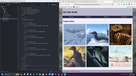
Currently working on building a new personal website.
I used to have a couple basic Wix.com sites that I used for my college portfolio, and after graduation served as my de-facto "main" site.
I had been meaning to retire it and replace it with something more polished for a while now (especially since taking some actual web design courses!). However, I was never motivated enough to take it down until I started looking into the BDS Movement and similar campaigns. It may not be as big a player as Hewlitt Packard, but it is still a notable company with headquarters in Tel Aviv.
So now I've finally deleted my crummy old site, and I'm setting up a new one for the new year.
I've been browsing through web-hosting services, seeing what's affordable. May install Wordpress at some point. In the meantime, I am also coding a dummy site from scratch (nothing fancy, just some html docs, a plain CSS stylesheet, and some Javascript), just so I can figure out how I want it to look.
#personal post#life update#web design#webdevelopment#artists on tumblr#digital art#html#html css#javascript#work in progress#upgrades people upgrades#i will probably delete my deviantart account too#after I archive everything#leve palestina#boycott divest sanction#wixwebsite#deleted
2 notes
·
View notes
Text
twine stylesheets are kicking my ass!! i am not a programmer and yet i am trying to figure out creating custom css and importing it into harlowe. sickening.
#you may ask why i’m formatting it before writing it. it’s not slick or final i just want something so i am hyped!! and to show y’all!!#you may say that i should crank out my 1667 words today instead to which i say. tomorrow sounds like a great day for that. today i code#nanowrimo#glitched: reborn#glitched#glitched devlog
2 notes
·
View notes
Text
Minimum Knowledge Required to Use GAM3
Someone who I have some faith in recently asked about using GAM3, Tinydark's proprietary game engine, to make a game similar to Marosia with elements of Flight Rising. I'm still in stealth mode but I thought I'd offer a license, and endeavor to get them an installation running some time in December.
GAM3 is a no-code piece of software. The pitch for GAM3 is the same it was in 2013: you shouldn't need to be a programmer to make a game. Eleven years later(!), that has never been more true. But in order to achieve the flexibility required to build complex games, I have had to make features which closely resemble programming.
Here's a screenshot from the most complex thing GAM3's ever made, URPG's battle system. This is the skill Mighty Leap and what follows after this event is played, is a ton of logic smartly injected (and cached) to account for all the features that URPG's alpha combat requires.

Most events aren't nearly this complex, but if you look closely you'll see a lotta code-lookin' things. This isn't a tutorial -- that will come in 2025 -- so I'll leave it at that and proceed with detailing the minimum knowledge you'll need for a comfortable GAM3 development experience.
Programming 101
You should understand the concept of variables, conditionals such as if statements, and how to use functions. Any functions available to PHP are available to use, but there are restrictions on any functions that could be security issues.

In this (nonsensical) example, we say: if the player chose choice #2, set the variable [$foo] to the number of swords they have * 2. Next, we increase their dexterity by whatever that amount: if they have 3 swords, +6 dexterity xp.
Understand web technology: here's a cute explainer I generated with ChatGPT which analogizes web development to building a house.
Styling With CSS
Websites are styled with CSS. Each game has its own stylesheet for overrides. We're still working on making everything perfectly flexible, but you're able to customize/override anything with CSS and most colors are based in configurable variables. Right-click on anything in the game and select Inspect Element to try changing a few properties and see what happens. :}
The layout itself is configurable through CSS grid. That's a big topic, but chances are you'll be able to figure out how to move things around easily.
Regardless, rest assured Tinydark is here for a minimal (or perhaps more) level of support should you need some styling help.
Game Design
Gasp! Yes. Game design is a real discipline. Here are a few resources I recommend.
Game Design Vocabulary -- I never got to read Naomi's part, but it's a good primer.
Extra Credits -- I was thrown for a loop when I tried to find the link to EC and it turns out they rebranded the channel as Extra History. You'll have to scroll down to find the Extra Credits episodes. They were formative for me as a younger designer.
Lost Garden -- A great general resource; Dan Cook is a brilliant designer and I have a lot of respect for him and Spry Fox. I recommend looking through his posts to find any that catch your eye.
Otherwise, it's hard to say what got me to the point of confidence I have now. I've failed a lot. I've read a lot of post-mortems. I've written a lot. I'm happy to provide feedback and guidance on the design of your game as well as talk about GAM3's strengths and weaknesses.
Finally, you'll really want to learn how to write a Game Design Doc. It is absolutely critical that you get your thoughts all out on paper and get settled on design pillars, as well as how to pivot out of them and determine the risks for your game/design.
1 note
·
View note
Note
Bam. As you wish:
This is a temporary setup while I figure out how to make a browser extension (JSON scary, I'm just a front-end dev), and you will need to manually add entries in the meantime, but it'll do the job in the meantime. You can install the highlighting stylesheet on any browser using any style-injector extension like Stylus. Thoughts, questions, and feedback are more than welcome right now since this is just a sketch of the kind of UI/UX I'd like to have.
Unpopular/unheard opinion: Some folk with great handling of programing should go and create a Shinigami's Eyes extention for jewish people to watch out and keep eachother safe from the huge rise of antisemitism lately¿
god that would be fucking incredible.
217 notes
·
View notes
Note
if it's not too much, would it be possible for you to reference the font you used and/or how u got the sidebar to the bottom left corner? it looks GORGEOUS and i'd love to figure out how to do it T__T. thank u for ur time!
no problem, i'm happy to help!!
with reference to the customize page
1. when i was editing this theme, the font family was Source Serif Pro, but now it's called Source Serif 4. in order to add support for special fonts you need to go to google fonts and get the URL (see below where it says "custom stylesheet url".

paste [https://fonts.googleapis.com/css2?family=Source+Serif+4:ital,opsz,wght@0,8..60,200..900;1,8..60,200..900&display=swap] into the custom stylesheet URL box.
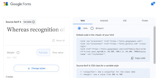
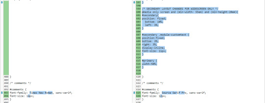
then in the "use embedded css" section, any time it says font-family you need to replace whatever font family name is there with the new font family. like so (text comparison: left being the original, right being my modified version). the serif/san-serif thing after is to provide a default in case the font doesn't load properly. if you were doing this with the above URL you'd type "Source Serif 4" in that spot though!

-----
2. the sidebar will be more difficult because i made so many changes and i don't remember what did what LOL but feel free to ask me again if it's not working for you. these steps are going to be somewhat specific to recessional though and i don't know how well they would apply to a different theme...
the sidebar is controlled by the div id called "secondary"... this page might help you tell the sections apart and the tool that helps me troubleshoot is the f12 key (windows) which shows you the elements of the webpage you're on.
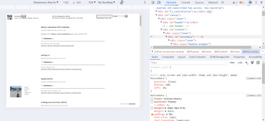
for the widescreen/desktop version of the layout, i fixed the secondary module to 10% page height off the bottom of the page and 3% width off the left... more info on pages like this. i usually just experiment with those numbers until they look good and test them on a few screen sizes.
i made some other changes that apply to the mobile version as well, but i added this code at the end of the secondary "section" of the css and right before the comments section (lines 599-605 are the relevant ones here).
something else i had to do to get my sidebar to work properly was change the page setup in dw to 1 column (different to what was specified in the theme install). i'm not sure why, i'm by no means a css/html expert T__T
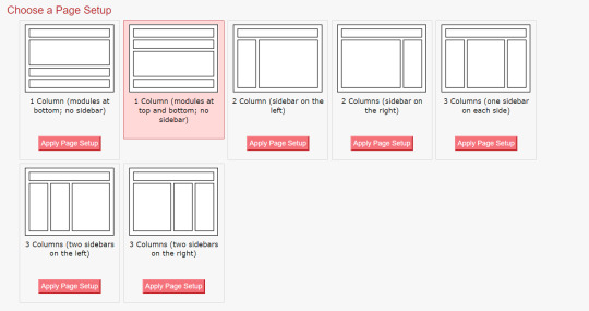
i hope this helps and you can figure out how to customize your theme to your liking!
#response#ironically discovered a coding error in my tumblr theme thanks to that long link text i put in this... i do not want to fix that rn LOL
0 notes
Text
griping internally about how i need to copy the CSS stylesheets for my current tumblr blog theme or just figure out what's in there so i can make FANCY CUSTOM CSS DAMMIT and make my poll options on my actual blog's URL, you know, readable.
i hate how the buttons currently look in my actual URL blog, they're so freakin unreadable and bright
i hate it so much
#text post#brightsuzaku#did you know that once upon a time i was taught HTML and CSS#once upon a time i was a baby webdev student#i have been learning and re-learning webdev since high school#also i hate coding#this is why i am not still in webdev#I NEED THE STYLE SHEETS
0 notes
Note
do you have any words of advice for coding a website? (i am so sorry if this is too vague for you to offer anything concrete by the way)
OH don't worry about it! It's a really broad question, so I'll try to give a broad answer =)
My best word of advice to give you is that HTML is ridiculously easy to learn. Like, impossibly easy. So easy that once you learn it you'll be shocked that anyone doesn't know it. You can't say that a lot about many coding languages, and that's because HTML itself isn't exactly 'coding' as you might imagine it—it's a markup language, which means it simply defines elements on a page for a browser to read and display. Like, once you have a place to host it, this is literally all you need to have a fully functioning webpage:
<!DOCTYPE html> <html> <body> <p>Hello, World!</p> </body> </html>
The <!DOCTYPE html> tag first defines that this is an HTML document, the <html> tag serves as a container for the rest of the tags, the <body> tag states the contents of the page, and the <p> tag within states that the "Hello, World!" text will be displayed as a paragraph. If all you want is to make a webpage, you don't need anything but basic knowledge that you can easily look up—and an idea, of course. I mean, hell, you don't even need an idea necessarily. Throw together random stuff on a page and do absolutely nothing else if you like. It's your page: you can do whatever you want.
Of course, it gets more complicated when you want to make it more complicated. That's where CSS styling comes in, and it's just as simple. CSS is a style sheet language, meaning it's used to 'style' markup languages. CSS changes how HTML elements appear; whatever HTML can't style by itself, CSS can. You can either put it in a separate stylesheet document, or throw it right onto an HTML document inside a <style> tag. Here's an example of some CSS:
body { background-color: black; } p { color: white; font-family: calibri; }
Now your entire page (<body>) is black, and your paragraph text (<p>) is white and in the Calibri font. If you want to alter the text in only a certain section, it gets a little more complicated—and by that, I mean you have to add like one additional set of tags to the original HTML document: the <div> tag, which 'divides' sections of a page that contain styled elements. So, if you want that, you'd write something like this:
... <body> <div> <p class="redtext">This text is red.</p> <p class="bluetext">This text is blue, and has a white border.</p> <p>This text displays how the page would otherwise display text.</p> </div> </body> ...
... and your CSS could look something like this:
... div { color: white; font-family: calibri; text-align: center; } .redtext { color: red; } .bluetext { color: blue; border: 2px solid white; }
With CSS, you can define preexisting HTML tags, or create your own "elements" (classes) that you can append to those same preexisting HTML tags. You can do this with any tag; classes aren't exclusive to one specific tag! You could have <div class="redtext"> and a <p class="bluetext"> inside that, and even a <span class="redtext"> inside that, if you want to make a specific word or couple of words red. Here's an example of this, as a screenshot:
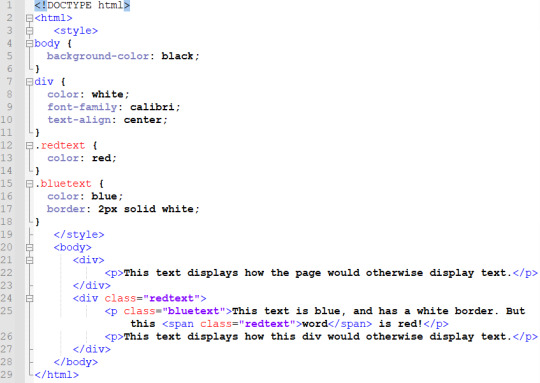

So know that you're a bit familiar with how HTML and CSS are structured, all you need to do now is figure out what you want to do with it, and then figure out how to do that.
This post is a hugely simplified example of a webpage, but I tried to simplify in such a way that if I saw it when I knew nothing about HTML, I could look at it and say "Wow, that looks easy." I explained things in the way that made HTML & CSS sorta 'click' for me, if that makes sense. I think that when you grasp the base 'structure' of HTML and CSS, everything starts making sense all at once. It's like... If your brain is a compiler, it needs a few necessary components to 'process' a certain language of code. Once you have this essential framework 'installed', you will be able to read any code in this language that you come across, or at least make some sense of it. It's nowhere near comprehensive, of course... But it's a start!
So here's my second word of advice: look up EVERYTHING. Want to add an image? Look up "html images". Want to style your page with a background image? Look up "css background image". Want to add a sparkly cursor? That might require you to use some JavaScript, but that's no problem. Look it up. If you don't know how to do something, take a second to learn how. The information is already there for you to find, so all you need to do is look it up. There are so many resources for you to use, all made by people who would love if you used them. Here are a few that I like:
w3schools.com is basically the main guide recommended to beginners—it has comprehensive resources on HTML and CSS, and really good guides to learn each! (Learning HTML) (Learning CSS)
neocities.org is a good second stop. If you want to host a website, you can do it here for free! Its free plan is extremely generous; you likely won't get anywhere near approaching its limits. It has an HTML editor that'll yell at you if you make any particularly egregious errors, so it's good for getting started. It has its own simple HTML guide that you can check out, plus a collection of other resources, too!
If you don't want to have a public website, you can even just write code in notepad and save it as a .html file. Seriously—copy any of the code in this post, save it as a .html, and open it up! It'll work just like an online webpage.
There are countless other resources to find with a quick search, too. If you can't find an answer in a general guide, there are websites like Stack Overflow that have user-submitted questions you can search through, and they almost always have useful answers. Don't be afraid to copy and paste code and mess with it; you could make a great website from a collection of copy-pasted code altered to your liking. You never even need to write anything from scratch if you don't want to, honestly. And remember that you can press F12, Ctrl+U, or right-click and press "View Page Source" to inspect the HTML on any website. If you want to know how something is done, go take a peek inside! No one will mind if you just rummage around a bit.
I really hope this answer is a bit useful in some way, or at least inspires you to get started. Once you get started—even if it's a really simple start—you unlock so much new potential for yourself. You don't have to explore all that potential if you don't want to, but having it there is already an amazing thing. Once you learn the basics they never really go away, so even if you don't have anything to do with it at first, you might find inspiration somewhere down the line. If you do, you'll be really glad you took the time to learn; if you don't, well, when is it ever bad to learn something new? The answer is never. The world is at your fingertips and the keyboard underneath them. Go put 10,000 glittery GIFs on your webpage, goddammit. HAVE FUN!!
#ALSO: if you have any further questions feel free to ask me!! i love to help people with this stuff#i honestly think everyone with a computer should learn html if they haven't already.#a lot of people have some knowledge of it without even being aware of it honestly!#it's such a key part of the internet itself that you probably have SOME passing knowledge. that makes it really easy to get started#what got me started was mainly my curiosity from poking around in view-source. an accidental f12 press can change your life LMAO#of course neoHTML was also part of my start. neopets taught SO many kids about html#but even if you don't have any of that preliminary knowledge it's super easy to gain it. so give it a try anyway!!#html is fun and making your own website is even MORE fun. and the internet is AWESOME!! WOOOO
409 notes
·
View notes