#but i didn't like the 1080p quality so i added grain texture
Explore tagged Tumblr posts
Text


Jin x W Korea | white
#btsgif#btsedit#userbangtan#dailybts#userdimple#userpat#raplineuser#useremmeline#annietrack#usersky#tuserandi#usermaggie#userkelli#heyginkgo#usersevn#uservans#userines#seokjinedit#kim seokjin#*#bts#tw flashing#i had to make gifs from 1080p bc i didn't like how they look from 4k video#but i didn't like the 1080p quality so i added grain texture#(i wanted it to be the noise effect but it adds so much mb to my gifs it's insane)#anyway i love that photoshoot i can't get enough of it
421 notes
·
View notes
Text
gif tutorial
i was asked to make a tutorial for this set i made, so let's get right into it!
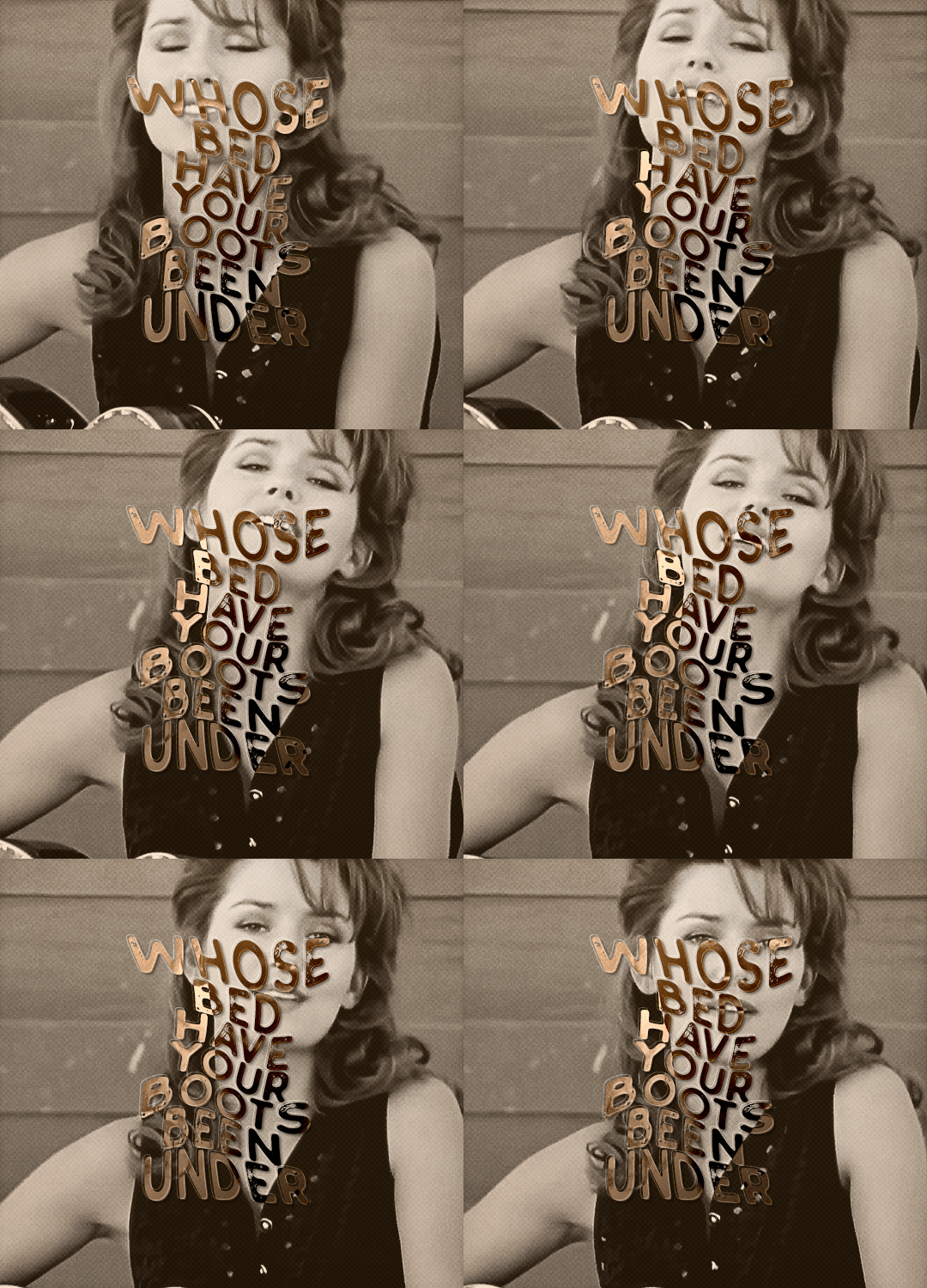
first things first, i downloaded the music videos from youtube in 1080p using 4k video downloader. unfortunately, the quality of youtube videos always seems... not great, to put it simply. plus these music videos are from the 90s, so they've been upscaled to 1080p after the fact. all of this works against us, but i've definitely worked with videos of lesser quality than these, so at least there's that!
when i gif, i import video frames to layers rather than screencapping. this comes down to personal preference. after everything has loaded, i group all my layers together and set the frame delay to 0.05. i then cropped my gif to 540x500.
the next step in my process is sharpening. i did play around with my settings a bit given the quality of the footage and the dimensions of the gif. i compared both @hellboys low-quality video gif tutorial to my regular sharpening action and my vivid sharpening action and in this case, i preferred my normal vivid sharpening action. i used this tutorial to create the action for myself, and you can find other sharpening tutorials here. this action converts my frames to video timeline and applies sharpening.
once my gif is sharpened and i'm in timeline, i begin coloring. i wanted to simplify the amount of colors used in these gifs, again because of the video quality -- i knew it wasn't going to have the crispness i would normally like for my gifs. here are my coloring adjustment layers and their settings (not pictured: my first layer is a brightness/contrast layer set to screen) (explanation in alt text):
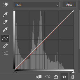

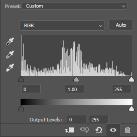
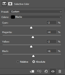
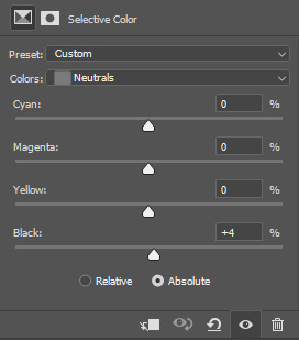
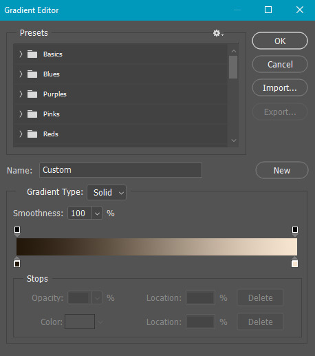
all of these layers and their settings will vary depending on your footage and its coloring (and obviously, feel free to make the gradient map whatever colors you like if you aren't going for this exact look).
pretty basic coloring, especially with just slapping a gradient map on top (my beloved), but at this point, i still didn't like the quality of the gif, so i added a couple textures/overlays.
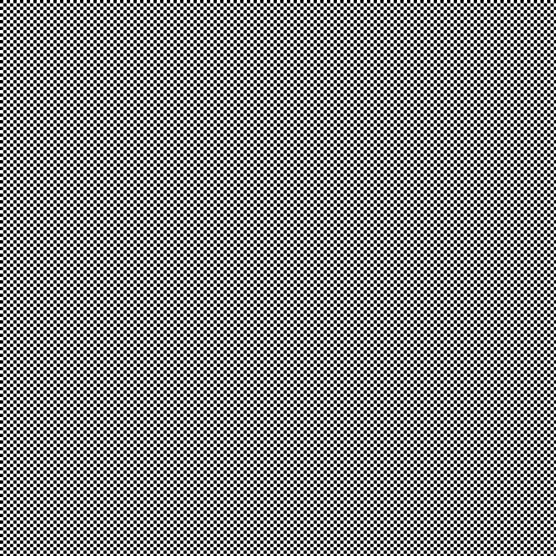
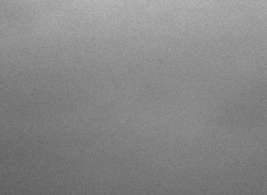
i put the left one down first and set the blending mode to soft light and the opacity to 8%. depending on what look you're going for, you could increase or decrease the opacity or play around with different blending modes. i like using this texture with lower quality footage because even when it's sized up a bit, it adds some crispness and makes things feel more defined. for the second texture, i set it to overlay and 75% opacity. we love and respect film grain in this house.
now for the typography! sometimes i really enjoy typography and other times it's the bane of my existence for the sole reason of just how many fonts i have installed. anyway, here are the settings i used for this set:
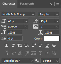
make sure the color of your font is white and then set the blending mode to either difference or exclusion. i can almost never see a difference between the two, but for this set, i used exclusion. below are the blending options (double click on your text layer to bring up this menu or right click and select blending options).
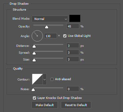
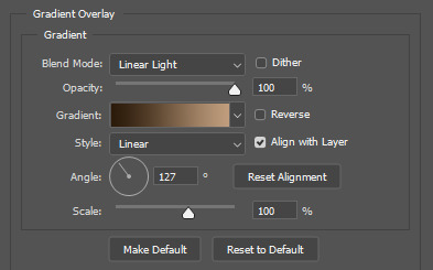
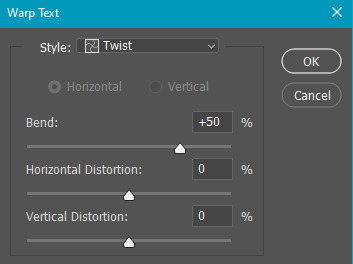
now we have to add the warp effect. with your text tool still selected, click this icon at the top of your screen:

from the dropdown menu, select twist. these were my settings, but feel free to play around with different warp options and their settings. the ones i use most often are flag, fish, and twist.
this last step is completely optional, but it's an effect i use in most of my sets with typography. duplicate your text layer (select the layer and ctrl+j), turn off the layer effects (click the eye icon next to effects), and set the blending mode to normal. right click on the layer and select rasterize type. right click on the layer icon itself and choose select pixels.

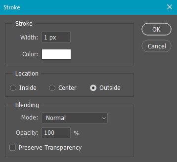
at this point, you should see the moving black and white dotted line showing that only your text is selected. then go to edit > stroke. here are the settings i almost exclusively use.
this is what your text should look like now:
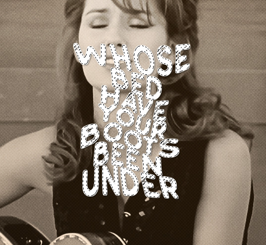
using ctrl+T, move the layer off the canvas so you can't see any of the text anymore. you should be left with only your outline. click anywhere on your canvas to de-select the text we just moved. use ctrl+T again as well as your arrow keys to nudge the outline over to the left 2px and up 2px. this is personal preference as far as the positioning, but i almost never move it any other way. you can leave it like this, which i sometimes do, or you can set the blending mode to soft light like i did for a more subtle effect.
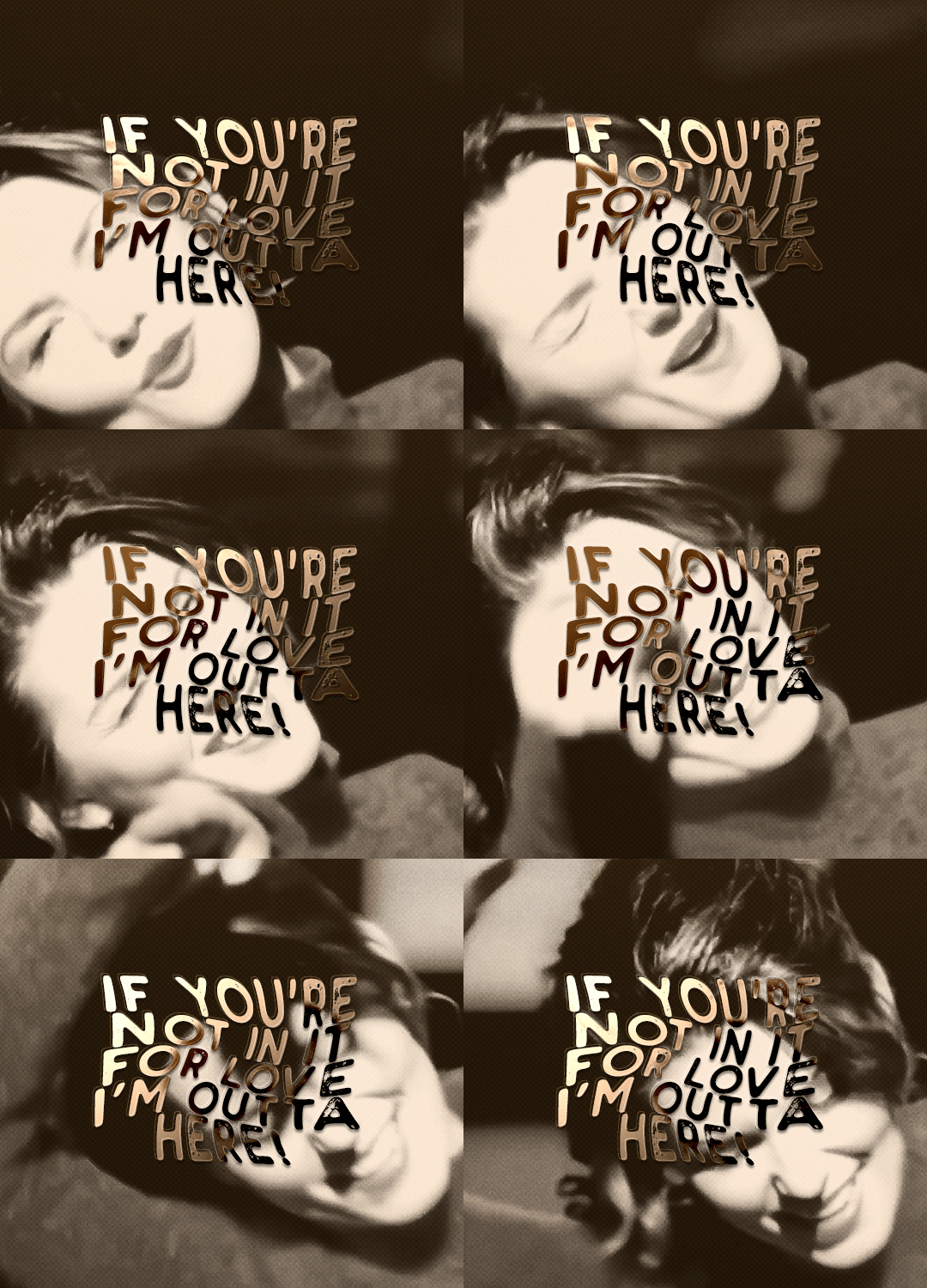
and that's it! rinse and repeat for each gif in your set or use a different warp effect on each gif to switch it up! if you have any questions about this tutorial or would like me to make one for anything else, please feel free to ask any time!
#gif tutorial#my tutorials#gifmakerresource#completeresources#dailyresources#chaoticresources#userdavid#coloring tutorial#typography tutorial#tutorial#photoshop tutorial
258 notes
·
View notes