#but also the only facial feature that really changes is the nose. which is very stylized. and the hair ig.
Explore tagged Tumblr posts
Text

Mish Mash
#i learned to draw chibis and it's the best thing that's ever happened to me cause now i can make infinate doodles of my special little guys#mashblr#mash fanart#hawkeye pierce#trapper john mcintyre#radar o'reilly#beej is here too#bj hunnicutt#this style is actually quite frusterating for mash characters cause you can't differenciate them with their clothing (they all wear the sam#but also the only facial feature that really changes is the nose. which is very stylized. and the hair ig.
114 notes
·
View notes
Text
Sidereal Vedic Beauty Indicators Pt.3


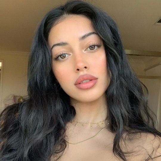
~{🪻}~Vishakha: I have no words to describe how divine and picturesque these folks appear that have this placement. Vishaka's beauty is the type that will have you looking for hours or even have you fully captivated and nobody can change my mind about their heavenly and enthralling beauty! They look like porcelain dolls with a delicate effect on them! Vishaka is the "Cherubic Beauty", so these people facial features includes emphasized and broad mid-face, cheekbones which grow outwardly to a strong extent, large, and very defined cheek apples which are slightly low-set, foreheads that are generally medium to tall in height, with a more narrow and short jawline, eyes are most typically small to medium in size, and sometimes generally widely-spaced, and their gaze/natural expression can appear distant, detached, or cold, their noses are plump (wide in the bridge and tip), a horizontally-elongated cupid's bow, and small (often generally spacey) teeth.
Vishakha Women {Left to Right}: Dove Cameron, Cindy Kimberly, Jessica Lowndes



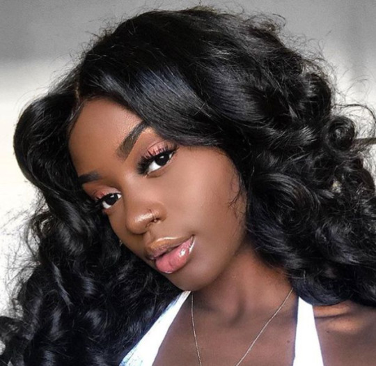
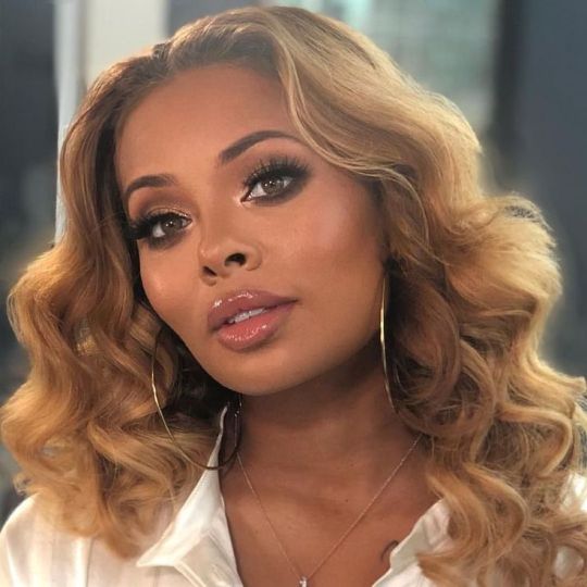
~{🪻}~Swati: Oh. My. Gosh! Ugh, I am so in love with people that have this nakshatra in their charts! Swati individuals beauty is so dazzling and jaw-dropping! Not only that but their eyes are so mesmerizing to many and myself appearing hypnotic due to Rahu's influence. Swati men and women definitely have me in choke hold, you just can't help but to fall in love with their otherworldly visuals! Also I've noticed that they look photogenic and glowing in photos but mostly attention is drawn to the eyes. Swati is known to be the "Bug Pretty", so their features contains protruding eyes with prominent eyelids and medium to close spacing, thin to medium, with a more de-emphasized upper lip, cheek bones that' are on the small side, but high and gently defined, with medium sized cheek apples, contrasting typically shorter, square (to rectangular) face shape, and sometimes with a prominent and pointed chin.
Swati Women {Left to Right}: Glow Princess, Lisa, Eva Marcille



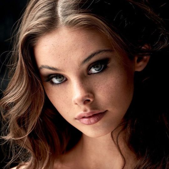
~{🪻}~Ashwini: My oh my!~ Y'all these natives are so fine!~ Ashwini's beauty tends to be youthful and appealing! You'll always see an Ashwini person that never looks their age, or might mistake them for being a kid, teen, or in their early 20's! It's really amazing how they maintain their beauty even at old age, to me Ashwini folks strike me as the one to have their visuals praised by many online and in real life, especially in the Kpop industry. Ashwini represents the "Raven Pretty", their looks consist of full and large cheeks, which are rounded and prominent in the buccal area, face shape tends to be round or gently squared, full and soft fleshy lips that's very succulent, nose is also soft and widened, upturned, and with quite broad nostril wings and rounded nostrils, eyes are typically small to medium in size, almond-shaped, medium to wide-set, and neutral to upturned but have also light vibrant undertones having minimal eyelid spacing, brows that are long, and straight to lightly arched, and shiny hair in dark and ashy tones.
Ashwini Women {Left to Right}: Meika Woollard, Challan Trishann, India Eisley
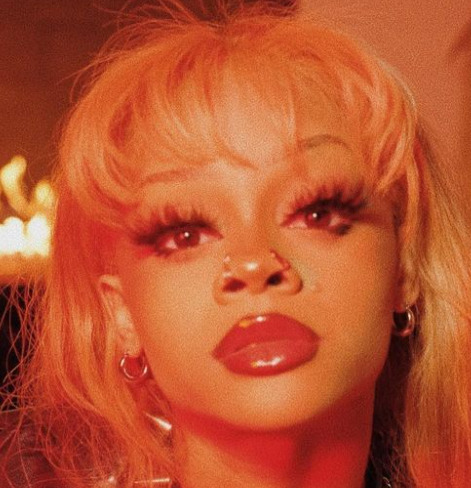


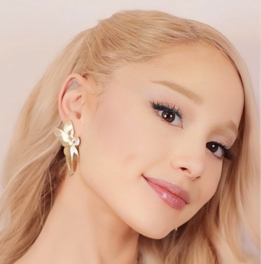
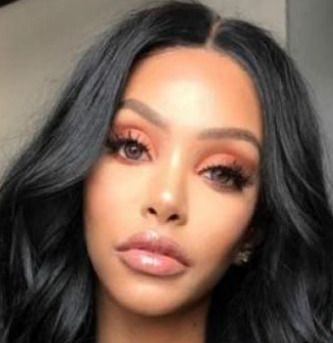
~{🪻}~Ardra: I had to add another Rahu nakshatra in this post! Ardra beauty is incredibly splendiferous and fetching to me! I'm not joking like Ardra had to be on the list because they can't go unnoticed including their electrifying eyes that's a little protruding and medium to close-set, just like other Rahu nakshatras their eyes are a prominent feature on their face that can't be ignored. Their beauty is one of a kind and rare almost alien-like or dreamy to a lot of people! They tend to outwardly appear celestial in pictures, try brighter, sparkly, and bling filters on your phone, I promise you the results will turn out beautiful! Last not least Ardra natives beauty that's "Diamond Pretty", are made up of a pointy & pinched lower face resulting in a inverted triangle face or ovalish because of the ruling symbol which is the "tear drop", stronger mid-face area, emphasized cheekbones, long medium to large size nose and low-set like the yoni animal (female dog), and lips that are thin to medium.
Ardra Women {Left to Right}: Ariana Grande, Yodit Yemane, Kaya Scodelario


#nakshatras#vedic beauty#sidereal beauty indicators#ashwini nakshatra#swati nakshatra#ardra nakshatra#vishakha nakshatra#beauty indicators#vedic astro observations#vedic astrology#vedic astro notes
427 notes
·
View notes
Note
Hi! I'm new to your account, but just binged your "I bet on losing dogs" storyline, and I had a question and concept for you? How much is the reader free to interpret? I'm a theater kid, so I like her hobbies. But is there any specific physical traits you're writing for her? I know you mentioned that we were/are chubby, which is cool, but do you imagine any certain features? Because I'm Mexican American with certain features, so I was curious if you had a certain ethnicity set for her besides being half White/Jewish from Bruce being her biological father.
I also had the same question about Tiffany, because I'm currently imagining the Stereotypical All American girl. Kinda got that Disney Channel actress vibe to her. (Physically). I also had this really messed up though of the reader having to spend YEARS trying to keep in touch her mother's culture and such, learning dishes, traditions, going to local festivals by herself, having to learn how to do makeup and hair styles/products that fit her face and hair pattern. No one bothered to help or teach her. But than, suddenly Tiffany starts to steal those "habits", uncaring if they were very personal to the reader. Than everyone in the family suddenly starts to like the Reader's culture and such. (I had this scene in my brain where the Reader walks in on Tiffany is bragging about some music or dish "she" tried out from the Reader's culture, while the family are all happy and curious about it. Even when the Reader tried to introduce it to the family, everyone declined even trying it.)
I see the Reader so "Your Best American Girl" coded by Mitski.
Anyway I just wanted to ramble, bye!
ok so, I'm trying to be as vague as possible bc reader is supposed to be whoever is reading so there's no in depth description or specific height or build (except chubby in the prologue). i feel like i've basically made reader an OC which i hate but personally when I'm reading a fic, I just ignore things if I don't like them or they don't apply to me which is what i suggest yall do!!
the reader's mother is Palestinian/ Venezualan, like my own mom but you can change it if you'd like. it's important to mention that reader does have Bruce's jaw structure and face shape and shares facial features with Damian as well. It's small things like the ears, the roman nose, even the eye shape, point is that every time reader looks in the mirror she can see shadows of Bruce and Damian on her face. it's kinda like the vibe of "like him" by tyler the creator. I'm middle eastern and hispanic so I imagine reader with darker feautures like tan skin, thick brown hair, arched brows and long lashes but it's all up to you!
reader is very confused because while her dad is white, she isn't. she did try to bond with Damian and learn Arabic with him but he shamed her for not knowing and kicked her out his room, literally. she used to be embarrassed of her heritage when she was younger (courtsey of Tiffany calling her a mutt) but as she got older she realized how interesting her culture is.
she wants to learn arabic but has no teachers and it's a pretty hard language to learn if you don't grow up speaking it .she has no sources to help her and most of the time culture and traditions are things you grow up with and are passed down to you from family. her mom used to speak to her in arabic and feed her dates and sandwiches with olive oil and sugar and make her fried plantians so those things are very special to her, they're some of the only details she remembers about her late mother. so yeah reader is very "Your best american girl coded"
You're so on point about Tiffany, she's your classic all American girl. Blonde hair, blue eyes, long tanned legs and a set of pearly whites. she's the kind of white girl to act like she cares about other races but is secretly racist. you know what girls im talking about! and that prompt you sent with the food eats so hard, I have a scene mapped out with that in the upcoming chapters. I rambled too girl!!! you really got me thinking tbh but let me stop and actually write the next chapter.
#yandere batfam#yandere jason todd#yandere dc#yandere batman#yandere damian wayne#yandere tim drake#yandere x reader#yandere dick grayson#yandere dick grayson x reader#yandere bruce wayne#yandere bruce wayne x reader#yandere batfamily#yandere batfamily x reader#yandere batman x reader#yandere batfam x reader#yandere batboys
153 notes
·
View notes
Note
Show us your Kirby gijinkas. Now. (If you even have any.)
sorry abt the long wait, but here u go
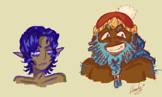
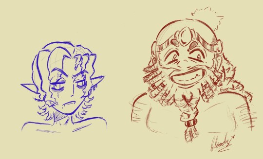
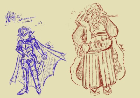
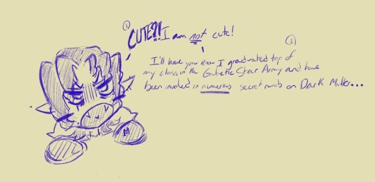
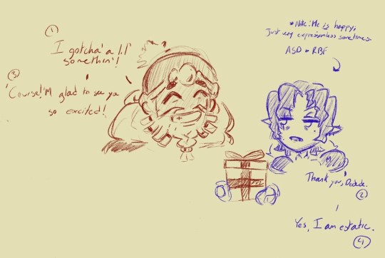
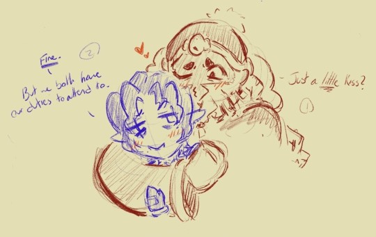
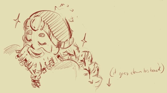
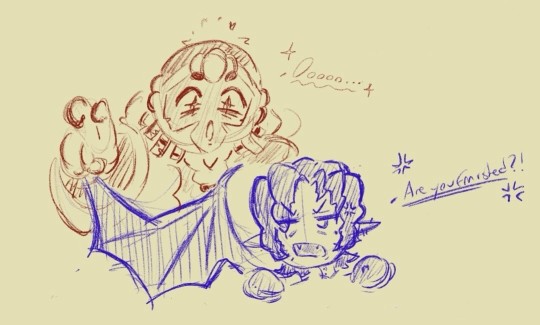
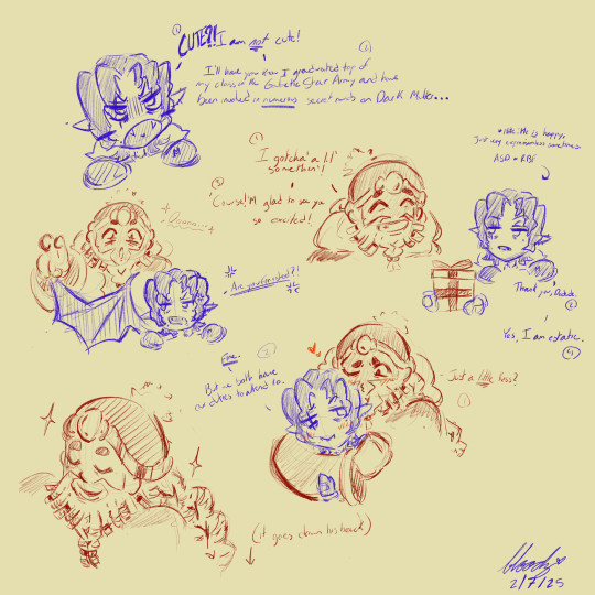
im SOOOO happy w how these turned out.
sorry, but i only really have set designs for meta and ddd at the moment but i'd LOVE to do the other characters. i know you didn't explicitly ask for mtdd, but I just couldn't help myself <3
(ill go into more detail about my choices under the cut, I just love to yap)
okay now that ur stuck here with me, I'm gonna start with my design headcanons and inspirations.
Meta Knight:
Okay for Meta I wanted go with a more slender-ish, short-statured body will a bit of a baby face. I really tried leaning into a bit for vampiric features like fangs, desaturated colors, and the signature vampire bites (although these ones are just moles for the aesthetic). I wanted to give him a good chunk of unique features too like a scar under his right eye, a few beauty marks, pale-white eyes, prominent fangs, like 2c/3a hair (this means curly/wavy incase ur unaware), permenant eye bags, and a hooked nose for good measure. Ski-slope nose meta is evil propaganda which shall not be trusted.
yes yes, i can hear u saying "he looks like a twink" and to that I respond, "well, I'm fucking trying. he looks strange w facial hair to me and also Im a raging lesbian who only draws women over and over again". Also I made him Mexican because have u SEEN the anime dub. its fucking gold. and while I'm not Mexican, I AM colombian and black, so I thought this would be a good time to flex my liberal wokeness and make meta darker than a piece of paper. excuse the egregious anime hairstyle, I like anime and don't get out much.
King Dedede:
Alrighty I REALLY stepped out of my comfort zone here. I'm gonna be honest and say not only do I not draw a lot of men, but I don't draw a lot of men with larger body types like ever so this was definitely a bit of a challenge. god bless the "fat guy" anatomy tumblr post I saved a year ago, it came in clutch. anyways, I wanted to add some traditionally black hairstyles to my kingy king so I did a bit of thinking until I came to a realization. BEARD. LOCS. it was genius. I scrolled thru this guys page on tiktok who also had beard locs but they had jewelry on them and I just thought "wow, el, ur a genius." so I threw them into the design ofc. I like how a few other gijinka designs of ddd give him a long braid in the back. It's very regal. So I did that too but it's a braid made up of locs. Dedede's head is probably extremely heavy from the hairstyle I gave him, but he'll live. To list off some attributes; I gave ddd a wide, flat nose, vibrantly dark skin, like the underbite kind of fangs that u see in werewolves(not sure what it's called exactly? anti fangs??), locs, bushy eyebrows, and blue, tiny pupils. Again, I am VERY happy w/ my resdesign of him since my design of MK didn't change all that much from 2022.
In Conclusion:
thank you to anyone who made it this far!!1!!1
I know I say a whole lot of nothing sometimes, but I'm just so touched somebody out there wanted to see MY gijinka designs. its so funny cuz that's literally what my first ever post was on this app and Its nice to see things come full circle for once. hopefully, you all think Ive improved since then. personally, I think I improved a wee bit, but ill always strive towards improvement so I can have enough talent to consider redrawing the designs I just made, but even better <3
58 notes
·
View notes
Text
Making Humanoids Less Human
I did make a small post on this, but now I've got the art for a much bigger and more detailed post! so here we go.
I had several anonymous asks that all came in quick succession weeks ago. Every single one of them was basically just a variation on "how would you take (typically humanoid) fantasy being, and make them look less human?"
This blog does not exist for me to just give people original designs for free, my goal is to show off my own personal thoughts about fantasy design and help people figure out how to adjust their own designs to fit their vision better. That means when people ask me questions about how to do something, I want to give them things to think about so they can come to their own conclusion. I don't mind making original designs to illustrate concepts, but a whole flood of "show me how to make this specific thing look different" all at once like that was too much. I'm not answering them all individually, it's just not what I want to do.
But what I can do is show my own thoughts and ideas about how to take any fantasy design and push it further away from "human", and you all can look at my ideas and figure out your own way to do things!
So here are the main 4 methods I've come up with to make humanoids look less human.
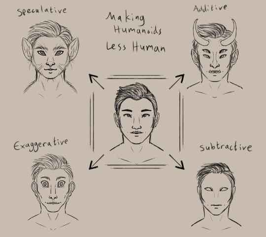
(image description: a simplified drawing of a humanoid face surrounded by four altered versions of the same face. clockwise starting from the top left, they are:
Speculative, drawn as a cat person. Additive, drawn with horns, pointy ears, sharp teeth, and a second pair of eyes. Subtractive, drawn with blank eyes, no nose, and no eyebrows. Exaggerative, drawn with a long face and huge eyes, as well as a wide mouth, narrow nose, and big ears.
end description)
I am personally a fan of the speculative route, which means exploring an alternate root of evolution to create a new design. Through this method, I've created monkey elves, frog goblins, and pig orcs.
the additive option is the most common, I think. adding new feature or doubled features to a humanoid form is a very intuitive way to change the design and make it look less human. you see this in most fantasy and scifi designs, like star trek aliens and the dnd player races.
subtractive and evaggerative are the most common options for people that like the uncanny valley. it's really easy to make uncomfortable designs by removing or exaggerating recognizable features, and they're often used together. Slenderman, for example, removes all facial features and skin color but also exaggerates the limbs and body.
Combining the four methods will give you a really interesting design as well! So for practice I decided to explore an alternate design for Tieflings, the part-demon player race in dnd.


(image description: four examples of differnt tiefling designs using the previously described methods. the additive example is just offical dnd art of a tiefling woman with purple skin, horns, and a long tail.
the subtractive sketch looks very alien, with a bald head, empty eyes, and no other facial featuers aside from a small mouth. it has three fingers per hand and two toe per foot.
the exaggerative sketch shows a hunched humanoid figure with huge eyes and big ears. the neck, limbs, and digits are all long with claws at the ends of the fingers and toes, and the limbs are also quite muscular.
the speculative sketch shows a bipedal figure with features similar to a giraffe, including a long neck, ossicones, and hooves.
end description)
now, because tielflings have such a distinct look to them, obviously my new sketches don't really look like tieflings, do they? the only one that comes close is the giraffe. relying only on one type of alteration to the human form has left the designs rather empty and lacking in the more iconic traits of the original concept. so i tried a sketch that combined my ideas! it came out looking like a completely different creature lol, like it could be a kobold or something, still not really a tiefling.
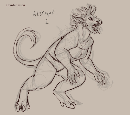
(image description: a sketch of a creature with a giraffe-like head, long tongue, and sharp teeth. it appears to be roaring at something and stands in a half-crouch. it has long limbs with hoof feet and clawed hands, as well as a long tufted tail curled behind it. end description.)
didn't work out. too far into the animal side of the speculative evolution, I think. so I tried again and got a design I liked much better!
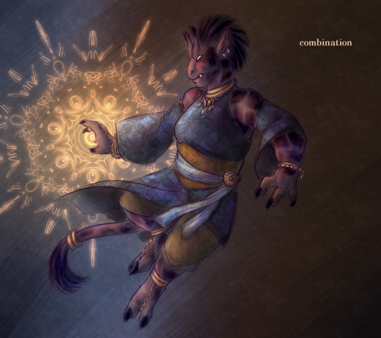
(image description: a digital painting of a tiefling leaping back and casting a glowing orange spell. she is wearing a tunic with a corset and detached sleeves, as well as several pieces of jewelry. Her skin is purple with dark patches like a giraffe's spots, and she has a giraffe's ossicones as well as hoof-like hands and two-toed hoof feet. Her tail is long with a tuft at the end. She has glowing eyes and a flat nose, and there is a single sharp tooth visible poking out of the side of her mouth. end description.)
Brought the face back into slightly more human proportions and that helped a lot. Sometimes designs just take a few tries! that's normal.
and hopefully this is helpful to all of you! there are so many ways to alter humanoid designs to come up with something original and unique to you!
#humanoids#making humanoids less human#altered humanoids#non primate humanoids#tiefling#long post#my designs#and btw ai cannot do this#does not matter how detailed you prompt it#it can't really get things to look this original and unique#it can't really blend different features like this in a way that makes sense#you have this power#the computers cannot replicate it
300 notes
·
View notes
Text
Ok here are those cool facial structure facts I wanted to highlight… :] (uhh shitty drawing warning)

Seen above, the most basic components of an Ivilitium’s facial features. (Like, really basic, lol). Self explanatory. These are consistent in all Ivilitium species. I plan to make a in-depth explanation/naming for each of these in the future… after I semi-finalise their design. I must show you guys their teeth- or should I say… blades heheh.
This is also a rough draft. (Intended so that I can make a better one in the near future). I would be happy to receive your opinion on what you would change/add! Do you see anything as impractical? Do you have Any questions? Suggestions? I am very open to constructive criticism!
everything has its use… or will be assigned a use eventually, because if not I will be pissed. Not a single thing can only be for design purposes.
——————
-The first and most beloved cool fact I have about their facial structure is their facial disk, which extends from the sides of their face, starting at the jawline and ending under their outer ears. Their outer ears aren’t connected to it, allowing for them to rotate and collect sound better from other areas. their natural resting position aligns neatly with their disk, though. The facial disk’s main purpose is to capture sound waves better, enhancing the Ivilitium’s auditory sense. It is analogous to how you cup your hands behind your ears to hear better. The Ivilitium’s brow ridges also play a part in directing sound waves that have made contact with the face towards the ears. I have made a simple GIF illustrating how the shape of the their facial features smoothly guide the sound waves into the ears… sound waves that diverge from the face are all captured by the facial disk. And curiously, right before entering the ears, sound waves from the facial disk will perform a little “loop” of sorts. (It is explained best by the GIF).

- don’t be fooled by their ‘nose’! Their real airway entrances are placed at the sides of the neck, near the face. They are positioned snugly between the sternocleidomastoid and the brachiocephalicus, and given form by a muscular ring capable of closing. These spiracles are equipped with a filtration system, (that’s for another post), and their distance from the lungs gives time for the inhaled air to be warmed by the body’s natural heat.
- They have an olfactory system located at front of their face, separate from their respiratory system. (I have multiple ideas for the reason behind this separation, but I’m still deciding which one I should choose).
- They have two pairs of vibrissae (whiskers, rictal bristles, whatever you want to call them.) located just above their brow ridges. These are for stimuli detection purposes. Their vibrissae help detect faint vibrations caused by movement in the surrounding environment, which is very useful when navigating and hunting for prey, especially in the dark. (Ivilitium hunt nocturnally). Ivilitium vibrissae are not as sensitive as a cat’s or dog’s.
- their facial disk and head plates are neither fur, scales or feathers. Instead, they are something in a completely new category. I like to call them plates. These ‘plates’ are a slightly thick and stiff. The plates on an Ivilitium’s head will naturally always grow away from the face, and can also be found on the back of the neck. They can be moved… for example plates could be moved in a way that might look a bit like bangs to us. It’s not a common occurrence for Ivilitium to do this, though. It is seen widely as impractical in most cases.
- Their eyes are larger, have a higher rod cell density than ours, and posses tapetum lucidum, a reflective membrane behind their retina. (Ivilitium have much better night vision). They have a slightly wider peripheral vision than humans due to their eye positioning on their face, and good binocular vision and depth perception, which is crucial as a predator.
- They have a medium-length snout and a flat/smooth-ish facial structure (regarding the forehead and jaw specifically) for a more efficient bite and minimal strain, since strain is more evenly distributed when force is exerted. The snout tapers a bit at the end with round edges.
——————
I am definitely forgetting something or getting some information wrong because I did not proofread this enough times lol… Plus normally I do my extensive beforehand research but with school I half-assed this one since I wanted to get it out of my brain 👍🏼
#bazookaboi’s art stuff#spec bio#speculative biology#original species#original creature#speculative evolution#spec evo#creature design
47 notes
·
View notes
Note
I'm in love with how you draw characters (especially when you draw sniperscout and demoman in general), I'm unsure if you've answered a question like this before, but how do you figure out what to do with face shapes? It's hard to explain but the way you over-exaggerate certain features to make their design pop is so cool to me and I've never been able to do it for myself. That, and making faces look like.. well, faces.
thank you so much!!! hopefully i'm understanding you right...
Regarding the face shapes in TF2...we're all standing on the shoulders of the (excellent) design work already done and laid out. The characters have really nice distinct face shapes with some general overlap before you even consider that a lot of them have facial accessories which you can pick and choose from to help push facial silhouettes and peel apart characters that are a little similar.

Naff threshold filter heads to show silhouettes lol In order to exaggerate them - it's mainly about pushing and pulling the existing proportions and ratios of their faces IE: Making Medic's/Soldier's/Heavy's stupid large-chins even longer but sacrificing some of their forehead or eye-region. Varied proportions have a lot of 'rhythm' or 'appeal' and typically the human face can break down into the forehead (+ hair), eyes (I like to do a Batman style mask but people will often use the nose to form a triangle too) and then....everything else (chin, cheek etc).

Soldier, Heavy and Sniper all have REALLY similar proportional ratios but their silhouettes are really different (in both the x and z). When you add in that the 'default' way to view Soldier and Sniper is with their accessories they're all really nice and different. Funnily enough Sniper's 'eye mask' is teeny tiny with his visors off but this relationship changes with his sunglasses on. Kinda interesting... I sometimes like to think of visual vibe-based 'archetypes' when i'm drawing the tf2 guys. I don't have one for everyone yet but Heavy is sort of like 'handsome caveman' to me. Archetypally, cavemen are drawn with thick brows, small low foreheads and big chins. The 'handsome'-ness comes in when you apply a delicate approach to eyes, cheekbones, lips and with careful posing. Having this kind of visual-archetype in mind informs how I view the character as a whole and thus how i depict them! HOPEFULLY even if I drift away from how they actually look because the vibes are right...it feels right you know? There's also a sliding scale to me as to HOW you represent them. If the character is doing something goofy/stupid, drawing them less handsome and toonier can add levity. Obviouslyyyy you can have your handsome depictions making a dick joke (and that's its own sort of visual gag) but you'll notice in a lot of my images the straight-man gets drawn a little more...realistic? on-model? than the butt of the joke. It just feels more appropriate to me haha I'm using 'toonier' here to mean not only am I drawing fewer details but also exaggerating those ratios between areas of the face away from their 'default' ratio. like with most drawing-y things it's practice AND experimentation! i draw these guys differently depending on my mood and how generous i'm feeling towards their looks lol if you wanted tips on the construction of faces I really recommend checking out Griz and Norm's 'Tuesday Tips'. They're incredibly clear, concise and very approachable (and cover a variety of subjects!) Hopefully this link works? but if you search them on Pinterest and grab a cuppa, there's some AMAZING tips to be had here: https://www.pinterest.co.uk/search/pins/?q=griz%20and%20norm&rs=typed
#asks#sorry i waffled too much and probably didn't answer your question#corner of shame#posting a full link like an old person <- me#tutorial
105 notes
·
View notes
Note
Hi! I asked this question on my other account but I had to delete it before you could respond so I’d thought I’d just ask you again lol
Do you have any tips as to facial likeness? Like making the character look the same in each drawing, at different angles, expressions, ect? I struggle with it, especially expressions and how a persons features change depending on which emotion, you know?
Also random but have you ever played left 4 dead? 😅
hi 🦭 sorry ! answering things can definitely take me a very long while sometimes. if i don’t get to it right away, stuff can get buried.
to answer your question, i’m really not sure if i have a definitive answer, but i can try. trust me i have a lot of trouble sometimes too. my main tip i guess is to have real life people in mind when it comes to drawing characters. it can either be their whole face or just specific features, but it really helps to have something tangible. over time it becomes a lot easier to replicate when you have a physical example of what you’re trying to draw, like staring at a vase would help you draw vases better. overall, it’s just all about keeping in mind which specific features they have, and what the important parts of their faces are.
as easier examples: for cheyenne, i reference pictures of kate lambert (katopunk), and for dove, i reference pictures of quannah chasinghorse. the likeness doesn’t have to be exact, but general facial shapes are pretty much the same. with chey, i keep in mind her very high arched eyebrows, stronger nose bridge, dead eyed stare, pouty lips, and sunken cheeks. with dove, i keep in mind her almond eyes, stronger jaw, freckles, fine lines, and thicker eyebrows. so, even if you make “mistakes” or draw in a completely different style, the important features still carry on that it’s the same person.
as a more difficult example, i’ll put down sledge. i made this little mishmash a while ago to help a friend out with drawing him. as you can see, he doesn’t really resemble one person specifically, but he has important features that i look for in other people, and general facial likeness to help get expressions across.

+ i honestly have no idea what left 4 dead is ! i don’t play a lot of games. i think the only big video game i actually played “myself” was rdr2 and i refused to hold the controller the whole time cause video games make me nervous.
33 notes
·
View notes
Text
So this whole 'if rhaenyra insisted on having bastards then she should at least have chosen someone who looked more targaryen/velaryon' argument actually doesn't make much sense when you think more about it. This idea that the problem with rhaenyra having bastards was that they had dark hair, like if they didn't there wouldn't be a problem, it was the dark hair that gave them away and caused suspicion etc. I feel like some in the fandom, and I also think the show can be a bit guilty of this too, assume that the white hair and purple eyes of the targaryens are a dominant trait like the baratheons black hair, but actually it's not. There are several targaryens who don't have the white hair, baelor breakspear targaryen had his dornish mother's dark hair which he in turn passed on to his son valarr, elia martell's daughter with rhaegar targaryen, rhaenys, also had dark hair as did jon snow. Another rhaenys that had dark hair, at least in the book, is the rhaenys from hotd, and I'm sure there are others too. In fact the only reason these 'targaryen' features were common amongst targaryens was because of the inbreeding.
This is where I think hotd messed up with the character design of rhaenys because, as I said above, in the book she has dark hair on account of her mother being a baratheon. If they had kept rhaenys dark hair then whenever anyone questioned jace, luke or joffrey's dark hair, rhaenyra could just shrug and go they get it from their grandmother. Even though they changed how rhaenys looked I do still wish that we had seen rhaenyra play the 'it's their baratheon genes coming through' angle in the show because it's the most logical explanation she could have given.
Another thing that I find kind of amusing about the assumption that the targaryen genes are dominant like the baratheon genes is that the founder of house baratheon, the very first baratheon, was orys baratheon who was actually a targaryen bastard himself, born from the same targaryen father as aegon the conqueror. So dark-haired targaryen bastards have existed since aegon the conqueror came to westeros and baratheon dark hair genes have been cancelling out the white hair of targaryens from the very first time a targaryen and baratheon crossed bloodlines.
So I don't think rhaenyra having dark haired children should be that big of a deal when they have close baratheon relatives and again I really wish the show had played into that more. I think the suspicion should have more been centered around maybe their facial features looked like harwin strong's, they had the same nose or the same mouth shape, but them merely having dark hair should have been a non issue in my opinion. Also where exactly would rhaenyra have found someone with targaryen/velaryon features who she could also trust to keep quiet about it afterwards? Just practically I don't think that makes sense nor would it have been safe for her or her children, so choosing someone who had similar features, ie dark hair, like a baratheon which could be explained away due to her sons having baratheon blood through rhaenys, was the most logical next step.
#hotd#house of the dragon#pro rhaenyra targaryen#rhaenys targaryen#rhaenyra targaryen#team black#anti team green
111 notes
·
View notes
Text
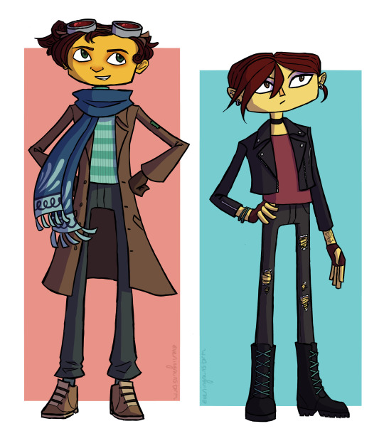
my take on teenage raz and lili!
some design notes under the cut:
They're intended to be about 16 here! I didn't go for anything too drastic in terms of changes -- these are largely just what I'd consider natural evolutions of their canon designs
For Raz, my main focus besides just making him look older was to add a bit more resemblance to the other Aquatos in his design, since his relationship with them wouldn't be strained like it is during canon
Raz is shown with very straight hair in canon, but since most of his family's hair is more wavy or curly I tend to imagine he styles it that way on purpose as part of his Sasha Nein cosplay or whatever. He wouldn't still feel the need to do that at this point, though, so for this design I wanted to make it more curly, similar to Augustus or Frazie, while still similar to his canon style. This turned out to be incredibly difficult and I'm still not entirely happy with where I landed, but it's good enough
I didn't think he would still wear the helmet but I didn't want to discard it entirely, so the goggles were a compromise. I meant to give them some visible scratches and wear and tear since they're presumably the same goggles he's been wearing since he was 10, but I forgot. rip
Obviously the most notable change to Raz's outfit is the scarf -- I wanted something that would tie him visually to the other Aquatos while still fitting with his general look. I imagine they gave it to him as a gift, sort of an acknowledgement that even if he doesn't perform with them as an acrobat, doing his Psychonaut work is his own way of being an Aquato
Raz's outfit here is honestly very similar to his PN2 outfit. This is because in my eyes "long coat and turtleneck" is Peak Character Design and cannot be improved on. (Hence why I may not be the best person to redesign Raz.) He has an actual coat rather than just an oversized blazer this time though, so that's an improvement. With the turtleneck I was was vaguely intending for it to be color-wise something of a middle ground between the Sasha-style green striped turtleneck and the Aquato blue/green and white stripes, but it ended up basically just being the PN1 stripes with the PN2 color. which, you know, that works
I went back and forth on what their heights should be -- I thought it would be kind of funny if Raz ended up short and Lili ended up taller than him, but then I decided to just make them more in line with their families, with Raz being tall and lanky and Lili being average verging on short. Except then I accidentally made Lili tall anyway because I was only vaguely considering her height relative to Raz. I guess Lili's probably taller than her dad now? good for her ig
Most of their facial features are just slight variations of how they look in canon -- slightly smaller eyes and so on. the only real specific change is that Lili has a more defined nose now, similar in shape to her father's
Lili's outfit here is more different from either of her canon outfits than Raz's is, but there's still not much that really requires a ton of explanation. The goal was to make her look vaguely cool and fashionable, although as I am neither of those things I cannot guarantee I was successful
I tried a couple different hairstyles for Lili, and I'm still not entirely set on this one -- Originally what I settled on was to give her two braids, which I did like, but I kept doing sketches of her where I just drew the top part of the hair and was like "ngl this kind of works on its own" and so I ended up going with the short hair. I also briefly tried an asymmetrical haircut but I couldn't get it to look right. I think this one suits her though
Lili's tattoo (on her left wrist) was a later addition to the design, and even in the later stages of drawing this I wasn't sure whether to keep it. I like it conceptually I just haven't figured out a consistent design for it yet, only that it has to be of plants
god these notes got way longer than I meant them to be I am so sorry. Uh basically I'm still figuring out the details of these designs but for now here's Raz and Lili, they're teenagers now, thanks for reading
#still not completely set on these designs but i think i've mostly gotten an idea of what i want from them#i'll probably revisit them in the future. i'm happy with these for now tho#razputin aquato#lili zanotto#psychonauts#psychonauts 2#my art
85 notes
·
View notes
Text
Trans Tips #10!
List off parts of yourself that you DO like!
I always see "oh I don't like this or that, I don't pass for this reason or another" ect ect ect (Also I'm totally a hypocrit for this) BUT
MAKE A LIST OF THINGS YOU DO LIKE!!!
In the process of making my Pfp, I had to think about what my face and stuff looks like, that makes it look most like me out of all of these options
MAKE LISTS OF THINGS YOU LIKE ABOUT YOURSELF
I have a mutual, I can't remember who, but somebody said they also did voice training, and (as a singer) they could no longer reach higher pitch notes
ID BE SO EUPHORIC OF THAT FACT!!! THATS FUCKING AWESOME!!!
I can change a tire! I aired my tires and had to change one recently!!! IM STILL LIVING OFF OF THE EUPHORIA OF THAT!
This post is derailing rapidly, so I'll move on to the example part of my post!
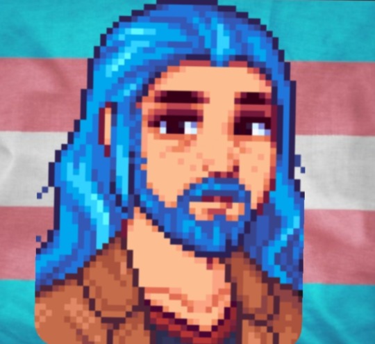
My lovely PFP in question! I used a stardew valley pfp creator to make it. I've only played a tiny bit of stardew valley, but @wizzom showed it to me months ago, and now I'm using it for my profile!
I had to select different characteristics that matched my face, and it made me think objectively about myself,
As an artist, I had to pull myself apart by my tiny details instead of looking at the big picture. Overall, I don't pass, my features work together to look at little more fem, but each characteristic made me feel better about myself
My hair is blue! Not really a masculine or feminine thing, it just is (it's also very grown own, so you can see my very long dark roots, but whatever)
My hair is wavy, very similar to my Dad's, which already makes me feel good
My hair is very long! I have been cutting/shaving my hair for the better part of 4 years, all through high school, and I'm finally letting it grow out. I feel like there's a nice punk element to it, but also, if my femininity was highlighted with short hair, may my masculinity be defined by my long, luxurious, wavy hair
I have sun kisses on my cheeks, bridge of my nose, and shoulders from repeatedly burning and peeling. Now they're very faint freckles
I am white, but I'm not super pale. I tan very good and will be outside more when summer hits. This is the closest I could get to my skin tone
I have very thick, bushy eyebrows. My fiancé jokes about them being patchy and fucked up near the ends, and that they're just very bold and wildly thick
I have a big forehead, also like my dad!
I have more of a rounded nose (Fiance calls it a snub/snoobie nose) which i get more from my mom
I have very, very dark brown eyes to the point that in the shade, people often can't tell my pupil from my iris. It's only clear in direct sunlight
I have some eye bags, I work and overnight/revolving shift at work, and just naturally have a droopy, depressed, tired resting face
I don't have a beard (YET), but in my dream post, this is very similar to the beard I had. In my dream, my beard was my natural brown, but this pfp creator wouldn't let me change the facial hair color. (Low key love the look tho)
I do have a giant brown leather jacket that I wear constantly, he's scuffed and fucked up, I got him from a thrift store, but he has personality and I love him
I wear alot of horror t-shirts, mostly black with red accents, which is why the shirt is that color
Also, all of my shirts either have a wide neck or I've stretched the neck. I have ADHD and sensory issues and can not handle shit touching my throat. I WILL throw up (same with tags, I rip them off of everything I own/wear. I just can't)
The character creator wouldn't let me add piercings, but I have 3 facial piercings. My right eyebrow, septum, and tongue ring
I have a wider/boxier/chubbier face shape, with a soft jawline. I have convinced myself that that + my big forehead makes me look more masc
I like to joke that I have those soft masculine looks that girls are jealous of (male long lashes, boys soft kissable lips, guys with big butts, ect) just to help re-frame how I think about that stuff
I have a very broad back, I'm working out more to try and build muscle, but I'm happy for my wide back
I can go on but you get the point. Everything i try and reframe into being masculine. It can be difficult with dysphoria, but I continue to try!
Anyway, please message me! Put shit in my ask box! Comment! Add your own traits that you love! Please please please please please interact I WANNA SEE HOW YOU SEE YOURSELF
#lgbtqia#trans pride#transgender#transmasc#ftm hrt#testosterone#trans hrt#transitioning#gender euphoria#gender dysphoria#gender dysmorphia#gay#masculine#trans man#trans men#boys with piercings#boys with long hair
16 notes
·
View notes
Note
Hi, I'm writing a book with a lot of characters who have facial differences for various reasons, and there are two I was hoping to ask you about because I'm afraid they may be too trope-y due to how they are when the reader meets them.
One is a girl who had a traumatic injury as a baby that caused the forced removal of around half of her face, including the skull, meaning she's missing one eye, around a third of her jaw, one cheekbone- the scar goes from right next to her nose back to just in front of her right ear, up to just a touch above her hairline (where her face meets the crown of her head) to halfway down her neck, as if someone took a upward swing at her head with some kind of blade. This girl has a magical healing ability, which is how she survived the injury, and has received a few surgeries years after the fact to try and give her face a more normal shape, but cosmetics aren't something she's extremely interested in. It's her face and she's pretty used to it, she likes it, and if people want to freak out at the sight of her scar then that's on them and she'll laugh. Still, when the reader first meets her, she is covering her face, though not because of her facial difference. She has a noticeably nonhuman skin tone, indigo, that marks her as someone with strong magic and thus puts her in a lot of danger, so she covers her skin to keep people from trying to kill her. This mask also includes a kind of plastic face shield under the cloth part that gives her face a slightly more normal shape. She ditches both pretty quickly once she's in a safe situation where she won't be killed over her skin colour, but I'm still really worried she falls into the mask trope.
The other character has Williams Syndrome, a scar from a clef lip, a major scar that covers around 70% of her body, including part of her face, and her pupils are kind of foggy from her glaucoma, eyes not usually focusing which makes it kind of obvious she's nearly completely blind (retinopathy of prematurity and recurring glaucoma.) The thing about her is that, when she reader first meets her, she's used her shapeshifting to hide most of her facial difference (all except the features from her Williams Syndrome) because there's an emergency going on and she would rather not be interrogated about her face while trying to save someone's life. She loses control of her shapeshifting and goes back to her normal form, with her scars and all of that, while extremely angry at someone, which does shock the two people in the room who don't see her day-to-day and who don't know that this is what she usually looks like. As far as this character is concerned, her scars are something she takes pride in. Her Williams Syndrome is a fact of her life, as is her blindness, her cleft lip scar has been there for as long as she can remember, it's as unremarkable to her as her eyebrows, and the big scar is from the time she fought what was basically a god a few years back and won, and she takes pride in that one. She usually doesn't shapeshift this stuff away (other than changing her eyes just a bit, just enough to make it so that she isn't obviously blind because that puts a target on her back,) because she doesn't see a point in it.
There are several other characters with facial differences, both congenital and from injuries, including the main character who has Williams Syndrome, I just want to know if there's anything I need to change about these two. Thank you
Hey,
First things first - great to see you have multiple characters with FD. That makes a lot of difference for tropes. Even better to hear that they're diverse among themselves. Love to see that.
For the first character, it sounds fine. She doesn't use it for her scarring - I enjoy that you make it clear - and doesn't wear it all the time, or even the majority of it. If you want to be very safe, you can have a character who is also indigo and hides it, but without a facial difference - could be referenced only in passing, or even just a mention that it was a some other, FD-less character in the same situation as her that gave her the idea on how to hide it. But again, it sounds good - I think of it in the same way as a character with FD who is a knight or a surgeon who covers their face when necessary because that's what needed at the moment.
The second one is a bit more complicated but it's okay as well. First thing I thought of is to make sure what type (open, closed, congenital, etc.) of glaucoma she has, as not all of them change the outward appearance of the eye. Just something to keep in mind to not accidentally mix the congenital appearance with open-angle onset. But back to the question. It's nice that when she transforms she still keeps some of her disability's features. As for the "hiding" I think it can be okay if done occasionally/not constantly, and especially if it's actually somewhat addressed in the story - with how, for example, people pay way too much attention to people with FDs and that can be awkward and uncomfortable. Of course it doesn't have to be said like that, but the sentiment is real for a ton of visibly disabled people - sometimes you just want others to stop staring and mind their business. That's real. Just pay attention to not make it seem like it's the disability's fault, but it doesn't seem like you need that remainder. For the "reveal", this is the slightly complicated part. It's not bad, but I would just advise you to use words carefully. I would consider it an interesting scenario that could be possibly written in a pejorative way. Make sure to put the shock on the change in her appearance, not the fact that it's a scar (or, if that is what the other characters focus on, narrate it in a way that shows it's a reaction that this specific person has, not a reasonable reaction to that information). Having someone you know shape-shift into someone else in front of you is the horrifying part, not the fact that they have a scar. Last thing, in regard to her shapeshifting her eyes' appearance - most people are extremely bad at telling when someone is blind. I suppose that it depends on the culture and knowledge of the environment she's in, but just something to keep in mind.
I will admit that I was rather nitpicky in this answer because I still wanted to give some suggestions and input, and there just isn't anything major to critique. In most questions I get about FD there are usually many glaring issues that I try to help with, but your story... doesn't really have those. You seem to be careful and cautious in your writing of characters with facial differences and I appreciate this a lot! Consider my answer a suggestion on how to expand on your characters or story, not "fix" them.
Mod Sasza
81 notes
·
View notes
Text
Dr. W. Afton headcanons
sfw and nsfw mentioned -> mdni
gen!neutral reader, just silly thoughts and mostly sweet (I hope) probably not readproof so sorry for any writing mistakes.
Dr. W. Afton from the game 'Thats Not My Neighbour'
Disclaimer!! I dont own the character or anything. Just trying to support the creators.
Art credits: @_.calitryx on TikTok

Appearance
probably about 5'11 to 6'0 tall
takes really good care of his facial hair (the maximum it gets are two days before he shaves again)
see him something between slim and yet muscular, sleeper build
slim waist and his shoulders on the broader side
Cake. Thats it.
his hands are rather on the rough side but he tries to take care of them
long fingers and takes the cleaning of his hands very seriously??
he has defined features but not like too sharp
Random
he has knee issues
addicted to coffee, also his very first thought after waking up
has a habit of sleeping in when he has a day off
or so he says ─ the first time you slept over he was awake at 7.
takes a lot of time for his hair in the bathroom
was insecure about his nose in his teens but learned to accept it nonetheless
he's left-handed
randomly mutturs out some facts throughout the day
he needs to push up his glasses pretty often because he once broke them by sitting down on them but refused to get them fixed
"its only a little bent." Yeah, a whole 90 degrees
he has a picture of you in his wallet
probably all his colleges know about you at this point
he's such a yapper once talking about a topic he enjoys maybe just a little too much ─ but you let him because who can say no to someone like him?
notices the tiniest changes of literally anything
going from things laying somewhere else in his apartment to the act of a person he's talking to
also the type of guy who watches you look at something a little too long and buys it for you as a present later
he remembers everything, literally has the brain of an elephant. 'I remember you saying you wish you had that so I got it for you.'
Style
you might actually mistake him for a phyics teacher (that damn checker pattern)
closet is mostly filled with linen shirts and some suit pants
'thats all he ever needed' ─ his words
color variates, he has almost every color but those bright ones.
of course he has some home clothes (you love to steal)
comfortable sweats and cozy sweaters
great taste when it comes for comfortable clothing ─ always manages to get the most fluffy ones too.
for jewlery, he only wears his watch around his left wrist
Activities
he probably has a gym membership but never actually goes
if you go tho, he might join you
in his freetime he loves to jog
loves to explore new things, like new recipes to new games (If mobile or not)
playfights usually end up with him laying down on you with his full weight
always has a stupid grin on his face when he does that
Apartment
he's completely clean, not freaky clean tho
there's not a single dust grain
but hes not too pressed about it ─ he simply enjoys tidying his apartment
gives him some sort of comfort
you can also find sometimes his clothes over the couch or laying on the ground, which is rare but it happens
his job doesnt require too much of his time so he has plenty of time at home
Relationships
like said before, he had some insecurities
confidence wasnt his thing in his teens (He was probably one of those 'uhm actually' kids but unintentionally.)
changed in his 20's ─ went out regulary but never found anything that could have gone further
which changed when you came around
so, he indeed was experienced but you taught him things aswell
love language is physical touch and acts of service (also words of affirmation)
loves random hugs and gives them too
huge on pda and shows it too
he really loves to just embrace you and cuddle with you on the couch or in bed while watching a movie or show
sleeping with him is hell
he's tussing and turning all night long, but only If you arent in his grasp
once youre trapped in his arms there's no way out and he wont move a single inch
small snores, but only once in a while ─ barely noticable too.
has all sorts of nicknames for you 'baby' , 'love' , 'honey' , 'sugar' , 'cupcake' you name it.
NSFW -> mdni
a complete switch
service dom
lives to do what you tell him to
to the location -> probably everywhere in the apartment when youre up to it
high-sex drive and probably lasts atleast 2 rounds
gets super touchy when he's worked up and just hints what he wants instead of saying it directly
he's shy! Just catch up to what he's implying.
knows the difference between harder and faster
also, not exactly into hard bdsm but isnt shy to explore with you either
praising to the top with him
you wont catch him letting out one word that would degrade
loves physical touch so this is his time to shine
body worshiping
kisses every inch of skin his lips can reach and then again
always tells you how good youre doing and how proud he is of you for taking him that well.
he's not.. exactly small either
a true mystery how he keeps it hidden beneath those forbidden pants
he loves to mark you, not for claiming and only for his eyes to see (maybe on the nape of your neck but not further)
basically, he does it how you want it. Romantic, slow and tender? He's in with all at it. Rose pedals even.
in the mood for something more rough and- ahem- man handling? Sure. He's in. But expect a godly aftercare ─ he can't stand the thought of hurting you
Aftercare
whenever, he's all sweet and gentle
acting as If youre made out of glass and will break any moment
once again he'll do anything you ask him to do.
a bath? 'Of course, my love.' Just a simple glass of water? Its already on your nightstand. Cuddles? Thats already happening before you had the thought. A massage? 'Just relax,'
a dream, literally.
he'll clean you both up without a second thought and wont let you lift a finger
if you do, youre met with a pouty expression on his face.

Thank you for reading, hope you enjoyed it. A little rushed.
#thats not my neighbor#headcanon#dr w afton#smut#D.D.D.#actually made for my friend??#physicist#down bad#thats not my neighbour Dr. W. Afton
54 notes
·
View notes
Note
If you are still talking about neopets designs, plz review lutari? I always wanted one of them

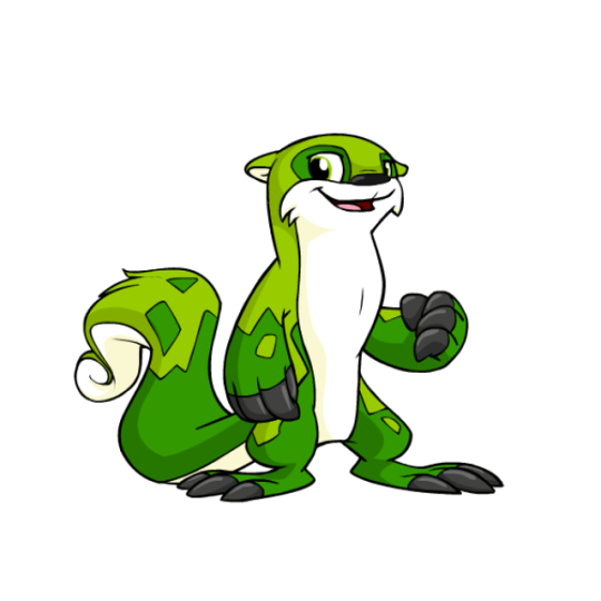


Lutari are probably most well-known for being one of the limited pets on the site, only being able to be made on their pet day and previously connected to the long-defunct Neopets Mobile game from back in the flip phone days. It's to the extreme where you can't even put one up for adoption, with them just running away instead of going to the pound. (Side note: TNT should re-release Lutari Island as a main site feature and make it so you can always create a Lutari while visiting. But I digress.)
Lutari are mostly just otters, but their very distinct, mottled markings, huge claws, and fluffy, curly tails are pretty distinct and make them feel unique, even though they're otherwise pretty straightforward. I like the amount of detail present; they have just the right balance of color, with white underbellies, black claws and noses, and two shades of the main color for their bodies, all of which is carefully balanced as to not be too busy. Overall, they're pretty dang nice... though they do have one drawback.

Considering that Lutari were released only shortly before conversion happened, you would think that they wouldn't have changed much other than losing their swimming pose (which is a shame, but a necessary change for customization). But in actuality, they actually changed quite a bit in various subtle ways, ending up with completely different proportions, markings, facial structure, and more. Here's a really great redraw that's more accurate to the original design, which really highlights the differences between the two:
The eyes are a completely different shape and the pupils are smaller, the mouth is smaller, the ears a completely different shape, the feet are weirdly elongated, the tail is less swirly... and they're such weird changes, because none of them actually have to do with customization.
Another good example of the changes made is Mr. Chipper, who was, weirdly enough, released prior to the Lutari species as a whole. He stands bipedally, and thus shows what a converted Lutari should've looked like. Also of note is the markings, which for some reason became weirdly angular on converted Lutari and less organic than they were originally.

And don't get me wrong, converted Lutaris are still fine, and are by no means ruined or anything like that. It's just a shame that they're less cute than they used to be, and that seemingly little care was put in to convert them properly.
Favorite Colours:

Maraquan: I went over this already in my Maraquan colour review so I won't go into too much detail here, but this design (based off a user submission) is beautiful. I love the use of an axoltle as a base, the pink and cream colors are lovely, and the gill ears are just perfect.


Pirate: While this design is pretty good as a whole, with a nice grey base with a few bright red accents and a properly cutthroat expression, it's the way they managed to seamlessly and subtly work a skull into the tail markings that really earns it a spot on this list. 10/10 no notes.
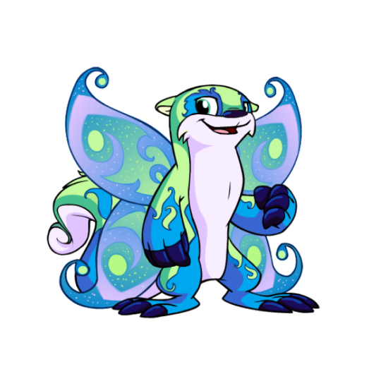
Faerie: While a little on the busy side, the faerie Lutari is quite pretty. The light green, blue and pink color palette works perfectly, and the beautiful swirled body markings work off of the Lutari's default markings perfectly. The wings also compliment it will, matching both the body colors and the intricate designs.
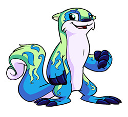
As an added benefit, you can also get a very pretty, less busy design out of this by using wings-be-gone, which arguably looks even better than the full color. I appreciate that kind of versatility.

BONUS: Camouflage isn't anything crazy, and it's not even all that camouflage-ish, but honestly I just really like this design. The use of a neutral palette and gradients creates a lovely and distinct color that's quite appealing for those who want a more realistic otter look or those, like me, who just like subtle and simple designs.
55 notes
·
View notes
Text

My favourite page from the Complete Character Book <3 (no duh!) I love Ito Yu's art a whole bunch, and even though the art style and character designs were what got me to check the show out in the first place, I don't think Chiba's anime adaptation fully does it justice. That's because the anime has a very rigid, hard-shaded look, while Ito's art has this soft, voluminous three-dimensionality to it. Especially when it comes to hair and cavernous clothing that seems to engulf the characters. It's so unique. I also like her preference for a more stocky build with her characters, gives some variety from your typical noodle anime silhouette. Plus the endless variety of facial features on display. Her rough drafts for the show are a display of incredible skill and talent all on their own. Here's some interesting notes on the page:
Shino's particularly wide shoulders are to differentiate him from Akihiro, who is wide and sturdy all over, and from Orga, who is slim and narrow like a straight line.
Akihiro is built like a judoka, he always tucks his shirt in.
Shino is built like an olympic swimmer or a basketball player.
His shoulders are really wide.
Further notes on Shino: Both ears pierced, cheerful, muscular, short hair, Latino appearance.
The crying Shino sketch is from when he's mourning Denji, the quote above says: "Didn't you say that, Danji?"
When Yamagi's hair is lifted it reveals his beautiful face with japanese features.
Yamagi is beautiful but he's also strong.
Yamagi has small, short eyebrows and a shallow nose bridge.
He's quiet and unobtrusive but he likes being with everyone else.
Tekkadan uniform was designed by Juuki Maejima, Ito Yu's husband. Jackets and pants are a common feature, underneath are random t-shirts and tank tops. Yu's comment on Shino: "Initially he had short dreadlocks*. To be honest I thought he was going to be a very minor character, kind of a small fry (lol). It was a great surprise to see him become such an active participant. I didn't expect it to be an ensemble drama which gave spotlight to so many characters, I thought the other Tekkadan members were rather minor characters at first. They've all become important people." Yu's comment on Yamagi: "My impression of him was someone of asian descent, so I was surprised to see that he ended up blonde. His hairstyle seems to reflect the director's image of an introvert. It's only when Shino caressed his head that both his eyes were revealed, and I think that's why grown-up Yamagi in the last episode decided to lift his bangs and show both his eyes. Grownup Yamagi wasn't something included in my proposal, I was very impressed with the artistic skill of showing his whole heart at a glance with just a single image." *I have also seen it mentionned on twitter that Shino initially also had a lot darker skin. As a result of several edits he gradually ended up looking more like Asian/Latino mix. The reason why his design was changed were never given, but my take is that dreads were deemed too difficult to animate for someone they thought would be a minor character.
#gundam#gundam iron blooded orphans#iron blooded orphans#norba shino#yamagi gilmerton#gundam ibo#ibo#official art
41 notes
·
View notes
Text
Slightly late monthly journal!
First off, the spreadsheet has been updated:
Nothing too drastic here, especially compared to my initial growth spurt. But still… there’s so much, yet so little to talk about.
I’ve been on spiro for a longer time now, and recently increased my estradiol dose. Note that my levels check was before the increased dose- the dates aren’t completely coordinated (they are on my private spreadsheet for my own personal tracking, don’t worry). It’s looking pretty good. Testosterone is well within target levels. E is about the same, which is much lower than I would like it. My endo says that 100-200 is “minimally acceptable”, and wants to shoot even higher than that. That’s comforting, in a way- I’m the slightest bit frustrated that some changes aren’t happening too quickly, but that gives a very distinct avenue for improvement. Ultimately, I’m gonna switch to injection monotherapy, probably around the same time I start prog. So the big change is decreased T. What has that done to me?
First off, the hard measurements. There’s really no surprises here. I’m losing weight, which tracks with my general diet and an increase in exercise levels. It seems to be happening faster than normal, though. Which, is pretty easily explainable by a new variable in the equation: adderall. I started adderall in the middle of the month. I’ve used it sparingly, but everyone I know that takes it told me that weight loss is pretty much unavoidable. I’m certainly still above any point where my weight would be worrying, but I’m gonna have to keep an eye on it. Especially if I want fat tits. As for how the weight loss is happening, I’m very happy with what’s going on. My bust and hip measurements are holding steady, while my waist and underbust are still slightly going down.
I do know that there’s another source of weight loss, however: muscle mass. With the increase in exercise level has come an increase in exertion for the same results, which has made me slightly dismayed. This is the main HRT effect that I was a little scared of. But honestly, I really only care about the muscle that helps me hike and swim- and if I maintain that better, I think it won’t be too much of an issue. I was never some pariah of physical condition, so I think with training I can even improve my hiking stamina. That’ll be very necessary with my future backpacking plans.
The main thing that I’m REALLY happy about is that, if I squint, I think I can slowly start to see the first hints of facial changes start to come in. They’re subtle, of course. A weird one is that my nose is literally straighter. Y’all don’t see it, but the reason I still shield my face (despite being easily identifiable at this point if you saw me irl and knew this account) is mostly insecurity about my nose and chin. My nose actually physically curves to my right when viewed from the front, and in general, is a huge, classic Roman nose. Looking at head on progress pictures, its actually starting to straighten out. I thought I was imagining things, but I checked in with a couple friends before and after pictures of several years on HRT, and yeah- their noses are different, usually smaller and more symmetrical. Saying that this is a huge relief to me would be an understatement. Additionally, I was insecure about my boxy jawline, but for some reason, it seems to work as a femme feature of my face now- I think slight cheek restructuring helps frame it better. Still not so sure how the chin is gonna turn out. But hey- I started HRT thinking that I would for sure need FFS to pass, but now, I'm far less concerned. I'll at least give it two years.
I’ve also gotten a lot of interesting comments. Several labmates and family members that don’t know I’m transitioning have remarked that my skin looks healthier, and I look younger. I’ve also had noticeable mental health improvement, so I think most people think I’m on some kind of self improvement kick. I mentioned skin care as part of that. We’ll see how long the excuse holds- probably a while, as the changes are so, so subtle at the moment. But shit, I’m only three months in. I’m thrilled.
There’s still no getting rid of my beard shadow. Even though the growth rate of my facial hair has noticeably decreased, the thickness of the basal hairs will always add shading to my face. When I started HRT, I thought it wouldn’t bother me that much until I was ready to socially transition- but tbh, it’s starting to look glaring to me. I’m looking into starting laser sometime in January, and hopefully that’ll help.
Which brings me to the emotional changes. Holy FUCK what a month its been. I’m not gonna expose all of my dirty laundry. But, a mixture of some long term anxieties and a few particular events led to a classic mid-20s “what the fuck am I doing with my life” crisis. One of those long term anxieties was a thought I’m sure many of y’all are familiar with: “I started HRT. Now what? How the fuck am I going to socially transition?”
For a couple days, I was very seriously considering quitting grad school and academia. I’m past that. Tragically, I love science a little too much. I do, however, need a break. I talked to my advisor about taking a hiatus, and he’s fully supportive of the idea. And conveniently, that also provides me with a clean way to simply disappear, and come back as a woman. A nice little break to allow me to socially transition.
But anyways. Here’s my big point here: if I went through something similar pre-HRT, I would’ve reacted completely differently. I would’ve shoved those thoughts deep and let them simmer as a general, background malaise that I would just stew in and suffer. Now? I cried. A lot. Actual fucking tears. I went through a few days of sharp sadness, and then actually fucking processed those emotions. What the fuck? That’s new. It’s insane. I wouldn’t have had the emotional capacity to that before.
I’m elated. It’s wonderful. It’s a more than welcome change.
But yeah. Steady as she goes. Progress is a little stalled, but both me and my provider are adamant about getting that E up. And I’m still making slow progress as it is.
Very quick NSFW notes after this button.
The final note: sexual function. With the low T… yup, my downstairs functionality has decreased. My ejaculate is clear, and often happens without being fully erect. That said… there’s no way in hell that I would ever trade getting that back for what I have now. My libido is still comes in waves, and is crazy when it comes. The feelings I get from intimate situations now are incredible beyond belief.
63 notes
·
View notes