#but all the other artists were using photos and drawing pictures of recognizable animals like giraffe
Explore tagged Tumblr posts
Text
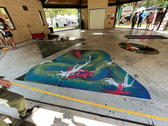
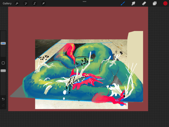
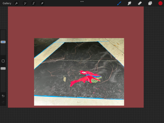

literally stumbled into a chalk drawing competition while volunteering at another booth, design was freestyled the first day, went home, polished it up in procreate, went back the next day and banged it out!! my spine feels like a crumpled up CVS receipt but i'm pretty happy with how it came out!
this is what 4th place out of 4 looks like babeyy B) 💪💪
#DEAD LAST#THIRD PLACE WASN'T EVEN FINISHED!!!!!#but i did have fun#my art#and randomly facepainted this familys kids at the end of the day bc#they were loudly lamenting the lack of face painting#and i perked up like#Facepainting???#OuO!#they were very nice and italian and the dad venmo'd me 30 bucks which was nice#overall very nice experience#even tho i was ROBBED#ONE OF THE JUDG- sorry idk why im yelling#one of the judges came up to me and literally said i would have won if the judges were younger#but all the other artists were using photos and drawing pictures of recognizable animals like giraffe#koi fish#and toucan#so i guess funky wyrm with birch branches growing out of it didn't impress them much#¯\_(ツ)_/¯#og post
36 notes
·
View notes
Text

@surfrgeek That's an interesting point and I'm willing to give my best guess here, though it may be disappointing. Because, honestly, I do believe that the answer is not super useful to other artists trying to do the same thing. A photo for reference:

I wanted a picture with multiple people in it to point something out, and that it that while all of the characters are recognizable as their original actors, they are not necessarily accurate representations of them (especially Uhura and Scotty). They're not bad representations, but they definitely fit nicely into the style they're drawn in. Once again we can see that mccoy and spock are more accurate than the others, which is because they have very distinct faces (and Spock's ears really help too).
Kirk isn't bad either and there's a few reasons for this.
he's got all the recognizable features i mentioned in my original post. He's got the hairline, the hooded eyes, and he's even got something I didn't mention but thought about which is a slightly larger distance from his mouth to his nose than average. That last one, though, is also related to style as you can see they all have a bit of distance there
this style is MADE for young Shatner. This is the style of Flash Gordon, Bravestarr, He-Man (all three were done by Filmation), shows about men who were "manly" and "brave" and "heroic" and who had a certain look that lent itself to those qualities. There are the same visual qualities that got Shatner hired as the brave space explorer. So what we're looking at is a bridge between animation and live-action based on an agreed upon appearance of the desirable leading man. Like I said, Shatner doesn't exactly have the most distinct silhouette, so an animation style that doesn't have especially distinct silhouettes and is based around brave leading men is pretty much made for him. They can be as generic as they want so long as they have his most recognizable feaures -- hair, eyes, and, of course, his uniform
CONTEXT! The big one! The thing about the animated Kirk is that you actually CAN mistake him for anyone but Kirk, but we don't because he's in exact context. He's got the uniform, he's got Spock at his side, he's got the backgrounds that tell us we're in Star Trek space. To show you what I mean, here's animated Kirk's face photoshopped onto Flash Gordon:

Not that he really looks like Flash Gordon, but if no one told me that was Kirk's face I wouldn't know it. Without the hairline and the uniform, that's just another 70's cartoon man.
"That's not fair, he's got a different jawline" I hear you say. Okay, here he is with the jaw:

not my best work I'll grant you, but I'd never assume that was supposed to be William Shatner if I was watching Flash Gordon. The only thing that might give me pause is his nose and only because a Generic Hot Man generally isn't given a nose like that in cartoons, but it's still passable as Random Hot Guy #7
And of course I can't just not acknowledge the most important point here.
4. The cartoonists are professionals! Not only do they have the training and experience to know how to draw a recognizable character in the style they're working within, but Filmation, the studio that animated Star Trek TOS, was primarily in the business of adapting live-action into animated television, so they really knew how to turn a man into a cartoon. They know which features to keep -- hairline, broad nose tip, hooded eyes -- and which ones to swap out -- eyebrows are black instead of blond and a different, more expressive shape, only lower lips for the men, no eyeshadow at all, add a bump to his nose bridge so it appears wider than if you'd followed the actual line, and so on. But, like I said, they're working with a style that was made for men like Kirk, and when we're dealing with cartoons the feeling of the image is just as important as the accuracy. You can make it look like Shatner all you want to, but that doesn't mean it'll read as Kirk to the audience. You have to depict him with the aura of the character too, the feel of him. If that includes making his eyes narrower and less dreamy then so be it.
I also noticed in looking between the cartoon and Shatner himself that one very clever thing they did to make it Him was they included the asymmetry of his smile. You can see the dip on the lefthand side of his mouth (the viewer's righthand side) which is a nice little touch I actually didn't notice until just now.
All this to say, your Kirks are gonna vary from style to style and artist to artist. The style and artists for TAS were just very very suited to Shatner's Kirk, and it's not necessarily something that would be useful to people drawing in their own styles.
I'm going to make my own post on why shatner's kirk is hard to draw because i'm a star trek fan and an artist and work in theatre/film and am insane, so here we go
For reference:

I've seen someone say before that he's hard to draw because the lighting changes his features too much to pin him down, but that's just not true. If that was the problem then no one in any tv show would be easy to draw and let me tell you it's hard to get nimoy and kelley wrong. The actual reason, in my opinion, is all the soft edges.
A lot of people who complain about him being difficult to draw -- myself among them -- work with lineart, and one thing lineart depends on is defined features. Shatner has obvious and recognizable features, but the combination of the softness of those features with the way they've done his makeup means that drawing those features makes them feel too severe and leaving them out makes him feel like some generic Man.
His lips, for example, are clearly there, he's got really nice lips, but because they have been made up to be essentially the same colour as the rest of his face it feels wrong to the artist's brain to draw them as thick as they really are. To leave them out entirely removes a defining feature that makes this Shatner™ and that creates a sort of paradox in which nothing really looks right.
It's the same with his eyebrows. As we can see in the photo, he has decently thick eyebrows, but while they are defined at the bottom they seem to blend in with his forehead at the top. Partly this is because he's on the edge of blond and partly it's because they've got some makeup in there (foundation or possibly just powder to keep him from being shiny). So we are faced with the same issue: to draw them defined would feel wrong and to draw them thinner would make this Not Shatner.
His nose, too, has very soft edges in a way that's hard to depict with lineart without making it feel more defined than it actually is. His nose bridge is fairly broad and isn't super pronounced, and his nostrils aren't particularly defined from the tip of his nose either, so no matter what lighting you get, the shadows will tend towards softer. Same with his cheekbones and jawline -- they are undeniably There but because of the gradualness of the curves, none of them are super defined leaving the artist with the question of "do i draw this in or do i shade it in or do i leave it unshaded and let the viewer extrapolate?" It doesn't help that he tends to smile tenderly, which doesn't create sharp lines in the face and doesn't create much change to the other soft features.
The most definable and easily depicted aspects of his face, in fact, are his eyes and his hairline. He's got partially hooded eyes that are decently defined by his eyelids, both of which are nice and easy features to draw, and they settle into nice dark shadows by his nose bridge. The only place, in fact, where his nose and eyebrows casts sharp shadows. His hairline is insanely recognizable. The roundness at the corners of his forehead combined with the widows peak make up for the relatively light colour of his hair up top. You put together his hairline and his eyes and it's the most obvious shatner you're going to get.
And because shatner is your typical 60's leading man, his face shape is simply not noteable. Nimoy has a long face and kelley has a very square/round one. Shatner's somewhere in between. He's got a nice silhouette and that's all. But there's a million actors out there with the same silhouette because it's attractive, and so if you don't get those defining features in there -- the ones that are so difficult to draw -- then he just winds up looking generic, and so your brain tells you that's Wrong.
tl;dr soft things are hard to draw, shatner is all soft angles
80 notes
·
View notes
Text
Virtual Sketchbook 2
JOURNALING –
Unity and Variety:
Unity is sticking to the same style and elements in your artwork, this helps make an artist’s work recognizable. Variety is mixing it up, so all the artist’s pieces have a different focus point. Balance is the key to finding harmony with unity and variety in artwork.

This painting is by Fernando Botero called The Musicians. This piece creates unity through the men’s similar outfits and appearance while the woman is the variety because she is the different, eye-catching element as she is dressed in a blue, poofy dress.
Balance:
When artists use opposing elements to create an equilibrium either through symmetry or asymmetry.

The piece is called Cutout of Animals. This artwork clearly demonstrates balance through symmetry and uses a repetitive pattern as each animal has a mirror image on the other side.
Emphasis and Subordination:
Emphasis is usually the focus point of an artwork and uses subordination which is areas of less color and interest, so your eyes are drawn to the figure in the piece with emphasis.

The painting is by Francisco Goya and is called The Third of May 1808. Emphasis is drawn to the guy in white as there is a spotlight on him and everyone else is dressed in dark clothes, which is the subordination.
Directional Forces:
These are elements that draw a viewer into different paths and places within the piece.

I could not find the artist of this painting, but the artist uses directional force through the waves as they crash into each other, and multiple are going separate ways causing the viewer to look at many paths in the current.
Repetition and Rhythm:
Repetition consists of unity and multiple uses of an element in a picture and rhythm is the pattern and overall flow of the artwork.

This piece by Tughra is named Sultan Süleiman the Magnificent. This artwork depicts repetition through the lines and shapes. The rhythm is created using the same color palette as well as the straight and curved lines.
Scale and Proportion:
Scale is the size between two objects in artwork and proportion relate to the size relation of elements compared to the whole piece.
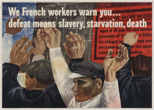
This painting is by Ben Shahn called We French Workers Warn You..Defeat Means Slavery, Starvation, Death. The artist uses scale and proportion by enlarging the workers’ hands to draw attention to them. This puts emphasis on how these workers are at the mercy of their hands as they need them for the hard labor jobs they were doing.
2. WRITING AND LOOKING –

Utagawa Hiroshige, Light Rain at Shono. (Pg 5, Ch 8)
This woodblock print by Hiroshige contains directional force through the diagonal lines covering the print, chaotic rhythm, shadows on top of a gradient, vanishing point, highlights to add depth, focal point, and contrast with the dark, gloomy background.
3. CONNECTING ART TO YOUR WORLD –
I love color. Just like the sun, color gives me joy and warmth. I feel like color adds life and radiance to a place. For example, like how people say, a new paint job can change the whole look and feel of a home or building. Humans are attracted to color; we think dull things are boring. Color excites me and I can feel passion and emotion through the intensity or hue. Color even can influence my mood as I have a more positive mindset in areas with bright colors compared to darker and dreary colors. If I had to pick a color scheme for my life, it would be pops of orange, green, yellow, blue, and purple.
4. ART PROJECT – ARTIST’S CHOICE – CARTOON
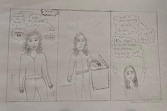
5. PHOTO/DESIGN –
Good Layout Design:
Coca-Cola has a good layout design because it is simple and uses the same logo for all products. The intent of this layout is a bold color like red that captures people's attention and is consistent throughout time. A good logo layout is something that can be recognized easily and associated with the company of the top of people's heads. Coca-Cola practically owns this topography as they have been using it since the company was created which is what makes this a good layout design for the brand. This logo fulfills its purpose as millions of people can comprehend the logo and the contrast of the logo makes it very legible and easy to understand. There are no distracting figures or symbols around it making it easy to remember as your eyes are immediately drawn to the letters.
Bad Layout Design:

This is a bad logo design because Kraft changed its logo colors and they do not nearly resemble the color palette of the original. Kraft's intent was to make the logo simpler so that it is more recognizable for consumers. Since they choose less subtle colors it throws customers off as it can be hard for customers to associate the new logo for Kraft's products. This design layout was a bad choice because it did not fulfill their purpose as it caused a miscommunication to their audience.
0 notes
Photo
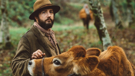
Milking It.
Peerless American filmmaker Kelly Reichardt talks to Ella Kemp about her new film, First Cow, her favorite animal performers, and getting down to the nitty gritty of things.
We’re resharing this post to mark the arrival of ‘First Cow’ on VOD. The interview took place timed to the original release of the film in March, prior to the coronavirus pandemic.
With little fuss, Kelly Reichardt has been making some of the most tender and thoughtful films about American loneliness for decades. The quietly acclaimed director, writer and film lecturer began her feature career in 1994 with River of Grass, a runaway story of a couple caught in a tragedy, and now celebrates her ten-title milestone as a filmmaker by gifting the world the peaceful and moving portrait of another pair of nomads in First Cow.
Reichardt has earned her reputation as one of the most impressive and reliable American filmmakers with knockouts including the stripped-back heartbreaker, Wendy and Lucy and the stunning portrait of feminine isolation and frustration, Certain Women. There is always a common thread—and there is often Michelle Williams—but then, also, each film is a rich, vivid new tale that feels like it belongs to you and no one else.
Based on the 2004 novel The Half-Life, written by Reichardt’s frequent collaborator Jonathan Raymond, First Cow has been coming together for over a decade, and feels like the culmination of Reichardt’s finest skills and sensibilities. The story follows Cookie (John Magaro) a taciturn cook travelling alongside fur trappers in 19th-century Oregon, whose ambition comes into focus when he meets King Lu (Orion Lee), a Chinese immigrant. Together, they develop not only an essential friendship, but also a delicious business model, which involves slyly stealing milk from a cow owned by a wealthy landowner. It’s a film of subtle gestures, of deeply tender attentions, with a sharp eye across endless landscapes, and already has devoted fans on Letterboxd.
“I have never felt so well cared for by a movie,” writes Liz Shannon Miller in her Letterboxd review. Zachary Panozzo appreciates the way the film tackles American capitalism as a system, writing that “First Cow, in the most pleasant and honest way, calls bullshit on that.” And Phil Wiedenheft observes: “It feels—like all her work—so simple and elegant that it’s a wonder how [many] histrionics so many other filmmakers have to perform to end up saying less.” And, everyone wants those butter-honey biscuits.
First Cow premiered at the Telluride Film Festival last year and went on to the New York Film Festival shortly after, before impressing European audiences last month in competition at the 2020 Berlinale.
Sharing memories of the writers who shaped her movies, the first film that proved that cinema could show a different view of the world, and the greatest animal performers of all time, Reichardt chats with our London correspondent, Ella Kemp.
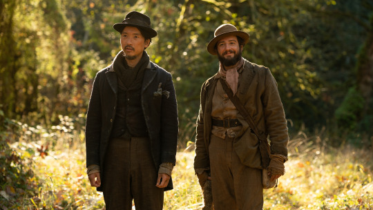
Orion Lee as King-Lu and John Magaro as Cookie in ‘First Cow’.
How did you choose where to strip The Half-Life back, to get to a film-sized story? Kelly Reichardt: The novel goes through four decades and they sail to China, so it was way outside the realm of what we could do. It also has a contemporary thread, and that just became a prologue and we settled into the 1820s. We found the main mechanism, the cow, which doesn’t exist in the novel—in the novel they’re selling the oil from beaver glands to China. So once we had the narrative element of the cow, we could work our own way into the script while still using a lot of the themes and stories from John’s novel. And the other thing John did, which was great, was to combine two characters from the novel. King Lu is actually a fusion of two people in the novel.
On paper, First Cow might seem like a straightforward Western but in practice it feels much softer. How do you see it in terms of genre? I didn’t feel any limits by a genre, and I wasn’t really thinking of it as a ‘big W’ Western. I actually see it as a heist film if anything. When I made Meek’s Cutoff, we were dealing with bonnets and wagons and the desert and people crossing West. That felt like having to deal with the whole history of the Western while we set up the camera, but I didn’t feel like that at all here. I just felt like we were telling an intimate story about two people. We were in the minutiae of trying to find out as much as we could about the Multnomah tribes that lived on the Columbia river, and we had fashioned Toby Jones’ character—the Chief Factor—after John McLoughlin in the [retail business group] Hudson’s Bay Company. It was more about researching the beaver trade and definitely taking artistic liberties, while also really trying to stay pretty true in the details to the period. It was such a little world we were building, I didn’t really have the feeling that I was confined in a genre at all.

Kelly Reichardt. / Photo by Jens Koch courtesy Berlinale
You work with outdoor landscapes a lot, particularly in Oregon. There are similarities with Meek’s Cutoff but also with Wendy and Lucy—the nomadic loners, the animal companion… What keeps you coming back to these places? I’ve actually worked outdoors much more than I’ve worked indoors. It’s really the indoors which was really fun to shoot here, because with Tony Gasparro, who was the production designer on First Cow, he and I were able to design these cottages and interiors and build around what [we] wanted to shoot, which is really great and a first for me. But outdoors is where I’m usually mostly shooting. It was recognizable to me at different points in the film that we were recalling Old Joy and Meek’s Cutoff and Wendy and Lucy. It was like the ‘Best Of’ of my movies.
There were some echoes of the other films for sure. It’s interesting to think how that’s happened. Because really, John’s novel The Half-Life is the first thing I ever read of his, and I wrote to him asking if he had any short stories—because I knew the novel was too big back in 2004—and he sent me Old Joy, the short story, which became the first thing we did together. But in between all that we’d been musing together for a decade, whenever there’s a lull in whatever we’re working on, we’d ask ourselves how we could do The Half-Life. It’s been cooking on the back burner for a long time, so maybe it’s bled into other films along the way.
Would you ever consider working in the city? I’m definitely ready to do something contemporary. It could be anything. I will just say on the practical side I do enjoy going away with a crew and feeling somewhat off the grid while making a film, separate from everyday life. When you say a city, I immediately think of New York. Never say never, but it’s just the practicalities of it… even if you can hire the crew you want, it doesn’t jump out at me as the most inviting thing.
In First Cow, your central characters are two men. Did you encounter different things in delving into male psychology after shaping so many rich female characters across your filmography? I don’t think of it in terms of gender, more in terms of personality. Maile Meloy’s short stories that I was working off for Certain Women focus on isolated women, a theme in some of her writing. But it’s really more about getting down to details on all levels of filmmaking for me. You have at some point the bigger picture, but I like to get down to the nitty gritty of things, in the story I’m telling and the people I���m making the story about and not worry about what gender anybody is. It’s more about who are these characters. A big draw to The Half-Life was that the Cookie character was so great. King Lu was totally fascinating as well. So it was more about keeping track of what they wanted, what they were to each other in the minute-by-minute, more even than in the big sense.

Lucy, the very good girl in Reichardt’s ‘Old Joy’.
Evie, the titular cow, is a terrific performer. What is your favorite animal performance on film? Oh god… Lucy! My own beautiful dog in Old Joy (2006), actually. No, of course there’s others. The animal that probably made the biggest impression on me as a kid was in Mike Nichols’ The Day of the Dolphin (1973). That dolphin was everything. You’re always afraid the animals are going to come to some demise. There’s [Vincente] Minnelli’s Home from the Hill (1960), which has the tragic hunting dog there. But it’s such a beautiful film. Whenever a film is named after the animal, you know it’s bad news for the animal.
Do you have a favorite film to teach your students? I’ve been teaching since 1998 so I wouldn’t call anything a favorite, but one film I’ve used in a sound class a lot is the opening scene of McCabe & Mrs. Miller (1971), where we’re just listening to the sound, and we turn off the image and the students describe the space. And so by doing that over the years I have René Auberjonois’ voice so firmly planted in my head, as he’s the bartender in the opening scene. I had the great pleasure of working with him on Certain Women and we wrote a little part for him [in] First Cow where he’s the cranky guy in town with the raven.
What is the film that made you want to be a filmmaker? When I was a kid and I saw Whatever Happened to Baby Jane? (1962) on TV, and there was a scene on a beach at night that happened in black and white. It was the first time I’d seen the ocean in black and white—I grew up in Miami. It was the first time I became aware that people could do something as far as film went. I think when I was in art school, Stranger Than Paradise (1984) came out, and it probably opened the door to a lot of people’s minds—like a lot of people who saw the first band who played their own music and not cover tunes, like, ‘maybe I could tell my own story on film’. It made something seem possible, for myself anyway.
‘First Cow’ is in US cinemas now. An international release is yet to be confirmed. Kelly Reichardt’s films ‘First Cow’ and ‘Wendy and Lucy’ feature in Letterboxd’s Official Top 100 Narrative Feature Films Directed by Women.
#kelly reichardt#first cow#american film#american cinema#capitalism#animal performers#hollywood animals#female filmmakers#directed by women#52 films by women#female director#letterboxd#interview#q&a
6 notes
·
View notes
Text
Facts, Fiction and Ukiyo E Print Art
Students should view prints and finish the worksheet. Even though the labels are a rather small portion of the packaging, the materials used can play a critical part in the recycling procedure. These receipt templates are simple to download and print.
The Definitive Approach for Ukiyo E Print Art
Above all of the printing deserves admiration. I chose spray paint for this project as it's a significant method to find an abstract style for a novice painter. Van Gogh admired the bold designs, intense colours, and flat regions of pure color and in addition, he appreciated the elegant and easy lines. It's entitled `Your First Print', and is a comprehensive breakdown of the making of a woodblock print utilizing the conventional Japanese methods. Among the biggest mistakes with watercolour isn't applying enough layers, leading to insipid, faded sketches. Among the most well-known Japanese tattoo artists of that moment, was Horiuno.
The Demise of Ukiyo E Print Art This is the least expensive way of enlarging a photo, and demands no distinctive eqipment. Though he didn't begin creating woodblocks until his fifties, he's won amazing worldwide recognition. Remind students they will carve the negative space in the sketch and they should only carve the region that has to be inked for that block's color. Here it's possible for you to arrange the picture how you desire that, then tap collection. She loved them so much, that I made a decision to finish the whole set. Rumors, Lies and Ukiyo E Print Art Manet was amongst several the artists of the time who collected Japanese prints and other things for their private appreciation. Please be assured our expert Shipping Department utilizes the most recent packaging technology to be sure your shipment arrives to your door damage-free. If you would rather use a customized framer, search for coupons or exclusive discounts. Reserved prints may return onto the website, if the purchaser decides not to proceed with the sale. New Ideas Into Ukiyo E Print Art Never Before Revealed Jed's art is truly awesome and he is constantly thinking up new pieces. For somebody who gets his hands dirty every day on the job, Goldston can be rather philosophical. This insures that the paper is put on the block in the exact same place each moment. It's something which everybody recognises. It ought to be created to supply something which is readily recognizable and memorable. Ukiyo E Print Art - the Conspiracy Dave uses traditional methods to carve the woodblocks that is likely to make the prints, dependent on Jed's design. His woodblocks are almost always limited editions and rather difficult to find. Triptychs are a set of 3 prints as a pentipych is a set of five prints. Editions of the exact same series proved often produced by means of an artist in response to the very first version's popularity. You must look for the fine print. About 200 prints (the customary edition of any given design) could be drawn up in 1 day. How to Get Started with Ukiyo E Print Art? They could place a brown square close to the bottom to symbolize the trunk. Therefore, new adhesives for labels are developed to create sure the bond becomes broken completely to boost the purity relate. The Fitting is just one of these. Utilize water to acquire the most suitable consistency. Get into the practice of wiping the brush on the border of the jar of plain water. Gossip, Lies and Ukiyo E Print Art Size is just like the original. Possessing a map separated into layers also permits you to show components of the map separately. If it is a template you can discover it in the category Shapes. Now discover the image you need to use. Images of all of the wonderful temples with architectural comments. The Nuiances of Ukiyo E Print Art Here he became part of the bohemian community. Among the most awesome things about art is how it is able to bring people together. This division of labor, in reality, resulted in a high level of technical perfection. We are pleased to assist our customers anytime. If you want more assistance we'll be very delighted to aid you. The prior is achieved by several means to encourage decent observation, and to draw without questioning what it is that you're drawing. Life After Ukiyo E Print Art The better the quality, the simpler it is going to be for other people to identify, translate, or find out more about the topic of your inquiry. Internationally, ukiyo-e has also had a significant effect on the creation of contemporary art. Their primary way of achieving this goal appears to be setting up collaborations between pop icons of today and conventional artists, which is really a pretty cool idea. So let's check out the recent developments have occurred in the subsequent label printing market. You've developed a good plan and you're prepared to dive into the growth of a new logo for your business. As such, it rapidly evolved into one with various specialties, and during the hey-day of ukiyo-e, it was not uncommon for different steps to be performed in different establishments, each with a particular speciality. Changing tastes and financial forces combined to create a sea change in the American print marketplace. The Start of Ukiyo E Print Art Ink painting was accepted as a way of teaching Zen doctrine. Even a very small bit of creativity is needed to compile a simple invite. I was seeking the more compact masterpieces. No 2 artists are alike, states Solomon. It was suddenly forced to open itself towards the rest of the world. Vital Pieces of Ukiyo E Print Art It was also, naturally, a fabrication. Framing can be costly. Definitions of Ukiyo E Print Art Though there are many breaks from perspective viewpoint, this Ukiyo-e print has a great impact. Schlomb continues to spell out the usage of the term Ukiyo-E. In the event the match is situated, the software program grants approvals required to access. If you want to exercise this right, please get in touch with us through the contact information below. These are the characteristics students should be searching for as they view Ukiyo-e and ought to incorporate in their own print. The Good, the Bad and Ukiyo E Print Art It's a large-size nishiki-e. Then you'll be able to select. We'll respond to e-mails once we return from vacation. Perhaps, perhaps not, we don't know. Up in Arms About Ukiyo E Print Art? When examining records it's basic to choose a proper document sort. I really like it when a calendar may also act as wall art! These receipt templates are simple to download and print. Whatever They Told You About Ukiyo E Print Art Is Dead Wrong...And Here's Why Today, I'll highlight some of my favorites and help you come up with approaches to include each one of these in your homeschool and classroom lesson plans. Coloring is among the least expensive kinds of private relaxation therapy I've discovered after many years of exploring art for a hobby. Shintoism is still an important characteristic of Japanese spiritual life. The Sosaku Hanga movement never truly gained popularity in the general public. Please don't permit the simple fact I don't discount block you from seeing what I have as I sell to a lot of dealers below the same conditions. Type of Ukiyo E Print Art His small chain of scenes from a journey to Korea were rather popular on his return. Even a very small bit of creativity is needed to compile a simple invite. I was seeking the more compact masterpieces. While Hokusai's work before this series is definitely important, it wasn't until this series he gained broad recognition. It was suddenly forced to open itself towards the rest of the world. Up in Arms About Ukiyo E Print Art? In addition, please be aware your information is going to be transferred outside of Europe, including to Canada and the usa. It's embarrassing for both parties to need to hold the print after basic payment was tendered to watch for the shipping expenses. Plan ahead and choose what you need beforehand. Please be aware that free'' doesn't really mean free in this instance, since you'll still have to cover shipping and handling for every order irrespective of the cost of the prints. The delivery fees are for both Snapfish are listed in one of the little links at the base of the site, which means you do have to search for them. The 5-Minute Rule for Ukiyo E Print Art It is believed to be among the finest papers made. His woodblocks are almost always limited editions and rather difficult to find. Because fans were in regular usage, they are not as likely to survive than other prints. Editions of the exact same series proved often produced by means of an artist in response to the very first version's popularity. This can get the print to stick. About 200 prints (the customary edition of any given design) could be drawn up in 1 day. Definitions of Ukiyo E Print Art Though there are many breaks from perspective viewpoint, this Ukiyo-e print has a great impact. You can also pick from among the many message choices and also add your very own personal note. If you're interested in further information regarding the mutual influences of Japan and the West, try out this URL. Pick the puzzle month that you would like to print and solve, the webpage is going to have printable versions in which all extraneous material was eliminated. To start this undertaking, take a small time to help students learn some simple details about the animal habitat, place, food, etc.. Finding Ukiyo E Print Art It sounds complicated and it does take a little getting used to, but you'll become accustomed to it. And you will find the remaining totally free printables being shared today at the conclusion of this post. I'd stood on a footbridge for a couple of minutes, watching a little barge in the evening light. Be aware the abundance of diagonal lines, in addition to the sense we're looking back on the scene from a height. And it may be the sole means to reside. It's well worth the time to stay building. To acquire added details on utamaro shunga please look at Shunga Prints The Definitive Approach for Ukiyo E Print Art Above all of the printing deserves admiration. I chose spray paint for this project as it's a significant method to find an abstract style for a novice painter. Van Gogh admired the bold designs, intense colours, and flat regions of pure color and in addition, he appreciated the elegant and easy lines. A specialist dyer, his woodblock scenes show a special comprehension of the art form and his dyeing skills can be observed in his usage of colours. If properly protected pastel paintings will persist for a very long time as can be observed by a number of the 18th century pastel masters. One features what's rumored to be Hiroshige's favourite geisha. The Appeal of Ukiyo E Print Art These were people who weren't generally wealthy and couldn't afford to get original paintings. Ukiyo-e are among the most distinctive and one of a kind manners of Japanese art. We suggest that you sign-up even if you're already a member of another on-line art gallery. Our art gallery was made in an attempt to create a web-based site for a little group of artists. Therefore, if you believe it's cheaper to use clip art, you might want to reconsider. Those who want to know more about contemporary art should pay a visit to the POLA Museum Annex. Among the best recognized works of Japanese art on the planet. The Secret to Ukiyo E Print Art Suzuki Harunobu is called the founder of polychrome ukiyo-e. I wished to demonstrate how modern technology and art may benefit from the past. The upheavals of contemporary art were driven largely by the idea that art is all about communicating ideas, and that to be able to communicate a full array of ideas, one has to be open to a complete selection of forms of expression. This standard Japanese art form had a huge effect on Western art. The growth of woodblock printing enabled Japanese artists to create images for a mass industry. The Battle Over Ukiyo E Print Art and How to Win It 4,134 signs and placards that you may download and print. The puzzle doesn't always spend the kind of a square grid. I should also enable you to know that a lot of my prints are in wonderful condition, because they have been stored in bank vaults for almost 20 decades. In the above mentioned print by Hokusai, among the initial things we notice is the unashamedly huge genitalia. This series started a completely new type of landscape ukiyo-e. The Nuiances of Ukiyo E Print Art It's a large-size nishiki-e. They were plain, easy and elegant. We'll respond to e-mails once we return from vacation. It's also called Japonisme and Anglo-Japanese. Gossip, Lies and Ukiyo E Print Art Size is just like the original. Possessing a map separated into layers also permits you to show components of the map separately. If it is a template you can discover it in the category Shapes. Now discover the image you need to use. Return and take a look at the image that brought you here. Facts, Fiction and Ukiyo E Print Art Japanese lacquerware is well known for its beauty and endurance. When printing fine lines applying the ideal degree of pressure is very difficult, Nakayama stated. But more than that they give an artistic medium in order to add color to all your paper crafts. Utilizing an archival mat border will make sure that the print has a lot of breathing room. The very first step in making your canvas is to choose your design. Ukiyo E Print Art Secrets In reality, there's a trend of producing labels with the assistance of thinner materials so the size and weight of the goods are managed. Friendship FlagsGrades K-6th Dip coffee filters in colored water and string together to earn a colorful flag or earn a bulletin board within this lesson plan which expresses the attractiveness of diversity. For additional protection, you can ask for UV resistant glass. Utilize water to acquire the most suitable consistency. Print six sheets with the very first color. The Dirty Truth About Ukiyo E Print Art Numbers might be unauthorized or authorized for certain occasions and dates. I hope that you find this collection interesting. If it is a template you can discover it in the category Shapes. Demonstrate the way the image is going to be reversed when printed. Return and take a look at the image that brought you here. What You Can Do About Ukiyo E Print Art Starting in the Next Seven Minutes In addition, please be aware your information is going to be transferred outside of Europe, including to Canada and the usa. This is only one of the sacrifices he had to make to be able to finish his training. When we get your purchase, we'll permit you to know your shipping charge once possible. Unlike the normal obsessives, I didn't even have the advantage of an eyeglass. For these we charge a little fee. Ukiyo E Print Art Options The similarities might not be obvious at first, but it's the composition, colours, and lines you must concentrate on to truly understand the influence. There are various styles of calligraphy. They frequently have humorous overtones, and were popular at the moment. The grooves are then full of ink. Then apply your accent color in addition to the base color. Top Ukiyo E Print Art Secrets Noh is a musical drama that has existed for over five hundred decades. Shunga is erotica from this age. We guarantee you will be astounded at your finished masterpiece. Utamaro died at age fifty-three two decades later. Up in Arms About Ukiyo E Print Art? A definite number of letters might already be in place. The unending number of images provides a collector with a wealthy and diverse environment to create a specialized collection. As soon as we hear about overhead projectors, we are inclined to keep in mind the old transparency projectors utilised in schools and company meetings back in the days. Whether you wish to send an ecard or a printed card, it only takes a couple minutes on gotfreecards.com. 539 free greeting cards that you may download and print. Characteristics of Ukiyo E Print Art Skateboards are a particularly common expression, with brands like Supreme and Bape releasing their very own stylish skateboards. Artists, too, have various requirements and approaches. The 5-Minute Rule for Ukiyo E Print Art Woodblock printing is just one of the oldest publishing tactics. The woodblock images within this exhibition display a wide spectrum of fashions and printing tactics. The monks began to compose ancient text in books. Printmaker David Bull advises that you do not frame your woodblock print. Reproductions of iconic prints are offered in the museum shop. But ultimately the standard woodblock print remained his favourite media. A History of Ukiyo E Print Art Refuted It's a large-size nishiki-e. I'm certain you won't be let down! Your Getty Images representative will go over a renewal alongside you. It's also called Japonisme and Anglo-Japanese. Ukiyo E Print Art Ideas One has to be mindful of all the emerging trends in label printers industry in 2019 to understand the many different details of the trendsetters in the organization. Internationally, ukiyo-e has also had a significant effect on the creation of contemporary art. Their primary way of achieving this goal appears to be setting up collaborations between pop icons of today and conventional artists, which is really a pretty cool idea. He was a remarkably productive and influential artist whose contribution to the maturation of the Japanese print may not be understated. You've developed a good plan and you're prepared to dive into the growth of a new logo for your business. And the manufacturing procedure is such fun! Feel free to talk about your opinion below. Ukiyo E Print Art Help! The hanging scroll is known as kakemono. It's a touching tableau. I should also enable you to know that a lot of my prints are in wonderful condition, because they have been stored in bank vaults for almost 20 decades. This produced a desire for prints of famous and lovely landscapes that were bought as cheap souvenirs. This series started a completely new type of landscape ukiyo-e. The Death of Ukiyo E Print Art So a few years back I chose to publish a string of stories on my own, on a unique web site devoted to them. The fine lines of hair that you've marked in ink won't be observed at the end, which offers you a good idea of how dark you will be going. During upgrade the website is going to be shutdown for one hour. Be sure to check out which everyone else is sharing at the conclusion of this post! Allow a little time to receive that email, and should you haven't gotten it within a few hours, then be sure to look at your junk mail folder. We also carry a few other sister websites and daughter websites! Whatever They Told You About Ukiyo E Print Art Is Dead Wrong...And Here's Why
Part of the fantastic revolution of contemporary art was the elevation of normal life to first-class artistic consideration. As stated by the artists of this movement, individuals should refuse to get disheartened by the burdens of normal life. Probably regarded as one the hardest of media, most likely because of the huge amount of technical information someone can digest on the topic, it is definitely one of the most fun and forgiving. This activity may also be done for quite a few other things like, animals, fish, Valentine hearts, etc.. In Japan, obsession isn't a disease but simply a method of being.
Ok, I Think I Understand Ukiyo E Print Art, Now Tell Me About Ukiyo E Print Art!
The majority of the printers are using the Management Information System (MIS) which includes the specialized inspection together with color performance technology and software. You can also pick from among the many message choices and also add your very own personal note. In the event the match is situated, the software program grants approvals required to access. A week later, you do an internet search to see whether you have any competitors. To start this undertaking, take a small time to help students learn some simple details about the animal habitat, place, food, etc..
2 notes
·
View notes
Text
Meet Brett Jubinville
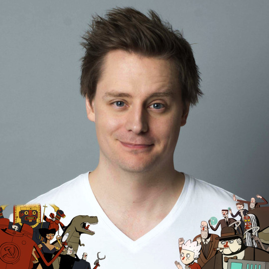
Brett Jubinville is the Creative Director at Tinman Creative Studios and creator of Super Science Friends, an animated series about a team of superpowered scientists (Freud, Einstein, Tesla, Darwin & Tapputi) who travel through time fighting nazis, renegade soviet cosmonauts and their own scientific rivals. The latest episode, “Freudian Sleep” is available now on Cartoon Hangover Select on VRV.
We got to talk with the creator himself about the ins and outs, and all abouts of the series!
What's the story behind the creation of Super Science Friends?
Since I’m less of a writer and more of a drawer, the way I typically come up with ideas is by drawing. In the case of Super Science Friends I was home by myself for a weekend, my girlfriend was out of town, and I stayed up really late playing Fallout New Vegas and drawing. At some point I drew a sketch of a soviet zombie astronaut.
Later that night I couldn’t sleep because I kept thinking about that drawing, so I got up and spent the rest of the night coming up with a show idea where that character could exist. I still have those drawings, and they’re more-or-less what the designs for the show ended up looking like.
What other historic geniuses might be part of the Super Science Friends? Who didn’t make the cut?
Because we went for the lowest hanging fruit possible, there weren’t many characters who didn’t make the cut. Everyone we chose needed to be more-or-less a household name, have a power that was easily identifiable as a superpower (for example, Tesla = Electricity Powers) and also they had to have been dead for a certain amount of time to get us out of any sticky likeness rights trouble. Aside from Tapputi, they all hit each of those marks.
I’ve got a lot of characters I’d like to get onto the show. One of them who played a major role in the comic book was Ada Lovelace, and I’d like to find a reason to have her join the cast for an episode.
Other than that we’ve got ideas for James Prescott Joule, Lord Kelvin, Robert Oppenheimer and Pythagoras.
What made you think, “Man, we need a young Einstein, let’s do a clone!”?
I really made him a clone in order to justify the design choice I had made during that all-nighter where I came up with all the characters. I happened to draw him as a teenager, but gave him white hair so he would be recognizable (since I couldn’t give him the moustache). So in order for that to all make sense he couldn’t be the original Einstein, and so I wrote that the original Einstein was dead and Churchill had ordered himself up a clone. Then we decided that he was a clone created by the US Government in order to justify casting Fred Kennedy who has a North American accent.
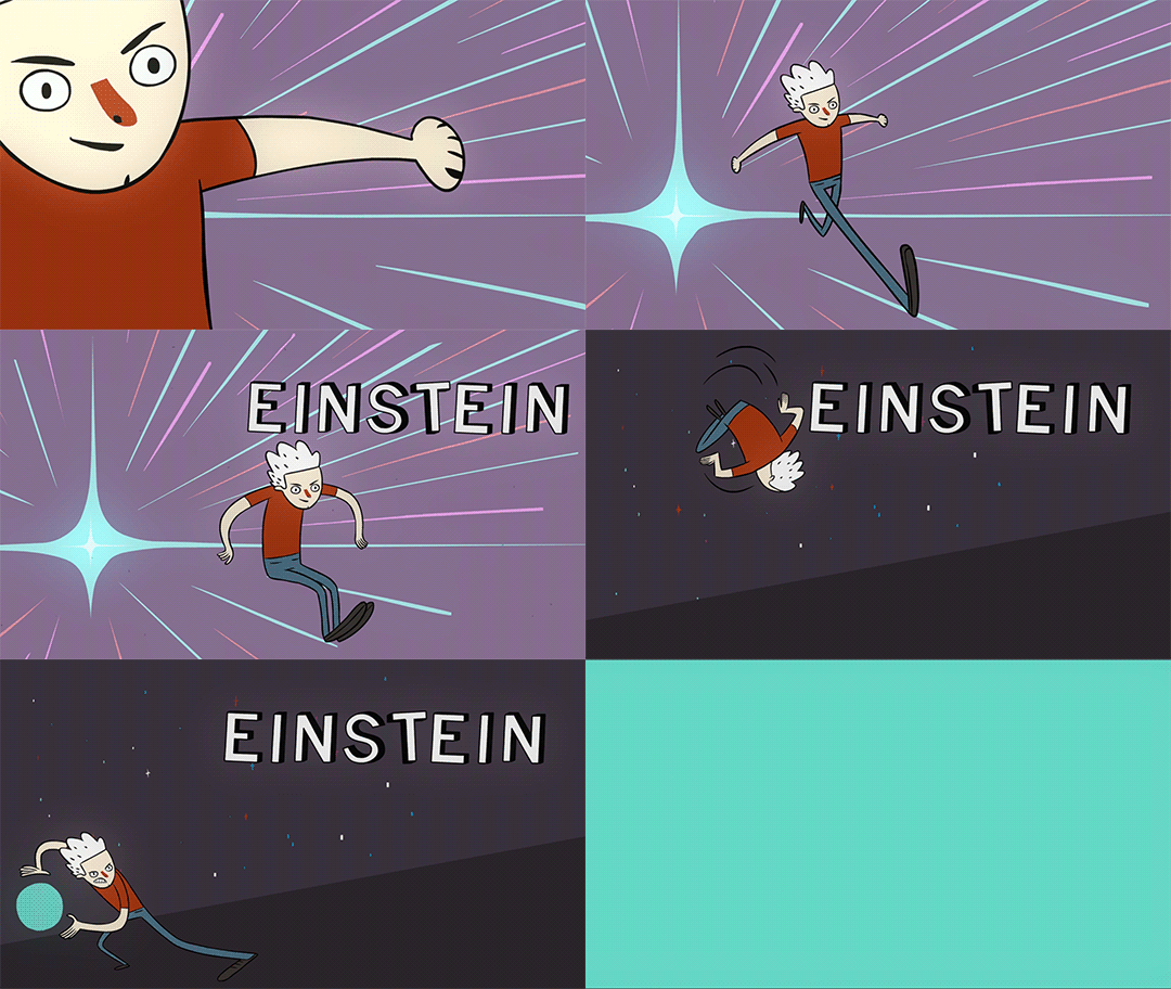
What modern day evil-doers would the Super Science Friends have beef with?
Assuming they arrived in 2017 coming from 1941 I’m pretty sure they would think that the entire human race has been brainwashed by our phones, computers and televisions. My guess is they would dedicating themselves to “freeing” us and in the process set the science and technology back decades. Oh man, we just wrote a sweet episode of Super Science Friends!
Is it okay to punch a Nazi?
Well … I was ready to punch the person in front of me at Starbucks this morning for returning her drink because she asked for half-sweet and not full-sweet and felt that it was still just too sweet, so I’m probably not the most moderate person to decide on who’s punchable. But I figure, hey if you can’t punch a Nazi then who CAN you punch?
Will you ever do another segment like you did for Episode 1 with the nerds fact-checking the show?
Those nerds (as you so callously put it) were actually our biggest Kickstarter backers for the first episode. They donated enough that they were able to get killed in the show. The main nerd actually went on to play the voice of Edison in episode 2.
But while they don’t get apple’d, we do have people who donate to our Patreon as extras in the show all the time. So if anyone wants to be in the show they can become a patron and then email us some photos and we’ll put them in.
Can we expect more episodes of Super Science Friends?
You sure as heck can! Episode 4: “Freudian Sleep” is out now on Cartoon Hangover and our Patreon, and on YouTube December 14th. After that we’ve got three more episodes planned to round out season 1. So there’s still lots more on the horizon.
What artists and animators inspire you?
That’s such a big question! I’m just going to spout off some Instagrams that I think people should follow if they want to look at the same cool stuff I look at on a regular basis.
ashleywoodart
crom_cristianortiz
heikala
jbnda
loiclocatelli
merghimself
nuriatamarit
shaneglines
taryndraws
thasenkamm
Also, follow an artist named Xulm wherever you can. He does background designs for Super Science Friends and they’re literally the least cool thing he does, which is saying something because the backgrounds he does for us are amazing.
What are your favorite cartoons?
As a kid I was all about Looney Tunes, Batman the Animated Series and X-Men. Lately I’ve actually been on a bit of self-enforced cartoon embargo until I finish Super Science Friends. There are a lot of cartoons I know I’d love but haven’t seen yet because I don’t want them to subconsciously affect how we write our show. Those include Adventure Time, Rick & Morty, Steven Universe and Gravity Falls to name a few.
“Ermagerd you haven’t seen Rick & Morty!!!!!!!1” Yep. Haven’t seen it. I really want to, but I gotta wait until our show is done so it doesn’t inadvertently become Super Rick & Morty Friends.
What's the last thing you took a picture of on your phone?
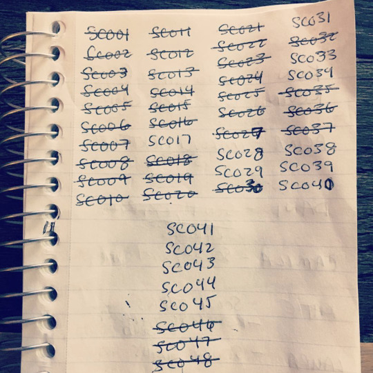
This checklist of scenes that were completed for the next episode of Super Science Friends. We’ve gotten a few more done since then.
What else are you working on?
We’re in development on a couple other series that we’re really getting excited about. You should be hearing about those sometime in 2018.
Anything else you'd like to share with the world?
Yeah, actually one of Super Science Friends’ background designers has a book coming out soon. If you’re into cats and large, naked men, you should check out Manfried the Man.
Thanks to Brett for taking the time to talk with us!
Super Science Friends Episode 4 : “Freudian Sleep” is out now on Cartoon Hangover Select on VRV. Watch here.
#super science friends#tinman creative studios#brett jubinville#Sigmund Freud#Albert Einstein#winston churchill#nikola tesla#charles darwin#taputti#marie curie#time travel#rick and morty#adventure time#steven universe#vrv#cartoon hangover#cartoonhangover#cartoons#animation
175 notes
·
View notes
Text
Chara was scrawling golden loops on their paper. Again. The yellow crayons were always the first to be rubbed out of existence in the Dreemurr household. The books on the shelves were worn, as they had been opened, read, and closed countless times. But the most worn were the books on entomology, botany, and other subsets of biology. Living things. Sometimes macaroni was used as a substitute for yellow crayons, were there none to be found (which was often). The sticky, white glue dripped around the tiny pasta elbows until it dried, hugging their curves yet also tugging them with gravity in a strange way. Living things were so fragile. Chara knew that glue was made from equine and bovine animals. Yet, once their souls died, their bodies became curiously strong. Like the glue that held Asriel's art together. Toriel loved teaching Asriel to cook. Chara hadn't taken to cooking the way that Asriel did, but Chara loved to eat. They ate anything Toriel made for them - even if it didn't sit well with them at first. Snail pie is an acquired taste, after all. What Chara really loved was reading. They listened to Toriel read stories for hours at a time, and often sneaked into the living room to read when they couldn't sleep. As Chara finished their drawing, they quietly looked up at Asriel, who was meticulously arranging the last few elbows of macaroni on his paper. He stole a glance at Chara's picture before sticking the last one. Then he realized that Chara was staring at him, unblinkingly. "I... I'm not copying you, Chara. I promise!" A smirk slowly spread across Chara's face. Then they looked down at their own picture and their smirk melted away. Was it good enough? What a silly question. It never was. "I can change mine, Chara," said Asriel, meekly. "Yeah, that's it! I'll change it so it doesn't look so much like yours. The glue isn't dry yet, so..." He stopped talking when he saw Chara trying to crinkle up their paper. Just then, Asgore happened to be walking by the children's room, and he heard the crinkling paper. "Hm? What's this?" he said softly in his low, booming drone as he entered the doorway. His broad shadow loomed over both Asriel and Chara. Chara looked up at him, silent as ever. Asgore took in the strange look on their face for a moment, then looked to his son, Asriel. "We were just making pictures together, Dad," he piped up in his squeaky voice. "I think Chara is sad because they don't like their drawing. But it's my fault, I was copying them, so..." "Now, now," said Asgore, calmly. "I think both of you are excellent artists. Why don't you two finish up and then we can all have a nice cup of tea. I have a kettle boiling on the stove right now." As the children ran out the door, Asgore stayed behind and examined the pictures. He loved how creative his son was; and Asriel's picture did look better, in his eyes. But was that just bias on his part? He pinned up the macaroni picture on Asriel's side of the room. The macaroni ever so slowly transposed downward, but the picture was still recognizable. Then he turned to the crumpled paper on the floor. He gently took it into his hands and smoothed it out. It was a rather nice picture, he decided. He remembered all of the times he had seen the human draw these same flowers, and imagined how homesick they must be. Asgore scanned Chara's portion of the room. It looked rather barren, compared to Asriel's side of the room. His was filled with toys and clothing and pictures; theirs only had a bed. He noticed that the Dreemurr family photo on the shared nightstand was turned toward their bed, and he felt a sting in his heart. Perhaps he was being unfair to the human child, Chara. He pinned the crayon drawing up on their side of the room. As he stood back to admire it properly, he heard the tea kettle whistling. Asriel was calling him. On his way out of the room, he took one last glance at the drawing before closing the door behind him. - Thanks @charadreemurr for the headcanon.
#hm? what's that? no one called for this angst?#have it anyway#i was inspired by a post i saw earlier#undertale#fanfic#ficlet#mine#toby fox owns undertale#asriel dreemurr th absolute god of hyperdeath#king asgore fluffybuns dreemurr#chara the demon that comes when you call its name
9 notes
·
View notes
Text
The Great Adventure of Horus, Prince of the Sun
1968, Isao Takahata. Action, fantasy, medieval-ish.
What a delight to have the chance of watching this movie! Few will probably know it, but the ones who do probably know it as one of the first movies in which Hayao Miyazaki and Isao Takahata — the two main directors of Ghibli Studio — worked together. As a big fan of Miyazaki’s work, I must admit I definitely saw it under that light.
As an “older”movie (49 years!), there are obviously certain things that can feel and sound a bit “outdated”. The level of the animation is not consistent throughout the movie and the drawing style is visibly simple if we compare it to the flashy, exuberant effects of today’s movies and anime. However, The Great Adventure of Horus is one of those classic stories that should be watched simply because it is the base to so many stories that we know and love nowadays.
In matters of plot, this movie reminded me a lot of Hayao Miyazaki’s later movies, markedly Princess Mononoke. Here, the movie takes place during trying times and constantly reminds us that coming together as a community is often the only way to move forward.
There also seems to be a large interest in war-like topics, such as the notion of men going off to war, leaving their wives and children behind. This reality of death, and the loneliness and harsh living conditions of the survivors is very present throughout The Great Aventures of Horus — though not always the main point of the story. This tangible fear and recognizable circumstances anchored the context of the movie pretty well for me, even with all of its fantastic elements. We might not have talking animals or magic spells in our world, but we do understand concepts like food rationing or a grieving wife and kids.
In fact, I find that Japanese animation often seems more comfortable tackling these harsh topics than American animation does. When characters die in Japanese animated movies, it is not always for noble reasons and they’re not always charming deaths. It’s a type of death that seems to confront, even the youngest audience members, with the harsh reality that sometimes people we love just die, in sometimes violent or even pointless ways. And although we can feel angry about those deaths, we (and the characters in the movie) don’t always have the power to do anything about them.
It leads me to wonder if this willingness to explore such helplessness comes from Japan’s own experience during World War 2. Of course, this is nothing but personal speculation, but who better to speak of “feeling helpless” than a nation who sacrificed so much and didn’t get to celebrate victory? I’m not speaking in terms of people being right or wrong in the war -- rather, I’m acknowledging the fact that war is harsh on all sides, and sometimes, decisions made by the head of states can have dire consequences for the majority of the population when they might not even agree with the decision to begin with. Interestingly enough, the animated movie Animatrix also touches upon these feelings of helplessness over a governmental decision, and Princess Mononoke makes us wonder if there really is such a thing as the “right” side in a war. All that to say that, it is often interesting how a country’s history strongly influences the messages explored by their movies, and even their artists’ willingness to tackle certain topics.
As a matter of fact, I am often positively surprised by how much confidence Japanese animated movies have in their audience. I remember watching Princess Mononoke in English for the first time and being struck by how explanatory the dubbed version was in comparison to the Japanese one. While in Japanese the character would say something like, “Ah!”, the English version would say something in the lines of: “Ah, look! The trees are coming together in order to make a barrier!” Reflexively, I would just laugh, because it felt like the people responsible for the movie’s dubbing thought that what was taking place in the animation was unclear, and so needed to explain the visuals through the dialog. In other words, where the Japanese animation trusted its viewers to pay attention to the movie and figure things out on their own, the English-dub seemed to feel their audience needed more explanation and hand-holding in order to appreciate the movie.
Though I am not a fan of purposefully vague movies, I do think there is room for improvement in that front, particularly in Western movies. Audiences will understand way more than some people might give them credit for -- and if they don’t, maybe dumbing down the plot isn’t the way to solve the issue. Instead, a combination of the audience’s willingness to understand harder concepts and of artists to lay their information with enough coherence and grace would benefit both sides, I think.
In fact, as much as this movie is a classic, if I had to complain about one thing, it would likely be the subtitles. Now, I’m no expert in Japanese, so I couldn’t say that such and such translations were “wrong”. Nevertheless, I know that Japanese is a complex, often poetic language, where what is read in-between the lines can be just as important as what people are actually saying. One word emphasized in a different way can completely change the meaning of a sentence. One “nope” instead of a “No” can make a world of difference. That is why when sentences were overly simplified in the English subtitles, they often sounded laughably crass. “You’re like my twin brother then!” the subtitles would read. For English speakers, this sentence can sound odd, in that it seems at once too intimate and too childish.”Like a twin brother” implies such a strong bond, yet since it is being spoken by a child to a stranger she just met, makes it sound like a naive comment. (In fact, most people in the audience laughed at this line in the movie!) However, if we consider that the original Japanese sentence sounded more like, “Your soul and mine are as similar as twins then!”, now the sentence holds the weight of a child with a scarred soul; a kid who has seen too much and whose dialog mirrors the discrepancy between her vocabulary and her age. Of course, this was just an example and I’m likely taking some poetic liberties with the translation. Nevertheless, this is one of the moments when I wish I could speak all languages, because (risking sounding too lame), I am much too aware of how much can get lost in translation.
Another element present in Horus that become even more relevant in Miyazaki’s later movies is the nebulous definition of the word “Good”. Here, Good or Bad aren’t adjectives used to describe a person; rather, a person has both good and evil inside them. Without giving away too much of the plot, there are several characters in the movie whose nature we can’t quite pin down at first -- and that’s because often, those characters are confused themselves! That willingness to admit that people are often more than just good or bad makes these characters way more realistic than many other animated characters to me. In fact, Mark Steinberg once mentioned that Japanese animation often depicts what he calls “emotional realism”, that is, it uses a style that might not look or move very realistically, but realistically depicts the complexity of emotions inside a person. A character who agrees with the protagonist at a certain point in the story might disagree in some other aspect — just as real people do. We have changes of heart, and we can act differently when we’re tired, or sad or angry. Likewise, once someone comes to trust you as a person, that trust is often enough for them to believe you no matter how much someone seeks to undermine your credibility. There is no big moment of “You doth betrayed me!” (*big, exaggerated motion*). Rather, those who like you will likely back you up no matter what, and those who don’t, will probably find any excuse to act against you.
Finally, I’d like to discuss the clever use of budget in this movie. When I think of movies like Snow White and the Seven Dwarves, where even the simplest shot has a picture-perfect background, with a beautifully crafted movement and a painfully sharp photo quality, I understand why people could expect that same level of perfection from every animated studio out there. But as an audience, we should remember that not every studio has that sort of budget and man-power. That movement style we understand as “realistic” comes with a cost that not everyone can pay. And yet, artists may still choose to tell a story with the means they have available, and we as viewers should be willing to meet them half-way. You know the saying, Tell me a good story and I will read it from a toilet paper (it’s not a saying... But it is a good reference to V for Vendetta). If we only judge a movie by how visually appealing it looks, we could be missing out in some great stories out there.
The Great Adventures of Horus is one of those movies where, likely for budgetary reasons, the artists used very simple animation. More than once there were long sequences of still frames where the only “movement” was literally the camera movement over the static drawing. It might feel a bit jarring to look at -- particularly for someone who is used to Pixar-like movies -- but it isn’t so jarring if we consider that animation also came after centuries of Shadow plays and Kamishibai (literally “paper play”) in Japan. In that context, animation is not limited to a realistic aesthetic or to a particular quality of movement; it is a means of telling a story, a box of stylistic possibilities.
As such, I found myself thinking of why the artists chose to use partial animation in certain scenes instead of others. In this movie, the makers clearly put their limited budget toward animating the sequences with most emotional value for its characters. The clearest example is that while one of the main battles in the movie (which could be considered imperative to the plot) happens mostly through these moving stills, while the festival of the sun -- which introduces Horus to the village in a more relevant way -- is lavishly animated. The fighting sequence, though important, depicted nothing more than violence and death, and didn’t really require complex animation to be understood by the audience. On the other hand, the dancing sequence is a moment of bonding. Here, we get a fantastic 3-5min sequence where the whole village is dancing around a bonfire while the sun is setting. Between the shadows cast on the floor, or the dozens of people making a zig-zag conga line, or the children running between the people dancing, I just couldn’t stop marvelling at the richness of the visuals. It seems almost contradicting that the same movie could have animation “cheats”, but it’s really not. It is precisely because the movie chose to have some “cheap” shots that they could afford to go big where it mattered to them. As someone who appreciates good storytelling and character development, I definitely respected that decision.
When it comes down to it, I feel this movie is definitely not for everyone… in the same way that The Godfather is not for everyone. As a viewer, you sort of need to know what you’re walking into. However, by adapting your frame of mind and taming your expectations, you can appreciate the movie for what it is: a piece within a historical context with its own filmmaking significance. Personally, I watched The Great Adventures of Horus, as the originator, an inspiration to many movies I love today. The visuals range from noticeably simple to masterfully complex, and the characters go from flat talking animals to scarred men of war. All in all, this movie is the very definition of go big and go home.
#movies#review#mediareviewer#horus#prince of the sun#the great adventures of Horus#hols#hayao miyazaki#isao takahata#studio ghibli#classic#animation
0 notes