#browser customization
Explore tagged Tumblr posts
Text
How to block most website elements with uBlock Origin
A lot of people are already familiar with uBlock Origin (if you aren't it's a pretty robust and customizable ad blocker addon available for most common browsers), but there's a great and simple-to-use feature that goes underlooked by a lot of users: the element picker.
The element picker lets users block specific parts of a website without needing to manually write a filter list. It simply works by selecting the tool (with a pippette icon), highlighting a website element, and then clicking the "create" button to make a blocker for it.
Let's go through an example. Say I'm browsing this website and it decides to put a picture of a clown in the bottom right. Maybe I don't like this clown. So let's get rid of it!
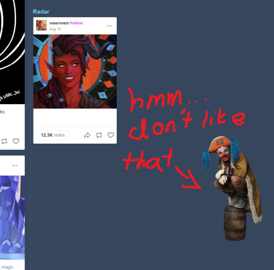
First, select the element picker tool by clicking on the icon for uBlock Origin to open the addon's panel and then selecting the pippette icon:
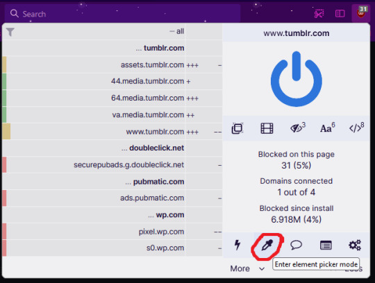
This tool changes your cursor to a selection tool which highlights web elements. Click the element you want to be rid of, and a panel will open. You can press "Preview" to see what it would look like when blocked, and the "Create" button adds the web element to your blocklist.

Your blocklist can be found in the options of uBlock Origin under "My Filters". Your latest filter applied will be at the very bottom of that list, so if you accidentally block something you didn't want to, just delete it from there.
This method isn't perfect, as it depends on how the website in question has designed its web elements. Sometimes elements need blocking a few times if the site has a few different types of webpages, and sometimes elements are reused and the picker will select some false positives.
This is a great way however to make the web more customizable for you with minimal effort. For example, maybe you find various number stats on social media (such as likes, views, ratings etc.) to be annoying or stressful. Maybe a website has some buttons you keep clicking by mistake or are otherwise not useful to you. Maybe your adblocker just missed a couple adverts. Well, you can just block them all with this.
Make the web more like how you want it to be, get creative with web element blocking!
9 notes
·
View notes
Text
How to Choose the Right Browser for Your Windows PC
Discover the best browsers for Windows in 2023! Learn about compatibility, security, UI, performance, customization, and privacy to enhance your browsing experience.
In today’s digital age, browsing the internet has become an essential part of our daily lives. Whether it’s for work or leisure, we spend a significant amount of time online, and choosing the right browser for our Windows PC can have a significant impact on our online experience. With so many browsers available in the market, each with its own strengths and weaknesses, it can be challenging to…

View On WordPress
#best browsers#browser compatibility#browser customization#browser performance#browser privacy#browser security#browser UI#Windows browsers
0 notes
Note
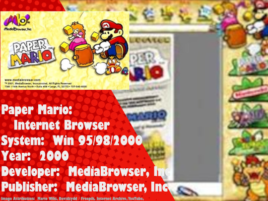
the paper mario web browser (not browser game)
#mario poll#is it a mainline super mario game#mainline super mario poll#mainline super mario game poll#what is a mainline super mario game#nintendo#super mario#paper mario web browser#did y'all know Nintendo commissioned custom web browsers based off their games?#because I didn't know that#Sorry for the bad image quality btw it was the best I could do
64 notes
·
View notes
Text
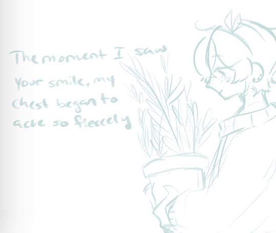
Wow Angel moment
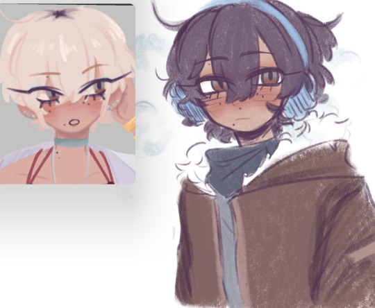
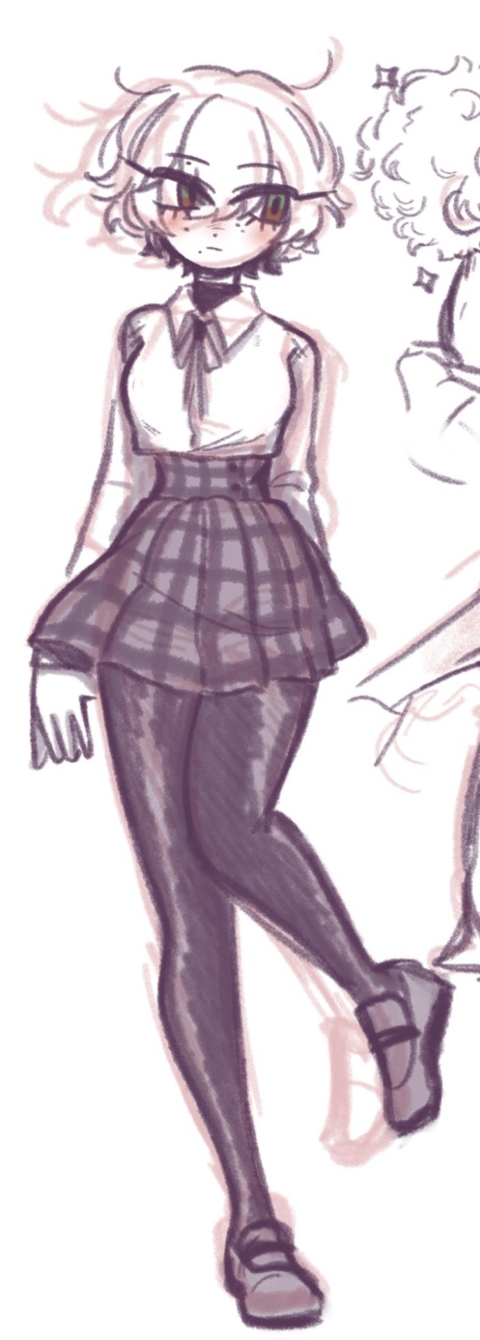
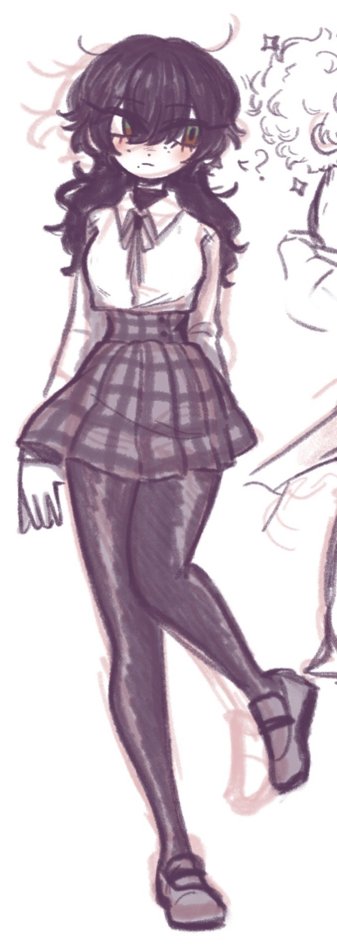
#my art#oc art#angel🪽#angel is genderfluid now! (we all clap) so happy they’re out of the closet#my daughter my son my lovely child#who has one MILLION BOYFRIENDS*#*Angel is a visual novel oc so I put them in all the vns I play when it lets u customize things lmao#deleted my twt app because I’ve been going crazy so I only pop in on browser really ramble time lowkey#been thinking about life#it snowed 2days ago#i remember when I was little id use to burry myself in a little snow hole and I’d fall asleep#did that at school recess once and they’d called us back inside but I was asleep in#you guessed it#the snow hole so imagine 6 very worried adults looking for a tiny child who’s currently (self) buried alive
25 notes
·
View notes
Text
Yesterday I finished moving to Firefox so here's some extensions. First, the serious ones:
AdBlocker Ultimate: Your run-of-the-mill adblock. I chose this one instead of uBlock since I'm fairly sure uBlock was giving me problems on Chrome and I don't wanna repeat the experience. You can use the "Block Element" feature to get rid of all the new annoying Tumblr features, it's easy.
ClearURLS: Removes tracking from URLs.
Decentraleyes: Protects from tracking & targeted ads.
DuckDuckGo Privacy Essentials: More tracking, cookies, etc etc protection.
Privacy Badger: More tracking protection.
Shinigami Eyes: Marks transphobic blogs/accounts/profiles red.
Alright now some less serious, more fun ones:
Enhancer For Youtube: Gives you a highly customizable utility bar with features like simple screenshotting, pop-up players, volume enhancement, & other things. Also has the ability to alter your YouTube theme and toggle settings that'll stop pesky YouTube tabs from automatically starting.
Firefox Color: Custom themes for dummies! It doesn't customize everything but it gets pretty close. I think this would be a good tool for folks who need high contrast themes and can't find pre-made ones suited to their needs. Also comes with a few pre-made themes you can either use or use as bases.
LanguageTool: A spelling and grammar checking program that works in many languages and on all websites!
OneTab: Turns tabs into lists. Fantastic for when you're knee-deep in hyperfixation/special interest territory, or even for research.
Turbo Download Manager: Helps with frustrating downloads.
Video DownloadHelper: Gives you options to download any video from your tabs in multiple formats. Also has the option to download and convert to another format. [Update: This one requires a paid subscription AND externally downloaded program for these features. Nevermind.]
XKit Rewritten: Most Tumblr users already know of xKit but I'm including the link nonetheless! This kit makes Tumblr on PC enjoyable.
Custom Scrollbars: Makes your scrollbar pretty :)
Also, Firefox has their own page of useful add-ons, like Facebook containers and note-taking extensions. There's also a ton of themes. I don't think any of these are advertised on the main add-ons page? So I might as well mention it.
cheers :)
#making this post because personally it took me forever to switch from Chrome just cause I couldn't bear to fully customize a new browser#A lot of these are advertised on the add-ons main page so they're easy to find but the links are useful anyways#You don't have to use all the privacy ones simultaneously btw. I know that. I like having options tho#Pro tip for people struggling to switch from Chrome on android: if you select all your tabs and click the 3 dots in the upper right corner#you can share them all as links. then it's just a matter of putting them in a document and opening them in firefox or wtv#or you can be like me and just leave them in the document for later use.#firefox
267 notes
·
View notes
Text

I CANT USE CSS ON ARTFIGHT...............
#I WAS REALLY HOPING TO FIX THE FUCKING. PARAGRAPH WIDTH. SIGH#idk why but it stretches across the ENTIRE page like. it takes up the full width of the browser and it BOTHERS ME. ON ALL THE PAGES#i could try manually putting shift breaks but im worried it might not look so good on mobile. ugghh... auyggghhh.....#im already learning CSS and API so i thought i could put it to good use but. AUGH#this whole time ive had to go into the inspect panel myself and change the padding so i dont have to read the length of the screen#like a fucking typewriter... i would have also loved to use custom fonts and animations......#i did find a guide for BBCode which the site uses on default and it covers basic styling but its not the same. sniffle#you CAN unlock CSS if you donate $25 to the page which seems fair. and if i could do it i would but. i do not have any way of#sending or receiving money online </3 i really need to figure out how to do that so i can set up comms like i said i would last summer#but it intimidates me.... and im already kept on a short leash when it comes to that so it feels like a lot of things could go wrong#i think toyhouse allows CSS or some sort of code...?? i remember seeing some oc pages with custom layouts#if thats the case i'll try fiddling with it but im not very familiar with using toyhouse so thatll take a while#(thanks again for the code sal ^_^ ill put it on my pin once its ready but im trying to learn my way around the site heh ;;)#at least i can use my pixel dividers.. ive been digging around for pixels to use and found some really cute ones#yapping
49 notes
·
View notes
Text
i cant decide if i like this or not someone help me
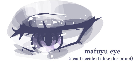
i filled up all the layers in cant tell if i like it </3
#safari is the best browser#safari posts#safari project sekai#project sekai#proseka#hatsune miku colorful stage#colorful stage#prosekai#pjsekai#pjsk#proseka custom profiles#pjsk custom profiles#mafuyu asahina#pjsk mafuyu#25ji mafuyu#niigo mafuyu#mafuyu project sekai#n25 mafuyu#nightcord mafuyu#pjsekai mafuyu
45 notes
·
View notes
Text
do people visit blogs as in the "[username].tumblr.com" pages anymore or do people only go to the "tumblr.com/[blogname]" route? my theme is so old and broken thanks to many tumblr updates over the years. i think about revamping it but it'd be soooo much effort to go in and adjust (since it won't let me edit/save the custom css anymore, id need to start over) to remake everything and like... do people even click through now...
i guess especially since so many people seem to use the app vs browser (cant be me, i am old and have tendonitis 😞) there's not good ways to get to that. i have all my personal info, tags, writing masterposts, characters, etc set up as static pages on my blog rather than posts for ease of editing/organization but i guess those are like. just invisible to most people browsing now probably. maybe i should make a pinned post + individual reference posts after all... hmm
#blog housekeeping#i am at heart a forum and weppage millennial. who grew up editing custom skins and pages and whatnot. so that is where my heart lies#but the internet... it has moved on... alas#ramblings#my own currently driving me insane tho bc whatever made it change sidebar height relative to browser window size broke#so now if your window is too short it just. hides the buttons#which is SO BAD but also would be so much to Fix hhhh
7 notes
·
View notes
Note
Hi Steph,
I am just wondering about your full fic rec list. When I click the link, it just brings me back to your home page. I cannot see your fic lists anymore.
Hey Nonny!
AHHHH Okay I know what the problem is as I have been asked about it before. Are you using the mobile app? Because on the app it just doesn't work. I have NO idea why. My theory is this, with what little I know about UI: I think the app can't read "sub-pages" (basically, it creates a folder on your blog that doesn't have a unique blog number code that the mobile app can read) that Desktop users are able to create on the "Customize" page of the Desktop Version (which functions essentially like a Wordpress blog), and because it's not reading it as a "real page" it gets forced into an endless link loop.
THE TUMBLR APP IS GARBAGE. It has been since implementation and they NEVER ever properly made the desktop and app versions work together.
It was only just LATE LAST YEAR that the desktop / browser version got all the style sheet stuff mobile's had for years AND the ability to edit mobile-made posts (before it used to lock you out and you had to go to the app to fix any posts even just reblogged on mobile, which is why I NEVER EVER blogged on the app). It's so bizarre that Tumblr hates their desktop/web browser users but it's the only version of the site that functions properly and is completely stable.
THAT ALL SAID, Nonny, the simple fix is to log into Tumblr on your Phone's web browser app, whether that's Safari, Firefox, Chrome, whatever... It functions just like the desktop version and all the links will work again for you.
OR you can copy-paste this web address into your web browser if you don't want to do that and the page will open as it should, since my blog isn't locked to only-Tumblr:
http://inevitably-johnlocked.tumblr.com/myficrecs
And to see the other pages just add a "2", "3", "4" or "5" at the end. I'm so sorry for the shit-show Nonny, but it IS there and the links all work on my end, and I just checked my web browser on my iPhone and it works in Safari <3
I should REALLY make a Rebloggable post since this is probably never going to be fixed on mobile (a rebloggable post will give it that unique ID number I mentioned and SHOULD fix the "fuck you mobile" issue, LOL). Let me know if y'all would like me to do that, and I'll put the pages as separate reblogs.
*HUGS*
#steph replies#tumblr things#tumblr problems#my blog#my fic recs#tumblr mobile is a piece of ABSOLUTE dumpster shit#i only use the mobile app if i want to scroll something on the bus#the desktop/browser version is FAR superior#case in point the customize page#you can do SO MUCH to your blog using the backend
8 notes
·
View notes
Video
tumblr
I’ve been formatting my sketches so they’d form one long line - made a page for it, too! https://sketchrope.loftyanchor.art
#sketch#sketches#my art#original#hoping to continue this til the heat death of the universe#been trying to make my sketches more sketchy#its hard not to refine them#whenever I make a new page or edit my tumblr theme I get worried about something being broken on certain devices or browsers#of course its broken in IE lol#please let me know if somethings broken i always appreciate it#my like button was broken forever because it turns out like buttons dont work with custom URLs#time to fix up my main blog's theme!
78 notes
·
View notes
Text

always been a big fan of tiny little shimejis but desktop mate has elysia.. how could i not give it a try🥺
#SHES SO CUTEEE#someone made her MPE model soooo well! they did a bunch of others from hyv and theyre amazing#someone also made casual ely... mightve been the same person bc that one was well done too...#the upside of desktop mate vs shimeji is detailed custom charas! 3d! better for chara models#also the characters stay where u place them. thought itd be annoying bc they were big on someone elses screen but this is fine#downside is theyre stuck in place and have a set amount of animations in each position. which is still cute tbf#and ig so did shimeji but shimejis are wild bro.#multiplying like crazy and throwing windows n walking all around ur screen n shit. i love it but i had to limit some stuff#like throwing my windows PISSED ME OFF LMAOO and multiplying is off too bc they fill ur screen up QUICK if u look away#cute that desktop mate has alarms tho. i dont need them but its sooo cute#personally im still a big shimeji fan bc i found an artist that makes nice pokemon ones and i have the evolvable eeveelutions (not all yet)#and solosis which will apparently also be evolvable one day. awesome how that works btw#also theyre a lot smaller and move a lot and are cute and sometimes come w custom sounds which is super cool. i like em#but ely 🥺 shes so cute#i thought of getting summer HoV but i saw her smiling brightly like shes elysia and my brain was like cute but thats not my queen !!!!#anyway i think u can only have one buddy out so ill just keep ely for a while bc shes so cute and polite and well behaved 😭#but if i could have 2 id give her hi3 friends!!! but i cannot so sadge#44597#elysia#honkai impact 3rd#desktop mate#it also helps that vroid models are probably made more often than shimejis. like shimejis died off long ago for the most part#not talking abt the fucking browser widget shit btw. i mean shimeji-ee the application u gotta run w java.#anyway. big fan of desktop friends 👍 live laugh elysia#day 2 of desktop mate and uhh. vroid hub is this also for vrchat models or.. bc that would make a lot of sense
4 notes
·
View notes
Text
....
#besties i just found out i can still open nancy lou's archive#and her blog on its custom theme#despite being blocked#i can't access her blog via tumblr search but i can directly open it via my browser's address bar#what. what do we do with this information#bc like#in this specific case i find it funny#bc obviously i'm not gonna bother nancy lou anymore either way#but i don't think that *should* be possible?#like if you block someone. they should be fully blocked#even if you have a custom theme#don't you think?#do we need to tell someone?#or is that stupid#is that a loophole we want#idk thought i'd share bc i guess it could be necessary information?#lmk your thoughts if you want
3 notes
·
View notes
Text
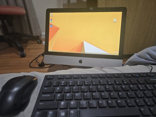
Up next: windows 10
#i got it with windows 8.1 and if i destroy it now i know how to do it again#so the steps are: downgrade from yosemite to mountain lion#go into info.plist and delete the word Pre from preusbbootable or whatever#add 12.1 as the model in that list#run bootcamp#if the windows says no bootable disk just press alt until its in that booting mode and then click the usb#start installing windows and custom set it to whichever partition you want#if it says the parition is in the wrong format-- theres an indian guy online who said click out and go to repair settings#and then advanced. open terminal#and then do some funny little disk list commands (forgot. FIND THE VIDEO!!!!!!!)#then try again to install windows and then chilling. and then go into usb open bootcamp and run the exe for drivers#and then youre back at windows 8.1 again on the imac12.1#indian guy is an uncle and the video is 4-5 minutes long with only a few hundred likes#my ass is never finding that video again#my work account keeps browser history on autodelete
2 notes
·
View notes
Text
Hello Tumblr Patio users (all 3 of them)!
Are you a former TweetDeck veteran? Wish the sidebar didn't take too much space? I have just the thing for you!
I made an interesting userstyle that you can install with the Stylus browser extension - it collapses the sidebar, and you can uncollapse it by hovering over it with the mouse (or leave it collapsed if you prefer!)
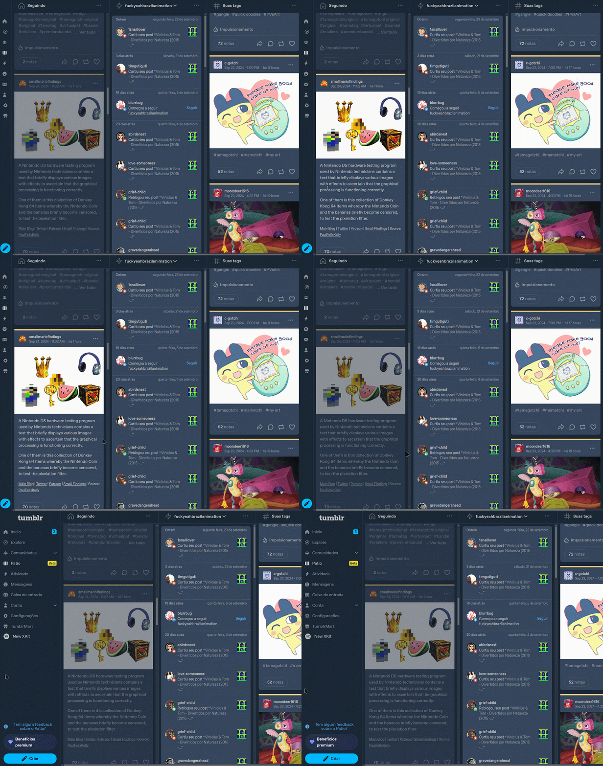
It is somewhat still kinda barebones and "not super pretty" (and if Patio updates often it might even break) but it gets the job done!
Get it here on userstyles.world!
#tumblr patio#patio#userstyles#userstyles.world#custom css#css#html css#tumblr mod#browser extension#xkit#stylus#stylish
5 notes
·
View notes
Text
desktop moots what do we think of my theme? :3
#i can customize my theme some but i can't really see how it actually looks because i'm on mobile browser#so let me know if execution is matching the vision
2 notes
·
View notes
Text
i want every tech company to know i am not putting your app on my computer. if it would work fine as a website and you have chosen to make it an app instead i will simply not use your product. hope this helps
#i just know we are staring down the barrel of a future where web browsers are archaic and barely supported on everything - not just phones.#corporations do not like the level of control the average consumer can exercise over their experience in a browser#they want to control the consumer's entire environment to make sure the 'customer experience' (coughadvertisingrevenuecough) is not#interrupted by our foul adblockers and loathsome reformatting extensions
5 notes
·
View notes