#both are outfits inspired by the 90’s but more specifically 90’s game systems
Text


Wanted to do another ego redesign, so this time I went with Bing and Google!
Thanks again to @ambrosiadreamer for the ideas!
#markiplier#googleiplier#bingiplier#okay so the explanation#I really took a lot of nates ideas literally here#both are outfits inspired by the 90’s but more specifically 90’s game systems#Google is simply a nerd#but I wanted his outfit to say a lot while saying nothing so I kinda took earthworm Jim’s outfit and made it nerd style with the out colors#as accents with the red yellow and Green#I also wanted a lot of white just cause how much it made me think of really sterile places#Bing on the other hand I wanted to look like a cool kid so I gave him those funky glasses and a nice outfit#BUT his colors are me trying to make him pop so I took those#game pro magazines and slapped all the brightest parts of the logo into the coloring#his limbs are also partially see through cause I wanted those clear gameboy vibes#really both their outfits colors can be narrowed down to them have the articles of clothing to fit in my the brightest colors that make you#squint if u saw them irl#they’re really fashion disasters if anything#both of them have glowing eyes and limbs as well as small lines on their fingers and face to give a robot look to em#the hair colors are directly taken from blue raspberry sour patch kids and orange creamsicle and if u know u know#googleplier
105 notes
·
View notes
Note
fashion queen! which nct era has the best fashun in ur opinion?? and if u were a designer which neos would u pick as ur models?
I was so excited to answer this that I wrote several pages and it basically turned into a style analysis for each unit so I sure hope you have some time on your hands to read everything I’ve just written! (I did not reread so sorry for any typing mistake)
NCT is known to be experimental in their music and that’s also the case in their styling so there’s a lot for me to get into even though sometimes it’s a miss. One thing I will say though is that when it comes to the styling in mv/teasers, what’s around the clothes is super important because if you have a very specific styling concept, your set design or graphic design needs to complement that and give the audience more clues on how to read all these elements together (the cherry bomb era is a great example of that with all the added graphic elements and the predominance of the colour pink) and recently I’ve found that the creative team has not really gone further than just putting nct in an outfit in front of a basic background so it makes for a pretty underwhelming result
But let’s move on to my favourite styling eras. I’m going to do this per unit (I’ll finish with NCT U) and define an era by its teaser pictures and the mv (and not go through all the performance looks during the promotion period)
I’m putting this under a read more because it’s reaaally long (I put pictures so that it’s not just one big chunk of text)
NCT 127
Easily the most experimental unit when it comes to fashion, especially in their first years where they would wear mix of sportswear, grunge references, avant-garde fashion and a lot of layers. When it comes to their debut “Firetruck”, I think it fitted the song really well but that it didn’t fit all the members equally (especially the younger ones, for me Taeyong and Taeil pulled it off the best – it’s expected of Taeyong but I also think that Taeil always stand out when they go for edgy/unconventional look, I think it really suits him).
Anyway, just to say that they were off to a very strong start and then I’m just going to kindly ignore the Limitless styling and move on to Cherry Bomb!
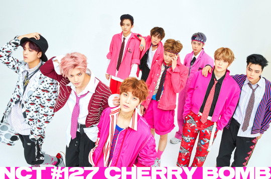
One thing nicely done for CB is how when you look at a group picture they’re clearly all following the same concept but they’re not necessarily matching or giving off the same vibes if you take them individually. I love the use of the colour pink which brings a) a great visual impact (you don’t ever see that much pink at once – especially on men) and b) an harmony despite the shapes and styles of their outfits being so vastly different, you’ve got ties, tousled, shirts, little frilled collars, stripes and all-over prints, sportswear and formal wear… (ex: taeyong’s short jacket is reminiscent of something a little luxurious, even maybe historical/noble with the little added embroidery-like details, it reminds me of these boleros jackets worn by toreros that are often red/gold VS doyoung’s overalls is an outfit that has a much more recent origin as it was first worn by factories workers, it’s usually blue or grey and is meant to be practical rather than pleasing to the eye -> here it fits very well with the general setting of the mv in what looks like an empty industrial storage space)
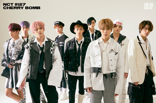
This second look is more of a game on how to deconstruct formal wear (there are less prints and no bold colours, their hair is less messy…) but they don’t just add sportswear like the bomber jacket, you can find rock or more “modern” elements with the leather jackets or the jean jackets. All in black and white so great contrast with the previous looks, although that mix and match concept is still there. My favourite elements are the checkered ones (worn by taeyong, taeil and haechan) as it reminds me of the strategy element of the chess game which fits pretty well with all the weapons and other arms visible in the mv (a bit like a nod to the game battleship)
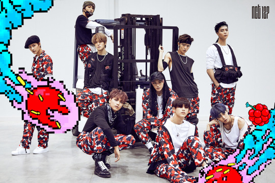
This one I love that they developed their own print, especially since it’s another graphic element used elsewhere (see their album cover), because it’s a great way to really introduce their identity as a group, through the different visual elements they put out in a comeback, it’s like a logo but as a print. And all the teasers and the mv did a great job at mixing 2D/3D contents so that’s another nice way to be cohesive. It’s not my fave look out of the 3 (especially because I do not approve of that belt-suspenders-bag they gave Johnny, it’s like everything you don’t want to put a dancer in and it’s ugly as well) but I still like the fact that’s it’s another nod to the battle/strategy aspect of this comeback, like they’re on a mission to hit the stage and conquer it
Then fast forward to my other favourite one, Simon Says! (No teaser pictures here because they don’t show anything or they show not enough lol)
First of all THE MASKS
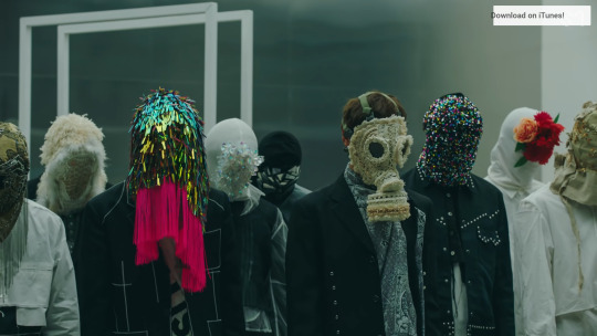
Oh how I wish they could’ve been shown more (imagine teasers with the members wearing them!!! I would’ve loved individual teasers based on each of the masks concepts) Once again, a great to have group concept without making everyone wear the same thing. They’re all super different and full of details. Haechan’s is the only one from what I could who’s mask is actually a mask and not a fully covering hood. The materials and techniques used on these are either evocative of “fragile” things like glass and flowers but theses elements have their own hidden strength. Some others are covered in lace, pearls, fringes or fur…all these things are usually considered to be precious or even luxurious but it covers their faces and their identity and they throw it away in rebellion (and I think it’s also super interesting how Taeyong who takes off his mask first has the least ornamented one)
Then the outfits themselves. Simon Says in an interesting MV because unlike most others they wear one outfit for most of the MV (the second one appears quite late in the mv and is lit and staged in a way that makes it less visible). It’s a mostly grey/white set of outfits which is usually a colour combo for office wear or maybe factory workers, it’s not something that can seem very exciting or edgy. The styling in these outfits reminds me of the works of Japanese designers who came to Paris in the 80’s and kind of shook the whole high fashion system by bringing a different type of shapes, aesthetic and purpose to fashion (Rei Kawakubo, Yohji Yamamoto…). These designers went on to become super successful and inspired another wave of “avant-garde” designers nicknamed “the 6 of Anvers” (Anvers is a city in Belgium), this group includes Martin Margiella, Dries Van Noten…And to me the outfits in Simon Says really fit into this aesthetic. Unconventional fits, various layers, it’s not so much mix and match than a work on contrast between structure and fluidity (Yuta’s half skirt with un-trimed edges, Haechan’s long shirt with the long bow and the fitted jacket, Mark’s top with the various see-through layers of different lengths…).
An other interesting details (which to me calls back to the mask and that tension in the song/concept of letting go/being free of expectations), is the way they all have thick strings tied on their feet/ankles. Not holding them back because their feet aren’t tied together but there’s still this clear restriction of the garment itself, a reminder that there are tied to something and not completely free (also an interesting choice when dressing dancers who would need to have no added weight or discomfort in their outfit to dance but visually something is holding their ankles)
Honorable mentions:
Kick It– they managed to create very memorable outfits while taking inspirations from already well known elements (both for the fighting/training outfits and the bomber jackets). The black and white outfits especially are very original as performance outfits/dancing clothes since the og garment they’re inspired by has already such a strong identity outside of the performing arts and I don’t think I’ve ever seen it be used as a stage outfit? Or concept? It’s a nice exemple of how you can take inspiration for something designed to be useful and to be efficient (in fighting) and turn it into an aesthetic.

Truthfully, martial art training outfit was already an “aesthetic” on its own but they made it a performance costume and now I do feel like it’s one of these looks that everyone will remember (like if there was a “most memorable kpop outfits” list it could easily have kick it’s black/white fits). The rest of the outfits for that concept weren’t as memorable/original to me although I feel like it showed a new approach to the styling of nct 127 as a group since they all had very similar outfits this time (especially when wearing the jackets).

Also, interestingly, that shot of Jaehyun that had everyone go “wow” ? Well it’s impactful because it’s him and he looks like that and it’s shot in a very specific way, but it’s also even more impactful because he’s the only one who gets to wear that kind of outfit in the mv. Everyone else has 3 sets of outfits (black and white, shiny black, red jacket and black pants) but he has 4 and that suit is only used in that shot which makes for a greater impact!
And I feel like Kick It in terms of styling opened a new era for NCT 127 has it kind of broke their usual mix and match/edgy concept. This time they were clearly referencing something already well known (either martial arts, the 90s…), and the members were all matching and they kept on doing that with the military jackets in punch, the other 90s concept in nct 2020…
Touch – for the way the outfits match the sets (in all their individual sets their outfits have a detail in a matching colour), the focus on colours !!! You can see that this whole concept was designed with this colour game/colour progression between the outfits and the set in mind. It’s just very pleasing to the eyes and a great contrast to their usual stuffs (also I wrote my graduation paper on colours so I am really into creative use of colours like this)
OK now moving on to Dream!!
The interesting thing about Dream compared to NCT 127 is that from the beginning although their outfits had to match the song an the concept of the comeback it also had to match their age. Dream’s a group that had to look young when debuting (to the point where they wore outfits that made them look even younger than they were which is rarely done for boy groups) and then they had to transition into adulthood, and all of that had to be made visible. In that aspect, I really like the styling for We Young and Boom (especially when you look at them at the same time).
For We Young, the styling is meant to be reminiscent of school/boy scout uniforms but with a marine vibe. It makes for playful outfits that aren’t too childish but that also aren’t grown up. I prefer the “seaside” outfits as I don’t really like school uniforms as a concept for styling and I think it’s really a choice that suited them and the song so well, it really fitted their energy. It’s playful but it also has a vintage touch to it as these outfits with their stripes and their squared flap at the back date back to the XIXth century (I just found out that it all started with the queen Victoria dressing up her kid in an outfit inspired by the royal navy uniforms for a painting after a cruise ).
Boom on the other side is their first proper “grown-up” concept. We go up was already more grown up but still very “teenager-ish” and although they were mostly teenagers when they did Boom it was clear that this was supposed to be their first entry into “adulthood” as a group at least. And although they did wear a sportswear/casual outfits which is something that isn’t related to age (and I really like the black and white “skeleton” set which already feels more grown-up and more “stylish” than the other casual outfit) , they wore two other “grown-up” elements: suits and all-jean outfits.
And yeah teenagers, and kids wear jeans too but a full jean-on-jean outfit is more of a “grown-up” fashion choice and it makes them look like young men rather than boys. As for the suits, I just really love when stylists play with the codes of that garment (length of the jacket, tightness of the pants, the way the shirt is tucked in…).
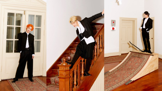
Notice how Renjun has a really short jacket, Chenle’s pants are wide, Jeno has a tail…Once again, a really interesting aspect of Kpop is the variations of the same concept based on the members. In the mv, there is a tension between their more grown up selves (the one in suits, the one with a craft/a path) and their young selves (the one running around in the field, the one laying down in the flowers and eating a cake). And there is also in these outfits and the contrast between them this tension, this contrast…which path should they go? The jeans are the more laide back, innocent outfits, whereas the suits come with responsibilities and status (and you’ll notice that in the scene where jisung is left alone to blow his candle it’s when he’s wearing jeans not when he’s in the suits).
Now on to WayV!!
WayV are different from the two in the sense than when they debuted they couldn’t have an “age” concept or an edgy concept because 127 and dream had already taken those and I feel like for that reason they’re still looking for what makes them stand out visually from the others (and in my opinion it’s not in whatever they were wearing for turn back time!). WayV’s concept is space and time travel, it’s building a new life, a new worl, going beyond anything! In my mind, they’re either supposed to feel a bit “otherworldly” (either spectacular or literally like they’re from another world/another universe, a little bit futuristic maybe?) or to look like explorers/travellers (they have a lot of travel/transportation “gears” references in their outfits). Their MVs also have a very different production than the other nct mvs (the scale and the way it’s filmed, the sets…it’s a different approach and it’s usually much more “grand” for their title tracks). The great thing about WayvV styling is usually that they match the outfits well with the world that the mv is set in (like in Moonwalk for example you get a sense of the world they’re in and the fact that it’s not ours or at least not as we know it now through the way they dress – you can’t really say oh it’s inspired by this era or by this or that because -at least- to me it immediately gives me a vibe of something that could be worn in a sci-fi movie, almost like a costume) or that they allude to travel in their styling.
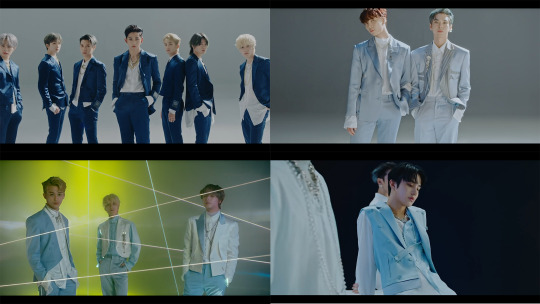
When they debuted with Regular they went for a very sleek and high fashion look which worked really well for them! Even their more “casual” looks were a bit striking and I think that’s very “wayv-like” to me.
Same goes for Take Off where they mix the individual styles (and I don’t like ten’s leopard fur sleeveless jacket at all) and the group concepts – the “flying” outfits and the “racing” outfits (that last one is my favourite! I love the silhouette it creates with the tight pants and the larger tops with an emphasis on the waist).

There’s something a bit extra to WayV - which is why some of their outfits remind me of costumes more than fashion while at the same time they’re the most “high fashion” unit– like the “flying” outfit in Take Off are recognizable as “flying gear” but you can’t really tell what they’re flying, it feels once again like something that they could wear in like star wars or a similar kind of story.
Imagine a movie about 7 men on another planet trying to come together to overcome the dark forces or whatever’s bad on their planet in a futuristic society with a mix of “traditional” and “trendy” outfits? That’s WayV. The movie the 5th Sense? That’s WayV but on steroids. They’re also the only group with actual characters in their mvs, they’re all supposed to have a backstory or an individual setting and find a way to get together in their mvs.
Anyway all that to say that it’s hard for me to pick an era for them because they’ve only had a few and they still feel like they’re looking to solidify their concept, and since moonwalk and turn back time really set the styling in different worlds than ours, you have to look at how they fit in that world rather than ours and I think Moonwalk does it best since it’s the most cohesive one visually. But then I think Regular had the best individual styling!
Okay this is super long but we’re finally getting to NCT U!!!!
Number one favourite:

The Year Party outfits!!!! I’ve already talked about this but I love when they say we’ll put them in suits and then since they have to make a different one for each of them they cut bits an dpieces of the suits here and there, play with lengths. It’s not a revolutionary concept but in terms of searching for a shape, searching for variations of an already so famous, so well-known garment (everyone has seen a suit, and so many designers have already deconstructed it and then put it back together and so on) it’s so nice, it’s almost like a full collection given how many members there are and it’s just a good tailoring work.It almost feel like an exercise of how many variations of an outfit can you think of? And it looks fun to do! It’s all about the details and the way the layers are set together.
The accessories add to the “formal attire” aspect of it. It almost has a ceremonial look to it. A bit of royalty with the futuristic vibe usually associated with WayV. The dark blue suits were pretty classic, the most interesting details (for me at least) were on the light blue ones. Especially since it’s a rare colour to find in formal wear or in ceremonial wear. In general, I feel like it’s a pretty rare colour in fashion outside of like shirts and baby clothes? I think it was a great styling choice for a content like the year party although I do wish they (either NCT or WayV who’ve touched upon this kind of outfit a bit already) would do a full comeback with this kind of styling (like the lighter version of the black and green outfits in SuperM’s One). It’s not revolutionary but it was something new for NCT and I really hope they use that elegant/futuristic concept once again.
Also in these outfits, the jewelry is super important and adds to the “grand” aspect of these outfits. The concept is that these aren’t ordinary outfits for ordinary men, we’re witnessing something “special” and so they aren’t wearing their usual jewels either (of course the big chains are still there but differently look at that necklace jaehyun is wearing)

Honorable mention:
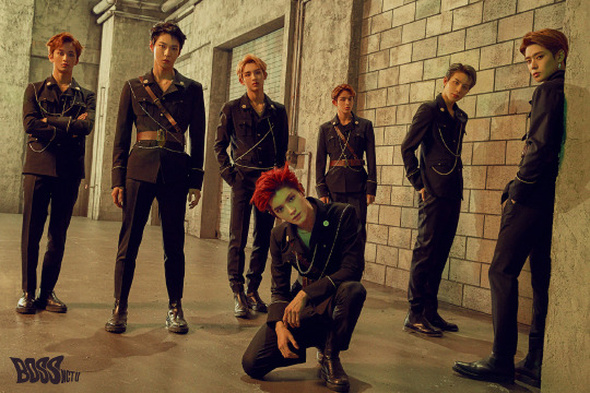
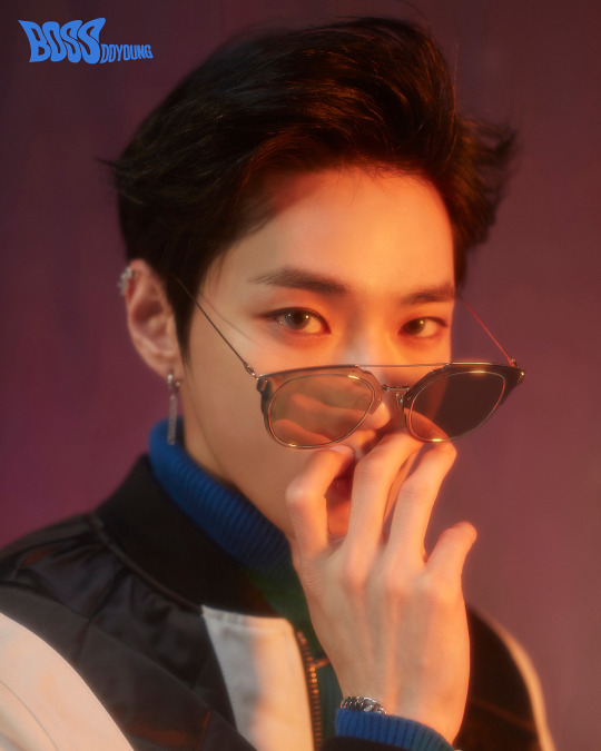
Boss & Baby Don’t Stop (they’re different but they go together in my mind lol). Look at them in their uniforms! And also they had doyoung wearing these sunglasses
Ok I think I’m done, if you’ve made it this far thank you so much and I hope it was a nice read!!
As for who would I chose as my models…it really depends on what I’d make them wear tbh for menswear the things I’d like to design would either be something like formal wear or knitwear – I’d pick Lucas, Taeyong and Doyoung (I think they’re the most model-like members and could pull off pretty much anything even my non-edgy concept because I can’t do that lol and they pose very well) and then depending on the concept I’d pick between Winwin, Jaehyun, Kun, Jungwoo, Taeil, Haechan and Shotaro (the way I struggled to remember all the members at once…there are too many really)
#this is soooo long omg I didn't know I had that much to say wow#I hope you've managed to read it all and that it was somewhat coherent and clear#now it's time to eat#nct#nct 127#nct dream#wayv#nct 2020#fashion#leemarx#I've got mail#vinformation
34 notes
·
View notes
Text
FIFA 20 Review
New Post has been published on https://gamerszone.tn/fifa-20-review/
FIFA 20 Review

I’ve had to reassess the way I’ve played FIFA this year, which is something I haven’t had to do in many years through all the tweaks, changes and so called “game-changing mechanics”. FIFA 20
feels different to previous years; in some ways for the better, but in others not. Volta, a brand-new way to play FIFA that offers a breath of fresh air to the series – albeit not without its own faults – is here, but does it come at the expense of the game as a whole?
Every IGN FIFA Game Review Ever

Last year, many of FIFA 19’s gameplay innovations were based on the attacking game, from timed-finishes to the basics of how the ball could be nudged into space with a flick of the stick. FIFA 20 swings the pendulum back the other way and puts much more emphasis on the other side of the ball. The way you defend has been overhauled and has never felt more crucial. You can no longer heedlessly charge at a defender, hold down the tackle button, and hope for the best. You’re punished for not thinking about defensive play to the same extent you would building an attack, due to the high level of risk-reward when going in for a challenge; time it well and you’ll likely take the ball cleanly and win possession. Misjudge the timing, however, and you’re punished with a foul or left watching as your opponent skips over your trailing leg.
The way you defend has been overhauled and has never felt more crucial.
“
This is due in part to a new weapon attackers now have in their arsenal in the form of strafe dribbling. You can square up to a defender by holding the left bumper and attempt to shimmy past, ultimately creating a yard of space needed for a cross or shot. It’s a useful tool that provides more options when in control of the ball. If successful, at the very least you’ll get fouled, giving you the chance to try out the new way set-pieces are taken. EA has seemingly taken inspiration from the now-dormant PGA Tour golf series when it comes to taking direct free kicks, because now you first place a target where you want to aim, then add spin with the right stick as the taker approaches the ball. This technique opens up new possibilities and can produce some great-looking finishes. It’s initially difficult to get to grips with but I found myself enjoying it greatly, especially in comparison the simplistic ways they’ve worked in previous games.
For more on specific gameplay changes, check out the video below:
Get past your man without being chopped down, however, and you’re in luck, as you’ll likely have the pace to ward them off and bear down on goal. This is thanks to a welcome adjustment of how player speed works in FIFA 20. A common FIFA 19 frustration was how easily slow defenders would often be able to catch up with much faster attackers; I’m happy to report that’s no longer the case here, and the sight of an aging Mats Hummels quickly closing in on a spritely Raheem Sterling is no longer a regular occurrence.
Add another new addition, the set-up touch, and a devastating combo is possible. By rolling the ball into space by holding the right bumper and flicking the right stick, you’re then able to hit a vicious shot on goal. This often creates some blockbuster moments and, when pulled off correctly, feels great. Sadly, FIFA 20 provides little opportunity to actually achieve this, because the set-up animation feels like it takes an age to complete, and often you’re crowded out by tenacious defenders before getting your effort on goal away.
FIFA 20 and VOLTA Mode

This loops back to the defensive overhaul implemented in FIFA 20. Defensive AI is far more intelligent and they’ll intercept passes and block shots much more often. Lofted through balls are no longer anywhere near as effective as they once were, as defenders are better at reading the game and provide more of a challenge than I’m used to when playing FIFA.
As a result I’ve found myself playing more on the counter-attack, which in turn has led to my biggest frustration with this year’s outing: it feels completely two paced. The players have returned to being lightning-quick, but that feels completely at odds with the speed at which the ball wants to move. New ball physics cause it to bobble and get slowed down grass more realistically, which admittedly looks great, but it also interrupts the flow of the game. It’s like listening to a song with someone sporadically pressing the half-speed button every time you hit a groove.
My biggest frustration with this year’s outing: it feels completely two paced.
“
This, coupled with the more realistic ways players turn, both on and off the ball, slows down the pace considerably, and some players’ turning circles are unusually large. I’m all for creating as authentic a football experience as possible – and something that FIFA excels in its presentation – but I fundamentally want it to be fun first. For me, football games have often been at their best when they don’t take themselves too seriously and embrace the silly side of the game. Whether that be the long-lost penguin outfits in the golden era of PES or the pure slapstick, arcade fun of FIFA Street. Luckily, there is still room for plenty of that in FIFA 20, even if it’s hard to find in its core 90-minute match modes.
For more a full match of FIFA 20 in 4K, check out the video below:
The Marred Volta
Volta is the grandstand addition to FIFA 20 and is an amalgamation of FIFA Street and the more recent story-based Journey mode. In many ways it’s a successful combination: there’s a lot of variety and perhaps even enough to do to to warrant a standalone release without provoking too many gripes. That alone nullifies the argument that FIFA 20 is just a reskin of the previous year’s version.
There are three ways to play Volta: Tour, League and Story, each of which is appealing in different measure. Tour is where you go to play matches against the CPU, using squads pulled from the server that have been built by other players. Once you beat a squad you can recruit a player from that team to join yours, similar to Need for Speed’s pink slip system. It also allows you to choose which of the 17 worldwide locations and forms of street football you’d like to play. Each of these global arenas has been beautifully crafted and has its own unique atmosphere, while also offering a genuinely different gameplay experience – though some with greater success than others. I much preferred the larger pitches like Rio de Janeiro’s favela or the Berlin gymnasium rather than the claustrophobic cages of Tokyo’s sky-high rooftops.
To see all of the different Volta modes, check out the video below:
Matches on these smaller pitches often descend into chaos, with balls bouncing between knees, concrete and chain fences, and very little football actually taking place. Repeatedly hitting shoot to see where the bounces was often the most successful tactic, repeating until it finds the back of the net. But on more open pitches, Volta really comes into its own. There’s time and space to pass the ball around, with enough scope to add flourishes like tricks and flicks. That said, if you overplay flair you’ll be punished, because Volta is much more rooted in classic FIFA than the old Street games. There are no bonus points for skills moves, they’re just another way to help win the match. It feels good to achieve a balance of the two, even if in my heart I yearn for the days of getting Peter Crouch to panna every opponent in sight.
If you overplay flair you’ll be punished, because Volta is much more rooted in classic FIFA than the old Street games.
“
There are subtle differences between the matches, some more engaging than others. Futsal is the pick of the bunch and the one most grounded in the traditional 11v11 game. The lack of walls to bounce the ball off provide an extra challenge and prevent matches descending into something akin to pinball. 4v4 and 5v5 play much like Futsal and are also enjoyable, with the major difference being manual shooting. This takes some getting used to, especially if you’re used to the assists the core game gives you, but it’s ultimately rewarding.
3v3 rush and 4v4 rush aren’t quite so enjoyable. It is essentially a three or four-aside match with one crucial difference – there are no goalkeepers. You therefore rely on defensive players to block incoming shots, something they’re often not that great at doing. Countless times I’d watch tame shots trundle towards a defender, only for them to let it roll past and straight into the goal. This happened regularly, with both AI and player-controlled defenders, leaving me infuriated when matches ended up 15-14. On the rare occasion a player blocked the ball, it would more often than not ping back to the attacker, who would then score anyway. This, coupled with the compact arenas, means you rarely ever feel in control of the outcome of a rush match, so it’s doubly frustrating a majority of Volta’s campaign mode is made up of these games.
To watch the first 11 minutes of Volta Story, check out the video below:
As for Volta’s story, it’s pure cheese and its cliché-laden plot will be familiar to anyone who has seen an underdog sports movie. The Journey’s branching storylines are gone, replaced by a rags to riches narrative that’s functional if forgettable. The acting is mixed, with one-dimensional robots sitting alongside more believable characters, like your loyal best friend, Syd. Although the cutscenes often feel repetitive, Volta is never the slog The Journey was, and is over in five to six hours. Progress is only halted if you lose a match, meaning you have to start the whole tournament again, which can mean replaying up to three or four matches. This can be frustrating, especially if it consists of the less appealing three or four aside rush ruleset.
Volta is never the slog The Journey was, and is over in five to six hours.
“
Naturally, there’s a wealth of customisation available. Importantly, these vanity items – tops, shoes, hairstyles and so on – can be purchased only with Volta coins, a currency earned through playing matches within Volta, which is currently a microtransaction-free zone. While I spent time tailoring my player’s look at the beginning of the story mode, I soon settled on a style I liked and little attention to it afterwards. However, I can really see customisation coming into its own in the Volta League mode.
League is Volta’s online game and is where you’ll likely spend most of your time, especially after completing the story mode, which offers little replay value. The premise is simple: face off against other online opponents to climb the rankings, while at the same time showcasing your squad and vanity items. Its approach is similar to Seasons in the core game, opening up every match type and location.
Volta is also available in kickoff mode should you fancy a quick game, alongside the options to add house rules. Last year’s selection are still present, with survival mode a particular highlight, especially as Volta means you’re reduced to one player each.
Modes, Modes and More Modes
Outside Volta, there are numerous additions to other modes in FIFA 20. House Rules gets a couple of new options: King of the Hill is a possession-based mode I can see myself spending little time with, while Mystery Ball is pure madness. Every time the ball goes out of play a new appears on the pitch, with a different ‘perk’ altering its physics each time. These include dribbling, speed and shooting boosts, to one ball that has all three combined. Panic ensues every time this ball comes into play, because the player in possession can breeze past defenders before slapping the ball into the net. It’s the kind of silliness I want from FIFA and continues the trend of last year’s fun additions.
Mystery Ball is pure madness.
“
Ultimate Team also benefits from House Rules modes this year, with a couple exclusive to FUT. Max Chemistry and Swaps modes are fun, but I can’t see them being a massive time suck for people already invested in FUT’s loop. They’re found in the new FUT Friendlies section, meaning you can take your assembled squad offline and play with a friend. It’s a quality-of-life improvement for those who don’t want to worry about player fitness or contracts running down.
For a full match of Mystery Ball, check out the video below:
For those going online, there are new Season Objectives. Much like a battle pass system, it sets challenges which rewards items only exclusive to this mode. Some are vanity items that express more of that welcome silliness in FIFA, introducing such things as a retro 16-bit ball and a dabbing unicorn tifo for your stadium. These are all positive changes that add a bit of personalisation to the FUT experience, which is much needed when a lot of squads are filled with the same handful of players, causing the whole thing to become a little homogenised.
Unsurprising Mechanics
One thing that hasn’t changed are the microtransactions. Card packs are still available and people will continue to buy them. EA has stated it has no plans to alter its approach to “surprise mechanics” unless laws are passed. As of yet, very little progress has been made on this front, but who knows, maybe by the time FIFA 21 comes around things might have changed. There have been baby steps made this year in regards to cards. Icons will now cost less on the transfer market, but the chances of obtaining one via a pack are still ludicrously low. In short, microtransactions still look to be an issue in FUT 20, with many fans vocal about their inclusion and inherent pay-to-win nature.
For more on changes to FUT in FIFA 20, check out the video below:
Another thing people have been hoping for is an overhauled career mode. For years now, it’s been overlooked. To be fair, in FIFA 20 some additions have been made, but none are big enough to make it an instantly more appealing game mode than it was last year or the year before that. Much as in Volta, you can now select to be male or female when choosing your playable manager, which is a step in the right direction. But apart from that, a largely ineffectual morale system and unimaginative press conference sequences are entirely underwhelming. It’s sad to see a mode that used to be my go-to in FIFA continue to formerly be my go-to in FIFA. Hey, there’s always next year.
Source : IGN
0 notes
Last Seen Blogs

hisui-lupo
Hisui-Lupo


hissa-abdallah
sudaderas.biz

friendsoneepisodeonescene
friends one episode one scene
peterbloxham-blog
yes, fine.