#books rankings
Explore tagged Tumblr posts
Text

it’s like there’s an audience.
#no i haven’t gotten to the eyes bit#don’t tell me about them#i’ve just seen a lot of fanart in the past where he’s plagued by ‘the eyes’#JUST SMILE AND WAVE DONT TELL ME WHAT THE CONTEXT IS#my tma friend said ‘that’s just him’ and that’s very high praise in my book#it’s like showing a priest a depiction of jesus and him going ‘yeah you captured his essence very well’#i think. i. idk. JKWHAJAHA#I RANK IT AS VERY HIGH PRAISE NONTHELESS#tma#the magnus archives#tma podcast#tma fanart#jon tma#jonathan sims#tma jon
1K notes
·
View notes
Text
To anyone who was genuinely excited/optimistic for this movie until now

#personally I’d rank them: Redstone; voyage; island in terms of enjoyment#but Voyage could’ve made an incredible minecraft movie#books#minecraft#minecraft movie
457 notes
·
View notes
Text
I think the effects of leaving a fandom unsupervised for too long needs to be studied
#watching the svsss fandom explode with skincreatures again like a scientist in a lab#interesting... interesting.....#the fact that svsss made it so high onto the tumblr rankings this year despite getting absolutely no new content#makes me think it was all the fandom's doing#and therefore makes me think it can be blamed on the skincreatures#which is. so insane.#there is something truly special about the svsss fandom#which i think is a combination of factors#namely that the source material is the freaks and sickos book made for freaks and sickos (said with affection. im one of those sickos)#so the fandom is already primed for weird content#and then an absolute drought of new official content for several years means the fandom is left to its own devices#meaning people will make their own new content to be insane about#and for some reason. that is skincreatures.#i really can't help but wonder what people who aren't in the svsss fandom think whenever they see those things lol
268 notes
·
View notes
Text
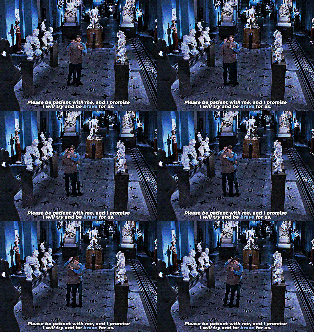


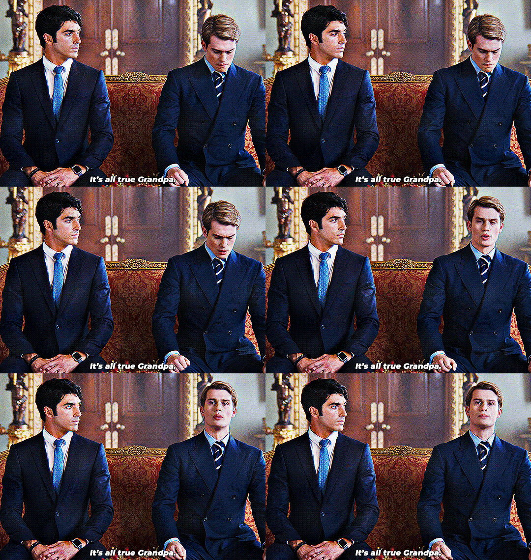



Hey, have I told you lately that you're brave?
#rwrb#rwrbedit#red white and royal blue#alex x henry#firstprince#userninz#userveronika#usersteen#usernuria#chrissiewatts#userclara#usermegbs#userkhael#mine*#trying to get rid of some of my drafts bc godd knows they are stacking up aLdlkjfgf#anyway i was thinking about this again and got emo#also henry's monologue in the book where he ripped philip a new one will always be famous#let henry swear in the sequel pls#anyway henry fox you Are Loved :(#the only time he really pulled rank was when he wanted to speak to alex#all in that moment was checking he was okay and to reach him :(
1K notes
·
View notes
Text
just because YOU don’t know why the eighth doctkr is half human doesn’t mean it’s dumb or bad. there’s literally a reason explicitly given in canon and yet every body is always like “ohh it was a dumb joke” “everybody ignored it anyway” “it wasn’t brought up again”. just say you’re uninformed it’s okay. i promkse you. go read interference books one and two and then you can join the discussion. maybe the blue angel too
#NO it wasn’t because of the toymaker or river song or whatever the Fuck… what are you talking about#faction paradox literally infected his biodata with a virus while he was the third doctor that matured over his regenerations until#he was half human in his 8th. because it makes his entire time line a paradox (he wasn’t half human until he was)#because the faction wanted him in their ranks. and they thought it would be funny too#and that’s why he doesn’t have a shadow for a couple of books. okay? okay okay? okay? okay? are you listening to me#you can pry him being half human out of my cold dead hands#because it’s THEMSTICALLY RELEVANT in his books#he is half human by nature. and then he is half human by nurture#(he is half human due to the faction’s Virus & Meddling)#(he is half human after having spent over 100 years living with them with no prior recollection of who he was)#either way he doesn’t truly know himself#doctor who#eighth doctor#edas
253 notes
·
View notes
Text
when kakashi and iruka announce they’re dating (they tell gai and gai tells everyone via a very loud ‘congratulations on your young and blooming love’) every auntie within a 200 mile radius drops to their knees in agony bc who are their sons and daughters supposed to marry now if not iruka-sensei??
#and kakashi makes it onto a specific kind of bingo book as a a-rank threat#iruka being konoha’s most eligible bachelor is canon. to me.#kakairu#kkir
341 notes
·
View notes
Text
Book Publishing Resources
Well, since a few people said they were interested and/or that posting about it on here occasionally was a decent idea, here we go!
I'm MC Calvi, a freelance editor specializing in self-help, psychology, spirituality, paganism, workbooks, and LGBTQ books.
You can find out more about me at my website, where I also offer free twenty-minute book/publishing consultations, in addition to regular editing services.
I am also now offering some pay-what-you-can resources on my website and on Gumroad. I'm committed to offering pay-what-you-can resources because the odds are already so stacked against marginalized authors, and publishing shouldn't be pay to win.
I have two new booklets I'm actually super happy with! They both draw on my eight years of experience in the publishing industry to give authors a leg up.
And now, back to our regularly scheduled programming as I hit "publish" on another good news post!
#Also if you're not interested but still want to help/support me#it would actually be super helpful if you reblogged this#because having my website link in more places will help boost my ranking in search engines#I promise not to post about this often#like we're talking less than once a month#I'm here to spread good news! not to spam my stuff!#and everything I do post will be tagged with#my editing#in case you want to filter#book editing#publishing#publishing tips#book publishing#indie author#self publishing#not news
263 notes
·
View notes
Text


"We will help you, Natsume-dono!"
#natsume´s book of friends#natsume yuujinchou#natsume season 7#natsume takashi#nyanko sensei#madara#fyanimegifs#fyanimanga#animanga#shoujoedit#shoujo#allanimanga#dailyanime#anisource#anime#animeedit#anime gifs#gifs#gifset#allanimations#cats#youkai#sebfreaks gif#mid ranks#hinoe#mizusu#the dog´s circle#no this quote isnt 100% from the anime#but they said something like this#just wanted to use natsume-dono lol
169 notes
·
View notes
Text


I've been thinking about LEP uniforms again.
My personal design for the LEPrecon uniforms is a "fake" jumpsuit with trousers and jacket, with an additional vest on top, for combat missions. Wings either attach or are part of the vest. Tool belt, and vambraces that have their wrist computers. (Holly as Captain, Trouble as Major).
The Traffic uniform is brighter than normal LEP uniform for the sake of visibility and the vest has a screen on the front and back as officers on traffic duty are described as "walking road signs". The commander's uniform is blue, but otherwise the same as any other LEPrecon uniform. (Holly as Corporal, Trouble as Commander).
Tool belt includes: Moonbelt, gun holster, buzz baton, handcuffs + additional zipties, pheromone spray (read: pepper spray), ammo, omnitool, first aid kit, camouflage foil. Optionally knife and flashlight.
The uniforms have rank insignia as well as name tags. The ranks in the books are... weird, so far we have: Cadet, Private, Corporal, Sergeant, Lieutenant, Commandant, Captain, Major, Commodore, Wing Commander and Commander (roughly in that order). I've also given different acorn clusters to different ranks; from Private to Commandant one acorn, from Captain to Commodore cluster of two acorns, and for Wing Commander and Commander cluster of three acorns.
#af#artemis fowl#holly short#trouble kelp#my art#val talks#i'm once again absolutely baffled by the ranks in LEP#so many lower ranks#so few senior/ general ranks#why is no one in this police force a detective or an inspector#if they are military where are colonels and generals#fucking HELP#anyway I put them roughly in order cause most of these don't appear in the same command structures so if it doesn't make sense blame Colfer#for example in book 1 as a Lieutenant Cudgeon was in command of a Captain even tho Captain is a higher rank#also some of these only get mentioned once like sergeant and commandant#anyway i tried#also about the pheromone spray don't look at me Colfer is the one who put it in the books#I might add the rank insignia later#if i draw them#posts that are ✨ just for me ✨#af headcanons
125 notes
·
View notes
Text
new book new poll let's go
NOT which one you think is objectively best. which one is your FAVORITE
#I really do think the the sunshine court might be my favorite aftg book#but the golden raven is a REALLY strong contender#i need to read it again to fully form my opinion on the ranking#vin speaks#aftg#all for the game#nora sakavic#the foxhole court#the raven king#the king's men#the sunshine court#the golden raven#neil josten#andrew minyard#kevin day#jean moreau#jeremy knox
187 notes
·
View notes
Text

POV: you’re a mal and you just interrupted their study date session (rip)
(mini-rant and bonus under the cut)
i arise from the dead to share this because I am so brainrotted and also so goddam DESPERATE!!! I NEED people to read the scholomance series by naomi novik pls pls PLS i love them so much i'm actually going INSANE
also i tried out new brushes and a new way of coloring for this so idk how i'm feeling about it but i had fun i guess?? here's the flat colors before rendering because i like how it looks as well hehe

anyway i'm going to slowly spiral by myself about this series :DDD I NEED MORE PEOPLE TO TALK TO ABOUT IT AAA
#like what do you MEAN there are like 3 people in the fandom#i fear these two are joining the ranks of the top TIER book couples!!!#i do not bestow this honor lightly#dont get me wrong there is some wonderful art out there for the books but i need MOREEEE#so i took it upon myself to contribute SKKSKS#like flatout i haven't made full on illustration level fanart in a hot minute these days it's usually a huge bunch of sketches#but this series awakened something in me HAHFKJSLHF#A Deadly Education#The Scholomance#Scholomance#Orion Lake#Galadriel Higgins#El Higgins#like what even is their shipname???? oh my god HELP#my art#fanart#artists on tumblr
88 notes
·
View notes
Text
JSTOR Wrapped: top ten JSTOR articles of 2023
Coo, Lyndsay. “A Tale of Two Sisters: Studies in Sophocles’ Tereus.” Transactions of the American Philological Association 143, no. 2 (2013): 349–84.
Finglass, P. J. “A New Fragment of Sophocles’ ‘Tereus.’” Zeitschrift Für Papyrologie Und Epigraphik 200 (2016): 61–85.
Foxhall, Lin. “Pandora Unbound: A Feminist Critique of Foucault’s History of Sexuality.” In Sex and Difference in Ancient Greece and Rome, edited by Mark Golden and Peter Toohey, 167–82. Edinburgh University Press, 2003.
Garrison, Elise P. “Eurydice’s Final Exit to Suicide in the ‘Antigone.’” The Classical World 82, no. 6 (1989): 431–35.
Grethlein, Jonas. “Eine Anthropologie Des Essens: Der Essensstreit in Der ‘Ilias’ Und Die Erntemetapher in Il. 19, 221-224.” Hermes 133, no. 3 (2005): 257–79.
McClure, Laura. “Tokens of Identity: Gender and Recognition in Greek Tragedy.” Illinois Classical Studies 40, no. 2 (2015): 219–36.
Purves, Alex C. “Wind and Time in Homeric Epic.” Transactions of the American Philological Association 140, no. 2 (2010): 323–50.
Richlin, Amy. “Gender and Rhetoric: Producing Manhood in the Schools.” In Sex and Difference in Ancient Greece and Rome, edited by Mark Golden and Peter Toohey, 202–20. Edinburgh University Press, 2003.
Rood, Naomi. “Four Silences in Sophocles�� ‘Trachiniae.’” Arethusa 43, no. 3 (2010): 345–64.
Zeitlin, Froma I. “The Dynamics of Misogyny: Myth and Mythmaking in the Oresteia.” Arethusa 11, no. 1/2 (1978): 149–84.
#alphabetical order. im not ranking them#i still have two more froma zeitlin essays to read (one new and one a reread) in the next few days though#and its possible one of those might knock amy richlin off the rest (nothing personal; its a great piece just not my area)#but if im willing to have two things by the same scholar i would have to rethink including grethlein 'the poetics of the bath in the iliad'#some of my favorite articles/book chapters of the year are not on jstor though...#bill beck 'lost in the middle: story time and discourse time in the iliad'!!!#and lyndsay coo has a 2020 chapter updating and expanding this 2013 article that is 🔥🔥🔥#and of course judith mossman 'women's voices in sophocles' which is what send me to garrison 1989 and rood 2010 but is not itself on jstor#i also reread some of melissa mueller's objects as actors book which is wonderful as always#and i would be incredibly tempted to put william m calder iii's tereus article on a top ten list for sheer entertainment value#jstor wrapped#mine
501 notes
·
View notes
Text
100 Moby-Dick covers ranked by your's truly. Thank you so much to all those of you who sent in contributions and helped make this completely out of proportion project a thing. Jars of angelic spermaceti for everyone! 🤍
As for the ranking, it is purely the result of my own personal taste in aesthetics and heavily influenced by my perception of the story. Add to that a generous amount of sentimentality, as shall be apparent.
What I have been mainly looking at in judging the designs is as follows...
- General appearance; is it attractive? 💕
- Does it help sufficiantly communicate the nature of the story (theme, genre, mood, plot)? ⚰️
- Is it canon? (Meaningful creative licence perfectly allowed!) ✅️
As for the tiers themselves, we have...
Topmost Greatness: this is something out of the ordinary, possibly genius and also I neeeeed it for my collection!
A: Good, good stuff, but might lack that very extra special something
B: Gets the job done, agreeable, totally okay.
C: It's not exactly bad and I'll let that oopsie over there slide, but I probably wouldn't pay much for this one.
You Had One Job: Yeah, you did.
Should Never Have Surfaced: Makes the Pequod tragedy look like a merry holiday.
Art thou ready?
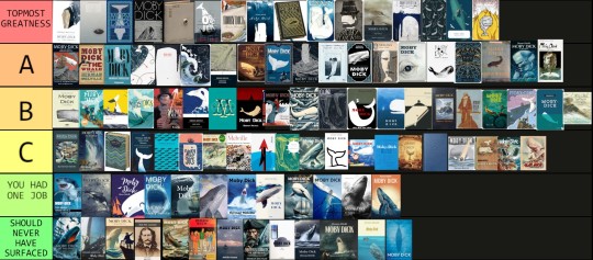
TOPMOST GREATNESS
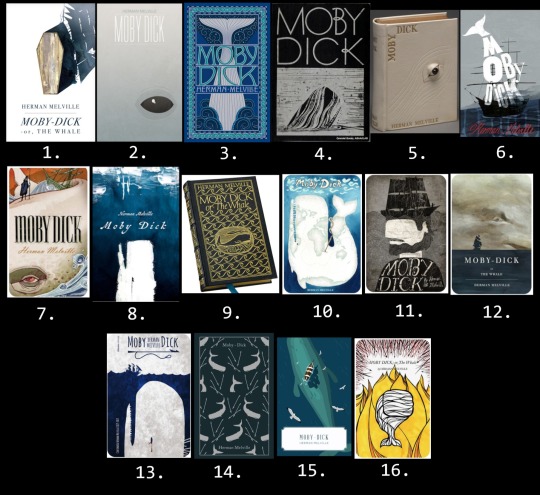
1. The most beautiful Moby-Dick cover I've ever seen. I was almost tempted to create a tier higher than Topmost Greatness only so that I could place it there.
2. Brilliant composition and color choice, despite its simplicity it hits me straight in the soul.
3. I remember drooling over this in the book store back in the day and considered reading it only because it was so gorgeous. Manages to be both crowded and clean at the same time. Story instantly recognizable.
4. The classiest of all time? Forever a winner!
5. I show the image of this one to people to make them understand the creative brilliancy that thrives within the Moby-Dick community.
6. Captures the mood in a fittingly crooked, awkward way that makes my heart beat faster. (Also reminds me of my copy of One Flew Over the Cuckoo's Nest for some reason.)
7. Another sort of awkward one, but I love the style, I love the surreal combination of drama and stiffness, pretty fitting the story itself. Makes 'Hab look a bit like the Grim Reaper.
8. The erratic painting technique gives me the perfect kind of crazy vibes.
9. Moby-Dick, a bibliophile's dream, topmost mood nailing, superior dark academia accessory... what more could anyone wish for in a book?
10. So well thought out and the claustrophobic feel helps to create an unsettling mood despite the otherwise quite cheery colors. Sorry, Madagascar.
11. Look, my two main areas of Moby-Dick interest is Ahab and rhe psychology, so... y'know.
12. Mood certainly set.
13. Guess I have a thing for harpoon/eye symbolism. Again that claustrophobic feel by leaving only a sliver of crowded surface.
14. First physical Moby-Dick copy I ever bought. All the books in this Penguin series are gorgeous, but to me this is one of the design winners regardless of the contents.
15. Unsettled in all this tropical serenity yet?
16. The boldness in color choice and to focus on the fire theme is as unusual as it is exciting, and the very modern touch makes it even more interesting!
A.
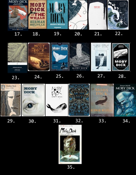
17. Not normally a style I'm drawn to, but somehow this manages to capture my interest. A successful nod to the painting at the Spouter Inn, lovely line work. My sibling got me this one as a locket for my last b-day.
18. My beloved companion, by now containing almost as much tape as paper. The 19th century poster design is irresistable to me. A white tail would've been even cooler though.
19. It's not that unique looking, yet the worn feel and harpooned Moby Dick simply gets to me somehow.
20. All the crucial elements skillfully and effectivly forged (no pun intended) together.
21. The way the psychology has been captured and the missing leg detail is yum!
22. Kind of busy but so unique and interesting! Yes plz.
23. Another classic! How could Kent's iconic whale ever fail?
24. Aiming for the adventure theme, it appears, and successfully so. Unusual color choice which I happen to be all about. Total vintage feel!
25. Again, not that much is happening, but the ropes, the character design, the inking... I love you, cover, and I need you in my life!
26. An often used scene, but the style gets to me so, so bad.
27. I'm not that much about the washed out color, but the rest is love.
28. Very basic, but also very nice and display friendly and I enjoy the vibe so much.
29. Almost made it to Topmost, but the positioning of the illustration gives off a cheap feel to me. Why couldn't you have used that gorgeous theme depiction to better advantage? Can one order a remake? Or a cropped poster?
30. Love the composition so much but the technique simply doesn't do it quite enough for me to move up one full notch. Still want it so bad for the collection though.
31. Runny ink on pure white is something I associate with Moby-Dick, don't know why. The blotchiness is a really great touch.
32. The design doesn't say much concerning the content, but nevertheless it is so pretty and am I correct when I say there's harpoon vibes?
33. Had that been a white whale, it would've ended up under Topmost!
34. My first reaction to this was that it's a really interesting piece of art, but I wasn't so sure I liked it as much in book cover form. The more I look at it, the more intrigued and enamoured I get. I want more of this.
35. Ahab and Moby Dick from Ahab's POV? Love the distorted psychedelic atmosphere, but another one with missed full illustration use potential.
B.
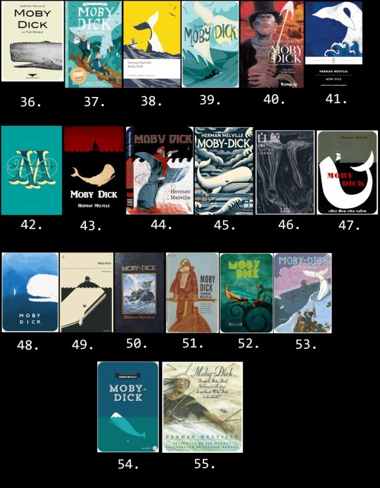
36. Brings back the menory of cigarettes and fear. Granny the Gregory Peck fan owned one of these and it freaked me out where she kept it on display ever after I'd been forced to watch the movie at age 6. Now I want one just for the hell of it.
37. Okay, so hear me out. I know it's a children's book, but the illustrator obviously knew the story. Love the tangling rope and that Ahab's prosthetic leg seems made out of whale bone rather than wood for once.
38. Nice modern touch, but that's straight up the New Bedford whaler statue, which kinda ruins it for me.
39. Lovely, lovely design, but I simply don't associate it with a story about suicidal tendencies, gore, and mass death.
40. A somewhat unusual character choice to pose on a cover, but hey, I'll take it! :D
41. Doesn't pop, but I do like me some traditional Japanese art vibes!
42. Elegant, but the huge M obscures the title text and the harpoon looks as if crossed with a sewing needle.
43. Basic, but the feel is there and I like the color combination for this story.
44. Love the art and it's impossible not to identify which story this is, but I have several Ahab design choice questions which won't leave me.
45. This whole thing is odd and busy, but I also really like it!
46. Speaking of Japanese traditional art. The lines and the moodiness is much to my liking.
47. Simple, spot on, nothing that extra.
48. If only he hadn't looked so damn happy about it as if Ahab was about to throw that harpoon like a stick for him to fetch. Untold plot line??
49. There is this whole sub genre of Moby Dick balancing the Pequod, a concept that certainly works, but by now it has to have that little extra something to seem truly special.
50. We have a less erroneous whale, folks! It may be a stock image, but Ishmael gave this one thumbs up, and so how could I possibly do differently? Nicely done!
51. First, I get strong The Old Man and the Sea impressions. Second, what kind of whale do you intend to kill with that thing, my dude? Points for canonical end game beard though.
52. I assume this is meant as a traditional Polynesian art style nod in honor of our dear Queequeg. The sports wear lining texture in the title letters confuses me though.
53. There certainly are plenty of canon here, but also, this is some odd mayhem and where are you aiming, Captain? Yay, ivory leg again!
54. Basic, works perfectly fine.
55. This is a really odd scene choice to pick for a cover, but I love this edition and its illustrations to bits. In fact, I'm planning on posting a review of it soon.
C.
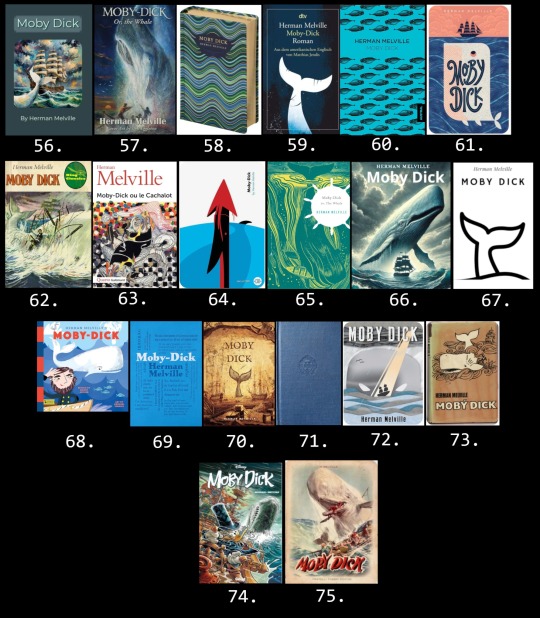
56. I haven't peeked into Melville's mind, but I'm pretty sure the Pequod looked quite different. The story is unmistakable though.
57. Nothing wrong with it, I guess, but way too messy for me to be comfortable with.
58. Not much to say here, but a perfectly nice-looking cover for any book.
59. Gets the job done, but not that inspiring.
60. Despite seemingly little effort behind it, this design based on a 19th century (erroneous) whale drawing could have gone straight up to A. You see, in the original image the (erroneous) whale has his penis (erroneous?) in full view, but on this cover it has been erased. How could I not have given a Moby-Dick book cover depicting dozens of (erroneous) whale dicks A? Alas.
61. Good, professional-looking cover, but judging by the illustration only, I would have guessed this was a children's book about the adventures of a jolly porpoise named Toni.
62. No spoilers to see here or anything. Is that a gold prosthetics??
63. This looks so much like a academic book on psychology. Not too far off, I suppose, but I wouldn't be able to figure out which famous story it is.
64. The Temple toggle harpoon was invented in 1848. Do with this information what you will.
65. Hey! That other cover from before! Have to say that the color alterations and helm sihouette wasn't an improvement.
66. A bit extreme for me.
67. I call this excessive simplicity. If you need a copy of Moby-Dick, you will recognize it at once, but it might not attract new readers merely in itself.
68. Just because it's a children's book doesn't mean the vibe has to be off, but I think it is in this case. Recently posted an example of this illustrator's adorable Ishmael here.
69. Where's the title? Confusing for a cover, but I would love this for a poster of mug! Also, the biggest words are Ahab, Queequeg, and Pequod, which I find mildly insulting towards a certain someone. What was he called again?
70. Cool whale picture which I really like, but the accuracy for Moby-Dick isn't really there.
71. It's blue.
72. I understand the idea and the illustration is awesome, but for me, the vibe is strangely all off and I get almost a comedic feel. Again, that's just me.
73. I often feel like an Ahab apologist and can often be somewhat harsh on the whale, but holy shit! A sort of red herring situation meant to make the reader think Ahab will be the winner?
74. It looks full of action and Scrooge's Ahab cosplay look is really neat, but I have... concerns.
75. I don't remember the scene playing out like this and Ahab is clearly not having it.
YOU HAD ONE JOB
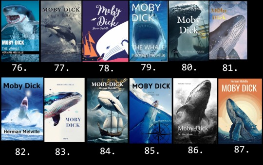
76. The exact face I made the first time I saw this kind of cover.
77. After all the people I've heard at the museum mistaking the sperm whale skeleton for an orca, I'm honestly surprised these fails aren't more common. The snowy setting is a nice touch.
78. Hast seen the white beluga?!
79. First shark Moby-Dick I ever saw and during my first week on Tumblr even. The nostalgia is real, shipmates.
80. Cool scene. Where is it from?
81. Come on! This is a fucking Wordsworth's edition!
82. My sentiments exactly.
83. No, it isn't.
84. At first I seriously thought this was some interesting modern sci-fi/fantasy take on Moby-Dick. Nope.
85. At least the person who did this one bothered to give it a traditional nautical flair.
86. The ocean is canon.
87. *screaming shark mode*
SHOULD NEVER HAVE SURFACED
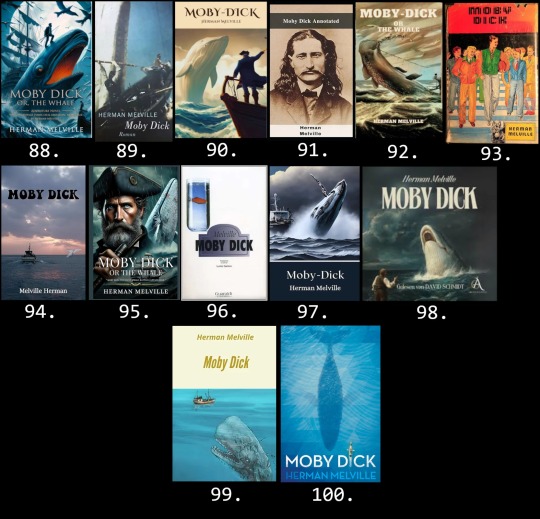
88. Someone's dad is balancing on top of a fire breathing eel whilst ravens are flying around and a poor guy has dark thoughts in the bottom right corner and... I dunno, man. "Whaling voyage turns fatal obsession" apparently. Moby-Dick the Prequel?
89. Whoa, dude!! I know you're angry, but holy shit!
90. "Captain Ahab? He went that way. Me? Just your average cliché 18th century pirate. If you don't mind me asking, sir, what sort of creature are you?"
91. By "annotated" they mean the truth about Wild Bill Hickok's one time side gig as a whaler. There's a fan fiction idea for ya.
92. What in the everloving AI fuck is happening here?
93. Friends, your guesses are as good as mine.
94. In the early 2020s, the ghost of Melville Herman set out to find the ghost of Moby Dick.
95. I guess we never learned what Ahab's dad died from back in the 18th century. Runs in the family and all that.
96. ?????????
97. If you download a public domain work to sell on Amazon for a possible extra buck, taking one minute to check the basic plot before slapping a stock image on it for a cover will be an actual long term investment.
98. "Lol! U overbite!"
99. Well, he is clearly a zombie whale, so maybe this is the sequel then?
100. And thus endeth MOBY D CK.
#moby dick#herman melville#literature#classic literature#ishmael#captain ahab#queequeg#moby dick spoilers#whale weekly#book tier list#tier list#moby dick tier list#moby dick projects#for fun#ranking#i'm dead
87 notes
·
View notes
Note
what's your opinion on whether or not canon zutara could have made sense to happen by the finale?? i can't decide if i would have preferred them getting together or just hints at it and then it's revealed in tlok that they got married (and ig the comics would include the story of them getting together then)
my stance has always been that the show should have ended with no canonical romantic relationships, or a hint of future zutara at best. we didn't need anything more than a quick, intimate scene where zuko and katara discuss their futures and promise to keep in touch, with maybe a lingering glance or two to foreshadow romantic feelings. no kiss or grand declarations necessary.
that being said, if a romantic relationship had to happen, zutara was both built up more and made more sense narratively than kat.aang and mai.ko. i wouldn't have liked a zutara kiss in the finale for many of the same reasons i didn't like the kat.aang one, but it would've at least been thematically fitting and consistent with the characterizations of everyone involved - unlike zuko ending up with someone who never underwent any of the growth he did, and katara entering a lifelong romantic relationship without even so much as a word to give us insight into her sudden change of heart.
the only way to really do justice to zutara would've been with book 4, allowing plenty of time for a proper slowburn friends-to-lovers arc, but the reason so many people ship them today is because their relationship at the end of the show is the perfect jumping-off point for a romance. canon didn't actually have to give us anything more - the seeds were all planted already, and the imagination of the fandom would've done the rest.
#zutara#anti kataang#anti maiko#they should've taken a leaf out of carmen sandiego's book#and left it up to the fans to decide what came next#every day i remember that atla chose to resolve the babysitter crush storyline instead of literally anything else in aang's arc#that ranks at no. 2 on worst decisions of all time surpassed only by bryke going for the m. night movie instead of book 4
203 notes
·
View notes
Text

AYYYY!!! MOVING UP IN THE WORLD
🥳🎉🎊💀⚔️🎊🎉🥳
#griddlehark#number one in books and the top 50 in ALL SHIPPING!!#LET'S GO LESBIANS!!#(and we're not even the highest ranked lesbians on the list. nice.)#year in review#the locked tomb
315 notes
·
View notes
Text

W.H. Rankin - Isometric Way to Instant Fitness - Sphere - 1970
#witches#marines#occult#vintage#isometric way to instant fitness#isometric#fitness#instant fitness#u.s. marine corps#sphere books#health#strenght#slimness#w.h. rankin#ranks#1970#blondie
55 notes
·
View notes