#bluelines
Explore tagged Tumblr posts
Text

Summits
21 x 29,7cm, ink on paper, Kevin Lucbert, 2025
83 notes
·
View notes
Text

Feel me thru you
#aesthetic#alternative#grunge#dark aesthetic#dark art#darkness#deep thoughts#vintage#bluelines#grungy blog#feeling blue#dark academia
39 notes
·
View notes
Text
🎵 Spinning: Massive Attack – Blue Lines 🔥
A trip-hop masterpiece that defined a genre! Blue Lines (1991) by Massive Attack is an iconic fusion of hip-hop, dub, soul, and electronic music—a sonic revolution that still resonates today. With tracks like Unfinished Sympathy and Safe from Harm, this album remains a must-listen for any music lover.
🖤 What’s your favorite track from Blue Lines? Drop it in the comments!

📌 #MassiveAttack #BlueLines #TripHop #NowSpinning #VinylCollection #MusicLovers #ElectronicMusic #ClassicAlbum
#MassiveAttack#BlueLines#TripHop#NowSpinning#VinylCollection#MusicLovers#ElectronicMusic#ClassicAlbum#chillout vibes#chillout
2 notes
·
View notes
Text
Monday's image: July 29, 2024
Liliane Lijn, Headborn, Glass, bronze and leather, 414 x 303 x 285 millimeters, 1987-90, Tate, U.K.
#mc_embed_signup{background:#fff; false;clear:left; font:14px Helvetica,Arial,sans-serif; width: 600px;} /* Add your own Mailchimp form style overrides in your site stylesheet or in this style block. We recommend moving this block and the preceding CSS link to the HEAD of your HTML file. */
Subscribe to Monday's image
* indicates required
Email Address *
First Name
Last Name
(function($) {window.fnames = new Array(); window.ftypes = new Array();fnames[0]='EMAIL';ftypes[0]='email';fnames[1]='FNAME';ftypes[1]='text';fnames[2]='LNAME';ftypes[2]='text';fnames[3]='ADDRESS';ftypes[3]='address';fnames[4]='PHONE';ftypes[4]='phone';}(jQuery));var $mcj = jQuery.noConflict(true);
#Proust'sQuestions#LilianeLijn#sculpture#glass#bronze#leather#mixedmedia#bluelines#TateUK#DeMorgen#Brussels#Belgium#animation#Futurama#Season12getsunderway#Doescultseries'Futurama'stillhaveafuture?#Noisesurveyof'TheCause'#Annoyancenumberone#fouroutoffiveFlemings#trafficnoise#Thensummerafterall#icecream#children#Butarebarsandpotatocropsstillsalvageable?#'TheyDumpedMeInTheDesert'#themigrationdealwithTunisia#FranciscoSchuster#Belgianvoiceactor#'InhighschoolIstartedpraying'#'Itgivesmecourageandstrength'
0 notes
Text

art trade with royinterrupted on twitter C:
#punchline#dc#dc punchline#bluebird#dc bluebird#dc fanart#dc comics#harper row#alexis kaye#the joker (2021)#blueline
128 notes
·
View notes
Text

There was movement.
(Probably) Two Spotted Blueline Butterfly, Quamby Hotel.
On my travels.
#original photographers#nature photography#wildlife photography#insect photography#Two Spotted Blueline Butterfly#on my travels#Quamby Hotel
34 notes
·
View notes
Text
Ok so... this person, @curly-b-blog asked me to criticize this art. So here I am.

For context this piece is supposed to replicate this panel shot in the switcheroo au made by @saiscribbles.

Because Curly thinks that the anatomy is bad and tried to fix her art. Even though there's nothing really wrong with it. Hell, the only reason why Curly is giving this "criticism" this is because Sai is against Lily Orchard and Curly is defending Lily Orchard for some reason. Here's the post if you want to look at it: Curly's "Critique" Originally I wasn't gonna say anything, but they asked for critique so here I am. I'll also be I will be comparing the two drawings because I Curly is blowing things out of proportion. And I genuinely hope she can learn. Because unlike Curly I don't give people criticism to bash other people and hinder them. I give it because I genuinely want people to learn and grow. Anyways onto the criticism.
I'm gonna point out that Curly added 5 fingers on one hand and 4 on the other. It's a simple mistake I know, but I wanted to point it out in case it happens again for the future. Or if they just didn't notice. The main thing I have a problem is with the legs on Curly. It's very stiff and static for a pose that should be fluid and expressive. It doesn't help that perspective of the legs doesn't match up with the body. You see the reason why Sai's drawing works is because the body is all in one perspective, adiagonal one, meanwhile Curly's is a more front facing one. Here's a picture to help demonstrate since I know I don't explain things very well:

That's why the legs don't exactly work out and it looks confusing. Especially when you consider that the hips aren't stretched out. In Sai's you can see that that the hips are stretched to match the movement of the legs. Meanwhile Curly's doesn't, they're just big ol balloons that don't go anywhere. Making the pose seem like it's stiff and unmoving even though the drawing is clearly depicting the character walking. I reworked the pose since again I'm not good at explaining things. And I know some people are visual learners.

I know Curly's gonna say something like: "Well that was the point since Sai's legs weren't right at all. You just proved my point sweetie." However like I said Sai's perspective is more diagonal one, and Spinel is a cartoon gem so her anatomy isn't exactly human. in fact the legs come out of Spinel's poofy hips. They aren't like a normal humans. And also I don't think it's the leg that's the issue. I think it's the white frills connecting to the leg. I think they should be more of an angle rather than a side view and not the actual leg. Anyways that's all I have to say, hope this was helpful.
#mera rambles#criticism#redlining#or in my case bluelining#I swear this isn't meant to be a critic blog#it's just this one time#unless someone deliberately asks#idk how to tag
17 notes
·
View notes
Text


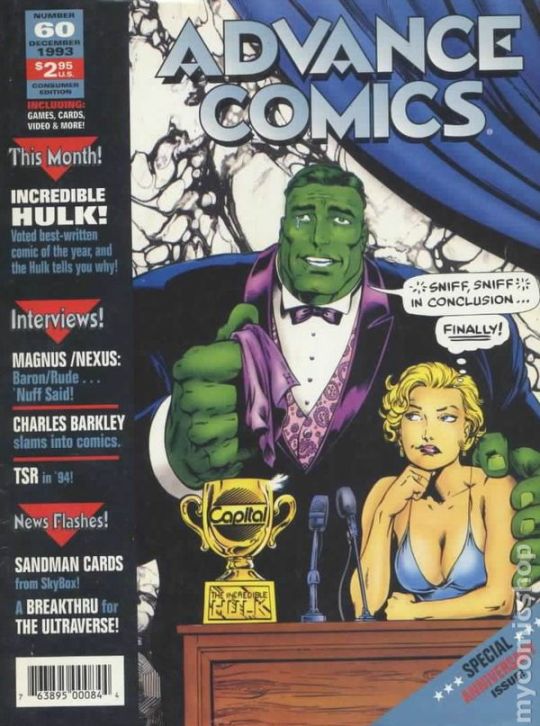
1993's Advance Comics #60 cover by Gary Frank (The Incredible Hulk interior artist at the time) and colorist Tom Smith (Future Imperfect).
#incredible hulk#gary frank#betty ross#bruce banner#professor hulk#merged hulk#hulk#the pantheon era#hulk smash#smash#awards#capital city#blueline#catalogue#cover#cover art#comics#marvel#marvel comics#Peter david era#90's#90s#1990s#smart hulk#bruce x betty#couple#married#lovers#tuxedo#dress
24 notes
·
View notes
Text

Distant castle
21 x 29,7cm, ink on paper, Kevin Lucbert, 2025
2K notes
·
View notes
Text

Blue line
Chicago
2024
7 notes
·
View notes
Text

The light can hurt sometimes
#grunge#vintage#aesthetic#alternative#art#dark aesthetic#dark art#darkness#deep thoughts#bluelines#feeling blue
32 notes
·
View notes
Text


#lotro#deliver me from this purgatory#ima go in the bree town training hall with an autoclicker see if i dont#anyway now that i have cry of the hunter and blood arrow i can solo the landscape wraiths#i couldnt before (although i probably could if i had good gear) because of that nasty corruption#and because my only option for immobilizing them was tripwire#which has a long cooldown#and a long induction in blueline
10 notes
·
View notes
Text
every time sasha barkov celebrates a goal, I grow 10x stronger
#panthers lb#i was once again airplane mode so i could post this but know i was !!!!!#talky bits#that blueline keep was sooooo sexy
8 notes
·
View notes
Text
esa 2min pk shift
3 notes
·
View notes
Text

Finally finished my painting of me and lifeline
43 notes
·
View notes
Text

your 2023-2024 season-opening roster
13 notes
·
View notes