#best art museum in san Francisco
Explore tagged Tumblr posts
Text
Museums play an important role in the preservation of both history and art, there are hundreds across the US, but which of them is the best? We are only allowing one per city to keep the list from just being DC and NYC
715 notes
·
View notes
Text
Pink is for Boys
"Pink or Blue? Which is intended for boys and which for girls? This question comes from one of our readers this month, and the discussion may be of interest to others. There has been a great diversity of opinion on this subject, but the generally accepted rule is pink for the boy and blue for the girl. The reason is that pink, being a more decided and stronger color, is more suitable for the boy, while blue, which is more delicate and dainty, is prettier for the girl." ~ The Infants' Department, June 1918

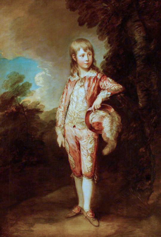
[Left: The Blue Boy, oil on canvas, c. 1770, by Thomas Gainsborough.
Right: The Pink Boy, oil on canvas, c. 1782, by Thomas Gainsborough.]
Pink is for girls and blue is for boys. But it hasn't always been this way. Colour coding infants as a way of denoting gender was popular in 20th century America. The problem? Pink and blue? Which is for boys and which is for girls?
In 1927 TIME Magazine asked ten of the "leading stores that sell baby equipment" which colour was for which gender. Four stores responded pink for girls and blue for boys; Macy's (Manhattan), Franklin Simon (Manhattan), Wanamaker's (Philadelphia) and Bullock's (Los Angeles). Five stores responded pink for boys and blue for girls; Best's (Manhattan), Marshall Field's (Chicago), Filene's (Boston), Maison Blanche (New Orleans) and The White House (San Francisco). Curiously Halle's (Cleveland) responded that pink was for both boys and girls.
This debate would continue and it wasn't until mid-20th century that pink for girls and blue for boys became firmly cemented in western culture.
However the idea of colour coding infants dates back to the 19th century. According to La cour de Hollande sous le règne de Louis Bonaparte in 1808 in Holland pink was used to announce the birth of a girl and blue a boy. In March 1856 Peterson's Magazine (Philadelphia, USA) advises that the ribbon on a christening cap should be blue for a boy and pink for a girl. On the 23rd of July 1893 the New York Times writes that for baby clothes it's "pink for a boy and blue for a girl!"

[The Oddie Children, oil on canvas, c. 1789, by William Beechey, via North Carolina Museum of Art.]
During the latter half of the 18th century one of the most popular outfits for young children, regardless of gender, was a white dress with a coloured sash tied around the waist. Pink and blue being the most popular colours, although other colours were worn as well. It would be tempting to assume that the colour of the sash indicated gender but there isn't clear evidence that this was the case. The Oddie Children (above) depicts Sarah, Henry, Catherine, and Jane Oddie. The three girls are all wearing white dresses; two with a blue sash one with a pink sash. We also see Henry Russell (bellow left) wearing a blue sash and Prince William (bellow right) wearing a pink sash.
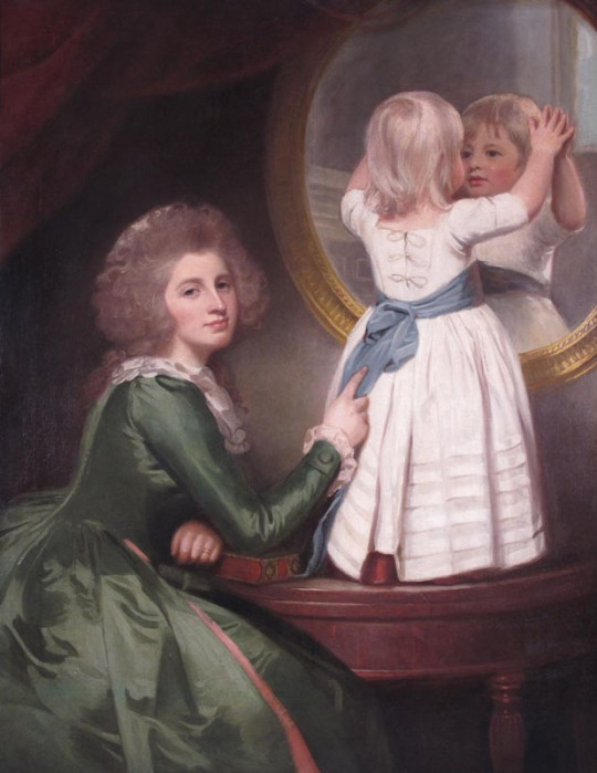
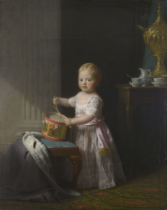
[Left: Anne Barbara Russell née Whitworth with her son Sir Henry Russell, oil on canvas, c. 1786, by George Romney, via Woolley & Wallis.
Right: Prince William, oil on canvas, c. 1767, by Allan Ramsay, via the Royal Collection Trust.]
Pink was just one of the many colours popular in 18th century English womenswear and seems to have stayed popular throughout the century. On the 3rd of January 1712 The Spectator published an article in which a man recalls seeing "a little Cluster of Women sitting together in the prettiest coloured Hoods that I ever saw. One of them was Blew, another Yellow, and another Philomot; the fourth was of a Pink Colour, and the fifth of a pale Green". On the 1st of May 1736 the Read's Weekly Journal, or British Gazetteer reports that the ladies attending the royal wedding wore gowns of "Gold stuffs, or rich Silks with Gold or Silver Flowers, or Pink or White Silks, with either Gold or Silver Netts or Trimmings;" shoes either "Pink, White or Green Silk, with Gold or Silver Lace and braid all over." On the 24th of May 1785 Charles Storer writes to Abigail Adams advising that fashionable colours in English court dress are "pink, lilac, and blue" such "as is worn at Versailles".
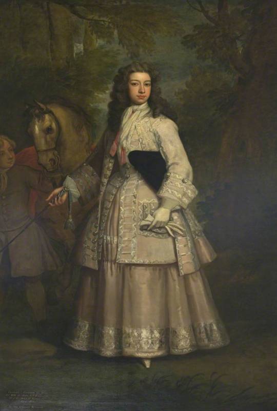
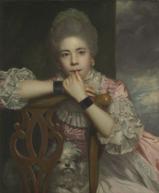
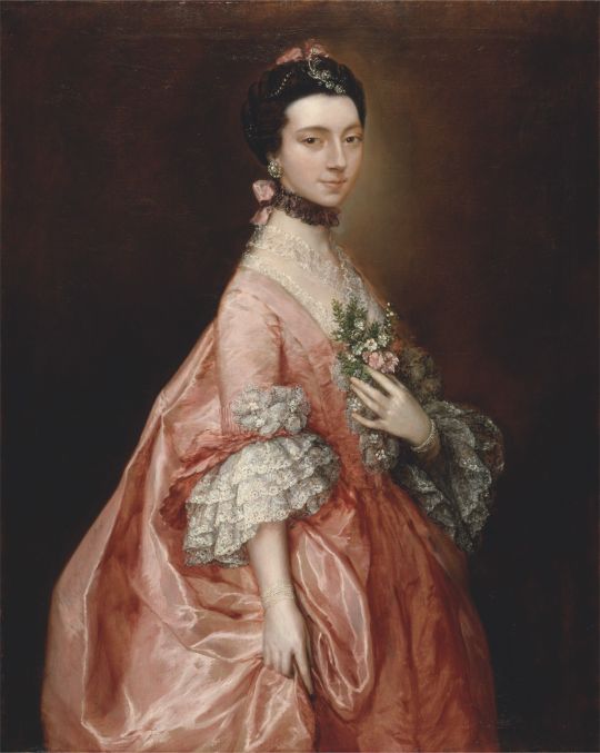
[Left: Frances, Daughter of Evelyn Pierpont, 1st Duke of Kingston, oil on canvas, c. 1700-23, by Godfrey Kneller, via Art UK.
Middle: Mrs. Abington as Miss Prue in "Love for Love" by William Congreve, oil on canvas, c. 1771, by Sir Joshua Reynolds, via Yale Center for British Art.
Right: Mary Little, later Lady Carr, oil on canvas, c. 1765, by Thomas Gainsborough, via Yale Center for British Art.]
In particular pink was popular amongst young women as the colour was associated with youth. Older women who wore pink were mocked as vain for dressing in a way that was seen as improper for their age. On the 31st of January 1754 Lady Jane Coke writes to Mrs. Eyre criticising old women who wear pink:
As for fashions in dress, which you sometimes inquire after, they are too various to describe. One thing is new, which is, there is not such a thing as a decent old woman left, everybody curls their hair, shews their neck, and wears pink, but your humble servant. People who have covered their heads for forty years now leave off their caps and think it becomes them, in short we try to out-do our patterns, the French, in every ridiculous vanity.
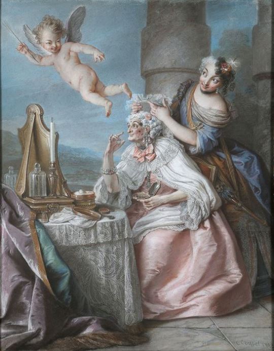
[Folly Embellishing Old Age With the Adornments of Youth, oil on canvas, c. 1743, by Charles-Antoine Coypel, via Master Art.]
For Englishmen acceptable clothing way much more limited. In A Foreign View of England in the Reigns of George I & George II Monsieur César de Saussure writes that Englishmen "do not trouble themselves about dress, but leave that to their womenfolk". He explains:
Englishmen are usually very plainly dressed, they scarcely ever wear gold on their clothes; they wear little coats called "frocks," without facings and without pleats, with a short cape above. Almost all wear small, round wigs, plain hats, and carry canes in their hands, but no swords. Their cloth and linen are of the best and finest. You will see rich merchants and gentlemen thus dressed, and sometimes even noblemen of high rank, especially in the morning, walking through the filthy and muddy streets.
César de Saussure warns that "a well-dressed person in the streets, especially if he is wearing a braided coat, a plume in his hat, or his hair tied in a bow, he will, without doubt, be called "French dog" twenty times perhaps before he reaches his destination" and is not only at risk of "being jeered at" but also "being bespattered with mud, but as likely as not dead dogs and cats will be thrown at him."
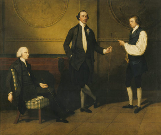
[Reverend Charles Everard Booth, Captain Griffith Booth, and an Unidentified Man playing Billiards, oil on canvas, c. 1775-9, by John Hamilton Mortimer, via the Royal Collection Trust.]
For Englishmen dressing "plainly" mostly meant wearing blacks and browns. In his book on macaroni, Pretty Gentleman, Peter McNeil found that in contrast most English menswear that he describes as generally consisting of "monochrome broadcloth" macaroni wore a variety of colours including green, orange, yellow, violet, red, white, blue, gold, silver and of course pink.
But it's not just the macaroni of the 1770s & 1780s that wore pink. We see pink in descriptions of feminine men's dress (both real and fictional) throughout the 18th century.
On the 2nd of June 1722 Sarah Osborn writes to Robert Byng:
I believe the gentlemen will wear petticoats very soon, for many of their coats were like our mantuas. Lord Essex had a silver tissue coat, and pink color lutestring waistcoat, and several had pink color and pale blue paduasoy coats, which looked prodigiously effeminate.
On the 18th of October 1729 the Universal Spectator and Weekly Journal published a story where an "effeminate" man's clothes were described as follows:
He had a flower'd pink-colour Silk Coat, with a Green-Sattin Waistcoat lac'd with Silver. Velvet Breeches, Clock'd Stockings the Colour of his Coat, Red-heel'd Pumps, a Blue Ribbon at the Collar of his Shirt, and his Sword-Hilt he embrac'd under the Elbow of his Left Arm,

[Sir Miles Stapylton, 4th Bt of Myton, oil on canvas, c. 1730-35, via Art UK.]
In The Adventures of Roderick Random (1748) the effeminate (and queer coded) Captain Whiffle is described as follows:
our new commander came on board in a ten-oared barge, overshadowed with a vast umbrella, and appeared in everything the reverse of Oakum, being a tall, thin young man, dressed in this manner: a white hat, garnished with a red feather, adorned his head, from whence his hair flowed upon his shoulders, in ringlets tied behind with a ribbon. His coat, consisting of pink-coloured silk, lined with white, by the elegance of the cut retired backward, as it were, to discover a white satin waistcoat embroidered with gold, unbuttoned at the upper part to display a brooch set with garnets, that glittered in the breast of his shirt, which was of the finest cambric, edged with right Mechlin: the knees of his crimson velvet breeches scarce descended so low as to meet his silk stockings, which rose without spot or wrinkle on his meagre legs, from shoes of blue Meroquin, studded with diamond buckles that flamed forth rivals to the sun! A steel-hilted sword, inlaid with gold, and decked with a knot of ribbon which fell down in a rich tassel, equipped his side; and an amber-headed cane hung dangling from his wrist. But the most remarkable parts of his furniture were, a mask on his face, and white gloves on his hands, which did not seem to be put on with an intention to be pulled off occasionally, but were fixed with a curious ring on the little finger of each hand.

[Henry Ingram, 7th Viscount Irwin and His Wife Anne, oil on canvas, c. 1745, by Philippe Mercier, via Art UK.]
On the 28th of July 1780 the London Courant reports:
A few days ago, a Macaroni made his appearance in the Assembly-room at Whitehaven, in the Following dress: a mixed silk coat, pink sattin waistcoat and breeches, covered with an elegant silver nett, white silk stockings with pink clocks, pink sattin shoes and large pearl buckles, a mushroom coloured stock, covered with a fine point lace; his hair dressed remarkably high, and stuck full of pearl pins.
On the 6th of August 1792 The Weekly Entertainer published Sketches and Portraits form the Life by Simon Tueopnrastus which included the following description:
Mercator was a youth of some genius and expectation, but by a strange perverseness of disposition, notwithstanding the extreme natural stiffness of his limbs, he had acquired an early attachment to the most finical and effeminate finery; so that, while yet a boy, he would exhaust every expedient of a fertile invention to procure a laced waistcoat, or the most foppish toy; would dangle a watch-string, with brass seals, from each fob, at a time when the frugal care of his parents would not permit him to wear a watch in either; and would strut in a fine pair of second-hand pink silk breeches, and a light blue coat, with all the formal dignity of—a soldier upon the parade.


[Left: Thomas King in "The Clandestine Marriage", oil on canvas, c. 1792, by Samuel De Wilde, via Yale Center for British Art.
Right: Edward Payne, oil on canvas, by Arthur Devis, via Art UK.]
While pink is mentioned in these descriptions of feminine men's dress it's not singled out as the girl colour the way pink would become in the 20th century. I would argue pink is seen as effeminate not because pink is a uniquely feminine colour but because it was used in fashionable dress. In 18th century England being interested in fashion was seen as an frivolous female trait. Men who showed too much interest in fashion were mocked and ridiculed for their gender nonconformity. "A Man must sink below the Dignity of his Nature, before he can suffer his Thoughts to be taken up on so trivial an Affair, as the Chosing, Suiting, and Adjusting the Adornments of his Person," complains a letter published on the 8th of May 1731 in Read's Weekly Journal, or British Gazetteer:
Decency of Garb ought inviolably to be preserved; nor can there be possibly an Excuse for Dressing like a Merry-Andrew: Rich and coloured Silks are in themselves effeminate, and unbecoming a Man; as are, in short, all Things that discover Dress to have been his Study 'Tis in vain for a Fop of Quality, to think his Title will protect him.


[Left: Madame de Pompadour (detail), oil on canvas, c. 1756, by François Boucher, via Alte Pinakothek.
Right: Elizabeth Wrottesley, later Duchess of Grafton, oil on canvas, c. 1764-5, by Thomas Gainsborough, via National Gallery of Victoria.]
English fashion was highly influenced by French fashion. A popular colour scheme in French fashion was green and pink. A famous example of this colour pairing can be seen in François Boucher's portrait of Madame de Pompadour (above left), she is depicted in a green gown with pink bows and flowers. You can see and example of how this style inspired English fashion in Thomas Gainsborough's portrait of Elizabeth Wrottesley (above right), who is depicted in a green gown with a floral pattern adorned with pink, white and green striped bows.
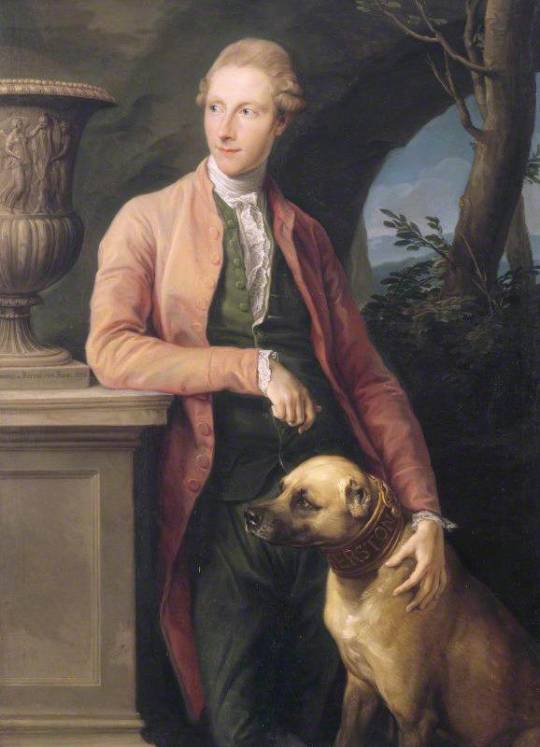
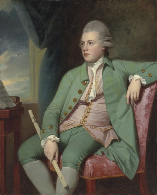
[Left: Sir Harry Fetherstonhaugh, oil on canvas, c. 1776, by Pompeo Batoni, via Wikimedia.
Right: Francis Lind, oil on canvas, c. 1775, by George Romney, via Mackinnon Fine Art.]
Fashionable Englishmen were also inspired by these French designs. Horace Walpole refers to the popularity of the colour combination writing to Lady Ossory on the 19th of February 1774 "If I went to Almack's and decked out my wrinkles in pink and green like Lord Harrington, I might still be in vogue". Almack's is referring to Almack's Assembly Rooms on Pall Mall which is believed to be the inspiration for the Macaroni Club. (see Pretty Gentleman by Petter McNeil p52-55) In a letter to Lord Harcourt on the 27th of July 1773 Walpole writes of "Macaronis lolling out of windows at Almack's like carpets to be dusted."
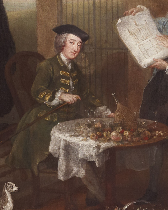

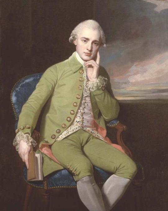
[Left: Detail of Stephen Fox from The Hervey Conversation Piece, oil on canvas, c. 1738-40, by William Hogarth, via Fairfax House.
Middle: Sir William Jones, oil on canvas, c. 1769, by Francis Cotes, via Art UK.
Right: Portrait of a Gentleman, oil on canvas, by George Romney.]
Men who wore green seem to have been just as much, if not more, at risk of being ridiculed, or even assaulted, for the colour of their clothes as those who wore pink. In Pierre Jean Grosley's A Tour to London (originally published 1772) he recalls traveling with a young English surgeon who was harassed by Londoners due to his green French frock coat:
At the first visit which he paid me in London, he informed me, that, a few days after his arrival, happening to take a walk thro' the fields on the Surry side of the Thames, dressed in a little green frock, which he had brought from Paris, he was attacked by three of those gentlemen of the mobility, who, taking him for a Frenchman, not only abused him with the foulest language, but gave him two or three slaps on the face: "Luckily, added he in French, I did not return their ill language; for, if I had, they would certainly have thrown me into the Thames, as they assured me they would, as soon as they perceived I was an Englishman, if I ever happened to come in their way again, in my Paris dress."
242 notes
·
View notes
Text
There are a lot of really cool big rich people buildings but these are the ones I would love the most. Feel free to comment other ideas!
23 notes
·
View notes
Text
Dear Listeners,
It’s winter break here in Vermont so my son and I have been out on the slopes every day. For many years I have stayed away from fast slidey sports because I was afraid of injuring my hands. If my hands don’t work, how do I make music? But among the many bits of advice I’ve gotten in my parenting journey, “be into what your kid is into” has been one of the best. My lad needed someone to ride the lifts with and I needed to overcome my fear and learn how to fall properly, so here I am.
I found that skiing is not all that different from rollerblading, which I learned to do in Central Park the summer of my junior year. I brought the skates with me on my year abroad in Florence. On weekends there was this amazing city to explore but buses and museums and cafes cost money. And whenever I roamed the quiet streets and parks alone, I would be perpetually harassed, groped and even flashed by pathetic men. But rollerblading was free and, bonus, I am already quite tall, so with skates I was at least 6ft2in. No one ever messed with me on skates. I adapted to the cobblestones and explored all of Florence with exhilarating freedom.
One Sunday, as I was enjoying the expanses of asphalt in Parco delle Cascine, I came upon a group of folks on old-school rollerskates. They had a boombox and were dancing, just like the skaters of Central Park but without the sequined hot pants. They waved me over and exclaimed over my weird skates. They invited me to join them and for the rest of the school year, I spent every Sunday afternoon I could with the rollerskaters. We would gather, dancing and skating around obstacles, and once we had critical mass, tear off along the Arno and into the old city. We’d skate past the David, circle the Piazza della Signoria multiple times and whizz down the marble collanade along the Piazza Republica, ending in a bar, still on skates, for an espresso or aperativo. Those are some of my best memories of my year in Florence.
I continued the skating when I moved to San Francisco, zooming most days through Golden Gate Park to the beach and back again. Sometimes I’d join a similar group of mad skaters on Friday nights to roll fearlessly down hills and through tunnels. Skating was always a great source of joy. But then I moved away from the paved environment of the city and I transitioned to music full time. After acquiring a broken finger from an Evil Door and being shocked at how much that tiny injury impacted my ability to play, I quit skating.
Fast forward to Vermont. Like many people did during the pandemic, I got back on skates except this time with padding, wrist guards and a helmet. And then, as my boy learned to snowboard, I learned to ski. We still ride the lifts together but now he zips down black diamond trails while I ski carefully down the easy ones. He is mystified as to how I can bear to do the same runs over and over but I like it that way. It’s like a meditation. I focus on perfecting my technique and try to make each turn better than the last. It feels similar to one of the things I enjoy about playing the cello, which is noticing tiny details and gradually polishing them. How can I improve this one phrase that I have played thousands of times? It never gets old or boring for me.
I hope it never gets boring for you either! Next week I’ll get back to work improving my old songs and figuring out to play some of my new ones in time for my concerts in March.
March 15 - ArtYard in Frenchtown,NJ
March 16 - Underground Arts in Philadelphia, PA opening up for my old friend The Sleepytime Gorilla Museum
March 17 - Le Poisson Rouge in NYC
March 21 - St John’s Cathedral at the Big Ears Festival in Knoxville, TN
And one more
April 6 - Unitarian Univeralist Church in Burlington VT, accompanied by mesmerizing visuals by Alex Reeves
also, outside my solo work on April 7 I’ll be a part of composer Randal Pierce’s ensemble, performing his live soundtrack to George Méliès’ silent cinematic masterpiece, A Trip to the Moon
6:30 and 8:30pm shows
More about all the events happening in Burlington around the eclipse
Thank you for listening and please wear a helmet when you are going fast.
celloly yours, Z
22 notes
·
View notes
Text


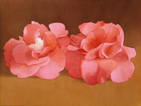


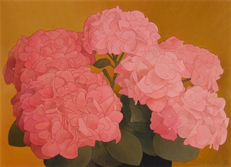
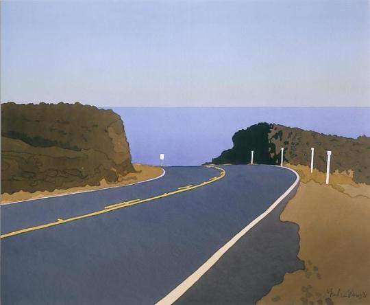
Mark Adams was born in Fort Plain, New York in 1925 and died in San Francisco in 2006. He attended the Hans Hofmann School of Fine Arts in New York City in 1945 after studying for two years at Syracuse University. He spent the next few years traveling between New York and California before he settled in the San Francisco Bay Area in 1952. Adams married fellow artist Beth Van Hoesen in 1953, and completed a four-month apprenticeship in Aubusson tapestry with the acclaimed Jean Lurcart in Saint-Cere, France in 1955.
Mark Adams is best remembered for his versatility as an artist, possessing talent in a diverse array of artistic media including tapestry, stained glass, oil painting, mosaic, drawing, watercolor, and printmaking. Early in his artistic career he focused on tapestry and stained glass. By 1962 Adams had two solo exhibitions of his tapestries at the de Young Museum and the San Francisco Museum of Modern Art. He completed tapestry commissions for various institutions, including the San Francisco International Airport. Adams also took an interest in stained glass, which he considered an extension of his work with tapestry and his enthusiasm for liturgical art.

By 1975, Adams grew frustrated with the limitations of his craft and the lack of complete control he had over the actual fabrication of his work. Drawn to the idea of small, intimate, and personal works that he could manage from beginning to end, he began a new venture in watercolour. Adams soon realized he could incorporate his techniques of flat planes of color as he had in tapestry and stained glass by using a wash to create his desired spatial effects, along with continuing his ideas of transparency and luminosity. He favored the quotidian subjects that exemplified his life, depicting them in such a way as to evoke a sense of nostalgia. Adams eventually learned to deemphasize his precise technique as a means to communicate his excitement for the subject he was portraying.
44 notes
·
View notes
Text
SET FOUR - ROUND ONE - MATCH TWO
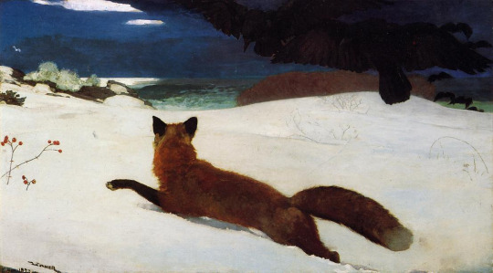
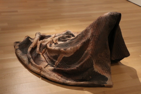
"Fox Hunt" (1893 - Winslow Homer) / "Tarpaulin" (2018 - Rebecca Belmore)
FOX HUNT: Whenever I see it I want to take an unprepared journey into the forest in the middle of the night and bite anything that moves until I eventually eat a poisonous plant and succumb to a slow and untimely death.
Look at the fox. The desperation. That is something that cannot be so easily replicated, yet is a feeling that has been engraved into my bones. @cups-and-pentacles
TARPAULIN: I saw this piece in Toronto, which references the housing crisis in Canada, that disproportionately affects indigenous people like the artist. The energy it emits it dense - full of grief and anger - and it flooded me with those emotions, especially as I saw most gallery patrons completely ignoring it as they walked by, which was a harsh reflection of how those affected by the housing crisis (and represented by the invisible yet present human form beneath the sculpture) are ignored by society. It's less effective as a static image and really is best experienced in person (@unbelievable-screaming-moth)
("Fox Hunt" is an oil on canvas painting by Winslow Homer. It measures 96.5 × 174 cm (38 × 68½ in) and is located at the Pennsylvania Academy of the Fine Arts.
"Tarpaulin" is a ceramic sculpture by indigenous (Anishinaabe) artist Rebecca Belmore. It measures 30 × 70 × 54 in. (76.2 × 177.8 × 137.2 cm) and is currently in the permanent collection of the San Francisco Museum of Modern Art. This photo was taken by the submitter!)
#art that fucks you up tournament#polls#atfyu polls#id in alt text#please correct me if there any mistakes on tarpaulin#some of the info was confusing there ie location and material
46 notes
·
View notes
Text

John Baldessari (American 1931-2020, lived and worked in Venice, CA), Throwing Three Balls in the Air to Get a Straight Line (Best of Thirty-Six Attempts), 1973. Each image: 177 by 259mm 7 by 10¼ in.; each sheet: 243 by 322mm 9½ by 12⅝ in.; overall: 248 by 329 by 9mm 9¾ by 13 by ⅜ in. (Source: SFMOMA, San Francisco Museum of Modern Art)
#art#artwork#modern art#contemporary art#modern artwork#contemporary artwork#20th century art#20th century modern art#20th century contemporary art#American art#modern American art#contemporary American art#American artist#Californian art#Californian artist#LA art#Los Angeles art#Los Angeles artist#LA artist#John Baldessari#California Dreaming#Made in LA#SFMOMA#San Francisco Museum of Modern Art
6 notes
·
View notes
Text
A new force has arrived on Detroit’s film scene.
One month after moving to the city, independent California filmmaker Tom E. Brown has hit the ground running excited to boost Detroit’s film community, which has suffered the recent loss of three Indie theaters in Metro Detroit. The freshly appointed Detroit Institute of Arts Detroit Film Theater board member said he has his eye on growing the local film community and pushing for a return of the state’s film tax credit.
During a free Sunday screening of his 2016 film “Pushing Dead” at the Senate Theater and Q&A for World AIDS Day, he announced plans to film a sequel in Detroit.

“I’m going to try to see if I can do anything to help bring the film incentives back, because that would be nice for Detroit,” added Brown, who bought a house in East English Village.
The bipartisan Multimedia Jobs Act would create a transferable tax credit of up to 30% for Michigan-based multimedia projects. The bill was co-sponsored in 2023 by John Roth, R-Interlochen, and Jason Hoskins, D-Southfield. Currently, more than 35 states have a multimedia or film incentive. For seven years Michigan had a film credit offering up to 42% rebate of filmmakers’ in-state production costs, but it ended in 2015 amid criticism that taxpayers weren’t benefitting.
Roth’s office did not immediately return a request for comment on the bill.
Opponents of the package, from teacher unions to Republican lawmakers, say the state can’t afford film subsidies amid large public infrastructure needs. In November, the Great Lakes Gun Rights nonprofit told Republican lawmakers in a post to X, formerly Twitter, that the package was “anti-gun” by giving tax dollars “to liberal anti-gun Hollywood elites to produce liberal anti-gun programs in Michigan.” The tax program would entail $2 billion in credits over 10 years.
Others, like the Michigan Film Industry Association, have argued that the money would be well spent by boosting the local economy and tourism by $6-$8 billion in direct spending in the first 10 years, and creating new jobs, while decreasing the population loss of college graduates.
The bills were tentatively scheduled for a vote in the state House last month, but no action was taken amid attendance issues and lingering concerns over the proposal. Time is running short to get the bills passed this session, as lawmakers will break for the year in late December.
Brown’s “Pushing Dead” is a comedy that focuses on an HIV-positive writer who is suddenly dropped from his health plan for earning too much after depositing a $100 check in his bank account. The film stars James Roday, Danny Glover and Robin Weigert.
Brown, 57, has made short films for nearly four decades that have been featured at the American Museum of Natural History, the Walker Art Center and the Guggenheim. “Pushing Dead,” supported by the Sundance Institute and Rockefeller Foundation, screened at more than 50 film festivals winning 10 best-feature and audience and jury awards.
The “Pushing Dead” sequel, which Brown said is 25% written, is one of several films he hopes to shoot in Detroit. The movie will open with a couple pushed out of San Francisco who land in Detroit, and features a scene in the city. Brown said he has already received verbal promises of financial support from locals, which is “rare” for an Indie film.
In San Francisco, films are ranked by factors like local jobs and diversity and entered into a lottery for tax incentives. Depending on whether Brown wins San Francisco’s film lottery and how Michigan’s legislation advances, Brown said he would also like to film the movie “American Dog,” in Detroit. That film, he said, is about “an unhinged lesbian cop in backwater America” who will be played by Margaret Cho.
If the Multimedia Jobs Act were passed Brown said it would make filming American Dog in Detroit “more appealing” because it’s increasingly challenging to raise funds for film. But regardless, Brown said he’ll film in Detroit, and is passionate about doing so.
“It’s a lot of things that come into play when you’re trying to raise money for a movie, but I will absolutely make movies in Michigan,” he said. “I like the idea of setting this little indie with the same characters, with the two main characters from ‘Pushing Dead’ in Detroit, just because it’s such a beautiful city. Everywhere you look it’s just filmic and gorgeous.”
Last year, the city’s Detroit Film Office authorized 83 productions to film, according to a BridgeDetroit FOIA.
The subject matter of Brown’s film is particularly relevant to Detroit, where HIV rates are four times higher than the rest of Michigan.
On Sunday, a post-screening panel featuring Brown, Weigert and LGBT Detroit Executive Director Nzere Kwabena focused on the film production process and AIDS.
In Detroit, approximately 766 people per 100,000 residents have HIV, according to the Michigan Department of Health and Human Services 2023 HIV Prevalence Report.
Brown, who was diagnosed with HIV 40 years ago and initially given three years to live, said World AIDS Day is a happy day for him now because it means he’s alive. World AIDS Day, on Dec. 1, was first recognized in 1988.
“Pushing Dead” is available for free streaming with a public library card on Kanopy or on various paid streaming services. The timeline for the sequel is unknown, but expected after Brown wraps production on “American Dog.”
(via DannyG)
#tom e brown#pushing dead#pushing dead 2#american dog#exciting new about that pushing dead sequel even though it'll probably be another decade before we get to see it#a bit confused that it is apparently about a “couple” but tom also talks about the “two main characters” being the subject of the film#not sure if he misspoke or the interviewer just misquoted what he said since james' and robin's characters are most certainly not a couple#also why am i not surprised that the michigan gun lobby is rallying against film incentives as being “anti-gun”#only in america#anyway#very exciting
4 notes
·
View notes
Text
If you are planning on fleeing a red state, here is my pitch for moving to Chicago

I am a lesbian and a lifelong Chicagoan and I fuckin love it here. I grew up here, went to college here, and now live here as an adult, and I have no plans to leave. Despite being the 3rd biggest city in America, Chicago gets weirdly overlooked a lot and many people have never even been here.
If you are fleeing a red state because you're LGBTQ+, a woman, or an immigrant, here are the reasons I think you should move to Chicago:
We're a super queer-friendly city with several historically queer neighborhoods (that are actually affordable enough to live in).
Illinois has literally never voted red in my entire lifetime. That's the entire 21st century so far, btw.
We have a looooong history of fighting for abortion rights, even helping women get care before it was legal (google the Jane Collective).
Although there are red counties in the more rural part of the states, the blue influence of Chicago spreads far beyond the city's official borders. Chicago has such a large network of sprawling towns around it that still feel like a part of the city that we have a name for it: Chicagoland! So even if you're not a city person, you can find lots of more rural spaces within Chicagoland.
If you can't stand the idea of living too far from nature, never fear: there are tons of gorgeous nature preserves around Chicago! I grew up in a suburb where both the city border AND a forest preserve were a bike ride away.
Illinois has a great governor, J. B. Pritzker, whose response after the recent election was "To anyone who intends to come take away the freedom, opportunity, and dignity of Illinoisans, I would remind you that a happy warrior is still a warrior. You come for my people – you come through me."
We're a very diverse city with a large immigrant population. (Fun fact: the only city with a larger population of Polish people is Warsaw.) We have many localized ethnic neighborhoods all over the city. Which ties into my next point...
We have amazing food! Seriously, Chicago is super overlooked as one of the best eating cities in the country. I can find literally any cuisine from any country somewhere in Chicagoland, and we have everything from 3 Michelin star restaurants to hidden gem counter service spots with the best tacos al pastor you've ever had.
We have very strict gun control laws. Unfortunately, people get around these laws by going to Indiana to buy guns (thanks a LOT, Indiana), but the extra hassle means that there are actually fewer guns here than in red states and no one can open carry.
Chicago has a $15 citywide minimum wage and has plans to phase out tipping in restaurants (replaced with higher salaries).
We have really amazing museums like the Art Institute of Chicago (widely considered to be one of the best museums IN THE WORLD), the Field Museum (home to the most complete T-Rex ever, our beautiful mascot Sue), as well as a great aquarium, modern art museum, planetarium, and so many more I can't list them all. And they all have free days for Illinois residents!
We have great public transit. I don't own a car, most of my friends don't own a car, and we can get around just fine.
We never have hurricanes because we're a LAKE city, baby. We do have tornados but they rarely hit the actual city, they tend to stay out where there's more open space.
Cost of living is lower than other major blue cities like San Francisco and NYC
We have two baseball teams so that's double the baseball
Broadway shows frequently do a premier in Chicago before they open in NYC so we get a lot of huge musicals here. I've gotten free tickets to shows that later went on to tour the country.
Unlike SOME other large blue cities I could mention, we know how to put our trash in DUMPSTERS instead of IN THE STREET.
Giant bean
Your life will change after you've had a juicy Italian beef sandwich with hot giardiniera.
And finally, to address all the stories about Chicago being a crime-ridden warzone, here's the deal: they are simply not true. Where do those stories come from? It's simple: Chicago has a historically large black population and we're a liberal city. Racist republicans have convinced themselves that this means we must be a haven for crime. We have the same amount of crime as any large city, which is to say: far less crime per capita than in rural red areas. Seriously, look it up.
Not only is Chicago not the most dangerous city in America, we don't even make the list of the top 25.
But the thing is, those lies about Chicago actually kind of work in our favor, because it means that Republicans are too scared to come here. My own grandparents haven't visited in 10 years because they're convinced that if they do they'll get shot or something.
Anyway, move to Chicago, it's great here. And it'll probably be one of the safest strongholds for whatever comes in the next 4 years. If you're also from Chicago and have any other points I missed, please add them!
5 notes
·
View notes
Text


I should be proud (I am! I am!) that the Dallas Museum of Art made it as one of the 20 best art museums in America, even if it's in last place. But what I'm really here for is the precious drawings. Love those axonometric projections.
I'm probably being redundant, but I also wanted to have the list in text form for easier reading or searching or whatever:
Metropolitan Museum of Art
Art Institute of Chicago
National Gallery of Art
Philadelphia Museum of Art
Museum of Fine Arts, Boston
Museum of Fine Arts, Houston
Cleveland Museum of Art
Museum of Modern Art
Detroit Institute of Art
Getty Center/Getty Villa
Virginia Museum of Fine Arts
St. Louis Art Museum
Los Angeles County Museum of Art
San Francisco Museum of Modern Art
Legion of Honor/De Young
Baltimore Museum of Art
Crystal Bridges Museum of American Art
Wadsworth Atheneum
Whitney Museum of American Art
Dallas Museum of Art
In a companion piece, the Washington Post lists (but doesn't rank) the 10 best small art museums in America:
Barnes Foundation, Philadelphia
Clark Art Institute, Williamstown, Massachusetts
Frick Collection, New York
Glenstone, Potomac, Maryland
Isabella Stewart Gardner Museum, Boston
Kimbell Art Museum, Fort Worth
Menil Collection, Houston
Neue Galerie, New York
Norton Simon, Pasadena, California
Phillips Collection, D.C.
And the best college art museums:
Blanton Museum of Art, University of Texas at Austin
Cantor Arts Center, Stanford University
Harvard Art Museums
RISD Museum
Yale University Art Gallery
6 notes
·
View notes
Text

Some good news.. 18TH ANNUAL BLACK AND WHITE SPIDER AWARDS HONORS PHOTOGRAPHER KOEN VAN DAMME FROM BELGIUM LOS ANGELES NOVEMBER 22, 2023 - Professional photographer Koen Van Damme of Belgium was presented with the 18th Annual Black and White Spider Awards 2nd Place - Merit of Excellence in the category of Architectural at a prestigious Nomination & Winners Photoshow streamed Saturday, November 18, 2023. The live online gala was attended by industry leaders and the photography community from around the globe who logged on to watch the climax of the world’s premier event for black and white photography. 18th Annual Jury members included captains of the industry from Phillips, London; Flatland Gallery, Amsterdam; David & Goliath, Los Angeles; San Francisco Museum of Modern Art; Saatchi & Saatchi, London; Portuguese Center of Photography, Porto; Jason McCoy Gallery, New York; Hulsbosch, Sydney; Willas Contemporary, Stockholm; FCB Global, New York; ADK Creative One Inc., Tokyo; The ArtFactory Club, Vienna; Silvan Faessler Fine Art, Switzerland; Goldsmiths, University of London; Alfred Ehrhardt Foundation, Berlin; DDB Canada, Edmonton; Galleria Valeria Bella, Milan; David Clarke, London; Chiara Badinella, Art Advisory & Appraisals, Milan; Goodby Silverstein & Partners, San Francisco; Grey Group, New York; and Galerie Bugada Cargnel in Paris who honored Spider Fellows with 612 coveted title awards and 561 nominees in 33 categories. “This year we saw another outstanding set of entries sparking some really fresh ideas, and making it very hard to select winners.” Commented Marcel Wijnen, Creative Director, Hulsbosch, Sydney. “Once again the Black & White Spider Awards has delivered a range of excellent winners in both the Professional and Amateur categories. There are a number of truly amazing images - not only the winners but also those with Honorable Mention. As a judge it was a challenge to select from so many strong submissions. Added Conrad Hechter, Correspondent, Goldsmiths, University of London. “It’s an incredible achievement to be selected among the best form the 6,193 entries from 69 countries we received this year” said Basil O’Brien, the awards Creative Director. “Koen Van Damme’s “Care center”, an exceptional image entered in the Architectural category, represents black and white photography at its finest, and we’re pleased to present him with the title of Merit of Excellence.” BLACK AND WHITE SPIDER AWARDS is the leading international award honoring excellence in black and white photography. This celebrated event shines a spotlight on the best professional and amateur photographers worldwide and honors the finest images with the highest achievements in black and white photography. www.thespiderawards.com
6 notes
·
View notes
Text
Art. On a wall. To look at. That's a museum baby, in the most simplest terms of course. one per city of course. Let's start the poll.
108 notes
·
View notes
Text


Muqi Fachang Six Persimmons 13th-century “The short window we have to experience these artworks echoes the brief time we have on Earth to make a positive impact on those around us. By allowing audiences to directly contemplate these humble yet powerful ink paintings, shared with us in the spirit of utmost generosity, The Heart of Zen reflects what we do best at the Asian Art Museum: offering a once-in-a-lifetime chance to connect the past with our lives today.” – Dr. Jay Xu, the Barbara Bass Bakar Director and CEO, Asian Art Museum of San Francisco [1] “Six Persimmons” (detail), a still life of an autumn fruit likely by the monk Muqi and one of Japan’s most revered works of art, is on view for only three weeks at the Asian Art Museum of San Francisco. C Okada Ai/Kyoto National Museum
[2] “Six Persimmons” was cut out of a hand scroll and mounted on green-and-white fabric inlaid with golden peonies. T. Minamoto
[3] “Chestnuts,” cut out of the same scroll as “Six Persimmons,” displays a dramatically different range of ink techniques. T. Minamoto
[4] At the Asian Art Museum, “Six Persimmons” is displayed by itself in a gently lit gallery with off-white walls reminiscent of a Japanese temple. Asian Art Museum source: https://www.nytimes.com/2023/11/21/arts/design/six-persimmons-zen-paintings-san-francisco.html source: https://about.asianart.org/press/the-heart-of-zen-international-debut-of-revered-masterpieces-six-persimmons-and-chestnuts-exclusively-at-asian-art-museum/
3 notes
·
View notes
Note
orchid, mahonia, sage & chamomile 🐻🩷
These got long so putting in a cut ૮ ෆ ´ ˕ ` ෆ ა
Orchid- already answered!
mahonia ⇢ what place, thing, activity inspires you most and how do you express yourself when it does?
I think I’m inspired most by fashion and fiber arts I see online. (Is ‘online’ a place?)
Besides lolita, my biggest hobbies are knitting, sewing, and embroidery. I have a ton of Pinterest boards with things I find inspiring- paintings and clothing from museums, knitting patterns, and things made by fiber artists and historical reenactors. When I’m starting a project I usually go through those, and my Ravelry (for knitting) or lolibrary (if I’m going to sew a lolita piece) as inspiration for what I want to make.
sage ⇢ what ‘medium’ of art (poetry, music, fiction, paintings, statues etc.) is the most touching to you? why do you think that is?
Music, paintings, and fashion. The first and last should be kinda self-explanatory since I think everyone finds music touching and my biggest hobby is fashion, but paintings are what I look at the most in an art museum- I really love Impressionism, the pre-Raphaelites, and 18th century rococo art, and a lot of other classical art in general. I also really love ukiyo-e prints from Japan.
I like paintings that feel like they express an emotion so strongly I can feel it myself; this is one of my favorite paintings from the Chicago Art Institute. I can feel the cool crisp morning air before sunrise, the bare earth under her feet, and the silence with just the sound of a bird singing. I’m a member at the art institute so I come in a lot to draw various paintings or just look around at stuff :)
I also love still-life paintings of fruits/flowers/food etc for a similar reason- it looks like I could really grab them off the canvas and eat them! I can taste those grapes just looking at them. And it feels like a connection to people from hundreds of years ago, to eat the same food.
chamomile ⇢ what kind of things do you like receiving as gifts?
I mean, ideally someone would gift me like, AP’s old Bunny-Chan set haha. But generally cute bunny-themed stuff does always make me happy :) I get a lot of books as gifts and I love that too! Christmas before last one of my friends got me a biography of Beatrix Potter which was awesome (I collect Beatrix Potter/Peter Rabbit things so those always make good gifts). I like tea (loose leaf), brooches (not enamel pins), perfume (my favorite company is Alkemia), and strawberry or rose-themed stuff a lot as well.
The best lolita fashion related gift I’ve ever gotten was my parasol! My mom was in San Francisco and I begged her to go to the AP store and get me the catalogue (was planning to pay her back), and instead she also got me the parasol and a pair of socks and made a gift of it :) She had to carry it on the plane since it didn’t even fit in her luggage! It meant so much to me to have that level of love and support, and I think the parasol is gorgeous too :D
3 notes
·
View notes
Text
SET FOUR - ROUND TWO - MATCH ONE


"Symphony of the Sixth Blast Furnace" (1979 - Evgeny Sedukhin) vs "Tarpaulin" (2018 - Rebecca Belmore)
SYMPHONY OF THE SIXTH BLAST FURNACE: I love the things it does with shape and light and I love how big and bright and holy the machinery is. the beauty of everyday overlooked things. (@regicidal-optimism)
TARPAULIN: I saw this piece in Toronto, which references the housing crisis in Canada, that disproportionately affects indigenous people like the artist. The energy it emits it dense - full of grief and anger - and it flooded me with those emotions, especially as I saw most gallery patrons completely ignoring it as they walked by, which was a harsh reflection of how those affected by the housing crisis (and represented by the invisible yet present human form beneath the sculpture) are ignored by society. It's less effective as a static image and really is best experienced in person (@unbelievable-screaming-moth)
("Symphony of the Sixth Blast Furnace" is an oil on canvas painting by Soviet artist Evgeny Sedukhin.
"Tarpaulin" is a ceramic sculpture by indigenous (Anishinaabe) artist Rebecca Belmore. It measures 30 × 70 × 54 in. (76.2 × 177.8 × 137.2 cm) and is currently in the permanent collection of the San Francisco Museum of Modern Art. This photo was taken by the submitter!)
25 notes
·
View notes
Text
Heaven's Door Spirits, in collaboration with Bob Dylan, releases Homesick Blues.


Press Release
CHICAGO … Heaven’s Door Spirits, the award-winning collection of American whiskeys founded by Bob Dylan, proudly announces the launch of “Homesick Blues” Minnesota Wheated Bourbon. This limited release offering pays homage to Dylan’s birthplace of Duluth, Minnesota and commemorates the debut of the definitive Dylan biography, Bob Dylan: Mixing Up The Medicine.
Heaven’s Door announces the release of “Homesick Blues” Minnesota Wheated Bourbon, a limited release that pays homage to Dylan’s birthplace of Duluth, Minnesota and commemorates the debut of the definitive Dylan biography, Bob Dylan: Mixing Up The Medicine. (The Bob Dylan Center)
Heaven’s Door announces the release of “Homesick Blues” Minnesota Wheated Bourbon, a limited release that pays homage to Dylan’s birthplace of Duluth, Minnesota and commemorates the debut of the definitive Dylan biography, Bob Dylan: Mixing Up The Medicine.
This cask-strength wheated bourbon has been aged for seven years in the extreme temperature fluctuations of Minnesota’s North Country, imparting distinctive flavors of honey, caramel, dried fruit, vanilla and nutmeg, all culminating in a long, mellow finish.
“Bob Dylan: Mixing Up the Medicine is the landmark tome that Bob Dylan fans have been waiting decades for. Spanning the life and career of the Nobel prize–winning musician, artist, and writer, this magnum opus provides unprecedented access to the hidden treasures found within the Bob Dylan Archive,” said Mark Davidson, Senior Director of Archives and Exhibitions at the Bob Dylan Center. This extraordinary book contains unprecedented insights into Dylan’s creative evolution.
Marc Bushala, co-founder and CEO of Heaven’s Door Spirits, enthused, “We are thrilled to introduce ‘Homesick Blues,’ a heartfelt tribute to Bob Dylan’s Minnesota roots and his journey to find home. This unique limited release expression stays true to Dylan’s desire to create a collection of whiskeys which each tell their own story.”
A limited-edition bundle featuring the book and bottle, complete with a custom box with a copy of Bob Dylan’s original handwritten lyrics to Knockin’ On Heaven’s Door, is now available for pre-order. The book and the bottle can also be purchased separately through HeavensDoor.com, with delivery timed for the official release of the book on October 24th.
About Heaven’s Door Spirits, LLC: Heaven’s Door Spirits was founded by legendary musician and cultural icon, Bob Dylan in collaboration with Spirits Investment Partnership (“SIP”). Heaven’s Door has won countless awards for its uncompromising quality and evolving collection of craft whiskey, including the #1 Consumer Choice Award at the 2021 San Francisco World Spirits Competition, and was cited as the “Best Bourbons of the Century…So Far” by the Robb Report. The Heaven’s Door portfolio of craft whiskeys are available nationwide and online at heavensdoor.com.
About Bob Dylan: Bob Dylan is widely regarded as one of the world’s most influential artists, selling more than 125 million records over the span of his 60-year career. In recent years, Dylan’s work as an author and visual artist has further burnished his popularity and acclaim. Dylan’s memoir, Chronicles Vol. 1, spent 19 weeks on the New York Times Best Seller List in 2004. Bob Dylan received The Nobel Prize in Literature 2016 “for having created new poetic expressions within the great American song tradition.” Bob Dylan’s visual art, including drawings, paintings, and metal sculptures, have received international, critical acclaim and have been featured in museum exhibitions from Miami to Shanghai, as well as the prestigious Halcyon Gallery in London.
About The Bob Dylan Center: Anchored by a permanent exhibit on the life and work of Bob Dylan, the Bob Dylan Center® is committed to exploring the myriad forms of creativity that enrich the world around us. Located in the Tulsa Arts District, the center serves to educate, motivate and inspire visitors to engage their own capacity as creators. Through exhibits, public programs, performances, lectures and publications, the center fosters lively conversations about the role of creativity in our lives.
As the primary public venue for the Bob Dylan Archive® collection, the center curates and exhibits a priceless collection of more than 100,000 items spanning Dylan’s career, including handwritten manuscripts, notebooks and correspondence; films, videos, photographs and artwork; memorabilia and ephemera; personal documents and effects; unreleased studio and concert recordings; musical instruments and many other elements. More information at bobdylancenter.com.
3 notes
·
View notes