#beige and brown color scheme
Explore tagged Tumblr posts
Text
Master Bath - Asian Bathroom

Mid-sized master bathroom with beige floor, gray tile, and porcelain tile, as well as flat-panel cabinets, light wood cabinets, white walls, a vessel sink, solid surface countertops, and a hinged shower door.
0 notes
Note
Wanted to know if you could make a colored theme sort of moodboard? The colors I was thinking of would be: Some sort of soft light green, Lightish brown, and beige?
Also gender neutral with a paci (Deco or no deco is fine!) other than those colors anything else is good with me! ^^ /nf
Here you go!!
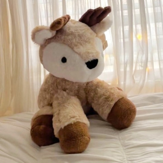


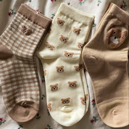


#this is a very cute color scheme!!#i hope this is what you wanted#because i had fun making it!#sfw interaction only#moodboard#sfw agere#age regression#agere#sfw littlespace#agere moodboard#babyre#age dreaming#baby regression#green#brown#beige
298 notes
·
View notes
Text
Not me calling every fictional blond man with the mcdonalds parted hairstyle "wiegraf looking ahh guy" ohfjvkgmgmg take me away from fft 😭😭😭
#final fantasy tactics#bonus if they rock the green/beige/red-brown color scheme in their outfit#like HAUUXHCJGJGJJGGJ#🥰🥰🥰🥰
7 notes
·
View notes
Text

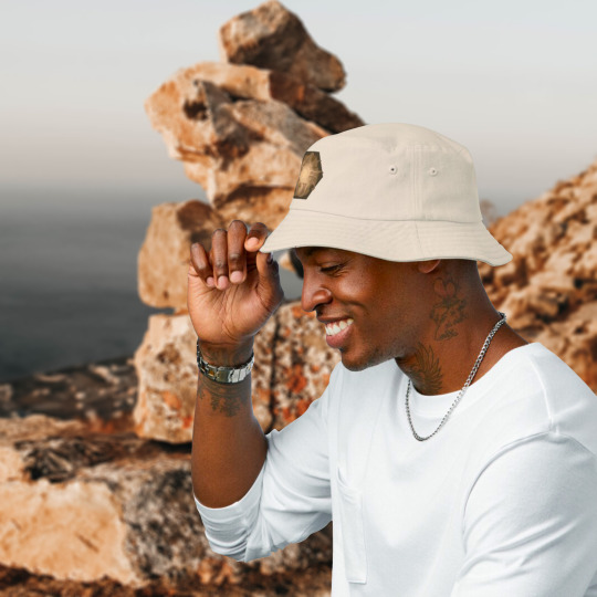
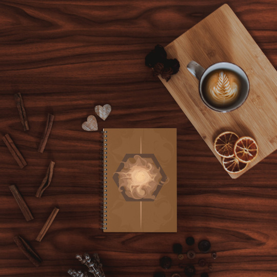


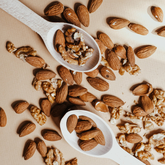
••
#moodboard#brown#cinnamon#swirl#coffee#latte#wood#almonds#color palette#mocca#brownskin#earth#ground#colour scheme#brown aesthetic#beige#luxury
24 notes
·
View notes
Text
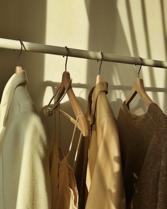
thebeiges: Instagram: @solncevgolove More posts like this here ♥ https://trashicorn.tumblr.com/post/641095803475247104/thebeiges-instagram-solncevgolove-more Sent from Pixm! A Photo Viewer and Universal Tool for Discovering Beautiful Pictures. https://appsto.re/us/pWte2.i
#brown moodboard#brown sugar#brown aesthetic#brown color#color palette#color harmony#brown street style#brown outfit#brown#color coordinated#color scheme#earthy tones#brown dress#brown sweater#brown coat#brown jacket#corduroyjacket#brown leather#jacket#beige#leather jacket#beige tones#knitted sweater#hand knitted#sweater#silk blouse#silk shirt#satin and lace#closet#coat hangers
2 notes
·
View notes
Text
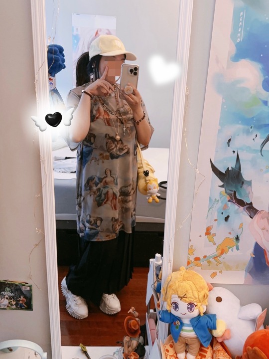
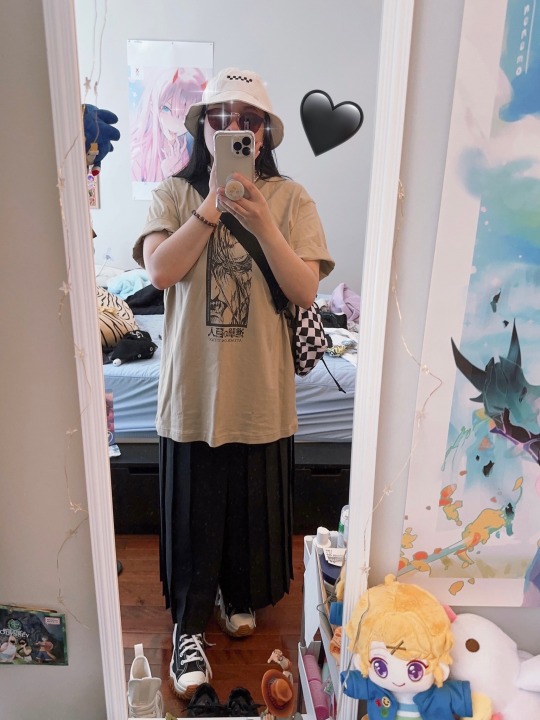
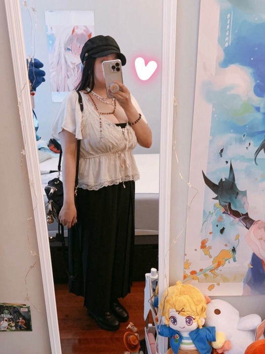
Went thrifting at this place called Basura (lol) w my sis and she got me these black pleated pants and I lost my mind I love them omfgg
I'm slowly packing my things bc I'm planning to move to Vegas REAL soon (to be Sushi's neighbor LOL JK it would be nice tho...) I feel like I got to let a lot of stuff go bc I don't wear it anymore! There are clothes I've had for years that I do NOT reach for at all, in fact I forgot about it??? So many items that I bought back then bc it was on sale, but never actually wore it... I stopped doing that when it comes to clothes bc I WANT to actually wear them for a long time and mix and match stuff in my closet. One of my friends said she wanted to see a clothing haul/closet clean out… Can’t imagine how long that would take, but I feel like packing w company makes it less of a drag to do, also spending time w friends is always nice lol. Tho idk if our schedules would like up bc we live on complete opposite time zones HAHA maybe if I wake up early to pack 🤔
It feels like there's still so much left to do before I move, idk if it's bc I AM leaving that my friends here plan SO MANY THINGS, SAYING "It's your last hurrah!" I don't think it has sunk in until I see more of my stuff in boxes and my living situation is figured out. I mean next month I'm actually going to Vegas to go to a festival w Sushi! And then while I'm there, I'm going to be looking at places to rent! It's exciting to think about, I keep thinking about how I'd decorate my room and starting the next stage of my life! It’s such a huge change, but I’m ready!

I forgot that I preordered the Kanae and Kuzuha figures until I got an email about the order being processed LMFAO which is such a coincidence bc a couple days ago I was just watching a bunch of random videos of them and they still make me laugh. Love Kuzuha’s expression! It’s so playful! Kanae’s face is one where you gotta look at him in a certain angle— tbh looking at him straight on, I’m like “at least you have a second head w ur eyes close” LMFAO BUT when I took him out the box to get a good look at him, he actually looked better than I had originally thought… or am I deluding myself… Either way, my man made it home! Even tho I had to do a double take and be like “Wait a min—“ 🤷♂️ I really love the poses, idk what it is about sitting poses that I absolutely LOVE. And how they have their gaming chair??? It’s so lax I wonder where I’ll put them in my new place. Even the Aki (CSM) figure where he’s all bloody and man spreading is such a nice figure too; and it’s a sitting pose!!! Really excited to see how that’ll look in person 🤭 Anyway these are gonna stay in the box until I move.
#I also realize how drawn I am to cream-beige-brown colors#like I find myself either going for black or beige…#my color range is so muted but I’m trying to expand AHHH#or maybe I just have to accept that I am stuck in a color scheme#I’m missing clothes too where’d they go… gotta search this house for em#do I get rid of shoes too… there are pairs I never wear too… guess I’ll see when I get to those too#shrekeii#x
5 notes
·
View notes
Text
I've decided to watch The Last of Us in the same way I rewatch John Carpenter's The Thing (1982), which means I'm only watching the parts with the cool special effects and skipping literally everything else!
Like, I'm sure all of the grayish beige misery that makes up the rest of the show is quite well done, but I don't wanna see it.
The main character of the show I am watching is gonna be the fungus. Anything that is not the fungus is of no consequence to the plot line I am following. Fungus don't care if little girl dies. Fungus gotta fung! And fung it shall!!
The plot line I am following, by the way, is "me, Jack, getting better at horror art and monster design, which means if I like these effects enough I will go back through every episode and screenshot literally ALL the frames I liked and then arrange the best 40 or so on a grid in my art program so I can color correct them for optimal tracing and art study. And also sometimes Pedro Pascal is in my periphery lookin' cute." - It's one of my favorite shows!!! Small fandom tho.
#tlou#the last of us#pedro Pascal#original#I'm sure it is well done but i can't handle that kind of stress#also i don't want to watch any more than the fun parts of a long-ass drama in which the color scheme is - as far as i can tell#'beige. army green. puke yellow (spicy beige). the greyish brown of a grimy window'#oooooo! i am enjoying the jerky movements of the infected so far!#sigh. the one thing i can never truly recreate in my static illustrations is upsetting movement!#and also like. music.#you can show approximations of most types of movement and this is fine except for movement that is also suppose to inspire#a gut reaction of either beauty or revulsion. i can illustrate an incredible dance and i can write out the music but oh to be able#to tell my stories in animation!#the bit with the dog staring is great. now that i COULD do#fuck that is a terrific idea for horror - the ant fungus that is the most upsetting of all fungi - i love the fx so far#this child actress is v talented and that is exactly why i can't watch the rest of the show. too upsetting. i hate zombie stuff tbh.#so claustrophobic and bleak. LOVE the monster design element tho#oh shit these bitches are FAST ZOMBOS#omg that girl died SO FAST#listen i know WHY that's the color scheme but it's still a no from me y'all
3 notes
·
View notes
Text

their color schemes are so lol. lmao
#this probably looks like shit bc my phone screen is unsalvageable LOL#but anyways yeah good for mary for introducing some well-needed blue in the mix#seto kido alone is a square tetradic color scheme but setos black hair is there to pair along w#kanos more monochrome palette. and seto's brown eyes + yellow hairclip is there to pair w kano's#beige and brown tones#also setos green pairs with kidos hair. very cool how seto is the meeting point of kanos and kidos colors#bc without seto kano and kido just completely contrast one another with no matching colors at all.#in fact kanos blonde (muddy yellow) is a direct contrast to kidos purple theming. very coollllll#lol i was laughing at how unpleasant it looks at first glance but now tht i analyze it more its like hmmmm clever#definitely not immediately pleasing tho but its not Bad and thats what matters#kgprambling#mekatrio
1 note
·
View note
Photo

Open Living Room Inspiration for a large, traditional, open-concept living room remodel with a beige floor and carpet, no television, a traditional fireplace, and a wood fireplace surround.
0 notes
Photo

Large Sun Room
#Example of a large transitional dark wood floor and brown floor sunroom design with no fireplace and a standard ceiling cream#beige walls#gold color scheme#throw pillows#sunroom#blue
0 notes
Photo

Bedroom - Contemporary Bedroom
#Bedroom - mid-sized contemporary master medium tone wood floor and brown floor bedroom idea with gray walls and no fireplace gray walls#white leather headboard#white furniture#tufted headboard#acrylic lamps#warm neutral gray color scheme#beige chair
1 note
·
View note
Text
On the Amphibia Timeskip Designs
Hi! I know I normally don't do analysis posts like these, but I got into an interesting conversation (read: infodumped hard to a couple of unsuspecting friends) about the subject on Discord earlier and I felt like it might be enjoyed by you all. Anyways, to begin...

I think the best place to start is Marcy. The thing that jumps out to me about her new design the most to me is her color scheme.


Across the board, everything is brighter and more saturated. Her dark blue coat has been swapped for a bright blue jacket, her dull green skirt has been traded for some vibrant green pants, her shirt has gone from a light gray to an off-white, and her debatably brown boots have been replaced with light brown, almost orange shoes.


Through the entire series, her hair is neat, properly combed (when not messed up by water or helmet-hair, anyways), and it's got this layer of gloss to it. It's a pretty innocuous set of details...

...but I think the picture comes together better when we compare it to her hair in the finale. It's less neat, it's messy in places, but it's not greasy anymore. It's not constrained at all, it's healthy and doing its own thing. And I think, in a way, that applies to her outfit as a whole. Throughout the "present" of Amphibia, Marcy is nearly always wearing a uniform of some kind; her school uniform, the Newtopian Night Guard uniform, the Core's greaves, it's always a look forced on her. In the finale, though, she finally gets to make her own decision on what to wear. It's casual, but it's her, emphasized by the personal touches like the pins on her jacket and the figures on her bag that expand out from little expressions of freedom on her original design. She's even got ear piercings, something typically associated with rebellion and freedom. She's finally allowed to be her own person. Not anybody else's, just... herself.
My thoughts on Sasha and Anne are a bit less in-depth, but there's definitely interesting stuff to mention regardless.


It might not seem like Sasha's changed much visually during the timeskip. Her hair is cut pretty much the same way, she still has a pink accessory on her head, she's still wearing a skirt and a jacket (like she did over her school uniform), and... I think that's intentional. It's a subtle sign that most of Sasha's growth wasn't off-screen during a ten-year time jump...


...it was during Season 3. With every redesign she got from her Barrel's Warhammer redesign onwards, her design got softer. Less spikes, more rounded edges, less rigidity. She even undid her ponytail, not holding her hair back anymore. Her reds got less area on her design, until on the timeskip look they were pretty much replaced entirely with a simple purple skirt. All that aggressiveness is gone, replaced with a comparatively soft design...

...and with the addition of a blue shirt to her color palette. It comes off as a little random, but considering her new profession as a therapist, I think a light and soft color palette featuring hues that are easy on the eyes is an important part of that. It's subtle, but I think it helps a lot.
And finally... Anne.

I find Anne's timeskip design to be the most difficult to talk about in this context, because it's mostly just a regular uniform. The green polo, beige shorts, white undershirt, and lanyard are just what she has to wear to work, and I find it a little difficult to find meaning from it... but that doesn't mean there's nothing there.

Let's get the obvious one out of the way. The leaf scrunchy is a cute way to call back to Anne's hair leaves, a pretty defining aspect of her original design dating all the way back to the first episode of the show that followed her all through her journey in Amphibia. It's a fun little way to reminisce on her past... but it's not the only part of her outfit dedicated to reminiscing.

That little blue flower band on her wrist is also easy to miss, but pretty obvious what it's referencing once you notice it.


It's most obviously a callback to the blue flower crown from earlier in the same episode, but Anne's almost always been associated with blue and flowers, with even her energy aura in her Calamity form taking the shape of blue flower petals.
But those are just simple callbacks. I think the two things that tell us the most about Anne's growth and who she is now... are these.

For her entire exodus in Amphibia, Anne's had one ragged shoe to keep her company. She wasn't ready for an adventure in the swamp. Now, she has proper rain boots, something designed to actually withstand the kind of work she does now. She's fully become comfortable with where she is and who she wants to be. And, of course, there's that little bandage on her leg. Perhaps it's a sign that she's still going out there, undergoing little adventures, taking risks and getting into trouble. Maybe it's a sign that that spirit we come to know so well over the course of the show is still alive and well... or maybe it's where she takes her estrogen shots
230 notes
·
View notes
Note
honestly looking at the designs for Vil's hometown event, the colors are giving Gucci. They're pretty close to gucci's brand colors.
[Referencing the new upcoming JP hometown event!]
Oooh, that’s so true!!
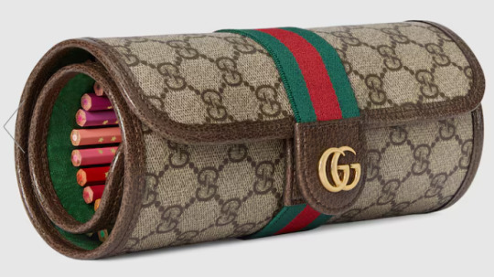
Vil aside, the outfits of the other boys do have very similar colors to Gucci’s signature ones, which are a terracotta red, a deep green, and a faded gold. Black and/or beige are also common in Gucci designs:


And well, what do ya know?? 😂 Jamil, Azul, AND Ace have beige suits with deep green undershirts, reddish-brown ties, and golden clasps/accessories. (I think Jamil wears a red-brown undershirt and has green lapels; it’s hard to tell from his pose.) They all also seem to have very dark liner, which, realistically, is probably meant to help their faces stand out in photos if they’re on a red carpet, but also fits into the Gucci color scheme.
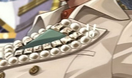
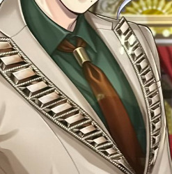
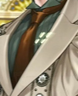
I believe Yana references luxury fashion sometimes for her designs, so maybe that was the intention here?? The color scheme also calls back to the Evil Queen's huntsman, so it creates a cool double meaning that fits the theme of a red carpet event starring Vil!
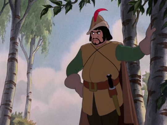
A friend recently proposed the theory to me that while Vil is the Evil Queen (and therefore is dressed most differently from the other event boys), Azul, Jamil, and Ace are dressed like the Huntsman to represent different aspects of him. For example, Ace is a card solider of hearts—so he’s the box that the Huntsman is meant to bring Snow White’s heart in. Azul could represent the deal the Huntsman made to spare Snow White’s life, or, alternatively, his kindness/mercy in letting her go. Finally, Jamil represents the profession itself and the Huntsman’s servile role to the queen.
I love seeing multifaceted fashion like this 🫶
UPDATE: Yes, it’s formally confirmed in the event that Vil’s guests are dressed up like the Huntsmen while his own outfit is inspired by the Beautiful Queen. The former are going to be his entourage and bodyguards as he walks down the red carpet!
#twst#twisted wonderland#Vil Schoenheit#Evil Queen#Huntsman#Azul Ashengrotto#Jamil Viper#Ace Trappola#disney twisted wonderland#disney twst#notes from the writing raven#jp spoilers#Snow White#twst theory#twst theories#twisted wonderland theories#twisted wonderland theory#tapis rouge in the shaftlands spoilers
259 notes
·
View notes
Text


This 1890 Victorian in Superior, WI was sent in by mildly-salted. The 5bd, 2ba, 9,147 sq ft home has been renovated and updated, and is listed for $549k. Normally, I wouldn't post it, but we like to discuss what we like and dislike in these renovated homes, so here it is.

Okay, there's a large entrance hall, and it looks completely intact, but it's been completely painted white and they put in new light wood flooring. The stairs have been painted deep gray and the red door ties in. What do you think? Original, yet light and bright, or a fail?

Would adding color help? I just noticed the X's on the floor. That's odd inlaid.

In the sitting room, the pocket doors are intact, but all the molding is painted white, the floor is painted deep gray, and I hate the gray/green walls. There's a fireplace back there, painted white, also.

Looks like they made this a game table, and the fireplace isn't original.


In the dining room they put in a darker wood floor, put up some very pale wallpaper, and painted the coffered ceiling, wainscoting, and built-in, white. The kitchen has open windows to the dining room.

They've got different flooring all over the house. The butler's pantry is painted black and has new modern handles with a marble counter and stone backsplash.

The kitchen is all white with brown counters and backsplash. Look at the square open boxes in the soffit on the right. It's very modern.

And, it has an eat-in area with a recessed desk. I wonder if a designer did this house. The windows look very modern, also.


They made a shower/laundry room in here.

The stained glass window on the landing is intact. The did a modern chandelier with a faux medallion and painted the floors. Now, it looks like the wall color switched to pale beige or creamy off-white. I'm sure that this new color scheme is much brighter and cheery than it was, originally.

Gray bedroom with a new fireplace surround.

This vanity is nice. I can't believe that they left the doors brown.

This room has a remodeled en-suite, but it's the only bath for the whole floor.


Bedrooms #2, 3, 4, & 5. Some are very small, some have a few remaining interesting architectural features.


The attic is a nicely finished space.


Nice yard with a patio in front of a large shed.

The corner lot is 9,147 sq ft.

It's just a couple of blocks from Lake Superior.
https://www.zillow.com/homedetails/1202-E-4th-St-Superior-WI-54880/79384366_zpid/
#victorian homes#renovated historic homes#houses#house tours#home tour#submissions#modernized victorians
99 notes
·
View notes
Note
What if in TFA holoforms were a thing and the Bots were able to use them?
What would the teams look like and how would they choose to use them?
-Optimus' holoform looks pretty similar to his human form from the episode Human Error. The difference is that his holoform has short, dark brown, curly hair that looks incredibly soft and freckles. His eyes are also brown and he's got those long eyelashes that models would kill for. His holoform wears pants similar to those belonging to firemen, complete with suspenders. He wears a simple, form fitting black t-shirt and big black boots.
As for what he would use it for, Optimus would use it to better help normal humans. Not everyone trusts or feel comfortable being handled by a cybertronian but someone that looks like a fellow human being? Yeah, it makes his work much easier.
-Ratchet's holoform got shoulder length white hair held back by a low ponytail and he's got a goatee. Like his human appearance in Human Error, he has a scar except this scar starts right above his eyebrow and disappears in his hairline. In holoform, he wears small, rectangular glasses, a red turtleneck, a white doctor's coat, beige khaki pants and brown leather shoes.
Similar to Optimus, Ratchet uses his holoform to better help humans. While he's not a human doctor, he still knows the basics and it's just easier to treat an injury when your fingers are not the size of your patient's limbs.
-Bumblebee's holoform looks to be about the same age as Sari after her upgrade. Other than that, he actually looks pretty much the same as his appearance in Human Error, thinking that his color scheme and general appearance is too iconic to change. He's got a lot of ear piercings though.
Bumblebee uses his holoform to goof off and have fun. There are some things he can't do in his true form, since everything on Earth was made for humans, but thanks to his holoform he can now access them. Things like theme parks and arcades.
-Bulkhead's holoform is 6'5 and built like a brick. But he's got the kindest eyes and a button nose. He's also got red, curly hair and freckles. His clothes consist of a green turtleneck with rolled up sleeves and brown suspender-pants, covered in paint stains.
Like Bumblebee, Bulkhead uses his holoform to have fun in ways that he couldn't as a bot, at least not without causing some major destruction on accident. But he also uses it to visit places and do stuff that he was always to nervous to do before, like visit museums and art galleries.
-Prowl's holoform is a tall and slim man with slicked back black hair. He's got a couple ear piercings and instead of his visor, he wears black pilot sunglasses instead. Prowl wears a fake leather jacket with gold detailing, a dark grey form fitting t-shirt underneath that in addition black jeans and combat boots.
As you might have expected, Prowl uses his holoform to better understand life on Earth and experience things in a way his true form does not allow. It allows him to gain a new perspective of things and better understand what it means to be a part of this planet.
63 notes
·
View notes
Text

My caprikid redesign. Everyone voted to keep the fur so I extended it into a vest though I also made a version where it stayed the same.
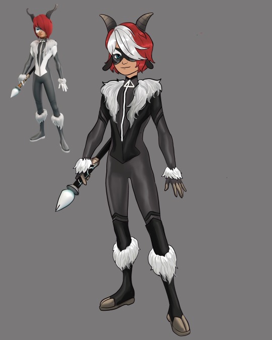
Turns out that I actually didn’t full dislike his design as much as I originally thought I just really hated his horns. While I know some goats have horns like that they reminded me more of gazelle or antelope horns than goat horns. They were also so tall sticking out of his head they looked kinda goofy. So I changed his horns to shorter straighter horns like on most common goats.
I added two more colors to his color scheme a darker gray and a beige. I gave him cloven hoof details on his boots and gave him some little goat ears. I wanted it to read more clearly as goat. I also updated his mask a lot. I tried to give it the same marking patterns as many goats and I like it a lot more. I also changed the color on his paint brush handle since that brown was not anywhere else in his color palette.
Finally I gave him I white patch in his hair. Don’t know how I feel about it, maybe I should have kept it solid red but I thought it might be fun idk.
Anyway who should I redesign next?
#miraculous redesign#miraculous ladybug#mlb fanart#miraculous ladybug redesign#marinette dupain cheng#ladybug and chat noir#ladybug redesign#goat miraculous#nathaniel miraculous#caprikid
145 notes
·
View notes