#because of the way i draw i try to simplify them to base shapes and so its a Lot of trial and error to get Right
Explore tagged Tumblr posts
Visit Tumblr Blog
Explore Tumblr blogs with no restrictions, modern design and the best experience.
Last Seen Tumblr Blogs


Fun Fact
In 2020, 27% of US Tumblr users had an annual household income of over $100,000.
Text
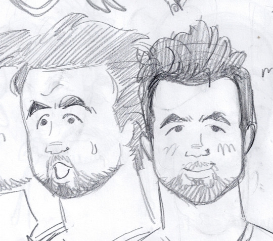
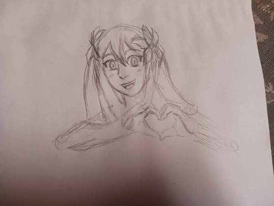
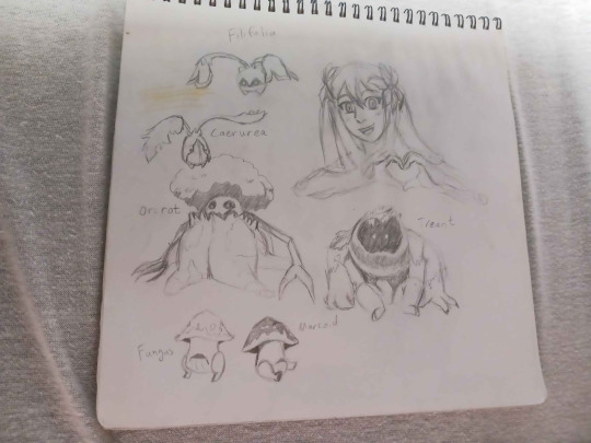
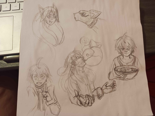
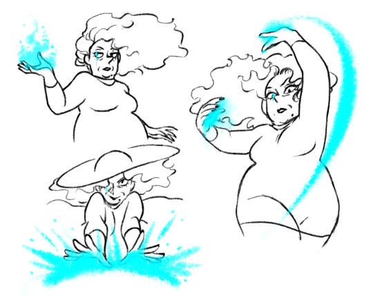
hai tumblr! fruits of my effort (practicing! i havent really done stuff like this before so some things are janky as hell ^_^)
[objects were done like fifteen minutes before the figures... they were my warmup!]
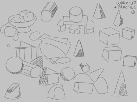
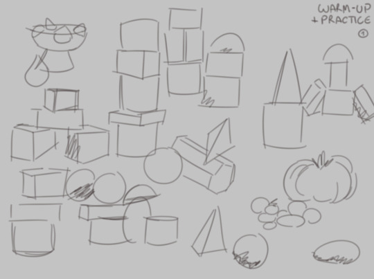
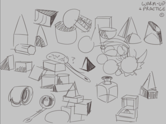
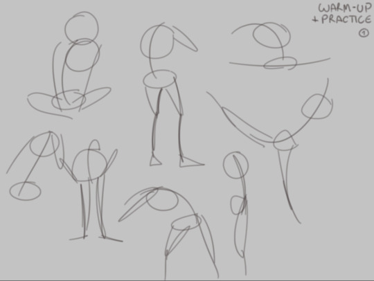
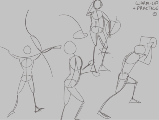
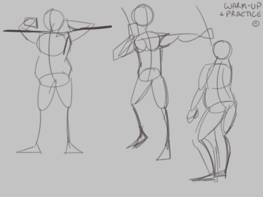
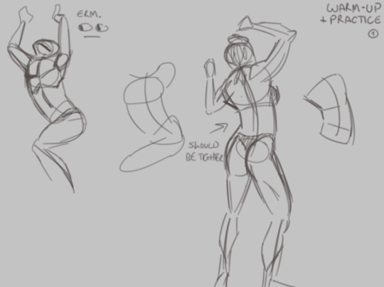
#haunted ecosystem#apparition sketchbook#normally i'd keep practice to the metaphorical sketchbook but! i feel like its interesting to share practice!#if anybody has critique/suggestions i am open to hearing you out ^_^ im still learning pgnjkfm human bodies are so. Odd#ALSO FORGIVE THE ONE ON THE LAST THING. that specific image set that its from always throws me off because of how hidden things are#i'll do more of these when ithink about it... its actually really fun tbh!!#also i totally didnt practically jump out of my seat when i saw that they have a variety in the models for the images!! i know its like.#pretty normal for these things? but it still!!! oh it brings me joy i love it!!#its interesting i need to try and think about things with Shapes [kind of like how i do with wings now that i think abt it...]#OH thats a whole Thing. i need to do rapid-fire wing studies i think.#because of the way i draw i try to simplify them to base shapes and so its a Lot of trial and error to get Right
3 notes
·
View notes
Text
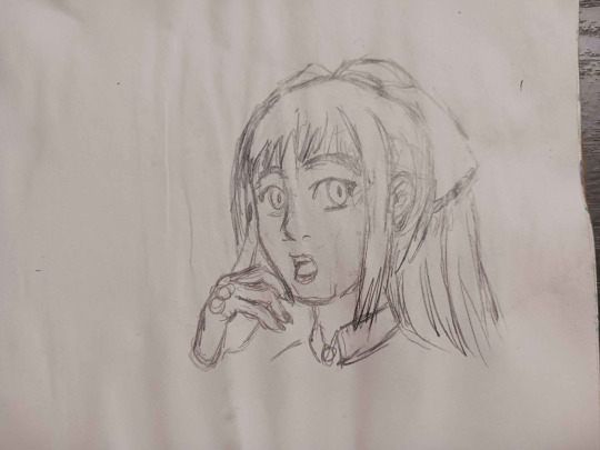
Here's a digital sketch dump of some pose/anatomy practices and some 2hu doodles, I think from now on if I don't have any big final piece to post, I'll just post sketches I liked that I did digitally (might also reblog some drawings of mine that I want more people to see, maybe idk).
Artist's Notes:
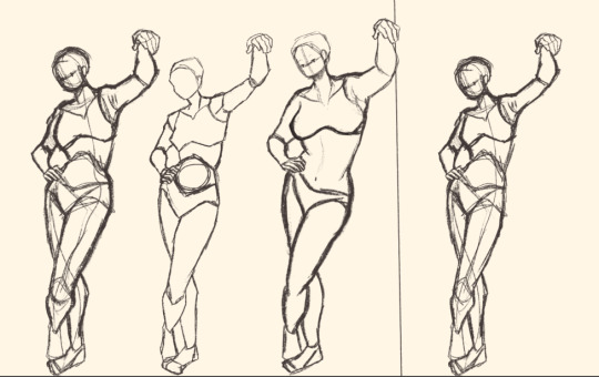
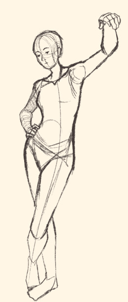
Ok so after the recent Hifuu fanart I did, I've been hoping to experiment more with how I draw faces, how I render, as well as how I stylize things. In some of the earlier sketches I did, I had an idea for a pose that I wanted to try drawing, so I took a ref pic of myself doing said pose (the leaning one btw) and then did a sketch over top of it just to get an idea for the shapes, negative space, and silhouette. After that, I wanted to do some simpler breakdowns of the shapes so I can get better at simplifying the body (these ended up being the bottom right sketches in the post). I also did some experimenting with how to push certain parts of said sketches to create a different body type (via liquify and then a more refined version based on that sketch), as well as figuring out what makes a pose feel natural and not stiff. This was also a bit of a foreshortening practice just so I can get more confident with it, and I ended up using the arms from the liquified version for the coloured Zanmu sketch I did since I liked them so much (dw I'll get to that).
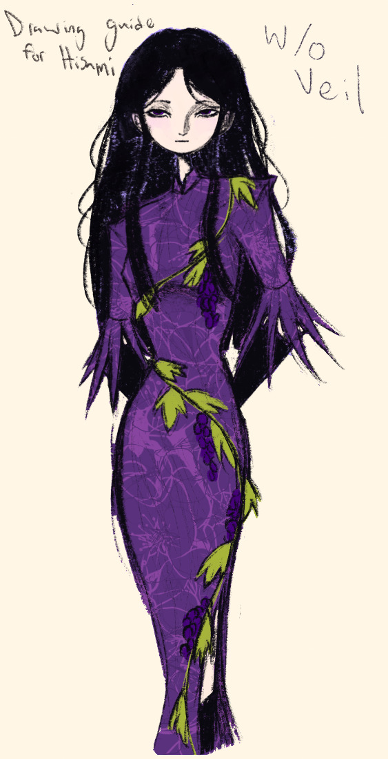
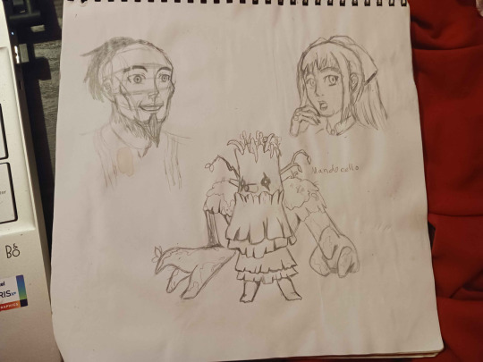
The next thing I wanted to try and draw was Hisami, mainly because.... I am very bad at drawing her in my style. Last time I drew her I made her look really creepy and spindly, and it is my headcanon now that she can switch between a more human, and more creepy look whenever she wants. I'm liking where the face is going a lot, might have to refine a few things about it in the future, but it's cute (I also made the blush purple which I think is what I'm gonna do with her face from now on). I also like how her hair in the sketch turned out a lot, but the outfit..... not as much... Ever since I started changing my style to something less cartoony, I've had a hard time drawing her outfit in my style. Especially the flower veil thing she has on, which, I did try to find a way to draw, but I ended up deleting that sketch because I didn't like it. I'm also not a fan of using the colour purple, like, pure purple, magentas are fine, indigos are fine, but not strict purple. I also have a hard time with drawing all the little pattern details on her dress. I also need to find a way to draw the flower veil in a way that looks good because everytime I try it ends up just looking off (very similar to whenever I try to draw Zanmu's blue spears). I think the only solution to this problem is to do what I normally do and make my own version of the outfit, but with adjustments to suit my style while still trying to keep core elements from the original design intact (like I do with Zanmu and Keiki, and yes I am going to get to that Zanmu drawing just gimme a minute).
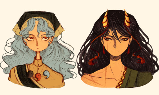
Ok next up is Keiki, my favourite Touhou character who I haven't drawn since the beginning of the year. Since my style has changed a lot, I wanted to just do a face sketch of her to get a hang of drawing her again, and I..... really really like how it turned out! When I drew her eyes, I realized that a good way of keeping faces too same facey can be via varying the sizes of their pupils, so that's an idea I'm gonna keep in mind from now on. I had a lot of fun with her hair, I initially was gonna do it like how it is in the official art, but I ended up not liking it, so now I'm gonna draw Keiki with wavy heir like this because it's fun and it looks nice. I also included my base sketch for Keiki's face since I was initially struggling with drawing her bandanna, and in the coloured sketch I added some more detail into her hair.
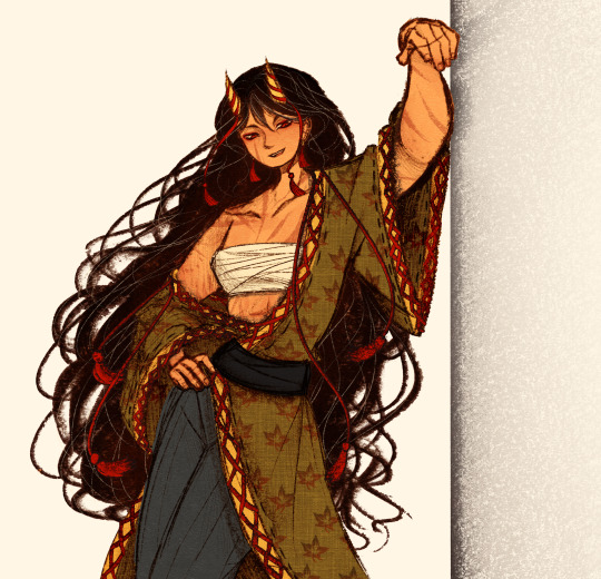
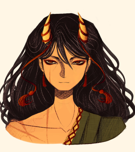
Now to finally talk about the sketches for Zanmu. Good lord was I having a tough time with her face. I also did this sketch before I figured out how I wanted to draw hair, so that's why the rendering on her hair is different (I did this soon after the Hisami sketch actually). Since I changed my art style a lot, I had to find a way to translate her face from my more cartoony style to my more detailed style, so while the face shape, nose shape and mouth was fine, I was really struggling with the eyes. I did get somewhere eventually though, and I am super happy with how it turned out. I wanted to lean more towards the androgynous side of the gender presentation spectrum, mainly because I think that makes sense for her character. Also made sure to include the silver hairs and some wrinkles just to bring some signs of her aging into her face because those are just staple features of how I draw Zanmu at this point lol. You will also notice that I gave her some scars on the right side of her face, and that's because I am a Zanmu-with-scars truther, I fucking love it whenever I see someone give Zanmu visible scars like that it just adds so much omg (I also tried to put a wolf bite mark on her arm in the full body drawing but idk if it reads well). While you can argue that her not having scars sells the idea of her being this "powerful, untouchable mastermind who is impossible to defeat," I'd say that instead of those scars representing times she got injured, they represent everyone who has failed to defeat her.
As I was drawing Zanmu's face, I referenced my sketch of to help with contrasting their features since I made Keiki's face more traditionally feminine. I also didn't mention this in my commentary on Keiki's face because I wanted to save it for here, but giving Zanmu scars also plays into the fact that she used to be human, wheras Keiki doesn't have any scars because she's a god who doesn't follow the rules of normal human biology. Plus I'm thinking about the two of them interacting again (return of Zan/Keik??? (I'm a multishipper btw) maybe???) so drawing their faces together will definitely help me in the future if I wanna draw them together (again, maybe as a ship? I've kinda been ironing out the kinks in their potential interactions (romantic and non-romantic) for a while now so idk maybe expect that in the future lol).
And now for the full body drawing, when I was doing the face sketch I did this little snippet of an outfit, had a vision, and the made it into a reality. I'll admit, part of me was worried that it would end up looking too much like Yuugi's outfits in the spinoffs and mangas, but I feel like I made enough changes to differentiate them. I tried to keep a few of the major details in Zanmu's design (i.e. the red tassles and yellow lining on her shirt) while putting a new spin on it. I also dialed up the scars to 11 since without them the whole thing kinda looked incomplete. Also, while I could say that the leaves on her kimono are "a nod to the fact that technically she should be a tengu because back then people belived that corrupt monks would turn into tengu but no Zanmu is an oni and they're maple leaves because...tengu...ahahahaha" what really ended up happening was that I looked up clothing patterns from Sengoku era Japan, liked the leaves the most because the red picked up on the red from the rest of her design and just ran with it. I also always had the idea to put Zanmu in men's clothing from Sengoku era Japan and while the accurate thing to do would be to put her in a Buddhist's clothes from that era.... from a character standpoint, I don't think Zanmu is pious enough to strictly wear the proper monk uniform, and also since she's basically the king of Hell, she would probably dress herself like royalty from that era. TBH, I probably could've been a bit more historically accurate, but again, this was mainly for conceptual purposes because I had a vision and I needed to see it through.
If I were to draw her in this sort of outfit again, I should probably try and use more references, although now that I look at it, if she were to wear it properly this would maybe, probably look a bit closer to a Kyūtai sugata (a very huge stretch, but it just kinda reminds me of that) just without the layers under and over the main piece of clothing (In the website that I searched up to try and compare the outfit in my sketch to, they name the outfit pieces but don't label them on the image, so I don't know 100% what everything is called) so I will definitely have to use that style of clothing as a reference going forward.
Also, I was kind of inspired by the ToTK design for Ganondorf since I have finished the game a while ago and I absolutely love what they did with his design (it's just so fucking cool omg) and I thought that sort of look would look good on Zanmu, so yeah got some inspo from that.
And those were all the notes for each of the sketches, I'm motivated to draw rn but kinda art blocked, so doing these little coloured sketches helps a lot.
#touhou project#art#fanart#sketches#sketch dump#zanmu nippaku#keiki haniyasushin#hisami yomotsu#touhou 19#touhou 17#unfinished dream of all living ghost#wily beast and weakest creature
344 notes
·
View notes
Note
Fresh drawing tutorial? Maybe even a colour picking tutorial? If you want,,,
I dont' really know how I would do a Fresh tutorial.. so I just drew up a quick process thing and also some design notes for things I keep in mind when drawing fresh, anatomy/body type wise.
I do a LOT of yapping, under cut


To make things look extra fresh to me, I try to keep in mind his body type, or what I see as his body type, when I'm drawing him, as well as shapes that remind me of him. [very triangle man!]
[note: when I draw him, I don't usually use different colors to go from step to step [that's just to show it off easier], and I don't usually Think about it all that much.]
Color wise! I don't really know, so much of it is just Experience, having drawn like this over and over, and trying out things that feel like they work or not. I don't consciously think of my color choices all that much, I'll try my best to explain it though.
[This will be going forward with the assumption you know basic color theory [ie. red looks nice next to green cus they're on opposite sides of the little circle, cyan and blue look nice cus they're next to each other, and that making blue go closer to grey makes it look warm, and making red go closer to grey makes it look cold.]]
V cont of the process thing in the first image.

First I want to know my "base" colors. For Fresh I have him pretty simplified to 5 colors, but this goes for any time I'm colorpicking. I want to know what it looks like devoid of any tints or lighting or similar. [They're kinda ugly since they're so .. grey haha]
After that, I want to think of the tone/environment I want to put him in, or a color that I want to work with.
With that, I'll decide my Line Color; this'll be a dark, usually highly saturated, color that'll decide the tone of the rest of the piece. Using my line color I'll oriantate myself by doing "black" & "white" next, black will be close to the line color, and white will usually be the line color very lightly and unsaturated. [sometimes I'll ignore that, and use a very light cyan. tinting white colder colors can make your whites look cleaner, especially if everything else is warm toned.]
For the other colors in the peice, I'll just be trying to pick things that are like the base colors but tinged by the line color I'd picked, as well as just fitting and looking nice next to it. Sometimes it doesn't need to be tinted towards the line color if there are other ways to make it look cohesive. If a piece I'm working with has a cyan tint, making the pink more red-toned looks nice, because red is complementary next to cyan.


To tint colors that are far away from the line color, you can also de-saturate them. De-saturating pink makes it cooler, and fit more next to blue.
Normally I eye-balled off the color-wheel, but if you're having trouble, multiply and overlays can help in a pinch [picking normal colors and than overlaying with like, blue or green or something]. I wouldn't recommend relying on them though, because they can often lead to your colors being de-saturated, or washed out if over used.
61 notes
·
View notes
Note
Iztea I need your help💔💔 I'm genuinely trying to find my art style but I'm not very good at art in the first place, I'm a beginner and I just don't feel motivated to draw anymore because I'm not good at it,, can you pls link your tutorials so I can try to follow them the best I can..😓 I genuinely love your art and your a huge inspiration but I can't draw for shit. A lot of the tutorials on YouTube don't actually help me as much as they do for other people so I'm lowkey putting my faith in you to try and help me lmao, I just can't get the proportions of anything right, like I can't draw a body or head,, and when I trace things it just feels like cheating in art like ugghhjjnn,, can you help me😓☹️
If you struggle with proportions, then drawing over the reference photo (which you should totally have, btw) to get a feel for the distance between things is a great starting point. I also think you should have simplified anatomy references, as well as references from other artists. Basically, everything I mentioned here i don't want to repeat the same points
Tracing is not "cheating" if you're using it to learn. It can be very distasteful if it's used for finished art, where it is obviously meant to replace actual skill, or if it's traced from another artist. If you're using it to study and as a stepping stone to improve your skills, then it's totally fine and even encouraged (it's like doing assisted pull-ups at the gym). But you gotta to play it smart—tracing the actual outline without engaging in critical thought leads to ugly, mediocre, commercialized art that we don't want because we're cool based and always striving to improve ourselves
Okay anyways "But how exactly do I trace references in a smart way, iztea?" Well, like I said, you can lower the opacity of your reference photo and draw over it. Use the general shapes and volume of the body as your guide until you learn to draw without them. Don't follow the outline exactly—exaggerate or stylize the limbs to your liking. For example, I like drawing small wrists and long, slim necks because I think it looks more appealing. So whenever I'm using a reference, I (subconsciously most of the time) slim these body parts down, elongate the fingers, and so on. If you're still not sure what your style is, that's fine too. Use this exercise to find out what your hand naturally leans into
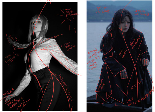
I'm not the cleanest sketcher, and it's been a while since I've done this sort of approach, so excuse the messiness but I wanted to show an example of how I'd tackle this technique. If you look closely, you'll see that I didn't exactly draw over the body parts, especially in the neck and arm area. I exaggerated the posture by adding more gestures—I made the shoulders rounder, the skull bigger, and the arms and neck longer and slimmer. I didn't focus on details like the face or fingers because that's not the point

The next important step after creating your guidelines is to redraw the lines from scratch on a separate layer, but this time without the reference. Set the reference aside and focus on copying your own guidelines. Afterward, compare the two drawings to check if your proportions are accurate. If they're off, take note of any recurring mistakes and correct them. For example, I have a tendency to draw the mouth too far down on the face, so it's something I am always aware of whenever I'm drawing. Other times, I draw the eyebrows too high from the eyes and so on. Another important thing to point out is that not all references are created equal—there are such things as bad or poor references. If the body’s silhouette looks like a blob or the limbs are heavily foreshortened, you'll find it much harder to draw so for practice, I recommend choosing poses that are fluid, clear, and expressive, with good lighting and features you can exaggerate. This will make it easier to understand the form and you'll have more fun in general I've provided a little comparison below. I'm not saying the 2nd pose is terrible and impossible to draw, it's obviously not, you can draw anything you want howeveerrr if you're just starting out, painting the 2nd one can be much more challenging due to it not being very clear in shape, value range, pose, gesture etc. So what I'm trying to say is to choose your poses wisely too
I don't remember doing any tutorials outside that hair one unless you consider my rambling sessions tutorials (i don't) but you can also scroll through the #ask iztea: art talk hashtag for whatever art-related question I might have answered I'm too lazy to link everything so YOU put the work and stalk my page
anyways yeah idk this is how i'd start.... so to summarize:
pull up references, from both real-life people, simplified anatomy sheets, and artists you like
draw over your reference photo and treat it as your training wheels
close the og reference, and use the newly traced, much more simplified outline as your new reference, and now draw the pose again, but "freehand" this time
compare the traced and the freehand version, take notice of your proportions and try to correct them
choose good, readable, easy to draw refs
never give up never what
#wjy would you ever put your faith in me though im just a girl#don't count on me bro#ask iztea#ask iztea: art talk
31 notes
·
View notes
Note
do u have any tips for learning to draw mecha :O?
Okay I feel like potentially I’m not the best person to ask if you want to learn to draw something cool like, canon detail transformers, metal gears, or gundam simply because I’m not the greatest with mecha, I’m just confident with simplifying it to a level where I can draw it repeatedly and comfortably 😅😅 I am learning to draw mecha behind the scenes but oh my goodness it takes so much practice!
I’m assuming you ask this because of my most recent drawings of Rev! (If that s not the case please feel free to ask how I managed a specific drawing/post)
In which case, basically my best advice to drawing mecha the way I do is to :
1- draw the original design a few times as close as possible to canon! Learn the intricacies. Do this several times, and it does not have to look good, you just need to know what’s there, and from an artist’s perspective, which parts are most important. Example: You will still recognize Revenant and Pathfinder even if I do not detail in all of the metal grooves, or tiny mechanical parts, especially if I still have things like Revenant’s spidery, extending hands, or Pathfinder’s spool(-like contraptions) for his grapple on his shoulders!
2- determine the shapes! What shapes is your mecha made from?

Doesn’t have to be perfect, but create the absolute most simple shapes from the silhouette of the mecha! Use this as the base for how complex or simple you want your mecha drawing to be!
3- experiment and try again!! What’s interesting about most mecha is that the design is usually completely unique and fantasy in the sense that: such a thing does not actually exist in real life, but ARE based on things we see everyday. They’re SUPPOSED to be difficult and convoluted and just strange. Think of them the same way you would a dragon. There’s so so many kinds of dragon in fiction, based on everything from owls to reptiles to bugs. Mecha can be inspired by analog TV sets, heavy machinery, or even non electrical things with mechanical components (think: levers, pulleys, wheels, etc.).
Lastly, check out some folks on YouTube who’ve definitely got a better grasp on mecha if you’re looking to get more realistic with it! Here’s a playlist I’ve put together of videos I’ve been watching to understand better!
14 notes
·
View notes
Note
I'm not sure if you've made a post about it already, but I'd love to hear your thoughts/headcanons for the jjk characters too!! :O
i briefly mentioned maki in a tangent off someone elses post, so ill go full into it here :)
-JJK spoilers ahead-
in general, i think its fitting for all the students to be in shape. i mean, physical training is a large part of their curriculum, its essential, but at the same time its important to recognize the variety of athletic bodies
also, i stated in my one piece post about how a bodybuilding physique isnt sustainable, and thats because you should have fat between your muscles and skin, end of story. and muscles generally arent defined without flexing anyway (another post that addresses this).
so, what does this mean for drawing these characters? it means theres no damn way yujji's dead ass is looking like this in the morgue
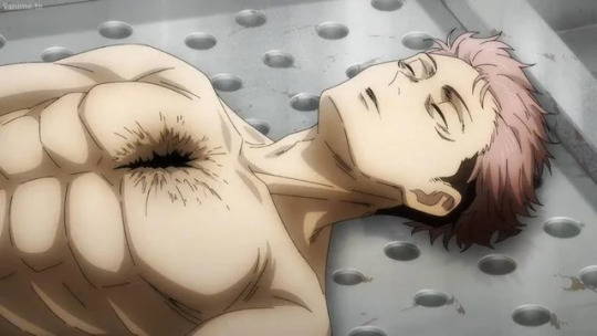
there should be little to no definition on those abs yet each one is shaded like that??? listen i for one fucking hate drawing abs period i will take any excuse to simplify it, but it realistically it should be far more subtle, just a suggestion of the muscles rather than individually outlining each and every one of them
here i have sketched a majority of the main students in my body hcs
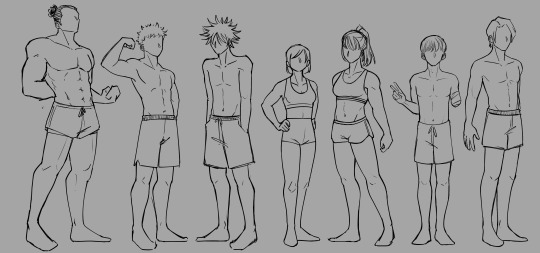
todo is absolutely the type to go after an aesthetic body, but i fr just see no appeal in a body fat percentage below 10 (by reference of this image)- so i kept his muscle level, but took out much of the definition (of course he could still flex to be more defined, but resting would be more like this)
the rest have much smaller differences, but differences nonetheless. based on vibes.
yuji is muscular, but drawn off the assumption he doesn't do much weightlifting, just strength training (a bigger focus on function over fashion). its the same thing with megumi, really- you can be strong without having bulk at all (see movementbydavid on yt) only really showing muscle when flexing
the rest follow the same lines of logic. vibe based and all that. i dont wanna drone on explaining each and every decision bc i hope its mostly self explanatory.
remember: their cursed energy strength is not equivalent to their visible strength. abs aren't always visible. use references and try to vary your body types, fanart or not.
#art#digital art#jujustu kaisen#aoi todo#yuji itadori#megumi fushiguro#nobara kugisaki#maki zenin#toge inumaki#yuta okkotsu#lesbomatic meta#artists on tumblr#drawing#body headcanons
17 notes
·
View notes
Note
Do you personally believe in Asian superstitions surrounding lucky and unlucky numbers? As somebody trying to make something but unsure of how much these beliefs have an influence on me it highkey drives me insane 😭
Hi there!
I did have this same struggle once with superstitions in general. Like you, I had the thought of "Should start believing in all these things now that I'm a spiritual person?"
Superstitions are held by laypeople who have an indirect and watered-down understanding of the world of spirit. There is undoubtedly some truth in them, yes, but it is often over-simplified, incomplete or misinterpreted. Think of Plato's allegory of the cave, where the prisoners see only the shadows on the wall and not the objects that cast those shadows.
What we do as spiritual practitioners is to ponder and investigate why and how, and base our craft and cultivation on that.
Just as a layperson can tell you that aspirin reduces the sensation of pain, but a scientist can explain the chemistry of why and how it happens.
You've probably heard of iron being used as a protective metal to repel Faery Folk, right? It's a natural assumption to make that iron is somehow fundamentally harmful to fae. This fascinating post by Lailoken proposes instead that iron is in fact sacred to the Folk, and the perversion of this metal through smithing is what repels them.
Remember, that spiritual practitioners, occultists, witches, magicians, sorcerer/esses (etc) are beings that laypeople have superstitions about.
I suspect you have visited my blog because you consider yourself to fall into this general category 🙂 So ask yourself, on what basis do you believe in the superstitions of your ancestors?
Onto the topic of numerology...
If I may: what you are really asking me is, where do things get their power from?
Laypeople believe that 4 (四) is unlucky simply because it is a homophone for death (死), or that 6 (六) and 8 (八) are lucky because they are homophones for the flow of fortune (溜, and 发 as in 发财).
Is there power in this? Perhaps, from the collective psyche of innumerable people making this connection. Whether it is powerful depends on how well you can tap into that current of psychological power. I personally find the idea of homophones creating in/auspicious numbers to be shaky, so I struggle to invest much belief in it.
I do believe that there is power and meaning in numerology, though. In magic, numbers are symbols, in the same way that colours, shapes, plants, animals, and celestial bodies are.
These things have power from how they naturally express themselves in reality. Allow me to expand on this:
1 is the number of beginnings, individuality, single-pointed focus. It can be used to express both the entirety of existence or the tiniest piece of it.
2 is duality, polarity, cycles and opposite or/yet complementary forces. Day and night, yin and yang, heat and cold, mother and father. It is attraction, passion and pursuit, such as that between predator and prey, or between lovers. Hence it begins to generate movement and force.
Where 1 lacks motion because it has nothing to be moved by, 2 creates a dynamism as it strives to find balance and union.
3 is the number of innovation and creativity, born of the attraction and movement of 2. Between fire-hot and ice-cold, between Heaven and Earth, 3 is the sweet spot in between that creates life, drawing on powers from contrasting forces.
3 is the first number where stability and balance can be found (a chair cannot stand on 2 legs, but it can on 3; pyramid structures are highly stable). 3 is the number that brings a sense of space and time: length/width/height, past/present/future. Triangles are used in magic for conjuration as well as for trapping spirits.
4 creates foundations upon which all else is built. The four elements, cardinal directions, seasons, DNA nucleotides. Therefore it is a number of solidity, consistency and endurance, yet it can also mean stagnancy and obstinance. You could argue that 4 is unlucky because it can be used as a symbol of imprisonment; after all, death is a fate none of us can escape.
5 is often the number of transformation, as our five-fingered hands create and destroy. 5 brings conflict because it is attempting to break out of the solid confines of 4 (incidentally, 5 is also associated with Mars, the planet of aggression).
In East Asia, we have 5 elements instead of 4. Hence our elements work differently; they are not building blocks or foundations, instead they represent the ever-changing and dynamic forces of reality that are constantly overpowering or being subdued by each other.
Conclusion
I'm vaguely aware that numerology features heavily in Daoist magic, but I have no idea how much of what I said above overlaps with Daoist numerology and how it is used in ritual. Even so, like any esoteric tradition, it is a study of the nature of reality, and anyone can attempt to reach these revelations through their own studies and meditations.
I hope I have demonstrated that it is not so simple as 'lucky' and 'unlucky', 'good' or 'bad'. Just as it is with all things. The water that nourishes and brings life, can also destroy everything in a mighty flood.
I also hope I have been able to inspire some clarity in you on this matter 😊 good luck on the path.
8 notes
·
View notes
Note
hi, i've been studying some of your sketches and i was wondering if you had any advice for drawing facial features? :> i know that's extremely broad but what i mean is, in a lot of your drawings, especially those where you're referencing actors (such as your drawings of ds9 characters and the iasip cast) you manage to stylize and exaggerate their features in a way that makes each individual look unique while still remaining extremely recognizable. especially for your drawings of mac, frank and dee, you've broken them down into simple shapes while perfectly maintaining their identities
do you have a process for that? i've been trying to push faces more and i've been referencing actors myself, but i have a hard time translating the shapes of the face and eyes into my own art, as well as reproducing it at different angles... thanks for your time
Hi! Thank you for such lovely words! My answer would seem very unprofessional since, if im being honest if im being raw and real right now i truly dont know exactly how i take the elements to make each of them unique, if i say what really REALLY helps me get them is knowing the character very well, once i know their personality its easier to choose one of the 3 mains shapes i enjoy which i always rely to when designing, circle, square and triangle, depending on which shape i choose for the character i will try and base nearly every shape possible surrounding that, this is mainly to keep in mind that i also dont design one character at the time, other thing that really helps me is comparing! If i design a bunch of characters like i did with sunny and ds9, i always make sure to go back to the other designs to see that i am not repeating a feature too many times, it ends up making me have to use different ways to convey a characters soul through it that really differs from other charas. I would say the 3 shapes is what helps me the most, knowing the character personality and other thing is just simply breaking down their features in comparison to others, but to be comepelty naked with you rn, sometimes i dont even look at references because if i have to REAAAAALLY simplify a character, i will go purely by vibe (example was the Damar and Kira drawings, i didnt used any references at all because i thought id over do it finding every single detail they have to implement), if a characters specifics stick with you purely by memory, then it totally means that it identifies them! Also just to appear more visual i will add the 3 examples you offered and how i visually see them different from each other when i drew them
Frank - circle

Dee - triangle


Mac - square
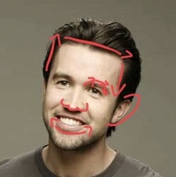

Overall, id say have fun with it! Dont stick too much on ALL their features, sometimes choosing main characteristics makes them pop instead of trying to imitate all their facial structure, i always put too much detail on their eyes, mouth and wrinkles, but what i truly enjoy the most that makes me feel that makes every face different is their nose! So just stretch them as much as you can until you go “hey , these people are different!”
52 notes
·
View notes
Note
If you're comfortable, can you make a tutorial on how to draw in your artstyle? I'm very sorry for asking if somebody else have already asked
hello anon, thank you for asking! i will preface all of this by saying i don't mind if anyone takes inspo from my art etc. but i will probably be a little neurotic if i notice it in the wild and there's itches in my head about it. i'm trying not to let personal feelings get in the way of my principle of it here 🏇
i don't really know how to make a tutorial. i tried to draw something that could get concepts across, but it was really hard and i didn't like any of it so instead i'll just put the general process and "rules" i have in mind when i draw. 🙏 sorry if this is less helpful than if i'd use a drawing
the drawing process changes by how much i plan and whatever i feel like, but my general rule of all of this is to keep it as enjoyable for me as much as possible 😊 i start with a sketch.
if i want to shade everything in one layer ("render" even...) i go straight to color after this. this only works if i don't mind it being messy and choppy. i never mind choppy shading i find it charming personally but it will be harder to adjust perspective/proportion/composition mistakes here. i usually color under the sketch layer then i merge it all(with a backup ver out of habit) and just color over the lines and refine things. this way is not very time consuming because i don't care about messiness 🤷♂️
or, if i want to use lineart. i just clean up the sketch usually because my attempts to redo the energy in a sketch suck balls 🤷♂️ if the sketch sucks too i just try to redo it entirely. idk. sketch=lineart etc. my general rule for this is too keep things shaped and simple. i don't think my silhouettes are very good at all but i want to work on it lol. i don't like having to do details so i like avoiding them. sometimes a messy lineart can be more charming to me than a clean proportionate lineart? keep shapes in mind that you find cute ⛹️♂️ details add texture so you have to be careful with how you want that to go. uhhh my mind when doing lineart is too jumbled up i mostly go by intuition based on what i like in other people's art but that applies to any part of drawing
for lineart-related coloring umm ive changed shading styles a couple times here lol. but they can all usually be categorized into two. i'll simplify it with hard to soft shading 🙂 hard is like, "cel shading" i guess? it's solid. it's easier to do but also harder if the colors are too complicated. i usually do this in one layer with the lineart because i use procreate and i'm too lazy to do the selection shit 💢 i like colors a lot in art and i've mentioned how i do them before i think? i always fuck with it with tone curves and gradient maps and posterize if it'd work. just fuck around with anything and you'll start to learn about colors from there 👍 i avoid multiply and add/luminosity layer settings to shade. just because i think it looks bad on my art. and it's annoying to work with too. the hard soft shading thing is a spectrum kind of cause it's really just how many colors are used in one "object"? like skin can vary from one color base and one color shading or a gajillion colors to create texture with blush etc. but there's inbetweens where it's various colors but "hard" but also soft and hard.
soft shading is just straight airbrush. actually not really usually for me it's just me lowering the opacity of my pen as i draw and fucking around with the colors like improvisation. feels like painting but in a too stupid for traditional art way 🤤. but i've also used the airbrush a lot lately. i don't try to use airbrush in "objects" and art that need more texture, like trying to shape with airbrush is fucking hard. but i've done drawings entirely with airbrush tool before just to size it down so it's basically a blurry pen the lol. but for the other way i use the airbrush (where i block out objects and make a flat-ish gradient on it) that one is just exactly what it looks like i just make shapes under the lineart and then clipping-mask a color over it. and always always mess with the tone curve after 🤤 or maybe you can learn color theory for real #up to you
that's all that's really important i think? if you want to ask more you can. sorry if this was less helpful than you'd want i just don't rly know how to give an art tutorial i don't rly have like. a set idea for my artstyle. is not solid
6 notes
·
View notes
Text
DotNW Draw-a-thon Recap
Links to individual posts and the associated art at the end. But first, some thoughts.
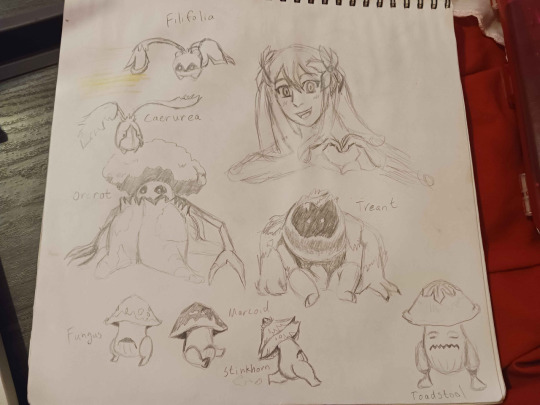
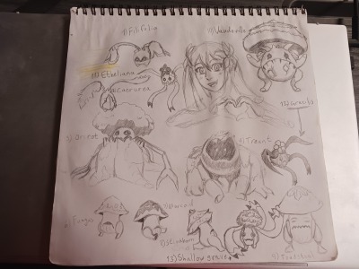
Want to start by saying this was an excellent and very fun event and even though the English fandom is very small, it was fun to participate. I will be adding on more monsters into the sketchbook to fill it up, but probably not at the rate I've been drawing this month. I would like to someday make the complete monsterbook, including the descriptions from the game, organized in groups based on evolution, but that's a big and very casual project for the future. No promises. It's just a shame that such a resource doesn't already exist. There are videos on youtube that let you look at the monsters in a players completed monster book, but none of them go for the little descriptions and all of the videos are ancient potato-quality rips or just straight up filmed from a monitor rather than screen-capped. It's just not the same as big fancy drawings. But also I will never not be salty that you cannot rotate the monsters in the monster book. I wanna see what these guys look like! SOMEBODY PUT EFFORT INTO DESIGNING THEM, LET ME SEE THEM! AUGH!
Skills I learned from this draw a thon:
People are hard to draw. But the Loomis method for heads simplifies a lot of facial anatomy with easy proportions to remember and landmark guidelines that are more than just "draw sphere, draw a cross on that sphere, put your eyes on that cross and manifest a jaw from the ether, slap hair on that and place ears somewhere. You're on your own for the mouth and hairline. Did you do it?" The Loomis method, at least the videos I found, very gently explained where all the lines go and what they're for. Rocky start but I think I'm getting a handle on it? Not an expert, clearly, but I'm getting better.
People are hard. Hands are harder. And yet if I have a reference of exactly what gesture I want to draw, I can do it? Which is very strange. Hand construction still eludes me, so I will be practicing that, along with feet because those are also hard, but I'm actually somehow way better now at just... taking a pic of my hand on the selfie cam on my phone and just... "Okay, yeah, that's what the fingers look like. Makes sense. Let me just slap down the contours for a rough idea of the const-- Oh, nevermind. I just made the hand perfectly the first time..." So yeah, any of the good hands you see are either me looking at my own hand and drawing it directly, me looking at a reference and drawing it directly, or, especially on the monsters, me being incredibly lucky every single time. All the bad hands? Construction or agonizing over trying to utilize indirect reference.
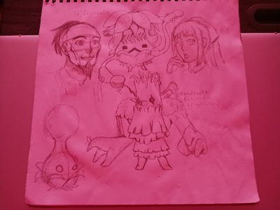
Monsters are easy except when they aren't. Aside from a few small proportion issues that can be easily remedied during the digital inking and coloring phase, I think basically every monster is either exactly what I wanted or pretty damn close. You can see with the Polwigles from 2011 that I was not having a good time trying to construct them. Like, they're spheres, but not really? But they're not hemispheres, and definitely not a hemisphere stacked on a sphere, even though that's the closest approximation. I struggled forever trying to get the body shapes right. And then literally after like, 2 or 3 attempts not shown here on various other projects over the years, I am suddenly the expert with Polwigles? Basically every single doodle I am happy with when it comes to the wigles. They are very inconsistent design-wise between the game and the manga, and since their mouths in the game open almost all the way around during damage animations... I am opting to lean on the design sensibilities of Onshuu no Richter. Still, basically every Polwigle is constructed without reference. So I guess, somehow, after 13 years, I understand the shapes? I dunno how it happened but it did?
I think most of my troubles with the monsters boil down to one of 2 problems: Not being good at construction, that is, constructing unique poses from indirect references to make an educated guess about how a thing would look like from a different angle if we were to rotate or tweak its fundamental shapes in 3 dimensional space. And then not being able to FUCKING SEE THE MONSTERS. JUST LET ME LOOK AT THEM. There are lots of Polwigles from different angles in the manga, so if I NEEDED to use a direct reference, I could. But for the rest of these guys you basically only get the standard 3/4 facing to the left pose from the monster book and if you can even get a clear frame to look at, there's very little dynamism in the pose. The Lailah for example. I wanted to having it point a blade toward the viewer. But the blade is a complicated shape. I am poor with construction so the best I could do is imagine it as a rectangle and sort of carve the contours out of it to the best of my ability to try to get that foreshortened. Because I have no way to study the shape from other angles besides the ones shown directly in the monster book.
The rest of my problems are me standing in my own way. I did try to practice a lot of new skills. Combining references, taking risks, drawing for fun and not just drawing for a final product. And all of them were helpful to a degree. But I think part of the reason my art doesn't turn out well is because I see failing even 2% of the time as being "too much failure." I see anything less than 100% as "not good enough" so I get discouraged and stop trying. Which makes it impossible to learn and grow and also isn't a healthy way to look at art, because even the pros who do this for a living will have pieces that they tear up or don't post because they just... didn't turn out good. To be at a point in my artistic journey where I can even say I like more than half the pieces I did for this draw a thon? That's above average. That's what success looks like for most people.
I think it's the rejection sensitive dysphoria of ADHD. Because I spent so much of my early life either succeeding at everything right away (usually with help and preparation from adults like my mom) and academic "giftedness" I started seeing "success" or "good end products" as things I could reach with little effort. Especially because any time I DID run up against a roadblock or a challenge, I could usually fix it by powering through. Like, if I just did the thing a little harder, I could do it. Which is why whenever I did run up against real challenges, things that needed muscle memory, for example, like riding a bicycle or those Heelie shoes or those waveboards (My obsession with 2 wheeled modes of transportation era was fraught for real) I would have MELTDOWNS because I couldn't just get on a two wheeler bike and go without even learning or trying. Especially because if I saw peers who could do those things "right away" my assumption was always "They're just better than me, I just suck at this thing." and never "they had help learning that I didn't get" or even "different people have different learning curves for the same skills and comparing yourself is a futile exercise."
My assumption was never "that peer spent 3 hours a day for a week falling on their ass just to learn to ride their bike for 3 minutes and then those three minutes eventually became 3 hours and then indefinitely because they finally got the hang of it." My assumption was always "I suck. So if I can't get it in five minutes like they probably did, then I must not be any good and I should give up." Because 5 minutes of really intense effort used to be the magic ingredient to fix the roadblock for other tasks. So I never had reason to assume it wasn't the solution to EVERYTHING.
So I built up this mindset for myself that if I just press harder, I can fix it, and if that doesn't fix it, I can never fix it. And that's been a stumbling block for everything in my life, basically. I brute-forced my way to getting good at basically anything that I'm currently good at. And I'm having to unlearn that. Because growth isn't something you can brute force.
And growth is ALSO not something you can get without failure and risk. Because the other unhealthy mindset I built by brute-forcing my way to success was that I became unfamiliar with failure. Failure was a temporary state of self. My failures were always either easily written off as failure on someone else's part (It's not that I didn't do my homework correctly, it's that the teacher couldn't read it! That's her fault not mine! [incorrect buzzer noise from future me. There are some assignments that I still think this about but, like, no actually young me, a lot of those were actually a you problem and not a teacher problem {The ones that were teacher problems make me livid to this day, but that's another post entirely}]) or they were VERY temporary. "You got this problem incorrect." "Let me look at it again. Okay, I immediately see what I did wrong, I can fix it." "That's correct." "Easy. I just needed to work a little harder." While ADHD, being shuttled ahead through the gifted program, and with how the USAmerican education system treats failure not as a growth opportunity but as a moral failing are certainly contributing factors, I can say with certainty that a lot of the bad mindset surrounding this hurdle for me was also just my lack of drive to try things that were difficult. Why waste time on things that are difficult if there's already so much I can already do that's so easy!?
Then add the cherry on top of the culture we have around failure where it's shameful to ever admit you failed before unless you can turn it into this big inspirational story of how you "learned instantly from that one bad experience and never failed again!" Easy cocktail for an absolute clusterfuck of imposter syndrome, perfectionism, and control freak behavior on my part.
I am having to systematically reprogram my brain. Failure is a part of life. Just because you don't see other people sharing their failures, publicly, online, all the time, doesn't mean that it's not happening.
Watching Scott Christian Sava's content on Youtube has been doing a lot to help me rewire my brain. Failing is part of the process. And I need to learn to be comfortable with it.
And I think I'll have to keep relearning the lesson a few more times before I get it. Because every time I start to internalize it, I backslide and relapse and get back in that old brain-space of "that doesn't apply to me. Everything I do should be easy because that's how it's always been, and if it's not easy the first time, it's because I personally suck and not because I'm growing."
But, little by little, I'm getting better and better. I am catching up to what I used to be in 2011. And in some ways I am getting even better than I was. 10 years of art atrophy isn't great. But climbing back to the summits I've seen before and realizing that a 10 year backslide doesn't mean a 10 year climb is refreshing. I'm still not where I want to be. But I'm discovering more things I like about drawing, more things I want to contribute to my own style, more things I want to polish up on, more things I'm excited to learn.
I've started of thinking of hair as ribbons which is helping me construct more interesting hair in my art, for example. That's new. And fun. Hair is starting to be a less scary thing. I'm incorprorating more natural lip shapes but still leaning into the anime-esque simplifications and exaggerations of expression. I'm getting ever so slightly better at the shape of the palm of the hand. Fingers are still insane foreign objects to me, but I am learning.
I've developed much better line control. And learning to fail means learning that sometimes your lines won't be perfect. But I have also noticed that I'm able, more often than not, to make the strokes I want on the first try when I finalize a drawing.
I'm still messy with my sketches, which does need some work, but I'm getting better at picking the correct shapes out without agonizing over the line stage anymore.
I'm at the point where a lot of the art books I bought in my youth that were so far beyond my skills at the time are actually... full of manageable if not nearly useless advice for me now. I am growing. And while a part of me will always be dissatisfied that I'm growing so slowly, I am still happy that I'm growing.
Thanks again to everyone who participated! I loved seeing the art! I hope to get more DotNW fanfic up soon, too!
And finally, here's the links to the original posts with their original thoughts and captions.
Day 1: Brute Lualdi
Day 2: Assorted Gels
Day 3: Blast From the Past: Aqua and Polwigle sketches from 2011 and Polwigle doodles from July 3 2024
Day 4: Marta Lualdi
Day 5: Assorted Plant Monsters
Day 6: Rilena Malory
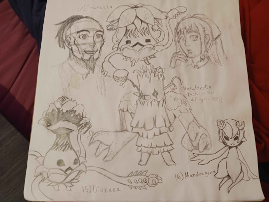
Days 7-9: More Plant Monsters
Days 10-12: Decus and Even More Plant Monsters
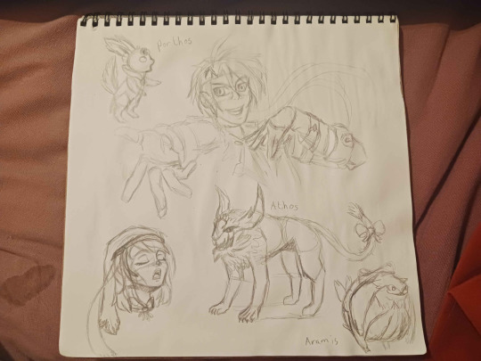
Days 13-15: Alice, Athos, Porthos, Aramis, and STILL MORE PLANT MONSTERS
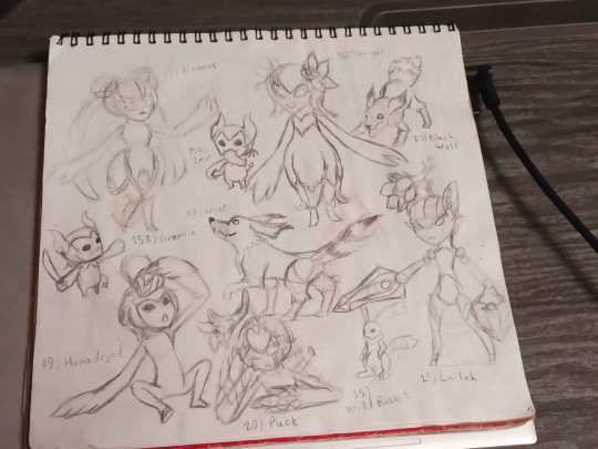
Days 16-24: Aqua, Tenebrae, the last of the Plant Monsters, and some Beast monsters
Days 25-31: A couple attempts at Richter Abend, More Polwigles (specifically Pontus from Onshuu no Richter), Emil Castagnier, Aster Laker, Ratatosk, and some more beast monsters
3 notes
·
View notes
Text
Turning the formerly feral kittens into public domain characters, starting with Sapphire, because she was the first to hold still for me to get a picture as a reference for her face.
Includes a more detailed guide and cute simplified versions, including one where her white paws are literally mittens and boots.
Fun fact: Her name is Sapphire because she was so fluffy, and at first we wanted to name her Cloud, but then we were like no, there's too much of a theme here already. So then we were like "okay but what about Sephiroth as a reference to clouds". And then we were like no, because we want someone to want to adopt her. So Sapphire it is. As a reference to the name Sephiroth. As a reference to the fact that she's fluffy like a cloud.
She has the biggest ears of all her siblings, and the shortest, skinniest, but fluffiest tail.
Feel free to draw her in whatever style you want. Or change her pronouns. She's a cat. She doesn't know what gender is. But she could in your version!
They can all have the last name Jupiter since we caught them on / the day after the 4th of July, and I can't think of any other name.
So, Sapphire Jupiter.
As of September 2023, she weighs 4lbs.
Gizmo is now posted!
Not drawn yet:
Eclipse Jupiter
Taaz Jupiter
and their mom, Marlena Jupiter.
Who is the father? The world may never know....unless you decide to create him yourself.
...Aand she has just jumped into an empty trash can. So I will edit the picture I just got of her in the trash can into this post. Lol.


[ID: Three digital drawings, each with the same royal blue background, each showing a black and white kitten character. The first shows the kitten with more detail, drawn linelessly, with the head and torso in the center, and the arms and legs off to the side, disconnected to fit in the square frame of the image. The character is labled, "Sapphire", and a small photo of the kitten it's based on is in the upper left corner. Some notes read, "Yellow eyes, thin, fluffy fur", and "short, skinny fluffy tail". The kitten has a mostly black body, with round yellow-gold eyes, and a pink and black nose. The face is solid black, except for an irregular white stripe from the chin, going crookedly up to between the eyes at a diagonal. Where the white stripe overlaps the nose, the nose is pink, and black where the stripe does not meet. The kitten has a thick white fluffy chest like a collar, and a thinner white stripe on the belly all the way down. All the feet are white with solid pink paw pads, with the front feet having the white end at the end of the foot, and the back feet stretching up to almost the knee, like tall socks. The tail, drawn to one side, is skinny and fluffy, and slightly more than half the length of the torso. The next two images show a much more simplified version of the character, standing upright against the blue background. The character now has larger pointed ears, oval shaped yellow eyes with a line for pupils, a simplified face stripe, a black nose and mouth, and a simpler white collar and belly. The limbs are drawn as simple bendy lines ending in white, with the tail raised happily behind. The second version of this image is the same as the first, except that the white parts of the front paws, or hands, have been extended out to form little gloves or mittens, and the white markings on the back legs have been extended into boots. End ID.]
I would share pictures of her for drawing references...but dear gods these cats do not want to be photographed lol. Every time I try to take a picture they're already moving.
Edit: Nope, lol, here's the picture of her in the trash can:

[ID: Another photo of the kitten depicted above, now looking up while sitting in the bottom of a medium sized white trashcan.]
@publicdomaincharacters some more public domain characters :)
#described images#eye contact#vbgfb#alright. Gizmo typed that. so it can stay#public domain characters#Sapphire Jupiter#Sapphire the cat#lol#furry#anthro#could be!!!!#xenofiction#public domain#public domain cats
13 notes
·
View notes
Note
I love your art style and how you draw hands! Mind showing us how you draw said hands? ✋🤌✌🤟
Hey there, thank you so much for your kind words! ✨
I really if I'll ever be able to explain how I draw hands with pedagogy, but I'll give out some tips that were always useful to me and I'll break down some sketches with notes explaining the creation process!
👌 ||| t i p s
• Draw the hands. Keep drawing it. Sketch it several times on the side if you're unsure and need to practice with the pose - but draw it. No one's gonna think less of you if it looks clumsy. But draw the damn hands! Just like everything else in art, practice is key and you won't get it anywhere else.
• Look at hands. Look at your own hands, at other people's hands. At the way hands are drawn in your favourite manga/comic/cartoon/anime, how artists render their hands - try to look for their personal tricks. Is it obvious that they use references? Do they simplify the process by stylising hands? How do they deal with foreshortening?
• Give your hands some character. I know it's hard to get the hang of it in the first place, but a big part of learning how to draw human figures is all about diversification. Learn to draw all kinds of hands, and when you draw them, ask yourself - who do they belong to? Height, weight, age, body shape, fashion, hobbies and work - these are parameters that will shape your hands. And to an extent, that will also determine the position you want them in.
• Struggling with the position? Go for an alternative. Sketch out the overall rudimentary shape of what you might have in mind. Use a bigger brush or a marker and determine the silhouette of the hands with no outline. Go for something simpler. Practice on another canvas; if you're struggling with a position, try drawing it from another angle or with another shape of hand; if you're struggling with a shape of hand, try drawing it from another position or another angle until you get the hang of it more naturally; if you're struggling with the angle, try drawing it with a simpler shape of hand and adjust it until you're satisfied.
🌟 ||| b r e a k d o w n

I gathered some old sketches of Bella Yaga that I lined and finished. I put the creation process with notes under the readmore! Fair warning, my sketches are horrendous and barely readable.

When I start constructing a character's base, I want to determine the position's dynamism right away - I find my balance with a few strokes, and I by the time I'm satisfied with the rough base, I know what the hands are supposed to be like, even if my sketch indicates nothing. Here's my thought process:
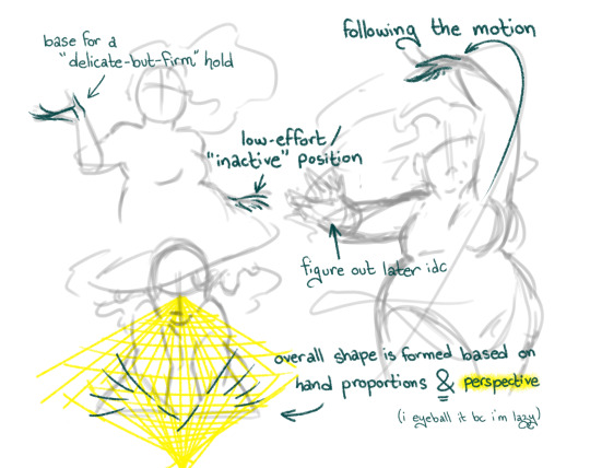
You'll see that being comfortable plays a huge part in how you construct your sketches. I used a character that I know by heart, so the shape and position of her hands came to me naturally - if it was someone I wasn't familiar with, the sketch would have been a lot more detailed and hesitant.
I tend to determine the details when I draw the lineart because it's a lot more efficient and time-saving - but you're free to draw an additional sketch to detail your hands before you line them.
Here's the finished look!
Thank you so much for your ask, I really appreciate your kind words 💕 I hope I made sense here and my tips will be useful to you!
#.ask#.tuto#.art#earwig and the witch#.bella#im unable to be normal about hands and i actively enjoy drawing them fr#thanks a lot tho i really appreciate the validation <3
20 notes
·
View notes
Text
Another Sillie had been added :D
process thoughts below cut- (WARNING- they long lol)
Has this barely changed from the wip I posted earlier????
not really but i need to talk about character design for I am FERAL so L moment i guess
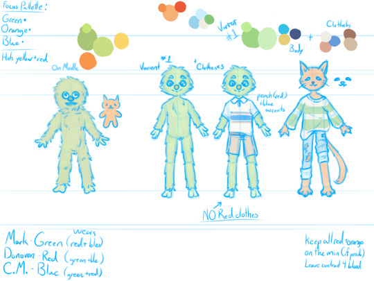
SO my personal favorite brand of character design has been, for as long as i remember, drawing more complex designs from simplified mediums. Think Minecraft or roblox skins, and some chibi avatars. Hand me something that is blurry and up to interpretation and i will simply go buck-wild. Mark is of course the only character to truly appear on camera. We see both his drawing of himself and his [puppet?] form. Now you only ever see donovan and cupcake monster as drawings, which leaves their appearance more up to interpretation.
When i first translated Marks design, i tried to stay as accurate as possible. The second iteration is more of my own twist on it, elongating the body, trimming down the fluff for a clearer shape,and adjusting facial proportions slightly. Note: this isn't to throw shade at marks original design. He's a puppet irl and he looks like one, i just suck at making puppets look like they have any life behind their eyes, so design tweaks it is. Mark is adorable and its a me problem that i struggle to recreate that.
Now my Mark design is obviously based off of the puppet, (his actual self,) as opposed to the way Mark draws himself. In the drawing, there is a bit less fluff on his body, compared to the real thing. This is important as it affects some of the decisions I made for Donovan.
Donovan caused a few hurdles when i tried to work on a design for him. First, I'm working with very little information, so creative license time. Since I don't have much to go off of, I started with a real simple drawing, similar to the one from the drawing in the show, just to try and capture the vibe. The most notable things about Donovan from this first doodle, was that he had a slightly smaller nose than Mark and that it was triangular and that his eyes were slanted. This gives me two prominent facial features to work with.
Following this, i started on a more detailed design. I began by plotting his proportions out similar to marks. To make him more cat like, I tried to make him a little taller and thinner[better for slipping out of cages], so that he had an elongated appearance, and to capture that sly you-cant-contain-me- cat energy that meow meows have. I wasn't sure how cat i wanted to go originally, but then i gave him paws....
I went full anthro cat on Donovan, adding in whiskers and a tail [still questioning that decision] even though they weren't present in my reference. Now is a good time to note that all these designs are pre-Billy, so no scars or anything. I bring this up because I gave Donovan claws, and I image Billy would have at least tried to declaw Donovan.
The next problem came with Donovans eye. So Donovans eyes are two slanted lines, very simple. Since these are one of Donovans few unique canon features, I wanted to keep them. I wasn't sure how to keep them simple yet still allow emotion. Playing around with this idea, i felt i could effectively convey emotion just by changing the relative direction of the eyes. However, I changed the eyes to be more tear-drop shape as well, partially to add more interest to the face, but also so i could add more detail to the iris of the eye if desired.
Finally, all my Mark and Friends designs have the characters wearing clothes, because I work at a clothing store and see too many damn clothes every day. [everything i know about fashion is against my own will] So since this canonically takes place in 1997, my designs are based roughly off of children's clothes at the time. For the monsters clothes, I want them to all have a somewhat fun shape, flare outs, wrinkles, cuffed sleeves and pants etc.
This is where i really struggled. Not so much with the actual design of the clothes, but with colors. As you can probably tell my this illustration as compared to the reference image, I am allergic to bright colors [they hurt my eyes :,(] So i shifted most characters to a more muted/pastel pallette. Now i really wanted each of the three friends, Mark, Donovan, and Cupcake Monster, to have the others "colors" per see, present in their outfits. Mark is obviously Green coded (lol), Donovan is orang, but outlined in red, so my boy gets a red association cause primaries of light. This leaves Cupcake Monster with Blue, the color they are outlined in.
I really wanted three designs to flow together, and though i haven't finished Cupcake Monster yet, I think the first two go nicely together. By giving each character a main color, I let them stand out from each other, but by adding bits of those colors back into the others outfits, it lets them flow together better in group images and keeps anyone character's pallette from feeling out of place.
Marks outfit is mostly cream, but with accents of Blue, and Red. Donovan's is about 1/3 cream 1/3 blue and a 1/3 blue. I struggled with the color distribution on donovan, as the reddish orange and blueish green i had chosen contrasted a lot more than i wanted. The light blue and cream worked as a nice base though, and making only the stripes green [the shirt is specifically cream with green stripes] it lets the green not overpower Donovan, which was another problem I was facing.
But yeah, this are my current designs for the sillies, if you read all this thank you! have some pie :]
7 notes
·
View notes
Note
What equipment and programs do you use to make your art? Your about says you're self taught, what helped you learn? And does anything specific give you inspiration for your current style or what you'd like to achieve in the future? I really like your art❤️
ahh!! hey, thank you so much!! <3 that's so kind of you to say!!
easy questions first: for digital art i use a wacom intuos tablet and paint tool sai, which is the only setup i've ever used. i've been trying to get into clip studio paint but something about it just doesn't stick with me. i think i need more practice.
for comic panels and lettering i use adobe indesign, and export as png to before putting them in sai.
everything else under the cut so this post isn't miles long
i've been drawing ever since i was a kid, but until middle school i mostly just drew animals or little notebook paper comics about animals. i grew up on a farm so there were lots around, and drawing from life is something i think really helped. like, there's a difference between knowing what a cat looks like and being able to pick one up and see how its bones and muscles fit together, being able to watch it change how it moves around depending on what it's doing, whether it's catching a mouse or playing with another cat or curled up asleep, and being able to break down that anatomy and movement into simple shapes. i'm a pretty visually oriented person so knowing how a thing functions or fits together as simple shapes helps me visualize it in my head and imagine how it would look in different poses or from different angles.
around middle school i moved onto drawing people, again from life while sitting in a cafe or at a park. actually being able to get what's in my head down onto paper in a way that satisfies me is something that i think just took practice. only recently (like, late last/this year) have i been consistently satisfied with the way i draw things.
sorry if that sounds weird or clinical--this is the first time i've been asked to explain how i learned to draw and this is the best way i can think to say it.
honestly, finding my own style has been looking at what i like about other artists' styles and trying to figure out how they achieved that. i did a lot of redraws of other peoples' art as a kid. for me, trying to replicate something makes me really think about why i like the way it looks. i try to lean towards a semi-realistic style--i don't like drawing super realistic all the time, i love cartoons and think they have a lot of character--but i also don't want to lose the underlying anatomy or structure because it helps my brain make sense of stuff. so i try to find the middle of the road, where things are simplified but still structured, if that makes sense.
brief tangent... that's why i draw pokémon the way i do. they're not on model, they're how i imagine they would look if they were real animals, based on the sort of animals they're... uh, based on. so like for this piece, because camerupt is a cow/camel hybrid, i looked at a bunch of pictures of cows laying on their sides, what their hooves and skulls looked like from certain angles, etc. and then i could draw what i wanted.
as for improvements, i need to get better at backgrounds and realistic coloring/lighting. color theory is one of those things that i understand... well, in theory, but when it comes to practice and paying attention to it when i color, i need work. and because i've mostly drawn animals and people my whole life--organic stuff--i find buildings and backgrounds difficult, so i tend to avoid them. and i need to not do that.
#thank you for the ask!! this one really made me think#let me know if you'd like me to clarify anything... i tend to get longwinded and distract myself with tangents.#so idk how clear this is? i really look like the charlie conspiracy board meme trying to explain anything to anybody#bc like there's CONTEXT alright#like i deleted a tangent about how much i love hiromu arakawa and fullmetal alchemist and it was a huge inspiration and#like damn dude that amount of granular detail was not asked for lmao#autumn.ask#autumn.personal
15 notes
·
View notes
Note
Thanks for answering. I’m new to art so I didn’t know the difference between base and reference. I was thinking they were the same thing
completely understandable with the information that you are new to art overall(which I did not know until this ask)! if you want to trace and use anything as a base in non-reference or redraw ways the general rule is to NEVER use/post it online: or show other people and claim it as your own art (or not outright state the disclaimer pointing to the origins of the it , as that would imply you did all of it by yourself(which would be a lie)
using your own past works that you made is still all your own and thus very easy to claim as your own art and there's no bad moral of "I stole someone's hours of art and put the finished artwork from all those hours and energy and emotion into an ai and am claiming the end results of the ai version as mine" or "I traced art and am now claiming it as mine" or "I stole art and poorly discolored it as much as changing this custom creature character to have orange eyes instead of pink so now it is my character I am posting everywhere" that you see posted about at times (especially on da and pintrest- though pintrest USUALLY has people who call out every one of these folks)
redrawing and/or referencing something is ENTIRELY okay(and is the MAIN implied purpose of bases as far as we are aware)- however we've seen so many "bases" that are not "your character here (ych for short)" traced and just vaguely drawn over instead of no efforts to learn or make their own tracing is the first thing our mind connects it with as that has been the most common use we've EVER seen them be used for.
tracing various artworks to speed up learning your own art style and what works for you when not tracing is ALSO okay (and we do NOT fault anyone who does this)- the issue is POSTING traced art or claiming said traced art as entirely yours.
We've traced art to mimic a style some of our favorite medias had before because we consumed so much littlest pet shop a lot of us were REALLY bad at figuring out our style ENTIRELY until middle school during our two year long splatoon hyper fixation- didn't have a sense of our art styles until high school still but improvements happen through evolution and knowledge!
I'd recommend since you're new to art just try some simple stuff- the basics as well as some art exorcises- like turning blobs of shapes into characters/creatures you can see the simplified silhouettes of in the color blobs, consume your favorite artist's works long enough and you WILL find a way to draw SOMETHING like their art- not EXACTLY but pretty close with enough time, draw splatters! and yes I mean like the "splat of paint on the ground" or "threw a paintbrush full of paint at a wall"- an old art teacher of ours had us do this just as a "draw before you really draw"
you are new to art at an amazing time to be new to art: there are so so many tutorials (speedpaints are an ENTIRELY different thing in case you are unaware) that give you so much more leeway and opportunity to make things yourself and your own using what they are telling your through the tutorials compared to the "how to draw" books we had to attempt(and failed) to learn to draw various things from.
(also DEEP apologies this is a long and rambly post, we try to make things easy to read but it is VERY HARD without a friend reading this before post to tell us what should be removed- since this all pretty much explains the "artist edict" and the basics of advice without trying possibly sounding like we're enforcing some sort of "there is only one way to do art!!" that some artists have come across doing at times, so we are unlikely to shorten this anytime soon)
3 notes
·
View notes
Text
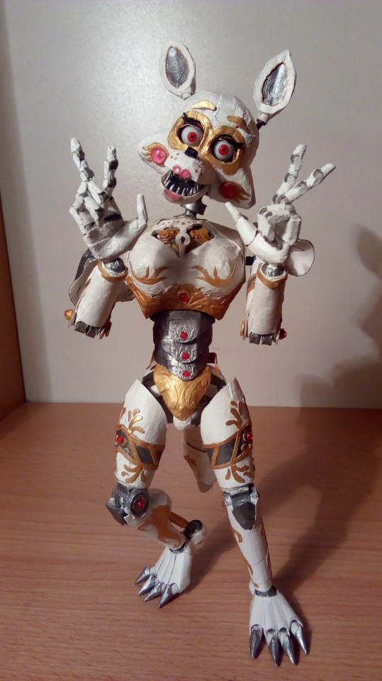
Hello! Many are now at confusion, yes... Foxy in what form it was - no longer exists, it will be redone in a new way. But in order not to throw away the finished parts, after I spent a lot of time on them, I decided to pay tribute and make the one who actually inspired me - Philomela a mechanical bird.
I will immediately warn you that some of the art or drawings are NOT mine and are used only for an example and a general understanding of what I am doing.
More recently, I discovered an expensive, but very effective method. Paper paste (or papier mache) - is finely cut paper impregnated with a water-based adhesive and then kneaded until a homogeneous mass is obtained.
This paste can be used to fill cavities, molds - after hot drying (in my case on a table lamp), this mixture becomes so hard that I can now process it with a file.
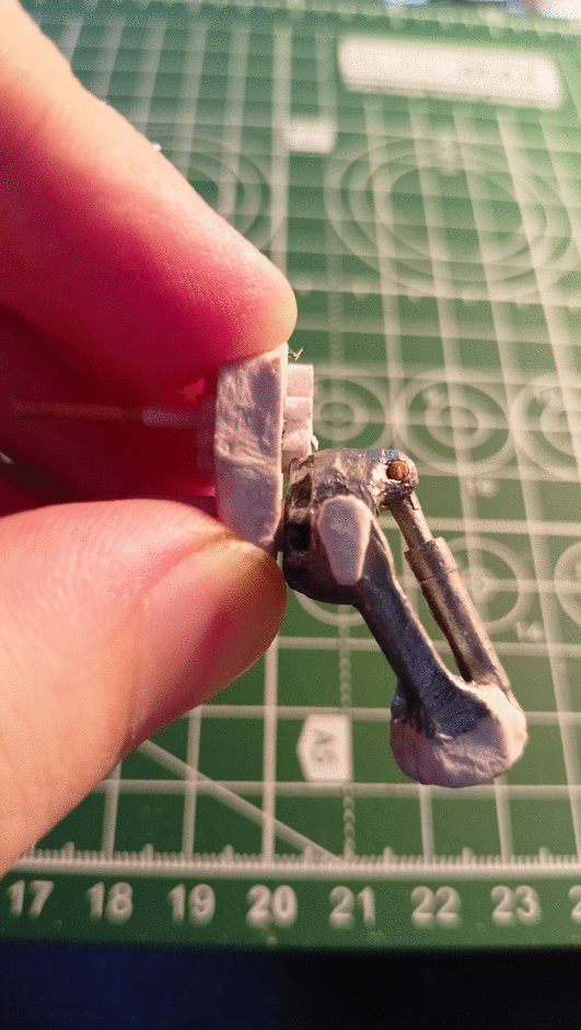
What I did with this hand, before this, clamp it between a vise and start processing part of the joint with a file. I did this trying to make a strong connection between the parts. I inserted the spire, made both holes and covered it completely with paste, let it dry a little, took out the spire and left it to dry completely.
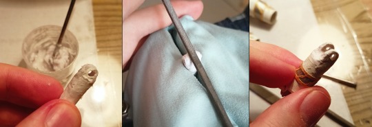
After I processed each part of the arm and slightly improved the connecting part (later I also covered it with paste and dried it), I got a very strong connection.
Now I'm looking for fill shapes to speed up the creation of models and parts for them.

There is a figure less than 20 cm in size, you want to make it close to the original, even parts of it... and you do it.
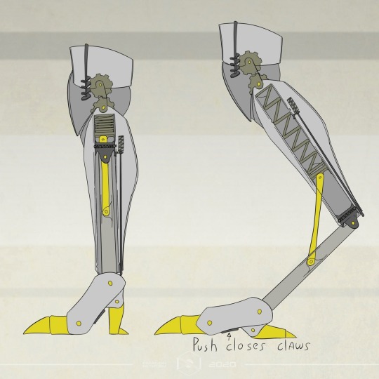

I couldn’t make the details identical, I had to cheat and simplify, but keep the same functionality.
Instead of a separate movable part to which part of the retractable leg is attached, it has become part of the entire leg.
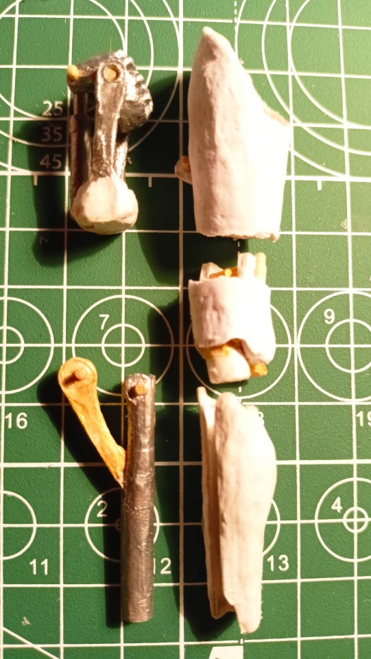
* First, I made the main part itself, a tube with a cutout and a moving part.
* I picked up a tube of a suitable diameter, made a cut along, substituted a half of a thin tube from the side and fixed it. Repeated the same on the other side.
* Part of the leg slides along the edges of these tubes, at the bottom the edges of these tubes are clogged, and thanks to the cutout in the leg, part of the leg bends and the movable part slides up along the tubes.
I couldn't do it without papier mache! Important parts are made using this technique.

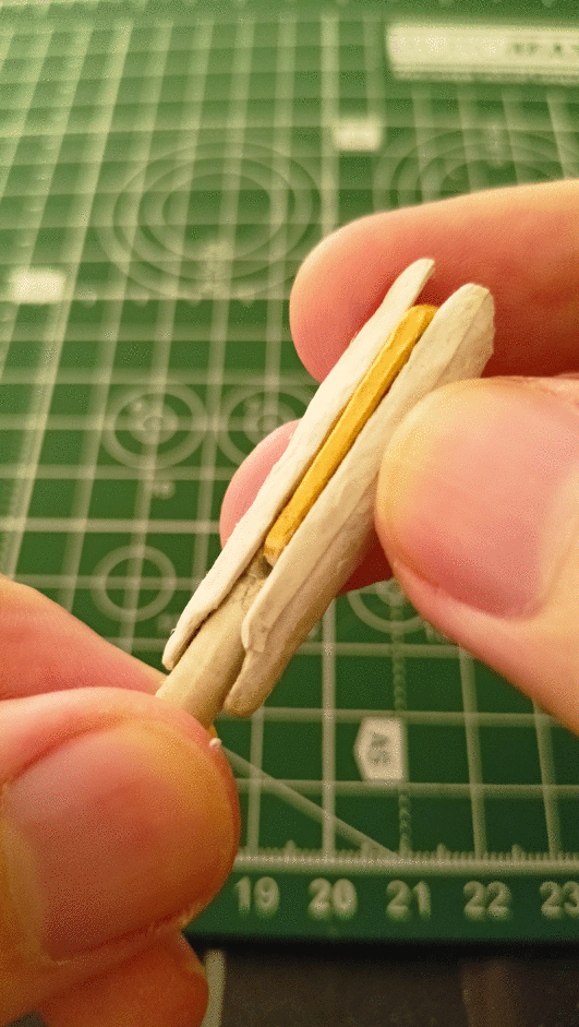
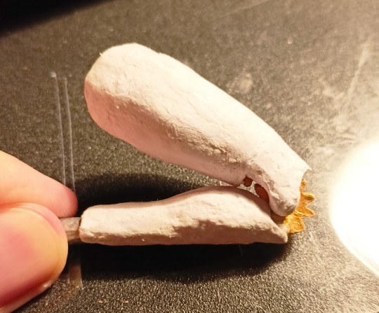
These are the details of the knee. I decided to slightly deviate from the original and try something new.
Was it necessary? No. Why I did this? Because I can.
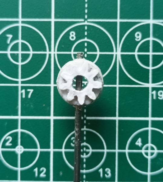
Half of the gear as the base for the knee and the small gear moves with the tilt of the leg.

On the left - this is what I could limit myself to, and on the right - this is what I ended up with:

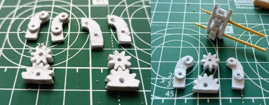
Here is a little more detail, it has a very complex mechanism in the reed. I decided to do something similar but not quite, in view of the complexity of the detail itself.
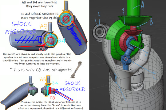
That's how I started to gradually create this mechanism:


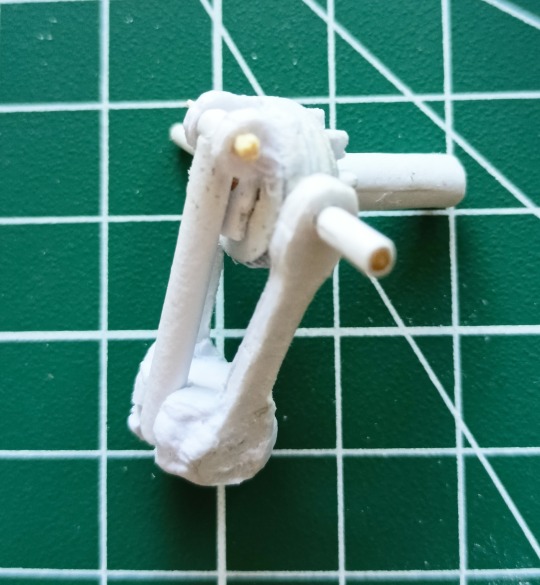
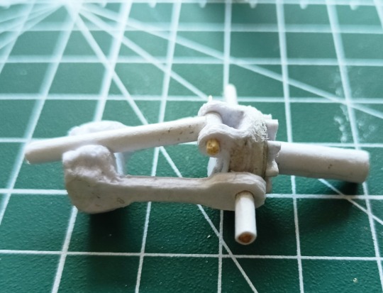

And finally, what the leg itself looks like (so far without a foot)


This is all I can show for now. Yes, I rarely make posts, it's still my hobby, I don't get paid for it)
There is not always time for this, I had an operation last month and put a prosthesis on the hip joint, but everything is already fine with me and so far I walk with crutches.
Thanks everyone and see you soon!
#papercraft#handcrafted#handmade#paper#papermodel#handcraft#robot#poseable doll#mechanical#clockwork#cog#automaton#gif animation#gif#fnaf
8 notes
·
View notes