#because my computer can barely handle photoshop
Explore tagged Tumblr posts
Visit Tumblr Blog
Explore Tumblr blogs with no restrictions, modern design and the best experience.
Last Seen Tumblr Blogs


Fun Fact
Tumblr was acquired by Yahoo for $1.1B in 2013.
Text
There's a whole bunch of things wrong with the new computer - it isn't much more powerful than the old and can't handle the latest version of photoshop. Files that used to have 300+ layers just can't be opened anymore whereas my old computer opens it fine. This new photoshop version can barely handle THREE layers. Three. I can't begin to describe how fucking discouraging this all is. I think tomorrow i will call adobe and cry until they give me a damn 2017 installer. This isn't an issue with zbrush. The latest zbrush is fine because its an actual fucking quality program. Fuck photoshop -__- if anyone has suggestions for alternative programs with pencil like sketch capabilities, i might actually consider switching.
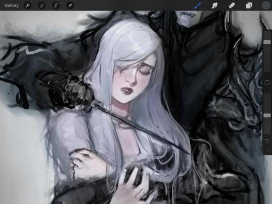
AnYwAY have this quick doodle of geno, at least he's beautiful even if computers suck.
edit: illustrator friend to the rescue - he says switch to 2021, which i think is still an option. so guess im trying that tomorrow. god damn it i hate subscription models i hate bloated software that adds bullshit to justify the monthly expense, i hate it all :(
16 notes
·
View notes
Note
5, 8, 9
hey you >:)
5. how do you choose your characters’ names?
oooh I always go to the most popular names for the decade (here's the site I use, this one is the 1950s). and obviously for the past decade I went into it looking for alliteration for the triplets. for the 1950s, in America, Lois was #117, Lynne was #160, and Lillian was #194. i like this method because it gives the sims the vibes of the decade. can't wait to get to the 1990s and name someone Rachel or something.
8. what about your story are you proud of?
anyone who knows me knows that I crack jokes pretty much all the time, and I like to add humour to my sims writing whenever I can. I hope it comes across? I really like having contrast between what the screenies show and the text says, to show that the character is dishonest about their experiences or their circumstances, mostly for comedic value. and I love my characters who become a vessel for my humour. Lily is really perfect for that right now. obviously she's wrong about a lot of things, and in my opinion that creates comedy.
9. what about your story are you looking to improve on?
I would love to make it more visually appealing...I look at other people's stories and I'm like, WOW, that looks beautiful. Recently I've been messing around in photoshop and doing things like blurring the background, I know it can be done better with reshade but my computer can barely handle the game as it is.
I do think the visual aspect has improved since I started, which feels like a success!
12 notes
·
View notes
Text
Survey #461
“this city looks so pretty, do you wanna burn it with me?”
Have you ever wanted a Nikon camera? Or do you have one already? My camera before the one I have now was a Nikon D3200. I use a Canon now. Who was the last person (if anyone) you said Happy Birthday to? A friend. Do you have Photoshop? If so, how often a day do you use it? I have it, but I barely use it nowadays. I use it to edit photos for character profiles or profile pictures, add a watermark for my actual photography, and I used to make Mark-oriented gifs like crazy. They mostly did really well, so... I might wanna get back into that and get That Sweet Validation. Do you watch any shows that you know your parents wouldn’t approve of? No. Have any of your exes gotten married or had kids since your breakup? None, I think. Do either of your parents have a mental illness? My mom has depression. Can you tolerate children for a long period of time? NO. Have you ever lived with someone you felt thoroughly uncomfortable around? No. Are you into dubstep? Yeah, I tend to enjoy it. Zelda or The Sims games? Can I pick neither? lol I don't feel very much at all for The Sims, and Zelda games have always looked... boring to me? Like I've watched most of the Game Grumps' playthroughs of all the games, and they make it hilarious of course, but the games themselves? Nah. Are you terrible at assigning bands their proper genre? YES YES YES YES YES YES. Even in my preferred category, that being metal, FUCK if I know the sub-genre. Have you ever made out in a closet? No, that shit sounds claustrophobic as hell. Have you ever been to a laser tag place? Yeah, on a triple-date once! It was SO fun. How do you wanna celebrate your next birthday? Have a couple friends over, pig out at The Cheesecake Factory. o3o Do you tease your parents about them being old? No, especially not Mom. She's self-conscious about getting older. Are you in love with someone? "In love" is a bit too far, buddy. But I love someone. Have you ever ridden a unicycle? No. Have you ever wanted a pet bunny? I was VERY serious about getting a lop-eared bunny for quite a while, but we just couldn't afford to adopt one (even off Craigslist) and get a cage for it, toys, etc. Are the bottom of your feet clean? I HATE seeing the bottom of my feet. Not because they're dirty, but because it's Callus City. I ain't even fuckin jokin'. Do you like really salty food? Yeah. :x When’s the last time you bled a lot? Well, I just recently finished my cycle after not menstruating for three or four MONTHS, so you can figure that one out. Have you ever watched a needle go into your own skin? Yeah. I like to know exactly when it's coming. Have you ever seen someone get a piercing/tattoo? Yes to both. When you’re done eating finger foods, do you usually lick your fingers? Usually kasdjlf;kalsdjf shut up ok I like food. What’s the most racist thing you have ever said? As a little kid, when my really good friend (a neighborhood kid, even) asked if he thought we'd be a good couple, I told him no because "blacks and whites don't date" or something like that. It was an idea I'd never been exposed to before; the idea was so foreign to little kid me. I had no idea I was being racist. It ended in a small fight and we didn't talk for a few days 'til he came to my house telling Mom that he had to "be a man" and fix this and if that ain't the cUTEST SHIT RIGHT THERE. We were friends again after that. He's still on my Facebook, and he actually semi-recently got married! :') Do you know someone that is mute, deaf or blind? No. Have you ever spent more than two weeks in a wheelchair? No. Does weed smell good? Or no? Ugh, no. Where do you see your closest friend in ten years? Successful and happy she kept pushing. Mama to so many reptiles that are blessed with the best lives possible in human care. Got at least one amazing book out there. If she's reading this, you've fucking got this. <3 Would you like to have twins? Mother of fucking god, no. Even if I WANTED kids, do fucking not give me twins. Who was the last person you got into an argument with? My mom. Want to have kids before you’re 30? Once again, I don't want kids, but IF I did, that'd be preferable before the risk of birth defects and other issues climb with age. Does anybody have a tattoo with your name on it? My older sister has my initial. Do you think somebody’s in love with you? No. Do you think you and your best friend will be friends in ten years? Yes, I genuinely do. Who were the last people to hang out at your house? Miss Tobey, our friend and landlord. Does anyone like you? Welp... I hope he still does. Guess we'll figure that out soon. What person on your Facebook do you talk to the most? VIA Facebook? Probably my friend Lyndsey. She likes to comment on stuff I share. Do you want to fall in love? I do, but I'm also utterly horrified to and risk being hurt again. Are you interested in more than one person at the moment? No. Once I realized I was so deeply into Girt, all other romantic feelings kinda just... poofed. How was your last break up? Civil and done with both of our best interests in mind. What is the hardest thing you’ve ever had to say? Probably the first time I admitted I needed to go to the hospital for suicidal thoughts. I was so, so scared of what it was going to be like. What is the hardest thing you NEEDED to hear? That if Jason wasn't happy with me, he had every right to move on. She was right. Do you treat yourself well? No... but I'm trying to change that. What was the last song you sang out loud to? This "Set Fire to the Rain" cover. Do you take good pictures? I think I do? Have you ever done any internship? No. What’s a topic you’ve drastically changed your opinion on? Holy shit, so much, especially when it comes to morality and political stances. I am now a massive supporter and member of the LGBTQ+ community, I'm pro-trans rights, pro-choice... I've done like a dozen 180s in a lot of topics. Do you know anyone who has a PhD? I mean, some doctors, but no one in my truly personal life. Do you know anyone who works as a lawyer? Yes: my cousin. Have you ever experienced sleep paralysis? LAKSDJFKLA;JWD NEVER AND I PRAY TO THE HOLY LORD THAT I NEVER DO. Does the thought of having wrinkles when you’re older upset you? Not massively? Like literally everyone gets them and is natural and inevitable. Do you know anyone who’s struggling with addiction? I know one alcoholic, and one that's probably borderline. I also have two friends who are extremely addicted to weed. Look me in the eyes and say it's not an addictive substance and I wouldn't believe you one bit. Is there a video or computer game that you can get lost in for hours? Eh, sometimes World of Warcraft. Some days I'm really into it, and others I barely touch it. What’s your favorite Disney Channel movie? I have no clue. I don't even remember movies that were made *for* Disney exclusively. Do you ever have to do yard work? No. We have a friend from the dance studio mow the lawn. Do you have any live versions of songs in your music software? My iPod has a whole live album of Ozzy. Did you or do you listen to Britney Spears songs? Both did and do. Britney is a boss bitch. Does your favorite band have a male or female lead singer? Male. Have you seen the movie Moulin Rouge? No, but I've seen some of that P!nk music video of the song and it brings out the Gay in me. Do you have a key to anything besides your house? No. Could you ever complete a 500-piece puzzle? I've done that before. I miss doing puzzles... Have you ever been to any sort of convention? I went to a reptile expo with Sara!! I REALLY want to go to another when my legs are stronger and can handle standing and walking so much. Is your mom or dad the older parent? Mom. Have you ever tried to walk on a moving vehicle and fallen over? No????? What is your favourite kind of bread? Is there any of that in your house? Pumpernickel. No. Are/were you in the school band, and if so, what instrument did you play? I played the flute all through middle school and I wanna say half of HS. Have you ever ordered an unusual drink at a bar? Never even been to one. Have you ever been pulled aside by security at the airport? I think once for some reason I don't recall? What is your favourite seasonal candy? (only available at certain times) Gingerbread men, probs. Or chocolate bunnies!!! :') How do you feel right now? My stomach is KILLING me. I'm super excited though that Girt is coming over tomorrow. Have you ever had surgery that kept you in the hospital for over a day? No. What would you like your generation to change? How we treat nature. Is there anyone that you truly could not live without? No. I learned that is a very unhealthy mentality to have. Do you like carrots more if they’re raw, or cooked? I just hate carrots. What restaurant did you last go out to dinner at with friends? With friends? I couldn't even guess. Does your refrigerator have an ice maker or do you use ice cube trays? It has an ice maker. Do you have a favorite sibling, if any? No; I love them all. Do you have a favorite brand of clothing? I STAN CLOAK. How’s the love life? Something new might start tomorrow. I think it will. Do you watch the news? No; that shit is depressing. Who do you admire most? Mark. Do you have a favorite album? Black Rain by Ozzy Osbourne takes the cake and always will.
3 notes
·
View notes
Text
part of me kind of wants to do that gif meme because i do enjoy making gifs even if they’re shitty and through making more i might even get better at it, BUT
1. all of the prompts are like “favourite xy” and i’m really bad at picking favourites lmao
and 2. my computer can barely handle photoshop and just opening it is an ordeal and it took literally 10 minutes and like 17 crashes just to import the frames for the last gif set i made lol
2 notes
·
View notes
Text
Coloring in grey scale
So, hey, this is somewhat of a tutorial for those curious about some of my coloring and blending. I made this especially for anyone younger than me and is exploring digital art, but this is also for others who are curious about what I do. I love reading other artist’s comments and looking at their WIPs, so why not.
Another reminder: if you’re looking for my artwork, please follow @rainbow-illness and not this blog. All of my finished stuff goes there; usually, my works in progress (WIPs) or Angry Doodle Corner go here. Sometimes I use this blog to repost my art, but that is my official art blog, no this one. Not unless you like nonsensical posting and metal, then have at it. If you have any questions, don’t be afraid to hit me up, I love talking about art.
So I can’t always sit down and talk about my processes and how I go about doing them, but I was able to sit down and take some screencaps while I was working on my iPad Pro. Using the iPad is actually my first choice to draw on because of the convenience of carrying it around like a sketchbook, whereas my laptop isn’t always easy to carry around--it’s a big laptop. While I use my iPad, I also like to go back and correct things, recolor, re-proportion, or spend more time privately working on a drawing. I have my iPad with me, all the time, so I’m out in places usually like Starbucks doing this. I also struggle with pretty bad PTSD and agoraphobia, so having my iPad out with my headphones on gives me an excuse to put my mind elsewhere to calm down. My family just usually looks at me and goes ��oh, she’s working on her art again”; I did this as a kid, too, only with sketchbooks.
I do not have a Cintiq either, though I would absolutely love one. This laptop is capable of using a stylus, but I think I need a better one to do it with. All I’m using is a cheap Wacom Bamboo tablet that I’ve had for five years, that’s it. Everything I’ve done on this blog has been on a small surface. So if you’re just dabbling into art, don’t beat yourself up for having the small stuff, I’ve worked with small stuff and still do. The only thing I have that’s not small is, well, the space and processor on my laptop are much faster than any other laptop I’ve owned, bought especially for graphic design classes and my artwork.
So, that being said lemme just forewarn some of you guys. My artwork is all done in two to three layers! Yes, you read that right! Why? When I was 16, I didn’t have a Wacom tablet to mess with, so I had to use a mouse and learned from there. When I turned 18, I got my first Wacom tablet while working my first official job and the family computer didn’t have a good processor. So when I got my first official laptop, it was basic and not made to run anything beyond the web browser and such, it could barely handle Photoshop. It did, however, run Paint Tool SAI with no issue (which is why I still prefer it over anything I use), it just couldn’t handle more than five layers. After losing my drawings constantly and not being able to do anything in the prized software I’ve been eyeing since my Sophmore year of high school, I found a workaround with it.
And that’s what I’m going to write about here. With that in mind, no, you do not have to limit your layers! I’ve taken traditional art classes so my first instinct is to literally paint over my stuff like I would on a canvas. If you don’t want to do that, you don’t have to! Yes, I am nuts.
That being said, let's do this.
If you haven’t taken traditional art classes, that’s cool! I’m going to be using some art terms you haven’t heard of, but you definitely will when you take your first ever drawing class. These terms are foreground, value, negative space, contour, and weighted line (I’ve seen it called line weight too). For the more experienced art students who are likely groaning over that stupid contour practice from that book “Drawing on the Right Side of the Brain”, I’m sorry, guys. Newbies, you are going to know this.
And you are going to hate it. While I still hate it and, yeah, my eyes are rolling into my skull right now just even talking about it, there are some useful practices in here that I... actually use. Who would have thought? At least we’re not talking about still lives.
Anyway, here’s what I’M going to say that some art teachers will not tell you but I want anyone to read this to know:
- Do not obsess over your drawing to look exactly like your reference. Just don’t. Forget this completely, worry about it later or don’t even worry about it at all. This is your style, your interpretation.
- Digital art is hard. Art is hard! Practice makes perfect and you learn over time just by studying (looking at) other pieces of art. It took me like well over 10 years to find my own little niche and I’m still playing around with coloring styles. I have a lot.
- If you’re just starting to draw with a tablet of any kind, play around with it. My first official program was a cheaper version of Paint Shop Pro and when I first got it when I was 14, I sat around and experimented on layers to see what it would look like. Explore!
- When you start drawing figures or faces, try not to think of it as, well, face or a figure. Reduce it to basic shapes, like squares, triangles, and circles.
Greyscale can establish light source, value, scale, and negative space.
I don’t always use greyscale for my art, but when I do, I appreciate it because it makes my life easier. For example, Alphonse Mucha’s pieces here from his “Slav Epic”.
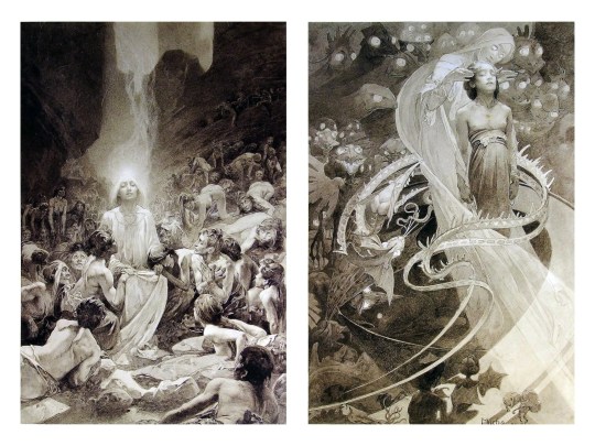
Chances are, you’ve seen Mucha’s art nouveau on prints, fanart, fabrics, and all of that. But Mucha did so much more and he is a huge influence on me for a reason. By the greyscale we see here, we can see foreground/subject with each illustration. Mucha is using value (that’s shadow) to emphasize this, in addition to negative space (background) to draw you in, just by using black and white. Notice how the other subjects don’t have such a powerful contrast and light source versus the other, especially the woman on the left. Mucha made his art pop by his understanding of contrast.
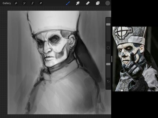
For this first part of this entry, I’m going to be using Papa Emeritus II from “Ghost”... who is a good example of how to draw faces, too. Huh. Regardless of what drawing program you’re using, keep your opacity low, at 50%.
Simplicity at its finest
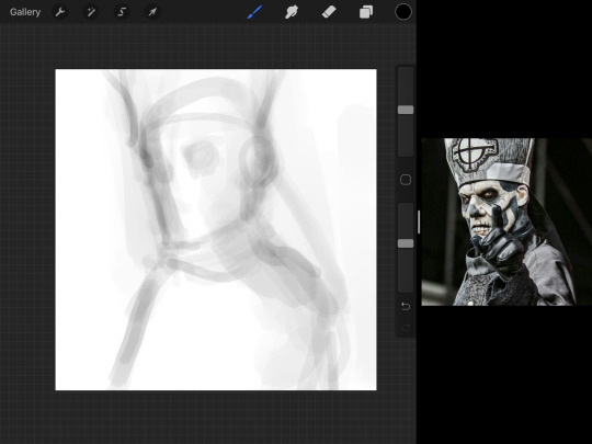
Instead of focusing a lot on Emeritus’ face, I’m going to focus on the negative space behind him. I’m using this to define his figure. This is a good picture because of the stark contrast, though, it’s a little tricky because it is really contrasted and you can’t see where the light source really is. But that is okay! I am going in and just using this negative space, the contour of his head and torso. Before I even think of a face, I want to softly go in and use black (or grey) to fill up that negative space. Keep it simple and work your way up.
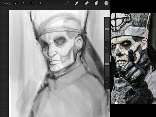
After I lightly fill in the negative space around him, I can start lightly going in and establish his face by blocks of shadow. And this is why Emeritus II is such a good example for this kind of work. I don’t usually start going in and drawing eyes, I rely on the shadows of the face to see where their eyes, ears, lips, and such lie.
Here’s another example (though, it’s old):
This is in my maroon style underpaint, which is what I post most of the time. For their faces, I just used basically eye sockets to start working on their faces, like Papa Emeritus II down below. Again, this dude is a great example.
Here is where it may get a little funky. I created a new layer and set that layer to Multiply, still keeping that opacity low. Since I have no light source and I just want to create a really dramatic lighting, I made a vignette with a simple airbrush tool.
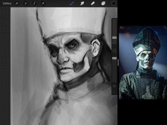
With that little vignette, you can create a new layer (unless you’re me, I just merge it down because of that constant fear of nonexistent software crashing) and I’m using the color pick tool to go back and forth to start using greys to really get into Emeritus’ face, especially his wrinkles. I’m painting over it constantly, switching back and forth between a paintbrush tool and color pick tool to blend. Again, keep your opacity low... unless you’re me and you’re feeling adventurous. You’ll also notice here that I have more than one photo reference. I use several for a lot of my art, so I encourage you to do the same. I had no idea what his jaw looked like, so I grabbed a second photo. Now that I have a better idea of where his hat ends on his forehead and how his nose looks, I start doing a weighted line.
Weighted line and Contour
Now is the dreaded talk. Of contour.

Welcome to Drawing I hell. This cursed image is from the book “How to Draw on the Right Side of the Brain” and if your teacher does not talk about this in your first drawing class, I am going to eat my hat... I have a hat lying around here somewhere. ANYWAY, the contour line exercise is basically you just using a neverending line for a drawing. I don’t know who drew this (and tbh, thanks a lot for every single boring assignment I’ve done in drawing classes), but this guy used contour lines for his drawing. I’m having war flashbacks over here, but I managed to find an art teacher’s page talking about different types of contour. My god, they are evolving.
Going back to our dear friend Papa Emeritus II, I used weighted line to start adding in little shadows to his face. Weighted line goes hand in hand with contour; it is a great technique to not only add details, but add little bits of shadows.

This is a simple example; the thicker line is adding to the shadow of the apple, giving it value!
Papa Emeritus II is such a good reference... I used him as inspiration for King Melwas here.
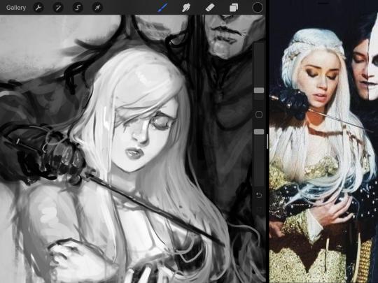
Gwenhwyfar is also a good example of weighted line. Gwen is essentially a very, very pale character. In contrast to Melwas, who is in darker clothing, Gwen is soft, she is the focal point in this drawing. For the little pieces of her hair, the corner of her lips, eyelashes, and her fingertips, I used a weighted line to establish these things, otherwise, Gwen is so pale, she’ll easily be washed out completely.
This drawing of Alice, which I’m still messing around with, is another example of how effective a weighted line can be with depth. The lines I added into her face, eyelashes, creases, hair, and fingers add those little details since everything I’ve done before like Papa Emeritus II was so soft with a low opacity on the brush settings.
Layer masks and curves
There are two ways you can color greyscale images.
You can do this by going into Layer > Adjustment Layer > Curves (this is how it looks like in Procreate).
This gives you a neat ol’ base color! I am playing around in the blues, adding soft hues of blue in their figures and the white in this picture can either turn blue, cream, or even green. You don’t have to use Blue, you can use any of the other colors. For me, I’m always drawn to blues. Another cool thing to play around with is Color Balance, which is underneath the same function as Curves.
But if you don’t have any of these, you can add a new layer, and do Multiply.
The only drawback to this, of course, is how destaturated (the lack of color) it looks. And yes, that’s an issue you will have and I did run into this while doing this. How I combat this is using additional layer masks. Believe it or not, Alice here was once at a grey scale, looking even more desaturated than Gwen.
For Alice’s face, I went in and use:
- Soft Light because she needed more peach and roses in her skin. Omri’s original drawing gave her a light rose blush so I wanted to do the same.
- Overlay to mask out the black lines from the greyscale I had.
- Lighten which I used to make her lips pinker, her apron’s shadows lighter, and parts of her hair brown.
The same went for Gwen, who is, again, very pale. But while she’s supposed to be pale, I didn’t wash her out completely. To add more saturation, I used a combination of Soft Light over my Multiply layer and Overlay to start working at the highlights on her hair, nose, and shoulder.
This little walkthrough isn’t as visual as I like, but with limited software like Fire Alpaca, GIMP, or Paint Tool SAI that don’t have the abilities of Photoshop in terms of color correction and playing around with colors, I really encourage you, readers, to play around with these tools. Using the color picker back and forth, especially after using layer masks, gives you an ability to mix and blend colors. The reason why I work with greyscale or a maroon under paint is that you can create brilliant colors and make a new palette; the trick is to constantly mess around with them. I never go in and flat out color anything, with the exception of things like “angry doodle corner” which is basically what I call my lazy drawings, drawings where I’m just honestly goofing off with.
So in summation...! Or me trying to summarize this.
Experiment and explore with layer masks and adjustments. Whoever says that using these tools isn’t real art, they’re wrong. And please don’t ever be afraid of using references of any sort! Alphonse Mucha is saved ten times over on this computer.
#my art#tutorial#i think#an attempt was made#digital art#procreate#ipad drawing#ipad pro#Alice madness returns#alice liddell#american mcgee's alice#alice asylum
8 notes
·
View notes
Text
Yugioh E6 S1: Everyone is Psychic but Mei
Last we left our four (five) buddies, Yugi just finished a two-episode long duel, and maybe that’s why he decided to go very off-character and just do nothing almost this entire episode. There’s plot reasons as to why this is, and mechanically, they can’t make the whole show all about Yugi--they have three other characters who right now barely serve a purpose since, up to now, Yugi’s basically done all the legwork for them.
Also, note they didn’t get the guy who is good at drawing Yugi into every episode--because this is one super googly-eyed Yugi. To be fair though, these character designs are pretty rough to throw at any animation team, and I don’t blame them--when your pupils don’t match your eye shape you get...you get this:

(more under the cut)
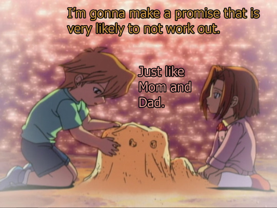
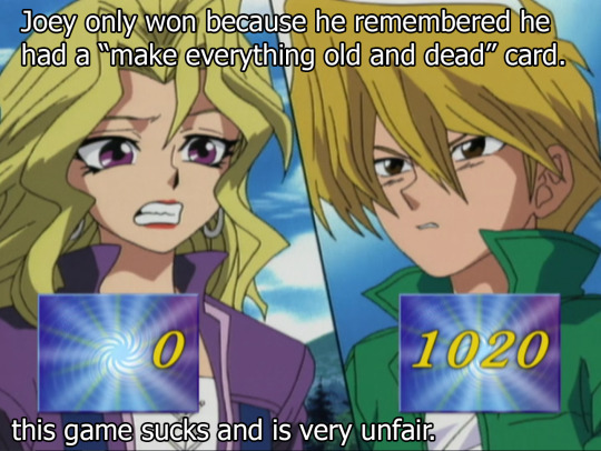
And as I’ve mentioned before, this show is unique amongst kids shows for not holding our hands as it dumps very heavy drama on our laps. Special interest kid’s shows like Hey Arnold did discuss how Arnold’s parents were dead, but also did so in a very PSA sort of way. It took time to digest the information, it gave it back to us in a way a child would understand. But, in Yugioh--heavy stuff just happens and there’s no processing it. There’s no real solution. We have this vague surgery that can fix Joey’s sister’s eyes but can it fix their situation? No. Not really.
And it’s not unusual for a kid’s show to take on divorce, but the Yugioh take is such a messy divorce--one where the two kids are starved of each other--the type of emotional abuse that does happen IRL, but just in general stays off the air during prime kid-watching time.
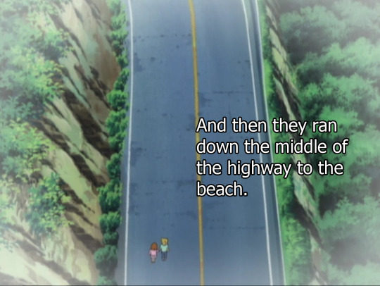
They’re actually pretty cute as kids, I’m not going to lie. Not sure why they got the OK to run away from home to escape to the beach for an entire day but maybe laws are different in Yugioh Japan?

And I just want to remind you--this show was only made to serve one purpose--to sell toys. That was it. This show only ever needed to make these cards look cool and that was it. But someone behind the scenes was like...”Guys, lets get REAL deep” Does it work? I...I don’t know yet. And the crazy thing is--if the rumors I’ve heard are correct--this isn’t even the tip of the iceberg to how far things are going to go later.
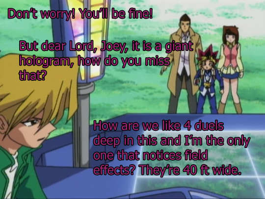
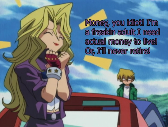
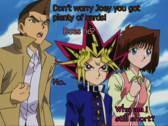
Joey, with the first opportunity to take his sister to the beach again somewhat in reach, realizes that maybe he should look at the cards that Yugi’s grandpa gave him in Episode 2.
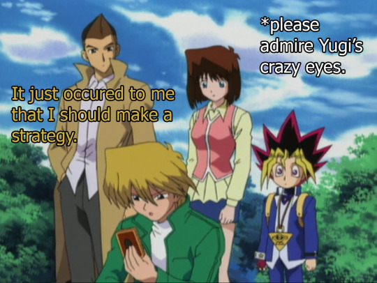
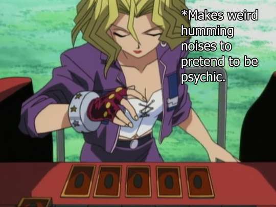
And Joey decides “welp I’ll just use a boost from the environment because I got all meadow cards” because he’s bad at cards. Tea decides to take the opportunity to beeline for Mei and harass her since Mei called Tea out for being a deadweight, which is completely true, lets be fair.

(Also I have a hell of a time with getting an accent over that a on my computer so forgive me for calling her Tea from here on out.) And I mean...it’s a 90′s early 00′s show, so they gotta have the girls all catty and jealous of each other, although in my mind Mei is just playing the game. Mei is fine. Tea is...I don’t know why she is like this.

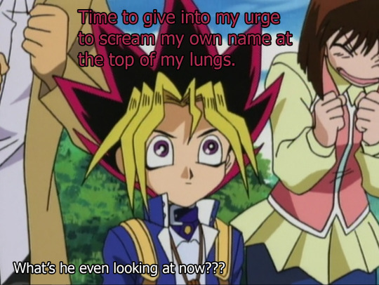
Also, the way they composed this shot is hilarious. Sometimes it looks like the storyboarder is fighting Yugi’s height, and other times, they are fully embracing it. This is fabulous. As a very short person, I approve.
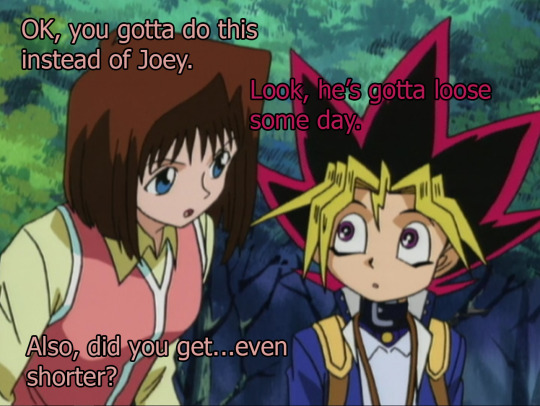
But Yugi’s decided, I’m gonna let Joey do this on his own. Why? I don’t know. Yugi usually jumps to defend his friends-- but today he’s just like...nah. I’m gonna stare blankly at the sky (in like eight different directions because these eyes are very hard to draw) with a very little mouth and just let this happen.


I don’t think I’ve even hardly covered Tristan, but basically he’s really into Joey’s sister and it’s just kinda gross to me.

Maybe being Pharaoh for too long makes Yugi a little spacy? I dunno. I dunno why this is happening other than they needed a Joey episode and gave up with trying to find a reason why Yugi would not be handling this himself. Also any zoom in on little Yugi turns into a cursed image--I can’t with these eyes.

It’s like he’s staring right through me, I can’t. I can’t handle this.


OK even when you zoom out little Yugi is still a cursed image--like they aren’t even trying to not make googly eyes here.


And like seriously kid’s shows need to stop with the whole “you should do what you do only because you love it.” Listen, I do art because I love it--but I gotta pay bills. It means I draw a lot of art I don’t really love at all. A lot like whoever the artist was this episode who had to draw Yugi’s face.
And then, just like that, Yugi comes out of whatever stupor he’s in and realizes yeah Joey has not changed at all since ep 2. Also, serious question as I’m looking at these zooms: Does Yugi wear eyeliner? He seems like the type, and guyliner was a trend around this time. I mean he does wear a belt around his neck so guyliner is just the next logical step.
Oh man I just had so much nostalgia for my 00′s youth just now.

And then, next to his friends, does his mind scream. I’ve heard that this really is happening in his head, which makes sense here. But like...the show does seem inconsistent of how they portray it, hence my confusion.
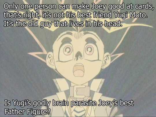
I mean...Joey’s Dad sucks, Yugi Grandpa is semi-dead--so this is the next closest Dad, right?
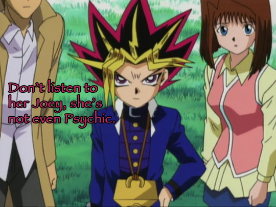

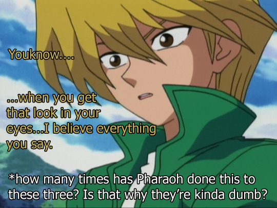
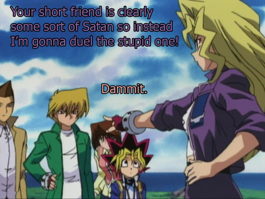
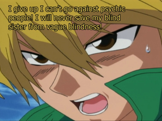
I do exaggerate what they say sometimes for jokes but this is an exact line. He’s done this before: Like do you have to use your superpowers to convince Joey that Mei isn’t psychic? Maybe Pharaoh knows no other way, he is a Pharaoh after all. These kids must have brains with holes in them like swiss cheese.


Also Yugi’s Pharaoh form is still short this episode, which seems sort inconsistent but youknow, it is a kids show, so inconsistent is gonna be a theme here and I don’t need to get stuck on that. But, I just want to point out that seeing an adult face on little Yugi is almost worse. Like...pictures of a human face photoshopped on a cute fat animal.
To the surprise of no one, Yugi gave Joey a Blue Shell That Screws Everything card about three episodes ago with the instructions “You might need to kill Mei’s harpies three episodes from now, so put this in your deck, because I’m a psychic��
Aw, what a good Pharaoh Brain Parasite Dad.

This show’s messed up.
#Yugioh#recap#ep6 S1#review#I'm pretty blind so don't spoil anything for me#Yugi Moto#Joey#Serenity#Mei#Tea#humor#sorry if your in the tea community and wanted like earl grey but instead got this nonsense on your timeline#you probably get this all the time though#accents on a's are really annoying on this keyboard#and it keeps opening up other tabs instead of accenting#so I have to copy and paste every a and hell no I'm not doing that anymore
26 notes
·
View notes
Text
Creating Vector Graphics
While making icons for StoryDevs it became obvious that raster graphics (i.e., images made of pixels) wouldn’t cut it. I wanted to be able to scale the images up or down without losing quality. This post is about me learning how to make vector graphics and the best free program I could find to make them.
Part 0: What Are Vector Graphics?
Most images you interact with on a computer are probably raster images which are made up of a grid of pixels. Common formats for such images are JPEG, PNG, GIF, and so on. When you zoom in on a raster image you can see the individual pixels, and scaling them up tends to look pretty nasty.

In contrast, vector graphics are made up of paths as shown below. You can zoom in forever and it will always be sharp as only the path info is saved, not the pixels that represent them on your screen. When you zoom in on a vector graphic it essentially re-renders the path again so it’s always smooth and clean:

Paths can be straight or curved. Paths can be stroked, which means a coloured line follows the path (as in the gif above), or they can be filled, meaning the interior of the shape is filled with colour. As far as I know, the only vector graphic format supported in modern web browsers SVG — Scalable Vector Graphics.
Part 1: Everything Is A Nail
I’m a 3D artist who can do a little digital painting if bullied. My first approach was to avoid learning a new skill and instead try mapping the problem to a domain I was already confident in. I had Blender and Photoshop installed but Photoshop barely does vector stuff. That left Blender.

Above you can see I modeled the icon for writing Blender. I then downloaded an old Python script that allowed you to render line art to an SVG file. This turned out okaaaay but there was a problem: it wasn’t exporting curves where there were curves… it was exporting segmented paths.
So this meant every time the line curved slightly it created a new segment, leading to a somewhat jagged line. Furthermore, the lines weren’t properly connected in the corners for some reason.

As you can see above the Blender SVG output was janky; you can see the segments even at normal zoom levels. Unfortunately I didn’t know the reason it looked bad at this point. So in the process of troubleshooting it I opened up the SVG file in my text editor. This is how it looked:

To my surprise it was written in XML (eXtensible Markup Language)! XML is similar to HTML — they’re both languages for categorising and storing data. The tags in each language are used to describe the data. If your document has a title, for example, you’d wrap it in a title tag <title>Like This</title>.
For now just ignore everything and look at the <path> tags with a bunch of numbers inside them. Those numbers describe the positions for points along the path. They’re all floating point numbers (i.e., they have a fractional part after the decimal point) rather than integers (whole numbers).
I’d read online that SVGs render best in browsers when there’s only integer values. I don’t know if that’s true, but I thought maybe that was why it was turning out screw-y looking. So I wrote a Python script that read SVG files and rounded the numbers up/down. Here was my script:

This had absolutely no effect! I was pretty pissed off by this point but it lead to a new idea: maybe what I’m seeing is the jagged-ness of polygons. There must be a lot of path segments due to it recreating the polygons as line segments… so maybe if I put it into an online optimiser it’d reduce the segments into curves?
After some searching I found an SVG optimiser online. I decided to try it. The file became much smaller but it didn’t look any better. At this point it became undeniable that Blender was not suited for this task.
Part 2: Get A New Tool
I already knew Inkscape and Adobe Illustrator existed. I had a bad experience once with Inkscape and I don’t want to talk about it. Illustrator is too expensive for me because I want the programs I use to be on-hand incase I want changes. I can’t afford a monthly subscription.
I decide to use Inkscape. It’s a good program in a technical sense — it has a lot of features — but it was just as confusing as I’d remembered. I’m sure there’s an internal logic for why things are the way they are, I just don’t know it. Still it’s a decent program and I made my icon in it.

As an aside: SVG doesn’t support branching paths. I didn’t realise this for a long time and kept trying to make the outer part of the page icon above a single path. Eventually I found this out and ended up making the fold on the upper-right of the writing icon as a separate path:

Using a dedicated vector program also allowed me to snap lines to the grid. This was another suggestion I’d read about creating SVGs that would supposedly help them render better in the browser. I dunno if that’s true but it couldn’t hurt. Something else I could do was use curves:

Notice how there’s only four control points (the grey diamonds)? That means the SVG file only needs to store these four positions rather than hundreds of little segments. This made the file quite small even before it was put through the optimiser.
Anyway, I exported it and ran it through the online optimiser. The result looked good and the file size was smaller. Below is a comparison of the files. The first attempt where I used Blender is on the left, while Inkscape + the online optimiser is on the right.

Much, much better. I integrated the icons I created into the site to see how they’d look when shrunk down. I was pretty happy with the result:

I didn’t feel like creating all the icons at that point so I took a break to do some client work as well as other programming tasks for StoryDevs.
Part 3: The Best Free Vector Graphics Program
When I came back I decided to look for something more easier to use than Inkscape. A couple months back I followed Ubuntu on Twitter since that’s the flavour of Linux that runs on StoryDevs servers. During my search I happened to see a vector art program shared by the Ubuntu account called Gravit Designer.

Overall it’s much easier to find what you’re looking for and it’s free! It’s a program for graphic art that looks like it was designed by graphic artists. I’ve only used the program a bit and while I was initially frustrated by some things, it seems like this is what I’ll be using from now on.
Conclusion
So that’s it! I skipped over the process of integrating the SVGs into the site because that’s another blog post right there. I’m probably going to recreate all StoryDevs’ existing branding and icons as SVGs at some point but for now they’ll remain raster images until I have some time to spare.
If you like what I’m doing with StoryDevs or you got some value out of this post (or both!), consider supporting me on Patreon. Sharing also helps :)
StoryDevs is a place for developers of story-focused games and visual novels to find each other and collaborate. The site is under development but handle reservations are open: www.storydevs.com/reserve
Website: www.storydevs.com Patreon: https://www.patreon.com/jakebowkett Twitter: https://twitter.com/storydevs Discord: https://discord.gg/A2jtNqE Email: [email protected]
15 notes
·
View notes
Link

We are gathered here today….
Today I write in memory of Adobe Flash (née Macromedia), something that a bunch of people are actually too young to remember. I write this with love, longing, and a palpable sense of relief that it’s all over. I have come to praise Flash, to curse it, and finally to bury it.
We’ve been hearing about the death of Flash for a long time. We know it’s coming. December 2020 has been announced as the official timeframe for removal, but let’s be real about this: it’s dead. It’s super-dead. It’s people-are-selling-Flash-game-archives-on-Steam dead.
That last bit actually makes me happy, because Flash games were a huge part of my childhood, and the archives must be preserved. Before I’d ever heard of video cards, frames per second, and “git gud”, I was whiling away many an hour on disney.com, cartoonnetwork.com, MiniClip, Kongregate, and other sites, looking for games.
I think we’ve established in my previous work that even as a missionary kid, I did not have a social life.
The Internet itself gave me a way to reach out and see beyond my house, my city, and my world, and it was wonderful. Flash was a part of that era when the Internet felt new, fresh, and loaded with potential. Flash never sent anyone abuse, or death threats. Flash was for silly animations, and games that my parent’s computer could just barely handle, after half an hour of downloading.
I even built my first animated navigation menus in Flash, because I didn’t know any better. At all. But those menus looked exactly like the ones I’d designed in Photoshop, so that’s what mattered to me, young as I was.
That was a part of Flash’s charm, really.
What Flash Got Right
Flash Brought Online Multimedia into the Mainstream
Funny story, JavaScript was only about a year old when Flash was released. While HTML5 and JS are the de-facto technologies for getting things done now, Flash was, for many, the better option at launch. JS had inconsistent support across browsers, and didn’t come with a handy application that would let you draw and animate whatever you wanted.
It was (in part) Flash that opened up a world of online business possibilities, that made people realize the Internet had potential rivalling that of television. It brought a wave of financial and social investment that wouldn’t be seen again until the advent of mainstream social networks like MySpace.
The Internet was already big business, but Flash design became an industry unto itself.
Flash Was Responsive
Yeah, Flash websites could be reliably responsive (and still fancy!) before purely HTML-based sites pulled it off. Of course, it was called by other names back then, names like “Liquid Design”, or “Flex Design”. But you could reliably build a website in Flash, and you knew it would look good on everything from 800×600 monitors, to the devastatingly huge 1024×768 screens.
You know, before those darned kids with their “wide screens” took over. Even then, Flash still looked good, even if a bunch of people suddenly had to stop making their sites with a square-ish aspect ratio.
Flash Was Browser-Agnostic
On top of being pseudo-responsive, the plugin-based Flash player was almost guaranteed to work the same in every major browser. Back in a time when Netscape and Internet Explorer didn’t have anything that remotely resembled feature parity, the ability to guarantee a consistent website experience was to be treasured. When FireFox and Chrome came out, with IE lagging further behind, that didn’t change.
While the CSS Working Group and others fought long and hard for the web to become something usable, Flash skated by on its sheer convenience. If your site was built in Flash, you didn’t have to care which browsers supported the <marquee> tag, or whatever other ill-conceived gimmick was new and trendy.
Flash Popularized Streaming Video
Remember when YouTube had a Flash-based video player? Long before YouTube, pretty much every site with video was using Flash to play videos online. It started with some sites I probably shouldn’t mention around the kids, and then everyone was doing it.
Some of my fondest memories are of watching cartoon clips as a teenager. I’d never gotten to watch Gargoyles or Batman: The Animated Series as a young kid, those experience came via the Internet, and yes… Flash. Flash video players brought me Avatar: The Last Airbender, which never ever had a live action adaptation.
Anyway, my point: Flash made online video streaming happen. If you’ve ever loved a Netflix or Prime original show (bring back The Tick!), you can thank Macromedia.
What Flash Got Wrong
Obviously, not everything was rosy and golden. If it was, we’d have never moved on to bigger, better things. Flash had problems that ultimately killed it, giving me the chance, nay, the responsibility of eulogizing one of the Internet’s most important formative technologies.
Firstly, it was buggy and insecure: This is not necessarily a deal-breaker in the tech world, and Microsoft is doing just fine, thank you. Still, as Flash matured and the code-base expanded, the bugs became more pronounced. The fact that it was prone to myriad security issues made it a hard sell to any company that wanted to make money.
Which is, you know, all of them.
Secondly, it was SEO-unfriendly: Here was a more serious problem, sales-wise. While we’re mostly past the era when everyone and their dog was running a shady SEO company, search engines are still the lifeblood of most online businesses. Having a site that Google can’t index is just a no-go. By the time Google had managed to index SWF files, it was already too late.
Thirdly, its performance steadily got worse: With an expanding set of features and code, the Flash plugin just took more and more resources to run. Pair it with Chrome during that browser’s worst RAM-devouring days, and you have a problem.
Then, while desktops were getting more and more powerful just (I assume) to keep up with Flash, Apple went and introduced the iPhone. Flash. Sucked. On. Mobile. Even the vendors that went out of their way to include a Flash implementation on their smartphones almost never did it well.
It was so much of a hassle that when Apple officially dropped Flash support, the entire world said, “Okay, yeah, that’s fair.”
Side note: Flash always sucked on Linux. I’m just saying.
Ashes To Ashes…
Flash was, for its time, a good thing for the Internet as a whole. We’ve outgrown it now, but it would be reckless of us to ignore the good things it brought to the world. Like the creativity of a million amateur animators, and especially that one cartoon called “End of Ze World”.
Goodbye Flash, you sucked. And you were great. Rest in peace. Rest in pieces. Good riddance. I’ll miss you.
0 notes
Text
In Memory of Flash: 1996-2020
We are gathered here today….
Today I write in memory of Adobe Flash (née Macromedia), something that a bunch of people are actually too young to remember. I write this with love, longing, and a palpable sense of relief that it’s all over. I have come to praise Flash, to curse it, and finally to bury it.
We’ve been hearing about the death of Flash for a long time. We know it’s coming. December 2020 has been announced as the official timeframe for removal, but let’s be real about this: it’s dead. It’s super-dead. It’s people-are-selling-Flash-game-archives-on-Steam dead.
That last bit actually makes me happy, because Flash games were a huge part of my childhood, and the archives must be preserved. Before I’d ever heard of video cards, frames per second, and “git gud”, I was whiling away many an hour on disney.com, cartoonnetwork.com, MiniClip, Kongregate, and other sites, looking for games.
I think we’ve established in my previous work that even as a missionary kid, I did not have a social life.
The Internet itself gave me a way to reach out and see beyond my house, my city, and my world, and it was wonderful. Flash was a part of that era when the Internet felt new, fresh, and loaded with potential. Flash never sent anyone abuse, or death threats. Flash was for silly animations, and games that my parent’s computer could just barely handle, after half an hour of downloading.
I even built my first animated navigation menus in Flash, because I didn’t know any better. At all. But those menus looked exactly like the ones I’d designed in Photoshop, so that’s what mattered to me, young as I was.
That was a part of Flash’s charm, really.
What Flash Got Right
Flash Brought Online Multimedia into the Mainstream
Funny story, JavaScript was only about a year old when Flash was released. While HTML5 and JS are the de-facto technologies for getting things done now, Flash was, for many, the better option at launch. JS had inconsistent support across browsers, and didn’t come with a handy application that would let you draw and animate whatever you wanted.
It was (in part) Flash that opened up a world of online business possibilities, that made people realize the Internet had potential rivalling that of television. It brought a wave of financial and social investment that wouldn’t be seen again until the advent of mainstream social networks like MySpace.
The Internet was already big business, but Flash design became an industry unto itself.
Flash Was Responsive
Yeah, Flash websites could be reliably responsive (and still fancy!) before purely HTML-based sites pulled it off. Of course, it was called by other names back then, names like “Liquid Design”, or “Flex Design”. But you could reliably build a website in Flash, and you knew it would look good on everything from 800×600 monitors, to the devastatingly huge 1024×768 screens.
You know, before those darned kids with their “wide screens” took over. Even then, Flash still looked good, even if a bunch of people suddenly had to stop making their sites with a square-ish aspect ratio.
Flash Was Browser-Agnostic
On top of being pseudo-responsive, the plugin-based Flash player was almost guaranteed to work the same in every major browser. Back in a time when Netscape and Internet Explorer didn’t have anything that remotely resembled feature parity, the ability to guarantee a consistent website experience was to be treasured. When FireFox and Chrome came out, with IE lagging further behind, that didn’t change.
While the CSS Working Group and others fought long and hard for the web to become something usable, Flash skated by on its sheer convenience. If your site was built in Flash, you didn’t have to care which browsers supported the <marquee> tag, or whatever other ill-conceived gimmick was new and trendy.
Flash Popularized Streaming Video
Remember when YouTube had a Flash-based video player? Long before YouTube, pretty much every site with video was using Flash to play videos online. It started with some sites I probably shouldn’t mention around the kids, and then everyone was doing it.
Some of my fondest memories are of watching cartoon clips as a teenager. I’d never gotten to watch Gargoyles or Batman: The Animated Series as a young kid, those experience came via the Internet, and yes… Flash. Flash video players brought me Avatar: The Last Airbender, which never ever had a live action adaptation.
Anyway, my point: Flash made online video streaming happen. If you’ve ever loved a Netflix or Prime original show (bring back The Tick!), you can thank Macromedia.
What Flash Got Wrong
Obviously, not everything was rosy and golden. If it was, we’d have never moved on to bigger, better things. Flash had problems that ultimately killed it, giving me the chance, nay, the responsibility of eulogizing one of the Internet’s most important formative technologies.
Firstly, it was buggy and insecure: This is not necessarily a deal-breaker in the tech world, and Microsoft is doing just fine, thank you. Still, as Flash matured and the code-base expanded, the bugs became more pronounced. The fact that it was prone to myriad security issues made it a hard sell to any company that wanted to make money.
Which is, you know, all of them.
Secondly, it was SEO-unfriendly: Here was a more serious problem, sales-wise. While we’re mostly past the era when everyone and their dog was running a shady SEO company, search engines are still the lifeblood of most online businesses. Having a site that Google can’t index is just a no-go. By the time Google had managed to index SWF files, it was already too late.
Thirdly, its performance steadily got worse: With an expanding set of features and code, the Flash plugin just took more and more resources to run. Pair it with Chrome during that browser’s worst RAM-devouring days, and you have a problem.
Then, while desktops were getting more and more powerful just (I assume) to keep up with Flash, Apple went and introduced the iPhone. Flash. Sucked. On. Mobile. Even the vendors that went out of their way to include a Flash implementation on their smartphones almost never did it well.
It was so much of a hassle that when Apple officially dropped Flash support, the entire world said, “Okay, yeah, that’s fair.”
Side note: Flash always sucked on Linux. I’m just saying.
Ashes to Ashes…
Flash was, for its time, a good thing for the Internet as a whole. We’ve outgrown it now, but it would be reckless of us to ignore the good things it brought to the world. Like the creativity of a million amateur animators, and especially that one cartoon called “End of Ze World”.
Goodbye Flash, you sucked. And you were great. Rest in peace. Rest in pieces. Good riddance. I’ll miss you.
Featured image via Fabio Ballasina and Daniel Korpai.
Source from Webdesigner Depot https://ift.tt/2Ox7wlK from Blogger https://ift.tt/2Wl1Hw3
0 notes
Text
Week 16 - Alex - Dénouement
--- Opening Thoughts:
Here we reach the end of the story of this project; the final knot, which took so many threads to tie, yet seemed not long ago to be little more than a tangled mess. This week, our group achieved more than what seemed achievable, given the time constrains and pressure. And although so much could have gone wrong, this was truly a very ‘right’ conclusion to an epic semester-long project. I’m so very, very thankful, and proud, of each and every member of our our group - without whom this film would never have been possible. And I’m honored to have been a part of what may very well be one of the finest films produced here in ACM Animation since its inception. I also would like to give a huge thanks to all the colorists who made the production pipeline go so much smoother and faster - sacrificing their own time and effort to be a part of something amazing! I also would like congratulate our terrific voice actor Justin Bendo, for his incredible work as the voice of Angel. And to our composer Joshua Namba, who breathed life and vigor into our film through his music.
--- Weekly Deliverables
For my work this past week, a lot has happened, as most of our group can probably agree to. It’s difficult to bring to memory every individual thing, but the core tasks were these: Coloring Sq13s6, a shot I originally roughed for. Although the final version would go on to have some major alterations to Angel, I’m happy to see it least one rough of Phantom I did pretty much stuck all the way to final:
youtube
Colored Sq13s16; took a heck of a long time even using pre-programmed inputs for the coloring process. But it turned out good, and due to me needing to use base layers for the characters, Gavin came up with an interesting blending mode for the Old Man which we can see in the final film:
youtube
For the next two shots I finished line from last week, plus color and shading for this week. They turned out pretty good I’d say:
youtube
youtube
We ran into some technical issues when it came to rendering out certain files, and one in particular that comes to mind is Sq9s16, as imaged below.
I don’t know how it was possible to even work on a file this large on Photoshop, with the hardware we have. It was so big that most of our group’s computers couldn’t even open it. Mine struggled big time to load it, let alone render it as an uncompressed .mov. I had to clear almost all my ram, and even then it crashed before finally managing to render it, which only took around 10 minutes (for one shot mind you,) and then uploading it which took a solid three and a half hours.
This one file almost stopped our whole production. It was amazing, kind of hilarious, and a bit scary, but we managed to pull through. I added a clipping mask to the fire’s lineart to make it orange.
The next thing which ate up a lot of time and energy this week was sound. Basically, I expected have sound done in maybe 5 or 6 hours over the weekend. Turned out it required almost two full days to finalize. Me and Gavin met up to discuss corrections and adjustments, and after some last minute feedback, all the retiming work was done, and we got an incredible audio track. Even though it was a heavy tax on my very tight finals week schedule, I think having those two days to work on it really raised the fluidity and creativity to provide something almost of a remaster to the animatic audio track we’ve been using up to this point. The premiere file itself is kind of a convoluted mess:
Nevertheless, it gets the job done, and taught me a whole lot about sound editing and design over the course of the semester (except organizational skills.)
--- Last Reflections
This semester has been such a momentous one for so many reasons. If 320 taught me “how to work on animation,” then 420 taught me how to work on animation for real. The jump is so tangible, not necessarily in a “workload” sense (although that may be part of it) but more so as an appreciation for the art of animation itself as a collaborative medium, and a visually exploratory one. I am much more aware now of every element that goes into a piece of work, and I think I can see the great value in attempting to discerning the purpose behind everything we see in Animation, as with any art piece. While it was easy to get away with seemingly arbitrary choices of shape, color, motion and such in the past, it has become especially necessary now to be deliberate in making choice, since the workload falls on someone else’s shoulders.
- Adjustments to the Process in the Future:
Not all of this is necessarily in my control, nor should this be held against anyone or any part of the film making process here, since after all we’re learning and exploring how to work in teams with new techniques. That being said, one thing I would aim to sharpen in the future is the pre-production estimates of workload times/levels, as well as the overall film length. I think I speak for most of us when I say that the film’s scope grew a lot over the course of the semester. And I’m not saying having a large or ambitious idea is bad - that’s my favorite kind of project! But it can become a bit of an issue when it grows to such a scope that we are having to recruit outside helpers and dedicate most or all of the 24 hours we have in a day to be able to manage finishing on time. Basically, just have a more rigid plan from the start, and be very cautious towards anything that adds unnecessary levels of complexity. That’s something that can be addressed at the animatic stage. Beyond that, being more cautious with the estimates of time and energy requirements per shot would help. I noticed that some (or maybe most) of the shots required quite a bit more time than originally intended to be roughed, lined, colored, and shaded. That’s not taking into consideration all the revisions they may go through as they are reviewed, given feedback, and trade hands between group members. Production schedule-wise, it’s much better to undershoot I think, and have a lot of extra time to hammer out details, maybe refine shots, and properly apply feedback versus feeling the dread of being behind schedule and cutting years from your life due to the amount of sleep lost to try and catch up. A general rule of thumb is that specificity helps. Despite how meticulously we planned, we would still occasionally run into issues such as what color a prop might be, or how the shading might change between environments. Or another example might be how a character’s physical attributes such as stretchiness might change or remain consistent throughout the film. Although these were minor things that got addressed in the end, baring those details in mind in the future would be of great help I think.
- Words of Advice to Future 420 Students
You have three options: either become a cyborg, learn to hate sleep, or adapt to being powered by copious amounts of coffee every day. As for me, I took something from all three of those this semester. Joking aside, these are some general pointers I would give to incoming 420 students: -Choose your story and teammates carefully: This semester can be as fun (or unfun) as you make it to be. No matter what though, the people you have at your side are the people you’re stuck with. Hopefully by this point in the major you would be familiar with your teammates and their individual strengths and quirks, so if you’re having trouble picking a team in the beginning, go with the people you feel are the most self-determined, hard working, and whom you can adapt to their mold (not necessarily vice versa.) If you hate your team, you will hate your semester. But if you love your team, it doesn’t matter how tough the work gets, because you can still come to class with a smile (a very dead inside smile.)
-Come in with a strong concept: Even if your idea doesn’t get picked, being able to receive other people’s ideas and represent them faithfully is vital to the overall success of the production. The better you understand the idea you are working on, the better prepared you will be to make it a reality. Also, simple designs and ideas tend to get picked more often. Keep that in mind when developing your idea.
-Diversity is a strength: Having a broad skillset on your crew is incredibly important. Ideally, everyone can functionally perform any given task on the production. But having specialists assigned certain specific tasks is very helpful. It serves to balance the workload more or less equally among members based on their strengths, and the result is a product where you have good work reflected in all aspects of the film.
-Be prepared to change your schedule: Unless your group’s idea is ridiculously simple, chances are you will be losing sleep, possible questioning your choice of major, and being forced to change both when and how you are available to people and things you care about in the world outside the borders of your computer screen. It is not a joke to say that this course can affect your health, your diet, and maybe even the way you view other people - or even yourself! If done properly, this class should challenge you in the way you live and handle work. It should force you to adapt to an animator’s lifestyle. Not that you need to forsake life to be an animator necessarily, but to give you a taste of what the industry may demand of you through certain seasons of life.
-Be able to take a joke: By the end of the project, you’re going to be throwing shots at each other left and right. It is a crazy, whacky time - and you may find yourself forgetting this is all for a school project. Learn to enjoy acknowledging your own weaknesses, and have fun pointing out the flaws in others, when its appropriate. This makes the experience not only more enjoyable, but in a strange, ironic way it makes us become comfortable with our shortcomings, and enables/pushes each other to genuinely improve our skills, and ultimately create a better product.
-Communication is key: You need to keep up with your group. Period. If you are our of the loop for even a day, it can throw things off big time. Setup a chat group via text, setup a Discord server, or find some other means to talk to one another that is reliable. Even if you don’t always feel like chatting, just be ready when somebody needs you (which will happen quite a lot.) Also, having a system of file sharing such as Google Drive is indispensable. You may find yourself keeping certain tabs open and rarely closing them, just to check for updates and be able to send/receive files when you need them.
-Practice makes perfect: I don’t care how good or bad you think you are at animating up till this point; if you do your best in this class, you will grow. You may find yourself drawing in a different art style than you’re used to, and implementing work methods and software that you’ve never used before. And that’s wonderful! Be open to experimenting and exploring new styles of work. I’ve found that is a big part of what makes animation enjoyable and inexhaustible. Just when you feel like you’re set in your ways, the moment you step into something new, it’s a whole other world, and you just might find something you like about it.That opens the door to not only other ways of being creative, but on a practical level, makes you a much more viable component to a team when being considered for hiring. Don’t let the early hardships bog you down; with time and practice, there’s nothing you can’t do. -- Well that pretty much wraps up this last blog post and the semester for 420. The experience has been life altering, no joke. I have no regrets, and I’m so thankful to have had the chance to work so closely with everyone. In my experience, this class has been the difference between being an animation student and becoming a professional animator. Even though it was as a real challenge emotionally and physically, I would take the class again if I could, and I very much look forward to working with you all - my fellow animators - in our continuing classes, as well as our careers beyond. You all have been my family here while I’ve been without one since moving all the way out here for school.
Thanks to Brittany for teaching our wonderful class! And to everyone who has fought through this semester together and made it something special, right up until the very end. Until next time my friends, this is the Undercover Animator signing out.
0 notes
Text
logicheartsoul replied to your post: Me: *wants to get back into 3D modeling* Maya...
God I haven’t touched Maya since HIGH SCHOOL… and that was only coz the school was able to get extremely reduced discounts! Ugh, why do art programs have to be exorbitant??? At least Photoshop used to be ok until they did the pay per subscription thing… though CS6 is ok with me right now. Still, fucked up
I got CS6 Photoshop, Illustrator, and InDesign as a one time buy right before they they started on the CC stuff. The only program I do the monthly payments for is Premiere because i like to make videos and soundbites, and 19$ a month isnt that bad considering how much I make...
But $185 a month? No way bro...
I think the ZBrush $750 dollar single user license is a one time buy, it doesnt say monthly, but thats still a LOT to pay... and also, looking at the system requirements, i don’t think my desktop computer can handle it (it can barely handle premeire, i have to use premiere on my laptop because my laptop has the HDD space for it)...
So either I have to save up for ONE BIG TREAT YO SELF and get both a 1TB Desktop (most likely a gaming computer, which are at the cheapest $1000 dollars) and ZBrush 4R8 for 750... Or wait till I have fewer big bills to pay and get either Maya at 185 a month, or do $175 (again, idk if this is one time buy or monthly payment) for ZBrush core, but the system requirements are the same as 4R8, so I would still need a better computer...
3D modeling can wait
1 note
·
View note
Text
Hello, friends! This post is a bit of a random one compared to my fangirling over anime, architecture and my precious bishies.
My Desktop during School (don’t mind the crappy panorama – I took this from my IG)
I’ve mentioned this in one of my Sunday Salutations post, that I’m starting to hunker down and really study for an exam I have coming up. It got me to thinking about a new computer. Now, to be fair, I don’t necessarily need a new one at the moment, but a girl can dream right? And while I’m mostly an Apple user, the PC has it’s own perks and is actually more accessible in terms of software *cough* gaming *cough*. So I started to ponder, what are the things I look for? And what would I put into my ideal set-up?
When in the market for a new computer, I’m looking for affordability, durability and reliability. Computers are an investment so affordability plays the biggest role as I want the best bang for my buck. So looking at the specs are key, so with that in mind what kind of components do I want? What’s this particular computer going to be used for? These questions should help narrow down the types of computers to look for. After affordability, I would probably look at the durability of the computer. This may not apply to desktops, but more so to laptops. When carrying a laptop and mobility it’s nice to have something sturdy because when you’re on the go you never know what’s going to happen. When it comes to desktops, it probably would be nice to have a tower that can handle a bit of wear and tear, sometimes chairs bump into it, and sometimes you accidentally bump up against it; that is unless you like the all-in-one computers; but again, it depends what you’re doing with your computer. Besides durability, I’d look at the reliability of the computer. Reliability in software and hardware are definite musts, I mean, who wants an unreliable computer that will crash frequently? So looking at the particular specifications of a computer will also play a key in reliability. I usually take into account the type of work I’ll be doing. Is the RAM high enough to handle multiple programs in the background? Do I have enough memory for all the program’s I’ll be needing?
Typically looking at big name brands like HP, Apple, Sony and Dell are definite go to’s for comparisons and contrasts as they’re notable brands in the computer world.
Top Three Specs
There are at least three things that I absolutely look for when shopping for a new computer because these things are definitely what I need in doing anything design, blog or game-related.
Processor
The faster the processor the more seamless productivity becomes. At the very least it has to have an i7 core.
Graphics Card
As someone that works with graphics pretty heavily, especially the adobe suite, it’s nice to have an additional graphics card that isn’t part of the integrated system to help boost output.
RAM
I run multiple programs at a time. I have to use photoshop, illustrator, indesign, Rhino 3D all at the same time to work efficiently without completely crashing my workstation.
These three things definitely help me determine the type of computer I’m willing to invest in. But, these are the bare minimum.
Dream Desktop
However, if we’re talking about my dream desktop, there are a few other items I’d definitely splurge on:
Computer Case
I’m a designer at heart, so aesthetics are everything. If I were to build a computer, I’d definitely pick up a cool looking tower; have you seen these tempered glass cases? Super cool! I love to see the working parts of the computer, it just looks so much more technical to see things exposed, especially with cool backlighting!
image source
Heating
With a big processor and lots of RAM, heat is bound to build-up and ultimately slow down the speed your OS operates, so to kind of alleviate that, I’d probably splurge a bit on a system that would help lessen the heatload. I also have a really bad habit of leaving my PC on for a few days at a time.
Graphics Card
Again, I cannot emphasize enough how important the graphics card is especially when you’re playing games. So a good graphics card could help with the frame rate of a video game (i.e. less skipping) and make the game more fluid. However, there are other things that can affect frame rate outside of graphics card and your CPU, the monitors also can be a factor. But I’d still splurge on the graphics card.
So, these were just a few things that came to mind when I started to think about building my own computer again. I built a PC for school since most of the programs I needed were PC based. The probability of me building a high-end computer like I did during school is probably not high on the priority list since I don’t do such heavy designing like I did a few years ago. But hey, it’s nice to keep a list of the spec’s you’d like to have in your dream desktop.
With that being said, I’m curious, if you guys were to build or buy a new desktop or even a laptop. What kind of things would you look for? Let me know in the comments below! 🙂
Computer Ideals: What Specs Appeal to You? Hello, friends! This post is a bit of a random one compared to my fangirling over anime, architecture and my precious bishies.
0 notes
Text
Living With the Lenovo ThinkPad X1 Carbon
If you’re on the road a lot – or were on the road a lot – and you’ve got to do business work that can’t be handled with a smartphone or tablet, you may want to invest in a seriously good, seriously compact notebook computer. The very lightest weigh in under 3 pounds, sometimes approaching just 1 kilogram, or 2.2 pounds. The best is the Lenovo ThinkPad Carbon X1, with a 14-inch display, priced from $1,400 to $2,400.
Working from home? The small size makes for a great computer-at-home when multiple adults and students are sheltering in place in the age of coronavirus: sitting at a kitchen table, draped across a couch, or lying in bed.
It’s not merely the ThinkPad X1 Carbon’s low weight. It’s the compact size, barely bigger than a sheaf of paper a half-inch thick. It’s the small power adapter and the 10-15 hour battery life. It’s also knowing that the machine is not going to break down when you’re on the road, or when you’re working from home and your company’s nearest IT guy is sheltering 20 miles away. ThinkPads don’t break very often. The price delta over a mainstream five-pound portable is not insignificant, but it’s less important than the fact that you’re remaining productive.
Great view(s): The companion ThinkVision M14 USB C display doubles screen real estate. It’s perfect for times when the hotel doesn’t let you jack into the big screen TV. (No, not all hotel rooms have this kind of view. Some trips, you get lucky.)
Second Display Extends Main Display
ThinkPad M14 display. Thick USB-C cable provides power and signal.
Dropping down from a larger, heavier notebook of 4-5 pounds also reduces how much bulk you have to carry when traveling. I’m on the road 20-plus times a year. (Well, I was until, uh, everybody stopped traveling.) The photo above was shot during a week at an auto show, where I needed to write stories; process photos; work social media to raise my ExtremeTech stories’ visibility on Twitter, Facebook, and Instagram; and keep up with friends and family, working not just in the hotel room-with-a-view but on shuttle buses, in downtime between meetings, or at airport departure gates.
For years, I’ve traveled with a thin HDMI cable 10-15 feet long ($15-$50) that I could jack into the hotel’s big TV if I could access the rear jacks, if the TV didn’t lock out access to the HDMI2 jack, and if the TV could be seen from the desk. That let me look at dozens of photos in Adobe Lightroom or stream videos. Now I travel with a second display, the ThinkVision M14 USB C display ($250), that quickly plugs in when I’m in the hotel or working in a convention center press room. Feet on the base let you get the screen bottom level with the base of the computer’s screen.
The 14-inch ThinkPad X1 Carbon is only a little smaller in every measurement. Calculate total size (volume) and weight, and the Extreme Gen 2 is half again as bulky and heavy. You notice it.
Whether stepping down to the hotel bar or at home headed to the media room to watch TV, I find that I now tuck the X1 under my arm – instead of my iPad – if I might want to check mail or social media. It’s unobtrusive. I wouldn’t do that with a 15-inch laptop weighing 5 pounds. Even the very nice ThinkPad X1 Extreme Gen 2 is just a little bigger in every respect (table above), enough so that you feel the size and heft going from place to place. And this one’s light compared with most notebooks with 15- to 16-inch screens.
The left side of the ThinkPad X1 has a USB C/Thunderbolt connector for power, a second that also connects the ThinkPad docking station, a wired Ethernet connector that requires a $35 adapter, a USB 3 jack, and an HDMI (full-size) jack.
First-Class Mechanicals
I’ve been a long-time user of laptop and notebook PCs. I wrote a book on using laptops in the early days, and was thrilled to see weights come down from 10 pounds and then slip below 5 pounds. Over time, I’ve valued ruggedness and reliability over low prices or (until now) the absolutely lowest weight. The X1 lets you have it all. Other than a low price: The cheapest X1 is still well over $1,000 and the every-options-box-checked X1 approaches $2,500.
If you go out on the road or commute daily by mass transit, when you lift the lid, you want the machine to come back to life every time, right away. For that, it’s worth a higher initial price point. It absolutely is when the company is paying, but probably is even when you’re paying. (Maybe you don’t need the 4K display upgrade on a screen measuring just 12 inches across.)
Mostly, I do the usual things on the road: deal with email, write documents and stories, chatter on Slack, and check social media. For that, any laptop works. I also handle a lot of photos and videos. For those, the X1 Carbon is more than workable. That said, Adobe is finally pushing its Photoshop and Lightroom tools onto the iPad and they’re certainly usable.
I have a 30-inch desktop monitor at home. Away from home, I compensate with the ThinkVision secondary display or jacking into the hotel TV when it’s accessible.
The right side has a headphone jack, always-on-for-power USB 3 jack, and a locking connector.
The X1 Carbon has two USB and two Thunderbolt/USB jacks plus a wired-Ethernet connector that requires an adapter. There is also a microphone array and a 720p front-facing camera with IR illumination for dark locations. You can almost double the price by upgrading:
14-inch 1920 x 1080 full-HD display (400 nits) to touchscreen to 2560 x 1440 WQHD to 3840 x 1440 UHD (500 nits)
CPU from 10th generation Intel Core i5-10210U at 1.6GHz to 8th generation i7-8665U at 1.9GHz
Solid state drive from 256GB to 512GB to 1TB storage (2TB not offered)
8GB to 16GB RAM
Windows 10 Home to Pro
ThinkPad keyboards have always been first-class. Use the TrackPoint, touchpad, or your own mouse to point.
Not the Only Ultra-Light Notebook
There are at least a half-dozen competing ultraportable laptops, those weighing 3 pounds or less, typically with 13- or 14-inch displays, solid-state hard drives, and battery life over 10 hours. The two that draw the most attraction are the Lenovo ThinkPad Carbon X1 and the Apple MacBook Pro 13-Inch. They’re both premium-priced and score high for reliability. I like them both; my wife has a 13-inch MacBook and she’s an artist, and that (artist) is a near-automatic win for Apple.
If you can live with 512GB not 1TB of storage, one of the best deals on the X1 Carbon is Costco’s take-it-or-leave-it $1,500 single configuration: the more powerful Intel Core i7-8565U processor, the larger 16GB RAM config, a 1920 x 1080 touchscreen with 300 nits brightness (the other X1 displays are 400, 300 and 500 nits), and Windows 10 Home.
Other good choices are the Dell XPS 13 (13-inch LCD, 2.7 pounds) and Inspiron 14 7000 (14-inch LCD, 2.9 pounds), HP Envy 13 (13.3-inch LCD, 2.6 pounds), and LG Gram 14 14Z90N (14-inch LCD, 2.2 pounds). Most offer 8GB or 16GB of RAM (typically soldered down) and 256GB to 2TB of SSD storage (512GB and 1TB are most common). If your company just buys one brand of portable PC, they’re all pretty good. You may want big-screen monitors at your home and office work desks, and 24-inch displays are so inexpensive now.
The Apple MacBook Air (13.3-inch LCD, 2.8 pounds) is even lighter than the MacBook Pro 13, but it’s light on I/O as well: You use the two Thunderbolt/USB-C for external VGA, HDMI, or wired Ethernet.
Of note is the LG Gram 17, a 17-incher with 2560 x 1600 (WQXD) resolution, weighing just 2.9 pounds with a rated 17-hour battery life. So it’s super light, but also may call for a larger backpack or shoulder bag, and you want to be extra careful you don’t torque or stress the case.
Over the years, I’ve used IBM/Lenovo, Compaq, Dell, Gateway, HP, NEC, Panasonic, and Toshiba laptops. All were major productivity enhancers at the time. The most dazzling was a 4-pound NEC UltraLite at a time when only a handful of laptops were under 10 pounds. I still have it as a souvenir, next to an ancestor’s Underwood 5 typewriter. Right now, the go-to notebook for me is the Lenovo ThinkPad X1 Carbon because portability matters. Even when the word portable, for now, means only from the den to the living room to the kitchen table.
Now read:
AMD and Intel’s Latest Mobile CPUs Go Head to Head in Benchmark Leak
Now You Can Fight Coronavirus on Your Smartphone or Raspberry Pi
Why TFLOPS Are Bad for Comparing PlayStation 5, Xbox Series X Performance
from ExtremeTechExtremeTech https://www.extremetech.com/computing/282800-lenovo-thinkpad-x1-carbon-review from Blogger http://componentplanet.blogspot.com/2020/04/living-with-lenovo-thinkpad-x1-carbon.html
0 notes
Text
HP ProBook 450 G5 Review
There are many 14-inch notebooks while in the office section,and HP has now introduced its redesigned ProBook 440 G5 as an entry-level system.Its quad-core CPU,IPS show and huge glass touchpad audio promising.Uncover why all this is not really pretty ok inside our comprehensive review.Following the ProBook 450 G5 and ProBook 470 G5,we've now taken a glance with the second-smallest ProBook four hundred design from HP.The ProBook 440 G5 is the successor from the ProBook 440 G4 and is one particular of the more cost-effective 14-inch notebooks during the company phase.On its site,HP has marketed the ProBook 440 G5 being an "affordable mix of innovation and stability and multimedia functions" for smaller providers.Today's levels of competition products undoubtedly are a Lenovo ThinkPad,a Dell Latitude and an Acer TravelMate.Only the ThinkPad E480 batteria hp hs04 has long been equipped with a new-generation CPU; the Latitude 3470 and also the TravelMate P449 inside our comparison still operate on more mature CPUs.Our check unit is supplied with a Complete Hd IPS display screen,an i5-8250U,a 256-GB SSD and 8 GB of RAM.The unit also arrives with Home windows 10.What we now have in front of us right now will be the HP ProBook 440 G5.As its identify implies,it really is aimed toward industry experts,either inside a business or freelancers,so it promises to be responsible,protected and naturally - productive.This just one would be the fourth consecutive machine with the fifth technology ProBook four hundred collection that we bought our hands on.We've got earlier reviewed the third technology of this model - ProBook 440 G3,so that you are going to find out if the brand new gadget is really worth the update or it's just the newest slight refreshment.Our distinct unit is supplied using an Intel Main i5-8250U processor,which delivers quite a bit of ability for an Ultra-Low voltage chip caricabatterie samsung 172s 172t as well as for the portion on the cost of the Main i7-8550U,so in certain regions it could be the CPU of decision,providing the ideal performance/price ratio.A different intriguing factor relating to this sequence is usually that just about every model appears the identical,irrespective of the size of it - in other words,the ProBook 440 G5 appears just like a little one to the ProBook 470 G5.
Design
HP has specified this year's ProBook four hundred collection a completely new style and design.The earlier era,the ProBook 400 G4,was primarily silver.The new products are still silver around the outdoors,though the inside of is principally black,that makes the product glimpse a lot more expert.The form is similar to previous year's model,although it happens to be a little bit more angular.A giant transform could be the hinge layout: Alternatively of two tiny drop-down hinges,the ProBook batteria asus n56 is currently outfitted by using a more substantial,broader hinge in the similar establish.The only hinge includes a silver cap and keeps the exhibit in place although being unfastened ample to allow opening the screen with a single hand.The components have not changed.The majority of the circumstance remains built of plastic; only the wrist rest has an aluminum area.This feels excellent and improves balance around the keyboard.Aside from that,the situation is comparatively flexible.The display screen include and base device could be warped fairly conveniently,although the display protect is weaker than the thicker foundation device.Tension within the back in the exhibit is straight away obvious to the panel.The ThinkPad E480 offers quite a bit more stability.The identical could be claimed for the workmanship.We currently noticed a badly produced edge at the entrance of the wrist rest around the ProBook 450 G5.Modern exam unit has a similar challenge at almost accurately the exact same place.We praised the ProBook 450 G5's chiclet keyboard that offers 6 rows and backlighting.It had been well-built and ok for the majority of buyers.Unfortunately,the keyboard batteria sony vpceh from the smaller sized ProBook 440 G5 would not provide such good quality.This is certainly predominantly linked towards the simple fact which the keyboard offers way within the still left aspect regardless if typing generally.A keyboard might be wonderful usually,but when its foundation just isn't secure,it can be no good.The still left aspect on the keyboard rattles and feels far too comfortable.The keyboard's structure is principally exactly the same as that from the much larger ProBook.The most important big difference will be the lacking number pad,which won't in shape into a 14-inch situation.For the appropriate of your enter important,it is possible to locate a row of navigation keys such as pos1,stop and pg up/down.Regardless of whether you prefer the format or not is really a subject of style.The vertical arrow keys which have been squeezed in to the space of 1 critical are simply just irritating.Such as the keyboard,the standard in the touchpad is not really 100% ideal,because the left edge protrudes slightly.But,in contrast to the keyboard difficulty,this does not affect the working in the touchpad and we assume this is actually a one-off problem of our exam device.We do not have nearly anything to criticize with regards to the operating from the touchpad,which works like a ClickPad.The area is produced of black-painted glass,which means it is straightforward to glide about.The press mechanism generates muffled,not-too-loud clicks and it has a fantastic force place.Because of the Windows Precision driver,all inputs, together with multi-touch gestures,are processed precisely.
Performance
Armed with an Intel Main i5-8250U CPU and 8GB of RAM,the HP ProBook 4350 G5 I tested packs enough punch for critical multitasking.I observed nary a stutter or pause immediately after splitting my display among a streaming 1080p YouTube video clip along with a dozen Google Chrome tabs batteria sony 15e svf15 and 13,990 from within the Latitude 7390.The 256GB PCIe NVMe SSD in the ProBook duplicated 4.97GB of media information in thirty seconds,for any gradual rate of 169.6 MBps,which is fewer than the 281.5-MBps premium notebook average.Quicker speeds were being recorded because of the 256GB NVMe PCIe SSD during the ThinkPad T480,as well as 256GB SSD during the Latitude 7390.The ProBook 430 G5 finished our Excel VLOOKUP examination in 1 minute and seventeen seconds.The ProBook 440 G5 is offered with a few display solutions: A reflective Hd TN touchscreen screen,a matte High definition TN non-touchscreen show,which it is best to surely steer clear of,along with a matte Complete Hd IPS alternative,that is certainly also non-touch.Our check device is equipped together with the latter Entire Hd panel.We didn't evaluate any PWM and only quite tiny backlight bleeding.The brightness distribution is 88% and no shading is visible for the bare eye.The Core i5-8250U is a well-liked Intel processor of your "Kaby Lake Refresh" technology and it has 4 cores.These clock at a greatest of 3.4 GHz according to the specification sheet and possess a foundation clock price of 1.six GHz.The conventional Thermal Style Electricity of the CPU is 15 watts.You are able to assess this with other CPUs caricabatterie adp-65dw af within our checklist of cell processors.After that it stays at seventeen watts.In our Cinebench loop,during which we operate the Cinebench R15 multi-core take a look at consecutively for half an hour,the improve to three.3 GHz is simply offered while in the 1st round,which happens to be when it reaches the most beneficial end result.After that,CPU efficiency drops,likely because of to large temperatures.Overall performance then recovers a little bit and continues to be secure at 530 points for your relaxation on the examination.The ProBook 430 G5 ran the Filth three racing match at 59 frames per second,that's beneath the 66-fps category typical,but higher than our 30-fps smoothness regular.The 0.9-megapixel webcam in the HP ProBook 430 G5 isn't really bad; it is really just no improved than every single other built-in camera that I have viewed in many other laptops I've reviewed.Absolutely sure,I'm recognizable during the selfie I shot about the notebook,but the pics are so blotchy that it looks like they have been processed employing Adobe Photoshop's Rasterize filter.The ProBook 430 G5 receives quite heat.Following we streamed fifteen minutes of Hd video around the notebook,its keyboard and underside measured 99 and one zero five degrees Fahrenheit,two marks which might be higher than our 95-degree ease and comfort threshold.Just the notebook's touchpad,which strike eighty two levels,stayed interesting on the touch.HP gave the ProBook 430 G5 a fairly light quantity of preloaded software package.Its JumpStart software program caricabatterie hp dv6-2010sg helps educate rookies on their order,IT execs will use HP Customer Protection for gadget administration,and HP WorkWise allows you to definitely handle your Computer system from an Android smartphone.Then,not surprisingly,you have the normal,unavoidable bloat of freeware such as Sweet Crush Soda Saga,March of Empires and Sketchbook.
The HP ProBook 430 G5 is usually a long-lasting notebook,adequate which you can go away your power cord in your own home for working day outings.The HP ProBook 430 G5 is usually a fast business enterprise notebook that gives strong productiveness with its long-lasting battery and comfortable keyboard.Furthermore,the Main i5 processor provides snappy effectiveness.If only this notebook's screen were not so lifeless and low-res,the ProBook could be an excellent laptop computer.I'd personally absolutely get the full-HD panel in its place.Those who want all the more battery existence can customise the ThinkPad T480 with its 72-watt-hour battery.In case you required a system with related specs,but using a 1080p display screen,I like to recommend the Dell Latitude 7390.General,all those constrained to the tighter spending budget really should certainly check out the ProBook 430 G5.To generate guaranteed we have been around the identical website page,we would prefer to provide you somewhat introduction on the sRGB colour gamut batteria hp dv6-61040ez and the Adobe RGB.To start out,there's the CIE 1976 Uniform Chromaticity Diagram that represents the obvious specter of colors via the human eye,providing you with a much better notion on the color gamut protection as well as the coloration accuracy.In the black triangle,you will notice the normal color gamut batteria asus a41-x550e that's currently being utilized by a lot of persons in HDTV and around the web.As for that Adobe RGB,this is utilized in specialist cameras,screens and so on for printing.In essence,colours in the black triangle are utilized by everyone which could be the essential section of the color high quality and color precision of the mainstream notebook.Even now,we've included other shade spaces such as renowned DCI-P3 normal used by movie studios,having said that,remains a matter of the potential and it's hard for currently's shows to go over that well.We've also included the so-called Michael Pointer gamut,or Pointer's gamut,which represents the colors that normally manifest close to us everyday.The following figure shows how very well the display screen will be able to reproduce genuinely dark areas of a picture,which can be important when seeing movies or actively playing game titles batteria asus a41-x550 in low ambient light-weight.The remaining facet from the impression represents the screen with inventory settings,even though the proper a person is along with the "Gaming and Net Design" profile activated.About the horizontal axis,you can find the grayscale and about the vertical axis - the luminance on the display.On the two graphs under you are able to easily examine on your own how your display screen handles the darkest nuances but retain in mind this also relies on the settings of your recent display,the calibration,the viewing angle along with the bordering gentle circumstances.Installing of our Health-Guard profile don't just eliminates PWM but additionally reduces the dangerous Blue Mild emissions though retaining the colors on the display perceptually accurate.For those who're not common along with the Blue mild,the TL;DR version is - emissions that negatively have an affect on your eyes,pores and skin and also your complete human body.You could come across more info about that in our dedicated short article on Blue Light-weight.
You can see the levels of emitted blue light around the spectral electricity distribution graph.The ports are just about precisely the same as about the bigger ProBook 450 G5.The one variance: The ProBook 440 G5 has a person USB-A port much less.In complete,there are a few USB ports; the product has a further USB Type-C port that transmits data at USB 3.1 Gen 1 speeds.The port also supports the DisplayPort alternate method too as Ability Delivery.The DisplayPort by means of USB Type-C,HDMI and VGA signifies the unit has 3 show outputs,a decent range for your 14-inch notebook.Significantly the VGA port may possibly certainly be a powerful reason for acquire for many buyers.We must criticize the placement with the USB-C port caricabatterie hp dv6-61040ez a bit - it's got been placed extremely much to your entrance to the appropriate facet of your device.This is often notably frustrating if you'd like to implement the port for charging the gadget.Subsequent its classification to be a "small business" laptop,the obtainable safety functions of your ProBook are instead rudimentary.It doesn't offer a sensible card reader,nevertheless it does have TPM along with a fingerprint reader.This fingerprint reader is really an more mature product,where by you might have to move your finger around the sensor.More recent products typically operate by using a touch sensor.The swipe sensor in the ProBook mainly does a very good job,although touch sensors are quicker and more specific.In case you change the ProBook the wrong way up,you'll find two maintenance hatches batteria dell 13 7000 which might be every single secured using a Phillips screw.In order to achieve the factors,you to start with really need to get rid of the much larger servicing hatch,given that the screw for your lesser hatch is concealed underneath the lid on the bigger hatch.In the greater location,you'll find the two RAM slots plus the Wi-Fi module.The scaled-down maintenance hatch hides the M.two SSD slot and also a cost-free slot for the two.5-inch HDD/SSD.We presume you need to have an HDD caddy for this past slot,as there are two screw holes caricabatterie asus s301 that are possibly meant to protected the SSD/HDD in its caddy.Even though it is rather simple to accessibility these components,we're not fully delighted with this layout,mainly because the cooling supporter and battery are not available.The supporter is noticeable but cannot be removed as quite a few struts of the scenario are during the way.As a way to succeed in these two components,you've to fundamentally take the case aside.
Conclusion
The Comprehensive High definition IPS panel used in the HP ProBook 440 G5 is great,as it has a fantastic contrast ratio,as well as comfortable viewing angles and suitable default options.An additional favourable about this panel is always that it doesn't use PWM in the least for controlling the levels of brightness.The sole disadvantage we were able to find may be the incapacity to screen essentially fifty percent from the colours of your sRGB shade room.Like its more substantial sibling,the ProBook 440 G5 delivers a good price-performance caricabatterie asus x205 ratio.It is actually a disgrace that HP counteracts its very good get the job done by allowing the keyboard crumple beneath stress.But enable us 1st start with the optimistic aspects: We absolutely much like the ProBook's touchpad,likewise as its CPU overall performance,which is much in advance of that of its competitor from Lenovo.The ProBook may also offer you a slightly far better port choice in comparison to the ThinkPad E480,since it gives not only VGA,HDMI and DisplayPort,however it also offers a full-size card reader.Much like the larger ProBook,we can praise the speakers in addition as being the device's expandability - whilst there's an issue mark driving the 2.5-inch slot because of on the lacking caddy.Unfortunately,this is where the benefits close.Even though the display is eventually an IPS panel,we simply cannot genuinely praise it because of to its very low brightness stages.The enthusiast is appreciably louder and has a better frequency than that in the ProBook 450 G5.Therefore,the cooling technique and display are not constructive features of the machine.The keyboard was a transparent disappointment,since it gives approach to strain.This ruins the typing experience,that's a major challenge for an office notebook.We were being also bothered through the workmanship caricabatterie svs131b11t on the ProBook 450 G5 within the wrist rest,just wherever you usually lay your hands.As good since the port selection is HP could have selected better positions for them.Particularly the USB C port is put much too significantly towards the front.Expandability is good,but general maintenance is disappointing,because it is hard to access the battery and cooling fan.Last but not least,we also have to indicate the limited one-year guarantee.
0 notes
Text
8, 12, 14 vs 16-Bit Depth: What Do You Really Need?!
“Bit depth” is one of those terms we’ve all run into, but very few photographers truly understand. Photoshop offers 8, 16, and 32-bit file formats. Sometimes we see files referred to as being 24 of 48-bit. And our cameras often offer 12 vs 14-bit files (though you might get 16-bit with a medium format camera). What does it all mean, and what really matters?
What is bit depth?
Before we compare the various options, lets first discuss what the naming means. A “bit” is a computer’s way of storing information as a 1 or 0. A single bit isn’t really good for anything beyond “yes” or “no” because it can only have 2 values. If it was a pixel, it would be pure black or pure white. Not very useful.
To describe something complex, we can combine multiple bits. Every time we add another bit, the number of potential combinations doubles. A single bit has 2 possible values, 0 or 1. When you combine 2 bits, then you can have four possible values (00, 01, 10, and 11). When you combine 3 bits, you can have eight possible values (000, 001, 010, 011, 100, 101, 110, and 111). And so on. In general, the number of possible choices is 2 raised to the number of bits. So “8-bit” = 28 = 256 possible integer values. In Photoshop, this is represented as integers 0-255 (internally, this is binary 00000000-11111111 to the computer).
So “bit-depth” determines the smallest changes you can make, relative to some range of values. If our scale is brightness from pure black to pure white, then the 4 values we get from a 2-bit number would include: black, dark midtones, light midtones, and white. This is a pretty lumpy scale and not very useful for a photograph. But if we have enough bits, we have enough gray values to make what appears to be a perfectly smooth gradient from black to white.
Here’s an example comparing a black to white gradient at different bit depths. The embedded image here is just an example, click here to see the full resolution image in the JPEG2000 format with bit depths up to 14-bits. Depending on the quality of your monitor, you can probably only display differences up to 8-10 bits.
How is bit-depth defined?
It would be convenient if all “bit-depths” could be compared directly, but there are some variations in terminology that are helpful to understand.
Note that the image above is a black and white image. A color image is typically composed of red, green, and blue pixels to create color. Each of these colors is handled by your computer and monitor as a “channel”. Photography software (such as Photoshop and Lightroom) refer to the number of bits per channel. So 8-bits means 8-bits per channel. Which means that an 8-bit RGB image in Photoshop will have a total of 24-bits per pixel (8 for red, 8 for green, and 8 for blue). A 16-bit RGB or LAB image in Photoshop would have 48-bits per pixel, etc.
You would assume that this then means 16-bits means 16-bits per channel in Photoshop. Well, it does and it doesn’t. Photoshop does actually use 16-bits per channel. However, it treats the 16th digit differently – it is simply added to the value created from the first 15-digits. This is sometimes called 15+1 bits. This means that instead of 216 possible values (which would be 65,536 possible values) there are only 215+1 possible values (which is 32,768 +1 = 32,769 possible values).
So from a quality perspective, it would be very fair to say that Adobe’s 16-bit mode is actually only 15-bits. Don’t believe me? Look at the 16-bit scale for the Info panel in Photoshop, which shows a scale of 0-32,768 (which means 32,769 values since we are including 0). Why does Adobe do this? According to Adobe developer Chris Cox, this allows Photoshop to work much more quickly and provides an exact midpoint for the range, which is helpful for blend modes). Should you worry about this “loss” of 1 bit? No, not at all (15-bits is plenty, as we’ll discuss below).
Most cameras will let you save files in 8-bits (JPG) or 12 to 16-bits (RAW). So why doesn’t Photoshop open a 12 or 14-bit RAW file as 12 or 14 bits? For one, it would be a lot of work to develop both Photoshop and file formats to support other bit depths. And opening a 12-bit file as 16-bits is really no different than opening an 8-bit JPG and then converting to 16-bits. There is no immediate visual difference. But most importantly, there are huge benefits to using a file format with a few extra bits (as we’ll discuss later).
For displays, the terminology changes. Monitor vendors want to make their equipment sound sexy, so they typically refer to displays with 8-bits/channel as “24-bit” (because you have 3 channels with 8-bits each, which can be used to create roughly 16MM colors). In other words, “24-bits” (aka “True Color”) for a monitor isn’t super impressive, it actually means the same thing as 8-bits for Photoshop. A better option would be “30-48 bits” (aka “Deep Color”), which is 10-16 bits/channel -with anything over 10 bits/channel being overkill for display in my opinion.
For the rest of this article, I’ll be referencing bits/channel (the camera/Photoshop terminology).
How many bits can you can see?
With a clean gradient (ie, worst case conditions), I can personally detect banding in a 9-bit gradient (which is 2,048 shades of gray) on both my 2018 MacBook Pro Retina display and my 10-bit Eizo monitor. A 9-bit gradient is extremely faint (barely detectable) on both displays. I would almost certainly miss it if I weren’t looking for it. And even when I am looking for it, I cannot easily tell exactly where the edges are in comparison to a 10-bit gradient. I’d almost say there is no banding at 9-bits. An 8-bit gradient is relatively easy to see when looking for it, though I might still potentially miss it if I weren’t paying attention. So, for my purposes, a 10-bit gradient is visually identical to 14-bits or more.
Illustration based on photo by Joel Staveley.
How did I test that? To give a little more detail on my methods, I created an image that is 16,384 pixels wide – which allows me exactly 1 pixel for every value in a 14-bit gradient. I created a software algorithm to generate my gradients in every bit depth from 1 to 14 on the image. I would gladly share the original PSB file, but it is over 20GB. Instead, I’ve posted a full-resolution JPEG2000 image (ie 16-bit; I do not see any differences between it and the original detail, even when processing it with extreme curves). Amazing how that JPEG2000 file shrinks down ~10,000X to only 2MB.
Note that if you want to create your own file in Photoshop, the gradient tool will create 8-bit gradients in 8-bit document mode (you can then convert the document to 16-bit mode and will still have an 8-bit gradient for testing/comparison). Photoshop’s gradient tool will create 12-bit gradients in 16-bit document mode. There is no 16-bit option for the gradient tool in Photoshop, it is a 12-bit tool internally (but 12-bits is more than enough for any practical work, as it allows for 4096 values).
Be sure to enable/disable dithering in the gradient toolbar as best for your testing. And if you convert color spaces, be aware that there is a dithering option for 8-bit images under Edit / Color Settings / Conversion Options. Using dithering will often reduce the appearance of banding if your bands are close to 1 pixel wide (ie, dithering won’t hide bands in documents above a certain resolution; a Nikon D850 file is almost twice as wide as you would need to display every value in a 12-bit gradient).
It is also important to note that you are likely to run into false “banding” when viewing images at less than 67% zoom. See this article I wrote on false banding to learn how to avoid any confusion.
Why use more bits than what you can see?
Why do we have options for even more than 10-bits in our cameras and Photoshop? If we never edited photos, there would be no need to add any more bits than the human eye can see. However, when we start editing the photos, previously hidden differences can easily start to show.
If we significantly brighten the shadows or darken the highlights, then we are expanding some portion of the range. We are making any minor errors or rounding error in the data more obvious. In other words, increasing the contrast in the image is like decreasing bit depth. If we manipulate the photograph enough, this will start to show up as “banding” in the image. Banding is obvious/discrete jumps from one color or tone to the next (instead of a smooth gradient). You’ve already seen a theoretical example with the low-bit gradients above. A typical real-world example would be various “bands” showing up in the clear blue sky or excess noise.
Why do 8-bit images look the same as 16-bit images?
If you convert a single layer 16-bit image to 8-bits, you will see something that looks exactly like the 16-bit image you started with. If so, why bother with 16-bits? As you apply Curves or other adjustments, you are expanding the tonal range of various parts of the image. This can start to make small gaps between values turn into large gaps. So even though the difference may not be initially visible, they can become a serious issue later as you edit the image.
So how many bits do you really need in camera?
A 4-stop change in exposure is on the order of losing a little over 4 bits. A 3-stop change in exposure is closer to only losing 2 bits. I rarely would adjust RAW exposure out to +/-4 stops, but it can happen with extreme situations or portions of poor exposures. So I’d suggest an extra 4-5 bits over the limits of visible banding to be safe. Adding that margin of safety on top of a goal of at least 9-10 bits to avoid visible banding gets you to roughly 14-15 bits as an ideal target.
In reality, you will probably never that many bits for several reasons:
There aren’t that many situations where you would encounter a perfect gradient. Clear blue skies are probably the most likely. Anything else with detail makes it MUCH harder to see the difference in bit depth.
Color offers more bit-depth. My discussion here is limited to a single black and white channel. If you process for fine art black and white, then these numbers apply directly to you. But if you process in color, you probably have a little more wiggle room.
Your camera’s accuracy is not as high as its precision. In other words, there is noise in your image. This noise typically makes banding a little harder to see at a given bit-depth (ie, real-world images don’t typically show banding quite as easily as the smooth gradients I’ve used above.)
You can remove banding in post-processing using a combination of Gaussian blur and/or adding noise. Of course, you’ll need to be on the lookout for it so that it doesn’t sneak into a print.
The extra bits mostly only matter for extreme tonal corrections.
Taking all of this into consideration, 12-bits sounds like a very reasonable level of detail that should allow for significant post-processing. However, cameras and the human eye respond differently to light. The human eye is more sensitive to shadows, and a “logarithmic” curve is applied to the RAW sensor data (not to TIF or other files after RAW conversion). The result is that the bits used for shadows are lower quality (see this DPReview article for an in-depth discussion of the topic). So there may be value in capturing extra bits of detail depending on your needs and camera.
To test the limits for my Nikon D850, I shot a series of exposures bracketed at 1 stop intervals using both 12 and 14-bit RAW capture with my D850 at base ISO under controlled lighting. My test scene included a gray card to help precisely evaluate white balance. I then processed the images in Lightroom (LR) using exposure and white balance adjustments.
I do not see notable differences in noise, but there are huge differences in color cast in deep shadows (with the 12-bit file shifting a bit yellow and quite a bit green) and some minor differences in shadow contrast (with the 12-bit file being a little too contrasty). The color cast starts at about 3 stops of underexposure (-3ev), is much more apparent at -4ev, and is a serious issue at -5 and -6. Results from other cameras are likely to vary, and the differences are ISO-dependent – so you should test with your own camera.
Furthermore, RAW processing software matters, so I also tried processing the same images in Capture One (testing auto, Film Standard, and Linear curves for the D850). LR and CO aren’t directly comparable since you can’t do more than 5 stops of exposure adjustment in LR or more than 4 stops of exposure adjustment in CO. So I set both to +4 exposure and then adjusted the RAW curve to bring in the white point to 50%.
What I found surprised me, the Capture One (CO) results fell off much more quickly with deep shadows. CO was not as good as LR at -5 and nearly unusable at -6ev, while the LR result was surprisingly usable at -6ev.
Ultimately, I find that at ISO 64 with a Nikon D850:
12-bit files can be pushed 3-4 stops in LR or CO
14-bit files can be pushed 5-6 stops in LR or 4-5 stops in CO
As I generally try to avoid more than 3 stops of shadow recovery due to noise, the color cast due to 12-bit files is rarely going to be an issue in my work. 12-bits is definitely a reasonable choice. That said, I care much more about quality than file size, so I just shoot at 14-bits all the time. This gives me more latitude to deal with extreme scenes or work with files that I may accidentally underexpose.
Below are some extreme examples from my testing. First is the original 14-bit RAW, which is about 6.5 stops underexposed. It probably looks pure black to you, but if you look closely, you’ll see there’s some detail. Clearly, this is massively underexposed throughout the image and about as extreme an example as you could ever imagine. I’m not posting the 12-bit original RAW as it looks the same before processing.
Because Lightroom only allows +5 stops of exposure, I also adjusted the curve to bring in the top-right point to 80% for the both of the versions below. The first version (on top) is the processed 14-bit image. As you can see, there is tremendous shadow detail. There is of course noise in the image, but this is actually a printable file (though certainly not ideal). Lightroom’s white balance tool was easily able to use the gray card to get proper white balance.
This next variant is the processed 12-bit image. It is also surprisingly useful for such an extreme adjustment but has some clear issues. I used the exact same +5ev and curve adjustments. Lightroom was unable to get a proper white balance from the gray card, there is simply too much color noise at the pixel level in this file. So I copied the white balance from the above image, which resulted in an image which was slightly warm and definitely a bit too green.
I then manually corrected the image the best I could, but there were no white balance settings which looked fully correct nor matched the 14-bit file. The final image shows a residual color cast and greater contrast (with the shadow behind the towel being most notable). Much more concerning though is the splotchy color noise (which you can see in the lighter part of the towel shadow below). Also, tweaking the white balance just slightly more than I have here started to show some large grey splotches in the wood of the door. So while this result is “ok”, it is just shy of a disaster.
So there is an advantage to shooting with a 14-bit file on the Nikon D850, but it is relatively slight under extreme conditions. Even if portions of your shadows are this underexposed, I can’t see a scenario where you would fully correct them to a middle gray. 12-bit files are a very reasonable option. (I have not posted the Capture One results here, but both are worse, with the 12-bit file being truly terrible for this extreme underexposure.)
What if you have a fancy camera that captures 16-bit RAW files – should you be worried about Photoshop’s 15-bit quality? No. For several reasons:
The limiting factor is your RAW conversion software, not Photoshop. I don’t know if Lightroom uses 15+1 or true 16-bit math internally, but I suspect the latter. I don’t have a 16-bit camera to test. No matter which camera or RAW conversion software you use, it is best to do white balance and tonal adjustments in RAW before Photoshop for best results.
As noted above, 14-15 stops is plenty.
Camera companies can claim any bit depth they want, it does not mean that you are getting better quality. In other words, precision (the number of bits) and accuracy (the quality of the numbers stored with those bits) are not the same. Noise is a very good example of this discrepancy. I wouldn’t be surprised if you are not getting 16-bit accuracy from a 16-bit file, but that is speculation on my part. [Note that I’m not saying these aren’t excellent cameras that produce better images, they probably are – I’m just saying that I don’t think Photoshop’s 15+1 bit depth design is something to worry about when processing files from these cameras].
That said, using 16-bit capture should give you at least an extra bit in Photoshop and may be beneficial.
In summary:
Do not shoot JPG (8-bits)
A 12-bit RAW file is excellent for most work and offers significant space savings over 14-bit RAW. This is the best choice if you care about file size.
If you want the absolute best quality in the shadows, shoot 14+ bit RAW files (ideally with lossless compression to save space). This is the best choice if you don’t care about larger files and shoot scenes with wide dynamic range (deep shadows).
If you can shoot 16-bits, that’s fine but probably overkill. Worth testing your camera to see if you can use a lesser setting to save on file size.
How many bits should you use in Photoshop?
Based on the discussion above, it should be clear that 8-bits is not enough. It is possible to see banding immediately in 8-bits. And if you don’t see it right away, even modest adjustments can expose it. So go with 16-bits.
That holds true even if you are using an 8-bit source file (such as a stock image downloaded in JPG). Even if the source has been degraded, processing in 16-bits will still yield better results as it will minimize the compounding of rounding errors in the math with multiple adjustments.
There is no reason to use 32-bits for photography unless you are processing an HDR file.
How many bits do you need for sharing on the Internet?
The benefits of 16-bits are largely in the ability to manipulate the image without causing issues. Conversion of the final edited image to 8-bits is perfectly fine and has the advantage of creating much smaller files on the Internet for faster uploads/downloads. Be sure that Photoshop’s dithering is enabled. Go to Edit / Color Settings and make sure “Use dither (8-bit/channel images)” is checked. If you are using Lightroom to export to JPG, dithering is used automatically (you don’t have a choice). This helps add a bit of noise that should minimize the risk of any banding being exposed with the final conversion to 8-bits.
How many bits do you need for printing?
If you print at home, you can just create a copy of your 16-bit working file and finalize it (flatten, sharpen, change color space if needed, etc). But what about if you are sending your images over the internet to be printed by a pro lab? Many will accept 16-bit TIF files, and that’s a great way to go. However, if the vendor requires a JPG or you want to send a smaller file, you might be faced with questions about converting to 8-bits.
If your print lab accepts 16-bit formats (TIFF, PSD, JPEG2000), that’s probably the way to go – but ask your vendor what they recommend if you are unsure.
If you have to send a JPG, it will be in 8-bits, but that shouldn’t be a concern. In reality, 8-bits is fine for final print output. Remember that most issues with 8-bits are caused by making changes to 8-bit data, not the initial conversion. I have printed hundreds of very high-quality images that were uploaded to my vendor as 8-bit JPGs and the final images look amazing (exported from Lightroom with 90% quality and Adobe RGB color space). I would recommend making all other changes (flattening, color space conversion, sharpening, etc) before conversion to 8-bits.
If you don’t see banding on your monitor after conversion to 8-bits, you should be ok to print. However, you can help guard against potential issues by ensuring that Photoshop is using dithering for the conversion to 8-bits (see previous section).
What is the difference between Bit-Depth and Color Space?
Bit-depth determines the number of possible values or increments. Color Space determines the maximum values or range (commonly known as “gamut”). If you were to use a box of crayons as an example, greater bit-depth would be like having more shades (more crayons) and greater gamut would be like having the most saturated color be bolder (regardless of the number of crayons).
To see out the difference, consider the following simplified visual example:
As you can see, increasing bit-depth reduces the risk of banding by creating more increments, while expanding color space (wider gamut) enables the use of more extreme colors. But the two do interact because the jumps will get bigger if you use the same bit-depth with a wider gamut. And it is those jumps that relate to banding.
How does Color Space impact Bit Depth?
sRGB (left) by Spigget and Adobe RGB (right) by Juanjfb. Both licensed under CC BY-SA 3.0.
Color space is gamut (the range over which the bits are applied), so a very large gamut could theoretically cause banding if it stretches your bits too thin. Remember that bits determine the number of increments relative to a range. So you can get larger jumps (risks of banding) by either reducing bit depth or increasing the range over which the bits are applied. I have heard/read various discussions about the “risks” of using ProPhoto RGB as a working space because its gamut is so much larger than needed (including a large number of colors that are beyond any foreseeable printer or monitor technology). Defining a range with a bunch of unused (imaginary) colors is wasteful/inefficient and causes larger jumps over the range of image values we care about. But ProPhoto is a well-defined standard worthy of consideration, so does it create jumps large enough to cause banding issues?
In reality, the longest dimensions of ProPhoto compared to Adobe RGB aren’t quite double the linear distance in XYZ coordinates. I haven’t spent the time to investigate how it all nets out when you factor in log-scaling used on the data, but my sense is that using ProPhoto is roughly like throwing roughly 1-bit of data. I wouldn’t worry about it if you are using a 16-bit working space (you definitely do not want to throw away any bits if you are using an 8-bit working space, but you should never use 8-bits anyhow).
But I’m not a big fan of speculating, so I’ve done a lot of testing. It is always important to validate your assumptions. I have heard many experts claim something to be true (in theory), only to find that real-world factors make the theory essentially irrelevant. A Ferrari is theoretically faster than a Ford truck, but maybe not on a dirt road.
I have tried various test edits designed to induce banding with ProPhoto and still not run into it (with 16-bit files). Even using extreme curves and other adjustments that go well beyond how I imagine anyone would edit these photos, I am not able to see any issues. ProPhoto is a good choice to keep all printable colors. If you really want to maximize your bits, check out the betaRGB or eciRGB v2 profiles (which contain all print/display colors with much less waste than ProPhoto). But personally, I’m sticking with ProPhoto.
Recommended settings and workflow to avoid banding
After all that discussion, it really comes down to a few simple rules.
Camera settings:
A 14+ bit RAW file is a good choice if you want the best possible quality, particularly if you expect you may need to do extreme tonal adjustments (such as increasing shadow exposure by 3-4 stops).
A 12-bit RAW file is excellent under most conditions and should be used if you want to save file space or shoot more quickly. For my D850, a 14-bit RAW file is roughly 30% larger than a 12-bit one, so that’s an important consideration. And the larger files may impact your ability to shoot long continuous sequences as the camera’s buffer fills.
Never shoot JPG if you can avoid it. If you shoot live events, you might be the exception to the rule (to quickly upload and send images). Even still, you might consider using a JPG+RAW setting if you need a higher quality file too. I’d probably stick with sRGB as your camera color space if you do shoot JPG, as your work is probably just going on the web and a smaller gamut reduces risks of banding with 8-bits. If you are shooting RAW, you can ignore the color space setting (RAW files don’t really have a color space, it isn’t set until you convert the RAW file to another format).
Lightroom and Photoshop (working files):
Always save your working (layered) files in 16-bits. Only use 8-bits for your final output to JPG for sharing smaller files on the web (and printing if that’s what your vendor requires/prefers). It is ok to use 8-bits for final output, but it should be avoided at all costs prior to final output.
Be sure to zoom in to 67% or closer to make sure that any banding you see is not due to the way Photoshop previews layered file. This is a very common issue that causes the photographer to falsely believe there is banding in the image.
Be careful when using HSL in Lightroom and Adobe Camera RAW, as this tool is prone to color banding. This has very little to do with bit-depth but is a source of banding.
If your source file is only available in 8-bits (such as a stock JPG), you should immediately convert the layered working document to 16-bits. Subsequent edits on 8-bit images will not degrade as badly if that math is performed in a 16-bit mode.
Skip the 32-bit working space, unless you are using it as a way to combine multiple RAW files and then multi-process them as 16-bit layers (HDR workflows). There are massive feature limitations in the 32-bit space, workflow challenges, and the files are twice as big. I would generally recommend merging to HDR in Lightroom instead of using 32-bit Photoshop files.
Lightroom’s HDR DNG format is perfectly fine to use. (You may be aware that it uses 16-bit floating point math in order to cover a wider dynamic range with a similar number of bits. Keeping in mind that we only need to expand dynamic range a few stops with HDR and that we really only need 12-14 bits in a single RAW file, this is an acceptable format that increases quality without creating enormous files.) Of course, be sure to export from this RAW as a 16-bit TIF/PSD when you need to continue on to Photoshop.
If you are one of the few people who need to use an 8-bit workflow for some reason, it is probably best to stick with the sRGB color space. With a 16-bit workflow, I see no reason to worry about banding/posterization with ProPhoto RGB and I use ProPhoto RGB as my primary color space these days. I believe the concerns with ProPhoto are probably driven by theoretical concerns that not found in the real work, banding caused by use of HSL in RAW (ie, not related to the color space), false perception of banding when viewing layered files without zooming in, or using ProPhoto with 8-bit test files (because any loss of quality at 8-bits is a big deal). Others may disagree with me on this, but I have yet to push a file and find banding issues related to ProPhoto in 16-bits. You should always use 16-bits when working with ProPhoto, which makes the minor waste of bit-depth a non-issue.
When using Photoshop’s gradient tool, checking the “dithering” option creates the perception of 1 extra bit of detail. This may be helpful if working in an 8-bit file. For a 16-bit file, it is unnecessary and increases the size of the saved file (assuming you are using compression to save your files).
A better generalized solution for removing banding is described below.
Exporting to the web:
JPG with 8/bits and sRGB color space is ideal/standard. While some monitors are capable of displaying greater bit depth, the increased file size is probably not worth it. And while more and more monitors are capable of wider gamuts, not all browsers properly support color management and could display your images incorrectly. And most of those larger gamut monitors have probably not been color calibrated by their owners either. So, sadly, the lowest common denominator rules the internet for now.
Printing:
8-bits is fine for the final output, but go for 16 if your vendor supports it.
Monitor:
A standard monitor is fine. But be aware that you may potentially see some banding due to an 8-bit display that is not truly in the image.
If you can afford it, a 10-bit display is ideal if you aren’t on a budget. A wide gamut (ie Adobe RGB) monitor is also ideal. But neither is really necessary, and I’ve done plenty of high-end work on a standard monitor. Be sure to calibrate the monitor though if you are sending files out for print. I do critical work on a 27″ Eizo (CG2730).
Future proofing
As we discussed above, sometimes the choice of bit depth doesn’t matter right away, but later in the process. The same would apply to monitors and printers, which may get better bit-depth and gamut in the future. The recommended 16-bits for working files should remain sufficient for a few reasons: (1) that’s greater than most monitors and printers are or will be in the foreseeable future and (2) beyond the limits of our ability to see differences.
However, gamut is another consideration. Most likely, you have a monitor with an sRGB color gamut. If you have a “wide gamut” (Adobe RGB) or P3 gamut monitor, then you have better gamut (with Adobe RGB expanding the blues/cyan/greens more than P3, and P3 expanding red/yellow/greens further than Adobe RGB). Aside from P3 monitors, there are printers commercially available which exceed the AdobeRGB gamut as well (particularly in the cyans). So both sRGB and AdobeRGB already fail to capture the full range of colors that can be recreated on a monitor or printer today. For that reason, it is worth using a wider gamut now so that your working file can take advantage of better printers and monitors later, such as ProPhoto RGB. Of course, you’ll need to convert the RAW to the wide gamut during the initial export, switching the color space later won’t recover any colors you throw away earlier in the process. And as discussed above, wider gamuts should be used with 16-bit files.
How to remove banding
If you follow the recommendations above, it is very unlikely you will run into banding. Be sure that you aren’t seeing false banding due to the way Photoshop manages layered files.
But if you do run into banding (most likely if you get an 8-bit stock image), you can take the following steps to minimize it:
Convert the relevant layer(s) to a Smart Object.
Add some Gaussian blur. Just enough to hide the banding (a radius equal to the pixel width of the banding is perfect).
Use the Smart Filter mask to apply the blurring just where it is needed in the banding. It is easiest to select the mask, invert it to black, and then paint white where you need the blur.
Lastly, add some noise to restore the appearance of grain lost due to blurring. If you are using Photoshop CC, use the Camera RAW filter to add some noise. Try using an amount of 6, size 4, and roughness 50. This should give a good appearance of grain. You can easily go back and try other values with the Smart Filter. [If you are using Photoshop CS6, you don’t have Camera RAW, so go to Filter / Noise / Add Noise instead and try 1% Gaussian monochromatic.]
About the author: Greg Benz is a photographer based in Minneapolis, Minnesota. The opinions expressed in this article are solely those of the author. You can find more of his work on his website, YouTube, Facebook, 500px, Flickr, and Instagram. This article was also published here.
from Photography News https://petapixel.com/2018/09/19/8-12-14-vs-16-bit-depth-what-do-you-really-need/
0 notes
Text
Judged a Total Loss by a Complete Sham
By Don Hall
This summer, as you likely know, my office has been Millennium Park. Thus, I have had little need to drive much. Taking the Blue Line every day and night, my time in my Prius has mostly been limited to moving it from legal parking spot to legal sparking spot and letting sit as long as I can without getting a street cleaning ticket or some sort of shit.
So, when I was just waking up, sitting in front of my computer with a mug of coffee, at around six o'clock on a Sunday morning and I heard, from the street, “Mr. Hall?” The last thing I expected to hear was, “Don Hall? Your car has been involved in an accident.”
It was the cops and they waited for me to come downstairs (in clothing) to take me to my legally parked car. The street side of it was a bit mashed in. Scraped up and mashed in. It turned out that the night before a drunken kid driving his mother’s SUV hit thirteen cars in his inebriated reverie. The Prius was Hit #1 making my tiny hybrid the speed bump that slowed him down thus sustaining the most damage. I live in Wicker Park. I live above one of fifty bars on the strip. It’s extraordinary this has never happened before.
I took the information on him (they caught him that night) and checked online. I had his name, his address, his mother’s name (he lived with his mother), and the insurance company (American Access) and policy number. I went to the other site and reported the accident. I tried to get ahold of their insurance company to no avail. I want to be furious at this stupid 22-year-old chimphole but I remember that pretty much all 22 year olds are kind of stupid by design. I was incredibly stupid when I was 22 and certainly had my fair share of driving while plastered (although I never wrecked a parked car or a moving car for that matter.) I want to be pissed at him but I already know that being pissed accomplishes nothing so why waste the energy?
Later that morning, Dana and I went down to see if the car could be driven. It was fine. All body damage, no glass broken. Looking at it, I thought it would be around $4K to fix it. We hopped in and I took Dana to Oak Park for a gig to see how well it still drove. To assess the damage to its drivability. Because it seemed perfectly fine the worst thing I can say is that, now, I’m driving a real beater car and, while a pain in the ass, it isn’t the end of the world. It was his fault and his insurance was going to pay for it, right?
Wrong.
We all understand why it’s rigged, right? The government steps in and requires a license for people to legally drive a vehicle. The government manages that licensing process and, despite the fact that one generally has to stand for hours in a sweaty line in order to get up to the front only to find out you have an unpaid parking ticket from 1985 that you have to pay to get your license and you can only pay in the building across town so you take another day off work to stand in another long fucking line to pay it then go back to get your license, you still get the privilege to legally drive.
Oh, but then there’s the city stickers for Chicago:
During negotiations for Chicago’s 2012 budget, newly elected Mayor Rahm Emanuel and then-City Clerk Susana Mendoza agreed to hike the price of what was already one of the priciest tickets vehicle owners can get in the city. Citations for not having a required vehicle sticker rose from $120 to $200.
The increase, approved unanimously by the City Council, was pitched by Mendoza as an alternative to raising the price of stickers as well as generating much-needed revenue from "scofflaws."
Debt from this one type of ticket swelled, compounded by late penalties and collection fees. Collectively, drivers now owe the city some $275 million for sticker tickets issued since 2012.
SOURCE
The government also requires insurance as well, but hand that process over to private business with little regulation and those businesses are there to make money. So they make money telling you they’ll pay you back if something bad happens to your car. When something bad happens to your car, these companies often (and I mean often) find arcane ways to cheat you from the bargain of insurance.
For the record, American Access Insurance is no better than scanning an old insurance card and photoshopping new dates on it. After calling their office eight times in three days and listening to bad easy jazz for longer than my brain could handle, I turned to my insurance: Progressive.
I’ve had no problems with Progressive. I’m a Diamond Member (whatever the fuck that means) and technically speaking haven’t needed them until now, so it was time to see how good their promises on the idiot box held up. I have the iPhone app and I use it. I send the police report, the info on the kid and his mom, and request some promised pay for help.
First up at bat was Craig. Craig was helpful. Told me no problem, took my info, took the info on the other guy, told me to take the car to an auto shop and let him know where it was at. I did all that: taking my crunchy ride to Armitage Auto Repair and getting the old school Chicago man’s man, Harry, to contact Craig.
Craig had passed the buck to Angela and she arranged for Anthony to come out and assess the damage.
Two days later, Adam sends me an email with the estimate attached with the sentence “We’ll take care of this and you should have your vehicle in a week or so. Notice the $250.00 deductible in the estimate.”
I look over the estimate. All body work. Nothing wrong with the car itself. $3,600 minus the deductible. I call Harry. He’s on it.
Same day, in the afternoon, Adam calls me. He now tells me that Anthony has reassessed the automobile and has deemed it a “Total Loss.” Meaning that it would cost more to fix it than it’s worth. While he’s on the phone, I drill up the CarMax website and the Bluebook for Used Cars. I look up my exact model, year and mileage.
“Adam. That doesn’t compute, man. I’m looking at six different cars, almost identical too mine and the average is $9,000. $3,600 isn’t even half of that.”
Adam proceeds to tell that Anthony went around the neighborhood and assessed ten vehicles similar to mine and determined that the basic body work made mine a “Total Motherfucking Bullshit Asslicking LOSS.” Progressive is going to take possession of my car, strip it and sell it for parts and give me $3,500.
“What the fuck are you talking about? I can’t buy a goddamned Vespa for $3,500 let alone a Prius in fucking any shape! Let’s give the money to fucking Anthony and let that jackass go find me a comparable replacement for $3,500!”
Yeah. I kind of lost my shit. I threatened to sue them. Empty threat. I went off on what a horseshit scam this all was. Pointless. Yes, I’ve spent a long while tamping down the Hulk Rage in my life but every once in a while, I’m reminded that it’s always still there just waiting for an excuse to erupt. I’m not proud of this just as I’m not proud of the occasional cookie or cheese binge I go on, or nights when I just let loose and drink too much booze.
I calm down. I get my ushers briefed but they can tell something is off. We disperse and my phone rings again. It’s Adam.
“Adam, first let me apologize. I work in a job right now where angry people yell in my face about things beyond my control all the time. I should know better. Sorry about that. And I am aware this call is being recorded.”
He laughs. He then tells me that he spoke to his supervisor and there is a second option. I can take possession of my own car, they’ll send me the balance of the claim, and my car will be listed as a salvage title should I ever want to sell it. I need the car — not to get to work or around a lot in the city — I need this car to get to and from Kansas, to and from Pennsylvania, to and from the various Team Retreats Dana and I like to go on.
On top of that, at this point in the space-time continuum, the idea of getting on a commercial airline seems kind of horrifying. Decreasing leg room to the point that if you were to crash, you couldn’t get out of your cracked-ass seat anyway. I just read about commercial flights having bed bugs. Shitpickles who feel entitled to put their bare feet on your tray table. Are you kidding me?
As I wrote once a long time ago, wheels equal freedom. Having once lived in my car, this rings truer for me than most.
I go for the second option.
He offers me $2,000. I ask Adam to send me the assessment from Anthony.
“I’m not supposed to...”
“Send it to me now.” I say in the don’t-set-me-off-again-Adam voice.
He sends it.
It turns out that Anthony has canvassed the neighborhood, found ten cars that fit the profile (Hybrid, 2008-2009, 100,000 miles or more.) The average resale price is $8K but then he has adjusted each down to an average of $4K. No notes to establish how he came to this adjusted average. He officially estimates the value of the Prius to be $4,350.
It occurs to me that if my driving record depreciates, the insurance company raises my monthly payment but that as my car depreciates and their obvious commitment to paying the freight should something go wrong wains, they should charge me less as the value of the vehicle goes down with age and wear and tear. But, oh, I dream of a world of fairness and justice for all, for work that pays a living wage, and free peanut butter and jelly sandwiches with hot chocolate every night as well.
I call Harry. He is sympathetic. He tells me to haggle for more than $2K and that he’ll cut me a deal on repairs.
I haggle with Adam. The fact that I know the assessed value from Anthony’s notes helps. They send me closer to $3K. Harry fixes my car for $2,400. It looks brand new.
Harry is one of those Chicago guys. Hard bit, rough around the edges, blue collar honest. If you need your ride fixed, call Harry. He’s solid. He's at Damen Auto Repair & Body Shop.
I’m still with Progressive but I’m down to the most basic, General Liability policy they have because, apparently, Full Coverage doesn’t mean a fucking thing.
#auto insurance scam#Shell Games R US#Full Coverage is Horseshit#don't drive your fucking mom's car when drinking#Armitage Auto Repair
0 notes