#because my artstyle is less on the realistic side and expressive
Explore tagged Tumblr posts
Visit Tumblr Blog
Explore Tumblr blogs with no restrictions, modern design and the best experience.
Last Seen Tumblr Blogs


Fun Fact
25% of US internet users with an annual income of $80-100K use Tumblr.
Text
LONG POST!!!⁉️
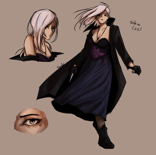
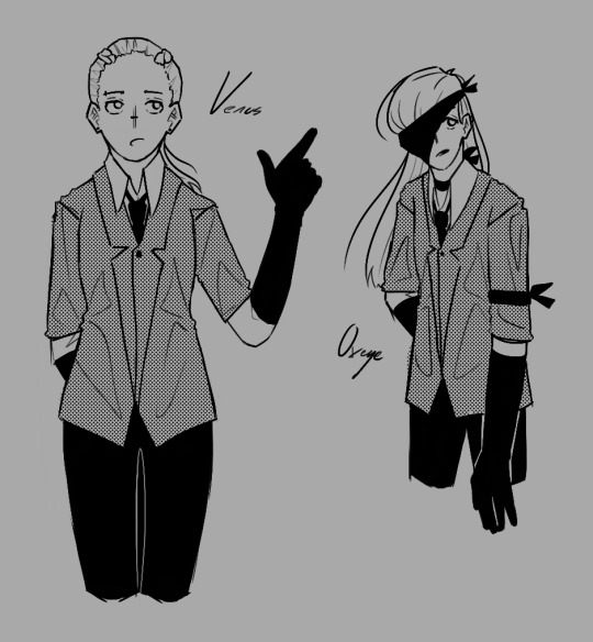
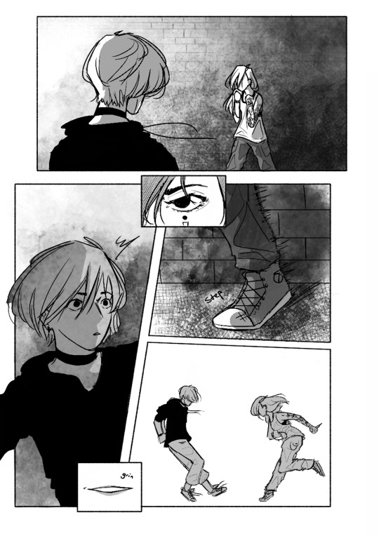
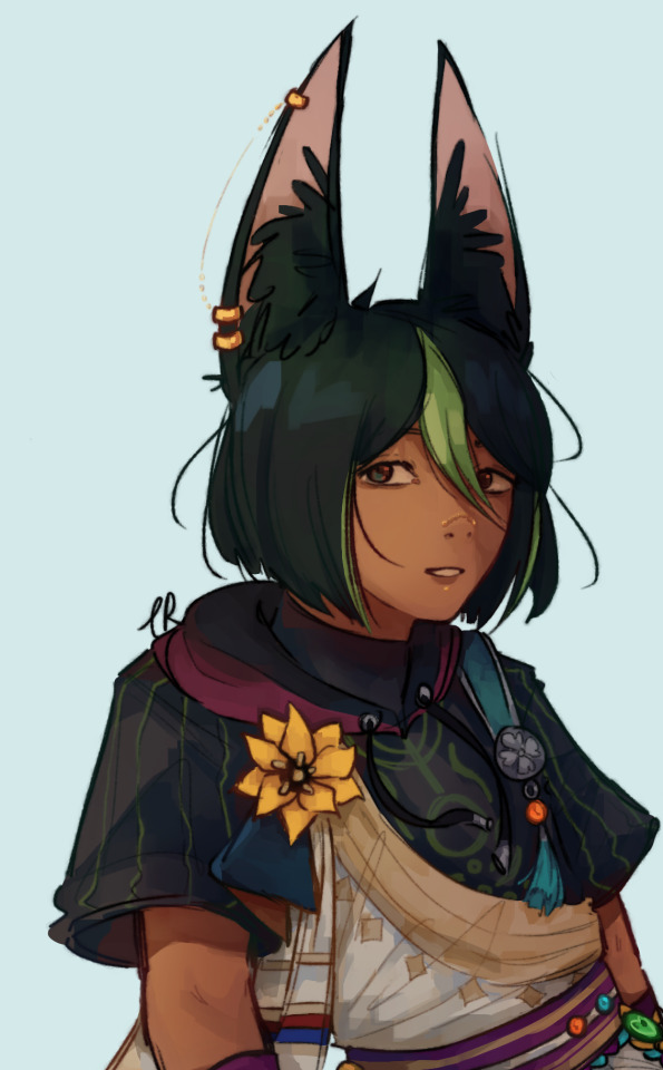
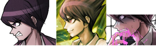
happy birthday to me and by proxy happy 4 years since i've (more or less) started digital art!! i've never talked too much about my art journey on here but i thought it'd be fun to share a few of my pieces over the years to showcase my growth
2021
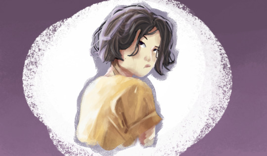


i literally did not DARE draw without reference. I hated drawing characters with their eyes open because i never knew how to draw them exactly, and i hated drawing hands more than anything cause i just couldn't get them to look right. My colours weren't horrible, but they definitely weren't always great.
2022


aaaa!!! colourful!!!!! i started doing more anime fanart! i was kinda afraid to do it beforehand since i was worried i couldn't get the characters looking right since i didnt really have an anime artstyle and was mucchhhh more comfortable with more realistic proportions, which is why for the pieces here i also mostly used reference and then just plopped the characters' designs on top. my faces & hands were definitely improving, but not quite there. Also ocs!! i love my ocs!!
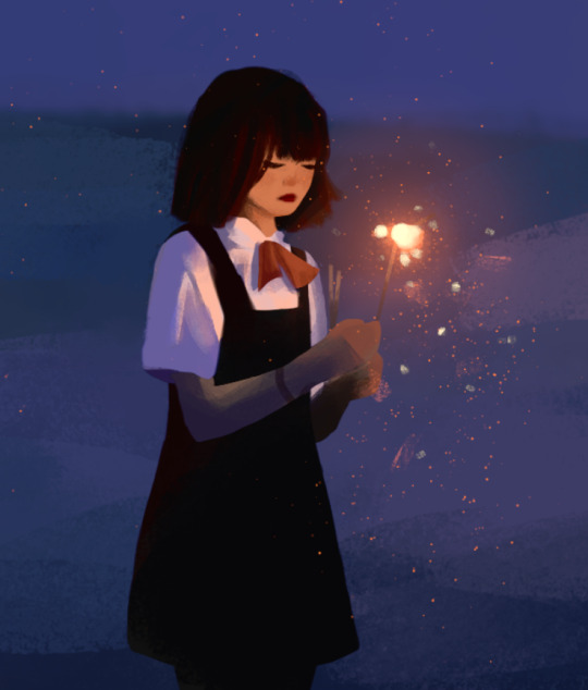
2023


welcome to the year of sskk and also the year i finally started posting comics!! (we ignore my webtoon that i definitely didnt have in 2022) im trying not to post too much art i already have up on my tumblr here but you can look up the sskk tag on my tumblr you can see how insane i was!! in fact, because of how much i drew them that year, i think i very rapidly improved at my anatomy and expressions AND hands compared to 2022. crazy what a hyperfixation does to you
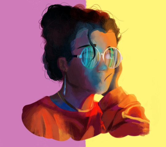
2024

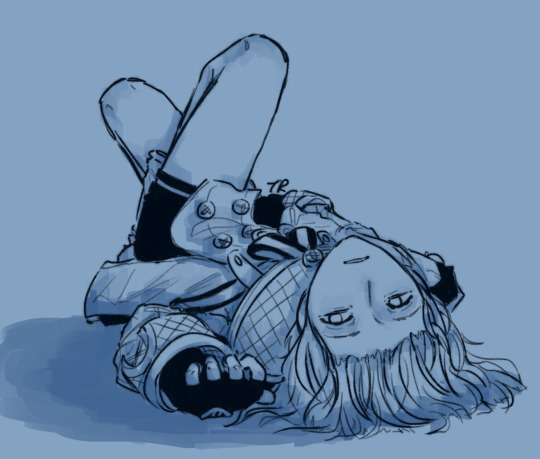


getting daaaangerously close to tumblr's image limit and also 2024 was probably my most active year on tumblr to date, so it's all here anyways, but here's some of my favourites for my overall improvement. i'm not sure i drew a single background all year.
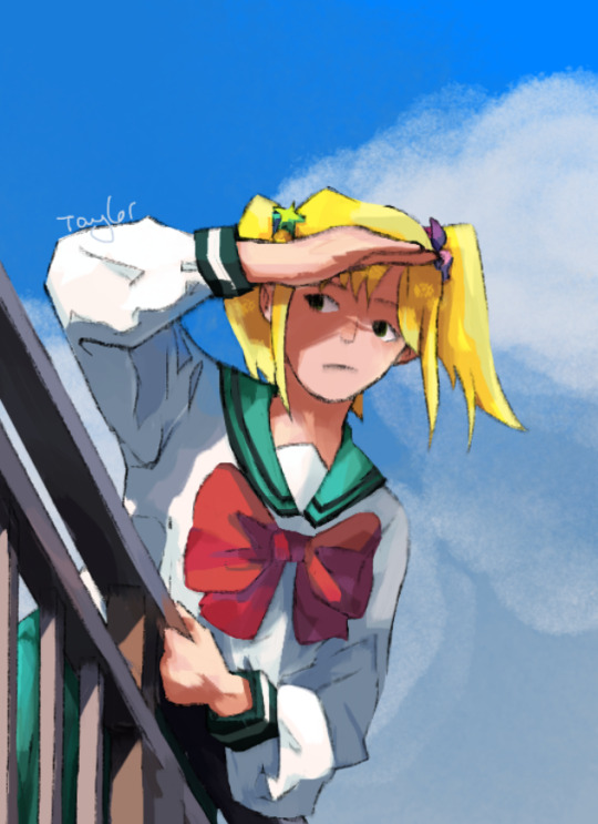
2025


anyways!! we're all caught up now! These two have been my favourite drawings from 2025 so far (one of which im techincally not supposed to show yet, oepsie) and i hope i can make hundreds more that i'm proud of! i've never really set up my art and looked at it side by side, so seeing how far i've come in the last four years is actually kind of heartwarming. thank you so much to everyone who's followed me and supported me & my journey! im getting sappy now so i'll stop jaja
#crazy to think i first got my art tablet 4 years ago its been so fucking long bro ive been at this for forever#was drawing on an ipad before that now THAT art is cooked#i did do digital art before but like i used to be a gacha life girlie like it was not actual people drawing#it just mostly got me used to colouring and nothing else#i learned pretty much all my anatomy in the past 4 years so i do consider myself only really having started once i started drawing on pc#happy 4 year old birthday to my wacom intuos S LMAO#that thing has been with me for forever that thing will continue to be with me for forever i am in fact never getting a new one#art#digital art#art journey#art improvement#art milestone#digital artist#original art#original characters#ocs#my ocs#my art#fanart#angel beats#saiki k#sk8 the infinity#bungou stray dogs#charlotte#chainsaw man#genshin impact#link click#<< feels weird to fandom tag a personal post but. like its fanart what else am i gonna do#anyways shoutout to pinterest for paving literally all of my art in 2021 half my art in 2022#shoutout to my autism that bsd hyperfixation absolutely carried my 2023
34 notes
·
View notes
Text
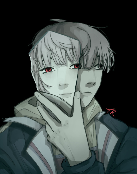
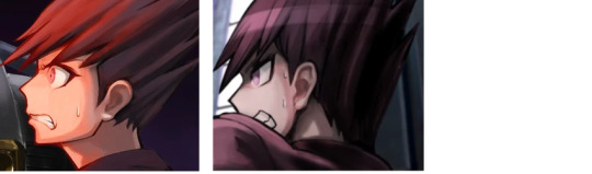
Hey did you guys know I like Springtrap? (Yes, I redesigned him)


#Idk why I gave him eyelashes but they are on fucking fleak 💅#reason why I redesigned him#the other desgin was too realistic and was super hard to make clear expressions with#because my artstyle is less on the realistic side and expressive#plus it's hard to translate a character like Springtrap into a cartoony artstyle like mine#and it took several attemps to pull off with this new design but I did it :>#/#springtrap#spring bonnie#william afton#purple guy#fnaf#five nights at freddy's#fnaf 3#skrunkly#peepaw willy#waiting for the springtrap simps to roll in#tw knife#tw animatronics
42 notes
·
View notes
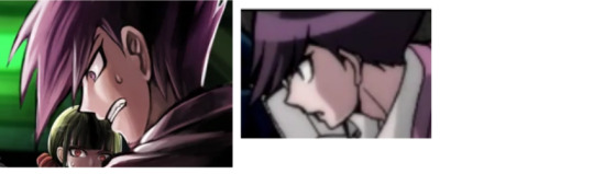
Note
Hi! Sorry to bother you but I really love your artstyle and I was wondering if you had any advice on improving character anatomy/expressions or perspective? 😊
It depends on how you want to learn. Some people like to use tricks to draw stuff. Unfortunately that never really worked for me so I’m in the “practice makes perfect” camp. For me, it’s studies and references. I’ll save everyone their sanity as this is just a big block of text..
For anatomy? Nudes. Haha, but seriously. I keep meaning to do another one because I had done an anatomy study using a nude model a while back. You can buy them, go to a workshop, or often times you can find them on art sites like Deviant art sometimes (which is what I had done, I think). If you’re not comfortable with nudes then use pose references with people that have a bit of clothing on. It’s up to you. I found this to be invaluable. I have no interest in achieving a photo-realistic style but, and I don’t remember who said this but for some, you have to learn anatomy before you can break it (i.e. furnish a more cartoonistic look). Pose studies like this help you understand limits of bone and muscle movement, how they’re positioned/contracted or relaxed in a certain pose. Then, depending on how you want your character to look, exaggerate it.
I have no serious tips for expressions as I just learned them over time. Ever since I could hold a pencil, I loved drawing facial expressions. I like to people watch, I love the expressions I’d see in old cartoons I’d watch and I generally follow artists with expressive styles that I like. As of late, I’ve sort of been doing what I just suggested for anatomy for specific parts of the face. Study it. If studies are a bit too time consuming, use references. Eventually, you may not need them. I used to need a reference every time I drew a hand. Just snap a photo of your own hand and use that. As of now? I rarely need one because I’ve gotten used to the feeling of drawing a hand by way of reference. Some times I still use them for a general idea but I’m not dependent on it anymore. I swear by references and use them all the time. Clip studio has some okay models to use when I need them for poses. I will say this for expressions though since these are things I’ve noticed/learned:
Your facial muscles work together. In pairs, in groups, etc. If something is moving on one side, there’s likely something going on on the other side.
Some changes are negligible like with eyes and ears (maybe. I am one of those that can move their ears individually). You can move those independently fairly well.
Others not so much, like eyebrows. I’ve been trying to employ this concept but you should be able to draw eyebrows in one fail swoop with many expressions (like a unibrow and then erase the middle). At the very least, the middle should be an anchor point (place your finger there. You’ll notice you can’t move those ends of your eyebrows independently). They always move together. Your mouth is another one.
No one’s face is perfectly symmetrical. It likely depends on your style but I try to avoid symmetry rulers when drawing faces.
There may be things that won’t come that easily though. I can’t give any tips on perspective. I really can’t. It’s something I’ve never been able to get used to drawing and I have to use a reference every. Single. Time.
These are just my opinions though. I’m not a professional artist. I mostly just do this as a hobby but these are the things that helped me. But in the end, do things to make your life easier. Use references, community assets, less difficult angles, etc. I even recommend tracing! (for learning purposes though, don’t go posting that).
18 notes
·
View notes
Text
How (not) to draw Kaito in left profile view: A Kaito Fanartist's Lament
If you're familiar with my blog, you'll know that I've drawn Kaito a lot. And contrary to apparently a large proportion of this fandom, I actually enjoy drawing his ridiculous hair! Usually. From a lot of the more commonly-used angles, it has a very distinctive shape to it which I find fun to get down.
But from certain angles? Not so much. In particular, it is not a coincidence that none of the drawings I've done of Kaito have ever been composed such that he's in a left profile view. Because I am not at all comfortable with drawing his spiky fringe from that angle. The rest of his hair is still fine - it is always very UP, just draw a lot of spikes going UP and you can't go too far wrong - but his fringe, from this angle, is a Problem. Here is a chronicle of my adventures in trying to figure this problem out.
First, let's look at some sprites of Kaito from the angles that give his hair its most distinctive shapes, in order to get a sense of the shape his fringe is "supposed" to be.
Front:
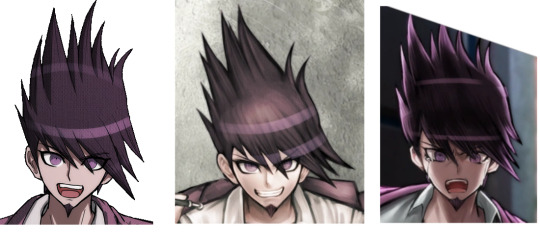
Pretty straightforward, and pretty consistent between the sprites and various illustrations drawn from that angle, give or take a spike or two. Kinda downwards, about as far as his nose or mouth for the longest spikes, and also pointing about 45 degrees to his left.
Right 3/4 view:
Also pretty straightforward and consistent between different depictions. I personally consider this the most distinctive and iconic shape of Kaito's hair, so if any angle should be considered "correct" and the thing to use for reference in case of inconsistencies, I think it should be this one. Note how from this angle we can see more than we could from the front that his fringe spikes not only point to his left but also outwards from his face at least a bit. They do not fold back around to the left side of his face towards his left ear.
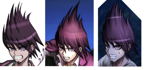
Right profile view:
This still seems fairly consistent with the other sprites we've looked at so far, at least as far as one can tell considering that his fringe spikes are partially hidden behind his face and pointing away from the camera. All of them are fine to look at, because any awkwardness in foreshortening of the spikes is mitigated by the fact that they're pointing away anyway, and they're not getting in the way of his face from this angle. There are however slight inconsistencies here between the different depictions of this angle, in exactly how far outwards from his face his fringe spikes are angled, and how long they are.
I personally like drawing Kaito from this angle a lot and have done it a bunch of times. It's pretty surprising to me to realise that the official artists almost never have (this was basically all I could find; that third one is some merch something or other from the wiki using what should be his opposing Debate Scrum sprite but for some reason the actual one they use in the game is a mirrored version of his left profile view, grumble grumble).
Left 3/4 view:
Now we're getting into possibly being a liiiittle more inconsistent with the other angles. At this point his fringe spikes should probably be pointing a little less downwards and to the left and generally more towards the camera than they actually are. Not that I blame the artists for not drawing it that way, though, because foreshortening is hard, probably especially when it's spikes. Nonetheless, these are still all quite consistent between different depictions of him from this angle, so getting his hair to look right from this angle is still fairly simple as you just need to copy this basic shape.
(The arrows are pointing out something else of note, namely the only downwards-pointing spikes in Kaito's hair that aren't on his fringe, which are only found on the left side of his head. Illustrations of Kaito from an angle that should have these spikes visible are incredibly inconsistent on whether they even exist or not, so while I personally choose to include them in my depictions of Kaito's hair whenever relevant, I think it can be considered equally correct not to do so).
But now for the left profile view, which for some reason has been used in official drawings way more than the right profile view despite the fact that even the official artists clearly don't have a clue how to keep it consistent, as we are about to see. There are a few different approaches they can take.
The Too Backwards:
On its own, aesthetically, this looks fine. But that's not the angle that his fringe spikes go at at all! This is incredibly inconsistent with his hair as seen from most other angles, particularly the right 3/4 view, in which clearly those spikes are not going to end up anywhere near behind his left ear. The spikes are very straight and should not be bending around his forehead to point backwards like this.
The Too Short:
This time, the spikes are probably angled about right; mostly downwards, maybe a bit forwards, any “leftwards” would be pointing into the camera from here and so not visible, and not doing any kind of wrapping backwards around behind his ear. But if you look at any of his regular sprites, the spikes are meant to be long enough to be down about as far as his nose or mouth. These barely go down past his eyes... which has the incidental benefit of keeping his eye unobscured. As it happens, the Too Backwards approach also incidentally results in mostly not getting in the way of his eye. Hmm. Starting to sense a pattern here.
The Too Forwards:
Now this is a novel idea! Only one regular illustration in the whole game uses this approach, such that I had to dig into the closing arguments (which I otherwise left out of this because their art style is a bit different anyway) to find another similar example. This overlaps with the Too Short approach a lot in terms of angle, but these spikes are longer while still not blocking his eye from view. But maybe in doing so they've ended up pointing just a little more forwards than they really should be? The one on the left here, while seeming closer to correct than the rest we've seen, still looks a little off to me. (Maybe it’s just that there isn’t even attempt to foreshorten and imply they’re pointing into the camera.)
So if none of these are quite correct and consistent with the shape of Kaito's hair as seen from other angles, what should it look like? The best way to be sure is to take an image of Kaito from the right profile view, flip it, and then redraw the hair spikes to be on the near side of his face while keeping the silhouette the same, since that should be the same from either side. So I went and did this both by tracing one of the official right-profile sprites, and then with one of my own drawings of Kaito from a right profile view, and...
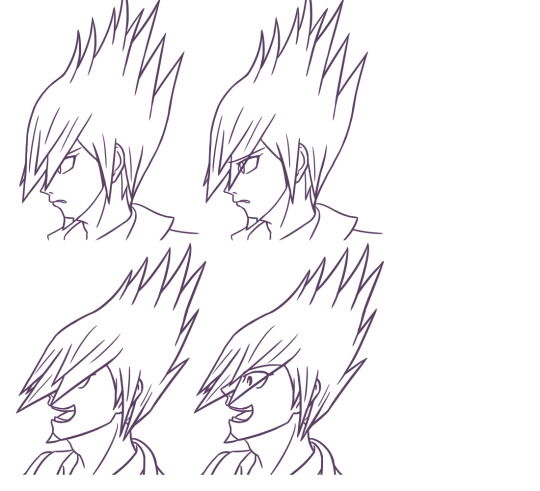
look at this ridiculous doofus how does he even manage to see anything that's approximately 45 degrees to his left (he probably doesn't)
...here we have the problem. The shape that Kaito's fringe is probably supposed to make from this angle blocks his eyes to varying degrees depending on exactly how you're angling it within the realistic bounds that it could be at. The Too Forwards approach kind of has the right idea but is probably exaggerating the forwardsness just slightly to avoid having that happen. I suppose it depends on which right profile image you use for reference, since they're all slightly inconsistent between the tiny handful of official ones that even exist.
I can try and do the anime artstyle cheat of having the eyes be visible through the hair anyway, but that's usually only forgivable because the fringe of hair blocking the view is probably thin enough that you'd be able to kind of see their eyes through it regardless. Here, though, there's such a large volume of foreshortened spikes in the way that I don't think one can reasonably get away with this. If the point of an art piece were to obscure Kaito's eyes and therefore his expression, then this particular angle would be great and incredibly useful. But otherwise, if he's supposed to be expressive? Eeehhhhhhh.
Leaving us with a conundrum of either drawing Kaito's hair correctly and how it should look from that angle but awkwardly obscuring his face in the process, or drawing something that leaves his face perfectly visible and readable but very clearly isn't consistent with what his hair is doing when he's seen from any other angle. This is also not even getting into the part where foreshortening is hard and I'm not sure how well I managed to do that when trying to draw the spikes "correctly"; they still don't look like they're pointing into the camera as much as they probably should, but how do you even???
So, to sum up, and to give the advice that I myself have been following all this time: how best to draw Kaito in left profile view?
Don't.
#danganronpa v3#danganronpa v3 spoilers#kaito momota#the kaito hair mystery#i'm not even sure why this post happened it just kind of did#was messing around with drawing what it 'should' look like and figured i might as well share my Important Research Findings#maybe it'll help someone else who's struggling to draw this space dork's hair?
35 notes
·
View notes
Text
Art Analysis: Gorillaz, and How an Art Style can Lose its Edge.
Ah, Jamie Hewlett. My hero, and ultimate inspiration. I hear y’all praising Damon all the time, but I never would have gotten into Gorillaz if it weren’t for Jamie’s artstyle....at least, it was amazing. What happened though? How does Gorillaz in 2018 compare to Gorillaz in 2001? Well, lets take a look back through the history of Gorillaz.
Welcome to the first Art Analysis. I’ve wanted to do this for a while because, frankly, I haven’t seen many other people do it. Today, I’ll be talking about the art style of Gorillaz, not actually Jamie Hewlett specifically (bummer, right?) We’re going to analyze what made it great, and why, I feel, it has lost its magic. Remember, this is all my opinion. Even though your wrong, feel free to tell me your thoughts as well.
Phase 1:

(Early Gorillaz Concept Art)
The Gorillaz was born when Damon Albarn and Jamie Hewlett expressed dissatisfaction with the modern state of mTV. The idea of having cartoon characters replace real musicians lent itself to be a vessel for great social commentary, but in order for this to work, the characters had to be distinctive. Gorillaz in phase 1 feel very at home in the early 2000s. Powerpuff Girls, Dexter’s Laboratory, and Johny Bravo all rocked the specific, thick-lined, angular, flat shaded style, and the Gorillaz followed suit. Many have pointed out how this style feels like a throwback to 50s UPA animation, and the Gorillaz use similar animation methods as well.
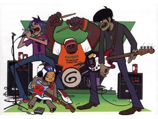
Let me just say that this is, in my view, the BEST cartoon style. Phase 1 Gorillaz art and animation felt more lively and slick. They had an over-emphasized cartoonyness that not only carried their message well but also contrasted beautifully with the dark nature of the characters. Jamie Hewlett’s work in Gorillaz phase 1 was his best work to date, outside of maybe Get the Freebies.

The Gorillaz in phase 1 also remind me a lot of urban vinyls, like those of KidRobot. This may be due to the smooth, flat colors and shading. It suits the more urban feel of their first album quite well. The Gorillaz fan artist Irina Bolshakova has mastered this style and deserves a mention because I think she is the greatest Gorillaz fan artist of all time. I often reference her work more than Jamie even!
Phase 2:
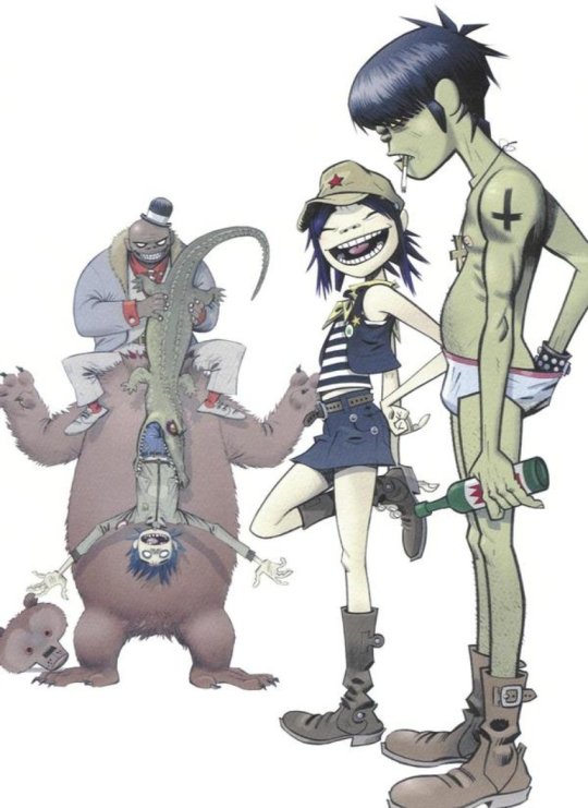
The most significant change in direction in terms of the Gorillaz artstyle, atleast until recently, was with the beginning of phase 2. Demon Days, as an album, have significantly different themes than the band’s previous outing. It was a post-911 world now, and gone were the innocent, chill vibes of Self Titled. The world just got a whole lot drearier and more paranoid. The cartoon network inspired style wouldn’t work for this, and changes needed to be made.

For starters, the characters became more gritty and detailed. They often looked worn out and ghoulish, like zombies, which was especially fitting. The thick lines, unfortunately, were diminished significantly, replaced with what almost resembles pencil lines, and shading began to use a gradient. It was often darker as well, making the eyes of the characters look sunken in and vampiric. Limbs showed more of a natural curve, and were less geometric, and muscles were more toned. The characters often felt stiff and spidery in phase 1, legs jutting out at exaggerated angles. They were often posed more naturally in phase 2. The colors in this art are often muddled and dull as well. To me, I describe the style of phase 2 as akin to walking into an old, dusty antique store.
While this style works very well for Demon Days, I feel like it was overall a downgrade. The characters feel less distinctive and eye catching. That may be why they are often seen wearing outlandish costumes in this phase, but I digress. The gothic feel of the album should be right up my ally, and, well, it is. I love this album so much, as well as D Sides. And I love the artstyle, don’t get me wrong. I just feel it changed too much and lost what made Gorillaz art so appealing to me in the first place.

Much like Irina is the best phase 1 Gorillaz fanartist, Lora Zombie gets the award for the best phase 2 Gorillaz fanartist.
Phase 3:

Phase 3 marks the beginning of a downward trend in the artstyle’s evolution. Plastic Beach is a bit of an odd-ball album from them, and a hit or miss for many people. The style of the album was dramatically different then previous outings, transitioning from demons and self destruction to a “Gorillaz at Sea” carnival attraction. At least that’s how I would describe it.

With only 1 2D animated music video for this album, and considerably less promotional imagery than past outings, there isn’t as much to go off of. The first thing I noticed was that the pencil lines in Demon Days are significantly more pronounced, making much of the art look unfinished at points(ironic, considering Rhinestone Eyes). This clashes with the more dynamic shading , leading to a bit of a strange look. Perhaps this would look good with darker colors, but since this album is much more pop-y and upbeat, the colors are actually much brighter than past incarnations. It is also here that Jamie appears to loose a sense of consistence with his character designs. Most notably is Murdoc, who appears to have gotten some sort of jaw reduction surgery (something we’ll see more of in phase 4), and at some points looks like a racoon, as the dark circles around his eyes are often extremely exaggerated. Murdoc particularly looks distinctly different at different parts of the album. 2D’s issue in phase 3 has to do with magically reducing his age. In some art, he has very visible wrinkles and a receding hairline, but other times, he looks just as old as he was in phase 1.
Phase 3 is a dramatic drop in quality, and it feels fitting that this album led to a falling out between Jamie and Damon due to his art feeling underutilized.
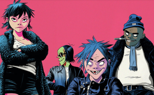
Phase 4:

7 years after Plastic Beach, the Gorillaz make an admittedly lack-luster comeback. Not only was the music of Humanz pretty dull, but the phase 4 artwork in general was Jamie Hewlett at his worst. The first change was the abandonment of any sort of consistent outlining on the characters. I hate when cartoons do this; thick outlines are amazing! Why tf would you get rid of them? The characters in this album are designed to look very human like, with very human proportions and less exaggerated features.
The style is unrecognizable. Eyes are smaller and less circular. Limbs are lankier and hands grosser. The classic “ape nose” seen in the past three phases and an iconic part of their design was shrunken and narrowed. Shading is more 3 dimensional, adding to the comparably realistic character designs. 2D and Noodle also joined Murdoc in getting jaw reduction surgery. 2D also grew back one of his front teeth apparently. And with this album, any consistency in character design is gone completely. I wouldn’t believe you if you told me that this:

and this:

Were the same character. What the hell? Phase 5 was a dark time for Gorillaz, and it shows, as not only the music itself, but the art also felt jumbled and inconsistent.
I feel like I should add, though, that while this is my least favorite Gorillaz artstyle, it is by no means a bad artstyle in general.
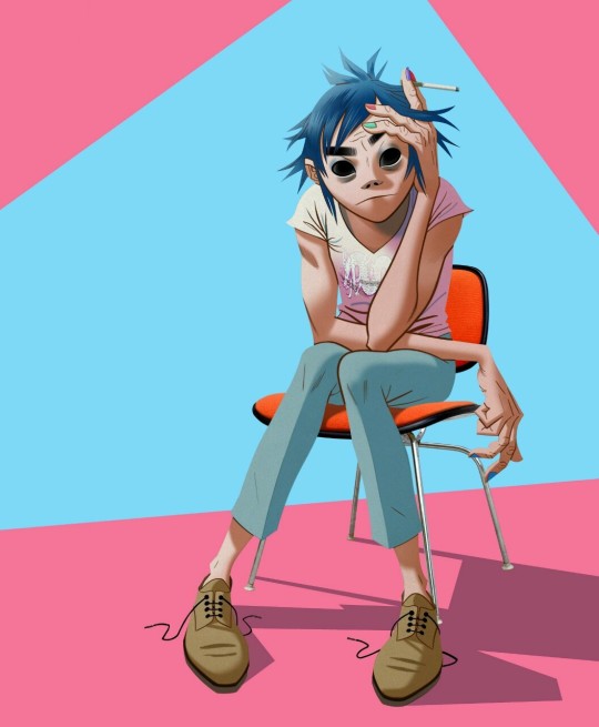
Phase 5:
It was with phase 5 that the Gorillaz started to look more like the Gorillaz again. It was also with phase 5 that Russel finally joined the jaw reduction club, but that’s besides the point. The Now Now was one of the best albums to come out of the Gorillaz, and that says a lot. It’s somber vibes were the score to my summer vacation, and were a breath of fresh air after the hot mess that was Humanz. The new art with this album took a different turn, feeling yet again like a throwback, not to UPA unfortunately, but to old fashioned comicbooks.

This style is marked by harsh shadows and flat, two-toned shading. Yes! Its about time you brought that back. Just like the album itself, the art gives a 70s vibe, particularly with the choice of color and tacky clothing. But a few things in this style don’t work.The body proportions of the characters are identical to real humans, and the hands and ears are considerably more realistic. This really bothers me, but at this point I’ve excepted that the Gorillaz aren’t just cartoon characters anymore. For the most part, this art is more consistent and stylish, and is a welcome change to the previous incarnation.
Having a damn good style for the Now Now is great and all, but I certainly miss what we had back in 2001. The Gorillaz are less underground now, and feel more consumerized, especially seeing as Noodle has an instagram, and I feel that the art has gone a similar route. I hope to see a bit more of that classic Gorillaz in the future, and I sure hope that the television show takes pointers from the OG Gorillaz. Until then, here are the artstyles of each phase ranked:
5. Phase 4
4. Phase 3
3. Phase 5
2. Phase 2
1. Phase 1
I hope to do more of these Art Analysis. This was really fun to put together.
134 notes
·
View notes
Text
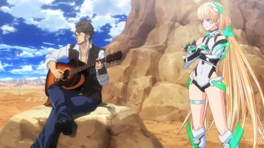
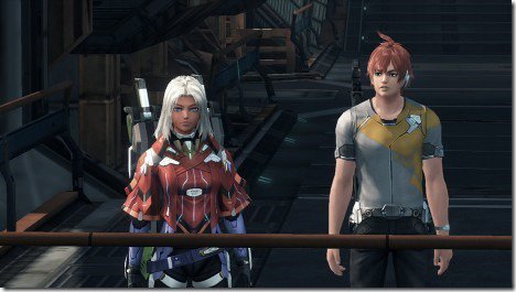
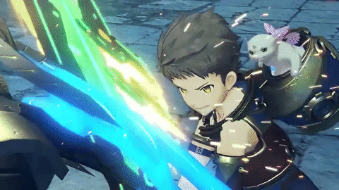
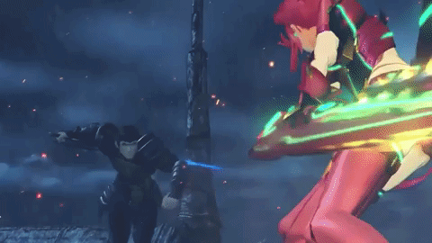
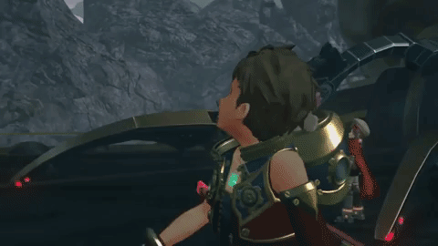
My thoughts and opinions on Xenoblade Chronicles 2 thus far.
The game’s only about a month and a half away from being released, and Super Mario Odyssey releases in just about a week. These are two of my most anticipated games for the Switch. Now, it’s pretty obvious that nearly everyone’s really excited for Odyssey.
But as for Xenoblade 2...not so much.

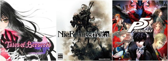
From the artstyle, and character designs, and the voice acting...lots of fans and gamers alike are pretty much giving it The Legend of Zelda: The Wind Waker treatment. From Youtube comments, social media sites, and game message boards...many fans weren’t happy with it. I was one of those people when the game was first announced. I kinda thought the artstyle looked way too generic, anime, and similar as to games like Tales of Berseria.

However, I did some research and mostly figured out as to why Xenoblade 2 looks the way it does. In the most recent interview with Monolithsoft director/writer, Tetsuya Takahashi said a couple of things as the reason he chose the direction he made with the game.
The Tone:
Let’s start with the overall tone of the story. No doubt that the bright and cheery look of the game has thrown off many people into thinking the plot will be “kiddy” or “generic, shonen, harem, fanservice, etc.” trash. All Xeno games up to this point has stories that were more serious, dark, and adult themed. This here ties in with what Takahashi has to say:
“A young adult story with a taste of boy-meets-girl. Lately it feels like all I’ve been doing are games full of devastation, like where your hometown burns down at the start, or the spaceship you’re riding crashes (oh wait, that is all I ever do). Sometimes I just wanna try something different! I’ll leave the stories about the solemn old men and stylish hot guys to someone else (even though there’s way more demand for that stuff), and go ahead with this.”
“ I want to make something that people can look back on fondly one day as something that really shaped their lives. Something like what I loved as a boy, like Oliver! (by Carol Reed) and Galaxy Express 999 (by Rintaro). — That’s why I started working on this game. “
So it seemed that Takahashi wanted to try his hands on making a more light-hearted, character-driven plot. Which mostly explains the more brighter tone of Xenoblade 2. He draws inspiration from this due to some young adult/coming-of-age books and films he experienced as a kid. Mostly in his case, the 1968 musical, family drama film Oliver!, and the 1977 adventure, space western anime Galaxy Express 999.

In addition, we’ve been getting quite a few JRPGs this year in the similar tones that Takahashi mentioned.
While it would be nice to have Xenoblade 2 following this trend, I can kinda understand where Takahashi’s coming from. As someone inspiring to become a writer myself, making the different story with the same tone and setting can be tiresome. Sometimes the creators just wanna to go with something different. even if their fans won’t like it.Plus, making original stories in this day and age is pretty hard to do.
People who’ve read tons of books, watched a lot of story-driven cartoons, movies,or anime, or even play many plot-heavy video games for years already know so many tropes and cliches these days. Writers have to borrow some old tropes from movies and such from the past, and figure out ways to add a unique twist to it. Sometimes it succeeds, while other times it fails. And this is pretty much the similar route Takahashi’s going with.
Sure the story might end up being “shonen,” but knowing the guy...I’m sure the story might end up being good. I can’t say for certain why, but I do have some faith in him. Speaking of such, let me explain the next thing many people have against Xenoblade 2.
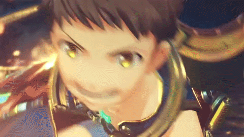
The Artstyle/Characters:
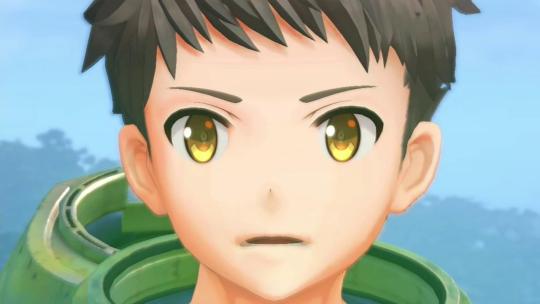
If it’s no surprise, Xenoblade 2 has a cast of a mostly kids group instead of young adult and such. Which sets a lot of people off, and makes them think that the cast might not be as likable. Especially the main character, Rex himself. And no, this isn’t about his pants. No matter how ridiculous they seem.
Many gamers nowadays come to conclusions that having a young kid or teenager as the protagonist is a sign of something bad. Mostly due to the fact that they might be whiny, bratty, or angsty. But before I dive deeper into this topic, let me talk the main character of the original Xenoblade, Shulk.
There was a time in JRPGs last gen where many main characters would end up being too unlikeable. They were either very one-dimenional, oblivious, annoying, idiotic, cowardly, or overly negative with zero character development. Takahashi’s goal for Shulk was to make a more likable and relatable protagonist than in most JRPGs. He was originally going to be a silent protagonist, but Takahashi rejected that idea.
He figured in order to make Shulk a more likeable protagonist, Takahashi tried giving Shulk a bit more of positive interactions and words of encouragement, especially in battle. Takahashi tried to make Shulk react much like he thought players would react to the scenarios. This was followed by giving him a bit more of a intelligent personality so he could interact with the world and characters better. Takahashi even took advantage of getting feedback from the Super Mario Club, whose assured that his intake for Shulk was positive.
Unfortunately, Shulk’s character got mixed reception from game reviewers. Some saying that he was pretty darn enjoyable with a fantastic voice actor and character growth, while others saying that he was rather "a vanilla, personality-less, unequivocally bland warrior" who "makes other JRPG heroes look like Marlon friggin' Brando."

However, Shulk does get pretty great responses from the fandom these days. Mostly getting praise for not being an idiotic, whiny brat, or some emo-ish ultra hot obnoxious macho man...who’s very mature, intelligent, and quick-to-the-bone instead.
For the most part, I’m one of those people as well. While Shulk may have seem bland or generic form an outside stand point, playing the game for myself, I was actually surprised by how likable and down-to-earth Shulk was. His interactions with some of the cast was nice as well. For example, with Reyn, him and Shulk felt like real close friends. Brothers even. With Dunban, Shulk looked up to him as a mentor and a hero. Dickson also felt like a father figure to him. Shulk wan’t just some one-dimensional character...he felt like a real person. This, lead by his incredible voice acting, made Shulk one of my favorite JRPG protagonist of all time.
It’s just too bad the Super Smash Bros. version of himself gets a bad rep.
Now where was I...?

Oh yeah, Rex.
Now it’s no surprise that compared to the more mature/older main characters from the previous games, Shulk and Elma, many people think Rex will probably be some annoying, bratty, angst kid like I said. And as I said before, this is the issue people have with making a kid as the protagonist in JRPGs nowadays.
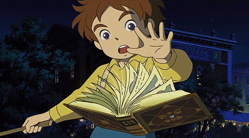
Although, thinking about what Takahashi said about trying to make Shulk a likable protagonist, I think I can see Rex being handled in a similar manner. For a better example of a kid protagonist done right, Oliver from Ni No Kuni is one of them.
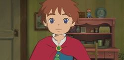
Some of the things I liked about Oliver was his honesty, determination, courage, kindness, strong sense of justice, and character development. He never strikes me as the whiny/bratty type when I got deeper into the game. He stroked me as a brave and sweet kid. And while he may not be the best JRPG protagonist out there, I really did like how his personality and character was handled, especially for someone his age.
I think I could see Rex being as well-developed in a similar way, especially with Takahashi saying that he’s a lot more mature than people let on. But only time can tell how Rex’s character will be handled, since we know very little about him.
Speaking of characters, let’s talk about the artstyle.

This is the major thing Xenoblade 2 gets a lot of flack about. Compared to the more realistic styles from Xenoblade 1 and X, going to a more “childish” anime look was a major kneejerk to a lot of fans. It’s no surprise that a lot of JRPGs these days are going in for more anime-esque artstyle to gain popularity, which is getting a lot of negative response. Fire Emblem Awakening and Fates being prime examples of this.
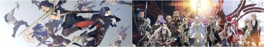
It’s no surprise to the older side of the FE fandom out there that the reasons Awakening and Fates get so much popularity is due to the fact that the games went in a more anime-ish approach with the characters and story, while making the games easier for newcomers to play...this choice made the veterans real upset about the direction the series has been going in lately.
And despite Shadows of Valentia going for a more classic approach with the characters and story, the gameplay and lack of many support conversations made the game not sell as much as the previous titles.
The anime artstyle approach that Xenoblade 2′s going with is making the fandom feel the same way. However Takahashi had this to say about the artstyle change:
“Targeting a wider audience was one of our goals but we wanted to make it to where the characters had more facial expressions. Masatsugu Saito’s character design is a way to make the protagonists more expressive.”
For those of you who don’t know Masatsugu Saito, he was the guy that did the animation for the CGI anime film, Escape From Paradise.
As far as video game designs, I think he only did one character design for Fire Emblem Awkening, which was Celica.
Not sure if this counts, but I believe this is the first time he’s designed characters in a video game.
Many see this a negative thing, but I think the reason Takahashi chose Saito was probably for the eyes.
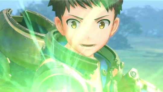
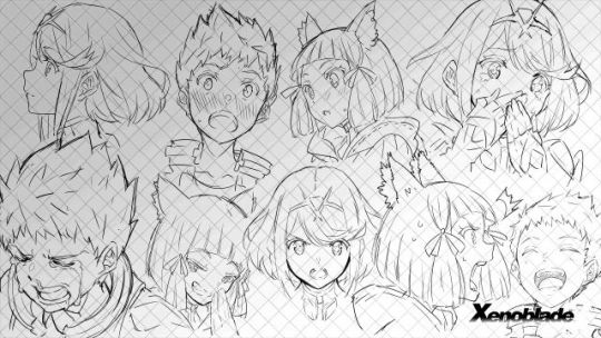
In most games, using cel-shading artstyle can be a way to make the character a lot more expressive. Which I think might be a good thing, because if you can recall in Xenoblade X, the characters expression in cut-scenes mostly stayed the same.

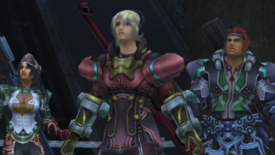
This was a major issue lots of fans and myself had with this game. While there were cinematic cut-scenes, the characters mostly had expressions like this 75% of the time, compared to how much more expressions there were in Xenoblade 1. Now don’t get me wrong, I love the characters in X, I was just mostly disappointed in the lack more expressions in the cut-scenes. And the more realistic visuals, heavy focus of exploration with the lack of a proper main story were probably to blame for this.

Whereas in Xenoblade 2, the characters show more a lot more expressions. The eyes and the artstyle help this out for the most part.


Visuals also getting improvements for not just the lighting and shading, but also for the facial expressions. While this may not change a lot of minds about how they feel with the art direction in the game...let me show another game that’s gone though a similar processes.
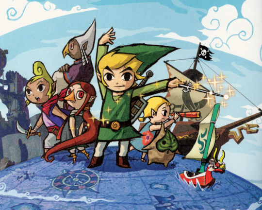
The Legend of Zelda: The Wind Waker.
This is a game that received a massive amount of negativity for a reason.

Before Wind Waker was announced, Nintendo showed a tech demo in 2000 about how a Zelda game would look on the GCN. This was something Zelda fans were excited for the realistic look. It was every OOT/MM fan’s dreams...but alas...they’re hopes and reams were crushed when Nintendo showed...
This.

The Wind Waker’s cartoony artstyle made Zelda fans cry and scream in rage like never before. Everyone thought that Nintendo was losing their touch. Of course, despite the positive reviews the game got, hardcore Zelda lovers still weren’t interested. Of course, over 10 yeard from now, many people now consider the game to be an ageless classic despite some gamers still not a fan of the artystyle
Later in the years after Wind Waker was out, fans rejoiced when Nintendo announced the more realistic The Legend of Zelda: Twilight Princess.
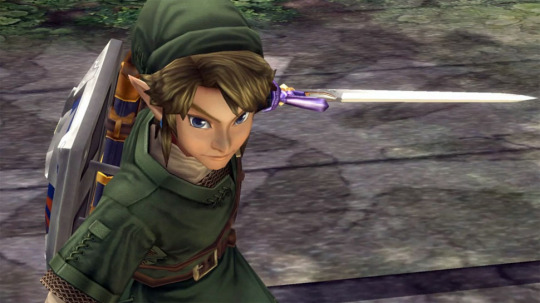
While I enjoy both The Wind Waker and Twilight Princess for different reasons, and I promise this isn’t a WW vs. TP debate, I will say there is one aspect I loved in The Wind Waker more:

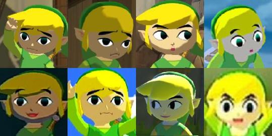
Toon Link’s facial expressions.
This easily is one of the reasons why I love this version of Link. Nintendo chose this artstyle to a similar reason of Takahashi’s, to make the characters more expressive. And they nailed it. Even without any dialogue, Toon Link’s face would speak for itself. I could tell if Link was happy, sad, scared, shocked, meme worthy, or even annoyed just by his facial expressions alone. They couldn’t have done something like this in a more realistic artstyle as much.
And this is the same thing with Xenoblade 2. Had they used a more realistic style, the characters wouldn't be as expressive. Do I still think Monolith Soft could’ve went with a different artstyle? Yes, but now I understand why they went with this style.
TL;DR
I’m really hoping people will give Xenoblade 2 a chance, instead of giving it The Wind Waker treatment. Yes, the graphics and character designs aren’t the best...but honesty, did the previous Xenoblade games get any praise though for those similar issues?
C’mon now...let’s be real here...

But hey, at least Xenoblade 2 still follows the trend of having some freaking gorgeous environments. Combine that with the gameplay and music, and I’m cautiously optimistic for this game along with Super Mario Odyssey. Don’t let me down, Monolith!
Additional Notice:
Also..the cutscenes in this game look freaking awesome.
#xenoblade chronicles#xenoblade chronicles x#xenoblade chronicles 2#the legend of zelda#the wind waker#twilight princess#tales of berseria#nier automata#persona 5#fire emblem awakening#fire emblem fates#super mario odyssey#ni no kuni#this too me forever to write btw#i have no life#my ramblings#unpopular thoughts
549 notes
·
View notes