#artstreet medibang
Explore tagged Tumblr posts
Text
Peace Within the Storm
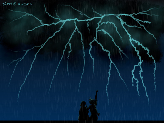
"It's beautiful, Pepa!"
#pepa madrigal#alma madrigal#abuela madrigal#encanto#encanto fanart#encantober#encantober 2023#medibang#medibang paint#artstreet medibang#aeshna's art#digital art#medibangpaint#medibang art#disney encanto#fanart#abuela alma madrigal#storm
102 notes
·
View notes
Text
This is so much fun to draw!!!

archangel michael, brandishing his trumpet, ready to play the song that signals the end of the world: who are you and what are you doing here
weird al yankovic, accordion in hand, ready to play the polka that signals the end of the end of the world:
#saint michael#michael the archangel#archangel michael#weird al#al yankovic#weird al yankovic#religious humor#humor#christian humor#medibang#medibang paint#artstreet medibang#aeshna's art
42K notes
·
View notes
Text

oh would you look at that, I'm drawing my oc again (this is him throughout the years)

(don't plan to redo this image with tumblr's thingies, I'm lazy)
#ARTstreet#art challenge#marvel oc#oc#marvel 616 oc#marvel 616#lokidanger#really don't feel like tagging#male oc#artwork#art#digital art#medibang
12 notes
·
View notes
Text
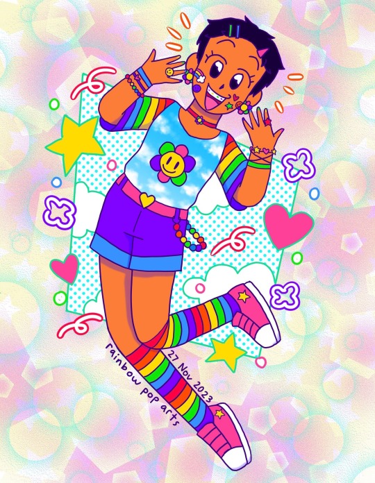
It’s-a me in decora style! 🌈❤️🧡💛💚💙💜🩷⭐️ This is for an ARTstreet contest and the theme is colorful
#decora kei#decora style#decora fashion#hyperpop#hyperpop art#self art#art#artists on tumblr#drawing#illustration#medibang#artstreet
8 notes
·
View notes
Text
Bruno in His Sunday Best


I made two versions: alpargatas and regular 1940s-era leather shoes. I don't know where this church is. It's a stock photo, and the description doesn't specify the location. But that's definitely San Antonio de Padua on the right. Bruno is also wearing a green scapular.
I was rewatching Encanto today when I saw something. During the scene where Mirabel looks around Bruno’s wall room—specifically when we see the rats falling down a leg of his hung-up pants—you can see something that disproves a headcanon some people have.
A single sock.
So either Bruno does, in fact, sometimes wear close-toed shoes…or he wears socks with sandals. Which would be worse?
#bruno madrigal#with shoes#in church#encanto fanart#bruno madrigal fanart#digital art#medibang#medibang paint#artstreet medibang#medibang art#aeshna's art
91 notes
·
View notes
Text
[does a little spin] oh the troubles [does another little spin]
#just me hi#minor troubles as per usual but ohhhh they're ruining my LIFE#i still don't have my stylus cuz it needs to be replaced and i'm Waiting!!#so i'm trying to Do Things cuz the Worst funks come upon you with no Things#and aaaaaaaaaaaaaaaaaaaaaauuuuuuuuuuuuuuuuuuuuuuuuuuuuuuuuuuuuuuhhhhhhhhhhhhhhhhh#None of these things are tickling my brain right!!! where is the. the- the SPARKLE!!#the SPUNK!!#the RAZZLE!!!#the- where's the whole interesting part ???#i don't know!!!#//but anyway! ALSO#artstreet/medibang dot-the-com has decided it will Not work for me on my computer anymore#it decided some days ago 'you are not allowed here anymore :)'#but it works just fine on the phone so i dunno!!!#it did the same thing on my last 'puter All The Time and i dunno whyyyy#//anyway i Am making art rn though and Of Course it's Oath cuz like. reduse reuse recycle lol--#almost done :33 prolly gonna draw him more cuz it's been ages :333 [<- drew him like an hour ago]#oh and i should!!!! oh!!!#i keep having ideas and then POOF ! gone o-o#but anyway i'll figure it out :>#//toodles! i will see you on the other side! [salute] [disappears into the Fog]
7 notes
·
View notes
Text
Here it's my page in Art street! ^^
4 notes
·
View notes
Text
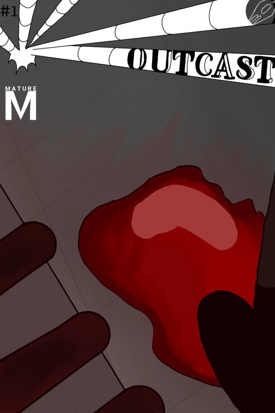
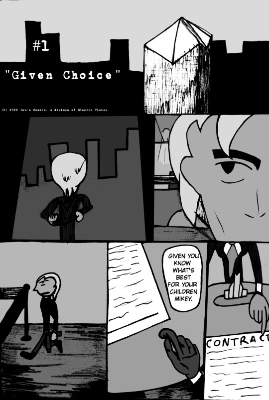

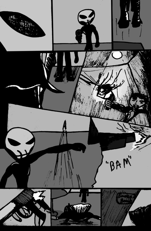
The first issue of OutCast is out
After being imprisoned for a crime he never committed, a young businessman gives that man a second chance
Note: the comic panels weren't supposed to be grainy, but it adds more texture, so screw it.
2 notes
·
View notes
Text
My old friends from artstreet thought I was a guy too loll, I still remember them explaining why they thought I was a guy😭
Edit: ALSO
HOW DID YOU THINK I WAS A MAN???
People that I thought were a man but turns out to be a woman list:
@sammysammer
@localcanadiancreature62
@biggesthuskersimp589
YOU'RE A WOMAN?????
#btw if you were wondering what artstreet is#its a website to post your art#its run by medibang :3#it was the first social media acc i had heheh#I met such wonderful people there#Ollie is my bestie skdbdjbd#really wish she was here in tumblr#but keeps and dexi is one of them#they are really cool people ngl#no not cool#THEY ARE AMAZING PEOPLE#sorry for yapping djfbjfdbjf#anyways#DONT SEARCH FOR MY ACC IT HAS CRINGY BAD ART IN THERE#IM STILL POSTING THERE THO#I THINK I SHOULD CHANGE THE USERNAME-#reblog :3#basement kid no.3
46 notes
·
View notes
Text

Drowning.
im just tryna practice drawing bubbles. also Kōrigashi is my medibang artstreet user btw
176 notes
·
View notes
Text
“It’s a beautiful sunset.”

Inspired from Chapter 1 of "Object Permanence" by @cannibalthoughts 😢
#encantober#encantober 2023#encanto#bruno madrigal#fanfiction fanart#aeshna's art#digital art#encanto fanart#medibangpaint#medibang art#fanart#medibang paint#disney encanto#artstreet medibang#sunset
54 notes
·
View notes
Text
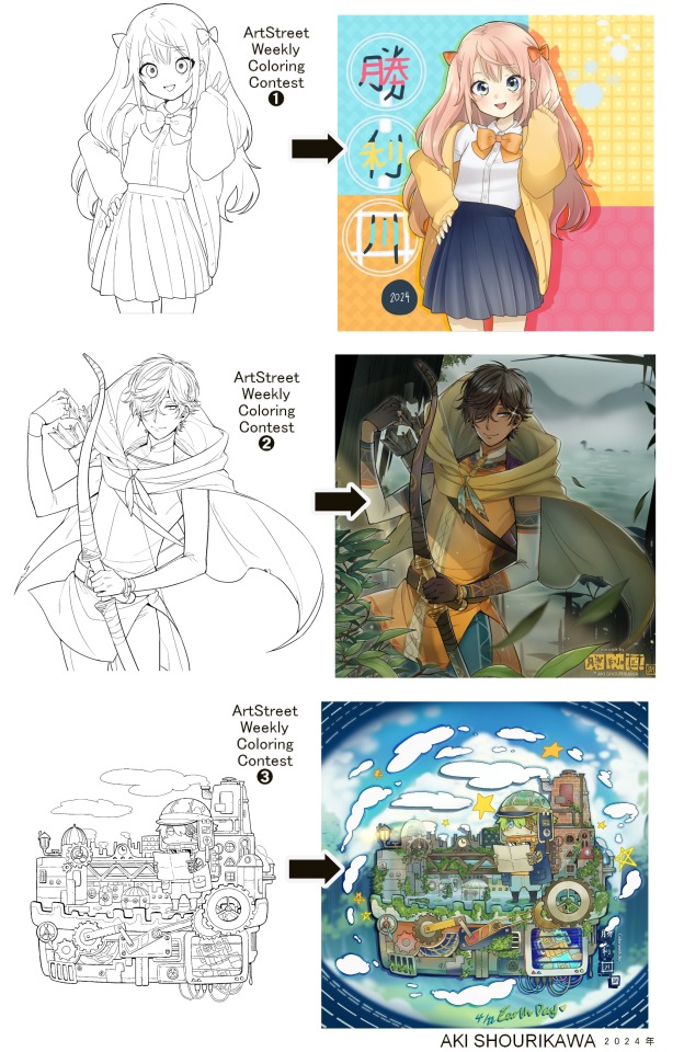
Blog No.003🍊 24年5月10日
「Let's Talk About Coloring+Rendering!!」
~ The Chaos of Akehhh-style Layering w/ Colors & Values ~
ArtStreet recently released some weekly coloring contests and as someone who likes joining 'em + colorwork being the absolute joyous part in drawing for me, I got really into it!! One of them somehow won and I still have the raw .mdp file of it with most of the layers unmerged... so, I thought there might be some value in sharing my chaotic coloring progress with it. There may never be an opportunity like this again...
CONTENTS:
Preface・・・・・・・・・
The Linework・・・・・・
Composition + Planning・
The Render・・・・・・・
Additional FX Tips・・・・
The Layers of Dread・・・
1. Preface
I use the free software MediBang Paint, which is made by the same folks who made the aforementioned art-sharing website, Artstreet. Although its file type extension is .mdp, it can also save as and open .psd files all the same.
If interested, you can download it on their website here! I believe it's available in both PC, Apple, iOs, and Android (also on the PlayStore). ☞And here is my google drive link of my fully rendered entry's raw .mdp file. I also included a .psd version that should be accessible with most other softwares like Photoshop, Clipstudio, etc.
NOTE: Not sure how some layer effects will be displayed apart from MediBang though (either in name or function) . But I think "multiply" and "overlay" is fair game on most drawing/photo-editing softwares with layer systems.
Either way, ↑this is just a bonus thing if you wish to see for yourself how much my MediBang cries everytime I work on something, since visuals of the rough step-by-step will be provided here as well!
At the end of this post, all of the layers' purposes will be explained...y-you'll see...
■And just as a disclaimer: I'm an instinctively self-taught illustrator who is a heavy visual learner, so there are certain methods I do that I cannot readily explain with back-up studies on color theories or formally taught techniques in art schools and the like/certain made-up terminologies that may or may not exist as something else. I mostly operate on instinct, observation, subjective preferences, and vibes, so this would just be me trying to verbalize my process (with visual aid) as a means of share-rambling, rather than actually directly "teaching" anything, I think haha You can take it as a cautionary tale too, honestly-
※I will also be going through this with the assumption that the reader has some background knowledge on digital illustration and general drawing basics + lingo. If you have any questions or needed clarifications, please feel free to let me know!
Although art can be fundamentally "wrong" when it comes to achieving certain specific styles, structures (especially when involving realism as the standard), or general executions of intentions/themes, I am of belief that there is generally no wrong or right 'way' for drawing anything; or for doing ANY type of artistic endeavor for that matter. This might be perceived as a "bad anatomy defender" / "no need to improve, then" stance on my part, but it is absolutely not the case! An artwork is never finished, there's always room for improvementsーa galaxy's size of a room especially for myselfーbut I just think anything at all that brings you an expressive or creative outlet, joy, or peace of mind is worth pursuing, regardless of your own skill or tact and there's no shame in that. I do not wish anyone, especially people starting out with drawing to be discouraged for having their own different approaches in comparison to other people's works by misconception of, "oh, am I doing it wrong?". Sometimes having different or an uncommon worldview is not always a 'bad' thing, I think. Heaven forbid artists actually start getting creative and unique―
What I will be presenting here is simply my one way out of thousands of thousands of different possibilities. So, let's start★
2. The Linework
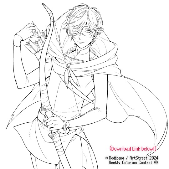
Equally lengthy talk of lineart is probably for a later discussion, but here is the template provided by ArtStreet for the contest + what will be colored in for today.
☞The contest has since ended, but you can still download the lineart template here if you'd like!
3. Composition + Planning
The contest rules said it's "OK to draw backgrounds", so let's go!!
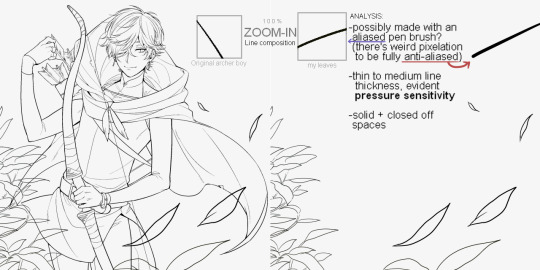
I had already decided on how I want to color it early on: It will be more scenic in nature, rather than stylistic. So, there will be more focus on looking 'real' than 'aesthetically stylish'! Just so it doesn't look disconnected or too out of place, I tried to draw my additions similarly to how Mr. archerman's linework looked as much as possible.
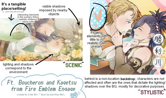
This how I visually define "scenic" VS "stylistic" illustrations (in my head)
I like experimenting and mixing different rendering techniques with varying linework styles and tend to think about my approach with the rendering long before the coloring process, even waaay before I line my final sketch, usually. But for this, I'm simply working with what was given to me.
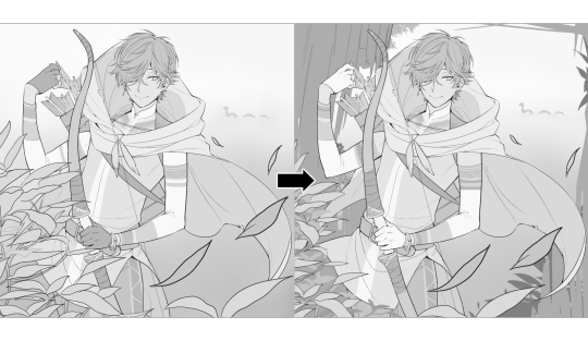
At first, I just wanted a "cool breeze w/ leaves flying away ahhhh refreshing~~" mood, but the space at the side of his head looked rather empty as is, even with Nessie. So I thought about putting him inside a vague...darkly-lit abandoned ruins-setting to eat up some of that space.
And with that, it's time for colors.
4. The Render
My coloring process is the lengthiest and often makes people who see me color in real-time scream in horror, but I think it's actually fairly simple and can be summarized into three nutshelled stages:
①Fill in the colors with a finalized palette of your choice,
②cry Continuously render until your arms fall off you're satisfied.
③ cry even HARDER (optional) Adjust accordingly to fit in better with other elements of the illustration, such as with the focus/subject to background. *will be explained later.
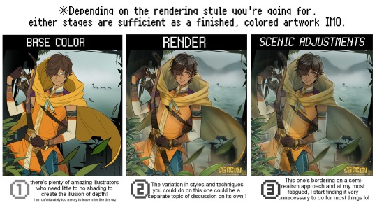
oh and btw, the usage of the words 'render(ing)' tends to be confusing with its association with other mediums like 3D models, but when it comes to drawing I like to think of it this way:
🎨Coloring is the planned/intentional selection of your color range, tints, tones, and palette to use in a drawing, ☀Rendering is the act (or product) of the set of techniques (including effects, filters, etc.) you use with the colors/values to create the illusions of depth, shadows and light, movement, warmth/cold atmospheres, etc in a 2D illustration.
But that's just how I define it with my own step-by-steps. Otherwise, I think either term is pretty much interchangeable.
Anyhoo, what do you think should this man's hair, skin, eye, and clothing's colors be?
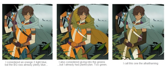
here are some of the variations on the color picks of his outfit that rotted my brain for about 3 hours straight, like it's a 2000s dress-and-match flash game
The many submissions for the contest had many fun color combinations and interesting interpretations I personally think should've won. I saw a lot of blonde archer-princes wearing greens, browns, and blues, as a lot also went for the "forest hunter boi" vibe. But I was saddened by the lack of my favorite colors being used as the primary colorーorange and yellow. So, let's use those!!
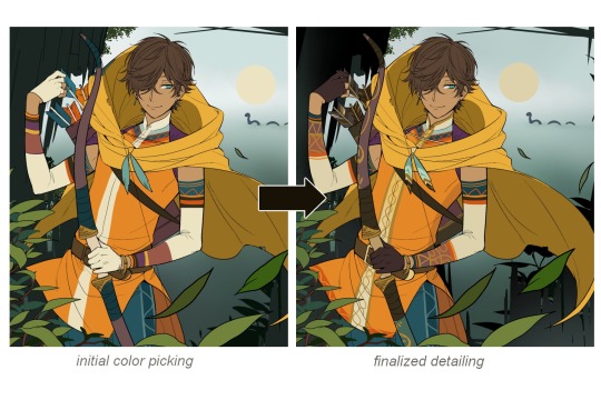
The start of my coloring/rendering journey is never at Layer '1'.........
―Starting with what I've always referred to as "environment prep":
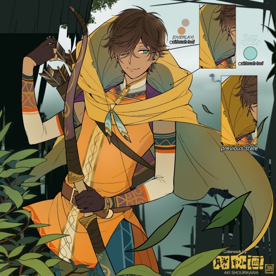
The purpose here is to 'set' the base colors so they match with the environment or general atmosphere. Get ready to see this over and over
This could mean adjusting the saturation, or spraying gradients of the BG's most prominent color on parts that...gives me anxiety the most-
As someone who tends to work with very, very bright color schemes with character designs, trying to blend in when the illustration is meant to be scenic or 'serious' in tone without it being a distracting eyesore can be a challenge. So, this is what I do to counter it.
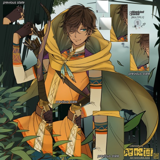
Shading is usually an early step for me as well, even though I think it's a lot of other artists' near-to-final step. I tend to lean towards an abomination mix of soft shade and cel shadeーthe strokes are sharp enough to trace where the shadows start and end, but softened around the edges for effect.
I also tend to apply an additional spray of subtly darker shade on top of the first one? It's usually on spots where I think the light source won't be hitting as much. I wouldn't do this for simple styles (stylized illustrations like with a chibi style), but for scenic illustrations I find it's necessary to achieve that depth against a fully-rendered environment.
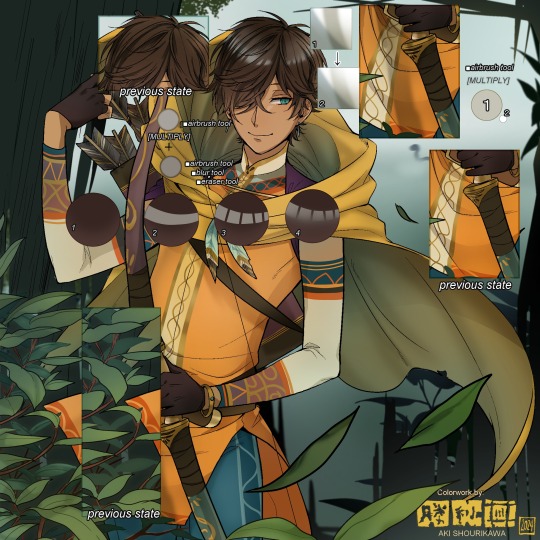
※Just a side note: You may see multiple things changing around, but in real time I'm most definitely working on one part at a time lol. These visual aids were ripped off the raw .mdp by hiding some of the layers, so that's why different areas seem to progress together all at once, even if that's a bit idealistic in actuality.
Apart from the previous adding of shades with a multiply-mode layer for the preliminary shadows, I add one more layer of shadow on there for objects or other characters that can cast distinct shadows on the subject. In here, it's the bow and the hovering strap across his chest.
Lighting is also starting to be added as well.
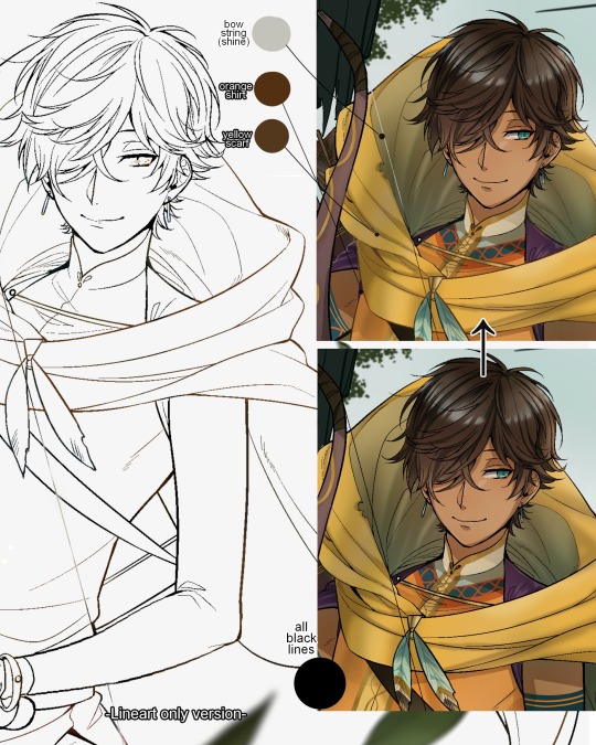
One direct alteration I did with the lineart template was change the line's colors. I find it really softens them to mix better with their filled-in colors + as well as not stand out too harshly against a light-colored scenic background.
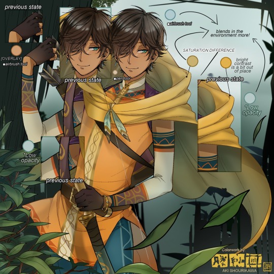
I think you now have a good idea over my hyperfixation on making sure colors are 'vibing' well against the BG lol A lot of these steps are basically just doing the same thing over and over with new layers for the sake of this purpose, really.
And after that, just repeating all the stuff we did with the character onto everything else (background, foreground, objects, etc.) until you're satisfied with it!
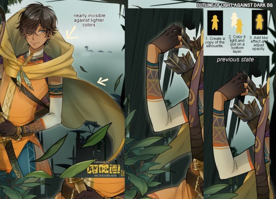
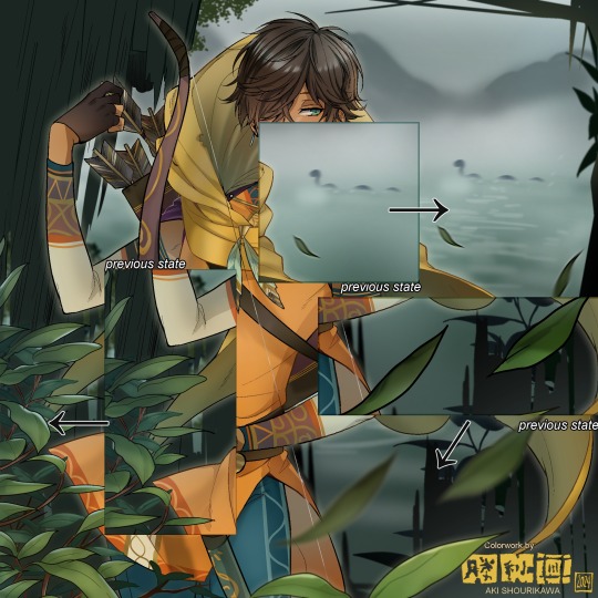
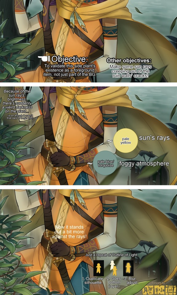
A lot of these changes are very subtle on their own, but makes all the difference in the bigger picture, I think!
Just maybe some additional finishing touches for some boom shakalaka and...that's pretty much it! You will notice that throughout the entire process, there's a lot of random little things that suddenly appear or change with seemingly not much purpose or meaning on its own. I unfortunately have always drawn in this sort of vague, quickly impulsive, directionless way since I was a child and I don't think even I will ever understand it, logically. It's mostly a... continuous string of instinctive feelings of "HEY let's do it this way, if not there's like 10 other things we can try next", is the closest I can get to an explanation of how it feels.
I don't know if it's common for other artists to think or function this way, but I do know for a fact that many people seem to be surprised and confused when they see me drawing in real time this way. Everytime I get asked 'how' I draw certain things, I say things like 'I turn my brain off and vibe with many, many layers with a broken back.' and people think it's just a dismissive joke. I-it's really not, it's literally what happens, I don't have any secret shortcuts for you-
Hopefully this very lengthy post + visual aids can help demystify some misconceptions on what "really" goes on when I'm drawing! It's also a bit of an update of my tutorials made for friendos starting out with digital drawing back in 2015!
Anyway, the rendering stage is where the simplified steps ② and optional step ③ branch out like a fork in the road for me; I don't think one is any "better" than the other, I think doing either is simply a matter of personal preference and artistic choice;
➋being leaving all that 100++ layers rendering that we just did alone and calling it a day,
➌being a little bit more extra w/ additional shadows/lighting that corresponds with the environment the character is in.
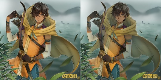
I removed the walls to see the whole figure better in a side-by-side comparison. I like the unadjusted (L) without the wall, but with the walls in the final illustration, I think adjusted (R) felt 'right'. What do you think?
There are some things, although realistic, don't look that good as a visual aesthetic and are just downright excessive/unnecessary to add to certain types of illustrations.
Then there's things that aren't possible in real life, but artistically? Looks really dang cool. Being biased for either ends of the hyperrealism and hyperstylized spectrums of styles is fine; only as long as no discrimination is involved towards people who don't share your opinions, in my opinion-
and to conclude this section, I say,
『 You go render however you wantーhellーno colors even necessary if you wish!
Simple ≠ laziness, just as much as complexity ≠ skill。』
I will never stop yapping about how a lot of minimalist styles require so much more amounts of planning and effort to make sure everything is nice and clean, especially compared to mindless rendering loops like these. Mine's a maximalist hell and I wouldn't have it any other way, but I greatly envy minimalist artists that can render with just something like my step ① with so much grace and tact; not a single stray or wasted stroke!! Anyone who dismisses these types as "lazy" I will violently stuff inside a couchーwithout any potato snacks to snack on!!!
5. Additional FX Tips
Just a shorter section for some optional finishing touches tips'n'tricks used in this I frequently (ab)use☆
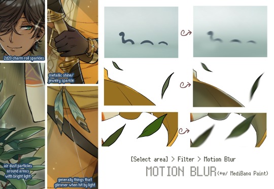
◆ From the very beginning, even before I understood how to draw, it's always been a tradition to doodle around sparkles all around the place. I usually do it with MediBang's sparkle brush if I want it to look polished, or simply draw it manually using either the pen or airbrush tool for a cruder charm.
◆ Motion blur is great, and MediBang in particular also has different types of blur effects like Gaussian and regular blurs. If your software doesn't have these effects / if you're working traditionally but still want to achieve the illusion of motion in a still drawing, you can still achieve the same effect through your linework! Try looking into incorporating action lines (commonly seen in manga and comics) into it. Otherwise, purposefully drawing something blurily to begin with oughta work as well.
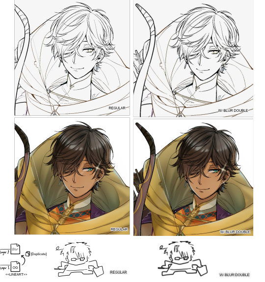
◆ Apart from changing the lineart's colors, there's also this little effect that is achieved by duplicating the lineart and blurring it. It gives something like a...'dreamy' quality to it? The higher the blurred copy's opacity is, the more emphasized it makes everything look.
6. The Layers of Dread
At long last we've arrived... at my MediBang's repeating demise for all of eternity...
Here's a preview of what the .mdp/.psd file of this colored entry's unhingedmerged layers looks like + how I try to validate their existence. When I work on full-sized illustrations, I tend to merge layers as I go, so this is probably one of the rare times I can show something like this without either mine or your PC dying. If you'd like to see, play around with, and toggle them for yourself in all of its............glory, feel free to download it here.
Yes
we're starting at Layer 611. Enjoy.
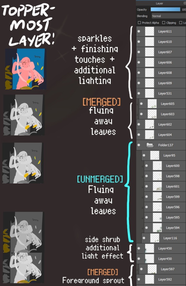
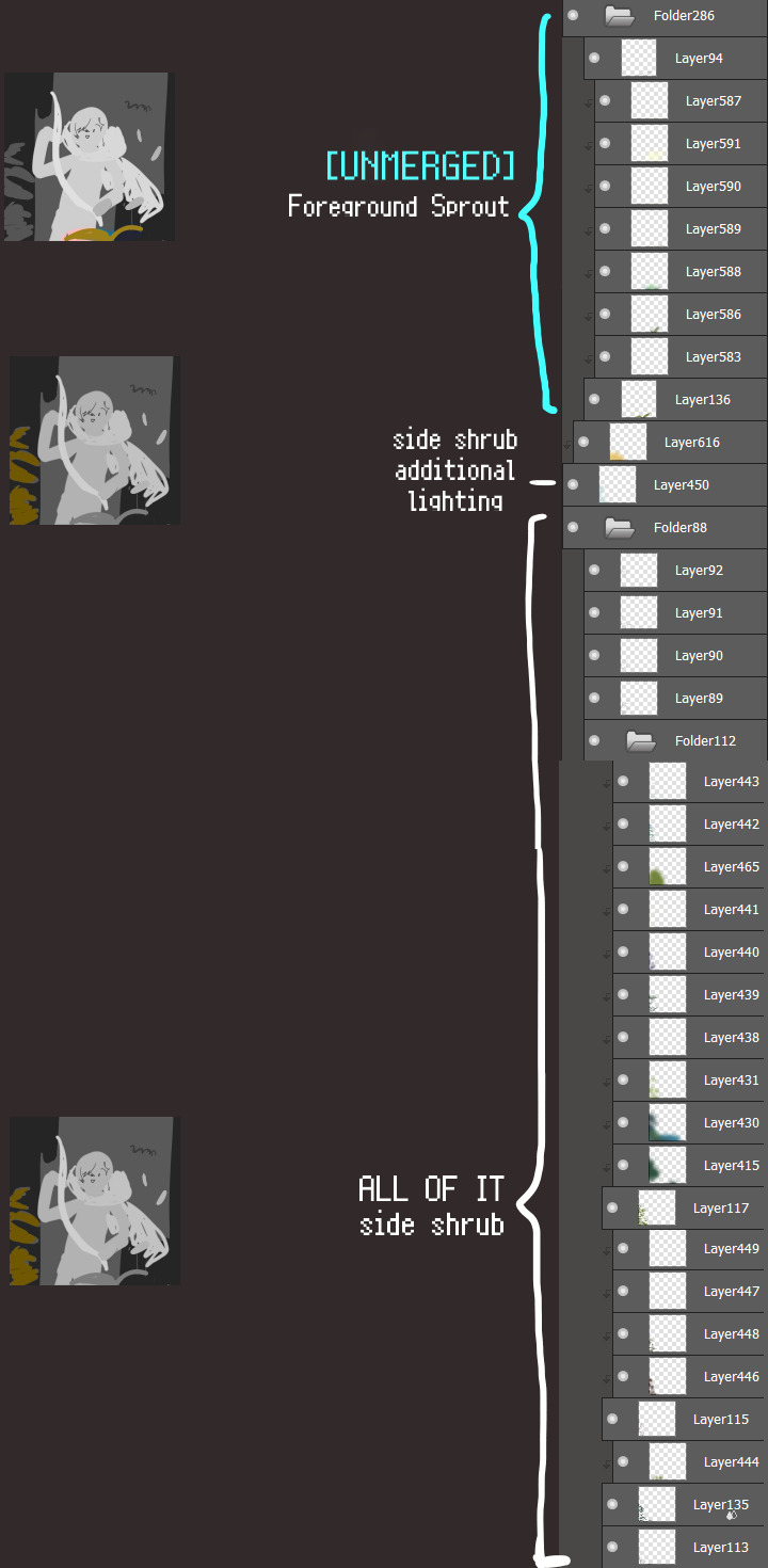
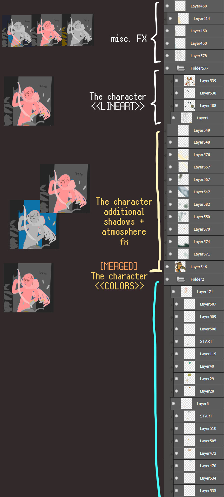
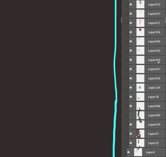
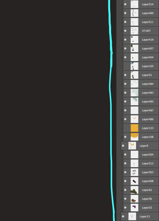
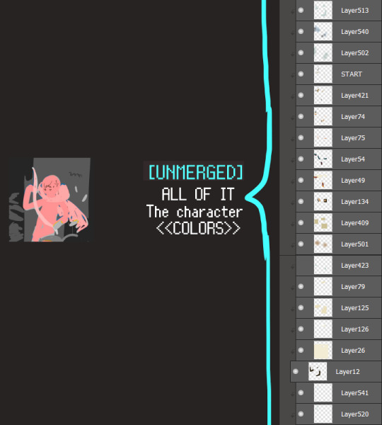
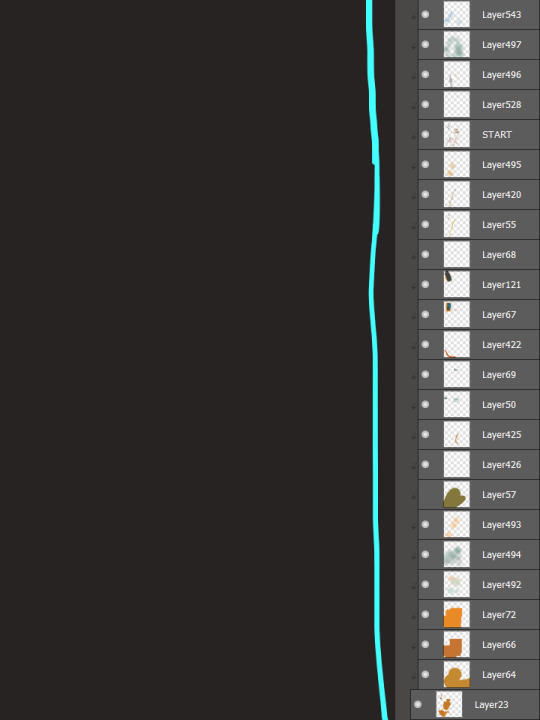
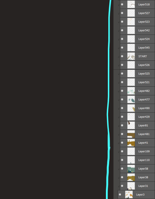
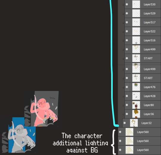
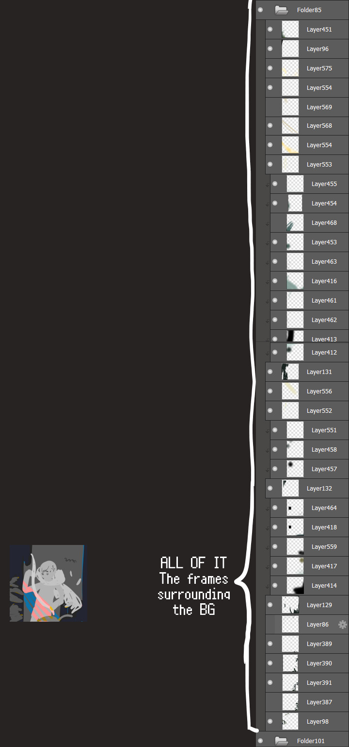
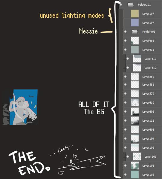
I will now delete my PC's copy because jfc that's one too many MBs ...and it's still eons lighter than what I usually work with on my own full illustrations from sketch to finish......。 (;´༎ຶٹ༎ຶ`) thank you for reading this far and making it out alive, goodbye for now...
・・・ホームページALL LINKS・・・
・Art Gallery・Commission Info・Ko-fi shop・
#art blog#long post#coloring#coloring tutorial#art tips#art tutorial#digital art#digital illustration#digital drawing#digital art tips#digital art tutorials#medibang#drawing journal#drawing process#illustration#coloring practice#nessie#the loch ness monster
24 notes
·
View notes
Text
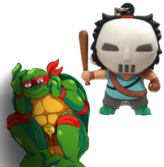
When Raphael has to "Babysit" Casey Jones on his own while the Other Turtles are Busy
(The Raphael drawing is by SweeneyDino from the Medibang Artstreet Website, I think)
(https://medibang.com/picture/5t2301230349162900012834117/)
#tmnt#tmnt 1987#fred wolf films#raphael#casey jones#saturday morning adventures#teenage mutant ninja turtles#goongala goongala#arnold bernid casey jones#monogram#teenage mutant ninja turtles 1987#raph#vigilante#tmnt casey jones#casey jones tmnt#lawbreakers#class is pain 101#hockey mask#casey jones the outlaw hero#tmnt memes
7 notes
·
View notes
Text
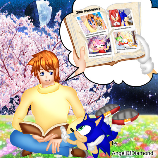
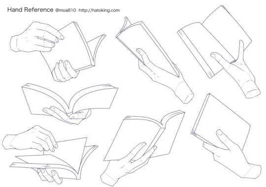
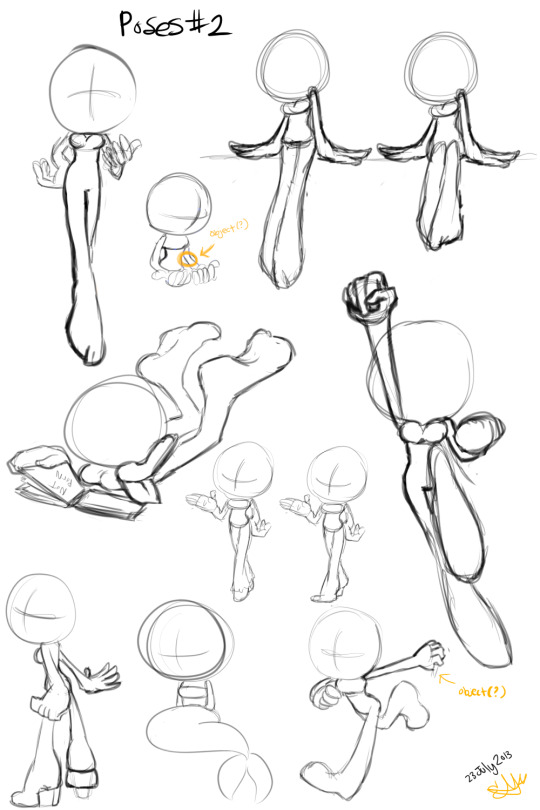
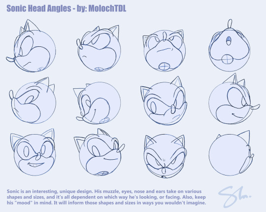
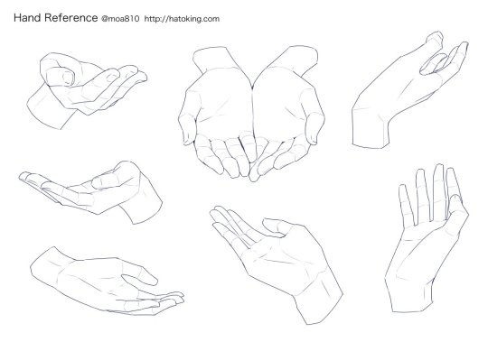
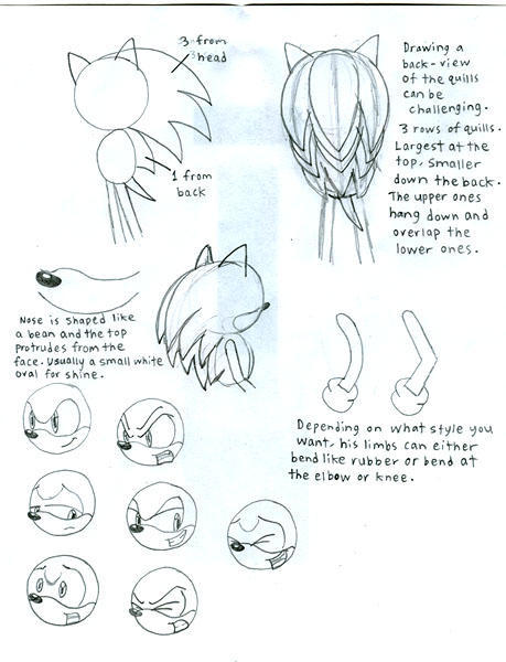
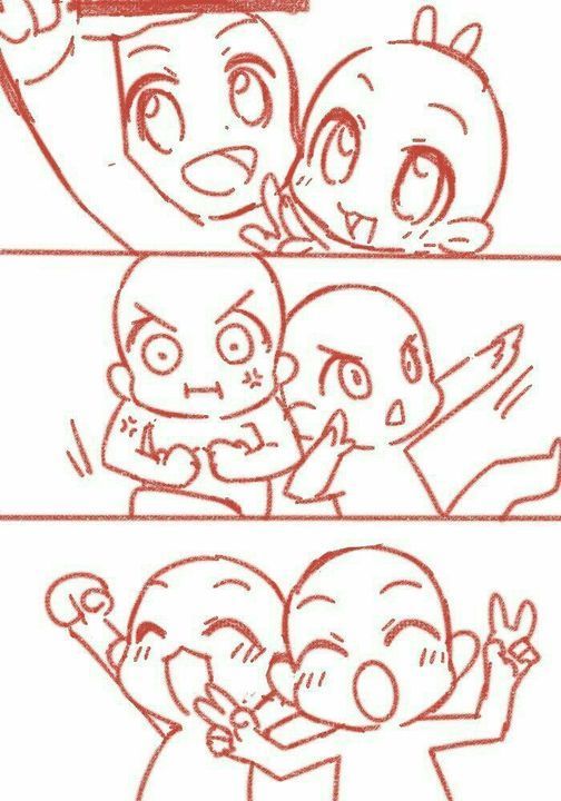
Also if in delayed here my drawing for the 20th anniversary of Sonic X ❤️. All the rights for the base reference going to: moa810, MolochTDL and Chobits13 on DeviantArt, this Pinterest photo group pose reference, CaribbeanPulse for the pose reference on DeviantArt and to ArtStreet: Medibang for the pose base reference.
"A real family stays connected, no matter how far apart they are"-Chris

#sonic the hedgehog#sonic#sonic x#anime#drawing#chris thorndyke#drawthisinyourstyle#christopher thorndyke#SonicX20thAnniversary#cosmo the seedrian#amy rose#miles tails prower#knuckles the echidna#cream the rabbit#cheese the chao
15 notes
·
View notes
Text





〔お仕事〕 株式会社MediBang(メディバン)様よりブラシ制作のご依頼をいただき、メディバンペイント内で使用できるイラスト・漫画用ブラシ20点を制作させていただきました。 ARTstreetの素材ページで販売中です。メディバンペイントご使用の際はご活用いただけますと幸いです!
※担当させていただいたブラシには「作者:まこ」と表記がございます。
制作:2021年 Tool:メディバンペイント(MediBang Paint)
0 notes