#are these blurbs just slightly altered copy pastes?
Explore tagged Tumblr posts
Visit Tumblr Blog
Explore Tumblr blogs with no restrictions, modern design and the best experience.
Last Seen Tumblr Blogs


Fun Fact
Mobile US users spent an average of 115.8 minutes on Tumblr app monthly.
Photo
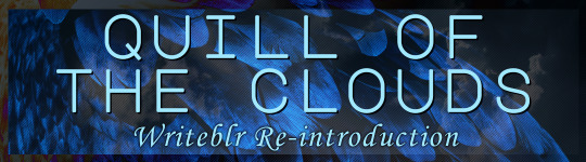
Inspired by @pens-swords-stuff‘s recent writeblr intro, I realized my last one was posted over a year ago so TIME FOR A NEW ONE YAY!
(Aka Quill just wanted an excuse to make another graphic...)
So without further ado: HI HELLO MY NAME IS QUILL, I’m a they/them non-binary nerd, welcome to the utter madness that is my writing blog~
I post the occasional advice or ask game, some wip things, and a lot of reblogs of writeblr content (often with some enthusiastic comments attached)! If you like fantasy/sci-fi and especially pirates, sirens, weird magic, and/or aliens, stick around for some neat wip blurbs~
(Click the titles for the WIP intros!)

Series Title: Anchored Souls (Main WIP)
Book Titles: One Siren’s Soul, Two Witch’s Woven, & Three Star’s Stolen
Four misfits of the Golden Age of Piracy have to settle their differences long enough to get back a stolen magical artifact—not so easy when His Majesty’s Royal Navy wants you dead, and when the shadows swimming under your ship want just the same… And that’s not all that hinders them: war rides on the tides, and it’s quickly coming in.
Book Title: CIRCUIT (Novella - Secondary WIP)
A U.F.O. crashes into a hill. The next day, the entirety of the electrical grid surrounding it, the lifeblood of nearby Kellowaut City, goes dark. But it’s not just a normal power outage... not even batteries work. G.R.I.D., a government formed group aiming to investigate and solve the power problem, forms from the wreckage. But what they find leads to no easy solution.
The one responsible might be alien, but she’s also an innocent child, and the blame goes sideways when she reveals it was all an accident.
Book Title: The Mirror’s Rifts (Novella - Kinda on the back burner)
The new kid in the neighbourhood, Maxine didn’t expect to make friends so quickly–nor did she expect to get caught up in a world-endangering puzzle of parallel dimensions and time-defying monsters.
And feel free to check out these links for more~ Projects Page || Navigation Page
#writeblr intro#writeblr introduction#writeblr re-introduction#writeblr community#writeblr#are these blurbs just slightly altered copy pastes?#yes shhh i have trouble writing blurbs
79 notes
·
View notes
Text
Wasn't Good Enough
Requested By: Nobody
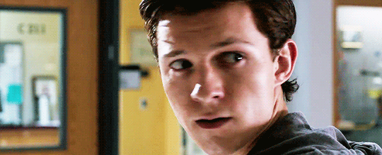
Pairing: Peter Parker x Reader
Description: Peter has a secret that he’s been hiding, but in order to protect you from it, he thinks breaking up with you is his only option.
Warnings: It’s sad :(
Friendly PSA: Please do not steal my writing without my permission, or flat out steal it at all. It’s super disrespectful and 100% plagiarism. So, if you’re someone who does steal other peoples’ work, think about what you’re doing before you hit that copy button. Thank you!
A/N: Ayeeee it’s my first Blurb!! I wrote this two days ago at like 2am and I was reading this imagine (it’s hella good btw go check it out) and it sparked something in me bc I could see this happening, Enjoy.
Everyone has a time in their life when they sit down and think, thinking about their past, present, and future, and simply wonder, what could you have done/or been doing different?
So you sit there, your brain wracking for the answers you lack, but there are none, simply because you truly didn’t know.
Instead, you look back on the good times, the times you’d rather remember rather than the ones that burden you almost everyday.
You’d sit there and laugh at the memories, which was all they were to you now, memories.
“Hey Y/N?” Peter questioned, looking over at you with his brows furrowed, making you smile.
“Yes, Peter?” You’d respond, a quiet giggle escaping your lips.
“If I’m standing outside, does that mean I’m outstanding?” He grinned, looking over at you as your eyes widened slightly, laughter escaping your lips as his stupid joke.
“O-Oh my god, P-Peter!” You’d laugh, making his face tint red, him beginning to laugh along with you.
“I’m serious!” He’d whine, making you laugh even harder.
Those were the good days.
And then the laughter would stop, and you’d sit there alone, blankly staring out the window, wondering to yourself, where did it all go wrong?
In a matter of seconds your life was great, you’d never been happier, but it can take even less time for it to be ruined, taken away from you, leaving you empty and broken.
And that’s what Peter Parker did, he broke you, making you feel empty and alone in just a matter of seconds.
And now, here you are, staring out the window at the busy streets of Queens, the city lights reflecting off your window into your apartment, an aching pain in your chest, your brain once again wracking for answers, only to end up leaving you with more questions.
Where did it really all go wrong? Were you too blind to see the red flags? Did you not love him enough? What had you done wrong? What made him do what he did?
A tear would slip down your cheek, a frustrated sigh escaping your lips, this was an ongoing process since the breakup three months ago.
And yet everyday, you’d sit in the same place, going through the same process, all over a boy who no longer wanted you.
“Y/N, we need to talk.” Peter spoke up suddenly, walking you up to your door to your apartment.
“Yeah, sure, what’s up?” You’d smile, turning to face him only to see his face filled with sorrow.
“This.. us.. it’s not working anymore.. I-I’m s-sorry..” He’d whisper, and for a second you thought he was joking, but when a tear would slip down his cheek you knew he was serious.
“I-I don’t understand..” You’d whisper back, your hands starting to shake, this wasn’t real, was it?
Peter would look at the ground guilty, avoiding your heartbreaking gaze.
“W-Was I n-not good e-enough?” You’d choke out, his head snapping up quickly, his eyes wide at your question.
Of course you were good enough, you were the only girl for him, but he needed to protect you, protect you from his alter ego, Spider-Man and what came with that version of him.
But, at the time, Peter couldn’t form the words, he couldn’t tell you how wrong you were and how much you meant to him, he just froze.
So, in response, you just nodded your head, your heart now shattered, your eyes bloodshot red.
And that was the last time you ever spoke to him.
Your friends would ask you what happened between the two of you, at first you’d ignore them, pretending it wasn’t reality and that it truly never did happen, but as time passed you had soon started to accept it, and then one day you finally cracked, and answered their question they had been dying to know.
You let out an annoyed sigh, stopping in the middle of the hallway, your friends gathering around you, eager to hear your answer after waiting for so long.
Your mouth parted, about to finally speak when a certain pair of brown eyes locked with yours, making your heart stop, the shattering feeling slowly creeping back into your heart.
You both couldn’t tear your eyes away from each other, his eyes looked tired and lost, while yours looked empty and alone, and before you knew it, those four words slipped past your quivering lips.
“I wasn’t good enough.”
#peter parker blurb#peter blurb#peter parker#peter parker imagine#peter parker imagines#peter parker x reader#peter x reader#peter x you#peter parker x you#tom holland#tom holland imagine#tom holland imagines#tom x you#tom x reader#tom holland x you#tom holland x reader#iron man#tony stark#robert downey jr#rdj#captain america#chris evans#zendaya#michelle#mj#jacob batalon#ned#ned leeds#liz allan#laura harrier
434 notes
·
View notes
Text
How to Create Unique Designs Using Before and After Pseudo Elements in Divi
As web designers we are always looking out for new ways to add individuality to the websites we create. Divi provides endless opportunities to produce unique layouts but there are always little additions we can include to bring a design together. This is where CSS pseudo-elements come in really handy.
What are CSS pseudo-elements?
Put simply, a CSS pseudo-element can be utilised to style specific parts of an element. There are five types of pseudo-element that do different things. For the purpose of this post we’ll be looking at ::before and ::after.
These two pseudo-elements are used to insert something before or after the content of an element. This is particularly useful since we can use them to add extra visual elements to existing images, text and anything else!
So why would we use these pseudo elements? Before and after are perfect for unlocking design possibilities without needing to add more elements or modules. Equally, they are useful for adding additional elements without having to touch html templates or core theme files.
How do you use before and after elements with Divi?
If this all sounds a little confusing so far, do not worry! If we were to use ::before and ::after when writing the CSS code from scratch, it would look a little like this:
Imagine we have a line of text with the class “text-example” – the CSS to style and customise this line would be:
.text-example {*This is where you add the styles*}
Now if you wanted to add and style a ::before or ::after element, the CSS would look like this:
.text-example::before {*This is where you add before content and styles*}
.text-example::after {*This is where you add after content and styles*}
Fortunately Divi provides easy access to ::before and ::after pseudo-elements with much less hassle. In fact, if you have ever opened up the “Advanced” tab for any module to add custom CSS code, you’ll have seen the areas that we are referring to.
These boxes provide a quick shortcut to add and customise content before and after any existing Divi module and we can utilise them to create some really flexible and interesting designs.
Sneak Peek
This is what we’ll be creating in this tutorial:
Example 1
Example 2
Example 3
Getting Started
For this tutorial we just need a copy of the Divi theme and a blank slate. To begin with we’ll create a new page and, after adding a page title, click on the visual builder.
Now we’re ready to begin!
Example 1: Numbered blurb modules using Pseudo Elements
The blurb is probably one of the most flexible Divi modules at your disposal. In this instance we will use pseudo elements to add numbers before each blurb to create a step by step “how it works” section. We’ll also add an arrow shape to the right to indicate the process.
What we’ll be creating:
Although this design will work with any blurb design, we’ve borrowed the blurb section from the Web Agency Layout. If you’d like to use these as a starting point you can access the Web Agency Landing Page by creating a new page and accessing the front end builder.
When your page loads you’ll have an option to use a premade layout, one of your saved layouts or build from scratch. Select premade layout and use the search bar to find “Web Agency” Layouts. The blurb section in this tutorial can be found on the Landing Page.
Once loaded, the only difference between the premade layout and our example is that we’ve changed the background of each blurb, the title and text font colour and added a little padding.
Once you’ve changed these settings on one blurb, you can right click on the module and use the “Extend Styles” to apply them to the other three.
Now that we’ve customised our four blurb modules to look as we want them, it’s time to add some code to create the numbered element. However for this design to work we first need to add one line of css to the Main Element custom css box.
overflow: visible;
This will simply allow any elements we create in the next steps to be visible wherever they overlap the edges of our blurb module.
Once you’ve done this, open up the module options and navigate to the “Advanced Tab”. Within the “before” box, add this CSS snippet:
content: '1.'; /* Adds the number 1. as before content */ font-weight: bold; font-size: 80px; opacity: 0.7; /* Makes the number slightly transparent */ color: blue; /* Changes the color of the number text */ position: absolute; z-index: 9999; left: 0; /* Positions the content 0px away from the left border */ Top:-20px; /* Positions the content 20px above the top border */
Once you have added this code snippet you’ll see the number appear to the top left of the blurb module. You can amend the number’s position by altering the “left:” and “top:” lines or change the color and font size of the number within this CSS snippet.
Once you’ve completed this for the first module, go into the three new blurb modules and change the “content:” line to:
content: ‘2.’; content: ‘3.’;
…and so on.
Now that we’ve got our numbers sorted, we need to add a little bit of css to create the arrow shape.
Open each module and enter this into the After box within the Custom CSS area:
content: ''; display:block; height:60px; /* Size of the shape */ width:60px; /* Size of the shape */ position:absolute; top:40%; right:-30px; z-index: -1; background-color: #e8e8e8; /* Colour of the shape */ transform: rotate(45deg); -ms-transform: rotate(45deg); -webkit-transform: rotate(45deg);
Now your four blurbs should look like this:
Example 2. Adding unique shapes to your existing modules
This design relies on simple but effective little code snippets that are added to both the ::before and ::after custom CSS boxes within each text module.
The beauty of using pseudo-elements here is that we can integrate unique shapes and objects to our existing modules without needing to add any additional elements or modules to our page. Because these pseudo-elements are contained within our existing modules, they don’t add any extra space to our designs and remain looking great on all devices.
What we’ll be creating:
To create the initial layout we need to add a regular section with a three column row, set to default width. Once you’ve done this, add a text module to one of the new columns.
Again, you can style this text module as you’d like however if you are following along, these are the steps to achieve this design:
Open the text module options and add your text content and a background image or background colour as required. We’ve used a normal background image with a transparent gradient on top:
Next, configure the following design options:
1.Top padding: 120px & Bottom padding: 120px
2.Text Alignment: center & Text color: #ffffff
3. Heading Alignment: center & Heading color: #f5ee5d
Now that we have all of the visual aspects in place for your first text module, it is time to add the CSS to make the magic happen. In the Advanced tab of the text module, add the following code to the “before” box:
content:''; height: 30px; /* change the size to suit your design */ width: 30px; /* change the size to suit your design */ display: block; position: absolute; border-top: solid 3px #f5ee5d; /* change the colour to suit your design */ border-left: solid 3px #f5ee5d; /* change the colour to suit your design */ left: 20px; /* change the position to suit your design */ top: 20px; /* change the position to suit your design */
And then add the following code to the “after” box:
content:''; height: 30px; /* change the size to suit your design */ width: 30px; /* change the size to suit your design */ display: block; position: absolute; border-bottom: solid 3px #f5ee5d; /* change the colour to suit your design */ border-right: solid 3px #f5ee5d; /* change the colour to suit your design */ right: 20px; /* change the position to suit your design */ bottom: 20px; /* change the position to suit your design */
Once you’ve added these code snippets to the module you will see our fancy new shapes added.
If you wondering what this CSS does, it’s actually quite simple. All we are doing is creating a transparent square that is positioned 20px away from the top and left (and bottom and right) of the text module. We then add two borders to these squares to create the arrow effect.
When you’re happy with the look of this first text module, simply copy and paste it to fill the other columns and change the text content, background and styles to suit.
The bonus of this method is that it will work with pretty much any Divi module with a little customisation. If you want to be more fancy, try adding some additional CSS to rotate, skew and customise the ::before and ::after elements even further. Have fun!
Example 3. Adding icons and descriptions to tab titles
Within this design we will take advantage of the ability to add an image icon before some existing content as well as a small text description below. This is perfect for customising the Divi tabs module a little further than you are normally able to.
Note – Although adding content via css is great for design, it isn’t readily indexed by search engines (although Google does in fact index CSS and Javascript content, it takes much longer and is unreliable at present. Search engines like Bing and DuckDuckGo do not index this content at all). For this reason your content should be minimal and you should not rely on it to influence your ranking potential.
What we’ll be creating:
First of all we need to add our standard section and a 1 column row, followed by the Divi tabs module itself. Within the tabs module, we only need to add our titles and content to each tab as we’ll be handling the styles in the next steps.
Once our content is in place, we need to begin adding content to the ::before element of the module. Since we cannot add custom CSS to specific tabs using the method we’ve followed above, we’ll need to accomplish this slightly differently.
Open up the tabs module options and within the Advanced tab give the module the class “fancy-tabs”.
Once you’ve added this CSS class we need to do a little preparation. To add some icons or images to your tab titles we obviously need to add these to WordPress. Go to the Media tab in the WordPress dashboard and upload your chosen icons as you normally would.
With your images uploaded, we need to click on each one and copy the URL that WordPress has generated for us. Go through each of your images and copy and paste these URLs into a document or your chosen notes application.
With the URL’s of your chosen images at hand, go to your Divi Theme Options within the Divi menu in the WordPress Dashboard.
At the bottom of this page you’ll see a box where you can add your own custom CSS. It’s within this box that we’ll be pasting some CSS code.
The following snippet will add the images above each tab title. Simply copy and paste this snippet into the custom CSS box and replace the content between (and including) the asterisks (e.g. *Replace this with the URL for your first image*) with the URLs you noted earlier.
.fancy-tabs .et_pb_tab_0 a::before { content: url(*Replace this with the URL for your first image*); padding-top: 20px; display: block; } .fancy-tabs .et_pb_tab_1 a::before { content: url(*Replace this with the URL for your second image*); padding-top: 20px; display: block; } .fancy-tabs .et_pb_tab_content a::before { content: '' !important; }
If you return to the page with your tabs module on, you should now see that the images have been added above each title – success!
So what about adding descriptions? Fortunately this is quite simple as well. Right below the code you have just copied into your custom CSS box, paste the following:
.fancy-tabs .et_pb_tab_0 a::after { content: 'this is a description'; font-size: 10px; padding-top: 5px; display: block; } .fancy-tabs .et_pb_tab_1 a::after { content: 'this is a description'; font-size: 10px; padding-top: 5px; display: block; } .fancy-tabs .et_pb_tab_content a::after { content: '' !important; }
As before with your images, you’ll need to replace “this is a description” with your own content. Returning to the page with your tabs module on you’ll see we now have fancy descriptions too!
Finally, we just have to apply a little more CSS to achieve the complete design shown above. Again, copy the following snippet into the same custom CSS box:
.fancy-tabs .et_pb_tab_content a:after { content: '' !important; } .fancy-tabs .et_pb_tabs_controls li { width: 50% !important; } .fancy-tabs .et_pb_tabs_controls li a { width: 100% !important; text-align: center; } @media (max-width: 768px) { .fancy-tabs .et_pb_tabs_controls li { width: 100% !important; } .fancy-tabs .et_pb_tabs_controls { padding: 0 !important; } }
This code centers your tab text and images and increases the width of your tabs to cover the entire module.
We also added some CSS to ensure the tabs look good on all devices – if you’d prefer to not have your tabs full width and stack on mobile, we’ll need to go back and surround the original CSS code in a media query. This means that on devices the size of a tablet and wider we add the descriptions and icons, however on smaller devices we will revert back to the Divi default styling.
To do this, copy the amended CSS code below and paste it into your custom CSS area in the Divi theme options panel:
@media (min-width: 769px) { .fancy-tabs .et_pb_tab_0 a::before { content: url(*Replace this with the URL for your first image*); padding-top: 20px; display: block; } .fancy-tabs .et_pb_tab_1 a::before { content: url(*Replace this with the URL for your second image*); padding-top: 20px; display: block; } .fancy-tabs .et_pb_tab_content a::before { content: '' !important; } .fancy-tabs .et_pb_tab_0 a::after { content: 'this is a description'; font-size: 10px; padding-top: 5px; display: block; } .fancy-tabs .et_pb_tab_1 a::after { content: 'this is a description'; font-size: 10px; padding-top: 5px; display: block; } .fancy-tabs .et_pb_tab_content a::after { content: '' !important; } .fancy-tabs .et_pb_tab_content a:after { content: '' !important; } .fancy-tabs .et_pb_tabs_controls li { width: 50% !important; } .fancy-tabs .et_pb_tabs_controls li a { width: 100% !important; text-align: center; } }
Adding more tabs
In this instance we have created a tab module that includes 2 different tabs, however in practice we sometimes require more than this. If you are in a position whereby you are seeking to create more than 2 tabs, we will need to amend the code you’ve just added.
As you can see from the snippet, Divi automatically assigns a class to each tab title – the first starting with 0 (.et_pb_tab_0), increasing by 1 each time (.et_pb_tab_1, .et_pb_tab_2 and so on). We’ve already taken care of the first two tabs, so when adding more we can simply copy and paste a section of the code for every new tab:
.fancy-tabs .et_pb_tab_0 a:before { content: url(*Replace this with the URL for your first image*); padding-top: 20px; }
and change the number in the class (.et_pb_tab_0) to 2, 3, 4 etc. You’ll need to do the same for your descriptions too.
The final amendment we need to make is to adjust one more line of CSS. Take the number of your tabs and divide it by 100. Note down this number and navigate to the following section in your custom CSS:
.fancy-tabs .et_pb_tabs_controls li { width: 50% !important; }
and swap the 50% with your answer. This will ensure your tabs are equally spaced across the width of the module.
For example, if you are creating a third tab, the additional CSS code you need would be as follows:
.fancy-tabs .et_pb_tabs_controls li { width: 33% !important; }
In closing
And there we have it, three great ways to utilise CSS ::before and ::after elements to create new design possibilities. Hopefully this guide will inspire you to explore how you can use pseudo-elements in your future creations – the opportunities really are endless!
The post How to Create Unique Designs Using Before and After Pseudo Elements in Divi appeared first on Elegant Themes Blog.
😉SiliconWebX | 🌐ElegantThemes
0 notes
Text


Once Upon a [Stolen] Time Stolen Series #1 by Samreen Ahsan 258 Pages Historical / Romance / Fantasy / Sci Fi Get a copy here!
2015… All her life, Myra Farrow has been obsessed with medieval castles—and the kings and princes who once inhabited them. Now, wealthy videogame designer Steve Bernard wants her to model for a princess character in his new game. Myra can’t resist his offer, especially when she learns that Steve plans to film inside the mysterious Hue Castle—a cursed, barren, colorless place forbidden to visitors for centuries. But unknown to Myra, her soul is bound to Hue Castle by blood and sorcery. When she enters its doors, she awakens dark powers that will reach through time—stealing her past, torturing her present, and rewriting her future.
1415… Edward Hue, the last of the Hue royal bloodline, has never stood in the sunshine or held a living flower. Cursed from birth to live in darkness and bring death to all he touches, he is at the mercy of his cruel, tyrannical father, who will not rest until he shatters Edward’s soul and makes his son into a diabolical copy of himself. Edward’s one hope is the mysterious woman who haunts his dreams—who will either break his curse and bring him out of the darkness, or destroy him utterly.
For Myra and Edward, past and future collide in a tale of love, obsession, betrayal, and the hope for redemption.

Quick Reasons: interesting plot points/story line; the characters fell way flat for me, sadly; I didn’t buy into the romance in this book at all; the curse on Edward’s family was unique, though could perhaps have done with a bit more development
entertaining
1-Dimensional
insta-love
fishing for more
WUT?!
HUGE thanks to Samreen Ahsan for sending a free egalley of this title my way in exchange for an honest review! This in no way altered my read of or opinions on this book.
I was super intrigued by this book once I laid eyes upon the blurb. I mean… medieval castles? princes?! a twisting blend of the past and the present/modern day?! What could I possibly say NO to? Having completed my read of this novel, I am both intrigued and slightly disappointed. Let’s get into the whys and hows, shall we?
youtube
There is a certain point, as a reader, where I need to be able to buy into the romance that takes up so much of a character’s mind. It is safe to say that Myra gets bitten–HARD–by a very dangerous, poisonous case of the love bug…but I had an equally difficult time trying to understand WHY. See, from the outside looking in (haha, like Myra watching Edward through the mirror, get it?!) these characters, and their emotions, did not feel quite genuine enough for me to be able to buy into a happily-ever-after for them. Don’t get me wrong, Penguins. I rooted for them HARDCORE…but not necessarily as a couple. I rooted for Myra to…do anything but swoon over and bemoan Edward, I guess. And I rooted for Edward to be able to stand up to the family curse, and his father–to break the chain of events, to free himself (in more than 1 way), to be who he was wholeheartedly and not just in pieces. Huh…putting it in those words, these characters actually remind me a lot of Bella and Edward from Twilight–I’ll have to ponder on that some more.

Regardless, the story WAS intriguing in other ways that I would have loved to see more development for. The curse placed upon Edward’s family, for instance–I’d have loved to have seen Samreen Ahsan go into a little more detail about that. Also, the magic of the mirrors was a key point that I felt was a bit flat and underplayed, though super interesting as an idea. I feel like, I suppose, a little TOO much of this story was granted to the “romance” and not quite enough to the story outside of the fairy tale. The side characters were very underplayed in Myra’s reality, as she was so focused on and driven to “win” Edward that the rest of life around her was basically nonexistent. Which I guess lends credence to the idea that she never really belonged in her world…but didn’t do much for developing her as a character outside of her role as love interest and curse breaker. Edward’s story, on the other hand, was filled with cruelty and development. The struggle Edward faced was horrifying and enlightening in turn. I wish Myra had been given just as much room to grow into herself.
youtube
I did have a fun time reading this, despite what my review above might lead you to believe. While the premise was interesting, the story and characters felt a bit flat to me, and I couldn’t quite buy into the actual romance portion of the novel. I’d recommend this read to lovers of Kate and Leopold, magic mirrors, and family curses. Steal a moment in time with me, Penguins–but don’t let the darkness consume you.
Once Upon a [Stolen] Time: Magic Mirrors and Family Curses, OH MY! Once Upon a Time Stolen Series #1 by Samreen Ahsan 258 Pages Historical / Romance / Fantasy / Sci Fi…
0 notes
Text
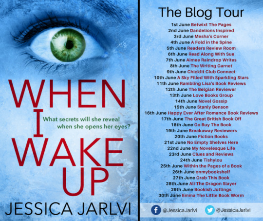
When I Wake Up by Jessica Jarlvi Mystery / Thriller / Suspense 272 Pages Aria / Head of Zeus Publishing Publication Date: June 1st, 2017 Get a copy: Amazon | iBooks | Kobo | Google Play
BLURB:
A breathtaking, heart-pounding, dark debut, sure to delight fans of The Girl on the Train and Before I Go To Sleep. When Anna, a much-loved teacher and mother of two, is left savagely beaten and in a coma, a police investigation is launched. News of the attack sends shock waves through her family and their small Swedish community. Anna seems to have had no enemies, so who wanted her dead?
As loved-ones wait anxiously by her bedside, her husband Erik is determined to get to the bottom of the attack, and soon begins uncovering his wife’s secret life, and a small town riven with desire, betrayal and jealousy.
As the list of suspects grows longer, it soon becomes clear that only one person can reveal the truth, and she’s lying silent in a hospital bed…
Author Bio
Born in Sweden, Jessica moved to London at the age of 18 to obtain a BSc Hons degree in Publishing and Business. She worked in publishing in the UK for a number of years before heading to Chicago where she edited a magazine for expats. Back in Sweden, she completed a Masters in Creative Writing. Since 2010, Jessica has taught journalism and media at a local university, and has spent the last five years as the marketing and PR manager for a British firm. Last year, she was one of the winners in the Montegrappa Prize for First Fiction at the Emirates Airline Festival of Literature. Jessica is married with three spirited children, and although she’s known for her positivity, her writing tends to be rather dark!
Follow Jessica–
Facebook: @JessicaJarlvi Twitter: @JessicaJarlvi Website: http://www.jessicajarlvi.com
Quick Reasons: there are some super creeptastic scenes, with a SUPER creeptastic POV; these characters are vibrant, well-written, and so individualized; I’m not so sure I like the epilogue chapter, I feel it cheapened the rest of the book somehow; this was a wild, unexpected journey–and I adored it
#gallery-0-6 { margin: auto; } #gallery-0-6 .gallery-item { float: left; margin-top: 10px; text-align: center; width: 25%; } #gallery-0-6 img { border: 2px solid #cfcfcf; } #gallery-0-6 .gallery-caption { margin-left: 0; } /* see gallery_shortcode() in wp-includes/media.php */
entertaining
devoured it
purple prose
creeptastic
HUGE thanks to Jessica Jarlvi, Aria Publishing, and Netgalley for sending me a free egalley of this title in exchange for an honest review! This in no way altered my read of or opinions on this book.
There is something to be said about an author who, seemingly effortlessly, can weave their readers into the heart of a mystery…and keep them enthralled there throughout. Jessica Jarlvi promised a tapestry of drama, intrigue, and fear in the blurb of this book–and then delivered beautifully on those promises! I was sucked in from the very beginning, and taken through a whirling journey spanning the past and present.
These characters are SO defined–super vibrant, complex in their emotions and reactions. Each character was individualized and believable, while still maintaining a sense of “suspicion” that kept me wavering between who might have done it. In fact, I was SO focused on hoping that Jessica Jarlvi wouldn’t go for the obvious, wouldn’t take the scapegoat she provides early on, that I *might* have missed some of the hidden foreshadows….and was caught completely off guard when the answer was finally revealed! This was brilliantly written, honestly–the leaps back and forth between past and present, with the alternating POVs, only helped to confuse and meander my mind from the truth!
I’m not entirely sure I like the epilogue chapter of this book, though I feel this is mostly a personal opinion than anything inherently wrong with the writing. I just felt, after such heavy buildup and tension, that the ending sort of cheapened the read a bit–probably because it ends on a bit of a “and they all lived happily ever after” note, which I just can’t wrap my head around I guess. I wish we had been given a DIFFERENT perspective for the ending, honestly–in fact, there was at the end one character I wish we’d been shown the TRUTH of. I went so far as to imagine how that closing scene could be written, even–though I’d bet Jessica Jarlvi would do much more justice with it than I. Regardless, the rest of the plot was fast-paced and filled with disturbing tension, and I adored the read overall.
This was a SUPER creepy read filled with some unique, sometimes creeptastic, characters. The action was tension-heavy and fast-paced, though I felt as if the ending didn’t quite live up to the rest of the read. I cannot WAIT to see what Jessica Jarlvi will deliver next, as I had a ton of fun stepping out of my head and into these characters’ for a while! I recommend this to lovers of mysteries, alternate POV journeys, and slightly unhinged characters. The coma’s over, penguins; can you figure out who-dun-it before the big reveal?!
Follow Aria Publishing–
Website: http://www.ariafiction.com Facebook: @ariafiction Twitter: @aria_fiction Instagram: @ariafiction NetGalley: http://bit.ly/2lkKB0e
Sign up to the Aria newsletter: http://bit.ly/2jQxVtV
Blog Tour and Review: When I Wake Up When I Wake Up by Jessica Jarlvi Mystery / Thriller / Suspense 272 Pages Aria / Head of Zeus Publishing…
#adult fiction#all about books#all things books#blog tours#book bloggers#book blogs#book reviewers#book tours#bookish fun#bookish posts#bookish things#books#creep worthy characters#creeptastic#mystery#penguin fun#penguin news#penguin posts#suspense#thriller#Book Reviews#Bookish News#Penguin Reviews
0 notes