#anyway it was so hard to choose a tagline for this particular one...
Explore tagged Tumblr posts
Visit Tumblr Blog
Explore Tumblr blogs with no restrictions, modern design and the best experience.
Last Seen Tumblr Blogs


Fun Fact
Average visit duration of Tumblr.com is 10 mins and 25 secs.
Text
10 fandoms, 10 characters, 10 tags
Basic rules: choose 10 fandoms that you are part of/support, and choose a favorite character from each of those. Then, tag ten folks!
Tagged by: @dragonsongmakhali and @thefreelanceangel (thanks! I get around to tagged things eventually, lmao)
This isn't in any particular order, they're just in whatever order they came to mind! I'll also note that I've never really understood the concept of 'being in a fandom'? I just...like the thing? So I guess this is more like "A handful of my all time favorite characters, many of whom went on to inspire me to write similar OCs whether I realized it at the time or not." Anyways, I wax verbose on this, so...buckle up, and thanks ahead of time if you decide to read it all!
I'll go through my recent notifications to tag some folks who've interacted lately (also thanks, I've been very ill and out of it for what feels like months now...) @ashenbun, @the-sycophant, @eorzeanflowers, @iron-sparrow, @briar-ffxiv, @merlwybs-wife, @sundered-souls, @superbolided, @ahollowgrave
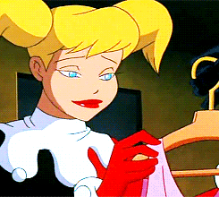
1. Harley Quinn, Batman
What's not to love? She's quirky, she's (incredibly) smart, she's bi, and she's just one of many female characters I love for being flawed, but better for it! She's dealing with mental illness, and feels like only this one person understands her - and having been wrapped around a narcissist's finger before? I get it. You don't realize they're a piece of shit until...one day you do, or one day your friends get through to you that this is unhealthy, and you're not really yourself around this person. I love that she gets to be her own character these days, and live her own life, and do what she wants to do (when she figures that out) - I actually love that she works more and more with the Batfam in recent material because...she was never a villain. She's always been chaotic neutral! She changed who she was for the Joker, and was always miserable and mistreated no matter how hard she tried to be exactly who and what he wanted (a mewling servant) - and more often than not, even when she did what she thought he wanted, he still punished and humiliated her (like when she almost killed Batman). Bruce has LONG been on Harley's side, and long tried to talk some sense into her...but I think they'd been 'at odds' for too long for his words to get through to her, and it took the initial mutual compassion (and eventual love) shared between her and Pamela for someone's 'get the fuck out' speech to finally sink in. And now she's a fully realized character/woman with her own goals, her own personality, her own style... and if people don't like that she can do crime AND do good stuff alongside the Batfam? They can fuck off - at least, I imagine she'd say that, tbh. It's her choice - she never wanted what the Joker wanted. She just wanted him to notice her. Now she can act on her whims, and live in the moment and live up to her fullest potential! (Plus, while I'm not Jewish, I love that she is! At least in most iterations that I've seen.)
I think 'hurt people hurt people' is another good tagline for her - because the instant she's shown real compassion...be it from Bruce-outside-the-suit, or Poison Ivy? You can see her heart. You can see the sweet, and loving person she is under all the performing...or 'masking', you might say. The tragic clown doesn't need your laughter... they need your compassion. They need you to listen.
2. Mackayla Lane, The Fever Series (I've read this series at least 6 times, and recommend you read it, too!)
Mackayla is a self-centered, pink-loving, girly-girl who doesn't think heavy thoughts - she likes to sunbathe, paint her nails, and enjoy lazy southern days by the pool, when she's not working part time as a bartender. Until her sister is murdered on a trip abroad, and in her fervor to find out what happened - and why it feels like nothing is being done about it - she picks up and goes to Ireland in search of clues her own damn self...and finds out about this whole hidden legacy of the Sidhe, Sidhe-Seers, and why/how she and her sister are tied into this world. It's such an emotional journey! She evolves into someone different a few times throughout this journey of grief, self-discovery, and...eventually, love. She learns to be more introspective, to be more aware of those around her, to look deeper in herself for strength, so as to never be a damsel in distress again - she fights furiously for a sister we never get to see alive. (and I love a good story about a character central to the plot who is dead before the story even begins, tbh.) She goes from someone I'd roll my eyes at, to someone I'd look up to, instead. She learns to be fierce, but not to lose her compassion in doing so. She learns to fight for not just herself, but others. She suffers, and it breaks her for a time - but she comes out of it stronger for it. She doesn't let it hold her down, anymore - she can't afford to, doesn't want to...she wants to fight back.
I love character development, and she's got it in spades...and that's not even touching on all the OTHER amazing characters around her in this series. Also, if you like a spicy slow-burn, this is it. 'Begrudging allies to lovers' is how I'd term it, I suppose. (I still long for a high production value show of this series...especially bc it would appeal to all kinds of people - it even goes post-apocalyptic later on! But not for the usual reasons.)
3. Margo Hanson, The Magicians (The show, not the books, for once)
Feminist icon without being 'cringe' about it - and has a line I love, later on, about how her father told her she could be anything she wanted...until she wanted to be those things. Suddenly, the world wanted her to pick - you can't be strong AND womanly; 'you can't have both,' they told her. And she said 'Fuck You', and did it anyways. She is impossibly strong, but even she feels deeply on the inside. She rarely, if ever, lets it show how heavy the weight of the world is...she just shoulders on, and does the things no one else will do. She stands up for what's right, and now and then she fucks things up, too...because she's only human. But she's never apologetic about who she is. She lives out loud, owns her body, owns her opinions, and the rest of the world better get the fuck out of her way, because she's got a witty one-liner...and a gun.


He's an alcoholic/addict, he's a wet rag, and he's basically the world's best occultist... whether you love him or hate him. (I love bisexuals getting the spotlight in media, so it's nice that he's that, too!) He's a rat bastard who's just trying to get by in a world that's chewed him up and spit him out time and time again - he drinks the pain away, he chases death, and...despite his best efforts, he lives. Because anytime he actually comes close to death, he realizes that it's all worth fighting for, actually - even if he always falls off the path again. Notably, neither he nor Harley Quinn were really supposed to be longstanding characters...and now they're both fully fleshed out people, and a couple of my favorites! I like that he's complex, mentally ill, and still tries to do what's right, most of the time. But the world pushes his hand, and something's got to give, and unfortunately it's usually the people around him who end up paying the price...which doesn't mean that he doesn't carry that guilt for the rest of his life, mind you. But the world itself was saved! ...though he'll never not regret the harm it causes the few people he lets close, and how it then causes so many others to avoid him like the plague, as they assume he's just a shit who will sacrifice his friends at the drop of a hat. He's the reluctant savior. The...anti-hero? I'm not even sure that's right, because he does want to do good. He just... does some fucked up things to achieve that good, because there's often genuinely no other way - and no one else has the fortitude or the know-how to do it but him. So he'll carry that load, so others don't have to. He'll smoke it away, drink it away...anything he has to, to quiet the guilt, and shame of saving the world from the shadows...never being thanked for it, because he doesn't fly around in spandex, or drive a fancy animal-themed car.
4. John Constantine, Hellblazer/DC Comics (An anti-hero I love, a rare bi-disaster MAN in media, and my favorite occultist/wizardy person in fiction, I think...besides Margo.)
Also, his Hellblazer comics are very politically left leaning and he shits on Tories and racists and homophobia, etc. He might hide his pain in ways that make him seem like a piece of shit, but at heart he knows what's right, and that his fellow man deserves better. (Also, it's implied that he slept with/dated King Shark...you go, king.)


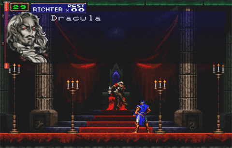
5. Dracula, Bram Stoker's Dracula and Castlevania (first the game, then the show) I was obsessed with the book even as a kid, and when I saw the most iconic scene in a video game ever, I was in love with his Castlevania counterpart, too.
Not much else to add to this one - I just think he's cool! I love vampires! I love Mina, as well, for all the strength she shows in the face of almost-certain-doom...but I love a good villain, and Dracula is the perfect villain. Also, it turns out the whole book might just have been one big, gay metaphor from a man in the closet! That's pretty cool to find out, after all these years. I do love the backstory from the film of him being SO IN LOVE with his wife that he cursed God and just...became a vampire. Because 'I fought in your crusades and you let the woman I love kill herself? Fuck you, I'm just never going to die. Now I'll kill all your beloved humans!' Castlevania's backstory is similar enough that I enjoy both iterations of it - a man driven to madness by love, and loss...and in Castlevania, it's not even his FAULT he keeps getting summoned back, which is where this scene below even comes from, which kinda cracks me up. He specifically points out what pieces of shit humans are...they say they hate him, but it's humans who always summon him back to do THEIR dirty work.
6. Taimi, Guild Wars 2
When you first meet her, she's a bobble headed child prodigy, even among the incredibly intelligent race of Asura, with big hair and an even bigger pink bow on her head - who has a terminal illness, and a physical disability from it that makes it hard for her to walk...but it never stops her. Not even once. Commander might be a badass, but they'd be nothing without Taimi's vast intelligence saving the world time and again - and you almost have to watch her die! She loses her favorite mech, which is both a walking apparatus and her best friend, and goes on to lose her best friend/love interest...and the pain never breaks her. She's a literal child, a teen/young adult by current story - and the endurance and compassion and strength she shows are just...making me emotional to even write about. And while she's still alive in story at present (and they've aged her up over time!)... we discussed with her not that long ago in story how she is dying - and she feels the pressure to get as much done as she can before that day. But one day, she won't be with us anymore...and despite all the people that Commander has lost? I'll never be ready to lose my little rat-daughter.
Go play Guild Wars 2.

7. Jaina, World of Warcraft
You meet her as a young woman, in Warcraft - an idealist who believes in peace, and stands against the open, and blatant racism against the Orcs, and the Horde. She strives for this peace so hard that she allows her own father to be executed - and for years, she stands with the Horde, and speaks on their behalf and fights for peace...until those same people go out of their way to not just screw her over, but almost kill one of the only family members she has who accepts her, and steal an ancient artifact that could basically just wipe out the Alliance much like the bomb that was used to wipe out the whole city she was in charge of. She suffers from the guilt of not trying harder to help Arthas. She suffers so...so much guilt, for so many things. She isn't perfect, and she has acted out of hurt, and rage at times - but she grows, and learns, and becomes this whole person comprised of beautiful flaws and complexities. I know what it's like to have your friends betray you, and want to burn it all down. I know what it's like, to need years to come to terms with that hurt. I know the pain of years and years of guilt and self-loathing and 'what-if's'. Jaina has become an amazing woman who has helped people, hurt people, and learned both difficult, and beautiful lessons along the way, to become an ultimately better person who still believes in the rights of all people...just with less of that youthful naivete that got her so hurt and blindsided.

8. Ahsoka, Star Wars: The Clone Wars

I put off watching Clone Wars, and thought I wouldn't like how they worked Ahsoka in...and boy was I ever wrong. Finally, at long last, there's a female character who is given as thorough a Jedi treatment as Luke, or Anakin...if not better! I love analyzing the 'family lineage' of which Jedi mentors which, and it's a bit funny how Qui-Gon was a rule-breaker paired with Obi-Wan-the-rule-lover...and then he ended up with a padawan even more about going against the grain, because Qui-Gon was supposed to have 'raised' Anakin, himself - then Anakin ends up with a Padawan in an attempt to teach him about how to move on from loss...because all padawans grow up and move on with their lives, one day - but he ended up with someone just as hard-headed and outspoken and out-going as him, and he got a taste of what it was like to be his master! All that said, Ahsoka grows and develops and learns hard lessons, and...grows up as a child soldier in a war the Jedi never should have been a part of, anyways - and (spoilers) when she goes on to be wrongfully accused of a crime by the Jedi Council...they try to walk it back later by saying 'oh this was clearly a test by the Force and you've passed, hooray promotion'. Ahsoka is having none of it. It's hypocrisy. It's a lie. They can't put their own pride aside, and admit that they were wrong! And why would she want to be a part of an organization like that? That's not a promotion at all. Now she'd be just like them, and that leaves a sour taste in her mouth. (Not to mention other hypocritical things she notices throughout the series.) She goes on to learn to live in balance - not all emotions are bad. It's not about complete eradication of emotion, but learning which ones to cultivate, and which ones to set aside and think on. She learns what the elder (extremist) Jedi will not - balance. She becomes better than all those who came before...even Yoda, who is in her Jedi-family-lineage; he admits that the Jedi are blinded by their arrogance, but he's among them! I love everything about her story...so far, at least. I've got yet more catching up to do with Rebels and the Ahsoka show.
9. Asajj Ventress, Star Wars: The Clone Wars
Honestly, I like her for a lot of the reasons I like Ahsoka - they're like two sides of a coin, and I think she even says this to Ahsoka later in the series. But Asajj suffered immensely early in life, and lost two father figures (even if one of them was her kidnapper) - to include a Jedi Knight who was briefly her Master, before he was slain in battle. She was picked up by Count Dooku, and had her pain and hate stoked like a fire...and in time he betrayed her, as well. And still...she went on to be resilient, strong, smart, and a master in her own fields of stealth and assassination. She learned hard lessons, and learned to think for herself - she learned that she didn't need any of those men who had come before, in her life...she only needed herself. Her own wits. Her own strength. Her own intelligence. Much like Ahsoka, she broke away from what others tried to mold her into, and became her own woman... whether people liked who she became, or not.


She's a badass. Watch Clone Wars. Read her books.
10. Buffy, Buffy the Vampire Slayer
Does this one need a reason? She's an imperfect badass, too! She's a lot like Mac, mentioned earlier - she's girly, but not always. Sometimes it concerns her what people might think of that - being feminine, but strong - but she learns to embrace her strength and ferocity and role in the supernatural world... although not without bucking against the system just like Ahsoka and Ventress do - she makes it her own. She plays by her rules, not the Council's, not her Watcher's...and when she does so selfishly, and screws up, she learns a hard lesson about the wisdom and input of your friends and family, and considering how your choices affect those around you. She decides she will not be a dog on a leash for the Council (maybe she was some inspiration for Ahsoka...) - she's here to do two things: look fly, and kick monster ass. Oh yeah - and empower other young women to do the same.

Honorable mentions for Spike (from Buffy), Lucifer (from the self-titled show), Aurene (GW2), Eliot Waugh (The Magicians), Catra (SPOP)
You'll no doubt note that pretty much all the women on the list are people who suffered immensely/were wronged and eventually grew stronger for that, and overcame both the situation and their own flaws...I love a bitch who can overcome both her own flaws, and the world itself being against her!
#favorite characters#blorbo from my shows#ugh I hate that word#The list goes on but we'd be here all week if I went on about EVERY character I love
14 notes
·
View notes
Text
...well... I have news. Kind of scary news. But good news.
Long story short, I have an opportunity to move out. On my own. I don’t know where yet, but... the program lets me choose, as long as it’s under a certain rent amount. I have a decision to make.
I Got Accepted into the Housing Assistance program, and once I find a place to live, I’m going to have help with rent and utilities.
A lot of things had to come together to make this happen; this wasn’t just something I could’ve applied for and gotten at any time, like food stamps or medical. I was on a waiting list for a year (some people wait for THREE years-- my name got Randomly Selected to make this happen! Or, as I see it: The universe was like, “It’s your time.”)
I have 6 months to find a place, or I start all over, back on the waiting list.
I’m a little afraid, because I’m not making enough money right now to feel Totally Financially Secure if I do move out. But I’m investigating resources to help out, and there are... a lot of resources. My mother offered to help me with things like paper products and food. I’m already enrolled in a food bank, though that particular one is hard to get to on the bus... ;;; But if I get a bike, that won’t be such a problem.
That’s another concern, getting around. I’d have to find a place on a bus route, that lets me access downtown easily because I’m in the midst of a job search, and if you need to get anywhere that’s not On Your Own Bus Route, you have to be able to get downtown to catch a transfer.
So there are all these factors, these worries, these legitimate concerns. Things to consider.
But I also feel like... I need to move out. That night, when there was no one else home, and it was just me and the animals... I felt so unburdened, so unafraid, so free.
Even today, things like the Phobia Triggering Event and Anxiety Attack that Ensued: I didn’t want anyone to know, anyone to hear what was happening, because I never know if I’m going to get the Nice Gentle Huggy Stepmom, or the Mean Angry Accusative Screaming Name-Calling “I don’t care how sick and hurting you are, you’re pathetic and selfish for staying home from work” stepmom. She has always used me as an outlet for her anger and frustration at things that have NOTHING to do with me. (By her own admission! Not in so few words, but she always called it “the straw that broke the camel’s back”. Even for things that shouldn’t have been a “straw” at all.... like, you know... suffering. Having vulnerability. Having an Emotion. Being human.)
Not to mention, the empathy. I’d gotten used to it again, forgotten how heavy it was to carry. Maybe, when I’m not constantly weighed down by the depression and anxiety of self-enabling family members who refuse to accept, confront, and combat it, maybe I’ll even be able to handle my own depression better, too.
Everything I said in this post still holds absolutely true: https://beyondthetemples-ooc.tumblr.com/post/187698373222/im-home-alone-the-parents-are-away-for-the
I can only get assistance with a 1-bedroom apartment, or a 2-bedroom if it falls under the price allowance (which, in a halfway decent neighborhood around here, is... unlikely). But what more do I need, really? Hell, I could make do with a studio apartment! I could use my bookshelves to section off areas for meditation. And wouldn’t that be so precious, such a relief, to have a space for meditation again...
I think I already have everything I need to move out. Bookshelves. Pots and pans, silverware and mugs. Cleaning supplies that are safe for me and the pets. Not to mention, a veritable fuck ton of books to make the place really feel like home.
maybe i should invest in a toilet plunger. but aside from that...
The only question would be whether the place comes with a stove and refrigerator... but most of them do, and even if they don’t, I can get by with a mini-fridge and a microwave. (I hardly have the energy to Properly Cook lately, anyways... but, again: Maybe if I’m not constantly in Survival Mode for PTSD and empathy alike, maybe I’ll? Actually Have More Energy???)
And the job search. I know there’s a better-paying job out there, available to me, it’s just a matter of FINDING it! (And maybe, it won’t even require three 12-hour shifts a week! How wonderful would THAT be?! Maybe, I’ll be able to... SIT DOWN! And maybe I’ll even be able to... utilize my skills? Gasp?!)
The hospital cafeteria job is still on the table, I’m just waiting for them to call me back... again. (They said they WOULD, again, but if it reaches the two weeks mark again, I’ll be calling again. I interviewed almost a month ago, I think I should’ve heard back from them by now...) It would pay $14/hour, I’m just REALLY hoping it goes through! Because that would be such a blessing, such a help, such a great thing for me!
And, when I got caught up in doubt and fear last night, I opened my book to a chapter with the tagline “letting go of the need for certainty”...
Signs from the Universe All Around, I guess.
(Now I just have to work up the courage to actually LOOK, and trust that the place I find won’t have bedbugs or fleas. 8P )
2 notes
·
View notes
Note
i have no idea who corrin is but he is beautiful and i would die for him
SJAKDSJFDKG I LOV CORRIN SO I HOPE YOU DON’T MIND IF I GIVE YOU SOME BACKSTORY FOR THEM,, Corrin is the lead character of Fire Emblem Fates, they’re a customizable PC so you can choose your gender and appearance, but in the extras, official art, other games, ect, Corrin is depicted with the default white hair and such. And I am honestly in love with their default design,,

Anyway, the concept of Fates is that you can “choose your own fate.” There are two different games you can buy, each with a different route (there’s also a hidden third route that’s like the True End, but you should play one of the other routes first.) Basically, there are two countries at war, the “peaceful Hoshida” and “glory seeking Nohr.” Hoshido is heavily influenced by Japan, and Nohr is an imperialist European country trying to conquer them. Corrin was actually a Hoshidan royal, but they were kidnapped and taken to the kingdom of Nohr.

Not knowing much about Corrin’s origins, the other Nohrian royals–all of whom were step siblings–raised Corrin as just another brother or sister, and were happy to have them. Though there is the very weird stipulation that Corrin is not allowed to leave this fortress because it’s “not safe for them,” so they end up being pretty naive and sheltered. Corrin effectively ends up being that prince/princess locked in a tower type character, and there’s also this whole switched places type subplot between them and another royal, it’s pretty cool. They also have dragon’s blood so they can tuRN INTO A FUCKING DRAGON,, WHICH IS AMAZING I LOV THEM,,

Anyway, so Corrin was raised by their “adoptive family.” Corrin’s Nohrian older brother Xander is especially attentive to Corrin’s needs and pretty much took care of them every day. Corrin loves their Nohrian family, and is perfectly happy, even though there is some anxiety because their “Father” hates them. Things are still going relatively good until that (x1) time Corrin is let out of the fortress, gets captured by Hoshidans when they realize Corrin is their missing prince/princess, and gets taken back to Hoshido against their will. From there you meet your Hoshidan family, who is mostly excited and overjoyed to see you, but the return is noticeably Awkward because for Corrin there are sudden expectations from that birth family that he/she will stand with them against Nohr, even though they’re all effectively strangers and the Nohrian siblings are the family they actually grew up with.
Things Happen and Corrin is forced to make a choice–whether to stay with their “adoptive” family in Nohr or return to the “blood” family they never know. Nohr’s Conquest route is marketed as the Obviously More Evil one, which makes sense. Nohr has got some Evil Shit going on behind the scenes that needs exorcising, their King is obviously the violent aggressor in the conflict with Hoshido, if you go with Nohr one of the characters sings a really passive aggressive song judging you for your choice,, it’s a whole thing lmao.

It is my favorite route though so,, positives–I’m honestly fonder of the Nohr family, the way Corrin’s character develops on that route, the ending, you get to take down Nohr’s corruption from the inside, and I’m pretty sure there are less casualties. Hoshido’s route was also very typical for me, the story just wasn’t as interesting to me I guess. LOVED most all the siblings though!!! asjkdfjfgk I feel bad for them…Hoshido is also easier while Nohr route is purposefully more difficult, so that was Hard lmao. Physically?? Nohr was much more difficult to beat. bUT EMOTIONALLY,,, THE TOLL OF HOSHIDO,, I bawled lmao it was bAD,, But yeah, whatever side you choose, people from the other country–inCLUDING SOME OF THE SIBLINGS–are gonna die,, it’s a Bad Time for Corrin,,
Long story short the tagline for these routes was, “Is your destiny tied to your bloodline? Or is your fate bound by loyalty?” so I knew right away which path was gonna be my favorite lmao cause I’m definitely biased on the whether or not “blood flows thicker than water” and such.


Anyway, side note, but you can also marry and pair off lots of different characters in these games, and it’s possible for MaleCorrin to marry one of the male romance options, and FemCorrin can also marry one of the female romance options, with Niles and Rhajat being the bi romance options respectively. My main male Corrin married Niles he’s a time,, so anyway yeah!! Corrin is a bi dragon prince/princess with commitment issues who just wants everyone to be happy and their character was practically tailored to my interests specifically lmao,,
As a final note, the particular Corrin I’ve been in lov with lately is from a spinoff where characters from all the other FE games appear and occasionally get new outfits, and they gave Corrin a specific costume based off the other royal they kind of end up getting role reversed with in Fates and I LOV it,,


This concludes my gushing about Corrin asjdkfjg I’m so sorry this get so long I’m just,, very invested in them still,,
60 notes
·
View notes
Text
Hollowed Heroes
chapter one (18+, MINORS DO NOT READ)
Summary: BuckyBarnes x FemaleReader-you have a unpolished past but you want a true chance at doing good in the world, to redeem yourself. Oh! And you happen to live and work with the Avengers sense the fall of shield while doing it... everything changes one day when Steve brings home a stray. What can the future hold for you and the team? Will this change the dynamic of missions? Will this stray be the answer to some of your darkest secret? Only time will tell...
Word count: 2,790ish
Taglines: 18+, Marvel AU, angst, explicit language, cursing (more to come as it gets deeper into the story)
Notes: Hi everyone! This is my first ever post of AU Marvel fanfic so please be gentle LOL...in short I've flipped some of the canon facts around like Sam and Steve got really close while shield is still in operation but age of Ultron happened before the triskelion incident in DC. So the facts are still the same but flipped or altered to work for my AU timeline. I'll try to fill in the differences as we go along with the fanfic, but I'mma Bebe writer so bare with me and my terrible grammar and punctuation XD so I apologize ahead of time! Also I do my own photo edits but I get a lot of the pictures of of Pinterest so all the credit goes to the OG poster of those pics...Happy reading & Hope y'all enjoy!
PS. I post from a mobile device so sorry for filling your feed and no keep reading option 😢
Updated on January 22, 2021
••••••••••
Chapter one-
First Impressions…
Tired and your eyes are burning. You casually lean against the wall with your knee bent and foot pushed on a piece of industrial paneling in an open debriefing room surrounded by soft sunlight and windows. It’s fairly early in the morning and you’re zoning out looking at the rich wooden floor while Tony drowns on for what felt like the 10th time on how you and Nat’s night op went and what the information you gathered meant for the “big picture.”
You had completely understood the gist of what he was trying to explain the first time he went over it. But when he gets on a roll with an audience, you know better than to interrupt him or let your sarcasm get the best of you. You and Nat were beat but the others had shown up late to the debrief so you just thought about getting out of your gear and hitting the rack for a few. The room was fairly quiet, with only Tony talking. So it wasn't hard to hear down the corridor a heavy set of metal doors close calmly with an mild echo…a side effect of having such wide open spaces on the operations level of the Avengers compound.
The noise had jarred you out of your dazed thought patterns. When you looked up, it had dawned on you that not everyone you'd had expected to see was in the meeting.
Steve.......where is Steve? Was your initial thought.
You and Steve had gotten close over the last 10 months sense Nat had brought you into the fold a little while before S.H.I.E.L.D fell. About as close as him a Nat. Sam had always joked with you 3 about being “the three musketeers” on ops. But you didn’t care because it was all in fun and was kind of true. You all had your particular skill sets, but also some skills that we’re similar. So it was easy to fall into step with each other.
It was then, you could hear hushed voices right outside the door frame to the room. Within seconds Steve and another man obscured slightly behind his right shoulder had entered, quietly sliding over to lean on the opposite wall from you hoping to not interrupt Tony you had guessed. He'd seemed to notice you following their movements with curious eyes and gave you a kind nod that you returned with a saw smile.
You glanced over quickly at the stranger. He was about as tall as Steve but thicker with broader shoulders. Dark, unkempt hair came down to his jawline obscuring his main features along with the black ball cap he was donning. He wore an Army green utility jacket over a light blue plaid shirt, denim jeans with boots. Dressed very mundane, perhaps too much. What struck you as especially odd was the fact that he was wearing black leather gloves out of season for upstate New York. It was early autumn, still fairly warm outside.
Steve had backed out of this last mission with you and Nat to deal with what he would only describe as a “personal matter,” so you started to wonder if this man had anything to do with that. Steve had explained how he had full confidence in you two to handle a simple stakeout/smash and grab on our own. So neither of you pressed him for more info and wished him luck.
A few seconds later, Tony had finished and everyone was content with all the information given and was about to stand when Tony, being snarky, acknowledged Steve finally showing up to the meeting.
“So nice of you to join us, we were helpless without you Cap!” Tony stated while waving his finger at our fearless leader dripping with sarcasm.
“Sorry Tony, I was hoping to be here earlier to talk to you.” He said a little unsure of Tony’s reaction to the stranger he glanced back at.
At that action, Tony seemed to register something in his memory. Possibly something him and Steve had discussed in private you wondered. Possibly something about this strange man who seem to be fairly familiar to you but you couldn't place him…By this time, everyone but Nat and Sam was staring back at Steve and the stranger waiting for an explanation. Those two seem to know something you and the others didn't. Nat looked at you out of the corner of your eye.
Who was he?...you wondered.
•••••••••••••••
He was nervous walking through the double doors in the corridor leading to a room that he could hear some guy rambling on, the voice sounded vaguely familiar. Looking back at the exit while the doors echoed shut behind them, Steve assured him that he wouldn’t let anything get out of hand and would explain everything to the group who may not understand or be upset that he had found the man Steve new long ago and was bringing him home like some lost pup...which Bucky hated to think of it like that but the man was damn determined and stubborn for him to come back with him. Bucky knew this team was established to do good in the world but he didn’t know if his presence would upset their carefully built dynamic.
Steve had left 3 weeks ago on a solo op that he was quiet about any details to most of the team but Sam and Tony knew. And Nat guessed it when she had seen the three in an incognito meeting disgusting details on a large timeline display of information Friday, Tony’s helpful A.I., had up about the ghost from more than just Steve’s past. Even with how close Steve, Nat and You are…you all have your individual secrets and knowledge that hasn’t come up in conversation. And Steve didn’t know that you had your own run in with the man he was about to walk through the door with right now. But Nat did know, but choose to not tell you this fact and may be regretting it that the moment. But it wasn’t her secret to tell Steve so how was she supposed to explain to him that not everyone may be okay with this.
Nat had warned Steve once at the cemetery when she gave him a copy of the file from Kiev. But she did it again a second time that evening. Before he and Sam left to find his oldest friend. He had promised to take what she said to heart and to not push Bucky or the others into anything they weren’t comfortable with. But they left anyways. Sam had returned alone 8 days after they left and only would say “it went as well as could be expected and Steve (more likely, Bucky) just needed some more time.”
In that time away, the boys found Bucky on a tip from the Smithsonian video feeds and CCTV which of course Bucky didn’t know was a thing. So it wasn’t hard to track him down and they found him in a seedy motel living on stolen credit cards, junk food from gas stations and a few random notebooks looking so lost. They had only left a note on the door to his room, letting Bucky know they wouldn’t bother him. But they added a phone number and that they could help him learn about his past, if he wanted. He thought about it for days before he called the man from the museum exhibition, the one everyone called ‘Captain America.’ He was starting to remember flashes of memories and feelings over the last few months away from Hydra's grasp, but couldn’t seem to make sense of them on his own. So he said, “fuck it!” And met the two men he recognized from that awful day in Washington DC.
•••••••••••••
They did help but his mind was far from perfect and he felt like an exposed nerve walking through the door to the room.
Fuck, so many people!
So he ducked his head and stayed near Steve. Even though he only knew the man for a few short weeks, he felt like he could trust Steve unconditionally which wasn’t a feeling he was used to. He recognized the guy talking as the famous Tony Stark or aka ‘Ironman.’ He was grateful when Tony didn’t really draw attention to him directly and chose instead to pick on Steve.
Bucky took the opportunity to scan the room. An old habit from all the Hydra training or maybe from howling commando days. That wasn’t clear to him yet. He seen some faces that were confused or apprehensive. Two he recognized to be Sam and a girl he thought was named Natalia, he’d hoped she didn’t completely want to shoot him for what he tried to do to her in DC and whatever else he may have done. She didn’t look upset though. She looked unsure, then glanced to a quiet girl he hadn’t noticed until he followed Nat’s eye line.
It was you, a beautiful girl nonchalantly leaning on the wall in a “back of the class” kind of way. With long, YC hair that was a bit wild from the long night and deep YC eyes with messy black smoky eyeshadow that resembled war paint. Dressed in all black, holsters and straps. She wasn’t like Natalia dressed in a sleek look though, more apocalyptic and organic. Weathered Moto pants, combat boots and a loose fitted, faded black tank top that had a worn group of holes reminiscent of bird shot where your utility belt buckle rubs against the material. Your jacket discarded on the floor haphazardly by your feet. Almost familiar to someone or something he’d seen before…wait………..yes……definitely someone………..shit… and the memory slips away…
Bucky was completely stunned by how beautiful you are. But he didn’t want to seem like a creep so he kept his glance short before looking back at Natalia and Sam. He had completely ignored what Steve was saying to his friends, being stuck in his thoughts when he heard Tony say,
“This is James Barnes everybody. Don’t be afraid to say ‘Hi' and remember to show him to his room later, will ya Cap?”
“He prefers Bucky actually,” Steve says nodding his head to the rest of the group “and I will. Thanks again for understanding Tony.”
By this time, Vis, Wanda, Tony, Maria, Rhodey and Clint began filling out of the door past Steve and Bucky with quick greetings and smiles in a hurry to get to their priorities for the day…whatever those were. You found yourself smiling and wanting to giggle at the thought of Clint’s main mission probably being to eat the last donuts in the kitchen of the compound, when you realized Nat had walked up to you and Sam had joined Barnes and Steve by the door. Nat was obviously trying to block his view of you for some reason. As good as she was executing a distraction, she should’ve known better as that was one of your many skill sets too.
That’s when you realized Barnes kept his head coy but was glancing at you periodically over Nat’s shoulder. It wasn’t hard to see because you were slightly taller than Nat so she couldn’t really block him from looking your way. It struck you differently than it usually does when someone stares at you. Normally, you cringe and feel awkward in a personal setting with someone staring at you. But this time it’s like his eyes are drawing you into a trap. His eyes…holy fuck, you hadn’t noticed his eyes. Before they were hidden under the bill of his hat but now they’re looking directly into yours and they’re the brightest slate blue color. You easily spot them from over 15 feet away.
Nat notices your eye contact and she scoops up your jacket and shoves it lightly to your chest. You grab it while she simultaneously hooks her elbow around yours and leads you out of the room. On your way by the three men, she smiles and says,
“see you boys at the gym later.”
Bucky follows you and Nat’s path with his eyes as you hang a left leading into the section that has the hanger bay on your right heading to the elevators on the left that will take you up to the living quarters. He turns back to Sam and Steve to find them looking at him.
“Don’t worry, YourNickName isn’t anyone you need to worry about. She’s actually really cool.” Sam says with a smug smile on his face like he noticed something.
Bucky repeated, “YNN?”
“Ya, it’s short for YFirstN. She’s been working with us for a while now but she’s still kind of the new here too. Now, how about a tour?” Steve added.
Bucky nodded in agreement and they walked out of the room heading in the same direction as you two did. Hoping he may run into you again while Sam and Steve kept pointing out what different sections of the compound were used for.
•••••••••••••
After you and Nat we're a little ways away from the debriefing room, she started some small talk about how nice a hot shower would feel right now and you agreed wholeheartedly. But stepping into the elevator, you couldn't shake the feeling that you wanted to go back and properly say hi to the new guy Bucky and welcome Steve back.
Nat told you with a smile sensing your thoughts, “don't worry, we will see Steve later at the gym. And later for movie night. You know how Tony gets if we don't show up for his events, we should catch up on our sleep now so we're not late.”
You giggle, “events?... It’s a movie Nat.”
“Ya, but Rogers is back and brought Barnes with him so now he’s going to go overboard and really make it a picture show.”
“Yep…agreed. It’ll be a whole thang now!” you say over exaggeratedly with you hands and jacket waving back and forth while rolling your eyes. “Hopefully he doesn’t plan on showing anything Charles Chaplin for our sakes!” you yell jokingly while turning away and jogging down the hall. You hear Nat belly laugh before you both duck into your rooms for some much needed R&R.
It doesn’t take you long to peel your gear off and start the shower. It starts to whistle due to the steaming hot water shooting out of the head while you bun your hair on the top of your head and flop your towel over the rod. Ready for the inevitable soap in your eye somehow because you’re secretly a total klutz. You turn the water down a tad and start your music on your phone and jump in while you start to sing along.
You’re clean and relaxed in no time at all so you shut off the shower and hop out, throw on a tank and shorts and turn the music down a bit. When you walk out of the bathroom you hear a familiar voice pass by your door. It’s Steve saying, “and your room is right here, mine’s just down the hall and Sam’s is around the corner if you need anything.”
A door in the hall latches softly, then…… silence. You open your door to hopefully catch Cap before he runs off and he’s already in front of your door. His hand up looking prepared to knock and eyebrows raised with a smile on his face when he sees you.
“Hey!” he boasts.
“Hey you!” you reach for a quick hug and he gladly accepts. “We all missed you.”
“Well I’m back now. So you don’t need to anymore. Listen, can I ask you a favor?” he asks with a grin.
“Of course!”
“I hope you don’t mind but…uh…I gave Bucky the room next to yours. And I know you don’t really know him…or anything…I guess what I’m asking is, if you see him out and about can you help make him feel welcome…I figured sense you’re still kind of new maybe…” He tries to explain while rubbing the back of his neck and looking shy.
But you hold up your hand to stop his awkwardness and say, ”yeah, of course Steve. Anything for ya.”
“That great, thanks YN, you rock!” he says beaming.
“Not a prob. Now unless you have any better uses for my bed you’d like to personally show me?” you tease with a sarcastically sultry expression to see if he blushes.
“Uhhh…I…” he totally does.
“That’s what I thought,” you giggle and shoo him off. “I’m hitting the rack, night Stevie!”
“But it’s day!” he jokes as he head down the hall as you shut your door.
You climb into bed thoroughly enjoying the thought of how your sense of humor and Steve’s reservoir of pent-up 1940s sass effortlessly fits together. Within seconds of getting comfy and turning off your tunes, you’re out.
Chapter Two coming soon... Masterlist here
***if you liked this please feel free to let me know with a *reblog or ask* thanks so much for reading!!!
#bucky barnes#bucky x reader#bucky imagine#bucky x you#marvelAU#avengers x reader#avengers x you#avengers x y/n#bucky x y/n#fanfic#fanfiction#writing#writers on tumblr#writeblr#writers
3 notes
·
View notes
Text
Parental Guidance is advised
For @vikingpoteto
Grandma, it’s me, Anastasia jk please get the reference Your Secret Santa!!!!! :D First of all, Happy Holidays to you and I hope that you’re having a good celebration! I combined two of your wishes, and meshed them together as much as I could, and I have grander things planned for this, seriously, but I don’t want to miss Christmas, so for the meantime, please make do with my humble offering! I hope you like it! Mwah!!!
Summary: Single dad Daichi needs some advice. Thankfully, blogger Cat Daddy is there to the rescue.
Pairing: KuroDai
Notes: Single Dad-slash-Internet Friends AU; kid!Kageyama Tobio and kid!Kozume Kenma
AO3
Daichi stares hard at his laptop screen, reading his message for any misspelling or grammar mistakes, while his finger hovers over the ‘enter’ key. He doesn’t know why he’s feeling nervous at the prospect of sending this message, and while he’s confident that he’ll virtually be unknown as Daichi and be only known as he handle he’s chosen, he’s quite scared of the reactions that his question might gather.
But he really needs help, and if it’s only just for him, then he might have not done this, thought of something else instead. But the thing is it isn’t. And as much as his real friends could help him, he doesn’t think they will understand.
His finger touches the key, a light caress. He takes a deep breath and releases it at the same time he presses ‘enter’. In the small moment that it took for the system to register his message, he feels the rush of panic and immediately wants to undo what he’s done, but the screen refreshes and the topmost entry in the blog is his question (well, from Papa_Crow, to be exact), staring back at him.
Hello!
I need some advice. I am a single dad of a three year old boy, and he’s turning four this winter, but the thing is, he is yet to talk, at least in complete sentences?
I mean, I keep talking to him and engaging him in conversations, and I think he understands what I am saying. I also don’t think he has a hearing disability, because he comes to me whenever I call him, and goes out of the room whenever he hears the jingle of a particular commercial. But he doesn’t speak often, and only chooses to do so when he needs something, which are mostly just the same things.
I’m thinking of taking him to a pediatrician, but I don’t know if I should wait a bit more or… I’m sorry, I just don’t know who to ask and I thought that as a single dad yourself, you have some advice. Thank you very much!
Respectfully, Papa Crow
The blog -Cat Daddy’s Parenting Adventure- is owned and being run by a single dad just like him. At least, according to the information Daichi’s read about him. He has a four year old son, who he affectionately calls ‘Ken-chan’. They don’t post pictures, as Cat Daddy is actually wary of posting them, lest single mothers fall in love with his charm (Daichi snorts at that), although the real reason he didn’t is because he respects Ken-chan’s privacy and wish that he doesn’t want his face to be known.
So, in place of a real photo, is an icon of a black cat, with bangs covering the upper right part of its face, for Cat Daddy, while it’s a calico cat, with long hair parted in the middle, for Ken-chan. It made Daichi smile, because it’s cute and creative. The blog, as Cat Daddy writes, is meant to be his journal of sorts about his adventure as a single parent and raising a child of his own.
To be honest, Daichi didn’t care much for the blog at first, skipping it, even though it’s the first site that appeared on the search. It’s the tagline that made him wary because honestly, there are other more serious sounding blogs that he saw. But then those were often run by single mothers, not that it’s a bad thing. There are also generic sites for parenting advice that he bookmarked for later use, but Daichi is looking for someone closer to his situation.
Almost giving up, he scrolls back to the top of the page and sees the blog once again. Thinking that he doesn’t have anything to lose, he clicks and finds out that the one he least expected, is the one that he’s actually looking for. Then he finds himself going to the last page to read the first entry, and it all went from there. It wasn’t until recently that Cat Daddy answered questions and gave advice, since he figured that if people actually look up to him, then might as well.
And so far, his responses are actually helpful, especially since he’s able to use his own experiences as example. As much as his humor could be eye roll inducing, his advices are respectful and considerate. It’s what made Daichi decide to ask in the first place. Now, he just has to wait for a reply. That is, if Cat Dad actually sees it.
A light tug on the side of his shirt shifts his attention away from his laptop, smiling down at his son.
“Yes, Tobio-kun? What is it?” Daichi asks gently, taking Tobio’s hand.
Tobio shuffles his feet and Daichi feels his small hand squeeze his own, before Tobio looks up at him with wide eyes. “Milk,” he whispers in his small voice.
Daichi blinks in surprise and glances at the clock hanging on the wall. True enough, it’s only a few minutes before Tobio’s bedtime, and he usually drinks milk around this time, as part of his sleeping routine. Daichi had forgotten about it because of his nervousness at the prospect of asking a stranger for advice.
“Ah, right,” he tells Tobio. “Hold on, Papa’s just going to close this.” His other hand is already clicking keys that would eventually turn off the laptop, and after a few seconds, it’s off and he pushes the screen down and calls it a day. He can just check for the reply tomorrow. Tobio, however, needs his milk now.
Daichi pads toward the kitchen with Tobio in tow. He lifts Tobio up and sits him down in the chair, while he goes to fetch everything he needs to make Tobio’s milk. After drinking, they went on to do their nightly routine of brushing their teeth together, then they’re both turning in for the night.
Daichi hands the stuffed bear to Tobio, as his son lies down on his side of the bed, arms wrapped around his sleeping companion.
“Good night, Tobio,” Daichi says, brushing Tobio’s hair away from his forehead and drops a gentle kiss on it. Tobio only blinks at him, but Daichi knows that he’s also saying good night in his own way. Then he closes his eyes, and he’s fast asleep.
Daichi walks over to his side of the bed. Sitting down, he gets the picture frame on top of the bedside table. Michimiya’s bright smiling face is staring up at him. “I hope I’m doing the right thing, Yui,” he tells the picture with a small sad smile. He stares at it a few seconds more, conversing silently with it, before he puts it down and turns off the lamp.
----------
He and Tobio are sitting comfortably on the sofa, with Tobio fiddling with the remote and changing channels, looking for something interesting to watch. Daichi supposes that he could just ask for it and set it himself, but thought better as it could be a good practice for Tobio to ask for help. Besides, Tobio’s got this small frown creasing his forehead, and Daichi thinks it’s adorable that he lets him be.
He suddenly remembers about the blog from last night, so he gets his phone and checks. He almost drops it when he sits up straight upon noticing that it has been answered.
Well hello there, Papa Crow, starts the reply.
Daichi doesn’t know why but it sounded smug in his mind’s ear and the image of the smirking cat icon came to mind. He shakes his head and continues reading.
First of all, thank you for thinking that I am actually qualified to give advice. I still don’t know how that happened, but it’s an honor. Anyway, back to the concern at hand, well, this is just my personal opinion, but I don’t think that you should take him to the doctor just yet. I mean, I’m only basing this from the information you provided, in that he responds to you and that he actually speaks up, though not much. I completely understand why you would be worried though.
To be honest, I kind went through the similar thing with my ward. Ken-chan’s very quiet, during the age that he’s supposed to be talkative. I didn’t know what to do with him, I thought I might be doing something wrong. And it’s easy to feel like that, especially when you’re parenting alone. But I realized that it’s not on me, since it turns out that’s just who he is as a kid, and that’s alright. That’s who he is. That, and he also just needs some social interaction with same aged peers that share his interests.
Now, Ken-chan still isn’t the most sociable kid out there, since he really prefers staying indoors and playing by himself (he likes video games a lot). I tried patterning our communication to video game terms, and it’s a work in progress, but there is progress. He’s also got a best friend, and it helped him open up a lot.
I’m not sure where your son’s interest lies, since children are still fundamentally different from each other. And what might have worked for my son, might be different from what will work for yours. But, hey, there’s no harm in trying right?
Now, even though I said this, you are still the parent, and your decision still trumps over my advice. If you decide that seeing a doctor would help ease your mind, then it’s your prerogative. I know you’ll come to a decision that’s right for you and your son.
I hope everything goes well, comrade. I would love to hear more about you and your son, so keep in touch! :)
Meow or never, Cat Daddy
Daichi reads the whole thing again, a sense of camaraderie towards the person behind this blog growing within him. The fear of being judged by others had been an unfounded worry, and despite his initial impression, Cat Daddy-whoever he is, is actually a really decent person.
He types up a quick reply to the message, thanking the man for his advice and a promise that he’ll update him. He keeps in mind the points that was raised on the reply, although it got him thinking about Tobio’s interest.
He’s assured that Tobio, doesn’t appreciate the arts as much. He doesn’t draw often, despite the numerous art materials Daichi have around the house. Tobio doesn’t have the impulse to doodle on walls or on any surface he could get his hands on.
He does, however, shows some inkling in sports. One time, he tried teaching Tobio simple volleyball, throwing the ball up and letting Tobio ‘spike’ it. But that had been just once. Daichi thinks it’s just him wanting to influence Tobio, and he doesn’t want to do that, especially if Tobio doesn’t really like it.
Maybe he can try other sports? Like soccer. He’ll teach basketball last. Exhaust first all his options before he offers that.
Daichi’s mentally listing all the sport he could think of on top of his head, simple ones that he can play with Tobio, just to check if it will interest him, when he looks up at the television and sees that it’s in the news channel. He smiles funnily at it before he glances down at Tobio, only to find him sitting straight on the edge of the sofa, eyes transfixed on the television unblinking, and there’s some sort of a spark in them.
Daichi looks at the tv, the news reporting about the results of the recently concluded Inter High competition, showing footages of the plays the winning team made. He looks at Tobio again, and repeats this back and forth and… wow. He feels a bubble of laughter in his chest, giddy at the situation. He doesn’t think that liking a particular sport is an actual inherited trait, but it might be.
He wasn’t able to let it out though, as Tobio chooses that moment to look up at him. “Papa, I want to play that,” he says clearly, finger pointing at the tv screen, his words as clear as cloudless sky.
The laughter dies in Daichi’s chest as a more intense feeling swells up inside him. Unable to hold himself back, he gathers Tobio in his arms and squeeze him into a hug, his tears falling on Tobio’s hair unbidden. Daichi cannot put into words the overwhelming happiness he’s feeling right now.
----------
The first order of business that day for Daichi is to buy a volleyball for Tobio, so he can at least play with it whenever he wants and he could get started on teaching him some basics. Since it’s a good day to be outside, they went to the nearby park. Seeing as Tobio’s just brimming with happiness because of his new ball, he readily agrees. Before Daichi can ask him if he wants to have some ice cream, Tobio lets go of his hand and starts running.
“Tobio!” Daichi calls out, sprinting after him, surprised at the way his son just runs away. There isn’t anything interesting to see, except for a boy, probably around Tobio’s age, sitting under the shade of a tree, concentrating on a handheld console. Daichi’s about to ask Tobio what he saw, but then he sees a volleyball beside the child.
Daichi realizes that Tobio must have recognized the colors of the ball, similar to the one they just bought and the prospect of seeing someone else have it got him excited.
Tobio stops a few steps away from the boy, with Daichi stopping just behind him, breathing hard after his impromptu jogging session.
He takes a closer look at the boy, and is surprised to see that his long hair is not actually blond, but rather, his hair is dyed blond, as his roots are already showing up on top of his head. Now, Daichi isn’t usually a judgmental person, but he did wonder what kind of parent did this boy have, that allowed him to dye his hair like that.
The little boy, noticing that he’s got company, looks up at them. He looks bored at first, but when he realized that Daichi is there, his expression turned into a frightened one. He smiles gently at the boy, making himself less imposing, but before he can greet him, Tobio is already exclaiming “Volleyball!” while pointing at the ball beside the boy.
The boy looks away from his game and glances down at the ball beside him, then gazes up at them again.
“Is something the matter?” Someone asks from behind Daichi and he jumps a little at surprise. He quickly turns around, almost giving himself a whiplash.
A man taller than him, with black unruly hair and bangs falling over the right side of his face, is looking at him and at the boy, a deceptively polite smile on his face. His eyes are quite sharp and it belies the polite look he’s going for.
There’s something familiar about him, though Daichi couldn’t place it at the moment, and couldn’t understand why, because he’s positive that this is the first time he saw this man. He doesn’t like the aura the man is giving off though, and Daichi is steadily getting tensed at the way he’s poised, like a cat ready to attack. He pulls Tobio closer to him.
“No. My son,” he nods his head once at Tobio’s direction, “just saw the volleyball. We didn’t mean to disturb.” He finishes stiffly, with a tight smile on his lips.
The man raises an eyebrow at the kid behind Daichi.
“You’re overreacting, Dad,” the blond boy says with a sigh.
Instantly, the heavy aura the man was emanating vanished, and his polite smile is replaced with a real one. “Is that so?” He says genially.
Even though it’s the case, Daichi still hasn’t relaxed. “Yeah. We’re really sorry. We’ll be taking our leave now.” He bows his head, and as much as he doesn’t want to pull Tobio, he does so, because his son is not making any indication that he likes to leave yet, still staring intently at the ball.
“Come on, Tobio. You have your own ball, we’ll just play at home,” he says to him as gently as he could.
“Wait,” the man puts an arm in front of Daichi. “Don’t leave yet. I’m sorry if I came across too threatening,” he sounds and looks truly apologetic. “But please stay. Kenma doesn’t get a lot of other kids approaching him.”
“…Dad.”
“Papa, volleyball,” Tobio insists again. The man noticed him and before Daichi knows it the man is already squatting down at Tobio’s eye level and talks to him. Expectedly, Tobio moves away from him, not used to strangers. But the man wasn’t deterred by it, and instead gave Tobio a bright smile.
“Hello there! I’m Kuroo,” he puts a palm on his chest. “And that’s my son, Kenma,” he points to the blond boy. “What’s your name?”
Tobio shuffles his feet and Daichi can feel his hands clench and unclench the material of his pants, he’s about to come to his sons rescue when he surprised him yet again.
“I’m Tobio,” his son says softly, shyly looking up at Kuroo.
Kuroo offers a hand for Tobio to shake, and he smiled when the child takes it. “It’s nice to meet you, Tobio-kun,” he says while shaking Tobio’s hand. “Do you like volleyball?”
Tobio nods.
“Kenma does too! Maybe you two can play with each other?”
Tobio stares at him, then shifts his gaze to Kenma, then to the ball beside him. He looks at the man again, and nods quietly. The man smiles at him again and raises a hand in front of himself. “Thank you! Can I get a high five?”
Daichi watches in amazement as Tobio slams his hand against Kuroo-san’s.
“Well, that settles it I guess,” Kuroo stands up to his full height and gives Daichi a disarming smile. “Can Tobio-kun play with Kenma, please?”
Daichi isn’t completely aware that he’s been watching the exchange with his mouth open and he promptly closes it with a shut when Kuroo smiles at him. He feels his face warm at being caught like that, but still, “You don’t even know me,” he replies instead.
Kuroo laughs. “That’s true. Which is unfair, since you already know my name.”
“Not all of it.”
“Kuroo Tetsurou,” he says, offering a hand to him, just like he did with Tobio a moment ago.
Daichi transfers the bag he’s holding to his other hand, and wipes it across his pants first, before he grips Kuroo’s hand and shakes it, in the way that one would when greeting a client. He doesn’t miss the surprised reaction that flitted across Kuroo’s face. “I’m Sawamura Daichi.”
“It’s a pleasure to meet you, Sawamura-san,” Kuroo says, lips curling into a smirk.
Because Daichi isn’t sure that meeting him would indeed be pleasurable, he doesn’t reply, and only nods instead.
----------
It’s hard to remain aloof towards Kuroo-san though, as Daichi soon finds out. After he’s basically pushed his son, Kenma, and Tobio to play together, he asked Daichi if he would be kind and help him set up their picnic blanket. Once the blanket’s been set up, he settles down and proceeds to bring out the contents of the picnic basket, which are mostly finger foods, save for a tray of apple pie.
“What are you standing there for, Sawamura-san? Come, sit here.” He pats the free space beside the basket.
“I don’t want to impose.”
“What do you mean impose? I invited you. And this is the least I can offer you, especially after how I came across earlier.”
There isn’t anything else that Daichi can say to that, so he complied with the request.
“I really am sorry about earlier,” Kuroo starts when Daichi’s sitting down comfortably. “It’s just that Kenma’s been picked on by other kids one time, and while he’s doing better and it’s not happening now, I can’t help but get protective.” He confesses, rubbing the back of his neck.
“Its fine Kuroo-san. And hearing that, I completely understand why you would react like so. I mean, I probably would’ve done the same for Tobio.”
Daichi smiles reassuringly at Kuroo.
“Oh, and thank you!” Kuroo exclaims suddenly, “for letting Tobio-kun play with Kenma. We’re not imposing are we?”
Daichi raises an eyebrow at him. “What do you mean imposing?” he echoes Kuroo’s words back at him. Kuroo looks at him with something akin to appreciation at his audacity.
“Touché, Sawamura-san.” Kuroo smirks and Daichi grins at him.
“Seriously though, I should be the one thanking you, for reaching out to Tobio like that. He’s reserved and don’t do well with strangers. But that might have been my fault though, since I don’t usually take him out.” Daichi admits.
Normally, Daichi wouldn’t act like this towards a stranger, wouldn’t open so easily, and he’ll dutifully keep a polite demeanor. But there’s something about Kuroo-san that while puts him on edge, makes him relax in his presence as well. Maybe it has something to do with how he deals well with children.
Speaking of…”“How are you so good with dealing with children anyway?”
Kuroo doesn’t even pause to consider the question. “I don’t think I’m good or superior just because I am good with them. I just have a lot of practice with Kenma. He’s reserved too, so I got lucky that your child has a similar disposition,” he grins at Daichi. “Besides, don’t beat yourself up or blame yourself for it. There are children like that, and the best thing that we can do for them is not push them and just keep supporting them.” He shrugs after saying this, as if what he’s just said is something trivial.
“You really got this parenting thing down, don’t you?”
Kuroo laughs. “Trust me, I don’t. But I am trying my best. We’re both a work in progress. Besides, I kind of have to since- Oh my god that is so adorable! Sawamura-san, look!”
Daichi quickly looks to the direction Kuroo is pointing at. It’s Tobio and Kenma playing with their respective volleyballs. Kenma, from the looks of it, is teaching Tobio how to toss the ball up. Tobio tries as best as he can to copy what Kenma is showing him, and he’s got the tossing up part good, but his hands are still uncoordinated to catch them, hence it falls on his head when it comes back down. Tobio’s got this pout on his face and Daichi thinks he’s about to cry, but Kenma pats his head in consolation and says something. The pout clears up from Tobio’s face and he looks determined to try again.
“Wow,” he whispered in amazement. He forgot that he has company, and when he looks at Kuroo again, the man is smiling at him, like he knows what Daichi is feeling at the moment. Daichi realizes that maybe he does.
“That deserves a treat, don’t you think, Sawamura-san?” Daichi nods his head enthusiastically.
“It definitely does.”
Kuroo calls the kids over, saying that it’s time for snacks.
----------
Daichi heaves a sleepy Tobio up and adjusts him in his arms, making sure that he’s snug in there, and that he can still comfortably carry the ball they bought earlier.
“Will you be fine like that, Sawamura-san?” Kuroo asks him. He’s carrying the picnic basket while Kenma’s backpack has the folded blanket. He looks tired as well, but he’s in a better state than Tobio.
Daichi smiles at the father and son. “Yes, I’ll be fine. It’s not a long walk. Thank you very much for playing with Tobio, Kenma-kun,” he tells the child. He would’ve squatted down to his eye level, but it’s kind of difficult with Tobio in his arms. “He had a lot of fun today.”
“You’re welcome, Sawamura-san,” the child answers quietly.
“Thank you very much, Kuroo-san.”
Kuroo grins at him. “You’re very much welcome, Sawamura-san,” he says, with a sort of a grand bow. Daichi huffs out a breath in amusement, rolling his eyes at Kuroo’s antics.
“Well, we got to go now,” Kuroo says, taking Kenma’s hand.
“Right,” Daichi says slowly. “This is goodbye then.”
“Yeah… bye.” They start walking away, and Daichi stays on the spot, watching them leave.
“Kuroo-san, wait!” Daichi calls out, and Kuroo turns around so fast, like he’s been waiting for it. “Yes?”
“Uhm… can we maybe do this, again…? I mean, Kenma-kun is basically Tobio’s first friend, and I want him to keep having that. I would understand if-”
“That’s a great idea, Sawamura-san.” Kuroo and Kenma walks back to them again. They exchanged numbers and talked about the possible day when they can do this again.
“Alright! That’s a date then!” Kuroo says excitedly before he can stop himself, then his face steadily turned red when what he actually said registered. Daichi knows that his face isn’t far from it as well, what with the warmth that traveled on his face.
“I-I mean playdate! For the boys! Since they’re going to play,” Kuroo stammered, unable to look at Daichi’s eyes.
“Right, right. Of course.” Daichi’s quick to assure him that it’s alright. Kuroo only nods at him. He takes a deep breath and composes himself.
“Well, until next time, Sawamura-san.”
“Yeah. Until next time.” Kuroo and Kenma turns again, but this time, they walked a little faster and Daichi couldn’t help but chuckle at them. He checks on Tobio, and finds that his son is fast asleep, before he turns to go to the opposite direction.
He’s looking forward to their next meeting already.
----------
Hello there, Cat Daddy!
I hope you don’t mind me messaging you personally, but I would like to thank you for the advice that you gave me. It’s relieving to have someone to talk to, and have them understand. And thank you, for the vote of support as well.
My son spoke his first sentence! And it was such a heartwarming moment for me and I want to share it to you, since well, since you said that you’d like an update. My worries have been unfounded, although there’s still room for improvement. But, it’s as you said- it’s a work in progress.
Oh, and he’s met a friend too! It feels like he’s growing up.
Anyway, I think things are starting to look good, especially for him, and I hope that it continues to be like this. Once again, thank you so much! And good job on your awesome parenting!
Soaring and Flying, Papa Crow
Daichi reads the message over, before he hits the send button. He’s too happy by the events of the day, that he’s unable to fully contain it to himself that he promised that he’ll give the update the single dad blogger wants. He didn’t go into details, fearing that he’ll just bore the person on the other side, but he made sure to stress his gratitude. Daichi doubts that he’ll reply at this time of the night, so he’ll just check back tomorrow.
His last thought before he goes to sleep, is that Cat Daddy seems like a really good person, and that he hopes to meet him in real life.
16 notes
·
View notes
Text
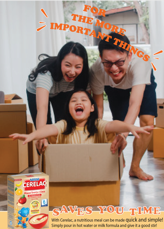
NESTLE CERELAC CAMPAIGN
#SAVESYOUTIMEFORTHEMOREIMPORTANTTHINGS is a mock campaign created for Nestle Cerelac.
The objectives of this campaign is to present Nestle Cerelac as a quick yet healthy solution, to help parents save time on having to prepare meals for their baby to have more precious time spent with their baby.
The problem is that Nestle Cerelac is perceived to be boring. Flavors are too basic and plain: wheat, grains, bananas...
Parents tend to think if it’s so simple and plain, they might as well make from scratch.
Hence, I decided to use that as its unique selling point and brand it in a way where spending precious time to create fond memories with baby is more important.
By using Nestle Cerelac as a base, which is loaded with nutrients sufficient for babies, saves them time then having to make it from scratch as it is quick and simple to make just by adding milk formula or hot water.
The visuals would work as a poster series, capturing the fun times and memories parents can create with their little ones.
POSTER SERIES
Visual 1:

Visual 2:
Visual 3:
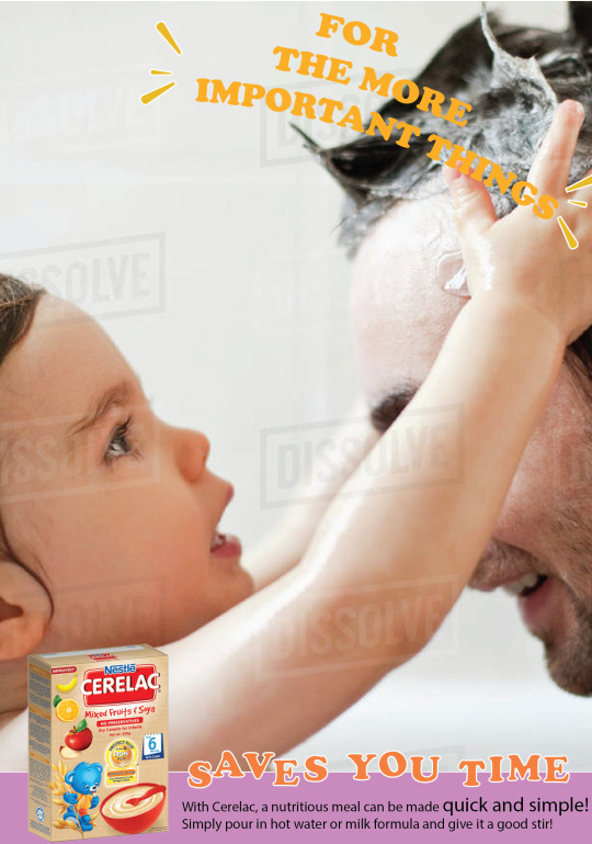
Visual 4:

Note: The images used are sourced from Google and edited on Adobe Photoshop.
CRITS:
1. Joanna Dorai:
Consider a key message that is closer and clearer to the role of the product... In reality, parents would spend time with their kids with or without the product. Or, they could be too busy to spend time with kids anyway, let alone prepare a simple meal. In this way, the headline doesn't quite sell the product.
So think about what the product really solves - yes it is a quick and nutritious meal. The question is, so what? And why would people care?
Therefore perhaps think about what Cerelac (quick nutritious meal) would mean to them as a busy parent. For example, busy parents need a quick fix for their children's meals. The problem is the instant format makes them feel like it is less nutritious which makes them feel guilty for spending so little effort in preparing an important meal for their children. The challenge then is how do we make the simple act of pouring in hot water or milk formula feel like a respectable effort? Explore if this will inform better your copywriting and art direction.
2. Gabrielle Moey:
It's nice that you use another approach (sentimental element) on this as you are right, I think people generally see this as quite a boring product. I think your poster conveys that mum and kids relationship/memories very well. But looking from the branding perspective, I think your key message could be improved.
Right now I see 2 key messages - "The More Important" & "Saves you Time". Perhaps focusing on just one can help expand your vision more and help you further communicate the message to your audience.
Once you have your narrowed down key message and target audience, I'm sure that you will come up with a more clear direction of design that works for that particular audience.
3. Annabelle Foo:
Choice of visuals are warm and captures the heart of spending quality time with family.
Convenience of the product is clear & straight to the point.
Suggestions/Feedback:
Although the visuals revolve around a similar theme, try using images without watermarks on them! (Visual 3 & 4)
The messaging behind #SAVESYOUTIMEFORTHEMOREIMPORTANTTHINGS can be expanded more to highlight the values that your visuals are bringing out. Like you said, the series captures the fun parents have with their little ones - these important things are actually little things that a parent would never want to miss out on in their child’s life - like when their baby learns to crawl for the first time or when a toddler utters words. However in reality, these moments take time and it’s easy for them to go by.
You could expand these situations into different headlines of your visual instead of having a similar headline since it’s already in your visuals! You have a really strong concept going on already, and if you boil it down even more to a single sentiment, I think it could be #NeverMisstheLittleThings or even #LittleThingsTakeTime which is where the main benefit of Nestle Cerelac also comes in - convenience!
That way, the hashtag also becomes catchy/memorable and also most importantly easier-utilised on social media platforms.
3. Eunice Loke:
Layout is clean Question: If the time spent to make porridge from scratch and make cerelac and add stuff is the same, why would I want to buy this? Problem: boring and plain Solution: Spice it up 4. Basil Cha: Definitely a great cause, about creating time to spend with parents and kids- Think it needs a bit more depth. The direct solution is that the solution saves much more time that can be spent with kids, but how can the brand actually encourage this relationship between parents and baby even more? Feels like parenting is a chore and this solution is just helping your burden but what if we position it as “my favorite things” instead of “the more important things” e.g. My favorite thing is playtime and I have more of it because I spend less time prepping meals. “These are a few of my favorite things” Advertising has gone past straightforward directions, need to tap into your audience. Is it stay-at-home moms? Working moms? What are their biggest pain points, what are their joys? When we understand our audience we know how to reach them. (Similar to evangelism no? HAHA)
Try not to use pictures with watermarks on it (if not have to Photoshop them out with the Clone Stamp tool – you can explore this) but there are tons of free stock images now like Pexels and Unsplash. Also if you’re targeting Malaysian people use Asian families not white people? 5. Yae-ber Neo: Hashtag as campaign title ought to be careful with use of hashtags as campaign titles. Think from the perspective of a user on Social Media what would catch your eye, readability, length and message all play a part. Study the more successful hashtag campaigns and discover the big idea that drives their campaign to relate with the target audience.
Execution: Elevate your execution by photographing on your own, examiners appreciate this better because then you can also incorporate a stronger conceptualization to back your execution. If you have to use a stock photo, do make sure to get those without a watermark. Visual hierarchy: arrangement of your items (visual, headline, body copy) should lead your reader to understand the message just as you plan for. Choice of size, colour, contrast, alignment and placement will do the trick! Headline: your headline ‘for the more important things’ is not bad, the treatment however can improve. The visibility is not as clear as your slogan/subhead, ‘saves your time’. Experiment with choice of colour, outlines, drop shadow etc. to see how you can make your key message (headline) stand out. Colour: Creating a colour palette that you stick to would give overall brand consistency. Body copy: should give it a little more breathing space, have more negative space on each side, look a little cramp atm, and enlarge the bottom box. 6. Sarah Ann Toolseram: Choose the right images. Change The font or change colour to give allowance for printing errors. Pictures are appropriate for target audience -Feeding can be a bonding activity. -Saves you time from prepping the meal or feeding the kid? So you can have more time for fun things.For the more important things -TaglineDesign consistency. 7. Damien Chung: I Understand the idea behind it, the motivation behind it. It’s a good thought. Personally, I don’t find the selling point really convincing for me. It’s basically the same as milo or rather powdered milk (since it’s for babies), or baby food. Perhaps what can be done is not shifting away the focus from the boring flavours but instead find a way to highlight it and make it interesting. Because parents might actually find the process of making food for their babies even more so interesting and also worthwhile, rather than finding ways to save time on it. From that satisfaction, it might then translate to them having fun with children. Preparing food is also considered “an important” thing 8. Ian Lai:
I really like the concept of focusing on the important things, like special moments with your child. But “#SAVESYOUTIMEFORTHEMOREIMPORTANTTHINGS” doesn’t work as a campaign hashtag, it’s too long and hard to read and remember. Something simpler like “#theimportantthings” would be easier to remember.As for the visuals/ads, I think that it can be stronger to drive home the message of focusing on the important things. Right now parents spending time with their kids is too generic. You want to really guilt trip parents with the visuals. For example, baby’s first steps. It would really suck for a parent to miss it, and every parent can relate to it. Copywriting can really drive the message across, “Don’t miss baby’s first steps just because you’re busy preparing her dinner.”“Saves you time for the more important things” is a good tagline for the campaign. Every ad could end with that as a tag. The typography can be more simple and tasteful, no need to have different font sizes or dancing letters (a bit high school word art). Also a better font choice for the body copy would help
0 notes
Text
TGF Thoughts: 1x01-- Inauguration
For those of you familiar with my posts, you know what this is. For those of you new to this fandom, I write obnoxiously long recaps of every episode (and you can find them all here). I started doing this with 6x01 of The Good Wife and I’m continuing the tradition for The Good Fight. They’re obnoxiously long because I try to be detailed, but they’re in bullet points so it should be easy to skip around and find comments on a particular scene.
As always, I’m happy to elaborate/explain/discuss any of the ideas in here. I’m hoping to get a 1x02 recap up before 1x03 goes live, but we’ll see.
Often, it’s easy to tell what a show wants to be from the way it introduces itself to the audience. First impressions aren’t all that matter—but they’re important. They’re especially important on the spinoff of a show that had an opening scene so iconic the writers recreated it seven years later, expecting viewers to get the reference. TGW’s opening scene set the tone for the whole series, so the bar was high for TGF, a show that exists essentially because CBS wants more money. How do you craft an opening scene that sets the tone for a show where the premise is PLEASE GIVE US YOUR MONEY?
The answer, it turns out, is to begin the series with a scene that acts as an argument in favor of its own existence. As Diane watches last month’s inauguration, we’re given a reason to care about this show about a diverse group of women fighting back. Why should we tune in to this show? Because we’re ready for a fight, too.
So, the opening moments of TGF—Diane, alone, watching that man’s inauguration—are irrelevant to most of what follows. You could argue (as I think the Kings have tried to, bizarrely) that Diane decides to retire to run away from the shitshow, but, come on. You and I both know that Diane decided to retire because the Kings needed a way to make her extremely vulnerable to the scandal they created. We know she would’ve retired if Hillary had won (that “shattered every glass ceiling” line they say they had to replace was terrible, btw), and we know she would’ve retired if this spinoff had aired a year earlier. As far as I’m concerned, the opening scene stands alone, and that’s fine.
In fact, since it sets the tone for the whole show (which will, undoubtedly, become more political as we get into the episodes written/filmed post-election), I’d argue it works (much, much) better as an opening scene than the Maia intro (here’s a new woman you’ve never seen before! She is a lawyer!) or the Diane intro (here is a house in France that will be important to this episode and only this episode!).
As much as I hate to admit it—because admitting it means that we’re really living in a world where that man is POTUS, the most recent presidential election gave TGF the reason it needed to exist. The moment I saw the tagline “GET NASTY”, it clicked into place. Suddenly I was excited about TGF as more than a weekly check-in with some characters I used to love. Suddenly I liked the name The Good Fight much more than The Greater Good (the show’s working title). Nothing had changed about the show itself—the “fight” in the title was still about recovering from a fictional scandal; the show was still something that came about because CBS wanted to profit more off of TGW—but it felt different. It felt necessary. And, even better: the show knew it.
The Kings claim they didn’t expect Trump to win, but they do have a knack for being eerily good at predicting what the political mood will be like in a few months. They seem to be right on the money with The Good Fight, even if they had to rethink the opening. The name and premise of the show, both decided in advance of the election, are about struggling.
(I know the Kings think there’s something darkly funny about watching Diane watch the inauguration or whatever but come on. They’re marketing to an audience that would not only understand that “Get Nasty” is a reference to “Nasty Woman” but be driven to watch by that reference.)
Before I move on: Hi, Diane… I’m sorry, but I have a message from the future—one fucking month in the future—this is really happening and it is a horrific shitshow.
Diane turns off the TV, drops the remote, and walks out of the frame as Erin McKewon’s “You Were Right About Everything” begins to play. She has the right idea.
A few seconds in and TGF is already spot-on with its music choices. Yay! (I don’t know if I like the songs used in The Good Universe because I associate them with the shows or because the people choosing them and I have similar tastes in music, but I’ll take it either way.)
Diane’s dark living room gives way to an image of an unfamiliar face against a black background. Moments later, the lights come on, and we see Maia Rindell, nervously waiting to take the bar exam. It’s hard to make much of her from this glimpse—who wouldn’t be nervous waiting to take the bar exam? Why would a character be on this show and not be a lawyer? One thing, though, is clear: she’s just starting out her career.
Cut to the French countryside, where Diane is touring a beautiful estate. She takes in the view and smiles: she’s going to love it here.
Then we’re back with Maia, sometime later. She’s waiting impatiently for her bar exam results. When she learns that she’s passed, she screams, alarming her sleeping girlfriend, Amy.
Maia begins to jump up and down on the bed and then jumps on top of Amy. It’s super adorable.
(Before I continue: I’m happy that a) Maia is queer, b) this is not remarked upon or treated as a huge reveal, and c) she’s in a committed long-term relationship. Seeing as TGW had a total of zero lead characters in relationships that resemble the ones most people actually have, this is a welcome change.)
Also: Maia and Amy’s apartment is amazing; they live behind a giant clock.
The music continues, and now Diane’s in a setting both familiar and unfamiliar: it’s familiar because David Lee and Howard Lyman are there; it’s unfamiliar because it’s an office in New York City instead of the old L/G/KeyboardSmash offices. Okay, I know they’re still in Chicago. But that... is definitely New York…
Anyway. Diane’s announcing her retirement. She stands and walks around the room, totally in control. The firm has grown since we last saw it. David and Howard congratulate her, and David secretly rejoices as the music ends. More power for him!
You know what I find odd? Lucca isn’t in the opening sequence. She’s ostensibly also a co-lead, so where is she in this sequence that starts of the show? My hope is that this doesn’t indicate she’s less of a co-lead and was instead an intentional move so her appearance later is more sudden. (Then again, this sequence doesn’t hint that Diane knows Maia or that Maia’s going to work at Diane’s firm, so… I see no reason Lucca couldn’t have been included too.)
The firm now has NINE name partners (LDGLLGLKT) because the Kings think they’re clever. I’m less amused by this than I am excited to know they (finally) understand that the audience is so over the name changes.
It’s Maia’s first day at LockhartKeyboardSmash, and she’s making friends one of the other new associates.
Maia wears a rosary ring, but she is not religious. Hm.
She is, however, nervous. She seems to be a very nervous person in general, though maybe that’s just my impression because we’re mostly seeing her in environments where she’s uncomfortable. (Maia is such an Alicia-esque character—the original casting call for her said it, not me!—that I wonder if Alicia used to act like that, too. Did Alicia struggle to put together a sentence without hesitating, the way Maia does? If so, when did she get that out of her system and learn to pause strategically instead? Law school? Being a politician’s wife? Gradually over time? Ok back to Maia now.)
I would never want to receive a job orientation from David Lee, and that’s all I have to say about that.
David calls off names of the new associates, and his tone changes when he gets to Maia. Be a little more obvious with your ass kissing, would you?
“Say hello to your parents for me, would you?” David tells her. He also informs her that some flowers have arrived for her, because apparently her parents are clueless as to the fact that she might not want to publicize, on her first day of work, that she’s the daughter of prominent billionaires.
Maia tells her mom not to send any more gifts; she doesn’t want to seem “entitled.” At least someone has some self-awareness! “Are people not being nice to you?” Maia’s mom, Bernadette Peters (!!!!!) asks. That one line is enough for me to recognize that it’s amazing Maia even understands that entitled is a thing people might call her.
Lenore, sitting in her office that looks like a living room but is really adjacent to a trading floor (what?), asks Maia if she wants Diane to give her her own office. Oh boy.
(Maia may not want to be seen as entitled… but I have to ask why, right out of law school, she took a job at her godmother’s firm. I’m not saying she shouldn’t have taken the job or anything... I’m just saying that while she understands she’s being perceived as entitled, she’s not exactly rocking the boat trying to accomplish things without her privilege. She seems pretty damn comfortable benefitting from it.)
Maia tries to rid herself of the Flowers of Privilege by mixing them in with the other LGKeyboardSmash floral arrangements. Howard walks by and assumes she’s a florist. Heh.
Maia is then called into Diane’s office. I love Diane’s new office, especially the wallpaper.
Diane also offers to give Maia her own office. This is because Diane is Maia’s godmother and she wants to spoil her. Oof. I get the impulse to help, but in what world is that helping to do anything other than make instant enemies for Maia?
Diane gives Maia a folio (is that what those things are called? I’m blanking on the word) that was given to her by Chicago’s first female public defender. She calls it a “baton” and tells Maia it’s her turn to carry it. Awww. It’s amazing how instantly I buy that Diane has a goddaughter even after seven seasons without a single mention of Maia.
Diane brings Maia into a deposition. Before we find out the topic of our COTW, we learn that Lucca’s not at LGSKGJSLG38527;;jslfj82745K anymore. What a shock.
Lucca’s been at Reddick and Boseman, the firm she’s at now, for four months. “Alicia too?” Diane wonders. “No, just me,” Lucca says pleasantly, but she doesn’t offer any further comments, so it comes off like unspoken shit went down. I don’t really care, though. I know why Alicia and Lucca aren’t working together and aren’t as close as they were, and it has nothing to do with them and everything to do with TGF’s plot. I don’t want TGF to tell me what Alicia’s up to, because I have my own headcanons. This line is the bare minimum for addressing her absence, and that’s fine by me. (I hope she and Lucca didn’t have a falling out, though. I would love to think they’re still friendly and working together, but obviously, if that were the case, there’d be a strong reason for Alicia to still show up frequently in TGF, and that’s not going to happen.)
Adrian Boseman walks in, interrupting any chance we had at learning more about Alicia’s whereabouts. I like you already, Adrian! No, but really: I like Adrian.
He sizes up the room, noting that all of the lawyers his firm brought are black and Diane’s whole team is white. Diane laughs off his comment. Sure, Diane.
The case is a police brutality case, and there’s a video. Case stuff happens; we spend a lot of time watching Maia react to it. Also there’s metadata, a word the Kings will never tire of using.
Maia thinks they should settle for 4 million (Diane’s asked for her opinion). Diane says they’ve been asked to settle for under $500,000. See, they’re representing Cook County now.
Adrian encourages Lucca to “play the radical” but she doesn’t want to; she thinks Diane will know. Lucca does anyway.
Diane makes an argument about Adrian’s firm taking on police brutality cases to make a profit. This is something I’d be interested in learning more about. The Kings said they’ve done their research on this, but I’d like to do a little research of my own.
“We’re both using this case, Lucca; why don’t you just stick to the facts?” Diane says. This is one of those arguments where it’s hard for me to determine who’s right and who’s wrong because we’re not given all the facts, but I think I’m going to side with Lucca here. There’s using a case to make a profit, and using a case to do good and make a profit. Only one of those sides contains “doing good,” so why would I suddenly only focus on the profit part?
Maia has the same questions I do. “Are we on the right side on this one?” she asks.
“We are on a necessary side,” Diane explains. Hold up. I understand that it’s necessary because this is how legal procedure works in this country and all that. But how is it necessary that Diane defend racist police departments who use unwarranted force and beat the shit out of black people? How is that a necessary side? Diane didn’t take on this case because she believes in the innocence of these particular policemen. She took on this case because Cook County is a good client to have. If she can sleep at night, then fine. But don’t tell me it’s a necessary side just because they might be innocent. You could say that about literally every single side of every single case. Isn’t that the whole point of trials? Everyone’s entitled to representation, innocent until proven guilty?
Diane continues with her speech: “People I’ve thought with all my heart were guilty turned out to be innocent, and people I thought were saints, they, um, they weren’t. That’s why you don’t go on instinct. You wait. You listen. And watch. Eventually everyone reveals themselves.” Argh. I find this so unsatisfying as an answer. It’s not bad advice to keep an open mind, but it feels like Diane’s not saying “keep an open mind instead of making snap judgments” but rather saying “keep an open mind because it’ll make you feel better about representing people you’d rather not be representing.” On second thought, that is useful advice. After all, Maia still has to defend clients she thinks are guilty, and maybe that would help her do it.
“People I thought were saints, they, um, they weren’t.” The Kings have said this line is about Alicia. If you follow me on Twitter, you know this has been under my skin for days now. At first, I thought Diane would never say these words. I’ve reconsidered. While I still think it’s odd she’d think of Alicia before, I dunno, the liberal legend who turned out to be a rapist (W205—I’m writing W in front of TGW episode numbers and F in front of TGF episode numbers, btw) or her dad who accused his best friend of being a communist (W419) or her husband who she discovered cheated on her, I suppose it’s possible, especially since this scene comes right after a meeting with Lucca. (Also, why would Diane have learned this lesson from Alicia’s betrayal in W722 and not from 40 years of being a lawyer?)
But, it irks me a little that Diane would use Saint Alicia as an example here. If anything, Diane was one of Alicia’s biggest critics throughout TGW’s run, and she was always suspicious of her (she never bought into the Saint Alicia myth!). In W101, Diane believes Alicia’s being entitled and trying to upstage her (Alicia is really attempting to help a client and clumsily moves a little too fast). There’s another season 1 episode where Diane is and remains convinced Alicia’s using SLG to fight Peter’s battles (this thought has not crossed Alicia’s mind). There’s a season two episode where Diane asks Alicia to join her new firm behind Will’s back, and the second Diane finds out Will knows about the new firm, she says that Alicia must’ve told him (Will didn’t know that Alicia knew). Diane befriends Alicia in season 3 in order to discourage her from sleeping with Will. Even in the later seasons, there are episodes like W620, where a misunderstanding is enough for Diane to believe Alicia’s scheming against her, or W703, where an even sillier misunderstanding leads Diane, for the second time in like five episodes, to mistrust Alicia. And that’s not even including the time that, you know, Alicia plotted for months to leave Diane’s firm and take clients with her. But sure. Diane thought Alicia was a saint.
I think what’s happening here is that the Kings thought they’d be cute by referring to Alicia as a saint, because SAINT ALICIA. The problem is that they put those words in Diane’s mouth, and now it sounds like Diane is saying she actually bought into the Saint Alicia crap. But maybe that’s the part of the point. Maybe Diane’s trying to save face just a little bit. After all, it’s easier to admit that you mistakenly believed in the same larger-than-life myth everyone else bought into than it is to admit that you had your suspicions, truly believed you knew someone, and were proven wrong. Ironically, if Diane’s trying to teach Maia that people aren’t always what they seem, she’d be better off telling her the full story.
(Um, also, I’m being a little unfair. Obviously a lot of the reason why Diane would reference Alicia here is that she was hurt—whether she “should have been” or not—by Alicia’s actions. I’m not questioning why Diane would mention Alicia; I’m questioning why she’d use the word saint to describe her own views towards a woman she’s been suspicious of since day one.)
At Reddick/Boseman, the attorneys are having an internal meeting about settlements, and we get our first glimpse of Barbara Kolstad, who would be my new favorite character if I didn’t also love all of the other characters. Barbara asks Lucca for advice on how to handle this. “I think Diane’s got something to prove and she’s out to prove it,” Lucca says. (Oh yeah! In all of my talk about Diane’s reasoning, I forgot to mention that this is her last case and she doesn’t want to lose it. Also, that reminds me that the last time Diane thought she was working her last case, the client fired her and hired Alicia instead. Yes. Diane definitely thought Alicia was a saint.)
Barbara understands what Lucca’s saying. I really like the way Erica Tazel plays Barbara’s thought process—her eyes express everything.
Seriously, I can’t wait to see more from Barbara and Adrian.
Reddick/Boseman is quite obviously the old LGksadjklasjflkahg set after some (minor) renovations. I think, mostly, they just painted, redecorated, and took out the central conference room. I don’t think there’s an in-universe reason they’re in the same space; I think there’s a budget reason.
Lucca has to put on a British accent so Adrian’s call will be put through faster. Haha, it’s just incredible that Lucca has a believable British accent. I don’t know how in the world they came up with that one.
Adrian is amused by Lucca’s fake/real accent, and I’m amused by his amusement. Unamused? Lucca.
Now we’re watching a retirement slide show for Diane. “Good Luck Diane! We’ll miss you!” a slide reads in an ugly font. The narration on the slideshow says that Diane was an assistant district attorney. Wait. So she practiced law somewhere other than Chicago (since it’s ADA and not ASA), and she didn’t start out in a private firm?! Woah. Also, omg, young Diane!
Diane’s many friends congratulate her and joke that if she wants to come out of retirement, they’ll have work for her.
The Rindells appear and briefly talk finances. Hmmm. Then Maia and Amy arrive, and Lenore asks when they’re getting married—they don’t have the Supreme Court excuse anymore. (So, Maia and Amy have been together for a while.)
A photo of Diane and Will pops up the slideshow next, and Diane wistfully stares at it. I’m glad that made it in. <3
Then the party’s over, and… that was fast. I was expecting to spend a whole act there.
Outside in the valet line, Maia’s dad gives her a weird warning about her uncle Jax.
Case stuff happens. Maia notices that there’s a car in the background of the video that has its own camera, so there’s an alternate recording of the events somewhere. What a great thing it is that Maia has enough money to know that! (I kid, I kid. It’s an important find.)
The familiar TGUniverse score is back now, but it sounds a bit more up-tempo and seems to have percussions now. Fine by me.
Maia feels triumphant for a moment, then Lyman mistakes her for a florist again (… ffs, I just wrote “florrist,” with two rs like I’m writing Florrick, because habit), and then she gets a call from Amy, informing her that their apartment is being searched.
Two things of note on the search warrant: one, Maia’s address is listed and it is a bogus address that gives no indication of where in the city she might live, and two, it’s dated 2/24/2017, so TGF takes place a few days ahead of realtime. I expect that TGF will be as bad with timeline as TGW was, so…
Amy tells Maia that the search is connected to Maia’s parents, then gets off the phone to argue with some agents who are trying to tell her what she is and isn’t allowed to do.
Maia calls her dad, who doesn’t pick up: he’s having a drink. Then Diane’s called out of a deposition to talk to her accountant. Uh oh.
Maia arrives at her family’s home just in time to see her dad being taken away in handcuffs. “I didn’t do it, Maia,” he says. “I know,” she replies. But does she?
Diane hasn’t heard the news yet. She turns on the TV and sees what’s going on: BILLIONAIRE INVESTOR HENRY RINDELL ARRESTED. He ran a Ponzi scheme… and now all of Diane’s retirement money is gone.
“FUCK,” Diane says when she learns all her savings are gone. That’s a very well deserved inaugural f-bomb, show!
Now it’s time for the credits sequence. At first, they seem like nothing special: cast names in an ugly font and images of objects you’d find in an office. Then the objects BEGIN TO SPONTANEOUSLY COMBUST IN SLOW MOTION as the score gets more operatic. I’m not sure I understand, but I’m not sure I need to.
(I don’t associate most of the TGW/TGF score with Alicia—more with the general feel of TGUniverse’s Chicago—but it’s weird to me that the piece of music in the TGF credits is the one from the 6x21 scene where Alicia and Grace turn Zach’s room into a home office. It’s possible they’ve used it before, but it only took me a second to place it. And I’m bad at identifying instrumental music, so I must strongly associate it with Alicia. Weird. 6x21 is an episode so Alicia-centric that when I wrote about it, I suggested that TGW no longer needed most of its non-Alicia series regulars!)
This episode was directed by Brooke Kennedy. I like it when Brooke directs, since she’s the producer most involved with the day-to-day on set. She has a very good understanding of the show’s themes, and she’s usually able to find interesting ways to visualize those themes.
This show was not just created by the Kings: there’s some other dude listed as a creator. I’m not even going to bother to write his name here, because… well, because I haven’t heard much about his role in the creative process, which I take to mean that he was called in to help with the show when it looked like the Kings weren’t going to be involved, and the moment the Kings returned, his level of involvement decreased significantly. I’m curious to know the real story.
Apparently you can see some dude’s bare ass in the first scene of act 2, but it’s so hidden in shadow I’d have to raise my screen’s brightness all the way and really look to see it. And, I’m sorry, CBS, but I really don’t care enough about this guy’s ass to get excited about the nudity.
The naked guy is with Lucca. Lucca’s watching the Rindell scandal unfold on TV. She recognizes Maia and watches carefully.
Maia, Amy, and Lenore wait for the family lawyer to arrive. Maia was on the board of a foundation, which might’ve been a front. Amy realizes this is bad: Maia needs her own lawyer. Lenore tries to convince Maia otherwise, but Maia knows Amy’s right.
Some dude on the news is insisting that Maia must’ve been in on the scheme. As the news plays, Maia showers. Amy joins her and comforts her. I’m excited to get more moments like this from Amy and Maia—not shower scenes, but scenes that show how they support each other from day to day, how well they know each other, and stuff like that.
Diane and her accountant go over the details of her new financial reality. It’s bad. Her money’s gone, even money that wasn’t involved in the fund is at risk (including Kurt’s money; they haven’t divorced yet), and all the charities she’s steered towards the Rindells have also lost their money. The house in France is gone. And Diane can’t even retire. She might not even be able to keep her apartment.
Christine Baranski is amazing. Have I said that yet?
At the next Lockhart Deckler Lee whatever meeting, Diane sits at the head of the table. Brooke positions the camera behind Diane, so we see everyone staring at her. She commanded the room in the earlier scene where she announced her retirement, but here, she’s not the one with the power. And everyone can see right through her speech about not wanting to retire.
Diane’s lost most of her leverage, but not all of it: she can still remind the partners they’re going to lose Cook County’s business without her. The score from W601 beings to play. Not sure why.
In the elevator at work, someone recognizes Maia and begins to yell at her. “I know where you work, you stupid bitch,” he screams. You ruined everything, you stupid bitch, SING WITH ME!
Maia’s new lawyer, Yesha, is waiting for her when she gets off the elevator. Yesha is 25, so Maia doesn’t trust her. Yesha seems capable, but inexperienced, and Maia resents having to get a lawyer at all.
Diane embarks on a quest to find a new job. Might one of her friends that said they’d always have a position open for her be willing to take her on? Everyone thinks she’s looking for an emeritus position. She’s not. And not even her friends have room for her, not now.
Diane gets to say “bullshit” and it feels so natural and appropriate to the moment it was only on rewatch that I processed it as a curse word. I’m glad—and unsurprised—to see that the Kings know how and when to use swear words.
“You’re poison. No firm will hire you,” Diane’s friend, Renee, informs her. Quick! Where’s the nearest desk!? Shove everything off of it!!! Now!!!
After a long and frustrating day, Diane returns home to find Kurt waiting on the stairs outside her home. She invites him in for a drink, and they discuss divorce. “It’s about money. It’s not about us,” she insists. Kurt doesn’t seem to care. Diane says it’s in his lap. Kurt says he didn’t leave her; Diane says that actually, he did—when he slept with Holly. I’m not sure I understand why Diane wouldn’t initiate the divorce? Does she not really want to? Does she not want to accept that it’s over? Does she want Kurt to accept responsibility? Maybe her reasons will become clearer later on. Or maybe she’ll stay married to but estranged from Kurt until season seven and beyond. (Sound familiar?)
Kurt isn’t even sure where they stand now. Honestly, neither am I. Did Kurt really cheat on Diane while they were married?! I still can’t believe that.
At any rate, Kurt still knows how to be there for Diane. She explains her current predicament to him and starts to cry. “How is my life suddenly so fucking meaningless?” Diane wonders. “It isn’t,” Kurt reassures her. I’ve said it before and I have a feeling I’ll be saying it many times over the course of TGF’s run: Christine Baranski is amazing.
I’m rereading this section of my recap, and it just occurred to me that I didn’t even think to comment about what it means for someone as successful as Diane to lose everything she’s known. I think part of the reason my mind didn’t go there is that this screams “NEW SHOW, NEW SCANDAL” instead of “NATURAL PLOT DEVELOPMENT,” but I think I should try to treat it as the latter. Diane’s emotional arc, no matter why it came about, is something that’ll drive this show going forward. For ages, I’ve thought of Diane as a character who works best in a supporting role. She’s well-defined enough to be a lead, but she’s so stable and successful—where’s the story? I can picture her leading a procedural, or a character study drama, but a huge part of her character was that she’d worked so hard, pre-TGW, that aside from firm drama bullshit and ambitions of getting a judgeship, her life was already the way she wanted it to be. She was more captivating than her story arc, if that makes sense. Because of the way the Kings like to write, it makes a lot of sense to me that to promote Diane to lead, they’d want to turn her into an unlikely fish out of water. Now she’s a captivating character with a captivating plot. And better still, a lot of the reason this plot is likely to work is that we know what Diane’s accomplished and how hard she’s worked. When she cries about her life feeling meaningless, we know exactly what meaning she used to find in her life. And, because she was always so stable and self-assured (and well-written!) as a secondary character on TGW, watching her lose everything hits even harder.
Maia’s playing with her rosary ring and lurking in reception, waiting to greet Diane. Diane’s not in a great mood, to say the least.
“We have a little opening right here,” Adrian advises Lucca, observing the icy Maia/Diane interaction. "Go for jugular.” As he says this, from approximately his POV, Maia is literally standing in the opening between two panes of glass.
Case stuff happens. This case is barely there. Lucca makes things personal, and Diane steps out.
Elevator Asshole who called Maia a stupid bitch has returned to complain more about Maia. Dude. It sucks that you lost your money, but you’re a misogynistic asshole who’s hanging around lobbies all day to harass a 25 year old woman at her place of work. You’re pathetic. And scary. And please don’t follow Maia, you creep.
Maia runs into the ladies’ room. Lucca takes care of the creep. He screams he’s going to sue Maia, and Lucca screams at him, “THEN DO IT. BUT RIGHT NOW, FUCK OFF!” YAY LUCCA!!!!!!!!!!!!!! (I want so much more from Lucca in this series. In the first episode, she’s pretty much just playing lawyer and supportive friend. I’ll have more to say about Lucca in episode two.)
Lucca walks into the bathroom, and Maia scurries into a stall, not sure if whoever opened the door is a friend or a foe. Lucca looks straight into the mirror and gives Maia a pep talk.
“When they see you cry, it makes them happy. So get it out of your system here,” she begins. Maia eyes her through the opening in the stall door—Lucca’s positioned herself where she can easily be seen. And she knows Maia’s watching.
Maia doesn’t understand why Lucca, who’s on the opposing side of the case, would be helping her. So Lucca explains it’s because Maia is the New Alicia. At least, that’s the (not very sub) subtext of her words.
No, but really: why is Lucca helping Maia? Lucca may like to say she’s out for herself, and she speaks with the non-nonsense, hard, strident tone of someone you wouldn’t necessarily want to befriend… but Lucca is actually a really kind person. And she’s not just kind to people she knows or had a reason to be kind to. She’s kind to people who should be her competition. I don’t know if there’s something she finds compelling about victims of scandals (my two examples of “Lucca is a kind person” are Lucca helping Alicia and Lucca helping Maia, and obviously Alicia and Maia have some significant things in common) or if she’s normally the kind who would reach out without realizing what she’s doing, though. I have a feeling she doesn’t do this too often, because anyone that’s constantly looking out for strangers is going to have at least a few friends.
(Which makes me wonder: Lucca helps Alicia right away, but only becomes her friend after months of working with each other and watching Alicia’s 7x13 breakdown. Does Lucca help Maia because she realizes she can help, because she wants to help, or because Maia reminds her of Alicia? Or all three?)
“I had a friend. Went through the same thing. Said it was hell for a few months,” Lucca says. Maia opens the door. Lucca doesn’t turn around the whole time, and when she’s done with her speech, she turns sharply and leaves.
Lucca’s speech is long, at least by the Kings’ standards. It’s also nearly identical to the speech Alicia gives her client in W101. I wish I could appreciate this more as a moment for Lucca, but it just makes me think about Alicia. To her credit, Lucca delivers the speech in a different manner than Alicia does. Alicia manages to be empathetic without getting emotional (which is, I think, why she made such a good handholder for clients—they felt her connecting with them but she still always came across as professional). Lucca is clearly sympathetic to Maia’s situation—she’s giving the speech, after all—but it kinda sounds like she’s trying to keep her tone as impersonal as David Lee’s orientation spiel, with only occasional glances (via the mirror) to let Maia know she’s a friend.
Diane gets a case related video and it’s bad for her client.
Adrian stops by to see Diane. She seems almost too tired to talk. But then he says something interesting: “I want you to join our firm.” Diane laughs, but Adrian is serious. He offers to let Diane be their diversity hire. Heh.
Why isn’t Adrian afraid of the Rindell scandal? His firm wasn’t affected by it, because the Rindell fund “never invited black folk.”
Adrian offers Diane the opportunity to “fuck them back” for fucking her over. Why do I feel like Adrian is going to be responsible for most of the swearing on this show?
Adrian—whose office really looks like Will’s office, because I’m pretty sure it is—and Barbara fight over the offer Adrian extended to Diane.
Barbara’s concern about Diane is that “she doesn’t know her place. She’s not gonna be happy until she’s in the inner circle.” I’m not sure what new, desperate Diane looks like, but that totally describes the old, confident Diane. You don’t get to be that self-assured and content making big decisions quickly without fully believing you deserve a seat at the table.
(In the TGW Pilot, Diane had a similar suspicion about Alicia—a junior associate who doesn’t think she’s a junior associate—and that was way off base.)
Adrian argues that he and Barbara are also ambitious like that, and ambition is a good thing. Barbara’s point isn’t that ambition is bad, though: it’s that they don’t want “people who are only happy when they’re giving orders.” She calls in Lucca for backup.
Lucca’s dress has a friggin’ cat on it. I love this show’s costume department.
Lucca argues in favor of bringing Diane in because she’s a good lawyer, idealistic, and cunning. Adrian laughs at Barbara’s move backfiring on her. And now Diane’s a junior partner.
Amy is watching a sex tape. Someone’s put some generic lesbian sex tape on TMZ and is claiming it’s Maia and Amy. “This isn’t even us! This person has a tattoo!” Amy exclaims. Maia tells her to ignore it—she’s a quick study.
Diane’s in her office, looking at a picture of her and Will, when Kurt shows up.
Kurt says he doesn’t want a divorce—he “doesn’t want the door to close completely.” Is the door really open, though? “It is closed between us,” Diane states. Kurt gets a bit agitated: “Then divorce me. But I won’t do it.” I’m curious, everyone: why do you think Diane’s insisting that Kurt be the one to initiate a divorce?
“You Were Right About Everything” begins to play again. Maia and Amy are in bed getting ready to go to sleep. “My parents saw the tape,” Amy says. They don’t believe it’s not her, and that breaks my heart a little.
Diane’s back in the Lockhart/Deckler conference room. Like the first partner meeting scene, she’s standing up. She’s in control, announcing her new firm. She walks around the table on her way out, drops the bombshell that they’re going to have to agree to a $6 million payout on the police brutality case, and defiantly exits the room. “Want the door closed?” she says. She leaves before she gets the answer.
David Lee fires Maia, who’s already having a rough day (week). Maia’s returned the folio to Diane, as though to indicate that she’s giving up (Diane said the folio would force her to accomplish something that would make her feel she deserved it). When Diane goes to return it, she sees that Maia’s being fired.
As Maia leaves the firm, Howard stops her to say he’s sorry she was fired; he likes the flowers. Wait, he knows she was fired but still thinks she was in charge of the flowers? Why would that be the case?
As Diane’s packing up her office, she calls Adrian to let him know Maia’s role in the COTW. She suggests that Adrian hire Maia. This is one of those moments that seems innocent enough—Diane’s just trying to help out her goddaughter who’s going through an awful scandal—but when you think about it, Diane’s first act at the predominantly black firm that took her in when no one else would is to get her (formerly) wealthy white goddaughter a job. YMMV on this. It’s not wrong of Diane to make this suggestion, but it’s this kind of thing that, when unchecked, leads to the lack of diversity Geneva called Peter out on in W412.
Maia sits outside of the firm, staring off into space and watching a WALK sign turn to DON’T WALK. I was going to write something about how Alicia also stared at a WALK/DON’T WALK sign when she found out Will died, but apparently my memory has mixed up Alicia’s feelings after Will’s death with a visual from the scene where Prady realizes he’s lost the SA election. Don’t know what happened there. (I think I mixed up the insert of Alicia watching a mother and child cross the street with the WALK/DON’T WALK?) At any rate, the writers have used this before to symbolize an existential crisis. I think it works because it suggests that there should be movement—walk when it says walk; run when the light starts blinking; don’t get stuck at the light for another traffic cycle—when there isn’t any. Maia’s at a standstill, stuck even when she should be moving with urgency.
Diane sees Maia sitting there and approaches with the folio. “You left this,” she says. “Give it to someone who needs it. I’m done,” Maia responds. “No, you’re not. Let’s go,” Diane decides. “Where?” Maia wants to know. “Someplace,” Diane says. “Why?” Maia can’t wrap her head around this. “Because it’s not over yet,” Diane reassures her. No, it’s not. The Good Fight is just beginning.
28 notes
·
View notes
Text
The Best Landing Page Examples You Gotta Save for Your Swipe File
Here’s our starting principle:
A polished, professional landing page can improve your conversion rates. (And a messy one can hurt them.)
Pretty simple, right? You’ve probably heard something similar before. But what the heck does it mean to be “polished” and “professional” on a landing page, anyway? And when it comes to conversions, what’s the magical x-factor that sets exceptional marketers apart?
With these questions in mind, we want to show off some fresh landing page examples to inspire your next creation. Go ahead and save their smartest, slickest, and snappiest elements for your swipe file.
Throughout, we’ll offer an Unbounce-certified perspective on what makes each page so darn good—and, occasionally, how each could be improved. (Incidentally, all of ’em show off what you can do with the Unbounce Builder.) Let’s go.
What makes a landing page effective?
Before looking at the examples, it’s worth highlighting some of the qualities that most great landing pages share. (Ain’t got time for that? Jump ahead for the top landing page examples.)
Here are a few fundamental practices of high-converting landing pages:
Use a clear and concise value statement (above the fold) so visitors understand the purpose of your page immediately.
Match your primary headline to the ad your visitor clicked to land on the page in the first place (or the button of the email CTA, for example).
Include social proof and testimonials to back up your claims.
Focus the whole page on a single offer, with just one primary call to action (CTA).
Use a conversion-centered layout to make your CTA stand out (think about whitespace, color, contrast, and directional cues).
Test new ideas using A/B testing. Sometimes what works will surprise you.
Not sure your own landing pages are hitting the mark? Try out Unbounce’s Landing Page Analyzer to get a personalized checklist of tactics that can kick your conversions up a notch.
The Best Landing Page Examples
1. Athabasca University
Image courtesy of Athabasca University. (Click to see the whole thing.)
Athabasca University pioneered distance education in Canada in the 1970s. Today, it uses landing pages to boost its online enrolment initiatives, including this example representing its 14 certificate programs. It’s a smart choice since landing pages allow AU to focus a visitor’s attention on a particular slice of its many online program offerings.
Industry: Education
Why it inspires…
Smart copy: It might be worth testing out a more direct headline, but the copy here matches the school’s other branding initiatives elsewhere. It’s also very sharp. The target is clear: people who might further their education but don’t feel they have time to pursue it. This landing page says otherwise (in words and in its hero image).
You-oriented copy: This page is all about me (or, uh, “you”) and not about the “Great and Powerful” Athabasca University. Marketers working in education understand the need to appeal to self-interest better than many of their counterparts in other industries, who can slip into bragging. I’m not sure what part of Maslow’s hierarchy of needs calls for tech bro flexing, but AU does better by appealing to a desire for self-actualization.
Testimonials: A little bit of inspiration never hurts. Here, the social proof shows pathways to personal success before people make a significant investment. I’d test to see if doubling down doesn’t produce even better results here. Giving each testimonial more visibility and offering a smidge more biography—along with portraits to humanize them—might provide a little boost. (Of course, it might not. But that’s why we test!)
Z-pattern: This page is a classic example of a Z-pattern at work. That is—its visual hierarchy takes advantage of the way people typically scan a webpage. In this case, the eye is encouraged to travel from the Athabasca University logo to their tagline (“Open. Flexible. Everywhere.”), then diagonally across the heading to the supporting copy, and then finally right to the call to action. (Pow!) Other visual queues also encourage the eye to move down (including, cleverly, the pointed tip of Athabasca crest).
2. blow LTD.
Image courtesy of blow LTD.. (Click to see the whole thing.)
If you look past the buzzy “Uber for beauty” thing, UK brand blow LTD. solves a genuine problem in a genius way. They offer affordable, professional beauty services that come to you, and—more importantly—you can book an appointment with one of their pros straight from their app. Smartly, landing pages are a big part of their campaign strategy. The example, for instance, promotes in-home eyelash extensions in clever ways.
Industry: Beauty
Why it inspires…
Crystal-clear value statement: This landing page doesn’t mess around with cute copy (e.g., “Eyes That Amaze”). Instead, it clearly states the offer and relies on value (and maybe a little bit of novelty) to win over prospective customers. A promise doesn’t get more unambiguous than “Eyelash Extensions At Home,” and that’s precisely why this headline is so effective.
Promo code: Providing a promo code to visitors sweetens the pot, but it’s also doing something more. The call to action (“Book Eyelash Extensions”) redirects to their main website, where they might get distracted or frustrated. The promo provides extra motivation to carry visitors through to complete a booking. Want these savings? Then ya’d best use that code before you forget.
Social proof: People are understandably picky about who does their hair and makeup, so providing social proof is a must. The testimonials here have been selected to highlight the personalized nature of the experience too. Since blow LTD. only works if prospects feel they can trust their professionals, providing social proof helps humanize the service and start building relationships.
Simple steps: Looking further down the page, we might pause over the “How It Works” section. In this post-Uber world, the service offered by blow LTD. is pretty easy to understand, so why bother including a three-step breakdown of it? That’s just the point, though. This landing page includes these steps to highlight this simplicity. I mean, come on—step three is “Sit Back & Relax.” That’s something I can get behind.
Subtle app promotion: Rather than aggressively funneling visitors into an app, the landing page ends with a gentle reminder that you can download the app on your iPhone or Android. (I’d test a mobile variant of the CTA that goes straight to the app.) Some people will certainly get excited about booking with blow LTD. on the go, but visitors don’t feel too pressured to whip out their smartphone. Once a visitor has converted, there’ll be plenty of other opportunities to onboard them to the app.
3. Border Buddy
Image courtesy of Border Buddy. (Click to see the whole thing.)
Ever try to cross the border with a 10-pound wheel of Wisconsin cheddar strapped into the passenger seat (and disguised as your wife)? Me neither. But if I did, I’d want Border Buddy behind me. This landing page works by evoking common anxieties and then offering to solve them without fuss.
Industry: Customs
Why it works…
Presenting the problem: The headline starts with the pain and insecurity (“Importing and Exporting Is Hard”) that any visitor who hits this landing page from a PPC campaign is likely to be feeling. Crucially, though, the promise of a solution appears with equal clarity above the fold: “We do the hard part for you,” says Border Buddy. Perfect.
Simplicity: Bringing your purchases across the border can get very messy, so keeping this landing page clean is essential. There’s no more information here than what you need to know. No legalese either. You’ll have a customs broker worrying about all those small details for you.
Speed: At Unbounce, we have a lot to say about the impact that page speed can have on your conversion rates. But Border Buddy is already ahead of the curve on this one. On mobile, this landing page takes less than three seconds to hit first meaningful paint. Border Buddy avoids weighing down the page with unnecessary media or scripts, ensuring immediate visitor engagement. (Prepping an SVG version of their logo could shave a few kilobytes off of what’s already a very lean page.)
Unexpected vibrancy: Sometimes marketers associate the push for faster speeds with a need to sacrifice the visual appeal of a landing page. This example from Border Buddy shows it that doesn’t have to be the case. They’ve made careful choices in terms of font, layout, and visuals to maximize impact and reinforce branding (without distracting the visitor).
F-pattern: Like the Z-pattern, the F-pattern layout mimics the way our eyes move across the screen when we look at content. It reduces cognitive load and ensures that the key pieces of the message (including the call to action) are located in the places that they’ll most noticeable.
Slow-loading pages can cost you conversions. Find out more about optimizing your landing page for speed, like Border Buddy did, with Unbounce’s Speed Boost and AMP support.
4. Bouquet Bar (Agency: Power Digital Marketing)
Image courtesy of Bouquet Bar. (Click to see the whole thing.)
Power Digital Marketing created this gorgeous landing page for Bouquet Bar. Though other landing pages target specific holidays, this one says that you don’t need an excuse to treat someone you love (or, y’know, need to impress) to a bouquet. You can do it “Just Because.” Ryan Picardal, the designer who worked on it, describes their goals:
For a fairly new brand, our team realized that we needed to capitalize on not only driving sales from these landing pages, but also expanding their audience. In order to achieve that, we needed to focus on putting enticing messaging and imagery at the forefront, and ensure that all key benefits Bouquet Bar provides are clearly visible and eye-catching.
Industry: Florist/Gifts
Why it works…
Choose your own adventure: While maintaining focus is important, sometimes a single call to action doesn’t quite capture the types of visitors your landing page receives. In these cases, it can be quite effective to provide multiple options. For buyers who want to craft something personal, the first call to action invites you to create your own bouquet. But for those short on time or imagination, “curated selections” provide a shortcut to celebrating an important person or occasion.
Just Because: 75% of roses sold in the US are purchased by men for Valentine’s Day. And 25% of all adults report buying flowers as gifts on Mother’s Day. It’s likely Bouquet Bar does a significant amount of business around these two days, but the “just because” messaging here invites business during the other 363 days of the year.
The right color palette: This point touches on Bouquet Bar’s overall branding, but it’s worth pointing out in the context of the “Just Because” page. Orange, particularly the deep shade they’ve chosen, aligns with the brand’s warm, sophisticated personality. A lot of what gets labeled as the psychology of color is fairly dubious—using pink won’t suddenly make your funeral home appear more cheerful—but the accents here definitely support the identity that Bouquet Bar wants to establish.
Evocative photography: The gallery helps contextualize the product as an “expression of love, gratitude and friendship” by showcasing people receiving the gift. Images of people can be more effective at evoking emotions than words, so a company like Bouquet Bar is wise to employ them here. The photos also, much more practically, show scale. This can be a real concern when purchasing products sight unseen. It’s an excellent lesson for anyone practicing ecommerce.
5. Class Creator
Image courtesy of Class Creator. (Click to see the whole thing.)
Australia-based Class Creator uses this Unbounce landing page to make inroads in the US market (and, hopefully, help the company secure US partners) when school’s between sessions in their home country. The page showcases many of the product’s features as well as the primary benefits. It targets high-level decision makers who need as much information as possible before they buy.
Industry: Education/SaaS
Why it works..
Breakin’ the rules: I know what you’re going to say. “That’s not a landing page. It’s a homepage. It breaks all the rules. Just look at that navigation bar! Look at all those different links. The Attention Ratio is out of control!” Grumble, grumble, grumble. But there’s a lesson here for anyone looking for landing page inspiration: stay flexible. Tim Bowman, Class Creator’s CEO, told me they’ve found it more success with this homepage than a traditional conversion-focused landing page. I wanted to include it here as an example of just what you can do.
Floating navigation bar: If you must include a navigation bar, it’s best to keep it in view at all times. This also lets Class Creator keep the primary call to action (“Demo School”) at the top of the page so that no scrolling is necessary for their visitors to find it.
The numbers don’t lie: Above the fold Class Creator marshals some pretty serious numbers as a form of social proof. They leverage the 10,000+ educators in 13 countries who’re already using their software as a powerful persuasive device.
Easy access to a product demo: In the SaaS space, it’s remarkably common to see companies throw up too many barriers between potential customers and demoing their product. (“Submit your firstborn for access to our 5-minute free trial.”) Class Creator knows that it’s essential for prospects to get their hands dirty with a demo or trial version of the software. This ensures that they get to evaluate the product in action, generating qualified leads (with a simple email form) and carrying them further down the funnel.
Smart use of lightboxes: This landing page (acting as a homepage) already has a ton to say about Class Creator. Relegating any additional information to lightboxes works to keep it out of the way. It’d certainly be worth their while testing different versions of this page that swap out features for benefits or put the testimonials in a more prevalent place.
Editor’s Note. If you’re looking for the creative freedom to make whatever you want, the Unbounce Builder offers that flexibility, whether you want to make a popup or sticky bar, a long-form landing page, or an SEO-optimized page. Learn more here.
6. Good Eggs
Image courtesy of Good Eggs. (Click to see the whole thing.)
The good people at Good Eggs know how to use slick marketing (just look at their rockin’ homepage!). In fact, I think a lot of their landing pages would be a great fit for this post about about landing page design. This particular example, which promotes free coconut water, is no exception, but it also offers a masterclass in restraint. It shows how to use a promo to score conversions without becoming overbearing.
Industry: Grocery Delivery
Why it inspires…
Freebies: Free seems universally good. But in this case, the promise of free is doing more than appealing to our instinctual love of not paying for stuff. It builds good will, provides a sample of a product that Good Egg carries, and quickly establishes a lifestyle match between the service and the visitor. What do I mean by lifestyle match? Well, if you’re thrilled by the getting free coconut water from Harmless Harvest, you already know Good Eggs will be a great fit for you.
Added value: At first, I was taken aback by the headline here because I thought you’d hit harder with the whole free thing (like, I dunno, “Free Coconut Water” could work?). But it’s likely the average Good Eggs customer has more on their mind just getting a deal. Here, the promotion helps show off brand values of wellness, sustainability, and ethical labor practices. So it’s not just free, it’s also a good thing.
Testimonials: It can be a little risky to mention your competitors, but Good Eggs gets around this problem by letting a customer do it for them. Sometimes testimonials can get a little samey, repeating the same point in different voices. (That’s not always a bad thing.) Here, though, they’ve been carefully selected to reinforce the three value propositions listed above.
7. Jet Pet
Image courtesy of Jet Pet. (Click to see the whole thing.)
For every person living in Vancouver, there must be at least six dogs. Jet Pet understands this city’s love of pooches, and they’re big fans of using the Unbounce Builder to advertise their premium dog boarding service and three locations to locals. We’ve included it here because this landing page is an inspiration for anyone targeting a select geographic area.
Industry: Pet Care/Boarding
Why it works…
Clear value statement: A simple heading (“Dog Boarding Vancouver”) lets the searcher know they’ve hit the jackpot. For paid campaigns, Jet Pet can also use Unbounce’s Dynamic Keyword Replacement (DTR) to swap in a search keyword (“Dog Kennels Vancouver”) for improved message match. Then, when a prospect clicks on an ad in Google, they’re brought to a page with a headline that matches their expectations.
Two-stage form: Typically, using multi-step forms can lead to higher conversion rates than a single long form. Here, a two-stage form reduces psychological friction in two ways. First, it minimizes the perceived effort in signing up for the service. (And even if the second form proves frustrating, someone who’s already filled out the first form is invested and more likely to continue onward. Sunk cost fallacy FTW.) Second, a two-stage form can delay asking for more “sensitive” questions until later.
Friendliness: Speaking of the form, I love that the first thing they ask you (and the only required field on the first page) is your dog’s name. I’d expect this question if I walked into one of their locations with my pup on a leash, but seeing the same question here made me smile. Jet Pet’s page is full of friendly gestures like this one that make them memorable.
Trust building: Trusting somebody else with your dog requires significant peace of mind. So it’s important that Jet Pet uses copy that builds that trust and leaves their customers feeling secure that they’ve left Fido with ”loving experts” who have his best interest in mind. The reassuring language that Jet Pet uses across the page reinforces this message, including emotionally loaded terms like “care,” “safe,” and “love.”
Video testimonials: You don’t always need a video to have an effective testimonial, but in Jet Pet’s case, I think this is a smart move. There’s a lot of questionable testimony out there, so showing actual dog owners speaking to the camera helps build further credibility. (I’d love to see the dogs in these videos too.)
8. Wavehuggers (Agency: Everett Andrew Marketing)
Image courtesy of Wavehuggers. (Click to see the whole thing.)
Created by Everett Andrew Marketing, this brilliant landing page connects safety and fun together through carefully selected visuals and clear, concise messaging. According to Mark Chapman, Founder and President of Everett Andrew, this design was all about standing out:
Our goal in creating the page was to cut through the clutter and crowded market of businesses here in southern California offering surf lessons—both on Google and Facebook. Getting each important conversion component (i.e. social proof, urgency, hero shot, CTA, etc.) into the page, mostly above the fold, was tricky but in the end we found a way to segment these out so each part catches the eye.
Industry: Surf Lessons
Why it inspires…
Yelp score: Even the crummiest of products or services can gather together a few positive testimonials. (“The CEO’s mom thinks we’re cool.”) That’s why high scores from Yelp, TripAdvisor, Amazon, or Google can complement testimonials, as they do here. It’s much more challenging to maintain strong scores on these sites. (Just remember that visitors can always verify your score for themselves.)
Timed special offer: Like many of the examples here, Wavehuggers add urgency to the landing page with a limited time promotion. It may not seem like much—this kind of thing is almost a marketing cliche at this point—but even small tweaks like adding “for a limited time only” to a promo code can affect your conversion rates.
Safety, comfort, fun: Prospects are likely seeking out lessons to feel more comfortable on the water. Everything on this landing page focuses on the promise of a positive experience. The copy on this landing page reassures them throughout that surfing is “not as scary as you might think.”
Real customers: The photographs here don’t have the polish of some of the others on this list (see Western Rise below), but guess what? They shouldn’t. A stunning stock photograph of a professional surfer hanging ten would be far less effective than these visuals of kids having fun on their boards. From the cursive fonts to the hand-drawn arrows, Wavehuggers’ style reflects the relaxed vibes of surfer culture.
9. Western Rise
Image courtesy of Western Rise. (Click to see the whole thing.)
Sometimes when prepping a piece like this one, you end up buying the product. I’m very, very close to pulling the trigger on a pair of Western Rise’s AT Slim Rivet Pants. And why not? This sharp landing page quickly establishes the appeal of the product through visuals and copy that stresses the benefits of these “elevated” pants. It may be time to give up on my ratty jeans altogether.
Industry: Clothier
Why it works…
Bold visuals: These pants may be handmade in Los Angeles, but many of the photos here (including the hero shot) scream Brooklyn. It’s easy to imagine wearing the AT Slim Rivet Pants as you peddle your fixie through traffic, balancing a latte on your handlebars on the way to a chic rooftop cocktail party.
Stressing the benefits: I never thought I’d be writing about the common pain points associated with wearing pants, but here we are. On this landing page, Western Rise addresses them all. Jeans are prone to tearing and tend to overheat. Chinos get dirty and wrinkled. Dress pants are for squares, man. By promising versatility (“pants for all day, every day”) and keeping the benefits up front, Western Rise offers a solution to a problem you didn’t know you had.
“Tech specs”: Though there’s some clever copy on display here, Western Rise is extremely straightforward about the features of the AT Slim Rivet Pants in the “Tech specs” section on the page. They provide precise details about materials (“Durable Nylon Canvas” and “Gusseted Crotch”) and design (“Media Pocket” and “Extendable Hem”) in a clear, concise way.
ABT: Always Be Testing
There you have it. These are some of the best landing page examples I’ve come across here at Unbounce, selected to represent a wide swath of industries with many different conversion goals. I hope you’ve found some qualities to inspire you.
But I have one final piece of advice for you: no page is ever perfect—or, more to the point, every page can be better. And what works for one page (with one target market) won’t necessarily work for you. With this in mind, you should always be testing your landing pages. If you’ve got a page you’re already planning to tinker with, try running it through our Landing Page Analyzer for some actionable steps you can take.
Be the Michael Jordan of landing pages
When I was in middle school, I had a friend who gave up playing basketball after watching Michael Jordan in the NBA Finals. “I’ll never get anywhere near his level,” he told me, “so what’s the point?”
Great landing page examples like the ones above should inspire you. But sometimes seeing other people’s awesomeness can have the opposite effect.
But don’t give up!
The good news is that everything you see here was built with Unbounce’s drag-and-drop builder. Though many take advantage of custom scripts to kick it up a notch, all these examples started in the same place as you will—with a brand, a blank page, and a big idea. Heck, some of these inspiring landing pages even started as Unbounce templates, though you’d never know it by looking at them. And we’re not tellin’.
So swipe a few ideas from these examples, load up your favorite template, and, yeah… be the Michael Jordan of landing pages.
If you’ve got a landing page you’d like to show off—yours or even somebody else’s—please share below.
from Digital https://unbounce.com/landing-page-examples/best-landing-page-examples/ via http://www.rssmix.com/
0 notes
Text
The Best Landing Page Examples You Gotta Save for Your Swipe File
Here’s our starting principle:
A polished, professional landing page can improve your conversion rates. (And a messy one can hurt them.)
Pretty simple, right? You’ve probably heard something similar before. But what the heck does it mean to be “polished” and “professional” on a landing page, anyway? And when it comes to conversions, what’s the magical x-factor that sets exceptional marketers apart?
With these questions in mind, we want to show off some fresh landing page examples to inspire your next creation. Go ahead and save their smartest, slickest, and snappiest elements for your swipe file.
Throughout, we’ll offer an Unbounce-certified perspective on what makes each page so darn good—and, occasionally, how each could be improved. (Incidentally, all of ’em show off what you can do with the Unbounce Builder.) Let’s go.
What makes a landing page effective?
Before looking at the examples, it’s worth highlighting some of the qualities that most great landing pages share. (Ain’t got time for that? Jump ahead for the top landing page examples.)
Here are a few fundamental practices of high-converting landing pages:
Use a clear and concise value statement (above the fold) so visitors understand the purpose of your page immediately.
Match your primary headline to the ad your visitor clicked to land on the page in the first place (or the button of the email CTA, for example).
Include social proof and testimonials to back up your claims.
Focus the whole page on a single offer, with just one primary call to action (CTA).
Use a conversion-centered layout to make your CTA stand out (think about whitespace, color, contrast, and directional cues).
Test new ideas using A/B testing. Sometimes what works will surprise you.
Not sure your own landing pages are hitting the mark? Try out Unbounce’s Landing Page Analyzer to get a personalized checklist of tactics that can kick your conversions up a notch.
The Best Landing Page Examples
1. Athabasca University
Image courtesy of Athabasca University. (Click to see the whole thing.)
Athabasca University pioneered distance education in Canada in the 1970s. Today, it uses landing pages to boost its online enrolment initiatives, including this example representing its 14 certificate programs. It’s a smart choice since landing pages allow AU to focus a visitor’s attention on a particular slice of its many online program offerings.
Industry: Education
Why it inspires…
Smart copy: It might be worth testing out a more direct headline, but the copy here matches the school’s other branding initiatives elsewhere. It’s also very sharp. The target is clear: people who might further their education but don’t feel they have time to pursue it. This landing page says otherwise (in words and in its hero image).
You-oriented copy: This page is all about me (or, uh, “you”) and not about the “Great and Powerful” Athabasca University. Marketers working in education understand the need to appeal to self-interest better than many of their counterparts in other industries, who can slip into bragging. I’m not sure what part of Maslow’s hierarchy of needs calls for tech bro flexing, but AU does better by appealing to a desire for self-actualization.
Testimonials: A little bit of inspiration never hurts. Here, the social proof shows pathways to personal success before people make a significant investment. I’d test to see if doubling down doesn’t produce even better results here. Giving each testimonial more visibility and offering a smidge more biography—along with portraits to humanize them—might provide a little boost. (Of course, it might not. But that’s why we test!)
Z-pattern: This page is a classic example of a Z-pattern at work. That is—its visual hierarchy takes advantage of the way people typically scan a webpage. In this case, the eye is encouraged to travel from the Athabasca University logo to their tagline (“Open. Flexible. Everywhere.”), then diagonally across the heading to the supporting copy, and then finally right to the call to action. (Pow!) Other visual queues also encourage the eye to move down (including, cleverly, the pointed tip of Athabasca crest).
2. blow LTD.
Image courtesy of blow LTD.. (Click to see the whole thing.)
If you look past the buzzy “Uber for beauty” thing, UK brand blow LTD. solves a genuine problem in a genius way. They offer affordable, professional beauty services that come to you, and—more importantly—you can book an appointment with one of their pros straight from their app. Smartly, landing pages are a big part of their campaign strategy. The example, for instance, promotes in-home eyelash extensions in clever ways.
Industry: Beauty
Why it inspires…
Crystal-clear value statement: This landing page doesn’t mess around with cute copy (e.g., “Eyes That Amaze”). Instead, it clearly states the offer and relies on value (and maybe a little bit of novelty) to win over prospective customers. A promise doesn’t get more unambiguous than “Eyelash Extensions At Home,” and that’s precisely why this headline is so effective.
Promo code: Providing a promo code to visitors sweetens the pot, but it’s also doing something more. The call to action (“Book Eyelash Extensions”) redirects to their main website, where they might get distracted or frustrated. The promo provides extra motivation to carry visitors through to complete a booking. Want these savings? Then ya’d best use that code before you forget.
Social proof: People are understandably picky about who does their hair and makeup, so providing social proof is a must. The testimonials here have been selected to highlight the personalized nature of the experience too. Since blow LTD. only works if prospects feel they can trust their professionals, providing social proof helps humanize the service and start building relationships.
Simple steps: Looking further down the page, we might pause over the “How It Works” section. In this post-Uber world, the service offered by blow LTD. is pretty easy to understand, so why bother including a three-step breakdown of it? That’s just the point, though. This landing page includes these steps to highlight this simplicity. I mean, come on—step three is “Sit Back & Relax.” That’s something I can get behind.
Subtle app promotion: Rather than aggressively funneling visitors into an app, the landing page ends with a gentle reminder that you can download the app on your iPhone or Android. (I’d test a mobile variant of the CTA that goes straight to the app.) Some people will certainly get excited about booking with blow LTD. on the go, but visitors don’t feel too pressured to whip out their smartphone. Once a visitor has converted, there’ll be plenty of other opportunities to onboard them to the app.
3. Border Buddy
Image courtesy of Border Buddy. (Click to see the whole thing.)
Ever try to cross the border with a 10-pound wheel of Wisconsin cheddar strapped into the passenger seat (and disguised as your wife)? Me neither. But if I did, I’d want Border Buddy behind me. This landing page works by evoking common anxieties and then offering to solve them without fuss.
Industry: Customs
Why it works…
Presenting the problem: The headline starts with the pain and insecurity (“Importing and Exporting Is Hard”) that any visitor who hits this landing page from a PPC campaign is likely to be feeling. Crucially, though, the promise of a solution appears with equal clarity above the fold: “We do the hard part for you,” says Border Buddy. Perfect.
Simplicity: Bringing your purchases across the border can get very messy, so keeping this landing page clean is essential. There’s no more information here than what you need to know. No legalese either. You’ll have a customs broker worrying about all those small details for you.
Speed: At Unbounce, we have a lot to say about the impact that page speed can have on your conversion rates. But Border Buddy is already ahead of the curve on this one. On mobile, this landing page takes less than three seconds to hit first meaningful paint. Border Buddy avoids weighing down the page with unnecessary media or scripts, ensuring immediate visitor engagement. (Prepping an SVG version of their logo could shave a few kilobytes off of what’s already a very lean page.)
Unexpected vibrancy: Sometimes marketers associate the push for faster speeds with a need to sacrifice the visual appeal of a landing page. This example from Border Buddy shows it that doesn’t have to be the case. They’ve made careful choices in terms of font, layout, and visuals to maximize impact and reinforce branding (without distracting the visitor).
F-pattern: Like the Z-pattern, the F-pattern layout mimics the way our eyes move across the screen when we look at content. It reduces cognitive load and ensures that the key pieces of the message (including the call to action) are located in the places that they’ll most noticeable.
Slow-loading pages can cost you conversions. Find out more about optimizing your landing page for speed, like Border Buddy did, with Unbounce’s Speed Boost and AMP support.
4. Bouquet Bar (Agency: Power Digital Marketing)
Image courtesy of Bouquet Bar. (Click to see the whole thing.)
Power Digital Marketing created this gorgeous landing page for Bouquet Bar. Though other landing pages target specific holidays, this one says that you don’t need an excuse to treat someone you love (or, y’know, need to impress) to a bouquet. You can do it “Just Because.” Ryan Picardal, the designer who worked on it, describes their goals:
For a fairly new brand, our team realized that we needed to capitalize on not only driving sales from these landing pages, but also expanding their audience. In order to achieve that, we needed to focus on putting enticing messaging and imagery at the forefront, and ensure that all key benefits Bouquet Bar provides are clearly visible and eye-catching.
Industry: Florist/Gifts
Why it works…
Choose your own adventure: While maintaining focus is important, sometimes a single call to action doesn’t quite capture the types of visitors your landing page receives. In these cases, it can be quite effective to provide multiple options. For buyers who want to craft something personal, the first call to action invites you to create your own bouquet. But for those short on time or imagination, “curated selections” provide a shortcut to celebrating an important person or occasion.
Just Because: 75% of roses sold in the US are purchased by men for Valentine’s Day. And 25% of all adults report buying flowers as gifts on Mother’s Day. It’s likely Bouquet Bar does a significant amount of business around these two days, but the “just because” messaging here invites business during the other 363 days of the year.
The right color palette: This point touches on Bouquet Bar’s overall branding, but it’s worth pointing out in the context of the “Just Because” page. Orange, particularly the deep shade they’ve chosen, aligns with the brand’s warm, sophisticated personality. A lot of what gets labeled as the psychology of color is fairly dubious—using pink won’t suddenly make your funeral home appear more cheerful—but the accents here definitely support the identity that Bouquet Bar wants to establish.
Evocative photography: The gallery helps contextualize the product as an “expression of love, gratitude and friendship” by showcasing people receiving the gift. Images of people can be more effective at evoking emotions than words, so a company like Bouquet Bar is wise to employ them here. The photos also, much more practically, show scale. This can be a real concern when purchasing products sight unseen. It’s an excellent lesson for anyone practicing ecommerce.
5. Class Creator
Image courtesy of Class Creator. (Click to see the whole thing.)
Australia-based Class Creator uses this Unbounce landing page to make inroads in the US market (and, hopefully, help the company secure US partners) when school’s between sessions in their home country. The page showcases many of the product’s features as well as the primary benefits. It targets high-level decision makers who need as much information as possible before they buy.
Industry: Education/SaaS
Why it works..
Breakin’ the rules: I know what you’re going to say. “That’s not a landing page. It’s a homepage. It breaks all the rules. Just look at that navigation bar! Look at all those different links. The Attention Ratio is out of control!” Grumble, grumble, grumble. But there’s a lesson here for anyone looking for landing page inspiration: stay flexible. Tim Bowman, Class Creator’s CEO, told me they’ve found it more success with this homepage than a traditional conversion-focused landing page. I wanted to include it here as an example of just what you can do.
Floating navigation bar: If you must include a navigation bar, it’s best to keep it in view at all times. This also lets Class Creator keep the primary call to action (“Demo School”) at the top of the page so that no scrolling is necessary for their visitors to find it.
The numbers don’t lie: Above the fold Class Creator marshals some pretty serious numbers as a form of social proof. They leverage the 10,000+ educators in 13 countries who’re already using their software as a powerful persuasive device.
Easy access to a product demo: In the SaaS space, it’s remarkably common to see companies throw up too many barriers between potential customers and demoing their product. (“Submit your firstborn for access to our 5-minute free trial.”) Class Creator knows that it’s essential for prospects to get their hands dirty with a demo or trial version of the software. This ensures that they get to evaluate the product in action, generating qualified leads (with a simple email form) and carrying them further down the funnel.
Smart use of lightboxes: This landing page (acting as a homepage) already has a ton to say about Class Creator. Relegating any additional information to lightboxes works to keep it out of the way. It’d certainly be worth their while testing different versions of this page that swap out features for benefits or put the testimonials in a more prevalent place.
Editor’s Note. If you’re looking for the creative freedom to make whatever you want, the Unbounce Builder offers that flexibility, whether you want to make a popup or sticky bar, a long-form landing page, or an SEO-optimized page. Learn more here.
6. Good Eggs
Image courtesy of Good Eggs. (Click to see the whole thing.)
The good people at Good Eggs know how to use slick marketing (just look at their rockin’ homepage!). In fact, I think a lot of their landing pages would be a great fit for this post about about landing page design. This particular example, which promotes free coconut water, is no exception, but it also offers a masterclass in restraint. It shows how to use a promo to score conversions without becoming overbearing.
Industry: Grocery Delivery
Why it inspires…
Freebies: Free seems universally good. But in this case, the promise of free is doing more than appealing to our instinctual love of not paying for stuff. It builds good will, provides a sample of a product that Good Egg carries, and quickly establishes a lifestyle match between the service and the visitor. What do I mean by lifestyle match? Well, if you’re thrilled by the getting free coconut water from Harmless Harvest, you already know Good Eggs will be a great fit for you.
Added value: At first, I was taken aback by the headline here because I thought you’d hit harder with the whole free thing (like, I dunno, “Free Coconut Water” could work?). But it’s likely the average Good Eggs customer has more on their mind just getting a deal. Here, the promotion helps show off brand values of wellness, sustainability, and ethical labor practices. So it’s not just free, it’s also a good thing.
Testimonials: It can be a little risky to mention your competitors, but Good Eggs gets around this problem by letting a customer do it for them. Sometimes testimonials can get a little samey, repeating the same point in different voices. (That’s not always a bad thing.) Here, though, they’ve been carefully selected to reinforce the three value propositions listed above.
7. Jet Pet
Image courtesy of Jet Pet. (Click to see the whole thing.)
For every person living in Vancouver, there must be at least six dogs. Jet Pet understands this city’s love of pooches, and they’re big fans of using the Unbounce Builder to advertise their premium dog boarding service and three locations to locals. We’ve included it here because this landing page is an inspiration for anyone targeting a select geographic area.
Industry: Pet Care/Boarding
Why it works…
Clear value statement: A simple heading (“Dog Boarding Vancouver”) lets the searcher know they’ve hit the jackpot. For paid campaigns, Jet Pet can also use Unbounce’s Dynamic Keyword Replacement (DTR) to swap in a search keyword (“Dog Kennels Vancouver”) for improved message match. Then, when a prospect clicks on an ad in Google, they’re brought to a page with a headline that matches their expectations.
Two-stage form: Typically, using multi-step forms can lead to higher conversion rates than a single long form. Here, a two-stage form reduces psychological friction in two ways. First, it minimizes the perceived effort in signing up for the service. (And even if the second form proves frustrating, someone who’s already filled out the first form is invested and more likely to continue onward. Sunk cost fallacy FTW.) Second, a two-stage form can delay asking for more “sensitive” questions until later.
Friendliness: Speaking of the form, I love that the first thing they ask you (and the only required field on the first page) is your dog’s name. I’d expect this question if I walked into one of their locations with my pup on a leash, but seeing the same question here made me smile. Jet Pet’s page is full of friendly gestures like this one that make them memorable.
Trust building: Trusting somebody else with your dog requires significant peace of mind. So it’s important that Jet Pet uses copy that builds that trust and leaves their customers feeling secure that they’ve left Fido with ”loving experts” who have his best interest in mind. The reassuring language that Jet Pet uses across the page reinforces this message, including emotionally loaded terms like “care,” “safe,” and “love.”
Video testimonials: You don’t always need a video to have an effective testimonial, but in Jet Pet’s case, I think this is a smart move. There’s a lot of questionable testimony out there, so showing actual dog owners speaking to the camera helps build further credibility. (I’d love to see the dogs in these videos too.)
8. Wavehuggers (Agency: Everett Andrew Marketing)
Image courtesy of Wavehuggers. (Click to see the whole thing.)
Created by Everett Andrew Marketing, this brilliant landing page connects safety and fun together through carefully selected visuals and clear, concise messaging. According to Mark Chapman, Founder and President of Everett Andrew, this design was all about standing out:
Our goal in creating the page was to cut through the clutter and crowded market of businesses here in southern California offering surf lessons—both on Google and Facebook. Getting each important conversion component (i.e. social proof, urgency, hero shot, CTA, etc.) into the page, mostly above the fold, was tricky but in the end we found a way to segment these out so each part catches the eye.
Industry: Surf Lessons
Why it inspires…
Yelp score: Even the crummiest of products or services can gather together a few positive testimonials. (“The CEO’s mom thinks we’re cool.”) That’s why high scores from Yelp, TripAdvisor, Amazon, or Google can complement testimonials, as they do here. It’s much more challenging to maintain strong scores on these sites. (Just remember that visitors can always verify your score for themselves.)
Timed special offer: Like many of the examples here, Wavehuggers add urgency to the landing page with a limited time promotion. It may not seem like much—this kind of thing is almost a marketing cliche at this point—but even small tweaks like adding “for a limited time only” to a promo code can affect your conversion rates.
Safety, comfort, fun: Prospects are likely seeking out lessons to feel more comfortable on the water. Everything on this landing page focuses on the promise of a positive experience. The copy on this landing page reassures them throughout that surfing is “not as scary as you might think.”
Real customers: The photographs here don’t have the polish of some of the others on this list (see Western Rise below), but guess what? They shouldn’t. A stunning stock photograph of a professional surfer hanging ten would be far less effective than these visuals of kids having fun on their boards. From the cursive fonts to the hand-drawn arrows, Wavehuggers’ style reflects the relaxed vibes of surfer culture.
9. Western Rise
Image courtesy of Western Rise. (Click to see the whole thing.)
Sometimes when prepping a piece like this one, you end up buying the product. I’m very, very close to pulling the trigger on a pair of Western Rise’s AT Slim Rivet Pants. And why not? This sharp landing page quickly establishes the appeal of the product through visuals and copy that stresses the benefits of these “elevated” pants. It may be time to give up on my ratty jeans altogether.
Industry: Clothier
Why it works…
Bold visuals: These pants may be handmade in Los Angeles, but many of the photos here (including the hero shot) scream Brooklyn. It’s easy to imagine wearing the AT Slim Rivet Pants as you peddle your fixie through traffic, balancing a latte on your handlebars on the way to a chic rooftop cocktail party.
Stressing the benefits: I never thought I’d be writing about the common pain points associated with wearing pants, but here we are. On this landing page, Western Rise addresses them all. Jeans are prone to tearing and tend to overheat. Chinos get dirty and wrinkled. Dress pants are for squares, man. By promising versatility (“pants for all day, every day”) and keeping the benefits up front, Western Rise offers a solution to a problem you didn’t know you had.
“Tech specs”: Though there’s some clever copy on display here, Western Rise is extremely straightforward about the features of the AT Slim Rivet Pants in the “Tech specs” section on the page. They provide precise details about materials (“Durable Nylon Canvas” and “Gusseted Crotch”) and design (“Media Pocket” and “Extendable Hem”) in a clear, concise way.
ABT: Always Be Testing
There you have it. These are some of the best landing page examples I’ve come across here at Unbounce, selected to represent a wide swath of industries with many different conversion goals. I hope you’ve found some qualities to inspire you.
But I have one final piece of advice for you: no page is ever perfect—or, more to the point, every page can be better. And what works for one page (with one target market) won’t necessarily work for you. With this in mind, you should always be testing your landing pages. If you’ve got a page you’re already planning to tinker with, try running it through our Landing Page Analyzer for some actionable steps you can take.
Be the Michael Jordan of landing pages
When I was in middle school, I had a friend who gave up playing basketball after watching Michael Jordan in the NBA Finals. “I’ll never get anywhere near his level,” he told me, “so what’s the point?”
Great landing page examples like the ones above should inspire you. But sometimes seeing other people’s awesomeness can have the opposite effect.
But don’t give up!
The good news is that everything you see here was built with Unbounce’s drag-and-drop builder. Though many take advantage of custom scripts to kick it up a notch, all these examples started in the same place as you will—with a brand, a blank page, and a big idea. Heck, some of these inspiring landing pages even started as Unbounce templates, though you’d never know it by looking at them. And we’re not tellin’.
So swipe a few ideas from these examples, load up your favorite template, and, yeah… be the Michael Jordan of landing pages.
If you’ve got a landing page you’d like to show off—yours or even somebody else’s—please share below.
The Best Landing Page Examples You Gotta Save for Your Swipe File published first on https://nickpontemrktg.wordpress.com/
0 notes
Text
The Best Landing Page Examples You Gotta Save for Your Swipe File
Here’s our starting principle:
A polished, professional landing page can improve your conversion rates. (And a messy one can hurt them.)
Pretty simple, right? You’ve probably heard something similar before. But what the heck does it mean to be “polished” and “professional” on a landing page, anyway? And when it comes to conversions, what’s the magical x-factor that sets exceptional marketers apart?
With these questions in mind, we want to show off some fresh landing page examples to inspire your next creation. Go ahead and save their smartest, slickest, and snappiest elements for your swipe file.
Throughout, we’ll offer an Unbounce-certified perspective on what makes each page so darn good—and, occasionally, how each could be improved. (Incidentally, all of ’em show off what you can do with the Unbounce Builder.) Let’s go.
What makes a landing page effective?
Before looking at the examples, it’s worth highlighting some of the qualities that most great landing pages share. (Ain’t got time for that? Jump ahead for the top landing page examples.)
Here are a few fundamental practices of high-converting landing pages:
Use a clear and concise value statement (above the fold) so visitors understand the purpose of your page immediately.
Match your primary headline to the ad your visitor clicked to land on the page in the first place (or the button of the email CTA, for example).
Include social proof and testimonials to back up your claims.
Focus the whole page on a single offer, with just one primary call to action (CTA).
Use a conversion-centered layout to make your CTA stand out (think about whitespace, color, contrast, and directional cues).
Test new ideas using A/B testing. Sometimes what works will surprise you.
Not sure your own landing pages are hitting the mark? Try out Unbounce’s Landing Page Analyzer to get a personalized checklist of tactics that can kick your conversions up a notch.
The Best Landing Page Examples
1. Athabasca University
Image courtesy of Athabasca University. (Click to see the whole thing.)
Athabasca University pioneered distance education in Canada in the 1970s. Today, it uses landing pages to boost its online enrolment initiatives, including this example representing its 14 certificate programs. It’s a smart choice since landing pages allow AU to focus a visitor’s attention on a particular slice of its many online program offerings.
Industry: Education
Why it inspires…
Smart copy: It might be worth testing out a more direct headline, but the copy here matches the school’s other branding initiatives elsewhere. It’s also very sharp. The target is clear: people who might further their education but don’t feel they have time to pursue it. This landing page says otherwise (in words and in its hero image).
You-oriented copy: This page is all about me (or, uh, “you”) and not about the “Great and Powerful” Athabasca University. Marketers working in education understand the need to appeal to self-interest better than many of their counterparts in other industries, who can slip into bragging. I’m not sure what part of Maslow’s hierarchy of needs calls for tech bro flexing, but AU does better by appealing to a desire for self-actualization.
Testimonials: A little bit of inspiration never hurts. Here, the social proof shows pathways to personal success before people make a significant investment. I’d test to see if doubling down doesn’t produce even better results here. Giving each testimonial more visibility and offering a smidge more biography—along with portraits to humanize them—might provide a little boost. (Of course, it might not. But that’s why we test!)
Z-pattern: This page is a classic example of a Z-pattern at work. That is—its visual hierarchy takes advantage of the way people typically scan a webpage. In this case, the eye is encouraged to travel from the Athabasca University logo to their tagline (“Open. Flexible. Everywhere.”), then diagonally across the heading to the supporting copy, and then finally right to the call to action. (Pow!) Other visual queues also encourage the eye to move down (including, cleverly, the pointed tip of Athabasca crest).
2. blow LTD.
Image courtesy of blow LTD.. (Click to see the whole thing.)
If you look past the buzzy “Uber for beauty” thing, UK brand blow LTD. solves a genuine problem in a genius way. They offer affordable, professional beauty services that come to you, and—more importantly—you can book an appointment with one of their pros straight from their app. Smartly, landing pages are a big part of their campaign strategy. The example, for instance, promotes in-home eyelash extensions in clever ways.
Industry: Beauty
Why it inspires…
Crystal-clear value statement: This landing page doesn’t mess around with cute copy (e.g., “Eyes That Amaze”). Instead, it clearly states the offer and relies on value (and maybe a little bit of novelty) to win over prospective customers. A promise doesn’t get more unambiguous than “Eyelash Extensions At Home,” and that’s precisely why this headline is so effective.
Promo code: Providing a promo code to visitors sweetens the pot, but it’s also doing something more. The call to action (“Book Eyelash Extensions”) redirects to their main website, where they might get distracted or frustrated. The promo provides extra motivation to carry visitors through to complete a booking. Want these savings? Then ya’d best use that code before you forget.
Social proof: People are understandably picky about who does their hair and makeup, so providing social proof is a must. The testimonials here have been selected to highlight the personalized nature of the experience too. Since blow LTD. only works if prospects feel they can trust their professionals, providing social proof helps humanize the service and start building relationships.
Simple steps: Looking further down the page, we might pause over the “How It Works” section. In this post-Uber world, the service offered by blow LTD. is pretty easy to understand, so why bother including a three-step breakdown of it? That’s just the point, though. This landing page includes these steps to highlight this simplicity. I mean, come on—step three is “Sit Back & Relax.” That’s something I can get behind.
Subtle app promotion: Rather than aggressively funneling visitors into an app, the landing page ends with a gentle reminder that you can download the app on your iPhone or Android. (I’d test a mobile variant of the CTA that goes straight to the app.) Some people will certainly get excited about booking with blow LTD. on the go, but visitors don’t feel too pressured to whip out their smartphone. Once a visitor has converted, there’ll be plenty of other opportunities to onboard them to the app.
3. Border Buddy
Image courtesy of Border Buddy. (Click to see the whole thing.)
Ever try to cross the border with a 10-pound wheel of Wisconsin cheddar strapped into the passenger seat (and disguised as your wife)? Me neither. But if I did, I’d want Border Buddy behind me. This landing page works by evoking common anxieties and then offering to solve them without fuss.
Industry: Customs
Why it works…
Presenting the problem: The headline starts with the pain and insecurity (“Importing and Exporting Is Hard”) that any visitor who hits this landing page from a PPC campaign is likely to be feeling. Crucially, though, the promise of a solution appears with equal clarity above the fold: “We do the hard part for you,” says Border Buddy. Perfect.
Simplicity: Bringing your purchases across the border can get very messy, so keeping this landing page clean is essential. There’s no more information here than what you need to know. No legalese either. You’ll have a customs broker worrying about all those small details for you.
Speed: At Unbounce, we have a lot to say about the impact that page speed can have on your conversion rates. But Border Buddy is already ahead of the curve on this one. On mobile, this landing page takes less than three seconds to hit first meaningful paint. Border Buddy avoids weighing down the page with unnecessary media or scripts, ensuring immediate visitor engagement. (Prepping an SVG version of their logo could shave a few kilobytes off of what’s already a very lean page.)
Unexpected vibrancy: Sometimes marketers associate the push for faster speeds with a need to sacrifice the visual appeal of a landing page. This example from Border Buddy shows it that doesn’t have to be the case. They’ve made careful choices in terms of font, layout, and visuals to maximize impact and reinforce branding (without distracting the visitor).
F-pattern: Like the Z-pattern, the F-pattern layout mimics the way our eyes move across the screen when we look at content. It reduces cognitive load and ensures that the key pieces of the message (including the call to action) are located in the places that they’ll most noticeable.
Slow-loading pages can cost you conversions. Find out more about optimizing your landing page for speed, like Border Buddy did, with Unbounce’s Speed Boost and AMP support.
4. Bouquet Bar (Agency: Power Digital Marketing)
Image courtesy of Bouquet Bar. (Click to see the whole thing.)
Power Digital Marketing created this gorgeous landing page for Bouquet Bar. Though other landing pages target specific holidays, this one says that you don’t need an excuse to treat someone you love (or, y’know, need to impress) to a bouquet. You can do it “Just Because.” Ryan Picardal, the designer who worked on it, describes their goals:
For a fairly new brand, our team realized that we needed to capitalize on not only driving sales from these landing pages, but also expanding their audience. In order to achieve that, we needed to focus on putting enticing messaging and imagery at the forefront, and ensure that all key benefits Bouquet Bar provides are clearly visible and eye-catching.
Industry: Florist/Gifts
Why it works…
Choose your own adventure: While maintaining focus is important, sometimes a single call to action doesn’t quite capture the types of visitors your landing page receives. In these cases, it can be quite effective to provide multiple options. For buyers who want to craft something personal, the first call to action invites you to create your own bouquet. But for those short on time or imagination, “curated selections” provide a shortcut to celebrating an important person or occasion.
Just Because: 75% of roses sold in the US are purchased by men for Valentine’s Day. And 25% of all adults report buying flowers as gifts on Mother’s Day. It’s likely Bouquet Bar does a significant amount of business around these two days, but the “just because” messaging here invites business during the other 363 days of the year.
The right color palette: This point touches on Bouquet Bar’s overall branding, but it’s worth pointing out in the context of the “Just Because” page. Orange, particularly the deep shade they’ve chosen, aligns with the brand’s warm, sophisticated personality. A lot of what gets labeled as the psychology of color is fairly dubious—using pink won’t suddenly make your funeral home appear more cheerful—but the accents here definitely support the identity that Bouquet Bar wants to establish.
Evocative photography: The gallery helps contextualize the product as an “expression of love, gratitude and friendship” by showcasing people receiving the gift. Images of people can be more effective at evoking emotions than words, so a company like Bouquet Bar is wise to employ them here. The photos also, much more practically, show scale. This can be a real concern when purchasing products sight unseen. It’s an excellent lesson for anyone practicing ecommerce.
5. Class Creator
Image courtesy of Class Creator. (Click to see the whole thing.)
Australia-based Class Creator uses this Unbounce landing page to make inroads in the US market (and, hopefully, help the company secure US partners) when school’s between sessions in their home country. The page showcases many of the product’s features as well as the primary benefits. It targets high-level decision makers who need as much information as possible before they buy.
Industry: Education/SaaS
Why it works..
Breakin’ the rules: I know what you’re going to say. “That’s not a landing page. It’s a homepage. It breaks all the rules. Just look at that navigation bar! Look at all those different links. The Attention Ratio is out of control!” Grumble, grumble, grumble. But there’s a lesson here for anyone looking for landing page inspiration: stay flexible. Tim Bowman, Class Creator’s CEO, told me they’ve found it more success with this homepage than a traditional conversion-focused landing page. I wanted to include it here as an example of just what you can do.
Floating navigation bar: If you must include a navigation bar, it’s best to keep it in view at all times. This also lets Class Creator keep the primary call to action (“Demo School”) at the top of the page so that no scrolling is necessary for their visitors to find it.
The numbers don’t lie: Above the fold Class Creator marshals some pretty serious numbers as a form of social proof. They leverage the 10,000+ educators in 13 countries who’re already using their software as a powerful persuasive device.
Easy access to a product demo: In the SaaS space, it’s remarkably common to see companies throw up too many barriers between potential customers and demoing their product. (“Submit your firstborn for access to our 5-minute free trial.”) Class Creator knows that it’s essential for prospects to get their hands dirty with a demo or trial version of the software. This ensures that they get to evaluate the product in action, generating qualified leads (with a simple email form) and carrying them further down the funnel.
Smart use of lightboxes: This landing page (acting as a homepage) already has a ton to say about Class Creator. Relegating any additional information to lightboxes works to keep it out of the way. It’d certainly be worth their while testing different versions of this page that swap out features for benefits or put the testimonials in a more prevalent place.
Editor’s Note. If you’re looking for the creative freedom to make whatever you want, the Unbounce Builder offers that flexibility, whether you want to make a popup or sticky bar, a long-form landing page, or an SEO-optimized page. Learn more here.
6. Good Eggs
Image courtesy of Good Eggs. (Click to see the whole thing.)
The good people at Good Eggs know how to use slick marketing (just look at their rockin’ homepage!). In fact, I think a lot of their landing pages would be a great fit for this post about about landing page design. This particular example, which promotes free coconut water, is no exception, but it also offers a masterclass in restraint. It shows how to use a promo to score conversions without becoming overbearing.
Industry: Grocery Delivery
Why it inspires…
Freebies: Free seems universally good. But in this case, the promise of free is doing more than appealing to our instinctual love of not paying for stuff. It builds good will, provides a sample of a product that Good Egg carries, and quickly establishes a lifestyle match between the service and the visitor. What do I mean by lifestyle match? Well, if you’re thrilled by the getting free coconut water from Harmless Harvest, you already know Good Eggs will be a great fit for you.
Added value: At first, I was taken aback by the headline here because I thought you’d hit harder with the whole free thing (like, I dunno, “Free Coconut Water” could work?). But it’s likely the average Good Eggs customer has more on their mind just getting a deal. Here, the promotion helps show off brand values of wellness, sustainability, and ethical labor practices. So it’s not just free, it’s also a good thing.
Testimonials: It can be a little risky to mention your competitors, but Good Eggs gets around this problem by letting a customer do it for them. Sometimes testimonials can get a little samey, repeating the same point in different voices. (That’s not always a bad thing.) Here, though, they’ve been carefully selected to reinforce the three value propositions listed above.
7. Jet Pet
Image courtesy of Jet Pet. (Click to see the whole thing.)
For every person living in Vancouver, there must be at least six dogs. Jet Pet understands this city’s love of pooches, and they’re big fans of using the Unbounce Builder to advertise their premium dog boarding service and three locations to locals. We’ve included it here because this landing page is an inspiration for anyone targeting a select geographic area.
Industry: Pet Care/Boarding
Why it works…
Clear value statement: A simple heading (“Dog Boarding Vancouver”) lets the searcher know they’ve hit the jackpot. For paid campaigns, Jet Pet can also use Unbounce’s Dynamic Keyword Replacement (DTR) to swap in a search keyword (“Dog Kennels Vancouver”) for improved message match. Then, when a prospect clicks on an ad in Google, they’re brought to a page with a headline that matches their expectations.
Two-stage form: Typically, using multi-step forms can lead to higher conversion rates than a single long form. Here, a two-stage form reduces psychological friction in two ways. First, it minimizes the perceived effort in signing up for the service. (And even if the second form proves frustrating, someone who’s already filled out the first form is invested and more likely to continue onward. Sunk cost fallacy FTW.) Second, a two-stage form can delay asking for more “sensitive” questions until later.
Friendliness: Speaking of the form, I love that the first thing they ask you (and the only required field on the first page) is your dog’s name. I’d expect this question if I walked into one of their locations with my pup on a leash, but seeing the same question here made me smile. Jet Pet’s page is full of friendly gestures like this one that make them memorable.
Trust building: Trusting somebody else with your dog requires significant peace of mind. So it’s important that Jet Pet uses copy that builds that trust and leaves their customers feeling secure that they’ve left Fido with ”loving experts” who have his best interest in mind. The reassuring language that Jet Pet uses across the page reinforces this message, including emotionally loaded terms like “care,” “safe,” and “love.”
Video testimonials: You don’t always need a video to have an effective testimonial, but in Jet Pet’s case, I think this is a smart move. There’s a lot of questionable testimony out there, so showing actual dog owners speaking to the camera helps build further credibility. (I’d love to see the dogs in these videos too.)
8. Wavehuggers (Agency: Everett Andrew Marketing)
Image courtesy of Wavehuggers. (Click to see the whole thing.)
Created by Everett Andrew Marketing, this brilliant landing page connects safety and fun together through carefully selected visuals and clear, concise messaging. According to Mark Chapman, Founder and President of Everett Andrew, this design was all about standing out:
Our goal in creating the page was to cut through the clutter and crowded market of businesses here in southern California offering surf lessons—both on Google and Facebook. Getting each important conversion component (i.e. social proof, urgency, hero shot, CTA, etc.) into the page, mostly above the fold, was tricky but in the end we found a way to segment these out so each part catches the eye.
Industry: Surf Lessons
Why it inspires…
Yelp score: Even the crummiest of products or services can gather together a few positive testimonials. (“The CEO’s mom thinks we’re cool.”) That’s why high scores from Yelp, TripAdvisor, Amazon, or Google can complement testimonials, as they do here. It’s much more challenging to maintain strong scores on these sites. (Just remember that visitors can always verify your score for themselves.)
Timed special offer: Like many of the examples here, Wavehuggers add urgency to the landing page with a limited time promotion. It may not seem like much—this kind of thing is almost a marketing cliche at this point—but even small tweaks like adding “for a limited time only” to a promo code can affect your conversion rates.
Safety, comfort, fun: Prospects are likely seeking out lessons to feel more comfortable on the water. Everything on this landing page focuses on the promise of a positive experience. The copy on this landing page reassures them throughout that surfing is “not as scary as you might think.”
Real customers: The photographs here don’t have the polish of some of the others on this list (see Western Rise below), but guess what? They shouldn’t. A stunning stock photograph of a professional surfer hanging ten would be far less effective than these visuals of kids having fun on their boards. From the cursive fonts to the hand-drawn arrows, Wavehuggers’ style reflects the relaxed vibes of surfer culture.
9. Western Rise
Image courtesy of Western Rise. (Click to see the whole thing.)
Sometimes when prepping a piece like this one, you end up buying the product. I’m very, very close to pulling the trigger on a pair of Western Rise’s AT Slim Rivet Pants. And why not? This sharp landing page quickly establishes the appeal of the product through visuals and copy that stresses the benefits of these “elevated” pants. It may be time to give up on my ratty jeans altogether.
Industry: Clothier
Why it works…
Bold visuals: These pants may be handmade in Los Angeles, but many of the photos here (including the hero shot) scream Brooklyn. It’s easy to imagine wearing the AT Slim Rivet Pants as you peddle your fixie through traffic, balancing a latte on your handlebars on the way to a chic rooftop cocktail party.
Stressing the benefits: I never thought I’d be writing about the common pain points associated with wearing pants, but here we are. On this landing page, Western Rise addresses them all. Jeans are prone to tearing and tend to overheat. Chinos get dirty and wrinkled. Dress pants are for squares, man. By promising versatility (“pants for all day, every day”) and keeping the benefits up front, Western Rise offers a solution to a problem you didn’t know you had.
“Tech specs”: Though there’s some clever copy on display here, Western Rise is extremely straightforward about the features of the AT Slim Rivet Pants in the “Tech specs” section on the page. They provide precise details about materials (“Durable Nylon Canvas” and “Gusseted Crotch”) and design (“Media Pocket” and “Extendable Hem”) in a clear, concise way.
ABT: Always Be Testing
There you have it. These are some of the best landing page examples I’ve come across here at Unbounce, selected to represent a wide swath of industries with many different conversion goals. I hope you’ve found some qualities to inspire you.
But I have one final piece of advice for you: no page is ever perfect—or, more to the point, every page can be better. And what works for one page (with one target market) won’t necessarily work for you. With this in mind, you should always be testing your landing pages. If you’ve got a page you’re already planning to tinker with, try running it through our Landing Page Analyzer for some actionable steps you can take.
Be the Michael Jordan of landing pages
When I was in middle school, I had a friend who gave up playing basketball after watching Michael Jordan in the NBA Finals. “I’ll never get anywhere near his level,” he told me, “so what’s the point?”
Great landing page examples like the ones above should inspire you. But sometimes seeing other people’s awesomeness can have the opposite effect.
But don’t give up!
The good news is that everything you see here was built with Unbounce’s drag-and-drop builder. Though many take advantage of custom scripts to kick it up a notch, all these examples started in the same place as you will—with a brand, a blank page, and a big idea. Heck, some of these inspiring landing pages even started as Unbounce templates, though you’d never know it by looking at them. And we’re not tellin’.
So swipe a few ideas from these examples, load up your favorite template, and, yeah… be the Michael Jordan of landing pages.
If you’ve got a landing page you’d like to show off—yours or even somebody else’s—please share below.
from Marketing https://unbounce.com/landing-page-examples/best-landing-page-examples/ via http://www.rssmix.com/
0 notes
Text
The Best Landing Page Examples You Gotta Save for Your Swipe File
Here’s our starting principle:
A polished, professional landing page can improve your conversion rates. (And a messy one can hurt them.)
Pretty simple, right? You’ve probably heard something similar before. But what the heck does it mean to be “polished” and “professional” on a landing page, anyway? And when it comes to conversions, what’s the magical x-factor that sets exceptional marketers apart?
With these questions in mind, we want to show off some fresh landing page examples to inspire your next creation. Go ahead and save their smartest, slickest, and snappiest elements for your swipe file.
Throughout, we’ll offer an Unbounce-certified perspective on what makes each page so darn good—and, occasionally, how each could be improved. (Incidentally, all of ’em show off what you can do with the Unbounce Builder.) Let’s go.
What makes a landing page effective?
Before looking at the examples, it’s worth highlighting some of the qualities that most great landing pages share. (Ain’t got time for that? Jump ahead for the top landing page examples.)
Here are a few fundamental practices of high-converting landing pages:
Use a clear and concise value statement (above the fold) so visitors understand the purpose of your page immediately.
Match your primary headline to the ad your visitor clicked to land on the page in the first place (or the button of the email CTA, for example).
Include social proof and testimonials to back up your claims.
Focus the whole page on a single offer, with just one primary call to action (CTA).
Use a conversion-centered layout to make your CTA stand out (think about whitespace, color, contrast, and directional cues).
Test new ideas using A/B testing. Sometimes what works will surprise you.
Not sure your own landing pages are hitting the mark? Try out Unbounce’s Landing Page Analyzer to get a personalized checklist of tactics that can kick your conversions up a notch.
The Best Landing Page Examples
1. Athabasca University
Image courtesy of Athabasca University. (Click to see the whole thing.)
Athabasca University pioneered distance education in Canada in the 1970s. Today, it uses landing pages to boost its online enrolment initiatives, including this example representing its 14 certificate programs. It’s a smart choice since landing pages allow AU to focus a visitor’s attention on a particular slice of its many online program offerings.
Industry: Education
Why it inspires…
Smart copy: It might be worth testing out a more direct headline, but the copy here matches the school’s other branding initiatives elsewhere. It’s also very sharp. The target is clear: people who might further their education but don’t feel they have time to pursue it. This landing page says otherwise (in words and in its hero image).
You-oriented copy: This page is all about me (or, uh, “you”) and not about the “Great and Powerful” Athabasca University. Marketers working in education understand the need to appeal to self-interest better than many of their counterparts in other industries, who can slip into bragging. I’m not sure what part of Maslow’s hierarchy of needs calls for tech bro flexing, but AU does better by appealing to a desire for self-actualization.
Testimonials: A little bit of inspiration never hurts. Here, the social proof shows pathways to personal success before people make a significant investment. I’d test to see if doubling down doesn’t produce even better results here. Giving each testimonial more visibility and offering a smidge more biography—along with portraits to humanize them—might provide a little boost. (Of course, it might not. But that’s why we test!)
Z-pattern: This page is a classic example of a Z-pattern at work. That is—its visual hierarchy takes advantage of the way people typically scan a webpage. In this case, the eye is encouraged to travel from the Athabasca University logo to their tagline (“Open. Flexible. Everywhere.”), then diagonally across the heading to the supporting copy, and then finally right to the call to action. (Pow!) Other visual queues also encourage the eye to move down (including, cleverly, the pointed tip of Athabasca crest).
2. blow LTD.
Image courtesy of blow LTD.. (Click to see the whole thing.)
If you look past the buzzy “Uber for beauty” thing, UK brand blow LTD. solves a genuine problem in a genius way. They offer affordable, professional beauty services that come to you, and—more importantly—you can book an appointment with one of their pros straight from their app. Smartly, landing pages are a big part of their campaign strategy. The example, for instance, promotes in-home eyelash extensions in clever ways.
Industry: Beauty
Why it inspires…
Crystal-clear value statement: This landing page doesn’t mess around with cute copy (e.g., “Eyes That Amaze”). Instead, it clearly states the offer and relies on value (and maybe a little bit of novelty) to win over prospective customers. A promise doesn’t get more unambiguous than “Eyelash Extensions At Home,” and that’s precisely why this headline is so effective.
Promo code: Providing a promo code to visitors sweetens the pot, but it’s also doing something more. The call to action (“Book Eyelash Extensions”) redirects to their main website, where they might get distracted or frustrated. The promo provides extra motivation to carry visitors through to complete a booking. Want these savings? Then ya’d best use that code before you forget.
Social proof: People are understandably picky about who does their hair and makeup, so providing social proof is a must. The testimonials here have been selected to highlight the personalized nature of the experience too. Since blow LTD. only works if prospects feel they can trust their professionals, providing social proof helps humanize the service and start building relationships.
Simple steps: Looking further down the page, we might pause over the “How It Works” section. In this post-Uber world, the service offered by blow LTD. is pretty easy to understand, so why bother including a three-step breakdown of it? That’s just the point, though. This landing page includes these steps to highlight this simplicity. I mean, come on—step three is “Sit Back & Relax.” That’s something I can get behind.
Subtle app promotion: Rather than aggressively funneling visitors into an app, the landing page ends with a gentle reminder that you can download the app on your iPhone or Android. (I’d test a mobile variant of the CTA that goes straight to the app.) Some people will certainly get excited about booking with blow LTD. on the go, but visitors don’t feel too pressured to whip out their smartphone. Once a visitor has converted, there’ll be plenty of other opportunities to onboard them to the app.
3. Border Buddy
Image courtesy of Border Buddy. (Click to see the whole thing.)
Ever try to cross the border with a 10-pound wheel of Wisconsin cheddar strapped into the passenger seat (and disguised as your wife)? Me neither. But if I did, I’d want Border Buddy behind me. This landing page works by evoking common anxieties and then offering to solve them without fuss.
Industry: Customs
Why it works…
Presenting the problem: The headline starts with the pain and insecurity (“Importing and Exporting Is Hard”) that any visitor who hits this landing page from a PPC campaign is likely to be feeling. Crucially, though, the promise of a solution appears with equal clarity above the fold: “We do the hard part for you,” says Border Buddy. Perfect.
Simplicity: Bringing your purchases across the border can get very messy, so keeping this landing page clean is essential. There’s no more information here than what you need to know. No legalese either. You’ll have a customs broker worrying about all those small details for you.
Speed: At Unbounce, we have a lot to say about the impact that page speed can have on your conversion rates. But Border Buddy is already ahead of the curve on this one. On mobile, this landing page takes less than three seconds to hit first meaningful paint. Border Buddy avoids weighing down the page with unnecessary media or scripts, ensuring immediate visitor engagement. (Prepping an SVG version of their logo could shave a few kilobytes off of what’s already a very lean page.)
Unexpected vibrancy: Sometimes marketers associate the push for faster speeds with a need to sacrifice the visual appeal of a landing page. This example from Border Buddy shows it that doesn’t have to be the case. They’ve made careful choices in terms of font, layout, and visuals to maximize impact and reinforce branding (without distracting the visitor).
F-pattern: Like the Z-pattern, the F-pattern layout mimics the way our eyes move across the screen when we look at content. It reduces cognitive load and ensures that the key pieces of the message (including the call to action) are located in the places that they’ll most noticeable.
Slow-loading pages can cost you conversions. Find out more about optimizing your landing page for speed, like Border Buddy did, with Unbounce’s Speed Boost and AMP support.
4. Bouquet Bar (Agency: Power Digital Marketing)
Image courtesy of Bouquet Bar. (Click to see the whole thing.)
Power Digital Marketing created this gorgeous landing page for Bouquet Bar. Though other landing pages target specific holidays, this one says that you don’t need an excuse to treat someone you love (or, y’know, need to impress) to a bouquet. You can do it “Just Because.” Ryan Picardal, the designer who worked on it, describes their goals:
For a fairly new brand, our team realized that we needed to capitalize on not only driving sales from these landing pages, but also expanding their audience. In order to achieve that, we needed to focus on putting enticing messaging and imagery at the forefront, and ensure that all key benefits Bouquet Bar provides are clearly visible and eye-catching.
Industry: Florist/Gifts
Why it works…
Choose your own adventure: While maintaining focus is important, sometimes a single call to action doesn’t quite capture the types of visitors your landing page receives. In these cases, it can be quite effective to provide multiple options. For buyers who want to craft something personal, the first call to action invites you to create your own bouquet. But for those short on time or imagination, “curated selections” provide a shortcut to celebrating an important person or occasion.
Just Because: 75% of roses sold in the US are purchased by men for Valentine’s Day. And 25% of all adults report buying flowers as gifts on Mother’s Day. It’s likely Bouquet Bar does a significant amount of business around these two days, but the “just because” messaging here invites business during the other 363 days of the year.
The right color palette: This point touches on Bouquet Bar’s overall branding, but it’s worth pointing out in the context of the “Just Because” page. Orange, particularly the deep shade they’ve chosen, aligns with the brand’s warm, sophisticated personality. A lot of what gets labeled as the psychology of color is fairly dubious—using pink won’t suddenly make your funeral home appear more cheerful—but the accents here definitely support the identity that Bouquet Bar wants to establish.
Evocative photography: The gallery helps contextualize the product as an “expression of love, gratitude and friendship” by showcasing people receiving the gift. Images of people can be more effective at evoking emotions than words, so a company like Bouquet Bar is wise to employ them here. The photos also, much more practically, show scale. This can be a real concern when purchasing products sight unseen. It’s an excellent lesson for anyone practicing ecommerce.
5. Class Creator
Image courtesy of Class Creator. (Click to see the whole thing.)
Australia-based Class Creator uses this Unbounce landing page to make inroads in the US market (and, hopefully, help the company secure US partners) when school’s between sessions in their home country. The page showcases many of the product’s features as well as the primary benefits. It targets high-level decision makers who need as much information as possible before they buy.
Industry: Education/SaaS
Why it works..
Breakin’ the rules: I know what you’re going to say. “That’s not a landing page. It’s a homepage. It breaks all the rules. Just look at that navigation bar! Look at all those different links. The Attention Ratio is out of control!” Grumble, grumble, grumble. But there’s a lesson here for anyone looking for landing page inspiration: stay flexible. Tim Bowman, Class Creator’s CEO, told me they’ve found it more success with this homepage than a traditional conversion-focused landing page. I wanted to include it here as an example of just what you can do.
Floating navigation bar: If you must include a navigation bar, it’s best to keep it in view at all times. This also lets Class Creator keep the primary call to action (“Demo School”) at the top of the page so that no scrolling is necessary for their visitors to find it.
The numbers don’t lie: Above the fold Class Creator marshals some pretty serious numbers as a form of social proof. They leverage the 10,000+ educators in 13 countries who’re already using their software as a powerful persuasive device.
Easy access to a product demo: In the SaaS space, it’s remarkably common to see companies throw up too many barriers between potential customers and demoing their product. (“Submit your firstborn for access to our 5-minute free trial.”) Class Creator knows that it’s essential for prospects to get their hands dirty with a demo or trial version of the software. This ensures that they get to evaluate the product in action, generating qualified leads (with a simple email form) and carrying them further down the funnel.
Smart use of lightboxes: This landing page (acting as a homepage) already has a ton to say about Class Creator. Relegating any additional information to lightboxes works to keep it out of the way. It’d certainly be worth their while testing different versions of this page that swap out features for benefits or put the testimonials in a more prevalent place.
Editor’s Note. If you’re looking for the creative freedom to make whatever you want, the Unbounce Builder offers that flexibility, whether you want to make a popup or sticky bar, a long-form landing page, or an SEO-optimized page. Learn more here.
6. Good Eggs
Image courtesy of Good Eggs. (Click to see the whole thing.)
The good people at Good Eggs know how to use slick marketing (just look at their rockin’ homepage!). In fact, I think a lot of their landing pages would be a great fit for this post about about landing page design. This particular example, which promotes free coconut water, is no exception, but it also offers a masterclass in restraint. It shows how to use a promo to score conversions without becoming overbearing.
Industry: Grocery Delivery
Why it inspires…
Freebies: Free seems universally good. But in this case, the promise of free is doing more than appealing to our instinctual love of not paying for stuff. It builds good will, provides a sample of a product that Good Egg carries, and quickly establishes a lifestyle match between the service and the visitor. What do I mean by lifestyle match? Well, if you’re thrilled by the getting free coconut water from Harmless Harvest, you already know Good Eggs will be a great fit for you.
Added value: At first, I was taken aback by the headline here because I thought you’d hit harder with the whole free thing (like, I dunno, “Free Coconut Water” could work?). But it’s likely the average Good Eggs customer has more on their mind just getting a deal. Here, the promotion helps show off brand values of wellness, sustainability, and ethical labor practices. So it’s not just free, it’s also a good thing.
Testimonials: It can be a little risky to mention your competitors, but Good Eggs gets around this problem by letting a customer do it for them. Sometimes testimonials can get a little samey, repeating the same point in different voices. (That’s not always a bad thing.) Here, though, they’ve been carefully selected to reinforce the three value propositions listed above.
7. Jet Pet
Image courtesy of Jet Pet. (Click to see the whole thing.)
For every person living in Vancouver, there must be at least six dogs. Jet Pet understands this city’s love of pooches, and they’re big fans of using the Unbounce Builder to advertise their premium dog boarding service and three locations to locals. We’ve included it here because this landing page is an inspiration for anyone targeting a select geographic area.
Industry: Pet Care/Boarding
Why it works…
Clear value statement: A simple heading (“Dog Boarding Vancouver”) lets the searcher know they’ve hit the jackpot. For paid campaigns, Jet Pet can also use Unbounce’s Dynamic Keyword Replacement (DTR) to swap in a search keyword (“Dog Kennels Vancouver”) for improved message match. Then, when a prospect clicks on an ad in Google, they’re brought to a page with a headline that matches their expectations.
Two-stage form: Typically, using multi-step forms can lead to higher conversion rates than a single long form. Here, a two-stage form reduces psychological friction in two ways. First, it minimizes the perceived effort in signing up for the service. (And even if the second form proves frustrating, someone who’s already filled out the first form is invested and more likely to continue onward. Sunk cost fallacy FTW.) Second, a two-stage form can delay asking for more “sensitive” questions until later.
Friendliness: Speaking of the form, I love that the first thing they ask you (and the only required field on the first page) is your dog’s name. I’d expect this question if I walked into one of their locations with my pup on a leash, but seeing the same question here made me smile. Jet Pet’s page is full of friendly gestures like this one that make them memorable.
Trust building: Trusting somebody else with your dog requires significant peace of mind. So it’s important that Jet Pet uses copy that builds that trust and leaves their customers feeling secure that they’ve left Fido with ”loving experts” who have his best interest in mind. The reassuring language that Jet Pet uses across the page reinforces this message, including emotionally loaded terms like “care,” “safe,” and “love.”
Video testimonials: You don’t always need a video to have an effective testimonial, but in Jet Pet’s case, I think this is a smart move. There’s a lot of questionable testimony out there, so showing actual dog owners speaking to the camera helps build further credibility. (I’d love to see the dogs in these videos too.)
8. Wavehuggers (Agency: Everett Andrew Marketing)
Image courtesy of Wavehuggers. (Click to see the whole thing.)
Created by Everett Andrew Marketing, this brilliant landing page connects safety and fun together through carefully selected visuals and clear, concise messaging. According to Mark Chapman, Founder and President of Everett Andrew, this design was all about standing out:
Our goal in creating the page was to cut through the clutter and crowded market of businesses here in southern California offering surf lessons—both on Google and Facebook. Getting each important conversion component (i.e. social proof, urgency, hero shot, CTA, etc.) into the page, mostly above the fold, was tricky but in the end we found a way to segment these out so each part catches the eye.
Industry: Surf Lessons
Why it inspires…
Yelp score: Even the crummiest of products or services can gather together a few positive testimonials. (“The CEO’s mom thinks we’re cool.”) That’s why high scores from Yelp, TripAdvisor, Amazon, or Google can complement testimonials, as they do here. It’s much more challenging to maintain strong scores on these sites. (Just remember that visitors can always verify your score for themselves.)
Timed special offer: Like many of the examples here, Wavehuggers add urgency to the landing page with a limited time promotion. It may not seem like much—this kind of thing is almost a marketing cliche at this point—but even small tweaks like adding “for a limited time only” to a promo code can affect your conversion rates.
Safety, comfort, fun: Prospects are likely seeking out lessons to feel more comfortable on the water. Everything on this landing page focuses on the promise of a positive experience. The copy on this landing page reassures them throughout that surfing is “not as scary as you might think.”
Real customers: The photographs here don’t have the polish of some of the others on this list (see Western Rise below), but guess what? They shouldn’t. A stunning stock photograph of a professional surfer hanging ten would be far less effective than these visuals of kids having fun on their boards. From the cursive fonts to the hand-drawn arrows, Wavehuggers’ style reflects the relaxed vibes of surfer culture.
9. Western Rise
Image courtesy of Western Rise. (Click to see the whole thing.)
Sometimes when prepping a piece like this one, you end up buying the product. I’m very, very close to pulling the trigger on a pair of Western Rise’s AT Slim Rivet Pants. And why not? This sharp landing page quickly establishes the appeal of the product through visuals and copy that stresses the benefits of these “elevated” pants. It may be time to give up on my ratty jeans altogether.
Industry: Clothier
Why it works…
Bold visuals: These pants may be handmade in Los Angeles, but many of the photos here (including the hero shot) scream Brooklyn. It’s easy to imagine wearing the AT Slim Rivet Pants as you peddle your fixie through traffic, balancing a latte on your handlebars on the way to a chic rooftop cocktail party.
Stressing the benefits: I never thought I’d be writing about the common pain points associated with wearing pants, but here we are. On this landing page, Western Rise addresses them all. Jeans are prone to tearing and tend to overheat. Chinos get dirty and wrinkled. Dress pants are for squares, man. By promising versatility (“pants for all day, every day”) and keeping the benefits up front, Western Rise offers a solution to a problem you didn’t know you had.
“Tech specs”: Though there’s some clever copy on display here, Western Rise is extremely straightforward about the features of the AT Slim Rivet Pants in the “Tech specs” section on the page. They provide precise details about materials (“Durable Nylon Canvas” and “Gusseted Crotch”) and design (“Media Pocket” and “Extendable Hem”) in a clear, concise way.
ABT: Always Be Testing
There you have it. These are some of the best landing page examples I’ve come across here at Unbounce, selected to represent a wide swath of industries with many different conversion goals. I hope you’ve found some qualities to inspire you.
But I have one final piece of advice for you: no page is ever perfect—or, more to the point, every page can be better. And what works for one page (with one target market) won’t necessarily work for you. With this in mind, you should always be testing your landing pages. If you’ve got a page you’re already planning to tinker with, try running it through our Landing Page Analyzer for some actionable steps you can take.
Be the Michael Jordan of landing pages
When I was in middle school, I had a friend who gave up playing basketball after watching Michael Jordan in the NBA Finals. “I’ll never get anywhere near his level,” he told me, “so what’s the point?”
Great landing page examples like the ones above should inspire you. But sometimes seeing other people’s awesomeness can have the opposite effect.
But don’t give up!
The good news is that everything you see here was built with Unbounce’s drag-and-drop builder. Though many take advantage of custom scripts to kick it up a notch, all these examples started in the same place as you will—with a brand, a blank page, and a big idea. Heck, some of these inspiring landing pages even started as Unbounce templates, though you’d never know it by looking at them. And we’re not tellin’.
So swipe a few ideas from these examples, load up your favorite template, and, yeah… be the Michael Jordan of landing pages.
If you’ve got a landing page you’d like to show off—yours or even somebody else’s—please share below.
The Best Landing Page Examples You Gotta Save for Your Swipe File published first on http://nickpontemktg.blogspot.com/
0 notes
Text
The Best Landing Page Examples You Gotta Save for Your Swipe File
Here’s our starting principle:
A polished, professional landing page can improve your conversion rates. (And a messy one can hurt them.)
Pretty simple, right? You’ve probably heard something similar before. But what the heck does it mean to be “polished” and “professional” on a landing page, anyway? And when it comes to conversions, what’s the magical x-factor that sets exceptional marketers apart?
With these questions in mind, we want to show off some fresh landing page examples to inspire your next creation. Go ahead and save their smartest, slickest, and snappiest elements for your swipe file.
Throughout, we’ll offer an Unbounce-certified perspective on what makes each page so darn good—and, occasionally, how each could be improved. (Incidentally, all of ’em show off what you can do with the Unbounce Builder.) Let’s go.
What makes a landing page effective?
Before looking at the examples, it’s worth highlighting some of the qualities that most great landing pages share. (Ain’t got time for that? Jump ahead for the top landing page examples.)
Here are a few fundamental practices of high-converting landing pages:
Use a clear and concise value statement (above the fold) so visitors understand the purpose of your page immediately.
Match your primary headline to the ad your visitor clicked to land on the page in the first place (or the button of the email CTA, for example).
Include social proof and testimonials to back up your claims.
Focus the whole page on a single offer, with just one primary call to action (CTA).
Use a conversion-centered layout to make your CTA stand out (think about whitespace, color, contrast, and directional cues).
Test new ideas using A/B testing. Sometimes what works will surprise you.
Not sure your own landing pages are hitting the mark? Try out Unbounce’s Landing Page Analyzer to get a personalized checklist of tactics that can kick your conversions up a notch.
The Best Landing Page Examples
1. Athabasca University
Image courtesy of Athabasca University. (Click to see the whole thing.)
Athabasca University pioneered distance education in Canada in the 1970s. Today, it uses landing pages to boost its online enrolment initiatives, including this example representing its 14 certificate programs. It’s a smart choice since landing pages allow AU to focus a visitor’s attention on a particular slice of its many online program offerings.
Industry: Education
Why it inspires…
Smart copy: It might be worth testing out a more direct headline, but the copy here matches the school’s other branding initiatives elsewhere. It’s also very sharp. The target is clear: people who might further their education but don’t feel they have time to pursue it. This landing page says otherwise (in words and in its hero image).
You-oriented copy: This page is all about me (or, uh, “you”) and not about the “Great and Powerful” Athabasca University. Marketers working in education understand the need to appeal to self-interest better than many of their counterparts in other industries, who can slip into bragging. I’m not sure what part of Maslow’s hierarchy of needs calls for tech bro flexing, but AU does better by appealing to a desire for self-actualization.
Testimonials: A little bit of inspiration never hurts. Here, the social proof shows pathways to personal success before people make a significant investment. I’d test to see if doubling down doesn’t produce even better results here. Giving each testimonial more visibility and offering a smidge more biography—along with portraits to humanize them—might provide a little boost. (Of course, it might not. But that’s why we test!)
Z-pattern: This page is a classic example of a Z-pattern at work. That is—its visual hierarchy takes advantage of the way people typically scan a webpage. In this case, the eye is encouraged to travel from the Athabasca University logo to their tagline (“Open. Flexible. Everywhere.”), then diagonally across the heading to the supporting copy, and then finally right to the call to action. (Pow!) Other visual queues also encourage the eye to move down (including, cleverly, the pointed tip of Athabasca crest).
2. blow LTD.
Image courtesy of blow LTD.. (Click to see the whole thing.)
If you look past the buzzy “Uber for beauty” thing, UK brand blow LTD. solves a genuine problem in a genius way. They offer affordable, professional beauty services that come to you, and—more importantly—you can book an appointment with one of their pros straight from their app. Smartly, landing pages are a big part of their campaign strategy. The example, for instance, promotes in-home eyelash extensions in clever ways.
Industry: Beauty
Why it inspires…
Crystal-clear value statement: This landing page doesn’t mess around with cute copy (e.g., “Eyes That Amaze”). Instead, it clearly states the offer and relies on value (and maybe a little bit of novelty) to win over prospective customers. A promise doesn’t get more unambiguous than “Eyelash Extensions At Home,” and that’s precisely why this headline is so effective.
Promo code: Providing a promo code to visitors sweetens the pot, but it’s also doing something more. The call to action (“Book Eyelash Extensions”) redirects to their main website, where they might get distracted or frustrated. The promo provides extra motivation to carry visitors through to complete a booking. Want these savings? Then ya’d best use that code before you forget.
Social proof: People are understandably picky about who does their hair and makeup, so providing social proof is a must. The testimonials here have been selected to highlight the personalized nature of the experience too. Since blow LTD. only works if prospects feel they can trust their professionals, providing social proof helps humanize the service and start building relationships.
Simple steps: Looking further down the page, we might pause over the “How It Works” section. In this post-Uber world, the service offered by blow LTD. is pretty easy to understand, so why bother including a three-step breakdown of it? That’s just the point, though. This landing page includes these steps to highlight this simplicity. I mean, come on—step three is “Sit Back & Relax.” That’s something I can get behind.
Subtle app promotion: Rather than aggressively funneling visitors into an app, the landing page ends with a gentle reminder that you can download the app on your iPhone or Android. (I’d test a mobile variant of the CTA that goes straight to the app.) Some people will certainly get excited about booking with blow LTD. on the go, but visitors don’t feel too pressured to whip out their smartphone. Once a visitor has converted, there’ll be plenty of other opportunities to onboard them to the app.
3. Border Buddy
Image courtesy of Border Buddy. (Click to see the whole thing.)
Ever try to cross the border with a 10-pound wheel of Wisconsin cheddar strapped into the passenger seat (and disguised as your wife)? Me neither. But if I did, I’d want Border Buddy behind me. This landing page works by evoking common anxieties and then offering to solve them without fuss.
Industry: Customs
Why it works…
Presenting the problem: The headline starts with the pain and insecurity (“Importing and Exporting Is Hard”) that any visitor who hits this landing page from a PPC campaign is likely to be feeling. Crucially, though, the promise of a solution appears with equal clarity above the fold: “We do the hard part for you,” says Border Buddy. Perfect.
Simplicity: Bringing your purchases across the border can get very messy, so keeping this landing page clean is essential. There’s no more information here than what you need to know. No legalese either. You’ll have a customs broker worrying about all those small details for you.
Speed: At Unbounce, we have a lot to say about the impact that page speed can have on your conversion rates. But Border Buddy is already ahead of the curve on this one. On mobile, this landing page takes less than three seconds to hit first meaningful paint. Border Buddy avoids weighing down the page with unnecessary media or scripts, ensuring immediate visitor engagement. (Prepping an SVG version of their logo could shave a few kilobytes off of what’s already a very lean page.)
Unexpected vibrancy: Sometimes marketers associate the push for faster speeds with a need to sacrifice the visual appeal of a landing page. This example from Border Buddy shows it that doesn’t have to be the case. They’ve made careful choices in terms of font, layout, and visuals to maximize impact and reinforce branding (without distracting the visitor).
F-pattern: Like the Z-pattern, the F-pattern layout mimics the way our eyes move across the screen when we look at content. It reduces cognitive load and ensures that the key pieces of the message (including the call to action) are located in the places that they’ll most noticeable.
Slow-loading pages can cost you conversions. Find out more about optimizing your landing page for speed, like Border Buddy did, with Unbounce’s Speed Boost and AMP support.
4. Bouquet Bar (Agency: Power Digital Marketing)
Image courtesy of Bouquet Bar. (Click to see the whole thing.)
Power Digital Marketing created this gorgeous landing page for Bouquet Bar. Though other landing pages target specific holidays, this one says that you don’t need an excuse to treat someone you love (or, y’know, need to impress) to a bouquet. You can do it “Just Because.” Ryan Picardal, the designer who worked on it, describes their goals:
For a fairly new brand, our team realized that we needed to capitalize on not only driving sales from these landing pages, but also expanding their audience. In order to achieve that, we needed to focus on putting enticing messaging and imagery at the forefront, and ensure that all key benefits Bouquet Bar provides are clearly visible and eye-catching.
Industry: Florist/Gifts
Why it works…
Choose your own adventure: While maintaining focus is important, sometimes a single call to action doesn’t quite capture the types of visitors your landing page receives. In these cases, it can be quite effective to provide multiple options. For buyers who want to craft something personal, the first call to action invites you to create your own bouquet. But for those short on time or imagination, “curated selections” provide a shortcut to celebrating an important person or occasion.
Just Because: 75% of roses sold in the US are purchased by men for Valentine’s Day. And 25% of all adults report buying flowers as gifts on Mother’s Day. It’s likely Bouquet Bar does a significant amount of business around these two days, but the “just because” messaging here invites business during the other 363 days of the year.
The right color palette: This point touches on Bouquet Bar’s overall branding, but it’s worth pointing out in the context of the “Just Because” page. Orange, particularly the deep shade they’ve chosen, aligns with the brand’s warm, sophisticated personality. A lot of what gets labeled as the psychology of color is fairly dubious—using pink won’t suddenly make your funeral home appear more cheerful—but the accents here definitely support the identity that Bouquet Bar wants to establish.
Evocative photography: The gallery helps contextualize the product as an “expression of love, gratitude and friendship” by showcasing people receiving the gift. Images of people can be more effective at evoking emotions than words, so a company like Bouquet Bar is wise to employ them here. The photos also, much more practically, show scale. This can be a real concern when purchasing products sight unseen. It’s an excellent lesson for anyone practicing ecommerce.
5. Class Creator
Image courtesy of Class Creator. (Click to see the whole thing.)
Australia-based Class Creator uses this Unbounce landing page to make inroads in the US market (and, hopefully, help the company secure US partners) when school’s between sessions in their home country. The page showcases many of the product’s features as well as the primary benefits. It targets high-level decision makers who need as much information as possible before they buy.
Industry: Education/SaaS
Why it works..
Breakin’ the rules: I know what you’re going to say. “That’s not a landing page. It’s a homepage. It breaks all the rules. Just look at that navigation bar! Look at all those different links. The Attention Ratio is out of control!” Grumble, grumble, grumble. But there’s a lesson here for anyone looking for landing page inspiration: stay flexible. Tim Bowman, Class Creator’s CEO, told me they’ve found it more success with this homepage than a traditional conversion-focused landing page. I wanted to include it here as an example of just what you can do.
Floating navigation bar: If you must include a navigation bar, it’s best to keep it in view at all times. This also lets Class Creator keep the primary call to action (“Demo School”) at the top of the page so that no scrolling is necessary for their visitors to find it.
The numbers don’t lie: Above the fold Class Creator marshals some pretty serious numbers as a form of social proof. They leverage the 10,000+ educators in 13 countries who’re already using their software as a powerful persuasive device.
Easy access to a product demo: In the SaaS space, it’s remarkably common to see companies throw up too many barriers between potential customers and demoing their product. (“Submit your firstborn for access to our 5-minute free trial.”) Class Creator knows that it’s essential for prospects to get their hands dirty with a demo or trial version of the software. This ensures that they get to evaluate the product in action, generating qualified leads (with a simple email form) and carrying them further down the funnel.
Smart use of lightboxes: This landing page (acting as a homepage) already has a ton to say about Class Creator. Relegating any additional information to lightboxes works to keep it out of the way. It’d certainly be worth their while testing different versions of this page that swap out features for benefits or put the testimonials in a more prevalent place.
Editor’s Note. If you’re looking for the creative freedom to make whatever you want, the Unbounce Builder offers that flexibility, whether you want to make a popup or sticky bar, a long-form landing page, or an SEO-optimized page. Learn more here.
6. Good Eggs
Image courtesy of Good Eggs. (Click to see the whole thing.)
The good people at Good Eggs know how to use slick marketing (just look at their rockin’ homepage!). In fact, I think a lot of their landing pages would be a great fit for this post about about landing page design. This particular example, which promotes free coconut water, is no exception, but it also offers a masterclass in restraint. It shows how to use a promo to score conversions without becoming overbearing.
Industry: Grocery Delivery
Why it inspires…
Freebies: Free seems universally good. But in this case, the promise of free is doing more than appealing to our instinctual love of not paying for stuff. It builds good will, provides a sample of a product that Good Egg carries, and quickly establishes a lifestyle match between the service and the visitor. What do I mean by lifestyle match? Well, if you’re thrilled by the getting free coconut water from Harmless Harvest, you already know Good Eggs will be a great fit for you.
Added value: At first, I was taken aback by the headline here because I thought you’d hit harder with the whole free thing (like, I dunno, “Free Coconut Water” could work?). But it’s likely the average Good Eggs customer has more on their mind just getting a deal. Here, the promotion helps show off brand values of wellness, sustainability, and ethical labor practices. So it’s not just free, it’s also a good thing.
Testimonials: It can be a little risky to mention your competitors, but Good Eggs gets around this problem by letting a customer do it for them. Sometimes testimonials can get a little samey, repeating the same point in different voices. (That’s not always a bad thing.) Here, though, they’ve been carefully selected to reinforce the three value propositions listed above.
7. Jet Pet
Image courtesy of Jet Pet. (Click to see the whole thing.)
For every person living in Vancouver, there must be at least six dogs. Jet Pet understands this city’s love of pooches, and they’re big fans of using the Unbounce Builder to advertise their premium dog boarding service and three locations to locals. We’ve included it here because this landing page is an inspiration for anyone targeting a select geographic area.
Industry: Pet Care/Boarding
Why it works…
Clear value statement: A simple heading (“Dog Boarding Vancouver”) lets the searcher know they’ve hit the jackpot. For paid campaigns, Jet Pet can also use Unbounce’s Dynamic Keyword Replacement (DTR) to swap in a search keyword (“Dog Kennels Vancouver”) for improved message match. Then, when a prospect clicks on an ad in Google, they’re brought to a page with a headline that matches their expectations.
Two-stage form: Typically, using multi-step forms can lead to higher conversion rates than a single long form. Here, a two-stage form reduces psychological friction in two ways. First, it minimizes the perceived effort in signing up for the service. (And even if the second form proves frustrating, someone who’s already filled out the first form is invested and more likely to continue onward. Sunk cost fallacy FTW.) Second, a two-stage form can delay asking for more “sensitive” questions until later.
Friendliness: Speaking of the form, I love that the first thing they ask you (and the only required field on the first page) is your dog’s name. I’d expect this question if I walked into one of their locations with my pup on a leash, but seeing the same question here made me smile. Jet Pet’s page is full of friendly gestures like this one that make them memorable.
Trust building: Trusting somebody else with your dog requires significant peace of mind. So it’s important that Jet Pet uses copy that builds that trust and leaves their customers feeling secure that they’ve left Fido with ”loving experts” who have his best interest in mind. The reassuring language that Jet Pet uses across the page reinforces this message, including emotionally loaded terms like “care,” “safe,” and “love.”
Video testimonials: You don’t always need a video to have an effective testimonial, but in Jet Pet’s case, I think this is a smart move. There’s a lot of questionable testimony out there, so showing actual dog owners speaking to the camera helps build further credibility. (I’d love to see the dogs in these videos too.)
8. Wavehuggers (Agency: Everett Andrew Marketing)
Image courtesy of Wavehuggers. (Click to see the whole thing.)
Created by Everett Andrew Marketing, this brilliant landing page connects safety and fun together through carefully selected visuals and clear, concise messaging. According to Mark Chapman, Founder and President of Everett Andrew, this design was all about standing out:
Our goal in creating the page was to cut through the clutter and crowded market of businesses here in southern California offering surf lessons—both on Google and Facebook. Getting each important conversion component (i.e. social proof, urgency, hero shot, CTA, etc.) into the page, mostly above the fold, was tricky but in the end we found a way to segment these out so each part catches the eye.
Industry: Surf Lessons
Why it inspires…
Yelp score: Even the crummiest of products or services can gather together a few positive testimonials. (“The CEO’s mom thinks we’re cool.”) That’s why high scores from Yelp, TripAdvisor, Amazon, or Google can complement testimonials, as they do here. It’s much more challenging to maintain strong scores on these sites. (Just remember that visitors can always verify your score for themselves.)
Timed special offer: Like many of the examples here, Wavehuggers add urgency to the landing page with a limited time promotion. It may not seem like much—this kind of thing is almost a marketing cliche at this point—but even small tweaks like adding “for a limited time only” to a promo code can affect your conversion rates.
Safety, comfort, fun: Prospects are likely seeking out lessons to feel more comfortable on the water. Everything on this landing page focuses on the promise of a positive experience. The copy on this landing page reassures them throughout that surfing is “not as scary as you might think.”
Real customers: The photographs here don’t have the polish of some of the others on this list (see Western Rise below), but guess what? They shouldn’t. A stunning stock photograph of a professional surfer hanging ten would be far less effective than these visuals of kids having fun on their boards. From the cursive fonts to the hand-drawn arrows, Wavehuggers’ style reflects the relaxed vibes of surfer culture.
9. Western Rise
Image courtesy of Western Rise. (Click to see the whole thing.)
Sometimes when prepping a piece like this one, you end up buying the product. I’m very, very close to pulling the trigger on a pair of Western Rise’s AT Slim Rivet Pants. And why not? This sharp landing page quickly establishes the appeal of the product through visuals and copy that stresses the benefits of these “elevated” pants. It may be time to give up on my ratty jeans altogether.
Industry: Clothier
Why it works…
Bold visuals: These pants may be handmade in Los Angeles, but many of the photos here (including the hero shot) scream Brooklyn. It’s easy to imagine wearing the AT Slim Rivet Pants as you peddle your fixie through traffic, balancing a latte on your handlebars on the way to a chic rooftop cocktail party.
Stressing the benefits: I never thought I’d be writing about the common pain points associated with wearing pants, but here we are. On this landing page, Western Rise addresses them all. Jeans are prone to tearing and tend to overheat. Chinos get dirty and wrinkled. Dress pants are for squares, man. By promising versatility (“pants for all day, every day”) and keeping the benefits up front, Western Rise offers a solution to a problem you didn’t know you had.
“Tech specs”: Though there’s some clever copy on display here, Western Rise is extremely straightforward about the features of the AT Slim Rivet Pants in the “Tech specs” section on the page. They provide precise details about materials (“Durable Nylon Canvas” and “Gusseted Crotch”) and design (“Media Pocket” and “Extendable Hem”) in a clear, concise way.
ABT: Always Be Testing
There you have it. These are some of the best landing page examples I’ve come across here at Unbounce, selected to represent a wide swath of industries with many different conversion goals. I hope you’ve found some qualities to inspire you.
But I have one final piece of advice for you: no page is ever perfect—or, more to the point, every page can be better. And what works for one page (with one target market) won’t necessarily work for you. With this in mind, you should always be testing your landing pages. If you’ve got a page you’re already planning to tinker with, try running it through our Landing Page Analyzer for some actionable steps you can take.
Be the Michael Jordan of landing pages
When I was in middle school, I had a friend who gave up playing basketball after watching Michael Jordan in the NBA Finals. “I’ll never get anywhere near his level,” he told me, “so what’s the point?”
Great landing page examples like the ones above should inspire you. But sometimes seeing other people’s awesomeness can have the opposite effect.
But don’t give up!
The good news is that everything you see here was built with Unbounce’s drag-and-drop builder. Though many take advantage of custom scripts to kick it up a notch, all these examples started in the same place as you will—with a brand, a blank page, and a big idea. Heck, some of these inspiring landing pages even started as Unbounce templates, though you’d never know it by looking at them. And we’re not tellin’.
So swipe a few ideas from these examples, load up your favorite template, and, yeah… be the Michael Jordan of landing pages.
If you’ve got a landing page you’d like to show off—yours or even somebody else’s—please share below.
from Marketing https://unbounce.com/landing-page-examples/best-landing-page-examples/ via http://www.rssmix.com/
0 notes
Text
The Best Landing Page Examples You Gotta Save for Your Swipe File
Here’s our starting principle:
A polished, professional landing page can improve your conversion rates. (And a messy one can hurt them.)
Pretty simple, right? You’ve probably heard something similar before. But what the heck does it mean to be “polished” and “professional” on a landing page, anyway? And when it comes to conversions, what’s the magical x-factor that sets exceptional marketers apart?
With these questions in mind, we want to show off some fresh landing page examples to inspire your next creation. Go ahead and save their smartest, slickest, and snappiest elements for your swipe file.
Throughout, we’ll offer an Unbounce-certified perspective on what makes each page so darn good—and, occasionally, how each could be improved. (Incidentally, all of ’em show off what you can do with the Unbounce Builder.) Let’s go.
What makes a landing page effective?
Before looking at the examples, it’s worth highlighting some of the qualities that most great landing pages share. (Ain’t got time for that? Jump ahead for the top landing page examples.)
Here are a few fundamental practices of high-converting landing pages:
Use a clear and concise value statement (above the fold) so visitors understand the purpose of your page immediately.
Match your primary headline to the ad your visitor clicked to land on the page in the first place (or the button of the email CTA, for example).
Include social proof and testimonials to back up your claims.
Focus the whole page on a single offer, with just one primary call to action (CTA).
Use a conversion-centered layout to make your CTA stand out (think about whitespace, color, contrast, and directional cues).
Test new ideas using A/B testing. Sometimes what works will surprise you.
Not sure your own landing pages are hitting the mark? Try out Unbounce’s Landing Page Analyzer to get a personalized checklist of tactics that can kick your conversions up a notch.
The Best Landing Page Examples
1. Athabasca University
Image courtesy of Athabasca University. (Click to see the whole thing.)
Athabasca University pioneered distance education in Canada in the 1970s. Today, it uses landing pages to boost its online enrolment initiatives, including this example representing its 14 certificate programs. It’s a smart choice since landing pages allow AU to focus a visitor’s attention on a particular slice of its many online program offerings.
Industry: Education
Why it inspires…
Smart copy: It might be worth testing out a more direct headline, but the copy here matches the school’s other branding initiatives elsewhere. It’s also very sharp. The target is clear: people who might further their education but don’t feel they have time to pursue it. This landing page says otherwise (in words and in its hero image).
You-oriented copy: This page is all about me (or, uh, “you”) and not about the “Great and Powerful” Athabasca University. Marketers working in education understand the need to appeal to self-interest better than many of their counterparts in other industries, who can slip into bragging. I’m not sure what part of Maslow’s hierarchy of needs calls for tech bro flexing, but AU does better by appealing to a desire for self-actualization.
Testimonials: A little bit of inspiration never hurts. Here, the social proof shows pathways to personal success before people make a significant investment. I’d test to see if doubling down doesn’t produce even better results here. Giving each testimonial more visibility and offering a smidge more biography—along with portraits to humanize them—might provide a little boost. (Of course, it might not. But that’s why we test!)
Z-pattern: This page is a classic example of a Z-pattern at work. That is—its visual hierarchy takes advantage of the way people typically scan a webpage. In this case, the eye is encouraged to travel from the Athabasca University logo to their tagline (“Open. Flexible. Everywhere.”), then diagonally across the heading to the supporting copy, and then finally right to the call to action. (Pow!) Other visual queues also encourage the eye to move down (including, cleverly, the pointed tip of Athabasca crest).
2. blow LTD.
Image courtesy of blow LTD.. (Click to see the whole thing.)
If you look past the buzzy “Uber for beauty” thing, UK brand blow LTD. solves a genuine problem in a genius way. They offer affordable, professional beauty services that come to you, and—more importantly—you can book an appointment with one of their pros straight from their app. Smartly, landing pages are a big part of their campaign strategy. The example, for instance, promotes in-home eyelash extensions in clever ways.
Industry: Beauty
Why it inspires…
Crystal-clear value statement: This landing page doesn’t mess around with cute copy (e.g., “Eyes That Amaze”). Instead, it clearly states the offer and relies on value (and maybe a little bit of novelty) to win over prospective customers. A promise doesn’t get more unambiguous than “Eyelash Extensions At Home,” and that’s precisely why this headline is so effective.
Promo code: Providing a promo code to visitors sweetens the pot, but it’s also doing something more. The call to action (“Book Eyelash Extensions”) redirects to their main website, where they might get distracted or frustrated. The promo provides extra motivation to carry visitors through to complete a booking. Want these savings? Then ya’d best use that code before you forget.
Social proof: People are understandably picky about who does their hair and makeup, so providing social proof is a must. The testimonials here have been selected to highlight the personalized nature of the experience too. Since blow LTD. only works if prospects feel they can trust their professionals, providing social proof helps humanize the service and start building relationships.
Simple steps: Looking further down the page, we might pause over the “How It Works” section. In this post-Uber world, the service offered by blow LTD. is pretty easy to understand, so why bother including a three-step breakdown of it? That’s just the point, though. This landing page includes these steps to highlight this simplicity. I mean, come on—step three is “Sit Back & Relax.” That’s something I can get behind.
Subtle app promotion: Rather than aggressively funneling visitors into an app, the landing page ends with a gentle reminder that you can download the app on your iPhone or Android. (I’d test a mobile variant of the CTA that goes straight to the app.) Some people will certainly get excited about booking with blow LTD. on the go, but visitors don’t feel too pressured to whip out their smartphone. Once a visitor has converted, there’ll be plenty of other opportunities to onboard them to the app.
3. Border Buddy
Image courtesy of Border Buddy. (Click to see the whole thing.)
Ever try to cross the border with a 10-pound wheel of Wisconsin cheddar strapped into the passenger seat (and disguised as your wife)? Me neither. But if I did, I’d want Border Buddy behind me. This landing page works by evoking common anxieties and then offering to solve them without fuss.
Industry: Customs
Why it works…
Presenting the problem: The headline starts with the pain and insecurity (“Importing and Exporting Is Hard”) that any visitor who hits this landing page from a PPC campaign is likely to be feeling. Crucially, though, the promise of a solution appears with equal clarity above the fold: “We do the hard part for you,” says Border Buddy. Perfect.
Simplicity: Bringing your purchases across the border can get very messy, so keeping this landing page clean is essential. There’s no more information here than what you need to know. No legalese either. You’ll have a customs broker worrying about all those small details for you.
Speed: At Unbounce, we have a lot to say about the impact that page speed can have on your conversion rates. But Border Buddy is already ahead of the curve on this one. On mobile, this landing page takes less than three seconds to hit first meaningful paint. Border Buddy avoids weighing down the page with unnecessary media or scripts, ensuring immediate visitor engagement. (Prepping an SVG version of their logo could shave a few kilobytes off of what’s already a very lean page.)
Unexpected vibrancy: Sometimes marketers associate the push for faster speeds with a need to sacrifice the visual appeal of a landing page. This example from Border Buddy shows it that doesn’t have to be the case. They’ve made careful choices in terms of font, layout, and visuals to maximize impact and reinforce branding (without distracting the visitor).
F-pattern: Like the Z-pattern, the F-pattern layout mimics the way our eyes move across the screen when we look at content. It reduces cognitive load and ensures that the key pieces of the message (including the call to action) are located in the places that they’ll most noticeable.
Slow-loading pages can cost you conversions. Find out more about optimizing your landing page for speed, like Border Buddy did, with Unbounce’s Speed Boost and AMP support.
4. Bouquet Bar (Agency: Power Digital Marketing)
Image courtesy of Bouquet Bar. (Click to see the whole thing.)
Power Digital Marketing created this gorgeous landing page for Bouquet Bar. Though other landing pages target specific holidays, this one says that you don’t need an excuse to treat someone you love (or, y’know, need to impress) to a bouquet. You can do it “Just Because.” Ryan Picardal, the designer who worked on it, describes their goals:
For a fairly new brand, our team realized that we needed to capitalize on not only driving sales from these landing pages, but also expanding their audience. In order to achieve that, we needed to focus on putting enticing messaging and imagery at the forefront, and ensure that all key benefits Bouquet Bar provides are clearly visible and eye-catching.
Industry: Florist/Gifts
Why it works…
Choose your own adventure: While maintaining focus is important, sometimes a single call to action doesn’t quite capture the types of visitors your landing page receives. In these cases, it can be quite effective to provide multiple options. For buyers who want to craft something personal, the first call to action invites you to create your own bouquet. But for those short on time or imagination, “curated selections” provide a shortcut to celebrating an important person or occasion.
Just Because: 75% of roses sold in the US are purchased by men for Valentine’s Day. And 25% of all adults report buying flowers as gifts on Mother’s Day. It’s likely Bouquet Bar does a significant amount of business around these two days, but the “just because” messaging here invites business during the other 363 days of the year.
The right color palette: This point touches on Bouquet Bar’s overall branding, but it’s worth pointing out in the context of the “Just Because” page. Orange, particularly the deep shade they’ve chosen, aligns with the brand’s warm, sophisticated personality. A lot of what gets labeled as the psychology of color is fairly dubious—using pink won’t suddenly make your funeral home appear more cheerful—but the accents here definitely support the identity that Bouquet Bar wants to establish.
Evocative photography: The gallery helps contextualize the product as an “expression of love, gratitude and friendship” by showcasing people receiving the gift. Images of people can be more effective at evoking emotions than words, so a company like Bouquet Bar is wise to employ them here. The photos also, much more practically, show scale. This can be a real concern when purchasing products sight unseen. It’s an excellent lesson for anyone practicing ecommerce.
5. Class Creator
Image courtesy of Class Creator. (Click to see the whole thing.)
Australia-based Class Creator uses this Unbounce landing page to make inroads in the US market (and, hopefully, help the company secure US partners) when school’s between sessions in their home country. The page showcases many of the product’s features as well as the primary benefits. It targets high-level decision makers who need as much information as possible before they buy.
Industry: Education/SaaS
Why it works..
Breakin’ the rules: I know what you’re going to say. “That’s not a landing page. It’s a homepage. It breaks all the rules. Just look at that navigation bar! Look at all those different links. The Attention Ratio is out of control!” Grumble, grumble, grumble. But there’s a lesson here for anyone looking for landing page inspiration: stay flexible. Tim Bowman, Class Creator’s CEO, told me they’ve found it more success with this homepage than a traditional conversion-focused landing page. I wanted to include it here as an example of just what you can do.
Floating navigation bar: If you must include a navigation bar, it’s best to keep it in view at all times. This also lets Class Creator keep the primary call to action (“Demo School”) at the top of the page so that no scrolling is necessary for their visitors to find it.
The numbers don’t lie: Above the fold Class Creator marshals some pretty serious numbers as a form of social proof. They leverage the 10,000+ educators in 13 countries who’re already using their software as a powerful persuasive device.
Easy access to a product demo: In the SaaS space, it’s remarkably common to see companies throw up too many barriers between potential customers and demoing their product. (“Submit your firstborn for access to our 5-minute free trial.”) Class Creator knows that it’s essential for prospects to get their hands dirty with a demo or trial version of the software. This ensures that they get to evaluate the product in action, generating qualified leads (with a simple email form) and carrying them further down the funnel.
Smart use of lightboxes: This landing page (acting as a homepage) already has a ton to say about Class Creator. Relegating any additional information to lightboxes works to keep it out of the way. It’d certainly be worth their while testing different versions of this page that swap out features for benefits or put the testimonials in a more prevalent place.
Editor’s Note. If you’re looking for the creative freedom to make whatever you want, the Unbounce Builder offers that flexibility, whether you want to make a popup or sticky bar, a long-form landing page, or an SEO-optimized page. Learn more here.
6. Good Eggs
Image courtesy of Good Eggs. (Click to see the whole thing.)
The good people at Good Eggs know how to use slick marketing (just look at their rockin’ homepage!). In fact, I think a lot of their landing pages would be a great fit for this post about about landing page design. This particular example, which promotes free coconut water, is no exception, but it also offers a masterclass in restraint. It shows how to use a promo to score conversions without becoming overbearing.
Industry: Grocery Delivery
Why it inspires…
Freebies: Free seems universally good. But in this case, the promise of free is doing more than appealing to our instinctual love of not paying for stuff. It builds good will, provides a sample of a product that Good Egg carries, and quickly establishes a lifestyle match between the service and the visitor. What do I mean by lifestyle match? Well, if you’re thrilled by the getting free coconut water from Harmless Harvest, you already know Good Eggs will be a great fit for you.
Added value: At first, I was taken aback by the headline here because I thought you’d hit harder with the whole free thing (like, I dunno, “Free Coconut Water” could work?). But it’s likely the average Good Eggs customer has more on their mind just getting a deal. Here, the promotion helps show off brand values of wellness, sustainability, and ethical labor practices. So it’s not just free, it’s also a good thing.
Testimonials: It can be a little risky to mention your competitors, but Good Eggs gets around this problem by letting a customer do it for them. Sometimes testimonials can get a little samey, repeating the same point in different voices. (That’s not always a bad thing.) Here, though, they’ve been carefully selected to reinforce the three value propositions listed above.
7. Jet Pet
Image courtesy of Jet Pet. (Click to see the whole thing.)
For every person living in Vancouver, there must be at least six dogs. Jet Pet understands this city’s love of pooches, and they’re big fans of using the Unbounce Builder to advertise their premium dog boarding service and three locations to locals. We’ve included it here because this landing page is an inspiration for anyone targeting a select geographic area.
Industry: Pet Care/Boarding
Why it works…
Clear value statement: A simple heading (“Dog Boarding Vancouver”) lets the searcher know they’ve hit the jackpot. For paid campaigns, Jet Pet can also use Unbounce’s Dynamic Keyword Replacement (DTR) to swap in a search keyword (“Dog Kennels Vancouver”) for improved message match. Then, when a prospect clicks on an ad in Google, they’re brought to a page with a headline that matches their expectations.
Two-stage form: Typically, using multi-step forms can lead to higher conversion rates than a single long form. Here, a two-stage form reduces psychological friction in two ways. First, it minimizes the perceived effort in signing up for the service. (And even if the second form proves frustrating, someone who’s already filled out the first form is invested and more likely to continue onward. Sunk cost fallacy FTW.) Second, a two-stage form can delay asking for more “sensitive” questions until later.
Friendliness: Speaking of the form, I love that the first thing they ask you (and the only required field on the first page) is your dog’s name. I’d expect this question if I walked into one of their locations with my pup on a leash, but seeing the same question here made me smile. Jet Pet’s page is full of friendly gestures like this one that make them memorable.
Trust building: Trusting somebody else with your dog requires significant peace of mind. So it’s important that Jet Pet uses copy that builds that trust and leaves their customers feeling secure that they’ve left Fido with ”loving experts” who have his best interest in mind. The reassuring language that Jet Pet uses across the page reinforces this message, including emotionally loaded terms like “care,” “safe,” and “love.”
Video testimonials: You don’t always need a video to have an effective testimonial, but in Jet Pet’s case, I think this is a smart move. There’s a lot of questionable testimony out there, so showing actual dog owners speaking to the camera helps build further credibility. (I’d love to see the dogs in these videos too.)
8. Wavehuggers (Agency: Everett Andrew Marketing)
Image courtesy of Wavehuggers. (Click to see the whole thing.)
Created by Everett Andrew Marketing, this brilliant landing page connects safety and fun together through carefully selected visuals and clear, concise messaging. According to Mark Chapman, Founder and President of Everett Andrew, this design was all about standing out:
Our goal in creating the page was to cut through the clutter and crowded market of businesses here in southern California offering surf lessons—both on Google and Facebook. Getting each important conversion component (i.e. social proof, urgency, hero shot, CTA, etc.) into the page, mostly above the fold, was tricky but in the end we found a way to segment these out so each part catches the eye.
Industry: Surf Lessons
Why it inspires…
Yelp score: Even the crummiest of products or services can gather together a few positive testimonials. (“The CEO’s mom thinks we’re cool.”) That’s why high scores from Yelp, TripAdvisor, Amazon, or Google can complement testimonials, as they do here. It’s much more challenging to maintain strong scores on these sites. (Just remember that visitors can always verify your score for themselves.)
Timed special offer: Like many of the examples here, Wavehuggers add urgency to the landing page with a limited time promotion. It may not seem like much—this kind of thing is almost a marketing cliche at this point—but even small tweaks like adding “for a limited time only” to a promo code can affect your conversion rates.
Safety, comfort, fun: Prospects are likely seeking out lessons to feel more comfortable on the water. Everything on this landing page focuses on the promise of a positive experience. The copy on this landing page reassures them throughout that surfing is “not as scary as you might think.”
Real customers: The photographs here don’t have the polish of some of the others on this list (see Western Rise below), but guess what? They shouldn’t. A stunning stock photograph of a professional surfer hanging ten would be far less effective than these visuals of kids having fun on their boards. From the cursive fonts to the hand-drawn arrows, Wavehuggers’ style reflects the relaxed vibes of surfer culture.
9. Western Rise
Image courtesy of Western Rise. (Click to see the whole thing.)
Sometimes when prepping a piece like this one, you end up buying the product. I’m very, very close to pulling the trigger on a pair of Western Rise’s AT Slim Rivet Pants. And why not? This sharp landing page quickly establishes the appeal of the product through visuals and copy that stresses the benefits of these “elevated” pants. It may be time to give up on my ratty jeans altogether.
Industry: Clothier
Why it works…
Bold visuals: These pants may be handmade in Los Angeles, but many of the photos here (including the hero shot) scream Brooklyn. It’s easy to imagine wearing the AT Slim Rivet Pants as you peddle your fixie through traffic, balancing a latte on your handlebars on the way to a chic rooftop cocktail party.
Stressing the benefits: I never thought I’d be writing about the common pain points associated with wearing pants, but here we are. On this landing page, Western Rise addresses them all. Jeans are prone to tearing and tend to overheat. Chinos get dirty and wrinkled. Dress pants are for squares, man. By promising versatility (“pants for all day, every day”) and keeping the benefits up front, Western Rise offers a solution to a problem you didn’t know you had.
“Tech specs”: Though there’s some clever copy on display here, Western Rise is extremely straightforward about the features of the AT Slim Rivet Pants in the “Tech specs” section on the page. They provide precise details about materials (“Durable Nylon Canvas” and “Gusseted Crotch”) and design (“Media Pocket” and “Extendable Hem”) in a clear, concise way.
ABT: Always Be Testing
There you have it. These are some of the best landing page examples I’ve come across here at Unbounce, selected to represent a wide swath of industries with many different conversion goals. I hope you’ve found some qualities to inspire you.
But I have one final piece of advice for you: no page is ever perfect—or, more to the point, every page can be better. And what works for one page (with one target market) won’t necessarily work for you. With this in mind, you should always be testing your landing pages. If you’ve got a page you’re already planning to tinker with, try running it through our Landing Page Analyzer for some actionable steps you can take.
Be the Michael Jordan of landing pages
When I was in middle school, I had a friend who gave up playing basketball after watching Michael Jordan in the NBA Finals. “I’ll never get anywhere near his level,” he told me, “so what’s the point?”
Great landing page examples like the ones above should inspire you. But sometimes seeing other people’s awesomeness can have the opposite effect.
But don’t give up!
The good news is that everything you see here was built with Unbounce’s drag-and-drop builder. Though many take advantage of custom scripts to kick it up a notch, all these examples started in the same place as you will—with a brand, a blank page, and a big idea. Heck, some of these inspiring landing pages even started as Unbounce templates, though you’d never know it by looking at them. And we’re not tellin’.
So swipe a few ideas from these examples, load up your favorite template, and, yeah… be the Michael Jordan of landing pages.
If you’ve got a landing page you’d like to show off—yours or even somebody else’s—please share below.
from RSSMix.com Mix ID 8217493 https://unbounce.com/landing-page-examples/best-landing-page-examples/
0 notes